Q2: How effective is the combination of your main product and ancillary texts?
7
TASK 2 FELIX RAYMENT HOW EFFECTIVE IS THE COMBINATION OF YOUR MAIN PRODUCT AND ANCILLARY TEXTS?
Transcript of Q2: How effective is the combination of your main product and ancillary texts?
TASK 2FELIX RAYMENT
HOW EFFECTIVE IS THE COMBINATION OF YOUR MAIN PRODUCT AND ANCILLARY TEXTS?

TITLE FONT I spent time researching various types of fonts for our title from other titles of relevant and similar films to ours. Most films like ours, whether it be 21 Jump Street or limitless, used simple sans serif fonts as they were easy to remember and were easily read by passers by, the audience etc. We also had the challenge of choosing a font that was contemporary and popular with the demographic we chose (teens and young adults).
Eventually I found a font that was perfect for our film called ‘Futura’. The reason why the font would work so well is because the font is used for the logo and text for clothing and graphic design company ‘OBEY’ run by Shepard Fairey. This company is extremely popular with our demographic and will therefore be aesthetically pleasing for them.
This is what our title looked like
with the Futura font:

TITLESWe realised that in order to make our whole product look more professional and visually attractive, we’d need to stick with the same font throughout our products. This meant that we kept the same font for all our texts on our teaser trailer, poster etc.
On the left we have the text we used for our title and tagline on our poster, and on the right is the tagline in our teaser trailer with a few effects added to it so that it was not static or boring. Using the same font proved very effective as it helped build on our brand identity.
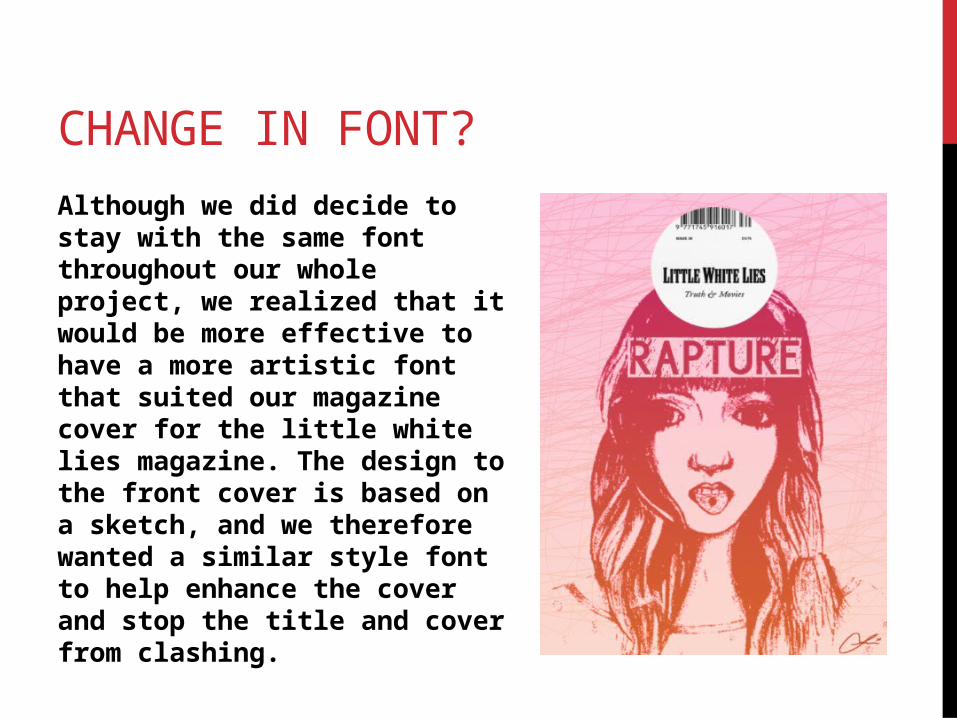
CHANGE IN FONT?
Although we did decide to stay with the same font throughout our whole project, we realized that it would be more effective to have a more artistic font that suited our magazine cover for the little white lies magazine. The design to the front cover is based on a sketch, and we therefore wanted a similar style font to help enhance the cover and stop the title and cover from clashing.

TAGLINE
We decided on the tagline ‘How much can you take?’ as it is relevant to our film as it is about how much mental and emotional pain someone can withstand, whilst also involving the viewers which will ultimately make the tagline stick in their heads. We used the tagline at the top of our poster above the title, and just before the title appears in the teaser trailer.
On the other hand we decided again that we did not want the magazine cover to follow the exact same conventions as our other products as having a tagline didn’t follow the conventions of the little white lies magazine.

MOTIF & ICONOGRAPHY
The colour red is a subtle yet strong part of our brand identity as it features in our trailer, poster and magazine cover. We decided on using Red in various areas of our work as it’d help build on our brand identity, this is due to the fact that Red is associated with the same things we wanted people to associate our film with, this being love and danger.
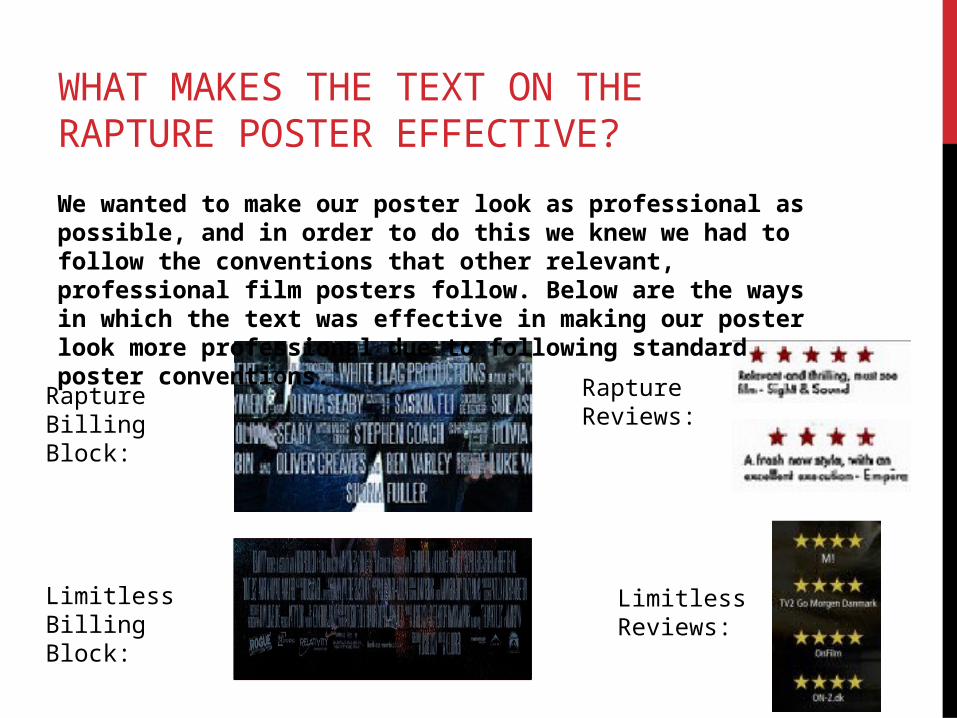
WHAT MAKES THE TEXT ON THE RAPTURE POSTER EFFECTIVE?
We wanted to make our poster look as professional as possible, and in order to do this we knew we had to follow the conventions that other relevant, professional film posters follow. Below are the ways in which the text was effective in making our poster look more professional due to following standard poster conventions.
Rapture Billing Block:
Limitless Billing Block:
Limitless Reviews:
Rapture Reviews: