Professionalisation of Bachelors Preparing Bachelors for the labour market.
Upload
silvester-conleyCategory
view
234download
0
Python Crash CoursePython Crash CoursePlottingPlotting
Bachelors
V1.0
dd 28-01-2015
Hour 2
Plotting - matplotlibPlotting - matplotlib
• User friendly, but powerful, plotting capabilites for python• http://matplotlib.sourceforge.net/
• Once installed (default at Observatory)
>>> import pylab
• Settings can be customised by editing ~/.matplotlib/matplotlibrc– default font, colours, layout, etc.
• Helpful website– many examples
Pyplot and pylabPyplot and pylab
Pylab is a module in matplotlib that gets installed alongside matplotlib; and matplotlib.pyplot is a module in matplotlib.•Pyplot provides the state-machine interface to the underlying plotting library in matplotlib. This means that figures and axes are implicitly and automatically created to achieve the desired plot. Setting a title will then automatically set that title to the current axes object.•Pylab combines the pyplot functionality (for plotting) with the numpy functionality (for mathematics and for working with arrays) in a single namespace, For example, one can call the sin and cos functions just like you could in MATLAB, as well as having all the features of pyplot.•The pyplot interface is generally preferred for non-interactive plotting (i.e., scripting). The pylab interface is convenient for interactive calculations and plotting, as it minimizes typing. Note that this is what you get if you use the ipython shell with the --pylab option, which imports everything from pylab and makes plotting fully interactive.
Pylab and PyplotPylab and Pyplot
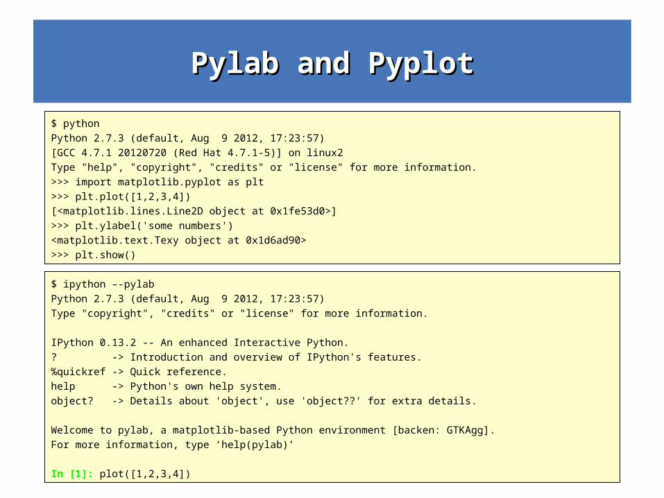
$ pythonPython 2.7.3 (default, Aug 9 2012, 17:23:57)[GCC 4.7.1 20120720 (Red Hat 4.7.1-5)] on linux2Type "help", "copyright", "credits" or "license" for more information.>>> import matplotlib.pyplot as plt >>> plt.plot([1,2,3,4]) [<matplotlib.lines.Line2D object at 0x1fe53d0>]>>> plt.ylabel('some numbers') <matplotlib.text.Texy object at 0x1d6ad90>>>> plt.show()
$ ipython –-pylabPython 2.7.3 (default, Aug 9 2012, 17:23:57)Type "copyright", "credits" or "license" for more information.
IPython 0.13.2 -- An enhanced Interactive Python.? -> Introduction and overview of IPython's features.%quickref -> Quick reference.help -> Python's own help system.object? -> Details about 'object', use 'object??' for extra details.
Welcome to pylab, a matplotlib-based Python environment [backen: GTKAgg].For more information, type ‘help(pylab)’
In [1]: plot([1,2,3,4])
Matplotlib.pyplot exampleMatplotlib.pyplot example
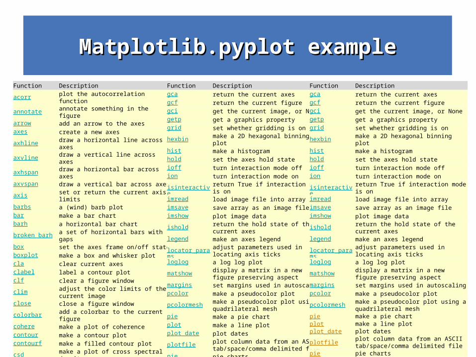
Function Descriptionacorr plot the autocorrelation functionannotate annotate something in the figurearrow add an arrow to the axesaxes create a new axesaxhline draw a horizontal line across axesaxvline draw a vertical line across axesaxhspan draw a horizontal bar across axesaxvspan draw a vertical bar across axesaxis set or return the current axis limitsbarbs a (wind) barb plotbar make a bar chartbarh a horizontal bar chartbroken_barh a set of horizontal bars with gapsbox set the axes frame on/off stateboxplot make a box and whisker plotcla clear current axesclabel label a contour plotclf clear a figure windowclim adjust the color limits of the current imageclose close a figure windowcolorbar add a colorbar to the current figurecohere make a plot of coherencecontour make a contour plotcontourf make a filled contour plotcsd make a plot of cross spectral densitydelaxes delete an axes from the current figuredraw Force a redraw of the current figureerrorbar make an errorbar graph
figlegendmake legend on the figure rather than the axes
figimage make a figure imagefigtext add text in figure coordsfigure create or change active figurefill make filled polygonsfill_between make filled polygons between two curves
Function Descriptiongca return the current axesgcf return the current figuregci get the current image, or Nonegetp get a graphics propertygrid set whether gridding is onhexbin make a 2D hexagonal binning plothist make a histogramhold set the axes hold stateioff turn interaction mode offion turn interaction mode onisinteractive return True if interaction mode is onimread load image file into arrayimsave save array as an image fileimshow plot image dataishold return the hold state of the current axeslegend make an axes legend
locator_paramsadjust parameters used in locating axis ticks
loglog a log log plot
matshowdisplay a matrix in a new figure preserving aspect
margins set margins used in autoscalingpcolor make a pseudocolor plot
pcolormeshmake a pseudocolor plot using a quadrilateral mesh
pie make a pie chartplot make a line plotplot_date plot dates
plotfileplot column data from an ASCII tab/space/comma delimited file
pie pie chartspolar make a polar plot on a PolarAxespsd make a plot of power spectral densityquiver make a direction field (arrows) plotrc control the default params
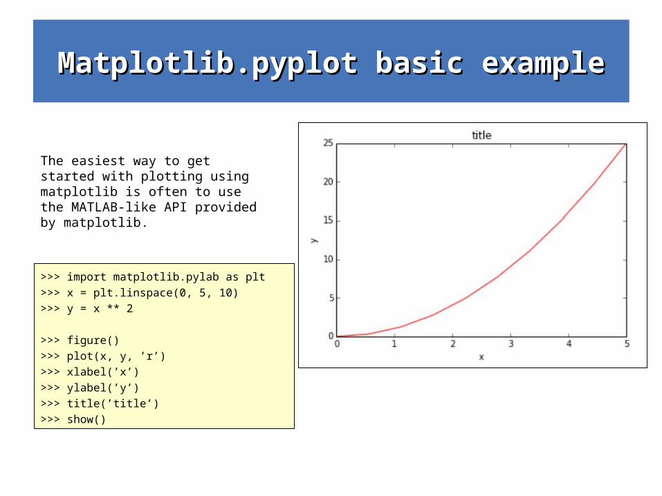
Matplotlib.pyplot basic exampleMatplotlib.pyplot basic example
>>> import matplotlib.pylab as plt
>>> x = plt.linspace(0, 5, 10)
>>> y = x ** 2
>>> figure()
>>> plot(x, y, ’r’)
>>> xlabel(’x’)
>>> ylabel(’y’)
>>> title(’title’)
>>> show()
The easiest way to get started with plotting using matplotlib is often to use the MATLAB-like API provided by matplotlib.
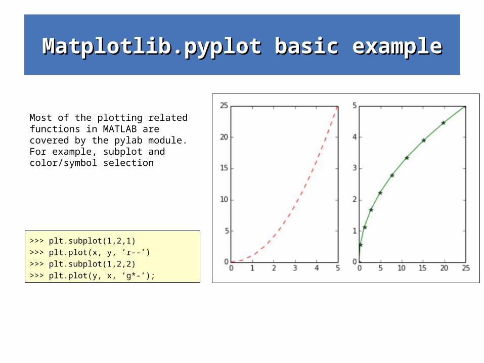
Matplotlib.pyplot basic exampleMatplotlib.pyplot basic example
>>> plt.subplot(1,2,1)
>>> plt.plot(x, y, ’r--’)
>>> plt.subplot(1,2,2)
>>> plt.plot(y, x, ’g*-’);
Most of the plotting related functions in MATLAB are covered by the pylab module. For example, subplot and color/symbol selection
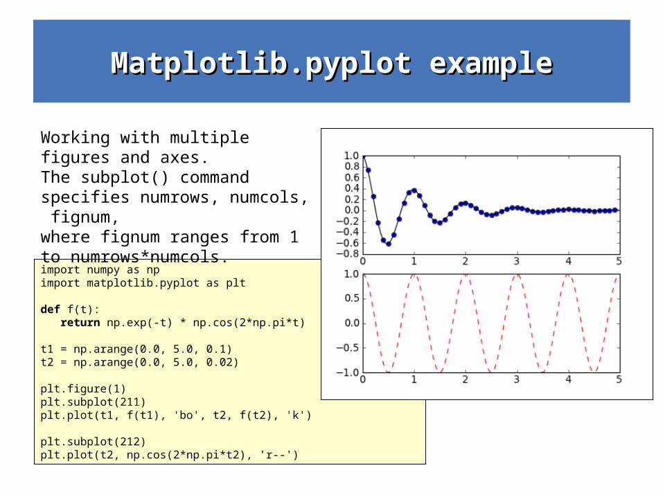
Matplotlib.pyplot exampleMatplotlib.pyplot example
import numpy as np import matplotlib.pyplot as plt
def f(t): return np.exp(-t) * np.cos(2*np.pi*t)
t1 = np.arange(0.0, 5.0, 0.1) t2 = np.arange(0.0, 5.0, 0.02)
plt.figure(1) plt.subplot(211) plt.plot(t1, f(t1), 'bo', t2, f(t2), 'k')
plt.subplot(212) plt.plot(t2, np.cos(2*np.pi*t2), 'r--')
Working with multiple figures and axes. The subplot() command specifies numrows, numcols, fignum, where fignum ranges from 1 to numrows*numcols.
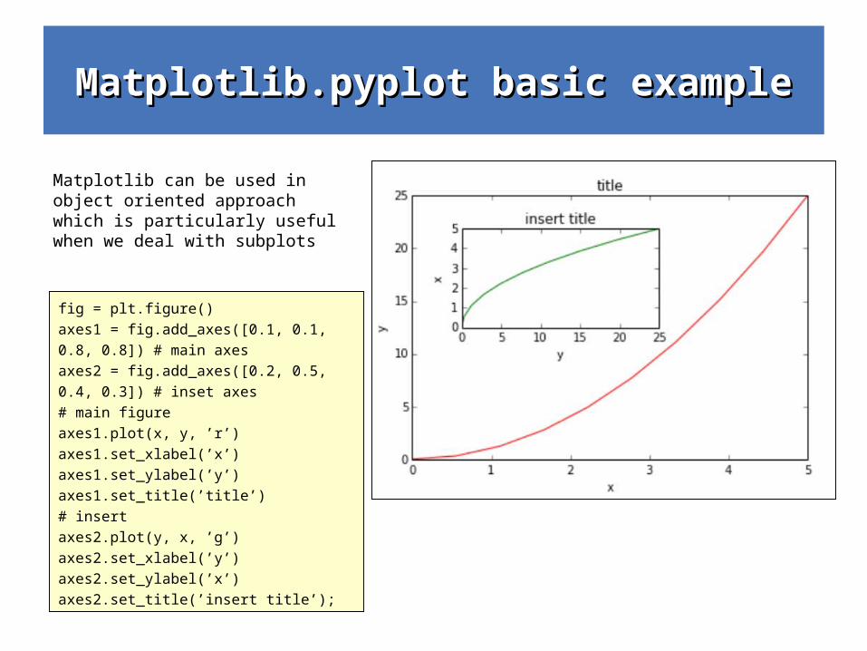
Matplotlib.pyplot basic exampleMatplotlib.pyplot basic example
fig = plt.figure()
axes1 = fig.add_axes([0.1, 0.1,
0.8, 0.8]) # main axes
axes2 = fig.add_axes([0.2, 0.5,
0.4, 0.3]) # inset axes
# main figure
axes1.plot(x, y, ’r’)
axes1.set_xlabel(’x’)
axes1.set_ylabel(’y’)
axes1.set_title(’title’)
# insert
axes2.plot(y, x, ’g’)
axes2.set_xlabel(’y’)
axes2.set_ylabel(’x’)
axes2.set_title(’insert title’);
Matplotlib can be used in object oriented approach which is particularly useful when we deal with subplots
Matplotlib.pyplot basic exampleMatplotlib.pyplot basic example
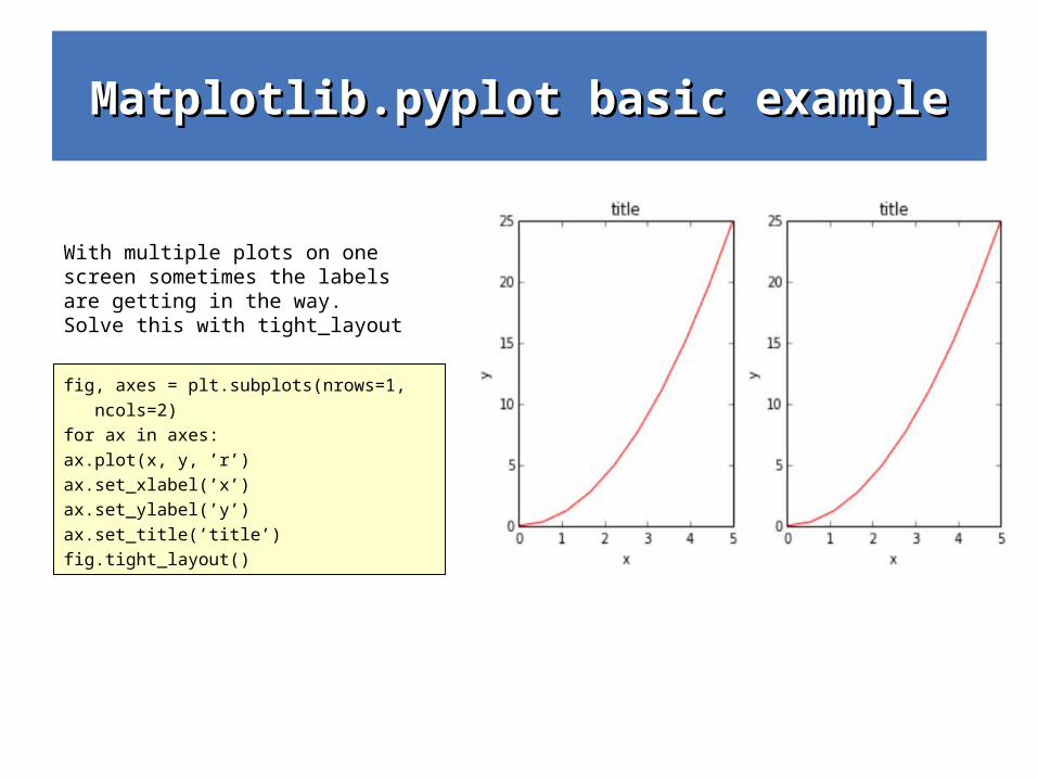
fig, axes = plt.subplots(nrows=1,
ncols=2)
for ax in axes:
ax.plot(x, y, ’r’)
ax.set_xlabel(’x’)
ax.set_ylabel(’y’)
ax.set_title(’title’)
fig.tight_layout()
With multiple plots on one screen sometimes the labels are getting in the way. Solve this with tight_layout
Matplotlib.pyplot basic exampleMatplotlib.pyplot basic example
>>> ax.set_title("title");
>>> ax.set_xlabel("x")
>>> ax.set_ylabel("y");
>>> ax.legend(["curve1", "curve2", "curve3"]);
>>> ax.plot(x, x**2, label="curve1")
>>> ax.plot(x, x**3, label="curve2")
>>> ax.legend()
>>> ax.legend(loc=0) # let matplotlib decide
>>> ax.legend(loc=1) # upper right corner
>>> ax.legend(loc=2) # upper left corner
>>> ax.legend(loc=3) # lower left corner
>>> ax.legend(loc=4) # lower right corner
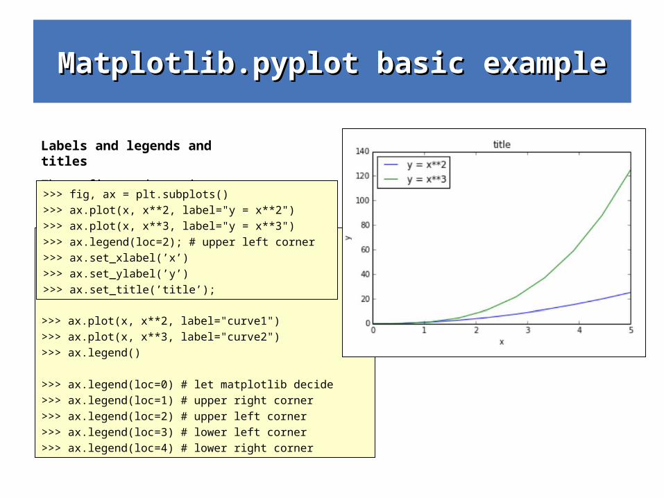
Labels and legends and titles
These figure decrations are essential for presenting your data to others (in papers and in oral presentations).>>> fig, ax = plt.subplots()
>>> ax.plot(x, x**2, label="y = x**2")
>>> ax.plot(x, x**3, label="y = x**3")
>>> ax.legend(loc=2); # upper left corner
>>> ax.set_xlabel(’x’)
>>> ax.set_ylabel(’y’)
>>> ax.set_title(’title’);
Matplotlib.pyplot basic exampleMatplotlib.pyplot basic example
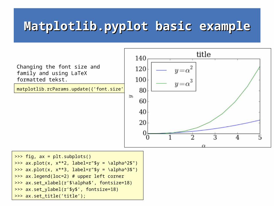
>>> fig, ax = plt.subplots()
>>> ax.plot(x, x**2, label=r"$y = \alpha^2$")
>>> ax.plot(x, x**3, label=r"$y = \alpha^3$")
>>> ax.legend(loc=2) # upper left corner
>>> ax.set_xlabel(r’$\alpha$’, fontsize=18)
>>> ax.set_ylabel(r’$y$’, fontsize=18)
>>> ax.set_title(’title’);
Changing the font size and family and using LaTeX formatted tekst.
matplotlib.rcParams.update({’font.size’: 18, ’font.family’: ’serif’})
Matplotlib.pyplot basic exampleMatplotlib.pyplot basic example
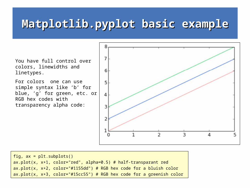
fig, ax = plt.subplots()
ax.plot(x, x+1, color="red", alpha=0.5) # half-transparant red
ax.plot(x, x+2, color="#1155dd") # RGB hex code for a bluish color
ax.plot(x, x+3, color="#15cc55") # RGB hex code for a greenish color
You have full control over colors, linewidths and linetypes.
For colors one can use simple syntax like ‘b’ for blue, ‘g’ for green, etc. or RGB hex codes with transparency alpha code:
Matplotlib.pyplot basic exampleMatplotlib.pyplot basic example
fig, ax = plt.subplots(figsize=(12,6))
ax.plot(x, x+1, color="blue", linewidth=0.25)
ax.plot(x, x+2, color="blue", linewidth=0.50)
ax.plot(x, x+3, color="blue", linewidth=1.00)
ax.plot(x, x+4, color="blue", linewidth=2.00)
# possible linestype options ‘-‘, ‘{’, ‘-.’, ‘:’, ‘steps’
ax.plot(x, x+5, color="red", lw=2, linestyle=’-’)
ax.plot(x, x+6, color="red", lw=2, ls=’-.’)
ax.plot(x, x+7, color="red", lw=2, ls=’:’)
# custom dash
line, = ax.plot(x, x+8, color="black", lw=1.50)
line.set_dashes([5, 10, 15, 10]) # format: line length, space length, ...
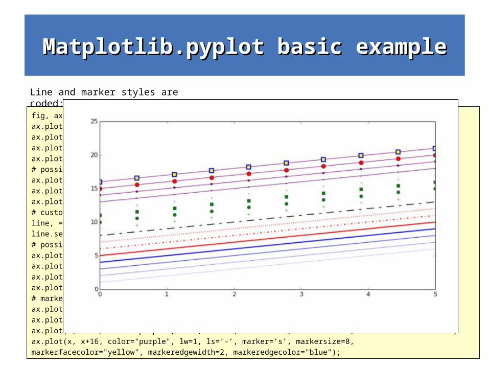
# possible marker symbols: marker = ’+’, ’o’, ’*’, ’s’, ’,’, ’.’, ’1’, ’2’, ’3’, ’4’, ...
ax.plot(x, x+ 9, color="green", lw=2, ls=’*’, marker=’+’)
ax.plot(x, x+10, color="green", lw=2, ls=’*’, marker=’o’)
ax.plot(x, x+11, color="green", lw=2, ls=’*’, marker=’s’)
ax.plot(x, x+12, color="green", lw=2, ls=’*’, marker=’1’)
# marker size and color
ax.plot(x, x+13, color="purple", lw=1, ls=’-’, marker=’o’, markersize=2)
ax.plot(x, x+14, color="purple", lw=1, ls=’-’, marker=’o’, markersize=4)
ax.plot(x, x+15, color="purple", lw=1, ls=’-’, marker=’o’, markersize=8, markerfacecolor="red")
ax.plot(x, x+16, color="purple", lw=1, ls=’-’, marker=’s’, markersize=8,
markerfacecolor="yellow", markeredgewidth=2, markeredgecolor="blue");
Line and marker styles are coded:
Matplotlib.pyplot basic exampleMatplotlib.pyplot basic example
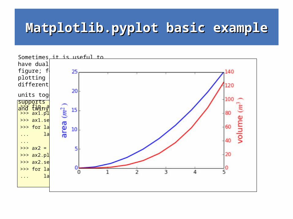
>>> fig, ax1 = plt.subplots()
>>> ax1.plot(x, x**2, lw=2, color="blue")
>>> ax1.set_ylabel(r"area $(m^2)$", fontsize=18, color="blue")
>>> for label in ax1.get_yticklabels():
... label.set_color("blue")
...
>>> ax2 = ax1.twinx()
>>> ax2.plot(x, x**3, lw=2, color="red")
>>> ax2.set_ylabel(r"volume $(m^3)$", fontsize=18, color="red")
>>> for label in ax2.get_yticklabels():
... label.set_color("red")
Sometimes it is useful to have dual x or y axes in a figure; for example, when plotting curves with different
units together. Matplotlib supports this with the twinx and twiny functions:
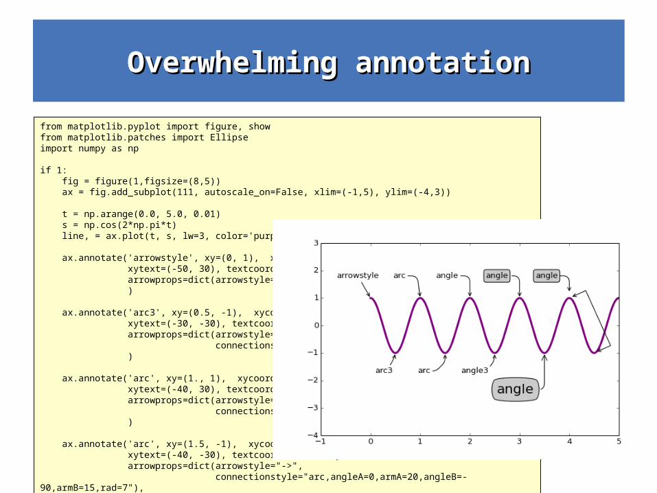
Overwhelming annotationOverwhelming annotation
from matplotlib.pyplot import figure, showfrom matplotlib.patches import Ellipseimport numpy as np
if 1: fig = figure(1,figsize=(8,5)) ax = fig.add_subplot(111, autoscale_on=False, xlim=(-1,5), ylim=(-4,3))
t = np.arange(0.0, 5.0, 0.01) s = np.cos(2*np.pi*t) line, = ax.plot(t, s, lw=3, color='purple')
ax.annotate('arrowstyle', xy=(0, 1), xycoords='data', xytext=(-50, 30), textcoords='offset points', arrowprops=dict(arrowstyle="->") )
ax.annotate('arc3', xy=(0.5, -1), xycoords='data', xytext=(-30, -30), textcoords='offset points', arrowprops=dict(arrowstyle="->", connectionstyle="arc3,rad=.2") )
ax.annotate('arc', xy=(1., 1), xycoords='data', xytext=(-40, 30), textcoords='offset points', arrowprops=dict(arrowstyle="->", connectionstyle="arc,angleA=0,armA=30,rad=10"), )
ax.annotate('arc', xy=(1.5, -1), xycoords='data', xytext=(-40, -30), textcoords='offset points', arrowprops=dict(arrowstyle="->", connectionstyle="arc,angleA=0,armA=20,angleB=-90,armB=15,rad=7"), )
ax.annotate('angle', xy=(2., 1), xycoords='data', xytext=(-50, 30), textcoords='offset points', arrowprops=dict(arrowstyle="->", connectionstyle="angle,angleA=0,angleB=90,rad=10"), )
ax.annotate('angle3', xy=(2.5, -1), xycoords='data', xytext=(-50, -30), textcoords='offset points', arrowprops=dict(arrowstyle="->", connectionstyle="angle3,angleA=0,angleB=-90"), )
ax.annotate('angle', xy=(3., 1), xycoords='data', xytext=(-50, 30), textcoords='offset points', bbox=dict(boxstyle="round", fc="0.8"), arrowprops=dict(arrowstyle="->", connectionstyle="angle,angleA=0,angleB=90,rad=10"), )
ax.annotate('angle', xy=(3.5, -1), xycoords='data', xytext=(-70, -60), textcoords='offset points', size=20, bbox=dict(boxstyle="round4,pad=.5", fc="0.8"), arrowprops=dict(arrowstyle="->", connectionstyle="angle,angleA=0,angleB=-90,rad=10"), )
ax.annotate('angle', xy=(4., 1), xycoords='data', xytext=(-50, 30), textcoords='offset points', bbox=dict(boxstyle="round", fc="0.8"), arrowprops=dict(arrowstyle="->", shrinkA=0, shrinkB=10, connectionstyle="angle,angleA=0,angleB=90,rad=10"), )
ann = ax.annotate('', xy=(4., 1.), xycoords='data', xytext=(4.5, -1), textcoords='data', arrowprops=dict(arrowstyle="<->", connectionstyle="bar", ec="k", shrinkA=5, shrinkB=5, ) )
if 1: fig = figure(2) fig.clf() ax = fig.add_subplot(111, autoscale_on=False, xlim=(-1,5), ylim=(-5,3))
el = Ellipse((2, -1), 0.5, 0.5) ax.add_patch(el)
ax.annotate('$->$', xy=(2., -1), xycoords='data', xytext=(-150, -140), textcoords='offset points', bbox=dict(boxstyle="round", fc="0.8"), arrowprops=dict(arrowstyle="->", patchB=el, connectionstyle="angle,angleA=90,angleB=0,rad=10"), )
ax.annotate('fancy', xy=(2., -1), xycoords='data', xytext=(-100, 60), textcoords='offset points', size=20, #bbox=dict(boxstyle="round", fc="0.8"), arrowprops=dict(arrowstyle="fancy", fc="0.6", ec="none", patchB=el, connectionstyle="angle3,angleA=0,angleB=-90"), )
ax.annotate('simple', xy=(2., -1), xycoords='data', xytext=(100, 60), textcoords='offset points', size=20, #bbox=dict(boxstyle="round", fc="0.8"), arrowprops=dict(arrowstyle="simple", fc="0.6", ec="none", patchB=el, connectionstyle="arc3,rad=0.3"), )
ax.annotate('wedge', xy=(2., -1), xycoords='data', xytext=(-100, -100), textcoords='offset points', size=20, #bbox=dict(boxstyle="round", fc="0.8"), arrowprops=dict(arrowstyle="wedge,tail_width=0.7", fc="0.6", ec="none", patchB=el, connectionstyle="arc3,rad=-0.3"), )
ann = ax.annotate('wedge', xy=(2., -1), xycoords='data', xytext=(0, -45), textcoords='offset points', size=20, bbox=dict(boxstyle="round", fc=(1.0, 0.7, 0.7), ec=(1., .5, .5)), arrowprops=dict(arrowstyle="wedge,tail_width=1.", fc=(1.0, 0.7, 0.7), ec=(1., .5, .5), patchA=None, patchB=el, relpos=(0.2, 0.8), connectionstyle="arc3,rad=-0.1"), )
ann = ax.annotate('wedge', xy=(2., -1), xycoords='data', xytext=(35, 0), textcoords='offset points', size=20, va="center", bbox=dict(boxstyle="round", fc=(1.0, 0.7, 0.7), ec="none"), arrowprops=dict(arrowstyle="wedge,tail_width=1.", fc=(1.0, 0.7, 0.7), ec="none", patchA=None, patchB=el, relpos=(0.2, 0.5), ) )
show()
Matplotlib.pyplot basic exampleMatplotlib.pyplot basic example
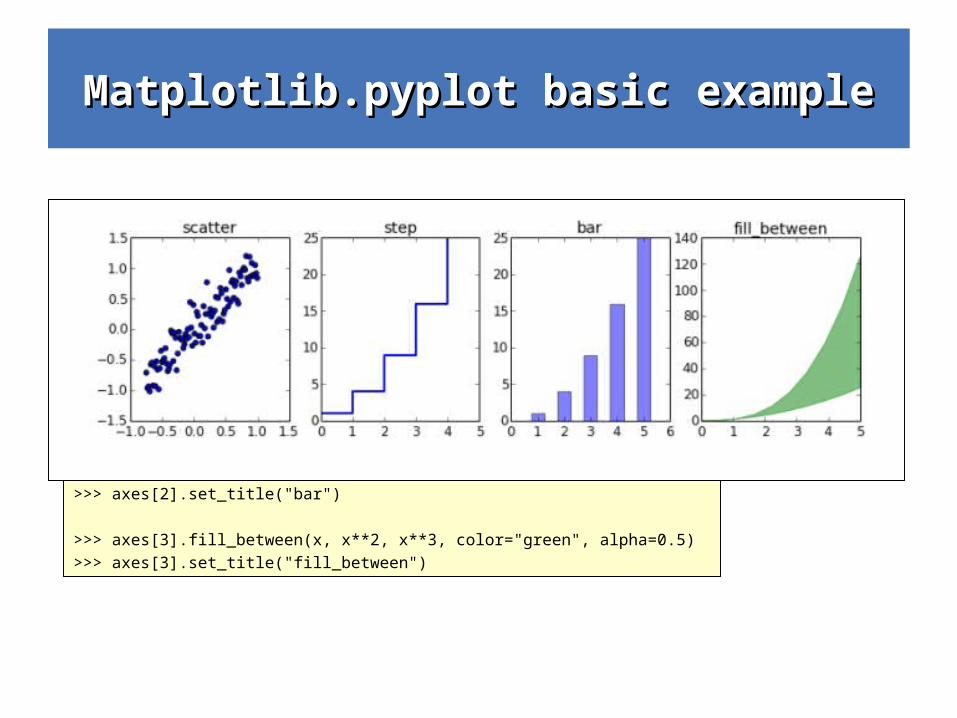
>>> n = array([0,1,2,3,4,5])
>>> fig, axes = plt.subplots(1, 4, figsize=(12,3))
>>> axes[0].scatter(xx, xx + 0.25*randn(len(xx)))
>>> axes[0].set_title("scatter")
>>> axes[1].step(n, n**2, lw=2)
>>> axes[1].set_title("step")
>>> axes[2].bar(n, n**2, align="center", width=0.5, alpha=0.5)
>>> axes[2].set_title("bar")
>>> axes[3].fill_between(x, x**2, x**3, color="green", alpha=0.5)
>>> axes[3].set_title("fill_between")
Other 2D plt styles
Matplotlib.pyplot basic exampleMatplotlib.pyplot basic example
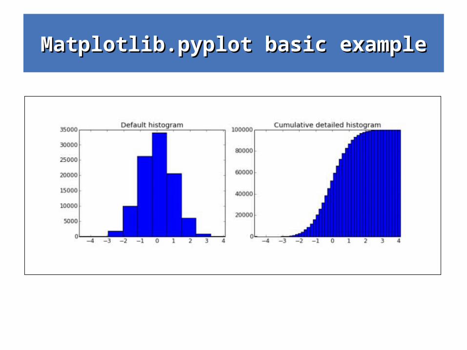
>>> n = np.random.randn(100000)
>>> fig, axes = plt.subplots(1, 2, figsize=(12,4))
>>> axes[0].hist(n)
>>> axes[0].set_title("Default histogram")
>>> axes[0].set_xlim((min(n), max(n)))
>>> axes[1].hist(n, cumulative=True, bins=50)
>>> axes[1].set_title("Cumulative detailed histogram")
>>> axes[1].set_xlim((min(n), max(n)));
Histograms are also a very useful visualisation tool
Matplotlib.pyplot exampleMatplotlib.pyplot example
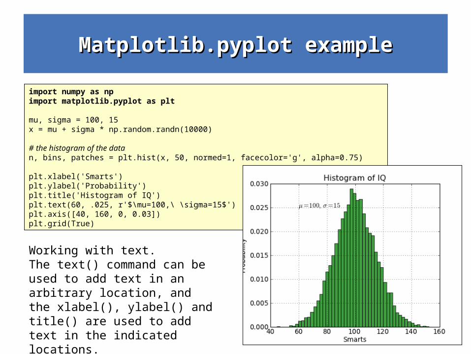
import numpy as np import matplotlib.pyplot as plt
mu, sigma = 100, 15 x = mu + sigma * np.random.randn(10000)
# the histogram of the data n, bins, patches = plt.hist(x, 50, normed=1, facecolor='g', alpha=0.75)
plt.xlabel('Smarts') plt.ylabel('Probability') plt.title('Histogram of IQ') plt.text(60, .025, r'$\mu=100,\ \sigma=15$') plt.axis([40, 160, 0, 0.03]) plt.grid(True)
Working with text.The text() command can be used to add text in an arbitrary location, and the xlabel(), ylabel() and title() are used to add text in the indicated locations.
Matplotlib.pyplot exampleMatplotlib.pyplot example
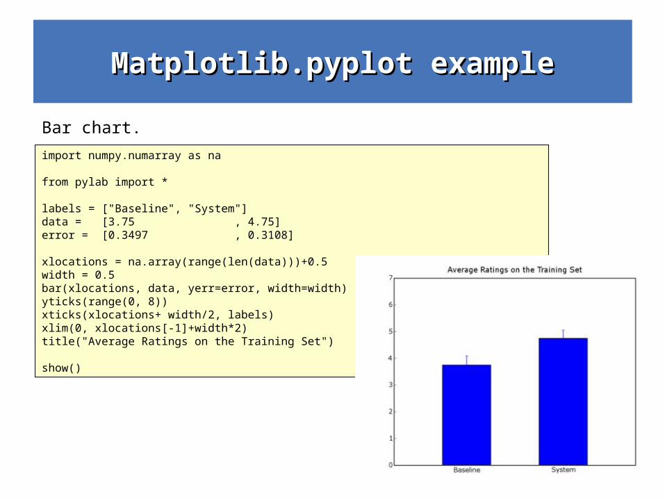
import numpy.numarray as na
from pylab import *
labels = ["Baseline", "System"]data = [3.75 , 4.75]error = [0.3497 , 0.3108]
xlocations = na.array(range(len(data)))+0.5width = 0.5bar(xlocations, data, yerr=error, width=width)yticks(range(0, 8))xticks(xlocations+ width/2, labels)xlim(0, xlocations[-1]+width*2)title("Average Ratings on the Training Set")
show()
Bar chart.
Matplotlib.pyplot exampleMatplotlib.pyplot example
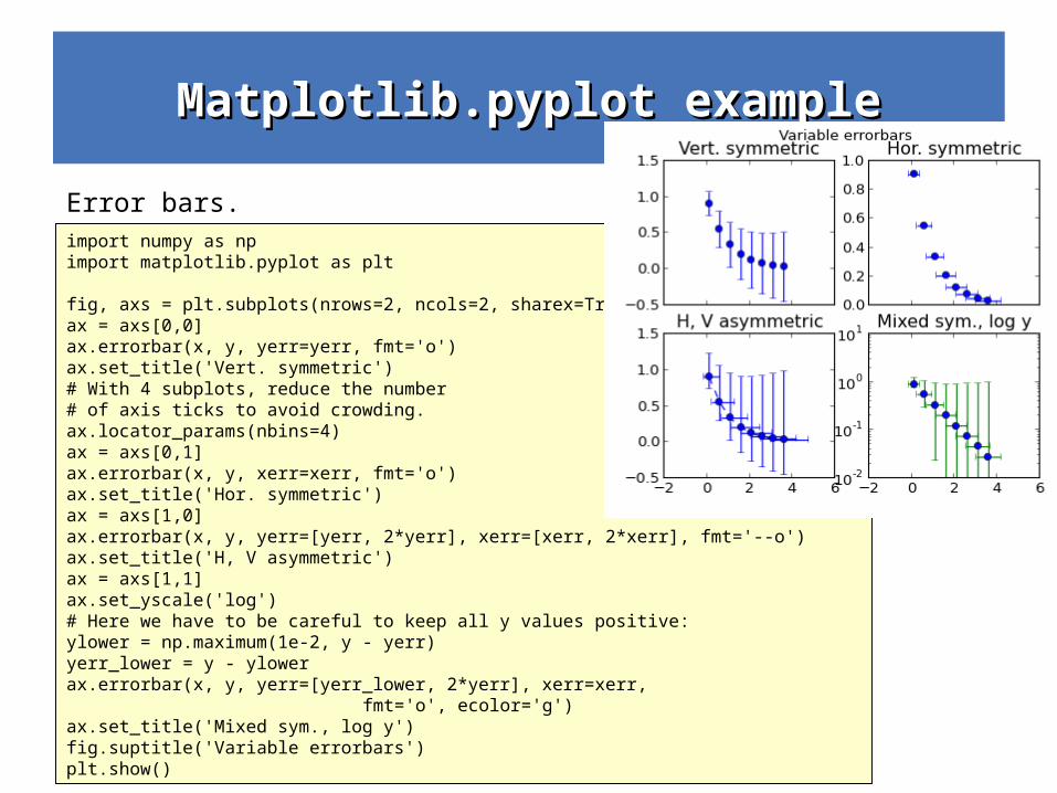
import numpy as npimport matplotlib.pyplot as plt
fig, axs = plt.subplots(nrows=2, ncols=2, sharex=True)ax = axs[0,0]ax.errorbar(x, y, yerr=yerr, fmt='o')ax.set_title('Vert. symmetric')# With 4 subplots, reduce the number # of axis ticks to avoid crowding.ax.locator_params(nbins=4)ax = axs[0,1]ax.errorbar(x, y, xerr=xerr, fmt='o')ax.set_title('Hor. symmetric')ax = axs[1,0]ax.errorbar(x, y, yerr=[yerr, 2*yerr], xerr=[xerr, 2*xerr], fmt='--o')ax.set_title('H, V asymmetric')ax = axs[1,1]ax.set_yscale('log')# Here we have to be careful to keep all y values positive:ylower = np.maximum(1e-2, y - yerr)yerr_lower = y - ylowerax.errorbar(x, y, yerr=[yerr_lower, 2*yerr], xerr=xerr, fmt='o', ecolor='g')ax.set_title('Mixed sym., log y')fig.suptitle('Variable errorbars')plt.show()
Error bars.
Matplotlib.pyplot examplesMatplotlib.pyplot examples
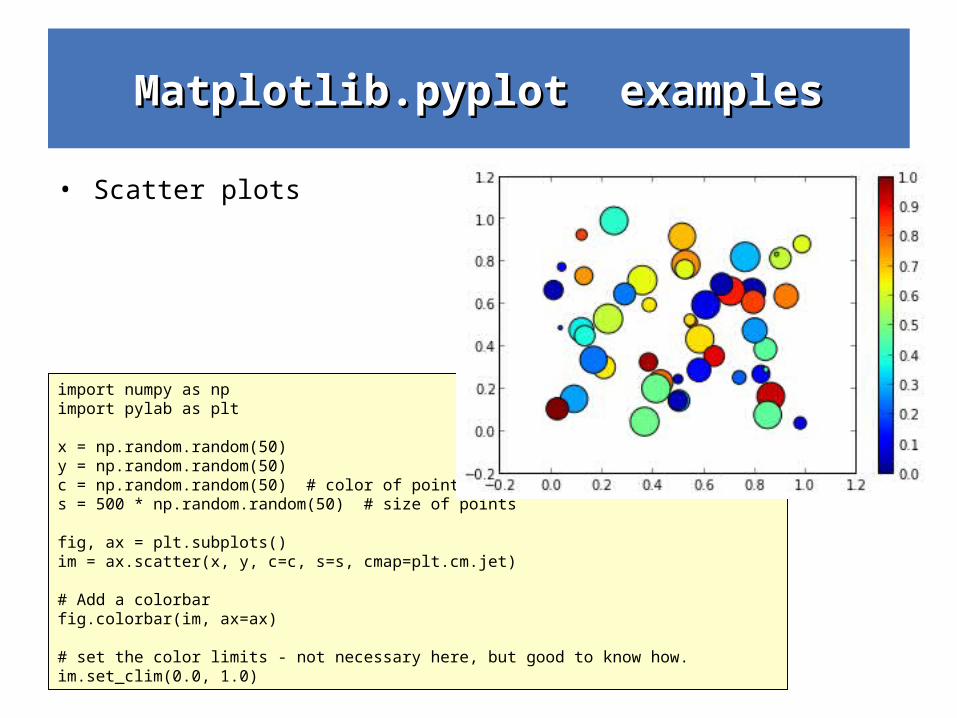
• Scatter plots
import numpy as npimport pylab as plt
x = np.random.random(50)y = np.random.random(50)c = np.random.random(50) # color of pointss = 500 * np.random.random(50) # size of points
fig, ax = plt.subplots()im = ax.scatter(x, y, c=c, s=s, cmap=plt.cm.jet)
# Add a colorbarfig.colorbar(im, ax=ax)
# set the color limits - not necessary here, but good to know how.im.set_clim(0.0, 1.0)
Matplotlib.pyplot basic exampleMatplotlib.pyplot basic example
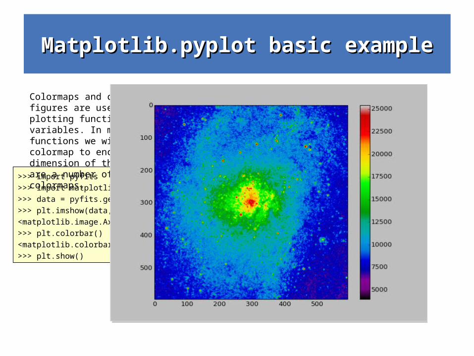
>>> import pyfits
>>> import matplotlib.pyplot as plt
>>> data = pyfits.getdata('m33.fits')
>>> plt.imshow(data, cmap='gray')
<matplotlib.image.AxesImage object at 0x7f6c09b1a250>
>>> plt.colorbar()
<matplotlib.colorbar.Colorbar instance at 0x7f6c09aabb90>
>>> plt.show()
Colormaps and contour figures are useful for plotting functions of two variables. In most of these functions we will use a colormap to encode one dimension of the data. There are a number of predefined colormaps.
Matplotlib.pyplot exampleMatplotlib.pyplot example
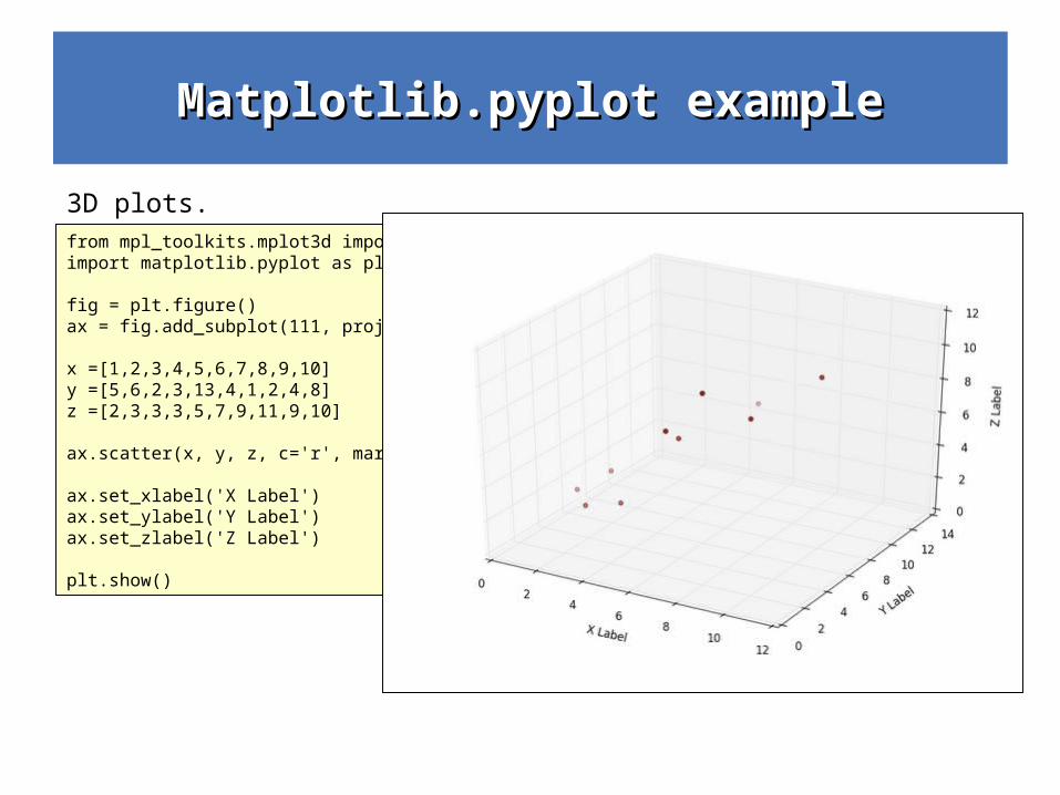
from mpl_toolkits.mplot3d import Axes3Dimport matplotlib.pyplot as plt fig = plt.figure()ax = fig.add_subplot(111, projection='3d') x =[1,2,3,4,5,6,7,8,9,10]y =[5,6,2,3,13,4,1,2,4,8]z =[2,3,3,3,5,7,9,11,9,10] ax.scatter(x, y, z, c='r', marker='o') ax.set_xlabel('X Label')ax.set_ylabel('Y Label')ax.set_zlabel('Z Label') plt.show()
3D plots.
Matplotlib.pyplot exampleMatplotlib.pyplot example
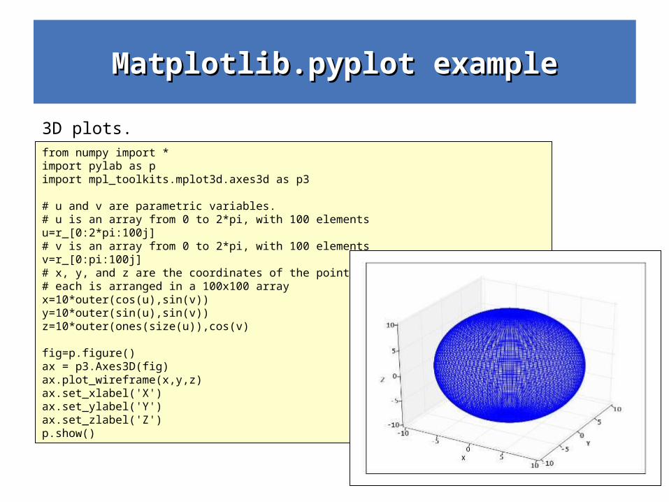
from numpy import *import pylab as pimport mpl_toolkits.mplot3d.axes3d as p3
# u and v are parametric variables.# u is an array from 0 to 2*pi, with 100 elementsu=r_[0:2*pi:100j]# v is an array from 0 to 2*pi, with 100 elementsv=r_[0:pi:100j]# x, y, and z are the coordinates of the points for plotting# each is arranged in a 100x100 arrayx=10*outer(cos(u),sin(v))y=10*outer(sin(u),sin(v))z=10*outer(ones(size(u)),cos(v)
fig=p.figure()ax = p3.Axes3D(fig)ax.plot_wireframe(x,y,z)ax.set_xlabel('X')ax.set_ylabel('Y')ax.set_zlabel('Z')p.show()
3D plots.
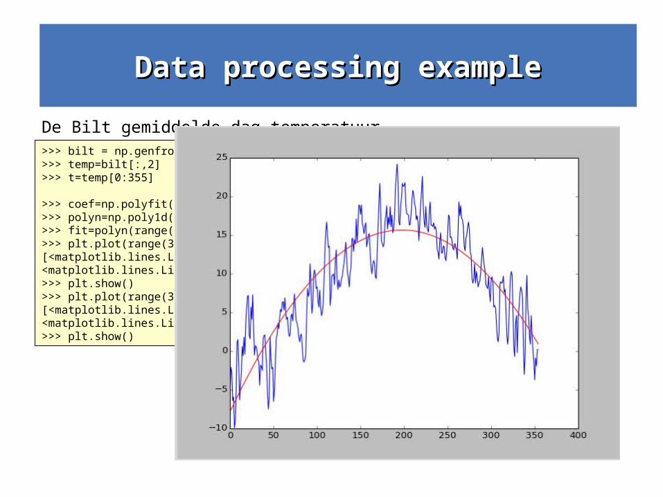
Data processing exampleData processing example
>>> bilt = np.genfromtxt('DeBilt.txt', delimiter=',',skip_header=1)>>> temp=bilt[:,2]>>> t=temp[0:355]
>>> coef=np.polyfit(range(355),t, 2)>>> polyn=np.poly1d(coef)>>> fit=polyn(range(355))>>> plt.plot(range(355),t*0.1,'b',range(355),fit,'r')[<matplotlib.lines.Line2D object at 0x7f6c09b2dd90>, <matplotlib.lines.Line2D object at 0x7f6c09b2db50>]>>> plt.show()>>> plt.plot(range(355),t*0.1,'b',range(355),fit*0.1,'r')[<matplotlib.lines.Line2D object at 0x7f6c086fe410>, <matplotlib.lines.Line2D object at 0x7f6c09b88d10>]>>> plt.show()
De Bilt gemiddelde dag temperatuur.
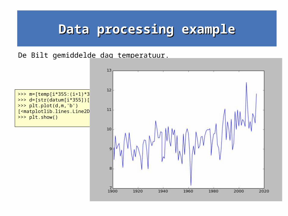
Data processing exampleData processing example
>>> m=[temp[i*355:(i+1)*355].mean() for i in range(temp.size / 356)]>>> d=[str(datum[i*355])[0:4] for i in range(temp.size / 356)]>>> plt.plot(d,m,'b')[<matplotlib.lines.Line2D object at 0x7f6c10861b50>]>>> plt.show()
De Bilt gemiddelde dag temperatuur.
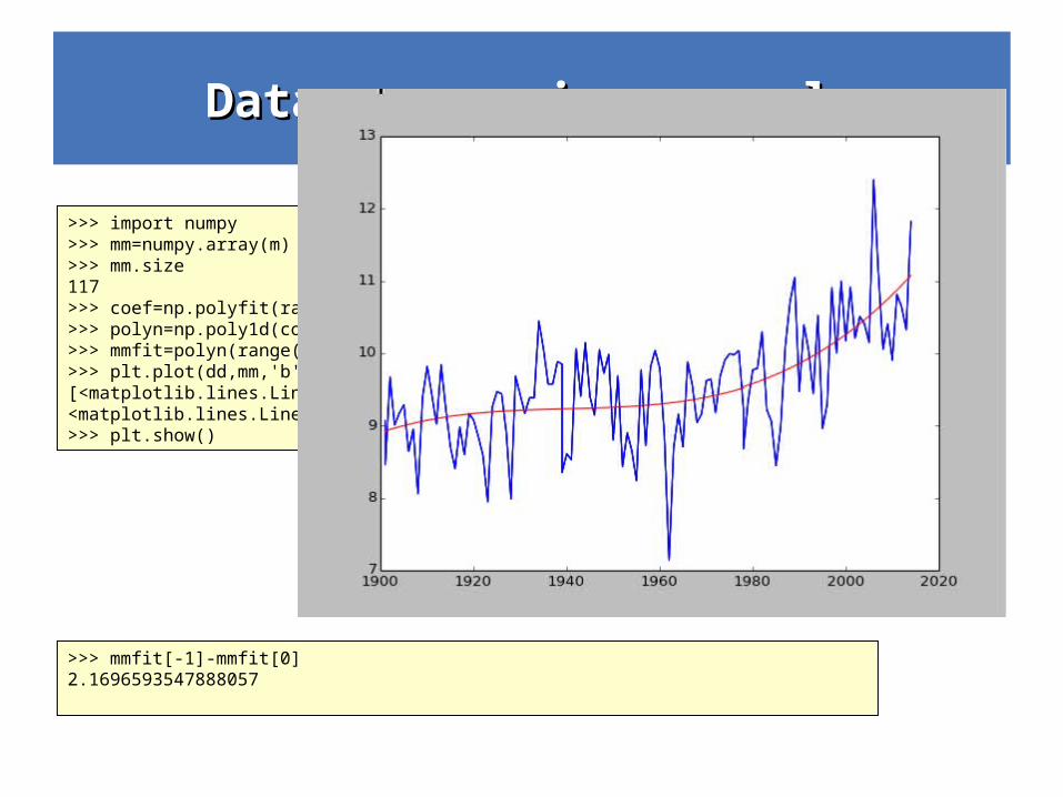
>>> import numpy>>> mm=numpy.array(m)>>> mm.size117>>> coef=np.polyfit(range(117),mm, 3)>>> polyn=np.poly1d(coef)>>> mmfit=polyn(range(117))>>> plt.plot(dd,mm,'b',dd,mmfit,'r')[<matplotlib.lines.Line2D object at 0x7f6c09b2da90>, <matplotlib.lines.Line2D object at 0x7f6c0d649350>]>>> plt.show()
Data processing exampleData processing example
End
>>> mmfit[-1]-mmfit[0]2.1696593547888057
Data processing exampleData processing example
End