Protiviti Style Guide
57
Protiviti Style Guide
Transcript of Protiviti Style Guide

Protiviti Style Guide

All logos shown are provided as master artwork files. Please DO NOT alter, redraw or misuse these logos in any way. Protiviti reserves the right to enforce the correct application of these logos and may demand reproduction or reprint of any incorect usage at the vendor’s expense.
Protiviti Preliminary Style Guide
Contents
Introduction . . . . . . . . . . . . . . . . . . . . . . . . . . . . . . . . . . . . . . . . . . . . . . . . . . . . . . . . . . . . . . . . . . . i
Corporate Logo and Brand . . . . . . . . . . . . . . . . . . . . . . . . . . . . . . . . . . . . . . . . . . . . . . . . . . . . . . 1-8 Preferred Version. . . . . . . . . . . . . . . . . . . . . . . . . . . . . . . . . . . . . . . . . . . . . . . . . . . . . . . . . . . .1 Other Logo Variations . . . . . . . . . . . . . . . . . . . . . . . . . . . . . . . . . . . . . . . . . . . . . . . . . . . . . . . .2 Exceptional Use Logos . . . . . . . . . . . . . . . . . . . . . . . . . . . . . . . . . . . . . . . . . . . . . . . . . . . . . . .3 Applying the Logo . . . . . . . . . . . . . . . . . . . . . . . . . . . . . . . . . . . . . . . . . . . . . . . . . . . . . . . . . . .4 Logo Restrictions. . . . . . . . . . . . . . . . . . . . . . . . . . . . . . . . . . . . . . . . . . . . . . . . . . . . . . . . . . . .5 Our Tagline. . . . . . . . . . . . . . . . . . . . . . . . . . . . . . . . . . . . . . . . . . . . . . . . . . . . . . . . . . . . . . . . .6 Applying the Tagline . . . . . . . . . . . . . . . . . . . . . . . . . . . . . . . . . . . . . . . . . . . . . . . . . . . . . . . . .7 Exceptional Use of the Tagline . . . . . . . . . . . . . . . . . . . . . . . . . . . . . . . . . . . . . . . . . . . . . . . . .8
Additional Graphics . . . . . . . . . . . . . . . . . . . . . . . . . . . . . . . . . . . . . . . . . . . . . . . . . . . . . . . . . . . . .9
Corporate Typefaces. . . . . . . . . . . . . . . . . . . . . . . . . . . . . . . . . . . . . . . . . . . . . . . . . . . . . . . . . . . . 10
Corporate Stationery . . . . . . . . . . . . . . . . . . . . . . . . . . . . . . . . . . . . . . . . . . . . . . . . . . . . . . . . . . . 11
Member Firm Program . . . . . . . . . . . . . . . . . . . . . . . . . . . . . . . . . . . . . . . . . . . . . . . . . . . . . . . . . 12-14 Logo / Preferred Version . . . . . . . . . . . . . . . . . . . . . . . . . . . . . . . . . . . . . . . . . . . . . . . . . . . . . 12 Member Firm Corporate Stationery . . . . . . . . . . . . . . . . . . . . . . . . . . . . . . . . . . . . . . . . . . . . 13 Member Firm Co-Branding . . . . . . . . . . . . . . . . . . . . . . . . . . . . . . . . . . . . . . . . . . . . . . . . . . . 14
Co-Branding: Companies Owned by Protiviti . . . . . . . . . . . . . . . . . . . . . . . . . . . . . . . . . . . . . . . 15
Corporate Alliances and Business Relationships . . . . . . . . . . . . . . . . . . . . . . . . . . . . . . . . . . . . 16-17 Member Firm Co-Branding . . . . . . . . . . . . . . . . . . . . . . . . . . . . . . . . . . . . . . . . . . . . . . . . . . . 16 Use of Client Logos . . . . . . . . . . . . . . . . . . . . . . . . . . . . . . . . . . . . . . . . . . . . . . . . . . . . . . . . . 17
Alliance and Member Firm Programs . . . . . . . . . . . . . . . . . . . . . . . . . . . . . . . . . . . . . . . . . . . . . . 18
Visual Identity . . . . . . . . . . . . . . . . . . . . . . . . . . . . . . . . . . . . . . . . . . . . . . . . . . . . . . . . . . . . . . . 19-21 Introduction. . . . . . . . . . . . . . . . . . . . . . . . . . . . . . . . . . . . . . . . . . . . . . . . . . . . . . . . . . . . . . . 19 Graphics. . . . . . . . . . . . . . . . . . . . . . . . . . . . . . . . . . . . . . . . . . . . . . . . . . . . . . . . . . . . . . . . . . 20 Templates . . . . . . . . . . . . . . . . . . . . . . . . . . . . . . . . . . . . . . . . . . . . . . . . . . . . . . . . . . . . . . . . 21 Imagery . . . . . . . . . . . . . . . . . . . . . . . . . . . . . . . . . . . . . . . . . . . . . . . . . . . . . . . . . . . . . . . . . . 22 (additional content) . . . . . . . . . . . . . . . . . . . . . . . . . . . . . . . . . . . . . . . . . . . . . . . . . . . . . . . . . . 23

All logos shown are provided as master artwork files. Please DO NOT alter, redraw or misuse these logos in any way. Protiviti reserves the right to enforce the correct application of these logos and may demand reproduction or reprint of any incorect usage at the vendor’s expense.
Protiviti Preliminary Style Guide
Contents
Print Production . . . . . . . . . . . . . . . . . . . . . . . . . . . . . . . . . . . . . . . . . . . . . . . . . . . . . . . . . . . . . . . 24
Corporate Colors. . . . . . . . . . . . . . . . . . . . . . . . . . . . . . . . . . . . . . . . . . . . . . . . . . . . . . . . . . . . . . . 25
Charts . . . . . . . . . . . . . . . . . . . . . . . . . . . . . . . . . . . . . . . . . . . . . . . . . . . . . . . . . . . . . . . . . . . . . . 26-27 (new samples) . . . . . . . . . . . . . . . . . . . . . . . . . . . . . . . . . . . . . . . . . . . . . . . . . . . . . . . . . . . . . . 26 (new samples) . . . . . . . . . . . . . . . . . . . . . . . . . . . . . . . . . . . . . . . . . . . . . . . . . . . . . . . . . . . . . . 27
PowerPoint and Word Templates. . . . . . . . . . . . . . . . . . . . . . . . . . . . . . . . . . . . . . . . . . . . . . . . . 28-31 (new samples) . . . . . . . . . . . . . . . . . . . . . . . . . . . . . . . . . . . . . . . . . . . . . . . . . . . . . . . . . . . . . . 28 (new samples) . . . . . . . . . . . . . . . . . . . . . . . . . . . . . . . . . . . . . . . . . . . . . . . . . . . . . . . . . . . . . . 29 (new samples) . . . . . . . . . . . . . . . . . . . . . . . . . . . . . . . . . . . . . . . . . . . . . . . . . . . . . . . . . . . . . . 30 (new samples) . . . . . . . . . . . . . . . . . . . . . . . . . . . . . . . . . . . . . . . . . . . . . . . . . . . . . . . . . . . . . . 31
Diagrams . . . . . . . . . . . . . . . . . . . . . . . . . . . . . . . . . . . . . . . . . . . . . . . . . . . . . . . . . . . . . . . . . . . . 32
Protiviti Voice . . . . . . . . . . . . . . . . . . . . . . . . . . . . . . . . . . . . . . . . . . . . . . . . . . . . . . . . . . . . . . . . 33-36 What is Voice? . . . . . . . . . . . . . . . . . . . . . . . . . . . . . . . . . . . . . . . . . . . . . . . . . . . . . . . . . . . . . 33 Defining the Protiviti Voice . . . . . . . . . . . . . . . . . . . . . . . . . . . . . . . . . . . . . . . . . . . . . . . . . . . 34 Speak Plainly . . . . . . . . . . . . . . . . . . . . . . . . . . . . . . . . . . . . . . . . . . . . . . . . . . . . . . . . . . . . . . 35 Writing for Thought Leadership . . . . . . . . . . . . . . . . . . . . . . . . . . . . . . . . . . . . . . . . . . . . . . . 36
Glossary of Term Use of Protiviti . . . . . . . . . . . . . . . . . . . . . . . . . . . . . . . . . . . . . . . . . . . . . . . . . 37-39
Point of View (POV) . . . . . . . . . . . . . . . . . . . . . . . . . . . . . . . . . . . . . . . . . . . . . . . . . . . . . . . . . . . . 40
Case Study . . . . . . . . . . . . . . . . . . . . . . . . . . . . . . . . . . . . . . . . . . . . . . . . . . . . . . . . . . . . . . . . . . . 41
Solution Sheet . . . . . . . . . . . . . . . . . . . . . . . . . . . . . . . . . . . . . . . . . . . . . . . . . . . . . . . . . . . . . . . . 42
Artwork & Legal . . . . . . . . . . . . . . . . . . . . . . . . . . . . . . . . . . . . . . . . . . . . . . . . . . . . . . . . . . . . . . . 43

All logos shown are provided as master artwork files. Please DO NOT alter, redraw or misuse these logos in any way. Protiviti reserves the right to enforce the correct application of these logos and may demand reproduction or reprint of any incorect usage at the vendor’s expense.
Protiviti Preliminary Style Guide / i
Introduction
This document outlines and defines the use of Protiviti’s updated logo and tagline. It provides details for stationary and business card designs, as well as an overview of corporate fonts and colors. This document is marked “preliminary” because it is meant to help you prepare for the transition to the new logo and visual style. There will be a subsequent release of this material on (TBD 2010). That document will provide detailed guidance on our visual identity, image use, MS Office templates (including PowerPoint), collateral and writing style.
As an employee of Protiviti, you are the face of our company for the clients you serve. What you do and the way you present yourself to a client ultimately determines how they perceive Protiviti. The materials in this document are meant to reflect the same confident professionalism that you present each day to your clients.
Each Protiviti employee or representative is responsible for being aware of these guidelines before using our logo or other visual elements. When used consistently, these guidelines will maximize the effectiveness of the messages for our clients and employees, both current and prospective. In addition, the style of materials outlined here lets us share information more easily amongst our colleagues that we can use to better serve our clients. It facilitates the broader solutions we want to deliver.
Corporate identities and brands are successful because they’re authentic and consistent. From our beginnings, we have sought to be an Insightful Partner to our clients and in our business communities. Our new tagline, “Powerful Insights. Proven Delivery.” was selected because our clients said that it represented us best. It perfectly sums up what we provide.
Our updated corporate positioning is not meant to change our identities as an organization or as individuals. Instead, it’s an opportunity to consistently reinforce our identity with our clients and the broader business community, and keep them aware of the many ways we can help them succeed. Our clients’ success reflects our own success and growth as a consulting firm and as consulting professionals.
We hope you find this information useful. This document is meant to be stable, but not static. If you have concerns, comments or suggestions regarding this material, please do not hesitate to share them with our marketing team so that we may continuously improve this document.

Protiviti Preliminary Style Guide / 1 All logos shown are provided as master artwork files. Please DO NOT alter, redraw or misuse these logos in any way. Protiviti reserves the right to enforce the correct application of these logos and may demand reproduction or reprint of any incorect usage at the vendor’s expense.
Preferred Version
The preferred use of the Protiviti logo is two-color positive, using the two corporate colors of Protiviti gray and Protiviti blue.
Whenever you request a high-resolution or print-quality version of the logo, please include information on the proposed usage for the logo. When the logo is sent to an outside vendor, the file must be accompanied by the corporate logo guidelines (pp. 5-9 of this document).
The logo is always locked up with the business descriptor “Risk & Business Consulting. Internal Audit.” The logo may only be used on its own when there are practical restrictions or with permission from the Brand Team.
Important Note: The logo is available on the ftp site.
Corporate Logo and Brand
Two-Color Positive Logo
Minimum Clear Space
A minimum clear space of 1x should always be preserved around ANY version of the corporate logo, as indicated below. Please keep the logo clear of other elements.
Minimum Size
The minimum size for reproducing this logo with tagline is 30mm whether in process or spot color. This is also the minimum size when using tints of the colors in the logo (see logo variations, page 3). The logo can be produced at 20mm without the tagline if space is confined.
30 mm
20 mm
Risk & Business Consulting.Internal Audit.
x
x
x
x
x

Protiviti Preliminary Style Guide / 2 All logos shown are provided as master artwork files. Please DO NOT alter, redraw or misuse these logos in any way. Protiviti reserves the right to enforce the correct application of these logos and may demand reproduction or reprint of any incorect usage at the vendor’s expense.
Corporate Logo and Brand
Positive and Reverse Logos
Two-Color Logo – Positive
One-Color Blue – Positive
Two-Color Gray – Positive
One-Color Black – Positive
Two-Color Logo – Reverse
One-Color Blue – Reverse
One-Color Gray – Reverse
One-Color Black – Reverse
Other Logo Variations
Other logo variations are available only if the preferred two-color Protiviti logo can’t be used.
These variations are available for single-color reproduction using either Protiviti blue, Protiviti gray or black. When a reverse version is required, the logo is reversed out in white against the color, and the 3 “i”s must be reproduced in a 50% tint of the color.
The logos are available in a range of formats for specific applications, including .gif files in RGB for online presentations and .eps files in CMYK for print and artwork requests. If you’re requesting one of these formats, please detail the reason and specs for usage.
Using Tints
Tints of the corporate colors may be used in design at any percentage. However the 3 “i”s in the logo MUST always be reproduced at 50% of the selected corporate color.

Protiviti Preliminary Style Guide / 3 All logos shown are provided as master artwork files. Please DO NOT alter, redraw or misuse these logos in any way. Protiviti reserves the right to enforce the correct application of these logos and may demand reproduction or reprint of any incorect usage at the vendor’s expense.
Corporate Logo and Brand
Line Art Logo
Minimum Clear Space
As with the preferred version, the minimum clear space of 1x must always be preserved around the logo.
Minimum Size
The minimum size for reproducing this line art logo is 20mm, and it must appear without the business descriptor underneath. It can be reproduced at this scale because it does not require the use of tints or reproduction in four-color process. For processes such as embroidery or silkscreening, however, the logo may need to be used without the business
descriptor. In these cases, please obtain permission from the Brand Team.
x
x
x
x
x
20 mm
Exceptional Use Logos
For print and reproduction processes where it is impossible or impractical to use tints of the logo (e.g. screenprinting), a line art version of the Protiviti logo is available upon request.
The line art logo may be reproduced in any of the corporate colors. It may also be used for promotional items where gold, silver, white or embossed logos are required and tints are not possible.
This version SHOULD NOT be used unless required for technical reasons.

Protiviti Preliminary Style Guide / 4 All logos shown are provided as master artwork files. Please DO NOT alter, redraw or misuse these logos in any way. Protiviti reserves the right to enforce the correct application of these logos and may demand reproduction or reprint of any incorect usage at the vendor’s expense.
Applying the Logo
When applying the Protiviti logo on textured or photographic backgrounds, always ensure that the logo is clear and visible.
If clear visibility is NOT possible, the logo must be placed upon a solid background that includes the minimum clear space to preserve the legibility of the logo.
The logo may be placed upon other background colors (e.g. the secondary color beige). In these cases, however, please ensure that the Protiviti logo is clearly visible and contrasted from the background.
Corporate Logo and Brand
Positive and Reverse Logos on Backgrounds
Two-Color Logo – Positive
One-Color Blue – Positive
Two-Color Gray – Positive
One-Color Black – Positive
Two-Color Logo – Reverse
One-Color Blue – Reverse
One-Color Gray – Reverse
One-Color Black – Reverse

Protiviti Preliminary Style Guide / 5 All logos shown are provided as master artwork files. Please DO NOT alter, redraw or misuse these logos in any way. Protiviti reserves the right to enforce the correct application of these logos and may demand reproduction or reprint of any incorect usage at the vendor’s expense.
Logo Restrictions
One of the easiest ways to dilute the potential of a brand is to misuse the logo. DO NOT change or alter the Protiviti logo in any way. The examples shown here are just some of the potential misuses of the logo.
If you are unsure of the correct use for the Protiviti logo in application, please contact the Brand Team to help you use the right version and maintain the highest standards of reproduction for all our communications.
Corporate Logo and Brand
Logo Misuse
Incorrect Color
Do Not Use Outlines
Do Not Add Other Elements
Incorrect Color
Do Not Use Outlines
Do Not Add Other Elements

Protiviti Preliminary Style Guide / 6 All logos shown are provided as master artwork files. Please DO NOT alter, redraw or misuse these logos in any way. Protiviti reserves the right to enforce the correct application of these logos and may demand reproduction or reprint of any incorect usage at the vendor’s expense.
Our Tagline
Protiviti’s tagline is “Powerful Insights. Proven Delivery.” This tagline replaces our previous tagline, “Know Risk. Know Reward”, which should no longer be used in any materials.
Our tagline is presented separately from our logo and descriptor. It should be used on all materials—including thought leadership—where space permits quality presentation. It should NOT appear on signage.
Tagline content may be used as section headers in collateral materials (i.e., one section of content headed “Powerful Insight” followed by a section headed “Proven Delivery”).
Important Note: The tagline is currently being legally trademarked and currently has the ™; it will eventually have the ®.
Corporate Logo and Brand
Protiviti’s Tagline
Protiviti’s Old Tagline

Protiviti Preliminary Style Guide / 7 All logos shown are provided as master artwork files. Please DO NOT alter, redraw or misuse these logos in any way. Protiviti reserves the right to enforce the correct application of these logos and may demand reproduction or reprint of any incorect usage at the vendor’s expense.
Applying the Tagline
The tagline should only be used in one of the three formats shown, and should appear separate from the logo and descriptor. The application of the tagline should depend on both the type of piece being produced and the amount of available space for the application. Three different versions of the tagline can be applied: a one-line version that bleeds from the top; a one-line version that bleeds from the bottom; and a two-line version for non-bleed materials.
Corporate Logo and Brand
The one-line top and bottom bleed versions should be used on professionally printed pieces and advertisements.
One-Line Version Bleed off the Top
Two-Line Version Non-Bleed
The two-line version of the tagline should be used in non-bleed applications or where space doesn’t permit the one-line version. This tagline should be used in the production of MS Word and PowerPoint templates or online.
Thought Leadership
One-Line Version Bleed off the Bottom

Protiviti Preliminary Style Guide / 8 All logos shown are provided as master artwork files. Please DO NOT alter, redraw or misuse these logos in any way. Protiviti reserves the right to enforce the correct application of these logos and may demand reproduction or reprint of any incorect usage at the vendor’s expense.
Corporate Logo and Brand
NEW PAGE
Tagline Restrictions
Adapting the tagline consistently in all pieces is important in maintaining a standard that will create a brand impression for Protiviti. With the addition of the new tagline, one of the easiest ways to cause confusion with the logo and descriptor is to misuse or recreate it. DO NOT change or alter the Protiviti tagline in any way. The tagline exists in .jpg and vector art files and should be applied in this format instead of being recreated in a font.
The examples shown here are just some of the potential misuses of the tagline.
If you’re not completely sure how to correctly use the Protiviti tagline in an application, please contact the Brand Team to help you use the right version and maintain the highest standards of reproduction for all our communications.
The following is a list of incorrect usage of the tagline:
Do not place tag line over a busy image where it is not •readable, or over a persons face
Do not use the tagline in any other color than CG10 or •its or equivalent build
The tagline should not overlap the line art•
A proper bleed-off version should be used for top or •bottom of the cover
The tagline should not be floating on a page•
Do not use two-line version of the tagine on any •collateral materials
Thought Leadership Thought Leadership
Thought Leadership
Solution Brochure

Protiviti Preliminary Style Guide / 9 All logos shown are provided as master artwork files. Please DO NOT alter, redraw or misuse these logos in any way. Protiviti reserves the right to enforce the correct application of these logos and may demand reproduction or reprint of any incorect usage at the vendor’s expense.
Applying the Tagline
The preferred use of the Protiviti tagline is one-color positive. The tagline’s font should be rendered in grey unless it’s being reversed. The tagline can be applied to photographic backgrounds as long as it’s fully legible.
The tagline should be sized no smaller than 1.5in. and no more than 20% larger than the logo. It should always stand alone and never be locked up with the logo.
The rule in the tagline is created as a box so that it scales proportionally. Both top and bottom bleed versions of the tag line have dotted lines on the left and on the right, indicating the edge of the paper. When the tagline is placed into InDesign, the dotted lines should be aligned with the edge of the paper and the rule bleeds off the paper.
Whenever you request a high-resolution or print-quality version of the tagline, please include information on how you propose to use it. When the tagline is sent to an outside vendor, the file must be accompanied by the corporate guidelines (pp. 2-9 of this document).
The tagline will available for print quality versions via ftp after launch.
Important Note: The tagline is available in low resolution on iShare. Vector art and other variations of the tagline are available by request to the Brand Team.
Corporate Logo and Brand
A minimum clear space of 0.5” should always be preserved around ANY version of the tagline, as indicated below. Please keep the tagline clear of other elements.
The minimum size for reproducing this tagline is 8pt., whether in process or spot color. This is also the minimum size when using tints of the colors in the logo (see logo variations, page 3). The logo can be produced at 20mm without the tagline if space is confined.
0.5”
0.5”
0.5”
0.5”
8pt
top version
bottom version

Protiviti Preliminary Style Guide / 10 All logos shown are provided as master artwork files. Please DO NOT alter, redraw or misuse these logos in any way. Protiviti reserves the right to enforce the correct application of these logos and may demand reproduction or reprint of any incorect usage at the vendor’s expense.
Additional Graphics
Professional integriti
Business objectiviti
Service capabiliti
Industry credibiliti
Improved strategi
Future securiti
Using the i character
The use of the “i” words has been a part of Protiviti’s character since our beginning. These words can be sparingly used to represent the core values and other key messages in internal or external presentation materials. In order to preserve the originality and legal defensibility of the concept, however, DO NOT use the “i” character or concept in other ways.

Protiviti Preliminary Style Guide / 11 All logos shown are provided as master artwork files. Please DO NOT alter, redraw or misuse these logos in any way. Protiviti reserves the right to enforce the correct application of these logos and may demand reproduction or reprint of any incorect usage at the vendor’s expense.
Corporate Typefaces
Sans Serif Font
FF Meta LFSerif Font
Janson TextFont Sources
To ensure that you or your vendors have the correct version of the corporate typefaces, please check the name of the typeface against those listed below:
FF Meta Lining Figures is available from FontShop
www.fontshop.com/fonts/downloads/fontfont/ff_meta_1/
Janson Text is available from Adobe
www.adobe.com/type/
Design & Microsoft Office Applications
The Protiviti logo is based upon the font FF Meta LF (Lining Figures), but has been customized so that it is not a straight conversion from the font. It MUST NEVER be recreated using the typeface alone.
The two corporate typefaces are FF Meta LF, a sans serif font, and Janson Text, a serif font. These fonts and their complete families are to be used in creative applications, and are available for both Mac and PC at www.fontshop.com (FF Meta Lining Figures) and www.adobe.com (Janson Text).
For MS Office applications, you should use the following font equivalents:
•ForFFMeta,useArial
•ForJansonText,useTimesNewRoman
Important Note: The new font FF Metal LF replaces the old font Meta Plus.

Protiviti Preliminary Style Guide / 12 All logos shown are provided as master artwork files. Please DO NOT alter, redraw or misuse these logos in any way. Protiviti reserves the right to enforce the correct application of these logos and may demand reproduction or reprint of any incorect usage at the vendor’s expense.
Corporate Stationery
Letterhead and Business Cards
Our letterhead and business cards are important carriers of Protiviti’s brand. Alongside the Protiviti logo, the tagline is applied on the letterhead in the appropriate one-line version format.
The artwork for letterhead, business cards and notepads is available in templates for local printing. DO NOT CHANGE the logo, tagline, or any other part of the artwork.
All files can be requested from the Brand Team.
Important Note: Titles do not appear in U.S. business cards. Each non-U.S. office should determine whether it uses titles on its cards.
120 First Street, Suite 401 . San Francisco, CA 94105 . Office: 415.111.2222 . Fax: 415.111.3333 . protiviti.com
Risk & Business Consulting.Internal Audit.
Powerful Insights. Proven Delivery.TM
1290 Avenue of the Americas,5th FloorNew York, NY 10104 USAOffice: 212.603.8300Fax: [email protected]
Joseph A. Tarantino
Risk & Business Consulting.Internal Audit.
Powerful Insights. Proven Delivery.TM
Powerful Insights. Proven Delivery.TM
Risk & Business Consulting.Internal Audit.

Protiviti Preliminary Style Guide / 13 All logos shown are provided as master artwork files. Please DO NOT alter, redraw or misuse these logos in any way. Protiviti reserves the right to enforce the correct application of these logos and may demand reproduction or reprint of any incorect usage at the vendor’s expense.
Logo
We developed the Protiviti Member Firm Program in order to improve client service through mutually beneficial relationships with established organizations in selected regions around the world. The program enables us to both service existing clients and develop new business relationships with Alliance partners. We designed the program’s multiple levels to provide flexibility to our partners based on their capabilities, infrastructure, brand presence and business goals.
Member Firms with an established corporate style and logo may prefer to co-present their logo with the Protiviti Member Firm logo. In these situations, the firms should partner with Protiviti’s Corporate Marketing team to establish and document guidelines to ensure that the paired logo presentation communicates the value of each brand.
When using only the Protiviti Member Firm logo, Member Firms should adhere to the guidelines outlined on the following pages.
Preferred Version
The preferred use of the Protiviti Member Firm logo is two-color positive, using the two corporate colors of Protiviti gray and Protiviti blue.
The logo is always locked up with both the Member Firm designation and the business descriptor Risk & Business Consulting. Internal Audit.
DO NOT change or alter the Protiviti Member Firm logo art in any way. The logo is availble upon request from the Brand Team.
Member Firm Program
Two-Color Positive Logo
Minimum Clear Space
A minimum clear space of 1x should always be preserved around ANY version of the corporate logo, as indicated below. Please keep the logo clear of other elements.
Minimum Size
The minimum size for reproducing this logo is 50 mm, whether in process or spot color. This is also the minimum size when using tints of the colors in the logo
(see logo variations, page 3).
x
x
x
x
x
50 mm

Protiviti Preliminary Style Guide / 14 All logos shown are provided as master artwork files. Please DO NOT alter, redraw or misuse these logos in any way. Protiviti reserves the right to enforce the correct application of these logos and may demand reproduction or reprint of any incorect usage at the vendor’s expense.
Member Firm Program
Incorrect Color Do not stretch the logo
Do not Use Outlines
Do not edit the logo
Logo Restrictions
DO NOT change or alter the Protiviti Member Firm logo in any way. The examples shown here are just some of the potential misuses of the logo.
If you are unsure of the correct use for the Protiviti Member Firm logo in application, please contact the Brand Team to help you use the right version and maintain the highest standards of reproduction for all our communications.
Protiviti Preliminary Style Guide / 15 All logos shown are provided as master artwork files. Please DO NOT alter, redraw or misuse these logos in any way. Protiviti reserves the right to enforce the correct application of these logos and may demand reproduction or reprint of any incorect usage at the vendor’s expense.
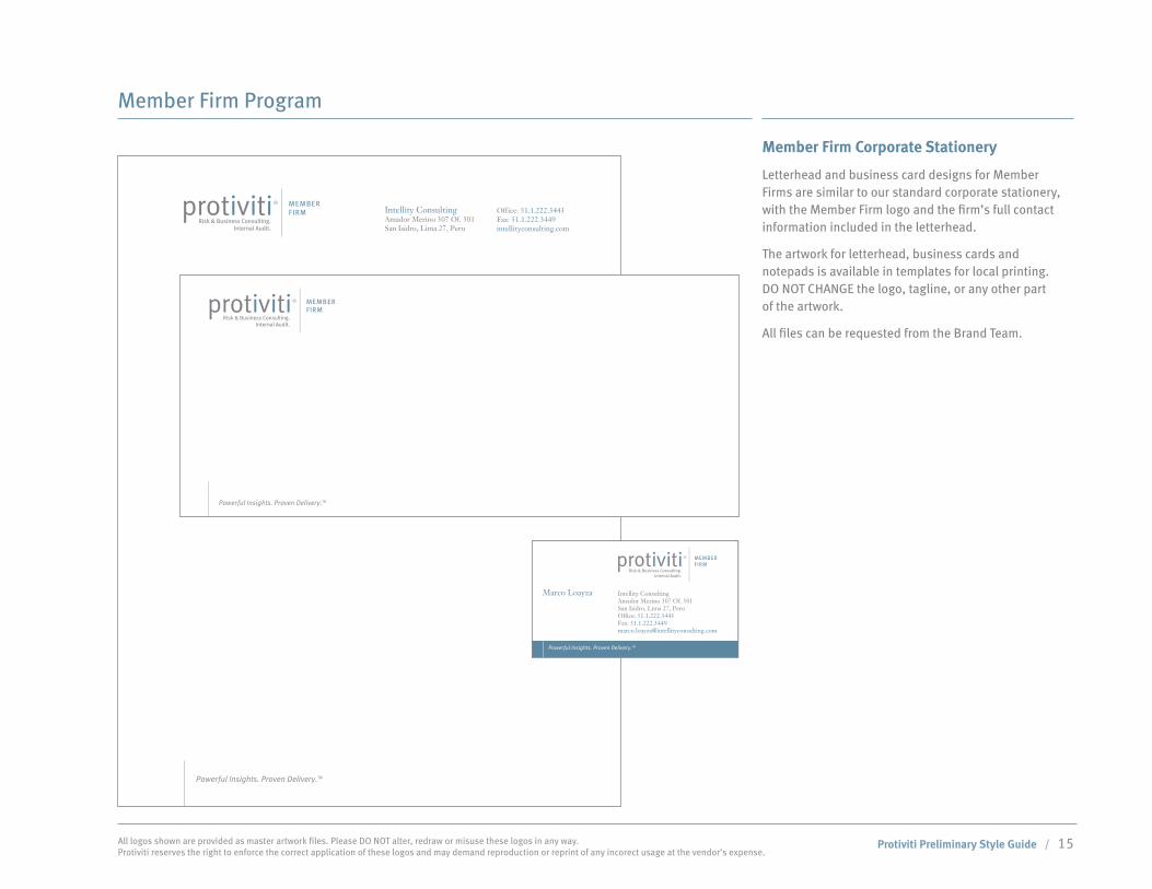
Member Firm Program
Member Firm Corporate Stationery
Letterhead and business card designs for Member Firms are similar to our standard corporate stationery, with the Member Firm logo and the firm’s full contact information included in the letterhead.
The artwork for letterhead, business cards and notepads is available in templates for local printing. DO NOT CHANGE the logo, tagline, or any other part of the artwork.
All files can be requested from the Brand Team.
Powerful Insights. Proven Delivery.TM
Intellity ConsultingAmador Merino 307 Of. 501San Isidro, Lima 27, Peru
Office: 51.1.222.3443Fax: 51.1.222.3449intellityconsulting.com
tag line - 8.33
discriptor - 6.92
address - 7.5 pt
Intellity Consulting . Amador Merino 307 Of. 501, Suite 401 . San Isidro, Lima 27, Peru protiviti.com
Powerful Insights. Proven Delivery.TM
Intellity ConsultingAmador Merino 307 Of. 501San Isidro, Lima 27, PeruOffice: 51.1.222.3443Fax: [email protected]
Powerful Insights. Proven Delivery.TM
Marco LoayzaDirector Ejecutivo
Intellity ConsultingAmador Merino 307 Of. 501San Isidro, Lima 27, PeruOffice: 51.1.222.3443Fax: [email protected]
Powerful Insights. Proven Delivery.TM
Marco Loayza
1290 Avenue of the Americas,5th FloorNew York, NY 10104 USAOffice: 212.603.8300Fax: [email protected]
Joseph A. TarantinoManaging Director
Risk & Business Consulting.Internal Audit.
Powerful Insights. Proven Delivery.TM
OPTION 1OPTION 2

Protiviti Preliminary Style Guide / 16 All logos shown are provided as master artwork files. Please DO NOT alter, redraw or misuse these logos in any way. Protiviti reserves the right to enforce the correct application of these logos and may demand reproduction or reprint of any incorect usage at the vendor’s expense.
Member Firm Program
Member Firm Co-Branding
Member Firms with an established corporate style and logo may prefer to co-present their logo with the Protiviti Member Firm logo.
In these situations, the firms should partner with Protiviti’s Corporate Marketing team to establish and document guidelines to ensure that the paired logo presentation communicates the value of each brand.
At left is an example of the header of a co-branded website.

Protiviti Preliminary Style Guide / 17 All logos shown are provided as master artwork files. Please DO NOT alter, redraw or misuse these logos in any way. Protiviti reserves the right to enforce the correct application of these logos and may demand reproduction or reprint of any incorect usage at the vendor’s expense.
Third-Party Endorsements and Professional Associations
When using a third-party endorsement like Gartner or the logo of a professional association (ie the Partners in Progress logo of the Institute of Internal Auditors), the Protiviti logo should be presented as the primary logo. The third-party logo should be presented in a secondary position, either next to the area in the document where it is specifically outlined or on the opposite side of the page from the Protiviti logo in a smaller size.
If you have any questions how to present and use third-party endorsement or professional association logos, please contact the organization directly or corporate marketing.
Co-Branding: Companies Owned by Protiviti
insert Partners in Progress logo

Protiviti Preliminary Style Guide / 18 All logos shown are provided as master artwork files. Please DO NOT alter, redraw or misuse these logos in any way. Protiviti reserves the right to enforce the correct application of these logos and may demand reproduction or reprint of any incorect usage at the vendor’s expense.
Corporate Alliances and Business Relationships
show Thought Leadership cover with correct usage of SAP logo Member Firm Co-Branding
When co-branding with another organization such as Robert Half or SAP, it’s important to create distinct and equal spaces on the material for each brand name and logo. The design style of the material should be agreed upon prior to development, and should encompass the color usage, fonts and images that help to identify each brand. In co-branded materials, the most distinctive elements of each brand are generally de-emphasized to create a more minimal design. Alternatively, one organization may agree to let the other lead the design and simply include their logo in a place of equal prominence in the material.
Before co-branding with another organization, you should review the examples provided here and then contact Corporate Marketing to discuss next steps. Another organization’s logo should not be used without their permission, and we reserve approval rights for all uses of the Protiviti logo prior to public release.

Protiviti Preliminary Style Guide / 19 All logos shown are provided as master artwork files. Please DO NOT alter, redraw or misuse these logos in any way. Protiviti reserves the right to enforce the correct application of these logos and may demand reproduction or reprint of any incorect usage at the vendor’s expense.
Use of Client Logos
The use of company logos, both internally and externally, requires permission from the associated company. Before posting logos on iShare or using them in a proposal, check Salesforce to verify approval. This verification process is available using the iShare Proposals Center.
To locate the Proposals Center in iShare, navigate to the iNeed page and then select the link to enter the Proposals Center. From the Proposals Center home page, select the Protiviti Client List link. This area provides names of clients approved for use in proposals. The links on this page take you to corresponding reports in Salesforce.com, our online customer relationship management tool provided for Protiviti managers and above. Because this data is constantly changing, it is important to pull the latest list for each new proposal.
If a client is NOT listed, that means Protiviti is not authorized to mention them in proposals or use their logo. Please read the Client Credentials FAQs, which can be found on the Protiviti Client List page in the Proposals Center. Contact your Salesforce.com administrator if you need to update a client who has provided their approval.
Corporate Alliances and Business Relationships
show Thought Leadership cover with correct usage of SAP logo

Protiviti Preliminary Style Guide / 20 All logos shown are provided as master artwork files. Please DO NOT alter, redraw or misuse these logos in any way. Protiviti reserves the right to enforce the correct application of these logos and may demand reproduction or reprint of any incorect usage at the vendor’s expense.
Alliance and Member Firm Programs
Guidelines
We developed the Protiviti Alliance and Member Firm Program in order to improve client service through mutually beneficial relationships with established organizations in selected regions around the world. The program enables us to both service existing clients and develop new business relationships with Alliance partners. We designed the program’s multiple levels to provide flexibility to our partners based on their capabilities, infrastructure, brand presence and business goals.
For potential Alliance Members or Member Firms, the first step toward becoming involved with Protiviti is to establish a subcontracting relationship. Protiviti subcontractors enter into nonexclusive arrangements to provide service alongside Protiviti on existing projects in regions where we do not currently have a physical presence. These arrangements give both Protiviti and the subcontracting organization an opportunity to identify synergies and determine if a more formal business association would be beneficial.
Marco Loayza Amador Merino 307 Of 501San Isidro, Lima 27, PERUDirect: 51 1 9641 3939Fax: 703.299.3046 [email protected]

Protiviti Preliminary Style Guide / 21 All logos shown are provided as master artwork files. Please DO NOT alter, redraw or misuse these logos in any way. Protiviti reserves the right to enforce the correct application of these logos and may demand reproduction or reprint of any incorect usage at the vendor’s expense.
Guidelines (cont.)
If a firm and Protiviti are interested in moving beyond the subcontractor level, the firm may become a Protiviti Alliance Member. Alliance Members enjoy a variety of benefits, including:
Use of Protiviti-branded collateral, thought •leadership and promotional materials
Use of Protiviti proprietary software •
Territorial exclusivity and first right of refusal on all •projects in the defined territory
Use of exclusive Alliance and Member Firm marks•
A presence on the Protiviti.com website•
The top level of association with Protiviti is Member •Firm status. Member Firms generally have an established business history and are seamless members of the Protiviti family. Along with Alliance Member benefits, these organizations are able to take advantage of:
Protiviti University•
Access to iShare, our online repository of shared •methodology, work programs, reports, etc.
Listing on the Protiviti website with prominence equal •to Protiviti offices
Protiviti email name usage•
Alliance and Member Firm Programs

Protiviti Preliminary Style Guide / 22 All logos shown are provided as master artwork files. Please DO NOT alter, redraw or misuse these logos in any way. Protiviti reserves the right to enforce the correct application of these logos and may demand reproduction or reprint of any incorect usage at the vendor’s expense.
Visual Identity
Introduction
The following pages outline our new visual identity. The concept is based on the repositioning research and is aligned with Protiviti’s business objectives. This new look communicates the brand attributes of our skilled people, our convergence of capabilities to provide solutions, our insight, and our fluidity in solving problems.
Two key components to this branding pull together the concept. The visuals are based on a combination of vector art and imagery. The vector art is created by repeated lines that can curve, extend and meet at points. These lines converge to creates organic shapes that can then be layered on top of imagery. These elements offer a dynamic and flexible design that represents our many capabilities converging to solve problems for our clients.
Global Solutionsand Capabilities
F P O

Protiviti Preliminary Style Guide / 23 All logos shown are provided as master artwork files. Please DO NOT alter, redraw or misuse these logos in any way. Protiviti reserves the right to enforce the correct application of these logos and may demand reproduction or reprint of any incorect usage at the vendor’s expense.
Visual Identity
Graphics
The vector art should be applied as part of the main visual for the branding, and can be used with or without imagery. These files will be created by the Brand Team and already placed into a variety of templates for general use such as presentation documents, PowerPoint proposals and Word documents, which will be available via request to the Brand Team.
If you need to create specific images, please either collaborate with the Brand Team or have the Brand Team review the materials you create.
These lines can be used in either of the two primary Protiviti colors or reversed out in white when necessary.
Important Note: This art has been created to attain the best production quality possible and should not be reproduced.

Protiviti Preliminary Style Guide / 24 All logos shown are provided as master artwork files. Please DO NOT alter, redraw or misuse these logos in any way. Protiviti reserves the right to enforce the correct application of these logos and may demand reproduction or reprint of any incorect usage at the vendor’s expense.
Visual Identity
Imagery
Protiviti’s sucess depends on our people. The new images follow this direction by focusing primarily on portraits and working shots both in the business and solutions areas that represent either our employees or clients. The current Protiviti imagery can be used through November 2009 along with the new photography. Images without people may be used to communicate other concepts or represent industries. These should be used with less frequency and should be approved by the Brand Team prior to use. All these images will be available as secondary graphics to the designs that are already in the templates. These images should be secondary to other visuals in the content of pieces.
The new imagery is comprised primarily of royalty-free stock photography. This means Protiviti does not have exclusive rights to the images. The images should be used in full color, unless the piece is being produced in less than four-color, in which the images can be Duotones. Creating the Duotones work best with the combination of black or PMS Cool Grey 10 and PMS 5415, or PMS Cool Grey 10 with PMS 464.
If you would like to have Duotones created of existing imagery, please request from the Brand Team.

Protiviti Preliminary Style Guide / 25 All logos shown are provided as master artwork files. Please DO NOT alter, redraw or misuse these logos in any way. Protiviti reserves the right to enforce the correct application of these logos and may demand reproduction or reprint of any incorect usage at the vendor’s expense.
Visual Identity
Imagery (cont.)
Most of the imagery in the photo library focuses on people, and the library includes two areas of people in business and people in industries. These photographs include medium distance portraits and group shots in a variety of business environments. Other areas of content in the library represent people in community service, training, recruiting, teams, and collaboration. This imagery communicates confidence, intelligence, experience, and naturalness, and should primarily be used online in marketing, recruiting and thought leadership materials.
The focus on people also crosses over into the area of our solutions. These images should be used in presentations or materials supporting industries. Although the images specifically represent an industry, the main focus is the people in most cases.
Protiviti has a library of these images in low-resolution available on iShare. High-resolution formats (300 dpi, CMYK) for printing may be obtained by request to the Brand Team along with the proposed materials prior to production. This is to ensure they are in alignment with the new Protiviti Brand and balance with the other elements outlined in this guide.
Important Note: The high-resolution images can be uploaded to the vendor sites or shipped on CD/DVD when an account number is provided with the request.
add more photos
here
F P O

Protiviti Preliminary Style Guide / 26 All logos shown are provided as master artwork files. Please DO NOT alter, redraw or misuse these logos in any way. Protiviti reserves the right to enforce the correct application of these logos and may demand reproduction or reprint of any incorect usage at the vendor’s expense.
Visual Identity
Imagery (cont.)
Images in the following industries are available:
Aerospace & Defense Asset Management Automotive Banking Broker-Dealer Chemical Communications Consumer Packaged Goods Education Energy Trading, Marketing & Generation Exploration & Production Government Healthcare Payers Healthcare Providers Hospitality & Leisure Industrial Products Insurance Life Sciences Materials & Chemicals Media & EntertainmentMining Non-Profit Oilfield Services Pipelines & Transmission Real Estate Refining Retail Software, High Tech & Electronics Specialty Financial Services Utilities
F P O

Protiviti Preliminary Style Guide / 27 All logos shown are provided as master artwork files. Please DO NOT alter, redraw or misuse these logos in any way. Protiviti reserves the right to enforce the correct application of these logos and may demand reproduction or reprint of any incorect usage at the vendor’s expense.
Visual Identity
Templates
The four cover templates have been created by the Brand Team to be used for various Thought Leadership collateral. The artwork of the templates is available via request.
Using just these templates rather than creating new designs is highly recommended. For any specific design requests, please contact the Brand Team.
NEW PAGE

Protiviti Preliminary Style Guide / 28 All logos shown are provided as master artwork files. Please DO NOT alter, redraw or misuse these logos in any way. Protiviti reserves the right to enforce the correct application of these logos and may demand reproduction or reprint of any incorect usage at the vendor’s expense.
Visual Identity
Graphic Restrictions
The following is a list of incorrect usage of the graphics:
Organic lines should not be used in any color other •than PMS 5415 or PMS cool Gray 10 (or equivalent builds).
When used with an image, organic lines should not •go over a person’s face, or block an image
The lines should not be set to more than 0.35 point •in width
Organic lines should not overlap on top of copy•
Do not edit the organic lines to make fewer lines or •add more lines- this will create an unwanted visual effect
Organic lines and images should not take up more •than 50% of the page.
Do not use any color on the background other than •PMS 5415 or PMS cool Gray 10 (or equivalent builds).
Global Solutionsand Capabilities
Global Solutionsand Capabilities
Global Solutionsand Capabilities
Thought Leadership
NEW PAGE

Protiviti Preliminary Style Guide / 29 All logos shown are provided as master artwork files. Please DO NOT alter, redraw or misuse these logos in any way. Protiviti reserves the right to enforce the correct application of these logos and may demand reproduction or reprint of any incorect usage at the vendor’s expense.
Print Production
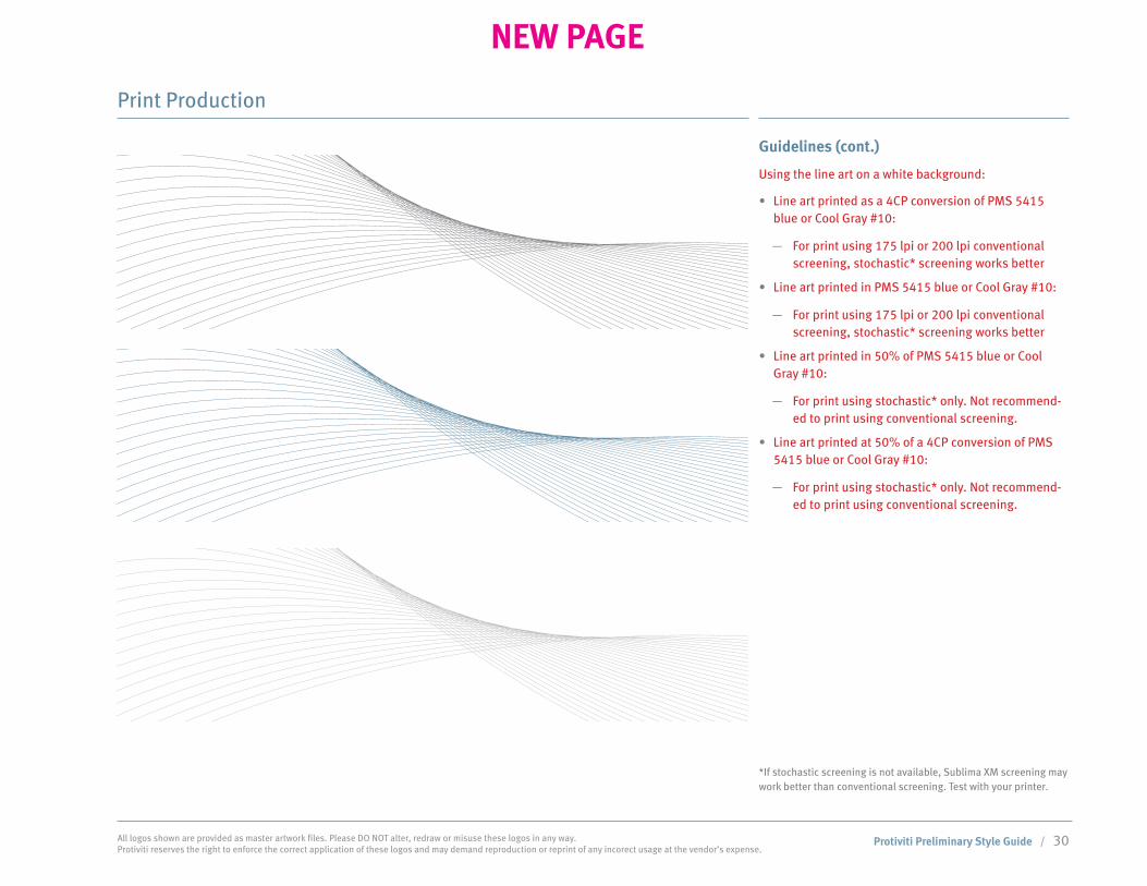
Guidelines
As a general rule use the line art files as templates to design from. These files are available on the the protiviti ftp site. When producing professionally printed pieces, try to use stochastic printing, so the fines lines will not be jagged. Use 200 lpi if possible.
Using the line art over an image at 100%:
Line art knocked out to 100% white:•
For print using 175 lpi or 200 lpi conventional —screening, stochastic* screening works better
Line art printed as a 4CP conversion of PMS 5415 •blue or Cool Gray #10:
For print using 175 lpi or 200 lpi conventional —screening, stochastic* screening works better.
For print using 175 lpi or 200 lpi conventional —screening, line art should be at 100% spot or 4C.
For print using stochastic, lines could be used in —range of 100% to 50% screen.
Line art printed in PMS 5415 blue or Cool Gray #10 – •SET TO OVERPRINT
For print using 175 lpi or 200 lpi conventional —screening, stochastic* screening works better
Do not knock out line art from 4CP images when —used as the blue or gray, as trapping and registra-tion problems occur.
*If stochastic screening is not available, Sublima XM screening may work better than conventional screening. Test with your printer.
NEW PAGE
Protiviti Preliminary Style Guide / 30 All logos shown are provided as master artwork files. Please DO NOT alter, redraw or misuse these logos in any way. Protiviti reserves the right to enforce the correct application of these logos and may demand reproduction or reprint of any incorect usage at the vendor’s expense.
Guidelines (cont.)
Using the line art on a white background:
Line art printed as a 4CP conversion of PMS 5415 •blue or Cool Gray #10:
For print using 175 lpi or 200 lpi conventional —screening, stochastic* screening works better
Line art printed in PMS 5415 blue or Cool Gray #10:•
For print using 175 lpi or 200 lpi conventional —screening, stochastic* screening works better
Line art printed in 50% of PMS 5415 blue or Cool •Gray #10:
For print using stochastic* only. Not recommend- —ed to print using conventional screening.
Line art printed at 50% of a 4CP conversion of PMS •5415 blue or Cool Gray #10:
For print using stochastic* only. Not recommend- —ed to print using conventional screening.
Print Production
*If stochastic screening is not available, Sublima XM screening may work better than conventional screening. Test with your printer.
NEW PAGE

Protiviti Preliminary Style Guide / 31 All logos shown are provided as master artwork files. Please DO NOT alter, redraw or misuse these logos in any way. Protiviti reserves the right to enforce the correct application of these logos and may demand reproduction or reprint of any incorect usage at the vendor’s expense.
Guidelines (cont.)
Using the line art reversed out of 100% PMS 5415 or Cool Gray #10 background
Line art reversed out of a 4CP conversion of PMS •5415 blue or Cool Gray #10 background:
For print using 175 lpi or 200 lpi conventional —screening, stochastic* screening works better
Line art reversed out of PMS 5415 blue or Cool Gray •#10:
For print using 175 lpi or 200 lpi conventional —screening, stochastic* screening works better
*If stochastic screening is not available, Sublima XM screening may work better than conventional screening. Test with your printer.
Print Production
NEW PAGE

Protiviti Preliminary Style Guide / 32 All logos shown are provided as master artwork files. Please DO NOT alter, redraw or misuse these logos in any way. Protiviti reserves the right to enforce the correct application of these logos and may demand reproduction or reprint of any incorect usage at the vendor’s expense.
Guidelines (cont.)
Using the line art reversed out of a gradient background of PMS 5415 or Cool Gray #10
Line art reversed out of a 4CP conversion of PMS •5415 blue or Cool Gray #10 background:
For print using 175 lpi or 200 lpi conventional —screening, stochastic* screening works better
Line art reversed out of PMS 5415 blue or Cool Gray •#10:
For print using 175 lpi or 200 lpi conventional —screening, stochastic* screening works better
*If stochastic screening is not available, Sublima XM screening may work better than conventional screening. Test with your printer.
Print Production
NEW PAGE

Protiviti Preliminary Style Guide / 33 All logos shown are provided as master artwork files. Please DO NOT alter, redraw or misuse these logos in any way. Protiviti reserves the right to enforce the correct application of these logos and may demand reproduction or reprint of any incorect usage at the vendor’s expense.
Print Production
Paper Specs
Stationery is printed on Neenah Environment – 100% post consumer fiber and is FSC certified
All stationery items are printed in PMS 5415 and Cool Gray #10.
Letterhead and 2nd sheets: Environment 24# writing – white
#10 security envelope: Environment 24# writing – white
Business cards: Environment 100# cover - white
#10 window envelope: 24# white wove
Collateral pieces are printed on Sterling Ultra dull text and cover – contains 10% PCF and is FSC certified. Substituting Productolith dull or Utopia II dull is acceptable on a one-time basis for rush projects if Sterling is not available.
Books Under 100 pages: Cover – 80# Sterling Ultra dull cover Text pages – 80# Sterling Ultra dull text
100 pages and over:* Cover – 100# Sterling Ultra dull cover Text pages – 80# Sterling Ultra dull text
White Papers – self cover: 100# Sterling Ultra dull text
Newsletters: 80# Sterling dull text
Solutions Overview: 100# Sterling dull text
Brochures: Up to 12 pages as a self cover use 80# Sterling dull cover Over 12 pages go to 80# Sterling dull cover with 100# Sterling dull text
Folders with pockets: 100# Sterling dull cover For special pieces that require handwritten notes such as Holiday cards or custom note cards 80# or 100# cover Finch Fine ultra smooth bright white 10% PCF and is FSC certified
*For very large books over 200 pages OK to use 70# sterling dull text
NEW PAGE

Protiviti Preliminary Style Guide / 34 All logos shown are provided as master artwork files. Please DO NOT alter, redraw or misuse these logos in any way. Protiviti reserves the right to enforce the correct application of these logos and may demand reproduction or reprint of any incorect usage at the vendor’s expense.
Corporate Colors
Primary Colors
Secondary Corporate Colors
Other Colors * The colors used throughout these guidelines have not been evaluated by Pantone, Inc. for accuracy and may not match the PANTONE® Color standards. Please consult current PANTONE
Publications for accurate color. PANTONE® is the property of Pantone, Inc.
Print Collateral/Digital
Color is a key part of the Protiviti logo and identity system. The logo uses variations of the primary Protiviti blue and Protiviti grey, including tints where required. Reproducing the subtlety and quality of these colors is VERY important to the brand.
The two brown secondary corporate colors are used to accent the primary colors. They are used in various design applications, including the treatment of photographs and graphics.
A new secondary color has been added to the color palette. Pantone 202 should be used sparingly in graphics and charts to highlight specific information. Only one secondary color should be used at a time so that the brown and red DO NOT appear together in graphics, type, or presentation materials.
You’ll find examples of this on the following pages. In order to keep the integrity of this color, it should not be used in less than an 80% gradation of the color. Any use of other colors is prohibited. If you have any questions about reproducing these colors or how to best apply them, please contact the Brand Team.
Important Note: The CMYK builds shown at left must be used instead of the defaults that come up automatically in design software. The RGB values should be used for MS and the HEX for online applications.
Black White
Protiviti Blue
Pantone PMS: 5415CMYK: 56.11.0.43HEX: 5d7b9a RGB: 93.123.154
Protiviti Gray
Pantone PMS: Cool Gray 10CMYK: 0.0.0.72HEX: 66666RGB: 83.83.85
100% 50% 100% 50%
Protiviti Brown
Pantone PMS: 464CMYK: 47.65.100.0HEX: 8b6730RGB: 139.103.48
Protiviti Red
Pantone PMS: 202CMYK: 0.100.65.47HEX: 990000 RGB: 128.28.39
Protiviti Beige
Pantone PMS: 454 CMYK: 9.6.17.0 HEX: d2d1b5 RGB: 210.209.181
100% 80%100% 50% 100% 50%
Protiviti Preliminary Style Guide / 35 All logos shown are provided as master artwork files. Please DO NOT alter, redraw or misuse these logos in any way. Protiviti reserves the right to enforce the correct application of these logos and may demand reproduction or reprint of any incorect usage at the vendor’s expense.
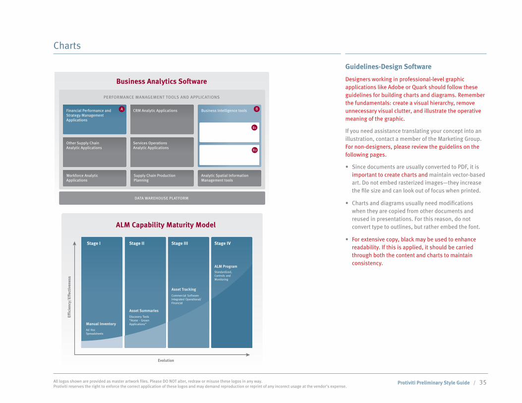
Charts
Guidelines-Design Software
Designers working in professional-level graphic applications like Adobe or Quark should follow these guidelines for building charts and diagrams. Remember the fundamentals: create a visual hierarchy, remove unnecessary visual clutter, and illustrate the operative meaning of the graphic.
If you need assistance translating your concept into an illustration, contact a member of the Marketing Group. For non-designers, please review the guidelins on the following pages.
Since documents are usually converted to PDF, it is •important to create charts and maintain vector-based art. Do not embed rasterized images—they increase the file size and can look out of focus when printed.
Charts and diagrams usually need modifications •when they are copied from other documents and reused in presentations. For this reason, do not convert type to outlines, but rather embed the font.
For extensive copy, black may be used to enhance •readability. If this is applied, it should be carried through both the content and charts to maintain consistency.
Revenue Assurance Security Asset Management
Business Analytics Software Privacy, IT Security
ALM Capability Maturity Model
Evolution
Effi
cien
cy/E
ffec
tive
ness
PERFORMANCE MANAGEMENT TOOLS AND APPLICATIONS
Financial Performance andStrategy Management Applications
Query, Reporting,Analysis
Advanced Analytics
Other Supply ChainAnalytic Applications
Workforce Analytic Applications
Analytic Spatial InformationManagement tools
Supply Chain ProductionPlanning
CRM Analytic Applications
Services Operations Analytic Applications
Business Intelligence tools
DATA WAREHOUSE PLATFORM
RIS
K E
LEM
EN
TS
A B
B1
B2
Stage I Stage II Stage III Stage IV
Effi
cien
cy/E
ffec
tive
ness
Ad Hoc Spreadsheets
Discovery Tools“Home - Grown Applications”
Commercial SoftwareIntegrated Operational/Financial
Standardized, Controls andMonitoring
Manual Inventory
Asset Summaries
Asset Tracking
ALM Program
Revenue Leakage
Billing andCollections
Royalty Reporting
Order to Cash
PersistentProtection, DRM
AssetValuation
Secure Storage
Archiving and Retrieval
Repurpose andRepackage
PartnerSettlement
ContentProtection
Licensing
DISTRIBUTION/MONETIZATIONCONTENT MANAGEMENTCONTENT ACQUISITION
Requirements Collection & Validation
– Stakeholder identification– Key metrics– Systems audit
Product Implementation
– Business needs validation– Design and architecture– Software implementation– Infrastructure optimization– Internal control testing– Stakeholder communications
Project Rollout
– Hardware readiness– Piloting and parallel runs– Training – technical and business usage– Desktop procedures– Enterprise acceptance– Performance metrics
Measurement & Feedback
– Changing business needs– New options available– Evaluation of effectiveness
Vendor Selection Process
– RFP– Vendor analysis– Demos
PrimarilyStrategy
Engagement Management
Option 02.1

Protiviti Preliminary Style Guide / 36 All logos shown are provided as master artwork files. Please DO NOT alter, redraw or misuse these logos in any way. Protiviti reserves the right to enforce the correct application of these logos and may demand reproduction or reprint of any incorect usage at the vendor’s expense.
Charts
Guidelines-Design Software (cont.)
Color is one of the tools used to create contrast and illustrate meaning or relationships. A majority of the color applied should be limited to the PRIMARY CORPORATE COLORS PMS 5415 and Cool Grey 10.
In order for the Protiviti colors to be consistent in •PowerPoint documents, the colors applied to the charts should be the RGB values:
Grey RGB: 83.83.85 —
Blue RGB GB: 93.123.154 —
To highlight specific information on charts, only one •of these colors maybe used with the above primary colors:
Brown RGB 139.103.48 —
Red RGB 128.28.39 —
Varying shades of these colors should be used •to simplify abstract or complex ideas, in easy-to-understand ways. Incisiveness is established through intentional use of color, type, and composition.
The gradient of gray if set in CMYK should be used •from 65%K (or lighter) to 5%K or darker screens. If gradient is a PMS color then it should be from 100% or lighter, to 5% or darker screens.
Revenue Assurance Security Asset Management
Business Analytics Software Privacy, IT Security
ALM Capability Maturity Model
Evolution
Effi
cien
cy/E
ffec
tive
ness
PERFORMANCE MANAGEMENT TOOLS AND APPLICATIONS
Financial Performance andStrategy Management Applications
Query, Reporting,Analysis
Advanced Analytics
Other Supply ChainAnalytic Applications
Workforce Analytic Applications
Analytic Spatial InformationManagement tools
Supply Chain ProductionPlanning
CRM Analytic Applications
Services Operations Analytic Applications
Business Intelligence tools
DATA WAREHOUSE PLATFORM
RIS
K E
LEM
EN
TS
A B
B1
B2
Stage I Stage II Stage III Stage IV
Effi
cien
cy/E
ffec
tive
ness
Ad Hoc Spreadsheets
Discovery Tools“Home - Grown Applications”
Commercial SoftwareIntegrated Operational/Financial
Standardized, Controls andMonitoring
Manual Inventory
Asset Summaries
Asset Tracking
ALM Program
Revenue Leakage
Billing andCollections
Royalty Reporting
Order to Cash
PersistentProtection, DRM
AssetValuation
Secure Storage
Archiving and Retrieval
Repurpose andRepackage
PartnerSettlement
ContentProtection
Licensing
DISTRIBUTION/MONETIZATIONCONTENT MANAGEMENTCONTENT ACQUISITION
Requirements Collection & Validation
– Stakeholder identification– Key metrics– Systems audit
Product Implementation
– Business needs validation– Design and architecture– Software implementation– Infrastructure optimization– Internal control testing– Stakeholder communications
Project Rollout
– Hardware readiness– Piloting and parallel runs– Training – technical and business usage– Desktop procedures– Enterprise acceptance– Performance metrics
Measurement & Feedback
– Changing business needs– New options available– Evaluation of effectiveness
Vendor Selection Process
– RFP– Vendor analysis– Demos
PrimarilyStrategy
Engagement Management
Option 02.1
do we want to give guidance for cmyk and rgb? if they’re importing from illustrator wouldn’t they need to use RGB?

Protiviti Preliminary Style Guide / 37 All logos shown are provided as master artwork files. Please DO NOT alter, redraw or misuse these logos in any way. Protiviti reserves the right to enforce the correct application of these logos and may demand reproduction or reprint of any incorect usage at the vendor’s expense.
Charts
Guidelines-Microsoft Applications
To create or request charts in PowerPoint and other MS-based programs, please follow the guidelines below. Remember the fundamentals: create a visual hierarchy, remove unnecessary visual clutter, and illustrate the operative meaning of the graphic.
Charts and graphics created in PowerPoint should be •using FF Meta LF or Arial, Jansen or Times fonts only.
In order for the Protiviti colors to be consistent in •PowerPoint documents as they are in print, the colors applied to the charts should be the RGB values: — Grey RGB: 83.83.85 — Blue RGB GB: 93.123.154
To highlight specific information on charts, only one •of the secondary colors should be used with the primary colors.
Secondary RGB colors: •— Brown RGB 139.103.48 — Red RGB 128.28.39
Utilizing both secondary colors and primary colors •distracts from the information being presented.
Charts usually need modifications when they •are copied from other documents and reused in presentations. For this reason, do not convert type to outlines, but rather embed the font.
Varying shades of these colors should be used to •present abstract or complex ideas in simple, easy-to-understand ways. Incisiveness is established through intentional use of color, type, and composition.
If you need help translating your concept into an •illustration, contact a member of the Marketing Group to discuss.
When requesting the Marketing team to update •a chart, please submit the chart in its original PowerPoint format instead ofas an embedded file. If you would like a chart edited or designed, please include either a reference chart or as much detail about what the chart should communicate.
Revenue Assurance Security Asset Management
Business Analytics Software Privacy, IT Security
ALM Capability Maturity Model
Evolution
Effi
cien
cy/E
ffec
tive
ness
PERFORMANCE MANAGEMENT TOOLS AND APPLICATIONS
Financial Performance andStrategy Management Applications
Query, Reporting,Analysis
Advanced Analytics
Other Supply ChainAnalytic Applications
Workforce Analytic Applications
Analytic Spatial InformationManagement tools
Supply Chain ProductionPlanning
CRM Analytic Applications
Services Operations Analytic Applications
Business Intelligence tools
DATA WAREHOUSE PLATFORM
RIS
K E
LEM
EN
TS
A B
B1
B2
Stage I Stage II Stage III Stage IV
Effi
cien
cy/E
ffec
tive
ness
Ad Hoc Spreadsheets
Discovery Tools“Home - Grown Applications”
Commercial SoftwareIntegrated Operational/Financial
Standardized, Controls andMonitoring
Manual Inventory
Asset Summaries
Asset Tracking
ALM Program
Revenue Leakage
Billing andCollections
Royalty Reporting
Order to Cash
PersistentProtection, DRM
AssetValuation
Secure Storage
Archiving and Retrieval
Repurpose andRepackage
PartnerSettlement
ContentProtection
Licensing
DISTRIBUTION/MONETIZATIONCONTENT MANAGEMENTCONTENT ACQUISITION
Requirements Collection & Validation
– Stakeholder identification– Key metrics– Systems audit
Product Implementation
– Business needs validation– Design and architecture– Software implementation– Infrastructure optimization– Internal control testing– Stakeholder communications
Project Rollout
– Hardware readiness– Piloting and parallel runs– Training – technical and business usage– Desktop procedures– Enterprise acceptance– Performance metrics
Measurement & Feedback
– Changing business needs– New options available– Evaluation of effectiveness
Vendor Selection Process
– RFP– Vendor analysis– Demos
PrimarilyStrategy
Engagement Management
Option 02.1

Protiviti Preliminary Style Guide / 38 All logos shown are provided as master artwork files. Please DO NOT alter, redraw or misuse these logos in any way. Protiviti reserves the right to enforce the correct application of these logos and may demand reproduction or reprint of any incorect usage at the vendor’s expense.
PowerPoint and Word Templates
Horizontal PowerPoint cover page
Horizontal PowerPoint inside page
Delivering an On-Brand Presentation
Microsoft PowerPoint and Word are common presentation mediums for communicating business concepts. Every presentation offers an opportunity to deliver a clear and compelling message. Presentation materials provide an opportunity to elevate the Protiviti brand experience. Consistently using the same format for your presentations not only communicates stability to your audience, but also facilitates knowledge-sharing across Protiviti.
The PowerPoint presentation templates are available in horizontal and vertical formats, with an alternate cover page option. These approved templates are available on iShare, for all presentation materials developed in 2009 and beyond.
Please consider the following when developing your next presentation:
Consider the audience and use• .
If the presentation is made in person, the content —should highlight key points rather than being a transcript of the presentation.
If the material needs to stand alone because it —will not be presented, then additional detail is appropriate.
Keep the message simple•
Many presentations have too much detail. The —speaker should relegate extraneous detail to his or her notes and deliver it only when appropriate.
Avoid text-heavy pages or complex page layouts•
Too much information, graphics, or text on any —given slide is difficult to comprehend and can distract from the content.
If a slide is oversaturated with graphics or text, —break it into multiple pages. Only one chart or model should be used per page.
Use imagery to enhance •
Use of approved photography and imagery can —help make a presentation visually appealing.

Protiviti Preliminary Style Guide / 39 All logos shown are provided as master artwork files. Please DO NOT alter, redraw or misuse these logos in any way. Protiviti reserves the right to enforce the correct application of these logos and may demand reproduction or reprint of any incorect usage at the vendor’s expense.
Do not use — clip art—it’s generally unprofessional and misaligned with the Protiviti brand.
Use color carefully•
Use the provided Protiviti color palette. —
Avoid using too many colors or — shades of colors from the Protiviti color palette. Multiple or non brand color choices are distracting and off brand. Varying shades of a color from 20-100% can often be more impactful then multiple colors.
Use color in a meaningful way, such as to empha- —size important text or highlight specific graphics while keeping other elements more neutral.
Use fonts consistently•
The Protiviti default fonts for presentations are —Arial and Times. These are standard system fonts that provide a consistent and clean look. In the content of presentations, use size, color and style (bold and italic) with meaning.
Use transitions and animations carefully•
Keep slide transitions simple. —
Animations should be used only to enhance com- —munication.
Diagrams•
Diagrams should be used to illustrate or clarify a —concept
Diagrams need to be as simple as possible while —capturing all required elements.
Use colors from the Protiviti color palette. —
Limit your use of color, as too many different hues —can be a distraction.
Meta and Janson (the corporate typefaces) or —Arial and Times New Roman (the Microsoft Office default fonts) should be used for all Protiviti marketing communications, including charts and diagrams.
o Headlines and subheads are in Meta or Arial CAPS o Be sure your font has enough contrast with the background and its surroundings o Often there is too much information in models and charts, which make them difficult to read, especially when reproduced smaller than 100%
PowerPoint and Word Templates
Vertical PowerPoint cover page
Vertical PowerPoint inside page

Protiviti Preliminary Style Guide / 40 All logos shown are provided as master artwork files. Please DO NOT alter, redraw or misuse these logos in any way. Protiviti reserves the right to enforce the correct application of these logos and may demand reproduction or reprint of any incorect usage at the vendor’s expense.
PowerPoint and Word Templates
Using Microsoft Word Templates
If you prefer to use Word presentation templates instead of PowerPoint, you can find the same presentation templates in Word format on iShare. Consistently using the same format for your presentations not only com-municates stability to your audience, but also facilitates knowledge-sharing across Protiviti.
Below is a list of templates available in Word:
content needed

Protiviti Preliminary Style Guide / 41 All logos shown are provided as master artwork files. Please DO NOT alter, redraw or misuse these logos in any way. Protiviti reserves the right to enforce the correct application of these logos and may demand reproduction or reprint of any incorect usage at the vendor’s expense.
PowerPoint and Word Templates
Using Microsoft Word Templates
B team to write additional content for this page

Protiviti Preliminary Style Guide / 42 All logos shown are provided as master artwork files. Please DO NOT alter, redraw or misuse these logos in any way. Protiviti reserves the right to enforce the correct application of these logos and may demand reproduction or reprint of any incorect usage at the vendor’s expense.
Diagrams
Guidelines
Charts and diagrams • need to be as simple as possible while capturing all required elements.
Charts and graphics created in PowerPoint should •be using FF Meta LF or Arial, Jansen or Times fonts only.
Headlines and subheads are in Meta or Arial —all CAPS
Be sure the font is readable and allows for —enough contrast with the background and its surrounding graphics
Too much information which makes both harts —and diagrams difficult to read, especially when reproduced at smaller than 100%
In order for the Protiviti colors to be consistent •in all diagrams, the colors applied should be the Protiviti brand RGB values or CMYK values. Refer to page 34 for the correct values.
To highlight specific information on diagrams, •only one of the secondary colors should be used with the primary colors.
DO NOT use both the brown and red together in •diagrams.
ExportReporting and
Testimony
Preservationand Collection
ACQUIRE
MEDIA DATA INFORMATION EVIDENCE
ANALYZE REPORT
COMPUTER FORENSICS
Examination
Computer Forensics
E-Discovery
FPO

Protiviti Preliminary Style Guide / 43 All logos shown are provided as master artwork files. Please DO NOT alter, redraw or misuse these logos in any way. Protiviti reserves the right to enforce the correct application of these logos and may demand reproduction or reprint of any incorect usage at the vendor’s expense.
Protiviti Voice
What is voice?
Voice is evident in everything that the company and its representatives communicate. It is the core of our spoken and written words, personality, attitude, music, sounds and more—everything we use to communicate Protiviti to the outside world. It is the single most important way that we represent the personality of the company. When all the collective elements of Voice are blended with images, colors, fonts, templates, designs and layouts, the result is the Brand Identity.
Why is it important to define the Protiviti Voice?
Defining the company’s Voice is critical because each time a Protiviti representative communicates in any way on behalf of the company—whether writing an ad, composing an email or voice mail, or speaking with a customer—they become that Voice. By ensuring that Protiviti representatives understand the Protiviti Voice, we maintain uniformity of message and tone, which helps us to establish a powerful, appropriate, and consistent Protiviti identity.
Defining the Protiviti Voice
At the highest level, five carefully chosen terms define the Protiviti Voice. The fact that only four attributes were selected testifies to the weight that each word carries in defining the Protiviti personality.
Independence We act and advise only in the best interests of our customers. We are objective and open to considering all options in the service of our customers.
Opportunity We believe that taking risks is an important part of managing a successful business. Companies that best understand their risks and use that information to their benefit build competitive advantage over the long term.
Trusted Advisor We are focused on long-term relationships, not short-term deals. We tell customers what they need to hear, not what they want to hear. We understand our capabilities and provide service only when we can deliver benefit.
Agile We focus on solutions that fit the business situation and demands of clients, not the services we offer. We are creative and collaborative in bringing experts together to solve problems.
Insightful We are confident enough in our capabilities and knowledge that we speak in plain, understandable language. We share knowledge and information with clients that they do not get from other organizations.
Communicating in a branded way At its core, the Protiviti Voice is confident, incisive and inspiring. But more is needed to understand the intricacies of the brand tone. Consider the following points:
Use “you” when appropriate Consider using a personal tone. Although you may begin your writing by discussing industry trends, eventually you want to speak directly to an individual customer’s pain. Once the tone is set, consider switching to a more direct dialogue with your reader.
All Protiviti communication should be scrutinized to ensure clarity and simplicity. The Protiviti Voice avoids the use of long, multi-syllabic words when simple ones will do. We speak plainly and get to the point quickly. We are pragmatic. We avoid colloquialisms and regionalized jargon and instead aim for communication that is simple, direct, clear and effective—even across global boundaries.
Recognize the needs Our audiences consist of real people with real business problems. In your communications, if you quickly recognize their needs they will see that we identify with them, which helps to establish credibility and earn their respect.
Keep it short Carefully consider the length of your communications and the patience of your audience. A shorter message is more likely to be read and remembered. Get to the point.

Protiviti Preliminary Style Guide / 44 All logos shown are provided as master artwork files. Please DO NOT alter, redraw or misuse these logos in any way. Protiviti reserves the right to enforce the correct application of these logos and may demand reproduction or reprint of any incorect usage at the vendor’s expense.
Protiviti Voice
Be aware of reader reaction As you write, consider what the reader must be thinking. A busy person is always looking for a reason to stop reading. Their inner monologue is, “Do I need to read this? Is it useful or a waste of my time?” You have only seconds to capture attention, so don’t give readers an excuse to stop reading by bombarding them with marketing fluff or rambling scenarios. Instead, quickly speak to their concerns and tell them how you can help.
Aim for a high-level, value-oriented message We offer solutions, not just products. Our value is not in a single process that solves the customer’s problems; it’s in a consultative, strategic, comprehensive service.
Recognize the different audiences One of the first rules for effective communication is, “Know Your Audience.” At Protiviti, our audiences are unique. Most of the time, we are not communicating to the general public, but rather to a targeted, intellectual audience. Our audience is either very business-savvy or extremely technically proficient—and often both.
1. The Business Audience This audience is busy and highly focused on the bottom line. It consists of C-level management and represents the non-technical audience most interested in how Protiviti can impact the success of their organization. Audience members may not have a technical background, so we can’t expect them to get excited about nuances of technologies or a single feature of service. They may not know the industry acronyms and we can’t necessarily expect them to grasp all the intricacies of their own problems. Therefore, focus on the concrete, tangible results that we can deliver, like percentage increases in productivity or dollar amounts that can be saved.
2. The Technical Audience This audience wants to hear facts and metrics about how Protiviti can make their lives easier by saving them time, improving performance and eliminating tasks. They need Protiviti to prove to them that they actually need an outside expert, and that Protiviti is the expert they should use.
Speak plainly
Writing Resources Protiviti adheres to The Associated Press Stylebook. Other useful resources include: - The Chicago Manual of Style, The University of Chicago Press - The Elements of Style, William Strunk Jr. and E.B. White
Writing headlines that communicate One of the best ways to communicate the Protiviti Voice is to ensure that your headlines communicate clearly and actively. Here are some tips for good business:
Headlines for presentations and collateral
Use direct style Instead of “the solution by Protiviti,” say “the Protiviti solution.” Use powerful, believable words. For example, Protiviti solutions don’t “help” business, they “drive” business.
Be clear Read your headline and try to think of any possible way it could be misinterpreted.
Use short words Use fewer words: brief headlines are more readable.
Use few adjectives Use adjectives and descriptive words sparingly—headlines should maintain more of a “newsy,” objective feel rather than a sensational flair. Facts are OK. Keep your headlines news-oriented and avoid the subjective points.
Avoid confusing line breaks Ensure your headlines don’t suffer odd interpretations due to ill-placed line breaks. Don’t divide hyphenated words or words that go together from one line to the next.
Avoid contrived headlines Don’t use puns or rhymes, and be wary of using humor. The Protiviti brand is professional and, in general, puns and humor do not translate well globally.
Avoid abbreviations Don’t abbreviate words in a headline that are normally abbreviated only on second reference in body copy.
Punctuation For the headline, replace periods with semicolons and double quotes with single quotes. Use commas sparingly. Do not use exclamation points.
Numbers Except for “one,” numbers in headlines should be written as numerals.

Protiviti Preliminary Style Guide / 45 All logos shown are provided as master artwork files. Please DO NOT alter, redraw or misuse these logos in any way. Protiviti reserves the right to enforce the correct application of these logos and may demand reproduction or reprint of any incorect usage at the vendor’s expense.
Protiviti Voice
Writing for thought leadership
We define our thought leadership to be the materials we produce for the marketplace that provide, in an objective manner, our opinions, guidance, recommendations, etc., on a specific subject, challenge or issue. Unlike materials produced specifically to promote our services, such as Protiviti brochureware or advertisements, our thought leadership extols our expertise on a topic or issue without directly promoting our services. (Such information normally is included at the end of the document only.) This information, among other benefits, serves to credential Protiviti in the marketplace as an expert on issues of importance to our clients.
Protiviti’s thought leadership includes:
· Resource guides, including FAQ publications
· White papers
· Point-of-view (POV) papers
· Survey/research reports
· Newsletters and bulletins
· Articles for publication in the media
· Flash reports
Tone When writing Protiviti thought leadership, the goal is to convey Protiviti as an expert. We want to be clear, articulate and authoritative. Unlike other Protiviti materials, we ideally want to develop our thought leadership so that this information is communicated in the third person. For example:
Third person (preferred) What role should management take during the process of converting to IFRS? To be successful, the project needs a project sponsor who is responsible for explaining the project and its importance to other members of the senior management team as well as operating and functional unit managers. These managers should be aware and knowledgeable of the project so they can support the IFRS activities that must be undertaken and make quality resources available when necessary.
Second person (not preferred) What role should management take during the process of converting to IFRS? To be successful, you need a project sponsor who is responsible for explaining the project and its importance to other members of your senior management team as well as operating and functional unit managers. Your managers should be aware and knowledgeable of the project so they can support the IFRS activities that you must undertake and make quality resources available when necessary.
Please note that while writing in the third person is preferred, there always will be exceptions, depending on the particular subject and thought leadership piece being developed. Also, for our Industry or Risk Solution POV papers, after communicating in the third person to define the issue, explain the challenges and opportunities, and convey our point of view, it is acceptable to switch to the second person to articulate how we help our clients with these issues and present a case study or example to reinforce this point.
Length In developing thought leadership, always think about your audience and how you will best reach them with your message. In this regard, length is an important consideration. Think about a Fortune CEO, CFO or board member – are these individuals more likely to read a 100-page guide or one that is 40 pages? Without question, many topics require extensive detail, such as regulatory compliance issues. In these instances, an FAQ format is preferable as it enables readers to locate and review areas of most interest to them. Another suggestion: Consider more detailed PDF supplements to printed materials. These files enable easier reading by clients, have a lower environmental impact, and reduce printing and shipping costs.
Regulatory topics Many product and industry groups are interested in producing materials that cover regulatory issues such as Sarbanes-Oxley, Basel II, anti-money laundering and other areas. Please note that given the nature of these subjects and the legal issues involved, these materials must be reviewed by outside counsel prior to publication. Protiviti’s Corporate Marketing and Communications teams can facilitate this review, if necessary.

Protiviti Preliminary Style Guide / 46 All logos shown are provided as master artwork files. Please DO NOT alter, redraw or misuse these logos in any way. Protiviti reserves the right to enforce the correct application of these logos and may demand reproduction or reprint of any incorect usage at the vendor’s expense.
Glossary of Term Use of Protiviti
Please note that Protiviti adheres to the Associated Press Style Guide whenever possible.
1990s: No apostrophe, lower case “s”
’07: Curly single close quote before abbreviated year. (“Smart” typesetting feature of word processing programs automatically prints open quote first, so you often see “ ’07)
24x7: Not 24/7 as that can be incorrectly construed as the “24th of July.”
a.m., p.m.: Lowercase with periods
among vs. between: Use “between” only when referring to two entities, and “among” for three or more.
and: We generally do not insert a comma before the “and” or “or” (serial comma) in a series. The only time we do use the serial comma is when it is unclear not to. For example, if the second-to-last item in a series has the word “and” or “or” in it, the serial comma is necessary for clarity. Also, use “and” instead of “&”, except in situations where two words are usually used together (e.g., Mergers & Acquisitions).
buy in, buy-in: Two words when used as a verb, hyphenated when used as a noun
decision-maker, -making: Hyphenate
e.g.,: Abbreviation for “for example”, always followed by a comma.
e-mail: preferred over “email”
enterprisewide: no hyphen
fewer vs. less: “Fewer” indicates number and “less” indicates quantity (e.g., fewer buyers, less business).
gender: Avoid gender-specific language. Change “his/her” to “their”
healthcare: one word
hyphenating compound adjectives/adverbs: Two adjectives should be hyphenated if they must be taken together to create the intended meaning. If they both apply independently to the following noun, they should not be hyphenated. Example: “low-level radiation” vs. “his low, level gaze”.
An adverb with an “-ly” ending before a participle (past tense of a verb, i.e. with “ed” ending) never gets a hyphen, even when directly before a noun (e.g., “highly skilled professional”). However, an adverb without an “-ly” ending before a participle does get a hyphen (e.g., “well-known author”).
i.e.,: Abbreviation for the Latin “id est” (“that is”) and means “in other words”; is followed by a comma.
Internet: Capitalize.
intranet: Do not capitalize.
like vs. such as: Use “such as” to mean “for example” and use “like” to make a comparison.
lists:
Use bullets instead of numbers, unless describing a sequence. —
Use parallel construction for all items in a list. If you begin one item with a —noun, begin all of them with a noun. If one item is a complete sentence, all of them should be complete sentences.
Capitalize the first word in each list and do not use periods unless the item —constitutes a complete sentence.
Months: Always capitalize. When using the month with the date, abbreviate —only the following: Jan., Feb., Aug., Sept., Oct., Nov., and Dec. Spell out when using alone or with year alone (charts are an exception).
more than vs. over: A common misuse is to use “over” when “more than” is preferred. “Over” indicates a position whereas “more than” indicates number (e.g. “More than thirty locations over a wide area.”)
nonaccelerated: not “non-accelerated” (Example: “nonaccelerated filers”)
none: none = not one, which is singular, even when followed by a phrase which makes it sound plural: “None of these programs is affiliated with Robert Half or any of its divisions.”

Protiviti Preliminary Style Guide / 47 All logos shown are provided as master artwork files. Please DO NOT alter, redraw or misuse these logos in any way. Protiviti reserves the right to enforce the correct application of these logos and may demand reproduction or reprint of any incorect usage at the vendor’s expense.
Glossary of Term Use of Protiviti
noon: Acceptable for 12 p.m. “12 p.m. noon” or “12 noon” are redundant.
numbers:
Spell out one through nine, except with dimensions. —
Use numerals for the number 10 and above. —
Use ”first”,” fifth”, and “eleventh”, etc., then above the number 11, use 12th, —13th, etc.
overspending: no hyphen
online: not “on-line” or “on line”.
noncompliance, -ant: no hyphen
nonexistent: no hyphen.
percent: spell out in text, use “%” in charts. Always use a numeral with “percent”.
quarter-end: always hyphenate”
reengineering: no hyphen
Sarbanes-Oxley Act or Sarbanes-Oxley: not “SOA” or “SOX”
since or as vs. because: Because “since” and “as” both have other meanings, “because” is preferred in most uses.
third party: not “3rd party”
toward: not “towards”
walkthrough(s): no hyphen”
website: Do not capitalize; one word, no hyphen
webinar: Do not capitalize
workflow: one word; no hyphen”
worldwide: no hyphen
year-end: always hyphenate”

Protiviti Preliminary Style Guide / 48 All logos shown are provided as master artwork files. Please DO NOT alter, redraw or misuse these logos in any way. Protiviti reserves the right to enforce the correct application of these logos and may demand reproduction or reprint of any incorect usage at the vendor’s expense.
Protiviti Collateral System
Protiviti’s collateral system was developed to display all of our capabilities while still allowing for materials tailored to the specific challenges our clients face. To achieve this, we created a cascading set of materials described below.
At the top of our collateral hierarchy is our new “Global Solutions and Capabilities Brochure.” This replaces the existing overview brochure and acts as both an introduction to our company and a folder for more specific materials. This material should be used not only in new client and prospect meetings, but also with existing clients. By using this material consistently, we remind our audience of our broad and deep capabilities.
These documents represent the new Protiviti collateral system. They have a consistent design and style that should be used. This system intentionally does not include specific brochures that target specific industries or solutions segments; such documents should be phased out in favor of the new system. Additional documents – including whitepapers, guides, newsletters and research overviews – can be found in our thought leadership section.

Protiviti Preliminary Style Guide / 49 All logos shown are provided as master artwork files. Please DO NOT alter, redraw or misuse these logos in any way. Protiviti reserves the right to enforce the correct application of these logos and may demand reproduction or reprint of any incorect usage at the vendor’s expense.
Solution Overview
This document provides an overview of the services for each of our solution groups. This style also encapsulates the “Protiviti Story” and other two-page information about the company. It is also used for overviews of services for specific buyer segments (e.g., CFO).

Protiviti Preliminary Style Guide / 50 All logos shown are provided as master artwork files. Please DO NOT alter, redraw or misuse these logos in any way. Protiviti reserves the right to enforce the correct application of these logos and may demand reproduction or reprint of any incorect usage at the vendor’s expense.
Solution Point of View (SPOV)
This document provides Protiviti’s thoughts on a specific issue or concern and shows how we can help solve that issue. This document replaces the existing “product sheets” and show be kept to two-pages in length.

Protiviti Preliminary Style Guide / 51 All logos shown are provided as master artwork files. Please DO NOT alter, redraw or misuse these logos in any way. Protiviti reserves the right to enforce the correct application of these logos and may demand reproduction or reprint of any incorect usage at the vendor’s expense.
Industry Point of View (IPOV)
This document is more robust than the solution point-of-view and focuses on a specific industry trend. This document follows the existing writing style of the industry point-of-view documents and can run as many pages as necessary.

Protiviti Preliminary Style Guide / 52 All logos shown are provided as master artwork files. Please DO NOT alter, redraw or misuse these logos in any way. Protiviti reserves the right to enforce the correct application of these logos and may demand reproduction or reprint of any incorect usage at the vendor’s expense.
Case Study
This document provides a detailed description of how Protiviti helped a client resolve a problem. This document is the embodiment of Proven Delivery. This document is two-pages in length and may contain client names and logos with prior approval.

Protiviti Preliminary Style Guide / 53 All logos shown are provided as master artwork files. Please DO NOT alter, redraw or misuse these logos in any way. Protiviti reserves the right to enforce the correct application of these logos and may demand reproduction or reprint of any incorect usage at the vendor’s expense.
Artwork & Legal
Legal Disclaimer
OUR BRAND IS A VALUABLE COMPANY ASSET THAT MUST BE PROTECTED FOR BOTH BUSINESS AND LEGAL REASONS. ANY MISUSE OF THIS ASSET IS DAMAGING TO OUR BUSINESS AND INVESTOR VALUE. APPROPRIATE ACTIONS WILL BE TAKEN TO PROTECT IT.
PROTIVITI RESERVES THE RIGHT OF FINAL APPROVAL OF ANY WORK PRODUCED USING THESE ARTWORK FILES, AND MAY REQUIRE THAT SAMPLES BE PROVIDED UPON REQUEST. MATERIALS THAT DO NOT MEET THE STANDARDS ESTABLISHED IN THESE GUIDELINES MAY NEED TO BE REVISED OR REMOVED FROM PUBLIC USAGE AT THE COST OF THE COMPANY OR COMPANIES RESPONSIBLE.
Further legal information is available from the Brand Team.
These guidelines have been produced to follow when using the Protiviti logo and graphic elements of the identity.