Productive Anachronism The materials and techniques that ...
7
The materials and techniques that we use to create architectural representations undoubtedly affect how we apprehend the work of architecture being depicted. By analogy, if we consider Leonardo da Vinci’s oil-on-poplar depiction of Lisa Gherardini next to a pencil sketch, a comic-book style half-tone, and a graffiti-based interpreta- tion of the Mona Lisa, it’s clear that each medium maintains its own set of associations, while, at the same time, clearly communicates its content and reference. The medium is not perhaps the whole message, but it is an important component of our experience of images and drawings. It is also true that the choice of a particular mode of drawing during the design process can profoundly shape the object being designed. Any student of architecture can rattle off the implications of choosing Rhino, Sketch-Up, Maya, AutoCad, or Revit to work through an archi- tectural design problem, particularly in terms of the forms and details that each software facilitates easily or with difficulty. Robin Evans’ insights about drawing’s fundamental difference from its content, and yet the agency it maintains in the shaping of that content, turns out to be just as true in the digital age as it was in the era of hand drawing. 1 Unfortunately, the professional trend toward hyperreal image-making has meant concealing the drawing’s own construction process¬es and neutering its space-generating potential. The specu- lative and uncertain nature of hand-production is sublimated in favor of the glossy render that makes the proposed appear as already-real. The pendulum is already swinging away from this tendency in some academic and professional circles, largely under the banner of the post-digital. 2 Despite a return to orthography, collage, and an “illus- trated” rather than “rendered” sensibility, the so-called post-digital largely remains stubbornly digital. How, in a world saturated with Instagram-worthy architectural images, can we teach our students to reinvest in a drawing-based design process that is experimental and open-ended? How can drawing itself be reinvigorated both in terms of its representational agency and its abilities to produce new kinds of form and space? STUDIO: PRODUCTIVE ANACHRONISM The upper-level undergraduate design studio that I led at Miami University in Oxford, OH in Spring 2010 pursued answers to these questions through a program of design research into a tradition- ally feminine, historical craft that has recently become new again: paper quilling. Paper quillwork, or paper filigree as it is also known, is a medium of representation dating back centuries to disputed ori- gins, and one that took on particular importance in the United States by the 18th- and 19th-centuries. Strips of colored or gilded paper were wound in coils and pressed by hand into various geometric and organic shapes. These were then assembled into a variety of pictorial arrangements: scenes of country life featuring architectural façades, floral bouquets, and devotional objects among others. 3 More recently, there has been a resurgence of interest in paper quilling at a range of levels, including fine artists, commercial graphic designers, and amateur hobbyists. This, in turn, has led to an expan- sion of quilling techniques that move beyond flat, coil-based prac- tices and traditional subjects. Some contemporary quillworkers like Elizabeth M. Keslacy Miami University Productive Anachronism Paper Quilling and the Craft of Architectural Representation 206
Transcript of Productive Anachronism The materials and techniques that ...

The materials and techniques that we use to create architectural
representations undoubtedly affect how we apprehend the work
of architecture being depicted. By analogy, if we consider Leonardo
da Vinci’s oil-on-poplar depiction of Lisa Gherardini next to a pencil
sketch, a comic-book style half-tone, and a graffiti-based interpreta-
tion of the Mona Lisa, it’s clear that each medium maintains its own
set of associations, while, at the same time, clearly communicates
its content and reference. The medium is not perhaps the whole
message, but it is an important component of our experience of
images and drawings.
It is also true that the choice of a particular mode of drawing during
the design process can profoundly shape the object being designed.
Any student of architecture can rattle off the implications of choosing
Rhino, Sketch-Up, Maya, AutoCad, or Revit to work through an archi-
tectural design problem, particularly in terms of the forms and details
that each software facilitates easily or with difficulty. Robin Evans’
insights about drawing’s fundamental difference from its content, and
yet the agency it maintains in the shaping of that content, turns out to
be just as true in the digital age as it was in the era of hand drawing.1
Unfortunately, the professional trend toward hyperreal
image-making has meant concealing the drawing’s own construction
process¬es and neutering its space-generating potential. The specu-
lative and uncertain nature of hand-production is sublimated in favor
of the glossy render that makes the proposed appear as already-real.
The pendulum is already swinging away from this tendency in some
academic and professional circles, largely under the banner of the
post-digital.2 Despite a return to orthography, collage, and an “illus-
trated” rather than “rendered” sensibility, the so-called post-digital
largely remains stubbornly digital. How, in a world saturated with
Instagram-worthy architectural images, can we teach our students to
reinvest in a drawing-based design process that is experimental and
open-ended? How can drawing itself be reinvigorated both in terms
of its representational agency and its abilities to produce new kinds
of form and space?
STUDIO: PRODUCTIVE ANACHRONISM
The upper-level undergraduate design studio that I led at Miami
University in Oxford, OH in Spring 2010 pursued answers to these
questions through a program of design research into a tradition-
ally feminine, historical craft that has recently become new again:
paper quilling. Paper quillwork, or paper filigree as it is also known,
is a medium of representation dating back centuries to disputed ori-
gins, and one that took on particular importance in the United States
by the 18th- and 19th-centuries. Strips of colored or gilded paper
were wound in coils and pressed by hand into various geometric and
organic shapes. These were then assembled into a variety of pictorial
arrangements: scenes of country life featuring architectural façades,
floral bouquets, and devotional objects among others.3
More recently, there has been a resurgence of interest in paper
quilling at a range of levels, including fine artists, commercial graphic
designers, and amateur hobbyists. This, in turn, has led to an expan-
sion of quilling techniques that move beyond flat, coil-based prac-
tices and traditional subjects. Some contemporary quillworkers like
Elizabeth M. KeslacyMiami University
Productive Anachronism Paper Quilling and the Craft of Architectural Representation
206

Amy Genser and Lisa Nilsson utilize three-dimensional thick shapes
or finer, more precise work than we find historically.4 Other artists
like Yulia Brodskaya have embraced a new graphic emphasis on out-
line, or they treat paper like paint to create impressionistic imag-
ery.5 At the same time, there has been a proliferation of inexpensive
tools and materials that make paper quilling one of the most accessi-
ble crafts today.
As an instructor designing a new upper-level undergraduate
studio, I bet on a hunch that paper quilling could offer a great deal
to architectural design and representation as an agent of innova-
tion. The German psychologist Gerd Gigerenzer has described the
“hunch” as a gut feeling or an intuition that appears quickly in con-
sciousness and is strong enough to act upon, despite the fact that one
may not fully understand its underlying reasons or logic.6 Gut feel-
ings, or hunches, aren’t just flashes of inspiration, but operate accord-
ing to a heuristic rationale: simple rules of thumb that take advantage
of our evolved human mental capacities.7 These are shortcuts to deci-
sion-making and ideas-generation that reduce complexities in order
to posit actionable rules.
The hunch at work here was that paper quilling had something to
offer to architecture. But what was the heuristic at work? If the goal
was to introduce a new medium into architecture as a potential source
of innovation, the heuristic was this: find something that isn’t explic-
itly architecture which is nevertheless architectural. In other words,
find something that shares some qualities with architectural drawing,
but that’s different enough to introduce an element of novelty. Paper
quilling seemed a promising candidate.
A hunch alone is not enough to put a complex proposition into
practice. Heuristics are useful in split-second decision-making, but
the follow-through requires other skills. Luis Perez-Breva, director of
innovation at MIT, has written about the processes by which a hunch
is developed into an innovation, something he defines as both novel
and impactful.8 The initial phase of this development is something he
calls “innovation prototyping,” a process that is incremental, nonlin-
ear and experimental. In it, the hunch is given the structure of a small-
er-scale problem that is solvable, recognizable, and verifiable.9 Only
later is it scaled up.
I utilized the process that Perez-Breva describes to transform my
hunch into a practicable, structured, studio-based design research
inquiry. I began with a series of four short exercises designed to
develop students’ quilling skills, expose the biases of quilling as a rep-
resentational medium, and explore how quilling techniques could
be employed in an experimental, open-ended design process. I
then “scaled up” for the studio’s final project, which was the design
of a “Museum of Minor Arts.” This project presented an opportuni-
ty to instrumentalize the techniques developed in preceding exper-
imental exercises in the service of an architectural design project.
Moreover, the project’s program served as a venue to think about the
cultural value of the so-called minor arts, a category to which quilling
belongs, through the design of spaces for their collection, exhibi-
tion, and practice.
PAPER QUILLING: FROM CRAFT TO MEDIUM
We began the series of short exercises by borrowing a format from
the sister craft of embroidery – the sampler. Samplers are collections
of techniques and demonstrations of skill, and they can depict a wide
variety of content: alphabets and aphorisms, maps and architectural
facades, abstract and floral patterns, as well as perspectival, pictorial
scenes.10 For this assignment, students were asked to utilize the basic
shapes of traditional quillwork to create their own sampler, compos-
ing it according to a known sampler type.
Some students hewed closely to samplers that featured repeated
motifs, borders, and other linear patterns. (Figure 1) Others were
inter-ested in the pictorial samplers that featured building facades
or ani-mals, while yet others looked to more contemporary
examples that emphasized color and composition. The students
came away from this assignment with an appreciation for the
necessity of good crafts-manship, and some understanding about the
pictorial possibilities and limitations inherent to the quillwork shapes.
The second short assignment, entitled “Draw it New,” focused
more specifically on architectural representation. In it, I asked
Figure 1. Quillwork Samplers by Ariana Smith (left), Rachel Staley (center), and Cooper Shira (right).
2019 ACSA/EAAE TEACHERS CONFERENCE PROCEEDING - CH2 207

Figure 3. Examples of perspectival drawings from the Draw It New exercise.(top) Superstudio’s Continuous Monument (1969-70) by Alex Bellman (bottom) Giovanni Batista Piranesi, Carceri Plate XIV (1761) by Rachel Justice.
and coil to reinterpret the drawings, and added non-quillwork ele-
ment – in one case, image, and in the other, flat areas that broke down
the deep space into a series of planes.
Students found other interesting strategies for dealing with the
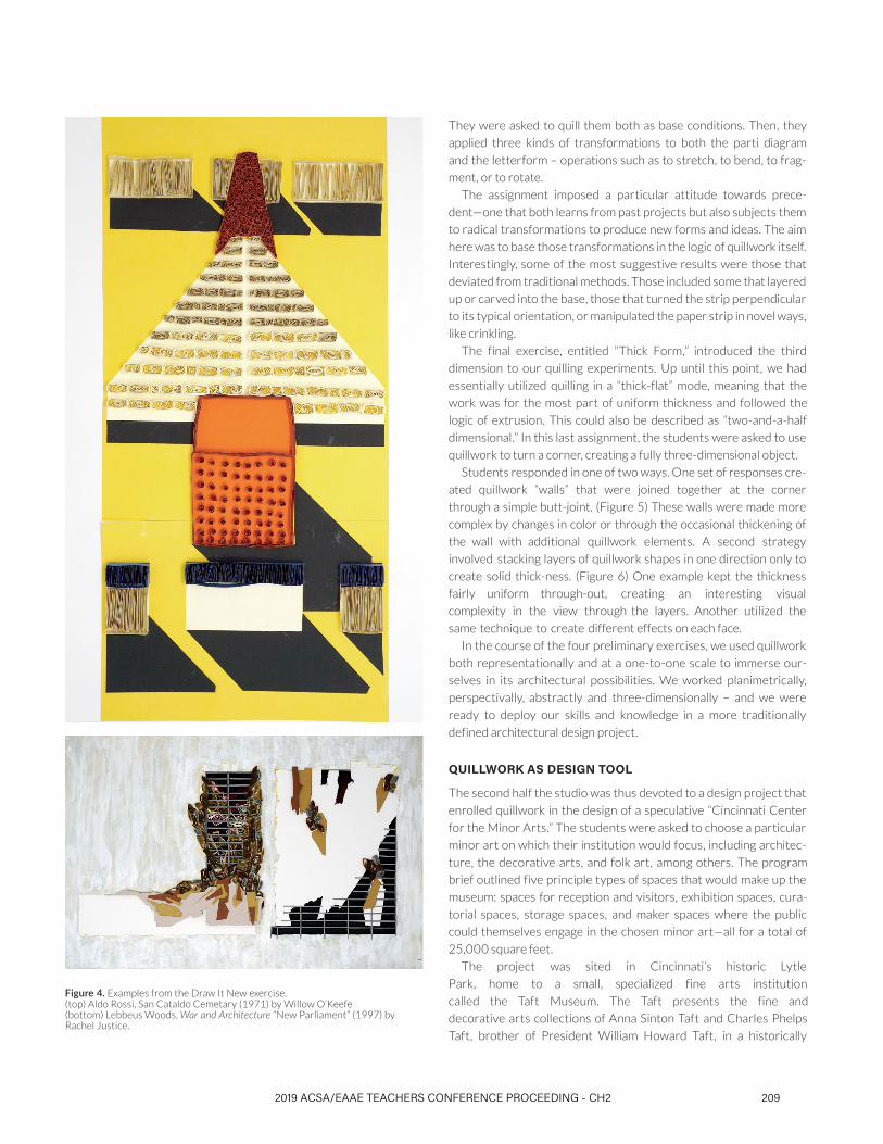
problem of depth. One student used real depth to recreate a plate
from Lebbeus Woods’ War and Architecture (1997), literally stack-
ing layers of quillwork and flat paper on top of one another. (Figure
4) In an interpretation of Aldo Rossi’s San Cataldo Cemetary (1971),
a student used a variety of quillwork techniques, including accordion
folds, rectangular coils, open swirls, and flat planes, to represent dif-
ferent kinds of surfaces, shadows, and elements as they layer back in
space. Through this exercise, we learned that quillwork can lend an air
of whimsy and informality, but it can also add texture and detail that
prolongs the viewer’s engagement with the drawing.
The third exercise, entitled “Type-Type,” began with a purpose-
ful elision of typography and architectural typology. In preparation
for the final project, I asked students to choose an existing design
museum and to extract a parti diagram from its plan that illustrated
the relationship between exhibition space and all other functions. At
the same time, students chose a letter from a select group of fonts.
208
They were asked to quill them both as base conditions. Then, they
applied three kinds of transformations to both the parti diagram
and the letterform – operations such as to stretch, to bend, to frag-
ment, or to rotate.
The assignment imposed a particular attitude towards prece-
dent—one that both learns from past projects but also subjects them
to radical transformations to produce new forms and ideas. The aim
here was to base those transformations in the logic of quillwork itself.
Interestingly, some of the most suggestive results were those that
deviated from traditional methods. Those included some that layered
up or carved into the base, those that turned the strip perpendicular
to its typical orientation, or manipulated the paper strip in novel ways,
like crinkling.
The final exercise, entitled “Thick Form,” introduced the third
dimension to our quilling experiments. Up until this point, we had
essentially utilized quilling in a “thick-flat” mode, meaning that the
work was for the most part of uniform thickness and followed the
logic of extrusion. This could also be described as “two-and-a-half
dimensional.” In this last assignment, the students were asked to use
quillwork to turn a corner, creating a fully three-dimensional object.
Students responded in one of two ways. One set of responses cre-
ated quillwork “walls” that were joined together at the corner
through a simple butt-joint. (Figure 5) These walls were made more
complex by changes in color or through the occasional thickening of
the wall with additional quillwork elements. A second strategy
involved stacking layers of quillwork shapes in one direction only to
create solid thick-ness. (Figure 6) One example kept the thickness
fairly uniform through-out, creating an interesting visual
complexity in the view through the layers. Another utilized the
same technique to create different effects on each face.
In the course of the four preliminary exercises, we used quillwork
both representationally and at a one-to-one scale to immerse our-
selves in its architectural possibilities. We worked planimetrically,
perspectivally, abstractly and three-dimensionally – and we were
ready to deploy our skills and knowledge in a more traditionally
defined architectural design project.
QUILLWORK AS DESIGN TOOL
The second half the studio was thus devoted to a design project that
enrolled quillwork in the design of a speculative “Cincinnati Center
for the Minor Arts.” The students were asked to choose a particular
minor art on which their institution would focus, including architec-
ture, the decorative arts, and folk art, among others. The program
brief outlined five principle types of spaces that would make up the
museum: spaces for reception and visitors, exhibition spaces, cura-
torial spaces, storage spaces, and maker spaces where the public
could themselves engage in the chosen minor art—all for a total of
25,000 square feet.
The project was sited in Cincinnati’s historic Lytle
Park, home to a small, specialized fine arts institution
called the Taft Museum. The Taft presents the fine and
decorative arts collections of Anna Sinton Taft and Charles Phelps
Taft, brother of President William Howard Taft, in a historically
Figure 4. Examples from the Draw It New exercise.(top) Aldo Rossi, San Cataldo Cemetary (1971) by Willow O’Keefe (bottom) Lebbeus Woods, War and Architecture “New Parliament” (1997) by Rachel Justice.
2019 ACSA/EAAE TEACHERS CONFERENCE PROCEEDING - CH2 209

significant Federal Style structure. Our site was located just across
the street from the Taft, and as such was very much in conversation
with that institution.
The sequence of work on the project was not only designed to
incorporate techniques of quillwork into the design process, but
also to facilitate consideration of the cultural value of the minor arts.
By considering how such a building is designed and organized, how
it stages the display of objects and people, and how it relates to its
site and surrounding neighborhood (particularly the Taft Museum),
the projects could articulate something about the role of these
arts in society.
The sequence of work on the project was designed to incorporate
techniques of quillwork into the design process. For example, the ini-
tial work involved a series of quilled sections that articulated possi-
ble relationships between building and ground, and between the
required programmatic elements. Some sections utilized the paper
strips in novel ways that challenged drawing conventions. One stu-
dent lifted the section cut-line off of the page to produce intriguing
effects, and experimented with different tones of paper as an analog
to lineweight. (Figure 7) Others utilized color and collage in
combination with the paper line to articulate programmatic
adjacencies. In another student’s drawings, the depth of the quilled
paper line became a kind
Figure 5. Examples from the Thick Form exercise depicting one common solution, the butt-joint corner. (left) Ariana Smith (right) Martha Everly
Figure 6. Examples from the Thick Form exercise depicting a second common solution using stacked layers of quillwork shapes. (left) Cooper Shira (right) Richelle Boyd
210

of formwork for another material—plaster—which created thickness
in the drawing of a different sort. (Figure 8)
The logic of quillwork informed the projects in a variety of ways,
some formally and some more conceptually. One project liberated
the paper strip from the page to create a three overlapping, bulbous
forms that would house her museum of paper arts. The quilled sec-
tions of this form, explored how using the paper strips both flat and on
their edge in a range of tones could communicate depth.
One student decided to create a museum of ceramics, and won-
dered whether the site of creation—the kiln—couldn’t provide for-
mal cues for the exhibition galleries as the site of consumption. The
spiral path of the rolled coil was used to organize the site and circu-
lation. Galleries were looped around an open courtyard, with visitor
spaces and offices peeling away from the core. Inside, ramps spiral up
the sides of the kiln forms in a sinusoidal pattern, leading visitors to
ascend and descend, to go forward and double back, adding complex-
ity to the experience of the galleries.
Quillwork informed the display strategy of another student’s proj-
ect, particularly in the design of a display armature. Here the paper
strip was reimagined as an endless double-sided display surface that
alternated between a large platform for featured items and thickened
storage to house the bulk of the collections. This armature could be
woven through an open display area, be used to surround structural
columns, and extend vertically to engage the second-floor catwalks
that crisscrossed the space.
DRAWING WITH PAPER
Taken as a whole, the students’ responses to the sequence of assign-
ments prompts consideration of a question that is fundamental to the
whole enterprise: What does it mean to draw with paper?
First, paper quilling refashions paper from a passive recipient of
pencil or ink into the very medium of drawing itself. Marco Frascari
has argued that paper is “an essential ingredient of architectural con-
ceiving,”11 pointing out that paper and its various qualities of texture
and translucency are a necessary precondition for the process of
design and documentation. In this work, paper is no longer a “passive
technology,” but becomes the active, mark-making device itself. Just
like ink, pencil, or laser printer, the use of paper as a representation-
al medium comes with baggage. That is, it is a medium with “tenden-
cies” that must be acknowledged, learned, and ultimately exploited to
produce its unique effects.12 For paper quillwork, those tendencies
include its capacities for color, the inherency of the spiral in its coiled
forms, and the shadows that are created as a corollary of its depth.
Secondly, paper quilling introduces real thickness into drawing
genres, such as the plan and elevation, that have long-established
conventions for representing depth. Those conventions include dark-
er lines for objects being cut, thinner lines for objects farther away,
dashed lines to indicate objects beyond or above, etc. Translating
those conventions of implying depth into the a medium with real
depth is not a seamless enterprise. Rather, it requires the drafts-
person to grapple with those conventions, and reformulate them to
account for a medium of material thickness. As such, it introduces a
productive element of ambiguity into the drawing. When that hap-
pens, quillwork drawings can be interpreted in multiple ways, allow-
ing them to be generative in modes unforeseen to the designer.
In his essay “How architectural drawings work,” Sonit Bafna divid-
ed architectural drawing into two categories borrowed from the
philosopher Nelson Goodman: the notational and the imaginative.
Figure 7. Speculative quillwork sections of the studio’s design project, a Center for the Minor Arts, by Willow O’Keefe.
2019 ACSA/EAAE TEACHERS CONFERENCE PROCEEDING - CH2 211

Notational drawings specify but do not depict, and they draw heav-
ily on convention to create what he terms a “mechanical” relationship
between drawing and object.13 Imaginative drawings, on the other
hand, are primarily aesthetic in nature, and they require the viewer to
engage with them creatively because of their inherent ambiguity. In
notational drawings, which are most typically orthographic drawings
like plan and section, the drawing medium is unremarkable and for
the most part invisible to the decoding process. In contrast, drawing
medium is an important element of imaginative drawings, which are
often but not exclusively perspectival. Drawing on the art historian
Michael Podro’s work, Bafna argues that “the look of the drawing pro-
cedure” becomes “a way of perceiving what is being represented.”14 In
other words, how the drawing is made becomes a subject of the view-
er’s attention and an important factor in the viewer’s understanding
of its content.
The introduction of quillwork into architectural drawing ultimate-
ly elides the distinction between notational and imaginative drawing.
Its materiality makes convention itself the site of ambiguity and play,
requiring the viewer to prolong their engagement and to create rath-
er than simply decode its meaning.
Notes I am grateful to my colleagues at Miami University’s Department of
Architecture and Interior Design for their support, encouragement,
and critical feedback during the studio. I am also proud of the
students, who were willing to join me in this experimental process
and produced work that none of us could have imagined when we
began. All photographs are reproduced courtsey ofthe author.
1. Robin Evans, “Translations from Drawing to Building,” inTranslations from Drawing to Building and Other Essays, (Cambridge, Mass.: MIT Press, 1997), 152-93.
2. Sam Jacob, “Drawing in a Post-Digital Age,” Metropolis 36, No.8 (2017): 76-91.
3. Images of historical quillwork objects can be found in the online digital collections of the Cooper Hewitt, Smithsonian Design Museum and the Winterthur Museum,Garden, and Library.
4. See Amy Genser’s work at amygenser.com. Lisa Nilsson’s workcan be found at lisanilssonart.com
5. See Yulia Brodskaya’s work at artyulia.co.uk
6. Gerd Gigerenzer, Gut Feelings: The Intelligence of theUnconscious (New York: Viking, 2007), 16.
7. Ibid, 18.
8. Luis Perez-Breva, Innovating a Doer’s Manifesto for Startingfrom a Hunch, Prototyping Problems, Scaling up, andLearning to Be Productively Wrong (Cambridge, MA: MITPress, 2016), 19.
9. Ibid, 41.
10. The V&A has an excellent and well-illustrated primer onthe history of embroidery samplers, at vam.ac.uk/content/articles/h/a-history-of-samplers/
11. Marco Frascari, “A Reflection on Paper and Its Virtues withinthe Material and Invisible Factures of Architecture,” in FromModels to Drawings: Imagination and Representation inArchitecture, ed. Marco Frascari, Jonathan Hale, and BradleyStarkey (London; New York: Routledge, 2007), 23.
12. Fraser and Henmi characterized the “tendencies” or biasesof pencil versus ink as drawing media, describing the soft shading and taut opaque lines that they, respectively, offer. IainFraser and Rod Henmi, Envisioning Architecture: An Analysis ofDrawing (New York: Van Nostrand Reinhold, 1994), viii.
13. Sonit Bafna, “How Architectural Drawings Work — and WhatThat Implies for the Role of Representation in Architecture,” The Journal of Architecture 13, no. 5 (2008), 537.
14. Ibid, 548.
Figure 8. Speculative quillwork sections of the studio’s design project, a Center for the Minor Arts, by Rachel Staley.
212