Production Process of Double Page Spread
12
Production Process of Double Page spread Alex Cooke
Transcript of Production Process of Double Page Spread

Production Process of Double Page spread
Alex Cooke

To begin creating my double page I had to insert my main image, of the band subculture, into Adobe Photoshop in order
to crop it to the correct size to insert into Quark.

After cropping the image, I decided to change and edit the brightness, contrast, levels and exposure to
make the image look its best.
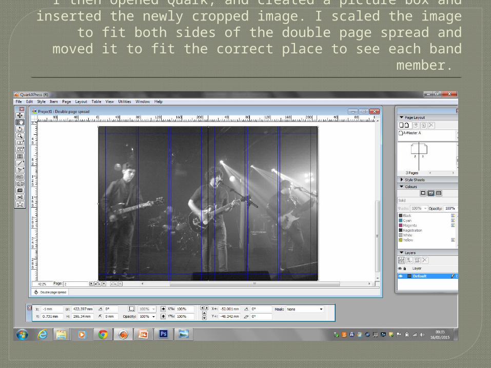
I then opened Quark, and created a picture box and inserted the newly cropped image. I scaled the image to fit both sides
of the double page spread and moved it to fit the correct place to see each band member.

I then added the title of the double page spread, which is the name of the band. I chose to make the ‘S’ larger and add a
line under the remaining words to give it an interesting edge that will attract the audience.
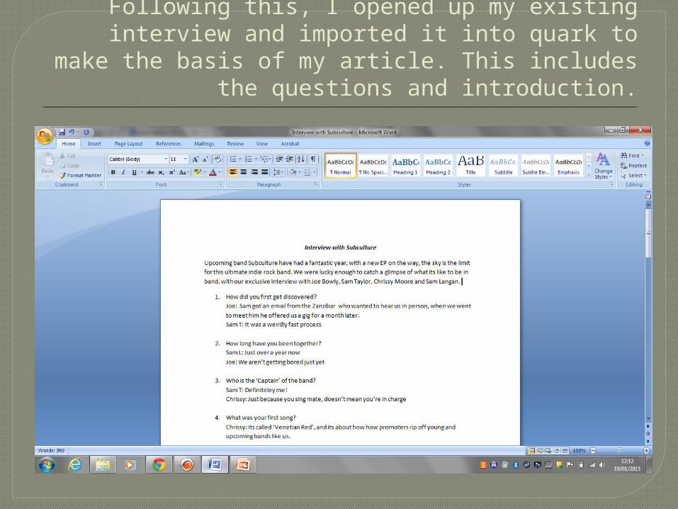
Following this, I opened up my existing interview and imported it into quark to make the basis of my
article. This includes the questions and introduction.

After importing the interview I changed the font to fit my continuing font scheme, as well as choosing
a colour and creating columns using the tool box at the bottom.

To ensure you could read the article, I created a black box around the text. I also added a stand first to give the readers
a small section of information before they read the article. I placed this beneath the headline, as it was relevant there.

After moving the text around I could see that it looked more suited at the bottom in four collums, and added a drop caps
to fit double page spread codes. I also highlighted each band members name in red, to fit the colour scheme.

After looking back at other double page spreads, I could see how many used bold typography for both the names of the
interviewee and the question. Hence I added a bold typography to each question and member of Subculture.

I then added the page number at the right hand corner of the page in a small font, and also added
the magazine name ‘iD’ to show continuity.

I then added a quote to the right page, with a highlighted word to catch the readers
attention.