Production Powerpoint
22
Production Hayley Roberts
-
Upload
hayleylou11 -
Category
Education
-
view
28 -
download
0
Transcript of Production Powerpoint
Production
Hayley Roberts

Logo Designs
This is my main logo and I also did a few extra designs just to get a range of logos to work with for both adults and for children. I feel that this one is my strongest with the surfboard because it is simple and shows what the organisation is about with the surf board. The writing is clear and easy to read no matter how big the logo is.


Outlined Idea…
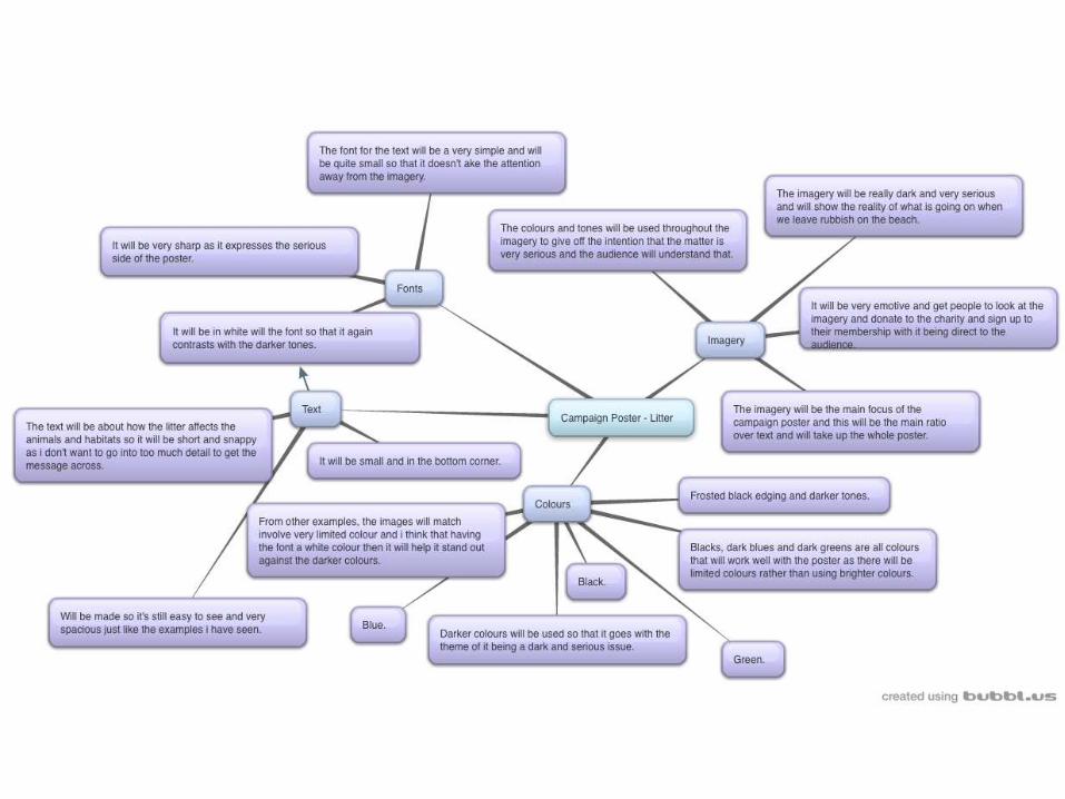
My idea for my campaign poster is that it is going to be a very dark and serious looking poster. With this in mind, it will be aimed at an older audience rather than children and will be aimed at adults. This is because the tones and the colours in the poster won’t attract children and the emotive imagery won’t really interact well with the audience. I want the image on the poster to be a really emotive and powerful image just like the examples I have seen. This is because the more emotive the image is, the more powerful it becomes and this will then get people to donate and to sign up to the charity to help it prevent what is being described in the poster. The image will be the main focus of the poster and this will be the element that will draw the audiences attention to it. There will be minimal text on the poster as I want the image to be the main focal point of the poster. The text will be short and snappy as I want the image to do the talking rather than writing a paragraph as this can put the audience off seeing a bunch of writing. With people now only just glancing at posters, I want it to be one that people glance at and get fixed to it and then read more into it. Around the image will be a dark frosting and this will highlight the writing more and it will also darken the edges so that the focus of the viewers eyes are kept in the middle of the image on the main subject. The writing will be in a clear and sharp font so that it expresses the serious side through the style of font and it will be quite spacious so that it stands out on the page. It will be in the colour white so that it stands out against the dark image and it will also create a strong contrast between the background and writing. All these elements will add to the serious side of the poster and will help the campaign be stronger. With it being minimal it will look more presentable and not as busy and this will be easier for the message to be brought across. The colours will be all dark colours and there will be no bright colours displayed in the poster and this will again add to the serious side of the poster and get the point across.

Campaign Poster
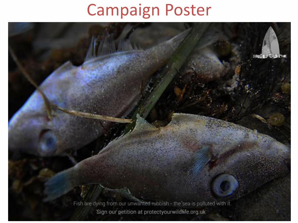
Campaign Poster

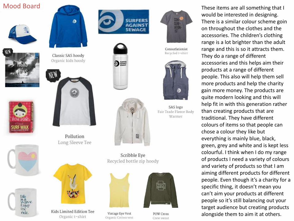
Mood Board These items are all something that I would be interested in designing. There is a similar colour scheme goin on throughout the clothes and the accessories. The children’s clothing range is a lot brighter than the adult range and this is so it attracts them. They do a range of different accessories and this helps aim their products at a range of different people. This also will help them sell more products and help the charity gain more money. The products are quite modern looking and this will help fit in with this generation rather than creating products that are traditional. They have different colours of items so that people can chose a colour they like but everything is mainly blue, black, green, grey and white and is kept less colourful. I think when I do my range of products I need a variety of colours and variety of products so that I am aiming different products for different people. Even though it’s a charity for a specific thing, it doesn’t mean you can’t aim your products at different people so it’s still balancing out your target audience but creating products alongside them to aim it at others.

This is one of my fist merchandise designs that I did and I wanted to make this a design that was aimed towards children rather than adults. I made the penguin quite cartoony so that it appeals to the younger audience and makes them more interested in the product. I’ve also put limited text on the design so that it doesn’t make the children bored of reading and so it’s just a simple line just so that they understand the message. By using a very popular and cute animal, it makes the children want to save it as they wouldn’t not want to see them so by putting the simple line at the bottom, they understand what to do and then get interested in trying to save the animals. It’s a really simple design that doesn’t look too complex and has a lot of colours to engage the children and with some being really bright it helps it stand out. To improve the viewing of this design, I could have zoomed out on some of the products so that you could see the whole design and so it fit on better rather than leaving it and there is just a few elements of the design that are a bit out of place and I could have sorted them out before finalising it.

This design is another one that is linked to the first design and again it is aimed at children rather than adults. I did it by using the shapes tool on Photoshop and so it created a starfish and then I did the same technique for the penguin design. I wanted to make my second design a lot brighter than the first one as I felt there was a lot of dull colours so using bright yellows and oranges is more appealing and will be better for the audience and aiming it at them. I used the same text so that it linked with the first design and after a few more animals being added, it could become a full range for children and I think that’s why it works.
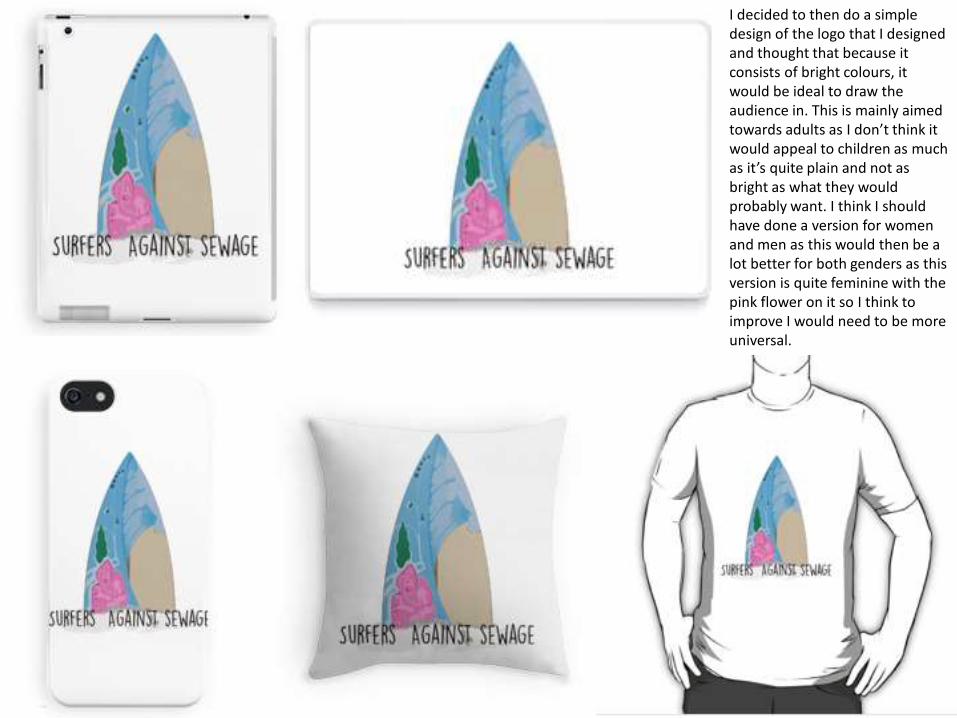
I decided to then do a simple design of the logo that I designed and thought that because it consists of bright colours, it would be ideal to draw the audience in. This is mainly aimed towards adults as I don’t think it would appeal to children as much as it’s quite plain and not as bright as what they would probably want. I think I should have done a version for women and men as this would then be a lot better for both genders as this version is quite feminine with the pink flower on it so I think to improve I would need to be more universal.

This range was done using typography and using a clipping mask to put an image within the text. I am sticking with the theme of keeping the beaches clean and how litter damages the beaches look by using an image of a clean beach so that it influences people to keep beaches looking this clean rather than leaving litter around on them. Using the quote I did for the writing linked with surfing and linked to the charity and so this then was something that would be close to people and this would then persuade them to buy the product. To improve I could have put a stroke around the writing so that it helps the writing stand out rather than it fading into the background.

This is a range that is aimed at adults rather than children and it shows the deterioration of the animals by using a double exposure effect. I think that these look really presentable and by using really cute images of animals, it makes the point that I am trying to get across more realistic and this could create more purchases as people will then feel sorry for the animals and could support the charity. The main focus of the campaign is litter on the beaches and how it damages the wildlife and their habitats and I think that this point has been got across in both the imagery and having the words there helps support it.

This design is very similar to the design before apart from I changed the animal on this one. I wanted to use another animal that people find lovely and find them really precious so that people understand that the more we litter on the beaches, the more it’s affecting wildlife like these. It has the same effect as the first design and it’s got a lot of detail as well as more monochrome colours which also suggests that it’s aimed towards adults.

This is another design with the same idea as the other two designs and keeping to a very emotive way of detailing the design.

This is my final design of this range for the adults as I feel it gets really repetitive so keeping it to a shorter amount is more suitable.

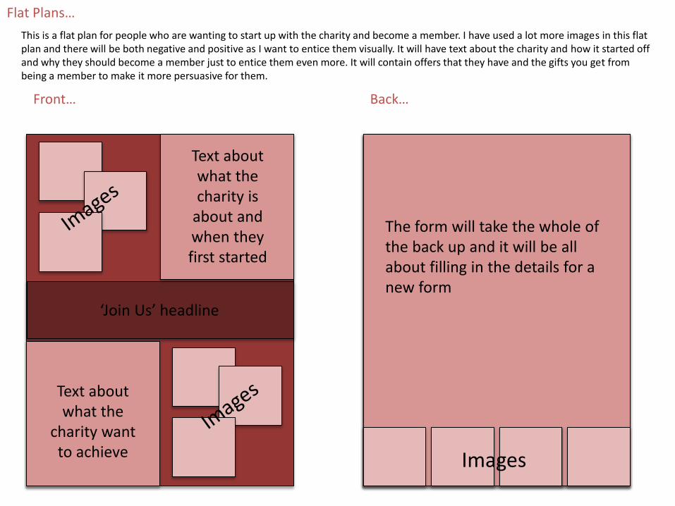
Flat Plans…
Back…Front…
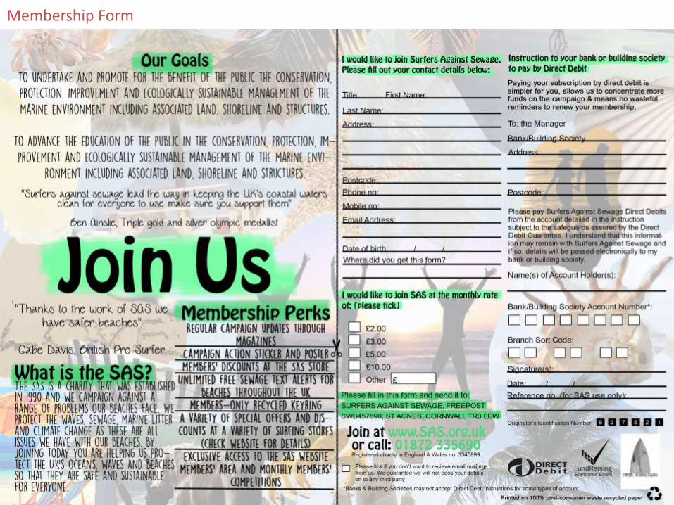
Information about the form they are filling in
This section will be the form for the membership and it will be for people who haven’t had a membership with them before.
‘Join Us’ headline
Negative image
Negative image
Text about the charity
Text about what the money from the membership could do for the
charity
This is a flat plan for somebody who doesn’t really know much about the charity and are wanting to sign up to the membership. There will be information about the charity on the front so they understand why they need as many members as possible and I will also explain what the money does from the members and how it helps the charity. There will be some negative images on the front so people understand why the charity want to change the images that are seen. The background of the form will be positive images of beaches and how they are meant to look so then the audience see what they are wanting to achieve visually.

Flat Plans…
Back…Front…
Collage of negative images
Text about when they renew the membership, what offers there is and why it helps the charity out
‘Join Us’ headline
Form for the renewal with all the details they need to fill out just incase details have changed since last time they were with the charity.
Positive image on the back with the form
This is a flat plan for somebody who is wanting to renew their membership with the charity. This will mean I won’t be explaining the charity for this form because they will already know about it. Instead there will be a collaboration of negative images on the front so they still understand the impact but on the back have a positive image because of how well the charity does with money from the members. I will also be explaining how their money has helped the charity so they feel rewarded and so they know how well the charity is doing.
Flat Plans…
Back…Front…
Text about what the
charity want to achieve
‘Join Us’ headline
The form will take the whole of the back up and it will be all about filling in the details for a new form
This is a flat plan for people who are wanting to start up with the charity and become a member. I have used a lot more images in this flat plan and there will be both negative and positive as I want to entice them visually. It will have text about the charity and how it started off and why they should become a member just to entice them even more. It will contain offers that they have and the gifts you get from being a member to make it more persuasive for them.
Text about what the charity is
about and when they first started
Images
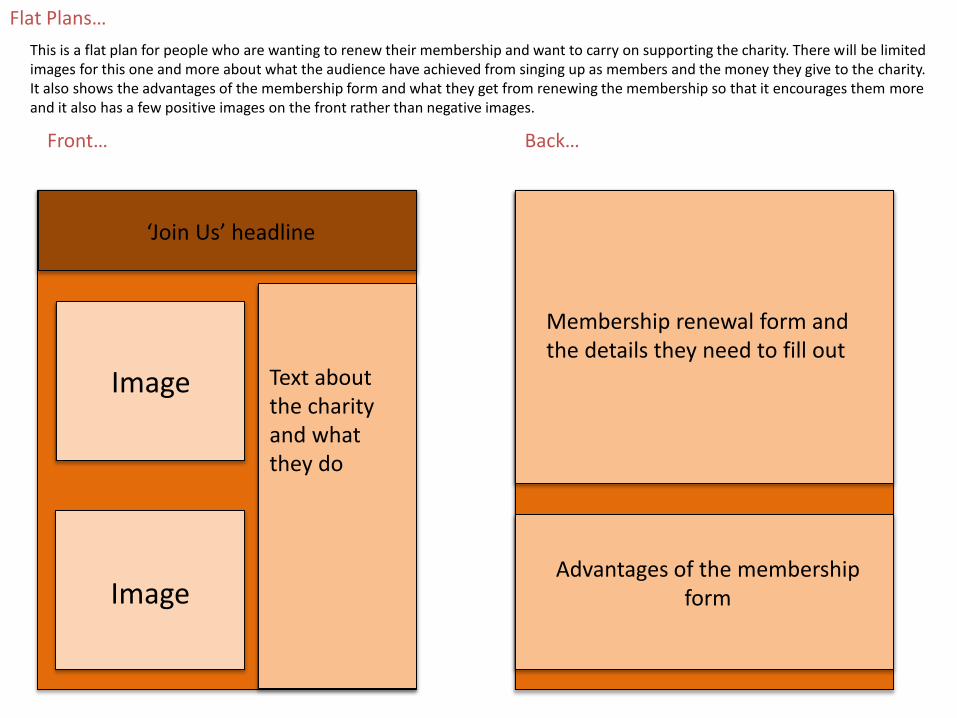
Flat Plans…
Back…Front…
Text about what the
charity want to achieve
‘Join Us’ headline
Membership renewal form and the details they need to fill out
This is a flat plan for people who are wanting to renew their membership and want to carry on supporting the charity. There will be limited images for this one and more about what the audience have achieved from singing up as members and the money they give to the charity. It also shows the advantages of the membership form and what they get from renewing the membership so that it encourages them more and it also has a few positive images on the front rather than negative images.
Image
Image
Text about the charity and what they do
Advantages of the membership form
Membership Form