Principles and applications. Michela Rossi Maria Pompeiana...
16
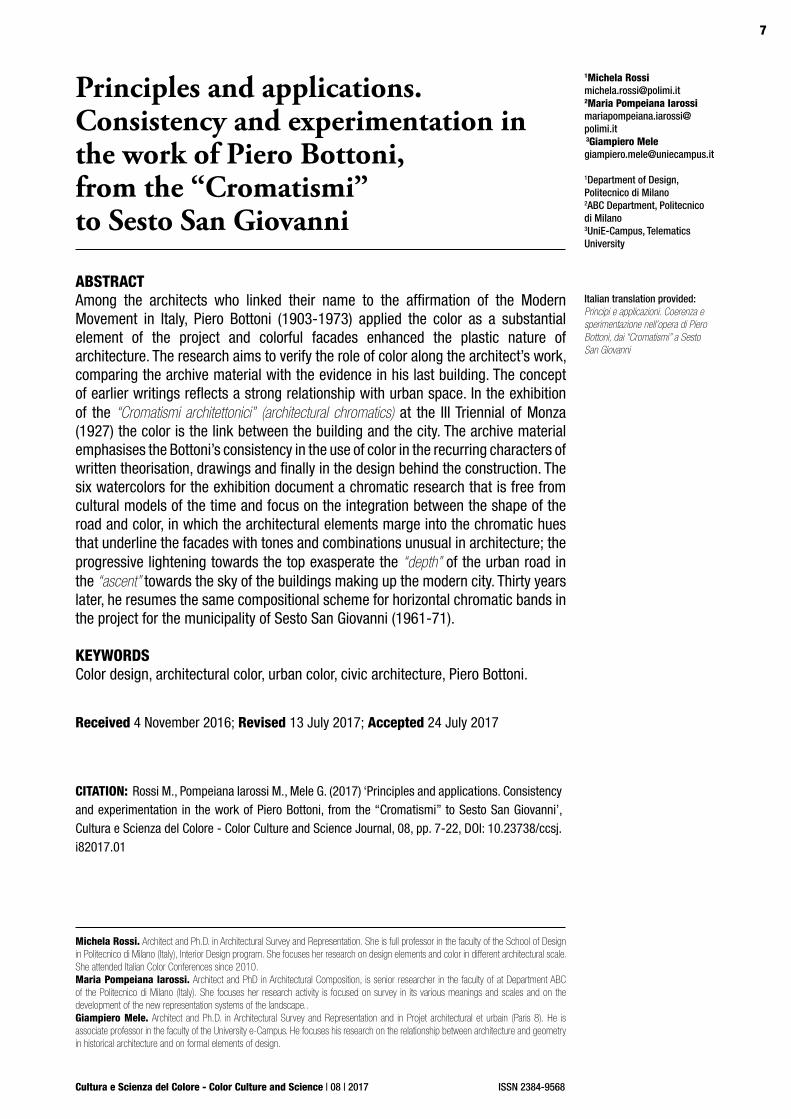
7 Cultura e Scienza del Colore - Color Culture and Science | 08 | 2017 ISSN 2384-9568 1 Michela Rossi [email protected] 2 Maria Pompeiana Iarossi mariapompeiana.iarossi@ polimi.it 3 Giampiero Mele [email protected] 1 Department of Design, Politecnico di Milano 2 ABC Department, Politecnico di Milano 3 UniE-Campus, Telematics University Principles and applications. Consistency and experimentation in the work of Piero Bottoni, from the “Cromatismi” to Sesto San Giovanni ABSTRACT Among the architects who linked their name to the affirmation of the Modern Movement in Italy, Piero Bottoni (1903-1973) applied the color as a substantial element of the project and colorful facades enhanced the plastic nature of architecture. The research aims to verify the role of color along the architect’s work, comparing the archive material with the evidence in his last building. The concept of earlier writings reflects a strong relationship with urban space. In the exhibition of the “Cromatismi architettonici” (architectural chromatics) at the III Triennial of Monza (1927) the color is the link between the building and the city. The archive material emphasises the Bottoni’s consistency in the use of color in the recurring characters of written theorisation, drawings and finally in the design behind the construction. The six watercolors for the exhibition document a chromatic research that is free from cultural models of the time and focus on the integration between the shape of the road and color, in which the architectural elements marge into the chromatic hues that underline the facades with tones and combinations unusual in architecture; the progressive lightening towards the top exasperate the “depth” of the urban road in the “ascent” towards the sky of the buildings making up the modern city. Thirty years later, he resumes the same compositional scheme for horizontal chromatic bands in the project for the municipality of Sesto San Giovanni (1961-71). KEYWORDS Color design, architectural color, urban color, civic architecture, Piero Bottoni. CITATION: Rossi M., Pompeiana Iarossi M., Mele G. (2017) ‘Principles and applications. Consistency and experimentation in the work of Piero Bottoni, from the “Cromatismi” to Sesto San Giovanni’, Cultura e Scienza del Colore - Color Culture and Science Journal, 08, pp. 7-22, DOI: 10.23738/ccsj. i82017.01 Received 4 November 2016; Revised 13 July 2017; Accepted 24 July 2017 Michela Rossi. Architect and Ph.D. in Architectural Survey and Representation. She is full professor in the faculty of the School of Design in Politecnico di Milano (Italy), Interior Design program. She focuses her research on design elements and color in different architectural scale. She attended Italian Color Conferences since 2010. Maria Pompeiana Iarossi. Architect and PhD in Architectural Composition, is senior researcher in the faculty of at Department ABC of the Politecnico di Milano (Italy). She focuses her research activity is focused on survey in its various meanings and scales and on the development of the new representation systems of the landscape.. Giampiero Mele. Architect and Ph.D. in Architectural Survey and Representation and in Projet architectural et urbain (Paris 8). He is associate professor in the faculty of the University e-Campus. He focuses his research on the relationship between architecture and geometry in historical architecture and on formal elements of design. Italian translation provided: Principi e applicazioni. Coerenza e sperimentazione nell’opera di Piero Bottoni, dai “Cromatismi” a Sesto San Giovanni
Transcript of Principles and applications. Michela Rossi Maria Pompeiana...
7
Cultura e Scienza del Colore - Color Culture and Science | 08 | 2017 ISSN 2384-9568
1Michela [email protected] Pompeiana [email protected] 3Giampiero [email protected]
1Department of Design, Politecnico di Milano2ABC Department, Politecnico di Milano3UniE-Campus, Telematics University
Principles and applications. Consistency and experimentation in the work of Piero Bottoni, from the “Cromatismi” to Sesto San Giovanni
ABSTRACTAmong the architects who linked their name to the affirmation of the Modern Movement in Italy, Piero Bottoni (1903-1973) applied the color as a substantial element of the project and colorful facades enhanced the plastic nature of architecture. The research aims to verify the role of color along the architect’s work, comparing the archive material with the evidence in his last building. The concept of earlier writings reflects a strong relationship with urban space. In the exhibition of the “Cromatismi architettonici” (architectural chromatics) at the III Triennial of Monza (1927) the color is the link between the building and the city. The archive material emphasises the Bottoni’s consistency in the use of color in the recurring characters of written theorisation, drawings and finally in the design behind the construction. The six watercolors for the exhibition document a chromatic research that is free from cultural models of the time and focus on the integration between the shape of the road and color, in which the architectural elements marge into the chromatic hues that underline the facades with tones and combinations unusual in architecture; the progressive lightening towards the top exasperate the “depth” of the urban road in the “ascent” towards the sky of the buildings making up the modern city. Thirty years later, he resumes the same compositional scheme for horizontal chromatic bands in the project for the municipality of Sesto San Giovanni (1961-71).
KEYWORDSColor design, architectural color, urban color, civic architecture, Piero Bottoni.
CITATION: Rossi M., Pompeiana Iarossi M., Mele G. (2017) ‘Principles and applications. Consistency and experimentation in the work of Piero Bottoni, from the “Cromatismi” to Sesto San Giovanni’, Cultura e Scienza del Colore - Color Culture and Science Journal, 08, pp. 7-22, DOI: 10.23738/ccsj.i82017.01
Received 4 November 2016; Revised 13 July 2017; Accepted 24 July 2017
Michela Rossi. Architect and Ph.D. in Architectural Survey and Representation. She is full professor in the faculty of the School of Design in Politecnico di Milano (Italy), Interior Design program. She focuses her research on design elements and color in different architectural scale. She attended Italian Color Conferences since 2010.Maria Pompeiana Iarossi. Architect and PhD in Architectural Composition, is senior researcher in the faculty of at Department ABC of the Politecnico di Milano (Italy). She focuses her research activity is focused on survey in its various meanings and scales and on the development of the new representation systems of the landscape..Giampiero Mele. Architect and Ph.D. in Architectural Survey and Representation and in Projet architectural et urbain (Paris 8). He is associate professor in the faculty of the University e-Campus. He focuses his research on the relationship between architecture and geometry in historical architecture and on formal elements of design.
Italian translation provided: Principi e applicazioni. Coerenza e sperimentazione nell’opera di Piero Bottoni, dai “Cromatismi” a Sesto San Giovanni

8
Cultura e Scienza del Colore - Color Culture and Science | 08 | 2017 | 7 - 22
Rossi M., Pompeiana Iarossi M., Mele G.
ISSN 2384-9568
DOI: 10.23738/ccsj.i82017.01
1. A THEORETICAL PREMISE: THE BEGINNINGS OF THE “CROMATISMI ARCHITETTONICI”
In historical literature, architecture has always expressed the art of form and space, as opposed to painting, defined as the art of color. Although the presence of color was important in the aesthetic characterisation of buildings, for the mimesis or the emphasis of architectural structures, it was not a fundamental consideration in the theory of the project. In fact, the culture of academic derivation was permeated by the Platonic conception that recognised in the form a substantial value of reality, identifying it as the true essence of architecture; color was instead connected to the variability of the phenomenal world, as a feature of the materials or the attribute of superficial appearance (Cremonini,1992). In any case, this was an inevitable but “secondary” factor, which did not alter the quality of the project. In addition, it was the competence of different craftsmen, whether it was the result of the materials used or the result of the last finishing treatment and therefore did not “belong” to the actual project, which concerned the construction. This accessory conception finds a confirmation in the different nature of the drawing, considered capable of representing the concepts and therefore the language of the project, and of painting, which instead expressed its visual experience, feelings and passions (Rossi, 2010). When at the beginning of the 20th century artistic avant-gardes promote the renewal of the arts with the search for an encompassing piece of art capable of bringing together the formal assumptions of other works, architecture is the art that can best incorporate the characters of the other disciplines: the fragmentation of the spatial box recalls the plastic value of sculpture, while the psychological research of the Gestalt transforms color into a “constructive” element of space. Color also becomes the substitute for the plastic decoration (Droste, 2002; Scheper, 1989). From this point of view, the various architectural avant-gardes are in agreement; it could not be otherwise, because this was in the premise of the Gesamtungswerk, but the real renewal of architecture promoted by the Modern Movement had other priorities, of a functional and constructive nature. It was also less free from the conditioning its own historical literature, which was configured as a programmatic theoretical treatise that went beyond the technical knowledge of painters (Polano, 1979; Klee, 1984). The relationship of the authors of the Modern Movement with color is contradictory, conditioned by the attitude of Le Corbusier, who like many others was also a painter, who first
1. LE PREMESSE TEORICHE: L’ESORDIO DEI “CROMATISMI ARCHITETTONICI”
Nella trattatistica storica l’architettura ha sempre espresso l’arte della forma e dello spazio, in contrapposizione alla pittura, definita come arte del colore. Sebbene la presenza del colore fosse importante nella caratterizzazione estetica degli edifici, per la mimesi o il risalto dell’articolazione architettonica, esso non era però materia di trattazione fondamentale nella teoria del progetto. Infatti la cultura di derivazione accademica era permeata dalla concezione di derivazione platonica che riconosceva alla forma un valore sostanziale della realtà, individuandola come vera essenza dell’architettura; il colore invece veniva ricondotto alla variabilità del mondo fenomenico, come carattere proprio dei materiali o come attributo dell’apparenza superficiale (Cremonini,1992). In ogni caso si trattava di un fattore inevitabile ma “secondario”, che non alterava la qualità del progetto. Inoltre esso era competenza di artigiani diversi, sia che fosse la conseguenza dei materiali usati, sia che fosse il risultato dell’ultimo trattamento di finitura, e quindi non “faceva parte” del progetto vero e proprio, che riguardava la costruzione. Questa concezione accessoria trova una conferma nella differente natura del disegno, ritenuto capace di rappresentare i concetti e quindi linguaggio del progetto, e della pittura, che invece ne esprimeva l’esperienza visiva, i sentimenti e le passioni (Rossi, 2010). Quando a inizio ‘900 le avanguardie artistiche promuovono il rinnovamento delle arti con la ricerca di un’opera d’arte totale capace di riunire i presupposti formali delle altre, l’architettura è quella che si presta meglio ad inglobare i caratteri delle restanti discipline: la frantumazione della scatola spaziale richiama il valore plastico della scultura, mentre le ricerche psicologiche della Gestalt trasformano il colore in un elemento “costruttivo” dello spazio. Esso diventa anche l’elemento sostitutivo della tanto avversata decorazione plastica (Droste, 2002; Scheper, 1989). Da questo punto di vista le diverse avanguardie architettoniche sono concordi; non poteva essere diversamente perché era nelle premesse della Gesamtungswerk, ma il vero rinnovamento dell’architettura promosso dal Movimento Moderno aveva altre priorità, funzionali e costruttive. Esso era anche meno libero dal condizionamento della sua letteratura storica, che si era configurata come una trattatistica teorica programmatica che andava oltre il sapere tecnico del know-how dei pittori (Polano, 1979; Klee, 1984).
9
Cultura e Scienza del Colore - Color Culture and Science | 08 | 2017 | 7 - 22
Art and Colour in the Requalification of Urban Areas and Landscapes
ISSN 2384-9568
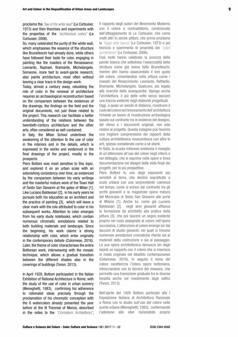
proclaims the “law of the white lead” (Le Corbusier, 1973) and then theorises and experiments with the properties of the “architectural colors” (Le Corbusier, 2006). So, many celebrated the purity of the white wall, which emphasises the essence of the structure like Brunelleschi had already done, while others have followed their taste for color, engaging in painting like the masters of the Renaissance: Leonardo, Raphael, Bramante, Michelangelo. Someone, more tied to avant-garde research, also paints architecture, most often without leaving a clear trace in the design work.Today, almost a century away, rebuilding the role of color in the renewal of architecture requires an archaeological reconstruction based on the comparison between the evidences of the drawings, the findings on the field and the original documents, not just those related to the project. This research can facilitate a better understanding of the relations between the twentieth-century architecture and the other arts, often considered as self-contained.In Italy, the Milan School underlines the awakening of the attention to the use of color in the interiors and in the details, which is expressed in the works and evidenced in the final drawings of the project, mostly in the prospects. Piero Bottoni was most sensitive to this topic, and explored it on an urban scale with an astonishing consistency over time, as evidenced by the comparison between his early writings and the masterful mature work of the Town Hall of Sesto San Giovanni at the gates of Milan [1]. Like Luciano Baldessari [2], in his early years he pursues both his education as an architect and the practice of painting [3], which will leave a clear mark with the role attributed to color in his subsequent works. Attention to color emerges from his early study notebooks, which contain numerous chromatic annotations related to both building materials and landscape. Since the beginning, his work claims a strong relationship with color, which enter originally in the contemporary debate (Colonnese, 2016). Later, the theme of color characterises the entire Bottonian work, interweaving with the mosaic technique, which allows a gradual transition between the different shades also in the coverings of buildings (Tonon, 2013).
In April 1928, Bottoni participated in the Italian Exhibition of Rational Architecture in Rome, with the study of the use of color in urban scenery (Meneghetti, 1983), confirming his adherence to rationalist ideas precisely through the proclamation of his chromatic conception with the 6 watercolors already presented the year before at the III Triennial of Monza, described in the notes to the “Cromatismi Architettonici”,
Il rapporto degli autori del Movimento Moderno con il colore è contradditorio, condizionato dall’atteggiamento di Le Corbusier, che come molti altri fu anche pittore, che prima proclama la “legge della biacca” (Le Corbusier, 1973) e poi teorizza e sperimenta le proprietà dei “colori architettonici” (Le Corbusier, 2006). Così molti hanno celebrato la purezza della parete bianca che sottolinea l’essenzialità della struttura come già aveva fatto Brunelleschi, mentre altri hanno assecondato il loro gusto del colore, cimentandosi nella pittura come i maestri del Rinascimento: Leonardo, Raffaello, Bramante, Michelangelo. Qualcuno, più legato alle ricerche delle avanguardie, dipinge anche l’architettura, il più delle volte senza lasciare una traccia evidente negli elaborati progettuali.Oggi, a quasi un secolo di distanza, ricostruire il ruolo del colore nel rinnovamento dell’architettura richiede un lavoro di ricostruzione archeologica basato sul confronto tra le evidenze del disegno, del rilievo e i documenti originali, non solo relativi al progetto. Questa indagine può favorire una migliore comprensione dei rapporti della cultura architettonica novecentesca con altre le arti, spesso considerate come a sé stanti.In Italia, la scuola milanese evidenzia il risveglio di un’attenzione all’uso del colore negli interni e nel dettaglio, che si esprime nelle opere e trova documentazione nei disegni delle viste finali dei progetti, per lo più prospettive. Piero Bottoni fu uno degli esponenti più sensibili al tema, che declinò soprattutto a scala urbana con una sorprendente coerenza nel tempo, come si evince dal confronto tra gli scritti giovanili e la magistrale opera matura del Municipio di Sesto San Giovanni alle porte di Milano [1]. Anche lui, come già Luciano Baldessari [2], negli anni giovanili affianca la formazione da architetto alla pratica della pittura [3], che poi lascerà un segno evidente proprio nel ruolo assegnato al colore nell’opera successiva. L’attenzione al colore emerge sin dai taccuini di studio giovanili, nei quali si trovano numerose annotazioni cromatiche riferite sia ai materiali della costruzione e sia al paesaggio. La sua opera architettonica denuncia sin dagli esordi un rapporto con il colore che si inserisce in modo originale nel dibattito contemporaneo (Colonnese, 2016). In seguito il tema del colore caratterizza l’intera opera bottoniana, intrecciandosi con la tecnica del mosaico, che permette una transizione graduale tra le diverse tonalità anche nel rivestimento degli edifici (Tonon, 2013).
Nell’aprile del 1928 Bottoni partecipò alla I Esposizione Italiana di Architettura Razionale a Roma con lo studio sull’uso del colore nelle quinte urbane (Meneghetti, 1983), confermando l’adesione alle idee razionaliste proprio

10
Cultura e Scienza del Colore - Color Culture and Science | 08 | 2017 | 7 - 22
Rossi M., Pompeiana Iarossi M., Mele G.
ISSN 2384-9568
DOI: 10.23738/ccsj.i82017.01
defined by the author as “constructive value of color” [4]. He adopted a theoretical-experimental perspective for his research on the use of color in architecture by referring to Le Corbusier, who in choosing colors in architecture seems to be the main reference of Baldessari as well (Rossi, 2013). The use of color as an element of the urban scale, which was already promoted at the beginning of the century by Bruno Taut, constitutes the original feature and became the pretext of the encounter with Le Corbusier.
2. FROM THE DRAWING TO THE PROJECT: COLOR IN ARCHIVE DOCUMENTS
The Bottoni archive at the Politecnico di Milano [5] provides a fundamental contribution to the architect’s study. It keeps the projects
documented by drawings, models and other paper documents, writings, notebooks and even some paintings. In particular, the relationship of Bottoni with color finds an exemplary expression in the coherence
attraverso la proclamazione della sua concezione cromatica coi 6 acquerelli già presentati l’anno precedente alla III Triennale di Monza, descritti nelle note ai “Cromatismi architettonici”, definiti dall’autore come “valore costruttivo del colore” [4]. Egli diede un taglio teorico-sperimentale alla sua ricerca sull’uso del colore in architettura rapportandosi a Le Corbusier, che nella scelta delle tinte in architettura sembra essere il principale riferimento anche di Baldessari (Rossi, 2013). L’uso del colore come elemento a scala urbana, già caldeggiato all’inizio del secolo da Bruno Taut, costituisce la caratteristica originale e divenne il pretesto dell’incontro con Le Corbusier.
2. DAL DISEGNO AL PROGETTO: IL COLORE NEI DOCUMENTI DI ARCHIVIO
L’archivio Bottoni conservato presso il Politecnico di Milano [5] è la tappa fondamentale per lo studio dell’architetto. Esso conserva i progetti documentati da disegni, modelli con
Figure 1 - Piero Bottoni, typed draft for “Cromatismi architettonici”. (Archivio Bottoni [Bottoni Archive] - Politecnico di Milano)
Figura 1 - Piero Bottoni, Bozza dattiloscritta per i “Cromatismi architettonici”. (Archivio Bottoni – Politecnico di Milano)

11
Cultura e Scienza del Colore - Color Culture and Science | 08 | 2017 | 7 - 22
Art and Colour in the Requalification of Urban Areas and Landscapes
ISSN 2384-9568
between the beginnings and the conclusion of his architectural work, represented respectively by the watercolors of the Cromatismi architettonici and by the monumental project for the City Hall of Sesto San Giovanni, which is evidenced by 556 drawings, a model and 268 written documents (the last of which is his professional bill) [6]. Archive files, published and unpublished, clarify what is summarised in the captions of the original watercolors. The texts are part of the contemporary debate of Rationalist Architecture, and between 1927 and 1928 were published several times in different languages: Italian, French and German. This gives an idea of how much the author was decided in the battle for a constructive use of color in the design of the contemporary city [7]. Bottoni complains about the absence of Italy from the exhibition “die Farbige Stadt” organised by the Kunstgewerbe Museum in Zurich, mentioning, for example, the attention to color of German and Swiss associations and the lively debate between critics and the public. The notes are his answer: on the one hand, they explain the watercolors and the experimentation on the constructive value of color, on the other they become his manifesto, which closes with an appeal to chemists, builders, architects and aesthetes. He states that
“...each color has its own volumetric value, capable of attributing to the body on which it is diffused a different aesthetic appearance that differs depending on the tone, its intensity, the relationship with the colored elements surrounding it.”
He names “color volume mass” the set of physical properties that a color gives to the geometric volume it covers, the constructive value of which then follows the laws of aerial perspective. The highest constructive value is given by warm colors, while cool colors make the architectural volume evanescent. The hot-cold contrast of color becomes a “resistance” factor:
“A dark red or sienna solid is heavier and resists better than with a light blue, grey, olive-green ...”.
Therefore, his is not about coloring architecture but designing colorful architectures, by controlling the spatial effect that color generates in the urban space. This requires technical and static knowledge, and hence a more architectural rather than pictorial sensitivity.Bottoni therefore mentions the essential stages of history, recalling the red-white contrast of Lombard architecture [8] and the white-grey one of Brunelleschi’s style, in which color matching highlights the constructive elements, pointing
altri documenti cartacei, gli scritti, i taccuini e anche alcuni dipinti. In particolare, il rapporto di Bottoni con il colore trova una esemplare espressione nella coerenza tra gli esordi e la conclusione della sua opera architettonica, rappresentati rispettivamente dagli acquerelli dei Cromatismi architettonici e dal monumentale progetto per il Municipio di Sesto San Giovanni, del quale si conservano 556 disegni, un plastico di studio e 268 documenti scritti (l’ultimo dei quali è la parcella) [6]. I documenti d’archivio, editi e inediti, chiariscono meglio quanto riassunto nelle didascalie originali degli acquerelli. I testi rientrano nel dibattito contemporaneo dell’Architettura Razionalista e tra il 1927 e il 1928 sono stati pubblicati più volte, in diverse lingue, italiano, francese e tedesco. Ciò lascia intuire quanto l’autore fosse deciso nella battaglia per un uso costruttivo del colore nella progettazione della città contemporanea [7]. Bottoni lamenta l’assenza dell’Italia dalla mostra “die Farbige Stadt”, organizzata dal Kunstgewerbe Museum di Zurigo, citando ad esempio l’attenzione al colore delle leghe tedesche e svizzere e la vivacità del dibattito tra critica e pubblico. Le note sono la sua risposta: da una parte spiegano gli acquerelli e la sperimentazione sul valore costruttivo del colore, dall’altra diventano il suo manifesto programmatico che si chiude con un appello a chimici, costruttori, architetti, esteti. Egli afferma:
“…ogni colore ha il suo proprio valore volumetrico, capace di attribuire al corpo in cui è diffuso un’impressione di ordine estetico diversa a seconda del tono, della sua intensità, del rapporto con gli elementi colorati che lo circondano…”.
Quindi definisce “massa volume colore” l’insieme delle proprietà fisiche che un colore conferisce al volume geometrico che riveste, il cui valore costruttivo segue poi le leggi della prospettiva aerea. Il valore costruttivo maggiore lo hanno i colori caldi mentre le tinte fredde rendono evanescente il volume architettonico. La contrapposizione del colore caldo–freddo diventa un fatto di “resistenza”:
“Un solido rosso scuro o terra di Siena è più pesante e resiste meglio di azzurro chiaro, grigio, verde oliva…”.
Non si tratta quindi di colorare l’architettura, ma di progettare architetture colorate, controllando l’effetto spaziale che il colore genera nello spazio urbano, cosa che richiede conoscenze di tecnica e di statica, e quindi una sensibilità più architettonica che pittorica.Bottoni cita quindi le tappe essenziali dalla
12
Cultura e Scienza del Colore - Color Culture and Science | 08 | 2017 | 7 - 22
Rossi M., Pompeiana Iarossi M., Mele G.
ISSN 2384-9568
DOI: 10.23738/ccsj.i82017.01
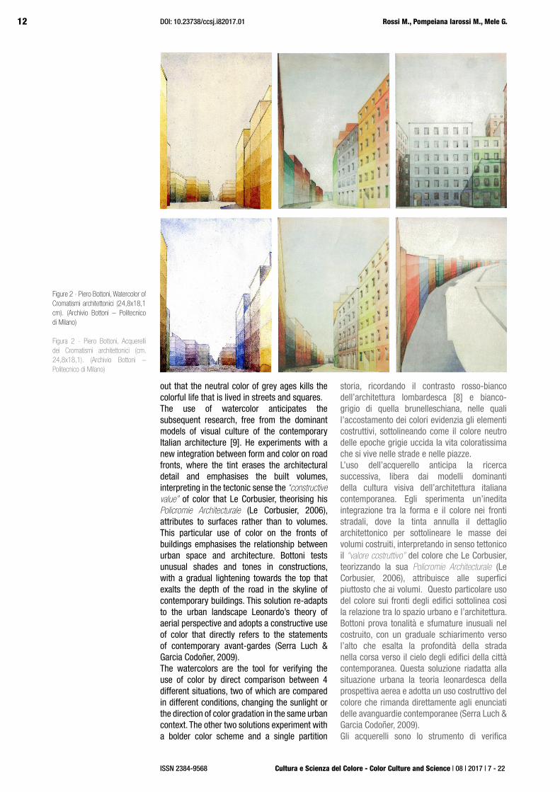
out that the neutral color of grey ages kills the colorful life that is lived in streets and squares.The use of watercolor anticipates the subsequent research, free from the dominant models of visual culture of the contemporary Italian architecture [9]. He experiments with a new integration between form and color on road fronts, where the tint erases the architectural detail and emphasises the built volumes, interpreting in the tectonic sense the “constructive value” of color that Le Corbusier, theorising his Policromie Architecturale (Le Corbusier, 2006), attributes to surfaces rather than to volumes. This particular use of color on the fronts of buildings emphasises the relationship between urban space and architecture. Bottoni tests unusual shades and tones in constructions, with a gradual lightening towards the top that exalts the depth of the road in the skyline of contemporary buildings. This solution re-adapts to the urban landscape Leonardo’s theory of aerial perspective and adopts a constructive use of color that directly refers to the statements of contemporary avant-gardes (Serra Luch & Garcia Codoñer, 2009). The watercolors are the tool for verifying the use of color by direct comparison between 4 different situations, two of which are compared in different conditions, changing the sunlight or the direction of color gradation in the same urban context. The other two solutions experiment with a bolder color scheme and a single partition
storia, ricordando il contrasto rosso-bianco dell’architettura lombardesca [8] e bianco-grigio di quella brunelleschiana, nelle quali l’accostamento dei colori evidenzia gli elementi costruttivi, sottolineando come il colore neutro delle epoche grigie uccida la vita coloratissima che si vive nelle strade e nelle piazze.L’uso dell’acquerello anticipa la ricerca successiva, libera dai modelli dominanti della cultura visiva dell’architettura italiana contemporanea. Egli sperimenta un’inedita integrazione tra la forma e il colore nei fronti stradali, dove la tinta annulla il dettaglio architettonico per sottolineare le masse dei volumi costruiti, interpretando in senso tettonico il “valore costruttivo” del colore che Le Corbusier, teorizzando la sua Policromie Architecturale (Le Corbusier, 2006), attribuisce alle superfici piuttosto che ai volumi. Questo particolare uso del colore sui fronti degli edifici sottolinea così la relazione tra lo spazio urbano e l’architettura. Bottoni prova tonalità e sfumature inusuali nel costruito, con un graduale schiarimento verso l’alto che esalta la profondità della strada nella corsa verso il cielo degli edifici della città contemporanea. Questa soluzione riadatta alla situazione urbana la teoria leonardesca della prospettiva aerea e adotta un uso costruttivo del colore che rimanda direttamente agli enunciati delle avanguardie contemporanee (Serra Luch & Garcia Codoñer, 2009). Gli acquerelli sono lo strumento di verifica
Figure 2 - Piero Bottoni, Watercolor of Cromatismi architettonici (24,8x18,1 cm). (Archivio Bottoni – Politecnico di Milano)
Figura 2 - Piero Bottoni, Acquerelli dei Cromatismi architettonici (cm. 24,8x18,1). (Archivio Bottoni – Politecnico di Milano)
13
Cultura e Scienza del Colore - Color Culture and Science | 08 | 2017 | 7 - 22
Art and Colour in the Requalification of Urban Areas and Landscapes
ISSN 2384-9568
facing the waterfront. The chromatic research thus interweaves the use of color with the brightness of the road and the correction of the visual perception of the urban space. The author explains that these are situations imagined to study the relationship between vacuum and color together with the “position values”, in relation to the two rhythms that characterise the scanning of the architecture: the vertical one marked by color and the horizontal one marked by the intensity; then he notes that the downward gradation lowers the apparent centre of gravity, giving balance to the masses while the opposite would give light to narrow streets, but would “remove density from the matter of lower floors”, contradicting the statics.The interest for color marks the conception of the building as part of the city, an essential part of the road and the urban landscape, establishing a closer relation between them [10].
3. THE CONFIRMATION OF MATURITY: THE TOWN HALL OF SESTO SAN GIOVANNI
Thirty years later, at the top of his professional activity, Bottoni resumes the same color model in the project for the Town Hall of Sesto San Giovanni (1961-71) (Cerruti,1967; Tonon, 1990; Tonon, 2007; Tonon (ed), 2011). The building is documented in its every stage and aspect by the material kept at the Piero Bottoni Archive [11]. Archive activities testify to the evolution of the color concept and, at the same time, the permanence of the peculiar and original characters of Bottoni’s research, through the comparison between documents and works: the written theory, the experimentation on the drawings and the design as a concrete response to defined needs and issues.Indeed, this assignment represents an extraordinary opportunity for the architect to fully experience the application of his ideas about color in architecture in the definition of the complex destined to become the new agorà of the city, already renamed the “Stalingrad of Italy”, in which the values of civil participation blend with those of labour and industrial production, where the use of color refers a strong symbolic value as well. The municipal complex is located on an artificial hill surrounded by a green area and consists of a basement with garages and warehouses, supporting the building hosting the council hall and the main offices, a 12-floor office building and an additional body with an elongated shape on a single floor for the register office.Within this composition of the architectural complex, the chromatic treatment of each building serves as a language capable of defining and communicating its identity, along
dell’uso del colore attraverso il confronto diretto di 4 situazioni diverse, due delle quali vengono confrontate in differenti condizioni, cambiando il soleggiamento o la direzione di degradazione dei colori allo stesso contesto urbano. Le altre due soluzioni sperimentano un accostamento di colori più audace e una strada con una sola quinta affacciata al lungomare. La ricerca cromatica intreccia quindi l’uso del colore alla luminosità della strada e alla correzione della percezione visiva dello spazio urbano. L’autore spiega che si tratta di situazioni immaginate per studiare il rapporto tra il vuoto e il colore insieme ai “valori di posizione”, rispetto ai due ritmi che caratterizzano la scansione dell’architettura: quello verticale marcato dal colore e quello orizzontale dall’intensità; quindi nota che l’intensità degradante verso l’alto abbassa il baricentro apparente, conferendo equilibrio alle masse mentre il contrario darebbe luce alle strade strette, ma “toglie consistenza alla materia dei piani bassi”, contraddicendo la statica.Nell’interesse al colore si delinea la concezione dell’edificio come parte della città, parte essenziale della strada e del paesaggio urbano, che lo accomuna e lo avvicina [10].
3. LA CONFERMA DELLA MATURITÀ: IL MUNICIPIO DI SESTO SAN GIOVANNI
Trent’anni dopo, all’apice sua attività professionale, Bottoni riprende lo stesso modello di colore nel progetto per la sede del Comune di Sesto San Giovanni (1961-71) (Cerruti,1967; Tonon, 1990; Tonon, 2007; Tonon (ed), 2011) documentato in ogni sua fase ed aspetto dal materiale custodito presso l’Archivio Piero Bottoni [11]. Le attività d’archivio testimoniano l’evoluzione del concetto di colore e, insieme, il mantenimento dei caratteri peculiari ed originali della ricerca di Bottoni, attraverso il confronto tra documenti e realizzazioni: la teoria scritta, la sperimentazione nel disegno e la progettazione come risposta concreta a richieste e problemi definiti.In effetti, questo incarico rappresenta per l’architetto un’occasione straordinaria per sperimentare compiutamente l’applicazione delle riflessioni iniziate nel ’27 con i Cromatismi alla definizione del complesso destinato a divenire la nuova agorà della città, già ribattezzata la “Stalingrado d’Italia”, in cui i valori della partecipazione civile si fondono con quelli del lavoro e della produzione industriale. Il complesso municipale si colloca su una collina artificiale circondata da un’area a verde ed è articolato in un basamento con le autorimesse ed i magazzini, sul quale poggiano il palazzetto contenente la sala consiliare e gli uffici di
14
Cultura e Scienza del Colore - Color Culture and Science | 08 | 2017 | 7 - 22
Rossi M., Pompeiana Iarossi M., Mele G.
ISSN 2384-9568
DOI: 10.23738/ccsj.i82017.01
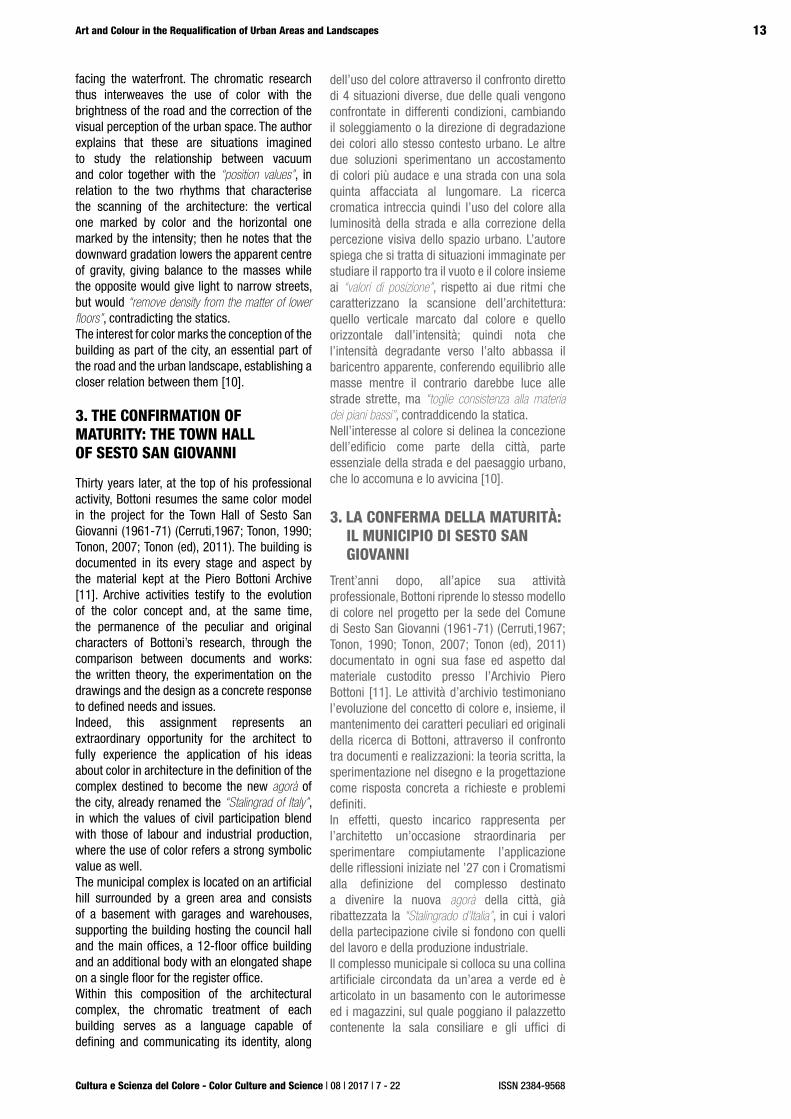
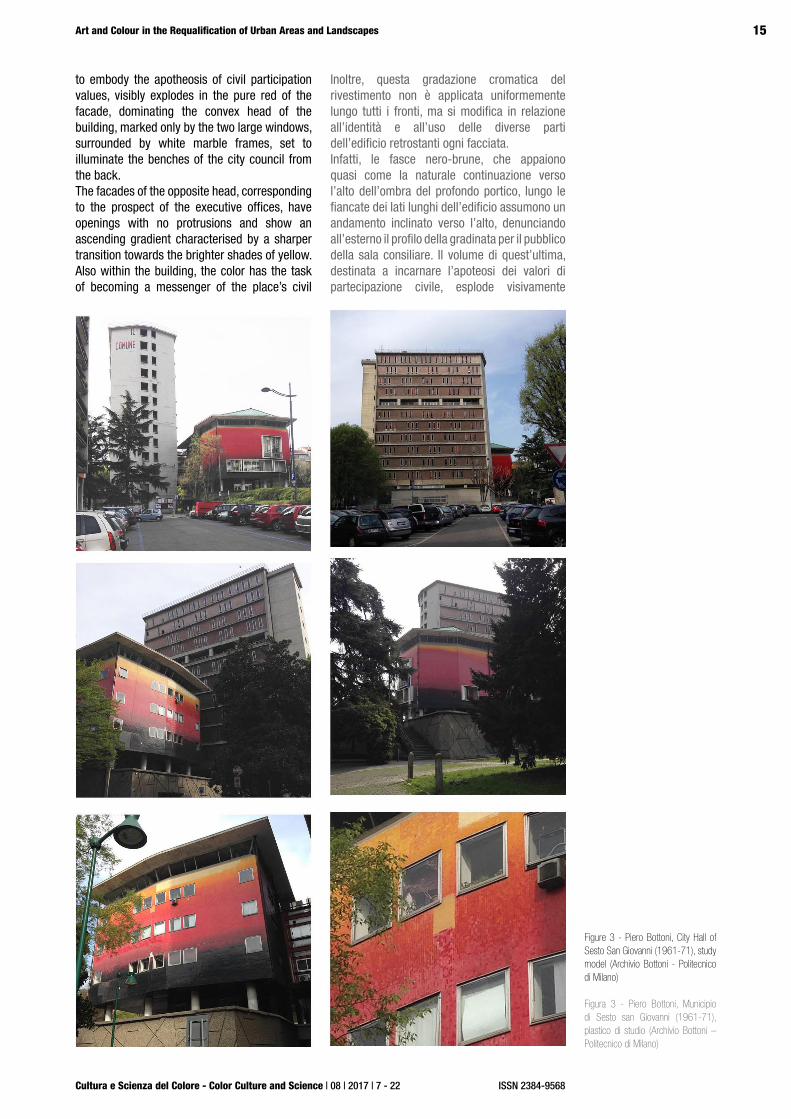
with the specific purpose of each part.The protagonist role assigned to color immediately appears on the facades of the official building, which, in keeping with the tradition of the Lombard “Broletto”, appears as a compact volume, leaning on a low porch. While the first version of this building, dated November ‘63, showed brick faces, it now appears completely covered by a mosaic of ceramic tiles, with a sequence of saturated tones of pure colors [12]. These, in accordance with Bottoni’s rule of giving greater weight to the building through an ascending chromatic gradient, modulate from the black-brown of the lower bands to the upper fire red, orange and yellow hues under the roof, separated by the longitudinal cut of a continuous window. A choice of colors which, as a whole, appears to suggest the image of a steel casting, accentuated by the brightness of the ceramic material, which the use of a glossy enamel also in the construction of the model already shows to be an important requirement pursued by the designer.The technical documentation in the Archives reveals that this impression of graduation, surprisingly, springs from the use of tiles with only 8 colors. In addition, each tile is not faded, but has a constant tonality over its entire surface [13]. The color modulation is therefore obtained during the laying of the mosaic, alternating, in increasing proportions, tiles of the initial color with those of the next color.In addition, this color gradation of the cladding is not uniformly applied along all fronts, but changes according to the identity and use of the different parts of the building behind each facade. In fact, the black-brown bands, which appear almost as the natural upward shade of the deep porch, along the long sides of the building take an upward slope, marking the external profile of the sloped public seating area in the council hall. The volume of the latter, intended
rappresentanza, un edificio per uffici alto 12 piani ed un corpo di fabbrica, di forma allungata ed ad un solo piano, per l’anagrafe.Entro questa composizione del complesso architettonico, il trattamento cromatico di ogni edificio funge da linguaggio capace di definirne e comunicarne l’identità, con la specifica ragion d’essere di ciascuna delle parti.Il ruolo di protagonista assegnato al colore appare immediatamente nelle facciate del palazzetto di rappresentanza che, in omaggio alla tradizione dei broletti lombardi, si presenta come un volume compatto, appoggiato su un basso portico. Mentre però la prima versione del novembre ’63 di quest’edificio presentava i fronti di laterizio, esso appare ora completamente rivestito da un mosaico di piastrelle ceramiche, con una successione di toni saturi di colori puri [12]. Questi, in conformità con la regola bottoniana di conferire maggior gravità all’edificio attraverso una gradazione cromatica ascendente, modulano dal nero-bruno delle fasce inferiori verso le soprastanti campiture rosso-fuoco, arancio, fino al giallo sottostante la falda del tetto, separato dal taglio longitudinale di una finestratura continua a nastro. Una scelta di colori che, nel suo insieme, appare destinata a richiamare immediatamente l’immagine della colata d’acciaio, accentuata dalla lucentezza del materiale ceramico, che l’utilizzo di uno smalto lucido anche nella realizzazione del plastico di studio già denuncia come requisito importante perseguito dal progettista.La documentazione tecnica rinvenuta in Archivio rivela che questa impressione di gradualità, sorprendentemente, scaturisce dall’impiego di piastrelle con solamente 8 varietà di colore e ciascuna non sfumata, ma con tonalità costante su tutta la sua superficie [13]. La gradualità della modulazione cromatica è perciò ottenuta durante la posa in opera del mosaico, alternando, in proporzioni crescenti, piastrelle del colore iniziale a quelle del colore successivo.
Figure 3 - Piero Bottoni, City Hall of Sesto San Giovanni (1961-71), study model (Archivio Bottoni - Politecnico di Milano) and photomodeling test for a three-dimensional display
Figura 3 - Piero Bottoni, Municipio di Sesto san Giovanni (1961-71), plastico di studio (Archivio Bottoni – Politecnico di Milano) e prova di fotomodellazione per visualizzazione tridimensionale in rete
15
Cultura e Scienza del Colore - Color Culture and Science | 08 | 2017 | 7 - 22
Art and Colour in the Requalification of Urban Areas and Landscapes
ISSN 2384-9568
to embody the apotheosis of civil participation values, visibly explodes in the pure red of the facade, dominating the convex head of the building, marked only by the two large windows, surrounded by white marble frames, set to illuminate the benches of the city council from the back.The facades of the opposite head, corresponding to the prospect of the executive offices, have openings with no protrusions and show an ascending gradient characterised by a sharper transition towards the brighter shades of yellow.Also within the building, the color has the task of becoming a messenger of the place’s civil
Inoltre, questa gradazione cromatica del rivestimento non è applicata uniformemente lungo tutti i fronti, ma si modifica in relazione all’identità e all’uso delle diverse parti dell’edificio retrostanti ogni facciata. Infatti, le fasce nero-brune, che appaiono quasi come la naturale continuazione verso l’alto dell’ombra del profondo portico, lungo le fiancate dei lati lunghi dell’edificio assumono un andamento inclinato verso l’alto, denunciando all’esterno il profilo della gradinata per il pubblico della sala consiliare. Il volume di quest’ultima, destinata a incarnare l’apoteosi dei valori di partecipazione civile, esplode visivamente
Figure 3 - Piero Bottoni, City Hall of Sesto San Giovanni (1961-71), study model (Archivio Bottoni - Politecnico di Milano)
Figura 3 - Piero Bottoni, Municipio di Sesto san Giovanni (1961-71), plastico di studio (Archivio Bottoni – Politecnico di Milano)
16
Cultura e Scienza del Colore - Color Culture and Science | 08 | 2017 | 7 - 22
Rossi M., Pompeiana Iarossi M., Mele G.
ISSN 2384-9568
DOI: 10.23738/ccsj.i82017.01
value. Indeed, in the hall, a particular emphasis underlines the centrality of the space between the circumference of the council benches and, in front, the concave profile of the public seating area. Bottoni places a circular figure on the mosaic floor, whose margin assumes wooden gradations ranging from black to red and yellow, to symbolically identify the place of participatory democracy, with the image of the mouth of the blast furnaces in the foundries on which Sesto at the time founded its economy.The circular shape comes back in the shape of the planter seat that protects the aeration chimney for the garages in the basement. In this case, the red ceramic mosaic, joining the black-brown metallic finishes, almost seems to evoke the form of an eruption crater and the underground igneous universe of the Vulcan myth, affirming more explicitly the bond with the metallurgy world.In contrast to the multifaceted and translucent volume of the executive building and placed parallel to it, stands the tower dedicated to the administrative offices, connected to the executive parts by a low transverse body.This is a rectangular building, which projects itself outwards with a polygonal head with marked chamfered corners.The planimetrical conformation offered the designer the opportunity to give the building a considerably different character according to the observation point, by means of a constructive and chromatic treatment of the long facades that is different from that of the head.In fact, for those who come from Via Cesare da Sesto, the proximity of the multifaceted and translucent volume of the executive building with the high grey shape of the office building recalls the Broletto with its civic tower. However, the greater visual dynamic energy given by the chamfering of the head, together with the large wording at the top of the tower, with hues that once again fade from brown to fire red, impose
in facciata nel rosso puro, che domina il rivestimento della testata convessa dell’edificio, marcata solo dalle due grandi vetrate, riquadrate da cornici di marmo bianco, poste ad illuminare da tergo i banchi con gli scranni del consiglio comunale.Le facciate della testata opposta, corrispondente all’affaccio degli uffici direzionali e di rappresentanza, hanno invece aperture prive di sporti e mostrano una gradazione ascendente caratterizzata da un più rapido trascolorare verso i toni luminosissimi del giallo.Anche all’interno dell’edificio, al colore viene demandato il compito di farsi messaggero del valore civile del luogo. Infatti, all’interno della sala, una particolare enfasi sottolinea il carattere di centralità dello spazio compreso tra l’arco di circonferenza dei banchi consiliari e, di fronte, l’andamento concavo della tribuna per il pubblico. Qui, Bottoni colloca sul pavimento a mosaico una figura circolare, il cui margine sfuma nelle gradazioni ignee che vanno dal nero al rosso e al giallo, ad identificare simbolicamente il luogo dell’esercizio della democrazia partecipata, con l’immagine della bocca degli altiforni delle fonderie su cui Sesto all’epoca fondava la propria economia.La sagoma circolare torna poi nella forma del sedile-fioriera che protegge il camino di aerazione per le autorimesse collocate nel basamento. In questo caso il mosaico ceramico rosso, unendosi al nero-bruno delle finiture metalliche, sembra quasi evocare la forma del cratere eruttivo e l’universo igneo sotterraneo del mito di Vulcano, affermando più esplicitamente il legame con il mondo della metallurgia.In contrappunto al volume poliedrico e traslucido del palazzetto direzionale e disposta parallelamente ad esso si erge la torre per gli uffici amministrativi, collegato a quelli direzionali da un basso corpo trasversale.Si tratta di un edificio a sviluppo planimetrico
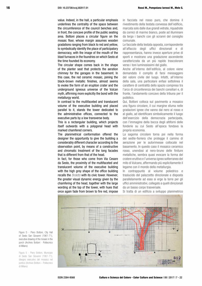
Figure 5 - Piero Bottoni, City Hall of Sesto San Giovanni (1961-71), executive drawing of the mosaic in the porch (Archivio Bottoni - Politecnico di Milano)
Figura 5 - Piero Bottoni, Municipio di Sesto San Giovanni (1961-71), disegno esecutivo del mosaico nel portico (Archivio Bottoni – Politecnico di Milano)

17
Cultura e Scienza del Colore - Color Culture and Science | 08 | 2017 | 7 - 22
Art and Colour in the Requalification of Urban Areas and Landscapes
ISSN 2384-9568
an almost mythical image of the productive world, with the name of the factory at the top of the flaming chimney.If instead the office tower is seen from the other two roads (via Oriani and via Modena) it appears as one of the urban scenes described by the Cromatismi.The emphasised horizontal partition, obtained by concrete stringcourses, marks the ascending desaturation gradient from the brown color of the lower floors to the pinkish beige nuance of the top.The materiality effect determined by the adoption of an earthy and warm chromaticity is accentuated by the shape of the walls that, between the stringcourses, show a marked upward flaring and are covered with plates of cement concretum texture-finished so grossly that its consistency recalls the iron melting residues. Although the color gradation is similar to the ascending color lightening in the Cromatismi, this effect draws a new strength from the play of light and shadow of the facade.In addition, if we observe the stringcourses closely, we can see that these are not just overly protruding cornices, since within their projection they host, in addition to the copper eaves, also skylights that, thanks to the flaring of the underneath walls, always provide the view of the sky from inside the offices, thus endowed with a source of natural light from above.Therefore, if the chromatic treatment of the facade confirms the ascendant desaturation studied in the early years, the color modulation - which in the Cromatismi was applied to flat and continuous facades - it is rhythmically marked by the deep shadow that the constructive element of the stringcourse-skylight, with the purpose of bringing natural light inside the rooms, projects on the outer front. In fact, the “naturalness” of the workplace seems to be recalled by the large decorative mosaic depicting on a black background a tree that, from the ground level, rises to reappear on the office floor. Another natural element like the fire seems to come out of the black-red-red decoration of some false ceilings, to recall once again the shapes and colors of the metallurgical world. The base, faithful to Le Corbusier’s definition of terrain artificiel, presents the two free fronts lined with embossed concrete slabs, almost to show, with an ostentation of materiality, their own technical role as containment wall of the hill. Along one of the sides where the base is buried into the green meadow of the artificial hill, the slope of the access ramp is sided by a sequence of slabs of brut concrete, which make up the Monument to Resistance, a sort of linear narrative, scratched on the grey and already rough surface, which accompanies the rise of
rettangolare, prospettante all’esterno con una testata resa poligonale dal marcato smusso degli angoli.Tale conformazione planimetrica ha offerto al progettista la possibilità di conferire all’edificio un carattere notevolmente diverso a secondo del punto di osservazione, mediante un trattamento costruttivo e cromatico delle facciate lunghe differente rispetto a quello della testata.Infatti, per chi arrivi da via Cesare da Sesto, la prossimità del volume poliedrico e traslucido del palazzetto direzionale con l’alta sagoma grigia dell’edificio per uffici rievoca la memoria del Broletto con la sua torre civica. Tuttavia il maggior slancio visivo provocato dallo smusso della testata, unitamente alla collocazione in sommità della torre della scritta “Il Comune”, realizzata a caratteri cubitali e con cromie che ancora una volta trascolorano salendo dal bruno al rosso fuoco, fanno sì che s’imponga l’immagine quasi mitizzata del mondo produttivo, con il nome della fabbrica riportato in cima alla ciminiera fiammeggiante.Se invece la torre per uffici viene vista dalle altre due strade di arrivo (via Oriani e via Modena) essa si presenta come una delle quinte urbane descritte dai Cromatismi.L’accentuata partizione orizzontale, affidata a marcapiani di cemento, scandisce la gradazione ascendente per de-saturazione del color bruno dei piani più bassi, fino alla nuance beige rosato della sommità.L’effetto di materialità determinato dall’adozione di un cromatismo terroso e caldo è accentuato dalla conformazione dei muri che, tra un marcapiano e l’altro, presentano una marcata svasatura verso l’alto e sono rivestiti da lastre di concretum cementizio strollato così grossolanamente che la sua consistenza ricorda i residui di lavorazione per fusione dei materiali ferrosi. Sebbene le fasce di gradazione cromatica riprendano l’alleggerimento ascendente del colore nei Cromatismi, tale effetto trae un vigore nuovo dal gioco di luci ed ombre della facciata.Inoltre, se si osservano da vicino le fasce marcapiano, si può rilevare che non si tratta solo di cornicioni più sporgenti del consueto, poiché nel loro aggetto alloggiano, oltre che i canali di gronda di rame, anche dei lucernari che, grazie alla svasatura dei muri sottostanti, consentono sempre la vista del cielo dall’interno degli uffici, dotati così anche di una fonte di luce naturale zenitale.Perciò, se il trattamento cromatico delle facciate riconferma la desaturazione ascendente studiata negli anni giovanili, la modulazione del colore – che nei Cromatismi era applicata a facciate piane e continue - è scandita ritmicamente dall’ombra profonda che l’elemento costruttivo del cornicione-lucernario, con lo scopo di portare la luce naturale all’interno degli ambienti, proietta

18
Cultura e Scienza del Colore - Color Culture and Science | 08 | 2017 | 7 - 22
Rossi M., Pompeiana Iarossi M., Mele G.
ISSN 2384-9568
DOI: 10.23738/ccsj.i82017.01
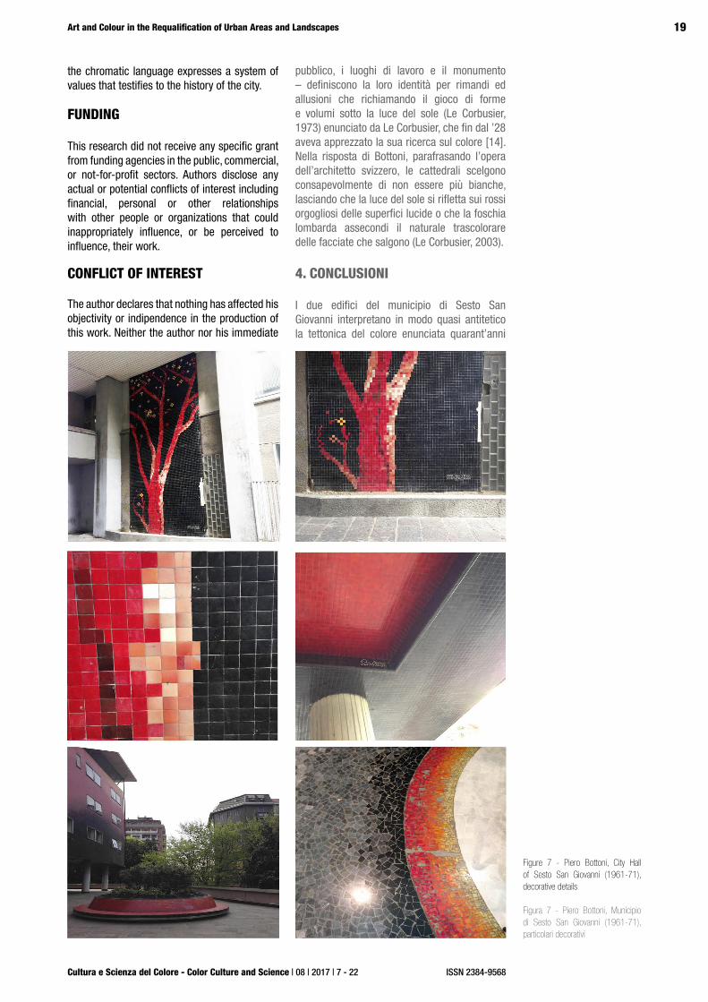
Figure 6 - Piero Bottoni, City Hall of Sesto San Giovanni (1961-71), pictorial decoration
Figura 6 - Piero Bottoni, Municipio di Sesto San Giovanni (1961-71), decorazione pittorica
which we can better understand the system of relationships in which, for Bottoni, color, as an ornamental attribute of buildings, becomes a tool for shaping the urban landscape. Its constituting elements - the house, the public building, the workplaces and the monument - define their identity by references and allusions that recalling the play of forms and volumes under the sunlight (Le Corbusier, 1973) enunciated by Le Corbusier, who since 1828 had appreciated his research on color [14]. In the response of Bottoni, paraphrasing the work of the Swiss architect, the cathedrals consciously choose not to be white anymore, letting the sunlight reflect on the proud reds of the glossy surfaces or the Lombard mist underline the natural fading of the rising facades (Le Corbusier, 2003).
4. CONCLUSIONS
The two buildings of the town hall of Sesto San Giovanni interpret almost antithetically the tectonics of color enunciated forty years before in the “Cromatismi architettonici”: on the one hand, the tonal sobriety of the opaque and rough surfaces of the browns and grey of the office tower, on the other the shine and the saturated colors of the ceramic cladding that envelops the lower body housing the executive spaces. The palace, with its glittering colors, expresses the institution and represents the values in which the community recognised its identity. The chromatic hues of the ceramic cladding remained unchanged due to the characteristics of the material that guarantee color stability over time.Today, the decline of the steel industry has crumbled the myth of the Stalingrad of Italy,
un albero che, dalla quota del terreno, ascende poi per ricomparire fino al piano degli uffici. Ed è ancora un elemento naturale come il fuoco che sembra affacciarsi dalla decorazione in nero-bruno-rosso di alcuni controsoffitti, a ricordare ancora una volta le forme e i colori ignei del mondo metallurgico. Così il basamento, fedele alla definizione lecorbusieriana di terrain artificiel, presenta i due fronti liberi rivestiti di lastre di cemento goffrato, quasi mostrare con l’ostentazione della materialità il proprio ruolo tecnico di muro di contenimento del terreno della collina. Lungo uno dei lati in cui il basamento s’interra nel prato verde della collina artificiale, la pendenza della rampa d’accesso è affiancata da una sequenza di lastre di cemento brut, che compongono il Monumento alla Resistenza, una sorta di racconto lineare, impresso a graffi sulla superficie grigia e già scabra, che accompagna la salita dalla strada alla quota della piazza comunale, sagrato laico per la lucentezza focosa del palazzetto con il sedile-fioriera.E’ proprio questo spazio pubblico aperto il luogo da cui si può meglio cogliere il sistema di relazioni in cui per Bottoni il colore, da attributo ornamentale degli edifici, si trasforma in strumento di costruzione del paesaggio urbano. In esso, gli elementi costitutivi – la casa, l’edificio
19
Cultura e Scienza del Colore - Color Culture and Science | 08 | 2017 | 7 - 22
Art and Colour in the Requalification of Urban Areas and Landscapes
ISSN 2384-9568
CONFLICT OF INTEREST
The author declares that nothing has affected his objectivity or indipendence in the production of this work. Neither the author nor his immediate
Figure 7 - Piero Bottoni, City Hall of Sesto San Giovanni (1961-71), decorative details
Figura 7 - Piero Bottoni, Municipio di Sesto San Giovanni (1961-71), particolari decorativi
the chromatic language expresses a system of values that testifies to the history of the city.
FUNDING
This research did not receive any specific grant from funding agencies in the public, commercial, or not-for-profit sectors. Authors disclose any actual or potential conflicts of interest including financial, personal or other relationships with other people or organizations that could inappropriately influence, or be perceived to influence, their work.
pubblico, i luoghi di lavoro e il monumento – definiscono la loro identità per rimandi ed allusioni che richiamando il gioco di forme e volumi sotto la luce del sole (Le Corbusier, 1973) enunciato da Le Corbusier, che fin dal ’28 aveva apprezzato la sua ricerca sul colore [14]. Nella risposta di Bottoni, parafrasando l’opera dell’architetto svizzero, le cattedrali scelgono consapevolmente di non essere più bianche, lasciando che la luce del sole si rifletta sui rossi orgogliosi delle superfici lucide o che la foschia lombarda assecondi il naturale trascolorare delle facciate che salgono (Le Corbusier, 2003).
4. CONCLUSIONI
I due edifici del municipio di Sesto San Giovanni interpretano in modo quasi antitetico la tettonica del colore enunciata quarant’anni

20
Cultura e Scienza del Colore - Color Culture and Science | 08 | 2017 | 7 - 22
Rossi M., Pompeiana Iarossi M., Mele G.
ISSN 2384-9568
DOI: 10.23738/ccsj.i82017.01
family member have any financial interest in the people, topics or companies involved by this article. Neither the author nor his immediate family member had a professional relationship with the people and companies cited in this article. Neither the author nor his immediate family member are involved in a legal dispute with the people and the companies cited in this article.No conflict of interest including financial, personal or other relatiohsjip with other people and organization within three years of beginning the submitted work that could inappropriately influence, or be perceived to influence, this work.
NOTES
[1] Piero Bottoni (1903-1973) was one of the founders of the Italian Movement for Rational Architecture (MIAR) before joining the Congrès International of Modern Architecture (CIAM), of which he was the Italian delegate until 1951, participating in the III edition in Brussels (1928) and the IV in Athens (1933).
[2] Luciano Baldessari (1896-1982), originally from Rovereto, was introduced to formal arts by Depero, who was his first master of design.
[3] Prior to his graduating at the Polytechnic School of Architecture in Milan (1926), Bottoni was professor of architectural design at the Academy of Fine Arts in Milan.
[4] Architettura e arti decorative, VII [1927-1928].
[5] Directed by G. Consonni and G. Tonon.
[6] Archivio Bottoni, Politecnico di Milano, Work 428 - City Hall of Sesto San Giovanni (Mi), 1961-71, collaborator Antonio Didoni.
[7] Archivio Bottoni: text drafted by Bottoni on the occasion of the Die Farbige Stadt exhibition in Zurich in August-September 1927, published as s substantially identical work with the title Cromatisme Architectural, in “Das Werk”, year XV, n. 7, July 1928, pages 219-221; Farbengebung in der Architektur, in Die Farbige Stadt, no. 3, March 3, 1928, pages 65-70; cyclostyled in Italian and presented as an annex to the watercolors on color at the 3rd International Exhibition of Decorative Arts in Monza, May-October 1927, published under the title Die Farbenwirkung in der Architektur, in the «Süddeutsche Maler-Zeitung», year XXVII, n. 12, June 1928, pp. 191-192; unpublished illustrative notes to Cromatismi architettonici, 1927.
[8] = “of Lombard tradition”, an adjective used in the historical-artistic context with reference to the thirteenth century. cf. De Mauro Dictionary.
[9] “With “color-mass-volume” I identify the set of physical, resistant, geometric (weight, strength, size) properties that color makes us attribute to the geometric volume it covers. The intensity value of this “color mass volume” attributed by the various colors to the bodies follows the laws of aerial perspective: ..., (Bottoni in the typed text).
[10] Without knowing him, Bottoni writes to Le Corbusier to present his research and the master replies with a letter (January 15, 1928) in which he appreciates the work by reiterating the role of color in the definition of urban space conceived as “an open room” with the description of his
sulla facciata esterna. A condizioni di “naturalità” del luogo di lavoro sembra, in effetti, alludere anche il grande mosaico decorativo raffigurante su fondo neroOggi che il declino della siderurgia ha sgretolato il mito della Stalingrado d’Italia, il linguaggio cromatico esprime un sistema di valori che testimonia la storia della città.
NOTE
[1] Piero Bottoni (1903-1973), fu uno dei fondatori del Movimento italiano per l’architettura razionale (MIAR) prima di aderire al Congrès internationaux d’architecture moderne (CIAM), di cui fu il delegato italiano sino al 1951, partecipando alla III edizione a Bruxelles (1928) e alla IV ad Atene (1933).
[2] Luciano Baldessari (1896-1982), originario di Rovereto fu introdotto alle arti formali da Depero, che fu il suo primo maestro di disegno.
[3] Prima di laurearsi alla Scuola superiore di architettura del Politecnico di Milano (1926), Bottoni divenne professore di disegno architettonico presso l’Accademia di Belle Arti di Milano.[4] In Architettura e arti decorative, VII [1927-1928], pp. 80-85.
[5] Diretto da G. Consonni e G. Tonon.
[6] Archivio Bottoni, Politecnico di Milano, Op. 428 - Palazzo comunale di Sesto San Giovanni (Mi), 1961-71, collaboratore Antonio Didoni.
[7] Archivio Bottoni: testo ciclostilato steso da Bottoni in occasione della rassegna Die Farbige Stadt di Zurigo nell’agosto-settembre 1927, pubblicato sostanzialmente identico col titolo Cromatisme Architectural, in «Das Werk», a. XV, n. 7, luglio 1928, pp. 219-221; Farbengebung in der Architektur, in «Die Farbige Stadt», n. 3, marzo 1928, pp. 65-70; ciclostilato in italiano presentato come allegato degli acquarelli sul colore alla III Mostra internazionale delle arti decorative di Monza, maggio-ottobre 1927, pubblicato col titolo Die Farbenwirkung in der Architektur, in «Süddeutsche Maler-Zeitung», a. XXVII, n. 12, giugno 1928, pp. 191-192; note illustrative inedite ai Cromatismi architettonici, 1927.
[8] = “di uso lombardo”, aggettivo usato in ambito storico-artistico in riferimento al XIII secolo. Cfr. Dizionario De Mauro.
[9] “indico con “massa-volume-colore” l’insieme delle proprietà fisiche, resistenti, geometriche (peso, resistenza, dimensioni) che il colore ci fa attribuire al volume geometrico che esso riveste. Il valore dell’intensità di
prima nei “Cromatismi architettonici”: da una parte la sobrietà tonale delle superfici opache e scabre dei bruni e dei grigi della torre degli uffici operativi, dall’altra la lucentezza e i colori saturi e puri del rivestimento ceramico che avvolge il corpo basso che ospita gli spazi di rappresentanza. Il palazzetto, con i suoi colori sgargianti esprime l’istituzione e rappresenta i valori in cui si riconosceva la collettività. Il cromatismo del rivestimento ceramico si è mantenuto inalterato grazie alle caratteristiche del materiale che garantiscono la stabilità del colore nel tempo.

21
Cultura e Scienza del Colore - Color Culture and Science | 08 | 2017 | 7 - 22
Art and Colour in the Requalification of Urban Areas and Landscapes
ISSN 2384-9568
intervention in Pessac, where the sienna facades of fix the space as firm points while the pale green ones mingle with the landscape.
[11] The archive of the project for the Sesto San Giovanni Municipal Building is composed of: 556 drawings, 527 photographic documents (consisting of prints and negatives) and 268 written documents. Of these, the first is the letter by which on July 4, 1960 the head of the Demographic Office transmits “...the list of offices considered necessary for a decent accommodation of our services [...], July 4, 1960; the last is the professional bill issued by Bottoni on December 17, 1971 for the supervision of the installation of mobile walls and office cabinets.
[12] first draft of the project, corresponding to drawings no. 1-60, Fondo Piero Bottoni work 428, City Hall of Sesto San Giovanni (MI), 1961-71. For the description and dates of the different drafti stages of the project, see Tonon G. (1990) e Tonon G. (2007).
[13] correspondence between April 22 and June 30, 1965 between the designer, the municipal administration and the company Italmosaic of Milan, for the supply and laying of a facade cladding made of 1000 square meters of 5 x 5 cm tiles, enameled with selenium and assorted in 8 color shades as per the sample. The tiles would be provided by the company already assembled in approximately 10,000 numbered sheets (Bottoni Archive, work 428, folders X-XV).
[14] correspondence documented at the Archivio Bottoni, Politecnico di Milano
BIBLIOGRAPHY
Bottoni, P. (1927-1928) ‘Cromatismi architettonici’, Architettura e Arti Decorative, VI(1-2), pp. 80-85.
Bottoni, Le Corbusier (1934) ‘Urbanismo’, Milano: Mazzotta. pp. 23-25.
Cerruti, M. (1967) ‘Il Palazzo del Comune di Sesto San Giovanni’, L’architettura. Cronache e storia, XIII(146), pp. 497-505
Colonnese F. (2016) ‘Chromatic gradation as a symbolic and spatial device in the European context: Piero Bottoni’s Cromatismi architettonici’, Cultura e Scienza del Colore - Color Culture and Science Journal, 06, pp. 07-22, DOI:10.23738/ccsj.i62016.01
Cremonini, L. (1992) ‘Colore e architettura’, Florence: Alinea.
Droste, M. (2002) ‘Bauhaus’, Berlin: Bauhaus-Archiv.
Klee, P. (1984) ‘Teoria e forma della figurazione’, Milan: Feltrinelli.
Le Corbusier (1973) Verso un’Architettura. Milan: Longanesi.
Le Corbusier, (2003) ‘Quando le cattedrali erano bianche, viaggio nel paese dei timidi’. Milan: Cristian Marinotti Edizioni.
Le Corbusier (2006) ‘Polycromie architecturale: Farbenklaviaturen von 1931 und 1959’, Basel: Birkhauser.
Meneghetti, L. (1983) ‘La città cromatica. Bottoni e il colore in architettura’, 1927-1928’, in Archivio 23-25.
Polano, S. (ed) (1979) ‘Theo Van Doesburg. Scritti di arte e
questa “massa volume colore”attibuito dai vari colori ai corpi segue le leggi della prospettiva aerea:…, (Bottoni nel testo dattiloscritto dei Cromatismi architettonici).
[10] Senza conoscerlo, Bottoni scrive a Le Corbusier per presentargli la sua ricerca e il maestro gli risponde con una lettera (15 gennaio 1928) nella quale apprezza il lavoro ribadendo il ruolo del colore nella definizione dello spazio urbano concepito come “camera aperta” con la descrizione del suo intervento a Pessac, dove le facciate terra di Siena fissano lo spazio come punti fermi mentre quelle verde pallido si perdono nel paesaggio.
[11] Il fondo relativo al progetto del Palazzo comunale di Sesto San Giovanni si compone di: n. 556 disegni, n. 527 documenti fotografici (costituiti da positivi e negativi) e n. 268 documenti scritti. Di essi, il primo è costituito dalla lettera con cui in data 4 luglio 1960 il capo dell’Ufficio Ripartizione Uffici demografici trasmette “…la distinta degli uffici ritenuti necessari per una decorosa sistemazione dei servizi [...], 4 luglio 1960; l’ultimo è invece la parcella emessa da Bottoni il 17 dicembre 1971 per la direzione lavori delle pareti mobili e degli armadi per uffici.
[12] Si tratta delle prime redazioni del progetto, corrispondenti ai disegni nn. 1-60, Fondo Piero Bottoni op. 428, Palazzo comunale di Sesto San Giovanni (Mi), 1961-71. Per la descrizione e datazione delle diverse fasi di redazione del progetto, cfr Tonon G. (1990) e Tonon G. (2007).
[13] Si tratta della corrispondenza intercorsa tra il 22 aprile e il 30 giugno del 1965 fra il progettista, l’amministrazione comunale e la ditta Italmosaic di Milano, per la fornitura e la posa come rivestimento delle facciate di 1000 mq di piastrelle da cm 5 x 5, smaltate al selenio ed assortite fra 8 tonalità di colore come da campione, fornite dalla ditta già assemblate in circa 10.000 fogli numerati (Archivio Bottoni, Fondo Bottoni, op. 428, cartelle X-XV).
[14] corrispondenza documentata all’Archivio Bottoni conservato presso il Politecnico di Milano

22
Cultura e Scienza del Colore - Color Culture and Science | 08 | 2017 | 7 - 22
Rossi M., Pompeiana Iarossi M., Mele G.
ISSN 2384-9568
DOI: 10.23738/ccsj.i82017.01
architettura’ Rome: Officina Edizioni.
Rossi, M. (2010) ‘Geometry, shape and color in Design. Reseach notes from historical color theory’, in Zennaro, P. (ed). Color and Light in Architecture, Venice: Nemesi, pp. 519-525.Rossi, M. (2013) ‘Disegno, progetto e rappresentazione grafica’, in Rossi, M. (ed), Geometria, spazio, colore, ricerche per la rappresentazione e il progetto. Santarcangelo di Romagna: Maggioli Editore, pp. 11-29.Scheper, R. (1989) ‘Farbenfroh! Die Werkstatt für Wandmalerei am Bauhaus’, Berlin: Bauhaus-Archiv.
Serra Luch J., Garcia Codoer A., Llopis Verdu J., (2009) ‘Aportaciones al colorido de la modernidad “Made in Italy”: Piero Bottoni y la gradación cromática que nunca fue’, EGA. Revista de expresión gráfica arquitectónic, XIV(14), pp. 180-187.
Tonon, G. (1990) ‘Palazzo comunale di Sesto San Giovanni (MI)’ in Consonni, G., Tonon, G., Meneghetti, L., ‘Piero Bottoni. Opera completa’. Milan: Fratelli Fabbri Editori, pp. 397-400.
Tonon, G. (2007) ‘Il ritrovamento dell’armonia. Il piano di Piero Bottoni per il centro civico di Sesto San Giovanni’, in M. Giambruno, Per una storia del Restauro Urbano, Novara: De Agostini Scuola, pp. 155-168.
Tonon G. (ed) (2011) ‘Sesto San Giovanni e Piero Bottoni’. Milano: Fondazione dell’Ordine degli Architetti, Pianificatori, paesaggisti e Conservatori della Provincia di Milano.
Tonon, G. (2013) ‘Piero Bottoni: il valore costruttivo del colore’, in Jean, G. (ed), La conservazione delle policromie nell’architettura del XX secolo. Florence: Nardini Editore, pp. 160-179.


![Presentation by maria, silvia, maria shi]](https://static.fdocuments.in/doc/165x107/547a8906b4af9f8f5e8b481a/presentation-by-maria-silvia-maria-shi.jpg)