Presenting my evalation
10
Presenting my evalation Deactivate
-
Upload
taurnknapp -
Category
Documents
-
view
1.178 -
download
1
Transcript of Presenting my evalation

Presenting my evalation
Deactivate
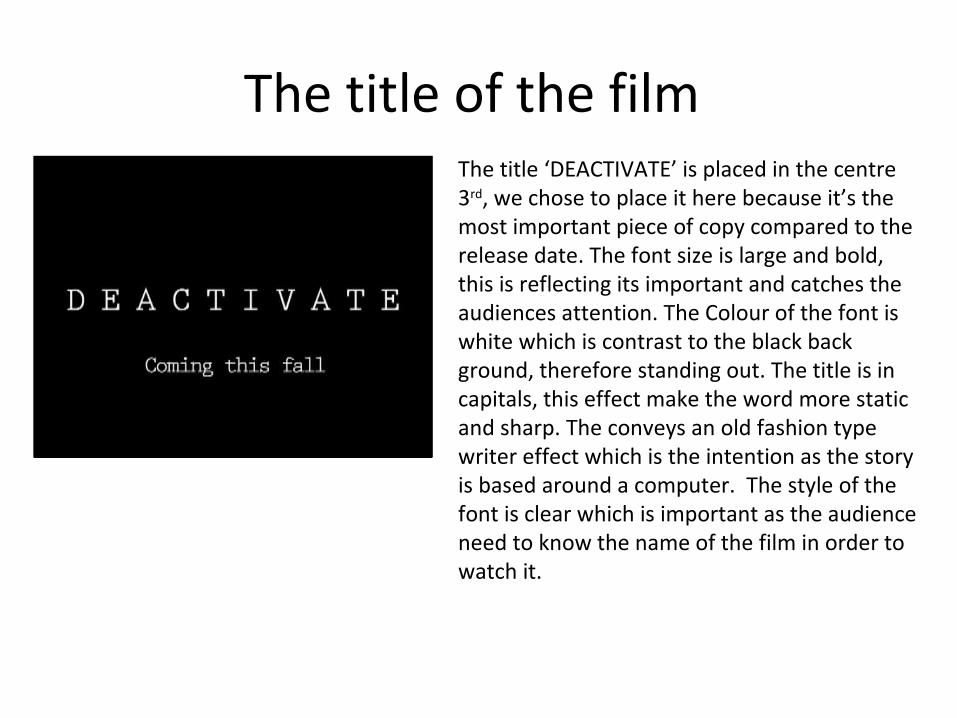
The title of the film The title ‘DEACTIVATE’ is placed in the centre 3rd, we chose to place it here because it’s the most important piece of copy compared to the release date. The font size is large and bold, this is reflecting its important and catches the audiences attention. The Colour of the font is white which is contrast to the black back ground, therefore standing out. The title is in capitals, this effect make the word more static and sharp. The conveys an old fashion type writer effect which is the intention as the story is based around a computer. The style of the font is clear which is important as the audience need to know the name of the film in order to watch it.

Setting/ location
This setting is of the villains bed room, the character is meant to be emotionless which is why we chose this room. Its extremely plain and doesn't show any of the character personality. This is effective as the audience find it hard to relate to her, making her feel distant. For this shot, the high angle allows the audience to see more of the empty room, this means that the audience are able to gage what type of person she is.
In contrast, the victims room is messy and cluttered, the bed isn’t made and the walls are covered in paper. This room was chosen as the victims location as it shows a stereotypical teenager, this help the audience to relate to the character. In addition this setting is colourful conveying a positive atmosphere. This shot is also at eye level so the audience feel equal to the victim, where as a high angle separates the audience form the character.

Costumes and propsPart of the horror genre used is slasher, in order to portray this sub genre we use a knife covered in blood. This is a stock prop, which the audience can easily recognise, therefore recognising that the film is a slasher. The red blood is also related to slasher films as red is associated with danger and death.
However, in contrast to the knife we used a book. The book is part of the psychological horror, the audience are yet to know the significance of it therefore incising them to watching the film.
One of the main characters (the villain) is dressed all in black. This was chosen because black is closely linked with evil, also the colour black means that little of the characters personality to shown. This makes it more appealing as the audience don’t know what type of persons she is.
However the victim is in a bright blue and yellow cartoon top, this shows that audience that the character is a bit of a joker and an easy target when it comes to horror. The bright colours correspond to the brightly coloured room, showing that the character is a typical outgoing teenager.

Camera workThrough out the first climax, a hand help camera is used. This makes the camera slightly shaky which adds to the slasher horror effect as the audience may become disorientated. In addition this camera shot enables the audience to relate to the villain, with out seeing the villain face. This is effective because in psychological horror the villain face is rarely seen.
To add a wide range to camera angles, used a worms eye view. When the book falls on top of the camera the audience understand how important it is, and the significance it will play later on in the film.
During the second climax, (murder scene) a canted angle is used, this angle is different compared to the normal viewing window. This angle cuts off the ‘normal’ viewing corner, this means the audience have to fill in the blanks and guess what might happen next. This is effective at it increases anticipation.
Another effect we created using the camera was a sharp tilt to the left, we created this by placing the camera on the tripod so the tilt effect worked side to side instead of forward and backwards. This means that the camera could almost fall to the side to cut a scene off quickly. This way effective as the audience couldn’t see the action on screen and allowed for a quick transition into black.

editing
Throughout the trailer we used fades and cross cutting to create consistency, one example of this is above. The first frame fades, whilst the second appears for a short amount of time they both look transparent then it moves onto the next frame. This helps to make the trailer less jumpy.
Also, to show the audience important information we create inserts using Photoshop. These were then placed into the trailer, here we could chose to fade them in or out.

Story and how the opening sets it upThe story is based around a girl, who finds an old book which contains nasty messages from her childhood, she seeks revenge on her bullies.
Seeing as the film is based around events from the characters childhood, we felt it was necessary to include a flash back. We created this by fading the teenagers face and merging it with a younger version. The flashback shows that she is remembering a time when she was bullied, this plays an important part in the development of the story because with out knowing what her childhood was like, the revenge would seem meaningless.

Genre and how the opening suggests it
The opening shows the character circling names in the book, showing that she is planning something. Its almost like a puzzle and both she and the audience are placing the pieces together. The mystery makes this film psychological .
During the opening, text appears and reads ‘ based on a true story’, because the font is simple and not gory this suggests that the film is psychological. The style of the font is similar to a type writer, this suggests that there is a mystery which is psychological.

How characters are introducedThe first character to be introduced is whom we assume is the villain, she is introduced as a emotionless psychopath as she is dressed in dark colours and the character doesn’t speak. She is introduced as someone to likes to keep to themselves, this is why there is a high angle used.
The second character introduced is the first victim. He is introduced as a stereotypical teenager, he is absorbed in some form of game which is why he doesn’t realise he is in danger. The character is a typical messy boy which is why the bed isn’t made, the character was introduced using a pan to the left, this was effective as the audience were able to see his room (personality) before they saw him.
The third and final character to be introduced is the second victim, see is seen running through a door. She is introduced as someone who is running away from her fears therefore she can’t be the last girl standing as she is portrayed as weak. This character is blond which automatically makes the audience think that she isn’t strong and is vulnerable.

Special effect To add to the effect of the flash back, we introduced a vignette. This makes the chosen fames look different from the rest of the trailer. We were able to make the vignette soft of strong, we chose to go in the middle as although we wanted it to look different we still wanted it to flow with the rest of the trailer.
All of the text inserts were faded out, initially they popped up and then it moved onto the next scene, however it looked very static. We kept the pop up to add impact along with a ‘boom’ sound, however we faded it out gradually so the trailer looked consistent.