Presented by: Dr. Husam Arman Quality management: SPC II 1.
51
Presented by: Dr. Husam Arman Quality management: SPC II 1
-
Upload
jayce-herridge -
Category
Documents
-
view
226 -
download
0
Transcript of Presented by: Dr. Husam Arman Quality management: SPC II 1.

Presented by:
Dr. Husam Arman
Quality management: SPC II
1

Histograms do not take into account changes over time.
Control charts can tell us when a process changes
2

Control Chart Applications
Establish state of statistical control
Monitor a process and signal when it goes out of control
Determine process capability
3

Commonly Used Control Charts
Variables data x-bar and R-charts x-bar and s-charts Charts for individuals (x-charts)
Attribute data For “defectives” (p-chart, np-chart) For “defects” (c-chart, u-chart)
4

Control chart functions
Control charts are decision-making tools - they provide an economic basis for deciding whether to alter a process or leave it alone
Control charts are problem-solving tools - they provide a basis on which to formulate improvement actions
SPC exposes problems; it does not solve them!
5

Control charts
Control charts are powerful aids to understanding the performance of a process over time.
PROCESS
Input Output
What’s causing variability?6

Control charts identify variation
Chance causes - “common cause” inherent to the process or random and not
controllable if only common cause present, the process is
considered stable or “in control” Assignable causes - “special cause”
variation due to outside influences if present, the process is “out of control”
7

Common Causes
Special Causes
8

Control charts help us learn more about processes Separate common and special causes of
variation Determine whether a process is in a state of
statistical control or out-of-control Estimate the process parameters (mean,
variation) and assess the performance of a process or its capability
9

Control charts to monitor processes To monitor output, we use a control chart
we check things like the mean, range, standard deviation
To monitor a process, we typically use two control charts mean (or some other central tendency
measure) variation (typically using range or standard
deviation)
10
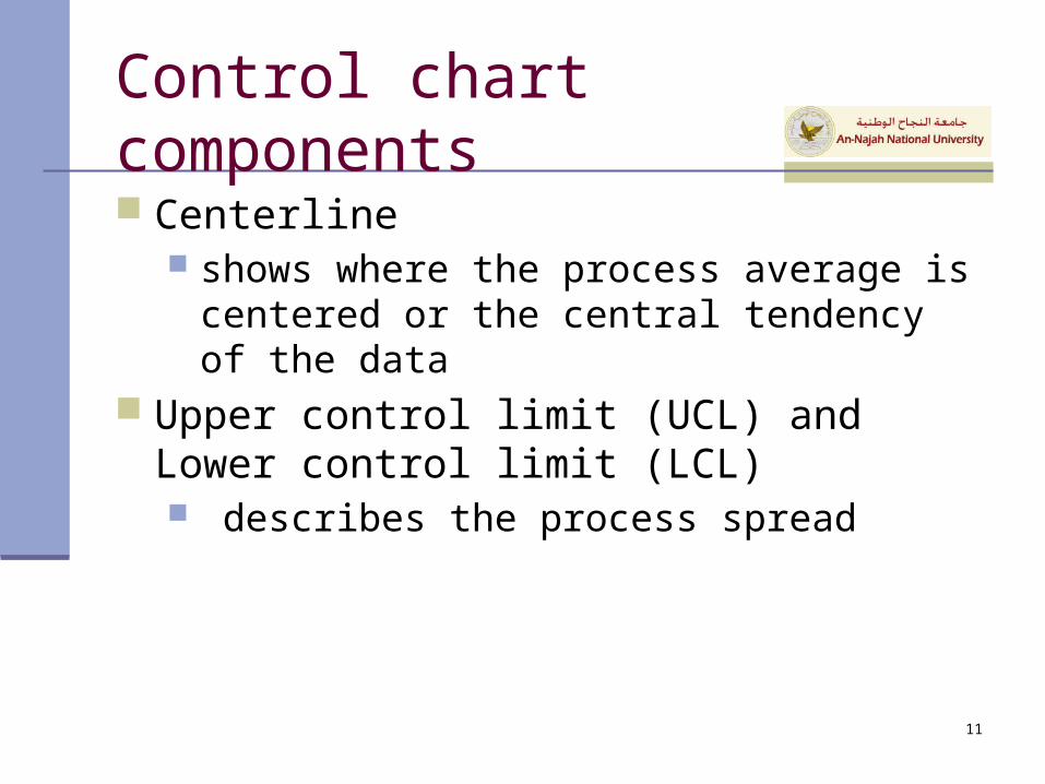
Control chart components
Centerline shows where the process average is centered
or the central tendency of the data Upper control limit (UCL) and Lower control
limit (LCL) describes the process spread
11

Control charts are practical tools to monitor the evolution of production processes.
In any production process a certain amount of natural variability will always exist (this is the cumulative effect of small and unavoidable causes)
A process that is operating in the presence of chance causes of variation only is said to be in statistical control.
Control chart
12

A process that is operating in the presence of assignable causes (sources of variability that are not part of the chance causes) is said to be out of control.
Three main sources of assignable causes:
1) improperly adjusted or controlled machines (or failures);
2) operator errors;
3) defective raw materials.
Control chart
13

A control chart contains A center line (CL) An upper control limit
(UCL) A lower control limit (LCL)
(LCL)
(UCL)
(CL)
Control limits are different from specification limits
Control chart
14

A point that plots within the control limits indicates that the process is in control → no action is necessary
A point that plots outside the control limits is evidence that the process is out of control
→ Investigation and corrective action are required to find and eliminate assignable cause(s)
There is a close connection between control charts and hypothesis testing (to test if the process is in a state of statistical control: we can fail to reject or reject this hypothesis)
(LCL)
(UCL)
(CL)Basic criterion
15

… in general we use L=3 → ±3·sw control limits16

Three standard deviations
99.73%
3 3
17

One of the two main types of control charts is chart for VARIABLES (quality characteristics measured on a numerical scale; e.g. geometrical dimensions, weights, tensile strengths…)
- (mean) control charts
- R (range) control charts
- s2 (sample variance) control charts
- s (sample standard deviation) control charts
- xi (control charts for individual measurements)
x
Control chart
18

Control chart for variables (Ch 5)
Variables are the measurable characteristics of a product or service.
Measurement data is taken and arrayed on charts.
19

X-bar and R charts
The X-bar chart - used to detect changes in the mean between subgroups tests central tendency or location effects
The R chart - used to detect changes in variation within subgroups tests dispersion effects
20
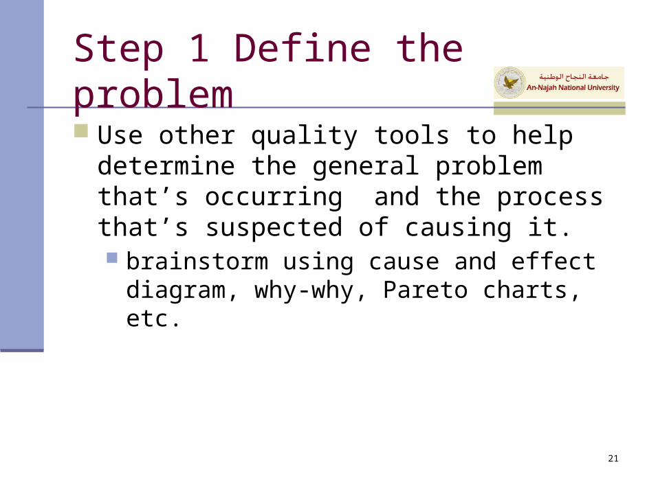
Step 1 Define the problem
Use other quality tools to help determine the general problem that’s occurring and the process that’s suspected of causing it. brainstorm using cause and effect diagram,
why-why, Pareto charts, etc.
21

Step 2 Select a quality characteristic to be measured Identify a characteristic to study - for
example, part length or any other variable affecting performance typically choose characteristics which are
creating quality problems possible characteristics include: length, height,
viscosity, temperature, velocity, weight, volume, density, etc.
22
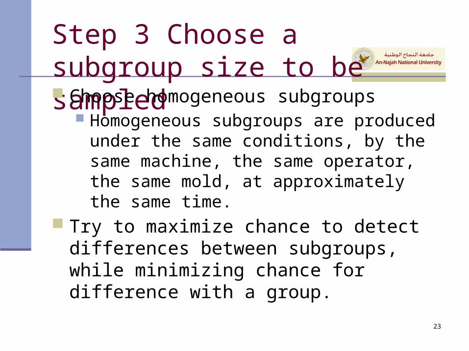
Step 3 Choose a subgroup size to be sampled Choose homogeneous subgroups
Homogeneous subgroups are produced under the same conditions, by the same machine, the same operator, the same mold, at approximately the same time.
Try to maximize chance to detect differences between subgroups, while minimizing chance for difference with a group.
23

Other guidelines
The larger the subgroup size, the more sensitive the chart becomes to small variations in the process average.
This increases data collection costs. Destructive testing may make large
subgroup sizes infeasible. Subgroup sizes smaller than 4 aren’t
representative of the distribution averages. Subgroups over 10 should use S chart.
24

Step 4 Collect the data
Run the process untouched to gather initial data for control limits.
Generally, collect 20-25 subgroups (100 total samples) before calculating the control limits.
Each time a subgroup of sample size n is taken, an average is calculated for the subgroup and plotted on the control chart.
25

Step 5 Determine trial centerline for the Xbar chart
The centerline should be the population mean, Since it is unknown, we use X double bar, or the
grand average of the subgroup averages.
m
m
i
i 1
XX
26

1 2 3 m
1 2 3 m
x x x ... xgrand average x
mR R R ... R
mean range Rm
1) x11, x12, … , x1n R1
2) x21, x22, … , x2n R2
......
...
m) xm1, xm2, … , xmn
Rm
1x
2x
mx
27

Step 6 Determine trial control limits - Xbar chart The normal curve displays the distribution of
the sample averages. A control chart is a time-dependent pictorial
representation of a normal curve. Processes that are considered under control
will have 99.73% of their graphed averages fall within six standard deviations.
28
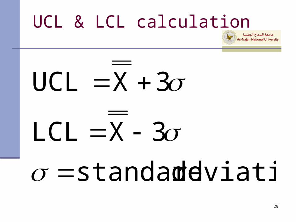
UCL & LCL calculation
deviation standard
3XLCL
3XUCL
29

Determining an alternative value for the standard deviation (Xbar chart)
XCL RAXUCL 2X
RAXLCL 2X
30

Step 7 Determine trial control limits - R chart The range chart shows the spread or
dispersion of the individual samples within the subgroup. If the product shows a wide spread, then the
individuals within the subgroup are not similar to each other.
Equal averages can be deceiving. Calculated similar to x-bar charts;
Use D3 & D4
31

R-chart
m
m
ii
1
RR
RR 3UCLR RR 3LCLR
32

Determining an alternative value for the standard deviation (R chart)
m
m
ii
1
RR
RDUCL 4R RDLCL 3R
33

Example
34

R-bar chart exceptions
Because range values cannot be negative, a value of 0 is given for the lower control limit of sample sizes of six or less (see D3 value in the previous table).
35

Step 8 Examine the process - Interpret the charts
A process is considered to be stable and in a state of control, or under control, when the performance of the process falls within the statistically calculated control limits and exhibits only chance, or common causes.
36

Consequences of misinterpreting the process Blaming people for problems that they
can’t control Spending time and money looking for
problems that do not exist Spending time and money on unnecessary
process adjustments Taking action where no action is warranted Asking for worker-related improvements
when process improvements are needed first 37

Process variation
When a system is subject to only chance causes of variation, 99.73% of the measurements will fall within 3 standard deviations If 1000 subgroups are measured, 997 will fall
within the six sigma limits.
38

Chart zones
Based on our knowledge of the normal curve, a control chart exhibits a state of control when:
1. Two thirds of all points are near the center value.
2. A few of the points are on or near the center value
3. The points appear to float back and forth across the centerline.
4. The points are balanced on both sides of the centerline.
5. No points beyond the control limits.
6. No patterns or trends.39

Identifying patterns
Sudden shift in the process average Cycles Trends
40

Shift in Process Average
41

Identifying Potential Shifts
42

Cycles
43

Trend
44

Step 9 Revise the charts
In certain cases, control limits are revised because: out-of-control points were included in the
calculation of the control limits. The process is in-control but the within
subgroup variation significantly improves.
45

Revising the charts
Interpret the original charts Isolate the causes Take corrective action Revise the chart
Only remove points for which you can determine an assignable cause
46

Step 10 Achieve the purpose
Our goal is to decrease the variation inherent in a process over time.
As we improve the process, the spread of the data will continue to decrease.
Quality improves!!
47

Charts for Attributes
Fraction nonconforming (p-chart) Fixed sample size Variable sample size
np-chart for number nonconforming
Charts for defects c-chart u-chart
48

Control Chart Selection
Quality Characteristic
variable attribute
n>1?
n>=10 ?
x and MRno
yes
x and s
x and Rno
yes
defective defect
constant sample size?
p-chart withvariable samplesize
no
p ornp
yes constantsampling unit?
c u
yes no
49

Control Chart Design Issues
Basis for samplingSample sizeFrequency of samplingLocation of control limits
50

SPC Implementation Requirements
Top management commitmentProject championInitial workable projectEmployee education and trainingAccurate measurement system
51