Presentation1
22
Question 1 : In what ways does your media product use, develop or challenge forms and conventions of real media products? Here I have presented existing media products and listed the conventions I identified in the research stage of my blog. I have then used a tick and cross system to see which conventions I followed or did not follow in my own media products. Any conventions that I previously identified
-
Upload
jemmajemmajemma -
Category
Entertainment & Humor
-
view
41 -
download
0
Transcript of Presentation1

Question 1 : In what ways does your media product use, develop
or challenge forms and conventions of real media
products?
Here I have presented existing media products and listed the conventions I identified in the research stage of my blog. I have
then used a tick and cross system to see which conventions I followed or did not follow in my own media products. Any
conventions that I previously identified that I did not follow I have explained my reasons for not following.

Conventions of these magazine covers:
. Big, bold masthead often in the color red
. Issue info and price under masthead
. Main cover lines bigger and bolder than other text
. Cover lines on the left of the page in a list style layout
. Barcodes
. The same color scheme is often used for the whole cover
. Main character is featured
. Quotes from the films featured on cover, not much plot info revealed from cover.

Identified conventions of the magazine covers on the first slide:
. Big, bold masthead often in the color red
. Issue info and price under masthead
. Main cover lines bigger and bolder than other text
. Cover lines on the left of the page in a list style layout
. Barcodes
. The same color scheme is often used for the whole cover
. Main character is featured
. Quotes from the films featured on cover, not much plot info revealed from cover.
KEY:I have followed these conventions:
I have not followed these conventions:
My Magazine cover:

What convention/s did I not follow in my magazine cover?
Big, bold masthead often in the color red
Why did I not follow this convention?I chose not to follow the convention and make my masthead red because I did not think that the masthead would stand out enough if it was colored
red. I have however, made my masthead big and bold and positioned it in the top
center of my magazine cover which therefore does follow conventions.
Any other conventions that I have challenged/followed?
I have followed several other conventions which I did not initially identify in the research stage, these conventions are:
. Textured background (Several of the magazine covers I have featured on the 2nd slide feature smoke/textured effect backgrounds) this conveys the genre of horror more.
I have used puffs/plugs and tag lines to entice the reader and therefore allow my product to carry out its purpose.
I have challenged another convention, regarding ethnicity. All of the magazine covers featured on the 2nd slide feature white actors. I have decided to feature a black actor. This
is positive as it is suggesting that black actors are just as good as white actors and suggests equality.
An example of a cover with a textured background similar to the one I have used.

Conventions of these film posters:. All of the posters either feature stills from the film or photography based on the film
. All of the posters have a black background or a black banner with white text on it. Also, the film title is nearly always in the color red. The film title is also bigger than the other text
. Most of the posters feature either a character and/or a location from the film on them.
. Most of the posters feature a slogan or quote from the film.
.The posters always have the actors names and company names at the bottom of the poster
. Characters are shown conveying emotion
. Dull, black and white, un-emotive colors are used for most of the poster apart from certain parts of the image or text which is meant to be more important or more noticeable than others.

Conventions of the film posters on the third slide:
.
KEY:I have followed these conventions:
I have not followed these conventions:
My film poster:
. Feature stills from the film or photography based on the film
. All of the posters have a black background or a black banner with white text on it. Also, the film title is nearly always in the color red. The film title is also bigger than the other text
. Most of the posters feature either a character and/or a location from the film on them.
. Most of the posters feature a slogan or quote from the film.
.The posters always have the actors names and company names at the bottom of the poster
. Characters are shown conveying emotion
. Dull, black and white, un-emotive colors are used for most of the poster apart from certain parts of the image or text which is meant to be more important or more noticeable than others.

What convention/s did I not follow in my film poster?
Why did I not follow this convention?
Any other conventions that I have challenged/followed?
Characters are shown conveying emotion
I have photographed from the rear of my characters therefore their faces are not visible so there is no obvious emotion conveyed. Emotion is still conveyed however, as the black & white filter and the red text conveys the genre and emotions associated with horror. Where there is no obvious emotion, it also leaves the viewer to guess what emotions the character is feeling making it more personal and involving to the viewer.
I took major influence from the funny games poster (Right).
Most horror film posters have a fairly plain/blank background however I chose to incorporate the film location into the poster also. Although this is not challenging conventions a such, the majority of horror film posters do have a plain background.Not many of the posters feature the cinema release date on them. I have, however, chosen to do this. I took reference from the funny games poster.
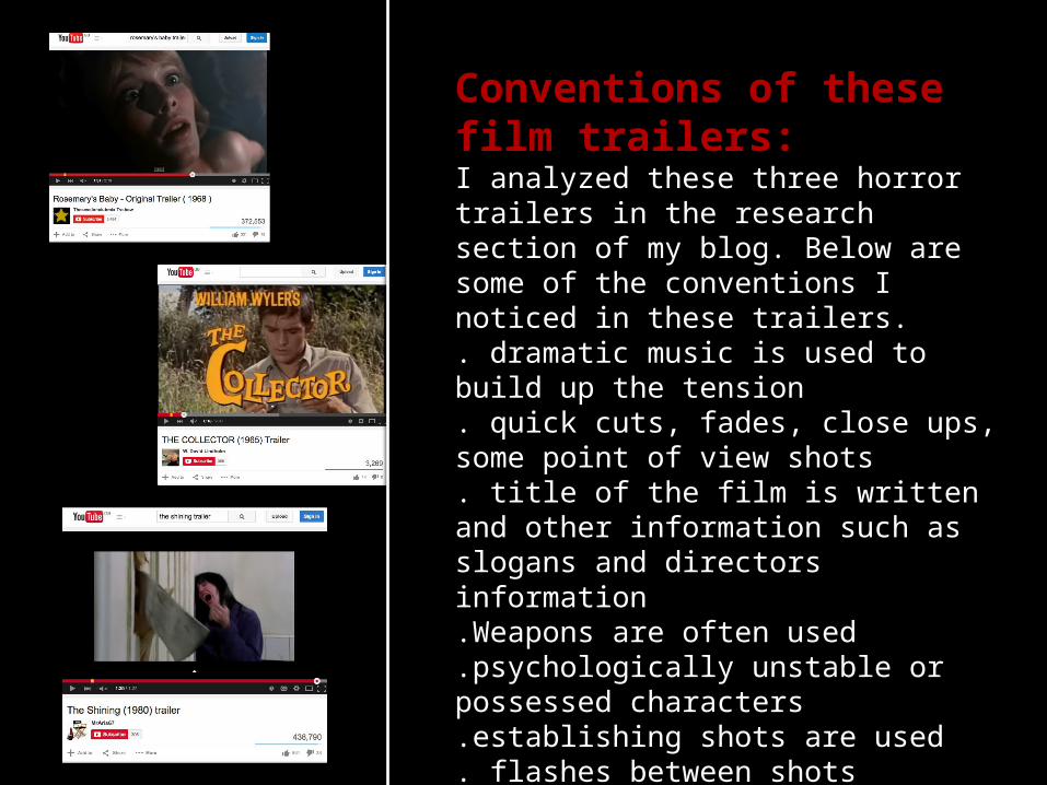
Conventions of these film trailers:I analyzed these three horror trailers in the research section of my blog. Below are some of the conventions I noticed in these trailers.. dramatic music is used to build up the tension . quick cuts, fades, close ups, some point of view shots. title of the film is written and other information such as slogans and directors information.Weapons are often used.psychologically unstable or possessed characters.establishing shots are used. flashes between shots

Analyzing my trailer and comparing it to the shining and
rosemary’s baby trailers:

We placed an establishing shot at the beginning the same as the type of shot used in the shining (below) scary music also starts.
We placed a title screen at the start of the trailer to tell the audience what the video is and who it is suitable for. These screens are common in the film industry however are not as conventional for being placed in trailers.

We used a shot of paintings on a wall similar to the shot from rosemary’s baby (below) the wall paintings worked well as they had scary faces in which conveys the horror genre.
We placed a series of shots of the interior acting as establishing shots at the start and throughout the trailer, this allowed the audience to get to know the location and therefore start to work out the plot. Lots of interior shots are present in the shining trailer.

These shots act as a narrator and the dialogue reveals the plot in a similar way to the shining trailer. This allows the audience to get an idea of the plot. It also allows the audience to familiarize themselves with the characters. This scene is similar to the scene in the shining trailer where the men are talking in the room and discussing bad things that have happened.
We added a shot of the production company’s logo, the same as the type of shot used in the shining (below) and rosemary’s baby.

This shot shows the characters going up the stairs, we used jumpy editing to speed the clip up and produce an effect conveying the genre.
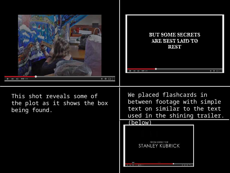
We placed flashcards in between footage with simple text on similar to the text used in the shining trailer. (below)
We placed flashcards in between footage with simple text on similar to the text used in the shining trailer. (below)
This shot reveals some of the plot as it shows the box being found.
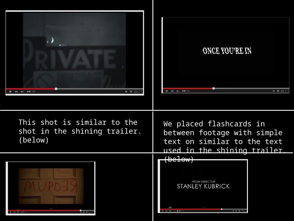
We placed flashcards in between footage with simple text on similar to the text used in the shining trailer. (below)
This shot is similar to the shot in the shining trailer. (below)

We placed flashcards in between footage with simple text on similar to the text used in the shining trailer. (below)
This shot also reveals more plot to the viewer.

We placed flashcards in between footage with simple text on similar to the text used in the shining trailer. (below)
This shot is in black and white which conveys the genre conventions of horror.
The screams are also a conventional feature of horror films.

This shot suggests the idea of death. The outline signifies that there was a person lying there or that this is a crime scene. This reveals more plot to the audience.
We used an over the shoulder shot like in the shining trailer. (below)
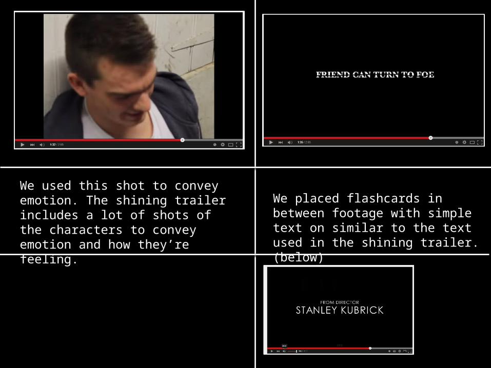
We placed flashcards in between footage with simple text on similar to the text used in the shining trailer. (below)
We used this shot to convey emotion. The shining trailer includes a lot of shots of the characters to convey emotion and how they’re feeling.
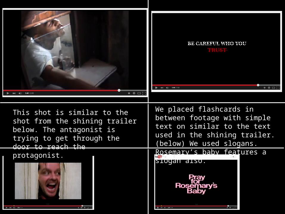
We placed flashcards in between footage with simple text on similar to the text used in the shining trailer. (below) We used slogans. Rosemary’s baby features a slogan also.
This shot is similar to the shot from the shining trailer below. The antagonist is trying to get through the door to reach the protagonist.

We placed flashcards to tell the audience what the title of the film is and other important information. We placed a hashtag and social media links so the target audience can find out more about the film. We placed this at the end of the trailer which is conventional.
This shot is used at the end. This is our final scare, along with the screech sound effect and the words don’t get lost. The idea of having a final scare is conventional in horror trailers. This shot also shows the characters making eye contact with the camera and audience. This is conventional and is done in the shining trailer (below)

Conventions of the real film trailers I looked at:
KEY:I have followed these conventions:
I have not followed these conventions:
My film trailer:
. Dramatic music
. quick cuts, fades, close ups, some point of view shots. title of the film is written and other information such as slogans and directors information.Weapons are often used.psychologically unstable or possessed characters.establishing shots are used. flashes between shots
Any other conventions that I have challenged/followed?
We have used a green title screen. This is conventional in the film industry before a film but is not conventional before a trailer. This suggests we have followed but also challenged this convention.In the last shot we followed the “last scare” convention and also the characters made eye contact with the viewer which is also conventional.We have also used the color scheme of red, black and white which are genre conventions.We have used fades in between shots and in the beginning in the establishing shot the shot flickers and flashes as it cuts.We use a series of shots towards the end which are very fast paced and the music has a screeching sound to it, this builds suspense and adds drama. The fast paced series of shots is a conventional sequence used in horror trailers.