Presentation Web Design: The Bad, the Ugly and the Good
14
Presentation eb Design: The Bad, the Ugly and the Presented by: Mark Benja
-
Upload
acton-pruitt -
Category
Documents
-
view
35 -
download
0
description
Presentation Web Design: The Bad, the Ugly and the Good. Presented by: Mark Benja. Overview. Overview. E lement Placement – Graphics, Text, White Space and Navigation E ye Appeal – Contrast, Colors and Readability E xpectations – Does the website match my expectations? - PowerPoint PPT Presentation
Transcript of Presentation Web Design: The Bad, the Ugly and the Good

Presentation Web Design: The Bad, the Ugly and the Good
Presented by:Mark Benja

OverviewOverview
Element Placement – Graphics, Text, White Space and Navigation
Eye Appeal – Contrast, Colors and Readability
Expectations – Does the website match my expectations?
Extras – Flash = Evil, 3-Clicks Rule, Site Maps, Mystery Meat Navigation and really Bad Websites
4E
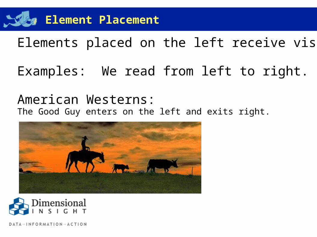
OverviewElement Placement
Elements placed on the left receive visual priority.
Examples: We read from left to right.
American Westerns:The Good Guy enters on the left and exits right.
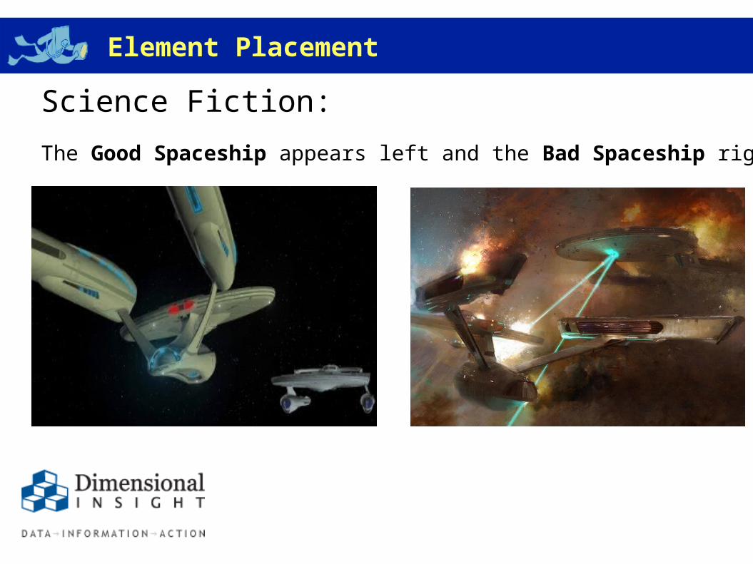
OverviewElement Placement
Science Fiction:
The Good Spaceship appears left and the Bad Spaceship right.
OverviewElement Placement
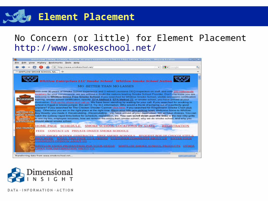
No Concern (or little) for Element Placementhttp://www.smokeschool.net/
OverviewElement Placement
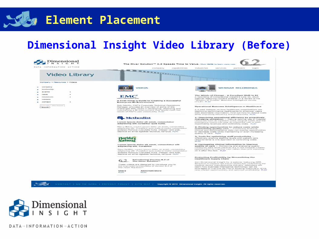
Dimensional Insight Video Library (Before)
OverviewElement Placement
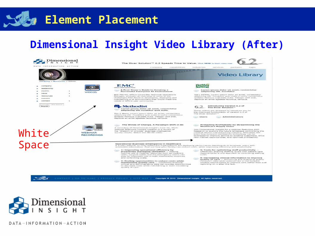
Dimensional Insight Video Library (After)
WhiteSpace
OverviewEye Appeal
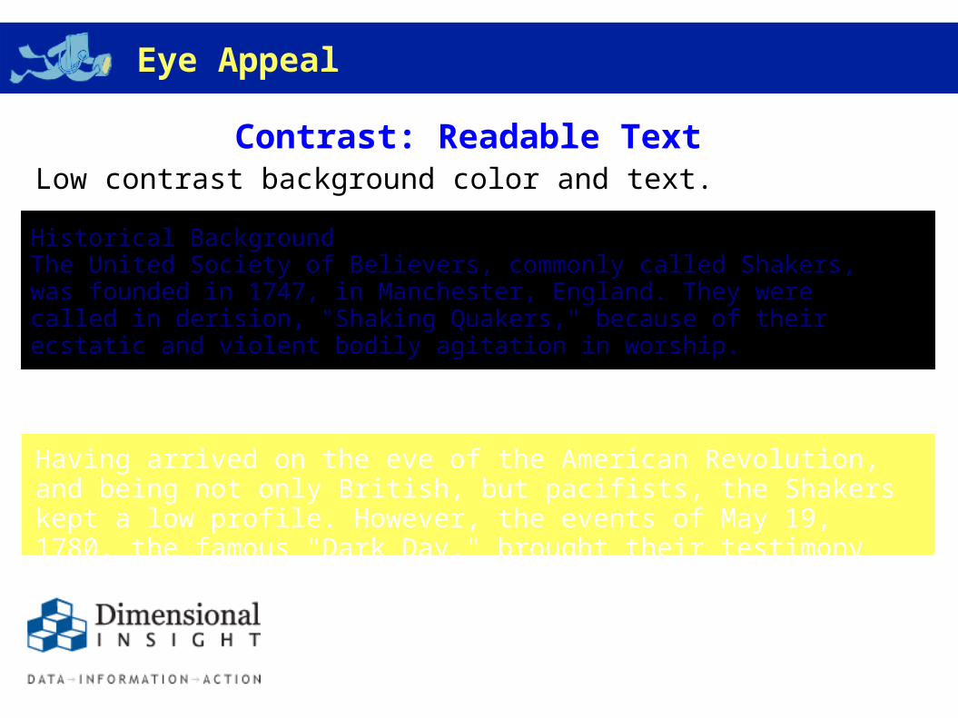
Contrast: Readable Text Low contrast background color and text.
Historical Background The United Society of Believers, commonly called Shakers, was founded in 1747, in Manchester, England. They were called in derision, "Shaking Quakers," because of their ecstatic and violent bodily agitation in worship.
Having arrived on the eve of the American Revolution, and being not only British, but pacifists, the Shakers kept a low profile. However, the events of May 19, 1780, the famous "Dark Day," brought their testimony to the public.
OverviewEye Appeal
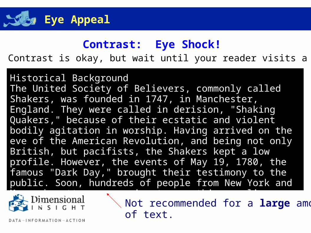
Contrast: Eye Shock! Contrast is okay, but wait until your reader visits a black on white site!
Historical Background The United Society of Believers, commonly called Shakers, was founded in 1747, in Manchester, England. They were called in derision, "Shaking Quakers," because of their ecstatic and violent bodily agitation in worship. Having arrived on the eve of the American Revolution, and being not only British, but pacifists, the Shakers kept a low profile. However, the events of May 19, 1780, the famous "Dark Day," brought their testimony to the public. Soon, hundreds of people from New York and Massachusetts were coming to see this peculiar people.
Not recommended for a large amount of text.
OverviewEye Appeal
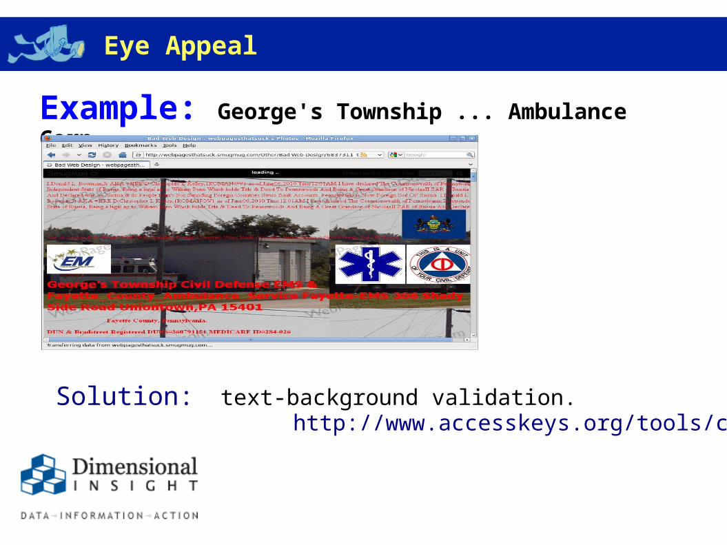
Example: George's Township ... Ambulance Corp.
Solution: text-background validation. http://www.accesskeys.org/tools/color-contrast.html
OverviewExpectations
The website should correctly reflect the company's business and match the viewer's expectations.
Thoughts on skiing?

OverviewExpectations
Skiing Samples:
Bad (rentals and lodging):http://www.ski-utah-rentals.com/
Ugly (kind of):http://www.bluemountain.ca/
Better:http://www.snowshoemtn.com/index.htm
Best:http://www.parkcitymountain.com

OverviewExtras
1. Flash = Evil: The Web suffered during Flash's reign.
2. 3-Clicks-to-Buy: Optimizing an e-commerce site to provide a customer with all the necessary information to make a purchase in 3-4 clicks.
3. Site Maps: A website is dysfunctional if a user needs to use Google to find information buried inside.
4. Mystery Meat Navigation (MMN): The user needs helpful navigation information.
5. More terrible websites
OverviewConclusion
Place the most important information, graphics or navigation tools to the left. Make the text easy to read. Match the website with the business you do.
? Questions ?