
PRACTICE MODULE DESKTOP PUBLISHING INTRODUCTION TO ADOBE INDESIGN INTRODUCTION TO ADOBE ILLUSTRATOR...
62
PRACTICE MODULE DESKTOP PUBLISHING INTRODUCTION TO ADOBE INDESIGN INTRODUCTION TO ADOBE ILLUSTRATOR Prepared by: Ambang Priyonggo, S.S., M.A.
-
Upload
primrose-brown -
Category
Documents
-
view
227 -
download
4
Transcript of PRACTICE MODULE DESKTOP PUBLISHING INTRODUCTION TO ADOBE INDESIGN INTRODUCTION TO ADOBE ILLUSTRATOR...
PRACTICE MODULEDESKTOP PUBLISHING
INTRODUCTION TO ADOBE INDESIGNINTRODUCTION TO ADOBE ILLUSTRATOR
Prepared by: Ambang Priyonggo, S.S., M.A.
1. ADOBE INDESIGN BASIC
Adobe InDesign
• InDesign really is a brand-new program. It is not a step up from PageMaker. It is not Adobe’s version of QuarkXPress. It is not a multipage Illustrator. It uses pieces and concepts from all of those programs, but the feel of the application is very different.
3
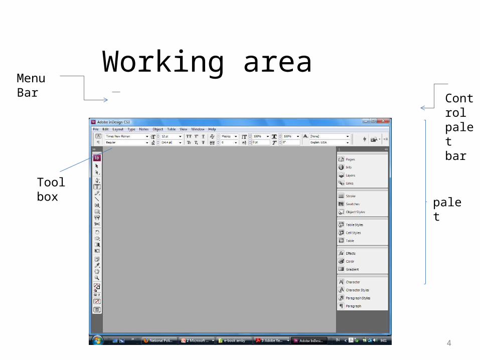
Working area
4
Tool box
palet
Menu Bar Contr
ol palet bar
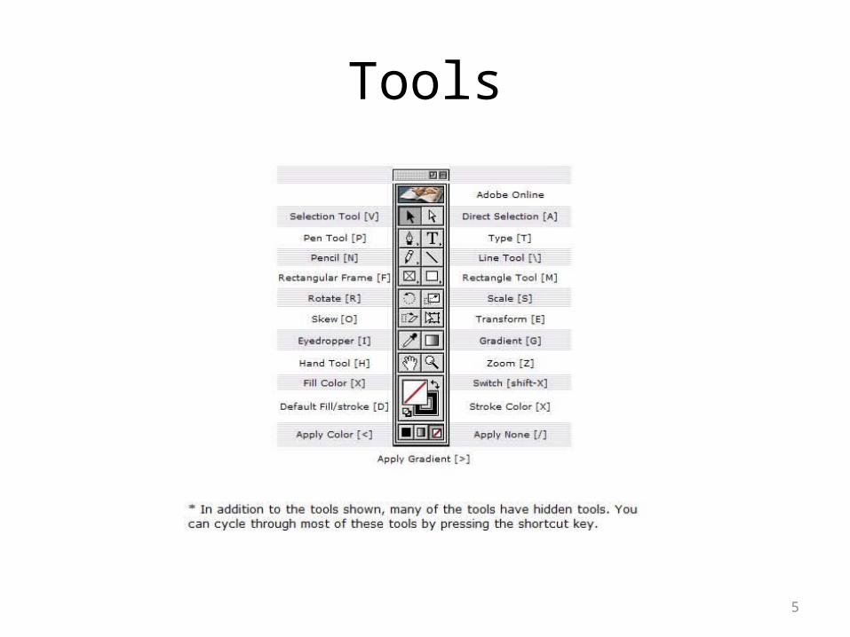
Tools
5
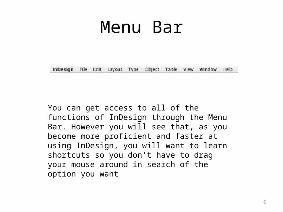
Menu Bar
6
You can get access to all of the functions of InDesign through the Menu Bar. However you will see that, as you become more proficient and faster at using InDesign, you will want to learn shortcuts so you don't have to drag your mouse around in search of the option you want
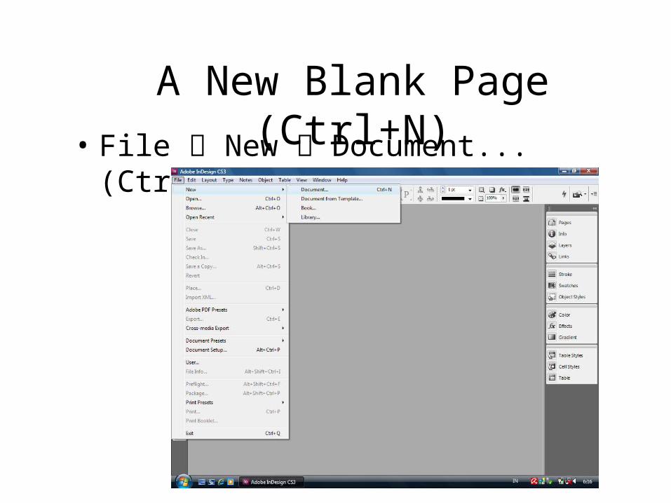
A New Blank Page (Ctrl+N)• File New Document... (Ctrl + N)

Page Size...• After you click, you
will see this kind of window
• You can accustom the number of pages, page size, columns, margin etc in the “new document menu”
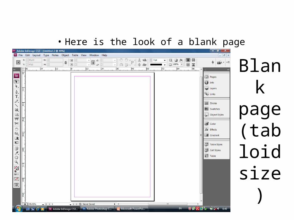
• As a practice, choose ‘tabloid’ size
Blank page
(tabloid size)
• Here is the look of a blank page
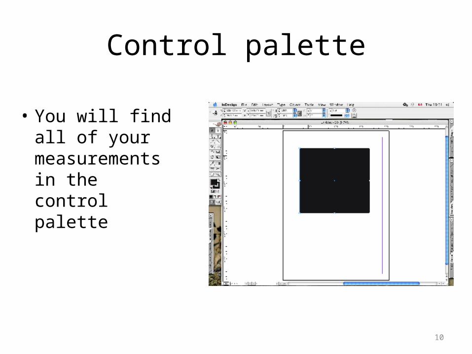
Control palette
• You will find all of your measurements in the control palette
10
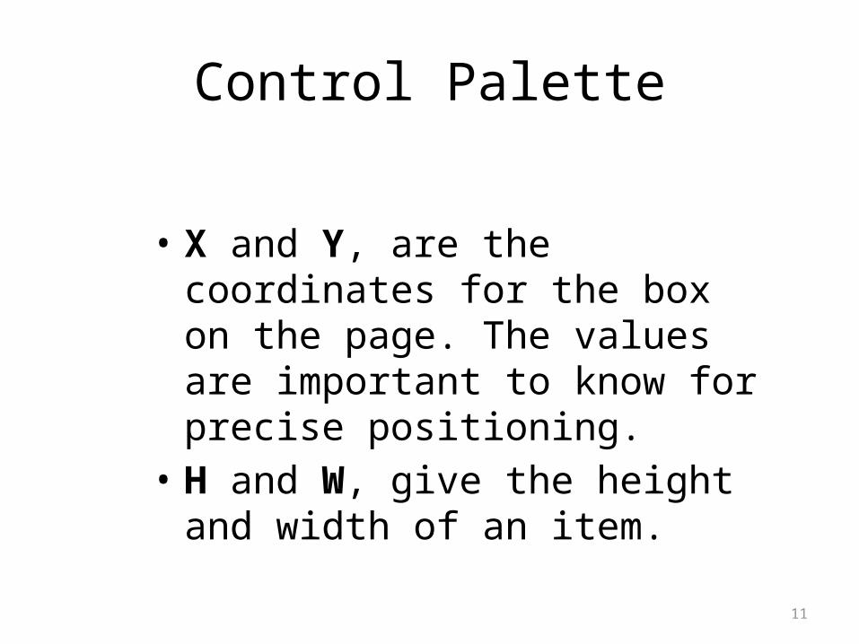
Control Palette
• X and Y, are the coordinates for the box on the page. The values are important to know for precise positioning.
• H and W, give the height and width of an item.
11
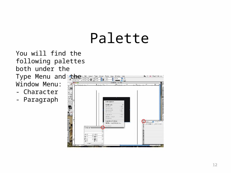
Palette
12
You will find the following palettes both under the Type Menu and the Window Menu:- Character - Paragraph
Pallete
These palettes are only under the Window Menu: • Align, Colour, Control (which is the same Control Palette
we discussed earlier), Gradient,Info, Layers, Links, Navigator, Flattener (Window > Output Preview), Separations (Window > Output Preview), Pages,Stroke,Swatches,Tools,Transform,Transparency, Character Styles (Window > Type & Tables),Paragraph Styles (Window > Type & Tables),Table (Window > Type & Tables),Text Wrap And we obviously also have the black sheep: the Library palette, which is under File > New > Library.
13
Further Readings
• How to Do Everything: Adobe InDesign CS4, chapter 1 and 3
• Teknik Profesional Adobe InDesign CS2. Chapter 1
14
2. ADOBE IN DESIGN TEXT
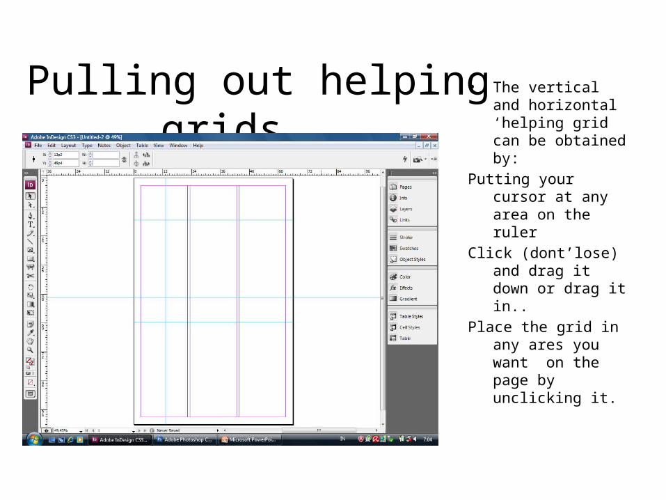
Pulling out helping grids...• The vertical and
horizontal ‘helping grid can be obtained by:
Putting your cursor at any area on the ruler
Click (dont’lose) and drag it down or drag it in..
Place the grid in any ares you want on the page by unclicking it.
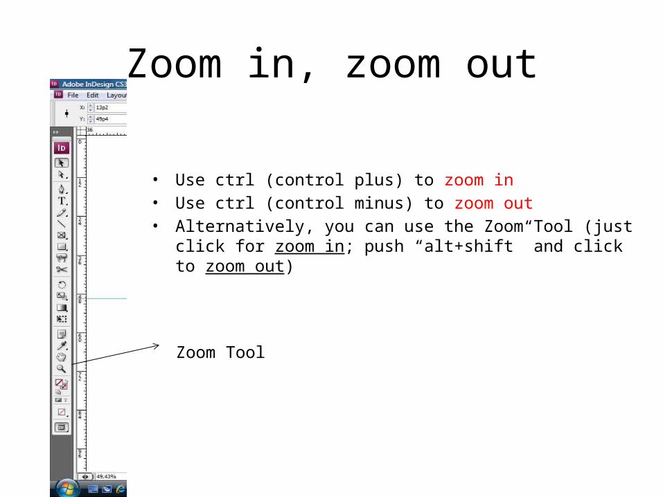
Zoom in, zoom out
• Use ctrl (control plus) to zoom in• Use ctrl (control minus) to zoom out• Alternatively, you can use the Zoom Tool (just click for zoom in; push
“alt+shift” and click to zoom out)
Zoom Tool
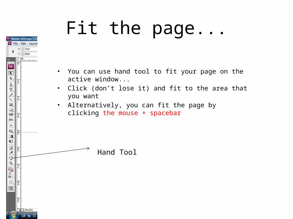
Fit the page...
• You can use hand tool to fit your page on the active window...• Click (don’t lose it) and fit to the area that you want• Alternatively, you can fit the page by clicking the mouse + spacebar
Hand Tool
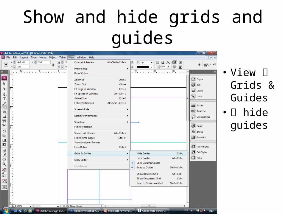
Show and hide grids and guides
• View Grids & Guides
• hide guides
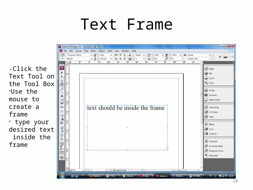
Text Frame
20
-Click the Text Tool on the Tool Box-Use the mouse to create a frame- type your desired text inside the frame
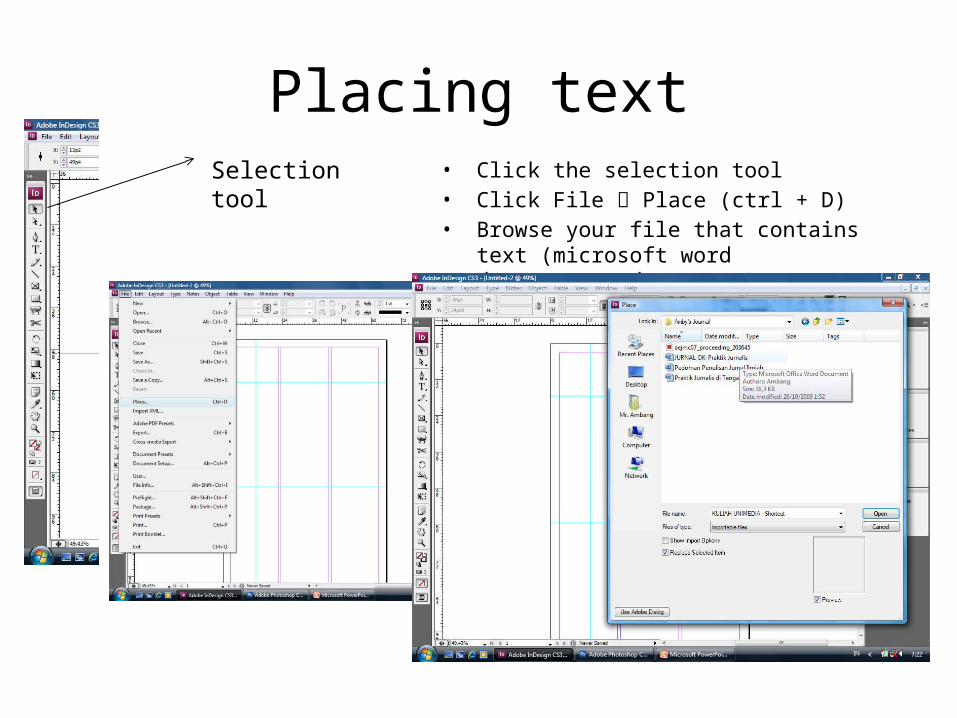
Placing text• Click the selection tool• Click File Place (ctrl + D)• Browse your file that contains text (microsoft word
documents, .doc, .txt)
Selection tool
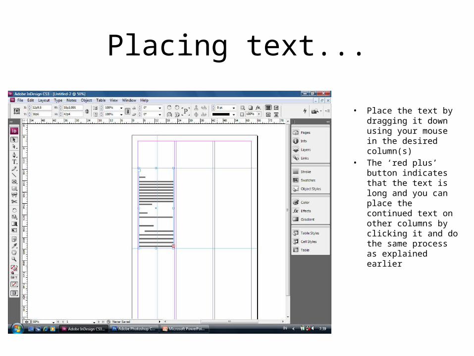
Placing text...
• Place the text by dragging it down using your mouse in the desired column(s)
• The ‘red plus’ button indicates that the text is long and you can place the continued text on other columns by clicking it and do the same process as explained earlier
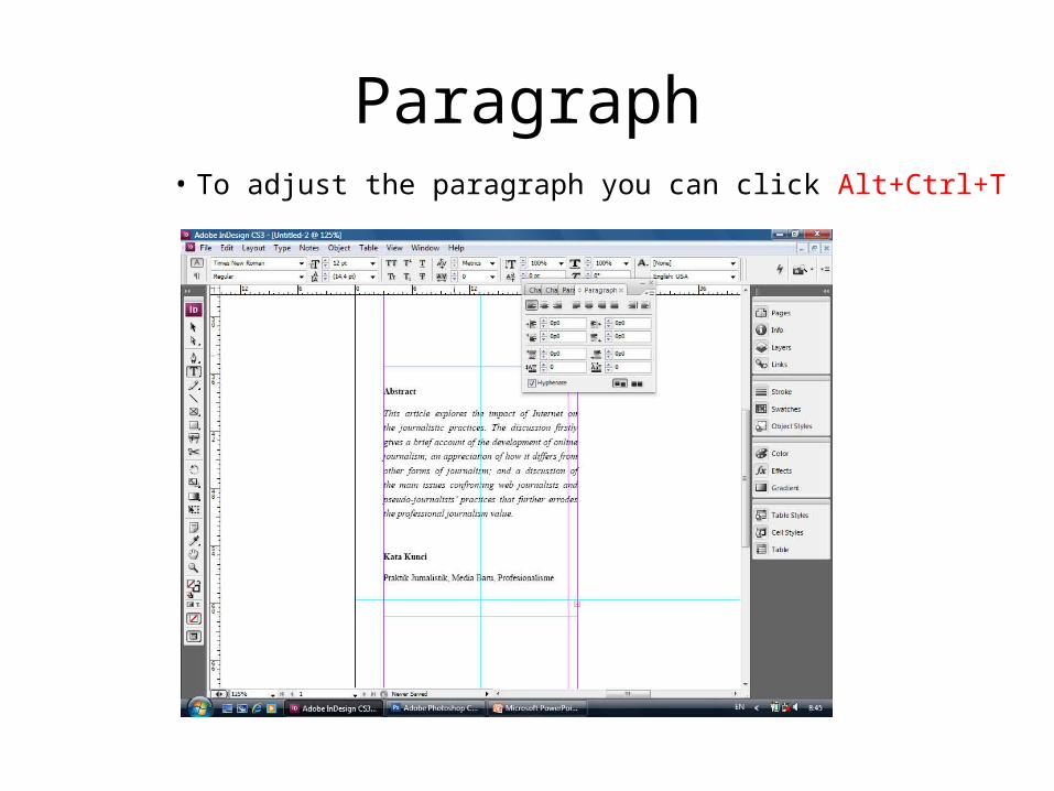
Paragraph• To adjust the paragraph you can click Alt+Ctrl+T
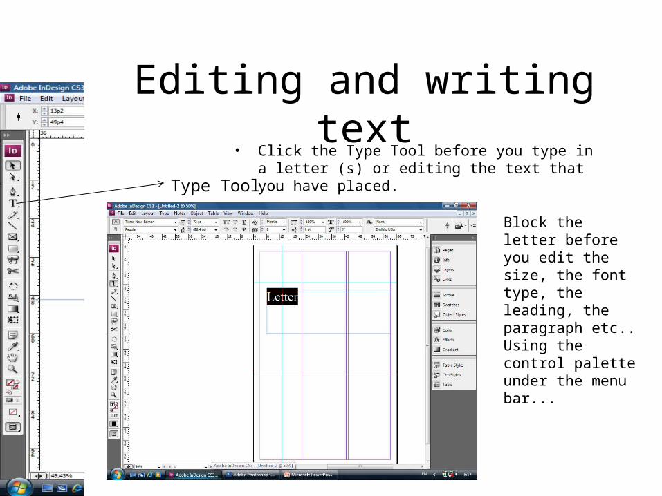
Editing and writing text• Click the Type Tool before you type in a letter (s) or
editing the text that you have placed.Type Tool
Block the letter before you edit the size, the font type, the leading, the paragraph etc.. Using the control palette under the menu bar...
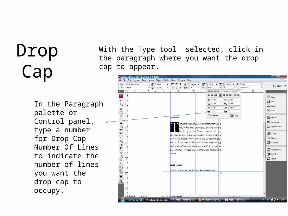
Drop CapWith the Type tool selected, click in the paragraph where you want the drop cap to appear.
In the Paragraph palette or Control panel, type a number for Drop Cap Number Of Lines to indicate the number of lines you want the drop cap to occupy.
3. ADOBE INDESIGN TEXT EFFECT
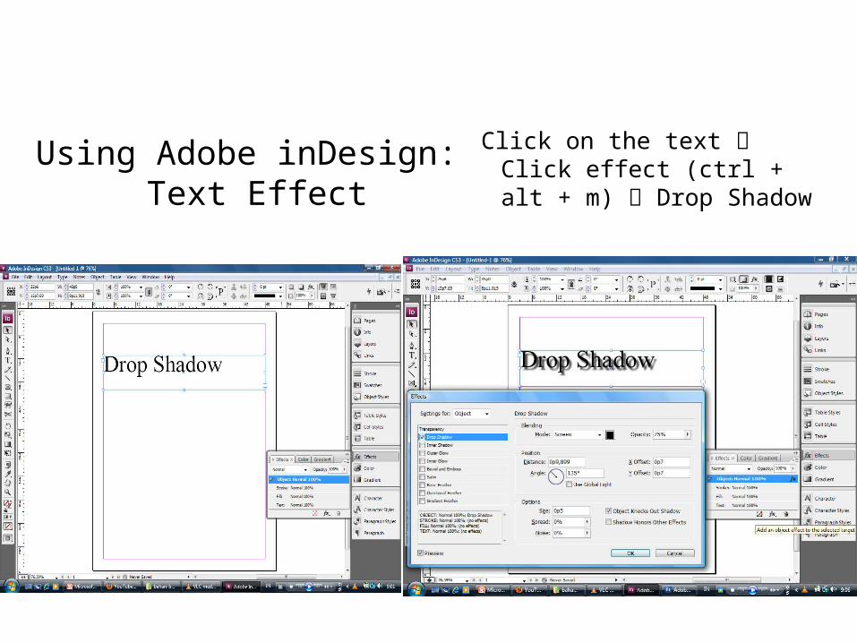
Using Adobe inDesign: Text Effect
Click on the text Click effect (ctrl + alt + m) Drop Shadow
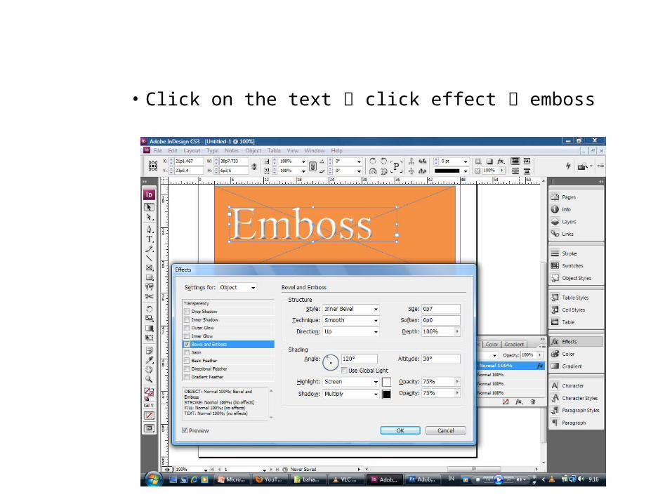
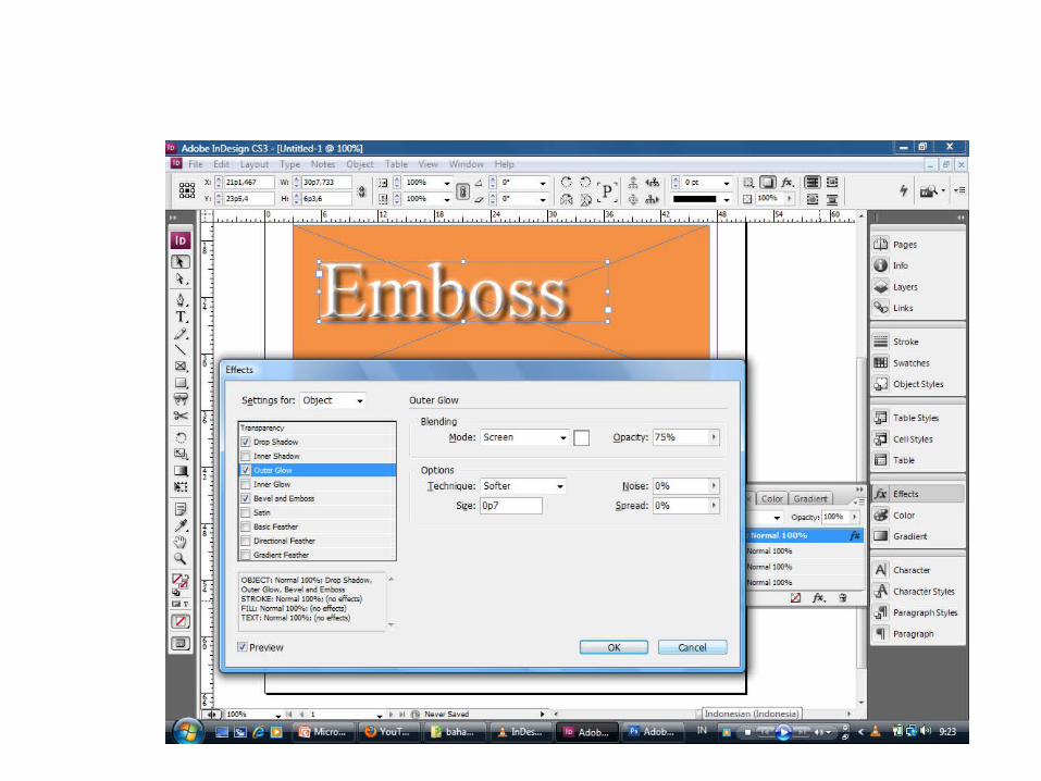
• Click on the text click effect emboss
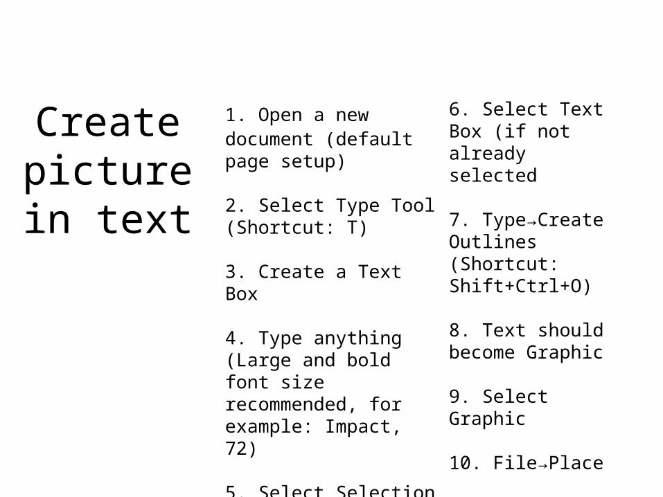
Create picture in
text
1. Open a new document (default page setup)
2. Select Type Tool (Shortcut: T)
3. Create a Text Box
4. Type anything (Large and bold font size recommended, for example: Impact, 72)
5. Select Selection Tool
6. Select Text Box (if not already selected
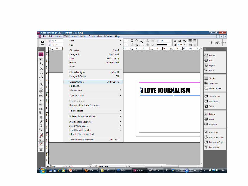
7. Type→Create Outlines (Shortcut: Shift+Ctrl+O)
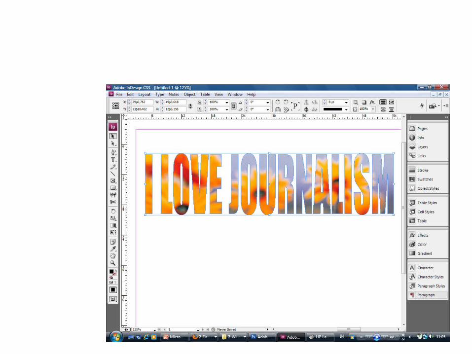
8. Text should become Graphic
9. Select Graphic
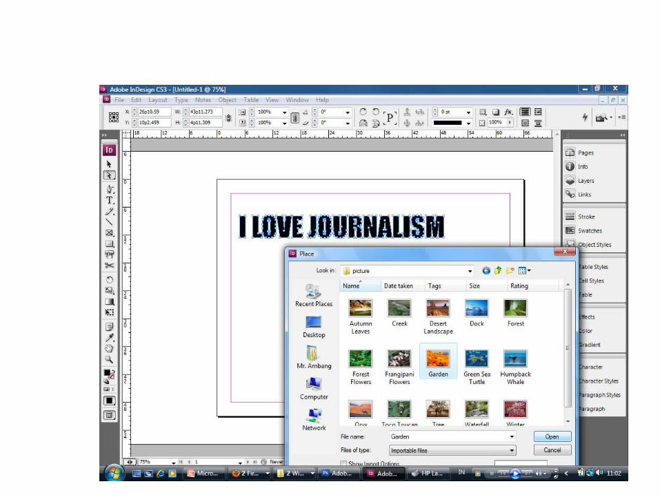
10. File→Place
11. Select Image of Choice
4. ADOBE INDESIGN: GRAPHICS AND IMAGES
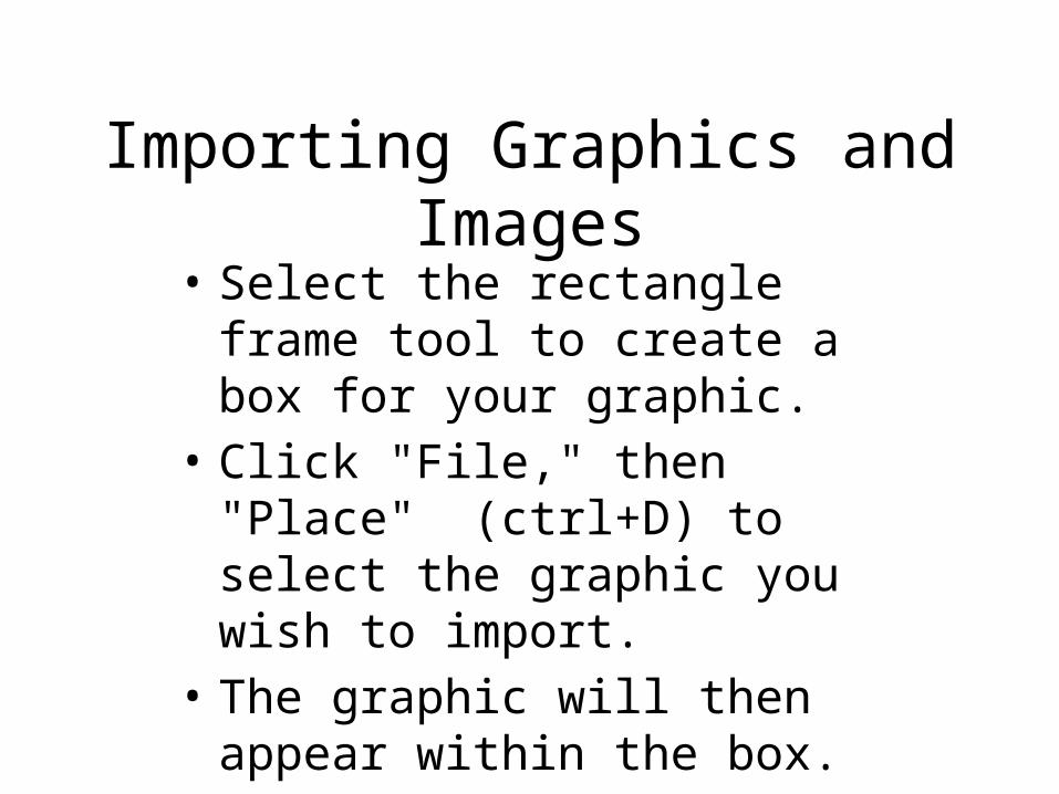
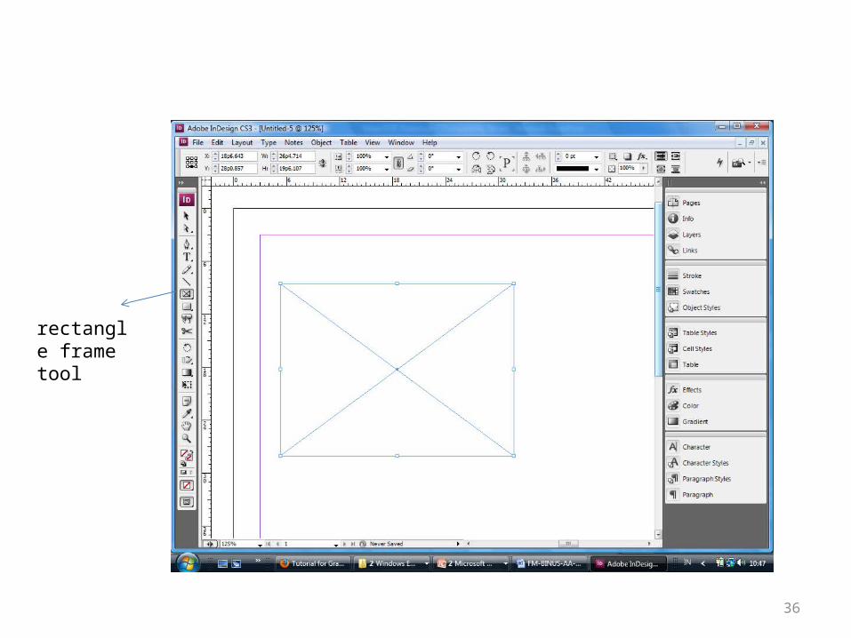
Importing Graphics and Images• Select the rectangle frame tool to
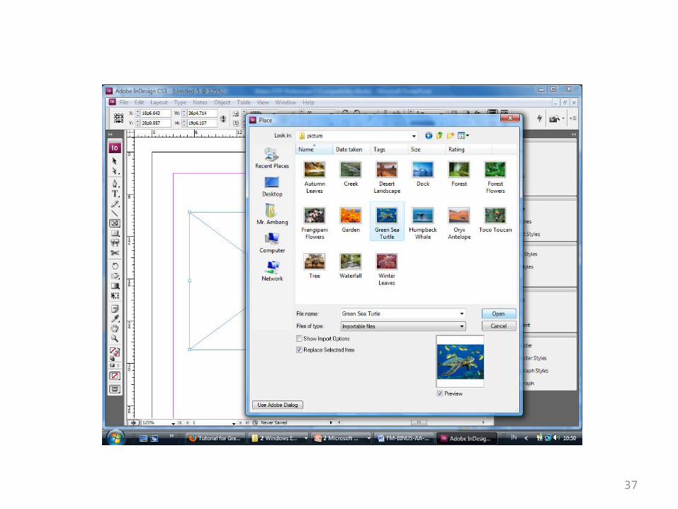
create a box for your graphic. • Click "File," then "Place" (ctrl+D)
to select the graphic you wish to import.
• The graphic will then appear within the box.
36
rectangle frame tool
37
38
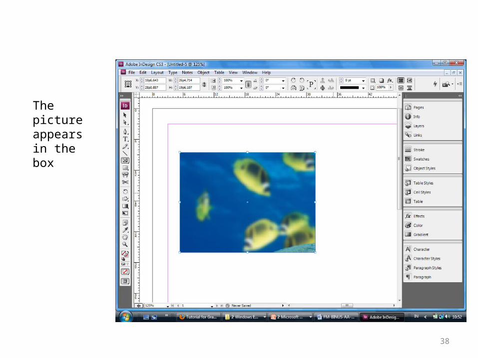
The picture appears in the box
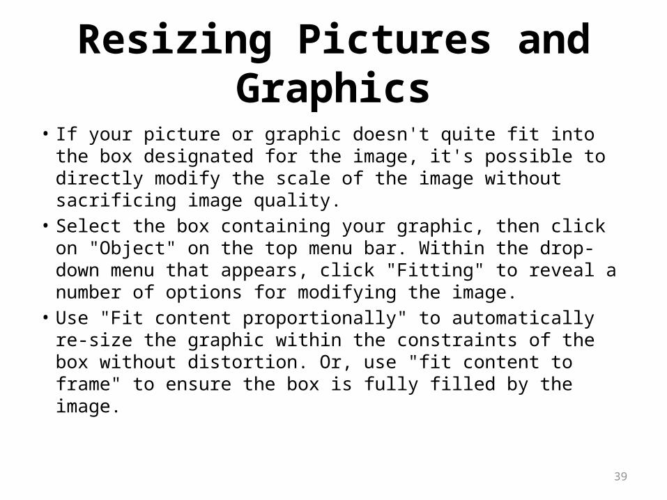
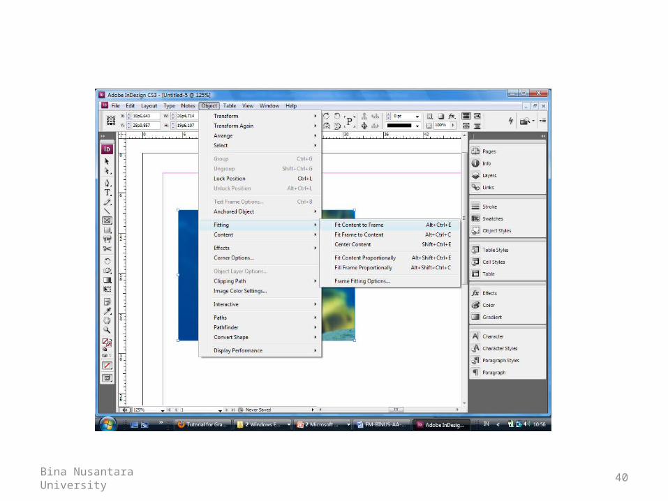
Resizing Pictures and Graphics
• If your picture or graphic doesn't quite fit into the box designated for the image, it's possible to directly modify the scale of the image without sacrificing image quality.
• Select the box containing your graphic, then click on "Object" on the top menu bar. Within the drop-down menu that appears, click "Fitting" to reveal a number of options for modifying the image.
• Use "Fit content proportionally" to automatically re-size the graphic within the constraints of the box without distortion. Or, use "fit content to frame" to ensure the box is fully filled by the image.
39
Bina Nusantara University 40
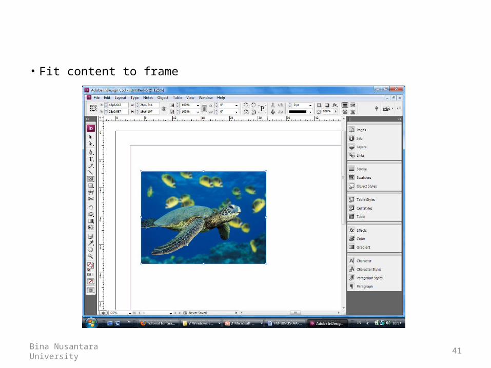
• Fit content to frame
Bina Nusantara University 41
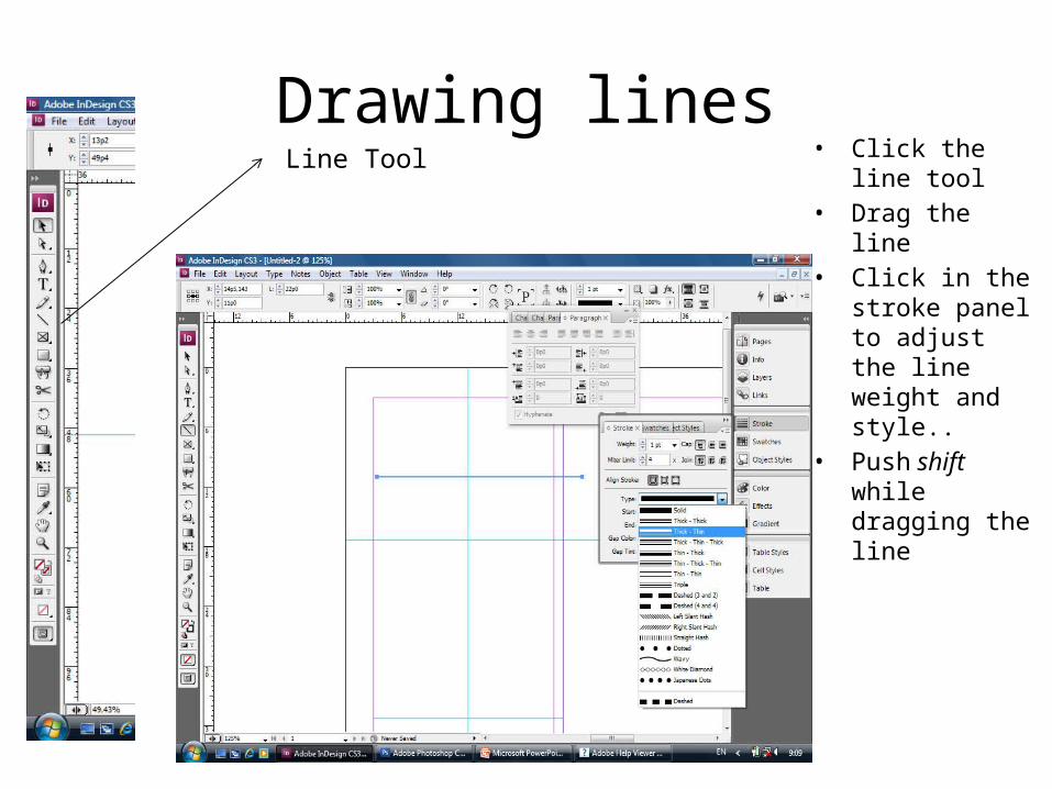
Drawing lines• Click the line tool• Drag the line• Click in the stroke
panel to adjust the line weight and style..
• Push shift while dragging the line
Line Tool
ADOBE ILLUSTRATOR: CREATING A LOGO
Getting Started
• When you first open up illustrator – you see a familiar (if you know a little Photoshop) interface. At first glance you might even say they’re twins. They are – in a way… but just like brothers there are lots of differences that become apparent only after you get acquainted.
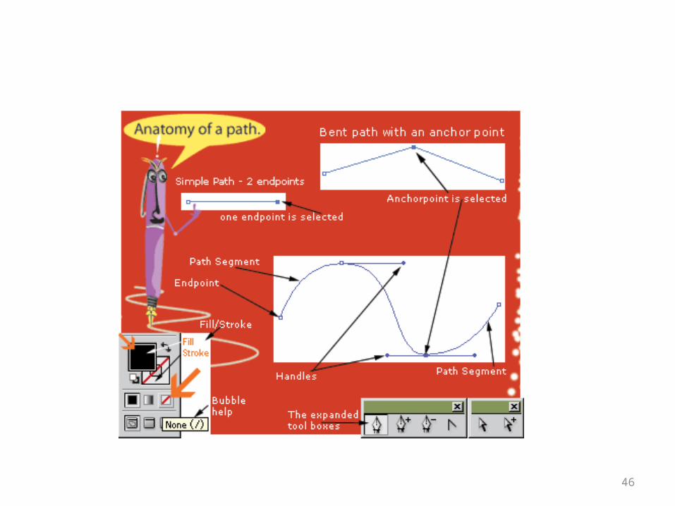
• The “godfather” of all tools on ILL is the pen tool. It (and its minions – the “Add /Delete anchor point ” tools and “Convert Anchor Point ” tool) rules over everything. He has a “wife” – the “Direct Selection ” tool. All other things are related to the fruits of its labor.
44
45
46
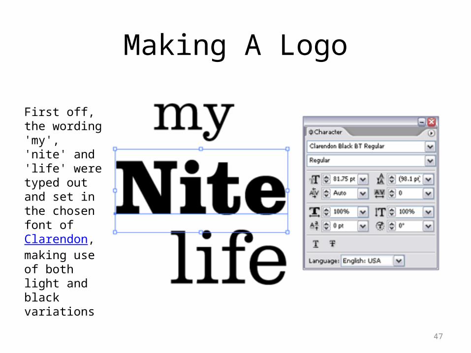
Making A Logo
47
First off, the wording 'my', 'nite' and 'life' were typed out and set in the chosen font of Clarendon, making use of both light and black variations
48
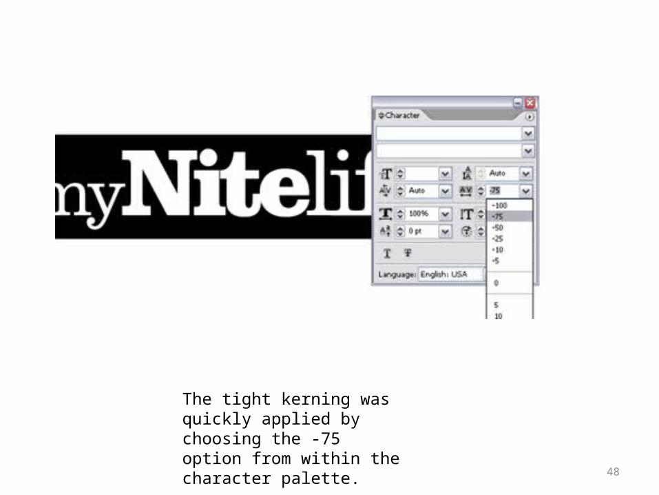
The tight kerning was quickly applied by choosing the -75 option from within the character palette.
49
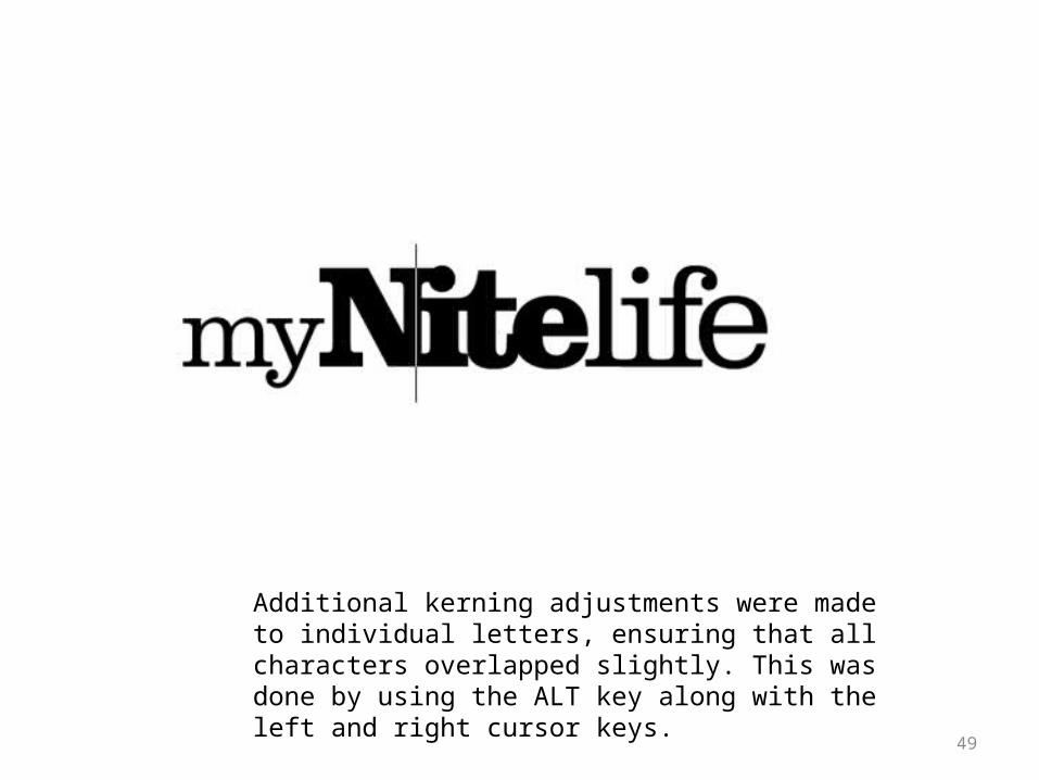
Additional kerning adjustments were made to individual letters, ensuring that all characters overlapped slightly. This was done by using the ALT key along with the left and right cursor keys.
50
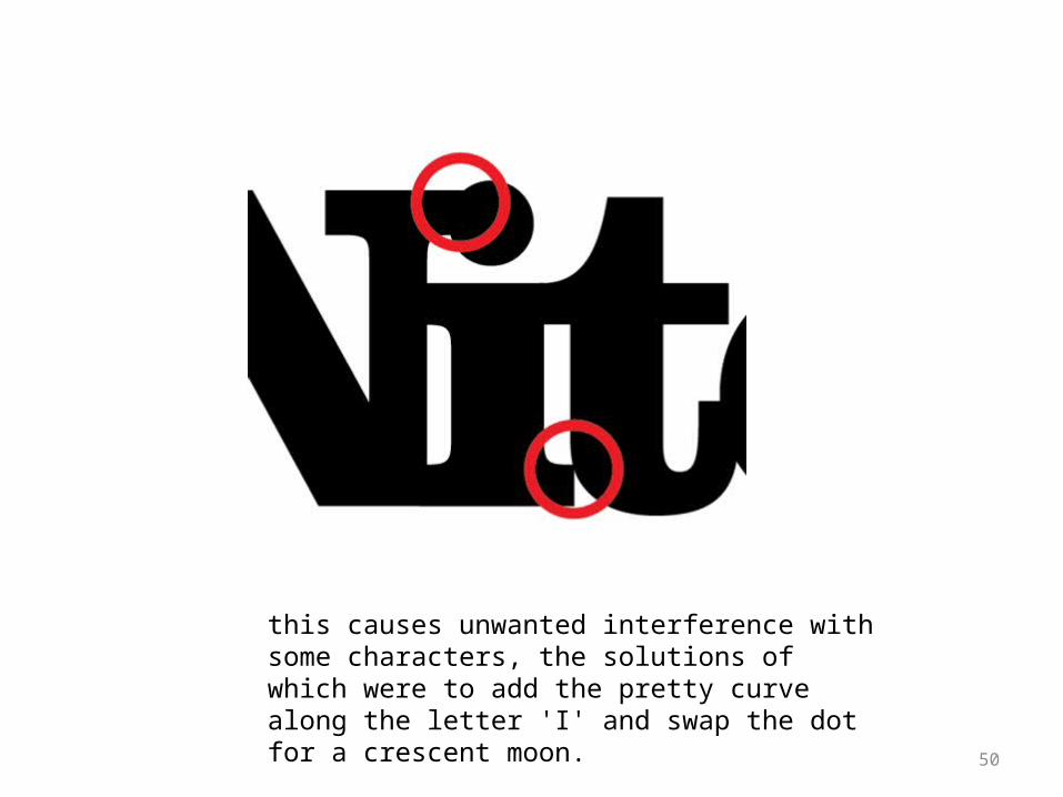
this causes unwanted interference with some characters, the solutions of which were to add the pretty curve along the letter 'I' and swap the dot for a crescent moon.
51
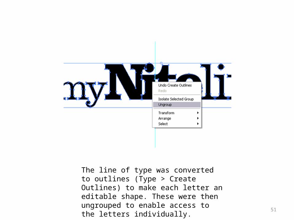
The line of type was converted to outlines (Type > Create Outlines) to make each letter an editable shape. These were then ungrouped to enable access to the letters individually.
52
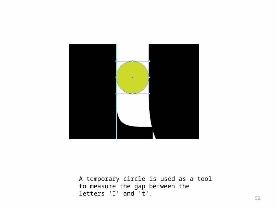
A temporary circle is used as a tool to measure the gap between the letters 'I' and 't'.
53
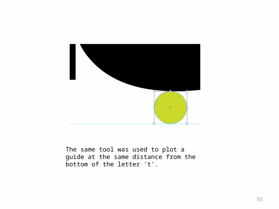
The same tool was used to plot a guide at the same distance from the bottom of the letter 't'.
54
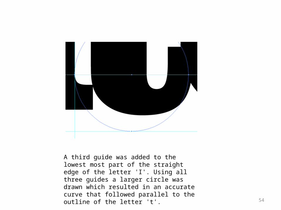
A third guide was added to the lowest most part of the straight edge of the letter 'I'. Using all three guides a larger circle was drawn which resulted in an accurate curve that followed parallel to the outline of the letter 't'.
55
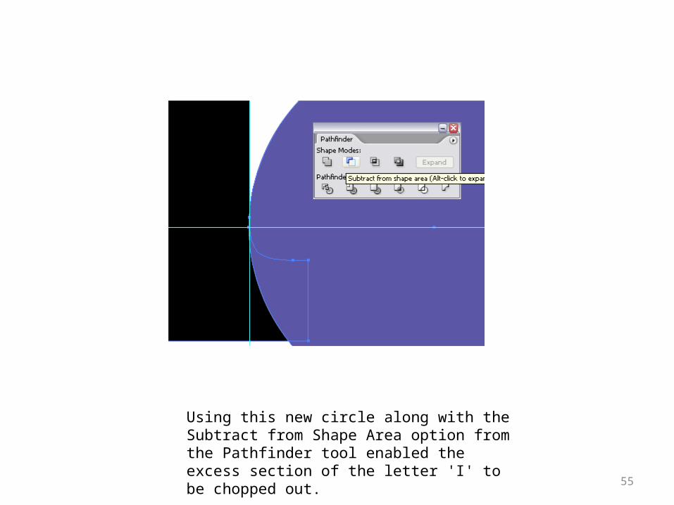
Using this new circle along with the Subtract from Shape Area option from the Pathfinder tool enabled the excess section of the letter 'I' to be chopped out.
56
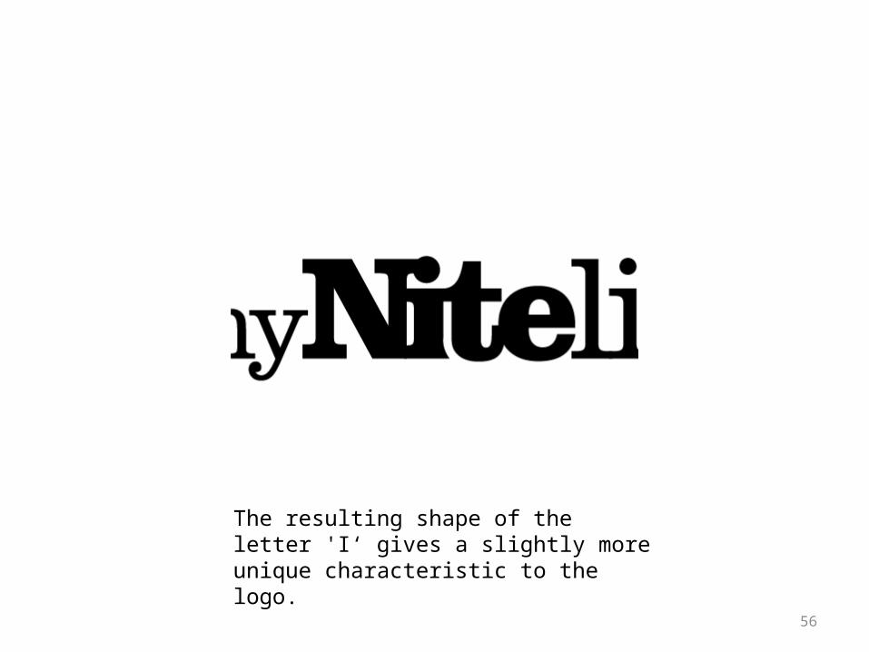
The resulting shape of the letter 'I‘ gives a slightly more unique characteristic to the logo.
57
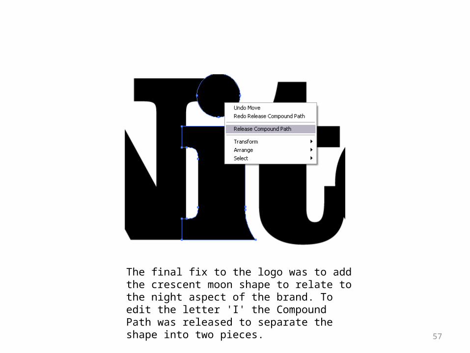
The final fix to the logo was to add the crescent moon shape to relate to the night aspect of the brand. To edit the letter 'I' the Compound Path was released to separate the shape into two pieces.
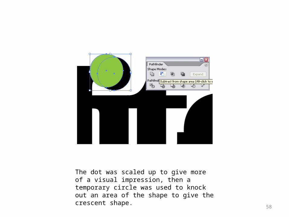
58
The dot was scaled up to give more of a visual impression, then a temporary circle was used to knock out an area of the shape to give the crescent shape.
59
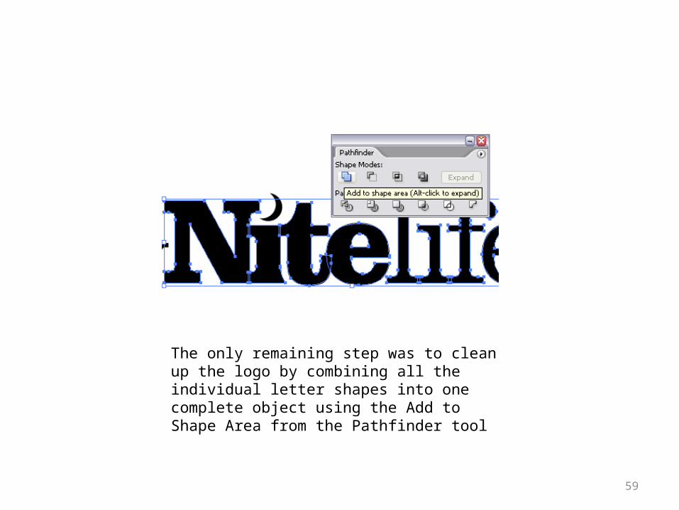
The only remaining step was to clean up the logo by combining all the individual letter shapes into one complete object using the Add to Shape Area from the Pathfinder tool
60
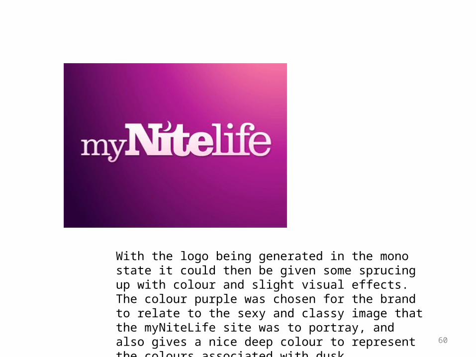
With the logo being generated in the mono state it could then be given some sprucing up with colour and slight visual effects. The colour purple was chosen for the brand to relate to the sexy and classy image that the myNiteLife site was to portray, and also gives a nice deep colour to represent the colours associated with dusk.
Further Readings• Baker, D.L., & Laurie, U.F. (2009). How to Do Everything: Adobe InDesign CS4. McGraw Hill. New York. ISBN: 978-0-
07-160635-6. • Widiyanto, R. (2006). Teknik Profesional Adobe InDesign CS2. Elex Media Komputindo. Jakarta. ISBN: 979-20-9654-X. • Widiyanto, R. (2010). Teknik Profesional Adobe Photoshop CS3. Elex Media Komputindo. Jakarta. ISBN: 978-979-27-
7012-4. • Widiyanto, R. (2007). Teknik Profesional Adobe Illustrator CS3. Elex Media Komputindo. Jakarta. ISBN: 978-979-27-
1259-9. Adobe Inc. (2009). • Adobe Photoshop CS4 Classroom in a Book. Adobe System Incorporated. San Jose-California. • Jan, V.W. (2003). Editing by Design: For Designers, Art Directors, and Editors. Allworth Press. New York. ISBN: 1-
58115-302-3. • Danton, S. (2001). Tipografi dalam Desain Grafis. Gramedia Pustaka Utama. Jakarta. • David, E. (2002). Designing Typeface. Rotovision. . • Fanson, B.A. (2004). Start and Run Desktop Publishing Business. SelfCounsel Press. Belingham.
61
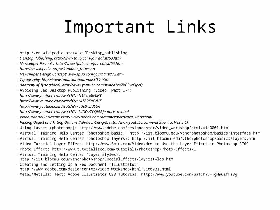
Important Links• http://en.wikipedia.org/wiki/Desktop_publishing• Desktop Publishing: http://www.tpub.com/journalist/63.htm• Newspaper Format : http://www.tpub.com/journalist/65.htm• http://en.wikipedia.org/wiki/Adobe_InDesign• Newspaper Design Concept: www.tpub.com/journalist/72.htm• Typography: http://www.tpub.com/journalist/69.htm• Anatomy of Type (video): http://www.youtube.com/watch?v=ZXGSyzCJpcQ• Avoiding Bad Desktop Publishing (Video, Part 1-4)
http://www.youtube.com/watch?v=N1PxU4k9iHYhttp://www.youtube.com/watch?v=r4ZAR5qFvMEhttp://www.youtube.com/watch?v=a3e8rSIdS6Ahttp://www.youtube.com/watch?v=L4DQv7Y4fi4&feature=related
• Video Tutorial InDesign: http://www.adobe.com/designcenter/video_workshop/• Placing Object and Fitting Options (Adobe InDesign): http://www.youtube.com/watch?v=TcoMTSteiCk• Using Layers (photoshop): http://www.adobe.com/designcenter/video_workshop/html/vid0001.html• Virtual Training Help Center (photoshop basic): http://iit.bloomu.edu/vthc/photoshop/basics/interface.htm• Virtual Training Help Center (photoshop layers): http://iit.bloomu.edu/vthc/photoshop/basics/layers.htm• Video Turorial Layer Effect: http://www.5min.com/Video/How-to-Use-the-Layer-Effect-in-Photoshop-3769• Photo Effect: http://www.tutorialized.com/tutorials/Photoshop/Photo-Effects/1• Virtual Training Help Center (Layer styles): http://iit.bloomu.edu/vthc/photoshop/SpecialEffects/layerstyles.htm• Creating and Setting Up a New Document (Illustrator): http://www.adobe.com/designcenter/video_workshop/html/vid0031.html• Metal/Metallic Text: Adobe Illustrator CS3 Tutorial: http://www.youtube.com/watch?v=TgH9uifkz3g