PRACTICAL User Experience Design FOR School Libraries · 2018-11-19 · (UX) design comes into...
10
PRACTICAL User Experience Design FOR School Libraries Suzanne Sannwald [email protected] FEATURE 38 Knowledge Quest | Preservice School Librarian Voices All materials in this journal subject to copyright by the American Library Association may be used for the noncommercial purpose of scientific or educational advancement granted by Sections 107 and 108 of the Copyright Revision Act of 1976. Address usage requests to the ALA Office of Rights and Permissions.
Transcript of PRACTICAL User Experience Design FOR School Libraries · 2018-11-19 · (UX) design comes into...

PRACTICAL User Experience
Design FOR School Libraries
Suzanne [email protected]
FEATURE
38 Knowledge Quest | Preservice School Librarian Voices
All materials in this journal subject to copyright by the American Library Association may be used for the noncommercial purpose of scientific or educational advancement
granted by Sections 107 and 108 of the Copyright Revision Act of 1976. Address usage requests to the ALA Office of Rights and Permissions.

5 Tips FOR IMPROVING
Day-to-Day Life FOR YOUR
USERS...AND YOU!
39Volume 45, No. 5 | May/June 2017
All materials in this journal subject to copyright by the American Library Association may be used for the noncommercial purpose of scientific or educational advancement
granted by Sections 107 and 108 of the Copyright Revision Act of 1976. Address usage requests to the ALA Office of Rights and Permissions.
Recently, while spending time in the school library, a student
asked, “Please don’t judge me, but is Alaska part of the United States or Canada?” Another student then chimed in, “Yeah, I’ve always found it confusing, because isn’t Alaska an island?” An island? I could understand how a student might think that Alaska is part of Canada, but the island comment caught me completely off guard.
After taking some time to process the situation, it finally struck me. While I automatically visualize Alaska within the context of a world map or globe, I realized that the Alaska-is-an-island student was picturing one of those maps of the United States that inserts Alaska and Hawaii just
“off-shore” for the sake of space and simplicity (see figure 1). I thumbed through a nearby atlas, finding an example of such a map, and the student exclaimed in recognition:
“Exactly!”
As another example, when getting organized this fall, I created a guide to keep near my work phone for students who help in the library. It includes a script for answering the phone, as well as emergency contact information for various key staff members on campus. When using it one day, though, a student asked me how to dial “x.”
Dial “x”? It took me a minute to register that the student did not know how to interpret the way I had listed extension numbers (e.g., Front Receptionist, x60400). Thinking that this student was an outlier, I asked others, and they were similarly befuddled. In retrospect, it makes sense that students may have little to no experience dialing extensions. With stored contacts and phone numbers now hyperlinked on their smartphones, they hardly need to dial any numbers at all.
The Alaska and extension incidents reminded me of how easy it is to make assumptions about what students do and should understand. I am forced to question what I consider to be common knowledge and to recognize that what makes sense to me may not make sense to others. How often do I unknowingly fail when attempting to communicate information to students in the school library? More than I probably even realize!
This is where User Experience (UX) design comes into play. In my previous work life—after I was pink-slipped from my job in public K–12 education back in 2012—I worked for a couple of years in a corporate setting. This is where I learned about everything from organiza-tional development and leadership
to marketing and customer satisfac-tion. I now consider those years to have been a sabbatical of sorts for me, and UX design is one area of interest that I have carried forward into my current work as a school librarian.
What Exactly Is UX Design?
Explained succinctly in Useful, Usable, Desirable: Applying User Experience Design to Your Library, “The user experience is how someone feels when using a product or service” (Schmidt and Etches 2014, 1). Defined another way,
“ ‘User experience’ encompasses all aspects of the end-user’s interaction with the company, its services, and its products” (Norman and Nielsen n.d.).
Combining these definitions in the context of the school library, user experience is how someone feels based on all of his or her interac-tions with the library program. For instance, how do people feel when:
• In your library’s physical space?
• Receiving assistance or instruction from staff members?
• Looking for books and other materials?
• Navigating your library’s website and other online resources?
40 Knowledge Quest | Preservice School Librarian Voices
All materials in this journal subject to copyright by the American Library Association may be used for the noncommercial purpose of scientific or educational advancement
granted by Sections 107 and 108 of the Copyright Revision Act of 1976. Address usage requests to the ALA Office of Rights and Permissions.

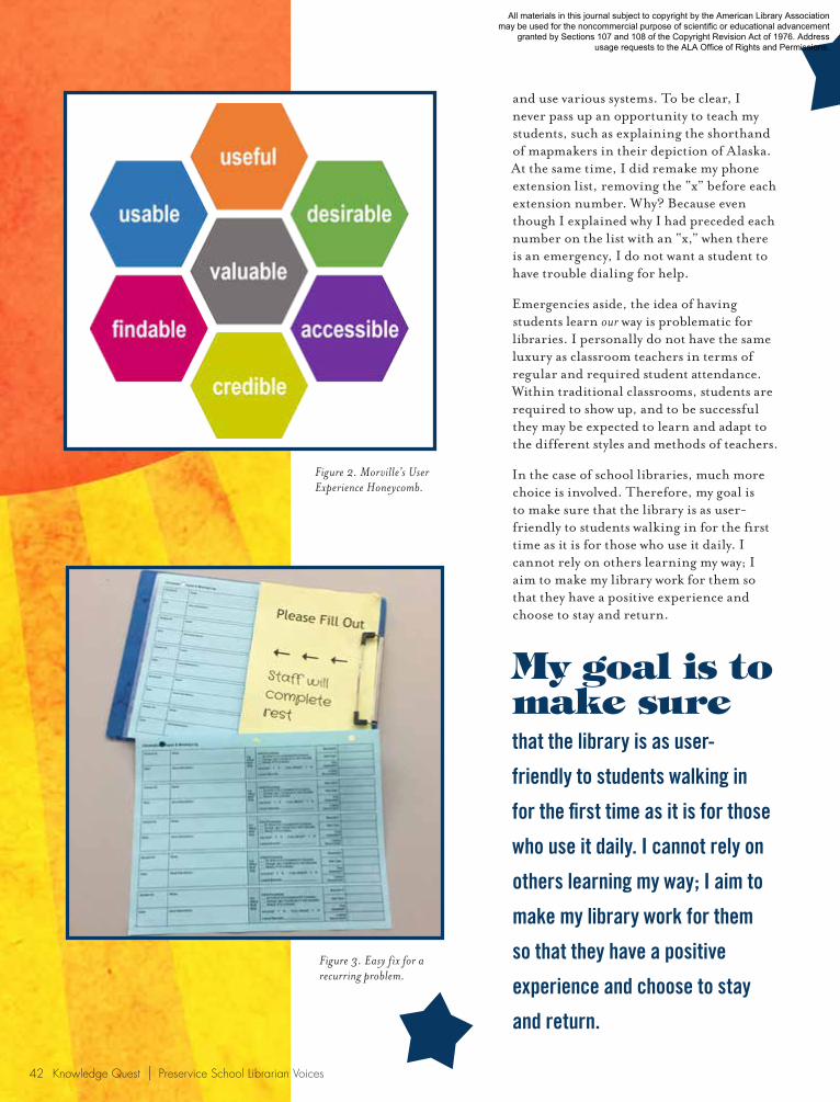
What becomes clear after thinking about UX for a few minutes is that, ultimately, every decision you make about your library affects the user experience. UX design is all about making decisions that contribute to an improved experience. One popular model that I have found helpful when making and evaluating decisions is the User Experience Honeycomb (see figure 2) shared by Peter Morville (2004). When looking at a given aspect of my school library program, I frame each hexagonal quality as a question. Is [fill in the blank] useful, usable, and desirable? Is it findable, accessible, and credible? Is it valuable? How can I make it more so?
Imperative and Practicalities for School Libraries
An argument I sometimes hear is that, rather than making changes to accommodate students, we should view gaps in understanding as teachable moments, helping them learn how to decipher, navigate,
What becomes clear after thinking about
UX for a few minutes is that,
ultimately, every decision you
make about your library affects
the user experience.
Figure 1. Map requiring knowledge of mapmakers’ conventions.
41Volume 45, No. 5 | May/June 2017
All materials in this journal subject to copyright by the American Library Association may be used for the noncommercial purpose of scientific or educational advancement
granted by Sections 107 and 108 of the Copyright Revision Act of 1976. Address usage requests to the ALA Office of Rights and Permissions.
and use various systems. To be clear, I never pass up an opportunity to teach my students, such as explaining the shorthand of mapmakers in their depiction of Alaska. At the same time, I did remake my phone extension list, removing the “x” before each extension number. Why? Because even though I explained why I had preceded each number on the list with an “x,” when there is an emergency, I do not want a student to have trouble dialing for help.
Emergencies aside, the idea of having students learn our way is problematic for libraries. I personally do not have the same luxury as classroom teachers in terms of regular and required student attendance. Within traditional classrooms, students are required to show up, and to be successful they may be expected to learn and adapt to the different styles and methods of teachers.
In the case of school libraries, much more choice is involved. Therefore, my goal is to make sure that the library is as user-friendly to students walking in for the first time as it is for those who use it daily. I cannot rely on others learning my way; I aim to make my library work for them so that they have a positive experience and choose to stay and return.
Figure 2. Morville’s User Experience Honeycomb.
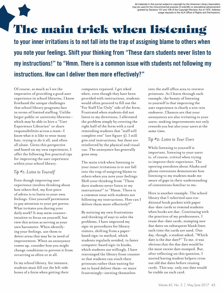
Figure 3. Easy fix for a recurring problem.
My goal is to make sure
that the library is as user-
friendly to students walking in
for the first time as it is for those
who use it daily. I cannot rely on
others learning my way; I aim to
make my library work for them
so that they have a positive
experience and choose to stay
and return.
42 Knowledge Quest | Preservice School Librarian Voices
All materials in this journal subject to copyright by the American Library Association may be used for the noncommercial purpose of scientific or educational advancement
granted by Sections 107 and 108 of the Copyright Revision Act of 1976. Address usage requests to the ALA Office of Rights and Permissions.
Of course, as much as I see the imperative of providing a good user experience in school libraries, I know firsthand the unique challenges that school library programs face in terms of limited staffing. Unlike larger public or university libraries—which may be able to hire a “User Experience Librarian” or share responsibilities across a team—I know what it is like to wear many hats, trying to do it all, and often all alone. Given this perspective and based on my own experiences, I offer the following five practical tips for improving the user experience within your school library.
Tip #1: Listen to Yourself
Even though improving user experience involves thinking about how others feel, my first piece of advice is to listen to your own feelings. Give yourself permission to pay attention to your pet peeves. What irritates you during your daily work? It may seem counter-intuitive to focus on yourself, but view this action as serving as your own barometer. When identify-ing your feelings, use them to detect areas that may be in need of improvement. When an annoyance comes up, consider how you might change conditions to prevent it from occurring as often or at all.
In my school library, for instance, students must fill out the left-side boxes of a form when getting their
The main trick when listening
to your inner irritations is to not fall into the trap of assigning blame to others when
you note your feelings. Shift your thinking from “These darn students never listen to
my instructions!” to “Hmm. There is a common issue with students not following my
instructions. How can I deliver them more effectively?”
computers repaired. I get irked when, even though they have been provided with instructions, students would often proceed to fill out the
“For Staff Use Only” side of the form. Frustrated when students did not listen to my directions, I alleviated the problem simply by covering the right half of the form with a card reminding students that “staff will complete rest” (see figure 3). I still give oral instructions, but these are reinforced by the physical and visual cue. The annoyance has generally gone away.
The main trick when listening to your inner irritations is to not fall into the trap of assigning blame to others when you note your feelings. Shift your thinking from “These darn students never listen to my instructions!” to “Hmm. There is a common issue with students not following my instructions. How can I deliver them more effectively?”
By noticing my own frustrations and thinking of ways to solve the problems, I have improved my sign-in procedures for library visitors, shifting from a paper-based sign-in method, which students regularly avoided, to faster computer-based sign-in kiosks, which students use willingly. I have rearranged the library front counter so that students can reach their printouts rather than waiting for me to hand deliver them—or more frustratingly—inviting themselves
into the staff office area to retrieve printouts. As I learn through each example, the beauty of listening to yourself is that improving the user experience is clearly a win-win endeavor. Chances are that your annoyances are also irritating to your users; making improvements not only rewards you but also your users at the same time.
Tip #2: Listen to Your Users
While listening to yourself is important, listening to your users is, of course, critical when trying to improve their experience. The opening anecdotes about Alaska and phone extensions demonstrate how listening to my students made me aware of gaps in their understanding of conventions familiar to me.
Here is another example. The school library that I inherited uses tra-ditional book pockets with paper due-date cards to remind students when books are due. Continuing with the practices of my predecessors, I reuse due-date cards, stamping new due dates on subsequent blank lines each time the cards are used. One day, though, a student asked, “Which date is the due date?” To me, it was obvious that the due date would be the most recent date stamped. But, after reflecting on this question, I started having student helpers cross out old due dates before reusing cards. This way, only one date would be visible on each card.
43Volume 45, No. 5 | May/June 2017
All materials in this journal subject to copyright by the American Library Association may be used for the noncommercial purpose of scientific or educational advancement
granted by Sections 107 and 108 of the Copyright Revision Act of 1976. Address usage requests to the ALA Office of Rights and Permissions.

The next improvement occurred after I had borrowed a book via inter-library loan from another school in my district. I noticed that the school librarian had added labels to the top of her due-date cards with a heading and brief explanatory message. I immediately borrowed my colleague’s idea, adding address-size labels with the message: “DUE DATE. Note your book’s due date on this card. There is a 10¢ fine per school day late. Renew in the library to avoid late fines.”
I was pleased with this version until one day another student asked me,
“Can I return my book before the due date?” My immediate thought was, “Does this student really think I require him to return it on the exact date?” Still, reflecting on this question made me wonder how often students may not fully understand how due dates work. As a result, I made a nuanced change in the label text: “Return or renew this book at the library before the date on this card” (see figure 4). Lesson of this story: Our students are always giving us clues for detecting areas for improve-ment, as long as we remain open to hearing them.
Tip #3: Be Explicit
As much as I try to listen to my users, I also realize that the absence of questions or complaints does not mean that everything is working fine. How many users come in to use the library and never talk to you? How many never come back? Students might be shy, scared, or simply may not make the effort to ask about what they do not know.
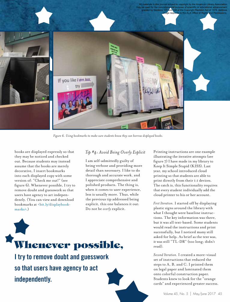
By being explicit, I aim to answer unasked questions and preemptively provide permission. At my desk, for instance, I have a sign: “If I am not at this desk, then I am working somewhere in the library. Please find me, and I will be happy to help you!” This both answers the potential question of “Where is the librarian?” and empowers the student to find me, aided by my name and picture on the sign (see figure 5).
As another example, I recognize that students may not realize that
Lesson of this story:
Our students are always giving us clues for
detecting areas for improvement, as long as we
remain open to hearing them.
Figure 5. Sign encouraging students to find the librarian.Figure 4. Evolution of due-date cards in author’s library.
44 Knowledge Quest | Preservice School Librarian Voices
All materials in this journal subject to copyright by the American Library Association may be used for the noncommercial purpose of scientific or educational advancement
granted by Sections 107 and 108 of the Copyright Revision Act of 1976. Address usage requests to the ALA Office of Rights and Permissions.
books are displayed expressly so that they may be noticed and checked out. Because students may instead assume that the books are merely decorative, I insert bookmarks into each displayed copy with some version of: “Check me out!” (see figure 6). Whenever possible, I try to remove doubt and guesswork so that users have agency to act indepen-dently. (You can view and download bookmarks at <bit.ly/displaybook-marks>.)
Whenever possible,
I try to remove doubt and guesswork
so that users have agency to act
independently.
Tip #4: Avoid Being Overly Explicit
I am self-admittedly guilty of being verbose and providing more detail than necessary. I like to do thorough and accurate work, and I appreciate comprehensive and polished products. The thing is, when it comes to user experience, less is usually more. Thus, while the previous tip addressed being explicit, this one balances it out: Do not be overly explicit.
Printing instructions are one example illustrating the iterative attempts (see figure 7) I have made in my library to Keep It Simple Stupid (KISS). Last year, my school introduced cloud printing so that students are able to print directly from their 1:1 devices. The catch is, this functionality requires that every student individually add the cloud printer to his or her account.
First Iteration. I started off by displaying plastic signs around the library with what I thought were baseline instruc-tions. The key information was there, but it was all text-based. Some students would read the instructions and print successfully, but I noticed many still asked for help. As brief as the text was, it was still “TL-DR” (too long; didn’t read).
Second Iteration. I created a more-visual set of instructions that reduced the steps to A, B, and C. I printed them on legal paper and laminated them onto colorful construction paper. Students knew to look for the “orange cards” and experienced greater success.
Figure 6. Using bookmarks to make sure students know they can borrow displayed books.
45Volume 45, No. 5 | May/June 2017
All materials in this journal subject to copyright by the American Library Association may be used for the noncommercial purpose of scientific or educational advancement
granted by Sections 107 and 108 of the Copyright Revision Act of 1976. Address usage requests to the ALA Office of Rights and Permissions.
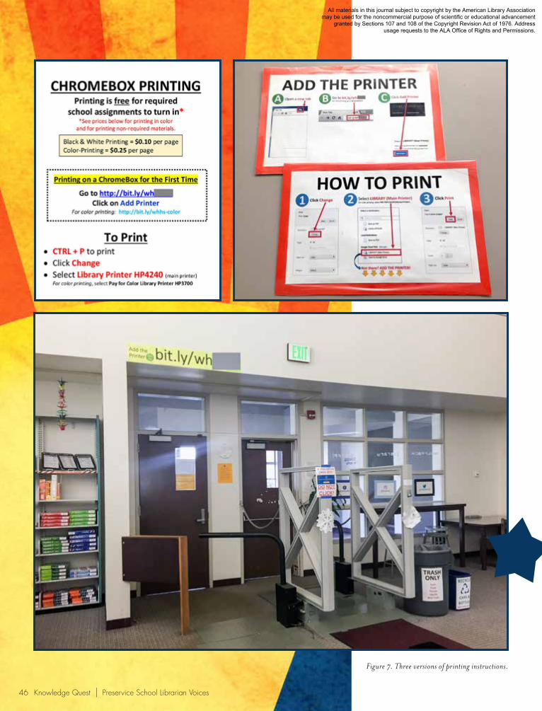
Figure 7. Three versions of printing instructions.
46 Knowledge Quest | Preservice School Librarian Voices
All materials in this journal subject to copyright by the American Library Association may be used for the noncommercial purpose of scientific or educational advancement
granted by Sections 107 and 108 of the Copyright Revision Act of 1976. Address usage requests to the ALA Office of Rights and Permissions.

Suzanne Sannwald
is in her third year of
serving as the school
librarian at West Hills
High School in the
Grossmont Union High School District, in San
Diego’s East County region. Hired under an
Emergency Teacher Librarian credential, she
enrolled in San Jose State University’s School
of Information online program, completing
the credential requirements in summer 2016;
she expects to earn an MLIS in spring 2017.
Suzanne is an ALA Spectrum Scholar who
copresented at the California School Library
Association (CSLA) 2016 Annual Conference
and San Diego Computer Using Educators
2016 Tech Fair. Recently, her article on
virtual makerspaces was published in the
CSLA Newsletter, and her approach to
library orientations was featured in Joyce
Valenza’s NeverEnding Search <blogs.
slj.com/neverendingsearch/2016/08/25/on-
orientation-attitude>.
Works Cited:Knight, Austin. 2016. “Good
Design Is Humble.” <austinknight.com/writing/good-design-is-humble> (accessed December 22, 2016).
Morville, Peter. 2004. “User Experience Design.” <semanticstudios.com/user_experience_design> (accessed December 22, 2016).
Norman, Don, and Jakob Nielsen. n.d. “The Definition of User Experience.” <www.nngroup.com/articles/definition-user-experience> (accessed December 22, 2016).
Schmidt, Aaron, and Amanda Etches. 2014. Useful, Usable, Desirable: Applying User Experience Design to Your Library. Chicago: ALA.
Third Iteration. While the orange cards were a marked improvement, and I still keep some floating around, I noticed I often resort to providing basic oral instructions when helping students. Realizing that all they really need to look at is the URL for adding the printer, I posted the Web address—using a large font—in a location that is easy to see. Students no longer need to read a sign or look for an orange card. Now I simply say,
“Open a new tab and go to the address above the front door,” and they are on their way.
Tip #5: Start Your Perpetual Beta Now
In school libraries, minimal staffing may impose some limitations, but a small staff also affords freedom to be more nimble when it comes to making changes. When even small decisions may improve the user experience in your library, why wait before trying them out? Inspired by the technology industry, I frame my work as being in a perpetual beta state. In other words, I aim to “RERO” (Release Early, Release Often). Translation: Start now and do not expect perfection!
When I decided to create computer-based sign-in kiosks, I “released early,” creating the workstations and hosted Web form in a single day. At the start, I based the form on a colleague’s model, and then I just
observed students’ use. Noting what parts slowed them down or invited mischief, I edited the form, re-releasing it at least two more times. Each time, I considered potential ramifications, such as data inconsis-tencies caused by midstream changes, but witnessing students sign in more quickly and with greater compliance reinforced my belief that the gains in terms of user experience were worthwhile.
When producing something that will be paper-based, I swear by small runs when creating informational handouts or forms and print only a small number at a time. If I were to have a large stack of copies, I might be less motivated to make improve-ments because of the convenience of having copies readily available and not wanting to waste paper. When I am forced to run new batches, I use the task as an opportunity to make edits at the same time.
Design with Humility
Whether I’m changing a Web form, a handout, signage, instructions, or due-date cards, I am reminded that user testing is paramount. The effort is not about what I know or how I think; it is about validating my users and what will work best for them. UX professional Austin Knight echoes the realization I had upon discovering my students’ lack of understanding about Alaska’s geography: “If there’s anything that design has taught me, it’s that my assumptions, while generally well-founded, are almost always wrong. No matter how much of an expert I become, I will never be able to represent the collective mass that is a user base” (2016). He reminds us that good design is humble, and I agree. No matter how much training and experience we may have, we must design our school libraries with our users at the center. It is not about us being wrong, but about making our libraries work right for users.
47Volume 45, No. 5 | May/June 2017
All materials in this journal subject to copyright by the American Library Association may be used for the noncommercial purpose of scientific or educational advancement
granted by Sections 107 and 108 of the Copyright Revision Act of 1976. Address usage requests to the ALA Office of Rights and Permissions.