


Practical Data Visualization
118
Practical Data Visualization April 10, 2014 COMPSCI 290-01: Everything Data https://iu.box.com/everythingdata Angela Zoss Data Visualization Coordinator Data & GIS Services
-
Upload
angela-zoss -
Category
Data & Analytics
-
view
1.993 -
download
0
Transcript of Practical Data Visualization

Practical Data Visualization
April 10, 2014
COMPSCI 290-01: Everything Data
https://iu.box.com/everythingdata
Angela Zoss Data Visualization Coordinator
Data & GIS Services

WHY VISUALIZE?

Preserve complexity
Anscombe’s Quartet
I II III IV
x y x y x y x y
10.0 8.04 10.0 9.14 10.0 7.46 8.0 6.58
8.0 6.95 8.0 8.14 8.0 6.77 8.0 5.76
13.0 7.58 13.0 8.74 13.0 12.74 8.0 7.71
9.0 8.81 9.0 8.77 9.0 7.11 8.0 8.84
11.0 8.33 11.0 9.26 11.0 7.81 8.0 8.47
14.0 9.96 14.0 8.10 14.0 8.84 8.0 7.04
6.0 7.24 6.0 6.13 6.0 6.08 8.0 5.25
4.0 4.26 4.0 3.10 4.0 5.39 19.0 12.50
12.0 10.84 12.0 9.13 12.0 8.15 8.0 5.56
7.0 4.82 7.0 7.26 7.0 6.42 8.0 7.91
5.0 5.68 5.0 4.74 5.0 5.73 8.0 6.89

Preserve complexity
http://en.wikipedia.org/wiki/Anscombe%27s_quartet
Anscombe’s Quartet
I II III IV
x y x y x y x y
10.0 8.04 10.0 9.14 10.0 7.46 8.0 6.58
8.0 6.95 8.0 8.14 8.0 6.77 8.0 5.76
13.0 7.58 13.0 8.74 13.0 12.74 8.0 7.71
9.0 8.81 9.0 8.77 9.0 7.11 8.0 8.84
11.0 8.33 11.0 9.26 11.0 7.81 8.0 8.47
14.0 9.96 14.0 8.10 14.0 8.84 8.0 7.04
6.0 7.24 6.0 6.13 6.0 6.08 8.0 5.25
4.0 4.26 4.0 3.10 4.0 5.39 19.0 12.50
12.0 10.84 12.0 9.13 12.0 8.15 8.0 5.56
7.0 4.82 7.0 7.26 7.0 6.42 8.0 7.91
5.0 5.68 5.0 4.74 5.0 5.73 8.0 6.89
Property Value
Mean of x 9 (exact)
Variance of x 11 (exact)
Mean of y 7.50 (to 2 decimal places)
Variance of y 4.122 or 4.127 (to 3 decimal places)
Correlation between
x and y 0.816 (to 3 decimal places)
Linear regression line y = 3.00 + 0.500x (to 2 and 3 decimal places,
respectively)

Preserve complexity
http://en.wikipedia.org/wiki/Anscombe%27s_quartet
Anscombe’s Quartet

Evaluate data quality
Query using Facebook API
• Node-link diagram
Kandel, Heer, Plaisant, et al. (2011)
http://dx.doi.org/10.1177/1473871611415994

Query using Facebook API
• Node-link diagram
• Matrix display with clustering
Evaluate data quality
Kandel, Heer, Plaisant, et al. (2011)
http://dx.doi.org/10.1177/1473871611415994

Kandel, Heer, Plaisant, et al. (2011)
http://dx.doi.org/10.1177/1473871611415994
Query using Facebook API
• Node-link diagram
• Matrix display with clustering
• Matrix display, API return order
Evaluate data quality

Kandel, Heer, Plaisant, et al. (2011)
http://dx.doi.org/10.1177/1473871611415994
Query using Facebook API
• Node-link diagram
• Matrix display with clustering
• Matrix display, API return order
5000-item result limit
Silent failure
Evaluate data quality

Tell a story
Hans Rosling – The River of Myths http://www.youtube.com/watch?v=OwII-dwh-bk
http://www.gapminder.org/

CREATING A VISUALIZATION

From Data to Graphic
• What data types are present in the data source?
• How are the variables likely to relate?
• What visualization type seems to be the best fit for
the goal?

Matching Data Types to Visual Elements
Mackinlay, J. (1986). Automating the design of graphical presentations of relational
information. ACM Transactions on Graphics, 5(2), 110-141. http://dx.doi.org.proxy.lib.duke.edu/10.1145/22949.22950

Example Encoding Ordered Useful values Quantitative Ordinal Categorical Relational
position, placement yes infinite Good Good Good Good
1, 2, 3; A, B, C text labels optional
(alphabetical
or numbered)
infinite Good Good Good Good
length yes many Good Good
size, area yes many Good Good
angle yes medium/few Good Good
pattern density yes few Good Good
weight, boldness yes few Good
saturation, brightness yes few Good
color no few (< 20) Good
shape, icon no medium Good
pattern texture no medium Good
enclosure, connection no infinite Good Good
line pattern no few Good
line endings no few Good
line weight yes few Good
Properties and Best Uses of Visual Encodings
Noah Iliinsky • ComplexDiagrams.com/properties • 2012-06
Visual Encodings
http://complexdiagrams.com/properties

Chart Choosers
• Interested in showing composition? Relationship? Distribution?
(What do the charts do well?) http://extremepresentation.typepad.com/blog/2006/09/choosing_a_good.html
• Chart typically determines position of elements, with some built-in
visual encodings.
• Additional visual encodings can often be added to incorporate more
variables into charts, but beware of overwhelming the audience.

Chart Choosers
http://extremepresentation.typepad.com/blog/2006/09/choosing_a_good.html

VISUALIZATION TYPES

Common Visualization Types
• 1D/Linear
• 2D/Planar (incl. Geospatial)
• 3D/Volumetric
• Temporal
• nD/Multidimensional (common charts, etc.)
• Tree/Hierarchical
• Network
Shneiderman, B. (1996). The eyes have it: A task by data type taxonomy for information visualizations. Proceedings of IEEE Symposium on Visual Languages - Boulder, CO (pp. 336-343). http://dx.doi.org.proxy.lib.duke.edu/10.1109/VL.1996.545307
See LibGuide (http://guides.library.duke.edu/vis_types) for examples and tools.

One-dimensional scatter plot

Common Visualization Types
Showing Space

Proportional symbol
http://ti.me/RQaRH9
http://wapo.st/2012-campaignvisits

Proportional symbol

Choropleth
https://twitter.com/mihi_tr/status/330261204083810304/photo/1

Choropleth
https://twitter.com/mihi_tr/status/330261204083810304/photo/1

And don’t make users do “visual math.” http://eagereyes.org/criticism/visual-math-wrong
http://enb105-2012s-rw.blogspot.com/2012/02/lab-two-mapping-excercise.html

Common Routes Based on Ship Log Data
http://bit.ly/1i3PSQh

Atlas of the Historical Geography of the
United States (1932)
http://bit.ly/1qv0Lvo

Possible tools for mapping
• ArcGIS
• QGIS
• Google Fusion Tables
• Tableau Public
• Google Earth
• GeoCommons
• CartoDB
• JavaScript
– D3
http://d3js.org/
– Leaflet
http://leafletjs.com/
– Kartograph
http://kartograph.org/
– Polymaps
http://polymaps.org/
– Google Maps API
https://developers.googl
e.com/maps/documentat
ion/javascript/
• Very basic:
– Google Spreadsheets
– BatchGeo
http://batchgeo.com/
– OpenHeatMap
http://www.openheatma
p.com/
See also:
http://library.duke.edu/data/gis
https://github.com/veltman/learninglunches/tree/master/maps

Common Visualization Types
Showing Time

Economic indicators over time
http://blogs.library.duke.edu/data/2012/11/12/adding-colored-regions-to-excel-charts/

http://seawifs.gsfc.nasa.gov/SEAWIFS/BACKGROUND/Gallery/time_series.jpg
Time series of 2D data set

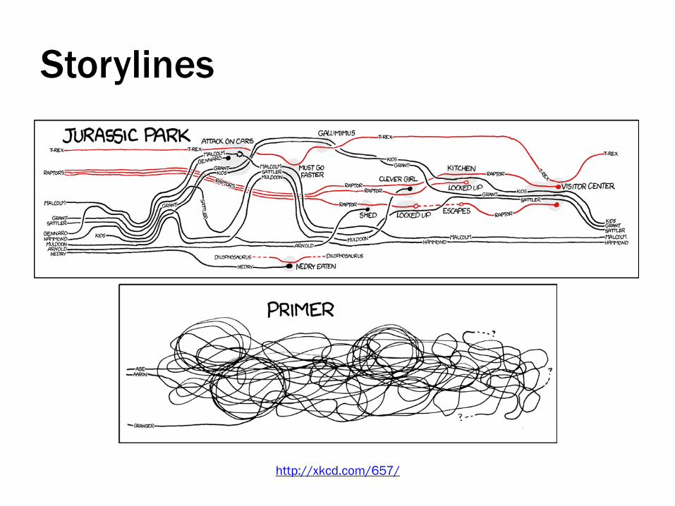
http://neoformix.com/2013/NovelViews.html

Shape of Song
http://www.turbulence.org/Works/song/mono.html
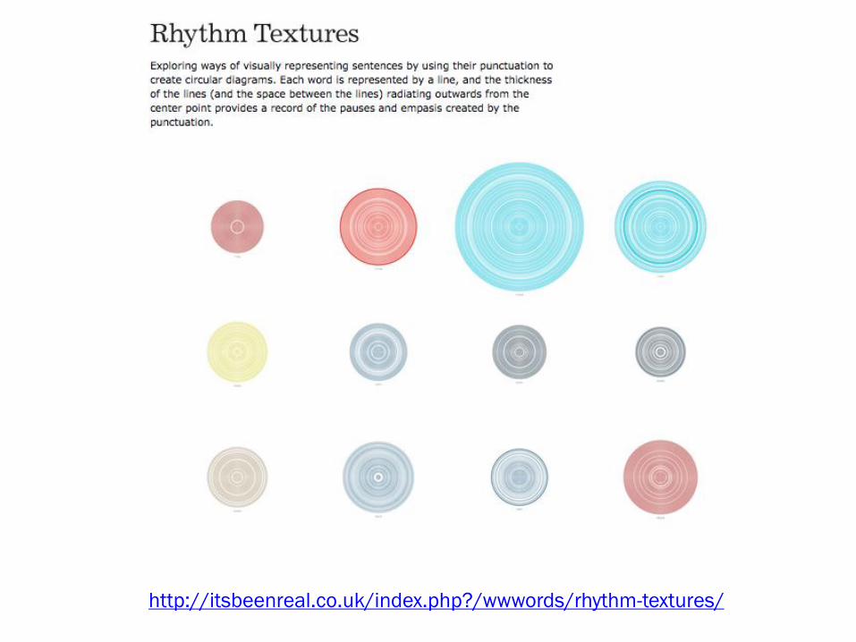
http://itsbeenreal.co.uk/index.php?/wwwords/rhythm-textures/

Over the Decades,
How States Have Shifted
http://nyti.ms/Wr1dhZ

Possible tools for temporal vis.
• Basic charting tools
• TimelineJS
http://timeline.knightlab.com/
• Simile Timeline
http://simile.mit.edu/
• D3

Common Visualization Types
Showing Numbers

Raw: Binned Scatterplot
http://raw.densitydesign.org/

Parallel Coordinates
http://eagereyes.org/techniques/parallel-coordinates

Alluvial Diagram (Raw)
http://raw.densitydesign.org/

http://www.nytimes.com/interactive/2008/09/04/us/politics/20080905_WORDS_GRAPHIC.html
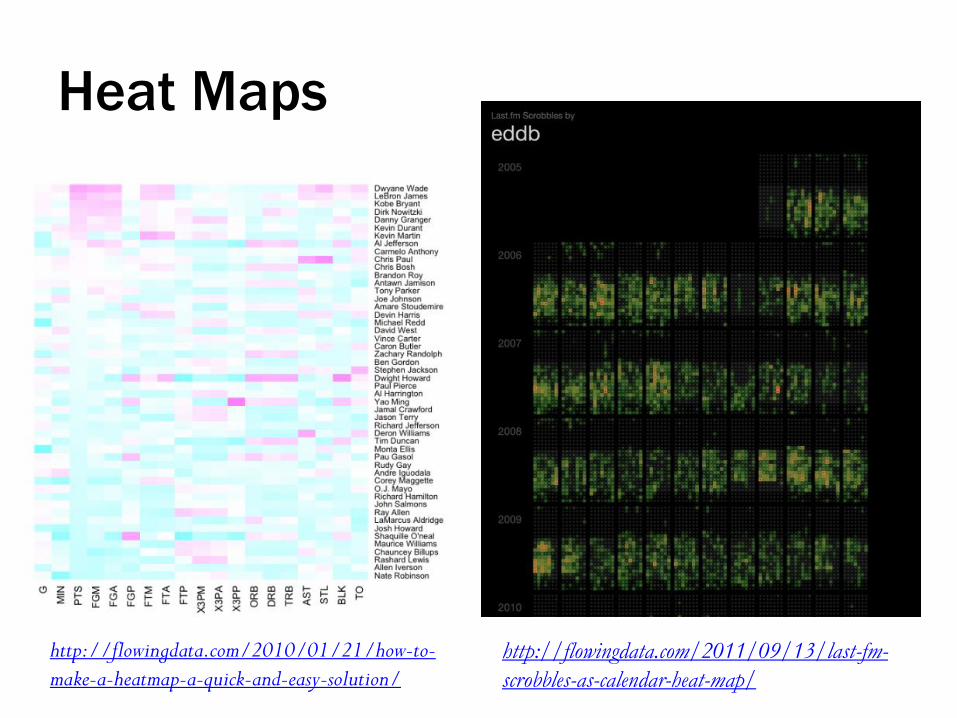
http://flowingdata.com/2010/01/21/how-to-
make-a-heatmap-a-quick-and-easy-solution/ http://flowingdata.com/2011/09/13/last-fm-
scrobbles-as-calendar-heat-map/
Heat Maps

Dynamic Pairs Plot: http://www.stat.sc.edu/~west/bradley/census.html
Pairs Plots

Possible tools for multidimensional vis.
• Basic charting tools
• Raw
http://raw.densitydesign.org/
• Tableau
• D3
• R

Common Visualization Types
Showing Hierarchies

Dendrogram (Raw)
http://raw.densitydesign.org/

Treemap (Raw)
http://raw.densitydesign.org/

Circle Packing (Raw)
http://raw.densitydesign.org/

Possible tools for hierarchies
• Tableau
• D3
• Raw
• Google Spreadsheets

Common Visualization Types
Showing Relationships

Flights
http://www.aaronkoblin.com/work/flightpatterns/

Revolutionaries
http://kieranhealy.org/blog/archives/2013/06/09/using-metadata-to-find-paul-revere/

Scientific Fields, Spanish Empire (1600-1810)
http://republicofletters.stanford.edu/casestudies/spanishempire.html

Example: NIH Map Viewer
https://app.nihmaps.org/nih/browser/

Chinese Canadian Immigrant Flows
http://stanford.io/1hCYwkd

Flight & Expulsion
http://www.niceone.org/lab/refugees/

Tube Map

Possible tools for network vis.
• D3
• Gephi
http://gephi.org/
• NodeXL
http://nodexl.codeplex.com/
• Pajek
http://vlado.fmf.uni-
lj.si/pub/networks/pajek/
• Cytoscape
• Network Workbench/Sci2
http://nwb.cns.iu.edu/,
https://sci2.cns.iu.edu/
• VOSviewer
http://www.vosviewer.com/
• UCINET
https://sites.google.com/site/ucinetso
ftware/home
• GUESS
http://graphexploration.cond.org/
• R
• SigmaJS
http://sigmajs.org/

VISUALIZING UNCERTAINTY

Showing uncertainty
http://peltiertech.com/WordPress/excel-fan-chart-showing-uncertainty-in-projections/

Showing uncertainty
http://ivi.sagepub.com/content/10/4/271

Showing uncertainty
http://vialab.science.uoit.ca/portfolio/lattice-uncertainty-visualization-
understanding-machine-translation-and-speech-recognition

Take-away
Uncertainty is blue.

TOOLS

JMP Pro
https://oit.duke.edu/comp-print/software/license/detail.php?id=4
http://www.jmp.com/support/help/Essential_Graphing.shtml

JMP: Essential Graphing
• Overlay Plots
• Scatterplot 3D
• Contour Plots
• Bubble Plots
• Parallel Plots
• Cell Plots
• Treemaps
• Scatterplot Matrix
• Ternary Plots
• Summary Charts
• Create Maps
http://www.jmp.com/support/help/Essential_Graphing.shtml

DEMO

Congress data query
SELECT person_id,
type,
MIN(start_date),
MAX(end_date),
gender
FROM person_roles
LEFT JOIN persons ON person_roles.person_id = persons.id
GROUP BY person_id, type;
OTHER TOOLS

Tableau
http://guides.library.duke.edu/tableau
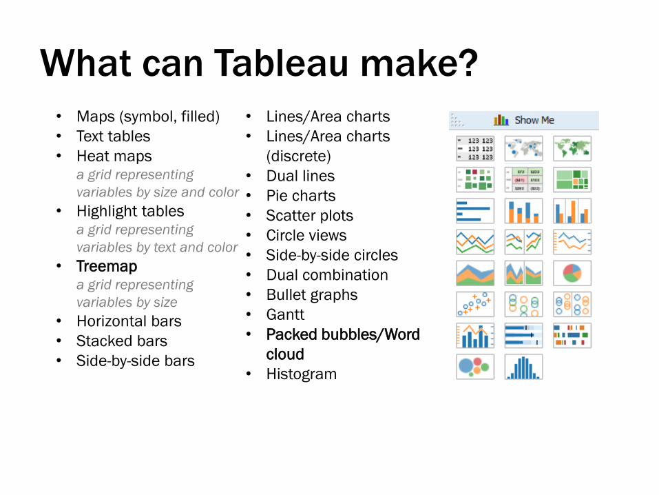
What can Tableau make?
• Maps (symbol, filled)
• Text tables
• Heat maps a grid representing
variables by size and color
• Highlight tables a grid representing
variables by text and color
• Treemap a grid representing
variables by size
• Horizontal bars
• Stacked bars
• Side-by-side bars
• Lines/Area charts
• Lines/Area charts
(discrete)
• Dual lines
• Pie charts
• Scatter plots
• Circle views
• Side-by-side circles
• Dual combination
• Bullet graphs
• Gantt
• Packed bubbles/Word
cloud
• Histogram
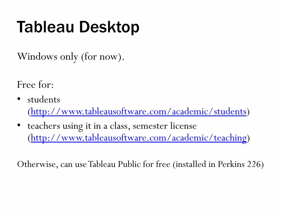
Tableau Desktop
Windows only (for now).
Free for:
• students (http://www.tableausoftware.com/academic/students)
• teachers using it in a class, semester license (http://www.tableausoftware.com/academic/teaching)
Otherwise, can use Tableau Public for free (installed in Perkins 226)

Protip: Tableau wants one column per variable

Data formats
• Confusing number of choices
• GEXF supports many program features, but a pain to write by hand
• Spreadsheet is convenient and supports important features
https://gephi.org/users/supported-graph-formats/

In addition to network visualization,
Gephi can calculate:
• Degree (when directed, in-degree and out-degree)
• Diameter
– Betweenness Centrality
– Closeness Centrality
– Eccentricity
• Density
• Clustering/Modularity

D3.js
http://bl.ocks.org/dukevis/8782982
http://d3js.org

About D3
• JavaScript library
• Fairly low level; building with rectangles and circles
and lines, instead of pre-made chart structures*
• Basic functioning makes it easy to join HTML
elements with data points

*D3 Middleware
Basic line/area chart:
• xCharts ~10 lines? http://tenxer.github.io/xcharts/
• Rickshaw (specifically for time series) ~16 lines http://code.shutterstock.com/rickshaw/
• NVD3 ~31 lines http://nvd3.org/
• Vega ~57 lines http://trifacta.github.io/vega/
http://chimera.labs.oreilly.com/books/12300000003
45/ch02.html#_tools_built_with_d3

D3 Resources
• Interactive Data Visualization for the Web
http://chimera.labs.oreilly.com/books/123000000
0345
• Tutorial and Cheat Sheet, c. 2012
www.jeromecukier.net/blog/2012/10/15/d3-
tutorial-at-visweek-2012/
• D3 Tips and Tricks
https://leanpub.com/D3-Tips-and-Tricks/read
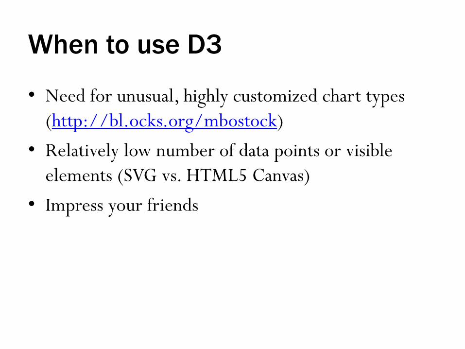
When to use D3
• Need for unusual, highly customized chart types
(http://bl.ocks.org/mbostock)
• Relatively low number of data points or visible
elements (SVG vs. HTML5 Canvas)
• Impress your friends

Raw
http://raw.densitydesign.org/
Has visualizations to show:
• Numbers
• Relationships
• Hierarchies

ManyEyes
http://www.ibm.com/manyeyes
…or maybe
http://www-958.ibm.com/software/analytics/labs/manyeyes/

ManyEyes
http://www.ibm.com/manyeyes
…or maybe
http://www-958.ibm.com/software/analytics/labs/manyeyes/
Many of these require Java

ChartBuilder
http://quartz.github.io/Chartbuilder/

TimelineJS
http://timeline.knightlab.com/

Timeliner
http://timemapper.okfnlabs.org/

StoryMapJS
http://storymap.knightlab.com/

Also, GitHub auto-rendering
• 3D Files https://help.github.com/articles/3
d-file-viewer
• GeoJSON/TopoJSON https://help.github.com/articles/m
apping-geojson-files-on-github
• CSV/TSV https://help.github.com/articles/re
ndering-csv-and-tsv-data

VISUALIZATION TIPS

Visualization Tips: Vector output
• Stats programs aren’t design programs
• Vector output (PDF, SVG, EPS) is easy to edit later
in a vector graphics program like Adobe Illustrator
• Also helps to create high-res for posters, Mediawall,
etc.

Design Tips: In a nutshell
Simplify (but not the axis):
• Reduce color
• Focus on major trends
• Consistent style/format/reference system
http://guides.library.duke.edu/topten
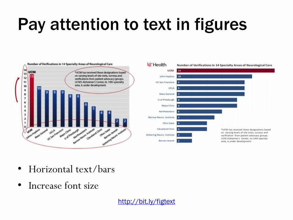
Pay attention to text in figures
• Horizontal text/bars
• Increase font size
http://bit.ly/figtext

Crowded charts can be overwhelming

Clarify groups and trends…

Or use multiple charts,
keeping a consistent grid

See also:
Tufte, E. R. (1990). Envisioning
information. Cheshire, CT:
Graphics Press, p. 28-29, 78.
http://www-958.ibm.com/software/data/cognos/manyeyes/visualizations/china-cdm-projects-by-type-and-regio
Small multiples
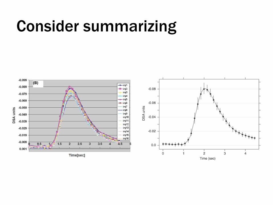
Consider summarizing

Design for Non-Designers
Michael Faber, basic graphic design principles
• Learn IT at Lunch, Wednesday, April 9
Follow-up: http://bit.ly/1ktHzRg
• Visualization Friday Forum recording, Spring 2013
http://bit.ly/14oxuIO

Good Chart Makeover Examples
The Why Axis chart remakes http://thewhyaxis.info/remakes/
Storytelling With Data visual makeovers: http://www.storytellingwithdata.com/search/l
abel/Visual%20Makeover
On the web
• Bad examples:
WTF Viz, http://wtfviz.net/
• Good examples:
Thumbs Up Viz, http://thumbsupviz.com/
• Ask for help:
Help Me Viz, http://helpmeviz.com/
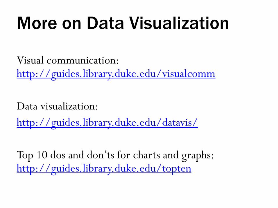
More on Data Visualization
Visual communication: http://guides.library.duke.edu/visualcomm
Data visualization:
http://guides.library.duke.edu/datavis/
Top 10 dos and don’ts for charts and graphs: http://guides.library.duke.edu/topten

RESOURCES OFFERED AT DUKE

Data & GIS Services
• Perkins 226 computing cluster
• Walk-in consultations
• Data collections
• Workshops
• Online instructional materials

Brandaleone Family Center for
Data and GIS Services
• Perkins 226
• Open whenever the library is open
• 12 high-powered Dell workstations
• 3 Bloomberg financial workstations
• Various data analysis, GIS, and
visualization software packages
available
http://library.duke.edu/data/about/lab

Support Area: Visualizing Data
• GIS (Geographic Information Systems) support
– Workshops on ArcGIS and other online mapping tools
– High powered computers with GIS software
– Expert help from Data & GIS Staff
• Visualization support, more broadly
– Workshops on Tableau Public and best practices for
charts, graphs, posters, etc.

Walk-in Consulting
…or by appointment:
http://library.duke.edu/data/about/schedule

Workshops
• Typically toward the beginning of the semester
• Covering: data processing/statistical software,
GIS/mapping, visualization
http://library.duke.edu/data/news
• 1-2 hours, often hands-on
http://library.duke.edu/data/guides/
For announcements, sign up for our listserv:
https://lists.duke.edu/sympa/subscribe/dgs-announce

Information about Data & GIS Services
• Data collections, LibGuides, etc. http://library.duke.edu/data/
• Blog (tutorials, announcements, etc.) http://blogs.library.duke.edu/data/
• E-mail consultations [email protected]
• Twitter accounts @duke_data, @duke_vis

Other visualization resources
• Visualization Friday Forum http://vis.duke.edu/FridayForum/
• Duke Flickr Gallery http://bit.ly/dukevis
• Student Data Visualization Contest http://bit.ly/viscontest14
• LINK Mediawall https://wiki.duke.edu/display/LMW/