PR8 Magazine Layout and Page Design
7
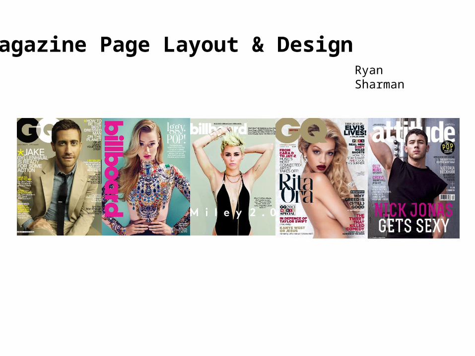
agazine Page Layout & Design Ryan Sharman
-
Upload
ryansharman -
Category
Business
-
view
66 -
download
0
Transcript of PR8 Magazine Layout and Page Design
Magazine Page Layout & DesignRyan Sharman
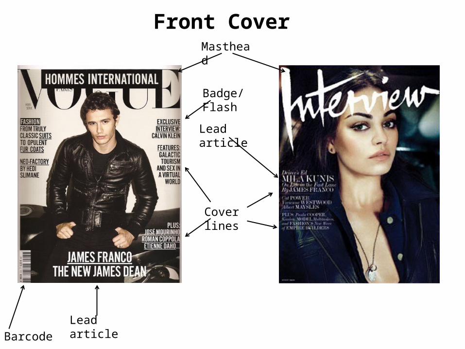
Front Cover Masthead
Lead article
Lead article
Cover lines
Barcode
Badge/Flash
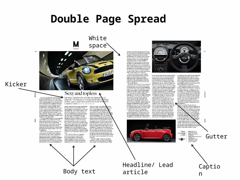
Double Page Spread
Body text
Kicker
Headline/ Lead article
Gutter
Caption
White space
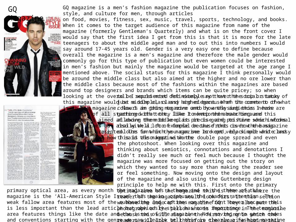
GQ Magazine GQ magazine is a men’s fashion magazine the publication focuses on fashion, style, and culture for men, through articles on food, movies, fitness, sex, music, travel, sports, technology, and books. When it comes to the target audience of this magazine from name of the magazine (formerly Gentleman’s Quarterly) and what is on the front cover I would say that the first idea I get from this is that it is more for the late teenagers to about the middle aged man and to out this into numbers I would say around 17-45 years old. Gender is a very easy one to define because overall the magazine is a men’s magazine and therefore the male gender would commonly go for this type of publication but even women could be interested in men’s fashion but mainly the magazine would be targeted at the age range I mentioned above. The social status for this magazine I think personally would be around the middle class but also aimed at the higher and no ore lower than the middle class because most of the fashions within the magazines are based around top designers and brands which items can be quite pricey; so when looking at the overall I would most definitely say that the social status of this magazine would be middle class and higher because of the content of what is in the magazine. Now I am going to move onto how the audiences needs are met first of all starting with text, like I mentioned above because this magazine is aimed at above the middle class it is going to have some informal text at times but also with a lot of formal because this is how the magazine want to be presented. The font in the magazine Is kept very simple and classy and again like how I said the magazine wants to be represented for example not over the top or tacky just a simple, classy and
elegant. When it comes to the colours in this magazine and by analysing this I have gathered that they like to keep them matching and allowing them to keep it precise and pristine which works really well; for example on the front cover the basic colours in which you can see are red, black and white and this is also kept with the double page spread and even the photoshoot. When looking over this magazine and thinking about semiotics, connotations and denotations I didn’t really see much or feel much because I thought the magazine was more focused on getting out the story on which they wanted to say more than making the reader see or feel something. Now moving onto the design and layout of the magazine and also using the Guttenberg design principle to help me with this. First onto the primary optical area of the magazine this is the area where the reader of the magazine would look first in this section we have the logo of the magazine GQ. They also put the photograph of the person who is featuring in the magazine because this will also be the first thing in which the readers will look at therefore the magazine hoping thiswill attract them. Now moving onto the strong fallow area this is very similar to the
primary optical area, as every month the magazine has a theme and so the theme of this magazine is the ‘All-American Style Issue’ this again captures the readers attention. The weak fallow area features most of the subheading and captions on the front cover because this is less important than the lead article but obviously still has some importance. The terminal area features things like the date and the issue of the magazine. Now moving onto genre codes and conventions starting with the genre we can clearly tell this is clearly a fashion magazine because of the subheadings on the magazine and also the well dressed celebrity as the front cover model. Anchorage is what anchors in the audience so for GQ they would use an attractive model with a good career and fashion sense to attracted the readers.
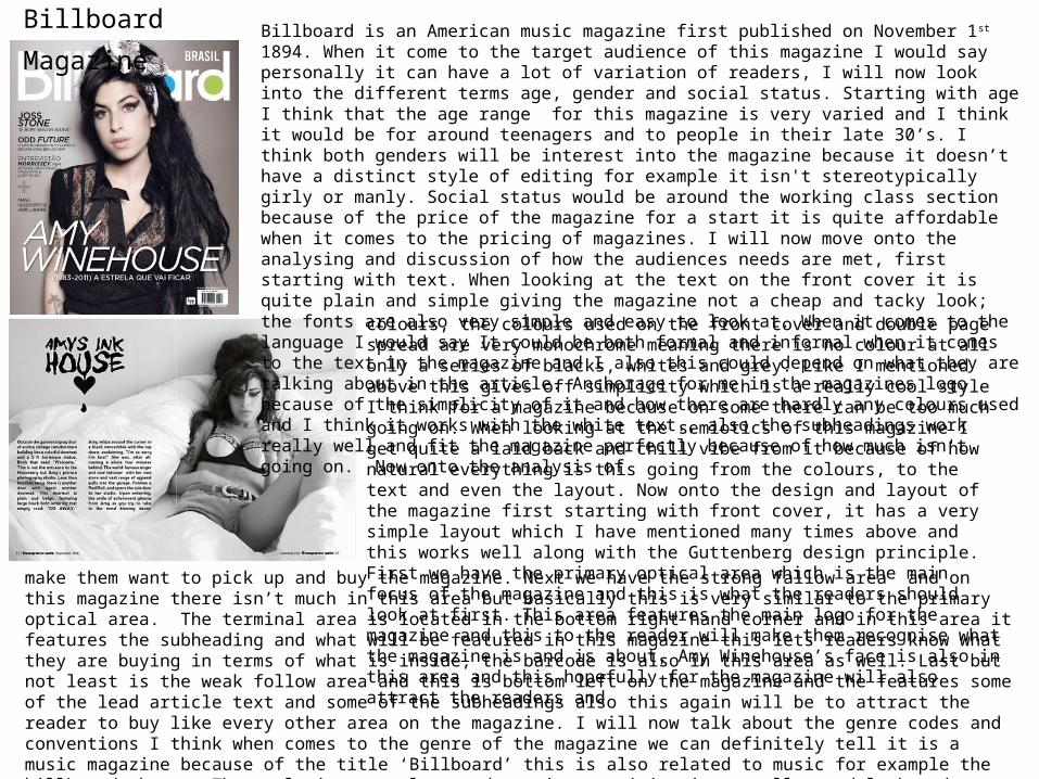
Billboard Magazine Billboard is an American music magazine first published on November 1 st 1894. When it come to the target audience of this magazine I would say personally it can have a lot of variation of readers, I will now look into the different terms age, gender and social status. Starting with age I think that the age range for this magazine is very varied and I think it would be for around teenagers and to people in their late 30’s. I think both genders will be interest into the magazine because it doesn’t have a distinct style of editing for example it isn't stereotypically girly or manly. Social status would be around the working class section because of the price of the magazine for a start it is quite affordable when it comes to the pricing of magazines. I will now move onto the analysing and discussion of how the audiences needs are met, first starting with text. When looking at the text on the front cover it is quite plain and simple giving the magazine not a cheap and tacky look; the fonts are also very simple and easy to look at. When it comes to the language I would say It could be both formal and informal when it comes to the text in the magazine and I also this could depend on what they are talking about in the article. Anchorage for me in the magazines logo because of the simplicity of it and how there are hardly any colours used and I think it works with the white text., also the subheadings work really well and fit the magazine perfectly because of how much isn't going on. Now onto the analysis of
colours, the colours used on the front cover and double page spread are very monochrome meaning there is no colour at all only a series of blacks, whites and grey. Like I mentioned above this gives off simplicity which is a really cool style I think for a magazine because on some there can be too much going on. When looking at the semiotics of this magazine I get quite a laid back and chill vibe from it because of how natural everything is this going from the colours, to the text and even the layout. Now onto the design and layout of the magazine first starting with front cover, it has a very simple layout which I have mentioned many times above and this works well along with the Guttenberg design principle. First we have the primary optical area which is the main focus of the magazine and this is what the readers should look at first. This area features the main logo for the magazine and this to the reader will make them recognise what the magazine is and is about, Amy Winehouse’s face is also in this area and this hopefully for the magazine will also attract the readers and
make them want to pick up and buy the magazine. Next we have the strong fallow area and on this magazine there isn’t much in this area but basically this is very similar to the primary optical area. The terminal area is located in the bottom right hand corner and in this area it features the subheading and what will be featured in this magazine this lets readers know what they are buying in terms of what is inside, the barcode is also in this area as well. Last but not least is the weak follow area and this is bottom left on the magazine and the features some of the lead article text and some of the subheadings also this again will be to attract the reader to buy like every other area on the magazine. I will now talk about the genre codes and conventions I think when comes to the genre of the magazine we can definitely tell it is a music magazine because of the title ‘Billboard’ this is also related to music for example the billboard charts. The style is very clean and persistent giving it a really good look and layout through the whole magazine and I think this works really well. The language used is quite informal and there is lots of music references which makes it relatable to the music genre magazine. Anchorage when it comes to this magazine I would say is the artist who is featured, the more famous the person the more popular the magazine.
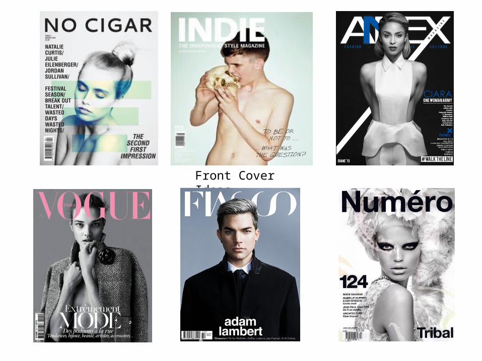
Front Cover Ideas
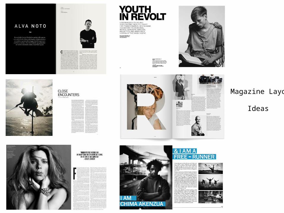
Magazine Layout Ideas