Pr11 production commentary
8
Unit 51 Page Layout and Design Production Commentary
-
Upload
shaunaeleacy -
Category
Education
-
view
18 -
download
0
Transcript of Pr11 production commentary

Unit 51 Page Layout and DesignProduction Commentary

Slide 1: Design ProgrammesPhotoshop
Microsoft WordI used Microsoft word to write my article for the double page spread, this Is also where I edited my friends article when I read it to give comments and improvements, I used Ctrl/Alt M to make a short comment next to her article I did this several times on her work and my friend did the same to mine, I then edited my own article to make the improvements my friend left on mine.
Photoshop is the main software I used, this is where I put all my front cover and double page spread together, I spent the most time on Photoshop putting all the pieces together, I also edited all my images in Photoshop, the main image for the front cover and the main image for the double page spread, I also edited the small images that are on my double page spread in Photoshop everything even down to font. Its basically where I edited everything this is the only editing software which I have used for the magazine.

Slide 2: FORMATSMy magazine is a music theme, I wanted it to have a certain music genre for the whole magazine I wanted to give it a alternative/pop/dance/synth pop, that’s the sort of music I wanted to have in my magazine I wanted to have this come across in the front cover with the editing of the front cover like the lighting in the image and the artist names on the front. The images I looked at had a very simple layout, text all in neat columns along with the headline, and not many bright colours and in your face with over the top images all over the place I wanted it to be neat and easy to look at the magazine I looked at for inspiration was clash magazine, id say that my double page spread shows this more than my front cover. The front cover of a clash magazine are very vibrant and colourful they almost seem like they have lighting projected onto the person on the front, I want this look for my front cover, I tired several times to get this effect I changed my mind a lot before I settled on one edited image, when you look at the double page spread of clash magazine you see how in mine I have got the one image on one side and the text on the over I like how one page can be dedicated to just text I think it looks really easy to read, I over all really like the colours on the front it really catches your eye and then inside its complete opposite, the only downside to having this as a inspiration is clash magazine isn't always music it can change each issue. Also the huge title which covers the image on the front cover I wanted the big title so you instantly knew what the name of the magazine was then along with it is the features. I also didn’t want to title to cover the image so having it just above Ryan's hairline keeps it from covering his face, like the people on the front of clash the writing never fully covers the faces only just slightly the side, I also looked at the way they lay out their articles and how they had the first word bigger than the rest I used this in my introduction text.

Slide 3: Conventions & Visual Language
Genre conventions I’d say what makes It music and things that I've added are things like artists, names etc. for my front cover I added subtle things like ‘top 10’ and ‘win £100 + CD’ even just putting the word music straight into one ‘magic music edition’. I also added a sticker down at the bottom which mentions 80’s vibe with a disco ball this indicates music straight away along with ‘top selling songs’. Another big music give away are the artists mentioned just on my front cover like James Bay, Years and Years, The 1975 and Chvrches. I didn’t want it to look like a fashion magazine so having Ryan and Emily just casually dressed in white t-shirts so it shows its not advertising clothing, you could say having the name Prime for a magazine could relate to music because its like what's now what important so I related this to what's new and popular with music, having things top 10 and introducing. For my double page spread things like the text itself mentions music frequently so that gives it away quiet a lot also the concert review a lot of language I use in that makes it clear that its music, the main thing on my double page spread which relates to music is the album cover I made with an image of Emily I put it together so I could use it as a advertisement I added a tag line ‘Their single dive out now’, if this doesn’t give it away that it’s a music magazine then I don’t know what would, this shows that you don’t need someone holding a guitar or a drum stick to get a music theme, most music magazine don’t even have their artists holding an instrument most don’t play them at all. I tried to get the music theme across as best I could with subtle things like the usage of words and images.
Slide 3: Conventions & Visual Language
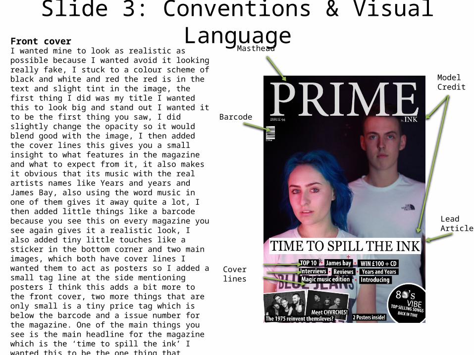
Barcode
Model Credit
Lead Article
Cover lines
MastheadI wanted mine to look as realistic as possible because I wanted avoid it looking really fake, I stuck to a colour scheme of black and white and red the red is in the text and slight tint in the image, the first thing I did was my title I wanted this to look big and stand out I wanted it to be the first thing you saw, I did slightly change the opacity so it would blend good with the image, I then added the cover lines this gives you a small insight to what features in the magazine and what to expect from it, it also makes it obvious that its music with the real artists names like Years and years and James Bay, also using the word music in one of them gives it away quite a lot, I then added little things like a barcode because you see this on every magazine you see again gives it a realistic look, I also added tiny little touches like a sticker in the bottom corner and two main images, which both have cover lines I wanted them to act as posters so I added a small tag line at the side mentioning posters I think this adds a bit more to the front cover, two more things that are only small is a tiny price tag which is below the barcode and a issue number for the magazine. One of the main things you see is the main headline for the magazine which is the ‘time to spill the ink’ I wanted this to be the one thing that stands out the most this is why it has a white background it’s the most important thing that should feature on the front cover so people know what its about along with the image, my image is of the artists featured who I've named INK, I had a idea in my head on how I wanted it to look, I wanted a dark background and I wanted them to have a slight light I decided on red because it goes with my colour theme.
Front cover

Slide 3: Conventions & Visual Language
SUBHEAD
Drop cap
Body textHeadline
Pull quote
Gutters
White space
I wanted the text to have simple layout and a simple colour the black against the white and the white against the image makes the text stand out, I also made the questions bold to make them different to the answers, I also put a background behind the review part to make it separate from the interview, I made everything else simple so the images would be the main focus on the magazine having the images be the main source of colour on the page makes you look at them first I wanted the images to have a vintage theme with a tint on them, I also added two photos over the top so I could show more of the images I took, the other image on the page is the album cover I made I wanted to add something else to make it look more realistic and to make it obvious that It was music related by having a tag line below saying ‘album out now’ I want people to get a chilled vibe from the interview because I worded it like a conversation and the images to have a chilled/none forced poses just them being them selves in front of the camera , I also think that the pull quote makes it look more realistic even just something simple as a pull quote, even the introduction makes it clear that its music related. I wanted the headline to start at the top and be the first thing you read so it can introduce the article, this is where the headline is normally placed, the next thing is the body text this is my introduction this is separate from the main interview I wanted this to go over my main image so it could look a bit more professional, the next thing is the pull quote this brings the article together and makes you read this first to give you a taster of what’s to come in the interview, the gutter separates it up and makes it look clean, finally the drop cap gives it another professional vibe its definitely my favourite part
Double page Spread

Guttenberg Principle (Front cover)
The Primary Optical Area
Strong Fallow Area
Weak Fallow Area The Terminal Area
Axis of orientation
The Primary Optical Area: The magazine name is centered right at the very top followed with the name of the people it features with ‘PRIME’ larger than the rest with the tag line below, I have put the main feature name at the top just under the ‘E’ of ‘PRIME’ I wanted it to be the first thing you read along with the title of the magazine and the first thing you see is the picture of them two because they are the band that has the main interview and pictures, so if the magazine was real and Ryan and Emily were actually a famous band their fans would see them and instantly want to know more. Also just under ‘P’ is the issue number I wanted to add this to give it more of a realistic look and then below that is the barcode and price again to make it look more realistic.The Terminal Area:I put a small ‘sticker’ at the bottom which tells you about another feature in the magazine, I wanted it to go along with one of my features which was the ‘Magic music edition’, which would explore older music etc., it goes there as one of the last things you would look at, it says 80s vibe where I have replaced the 0 with an image of a disco ball to make it stand out a bit more, you can also see the rest of the features.Strong Fallow Area:The title crosses over to the strong fallow area also so it’s very similar to the primary optical area. You see the feature which is only small but says ‘ft. INK’ which is my main feature this is only brief because I featured the artists name in my headline ‘time to spill the ink’Weak Fallow Area:The weak fallow area has the two small images of two real bands and small headlines for them I wanted to make it look like there was a poster feature and a small article about them I added a white border to make them stand out a bit more and not clash with my background, this also includes the start of all my small features which I also but a background on to make the white writing stand out.

Slide 4: AudienceI’d give my magazine the age probably between 14-24 just because it has features with popular bands and artists and even new artists with the introducing feature, plus is has artist posters and posters are more for the younger audience especially if you have a favourite band. For gender I’d say both male and female because the music genre is listened to by both genders, I wanted the genre to come across as alternative/pop/dance/synth pop because I have mentioned people like Years and Years, The 1975, James Bay and Chvrches which all fit one of those genres. There aren’t many bright colours so if you were to stereotype gender you wouldn’t really be able to, so personally id say both genders. Looking at social class I would say the working class because its just your normal type magazine nothing fancy just a standard music magazines with a few reviews and interviews things like that and if I was to choose a social grade probably go for c2 and below plus I’ve put a price on the front cover and it is £2.99 which Id say is affordable and a normal magazine price. My magazine meets this type of audience because its simple and like most music magazine which has a popular band featured on the cover, its a simple style with casual fonts nothing to extreme the colours are all basic.