PowerPoint Presentations: The Good, The Bad, and The Uglyfaculty.salisbury.edu/~dlprice/SU Lab...
25
PowerPoint Presentations: The Good, The Bad, and The Ugly Dr. Dana L. Price Salisbury University February 2, 2010
Transcript of PowerPoint Presentations: The Good, The Bad, and The Uglyfaculty.salisbury.edu/~dlprice/SU Lab...

PowerPoint Presentations: The Good, The Bad,
and The Ugly
Dr. Dana L. Price Salisbury University
February 2, 2010

Format
• Your talk should be organized in a top-down manner – Introduction – Methods and Details – Results – Conclusions and Future Directions – Critique if needed

Introduction
• Background information • The Big Picture: what, and why we should
care about this research. • Include a statement of the problem being
solved (what)

Details
• Methods and Materials Used in Research • Details needed to explain • Give the bare essentials about the subjects,
study site, and protocol. • But, don’t be so brief that we can’t figure out
what was done • If some facet of the research was peripheral,
leave it out.

Results
• What did you find? • Did the tests come out the way they
expected? • This section will be supported by graphics
of the data and statistics (graphs, tables, figures etc…)

Discussion and Conclusions
• Conclusions • What is the central message of your
Discussion • Critique of Work
– possibly compare to related work by other authors
• Future Directions

Questions
• You can prepare a few backup slides that may help to better answer questions
• Be able to respond in a timely manner • Try to prepare for any question that you
may be asked

Presentation Style
Colors Experiment with color combinations Make sure they work well on the screen Often there is a difference between how
something looks on your computer and how it looks on the screen
Test your presentation ahead of time if you can

Color blindness

Is this distracting?

Does this make you angry?

Font Format
• Use it sparingly • Font size should be 28-32 (sometimes 24) • Commonly there should be no more than 6
points per slide • Font format – Easy to read fonts (Arial is
most common)

How big should I be?
• Can you read me now? – 48 • Can your read me now? – 36 • Can you read me now? – 28 • Can you read me now? – 24 • Can you read me now? - 20
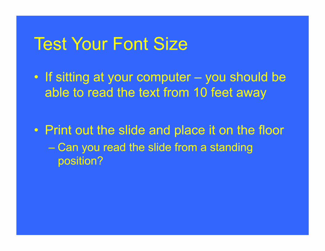
Test Your Font Size
• If sitting at your computer – you should be able to read the text from 10 feet away
• Print out the slide and place it on the floor – Can you read the slide from a standing
position?

Effective use of your slides
• Use your slides as a • Don’t read word for word (BORING) – the
audience knows how to read • If you must read something from your slide
– show excitement

Unity
• Keep unity from slide to slide (this doesn’t mean be boring)
• Same colors • Same bullets • Same font, etc… • Slides of different formats are distracting
Fancy Presentations
• Are they worth it? • If it takes a long time to upload, etc… don’t
do it. • Often times, fancy animations can be
distracting • Should be short and to the point • Minimize or avoid animated texts

Text Animation
• Appear • Blinds • Diamond • Fly In • If you choose to use animation, be
consistent • Only use to show a point

Visual Images
• Graphs, Tables, and Figures should be large enough for the audience to examine
• If you have to apologize for too much information, don’t do it.
• Scans can often be blurry • You can recreate your tables, etc…

Picture Size
• Pictures should be large enough for everyone to see
• Try to minimize the picture size – if the size is 20MB your presentation will have trouble loading

Internet Information
• If you download pictures from the internet – give your source with the picture – Small font size
• Your review information should come from review articles, not Wikipedia!

How long is your presentation?
• Your goal is to hit exactly 12 minutes! • First practice the talk without timing yourself • When you are comfortable with it – time it. • Use the “Rehearse timings” option in
PowerPoint to practice

Mac vs. PC
• Test your presentation on both • Conversion from Mac to PC and vice
versa can be tricky – Missing photos – Text indents may change – Bullets may change, etc…
• This classroom has a PC!

Topic choice
• Choose a topic that you are excited about
• The goal is to make your excitement shine through in your presentation!

Resources
The information presented here was taken from the following resources:
• http://cte.umdnj.edu/career_development/career_presentations.cfm
• Creating an Effective PowerPoint Presentation, by Thomas Saylor