Portfolio - WordPress.com · Adrian Frutiger was the Type designer of Avenir. He gained an...
12
Dylan Wert Portfolio Dylan Wert
Transcript of Portfolio - WordPress.com · Adrian Frutiger was the Type designer of Avenir. He gained an...

1
Dylan Wert
Portfolio
Dylan Wert

2 3
Portf
olio
Dylan Wert
Type Specimen
aHistoryAdrian Frutiger was the Type designer of Avenir. He gained
an apprenticeship at a print house in Interlaken. He lived
in Paris most of his professional life passing away in 2015
at the age of 87. He is most known for His three big Type-
faces Univers, Frutiger and Avenir. Univers is used on Lon-
don street signs which are recognised all over the world.
Frutiger sans serif font is used by the Dutch railway sys-
tem and road signs in Switzerland. Finally, Avenir is used
by the likes of snapchat but also the popular I am Amster-
dam sign. He received 15 awards and prizes from 1950-
2013 for his type faces. He also founded the Adrian et Si-
mone Frutiger to fund money into mental health support.
TypefaceThe classification of the typeface is geom
etric and category is
sans-serif. Originally three w
eights including a roman and oblique
version and later expanded to six weights. Som
e small details
like the a and t with a curl at the bottom
and letters like o are
not perfect circles but optically corrected. Frutiger said that the
change from three w
eights to six was a response to how
peo-
ple perceive colour for example bolder designs on w
hite-on-
black text looking the same to the view
er then on black-on-
white. Frutiger rew
orked the Avenir Family w
ith Akira Kobayashi
extending the Font Family to a total of 32 Fonts by 2007.
UsageThe typeface is used for a range of ways however recently has
been used a lot in media and by large corporations. The likes
of Snapchat, Apple, Samsung, Best Buy and Linked In have
used this font as it is a minimalist geometric font which is very
popular at the moment for multimedia platforms and adver-
tisement. However, it is also used for Uno bus company, Wake
Forest University and the city of Amsterdam for their corporate
identity. This shows that the Font is very versatile and modern
which can be used for a range of different companies and areas.
Aven
ir
Aa
Bb
Cc
Dd
Ee F
f G
g H
h Ii
Jj K
k Ll
Mm
N
n O
o Pp
Rr S
s Tt
Uu
Vv W
w X
x Yy
Zz
1 2
3 4
5 6
7 8
9 0
! @
£ $
% ^
& *
# ?
Avenir 35 LightAvenir 35 Light ObliqueAvenir 45 BookAvenir 45 Book ObliqueAvenir 55 RomanAvenir 55 ObliqueAvenir 65 MediumAvenir 65 Medium ObliqueAvenir 85 HeavyAvenir 85 Heavy ObliqueAvenir 95 BlackAvenir 95 Black Oblique
Futu
re
1988
L4 Graphic Communication Dylan Wert
aLinked in
I amsterdam
.
Adrian Frutiger
Type Specimen for Avenir which brings to life and celebrate the typeface. This allowed me to appreciate typography further and understand the form and function of visual language.

4 5
Portf
olio
Dylan WertImage Zine
Type Specimen for Avenir which brings to life and celebrate the typeface. This allowed me to appreciate typography further and understand the form and function of visual language.

6 7
Portf
olio
Dylan Wert
MovementA movement highlighting the difference in wholebean coffee compared to instant coffee and the fight for more people to throw away instant and only drink the good stuff.
8 9
Portf
olio
Dylan Wert
collab outcomes?
10 11
Portf
olio
Dylan Wert
Design as ActivismA movement highlighting the difference in wholebean coffee compared to instant coffee and the fight for more people to throw away instant and only drink the good stuff.
12 13
Portf
olio
Dylan Wert
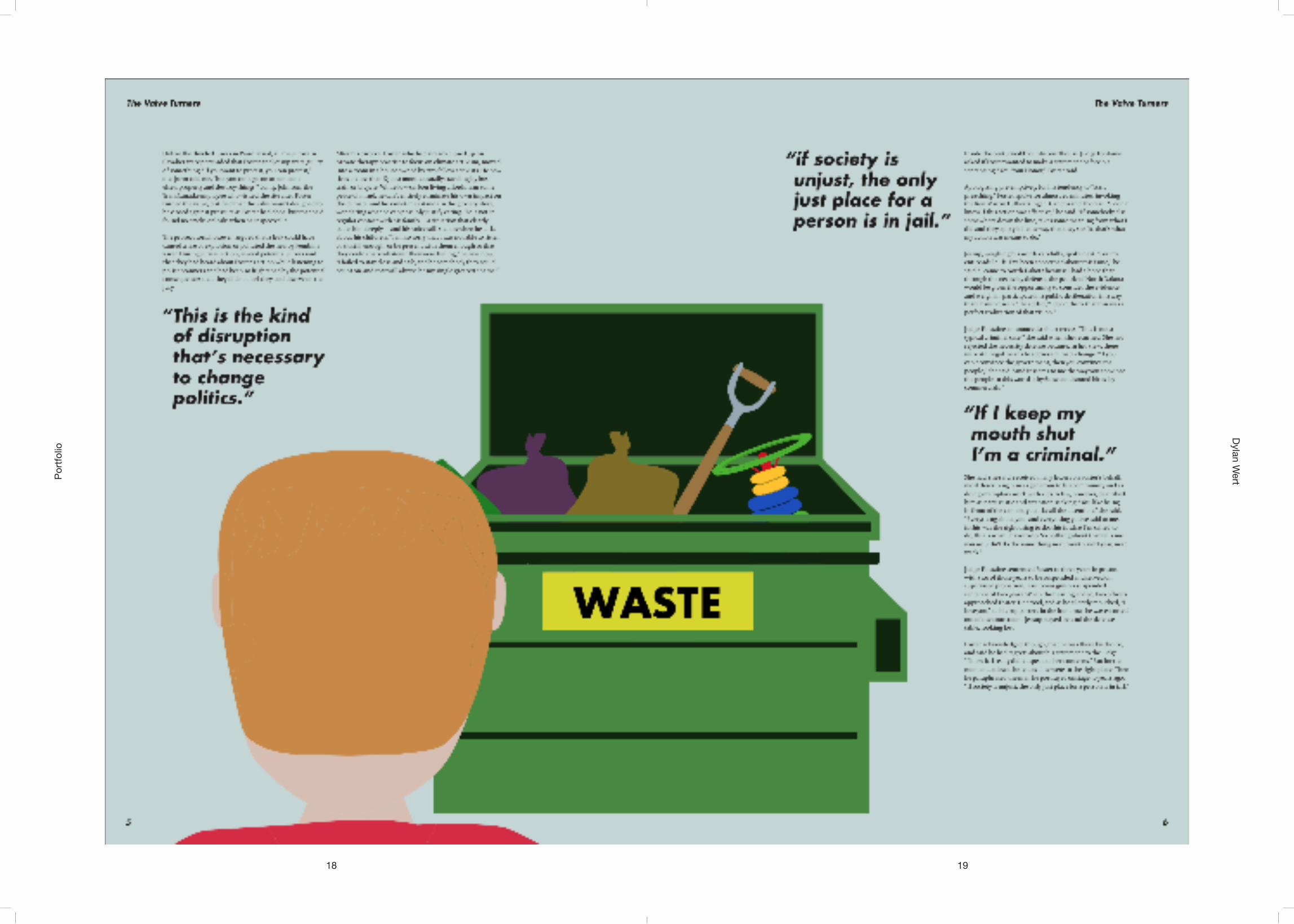
Changing FacesChanging Faces allowed me to redesign an article sheding light on the issue of oil pollution from a different perspective of family life using imagery. The Valve Turners and impact this had on their families rather than the impact they had on the corrupt system they tried to exploit.

14 15
Portf
olio
Dylan Wert

16 17
Portf
olio
Dylan Wert
18 19
Portf
olio
Dylan Wert
20 21
Portf
olio
Dylan Wert
Open / CloseType Specimen for Avenir which brings to life and celebrate the typeface. This allowed me to appreciate typography further and understand the form and function of visual language.

22 23
Portf
olio
Dylan Wert
The open/close project allowed me to improve and show my skills that i have learned throughout this year using type, layout, grid systems and colour. A collection of all of the years work and learning in one piece which shows the improvement within my work compared to before this year of university.