Population Pyramids. Population pyramids are graphs that can tell us a wealth of information about a...
42
Populatio n Pyramids
-
Upload
juliana-booker -
Category
Documents
-
view
225 -
download
1
Transcript of Population Pyramids. Population pyramids are graphs that can tell us a wealth of information about a...

Population Pyramids
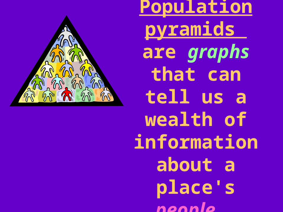
Population pyramids
are graphs that can tell us a
wealth of information about a place's people.

These special graphs are called “pyramids” because most
nation’s statistics take the shape of a upward-sloping pyramid.

The statistics on a population pyramid
give governments and others the tools they need to make
informed decisions and plans for the future.

Population pyramids are easier to interpret that most
people think!

Pyramids are types of graphs that depict the basic shape of a country's age and gender structure in a way different from
charts like this:

They are created by making horizontal bars to show how many males and
females fall into specific age categories.

A population pyramid begins with a bar graph that shows the number of
people in a country, at each age group.
Millions Of
People
Age groups

The bar graph is turned on its side, next to another bar graph, turned on its side.
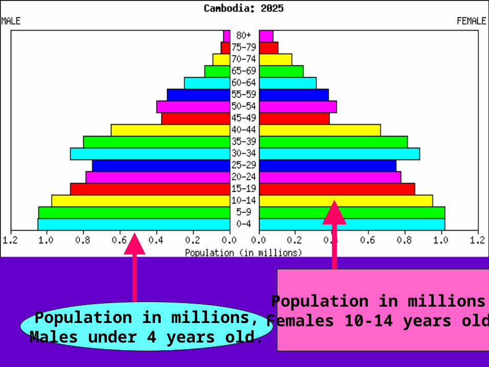
Population in millions,Males under 4 years old.
Population in millions,Females 10-14 years old.
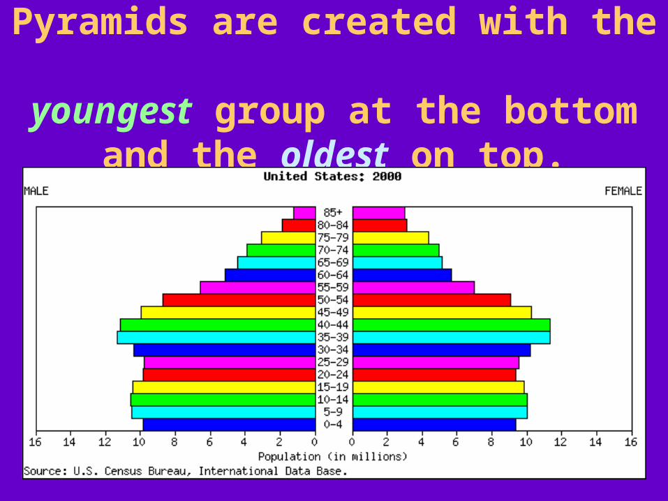
Pyramids are created with the youngest group at the bottom
and the oldest on top.

There are three general shapes of population pyramids;

1. Rapid Growth
2. Slow Growth
3. Near Zero Growth

Rapid Growth:

A rapid growth's pyramid really has the triangular shape of a pyramid
because each group is larger than the one born before it.
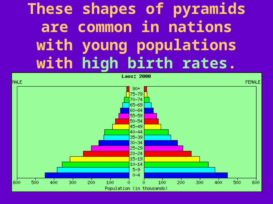
These shapes of pyramids are common in nations with young
populations with high birth rates.

Many developing nations’ pyramids reflect this shape.
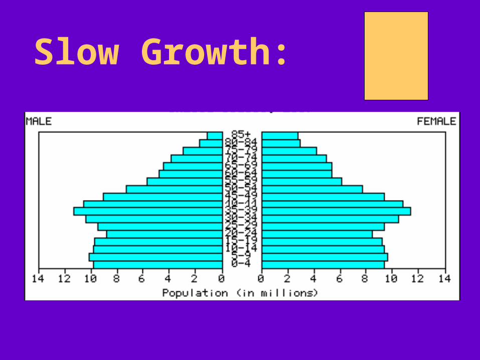
Slow Growth:

A slow-growth population's pyramid is more of a straight, column-shape.

It seems to be a nearly equal distribution of the population at most
age group categories.

This shape is common in developed countries, like the United States.


Near-Zero, or Negative Growth:

A population that is not growing, or actually decreasing produces a
different shaped pyramid.

The bottom of its pyramid narrows.

Many highly industrialized societies are actually experiencing negative
population growth.
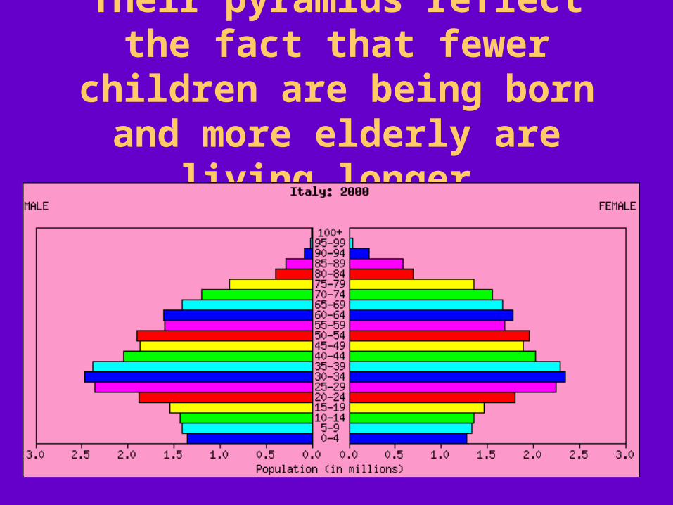
Their pyramids reflect the fact that fewer children are being born and
more elderly are living longer.


How do Pyramids Predict the Future?
Explain the
changing
needs of
government
services,

If a country's population is growing tremendously, the need will be immediate
for more schools and teachers, then eventually, the need for more
health services for the elderly!

Burkina Faso, 2000
Burkina Faso, 2025

Possible usage of natural resources,

INDIA, 2000

INDIA, 2025

INDIA, 2050

Let’s look at population pyramids for Indonesia for the next
few decades…Can you predict what decisions and plans will need to be made
for the future?

INDONESIA,2000
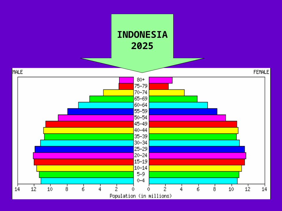
INDONESIA2025

INDONESIA2050

Population pyramids are useful
predictors of the growing needs of
our planet!

Population Pyramids

Source: U.S. Census Bureau