Pop art photographers
12
POP ART JACK SARGENT
-
Upload
jackjsargent -
Category
Art & Photos
-
view
1.830 -
download
0
Transcript of Pop art photographers
POP ART
JACK SARGENT

THE HISTORYPop art begun in the mid 1950’s and was the creation of several young adults in Britain with the aim of bringing a new creative, fun and bright movement to the world. Pop art focuses on what is popular in culture and was around after the war which characterised a sense optimism during the post was consumer boom of the 50’s and 60’s. This is where the name pop art comes from, being popular culture. Pop art was big during the globalisation of pop music and youth culture. The British artists behind pop art grew up in a very dull world of ration books and utility design. They saw America as a land of freedom, a more inclusive and youthful culture that embraced social influence of mass media and mass production. Pop art was greatly influenced by dada collages which was combinations of random images to gain a reaction from the establishment of that time. Pop art was similar to this although focused instead on popular culture. A movement that is similar to pop art is surrealism. Surrealism combined the collage and unique style of pop art/photo illustration where photos are edited or illustrated which also uses the contrasting colors.

ANDY WARHOLAndy Warhol was probably the most famous pop art photographer and artist. He was born in 1928 in the United States and died in 1987 unexpectedly after a gall bladder operation. He was the pioneer of popular culture and explored the relationship between artistic expression, celebrity culture, advertising and mass-production, all of which flourished in the 1960’s. His work was often created with a range of other copies in different styles. One of his most famous pieces was a series of portraits of Marilyn Monroe. His work was very unique and he photographed some of the most famous and influential people in the world. All of his work uses the portrait of the person edited into bright and vibrant contrasting pieces, which are set onto a bright background. The photo of Marilyn Monroe reflects the symbol that she was at the time, with her mouth slightly open it shows purity and her iconic blonde hair. Most of his photographs are very simple and basic focusing on mainly the head and excluding the rest of the body. He also took a range of self portraits where in each one the actual photo of his self is contrasting to the background. This puts emphasis onto the subject which is effective in every piece that he creates. The colors used in the photos also create the overall mood of the photo and the colors alone reflect the person for example red white and blue to represent the Queen of England. He used silk screening to absorb the ink and create the contrasting colored effect.
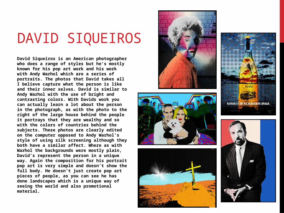
DAVID SIQUEIROSDavid Siqueiros is an American photographer who does a range of styles but he's mostly known for his pop art work and his work with Andy Warhol which are a series of portraits. The photos that David takes all I believe capture what the person is like and their inner selves. David is similar to Andy Warhol with the use of bright and contrasting colors. With Davids work you can actually learn a lot about the person in the photograph, as with the photo to the right of the large house behind the people it portrays that they are wealthy and so with the colors of countries behind the subjects. These photos are clearly edited on the computer opposed to Andy Warhol’s style of using silk screening although they both have a similar affect. Where as with Warhol the backgrounds were mostly plain, David’s represent the person in a unique way. Again the composition for his portrait pop art is very simple and doesn’t show the full body. He doesn’t just create pop art pieces of people, as you can see he has done landscapes which is a unique way of seeing the world and also promotional material.
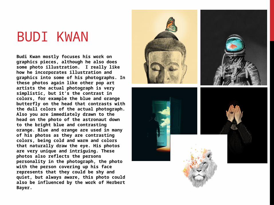
BUDI KWANBudi Kwan mostly focuses his work on graphics pieces, although he also does some photo illustration. I really like how he incorporates illustration and graphics into some of his photographs. In these photos again like other pop art artists the actual photograph is very simplistic, but it’s the contrast in colors, for example the blue and orange butterfly on the head that contrasts with the dull colors of the actual photograph. Also you are immediately drawn to the head on the photo of the astronaut down to the bright blue and contrasting orange. Blue and orange are used in many of his photos as they are contrasting colors, being cold and warm and colors that naturally draw the eye. His photos are very unique and intriguing. These photos also reflects the persons personality in the photograph, the photo with the person covering up his face represents that they could be shy and quiet, but always aware, this photo could also be influenced by the work of Herbert Bayer.
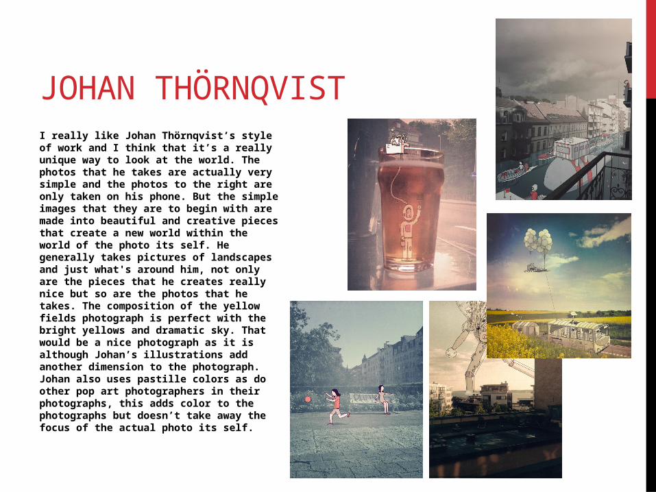
JOHAN THÖRNQVISTI really like Johan Thörnqvist’s style of work and I think that it’s a really unique way to look at the world. The photos that he takes are actually very simple and the photos to the right are only taken on his phone. But the simple images that they are to begin with are made into beautiful and creative pieces that create a new world within the world of the photo its self. He generally takes pictures of landscapes and just what's around him, not only are the pieces that he creates really nice but so are the photos that he takes. The composition of the yellow fields photograph is perfect with the bright yellows and dramatic sky. That would be a nice photograph as it is although Johan’s illustrations add another dimension to the photograph. Johan also uses pastille colors as do other pop art photographers in their photographs, this adds color to the photographs but doesn’t take away the focus of the actual photo its self.
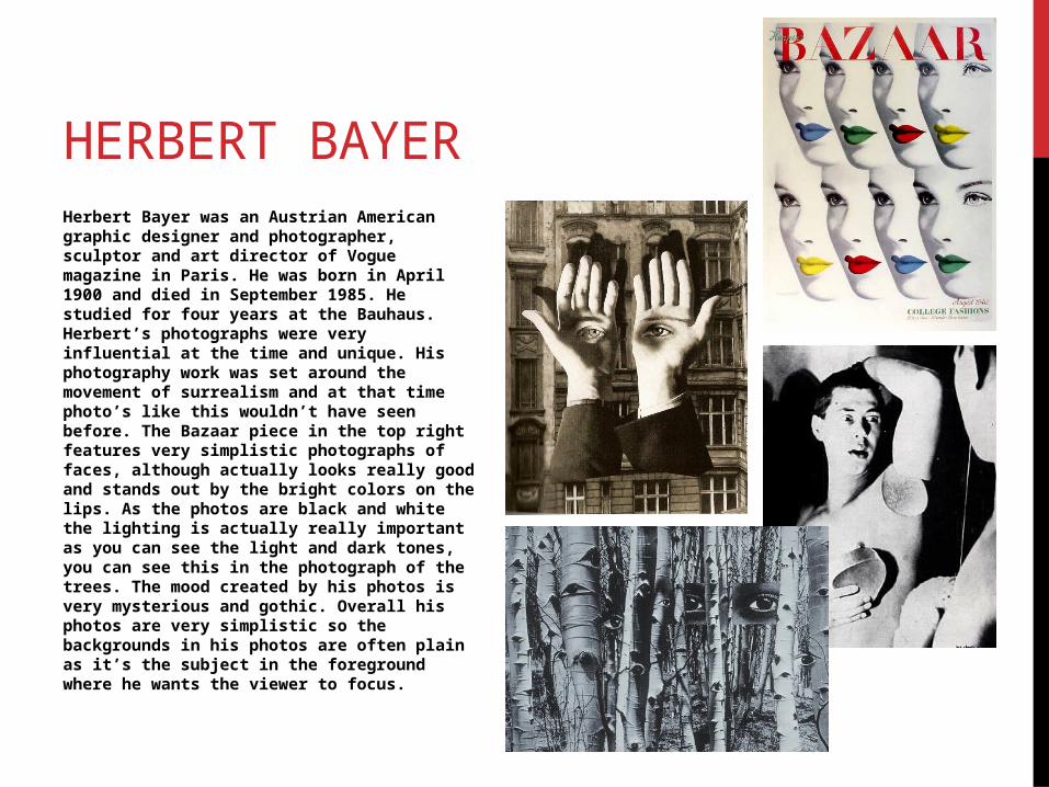
HERBERT BAYERHerbert Bayer was an Austrian American graphic designer and photographer, sculptor and art director of Vogue magazine in Paris. He was born in April 1900 and died in September 1985. He studied for four years at the Bauhaus. Herbert’s photographs were very influential at the time and unique. His photography work was set around the movement of surrealism and at that time photo’s like this wouldn’t have seen before. The Bazaar piece in the top right features very simplistic photographs of faces, although actually looks really good and stands out by the bright colors on the lips. As the photos are black and white the lighting is actually really important as you can see the light and dark tones, you can see this in the photograph of the trees. The mood created by his photos is very mysterious and gothic. Overall his photos are very simplistic so the backgrounds in his photos are often plain as it’s the subject in the foreground where he wants the viewer to focus.
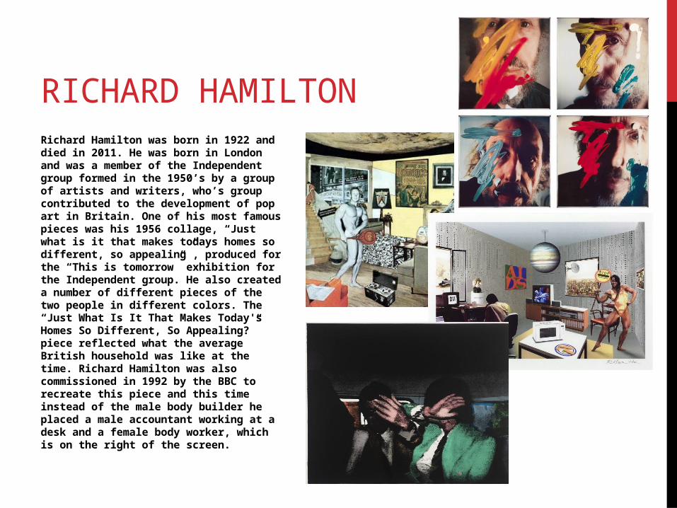
RICHARD HAMILTONRichard Hamilton was born in 1922 and died in 2011. He was born in London and was a member of the Independent group formed in the 1950’s by a group of artists and writers, who’s group contributed to the development of pop art in Britain. One of his most famous pieces was his 1956 collage, “Just what is it that makes todays homes so different, so appealing”, produced for the “This is tomorrow” exhibition for the Independent group. He also created a number of different pieces of the two people in different colors. The “Just What Is It That Makes Today's Homes So Different, So Appealing?” piece reflected what the average British household was like at the time. Richard Hamilton was also commissioned in 1992 by the BBC to recreate this piece and this time instead of the male body builder he placed a male accountant working at a desk and a female body worker, which is on the right of the screen.
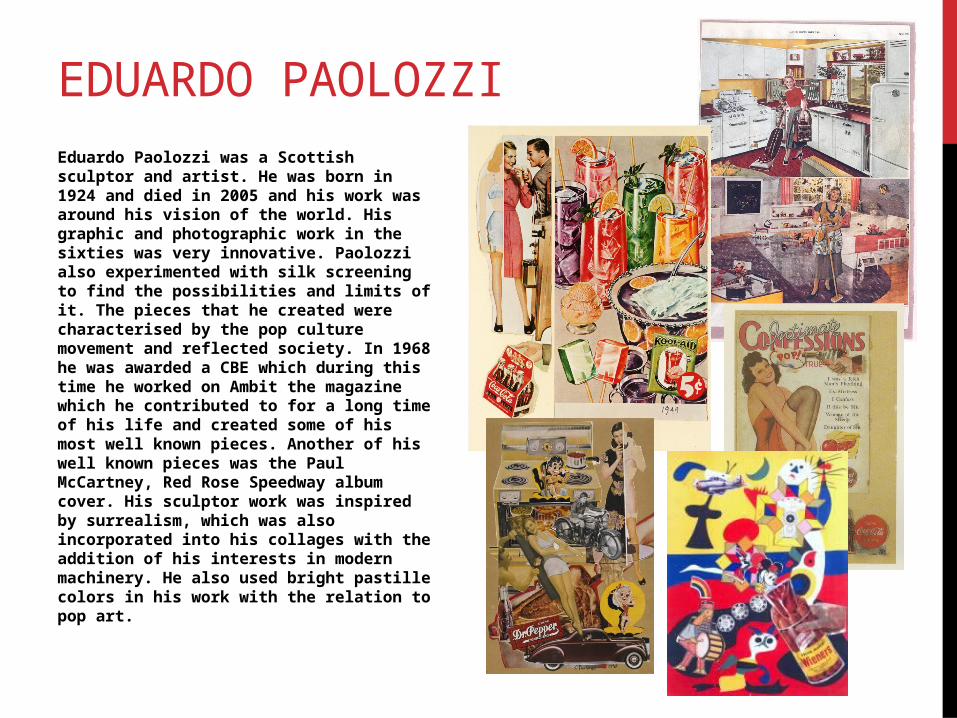
EDUARDO PAOLOZZIEduardo Paolozzi was a Scottish sculptor and artist. He was born in 1924 and died in 2005 and his work was around his vision of the world. His graphic and photographic work in the sixties was very innovative. Paolozzi also experimented with silk screening to find the possibilities and limits of it. The pieces that he created were characterised by the pop culture movement and reflected society. In 1968 he was awarded a CBE which during this time he worked on Ambit the magazine which he contributed to for a long time of his life and created some of his most well known pieces. Another of his well known pieces was the Paul McCartney, Red Rose Speedway album cover. His sculptor work was inspired by surrealism, which was also incorporated into his collages with the addition of his interests in modern machinery. He also used bright pastille colors in his work with the relation to pop art.
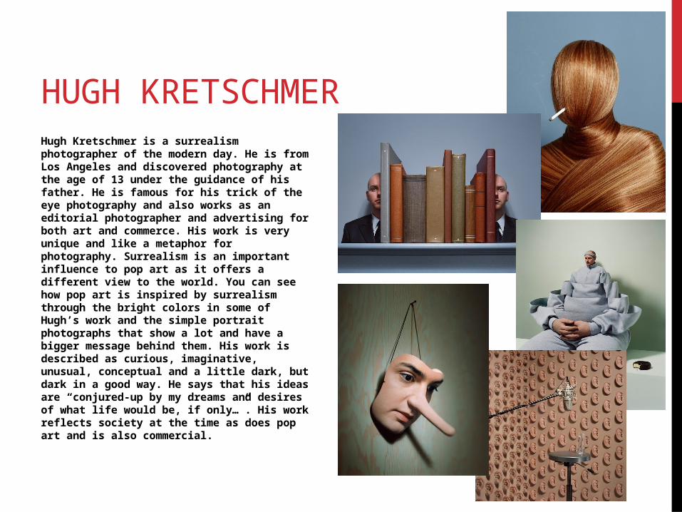
HUGH KRETSCHMERHugh Kretschmer is a surrealism photographer of the modern day. He is from Los Angeles and discovered photography at the age of 13 under the guidance of his father. He is famous for his trick of the eye photography and also works as an editorial photographer and advertising for both art and commerce. His work is very unique and like a metaphor for photography. Surrealism is an important influence to pop art as it offers a different view to the world. You can see how pop art is inspired by surrealism through the bright colors in some of Hugh’s work and the simple portrait photographs that show a lot and have a bigger message behind them. His work is described as curious, imaginative, unusual, conceptual and a little dark, but dark in a good way. He says that his ideas are “conjured-up by my dreams and desires of what life would be, if only…”. His work reflects society at the time as does pop art and is also commercial.
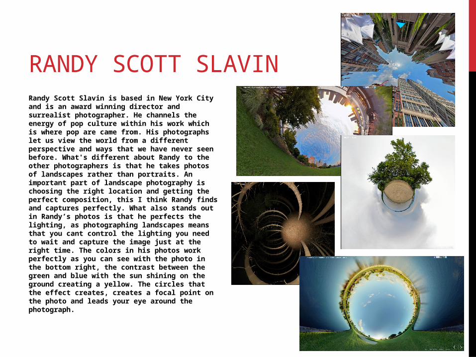
RANDY SCOTT SLAVINRandy Scott Slavin is based in New York City and is an award winning director and surrealist photographer. He channels the energy of pop culture within his work which is where pop are came from. His photographs let us view the world from a different perspective and ways that we have never seen before. What's different about Randy to the other photographers is that he takes photos of landscapes rather than portraits. An important part of landscape photography is choosing the right location and getting the perfect composition, this I think Randy finds and captures perfectly. What also stands out in Randy’s photos is that he perfects the lighting, as photographing landscapes means that you cant control the lighting you need to wait and capture the image just at the right time. The colors in his photos work perfectly as you can see with the photo in the bottom right, the contrast between the green and blue with the sun shining on the ground creating a yellow. The circles that the effect creates, creates a focal point on the photo and leads your eye around the photograph.
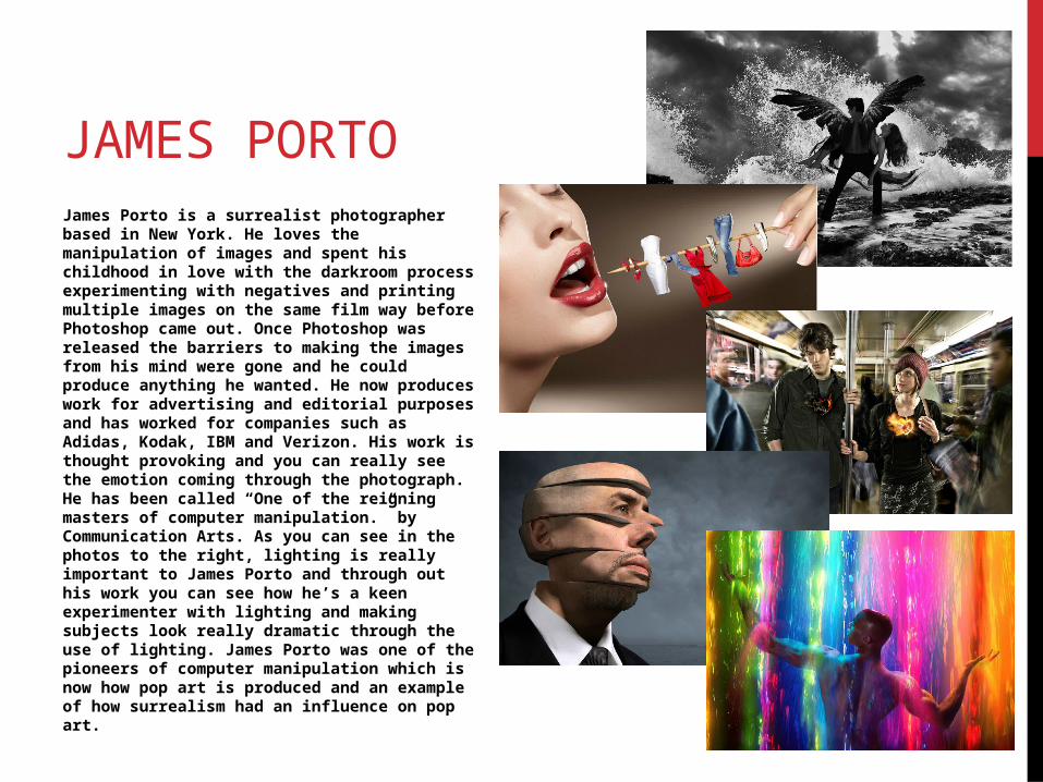
JAMES PORTOJames Porto is a surrealist photographer based in New York. He loves the manipulation of images and spent his childhood in love with the darkroom process experimenting with negatives and printing multiple images on the same film way before Photoshop came out. Once Photoshop was released the barriers to making the images from his mind were gone and he could produce anything he wanted. He now produces work for advertising and editorial purposes and has worked for companies such as Adidas, Kodak, IBM and Verizon. His work is thought provoking and you can really see the emotion coming through the photograph. He has been called “One of the reigning masters of computer manipulation.” by Communication Arts. As you can see in the photos to the right, lighting is really important to James Porto and through out his work you can see how he’s a keen experimenter with lighting and making subjects look really dramatic through the use of lighting. James Porto was one of the pioneers of computer manipulation which is now how pop art is produced and an example of how surrealism had an influence on pop art.