Planning my poster
8
Planning my poster. Emma Hillary
-
Upload
811553 -
Category
Art & Photos
-
view
173 -
download
0
Transcript of Planning my poster
Planning my poster.Emma Hillary
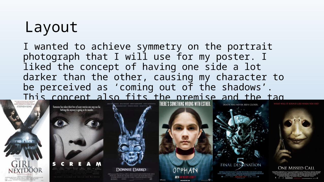
LayoutI wanted to achieve symmetry on the portrait photograph that I will use for my poster. I liked the concept of having one side a lot darker than the other, causing my character to be perceived as ‘coming out of the shadows’. This concept also fits the premise and the tag line of my trailer. As it makes the individual look sinister and twisted.
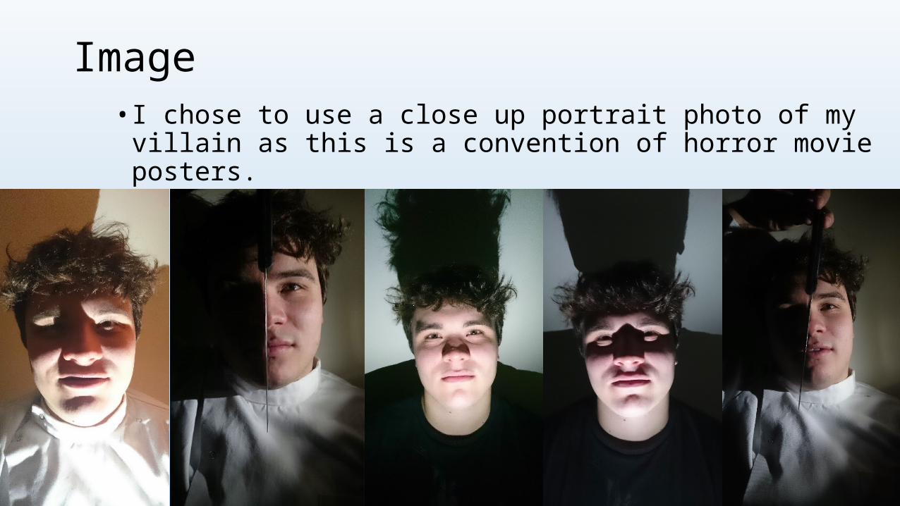
Image • I chose to use a close up portrait photo of my villain as this is a
convention of horror movie posters.
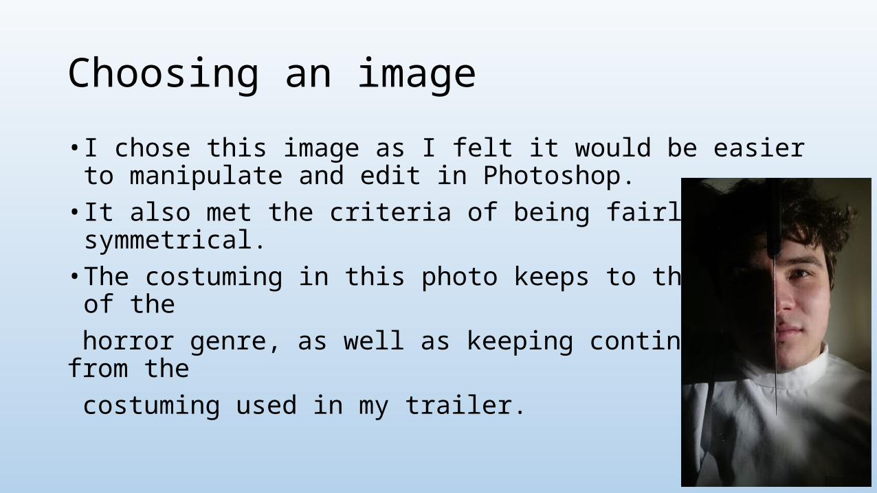
Choosing an image
• I chose this image as I felt it would be easier to manipulate and edit in Photoshop. • It also met the criteria of being fairly symmetrical. • The costuming in this photo keeps to the theme of the horror genre, as well as keeping continuity from the costuming used in my trailer.
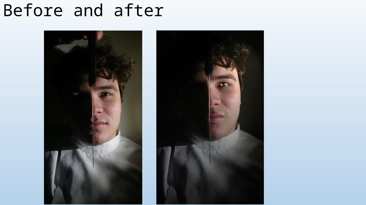
Before and after
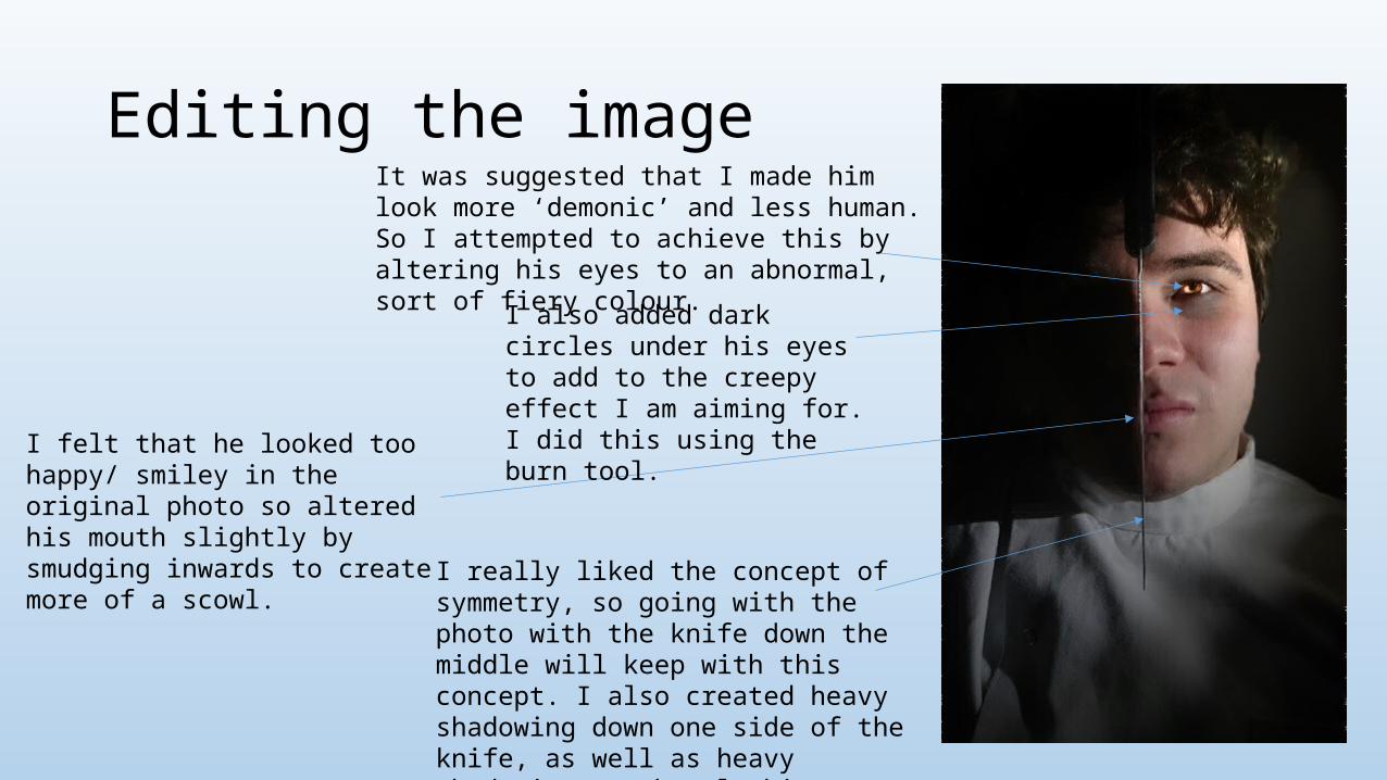
Editing the imageIt was suggested that I made him look more ‘demonic’ and less human. So I attempted to achieve this by altering his eyes to an abnormal, sort of fiery colour.
I really liked the concept of symmetry, so going with the photo with the knife down the middle will keep with this concept. I also created heavy shadowing down one side of the knife, as well as heavy shadowing on the clothing. I feel that this gives it a more frightening aesthetic.
I felt that he looked too happy/ smiley in the original photo so altered his mouth slightly by smudging inwards to create more of a scowl.
I also added dark circles under his eyes to add to the creepy effect I am aiming for. I did this using the burn tool.
Title
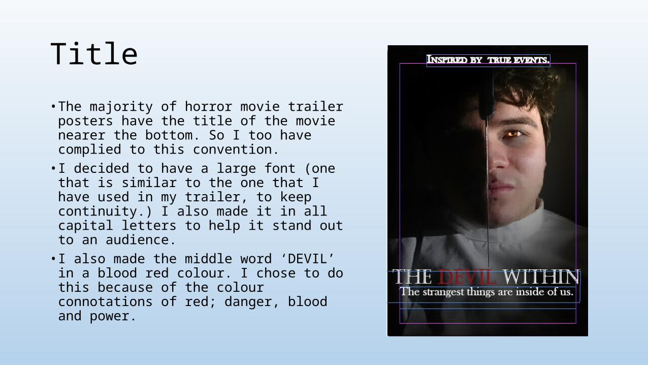
• The majority of horror movie trailer posters have the title of the movie nearer the bottom. So I too have complied to this convention. • I decided to have a large font (one that is
similar to the one that I have used in my trailer, to keep continuity.) I also made it in all capital letters to help it stand out to an audience.• I also made the middle word ‘DEVIL’ in a blood
red colour. I chose to do this because of the colour connotations of red; danger, blood and power.
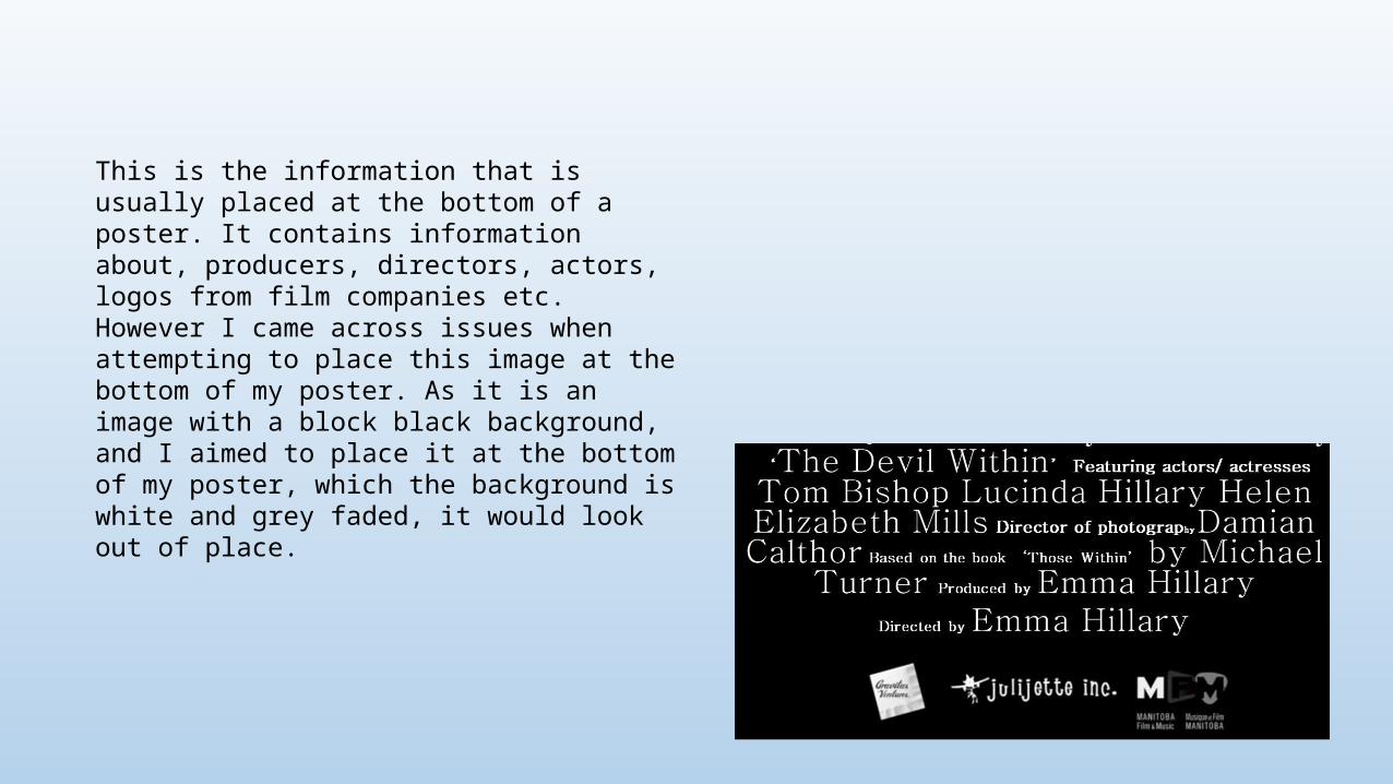
This is the information that is usually placed at the bottom of a poster. It contains information about, producers, directors, actors, logos from film companies etc. However I came across issues when attempting to place this image at the bottom of my poster. As it is an image with a block black background, and I aimed to place it at the bottom of my poster, which the background is white and grey faded, it would look out of place.