PictuRE THiS - pdfs.semanticscholar.org fileB ook illustration is an art equally decorative and...
34
PictuR E T Hi S Five Centuries T h e c a t a p i l l e r i s g r e e n w i t h a d a r k g r e e n l i n e a l o n g t h e b a c k , a n d t h r e e n a r r o w p a l e g r e e n l i n e s o n e a c h s i d e . I t f e e d s o n t h e s e d g e ( C a r e x D i v i s a ) , a n d t h e b u r r e e d ( S p a r g a n i u m r a m o s u m ) . T h e c h r y s a l i s i s e n c l o s e d i n a l o o s e s i l k e n c a c o o n . of Book Illustration
Transcript of PictuRE THiS - pdfs.semanticscholar.org fileB ook illustration is an art equally decorative and...

PictuRE THiS
Five Centuries
Thec
atap
illerisgree
n with a dark green line along the bac
k, and
threenarrow
palegreenlines
oneach
side.Itfeedson
thesedge
(CarexDivisa),andthe
burreed
(Spargan ium
ramo
sum). The chrysalis is enclose
d in
aloosesilken
cacoon
.
of Book Illustration


T h e U C I r v i n e L i b r a r i e s • I r v i n e , C a l i f o r n i a • 2 0 0 6
An exhibit in the UC Irvine Langson Library’sMuriel Ansley Reynolds Exhibit Gallery
November 2006 - May 2007
Curated by
Ryan Hildebrand
Special Collections librarian
Five Centuries
of Book Illustration


Foreword
Welcome to the UCI Libraries’ fall 2006 exhibit, Picture This: Five Centuries of Book Illustration, which will give you a glimpse of our rich collections of both rare and contemporary illustrated books.
As we all know, today’s society greatly values visual information. We certainly see this among UCI’s undergraduates, who often seek visual resources in the context of their research. As a result, Special Collections and Archives places a particular emphasis on collecting pictorially interesting books, including contemporary examples of “artists’ books” and the art of the book.
Exhibit curator Ryan Hildebrand, the Libraries’ cataloger of rare and archival materials, discovered his passion for rare books as an English literature major at UC Riverside. While a graduate student at UCLA he deepened his knowledge of the field through internships at both the Huntington Library and UCLA’s William Andrews Clark Library. Ryan proposed this exhibit after studying the history of book illustration techniques under Terry Belanger, a Macarthur Fellowship recipient who directs the University of Virginia’s renowned Rare Book School.
The speaker for our opening event on November 14th is Stephen Tabor, Curator of Early Printed Books at the Huntington Library. His distinguished career as an expert in rare books has included appointments at UCLA’s Clark Library and the legendary Dawson’s Book Shop in Los Angeles. Steve and Ryan’s careers have been intertwined: Ryan studied historical bibliography with Steve at UCLA and was his enthusiastic acolyte while interning at the Huntington. Our exhibit thus reunites these two kindred spirits.
I hope you find that Picture This enhances your appreciation for illustrated books and the techniques used to create them in the past, present, and perhaps the future.
On behalf of both the Partners of the UCI Libraries and the entire library staff, we welcome you to this exhibit and invite you to return to view others in the future.
Gerald J. MunoffUniversity Librarian


Book illustration is an art equally decorative and didactic. In its finest form, it makes information more understandable, more interesting, and, to many,
more palatable. Illustrations are a means by which texts are enhanced and made capable of conveying information and emotion in a way that words alone cannot.
Antecedents of the illustrated book in various formats were found in disparate parts of the world. The earliest known is the Egyptian Dramatic Ramesseum Papyrus. Produced ca. 1980 BC, it is a ceremonial play, illustrated with simple drawings, that celebrates the accession to the throne of Sesostris I. In about the year 400 AD, the Chinese produced illustrated scrolls on moral lessons. The first illustrated books in the familiar codex (i.e., book) form, printed from a combination of type and woodblocks, did not appear until the 1460s. Until this time, illustrated texts were written and illuminated by hand and were therefore reproduced in very limited quantities.
These first illustrated printed books were regarded as inferior to the lavishly illuminated manuscripts they sought to replace. Many of the woodblocks used for the illustrations were, in fact, quite crudely cut. But the potential of the illustrated book was shortly realized with the popular reception of works such as Liber Chronicarum (better known as The Nuremberg Chronicle) in 1493 and the brilliant illustrations by artists such as Dürer and Grüninger.
Readers prior to the mid-19th century did not view illustrated books as the modern reader does; their society was not inundated with images as ours is today. The average household had little if any art in the home. Many did not live near museums or lacked the time or money to visit them. Illustrated books brought to readers otherwise unobtainable graphic representations of real and imagined people, places, and events, and were received with great interest and excitement.
Until the second half of the 19th century, book illustrations had a representative relationship with the text, which they paraphrased in pictures as an aid to description and/or narrative. But with the rise of modernism and the avant garde, authors and artists began exploring new modes of narrative and representation and began to seek new relationships between text and image.
Picture ThisFive Centuries of Book Illustration

Where illustration had previously situated the reader within and aided his comprehension of a work, the work of modern illustrators explored impressionistic, disharmonious, and even occult relationships to texts. Due to a rapidly-increasing repertoire of illustration processes, which by the late 19th century included photomechanical methods, artists were well disposed to express their wildest imaginings. By the early 20th century, these new approaches to illustration had become situated within movements such as Cubism, Dada, and Surrealism.
This break with traditional modes of illustration coincides with the development of a market for upscale illustrated books. Elegantly printed, often in small editions, these were regarded both as texts to be read and objects to behold. It is at this point in time that we first see livres d’artistes, which are upmarket books containing original art, usually produced in miniscule editions.
With the development of the 20th-century artists’ book in which format, typography, and graphics work together to produce an artistic object, the separation of text and image becomes even less distinct, as does their relationship. Because each artists’ book exists on its own terms, and can incorporate nearly any materials the artist has at hand, they are difficult to discuss categorically within the context of illustrated books, save to emphasize their historical and contemporary importance.
At present, illustrators have an astounding number of processes from which to choose, from the ancient practice of illustration by hand, to modern born-digital prints, to any number of hybrid processes. None of the processes exhibited here are in danger of extinction, even if some are most commonly found at the fringes of modern publishing. Each seems to have its own cult dedicated to preserving the process while adapting it to the 21st century. We can look forward to discovering what the future holds for the illustrated book.
This exhibit focuses on the methods and processes used to create book illustrations and presents both typical and extraordinary examples of a wide variety of processes. Early and modern examples of the traditional processes—relief, intaglio, and lithographic—are shown, followed by the more recently
Picture This
�
invented pochoir and silkscreen, a group of hybrid and unusual processes and, finally, electronic (including digital) processes.
Picture This: Five Centuries of Book Illustration was curated by Special Collections librarian Ryan Hildebrand. All items in the exhibit are from Special Collections and Archives in the UCI Libraries, with the exception of Item 5, which was generously loaned by the artist, Richenda Brim.
Five Centuries of Book Illustration
�
�
How Does It Work?
Throughout this exhibit you will read explanations of how various types of book illustration are created: the tools used, the plates and blocks on which
the image to be reproduced is created, observations about the particular images that are shown, and historical facts about methods, illustrators, and books. What better way to begin than by illustrating the methods used?
The items in this first section include examples of actual printing plates, stones, and blocks (Items 1, 2, and 5) from which many copies of the original image could be created. The images printed from each such original—a steel engraving, a line engraving, and a relief print—are shown in Items 1, 4, and 5. The illustrations shown in Items 3 and 4 depict printers at work on the types of presses used to produce the three basic categories of traditional prints: lithographic, relief, and intaglio.
1. Hablot Knight Browne, artist. Charles Dickens, author. “AffectionatebehaviourofMessrs.Pyke&Pluck.”
Steel engraving and plate, 19th century.
Hablot Knight Browne, or “Phiz,” is among the best-known illustrators of Dickens’ original editions. The etched print and print, from Nicholas Nickelby, were issued as part of The Nonesuch Dickens in 1937 and 1938. This ambitious undertaking published the complete works of Dickens. The illustrations were printed from the original 19th-century plates and blocks, one of which was included with each subscription. The edition was limited to 877 copies—the number of plates and blocks owned by the press.
2. Lithographicstone, 20th century.
This lithographic stone, from which copies of the image it depicts were printed, was sold as a collector’s item by the Jeffries Banknote Company. Notice that the text is right-reading, indicating that it was used in offset lithography.

�
3. Felix Brunner, author. AHandbookofGraphicReproductionProcesses.
Teufen AR, Switzerland: Arthur Niggle, 1975.
In this image the lithographer applies ink to the stone on the bed of a lithographic press. Brunner’s text is excellent for those interested in the technical details of printing processes.
4. Andrew Bell, engraver and printer. EncyclopædiaBritannica;or,ADictionaryofArts,Sciences,and
MiscellaneousLiterature. Edinburgh: A. Bell and C. Macfarquhar, 1797.
This illustration from the third edition of this perennially popular encyclopedia illustrates both the common press—here labeled “Printing Press”—such as that an 18th-century printer would have used to print relief illustrations, and the rolling press, which an 18th-century printer would have used to print from intaglio plates. Modern presses for printing from either surface still operate on the same principles as those shown here. This print, incidentally, is a copper plate line engraving, one of 542 contained in the encyclopedia.
5. Richenda Brim, artist and printmaker. TheOneThatGotAway. Unpublished artist’s proof and woodblock, 1999.
In this two-color print, the black image is printed from a woodblock, also shown. Note that the image on the printing surface is the reverse of that on the page. This is the case for each illustration type represented in this exhibit. Woodcutters, engravers, and lithographers prepare images on their printing surfaces exactly opposite of the intended printed image, which can be especially tricky when lettering is involved. Item generously loaned by the artist.

�
Relief Processes
Relief prints are printed from the raised surface of an object, often a block of wood, which has been carved away, leaving a raised design that is inked and
pressed into paper. The most common forms are woodcuts, wood engravings, and linocuts.
Cuneiform, which appeared in the 34th century BC, is a system of pictographs impressed in clay with a stylus. These are the earliest relief prints known to man. Woodcuts were used in China as early as the 6th century AD. In the 13th century, the art finally appears in Europe, where woodblocks were used for the decorative stamping of textiles.
The first illustrated books in codex form were “blockbooks,” which originated in the second half of the 15th century in the Netherlands and Germany. Both text and image are printed from woodblocks. The labor of cutting letters in wood is great, so the texts of such books were brief and only the most popular titles were published, though they are thought to have been issued in great numbers.
Relief prints can be made from any malleable surface: wood, metal, linoleum, rubber, even potatoes. A woodcut is made by carving out a design on the plank side of a piece of wood (pear, cherry, and apple woods are historically popular), with the grain, using knives and broad gouging tools. A wood engraving is executed on the end grain of a very hard wood, such as box wood, the density of which allows for much finer detail. A linocut is printed from a thin strip of linoleum mounted on a block of wood and is usually worked with small knives and scooping tools.
From about the 1840s onwards, it is unlikely that woodcuts or wood engravings were printed from wood. More likely they were printed from an electrotype—a metal block made from a cast of an original woodcut or engraving. The electrotype is more durable than the original block and can withstand extremely long print runs. If an electrotype becomes damaged or begins to show wear, another is easily made from the original block.

�
6. Edmund Evans, wood engraver and printer. Alfred W. Cooper, artist. Helen M. Burnside, author.
RoundNature’sDial. New York: George Routledge and Sons, 1887.
The color wood engraving, or chromoxylograph, was developed in the mid-19th century, and Edmund Evans was one of the foremost color printers of the period. His wood engravings in Round Nature’s Dial are executed after original illustrations by Alfred W. Cooper. Evans’ blending of colors, particularly in finely-hatched areas, makes it difficult to determine exactly how many blocks were used to create the print displayed here.
7. Thomas Bewick, artist and wood engraver. Ralph Beilby, author. AGeneralHistoryofQuadrupeds. Newcastle upon Tyne: Printed by
and for S. Hodgson, R. Beilby, & T. Bewick, 1791.
Bewick is widely acknowledged as an early master (if not the master) of wood engraving, and this is one of his best-loved works. It is said to have been nine years in preparation, which seems reasonable considering that the first edition featured 200 wood engravings of animals in addition to the vignettes that appear throughout, and the fact that Bewick worked on the blocks chiefly in the evenings after work. The second edition (shown here) added 12 additional figures, and subsequent editions added more still.
8. Barry Moser, artist, wood engraver, and printer. Lewis Carroll, author. LewisCarroll’sAlice’sAdventuresinWonderland.
Berkeley: University of California Press, 1982.
The University of California edition of this work is a facsimile of the award-winning original, published by Moser’s Pennyroyal Press in an edition of 350, which has been called “one of the finest of modern press books.”

9. Schmied, François-Louis, wood engraver and printer. Vicomte de François-René Chateaubriand, author.
LesAventuresdudernierAbencérage. Paris: Les Bibliophiles de l’Amérique Latine, 1930. No. 1 of 140 copies printed.
Schmied has long been internationally praised for his role in the late 1920s revival of the livre d’art, specifically for his arresting multi-color wood engravings, his typography and printing, and his enthusiastic incorporation of contemporary decorative art into his books. The print displayed is made up of about 14 different colors from as many blocks and required an equal number of passes through the press.
10. Cristoforo Chrieger, woodcutter. Cesare Vecellio, author and artist. Deglihabitiantichi,etmodernididiversepartidelmondo,libridue.
Venice: Presso Damian Zenaro, 1590.
This is the first edition of the foremost early treatise on costume, and the first to comment on contemporary manners and dress. It was written and illustrated by the Venetian painter Cesare Vecellio and contains 418 full-page woodcuts depicting a vast array of ancient and Renaissance costumes from Europe, Asia, Africa, and America. The illustrations provide an unusually broad insight into the Renaissance use of dress as a sign of the rank and function of an individual in society.
11. Nancy O’Banion, artist and linocutter. Julie Chen, book designer and binder.
DomesticScience:Pop-UpIcons.DomesticScience:Idioms. Berkeley: Flying Fish Press, 1990. No. 121 of 150 copies printed.
This accordion-fold book contains two titles: Domestic Science: Pop-up Icons (shown) and Domestic Science: Idioms. In total the book contains about 58 linoleum cuts, five of which are pop-ups, by Nancy O’Banion. Book designer and binder Julie Chen engineered the pop-up illustrations. These “icons” are pictorial representations of contemporary domestic instances and are presented as both form and subject.
Relief Processes
�

12. Ronald Keller, artist, woodcutter, and book designer. Nathaniel Hawthorne, author.
SightsFromaSteeple. Bremen, Maine: Red Angel Press, 1988. No. 56 of 100 copies printed.
It takes a massive illustration to capture Hawthorne’s lively descriptions of a New England seaport as viewed from his lofty perch upon a steeple. The “heaps of fleecy vapor,” “cultivated fields, villages, white country seats, the waving lines of rivulets, little placid lakes,” and “the sea, stretching away towards a viewless boundary” are all captured in Ronald Keller’s colossal three-color woodcut.
�

10
Intaglio Processes
Intaglio printing is thought to have its origins in the 1430s. The term encompasses a number of processes which can be grouped into two
categories: line and tonal. Line processes include engravings, etchings, and drypoint; tonal processes include mezzotint and aquatint. There are, however, numerous other methods, some of them with many variations, and it is not uncommon to find a combination of intaglio processes in a single print.
Intaglio plates are prepared by incising or marring the surface of a metal plate with a design. The plate is then inked and wiped clean so that ink sits only within the recesses of the plate. The inked plate and paper are then rolled through the press, the pressure of which is so tremendous that the paper is forced into the tiny recesses of the plate, where it receives the ink. The earliest plates were copper, with steel coming into use around the 1820s.
An engraving is made by incising the lines of a design into a plate with a burin (a tool with a knob-like wooden handle and sharp beveled metal shaft).
In an etching, the plate is covered with an acid-resistant ground through which a design is drawn with a burin, exposing the metal. The plate is then bathed in water and nitric acid, which etches the exposed areas of the plate. Because an etching is rendered freehand, it can be made more easily and with greater expression than an engraving.
A drypoint is made by scratching a design directly into the plate with a large, sharp-pointed steel needle. As the needle displaces metal, burrs are formed. When the plate is inked, the ink collects along the burr, producing a warm, tonal fuzziness.
In a mezzotint, the surface of the plate is uniformly roughened with a beveled, sharp-edged, serrated tool called a rocker. The preparation of the plate is time consuming—large plates can take many days to prepare. With no further treatment, a prepared plate prints in a uniform velvety black. The image is created with scraper and burnisher tools which smooth areas of the plate so that they hold less, or no, ink.

11
An aquatint is prepared by uniformly covering a plate with a fine powdery ground, often of rosin or asphalt, which is applied dry or mixed with distilled spirits. The plate is then heated, causing the ground to adhere and forming a reticulated network. Designs are achieved via the etching process, with areas stopped out over the course of numerous acid baths for different depths of tone.
13. Alfonso López Monreal, artist and engraver. Ignacio Orendaín, author. EscucharFausto. Mexico: Ediciones Papeles Privados, 1996.
No. 25 of 400 copies printed.
Mexican artist Alfonso López Monreal uses intaglio and other processes in his illustrations for Escuchar Fausto. The abstract blue forms are likely aquatint, and the brown and green areas seem to be stenciled watercolor. The luminous figures in the foreground are in mezzotint, with the fine lines etched.
14. Mario Prassinos, artist and engraver. Raymond Queneau, author. L’Instantfatal:Ensixpoèmes. Paris: Nourritures Terrestres, 1946.
No. 187 of 215 copies printed.
Greek artist Mario Prassinos’ illustrations for L’Instant fatal incorporate a number of intaglio techniques. The large areas of grey appear to be aquatint, while the bold black lines are executed in drypoint. The fine pattern of dots on the main figure’s arm and along the shadows of the chair’s legs was achieved by use of a roulette tool.
15. Charles Eisen, artist. Jean de La Fontaine, author. Contesetnouvellesenvers. Amsterdam, 1764.
This two-volume set is the first pirated edition of a luxurious limited edition commissioned by the Fermiers Généraux in 1762, which has been called “a masterpiece of rococo book illustration.” It contains 80 line engravings after drawings by Charles Eisen. The engraver is unknown. “Le villageois qui cherche son veau” is a tale about a man searching for his lost calf in the woods.

He climbs a tree to improve his view, and shortly after, a young couple lies down beneath the tree. Enraptured with the sight of his lover’s “charms,” the young man exclaims, “Look what I see, and what remains to be disclosed!” to which the villager replies, “Did you by chance see my little calf?”
16. Gérard Trignac, artist and engraver. Italo Calvino, author. LesVillesinvisibles. Paris: Les Amis du Livre Contemporain, 1993.
No. 6 of 200 copies printed.
Trignac is best known for his line engravings of cityscapes and minutely detailed images of architectural ruin, of which his illustrations for Calvino’s ever-popular Le Città invisibili (Invisible cities) are a fine example.
17. François Roland Elluin, engraver. Antoine Borel, artist. Michel Jean Sedaine, attributed author.
LaTentationdeSaintAntoine:Ornéedefiguresetdemusique. London, 1781.
This is the first edition of Sedaine’s libretto on St. Anthony, which features wonderfully demonic/erotic line engravings by François Roland Elluin after drawings by Antoine Borel. Though it purports to be published “A Londres,” this book was much more likely published in Paris. The false imprint and complete lack of publisher or printer information regarding its production were means by which the parties involved could escape censorship and punishment.
18. George Cooke, artist and engraver. TheBotanicalCabinet,ConsistingofColouredDelineationsofPlants...
London: John and Arthur Arch, 1822. Vol. VII.
This volume contains a total of 100 aquatints with line engraving, all executed by George Cooke and all tastefully hand colored. The Botanical Cabinet was issued in monthly parts, each containing ten hand-colored plates.
Intaglio Processes
1�

19. E. Benjamin, engraver. William Henry Bartlett, artist. Nathaniel Parker Willis, author.
AmericanScenery,or,Land,Lake,andRiverIllustrationsof TransatlanticNature. London: George Virtue, 1840.
Benjamin was a landscape engraver active in London circa 1829-1846. His work here is after a sepia wash drawing by William Henry Bartlett, who reportedly painted at the exact size at which his designs were to be engraved. American Scenery, a two-volume work containing 119 steel engravings, is a fine example of the 19th-century illustrated travel book—a very popular genre of the time. These books offered readers a view of otherwise unknown and distant lands through descriptive accounts and richly detailed illustrations.
20. Vigna-Vigneron, engraver. Adolphe Willette, artist. Georges Montorgueil, author.
Parisdansant. Paris: Théophile Belin, 1898. No. 71 of 200 copies printed.
Montorgueil’s book on Parisian social and stage dancing features 13 colorful mezzotints and twice as many sepia head and tail pieces. Remarkably, each of the plates is presented in composite colored and uncolored states, with the frontispiece re-appearing at the end in color separation plates. This reveals how an image such as that displayed can be created using only three-color plates, plus a black key plate.
1�

1�
Lithography
The primary planographic process is lithography, the basic principle of which is that grease and water do not mix. The process was invented around 1798
but was not in general use until the 1820s. The chief advantage of lithography is the ease by which a printing surface—first limestone, later zinc and aluminum—can be prepared. At its most basic, this is nearly as easy as making a pen-and-ink drawing.
An image is applied to a lithographic stone using a greasy substance such as lithographic crayon, litho ink, or conventional printing ink. If the image is hand drawn, the artist must be careful not to place her hand on the stone, as the oils of the skin will affect the image. Very fine details or corrections may be achieved by removing ink with tools such as wire brushes, scrapers, pumice stone pencils, or cloth.
Once ready, the stone is laid face up on the press, where it is moistened and inked. The design in grease rejects the water but takes the printing ink, which the moistened areas of the stone in turn reject. Printing paper and backing material are placed on top of the stone, then the bed and stone are cranked under the scraper of the lithographic press, transferring the image to paper.
Modern lithography is done from metal plates which have been treated to accept both water and grease. In offset lithography, a rubber roller receives ink from a prepared lithographic surface; the roller is then applied to paper to create a print. The vast majority of contemporary trade printing is done in this manner.
Lithographers were quick to bring color to the process, and by the second half of the 19th century, chromolithographs, or color lithographs, were all the rage. Due to the process’s commercial associations, the term “chromolithograph” acquired negative connotations, and chromolithographic prints were seen as something quite different and less desirable than an artist’s color lithograph. The distinction, being one of aesthetics, is in the eye of the beholder, though in practice, “chromolithograph” is often reserved for down-market prints, while “color lithograph” is used for up-market work.

1�
21. United States Navy Department, author. RegulationsGoverningtheUniformofCommissionedOfficers,
WarrantOfficers,andEnlistedMenoftheNavyoftheUnitedStates.Washington: Government Printing Office, 1886.
This work includes 54 chromolithographic plates showing full uniforms of many ranks, plus details of ribbons, medals, buttons, and specialty marks. This plate shows regulation rain clothes of the period: “Hat, coat, and trousers, oiled, unbleached cotton duck, Cape Ann pattern.” The lithographer and artist are unknown.
22. K.K., artist. Ardern Holt, author. FancyDressesDescribed,or,WhattoWearatFancyBalls.
London: Debenham & Freebody, 1887.
Holt’s text describes “several hundred characters, which a long and varied experience has proved to be the favorite and most effective” such as “Dominoes, box of,” “Bunch of keys,” “Fire-fly,” and the “The hornet,” which is shown in this chromolithograph. The lithographer is unknown.
23. M. Gauci, lithographer. John William Wright, artist. Mrs. A. Walker, author.
FemaleBeauty:AsPreservedandImprovedbyRegimen,CleanlinessandDress. London: Thomas Hurst, 1837.
This work features ten pairs of hand-colored costume prints, one die-cut to overlay another. They illustrate, for example, management of short limbs, production of character in dress, and, as shown here, management of broad jaws.

24. Lithographer and artist unknown. Orange,Cal.andItsSurroundings:IllustratedandDescribed,
ShowingItsAdvantagesforHomes. San Francisco, Calif.: W. W. Elliott & Co., 1886.
The lithographs in this work were printed by its publisher, W.W. Elliot & Co. of San Francisco and Oakland. An advertisement within the publication indicates that the firm specialized in prints of bird’s-eye views and ranches. In the introduction, it is explained that they “make a specialty of getting up illustrated descriptive works, keeping artists and engravers adapted to this line of work constantly employed.” At the time of publication, the city of Orange, just over 3 miles square, was still a part of Los Angeles County (Orange County was established in 1888).
25. J.N. Fitch, lithographer. M.S., artist. Curtis’sBotanicalMagazine. London: L. Reeve & Co., Ltd.,
1914 and 1916.
At left is Pandanus furcatus, or Screw Pine. This copy of the print is interesting for its incompleteness; the colorist still had a long way to go. In its unfinished state it illustrates very well the process of hand coloring. At right is the fully-colored Hypericum ascyron, or St. John’s Wort. Curtis’s Botanical Magazine began in 1787 as the interest of William Curtis (1746-1799) a London pharmacist with strong botanical interests. The magazine is still published today, but the illustrations have been machine-colored since 1949.
26. Frances Orpen Morris, author. ANaturalHistoryofBritishMoths. London: John C. Nimmo, 1891.
Morris, a noted anti-Darwinist and ornithologist, published widely in the area of popular natural history. His four-volume work illustrates nearly 2,000 specimens spread over 132 lithographic plates—each specimen colored by hand—creating an exhaustive account of the then-known species of British moths. The artist and lithographer are unknown.
Lithography
1�
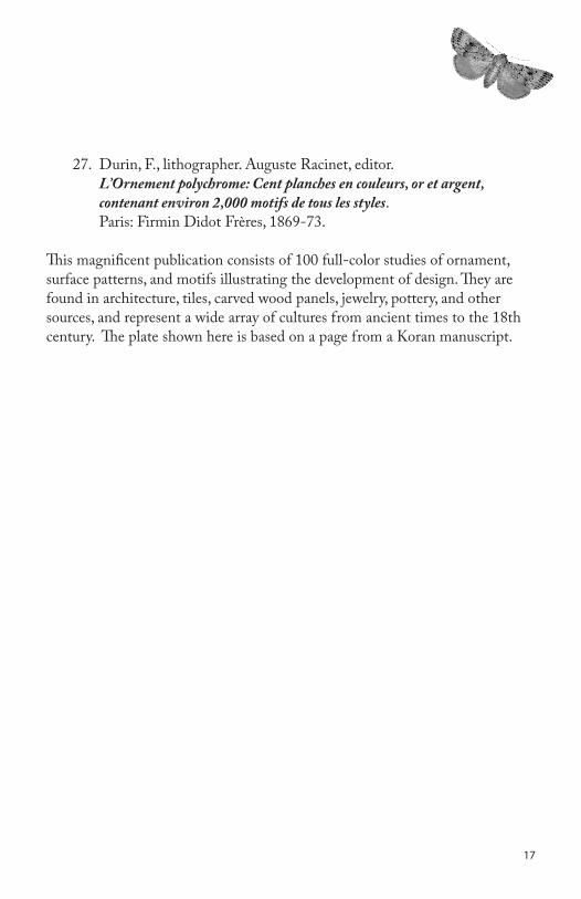
27. Durin, F., lithographer. Auguste Racinet, editor. L’Ornementpolychrome:Centplanchesencouleurs,oretargent,
contenantenviron2,000motifsdetouslesstyles. Paris: Firmin Didot Frères, 1869-73.
This magnificent publication consists of 100 full-color studies of ornament, surface patterns, and motifs illustrating the development of design. They are found in architecture, tiles, carved wood panels, jewelry, pottery, and other sources, and represent a wide array of cultures from ancient times to the 18th century. The plate shown here is based on a page from a Koran manuscript.
1�

1�
Pochoir
Pochoir is French for “stencil.” In a pochoir print, color is applied—usually in watercolor or gouache—with the use of stencils. Most often it is
brushed or daubed. It is difficult to identify when the process began to be used in bookwork, but examples are to be seen as early as the 15th century. The process is labor intensive, but up to the early 20th century, labor was cheap and readily available.
Pochoir flourished in France in the early 1900s to the 1930s, in particular within the context of the livres d’artiste (finely-printed books containing original works by visual artists). Artists and art connoisseurs looked favorably on the process because the color was applied by hand, making each print an original.
Stencils are cut according to a printed “key”—usually the black-and-white design which is to be colored—though it is possible to make and apply stencils without a key. Stencils for higher quality work were traditionally made from tin or copper; lower quality work was done using cardboard. Today, thin transparent sheets of plastic are frequently used. One would not expect to see pochoir in contemporary trade books, though it is somewhat commonly found in private press and artists’ books.
28. Pierre Brissaud, artist. Paul Armont and Jacques Bousquet, authors. LeDanseurdeMadame:Comédieentroisactes. Paris: Éditions Lucien
Vogel, 1921. No. 28 of 260 copies printed.
In this two-page spread, the blacks are printed from a relief block. The illustration contains at least 26 colors, requiring at least that many stencils. Brissaud is perhaps best known for his prints in the Gazette du bon ton, which was also published by Lucien Vogel. His illustrations often depict the lifestyles of the Parisian upper class and have appeared in periodicals such as Vogue, House & Garden, and Fortune.
29. Artist and author unknown. LesCostumesdupaysdeFrance.
Paris: Éditions Nilsson, 1930.

1�
The base figures are printed from relief blocks and the colors added with the use of stencils. Each of the three parts contains 20 miniature color prints depicting women’s clothing in various regions of France.
30. Scott Williams, artist. Fred Rinne, author and binder. SanFrancisco:CityofCrime:GemstoneFever.
San Francisco, California, 2004. No. 4 of 10 copies printed.
Williams’ beautiful and jarring stencil and airbrush illustrations decorate nearly every square inch of this “psychedelic-noir mystery.” Though his award-winning work is not limited to book arts, this is a fine example of his aesthetic, which frequently involves the recontextualization and layering of historic and pop-culture images.
31. Giorgio De Chirico and Hélène Perdriat, artists. LesBalletsSuédoisdansl’artcontemporain.
Paris: Éditions du Trianon, 1931.
Shown are set designs for the Ballet Suédois; the book also includes costume prints. The colors are applied over a lithographically-printed base, very little of which is readily visible. Perdriat’s print, the more colorful of the two, contains at least 20 colors, requiring as many stencils. The prints accompany a text documenting the Ballet Suédois, an avant-garde company based in Paris in the 1920s which melded abstract forms in dance with revolutionary set designs and costumes.
32. Joan Miró, artist. BoisgravespourunpoèmedePaulEluard.
Paris: Berggruen & Cie, 1958.
This prospectus for Berggruen & Cie’s 1958 edition of Eluard’s A Toute épreuve reproduces some of Miró’s original woodcut illustrations with the color applied in pochoir. The brush strokes, characteristic of the process, are particularly visible in the red portion.

�0
Screenprints, often called “serigraphs” in high-art contexts, are produced from the silkscreen process, which derives from the pochoir, or stencil,
process. The principles at work in both processes are very similar: an opening of specific shape and size is created through which ink is allowed to pass. Because designs are fixed to a screen, the process accommodates “floating” elements that stencils cannot, such as the round area in the center of an “o”.
The process dates to the early 1900s when Samuel Simon of England patented the silk printing screen. Soon after, in San Francisco, John Pilsworth developed a multicolor silkscreen process. Its first major applications were industrial, and during World War I it was used to print flags and banners.
The eventual appropriation of silkscreen by artists, especially Pop artists of the 1960s, probably stems from the numerous ways in which screens can be prepared. Simple screens can be made by attaching impermeable material such as paper or thin plastic to the screen. Images may also be drawn on the screen in grease and covered in a water-soluble size. The grease is then washed out with turpentine, leaving behind on the screen a negative image. Light-sensitive emulsion may also be used to coat the screen, which is then, with an intermediary transparency bearing a positive image, exposed in the manner and with the same ease as a photographic print.
33. John Christie, artist. Gael Turnbull, poet. AsFromaFleece. London: Circle Press, 1990.
No. 93 of 120 copies printed.
Christie is a British visual artist long associated with Circle Press. Turnbull is a Scottish poet whose later work explores experimental presentations of his poetry. This work is presented in a landscape concertina format which extends unbroken over 26 pages. It is one in a series of eight commissioned works pairing authors with artists to commemorate the move of the press from Guildford to London.
Silkscreen

�1
34. Ian Hamilton Finlay and Gordon Huntley, artists. ASailor’sCalendar:AMiscellany.
New York: Something Else Press, 1971.
A Sailor’s Calendar consists of small ring-bound graphic poems on nautical themes, printed in up to three colors. The recently-deceased Finlay was a Scottish poet, writer, visual artist, and gardener; Huntley is associated with the group of contemporary Scottish artists and writers of which Finlay is probably the best known.
35. Magali Lara, artist. Pablo Torrealba, printer. Delverbo. Mexico: Magali Lara, 1992. No. 119 of 200 copies printed.
Mexican artist Magali Lara’s Del verbo consists of nine minimal yet colorful graphic representations of Spanish verbs, such as “tocar” (to touch), “callar” (to be quiet), and “amar” (to love), shown here.
36. Christine Shields, artist and author. EsmeraldaTreeCat/TheLonelyBear. New York: Christine Shields,
2006. Eight copies printed.
In this artists’ book, both text and illustration are silkscreened in the manner of a coloring book, then hand-painted by the artist. The book contains two stories. The first tells the story of Esmeralda, a girl who escapes from an oppressive Catholic school, is eaten by a Jaguar, and is reborn as “a jaguar girl with many powers.” The second is of a bear haunted by his own loneliness and by his dreams of a being who sometimes manifests as a spotted kitten and at other times as a small girl. At the end of each story, Esmeralda and the bear meet.

��
Anything that makes a mark on or can be attached to a page may serve as illustration. When an artist chooses to illustrate using an unconventional
method, it is worth considering why he has chosen to do so.
What does an idiosyncratic approach provide that conventional processes do not offer? Is it used primarily for artistic purposes? Or is it due to a lack of suitable alternatives? How does the artistic solution affect the fabrication and distribution of the book?
Answers to these questions are unique to each work, though they all share as a common feature a marked physical presence unobtainable through other processes.
37. Yani Pecanins, artist. ElBesolamuerte. México, D.F.: Cocina Ediciones Mimeográficas, 1980.
100 copies printed.
The text and illustrations of this artists’ book are printed by mimeograph (a stencil process) and rubber stamps (a relief process), though the illustrations incorporate found objects, organic matter, and wax.
38. Rory Golden, artist, poet, book designer, and bookbinder. SixteenSonnets. New York: Palmapodoca Press, 2000.
Two copies printed.
After these 16 very non-traditional sonnets were printed, the author illustrated the pages by hand. The drawings are in black graphite with color added in gouache or watercolor. Ink pens and water-soluble crayons were used to add highlights. The pages are entirely coated in a light-gold paste-paper medium. Golden, the former Executive Director for the Center for Book Arts in New York, was recently an artist-in-residence at Central Wyoming College in Riverton, Wyoming, and has taught at the San Francisco Center for the Book.
Other Processes

��
39. Shon Schooler, D. Heagle, and I. Veryari, artists. C.K.Wilde et al., authors.
WaterUndertheBridge. Brooklyn, N.Y.: Artichoke Yink Press, 2003. Nine copies printed.
This artists’ book is a highly collaborative work utilizing rubber stamps, stencils, relief blocks (some made from Legos), Print Gocco, and blown ink. It is rightfully described by its publisher as “more ink than paper.” Text and illustration are printed on papers of various textures and origins. The text is a poem by C.K. Wilde, revised by four editorial collaborators. The artists describe the work as “part ecological document, part poetical investigation of perception.”
40. Ronald King, artist. TurnOverDarling. London: Circle Press, 1990.
Ronald King, proprietor of England’s Circle Press, has for many years been exploring the possibilities of images printed “in blind,” that is, without ink. Turn Over Darling is one of a number of his books “drawn in wire.” The work consists of a series of blind-embossed nudes in which the right-hand portion of each image forms the left-hand portion of that which follows.
41. Romeyn Beck Hough, author and illustrator. TheAmericanWoods:ExhibitedbyActualSpecimensandwith
CopiousExplanatoryText. Lowville, N.Y.: The author, 1910-1928.
Each part of this 14-volume work contains 75 sections of wood mounted on 25 plates with an accompanying volume of text. Hough, who also prepared the specimens, sought to show “in as compact and perfect a manner as possible, authentic specimens of our American woods, both native and introduced.” In doing so he produced a valuable scientific work as well as—perhaps unwittingly—a strangely beautiful objet d’art.

��
E lectronic processes include electrostatic processes (such as photocopying), digital photography, and numerous other methods. One advantage these
have over other methods is that they are capable of reproducing in great detail any image that may be captured (by camera, scanner, photocopier, etc.). When properly done, the results are as perfect a pictorial document as one can hope for and are of obvious importance in technical literature.
Another advantage, particularly for artists, lies in the amount of manipulation that may be involved in producing a print, either prior to image capture (e.g., physical collage) or during its processing (via photo editing programs).
Because electronic prints allow for high-quality reproduction, they are extremely well suited to convey cultural critique and satire through the juxtaposition and recontextualization of popular images.
With the introduction of electronic prints, the lines begin to blur between original prints, as discussed throughout this exhibit, and reproductions of prints and other images, as found in most contemporary books, magazines, and other publications. The books shown in this section, however, qualify as original works of art.
42. Maureen Cummins, book artist. Femmesfatales. Brooklyn, N.Y.: Maureen Cummins, 2001.
No. 22 of 50 copies printed.
Cummins’ book, constructed in the form of a 19th-century photograph album, features color photocopies of vintage photographic portraits of women. The phrases accompanying the photographs, such as “The Virgin” (shown here), “The Bride of Nuremberg,” or “The Lady of the Carousel,” are not descriptions of the women; they are names of historical devices of torture and execution, each of which is described at the end of the book.
Electronic Processes

��
43. Linda Hoffman, photographer and author. WinterAir:AJournal. Portland, Maine: Wolfe Editions, 2001.
No. 45 of 200 copies printed.
Hoffman is a trained graphic artist who, in her own words, approaches digital photography “as a printmaker rather than a photographer.” She produced this work in memory of her mother, Dr. Annette B. Weiner, a well-known anthropologist who died after a battle with cancer in 1997.
44. Marshall Weber, artist. Souvenir. Brooklyn, N.Y.: Booklyn Artists Alliance, 2003.
No. 15 of 35 copies printed.
Souvenir was produced by the literal deconstruction of a discarded 1969 high school yearbook and its subsequent reconstruction in an old stamp album. Weber describes Souvenir as “a talismanic antidote to revisionist attempts to diminish the legacy of the 60s ... a time when college students in the United States had class-consciousness with interests different from those of their parents. The student class had idealistic goals beyond securing a super-sized version of their parents’ lifestyle.” The images in the book are digital scans of original collages.
45. Lise Melhorn-Boe, artist. Cinderella:HowtoMakeaStatementWithoutSayingaWord.
North Bay, Ontario: Transformer Press, 1997. No. 3 of 10 copies printed.
This is the first in a series of four pop-up fairy tale books in which Melhorn-Boe uses text and images from fashion magazines to retell traditional tales in a non-traditional way and from a feminist perspective. A strong link between fairy tales and fashion magazines is that both deal in dreams, hopes,

transformations, gender roles, and the formation of values and taste. By decontextualizing and combining elements of both genres via collage and pop-up constructions, the artist allows these associations to come to the fore where they can be better examined.
46. Patrick JB Flynn, artist. Lvs.:CollagePhotographic. New York: Hot Dang Press, 2000.
No. 2 of 10 copies printed.
The images in this book are color photocopy enlargements of 4”x6” photo-collages constructed between 1995 and 1999. Flynn explains his work as an “investigation into the dichotomy between commercial imagery, as depicted and reproduced in popular culture and the ‘natural’ environment. Through the redundant utilization of the ‘Lf.,’ a graphic logoform symbolizing nature, I cut into the sea of commercial hyperbole incessantly crashing in on society, which I contend is largely responsible for eroding the shoreline of collective imagination ... [The images] have been collaged, assembled, rephotographed, cropped, and enlarged as a means to at once derail and revel in the seductive nature of commercial imagery.”
Electronic Processes
��

The primary objective of the UC Irvine Libraries Exhibits Program is to support the research and instructional missions of UCI by interpreting and publicizing the richness, diversity, and unique strengths of the resources of the UC Irvine Libraries.
UC Irvine Libraries Exhibits Staff
Jackie DooleyExhibits Officer
Sylvia IrvingArt Director, Exhibits Preparator
Julia Crosara & Sage KimDesigners, Exhibits Preparators
Design and Production:Design Services, UCI Libraries
Printed November 2006��

UCIrvineLibraries