Pia Grote – Portfolio
44
PORTFOLIO PIA GROTE Pia
-
Upload
kda-koelner-design-akademie -
Category
Documents
-
view
224 -
download
2
description
Print Portfolio des KDA Abschlußsemesters 2013
Transcript of Pia Grote – Portfolio

PORTFOLIOPIA GROTE
Pia
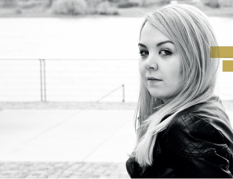

I‘m a gRaPhIc dEsIgnER from the Ruhr Area, at the moment located in Cologne. I have always been interested in all kinds of design. The creative school subjects or doing some kind of art in my leisure time, art and design have always been part of my life. With the beginning of my studies, design became one of the most important things in my life. Not only because of my studies, about which I am still enthusiastic, but also because of my first working experience I made at an Full-Service Angency and an Lifestyle-Blog, I recognized that the design section was the right choice for me. For my future I can‘t ima-gine doing anything else. My enthusiasm for design hasn‘t decreased since my early years in school. Quite the contrary – it increases more and more every day.
Enough has been said. It‘s time for you to take a look at some of my work in this portfolio. I hope you enjoy it!
hI FOLks! mY namE Is PIa gROTE.

3/2013 – 7/2013 InTERnshIP gOLdsTÜck cOmmUnIcaTIOn (OnLInE magaZInE/LIFEsTYLE bLOg), cOLOgnE8/2012 – 2/2013 InTERnshIP mUEhLhaUsmOERs cORPORaTE cOmmUnIcaTIOns (FULL-sERVIcE agEncY), cOLOgnE9/2010 – 8/2013 cOmmUnIcaTIOn dEsIgn sTUdIEs cOLOgnE dEsIgn acadEmY, cOLOgnE9/2009 – 4/2010 PRELImInaRY sTUdIEs In PhOTOgRaPhY and gRaPhIc dEsIgn, Fadbk, EssEn2009 a-LEVEL WILLY-bRandT-gYmnasIUm,OER-ERkEnschWIck
cURRIcULUm VITaE
Pia grote Venloer straße 527 50825 köln [email protected]
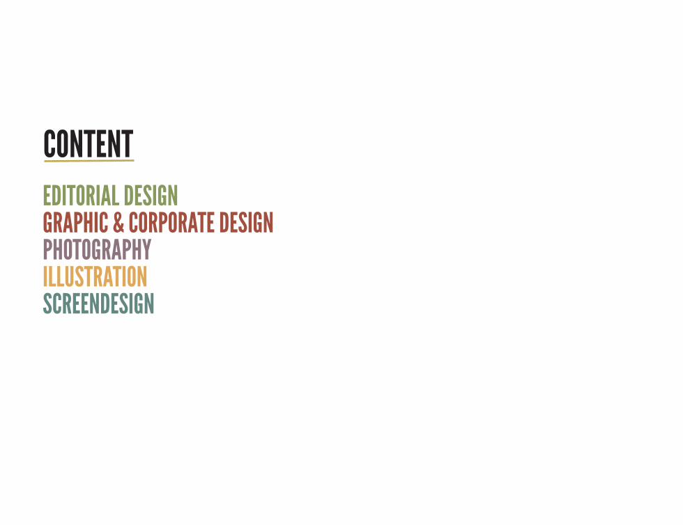
EdITORIaL dEsIgn gRaPhIc & cORPORaTE dEsIgnPhOTOgRaPhYILLUsTRaTIOnscREEndEsIgn
cOnTEnT
EdITORIaL dEsIgn

8

The magazine “Wolpertinger“ is the result of a project I did with a group of three during the Editorial Design classes. The topic is the so called “Belgian Quarter” in Cologne. Like the mythi-cal creature Wolpertinger, which was the name giver for our magazine, this borough in Cologne has a lot to offer. We wanted to show that in our magazine. So we created a mix of reports, interviews, photos and graphic elements.
WOLPERTIngER magaZInE
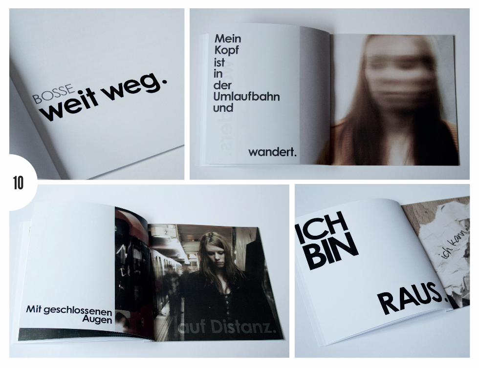
10

This brochure deals with the songtext of the song “weit weg” of the german band “Bosse”. The task was to visualize the song with the help of photos and typography. With the choosen photos I tried to create a special and thoughtful atmosphere, which I notice when I‘m listening to this song. In addition to the photos, whch are shown in this brochure, I used the different typographic elements to support the message of the pictures.
EdITORIaL PhOTOgRaPhY
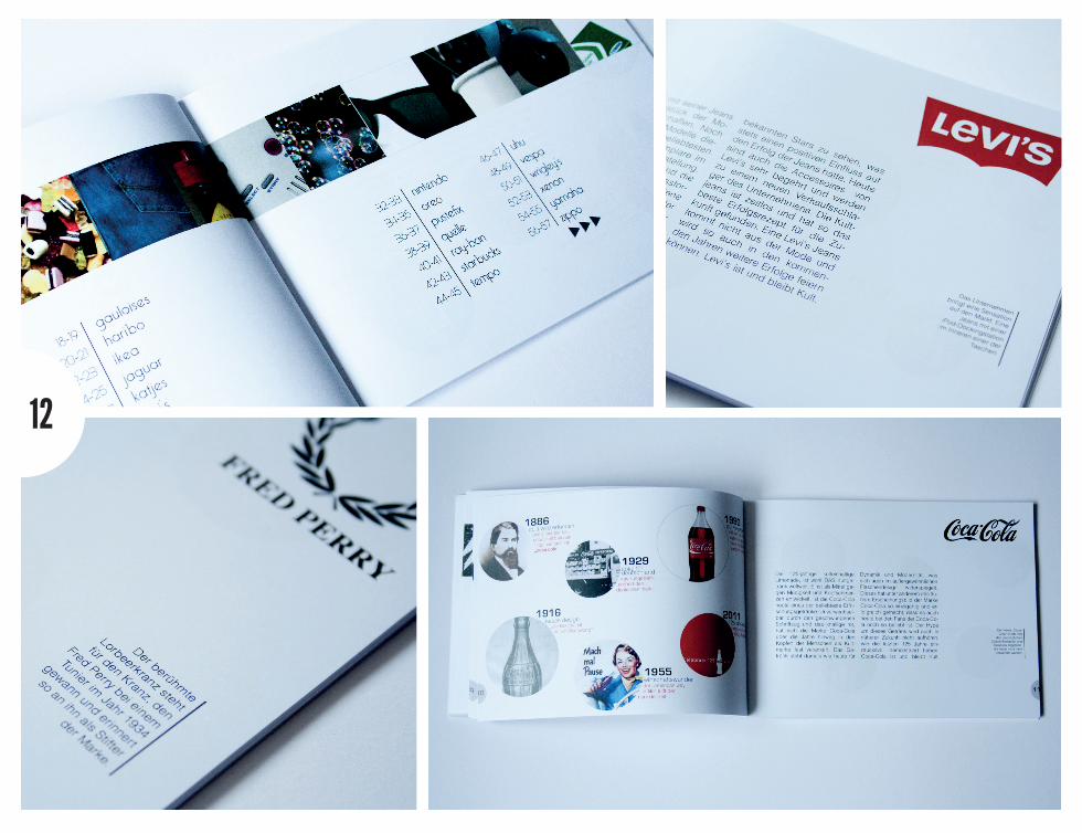
12

For this Editorial Design project the task was to design a booklet based on the ABC with an topic we could choose on our own. I‘ve finally choosen the topic “Kultmarken“ (engl. cult brand). From the letter “A” to “Z” I‘m presenting some of the most famous brands. I‘ve collected the most impor-tant facts for each brand and visualized them with significant photos, which were connected with the different labels.
TYPE abc – cULT bRands

gRaPhIc & cORPORaTE dEsIgn

16
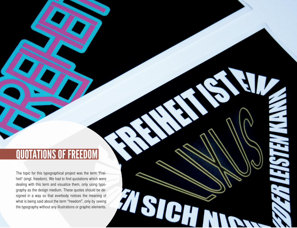
The topic for this typographical project was the term “Frei-heit“ (engl. freedom). We had to find quotations which were dealing with this term and visualize them, only using typo-graphy as the design medium. These quotes should be de-signed in a way so that everbody notices the meaning of what is being said about the term “freedom”, only by seeing the typography without any illustrations or graphic elements.
QUOTaTIOns OF FREEdOm
18

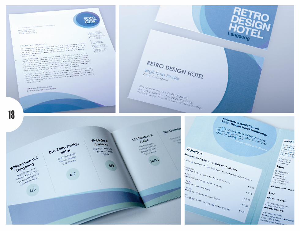
A new and conclusive Corporate Design was to be created for the “Retro Design Hotel”, which is a real hotel on the island Langeoog. In addition to the common products like business cards and business papers, things like a menu and an image brochure should be designed, too. It was our task to choose the typography, the colours and materials, so that the character of this exceptual hotel is presented at its best.
RETRO dEsIgn hOTEL

20
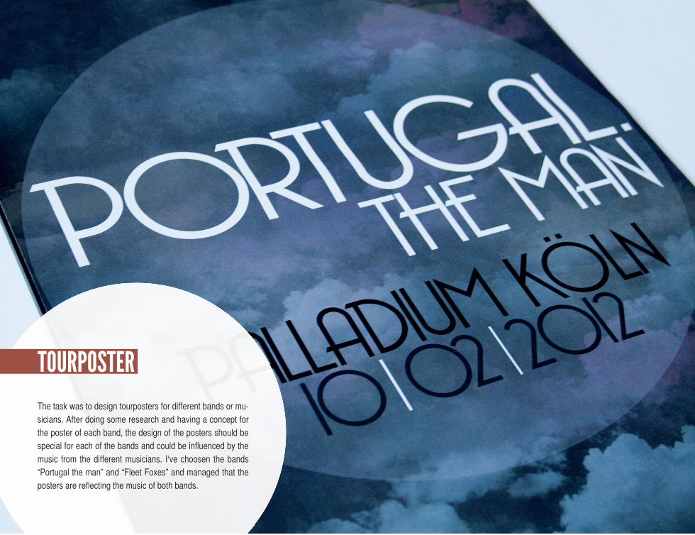
The task was to design tourposters for different bands or mu-sicians. After doing some research and having a concept for the poster of each band, the design of the posters should be special for each of the bands and could be influenced by the music from the different musicians. I‘ve choosen the bands “Portugal the man” and “Fleet Foxes” and managed that the posters are reflecting the music of both bands.
TOURPOsTER


PhOTOgRaPhY
24

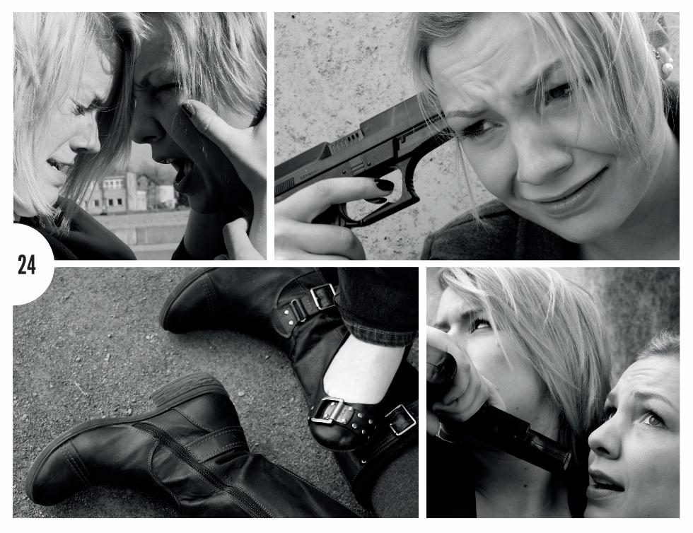
These photos are a free work I did during my preliminary stu-dies. The pictures should show some kind of thriller. It was one of the most important things for me that the people on the photos show a strong and emotional expression, so that the idea of the photos is presented in an credible way. I‘ve decided to convert them into black and white, because the photos are looking more dramatically. It was the aim to have a story, which is only told by the sequence of these photos.
shE‘s gOT a gUn!
26
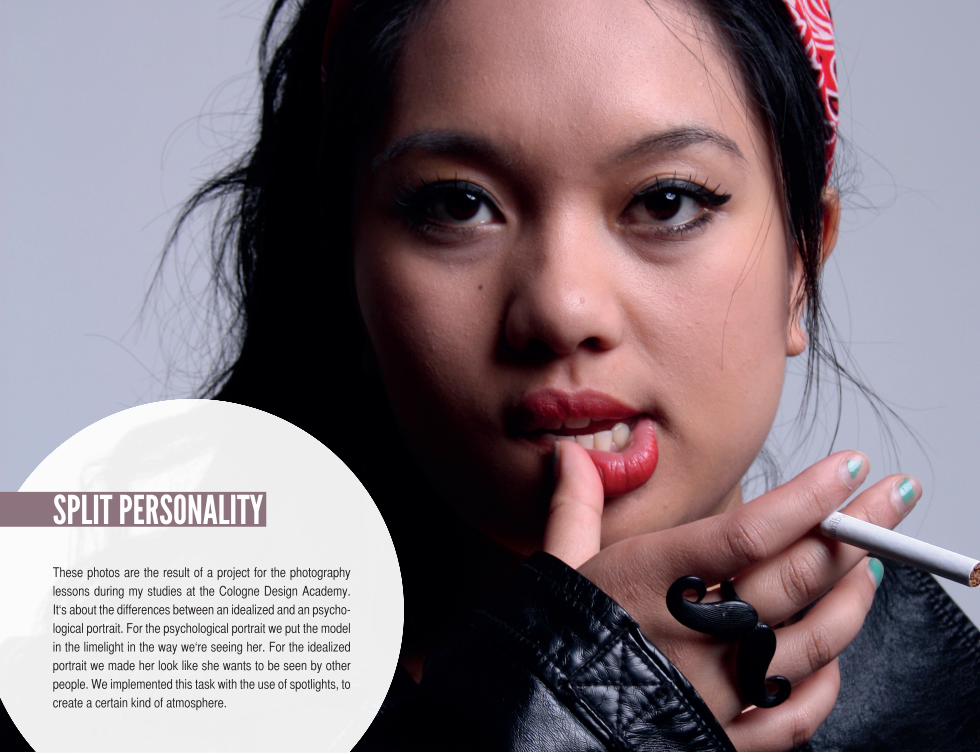
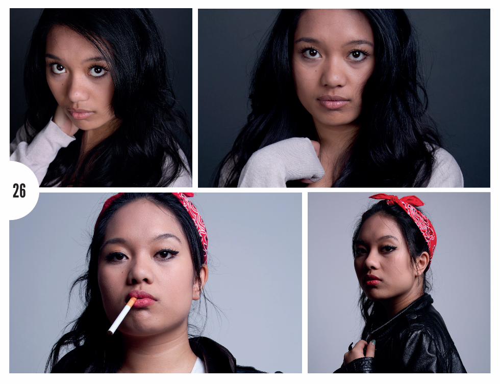
These photos are the result of a project for the photography lessons during my studies at the Cologne Design Academy. It‘s about the differences between an idealized and an psycho-logical portrait. For the psychological portrait we put the model in the limelight in the way we‘re seeing her. For the idealized portrait we made her look like she wants to be seen by other people. We implemented this task with the use of spotlights, to create a certain kind of atmosphere.
sPLIT PERsOnaLITY
28
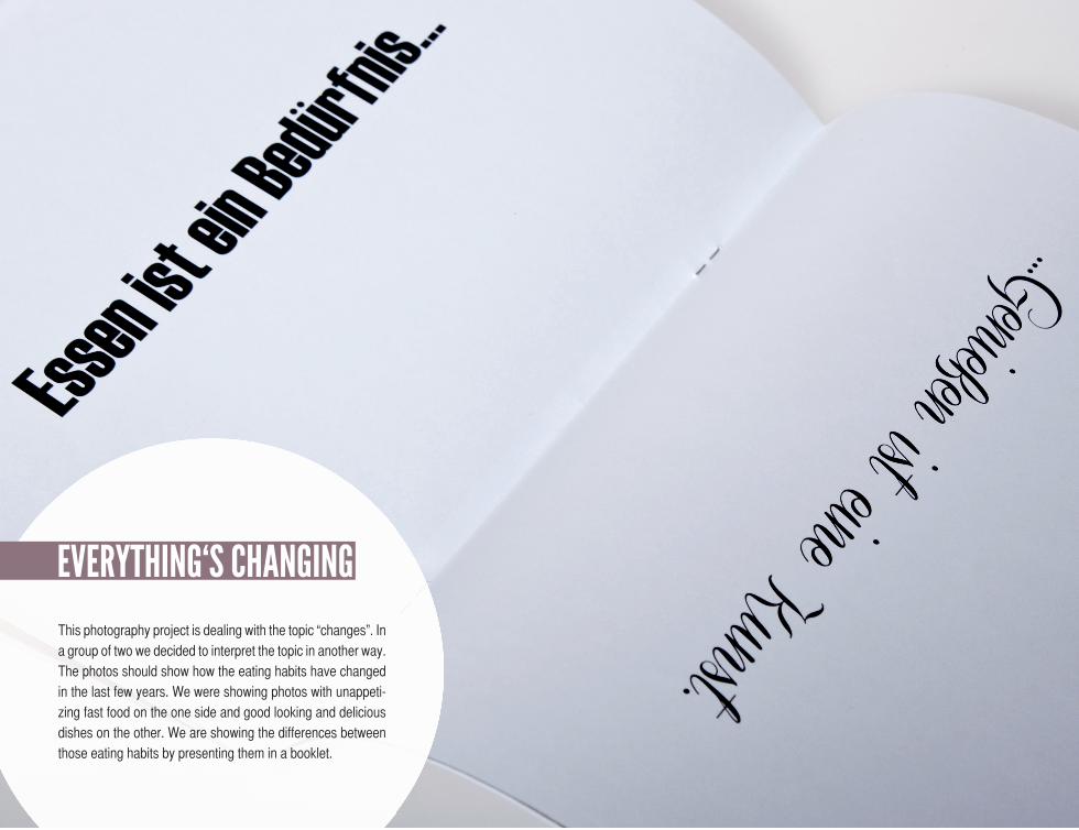
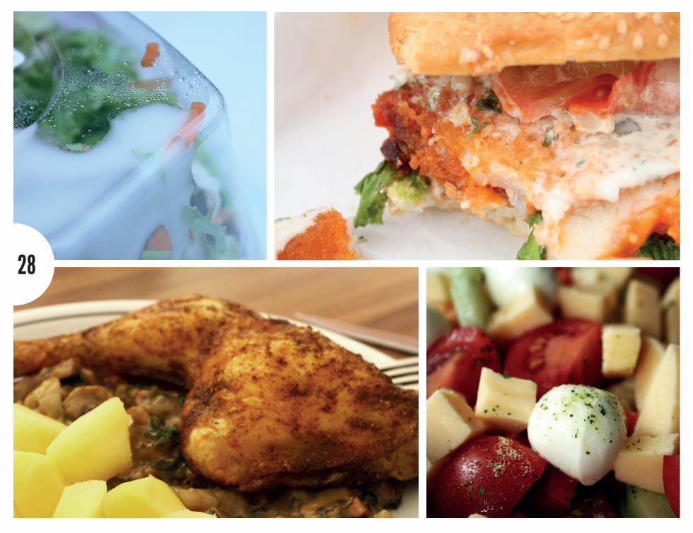
This photography project is dealing with the topic “changes”. In a group of two we decided to interpret the topic in another way. The photos should show how the eating habits have changed in the last few years. We were showing photos with unappeti-zing fast food on the one side and good looking and delicious dishes on the other. We are showing the differences between those eating habits by presenting them in a booklet.
EVERYThIng‘s changIng
ILLUsTRaTIOn
32
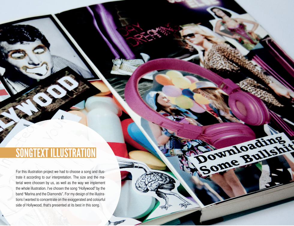
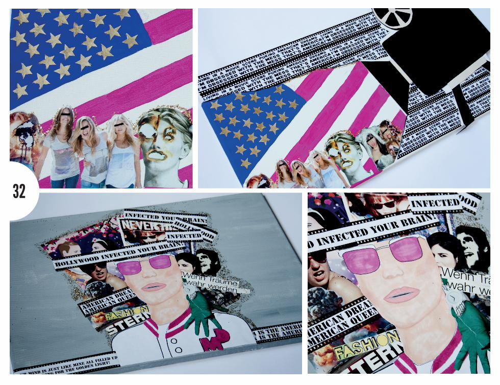
For this illustration project we had to choose a song and illus-trate it according to our interpretation. The size and the ma-terial were choosen by us, as well as the way we implement the whole illustration. I‘ve chosen the song “Hollywood” by the band “Marina and the Diamonds”. For my design of the illustra-tions I wanted to concentrate on the exaggerated and colourful side of Hollywood, that‘s presented at its best in this song.
sOngTEXT ILLUsTRaTIOn
34
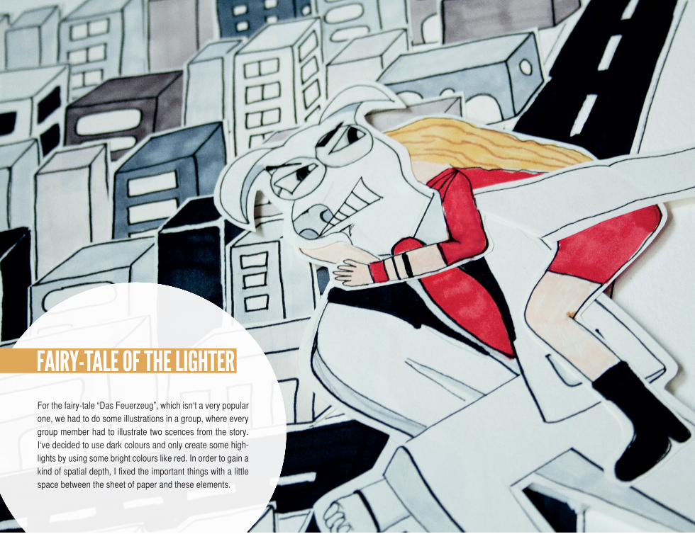
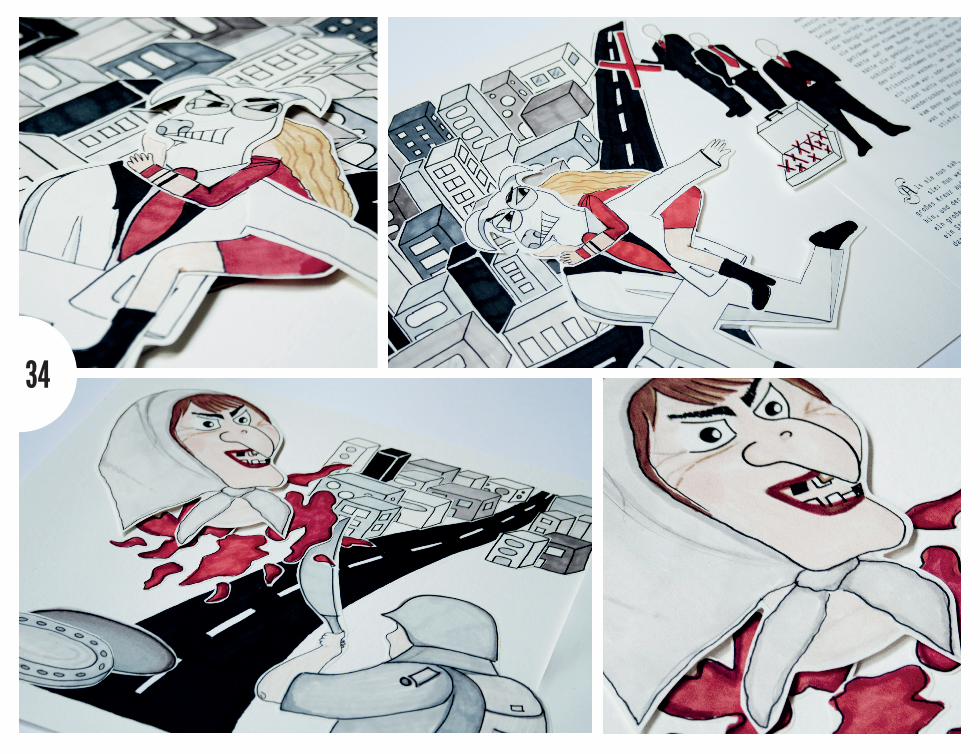
For the fairy-tale “Das Feuerzeug”, which isn‘t a very popular one, we had to do some illustrations in a group, where every group member had to illustrate two scences from the story. I‘ve decided to use dark colours and only create some high-lights by using some bright colours like red. In order to gain a kind of spatial depth, I fixed the important things with a little space between the sheet of paper and these elements.
FaIRY-TaLE OF ThE LIghTER
36
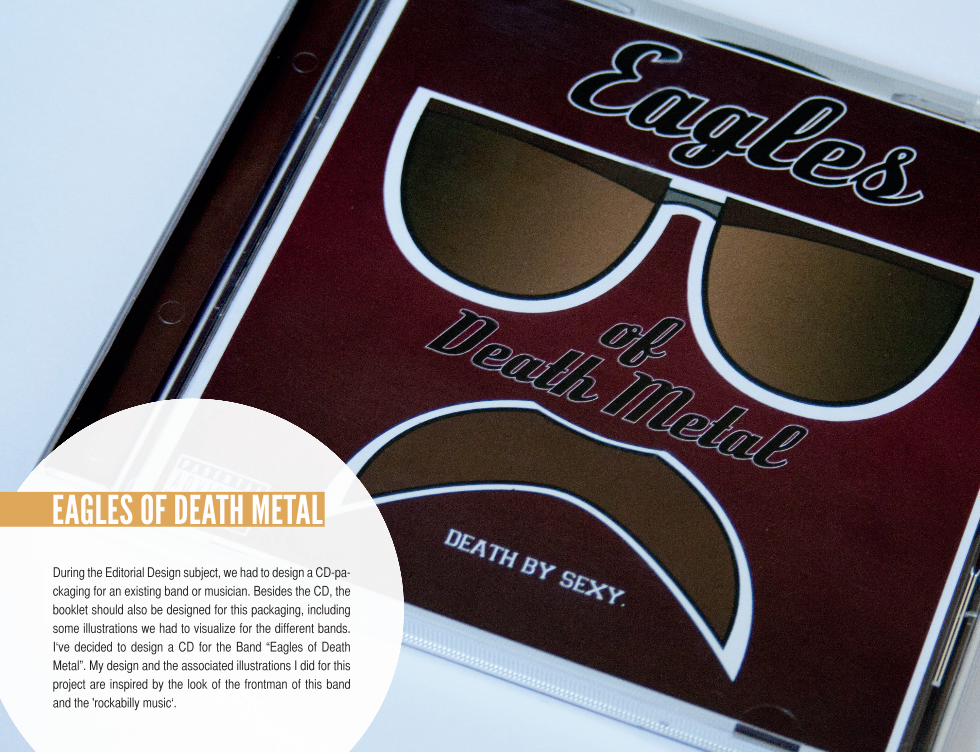
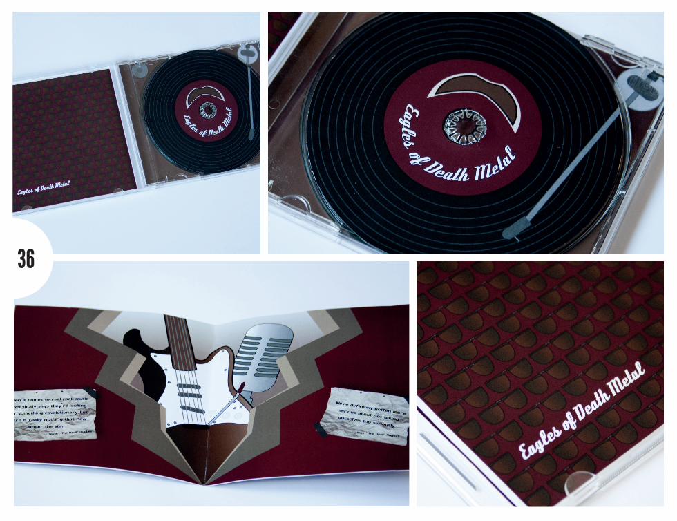
During the Editorial Design subject, we had to design a CD-pa-ckaging for an existing band or musician. Besides the CD, the booklet should also be designed for this packaging, including some illustrations we had to visualize for the different bands. I‘ve decided to design a CD for the Band “Eagles of Death Metal”. My design and the associated illustrations I did for this project are inspired by the look of the frontman of this band and the 'rockabilly music‘.
EagLEs OF dEaTh mETaL
scREEndEsIgn
40
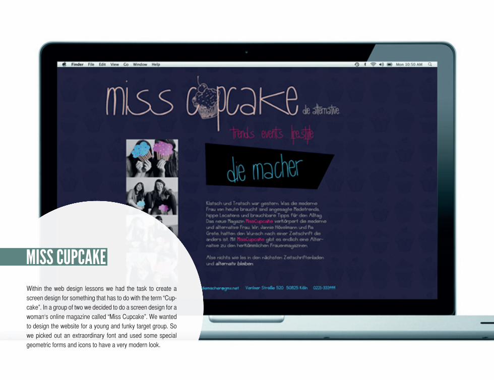
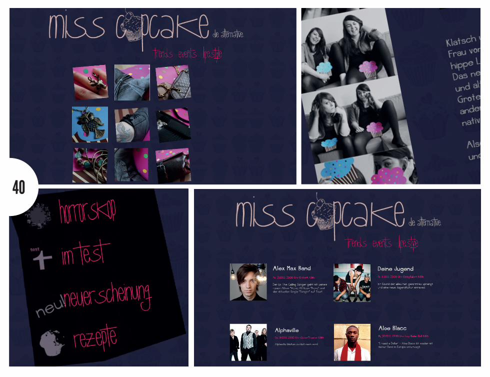
Within the web design lessons we had the task to create a screen design for something that has to do with the term “Cup-cake”. In a group of two we decided to do a screen design for a woman‘s online magazine called “Miss Cupcake”. We wanted to design the website for a young and funky target group. So we picked out an extraordinary font and used some special geometric forms and icons to have a very modern look.
mIss cUPcakE
42

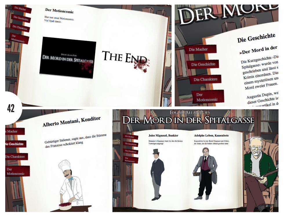
This screen design is linked to an illustration project for the mystery story “Mord in der Spitalgasse”. During the illustra-tion classes we created a motion comic which should finally be presented on the website we have designed. According to the gloomy mood of the story, we designed the website like a dark library with a narrator that is reading out the book like it‘s in the story.
RUE mORgUE
PORTFOLIO bY PIa gROTE Copyright © 2013 Pia Grote, all rights reserved.
“sTOP TRYIng TO bE PERFEcT and sTaRT bEIng REmaRkabLE.”
– Seth Godin