
pg 05. Mobile Guidelines - Bauhaus University, Weimar · Mobile Media Design | 05. Mobile...
195
Mobile Media Design | 05. Mobile Guidelines Faculty of Art & Design Chair of Interface Design Joatan Preis Dutra [email protected] 05. Mobile Guidelines http://www.uni-weimar.de/medien/wiki/IFD:MobileMediaDesign-SS16 Image retrieved and modified from: http://www.plasticmobile.com/wp-content/uploads/2014/03/wireframe-mobile-blueprint.jpg
Transcript of pg 05. Mobile Guidelines - Bauhaus University, Weimar · Mobile Media Design | 05. Mobile...

Mobile Media Design | 05. Mobile Guidelines
Faculty of Art & DesignChair of Interface Design
Joatan Preis [email protected]
05. Mobile Guidelines
http://www.uni-weimar.de/medien/wiki/IFD:MobileMediaDesign-SS16
Imag
e r
etr
ieve
d a
nd
mo
difie
d fro
m:
htt
p:/
/ww
w.p
last
icm
ob
ile.c
om
/wp
-co
nte
nt/
uplo
ads/
20
14
/03
/wir
efr
ame-m
obile-b
luep
rin
t.jp
g

Mobile Media Design | 05. Mobile Guidelines
1. Schedule2. Platforms3. Guidelines
3.1 Interface Elements 3.2 Interface Structure
3.3 Designing for both OS4. iOS & Android Comparison
5. WHS Apps in Germany6. Overview & Tips
6.1 Heuristics6.2 Designing for 4 – 5,5’’
6.3 Prototype Tips7. App Project
8. References
- 3- 5- 9- 14- 24- 32- 73- 123- 153- 155- 160- 166- 176- 190
Summary

Mobile Media Design | 05. Mobile Guidelines
Schedule

Mobile Media Design | 05. Mobile Guidelines
Course Schedule and Details
18.04 MMD 01 - Introduction | MMD 02 - Media & Mediatization
25.04 MMD 03 - Mobile Media & Apps | MMD 04 - UNESCO WHS Tourism in Germany / Project Description
06.05 Deadline at 23:59 of App Evaluation
09.05 MMD 05 - Mobile Guidelines | MMD 06 - Icon Design / Project Consultation
23.05 MMD 07 - References & Writing / Project Consultation
13.06 Students' Prototype Presentations
20.06 Students' Prototype Presentations -
04.07 MMD 08 - Closing Lecture & Feedback
31.07 Deadline for the paper/essay: 23:59
4

Mobile Media Design | 05. Mobile Guidelines
Platforms

Mobile Media Design | 05. Mobile Guidelines
Mobile OS in Europe (July - September 2015)
Source: http://data.wurfl.io/MOVR/pdf/2015_q3/MOVR_2015_q3.pdf
OS:
67% Android
31% iOS
6
Mobile Media Design | 05. Mobile Guidelines
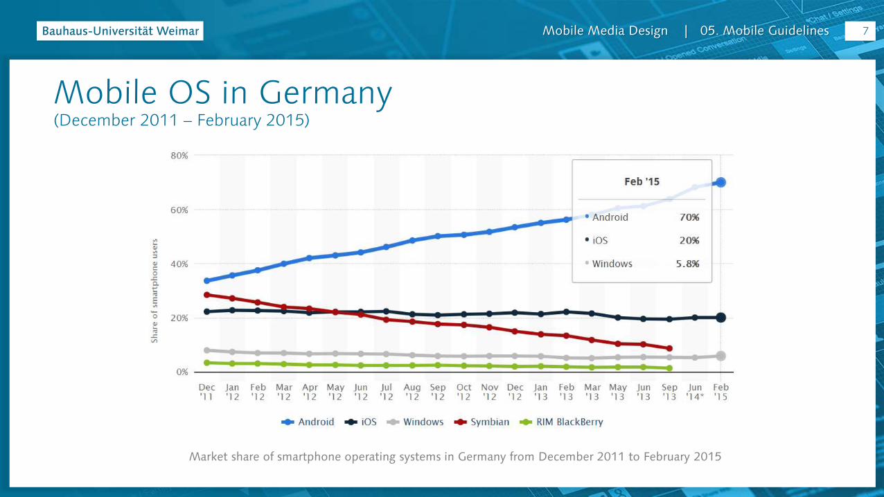
Mobile OS in Germany (December 2011 – February 2015)
Market share of smartphone operating systems in Germany from December 2011 to February 2015
7
Mobile Media Design | 05. Mobile Guidelines
Android & iOS
Two most popular mobile platforms
8
Mobile Media Design | 05. Mobile Guidelines
Guidelines

Mobile Media Design | 05. Mobile Guidelines
Guidelines
?
10

Mobile Media Design | 05. Mobile Guidelines
Official Design Guidelines: iOS
iOS Human Interface Guidelines https://developer.apple.com/library/ios/documentation/
UserExperience/Conceptual/MobileHIG/index.html
11
Mobile Media Design | 05. Mobile Guidelines
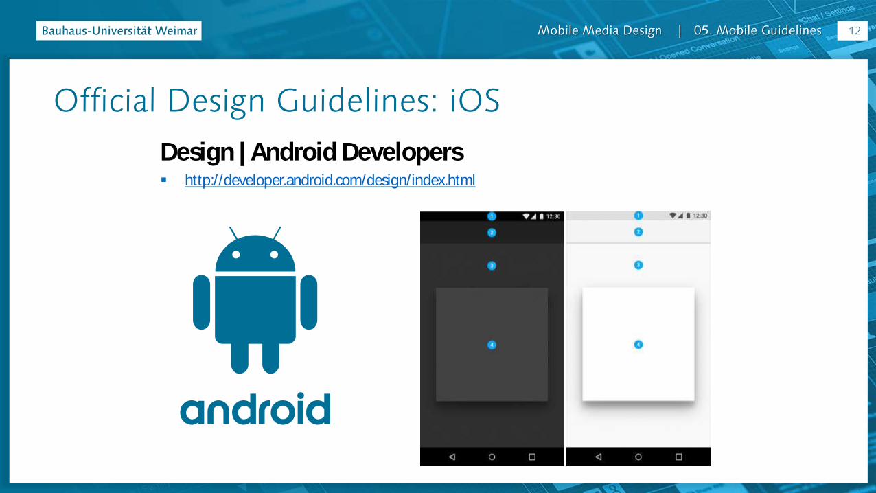
Official Design Guidelines: iOS
Design | Android Developers http://developer.android.com/design/index.html
12

Mobile Media Design | 05. Mobile Guidelines
Official Design Guidelines: Windows
Design Universal Windows Platform (UWP) App https://dev.windows.com/en-us/design
Windows Phone
13
Mobile Media Design | 05. Mobile Guidelines
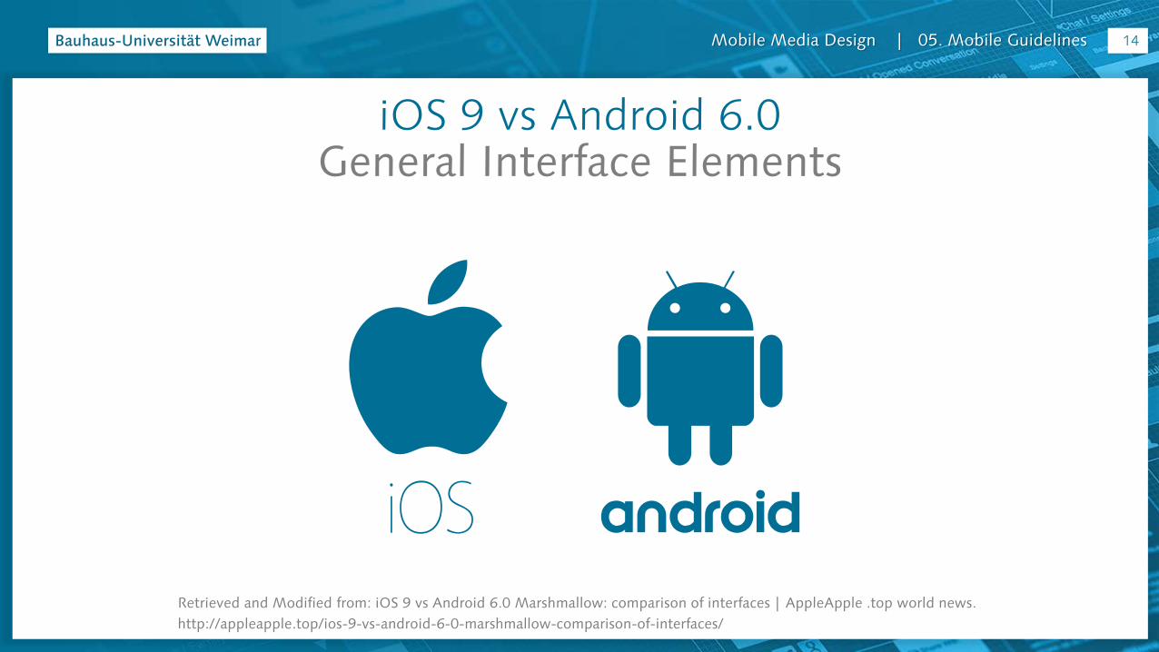
iOS 9 vs Android 6.0General Interface Elements
Retrieved and Modified from: iOS 9 vs Android 6.0 Marshmallow: comparison of interfaces | AppleApple .top world news.
http://appleapple.top/ios-9-vs-android-6-0-marshmallow-comparison-of-interfaces/
14
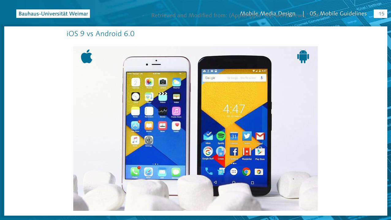
Mobile Media Design | 05. Mobile Guidelines
iOS 9 vs Android 6.0
- Retrieved and Modified from: (AppleApple .top world news,” n.d.) 15
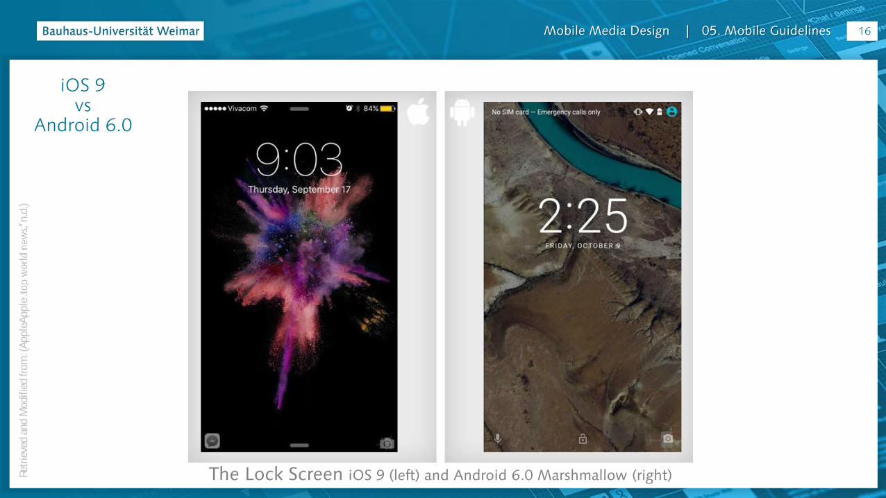
Mobile Media Design | 05. Mobile Guidelines
The Lock Screen iOS 9 (left) and Android 6.0 Marshmallow (right)
16
iOS 9 vs
Android 6.0
Retr
ieve
d a
nd
Mod
ified
from
: (A
pp
leA
pp
len
.d.)

Mobile Media Design | 05. Mobile Guidelines
Home Screen
17
iOS 9 vs
Android 6.0
Retr
ieve
d a
nd
Mod
ified
from
: (A
pp
leA
pp
len
.d.)
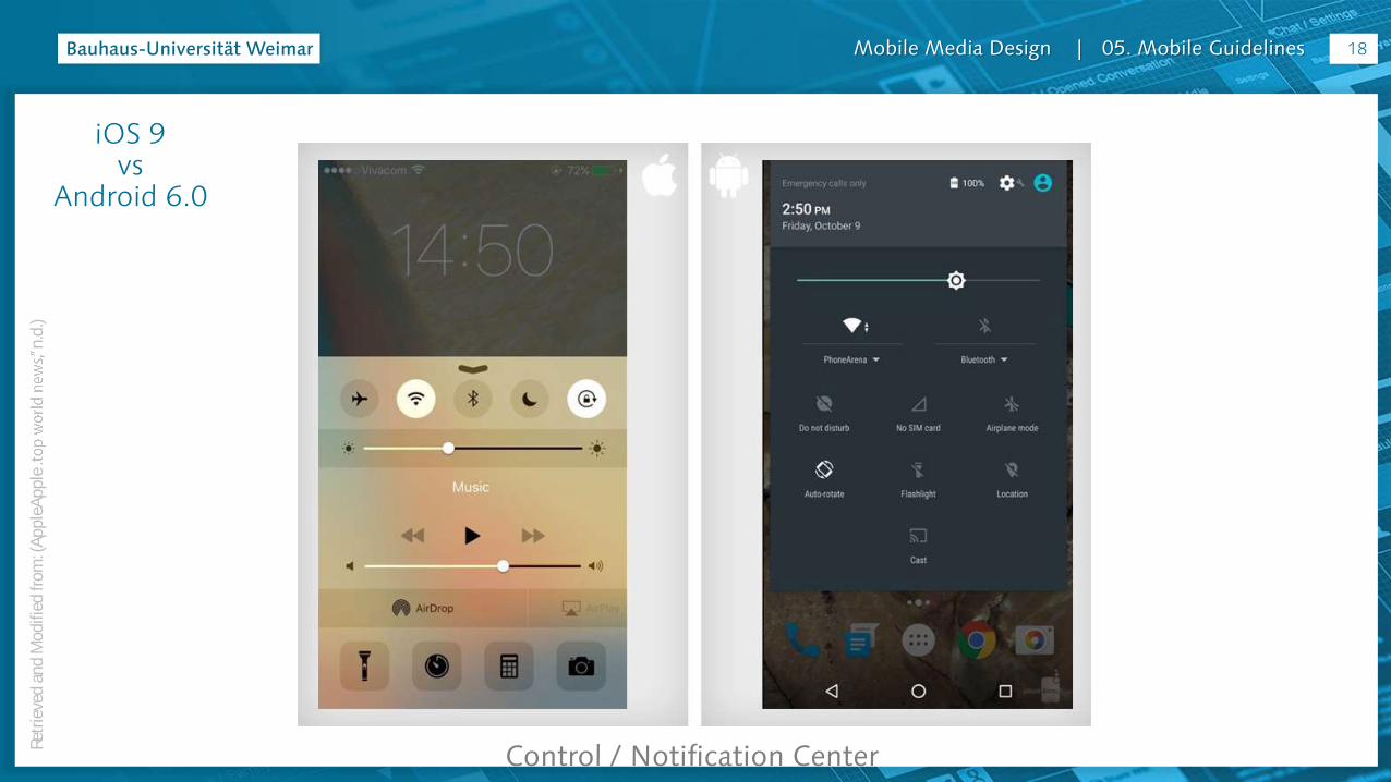
Mobile Media Design | 05. Mobile Guidelines
Control / Notification Center
iOS 9 vs
Android 6.0
Retr
ieve
d a
nd
Mod
ified
from
: (A
pp
leA
pp
len
.d.)
18

Mobile Media Design | 05. Mobile Guidelines
Folder
19
iOS 9 vs
Android 6.0
Retr
ieve
d a
nd
Mod
ified
from
: (A
pp
leA
pp
len
.d.)
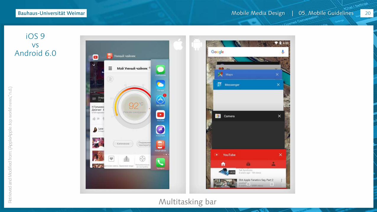
Mobile Media Design | 05. Mobile Guidelines
Multitasking bar
20
iOS 9 vs
Android 6.0
Retr
ieve
d a
nd
Mod
ified
from
: (A
pp
leA
pp
len
.d.)
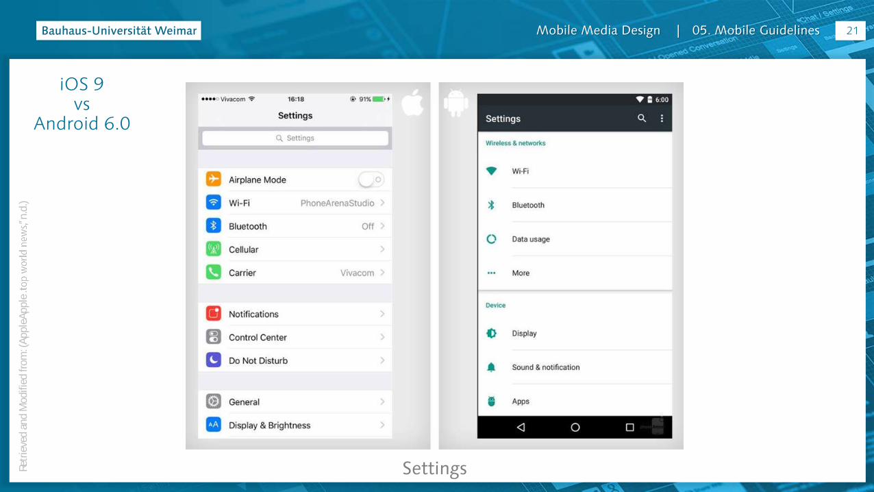
Mobile Media Design | 05. Mobile Guidelines
Settings
21
iOS 9 vs
Android 6.0
Retr
ieve
d a
nd
Mod
ified
from
: (A
pp
leA
pp
len
.d.)
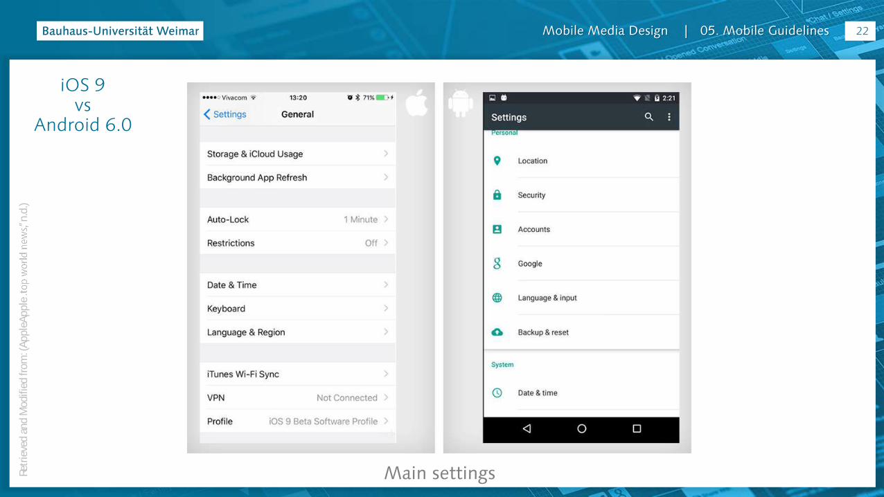
Mobile Media Design | 05. Mobile Guidelines
Main settings
22
iOS 9 vs
Android 6.0
Retr
ieve
d a
nd
Mod
ified
from
: (A
pp
leA
pp
len
.d.)
Mobile Media Design | 05. Mobile Guidelines
iOS 9 vs Android 6.0
iOS 9 – What’s New – Applehttp://www.apple.com/ios/whats-new/
Android – Marshmallowhttps://www.android.com/versions/marshmallow-6-0/
More about the current OS:
23
Mobile Media Design | 05. Mobile Guidelines
Retrieved and Modified from: McKibben
http://www.kinvey.com/blog/2765/ios-and-android-design-guidelines-cheat-sheet
iOS & AndroidInterface Structure
24

Mobile Media Design | 05. Mobile Guidelines
iOS & Android: Interface Structure - Retrieved and Modified from: (McKibben, n.d.)
25

Mobile Media Design | 05. Mobile Guidelines
#1 STATUS BARContainsBattery charge, network connection, time.
Things to noteIt can hidden but should only be done when the media being displayed needs the extra real estate.
#1 STATUS BARContainsBattery charge, network connection, time.
Things to noteIt can hidden but should only be done when the media being displayed needs the extra real estate.
iOS & Android: Interface Structure
Retr
ieve
d a
nd
Mod
ified
from
: (M
cKib
ben
, n.d
.)26
Mobile Media Design | 05. Mobile Guidelines
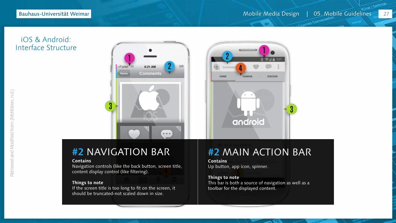
#2 NAVIGATION BARContainsNavigation controls (like the back button, screen title, content display control (like filtering).
Things to noteIf the screen title is too long to fit on the screen, it should be truncated-not scaled down in size.
#2 MAIN ACTION BARContainsUp button, app icon, spinner.
Things to noteThis bar is both a source of navigation as well as a toolbar for the displayed content.
27
iOS & Android: Interface Structure
Retr
ieve
d a
nd
Mod
ified
from
: (M
cKib
ben
, n.d
.)
Mobile Media Design | 05. Mobile Guidelines
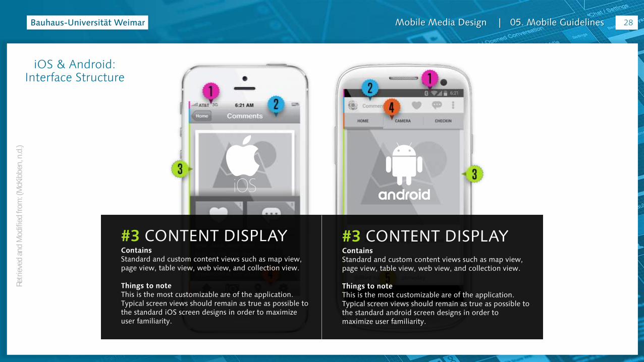
#3 CONTENT DISPLAYContainsStandard and custom content views such as map view, page view, table view, web view, and collection view.
Things to noteThis is the most customizable are of the application. Typical screen views should remain as true as possible to the standard iOS screen designs in order to maximize user familiarity.
#3 CONTENT DISPLAYContainsStandard and custom content views such as map view, page view, table view, web view, and collection view.
Things to noteThis is the most customizable are of the application. Typical screen views should remain as true as possible to the standard android screen designs in order to maximize user familiarity.
28
iOS & Android: Interface Structure
Retr
ieve
d a
nd
Mod
ified
from
: (M
cKib
ben
, n.d
.)

Mobile Media Design | 05. Mobile Guidelines
#4 TAB BAR / TOOLBARContainsTab style navigation or progress bar, activity indicator and/or other controls.
Things to noteTab bars are used as main source of navigation and as such should be present on every screen (excluding some edge cases). Toolbars are only used when your application requires the user to edit the app’s content view.
#4 ACTION BAR TABSContainsTab style navigation.
Things to noteYou can choose between fixed and scrollable tabs for your action bar. Fixed allows the user to see all options at a glance while scrollable can support more views.
29
iOS & Android: Interface Structure
Retr
ieve
d a
nd
Mod
ified
from
: (M
cKib
ben
, n.d
.)

Mobile Media Design | 05. Mobile Guidelines
#5 NAVIGATION BARContainsBack button, home button, and history button.
Things to noteThe nav bar is persistent across all views.
30
iOS & Android: Interface Structure
Retr
ieve
d a
nd
Mod
ified
from
: (M
cKib
ben
, n.d
.)
Mobile Media Design | 05. Mobile Guidelines
iOS & Android: Interface Structure
Retr
ieve
d a
nd
Mod
ified
from
: (M
cKib
ben
, n.d
.)
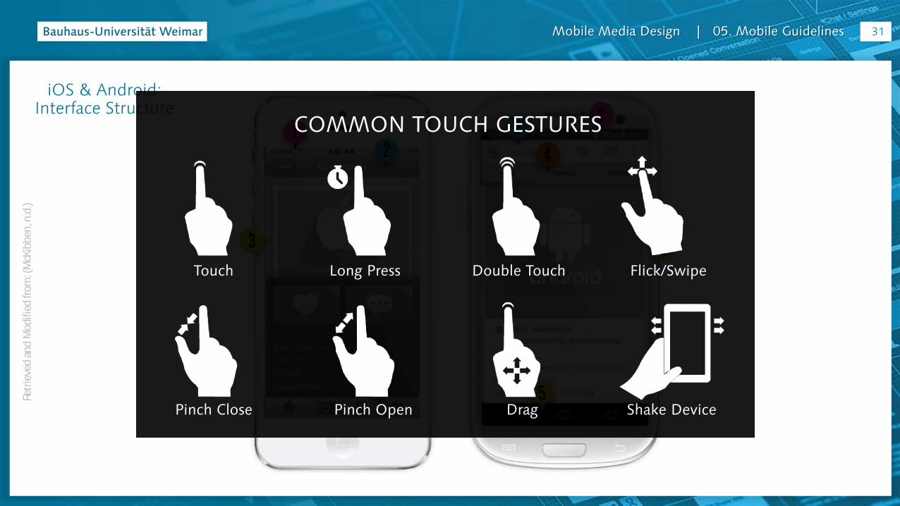
COMMON TOUCH GESTURES
Touch Long Press Double Touch Flick/Swipe
Pinch Close Pinch Open Drag Shake Device
31
Mobile Media Design | 05. Mobile Guidelines
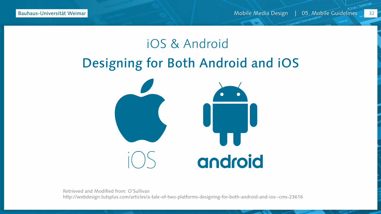
iOS & Android
Retrieved and Modified from: O’Sullivan http://webdesign.tutsplus.com/articles/a-tale-of-two-platforms-designing-for-both-android-and-ios--cms-23616
Designing for Both Android and iOS
32
Mobile Media Design | 05. Mobile Guidelines
iOS & Android: Design Guidelines - Retrieved and Modified from: (O’Sullivan, n.d.)
Choose a lead
Prioritize one platform at the outset. Make this decision not based on your personal preference, but based on the market for your app.
Do more people in your market use Android phones?
Is it a paid app?
What is the target audience?
Asking these questions will help you to decide on which is preferable.
33
Mobile Media Design | 05. Mobile Guidelines
iOS & Android: Design Guidelines
Retr
ieve
d
n.d
.)
Know the rules
Read up on UI guidelines for Android and iOS.
In the past Apple was known for being more strict with their guidelines. To get an app in the app store, there is an approval process which takes approximately two weeks.
Here is no approval process for the Play store.
However, due to this lower barrier to entry on Android the quality of design has traditionally been worse off.
Google are looking to change this with their Material Design guidelines.
34

Mobile Media Design | 05. Mobile Guidelines
iOS & Android: Design Guidelines
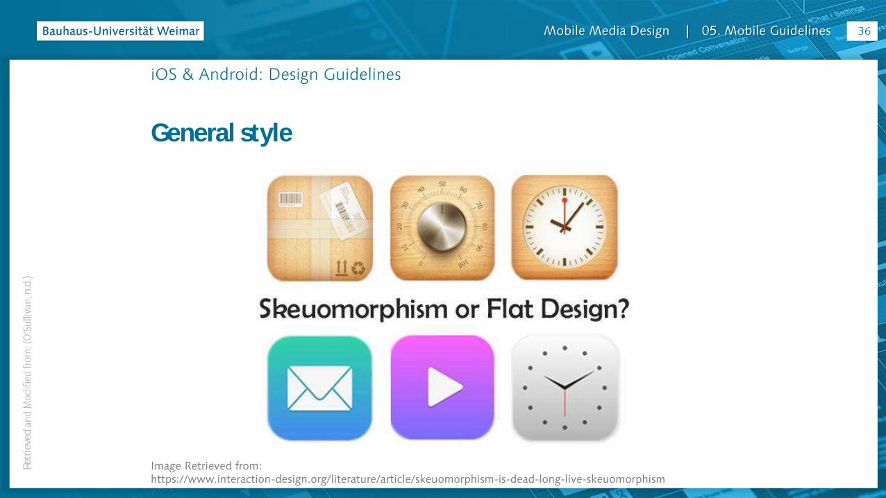
General style
Since iOS7, Apple has shifted to a flatter design style, and ditched the skeuomorphic shadows, textures and effects which defined the
Android, having been more systematic in style in the beginning, has gone slightly the other way. guidelines create more subtle references to the real world, with a layered
providing more hierarchy.
35Re
trie
ved
n
.d.)
Mobile Media Design | 05. Mobile Guidelines
iOS & Android: Design Guidelines
General style
Image Retrieved from: https://www.interaction-design.org/literature/article/skeuomorphism-is-dead-long-live-skeuomorphism
36Re
trie
ved
n
.d.)

Mobile Media Design | 05. Mobile Guidelines
iOS & Android: Design Guidelines
Real buttons
Android phones have a back button, which can be used to return to previous screens in the app.
have this button, so there needs to be a way to travel
in the top left of the screen, but needs to be considered throughout the various journeys in your app.
37Re
trie
ved
n
.d.)

Mobile Media Design | 05. Mobile Guidelines
iOS & Android: Design Guidelines
Global elements
There are slight differences between the navigation bars on each platform.
On Android the text is left aligned, whereas for iOS centered. On iOS, a lot of companies replace the title of the main page with their company logo, but this is not best practice on Android.
The status bar (with your network, battery, and time information) is a nativemake sure when presenting mockups to use the correct one to avoid any confusion or distraction.
38Re
trie
ved
n
.d.)

Mobile Media Design | 05. Mobile Guidelines
iOS & Android: Design Guidelines
Global elements
39Re
trie
ved
n
.d.)
Mobile Media Design | 05. Mobile Guidelines
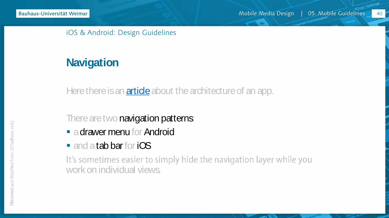
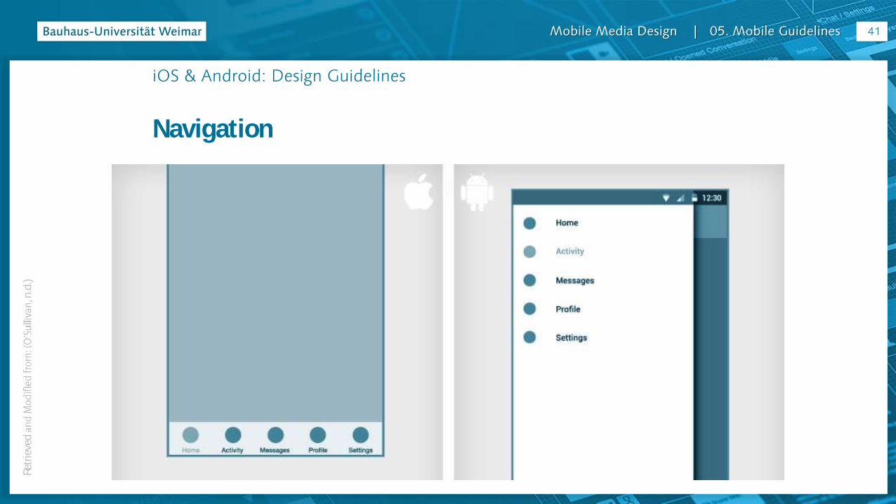
iOS & Android: Design Guidelines
Navigation
Here there is an article about the architecture of an app.
There are two navigation patterns:
a drawer menu for Android
and a tab bar for iOS.
work on individual views.
40Re
trie
ved
n
.d.)
Mobile Media Design | 05. Mobile Guidelines
iOS & Android: Design Guidelines
Navigation
41Re
trie
ved
n
.d.)

Mobile Media Design | 05. Mobile Guidelines
iOS & Android: Design Guidelines
Cards
Cards are becoming the primary UI pattern versatile and allow users to consume quick bites of content in a way that suits mobile behaviors. Visually, cards fit in very well with
(it being inspired by paper). Using drop shadows and reasonable gutters between cards will create a native look and feel naturally.
42
Mobile Media Design | 05. Mobile Guidelines
iOS & Android: Design Guidelines
Cards
iOS guidelines suggest using depth in transparencies and overlays, but the basic view is usually more flat.
shadow, and try to keep them as subtle as possible.
43

Mobile Media Design | 05. Mobile Guidelines
iOS & Android: Design Guidelines
Cards
44
Mobile Media Design | 05. Mobile Guidelines
iOS & Android: Design Guidelines
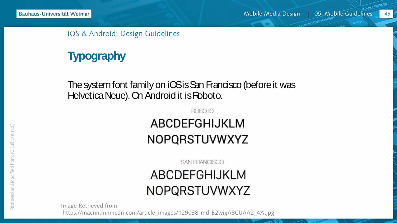
Typography
The system font family on iOS is San Francisco (before it was Helvetica Neue). On Android it is Roboto.
Image Retrieved from:https://macnn.mnmcdn.com/article_images/129038-md-B2wigA8CUAA2_4A.jpg
45Re
trie
ved
n
.d.)
Mobile Media Design | 05. Mobile Guidelines
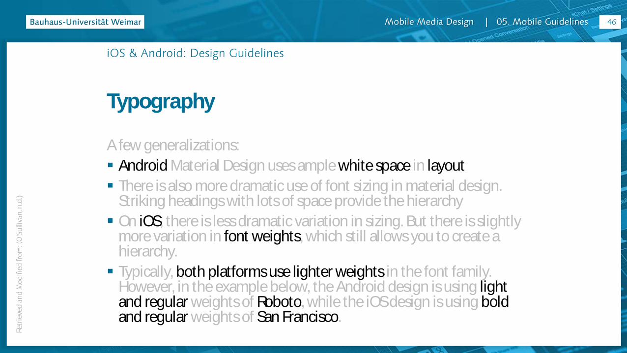
iOS & Android: Design Guidelines
Typography
A few generalizations:
Android Material Design uses ample white space in layout
There is also more dramatic use of font sizing in material design. Striking headings with lots of space provide the hierarchy
On iOS, there is less dramatic variation in sizing. But there is slightly more variation in font weights, which still allows you to create a hierarchy.
Typically, both platforms use lighter weights in the font family. However, in the example below, the Android design is using light and regular weights of Roboto, while the iOS design is using bold and regular weights of San Francisco.
46Re
trie
ved
n
.d.)

Mobile Media Design | 05. Mobile Guidelines
iOS & Android: Design Guidelines
Typography
This is a very simple example, to emphasize how even in simple ways the
app.
47Re
trie
ved
n
.d.)
Mobile Media Design | 05. Mobile Guidelines
iOS & Android: Design Guidelines
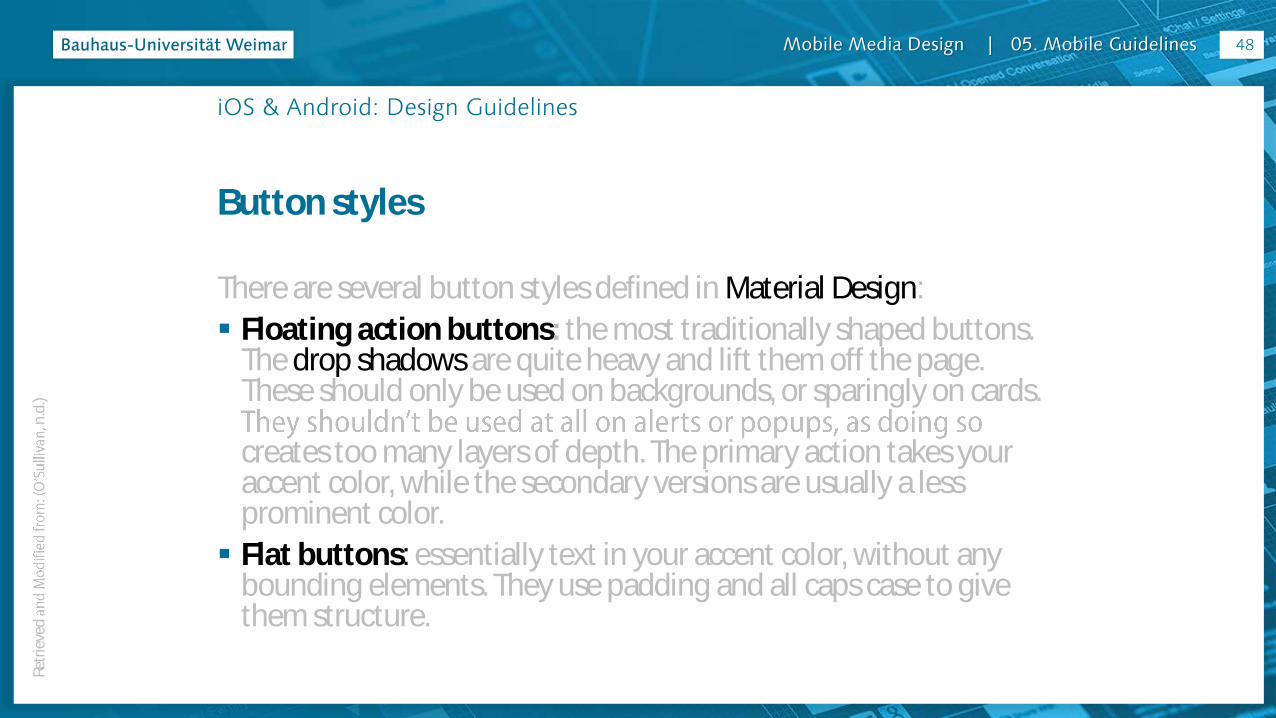
Button styles
There are several button styles defined in Material Design:
Floating action buttons: the most traditionally shaped buttons. The drop shadows are quite heavy and lift them off the page. These should only be used on backgrounds, or sparingly on cards.
creates too many layers of depth. The primary action takes your accent color, while the secondary versions are usually a less prominent color.
Flat buttons: essentially text in your accent color, without any bounding elements. They use padding and all caps case to give them structure.
48Re
trie
ved
n
.d.)

Mobile Media Design | 05. Mobile Guidelines
iOS & Android: Design Guidelines
Button styles
Compared to Material Design, iOS apps are typically flat in appearance, making no use of depth or drop shadows.
The primary buttons have a fill color, while the secondary buttons are reversed out, using a stroke of the same color.
This metaphor can become somewhat limited, especially when compared to tabs and other elements to follow.
consistent metaphors for what colors mean in your app.
49Re
trie
ved
n
.d.)

Mobile Media Design | 05. Mobile Guidelines
iOS & Android: Design Guidelines
Button styles
uppercase styling, and is lighter in font weight.
50Re
trie
ved
n
.d.)
Mobile Media Design | 05. Mobile Guidelines
iOS & Android: Design Guidelines
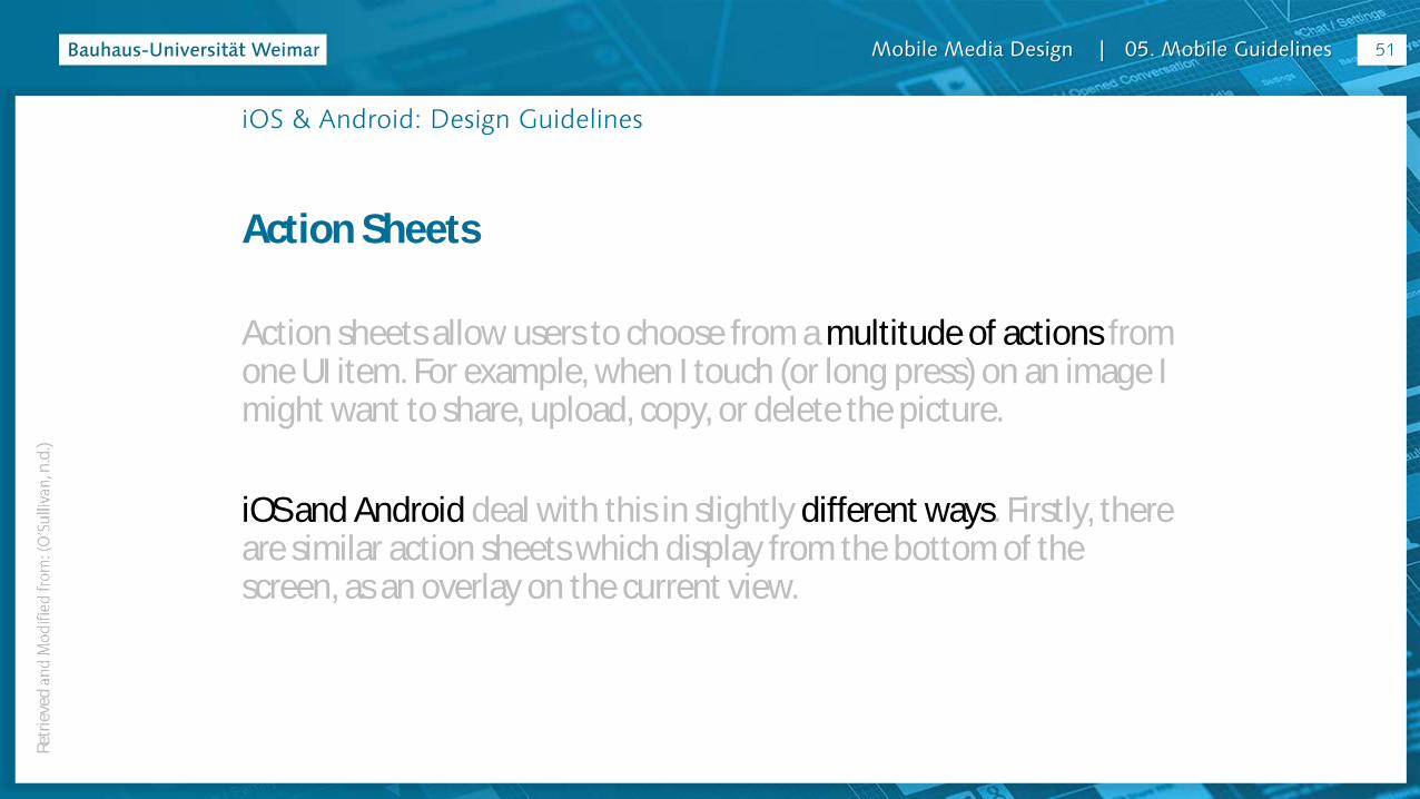
Action Sheets
Action sheets allow users to choose from a multitude of actions from one UI item. For example, when I touch (or long press) on an image I might want to share, upload, copy, or delete the picture.
iOS and Android deal with this in slightly different ways. Firstly, there are similar action sheets which display from the bottom of the screen, as an overlay on the current view.
51Re
trie
ved
n
.d.)

Mobile Media Design | 05. Mobile Guidelines
iOS & Android: Design Guidelines
Action Sheets
With Action sheets, overlays, and alerts, iOS and Android use different details to indicate depth in layers:
Android overlays have a solid color with a slight drop shadow to
iOS overlays have no drop shadow, but have a slight transparency on the background.
52Re
trie
ved
n
.d.)

Mobile Media Design | 05. Mobile Guidelines
iOS & Android: Design Guidelines
Action Sheets
53Re
trie
ved
n
.d.)
Mobile Media Design | 05. Mobile Guidelines
iOS & Android: Design Guidelines
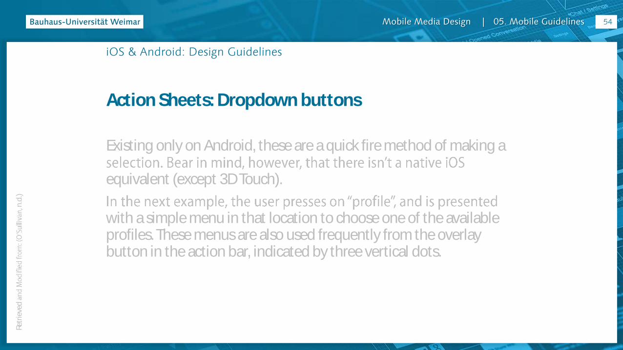
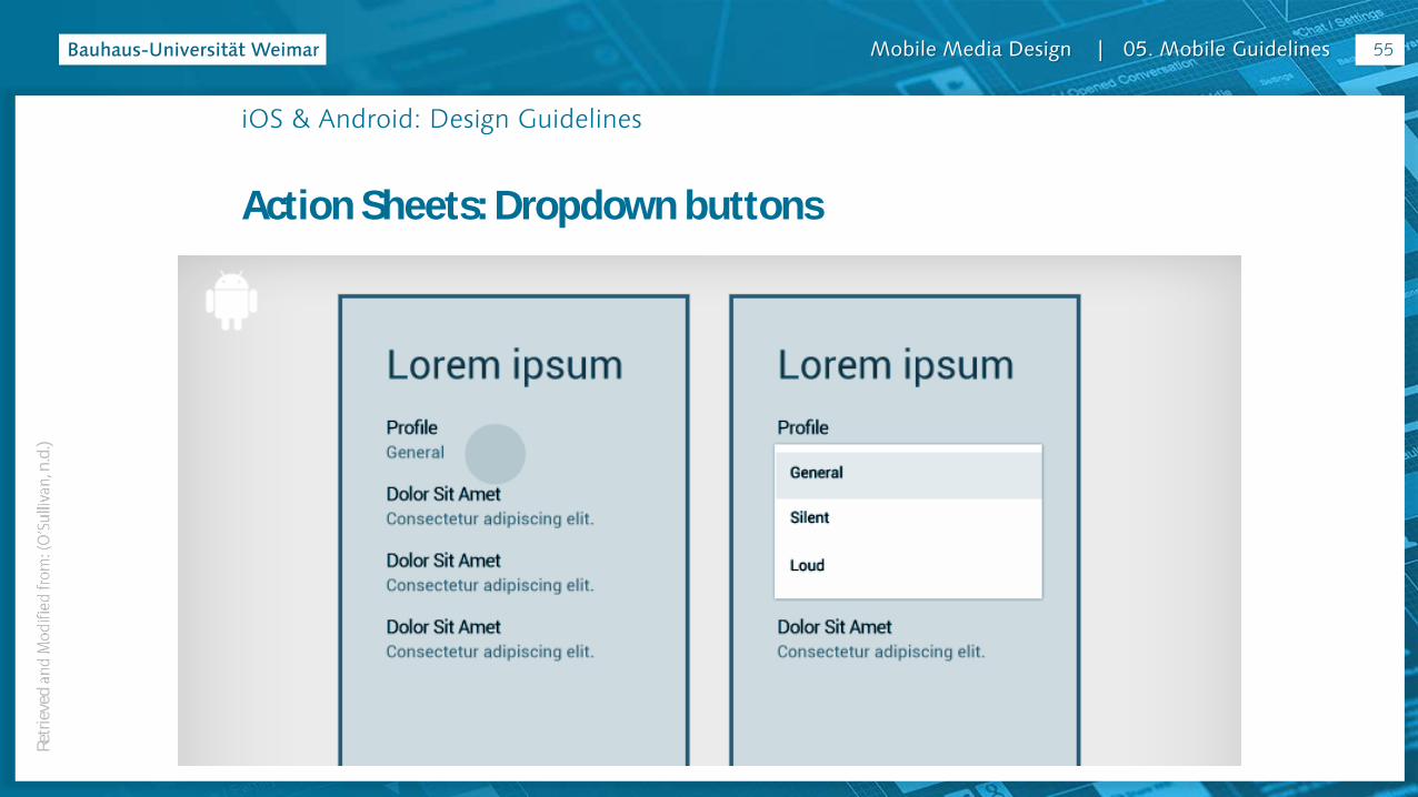
Action Sheets: Dropdown buttons
Existing only on Android, these are a quick fire method of making a
equivalent (except 3D Touch).
with a simple menu in that location to choose one of the available profiles. These menus are also used frequently from the overlay button in the action bar, indicated by three vertical dots.
54Re
trie
ved
n
.d.)
Mobile Media Design | 05. Mobile Guidelines
iOS & Android: Design Guidelines
Action Sheets: Dropdown buttons
55Re
trie
ved
n
.d.)

Mobile Media Design | 05. Mobile Guidelines
iOS & Android: Design Guidelines
Segmented controls
Segmented controls are used to switch between different content
style. On iOS there are three tabs, styled similarly to the line buttons discussed previously. On Android, they are denoted by a simple underline, and given a lot more white space to signify their interaction.
56Re
trie
ved
n
.d.)

Mobile Media Design | 05. Mobile Guidelines
iOS & Android: Design Guidelines
Segmented controls
57Re
trie
ved
n
.d.)
Mobile Media Design | 05. Mobile Guidelines
iOS & Android: Design Guidelines
Alerts
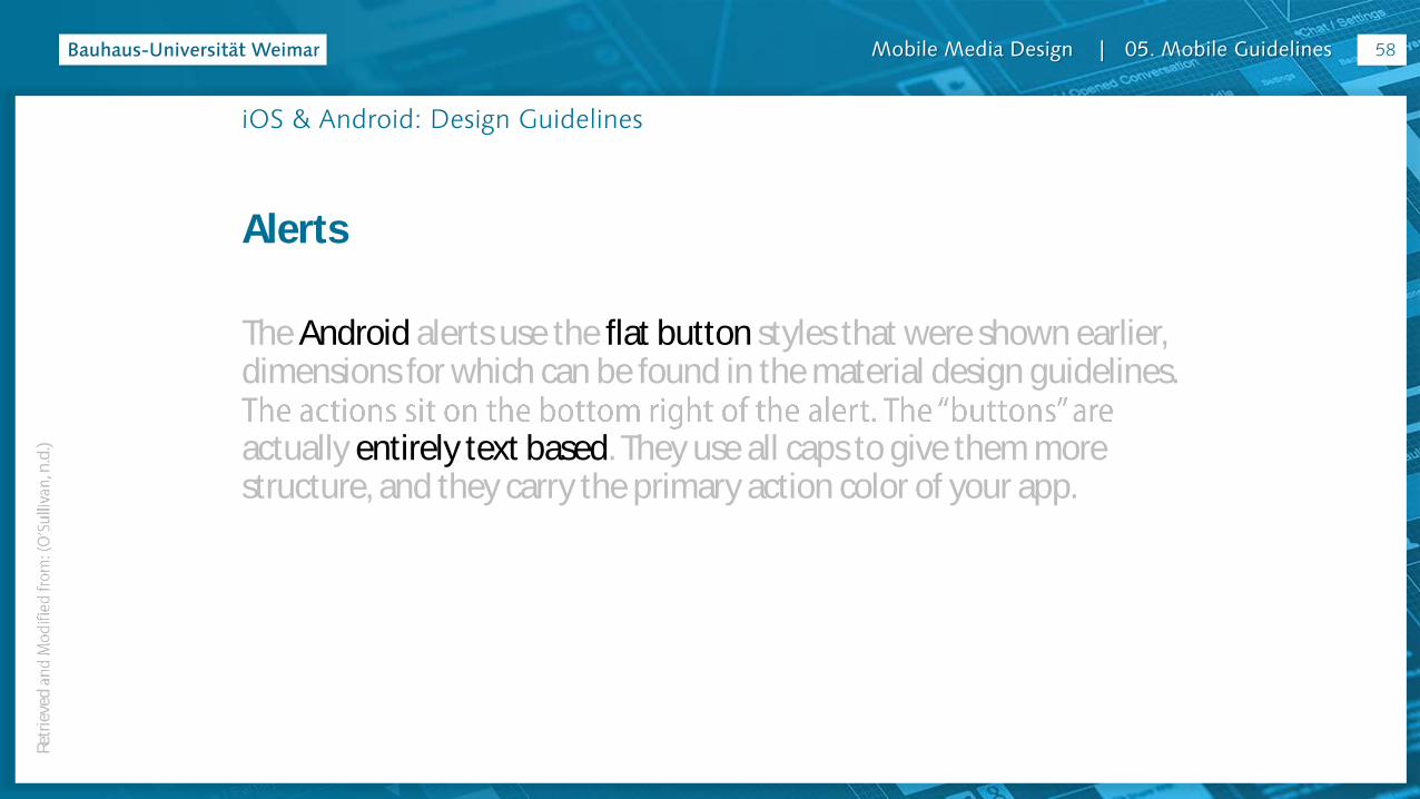
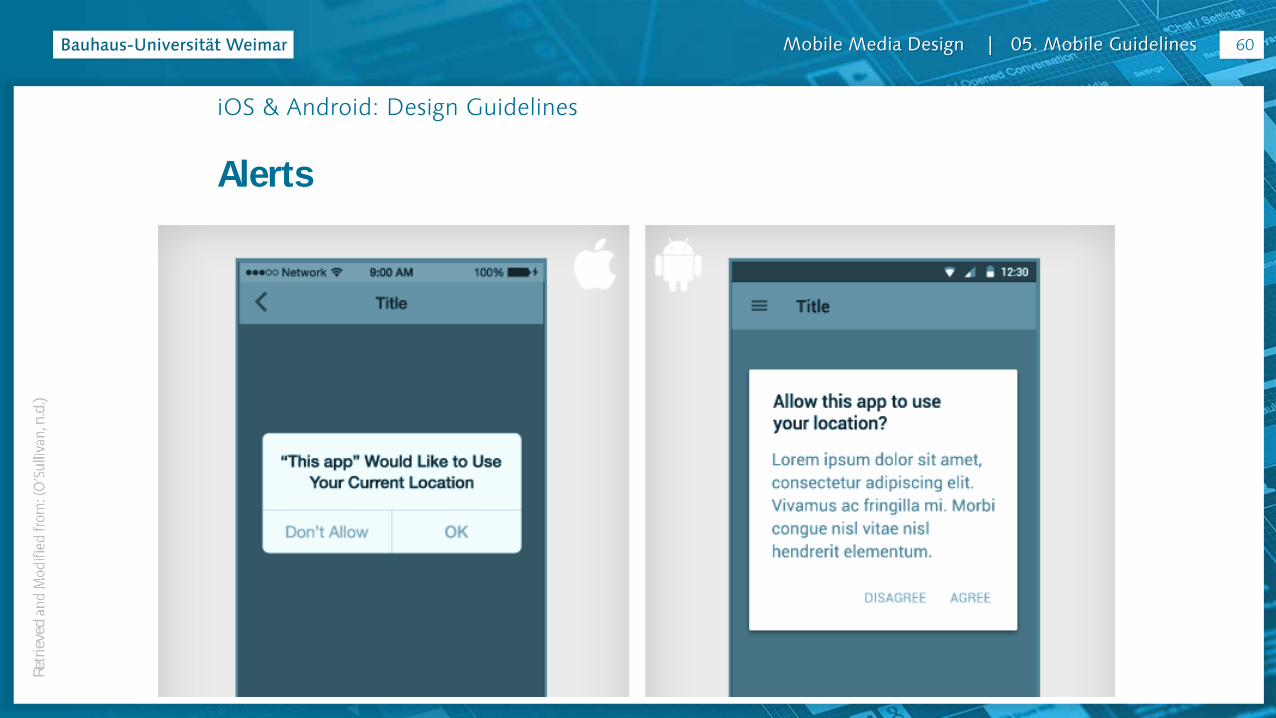
The Android alerts use the flat button styles that were shown earlier, dimensions for which can be found in the material design guidelines.
actually entirely text based. They use all caps to give them more structure, and they carry the primary action color of your app.
58Re
trie
ved
n
.d.)

Mobile Media Design | 05. Mobile Guidelines
iOS & Android: Design Guidelines
Alerts
On iOS, the actions are separated by dividers. They are usually in sentence or title case, as they gain their structure from the separate blocks. They are centered in the field, and again they will inherit your active color.
59Re
trie
ved
n
.d.)
Mobile Media Design | 05. Mobile Guidelines
iOS & Android: Design Guidelines
Alerts
60Re
trie
ved
n
.d.)

Mobile Media Design | 05. Mobile Guidelines
iOS & Android: Design Guidelines
Icons
iOS popularized line icons, with very thin strokes.
The Android system icons have thicker strokes, or are entirely solid icons.
In the past, Android icons used perspective or a three dimensional twist, but now their guidelines specify two dimensional icons viewed
comparison, or use the direct links to icon guidelines for Android or iOS
61Re
trie
ved
n
.d.)

Mobile Media Design | 05. Mobile Guidelines
iOS & Android: Design Guidelines
Icons
62Re
trie
ved
n
.d.)
Mobile Media Design | 05. Mobile Guidelines
iOS & Android: Design Guidelines
Icons
Android https://www.google.com/design/icons/index.html
http://www.google.com/design/spec/style/icons.html#icons-product-icons
iOS https://developer.apple.com/library/ios/documentation/UserExperience/Conceptual/MobileHIG/BarI
cons.html#//apple_ref/doc/uid/TP40006556-CH21-SW1
https://developer.apple.com/library/ios/documentation/UserExperience/Conceptual/MobileHIG/Iconography.html#//apple_ref/doc/uid/TP40006556-CH59-SW1
63

Mobile Media Design | 05. Mobile Guidelines
iOS & Android: Design Guidelines
Common UI Controls
Radio buttons, check boxes, fields and switches are functional components that should be given a native feel. As with alerts and dialogues, these controls and inputs are an area of trust and familiarity for the user.
Use the native components as much as possible for these, so that people (a) know how to use them,
and (b) trust your app with their sensitive data or payment details.
64Re
trie
ved
n
.d.)
Mobile Media Design | 05. Mobile Guidelines
iOS & Android: Design Guidelines
Common UI Controls
In the next example we see switch and radio button equivalents for Android and iOS. Again, the differences are small enough for you to progress with one design, and tweak for the other later, but the subtle differences are essential for a native look. Use your UI kit as much as possible for these components, and again communicate with developers early on in the process.
65Re
trie
ved
n
.d.)

Mobile Media Design | 05. Mobile Guidelines
iOS & Android: Design Guidelines
Common UI Controls
66
Mobile Media Design | 05. Mobile Guidelines
iOS & Android: Design Guidelines
Summary
iOS and Android with one design.
Try to keep on top of these tweaks from the beginning, keep an eye out for components that feel out of sync on one platform, and always work as closely as you can with developers.
67

Mobile Media Design | 05. Mobile Guidelines
iOS & Android: Design Guidelines
Resources
Guidelines
be found in the platform guidelines:
iOS Human interface guidelines
Android material design guidelines
68
Mobile Media Design | 05. Mobile Guidelines
iOS & Android: Design Guidelines
Resources
Icons
useful to have as placeholders while you work. Icon design can be a
get an overall feel for your app. I recently found the links below on icons8 look pretty good, or flaticon.com is great for more general icons.
Line icons which are great for iOS design
Flat icons that work well with material design
69

Mobile Media Design | 05. Mobile Guidelines
iOS & Android: Design Guidelines
- Retrieved and Modified from: (O’Sullivan, n.d.)
Resources
UI Kits
These UI Kits will save you recreating basic native controls and matching sizes. You can pluck out the pieces you need and then switch between them for the Android and iPhone output of your designs.
An excellent PSD template for iOS from Teehan + Lax
Android Material Design PSD Template
70Re
trie
ved
n
.d.)
Mobile Media Design | 05. Mobile Guidelines
iOS & Android: Design Guidelines
Resources
Mockups
These come in many categories. You might want a basic device mockup for context, a simplified flat device to let your app shine, or a lifestyle mockup to present a use case.
Official iPhone device downloads
Flat apple devices with multiple perspectives
Nexus 6 flat mockup
Lifestyle mockups from placeit
71
Mobile Media Design | 05. Mobile Guidelines
iOS & Android: Design Guidelines
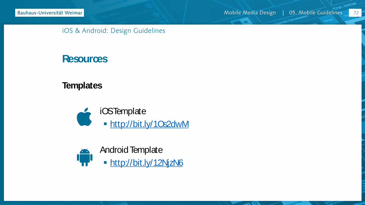
Resources
Templates
iOS Template
http://bit.ly/1Os2dwM
Android Template
http://bit.ly/12NjzN6
72
Mobile Media Design | 05. Mobile Guidelines
iOS and Androidcomparison
Mobile Media Design | 05. Mobile Guidelines
iOS & Android: Differences
74

Mobile Media Design | 05. Mobile Guidelines
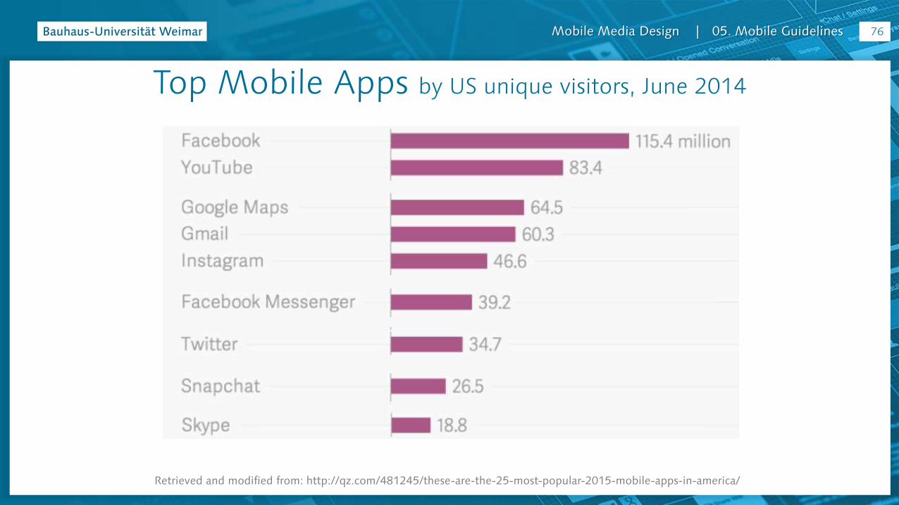
Retrieved and modified from: http://qz.com/481245/these-are-the-25-most-popular-2015-mobile-apps-in-america/
Top Mobile Apps by US unique visitors, June 2014
75
Mobile Media Design | 05. Mobile Guidelines
Top Mobile Apps by US unique visitors, June 2014
Retrieved and modified from: http://qz.com/481245/these-are-the-25-most-popular-2015-mobile-apps-in-america/
76

Mobile Media Design | 05. Mobile Guidelines
iOS & Android: Examples & Differences
Examples retrieved at 23rd November 2015, using:
iPhone 5c iOS 9.2
640 × 1136 pixels
4"
Samsung Galaxy S3
Android 4.3
720 x 1280 pixels
4.8"
77

Mobile Media Design | 05. Mobile Guidelines
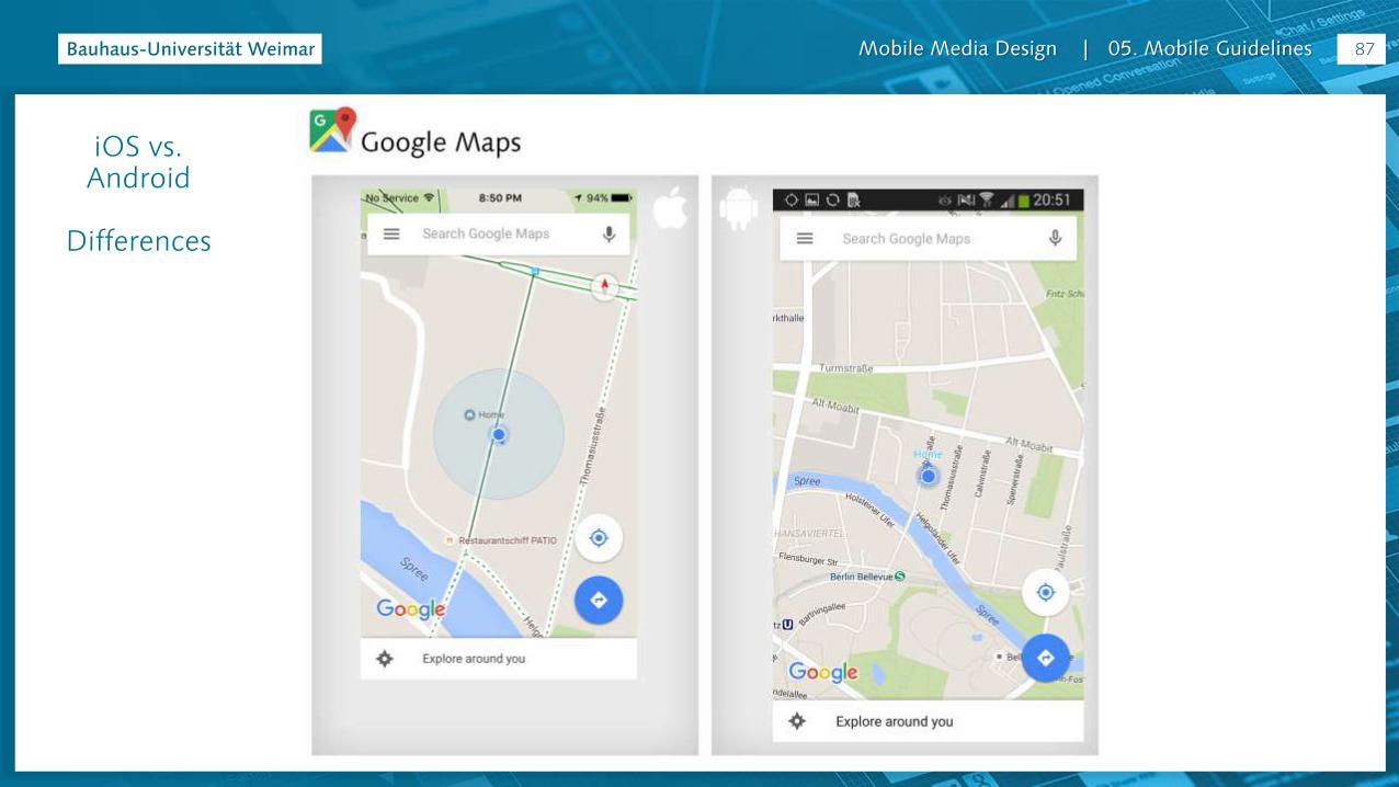
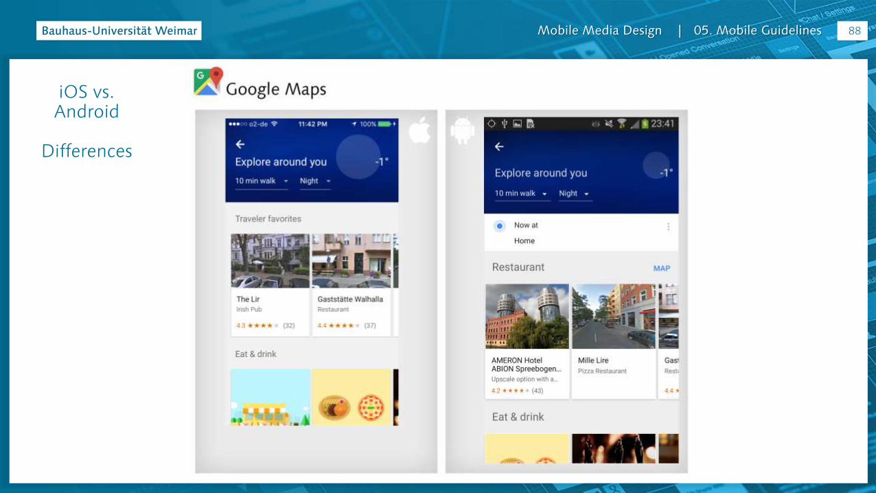
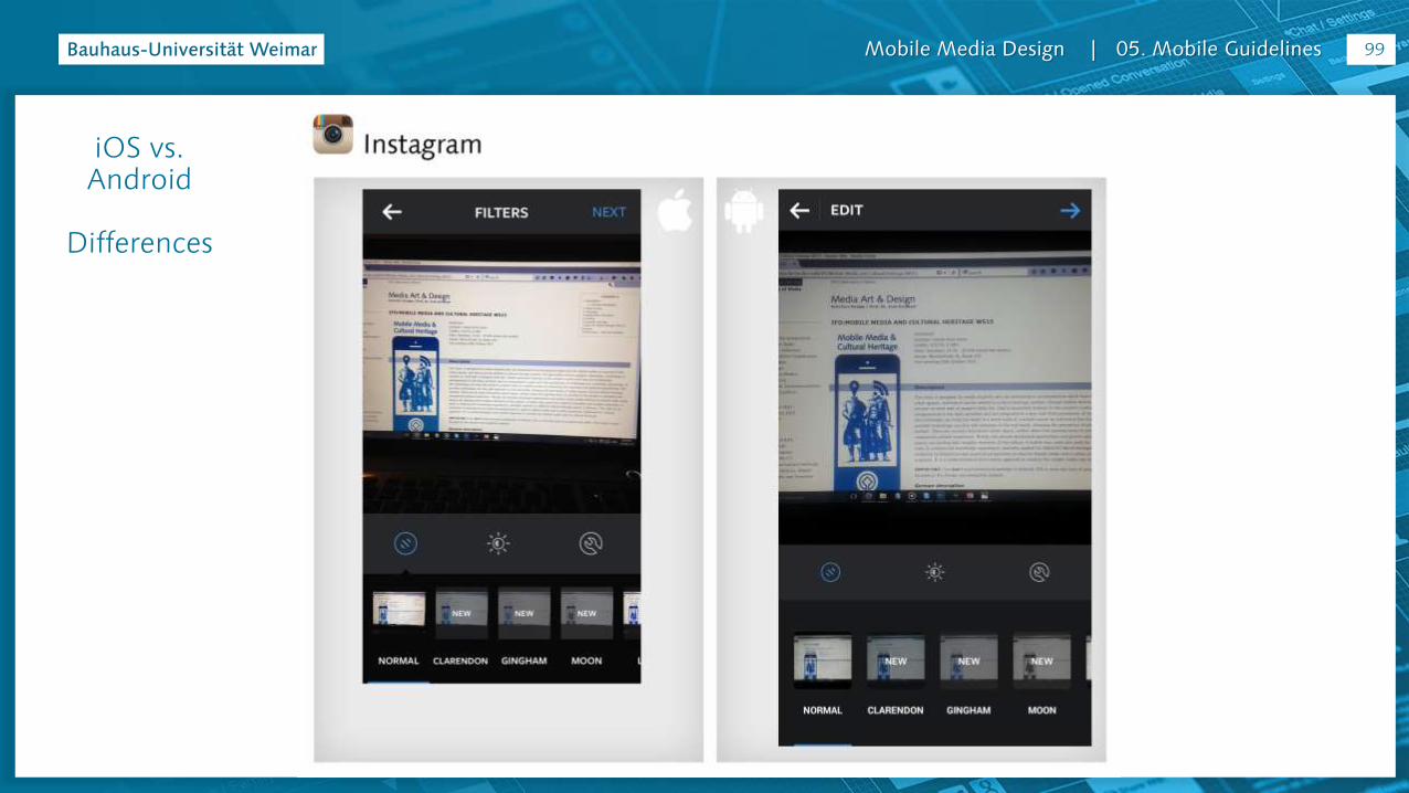
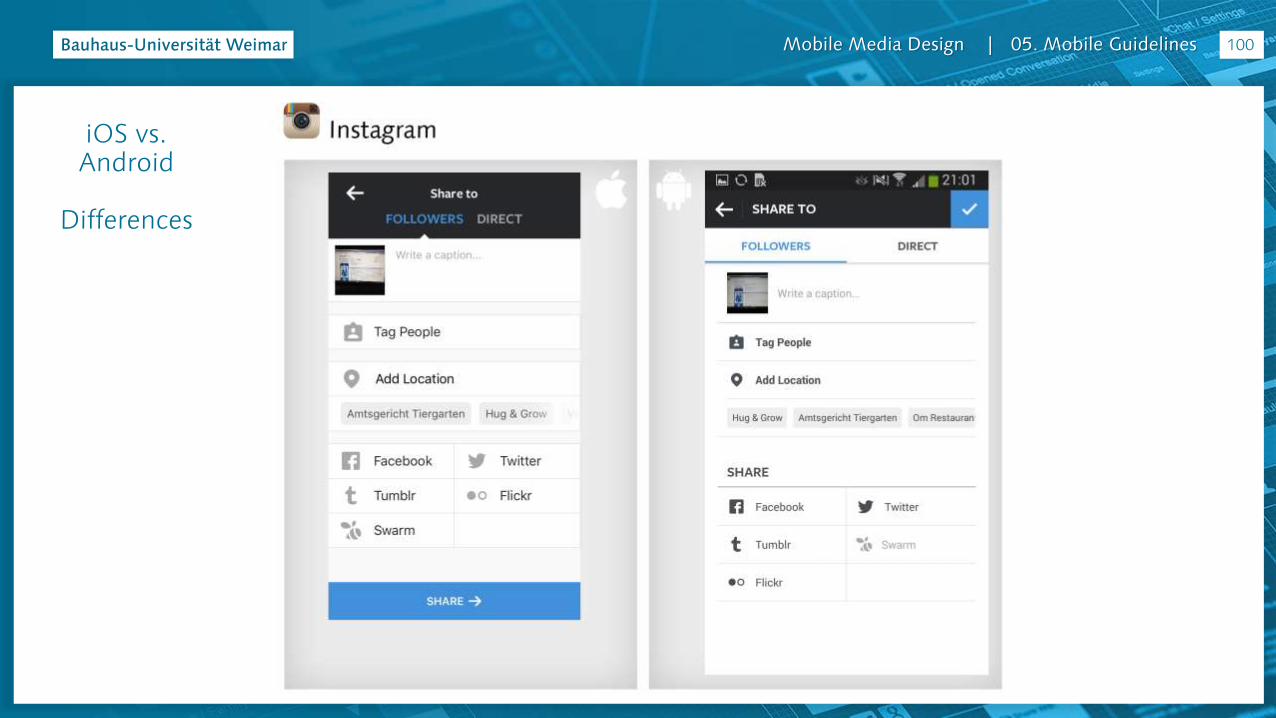
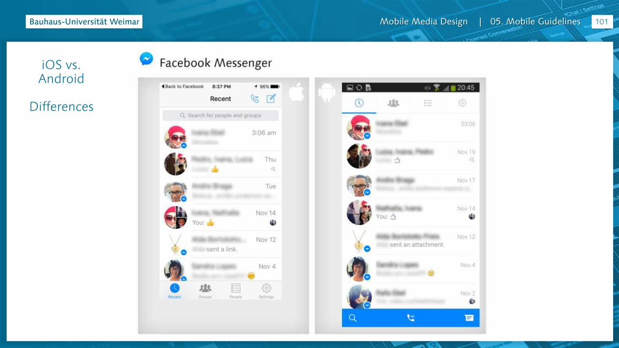
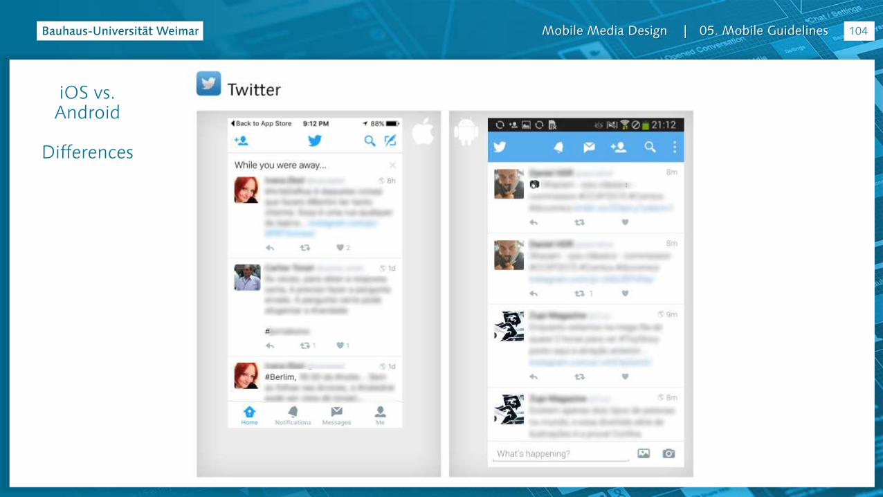
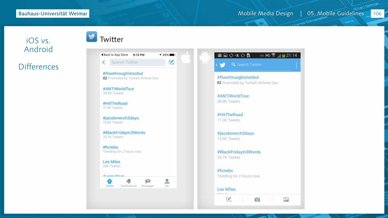
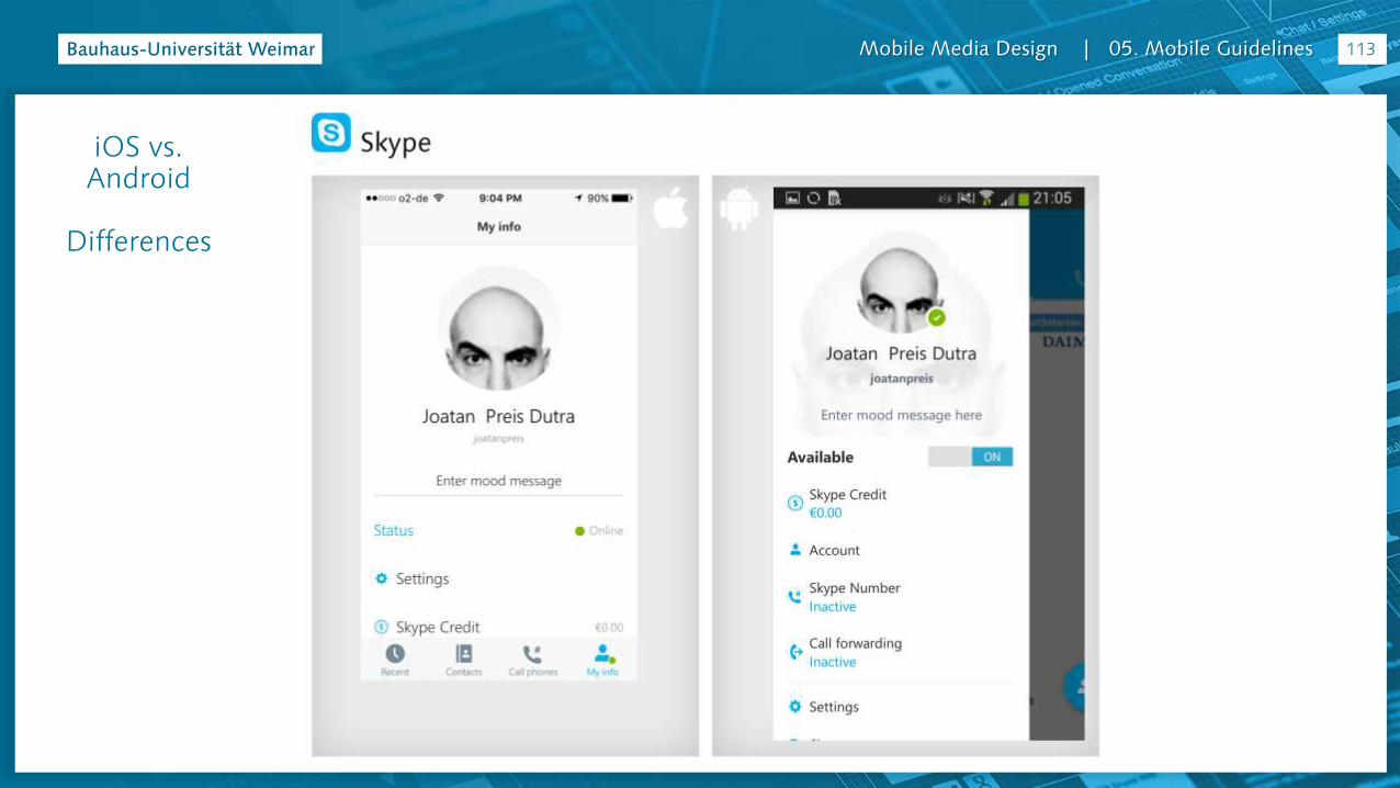
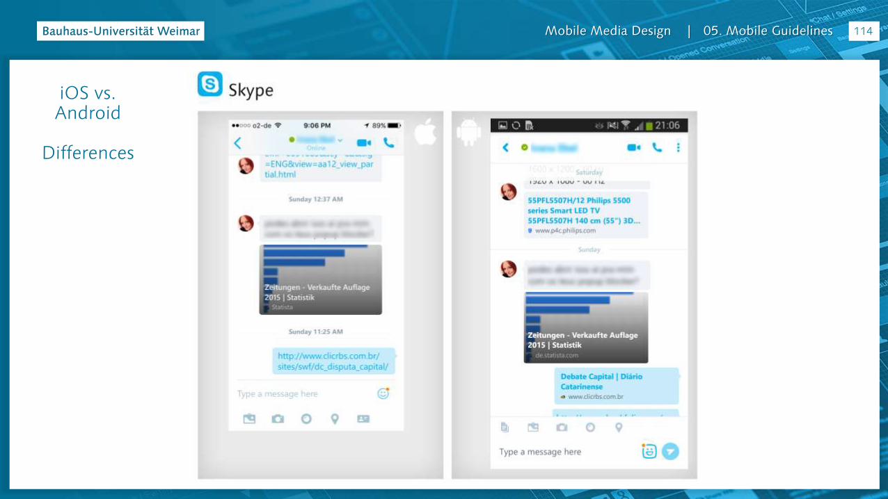
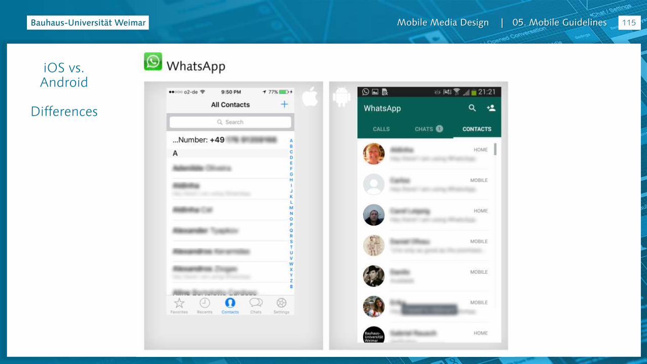
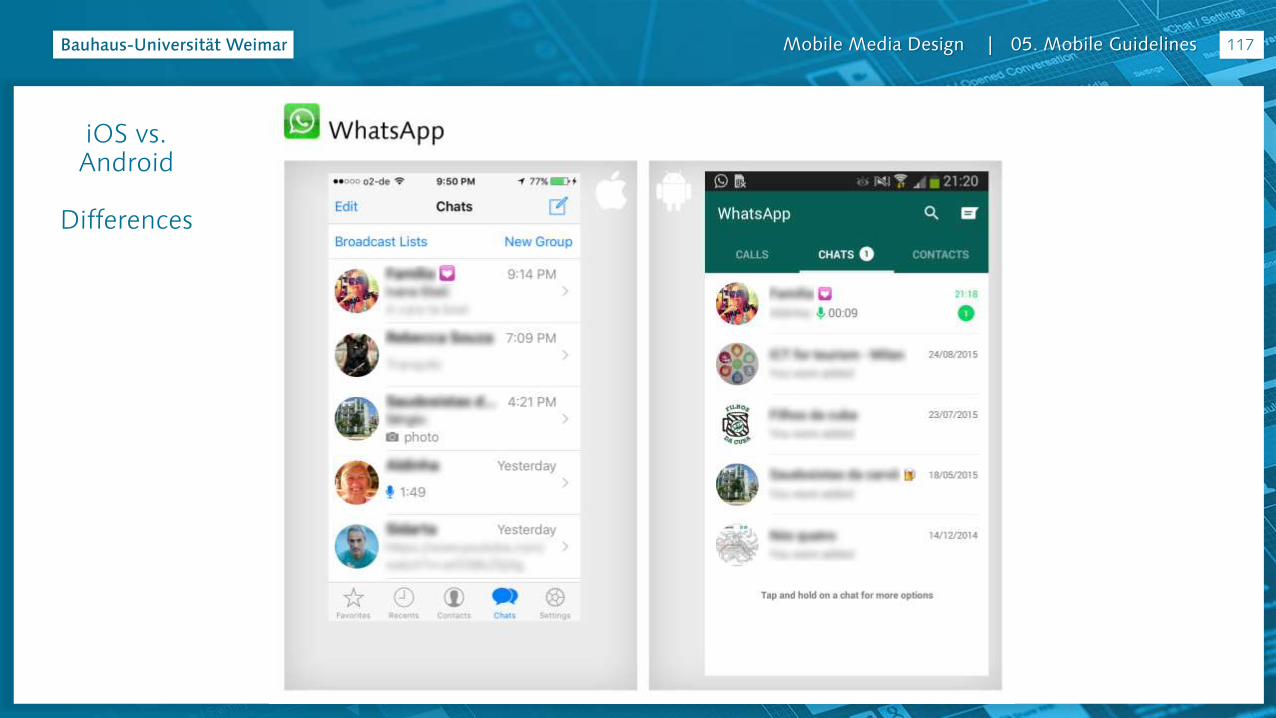
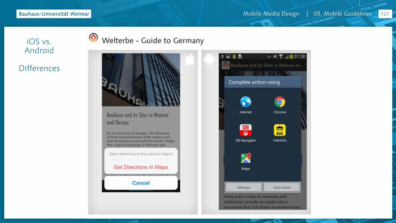
iOS vs. Android
Differences
78
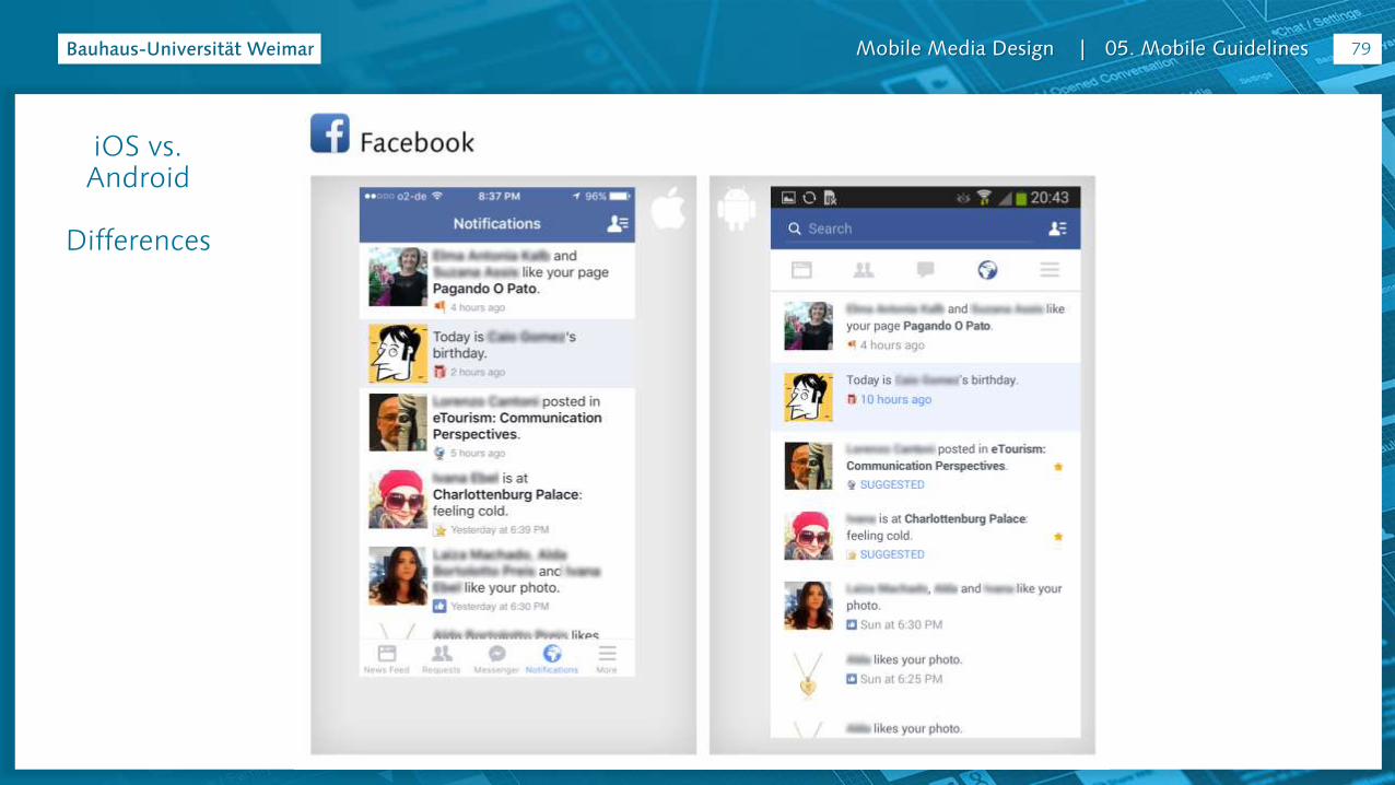
Mobile Media Design | 05. Mobile Guidelines 79
iOS vs. Android
Differences
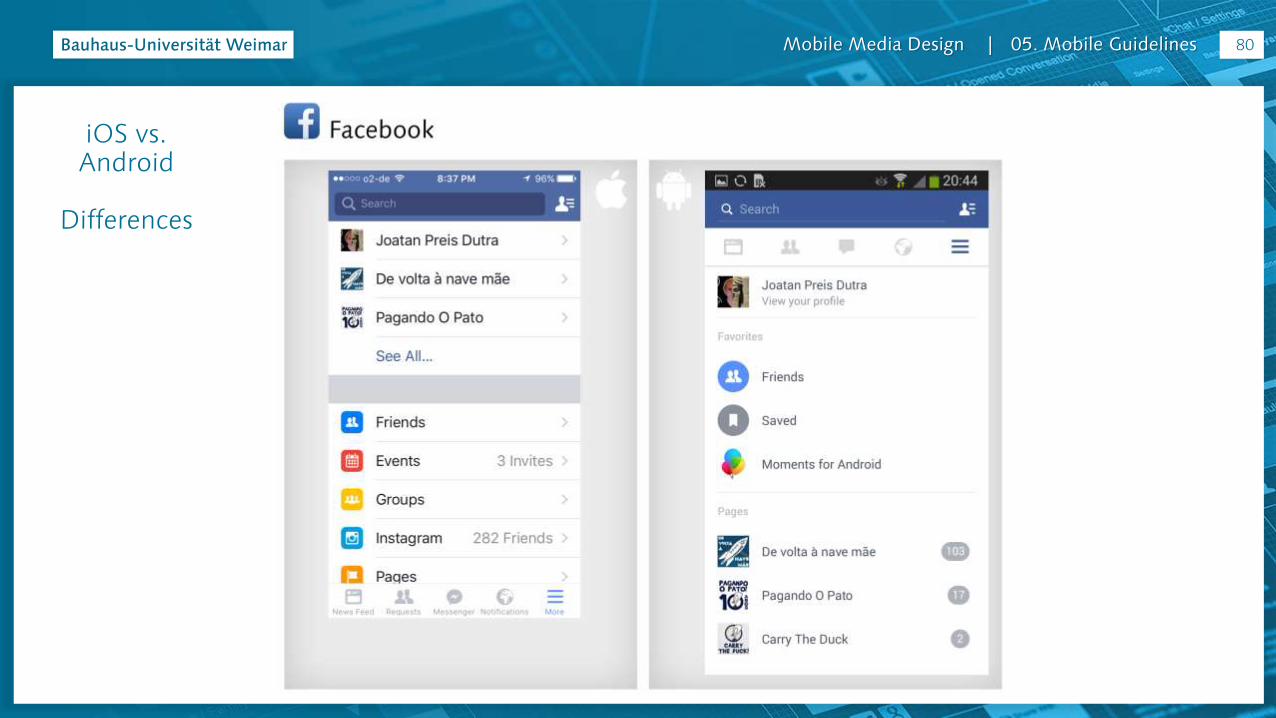
Mobile Media Design | 05. Mobile Guidelines 80
iOS vs. Android
Differences

Mobile Media Design | 05. Mobile Guidelines 81
iOS vs. Android
Differences

Mobile Media Design | 05. Mobile Guidelines 82
iOS vs. Android
Differences
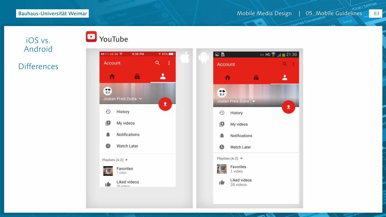
Mobile Media Design | 05. Mobile Guidelines 83
iOS vs. Android
Differences

Mobile Media Design | 05. Mobile Guidelines 84
iOS vs. Android
Differences

Mobile Media Design | 05. Mobile Guidelines 85
iOS vs. Android
Differences

Mobile Media Design | 05. Mobile Guidelines 86
iOS vs. Android
Differences
Mobile Media Design | 05. Mobile Guidelines 87
iOS vs. Android
Differences
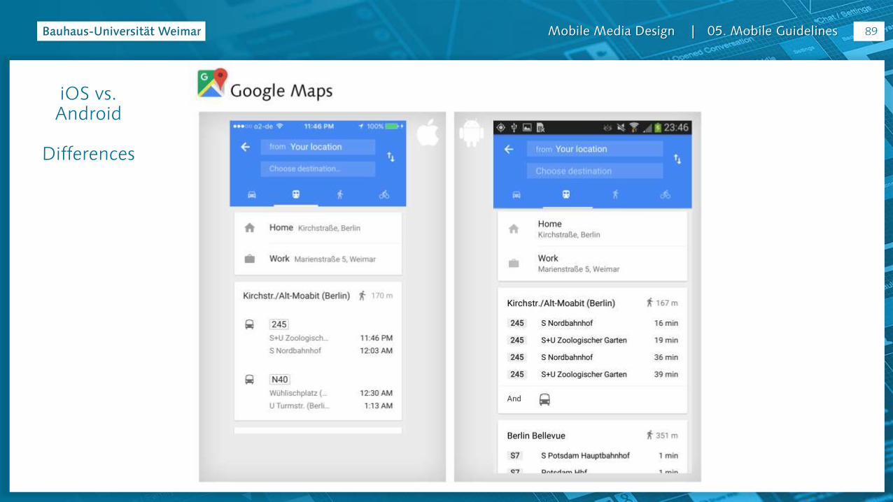
Mobile Media Design | 05. Mobile Guidelines 88
iOS vs. Android
Differences
Mobile Media Design | 05. Mobile Guidelines 89
iOS vs. Android
Differences

Mobile Media Design | 05. Mobile Guidelines 90
iOS vs. Android
Differences

Mobile Media Design | 05. Mobile Guidelines 91
iOS vs. Android
Differences

Mobile Media Design | 05. Mobile Guidelines 92
iOS vs. Android
Differences

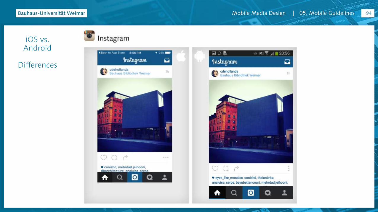
Mobile Media Design | 05. Mobile Guidelines 93
iOS vs. Android
Differences
Mobile Media Design | 05. Mobile Guidelines 94
iOS vs. Android
Differences

Mobile Media Design | 05. Mobile Guidelines 95
iOS vs. Android
Differences

Mobile Media Design | 05. Mobile Guidelines 96
iOS vs. Android
Differences

Mobile Media Design | 05. Mobile Guidelines 97
iOS vs. Android
Differences
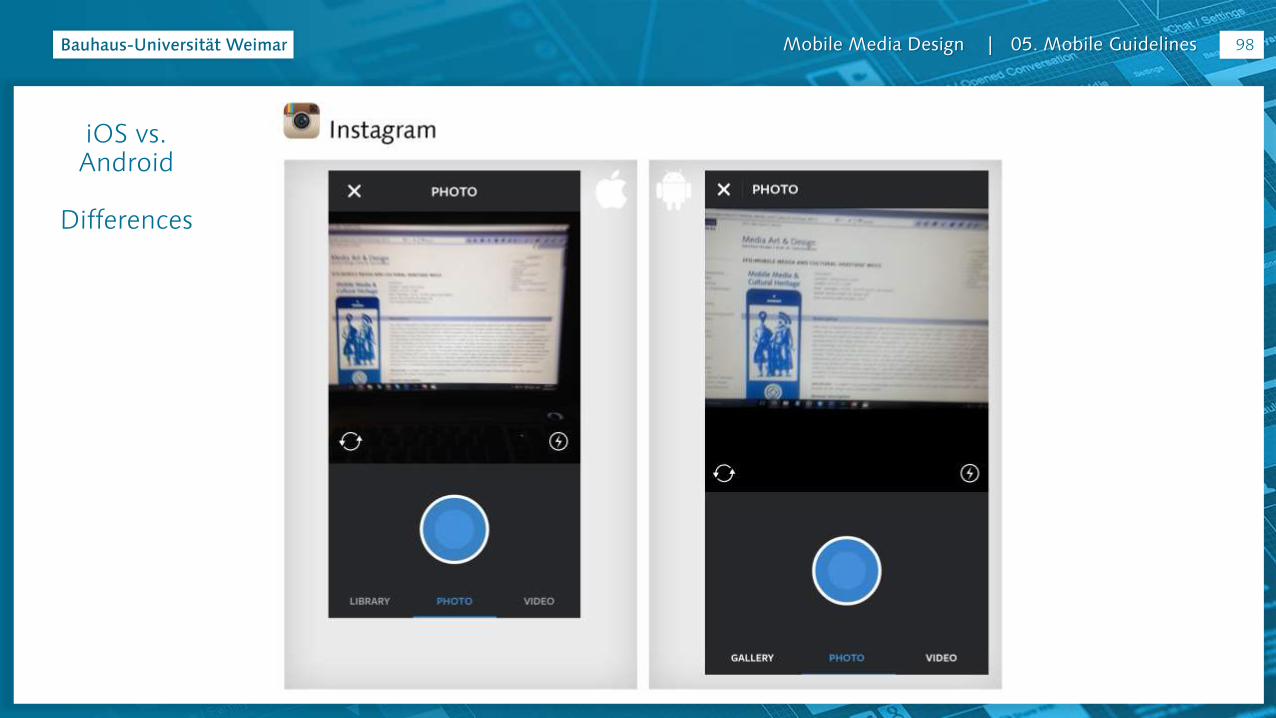
Mobile Media Design | 05. Mobile Guidelines 98
iOS vs. Android
Differences
Mobile Media Design | 05. Mobile Guidelines 99
iOS vs. Android
Differences
Mobile Media Design | 05. Mobile Guidelines 100
iOS vs. Android
Differences
Mobile Media Design | 05. Mobile Guidelines 101
iOS vs. Android
Differences

Mobile Media Design | 05. Mobile Guidelines 102
iOS vs. Android
Differences

Mobile Media Design | 05. Mobile Guidelines 103
iOS vs. Android
Differences
Mobile Media Design | 05. Mobile Guidelines 104
iOS vs. Android
Differences

Mobile Media Design | 05. Mobile Guidelines 105
iOS vs. Android
Differences
Mobile Media Design | 05. Mobile Guidelines 106
iOS vs. Android
Differences

Mobile Media Design | 05. Mobile Guidelines 107
iOS vs. Android
Differences

Mobile Media Design | 05. Mobile Guidelines 108
iOS vs. Android
Differences

Mobile Media Design | 05. Mobile Guidelines 109
iOS vs. Android
Differences
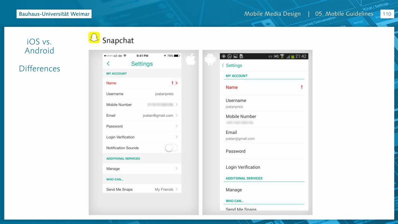
Mobile Media Design | 05. Mobile Guidelines 110
iOS vs. Android
Differences
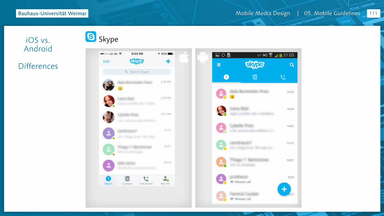
Mobile Media Design | 05. Mobile Guidelines 111
iOS vs. Android
Differences
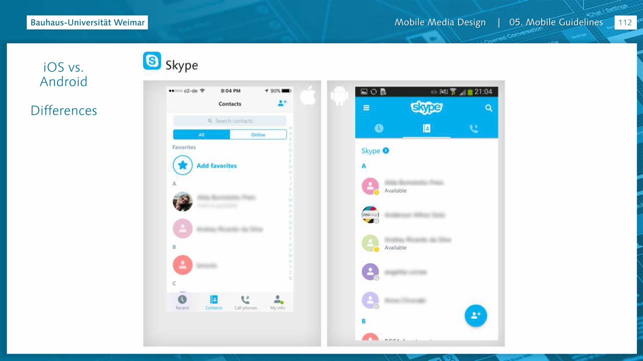
Mobile Media Design | 05. Mobile Guidelines 112
iOS vs. Android
Differences
Mobile Media Design | 05. Mobile Guidelines 113
iOS vs. Android
Differences
Mobile Media Design | 05. Mobile Guidelines 114
iOS vs. Android
Differences
Mobile Media Design | 05. Mobile Guidelines 115
iOS vs. Android
Differences

Mobile Media Design | 05. Mobile Guidelines 116
iOS vs. Android
Differences
Mobile Media Design | 05. Mobile Guidelines 117
iOS vs. Android
Differences

Mobile Media Design | 05. Mobile Guidelines 118
iOS vs. Android
Differences

Mobile Media Design | 05. Mobile Guidelines
119
iOS vs. Android
Differences

Mobile Media Design | 05. Mobile Guidelines 120
iOS vs. Android
Differences
Mobile Media Design | 05. Mobile Guidelines 121
iOS vs. Android
Differences
Mobile Media Design | 05. Mobile Guidelines
iOS & Android
Which one is better?
It is just a matter of taste
122

Mobile Media Design | 05. Mobile Guidelines
WHS Apps in Germany

Mobile Media Design | 05. Mobile Guidelines
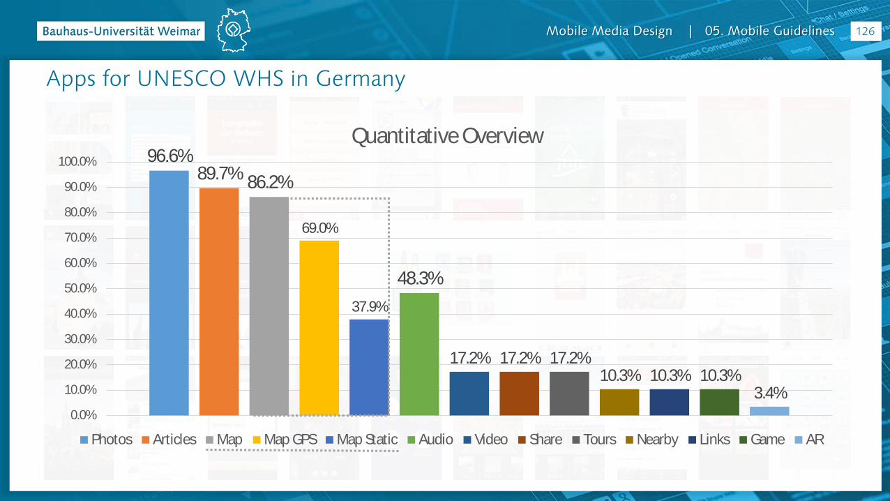
Apps for UNESCO WHS in Germany
27 dedicated Apps (*+2)for 19 places (of 37)
= only 51% of the WHS have a dedicated App
* On official App markets, using the search words: Welterbe
names of WHS in English and German. Are excluded on this count the Apps Welterbe
Germany
124
Link: http://www.uni-weimar.de/medien/wiki/IFD:MobileMediaDesign-SS16#Apps_for_World_Heritage_Sites_in_Germany

Mobile Media Design | 05. Mobile Guidelines
Apps for UNESCO WHS in Germany
125
Mobile Media Design | 05. Mobile Guidelines 126
96.6%89.7% 86.2%
69.0%
37.9%
48.3%
17.2% 17.2% 17.2%10.3% 10.3% 10.3%
3.4%0.0%
10.0%
20.0%
30.0%
40.0%
50.0%
60.0%
70.0%
80.0%
90.0%
100.0%
Quantitative Overview
Photos Articles Map Map GPS Map Static Audio Video Share Tours Nearby Links Game AR
Apps for UNESCO WHS in Germany

Mobile Media Design | 05. Mobile Guidelines 127
Apps for UNESCO WHS in Germany
1 Tap = 12 Apps (41,3%)
2 Taps = 12 Apps (41,3%)
3 Taps = 4 Apps (13,7%)
4 Taps = 1 App (3,4%)
1 to 2 Taps = 82,6%
0
1
2
3
4
# of Clicks/Taps to achieve WHS info
Aachner Dom Dom zu Speyer Altstadt von Lübeck
iTour Lübeck Sanssouci - Pars and its buildings Sanssouci Palace Visitor Guide
Show Me: Bamberg Quedlinburger FachwerkAPP Freizeitführer Saarmoselle
Der Kölner Dom Kölner Dom für Kinder Der Kölner Dom - Ein Hörführer
Cologne Cathedral Topography of Modernism Bauhaus Archive
Museum Island Visitor Guide Zollverein App Wismar Tourist Guide
Rheintour DE Limes Mittelfranken Mobil Virtuelle Limeswelten mobil
Main Limes Mobile Stadtführung Regensburg Palafittes Guide
Bergpark Corvey Quarterquest Hamburg
Welterbe - Guide to Germany World Heritage in Germany
Mobile Media Design | 05. Mobile Guidelines
Overview: Photos / Gallery
128
Mobile Media Design | 05. Mobile Guidelines
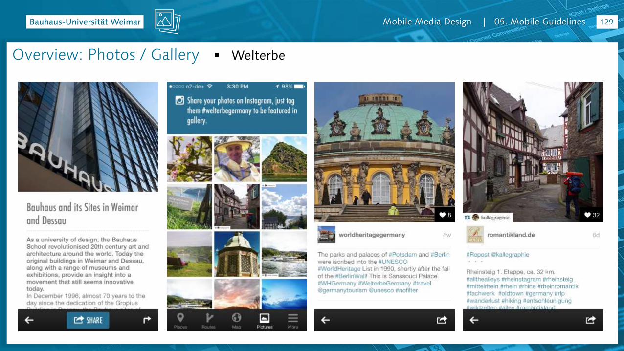
Welterbe
129
Overview: Photos / Gallery
Mobile Media Design | 05. Mobile Guidelines 130
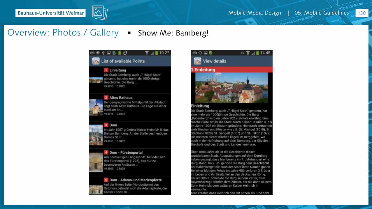
Show Me: Bamberg!Overview: Photos / Gallery

Mobile Media Design | 05. Mobile Guidelines 131
CorveyOverview: Photos / Gallery

Mobile Media Design | 05. Mobile Guidelines 132
Stadtführung RegensburgOverview: Photos / Gallery
Mobile Media Design | 05. Mobile Guidelines 133
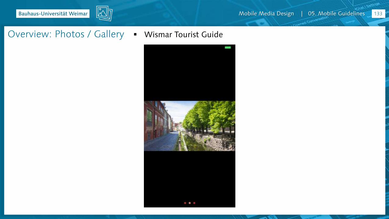
Wismar Tourist GuideOverview: Photos / Gallery
Mobile Media Design | 05. Mobile Guidelines 134
Overview: Articles / Text
Mobile Media Design | 05. Mobile Guidelines 135
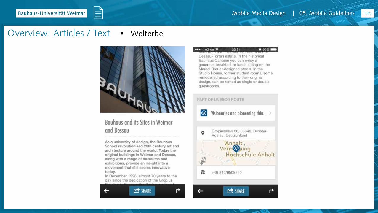
WelterbeOverview: Articles / Text
Mobile Media Design | 05. Mobile Guidelines 136
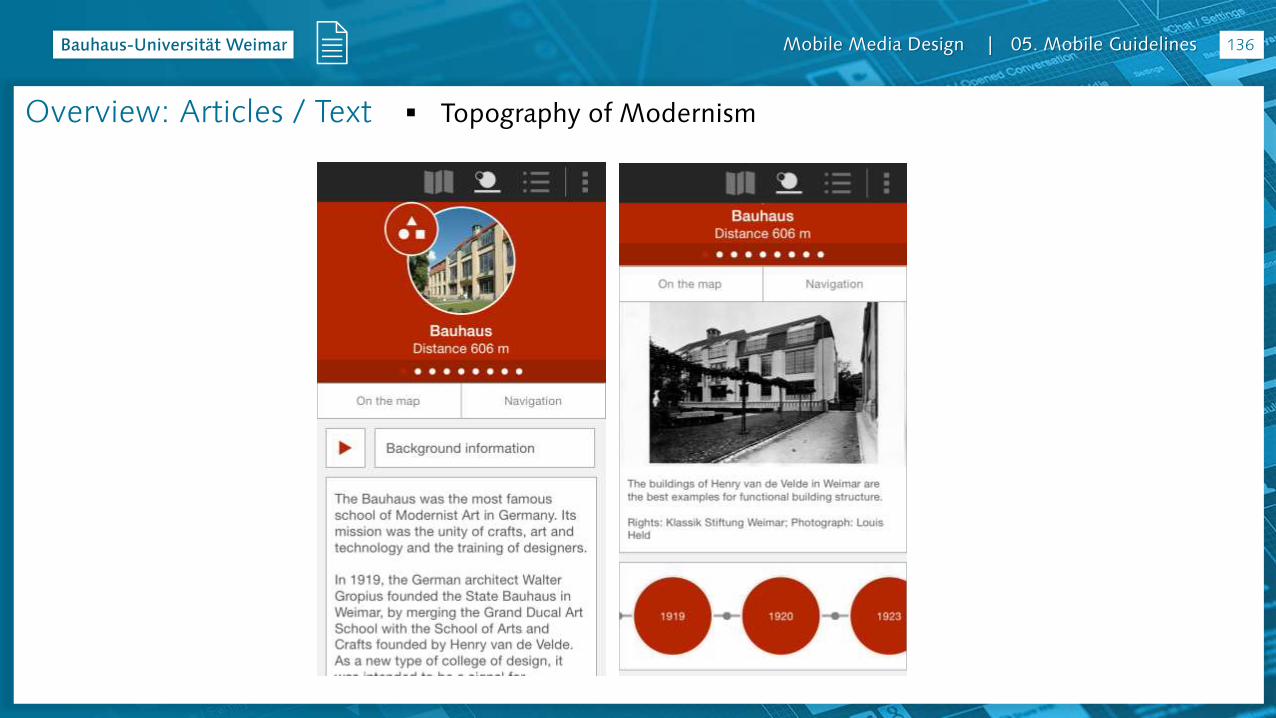
Topography of ModernismOverview: Articles / Text

Mobile Media Design | 05. Mobile Guidelines 137
UNESCO-Welterbe Zollverein AppOverview: Articles / Text
Mobile Media Design | 05. Mobile Guidelines 138
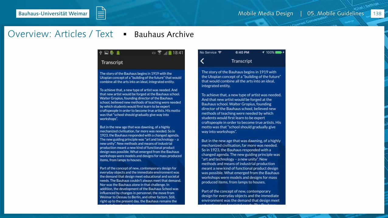
Bauhaus ArchiveOverview: Articles / Text
Mobile Media Design | 05. Mobile Guidelines 139
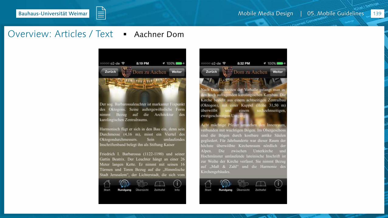
Aachner DomOverview: Articles / Text

Mobile Media Design | 05. Mobile Guidelines 140
Aachner DomOverview: Maps

Mobile Media Design | 05. Mobile Guidelines 141
WelterbeOverview: Maps

Mobile Media Design | 05. Mobile Guidelines 142
Topography of ModernismOverview: Maps
Mobile Media Design | 05. Mobile Guidelines 143
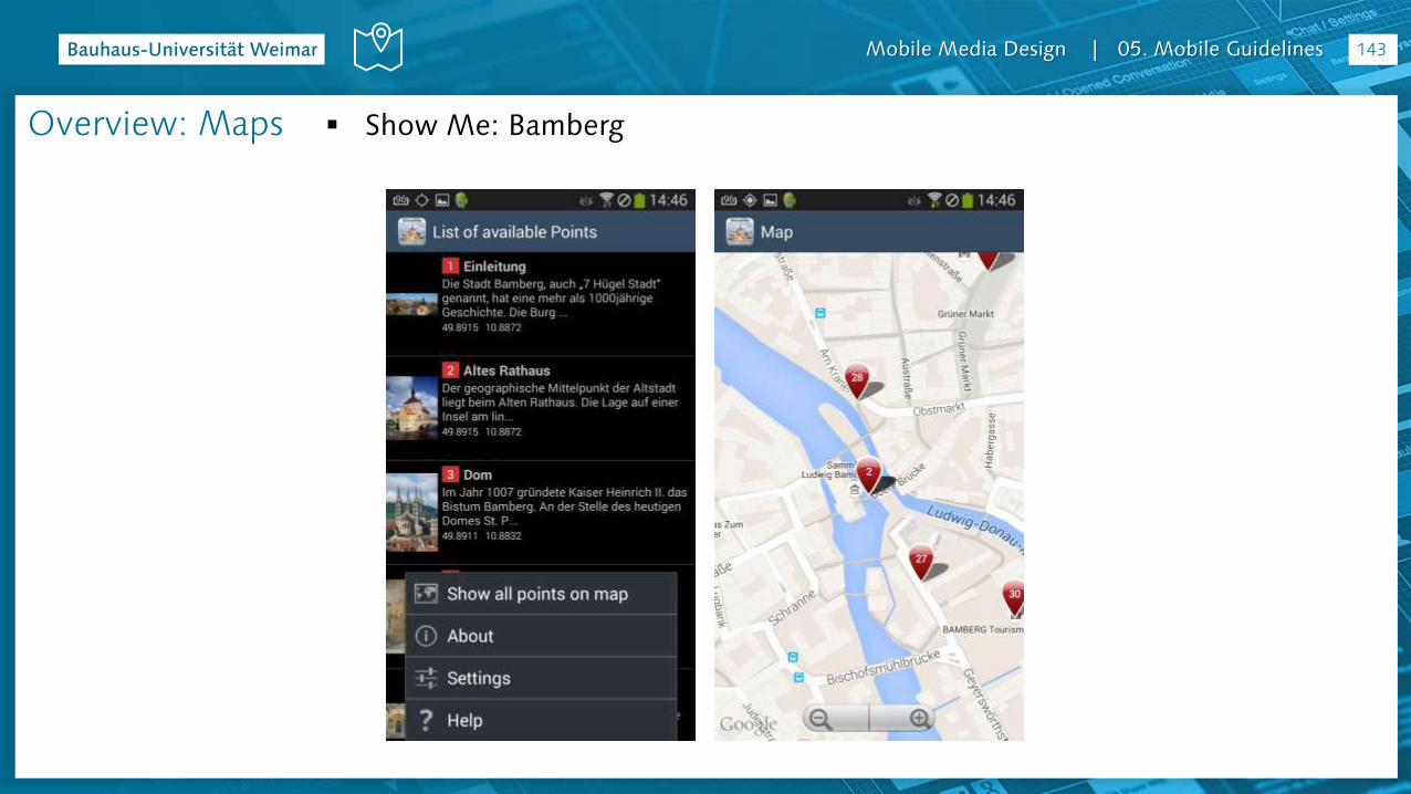
Show Me: BambergOverview: Maps
Mobile Media Design | 05. Mobile Guidelines 144
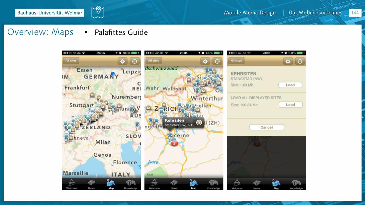
Palafittes GuideOverview: Maps

Mobile Media Design | 05. Mobile Guidelines 145
Sanssoussi – The park and its buildingsOverview: Maps
Mobile Media Design | 05. Mobile Guidelines 146
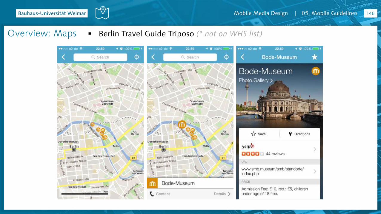
Berlin Travel Guide Triposo (* not on WHS list)Overview: Maps

Mobile Media Design | 05. Mobile Guidelines 147
Berlin City Guide TripAdvisor (* not on WHS list)Overview: Maps

Mobile Media Design | 05. Mobile Guidelines 148
Berlin Travel Guide Triposo (* not on WHS list)Overview: Participation
Mobile Media Design | 05. Mobile Guidelines 149
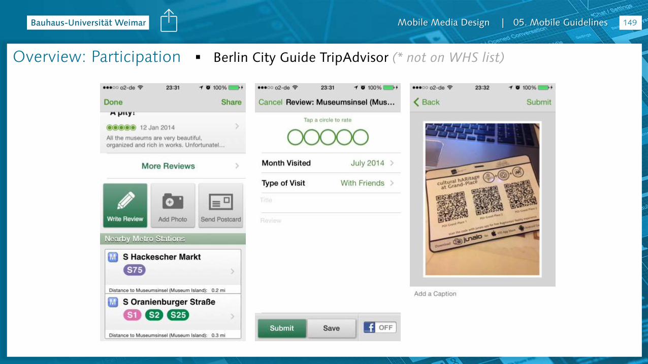
Berlin City Guide TripAdvisor (* not on WHS list)Overview: Participation
Mobile Media Design | 05. Mobile Guidelines 150
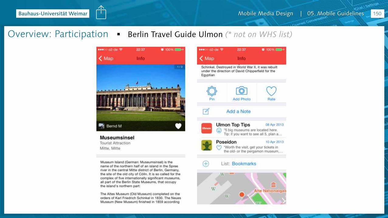
Berlin Travel Guide Ulmon (* not on WHS list)Overview: Participation

Mobile Media Design | 05. Mobile Guidelines 151
Cologne Guide Tourias (* not on WHS list)Overview: Participation

Mobile Media Design | 05. Mobile Guidelines 152
Eisenach CityGuide (* not on WHS list)Overview: Participation
Mobile Media Design | 05. Mobile Guidelines
Overview& Tips
Mobile Media Design | 05. Mobile Guidelines
Overview
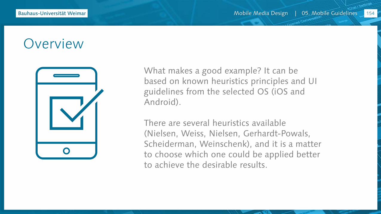
What makes a good example? It can be based on known heuristics principles and UI guidelines from the selected OS (iOS and Android).
There are several heuristics available (Nielsen, Weiss, Nielsen, Gerhardt-Powals, Scheiderman, Weinschenk), and it is a matter to choose which one could be applied better to achieve the desirable results.
154
Mobile Media Design | 05. Mobile Guidelines
Heuristics
Based on Nayebi, F., Desharnais, J.-M., & Abran, A. (2013a). An Expert-Based Framework for Evaluating iOS Application Usability (pp. 147–155). IEEE. http://doi.org/10.1109/IWSM-Mensura.2013.30
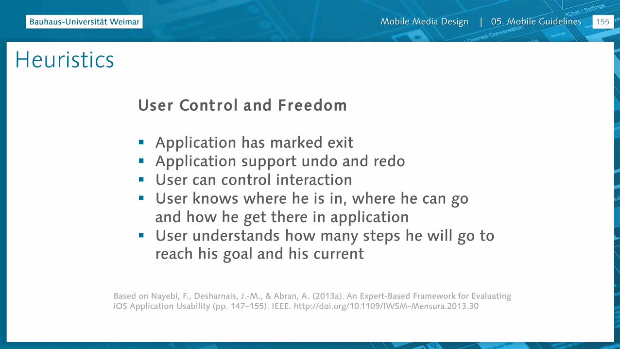
User Control and Freedom
Application has marked exit Application support undo and redo User can control interaction User knows where he is in, where he can go
and how he get there in application User understands how many steps he will go to
reach his goal and his current
155
Mobile Media Design | 05. Mobile Guidelines
Based on Nayebi, F., Desharnais, J.-M., & Abran, A. (2013a)
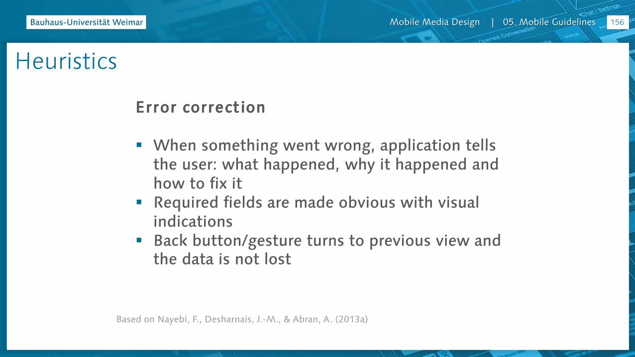
Error correct ion
When something went wrong, application tells the user: what happened, why it happened and how to fix it
Required fields are made obvious with visual indications
Back button/gesture turns to previous view and the data is not lost
156
Heuristics

Mobile Media Design | 05. Mobile Guidelines
Based on Nayebi, F., Desharnais, J.-M., & Abran, A. (2013a)
Accommodation
Application speaks user’s language Relevant metaphors are used when needed Interface is suitable for the user’s task and skill
level
157
Heuristics
Mobile Media Design | 05. Mobile Guidelines
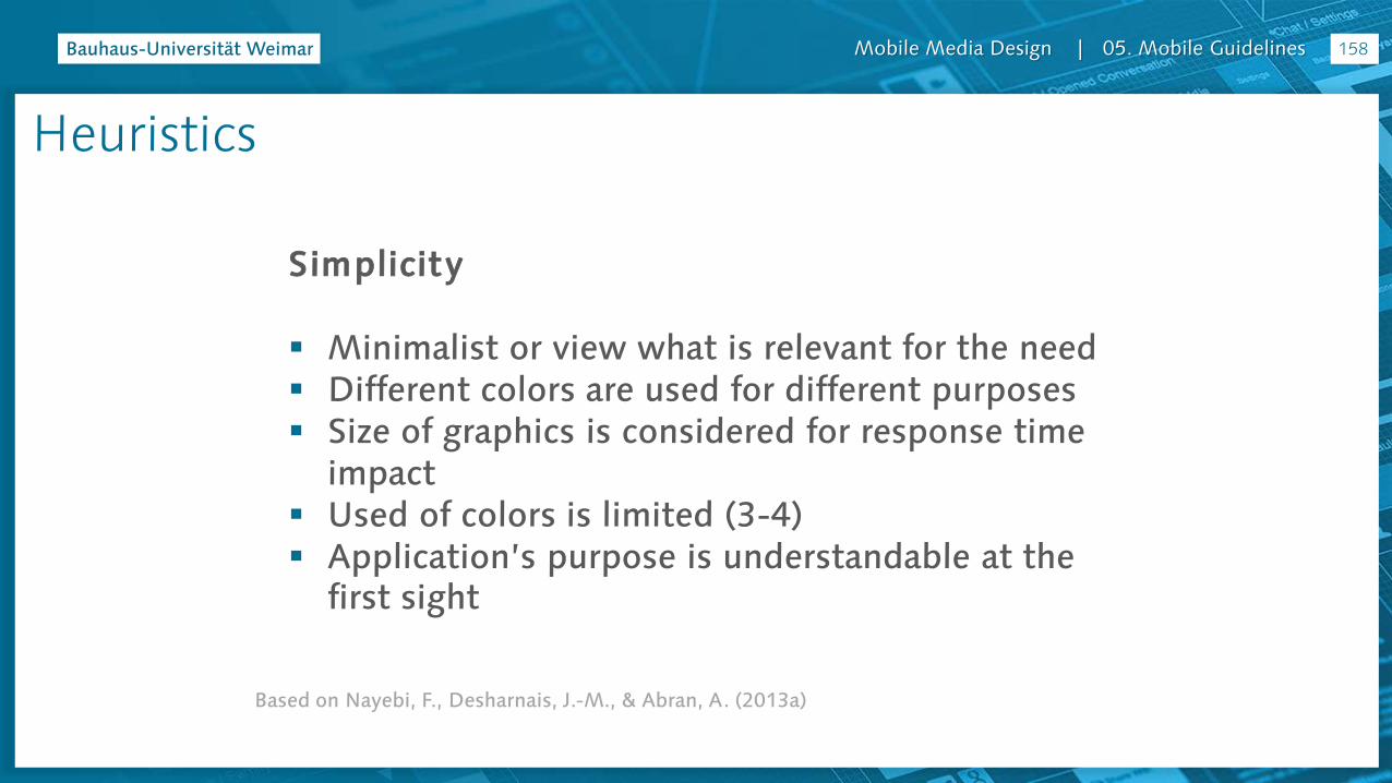
Based on Nayebi, F., Desharnais, J.-M., & Abran, A. (2013a)
Simplicity
Minimalist or view what is relevant for the need Different colors are used for different purposes Size of graphics is considered for response time
impact Used of colors is limited (3-4) Application’s purpose is understandable at the
first sight
158
Heuristics

Mobile Media Design | 05. Mobile Guidelines
Based on Nayebi, F., Desharnais, J.-M., & Abran, A. (2013a)
Aesthetics
Similarity - when objects look similar to one another, and
can be perceived as part of a group or pattern.
Continuation - when the eye is compelled to move from
one object another.
Closure - when an incomplete object or a space that is not
completely filled can be perceived by the user as a whole when he adds the missing information.
Proximity - when elements are placed close together, and
can be perceived as belonging to a group
Figure and ground - Figures (forms, silhouettes, and shapes) are differentiated from background.
159
Heuristics
Mobile Media Design | 05. Mobile Guidelines
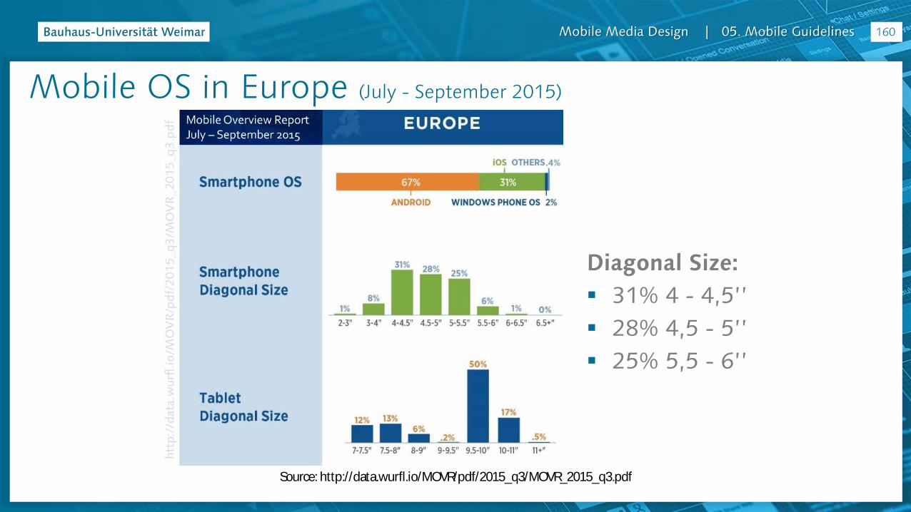
Mobile OS in Europe (July - September 2015)
Source: http://data.wurfl.io/MOVR/pdf/2015_q3/MOVR_2015_q3.pdf
Diagonal Size:
31% 4 - 4,5’’
28% 4,5 - 5’’
25% 5,5 - 6’’
160
Mobile Media Design | 05. Mobile Guidelines
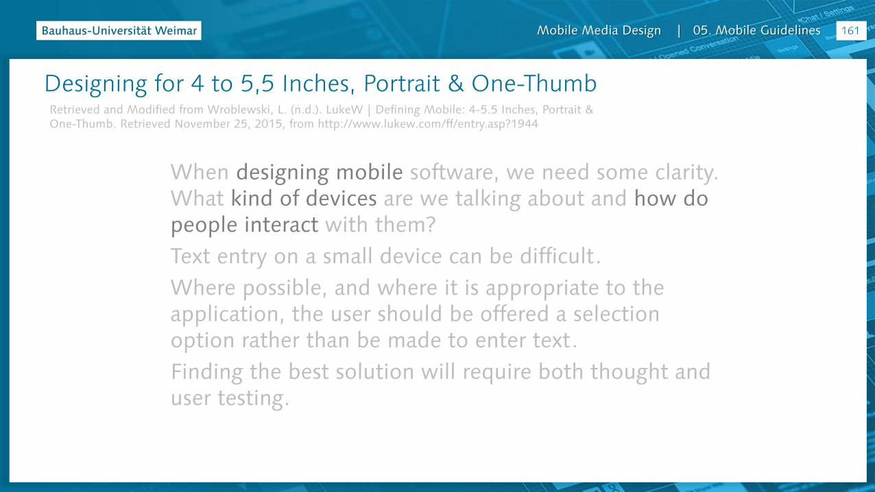
Designing for 4 to 5,5 Inches, Portrait & One-Thumb
When designing mobile software, we need some clarity. What kind of devices are we talking about and how do people interact with them?
Text entry on a small device can be difficult.
Where possible, and where it is appropriate to the application, the user should be offered a selection option rather than be made to enter text.
Finding the best solution will require both thought and user testing.
Retrieved and Modified from Wroblewski, L. (n.d.). LukeW | Defining Mobile: 4-5.5 Inches, Portrait & One-Thumb. Retrieved November 25, 2015, from http://www.lukew.com/ff/entry.asp?1944
161
Mobile Media Design | 05. Mobile Guidelines
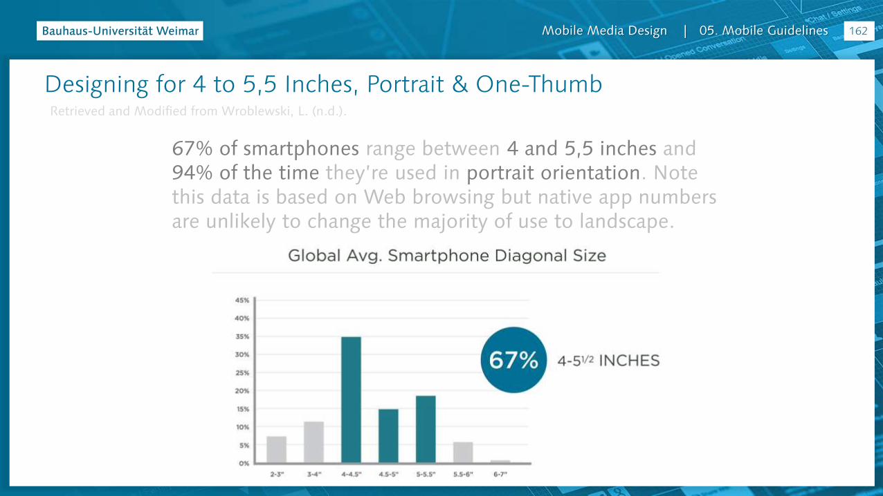
67% of smartphones range between 4 and 5,5 inches and 94% of the time they’re used in portrait orientation. Note this data is based on Web browsing but native app numbers are unlikely to change the majority of use to landscape.
162
Designing for 4 to 5,5 Inches, Portrait & One-ThumbRetrieved and Modified from Wroblewski, L. (n.d.).
Mobile Media Design | 05. Mobile Guidelines
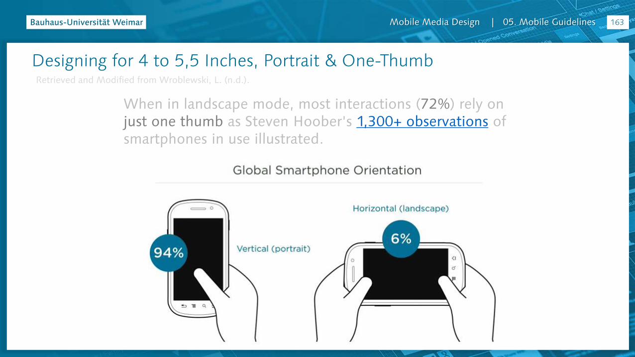
When in landscape mode, most interactions (72%) rely on just one thumb as Steven Hoober's 1,300+ observations of smartphones in use illustrated.
163
Designing for 4 to 5,5 Inches, Portrait & One-ThumbRetrieved and Modified from Wroblewski, L. (n.d.).

Mobile Media Design | 05. Mobile Guidelines
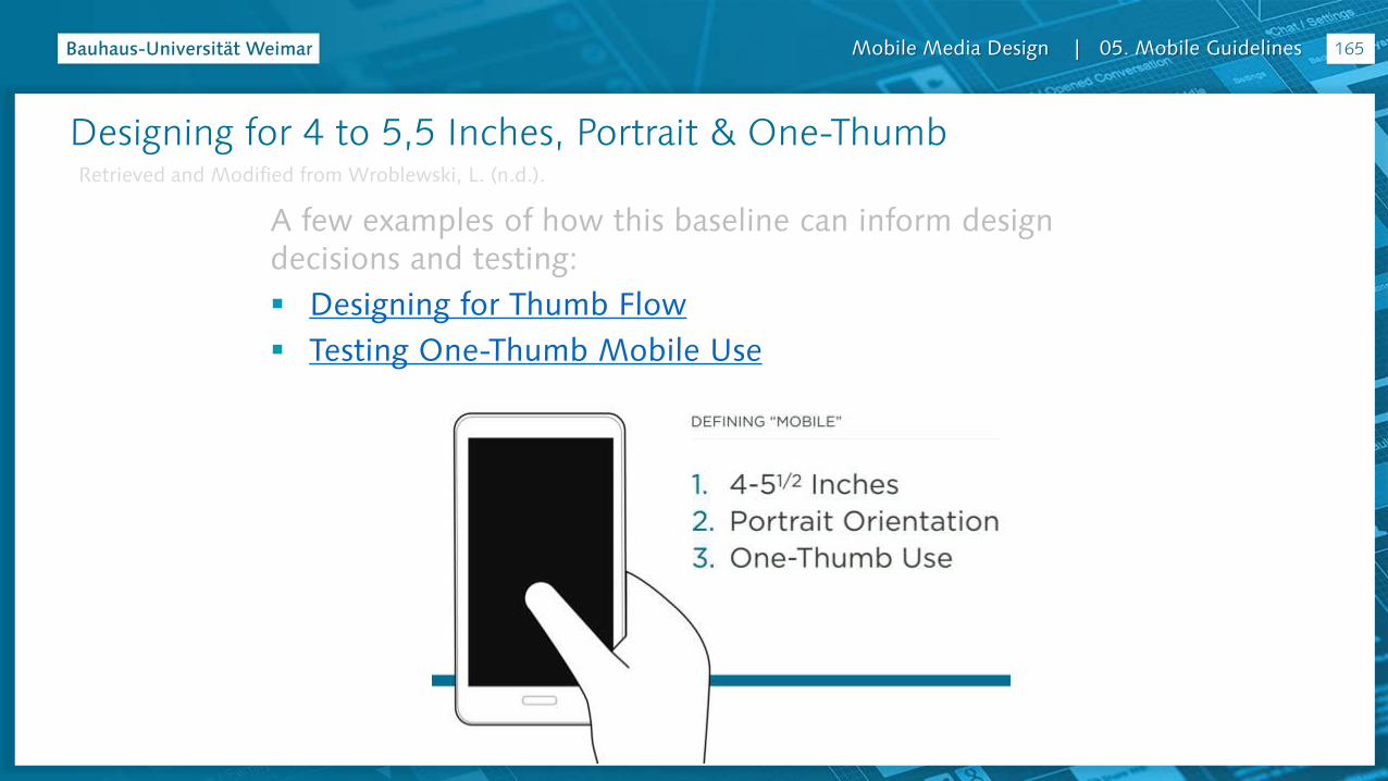
So when designing for mobile today, it’s worth considering a 4-5,5 inch smartphone, in portrait (vertical) orientation, being used with one-thumb. Of course, there many variants as well but making sure your mobile experiences work well in this context is a great baseline to start from.
164
Designing for 4 to 5,5 Inches, Portrait & One-ThumbRetrieved and Modified from Wroblewski, L. (n.d.).
Mobile Media Design | 05. Mobile Guidelines
A few examples of how this baseline can inform design decisions and testing:
Designing for Thumb Flow
Testing One-Thumb Mobile Use
165
Designing for 4 to 5,5 Inches, Portrait & One-ThumbRetrieved and Modified from Wroblewski, L. (n.d.).
Mobile Media Design | 05. Mobile Guidelines
Prototype Tips
UI Design Guidelines for Handheld Devices (Stone & Open University, 2005, p. 384) (adapted from Weiss, 2002, pp. 66–70)
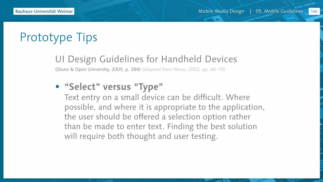
“Select” versus “Type”Text entry on a small device can be difficult. Where possible, and where it is appropriate to the application, the user should be offered a selection option rather than be made to enter text. Finding the best solution will require both thought and user testing.
166
Mobile Media Design | 05. Mobile Guidelines
Prototype Tips
UI Design Guidelines for Handheld Devices (Stone & Open University, 2005, p. 384) (adapted from Weiss, 2002, pp. 66–70)
Be consistentEnsure that the same terminology is used within an application and that the same terminology is used between handheld applications. In the absence of guidelines, try to borrow ideas from applications that have been well designed and have a high degree of usability.
167

Mobile Media Design | 05. Mobile Guidelines
Prototype Tips
UI Design Guidelines for Handheld Devices (Stone & Open University, 2005, p. 384) (adapted from Weiss, 2002, pp. 66–70)
Consistency between platformsWhile the same terminology can be used between handheld applications, you will need to think carefully when adapting an application from a desktop to a handheld device. It is not necessarily the case that terminology that works for a desktop will work for the smaller screened handheld device.
168
Mobile Media Design | 05. Mobile Guidelines
Prototype Tips
UI Design Guidelines for Handheld Devices (Stone & Open University, 2005, p. 384) (adapted from Weiss, 2002, pp. 66–70)
Design stabilityIn the event of, say, a connectivity failure, the system should allow the user to pick up from where he or she left off when the connection is restored. For example, if the user is completing some sort of form and a wireless connection goes down, the data in the fields from previously should not be lost and have to be reentered.
169

Mobile Media Design | 05. Mobile Guidelines
Prototype Tips
UI Design Guidelines for Handheld Devices (Stone & Open University, 2005, p. 384) (adapted from Weiss, 2002, pp. 66–70)
Provide feedbackThe system should support the user with feedback regarding what the application is doing. Feedback in relation to, say, the use of an application or navigation within it could be provided via an assigned information key.
170

Mobile Media Design | 05. Mobile Guidelines
Prototype Tips
UI Design Guidelines for Handheld Devices (Stone & Open University, 2005, p. 384) (adapted from Weiss, 2002, pp. 66–70)
ForgivenessThe UI should be tolerant of user errors and provide an Undo function by, where feasible, a specially designated Back key.
171
Mobile Media Design | 05. Mobile Guidelines
Prototype Tips
UI Design Guidelines for Handheld Devices (Stone & Open University, 2005, p. 384) (adapted from Weiss, 2002, pp. 66–70)
Use metaphorsReal-world metaphors in line with the size of the display should be used. For example, while a desktop metaphor would be inappropriate for a cell phone, the use of an address book for storing telephone numbers would be okay.
172

Mobile Media Design | 05. Mobile Guidelines
Prototype Tips
UI Design Guidelines for Handheld Devices (Stone & Open University, 2005, p. 385) (adapted from Weiss, 2002, pp. 66–70)
Clickable graphics should look clickableIf a graphic is clickable, then it should have defined borders and the graphic should have high contrast with the background color. Conversely, graphics that are static should not appear to be clickable.
173
Mobile Media Design | 05. Mobile Guidelines
Prototype Tips
UI Design Guidelines for Handheld Devices (Stone & Open University, 2005, p. 385) (adapted from Weiss, 2002, pp. 66–70)
Use icons to clarify conceptsIcons should be meaningful and representative of the concepts they are meant to convey.
174
Mobile Media Design | 05. Mobile Guidelines
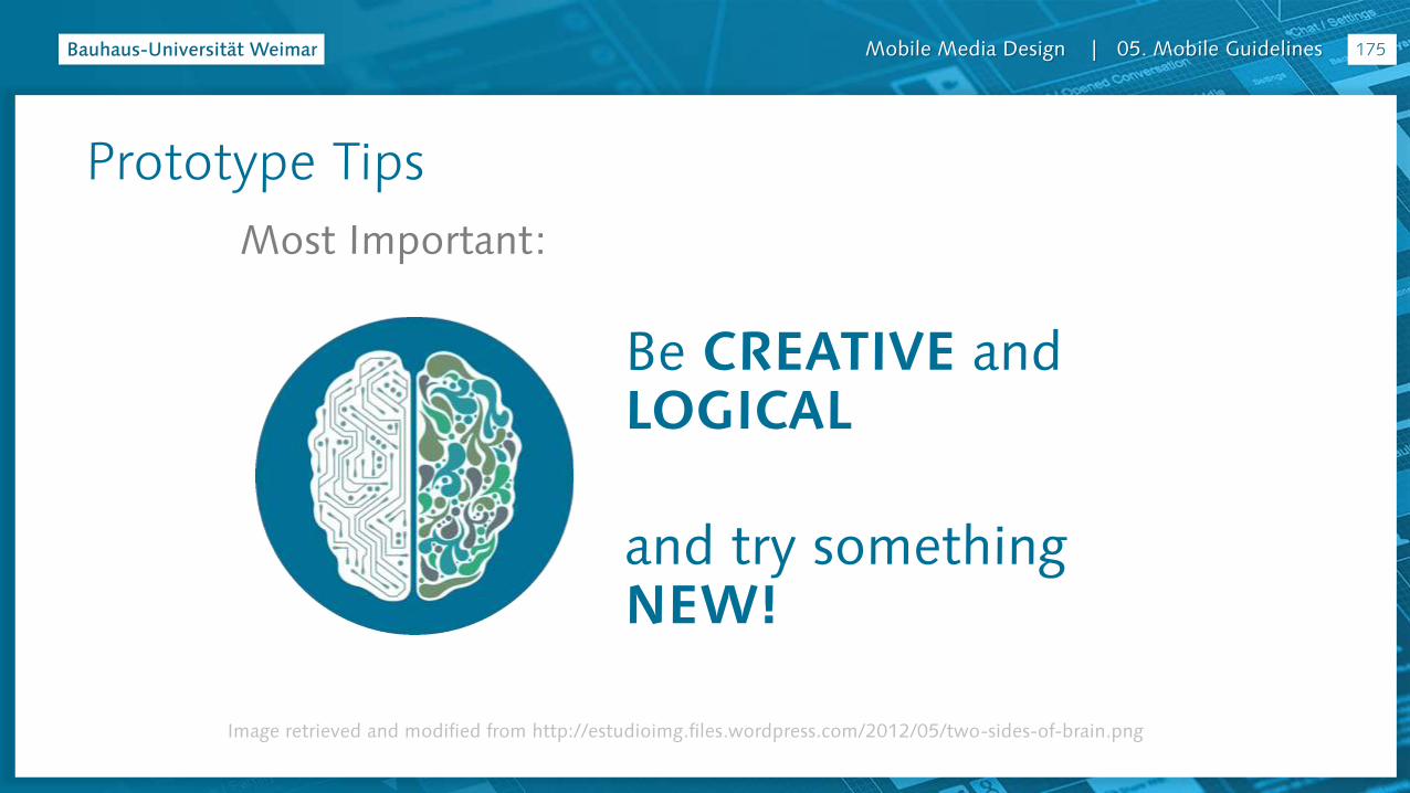
Prototype Tips
Most Important:
Image retrieved and modified from http://estudioimg.files.wordpress.com/2012/05/two-sides-of-brain.png
Be CREATIVE andLOGICAL
and try something NEW!
175

Mobile Media Design | 05. Mobile Guidelines
App Project

Mobile Media Design | 05. Mobile Guidelines
App Target: City with World Heritage Site
177

Mobile Media Design | 05. Mobile Guidelines
App Target: Suggestion – Weimar & Weimarpedia.de
178
Map: Geo-Location
Articles: Encyclopedia Style
Gallery: Different Media / Participatory
Materials: for Teachers
+WEIMAR
Mobile Media Design | 05. Mobile Guidelines
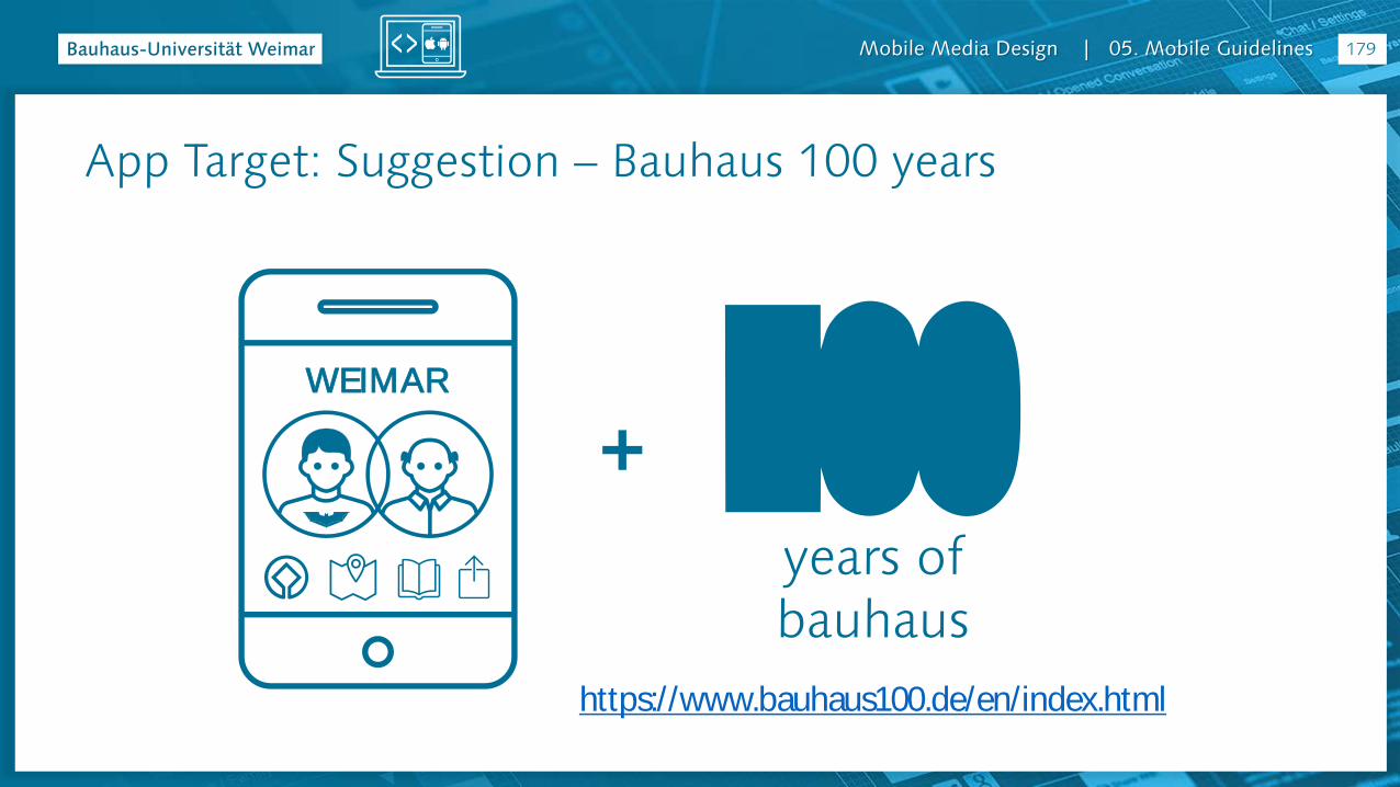
App Target: Suggestion – Bauhaus 100 years
179
+WEIMAR
years ofbauhaus
https://www.bauhaus100.de/en/index.html

Mobile Media Design | 05. Mobile Guidelines 180
Target Groups: Teenager Students & Adults & Older Adults

Mobile Media Design | 05. Mobile Guidelines
General needs when visiting Weimar
Find P.O.I. and information
Research articles
Create content
Find P.O.I. and Information:• 94% - sightseeing
• 79% - restaurant and cafés
• 65% - museums and exhibitions
• (…)
• 35% - UNESCO WHS
181
Target Groups: Teenager Students & Adults & Older Adults
Mobile Media Design | 05. Mobile Guidelines
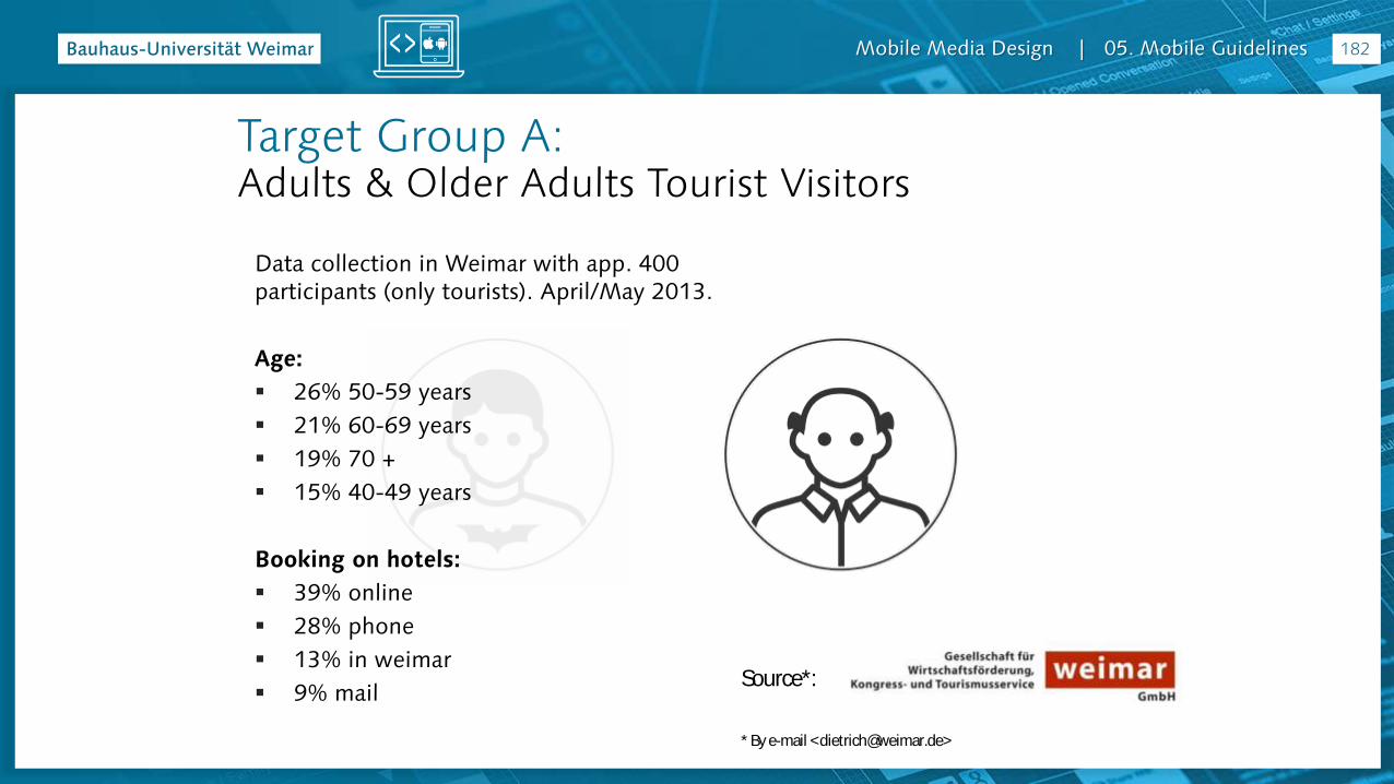
Target Group A: Adults & Older Adults Tourist Visitors
Source*:
* By e-mail <[email protected]>
Data collection in Weimar with app. 400 participants (only tourists). April/May 2013.
Age:
26% 50-59 years
21% 60-69 years
19% 70 +
15% 40-49 years
Booking on hotels:
39% online
28% phone
13% in weimar
9% mail
182

Mobile Media Design | 05. Mobile Guidelines
Target Group A: Adults & Older Adults Tourist Visitors
Source*:
* By e-mail <[email protected]>
Traveling with:
57% couples
14% alone
9% groups
8% friends
Average stay: 3,2 nights
Duration of stay:
70% up to 3 nights
27% 4 – 7 nights
3% 8 nights and more
183

Mobile Media Design | 05. Mobile Guidelines
Target Group A: Adults & Older Adults Tourist Visitors
Source*:
* By e-mail <[email protected]>
Top ten activities:
94% sightseeing
79% restaurant and cafés
65% museums and exhibitions
58% strolling around
54% regional food and drinks
53% shopping
47% guided tours
35% UNESCO World Heritage
33% Theatre
26% relaxing
184
Mobile Media Design | 05. Mobile Guidelines
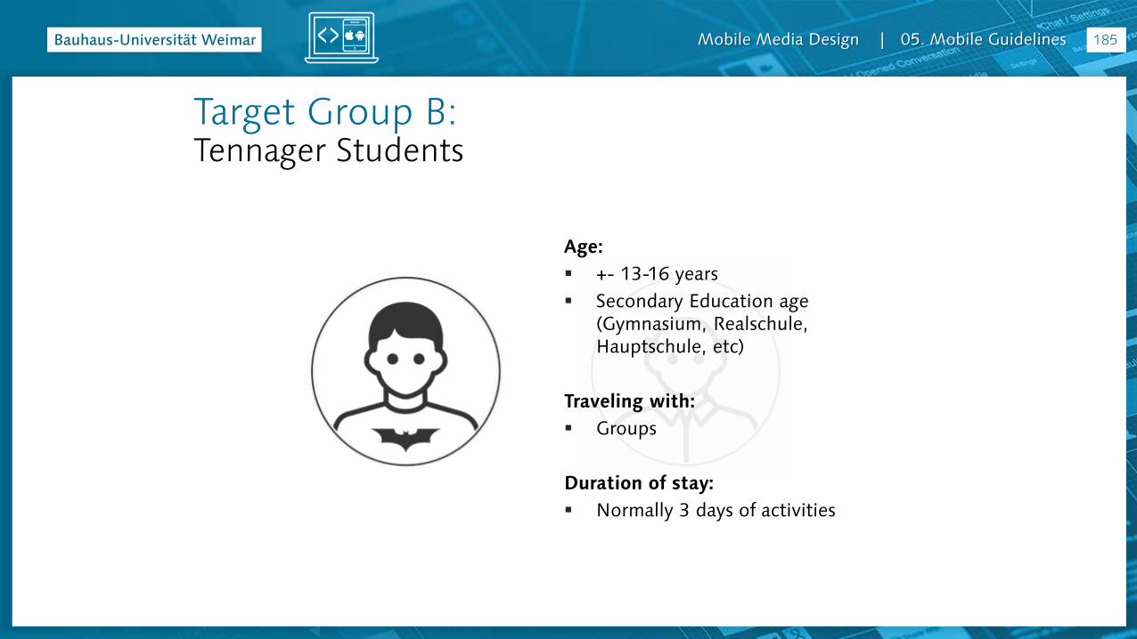
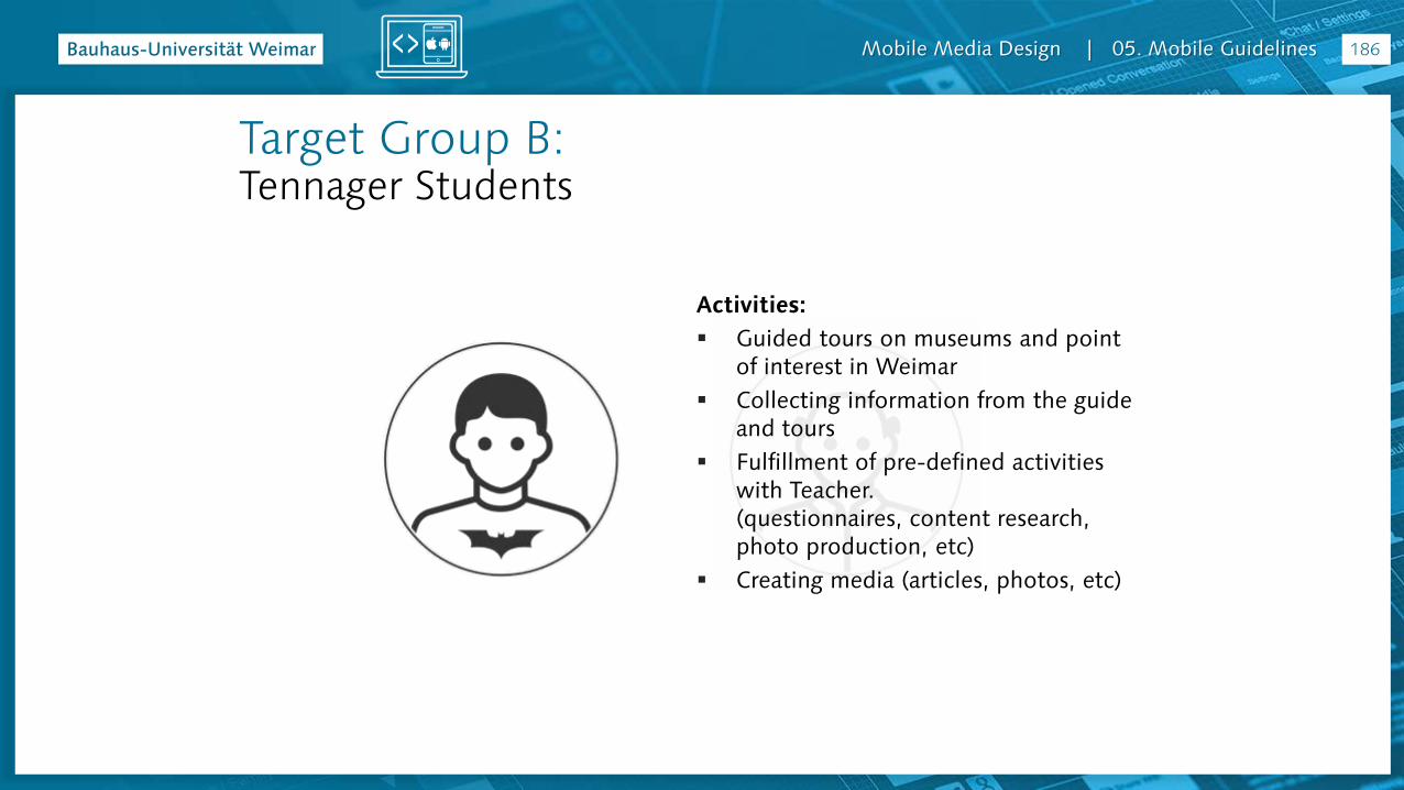
Target Group B:Tennager Students
Age:
+- 13-16 years
Secondary Education age (Gymnasium, Realschule, Hauptschule, etc)
Traveling with:
Groups
Duration of stay:
Normally 3 days of activities
185
Mobile Media Design | 05. Mobile Guidelines
Target Group B:Tennager Students
Activities:
Guided tours on museums and point of interest in Weimar
Collecting information from the guide and tours
Fulfillment of pre-defined activities with Teacher.(questionnaires, content research, photo production, etc)
Creating media (articles, photos, etc)
186
Mobile Media Design | 05. Mobile Guidelines
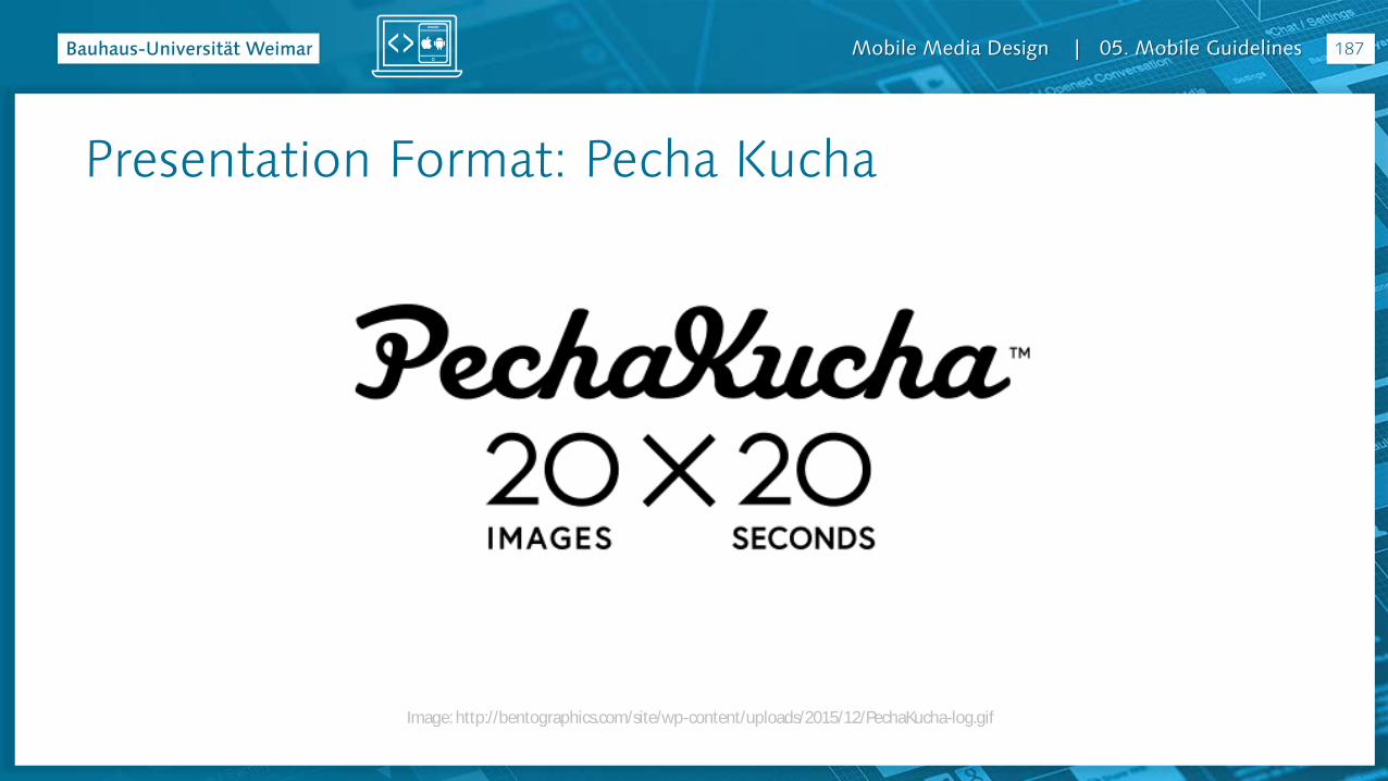
Presentation Format: Pecha Kucha
Image: http://bentographics.com/site/wp-content/uploads/2015/12/PechaKucha-log.gif
187
Mobile Media Design | 05. Mobile Guidelines
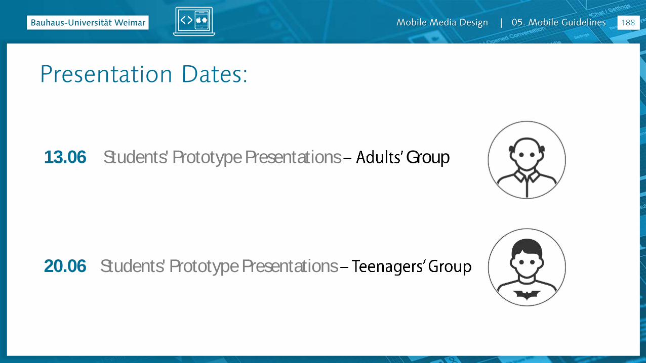
13.06 Students' Prototype Presentations Group
20.06 Students' Prototype Presentations
188
Presentation Dates:
Mobile Media Design | 05. Mobile Guidelines
23.05
MMD 7 Writing and References (+ - 1 hour )
Around 5 minutes per student
Optional, not mandatory
http://www.uni-weimar.de/medien/wiki/IFD:MobileMediaDesign-SS16#Project_Consultation
(for those interested, write your name on this list)
189
App Project Consultation

Mobile Media Design | 05. Mobile Guidelines
References
Mobile Media Design | 05. Mobile Guidelines
References
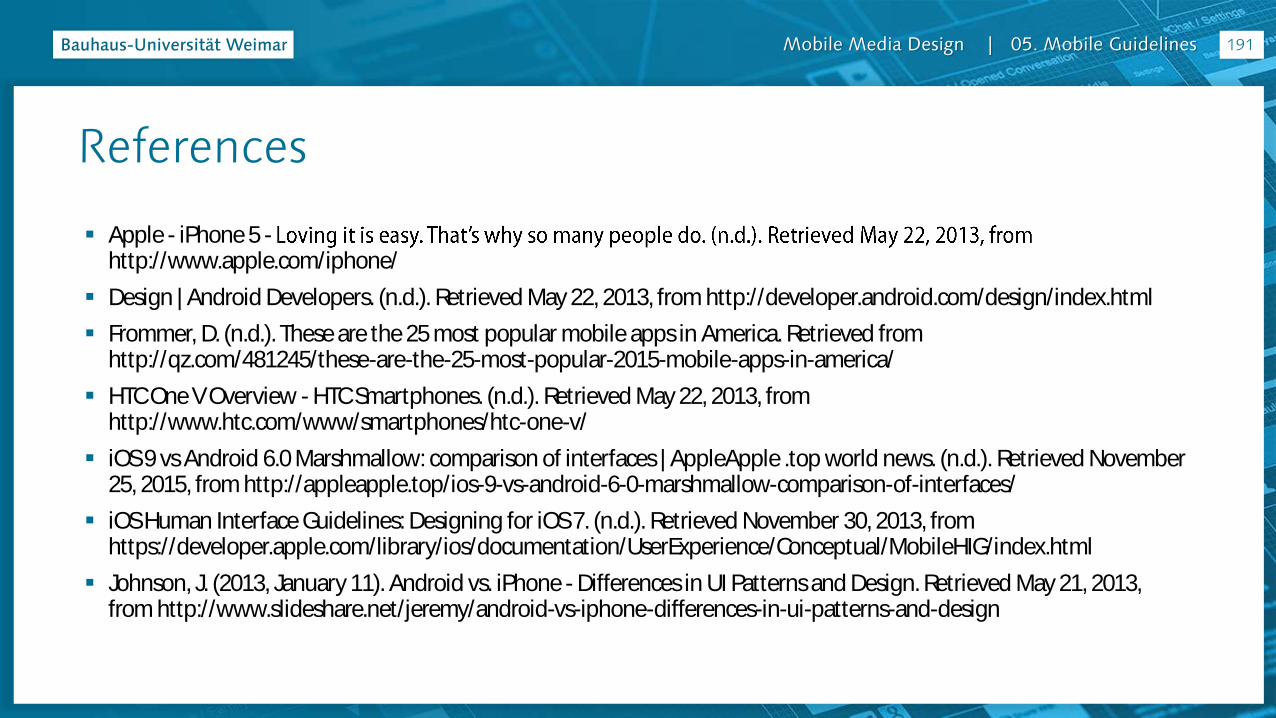
Apple - iPhone 5 -http://www.apple.com/iphone/
Design | Android Developers. (n.d.). Retrieved May 22, 2013, from http://developer.android.com/design/index.html
Frommer, D. (n.d.). These are the 25 most popular mobile apps in America. Retrieved from http://qz.com/481245/these-are-the-25-most-popular-2015-mobile-apps-in-america/
HTC One V Overview - HTC Smartphones. (n.d.). Retrieved May 22, 2013, from http://www.htc.com/www/smartphones/htc-one-v/
iOS 9 vs Android 6.0 Marshmallow: comparison of interfaces | AppleApple .top world news. (n.d.). Retrieved November 25, 2015, from http://appleapple.top/ios-9-vs-android-6-0-marshmallow-comparison-of-interfaces/
iOS Human Interface Guidelines: Designing for iOS 7. (n.d.). Retrieved November 30, 2013, from https://developer.apple.com/library/ios/documentation/UserExperience/Conceptual/MobileHIG/index.html
Johnson, J. (2013, January 11). Android vs. iPhone - Differences in UI Patterns and Design. Retrieved May 21, 2013, from http://www.slideshare.net/jeremy/android-vs-iphone-differences-in-ui-patterns-and-design
191
Mobile Media Design | 05. Mobile Guidelines
References
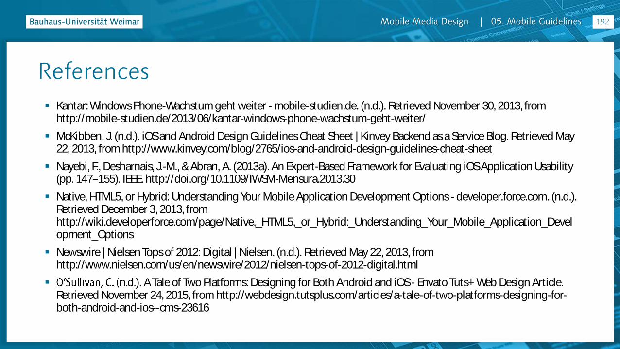
Kantar: Windows Phone-Wachstum geht weiter - mobile-studien.de. (n.d.). Retrieved November 30, 2013, from http://mobile-studien.de/2013/06/kantar-windows-phone-wachstum-geht-weiter/
McKibben, J. (n.d.). iOS and Android Design Guidelines Cheat Sheet | Kinvey Backend as a Service Blog. Retrieved May 22, 2013, from http://www.kinvey.com/blog/2765/ios-and-android-design-guidelines-cheat-sheet
Nayebi, F., Desharnais, J.-M., & Abran, A. (2013a). An Expert-Based Framework for Evaluating iOS Application Usability (pp. 147 155). IEEE. http://doi.org/10.1109/IWSM-Mensura.2013.30
Native, HTML5, or Hybrid: Understanding Your Mobile Application Development Options - developer.force.com. (n.d.). Retrieved December 3, 2013, from http://wiki.developerforce.com/page/Native,_HTML5,_or_Hybrid:_Understanding_Your_Mobile_Application_Development_Options
Newswire | Nielsen Tops of 2012: Digital | Nielsen. (n.d.). Retrieved May 22, 2013, from http://www.nielsen.com/us/en/newswire/2012/nielsen-tops-of-2012-digital.html
n.d.). A Tale of Two Platforms: Designing for Both Android and iOS - Envato Tuts+ Web Design Article. Retrieved November 24, 2015, from http://webdesign.tutsplus.com/articles/a-tale-of-two-platforms-designing-for-both-android-and-ios--cms-23616
192
Mobile Media Design | 05. Mobile Guidelines
References
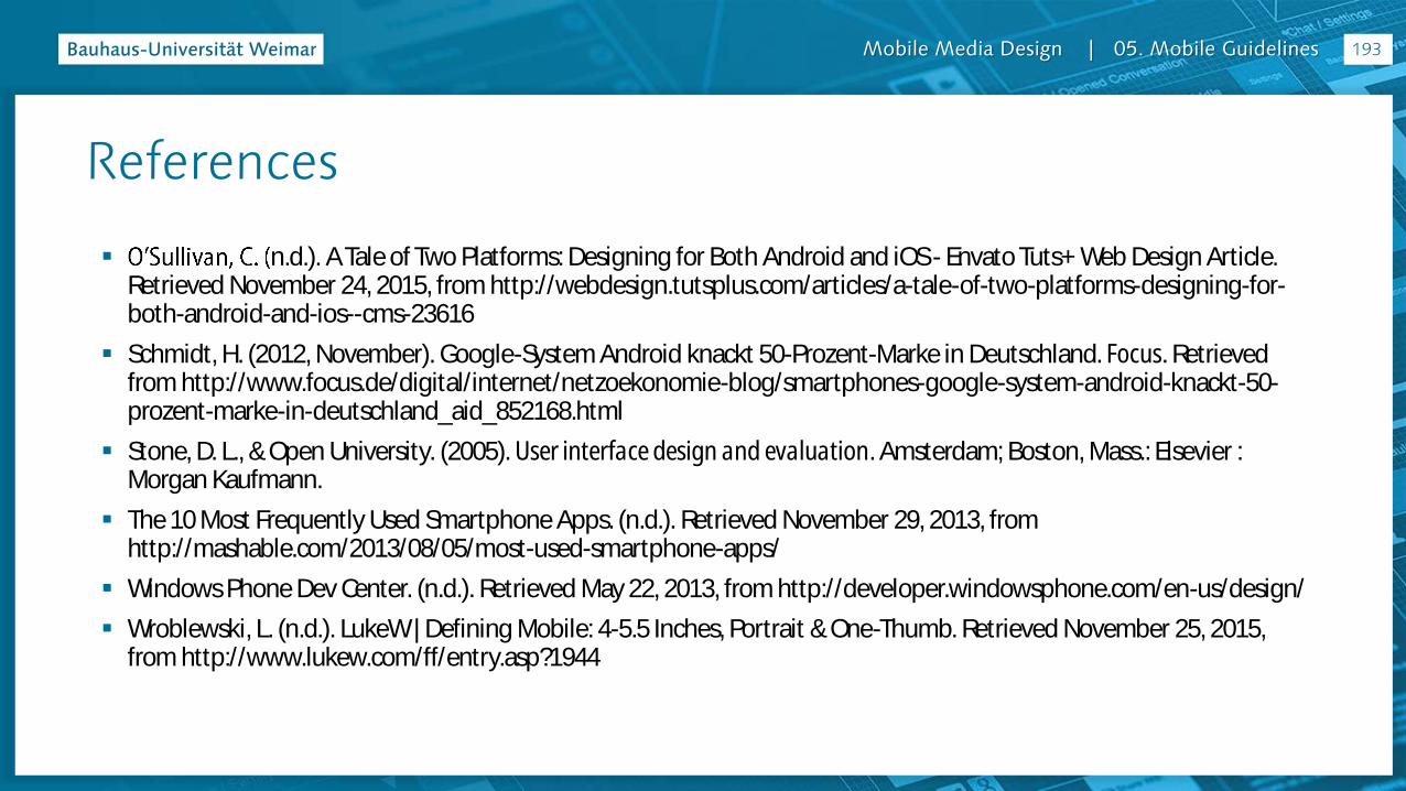
n.d.). A Tale of Two Platforms: Designing for Both Android and iOS - Envato Tuts+ Web Design Article. Retrieved November 24, 2015, from http://webdesign.tutsplus.com/articles/a-tale-of-two-platforms-designing-for-both-android-and-ios--cms-23616
Schmidt, H. (2012, November). Google-System Android knackt 50-Prozent-Marke in Deutschland. Focus. Retrieved from http://www.focus.de/digital/internet/netzoekonomie-blog/smartphones-google-system-android-knackt-50-prozent-marke-in-deutschland_aid_852168.html
Stone, D. L., & Open University. (2005). User interface design and evaluation. Amsterdam; Boston, Mass.: Elsevier : Morgan Kaufmann.
The 10 Most Frequently Used Smartphone Apps. (n.d.). Retrieved November 29, 2013, from http://mashable.com/2013/08/05/most-used-smartphone-apps/
Windows Phone Dev Center. (n.d.). Retrieved May 22, 2013, from http://developer.windowsphone.com/en-us/design/
Wroblewski, L. (n.d.). LukeW | Defining Mobile: 4-5.5 Inches, Portrait & One-Thumb. Retrieved November 25, 2015, from http://www.lukew.com/ff/entry.asp?1944
193

Mobile Media Design | 05. Mobile Guidelines
Thank You!
10 min break
Mobile Media Design | 05. Mobile Guidelines
Faculty of Art & DesignChair of Interface Design
Joatan Preis [email protected]
05. Mobile Guidelines
http://www.uni-weimar.de/medien/wiki/IFD:MobileMediaDesign-SS16