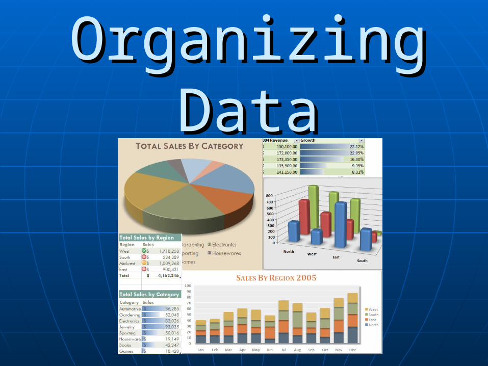
Organizing Data. Displaying data in a chart is a good way of organizing your data, however GRAPHS...
19
Organizing Organizing Data Data
-
Upload
ashlynn-davis -
Category
Documents
-
view
217 -
download
0
Transcript of Organizing Data. Displaying data in a chart is a good way of organizing your data, however GRAPHS...
Organizing Organizing DataData
Displaying data in a chart is a good way of Displaying data in a chart is a good way of organizing your data, however GRAPHS organizing your data, however GRAPHS are invaluable when it comes to organizing are invaluable when it comes to organizing your datayour data
WHY?????WHY?????
With graphs you can determine any trend With graphs you can determine any trend in the data. in the data.
However it is very Important to use the However it is very Important to use the proper type of graphproper type of graph
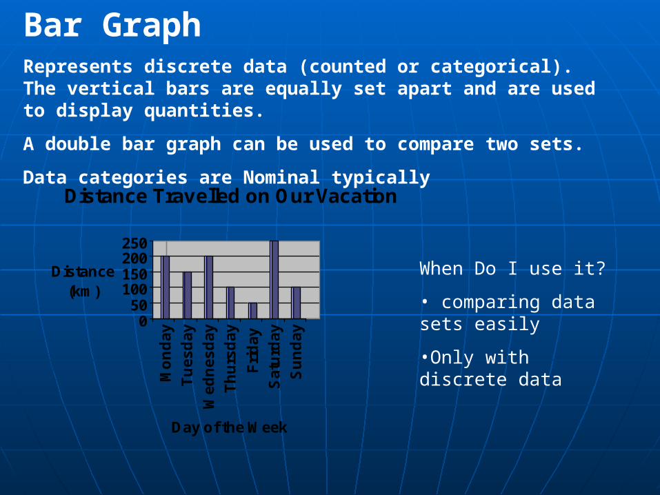
Bar GraphRepresents discrete data (counted or categorical). The vertical bars are equally set apart and are used to display quantities.
A double bar graph can be used to compare two sets.
Data categories are Nominal typically
050
100150200250
Distance (km)
Mo
nd
ay
Tu
es
da
y
We
dn
es
da
y
Th
urs
da
y
Fri
da
y
Sa
turd
ay
Su
nd
ay
Day of the Week
Distance Travelled on Our Vacation
When Do I use it?
• comparing data sets easily
•Only with discrete data
Patient's Mass
73.5
74
74.5
75
75.5
76
76.5
77
Ju
ne
6th
Jun
e12
th
Jun
e19
th
Jun
e26
th
Mas
s (k
g)
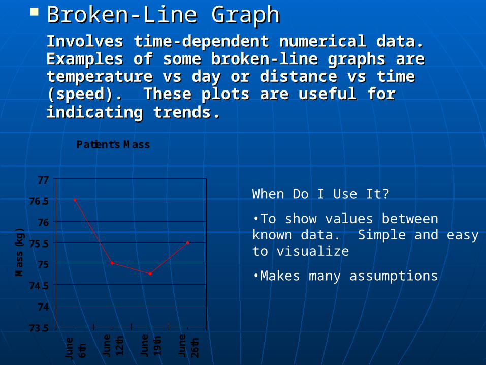
Broken-Line GraphBroken-Line GraphInvolves time-dependent numerical Involves time-dependent numerical data. Examples of some broken-line data. Examples of some broken-line graphs are temperature vs day or graphs are temperature vs day or distance vs time (speed). These plots distance vs time (speed). These plots are useful for indicating trendsare useful for indicating trends. .
When Do I Use It?
•To show values between known data. Simple and easy to visualize
•Makes many assumptions
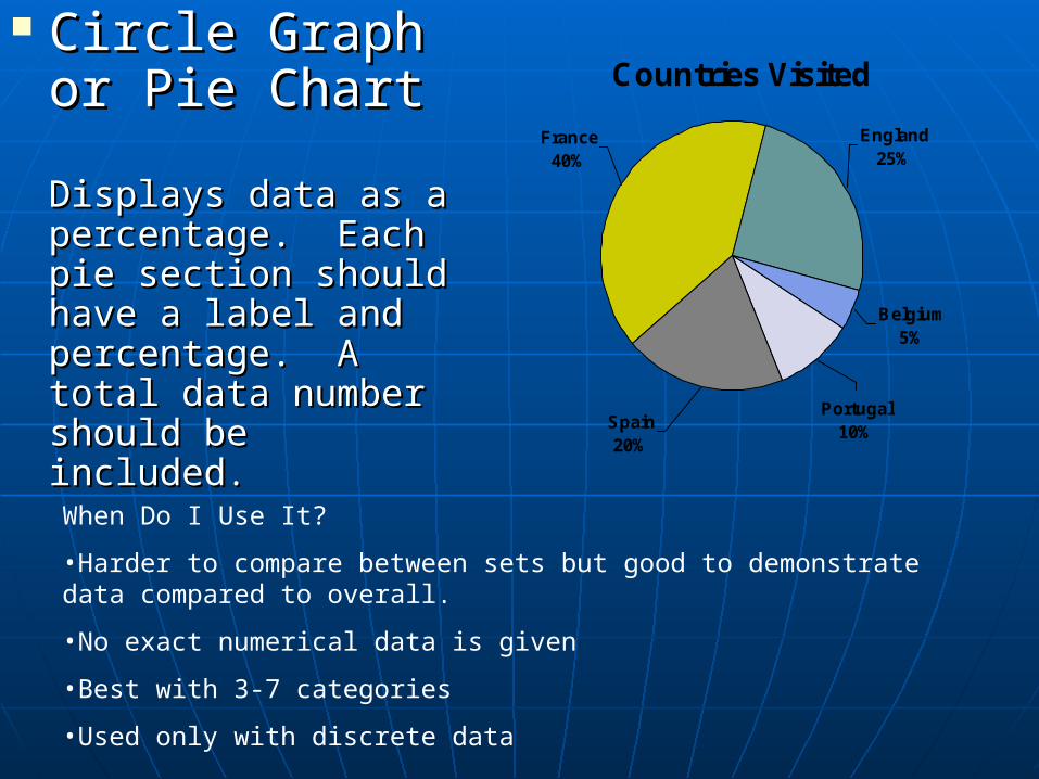
Circle Graph Circle Graph or Pie Chartor Pie Chart
Displays data as a Displays data as a percentage. Each percentage. Each pie section should pie section should have a label and have a label and percentage. A total percentage. A total data number should data number should be includedbe included..
Countries Visited
Belgium 5%
Portugal 10%
Spain 20%
France 40%
England 25%
When Do I Use It?
•Harder to compare between sets but good to demonstrate data compared to overall.
•No exact numerical data is given
•Best with 3-7 categories
•Used only with discrete data
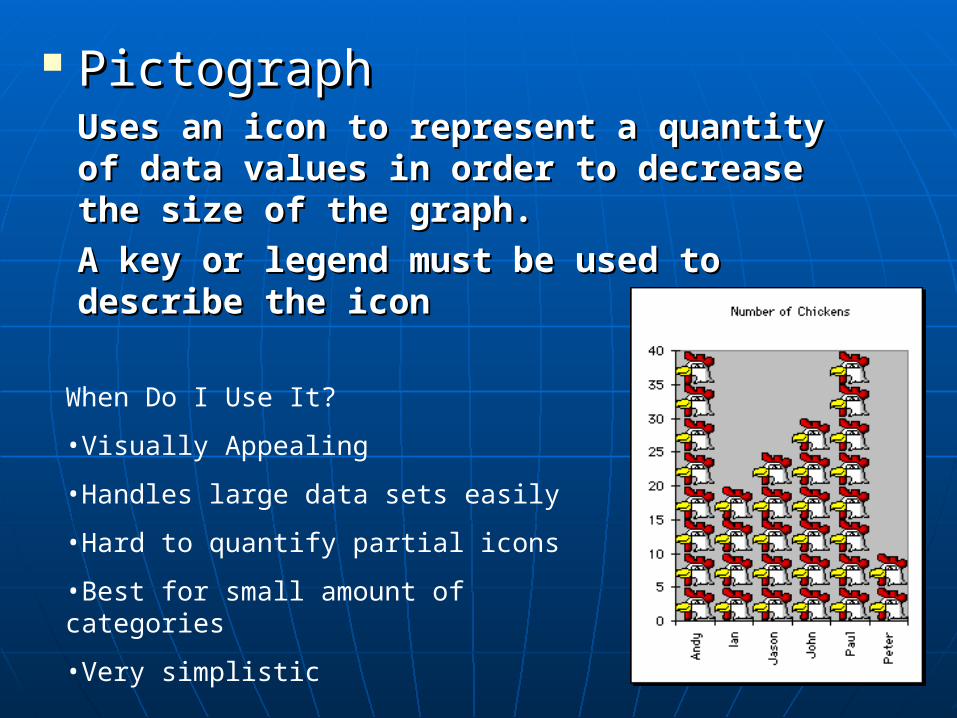
PictographPictographUses an icon to represent a quantity of Uses an icon to represent a quantity of data values in order to decrease the data values in order to decrease the size of the graph.size of the graph.
A key or legend must be used to A key or legend must be used to describe the icondescribe the icon
When Do I Use It?
•Visually Appealing
•Handles large data sets easily
•Hard to quantify partial icons
•Best for small amount of categories
•Very simplistic
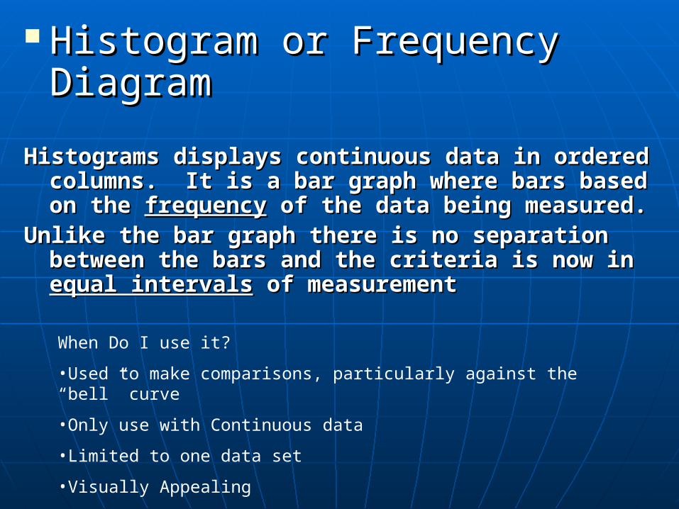
Histogram or Frequency Histogram or Frequency DiagramDiagram
Histograms displays continuous data in ordered Histograms displays continuous data in ordered columns. It is a bar graph where bars based on columns. It is a bar graph where bars based on the the frequencyfrequency of the data being measured. of the data being measured.
Unlike the bar graph there is no separation Unlike the bar graph there is no separation between the bars and the criteria is now in between the bars and the criteria is now in equal intervalsequal intervals of measurement of measurement
When Do I use it?
•Used to make comparisons, particularly against the “bell” curve
•Only use with Continuous data
•Limited to one data set
•Visually Appealing
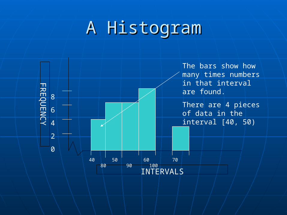
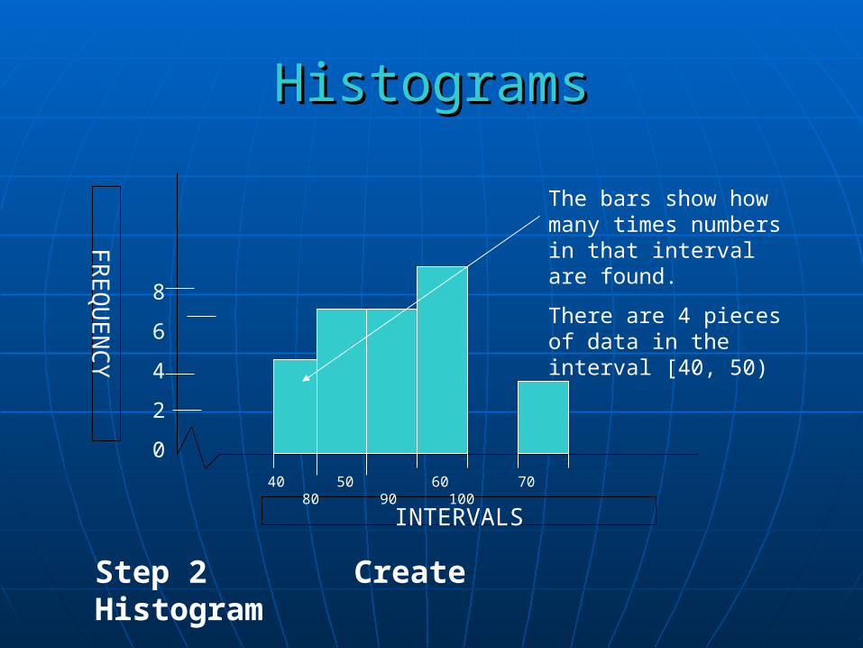
A HistogramA Histogram
INTERVALS
FR
EQ
UE
NC
Y
40 50 60 70 80 90 100
8
6
4
2
0
The bars show how many times numbers in that interval are found.
There are 4 pieces of data in the interval [40, 50)
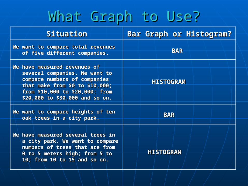
What Graph to Use?What Graph to Use?SituationSituation Bar Graph or Histogram?Bar Graph or Histogram?
We want to compare total revenues We want to compare total revenues of five different companies.of five different companies.
We have measured revenues of We have measured revenues of several companies. We want to several companies. We want to compare numbers of companies compare numbers of companies that make from $0 to $10,000; that make from $0 to $10,000; from $10,000 to $20,000; from from $10,000 to $20,000; from $20,000 to $30,000 and so on.$20,000 to $30,000 and so on.
We want to compare heights of ten We want to compare heights of ten oak trees in a city park.oak trees in a city park.
We have measured several trees in We have measured several trees in a city park. We want to compare a city park. We want to compare numbers of trees that are from 0 numbers of trees that are from 0 to 5 meters high; from 5 to 10; to 5 meters high; from 5 to 10; from 10 to 15 and so on.from 10 to 15 and so on.
BARBAR
BARBAR
HISTOGRAMHISTOGRAM
HISTOGRAMHISTOGRAM

Making a HistogramMaking a Histogram
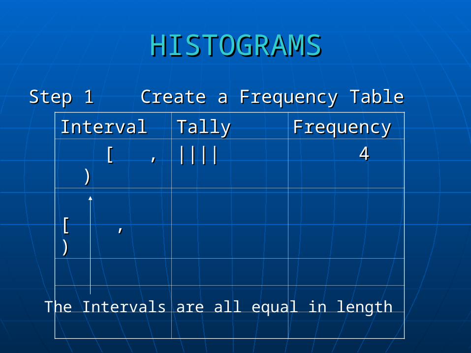
HISTOGRAMSHISTOGRAMS
Step 1 Step 1 Create a Frequency TableCreate a Frequency Table
IntervalInterval TallyTally FrequencyFrequency
[ , ) [ , ) |||||||| 44
[ , )[ , )
The Intervals are all equal in length
HistogramsHistograms
INTERVALS
FR
EQ
UE
NC
Y
40 50 60 70 80 90 100
8
6
4
2
0
The bars show how many times numbers in that interval are found.
There are 4 pieces of data in the interval [40, 50)
Step 2 Create Histogram
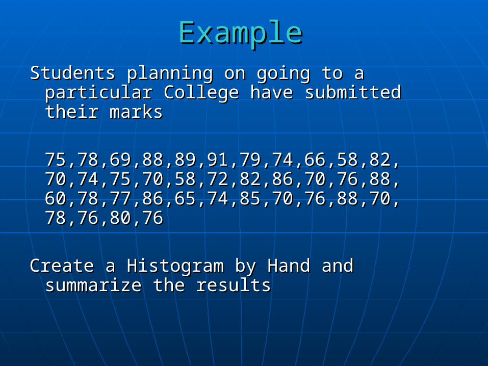
Students planning on going to a particular Students planning on going to a particular College have submitted their marksCollege have submitted their marks
75,78,69,88,89,91,79,74,66,58,82, 75,78,69,88,89,91,79,74,66,58,82, 70,74,75,70,58,72,82,86,70,76,88, 70,74,75,70,58,72,82,86,70,76,88, 60,78,77,86,65,74,85,70,76,88,70, 60,78,77,86,65,74,85,70,76,88,70, 78,76,80,7678,76,80,76
Create a Histogram by Hand and Create a Histogram by Hand and summarize the resultssummarize the results
ExampleExample

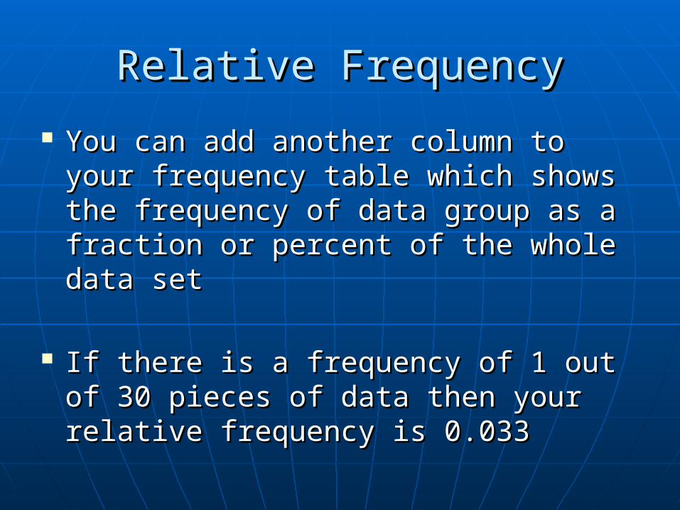
Relative FrequencyRelative Frequency
You can add another column to your You can add another column to your frequency table which shows the frequency table which shows the frequency of data group as a fraction frequency of data group as a fraction or percent of the whole data setor percent of the whole data set
If there is a frequency of 1 out of 30 If there is a frequency of 1 out of 30 pieces of data then your relative pieces of data then your relative frequency is 0.033frequency is 0.033
You can graph this on your histogram You can graph this on your histogram as a broken line graphas a broken line graph
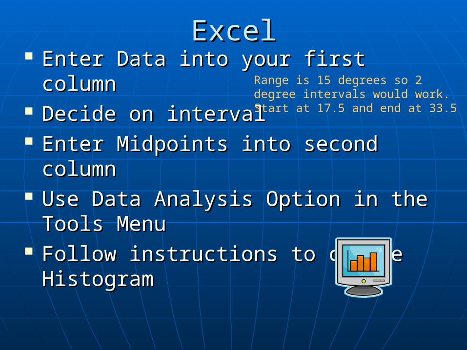
ExcelExcel Enter Data into your first columnEnter Data into your first column Decide on intervalDecide on interval Enter Midpoints into second columnEnter Midpoints into second column Use Data Analysis Option in the Tools Use Data Analysis Option in the Tools
MenuMenu Follow instructions to create Follow instructions to create
HistogramHistogram
Range is 15 degrees so 2 degree intervals would work. Start at 17.5 and end at 33.5
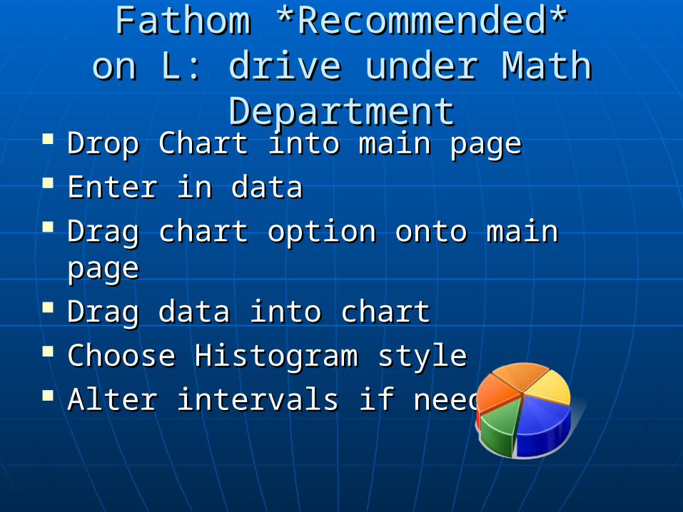
Fathom *Recommended*Fathom *Recommended*on L: drive under Math Departmenton L: drive under Math Department
Drop Chart into main pageDrop Chart into main page Enter in dataEnter in data Drag chart option onto main pageDrag chart option onto main page Drag data into chartDrag data into chart Choose Histogram styleChoose Histogram style Alter intervals if neededAlter intervals if needed
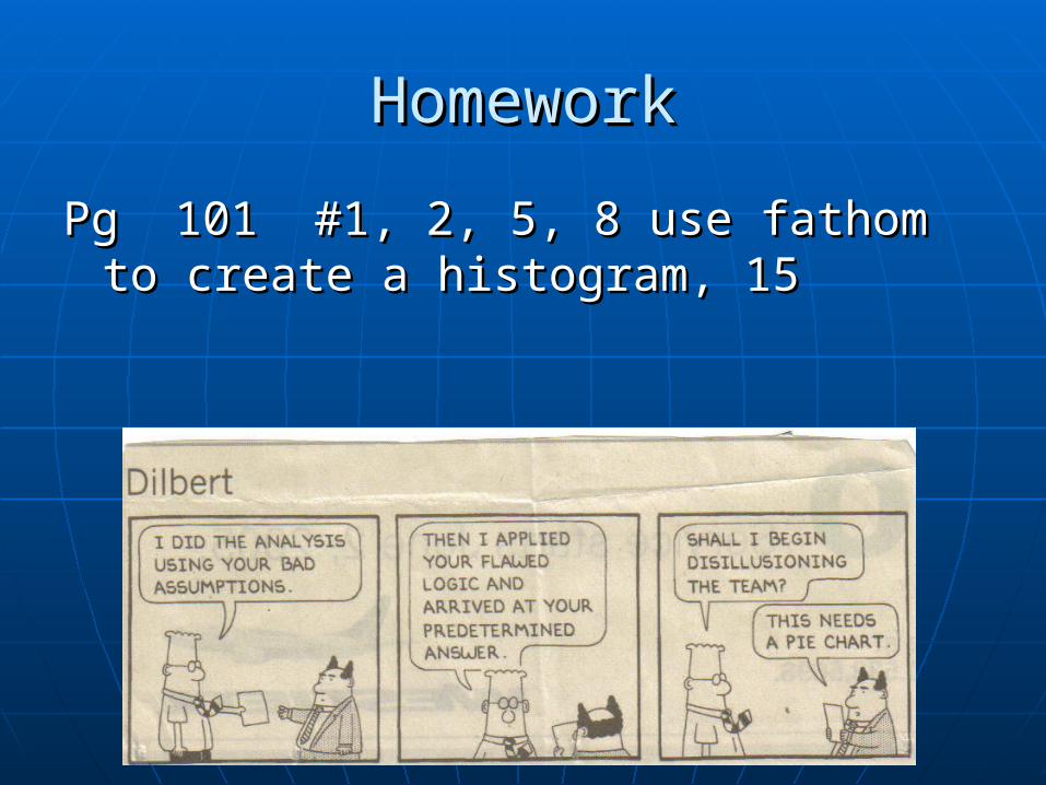
HomeworkHomework
Pg 101 #1, 2, 5, 8 use fathom to Pg 101 #1, 2, 5, 8 use fathom to create a histogram, 15create a histogram, 15