
OneClick Customization Guide (5160) - CA...
160
SPECTRUM ® OneClick Customization Guide (5160) r9.0.1
Transcript of OneClick Customization Guide (5160) - CA...

SPECTRUM ®
OneClick Customization Guide (5160)r9.0.1

This documentation and any related computer software help programs (hereinafter referred to as the “Documentation”) is for the end user’s informational purposes only and is subject to change or withdrawal by CA at any time.
This Documentation may not be copied, transferred, reproduced, disclosed, modified or duplicated, in whole or in part, without the prior written consent of CA. This Documentation is confidential and proprietary information of CA and protected by the copyright laws of the United States and international treaties.
Notwithstanding the foregoing, licensed users may print a reasonable number of copies of the Documentation for their own internal use, and may make one copy of the related software as reasonably required for back-up and disaster recovery purposes, provided that all CA copyright notices and legends are affixed to each reproduced copy. Only authorized employees, consultants, or agents of the user who are bound by the provisions of the license for the product are permitted to have access to such copies.
The right to print copies of the Documentation and to make a copy of the related software is limited to the period during which the applicable license for the product remains in full force and effect. Should the license terminate for any reason, it shall be the user’s responsibility to certify in writing to CA that all copies and partial copies of the Documentation have been returned to CA or destroyed.
EXCEPT AS OTHERWISE STATED IN THE APPLICABLE LICENSE AGREEMENT, TO THE EXTENT PERMITTED BY APPLICABLE LAW, CA PROVIDES THIS DOCUMENTATION “AS IS” WITHOUT WARRANTY OF ANY KIND, INCLUDING WITHOUT LIMITATION, ANY IMPLIED WARRANTIES OF MERCHANTABILITY, FITNESS FOR A PARTICULAR PURPOSE OR NONINFRINGEMENT. IN NO EVENT WILL CA BE LIABLE TO THE END USER OR ANY THIRD PARTY FOR ANY LOSS OR DAMAGE, DIRECT OR INDIRECT, FROM THE USE OF THIS DOCUMENTATION, INCLUDING WITHOUT LIMITATION, LOST PROFITS, BUSINESS INTERRUPTION, GOODWILL, OR LOST DATA, EVEN IF CA IS EXPRESSLY ADVISED OF SUCH LOSS OR DAMAGE.
The use of any product referenced in the Documentation is governed by the end user’s applicable license agreement.
The manufacturer of this Documentation is CA.
Provided with “Restricted Rights.” Use, duplication or disclosure by the United States Government is subject to the restrictions set forth in FAR Sections 12.212, 52.227-14, and 52.227-19(c)(1) - (2) and DFARS Section 252.227-7014(b)(3), as applicable, or their successors.
All trademarks, trade names, service marks, and logos referenced herein belong to their respective companies.
Copyright © 2008 CA. All rights reserved.
Contents
PrefaceIntended Audience . . . . . . . . . . . . . . . . . . . . . . . . . . . . . . . . . . . . . . . . . . . . . . . . . . . . . . . . . viiWhat Is in This Book . . . . . . . . . . . . . . . . . . . . . . . . . . . . . . . . . . . . . . . . . . . . . . . . . . . . . . . . viiText Conventions . . . . . . . . . . . . . . . . . . . . . . . . . . . . . . . . . . . . . . . . . . . . . . . . . . . . . . . . . . viiiDocumentation Feedback. . . . . . . . . . . . . . . . . . . . . . . . . . . . . . . . . . . . . . . . . . . . . . . . . . . . . .ixOnline Documentation . . . . . . . . . . . . . . . . . . . . . . . . . . . . . . . . . . . . . . . . . . . . . . . . . . . . . . . .ix
Chapter 1: OneClick Directory StructureExisting OneClick Files. . . . . . . . . . . . . . . . . . . . . . . . . . . . . . . . . . . . . . . . . . . . . . . . . . . . . . . . 1
The console/config Directory . . . . . . . . . . . . . . . . . . . . . . . . . . . . . . . . . . . . . . . . . . . . . . . . . 2The topo/config Directory . . . . . . . . . . . . . . . . . . . . . . . . . . . . . . . . . . . . . . . . . . . . . . . . . . . 3The common/config Directory . . . . . . . . . . . . . . . . . . . . . . . . . . . . . . . . . . . . . . . . . . . . . . . . 3The alarm/config Directory . . . . . . . . . . . . . . . . . . . . . . . . . . . . . . . . . . . . . . . . . . . . . . . . . . 3
Create Customizations. . . . . . . . . . . . . . . . . . . . . . . . . . . . . . . . . . . . . . . . . . . . . . . . . . . . . . . . 4Prerequisites for Customizing OneClick XML Files . . . . . . . . . . . . . . . . . . . . . . . . . . . . . . . . . . . 4Extend Factory XML Files. . . . . . . . . . . . . . . . . . . . . . . . . . . . . . . . . . . . . . . . . . . . . . . . . . . . 4Override Factory Files . . . . . . . . . . . . . . . . . . . . . . . . . . . . . . . . . . . . . . . . . . . . . . . . . . . . . . 5Inherit Features in Factory XML Files . . . . . . . . . . . . . . . . . . . . . . . . . . . . . . . . . . . . . . . . . . . 5Example: Extending Factory XML File . . . . . . . . . . . . . . . . . . . . . . . . . . . . . . . . . . . . . . . . . . . 6
Save Customized XML Files . . . . . . . . . . . . . . . . . . . . . . . . . . . . . . . . . . . . . . . . . . . . . . . . . . . . 6Preserve XML Customizations . . . . . . . . . . . . . . . . . . . . . . . . . . . . . . . . . . . . . . . . . . . . . . . . . . . 7Preserve Custom Images . . . . . . . . . . . . . . . . . . . . . . . . . . . . . . . . . . . . . . . . . . . . . . . . . . . . . . 7
Chapter 2: Customize the OneClick Console MenuThe custom-menu-config.xml File . . . . . . . . . . . . . . . . . . . . . . . . . . . . . . . . . . . . . . . . . . . . . . . . 9Add a New Menu. . . . . . . . . . . . . . . . . . . . . . . . . . . . . . . . . . . . . . . . . . . . . . . . . . . . . . . . . . . 12Add a New Menu Item . . . . . . . . . . . . . . . . . . . . . . . . . . . . . . . . . . . . . . . . . . . . . . . . . . . . . . . 13
Add Toolbar Images . . . . . . . . . . . . . . . . . . . . . . . . . . . . . . . . . . . . . . . . . . . . . . . . . . . . . . 15Define a Keyboard Accelerator . . . . . . . . . . . . . . . . . . . . . . . . . . . . . . . . . . . . . . . . . . . . . . . 15Perform an Action . . . . . . . . . . . . . . . . . . . . . . . . . . . . . . . . . . . . . . . . . . . . . . . . . . . . . . . 16
Contextually Apply the Action . . . . . . . . . . . . . . . . . . . . . . . . . . . . . . . . . . . . . . . . . . . . . 16Limit the Availability of Menu Items . . . . . . . . . . . . . . . . . . . . . . . . . . . . . . . . . . . . . . . . . 19Launch a Browser . . . . . . . . . . . . . . . . . . . . . . . . . . . . . . . . . . . . . . . . . . . . . . . . . . . . . 22Important Information About Specifying URLs . . . . . . . . . . . . . . . . . . . . . . . . . . . . . . . . . . 22Specify a Username . . . . . . . . . . . . . . . . . . . . . . . . . . . . . . . . . . . . . . . . . . . . . . . . . . . . 24Launch an Application From OneClick . . . . . . . . . . . . . . . . . . . . . . . . . . . . . . . . . . . . . . . . 25Launch a Web Server Script . . . . . . . . . . . . . . . . . . . . . . . . . . . . . . . . . . . . . . . . . . . . . . 27
Display the Status of a Launched Application or Script . . . . . . . . . . . . . . . . . . . . . . . . . . . . . . 28
Contents iii
Chapter 3: Customize OneClick Alarms
Chapter 4: Customize OneClick TablesModify Table Columns . . . . . . . . . . . . . . . . . . . . . . . . . . . . . . . . . . . . . . . . . . . . . . . . . . . . . . . 31
Extend a Factory Default File Using IDREF . . . . . . . . . . . . . . . . . . . . . . . . . . . . . . . . . . . . . . 31Modify a Table Column . . . . . . . . . . . . . . . . . . . . . . . . . . . . . . . . . . . . . . . . . . . . . . . . . . . . 33
Define How Cells Display in Table Columns . . . . . . . . . . . . . . . . . . . . . . . . . . . . . . . . . . . . . . . . 38Use Renderers to Present Data in Column Cells . . . . . . . . . . . . . . . . . . . . . . . . . . . . . . . . . . . 39
TextAreaCellRenderer. . . . . . . . . . . . . . . . . . . . . . . . . . . . . . . . . . . . . . . . . . . . . . . . . . . 39ListAttributeRenderer . . . . . . . . . . . . . . . . . . . . . . . . . . . . . . . . . . . . . . . . . . . . . . . . . . . 39ListAttributeOIDRenderer . . . . . . . . . . . . . . . . . . . . . . . . . . . . . . . . . . . . . . . . . . . . . . . . 40ActionButtonCellRenderer . . . . . . . . . . . . . . . . . . . . . . . . . . . . . . . . . . . . . . . . . . . . . . . . 40ActionButtonPanelCellRenderer . . . . . . . . . . . . . . . . . . . . . . . . . . . . . . . . . . . . . . . . . . . . 41AttrToggleButtonCellRenderer . . . . . . . . . . . . . . . . . . . . . . . . . . . . . . . . . . . . . . . . . . . . . 42BoldAttributeTableCellRenderer . . . . . . . . . . . . . . . . . . . . . . . . . . . . . . . . . . . . . . . . . . . . 43
Make a Table Column Editable . . . . . . . . . . . . . . . . . . . . . . . . . . . . . . . . . . . . . . . . . . . . . . . . . 43Customize the Alarm Table Acknowledge Field . . . . . . . . . . . . . . . . . . . . . . . . . . . . . . . . . . . . 43
Customize Alarm Table Row Colors . . . . . . . . . . . . . . . . . . . . . . . . . . . . . . . . . . . . . . . . . . . . . . 45Set Up a Default Sort . . . . . . . . . . . . . . . . . . . . . . . . . . . . . . . . . . . . . . . . . . . . . . . . . . . . . . . 46Customize the Port Name Column of the Interface Table . . . . . . . . . . . . . . . . . . . . . . . . . . . . . . . 48Sort Interfaces Table by ifIndex . . . . . . . . . . . . . . . . . . . . . . . . . . . . . . . . . . . . . . . . . . . . . . . . 49
Chapter 5: Add Support for Model Types or Model ClassesCreate a Registration . . . . . . . . . . . . . . . . . . . . . . . . . . . . . . . . . . . . . . . . . . . . . . . . . . . . . . . 51
Register the Model Type or Model Class in custom-app-config.xml . . . . . . . . . . . . . . . . . . . . . . 51Define General OneClick Device Support Based on Model Class . . . . . . . . . . . . . . . . . . . . . . . . 52Define Specific OneClick Device Support Based on Model Type . . . . . . . . . . . . . . . . . . . . . . . . 54Define Model Appearance . . . . . . . . . . . . . . . . . . . . . . . . . . . . . . . . . . . . . . . . . . . . . . . . . . 56
Configure Icons for OneClick Themes . . . . . . . . . . . . . . . . . . . . . . . . . . . . . . . . . . . . . . . . . . . . 57Using the <theme-config> Element to Create Icon Appearance . . . . . . . . . . . . . . . . . . . . . . . . 60
Design On-Page and Off-Page Reference Icons. . . . . . . . . . . . . . . . . . . . . . . . . . . . . . . . . . . . . . 60Use <on-page> and <off-page> Elements . . . . . . . . . . . . . . . . . . . . . . . . . . . . . . . . . . . . . . 63Define the Icon Shape . . . . . . . . . . . . . . . . . . . . . . . . . . . . . . . . . . . . . . . . . . . . . . . . . . . . 64
Rectangle . . . . . . . . . . . . . . . . . . . . . . . . . . . . . . . . . . . . . . . . . . . . . . . . . . . . . . . . . . . 65Rounded Rectangle . . . . . . . . . . . . . . . . . . . . . . . . . . . . . . . . . . . . . . . . . . . . . . . . . . . . 65Ellipse . . . . . . . . . . . . . . . . . . . . . . . . . . . . . . . . . . . . . . . . . . . . . . . . . . . . . . . . . . . . . 66Polygon . . . . . . . . . . . . . . . . . . . . . . . . . . . . . . . . . . . . . . . . . . . . . . . . . . . . . . . . . . . . 67Line . . . . . . . . . . . . . . . . . . . . . . . . . . . . . . . . . . . . . . . . . . . . . . . . . . . . . . . . . . . . . . . 68Create an Icon Shape. . . . . . . . . . . . . . . . . . . . . . . . . . . . . . . . . . . . . . . . . . . . . . . . . . . 69X and Y Coordinates. . . . . . . . . . . . . . . . . . . . . . . . . . . . . . . . . . . . . . . . . . . . . . . . . . . . 69
Define Pipe Connection Location . . . . . . . . . . . . . . . . . . . . . . . . . . . . . . . . . . . . . . . . . . . . . 70Define Image Components . . . . . . . . . . . . . . . . . . . . . . . . . . . . . . . . . . . . . . . . . . . . . . . . . 70
Create an Icon Label. . . . . . . . . . . . . . . . . . . . . . . . . . . . . . . . . . . . . . . . . . . . . . . . . . . . . . . . 76The default-iconlabel-config.xml File . . . . . . . . . . . . . . . . . . . . . . . . . . . . . . . . . . . . . . . . . . 77Adjust Icon Label Background Width . . . . . . . . . . . . . . . . . . . . . . . . . . . . . . . . . . . . . . . . . . 80Default Label Width Settings . . . . . . . . . . . . . . . . . . . . . . . . . . . . . . . . . . . . . . . . . . . . . . . . 80Create Fixed Width Icon Labels . . . . . . . . . . . . . . . . . . . . . . . . . . . . . . . . . . . . . . . . . . . . . . 80
iv OneClick Customization Guide

Define Text Components . . . . . . . . . . . . . . . . . . . . . . . . . . . . . . . . . . . . . . . . . . . . . . . . . . . . . 81Define Selection Components . . . . . . . . . . . . . . . . . . . . . . . . . . . . . . . . . . . . . . . . . . . . . . . . . . 82Define Model Icon Tooltips . . . . . . . . . . . . . . . . . . . . . . . . . . . . . . . . . . . . . . . . . . . . . . . . . . . . 85
Chapter 6: Customize a Model’s Information ViewExtend or Modify an Information View . . . . . . . . . . . . . . . . . . . . . . . . . . . . . . . . . . . . . . . . . . . . 90Create an Information Configuration File . . . . . . . . . . . . . . . . . . . . . . . . . . . . . . . . . . . . . . . . . . 92
Define the Header . . . . . . . . . . . . . . . . . . . . . . . . . . . . . . . . . . . . . . . . . . . . . . . . . . . . . . . 93Define the Subview . . . . . . . . . . . . . . . . . . . . . . . . . . . . . . . . . . . . . . . . . . . . . . . . . . . . . . 94
Add a Field Subview . . . . . . . . . . . . . . . . . . . . . . . . . . . . . . . . . . . . . . . . . . . . . . . . . . . . 96Add Field Subviews Using IDREF . . . . . . . . . . . . . . . . . . . . . . . . . . . . . . . . . . . . . . . . . . . 98Add a Table Subview . . . . . . . . . . . . . . . . . . . . . . . . . . . . . . . . . . . . . . . . . . . . . . . . . . . 98Add an Application Subview . . . . . . . . . . . . . . . . . . . . . . . . . . . . . . . . . . . . . . . . . . . . . 101Add a Related Model Subview . . . . . . . . . . . . . . . . . . . . . . . . . . . . . . . . . . . . . . . . . . . . 102Add a Related Models Table Subview . . . . . . . . . . . . . . . . . . . . . . . . . . . . . . . . . . . . . . . 103
Define a Subview Group . . . . . . . . . . . . . . . . . . . . . . . . . . . . . . . . . . . . . . . . . . . . . . . . . . 106Associate an Information Configuration File with a Model Class or Model Type . . . . . . . . . . . . . . . 107
Chapter 7: Create a Model’s Performance ViewCreate a New Performance View . . . . . . . . . . . . . . . . . . . . . . . . . . . . . . . . . . . . . . . . . . . . . . . 110
Create a Performance Data Configuration File . . . . . . . . . . . . . . . . . . . . . . . . . . . . . . . . . . . 111Create a Performance View Configuration File . . . . . . . . . . . . . . . . . . . . . . . . . . . . . . . . . . . 114
Customize an Existing Performance View . . . . . . . . . . . . . . . . . . . . . . . . . . . . . . . . . . . . . . . . . 116
Chapter 8: Create Custom PrivilegesDefine a Custom Privilege . . . . . . . . . . . . . . . . . . . . . . . . . . . . . . . . . . . . . . . . . . . . . . . . . . . 119
Restrict Access to Attribute Values in Model Subviews. . . . . . . . . . . . . . . . . . . . . . . . . . . . . . 122Group Privileges. . . . . . . . . . . . . . . . . . . . . . . . . . . . . . . . . . . . . . . . . . . . . . . . . . . . . . . . 123
Reference a Privilege When Defining a Menu Item, Column, or Subview . . . . . . . . . . . . . . . . . . . 125
Chapter 9: XML Usage Common to All Customization FilesAbout Parameters . . . . . . . . . . . . . . . . . . . . . . . . . . . . . . . . . . . . . . . . . . . . . . . . . . . . . . . . . 127Acquire Data—Render a Value . . . . . . . . . . . . . . . . . . . . . . . . . . . . . . . . . . . . . . . . . . . . . . . . 128Use a Select Case . . . . . . . . . . . . . . . . . . . . . . . . . . . . . . . . . . . . . . . . . . . . . . . . . . . . . . . . . 129
Contents v

Manipulate Attribute Output Using Renderers. . . . . . . . . . . . . . . . . . . . . . . . . . . . . . . . . . . . . . 129Boolean Renderer . . . . . . . . . . . . . . . . . . . . . . . . . . . . . . . . . . . . . . . . . . . . . . . . . . . . . . 130Commented Text Renderer . . . . . . . . . . . . . . . . . . . . . . . . . . . . . . . . . . . . . . . . . . . . . . . . 130Date Renderer . . . . . . . . . . . . . . . . . . . . . . . . . . . . . . . . . . . . . . . . . . . . . . . . . . . . . . . . . 131Enumerated Attribute Renderer . . . . . . . . . . . . . . . . . . . . . . . . . . . . . . . . . . . . . . . . . . . . . 132List Renderer. . . . . . . . . . . . . . . . . . . . . . . . . . . . . . . . . . . . . . . . . . . . . . . . . . . . . . . . . . 132Null Renderer . . . . . . . . . . . . . . . . . . . . . . . . . . . . . . . . . . . . . . . . . . . . . . . . . . . . . . . . . 132Object ID Renderer . . . . . . . . . . . . . . . . . . . . . . . . . . . . . . . . . . . . . . . . . . . . . . . . . . . . . 132The Round Number Renderer . . . . . . . . . . . . . . . . . . . . . . . . . . . . . . . . . . . . . . . . . . . . . . 134System Up Time Renderer . . . . . . . . . . . . . . . . . . . . . . . . . . . . . . . . . . . . . . . . . . . . . . . . 134ByteRenderer . . . . . . . . . . . . . . . . . . . . . . . . . . . . . . . . . . . . . . . . . . . . . . . . . . . . . . . . . 134InetAddressRenderer . . . . . . . . . . . . . . . . . . . . . . . . . . . . . . . . . . . . . . . . . . . . . . . . . . . . 135ListInstanceRenderer . . . . . . . . . . . . . . . . . . . . . . . . . . . . . . . . . . . . . . . . . . . . . . . . . . . . 135SimpleIntegerRenderer. . . . . . . . . . . . . . . . . . . . . . . . . . . . . . . . . . . . . . . . . . . . . . . . . . . 135TypePrependedInetAddressRenderer . . . . . . . . . . . . . . . . . . . . . . . . . . . . . . . . . . . . . . . . . 135
About <dynamic-renderer> . . . . . . . . . . . . . . . . . . . . . . . . . . . . . . . . . . . . . . . . . . . . . . . . . . 136Attribute Filter Criteria and <dynamic-renderer>. . . . . . . . . . . . . . . . . . . . . . . . . . . . . . . . . 136Specify a Default <dynamic-renderer>. . . . . . . . . . . . . . . . . . . . . . . . . . . . . . . . . . . . . . . . 137
About Expressions . . . . . . . . . . . . . . . . . . . . . . . . . . . . . . . . . . . . . . . . . . . . . . . . . . . . . . . . 139Manipulate Attribute Information . . . . . . . . . . . . . . . . . . . . . . . . . . . . . . . . . . . . . . . . . . . . 139
Use Attribute Methods to Form Arithmetic Expressions. . . . . . . . . . . . . . . . . . . . . . . . . . . 141Append Suffix to Values . . . . . . . . . . . . . . . . . . . . . . . . . . . . . . . . . . . . . . . . . . . . . . . . 141
Precautions for Using Expressions . . . . . . . . . . . . . . . . . . . . . . . . . . . . . . . . . . . . . . . . . . . 141Reference XML Files . . . . . . . . . . . . . . . . . . . . . . . . . . . . . . . . . . . . . . . . . . . . . . . . . . . . . . . 142Reference Images. . . . . . . . . . . . . . . . . . . . . . . . . . . . . . . . . . . . . . . . . . . . . . . . . . . . . . . . . 142Verify User Input Using Verifiers . . . . . . . . . . . . . . . . . . . . . . . . . . . . . . . . . . . . . . . . . . . . . . . 142
OneClick Input Verifiers . . . . . . . . . . . . . . . . . . . . . . . . . . . . . . . . . . . . . . . . . . . . . . . . . . 143IntegerContainedInRangeInputVerifier . . . . . . . . . . . . . . . . . . . . . . . . . . . . . . . . . . . . . . 143AttrIDInputVerifier . . . . . . . . . . . . . . . . . . . . . . . . . . . . . . . . . . . . . . . . . . . . . . . . . . . . 143DoubleInputVerifier . . . . . . . . . . . . . . . . . . . . . . . . . . . . . . . . . . . . . . . . . . . . . . . . . . . 143IPAddressInputVerifier . . . . . . . . . . . . . . . . . . . . . . . . . . . . . . . . . . . . . . . . . . . . . . . . . 143IntegerInputVerifier . . . . . . . . . . . . . . . . . . . . . . . . . . . . . . . . . . . . . . . . . . . . . . . . . . . 144LongInputVerifier. . . . . . . . . . . . . . . . . . . . . . . . . . . . . . . . . . . . . . . . . . . . . . . . . . . . . 144MACAddressInputVerifier . . . . . . . . . . . . . . . . . . . . . . . . . . . . . . . . . . . . . . . . . . . . . . . 144NonEmptyStringInputVerifier . . . . . . . . . . . . . . . . . . . . . . . . . . . . . . . . . . . . . . . . . . . . 144UnsignedIntInputVerifier . . . . . . . . . . . . . . . . . . . . . . . . . . . . . . . . . . . . . . . . . . . . . . . 144
Chapter 10: Customize OneClick for CA Service Desk
Index
vi OneClick Customization Guide
Preface
Welcome to the OneClick Customization Guide (5160).
Intended AudienceThis guide is intended for OneClick administrators who want to customize the OneClick console by coding their changes in XML. The information and instructions in this document assume that the reader has thorough knowledge of XML and the concepts used in programming in XML.
What Is in This BookThis guide contains the following chapters:
Chapter 1: OneClick Directory Structure: Describes the directory structure of the XML files used to create the OneClick interface. You must be familiar with the directory structure in order to find the files to customize and to implement the customizations so they are not overwritten by an upgrade or reinstallation of SPECTRUM.
Chapter 2: Customize the OneClick Console Menu: Describes how you can add menus and menu items to the console menu in order to launch third-party applications, scripts, or web pages.
Chapter 3: Customize OneClick Alarms: Describes the process of creating custom alarm attributes and displaying them in the alarm table and information views.
Chapter 4: Customize OneClick Tables: Describes how you can customize and add columns to some of the tables available in the OneClick console.
Chapter 5: Add Support for Model Types or Model Classes: Describes how to add or extend OneClick support for a SPECTRUM model type or model class.
Chapter 6: Customize a Model’s Information View: Describes how to add new information and subviews to a model type’s Information view.
Chapter 7: Create a Model’s Performance View: Describes how to create or customize the Performance view of a model type or model class.
vii
Text Conventions
Chapter 8: Create Custom Privileges: Describes how to define new privileges, which can be applied to menu items or subviews.
Chapter 9: XML Usage Common to All Customization Files: Discusses XML elements and implementation strategies that can be used across all customization files.
Chapter 10: Customize OneClick for CA Service Desk: Provides high-level information on how OneClick can be customized for CA Service Desk.
Text ConventionsThe following text conventions are used in this document:
Element Convention Used Example
Variables
(The user supplies a value for the variable.)
Courier and Italic in angle brackets (<>)
Type the following:
DISPLAY=<workstation name>:0.0 export display
The directory where you installed SPECTRUM
(The user supplies a value for the variable.)
<$SPECROOT> Navigate to:
<$SPECROOT>/app-defaults
Solaris, Linux, and Windows directory paths
Unless otherwise noted, directory paths are common to both operating systems, with the exception that slashes (/) should be used in Solaris and Linux paths, and backslashes (\) should be used in Windows paths.
<$SPECROOT>/app-defaults on Solaris or Linux is equivalent to <$SPECROOT>\app-defaults on Windows.
On-screen text Courier The following line displays:path=“/audit”
User-typed text Courier Type the following path name:C:\ABC\lib\db
viii OneClick Customization Guide
Documentation Feedback
Documentation FeedbackTo send feedback regarding SPECTRUM documentation, access the following web address:
http://supportconnectw.ca.com/public/ca_common_docs/docserver_email.asp
Thank you for helping us improve our documentation.
Online DocumentationSPECTRUM documentation is available online at the following web address:
http://ca.com/support
Check this site for the latest updates and additions.
ix

Online Documentation
x OneClick Customization Guide

Chapter 1: OneClick Directory Structure
This chapter explains the directory structure of the XML files used to create the OneClick interface. You must be familiar with the structure to find the files necessary for customization and to implement customizations in directories that are not overwritten when you upgrade or reinstall SPECTRUM.
Existing OneClick FilesThe OneClick UI is installed with a default layout, panel, menu, toolbar, and submenu content controlled by files that reside on the OneClick server. These files and their locations are identified in this section.
OneClick Directory Structure 1
Existing OneClick Files
The console/config Directory
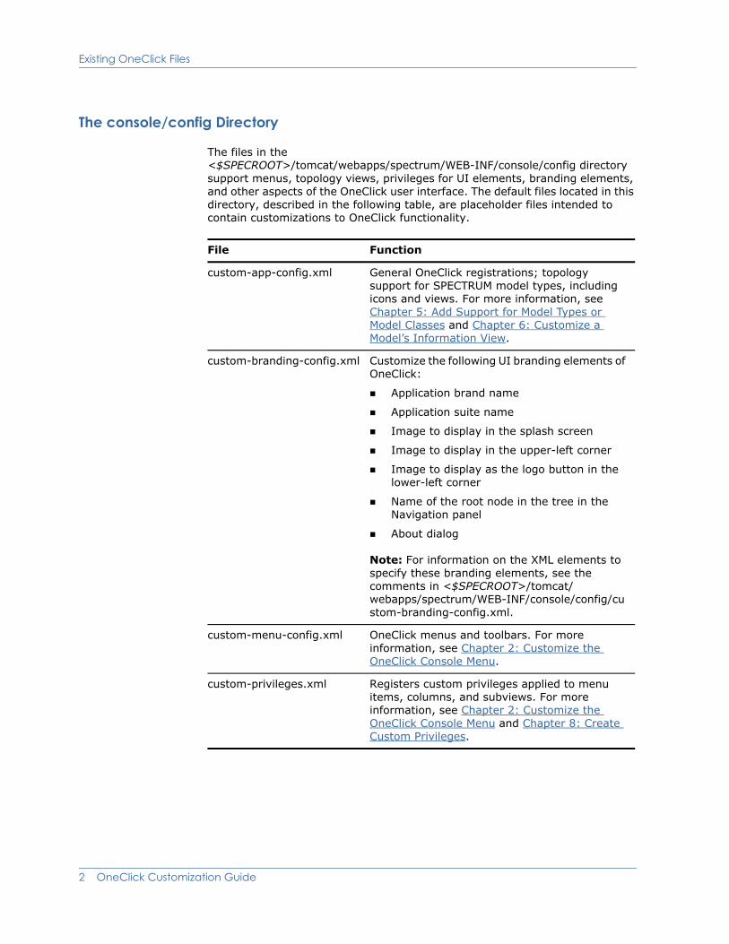
The files in the <$SPECROOT>/tomcat/webapps/spectrum/WEB-INF/console/config directory support menus, topology views, privileges for UI elements, branding elements, and other aspects of the OneClick user interface. The default files located in this directory, described in the following table, are placeholder files intended to contain customizations to OneClick functionality.
File Function
custom-app-config.xml General OneClick registrations; topology support for SPECTRUM model types, including icons and views. For more information, see Chapter 5: Add Support for Model Types or Model Classes and Chapter 6: Customize a Model’s Information View.
custom-branding-config.xml Customize the following UI branding elements of OneClick:
Application brand name
Application suite name
Image to display in the splash screen
Image to display in the upper-left corner
Image to display as the logo button in the lower-left corner
Name of the root node in the tree in the Navigation panel
About dialog
Note: For information on the XML elements to specify these branding elements, see the comments in <$SPECROOT>/tomcat/ webapps/spectrum/WEB-INF/console/config/custom-branding-config.xml.
custom-menu-config.xml OneClick menus and toolbars. For more information, see Chapter 2: Customize the OneClick Console Menu.
custom-privileges.xml Registers custom privileges applied to menu items, columns, and subviews. For more information, see Chapter 2: Customize the OneClick Console Menu and Chapter 8: Create Custom Privileges.
2 OneClick Customization Guide
Existing OneClick Files
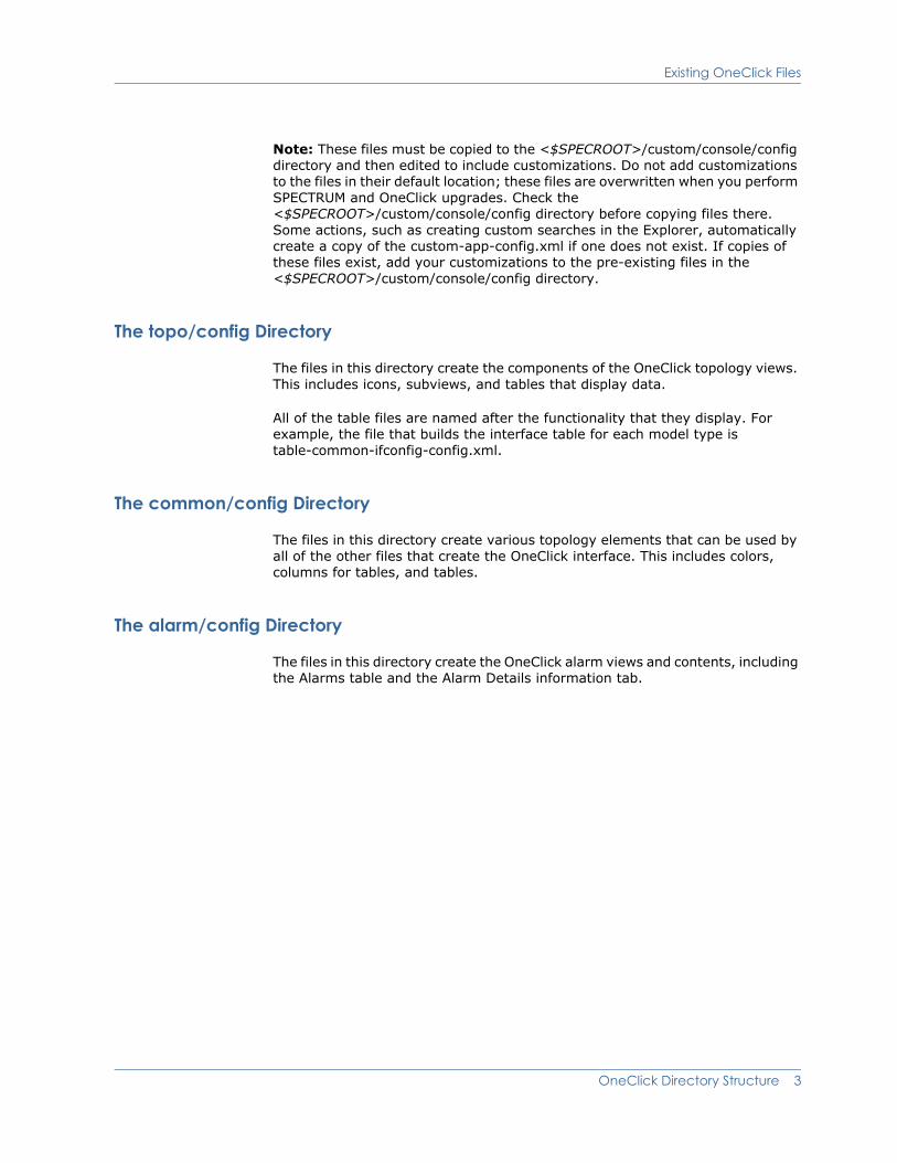
Note: These files must be copied to the <$SPECROOT>/custom/console/config directory and then edited to include customizations. Do not add customizations to the files in their default location; these files are overwritten when you perform SPECTRUM and OneClick upgrades. Check the <$SPECROOT>/custom/console/config directory before copying files there. Some actions, such as creating custom searches in the Explorer, automatically create a copy of the custom-app-config.xml if one does not exist. If copies of these files exist, add your customizations to the pre-existing files in the <$SPECROOT>/custom/console/config directory.
The topo/config Directory
The files in this directory create the components of the OneClick topology views. This includes icons, subviews, and tables that display data.
All of the table files are named after the functionality that they display. For example, the file that builds the interface table for each model type is table-common-ifconfig-config.xml.
The common/config Directory
The files in this directory create various topology elements that can be used by all of the other files that create the OneClick interface. This includes colors, columns for tables, and tables.
The alarm/config Directory
The files in this directory create the OneClick alarm views and contents, including the Alarms table and the Alarm Details information tab.
OneClick Directory Structure 3

Create Customizations
Create CustomizationsOneClick provides a flexible platform for administrators to modify aspects of the application to meet the requirements of each customer’s site, enterprise and network environment, work processes, and deployment of the software. Modifications can be made using the OneClick UI and by coding changes directly in XML.
Prerequisites for Customizing OneClick XML Files
You need to be aware of the following items before attempting to customize OneClick files:
You must be able to create and modify files on the OneClick server.
You must be familiar with the fundamentals of XML coding as well as the SPECTRUM and OneClick directory structure.
You must know the following:
– The file that you want to “extend” the functionality of with your modifications.
– The directory in the <$SPECROOT>/custom directory in which to create your custom file.
Extend Factory XML Files
You can extend default XML files to accomplish OneClick customizations without overriding the entire factory default file. Customized XML files are not removed during a SPECTRUM/OneClick software upgrade or reinstallation (see Preserve XML Customizations on page 7).
To extend the default OneClick XML configuration files, create a file with the same name as the default file in the appropriate custom directory (see the table in Save Customized XML Files on page 6). Use the XML idref attribute in the new file to refer to the default OneClick file of the same name. Code the new functionality in this file. When OneClick parses the XML files, the changes in the new file are added to the existing factory file referenced using idref.
By extending factory files, you are able to take advantage of new features and functionality available in software updates to the factory XML code while preserving your customizations.
Although you can still override a factory XML file by creating a copy of it in the <$SPECROOT>/custom directory and making your changes in the copy, using the IDREF XML attribute provides the ability to inherit and extend the factory file, while maintaining customizations in streamlined files.
4 OneClick Customization Guide

Create Customizations
Override Factory Files
Overriding a factory file is accomplished by copying the original file you want to customize to the appropriate custom directory, and then adding new XML code or making changes to the existing XML code. OneClick reads the files in the custom directory first. If the file exists in the custom directory and does not contain an idref statement referencing the original factory file, OneClick will not read the original factory file, and the new file overrides the original factory file.
Inherit Features in Factory XML Files
Using idref to extend XML files has applications beyond extending the factory file with the same name. You can use this technique to inherit or reuse features in any file of the same type. For example, you can create your own model types that have a customized details view defined in view-mymtypedetails-config.xml. This model type can also inherit the default device views configured in view-devicedetails-config using idref. The new custom file extends the functionality of the default file while also inheriting the views in the default file.
OneClick Directory Structure 5

Save Customized XML Files
Example: Extending Factory XML File
The example in the following figure extends the functionality of the factory default <$SPECROOT>/tomcat/webapps/spectrum/WEB-INF/topo/ config/view-devicedetails-config.xml file by adding the code for the new subviews in <$SPECROOT>/custom/topo/config/view-devicedetails-config.xml. The default factory file view-devicedetails-config is specified in an "idref" statement.
Save Customized XML FilesOneClick customization files must be placed in specific “custom” directories so that OneClick finds and reads the customized code and associates it with the correct default factory file. The following table lists the custom directories for the OneClick component categories.
Factory default file
<$SPECROOT>/tomcat/webapps/spectrum/WEB-INF/ topo/config/view-devicedetails-config.xml
Customizations extending view-devicedetails-config file
<$SPECROOT>/custom/topo/config/ view-devicedetails-config.xml
OneClick displays the Device Details view with the additional subviews
<view idref="view-devicedetails-config">
<subviews>
... Add subviews here
</subviews>
</view>
view-devicedetails-configIDREF references factory file
OneClick Component Categories
Custom Directory Path
Console components <$SPECROOT>/custom/console/config/
Topologies <$SPECROOT>/custom/topo/config/
Alarms <$SPECROOT>/custom/alarm/config/
6 OneClick Customization Guide

Preserve XML Customizations
Preserve XML CustomizationsOneClick does not delete or overwrite files in the custom directory during an upgrade of SPECTRUM or OneClick.
Note: Customized OneClick XML files may be overwritten in the following situation: Uninstalling and then reinstalling the same version of SpectroSERVER if you have installed OneClick under the SPECTRUM installation directory. In this case, you should save off the customized files to an area unaffected by the uninstall process, and re-insert them once you have reinstalled SpectroSERVER. Refer to the Installation Guide (5136) for details regarding upgrades and installations of SPECTRUM and OneClick.
Preserve Custom ImagesYou must place all image files that you create or customize in the <$SPECROOT>/custom/images directory. Otherwise, all new or customized images are deleted or overwritten during an upgrade or reinstallation of SPECTRUM or OneClick.
Common <$SPECROOT>/custom/common/config/
Events <$SPECROOT>/custom/Events/config/
Images <$SPECROOT>/custom/images/
OneClick Component Categories
Custom Directory Path
OneClick Directory Structure 7

Preserve Custom Images
8 OneClick Customization Guide

Chapter 2: Customize the OneClick Console Menu
This chapter describes how to add new menus and new menu items to the OneClick console. You can use new menu items to launch URLs, third-party applications, and scripts, and to pass parameters to them.
The custom-menu-config.xml FileThe <$SPECROOT>/tomcat/webapps/spectrum/WEB-INF/console/config/ custom-menu-config.xml file contains examples on how to add custom menus and custom menu items to your OneClick console (as shown in the images later in this section). You will need to copy this file into the <$SPECROOT>/custom/console/config/ directory if the file is not already in this directory. For more information on these factory files, see Existing OneClick Files on page 1.
The following image shows a new menu called Connections that has 2 new menu items: Ping Local and Launch Diagnostics.
Customize the OneClick Console Menu 9
The custom-menu-config.xml File
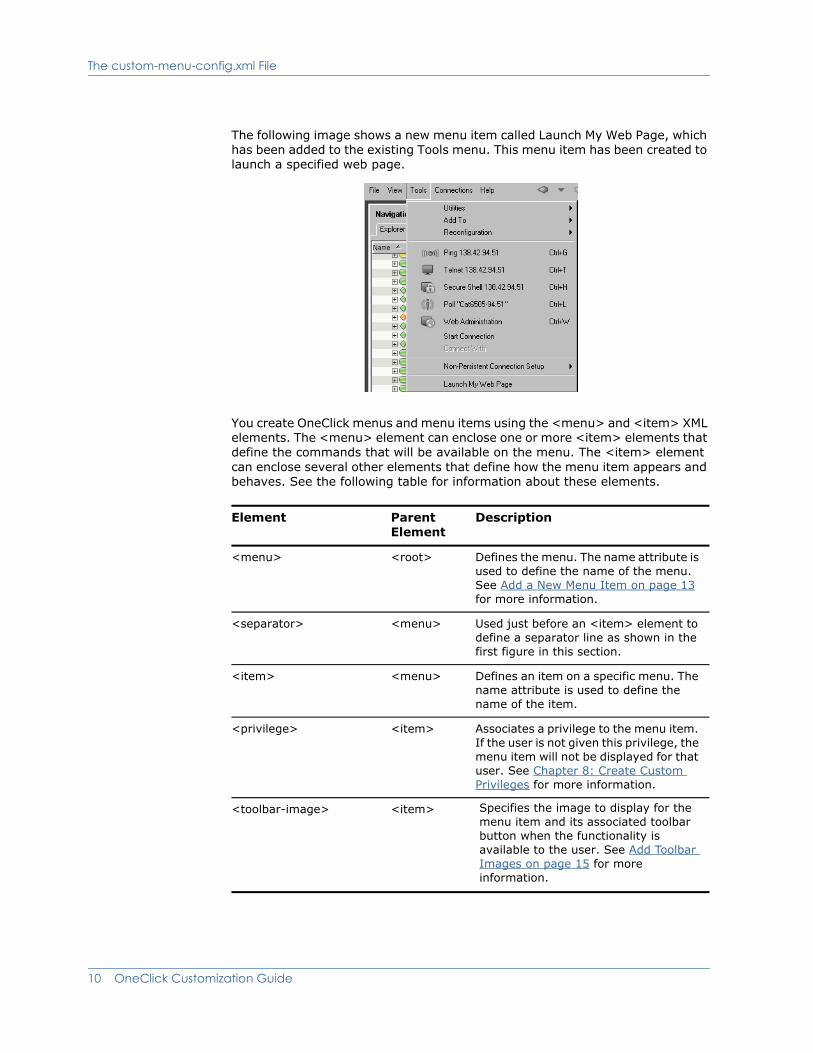
The following image shows a new menu item called Launch My Web Page, which has been added to the existing Tools menu. This menu item has been created to launch a specified web page.
You create OneClick menus and menu items using the <menu> and <item> XML elements. The <menu> element can enclose one or more <item> elements that define the commands that will be available on the menu. The <item> element can enclose several other elements that define how the menu item appears and behaves. See the following table for information about these elements.
Element Parent Element
Description
<menu> <root> Defines the menu. The name attribute is used to define the name of the menu. See Add a New Menu Item on page 13 for more information.
<separator> <menu> Used just before an <item> element to define a separator line as shown in the first figure in this section.
<item> <menu> Defines an item on a specific menu. The name attribute is used to define the name of the item.
<privilege> <item> Associates a privilege to the menu item. If the user is not given this privilege, the menu item will not be displayed for that user. See Chapter 8: Create Custom Privileges for more information.
<toolbar-image> <item> Specifies the image to display for the menu item and its associated toolbar button when the functionality is available to the user. See Add Toolbar Images on page 15 for more information.
10 OneClick Customization Guide
The custom-menu-config.xml File
The subsequent sections of this chapter describe how to use the <menu> element to create a new menu and how to use the <item> element and its child elements to add menu items to a new or existing menu.
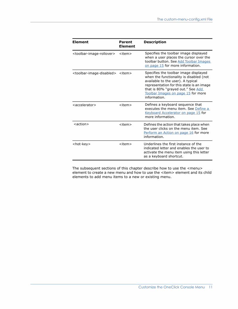
<toolbar-image-rollover> <item> Specifies the toolbar image displayed when a user places the cursor over the toolbar button. See Add Toolbar Images on page 15 for more information.
<toolbar-image-disabled> <item> Specifies the toolbar image displayed when the functionality is disabled (not available to the user). A typical representation for this state is an image that is 80% “grayed out.” See Add Toolbar Images on page 15 for more information.
<accelerator> <item> Defines a keyboard sequence that executes the menu item. See Define a Keyboard Accelerator on page 15 for more information.
<action> <item> Defines the action that takes place when the user clicks on the menu item. See Perform an Action on page 16 for more information.
<hot-key> <item> Underlines the first instance of the indicated letter and enables the user to activate the menu item using this letter as a keyboard shortcut.
Element Parent Element
Description
Customize the OneClick Console Menu 11
Add a New Menu
Add a New MenuThe <menu> element is used to create a OneClick console menu (as shown in the first image in The custom-menu-config.xml File on page 9).
To add a new menu
1. Open the existing <$SPECROOT>/custom/console/config/custom-menu-config.xml file.
If the file does not exist, copy the file <$SPECROOT>/tomcat/webapps/spectrum/WEB-INF/console/config/ custom-menu-config.xml into the <$SPECROOT>/custom/console/config directory, and then open it.
For information about the location of factory and customized OneClick Console files, see Chapter 1: OneClick Directory Structure.
The <root> element is the root element for this file. You must define all new menus inside the <root> element.
2. Use the <menu> element to create new menus. This element has a single attribute, name, which defines the name of the menu.
Note: Some of the examples in the custom-menu-config.xml file show a fully qualified menu name that references a Java class created by OneClick engineers. For example, com.aprisma.spectrum.app.swing.window.menu.Tool is used as the value for the name attribute in the <menu> element that defines the Tools menu. You do not have to use a fully qualified name to create a new menu or to refer to an existing menu. Simply use the exact text that you would like to appear as the menu name on the toolbar.
3. Add items to the new menu by specifying them using the <item> element and its available child elements. Detailed instructions for this can be found in Add a New Menu Item on page 13. If you do not specify menu items for a menu, the menu will not be visible in the OneClick console.
4. Save the changes you have made to custom-menu-config.xml.
5. To view and test the new menus, restart the OneClick console.
12 OneClick Customization Guide
Add a New Menu Item
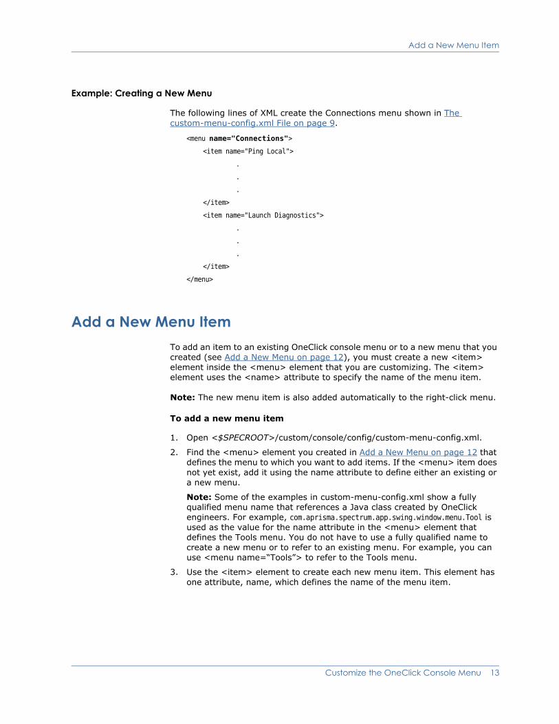
Example: Creating a New Menu
The following lines of XML create the Connections menu shown in The custom-menu-config.xml File on page 9.
<menu name="Connections">
<item name="Ping Local">
.
.
.
</item>
<item name="Launch Diagnostics">
.
.
.
</item>
</menu>
Add a New Menu ItemTo add an item to an existing OneClick console menu or to a new menu that you created (see Add a New Menu on page 12), you must create a new <item> element inside the <menu> element that you are customizing. The <item> element uses the <name> attribute to specify the name of the menu item.
Note: The new menu item is also added automatically to the right-click menu.
To add a new menu item
1. Open <$SPECROOT>/custom/console/config/custom-menu-config.xml.
2. Find the <menu> element you created in Add a New Menu on page 12 that defines the menu to which you want to add items. If the <menu> item does not yet exist, add it using the name attribute to define either an existing or a new menu.
Note: Some of the examples in custom-menu-config.xml show a fully qualified menu name that references a Java class created by OneClick engineers. For example, com.aprisma.spectrum.app.swing.window.menu.Tool is used as the value for the name attribute in the <menu> element that defines the Tools menu. You do not have to use a fully qualified name to create a new menu or to refer to an existing menu. For example, you can use <menu name=“Tools”> to refer to the Tools menu.
3. Use the <item> element to create each new menu item. This element has one attribute, name, which defines the name of the menu item.
Customize the OneClick Console Menu 13

Add a New Menu Item
4. The <item> element has a series of child elements that enable you to define how the item behaves. These elements are listed in the table in The custom-menu-config.xml File on page 9, and they are further defined in the rest of this chapter. Use these elements to define the behavior of the menu item you have added.
5. Save the changes you have made to custom-menu-config.xml.
6. To view the new menu items, restart the OneClick Console.
Example: Creating New Menu Items
The following example adds a menu item called Ping Local to a menu called Connections.
<menu name="Connections">
<item name="Ping Local">
<accelerator modifiers="2">VK_I</accelerator>
<action>
<filter>
<has-attribute>AttributeID.NETWORK_ADDRESS</has- attribute>
</filter>
<context>com.aprisma.spectrum.app.topo.client.render.ModelContext
</context>
<context>com.aprisma.spectrum.app.alarm.client.group.AlarmContext
</context>
<launch-application>
<platform>
<os-name>Windows 9x</os-name>
<command>command.com /c start "Local ping {0}" cmd.exe /c "ping.exe {0} && pause"</command>
</platform>
<platform>
<os-name>Windows</os-name>
<command>cmd.exe /c start "Local ping {0}" cmd.exe /c "ping.exe {0} && pause"</command>
</platform>
<platform>
<command>/usr/dt/bin/dtterm -e ping -s {0}</command>
</platform>
<param>
<attribute>AttributeID.NETWORK_ADDRESS</attribute>
</param>
</launch-application>
</action>
</item>
</menu>
14 OneClick Customization Guide
Add a New Menu Item
Add Toolbar Images
In order to have a toolbar image available for each of the three toolbar image states, you must specify them in your menu item definition. The elements for toolbar states are:
<toolbar-image>
<toolbar-image-rollover>
<toolbar-image-disabled>
You can use the following image formats for OneClick toolbar images: .png, .gif, .jpg, and .jpeg.
The recommended toolbar image size is 24 x 24 pixels. Store custom images in the <$SPECROOT>/custom/images directory. When you reference an image placed in this directory, specify the path from the images directory, for example, images/myimage.png. The following line of code specifies a toolbar image using the relative path to the image file.
<toolbar-image>images/hints.gif</toolbar-image>
For a listing of all of the elements used in defining OneClick menu items, see the table in Contextually Apply the Action on page 16.
Define a Keyboard Accelerator
The <accelerator> element specifies a combination of keyboard input that executes a corresponding menu item.
Specify the code for the accelerator key using the capitalized letter on the keyboard, preceded by “VK_”.
The modifiers attribute indicates the modifier key combinations as an integer where:
1 = Shift
2 = Ctrl
3 = Ctrl+Shift
8 = Alt
9 = Alt+Shift
10 = Ctrl+Alt
You are not required to specify a keyboard accelerator for a customized menu item.
<accelerator modifiers="2">VK_L</accelerator>
In the preceding example, the menu item’s specified action (see Perform an Action on page 16) is performed if the 'L' key is pressed while holding down the Control key (Ctrl+L).
Customize the OneClick Console Menu 15
Add a New Menu Item
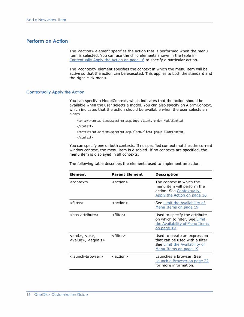
Perform an Action
The <action> element specifies the action that is performed when the menu item is selected. You can use the child elements shown in the table in Contextually Apply the Action on page 16 to specify a particular action.
The <context> element specifies the context in which the menu item will be active so that the action can be executed. This applies to both the standard and the right-click menu.
Contextually Apply the Action
You can specify a ModelContext, which indicates that the action should be available when the user selects a model. You can also specify an AlarmContext, which indicates that the action should be available when the user selects an alarm.
<context>com.aprisma.spectrum.app.topo.client.render.ModelContext
</context>
<context>com.aprisma.spectrum.app.alarm.client.group.AlarmContext
</context>
You can specify one or both contexts. If no specified context matches the current window context, the menu item is disabled. If no contexts are specified, the menu item is displayed in all contexts.
The following table describes the elements used to implement an action.
Element Parent Element Description
<context> <action> The context in which the menu item will perform the action. See Contextually Apply the Action on page 16.
<filter> <action> See Limit the Availability of Menu Items on page 19.
<has-attribute> <filter> Used to specify the attribute on which to filter. See Limit the Availability of Menu Items on page 19.
<and>, <or>, <value>, <equals>
<filter> Used to create an expression that can be used with a filter. See Limit the Availability of Menu Items on page 19.
<launch-browser> <action> Launches a browser. See Launch a Browser on page 22 for more information.
16 OneClick Customization Guide
Add a New Menu Item
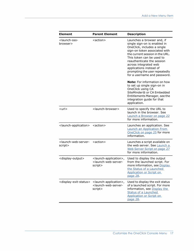
<launch-sso- browser>
<action> Launches a browser and, if single sign-on is enabled in OneClick, includes a single sign-on token associated with the current session in the URL. This token can be used to reauthenticate the session across integrated web applications instead of prompting the user repeatedly for a username and password.
Note: For information on how to set up single sign-on in OneClick using CA SiteMinder® or CA Embedded Entitlements Manager, see the integration guide for that application.
<url> <launch-browser> Used to specify the URL to launch in the browser. See Launch a Browser on page 22 for more information.
<launch-application> <action> Launches an application. See Launch an Application From OneClick on page 25 for more information.
<launch-web-server-script>
<action> Launches a script available on the web server. See Launch a Web Server Script on page 27 for more information.
<display-output> <launch-application>, <launch-web-server- script>
Used to display the output from the launched script. For more information, see Display the Status of a Launched Application or Script on page 28.
<display-exit-status> <launch-application>, <launch-web-server- script>
Used to display the exit status of a launched script. For more information, see Display the Status of a Launched Application or Script on page 28.
Element Parent Element Description
Customize the OneClick Console Menu 17
Add a New Menu Item
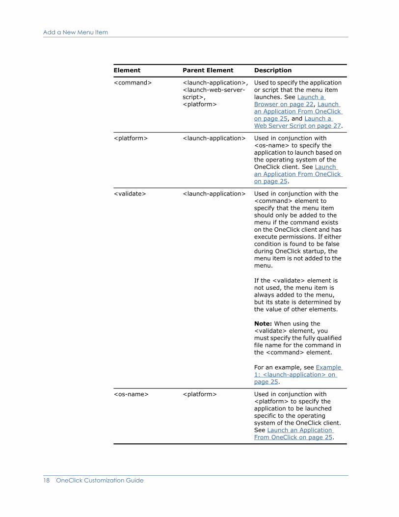
<command> <launch-application>, <launch-web-server- script>, <platform>
Used to specify the application or script that the menu item launches. See Launch a Browser on page 22, Launch an Application From OneClick on page 25, and Launch a Web Server Script on page 27.
<platform> <launch-application> Used in conjunction with <os-name> to specify the application to launch based on the operating system of the OneClick client. See Launch an Application From OneClick on page 25.
<validate> <launch-application> Used in conjunction with the <command> element to specify that the menu item should only be added to the menu if the command exists on the OneClick client and has execute permissions. If either condition is found to be false during OneClick startup, the menu item is not added to the menu.
If the <validate> element is not used, the menu item is always added to the menu, but its state is determined by the value of other elements.
Note: When using the <validate> element, you must specify the fully qualified file name for the command in the <command> element.
For an example, see Example 1: <launch-application> on page 25.
<os-name> <platform> Used in conjunction with <platform> to specify the application to be launched specific to the operating system of the OneClick client. See Launch an Application From OneClick on page 25.
Element Parent Element Description
18 OneClick Customization Guide
Add a New Menu Item
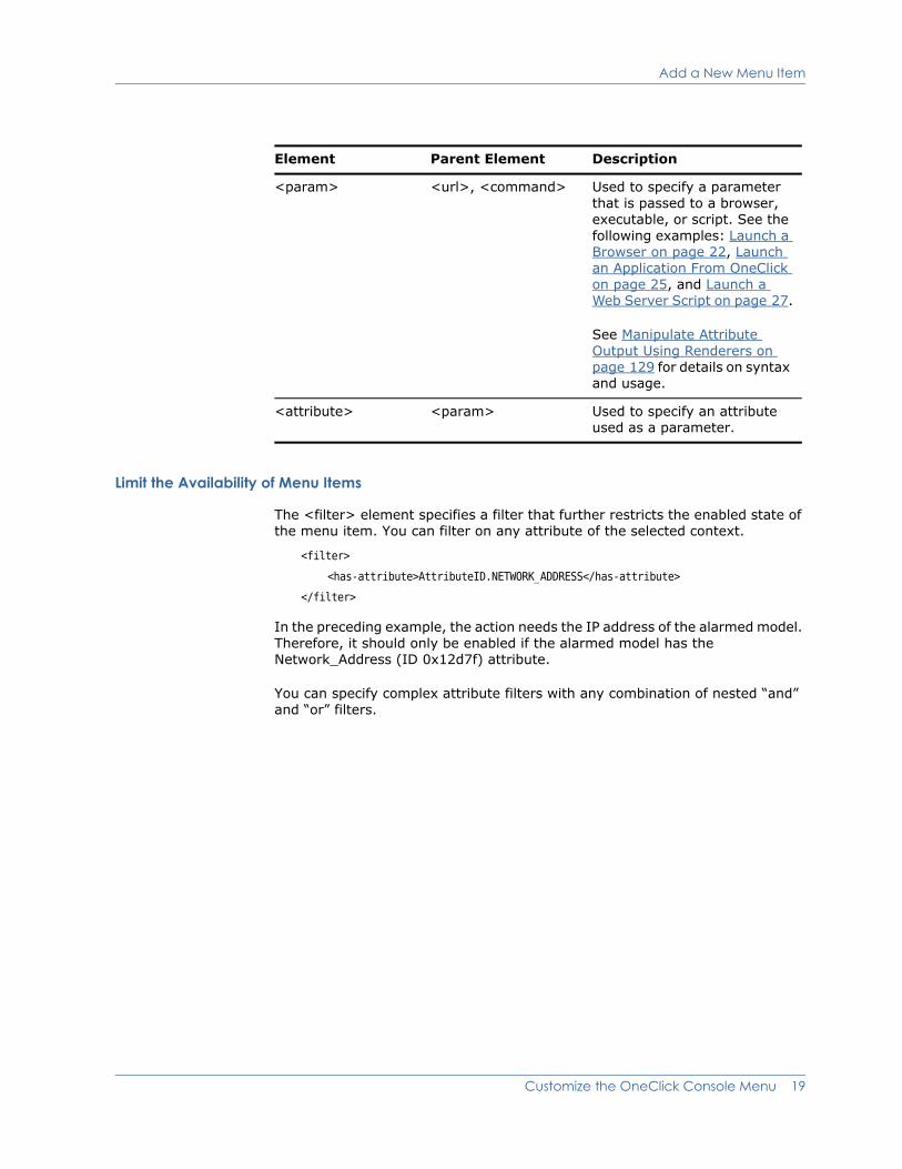
Limit the Availability of Menu Items
The <filter> element specifies a filter that further restricts the enabled state of the menu item. You can filter on any attribute of the selected context.
<filter>
<has-attribute>AttributeID.NETWORK_ADDRESS</has-attribute>
</filter>
In the preceding example, the action needs the IP address of the alarmed model. Therefore, it should only be enabled if the alarmed model has the Network_Address (ID 0x12d7f) attribute.
You can specify complex attribute filters with any combination of nested “and” and “or” filters.
<param> <url>, <command> Used to specify a parameter that is passed to a browser, executable, or script. See the following examples: Launch a Browser on page 22, Launch an Application From OneClick on page 25, and Launch a Web Server Script on page 27.
See Manipulate Attribute Output Using Renderers on page 129 for details on syntax and usage.
<attribute> <param> Used to specify an attribute used as a parameter.
Element Parent Element Description
Customize the OneClick Console Menu 19

Add a New Menu Item
Example: Nesting Filters
The following example enables the item if the selected model has the Network_Address attribute and the Condition (ID 0x1000a) attribute is RED.
<filter>
<and>
<has-attribute>AttributeID.NETWORK_ADDRESS</has-attribute>
<equals>
<attribute id="AttributeID.CONDITION">
<value>3</value> <!--red-->
</attribute>
</equals>
</and>
</filter>
The file <$SPECROOT>/tomcat/webapps/spectrum/WEB-INF/common/schema/ attribute-filter.xsd contains the complete syntax for attribute filters.
The following table defines commonly used attributes where an attribute ID is expected.
Constant Attribute
AttributeID.NETWORK_ADDRESS Network Address (ID 0x12d7f)
AttributeID.MTYPE_ID Model Type Handle (ID 0x129ab)
AttributeID.MTYPE_NAME Model Type Name (ID 0x10000)
AttributeID.MODEL_OBJECT Model Handle (ID 0x11f53)
AttributeID.MODEL_NAME Model Name (ID 0x1006e)
AttributeID.MODEL_CLASS Model Class (ID 0x11ee8)
AttributeID.CONDITION Condition (ID 0x1000a)
AttributeID.DOMAIN_ID Landscape Handle (ID 0x129ac)
AttributeID.DOMAIN_NAME Landscape Name (ID 0x11d42)
AttributeID.MAC_ADDRESS MAC Address (ID 0x110df)
AttributeID.DEVICE_TYPE Device Type (ID 0x23000e)
20 OneClick Customization Guide
Add a New Menu Item
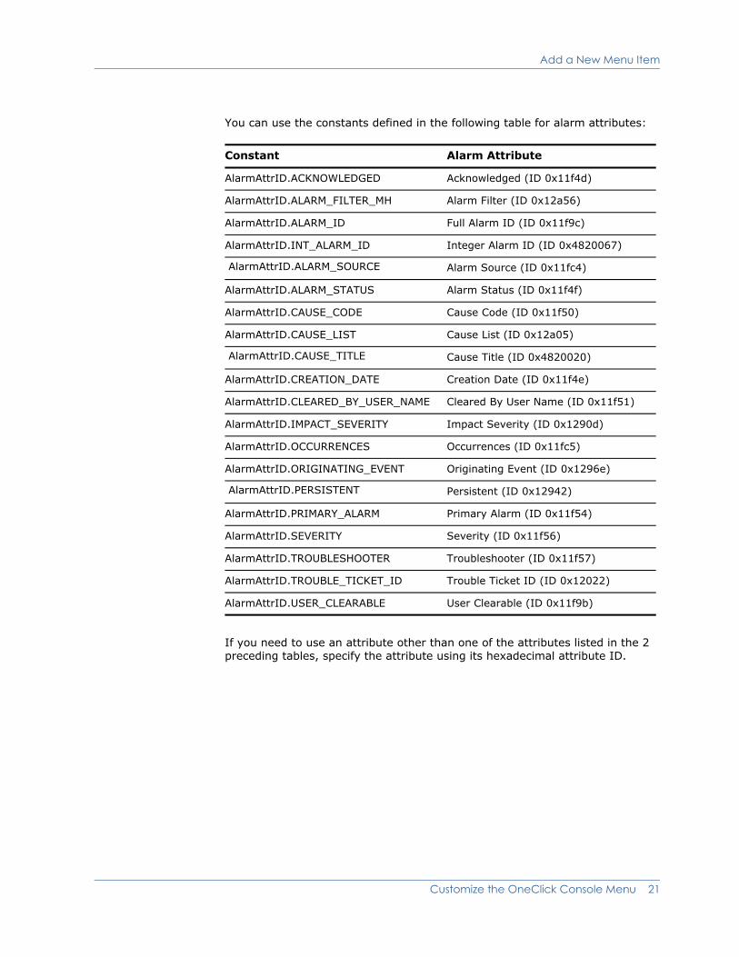
You can use the constants defined in the following table for alarm attributes:
If you need to use an attribute other than one of the attributes listed in the 2 preceding tables, specify the attribute using its hexadecimal attribute ID.
Constant Alarm Attribute
AlarmAttrID.ACKNOWLEDGED Acknowledged (ID 0x11f4d)
AlarmAttrID.ALARM_FILTER_MH Alarm Filter (ID 0x12a56)
AlarmAttrID.ALARM_ID Full Alarm ID (ID 0x11f9c)
AlarmAttrID.INT_ALARM_ID Integer Alarm ID (ID 0x4820067)
AlarmAttrID.ALARM_SOURCE Alarm Source (ID 0x11fc4)
AlarmAttrID.ALARM_STATUS Alarm Status (ID 0x11f4f)
AlarmAttrID.CAUSE_CODE Cause Code (ID 0x11f50)
AlarmAttrID.CAUSE_LIST Cause List (ID 0x12a05)
AlarmAttrID.CAUSE_TITLE Cause Title (ID 0x4820020)
AlarmAttrID.CREATION_DATE Creation Date (ID 0x11f4e)
AlarmAttrID.CLEARED_BY_USER_NAME Cleared By User Name (ID 0x11f51)
AlarmAttrID.IMPACT_SEVERITY Impact Severity (ID 0x1290d)
AlarmAttrID.OCCURRENCES Occurrences (ID 0x11fc5)
AlarmAttrID.ORIGINATING_EVENT Originating Event (ID 0x1296e)
AlarmAttrID.PERSISTENT Persistent (ID 0x12942)
AlarmAttrID.PRIMARY_ALARM Primary Alarm (ID 0x11f54)
AlarmAttrID.SEVERITY Severity (ID 0x11f56)
AlarmAttrID.TROUBLESHOOTER Troubleshooter (ID 0x11f57)
AlarmAttrID.TROUBLE_TICKET_ID Trouble Ticket ID (ID 0x12022)
AlarmAttrID.USER_CLEARABLE User Clearable (ID 0x11f9b)
Customize the OneClick Console Menu 21
Add a New Menu Item
Launch a Browser
The <launch-browser> element enables you to launch a specified URL in a browser and pass parameters to the URL. These parameters can be hard-coded values or values from model attributes.
Example: <launch-browser> Code
The following example launches the default browser on the client machine. The <url> element specifies the URL pattern. You can specify parameters to substitute in the URL pattern by enclosing the parameter number (starting at 0) in curly braces {}. You then specify <param> elements for each parameter.
<launch-browser>
<url>http://{0}</url>
<param>
<attribute>AttributeID.NETWORK_ADDRESS</attribute>
</param>
</launch-browser>
SPECTRUM processes the <param> elements in order so the first one corresponds to the 0th parameter in the URL pattern. A <param> element has a specific syntax (see About Parameters on page 127). The most commonly used is the <attribute> element. This element substitutes the value of the specified attribute for the selected context. In the preceding example, the value of the Network Address attribute is substituted in the URL pattern. For more complex parameters, see the definition of <param-type> in the file.
<$SPECROOT>/tomcat/webapps/spectrum/WEB-INF/common/schema/basic-config.xsd
Important Information About Specifying URLs
Use Standard Characters. Whenever a URL is specified in XML customization code for OneClick, the URL formatting must adhere to the standards published in the Internet Engineering Task Force (IETF) RFC 1738. Use of non-standard characters in URLs results in unreliable browser performance including the browser not locating the specified web page.
URL Encoding of Spaces and Commas. If you are using spaces or commas, or other "reserved" or "unsafe" characters in URLs (see the tables later in this section), convert them to their ASCII equivalent value with the proper URL encoding. URL encoding of a character consists of a "%" symbol, followed by the two-digit hexadecimal representation (case-insensitive) of the ISO-Latin code point for the character. Examples for "space" and "comma" are:
For spaces, use %20
For commas, use %2C
Note: Some browsers may encounter problems processing URLs even when using this encoding.
22 OneClick Customization Guide
Add a New Menu Item
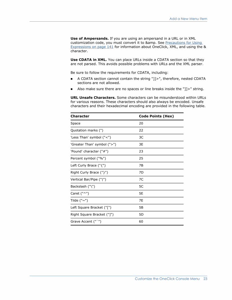
Use of Ampersands. If you are using an ampersand in a URL or in XML customization code, you must convert it to &. See Precautions for Using Expressions on page 141 for information about OneClick, XML, and using the & character.
Use CDATA in XML. You can place URLs inside a CDATA section so that they are not parsed. This avoids possible problems with URLs and the XML parser.
Be sure to follow the requirements for CDATA, including:
A CDATA section cannot contain the string "]]>", therefore, nested CDATA sections are not allowed.
Also make sure there are no spaces or line breaks inside the "]]>" string.
URL Unsafe Characters. Some characters can be misunderstood within URLs for various reasons. These characters should also always be encoded. Unsafe characters and their hexadecimal encoding are provided in the following table.
Character Code Points (Hex)
Space 20
Quotation marks (") 22
'Less Than' symbol ("<") 3C
'Greater Than' symbol (">") 3E
'Pound' character ("#") 23
Percent symbol ("%") 25
Left Curly Brace ("{") 7B
Right Curly Brace ("}") 7D
Vertical Bar/Pipe ("|") 7C
Backslash ("\") 5C
Caret ("^") 5E
Tilde ("~") 7E
Left Square Bracket ("[") 5B
Right Square Bracket ("]") 5D
Grave Accent ("`") 60
Customize the OneClick Console Menu 23
Add a New Menu Item
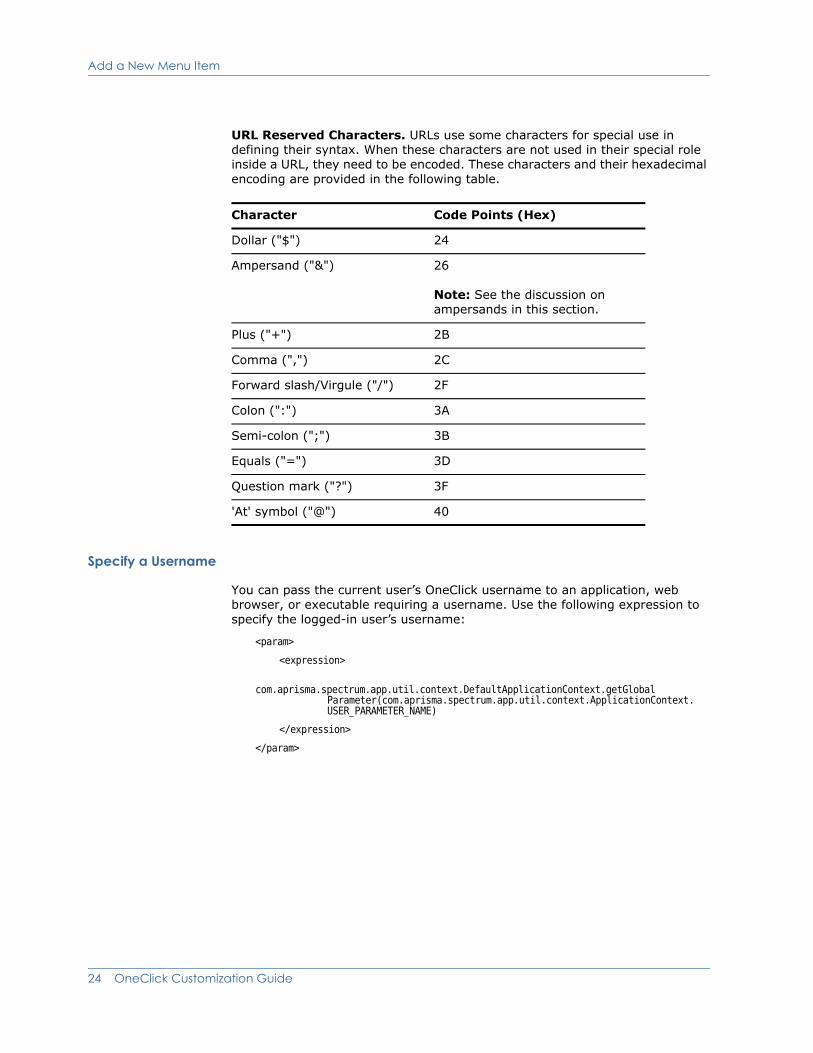
URL Reserved Characters. URLs use some characters for special use in defining their syntax. When these characters are not used in their special role inside a URL, they need to be encoded. These characters and their hexadecimal encoding are provided in the following table.
Specify a Username
You can pass the current user’s OneClick username to an application, web browser, or executable requiring a username. Use the following expression to specify the logged-in user’s username:
<param>
<expression>
com.aprisma.spectrum.app.util.context.DefaultApplicationContext.getGlobal Parameter(com.aprisma.spectrum.app.util.context.ApplicationContext. USER_PARAMETER_NAME)
</expression>
</param>
Character Code Points (Hex)
Dollar ("$") 24
Ampersand ("&") 26
Note: See the discussion on ampersands in this section.
Plus ("+") 2B
Comma (",") 2C
Forward slash/Virgule ("/") 2F
Colon (":") 3A
Semi-colon (";") 3B
Equals ("=") 3D
Question mark ("?") 3F
'At' symbol ("@") 40
24 OneClick Customization Guide

Add a New Menu Item
Example: Pass Username to Browser
The following example launches a browser to a specified URL and passes the username to the browser.
<launch-browser>
<url> http://acme.com?user={0}</url>
<param>
<expression>
com.aprisma.spectrum.app.util.context.DefaultApplicationContext.getGlobalParameter(com.aprisma.spectrum.app.util.context.ApplicationContext.USER_PARAMETER_NAME)
</expression>
</param>
</launch-browser>
Launch an Application From OneClick
The <launch-application> element enables you to launch a specified command or executable.
Example 1: <launch-application>
The following example launches an application called myapp on the client machine and passes in the IP address of the selected model. As with the <launch-browser> action, you can substitute any number of parameters.
<launch-application>
<command>myapp {0}</command>
<param>
<attribute>AttributeID.NETWORK_ADDRESS</attribute>
</param>
</launch-application>
The <command> element specifies the command or executable to execute. You can provide the path to the command or executable in one of two ways:
You can specify the path on each client via an environment variable. To do this in the Solaris environment, use the PATH environment variable. To create an environment variable in the Windows environment, select My Computer > Properties > Advanced, and then choose the Environment Variables button.
You can specify an absolute path to the command or executable. If you do this, keep in mind that the path must be the same on each OneClick client. Path statements in the Windows environment should use a double backslash instead of a single backslash, for example:
C:\\Windows\\system32\\cmd.exe
Note: You can use the <validate> element to verify that the command or executable exists on the OneClick client and has execute permissions. If either of these conditions is found to be false during OneClick startup, the
Customize the OneClick Console Menu 25
Add a New Menu Item
associated menu item is not added to the OneClick menu. (If the <validate> element is not used, the menu item is always added to the menu, but its state is determined by the value of other elements.)
If you use the <validate> element, you must specify an absolute path in the <command> element, as shown in the following example:
<launch-application>
<command>c:\\windows\\system32\\notepad.exe</command>
<validate/>
</launch-application>
The <command> element must conform to the following syntax rules:
The command arguments are delimited by only spaces. If you would like to have a space within an argument, you must either place quotes around the argument or use the escape character '\' prior to the internal space(s).
If you would like to embed quotes within an argument, you must place the escape character '\' prior to the quote.
If any of your command arguments contain commas, SPECTRUM will automatically place the argument within quotes. This is important to know in case you are going to parse an argument that is a numeric value that contains commas.
SPECTRUM replaces arguments that return null or have a string length of zero with empty quotes (“ ” ).
Example 2: <launch-application>
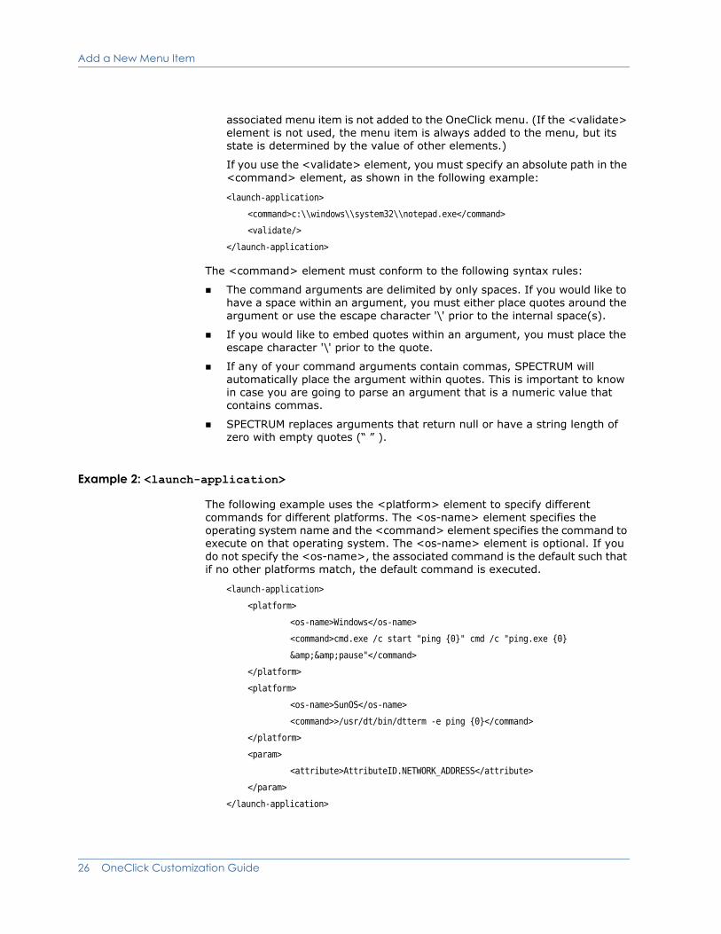
The following example uses the <platform> element to specify different commands for different platforms. The <os-name> element specifies the operating system name and the <command> element specifies the command to execute on that operating system. The <os-name> element is optional. If you do not specify the <os-name>, the associated command is the default such that if no other platforms match, the default command is executed.
<launch-application>
<platform>
<os-name>Windows</os-name>
<command>cmd.exe /c start "ping {0}" cmd /c "ping.exe {0}
&&pause"</command>
</platform>
<platform>
<os-name>SunOS</os-name>
<command>>/usr/dt/bin/dtterm -e ping {0}</command>
</platform>
<param>
<attribute>AttributeID.NETWORK_ADDRESS</attribute>
</param>
</launch-application>
26 OneClick Customization Guide
Add a New Menu Item
At runtime, SPECTRUM compares the specified OS names to the OS name returned by the “os.name” Java property. SPECTRUM uses a best-match algorithm so only a prefix of the OS name need be specified. You may specify any of the following OS names:
SunOS for the Solaris platform
Windows for all Windows platforms
Windows 9x for Windows 95/98
Windows 2000 for Windows 2000
Windows 2003 for Windows 2003
Windows XP for Windows XP
Windows Vista for Windows Vista and Windows Server 2008
Linux for the Linux platform
Mac for the Macintosh platform
If no specified platforms match, the associated menu item will be disabled.
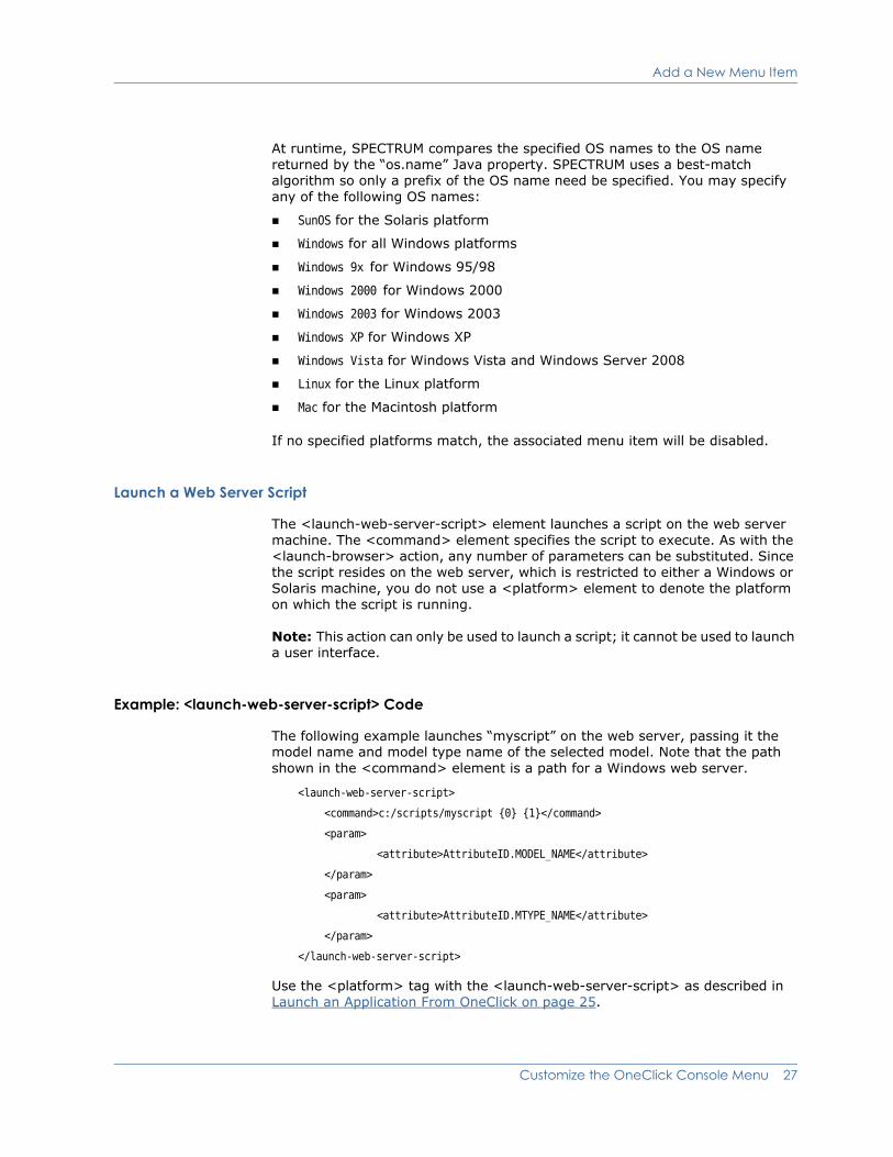
Launch a Web Server Script
The <launch-web-server-script> element launches a script on the web server machine. The <command> element specifies the script to execute. As with the <launch-browser> action, any number of parameters can be substituted. Since the script resides on the web server, which is restricted to either a Windows or Solaris machine, you do not use a <platform> element to denote the platform on which the script is running.
Note: This action can only be used to launch a script; it cannot be used to launch a user interface.
Example: <launch-web-server-script> Code
The following example launches “myscript” on the web server, passing it the model name and model type name of the selected model. Note that the path shown in the <command> element is a path for a Windows web server.
<launch-web-server-script>
<command>c:/scripts/myscript {0} {1}</command>
<param>
<attribute>AttributeID.MODEL_NAME</attribute>
</param>
<param>
<attribute>AttributeID.MTYPE_NAME</attribute>
</param>
</launch-web-server-script>
Use the <platform> tag with the <launch-web-server-script> as described in Launch an Application From OneClick on page 25.
Customize the OneClick Console Menu 27

Add a New Menu Item
Display the Status of a Launched Application or Script
Use the <display-exit-status> and <display-output> elements with <launch-web-server-script> and <launch-application> to display the exit status and the output from the script or application.
By default <display-exit-status> displays “Success” if the exit code is 0 and “Failed with error code #” otherwise. You can change the default behavior by specifying <status> child tags that map an exit code to a custom message to display.
Example: <display-exit-status> Code
Examine the following example using <display-exit-status>:
<display-exit-status>
<status code="1">Could not open file</status>
<status code="2">Bad parameter</status>
<status code="3">Could not connect to the server</status>
<status default="true">Unknown error code {0}</status>
</display-exit-status>
This example maps status codes 1, 2, and 3 to specific message strings. The last status code specifies default=“true”, mapping all other error codes except 0, which by default maps to “Success”. If exit code 0 does not indicate success, you can override it with a <status> tag. The {0} in the message string will substitute the exit code.
By default, <display-output> displays both the standard output and standard error output from the process. You can display only the standard output by specifying:
<display-output stdout="t"/>
or only the standard error output by specifying:
<display-output stderr="t"/>
Note: The <display-exit-status> and <display-output> elements can only be used for command line applications or scripts and not GUI applications. OneClick waits for the script to complete before being available to the user again.
28 OneClick Customization Guide

Chapter 3: Customize OneClick Alarms
You can create custom alarm attributes and add them to the Alarm table and Information views.
Adding customized alarm attributes that display in OneClick is a multi-step process that requires using the Model Type Editor and the Alarm Preferences dialog, in addition to modifying the Alarm table and the Alarm Information view to display the custom alarm attributes. The following steps outline the high level process required to create and then view custom alarm attributes.
1. Create the custom alarm attributes by adding them to the GlobalAlarm model type using the Model Type Editor. The attribute group ID value must be set to equal 11f4c.
The Model Type Editor User Guide (0659) provides complete instructions on accessing and using the Model Type Editor. Refer to this guide for information on how to add custom alarm attributes to the GlobalAlarm model type.
2. Add a column to the Alarm table that displays the new customized alarm attribute by customizing the alarm-table-config.xml file. Modify Table Columns on page 31 provides an example showing how to add a column to a table configuration file.
3. Add a field to the Alarm Details view configuration that displays the alarm attribute in the alarm’s Information tab by customizing the view-alarmdetails-config.xml file. Extend or Modify an Information View on page 90 provides information and examples on how to add a subview to an existing information view.
4. You can also apply a custom privilege to the new alarm attribute by customizing the custom-privileges.xml file. Doing this limits which users or user groups or specific privileges are required to view the customized alarms. See Chapter 8: Create Custom Privileges for details on applying custom privileges.
The name of the privilege must use the following syntax:
alarm-write-<attribute ID in hex>
Customize OneClick Alarms 29
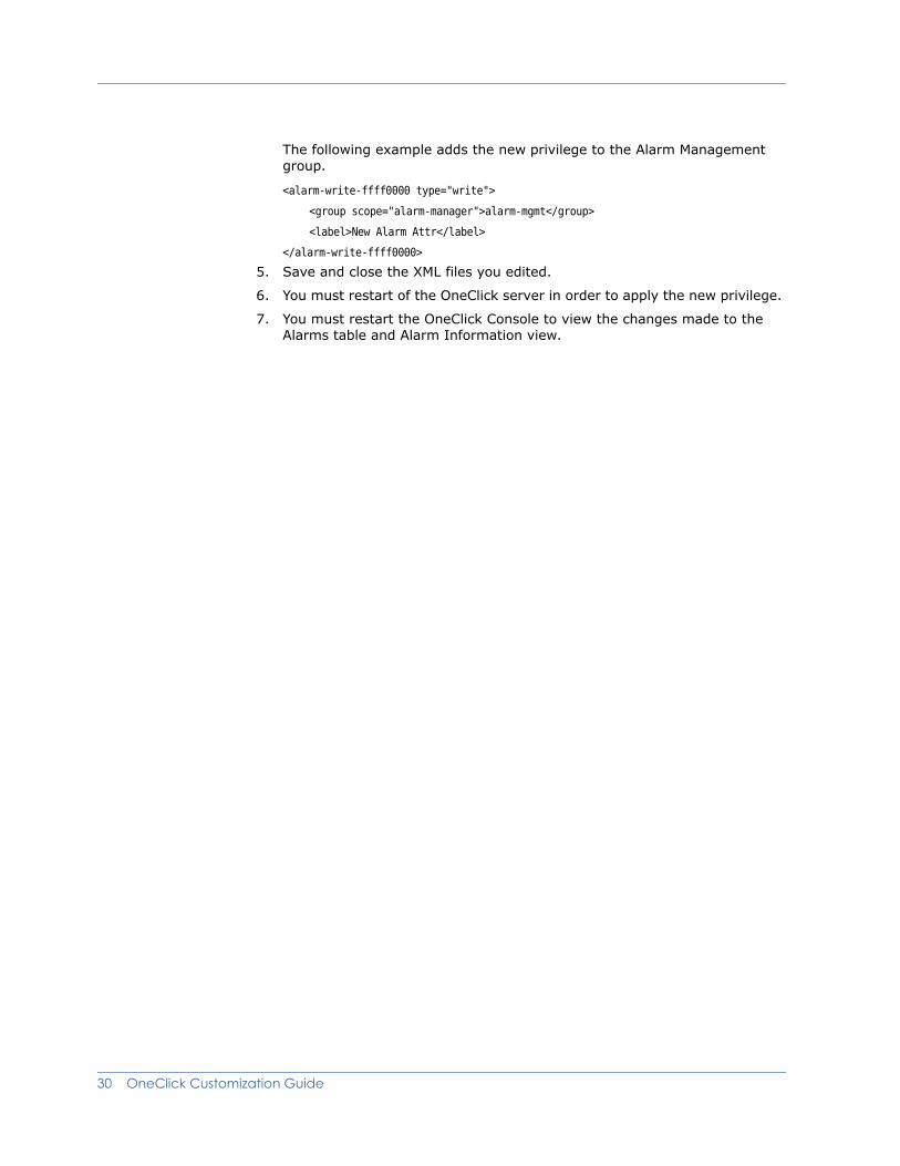
The following example adds the new privilege to the Alarm Management group.
<alarm-write-ffff0000 type="write">
<group scope="alarm-manager">alarm-mgmt</group>
<label>New Alarm Attr</label>
</alarm-write-ffff0000>
5. Save and close the XML files you edited.
6. You must restart of the OneClick server in order to apply the new privilege.
7. You must restart the OneClick Console to view the changes made to the Alarms table and Alarm Information view.
30 OneClick Customization Guide
Chapter 4: Customize OneClick Tables
This chapter discusses some of the ways that you can modify existing tables found in the OneClick Console. A list of the table elements available in OneClick and their descriptions are presented in Example: Defining a Table Column on page 34. Specific examples for modifying table columns are presented in the sections listed below.
Modify Table ColumnsIf you want to display additional attributes in a OneClick console table, you can do so by making modifications to the XML using a customization file. The modifications need to be made in a separate XML file in the appropriate directory under <$SPECROOT>/custom/.
Extend a Factory Default File Using IDREF
OneClick requires that you write your customization code in a new file located in the <$SPECROOT>/custom/topo/config directory that uses the same name as the factory default file that builds the table you are modifying. Use the IDREF attribute to “reference” the factory file and extend it with the new customization file. See Create Customizations on page 4 for details on creating customization files in OneClick.
Customize OneClick Tables 31

Modify Table Columns
Example: Referencing a Column File from a Table Configuration File
The following example shows a portion of an XML file used to define a table. Rather than defining each column in the same file that defines the entire table, the example uses separate files to define the first two columns in the table. The example uses the idref attribute with each <column> element to link to the file that defines the column.
<table id="table-licenses-config"
xmlns="http://www.aprisma.com"
xmlns:xsi="http://www.w3.org/2001/XMLSchema-instance"
xsi:schemaLocation="http://www.aprisma.com
../../common/schema/table-config.xsd">
<swing-row-template>
<enumerated-color idref="alternatingrow-color-config"/>
</swing-row-template>
<swing-table-template>
<show-vertical-lines>true</show-vertical-lines>
<show-horizontal-lines>false</show-horizontal-lines>
</swing-table-template>
<swing-header-row-template>
<static-color idref="row-header-color-config"/>
</swing-header-row-template>
<column-list>
<column idref="column-servicestate-config"/>
<column idref="column-modelname-config">
<default-width>300</default-width>
</column>
</column-list>
.
.
</table>
The first column is defined in the column-servicestate-config.xml file. The beginning portion of this file is shown below. Note the id attribute used with the <column> element to define this file as “column-servicestate-config”.
<column id="column-servicestate-config"
xmlns="http://www.aprisma.com"
xmlns:xsi="http://www.w3.org/2001/XMLSchema-instance"
xsi:schemaLocation="http://www.aprisma.com
../../common/schema/table-config.xsd">
32 OneClick Customization Guide

Modify Table Columns
Modify a Table Column
The following steps describe the general process for modifying table columns in OneClick. Specific examples are provided in the following sections.
Procedure
1. Identify the default factory XML file that builds the table that you want to modify.
Many of the table files used to display data in the OneClick console are located in <$SPECROOT>/tomcat/webapps/spectrum/WEB-INF/topo/config. All of the table files are named for the functionality that they display. For example, the table used to display interface information for each model is called table-common-ifconfig-config.xml.
2. Create the file in which to add your modifications.
In this example the default file is <$SPECROOT>/tomcat/webapps/spectrum/WEB-INF/topo/ configtable-common-ifconfig-config.xml. Create a file with the same name in the <$SPECROOT>/custom/topo/config directory. If a file with that name already exists in this directory, that is an indication that previous customizations have been made to this table. In this case, add your customized code to the existing file.
3. Open the file in a text editor in order to make the appropriate modifications.
4. Use idref to reference the table configuration you are extending with this new column configuration (see step 1).
5. Construct a new column using the XML elements defined in Example: Defining a Table Column on page 34. The example that follows this procedure shows how some of these elements are used to define a column.
6. Find the <column-list> element in the XML file. The <column-list> element contains all of the <column> elements used to define each column in the table.
7. Define a <column> element within the <column-list> element. The columns display in the order they appear within the <column-list> element.
8. Insert the <name> element to define the title of the column.
9. Insert a <content> and an <attribute> element to define the contents you want to display in the column.
10. (Optional) Use the <default-width> element to define the default width of the column.
11. Save and close the modified file, and restart the OneClick console to view the changes.
Customize OneClick Tables 33

Modify Table Columns
Example: Defining a Table Column<column-list>
<column>
<name>Interface</name>
<content>
<attribute>0x100c4</attribute>
</content>
<default-width>30</default-width>
</column>
.
.
.
</column-list>
The following table describes the elements used for modifying a table.
Element Parent Element Description
<table> Not applicable This is the root element, and encloses all child elements used to create a table.
<swing-table-template> <table> Used to define the appearance of the table.
<show-vertical-lines> <swing-table- template>
Defines whether to show vertical lines in the table, values are true or false.
<show-horizontal-lines> <swing-table- template>
Defines whether to show horizontal lines in the table, values are true or false.
<line-color> <swing-table- template>
Defines the color of the lines used to create the table. The default value is light-background_color. Other values can be found in the <$SPECROOT>/tomcat/webapps/spectrum/WEB-INF/console/common/config/ common-color-config.xml file.
<show-tree-lines> <swing-table- template>
Defines whether the table will be shown with dashed lines connecting tree nodes, values are true or false.
<preferred-width> <swing-table- template>
Defines (in pixels) the default width of the table.
34 OneClick Customization Guide
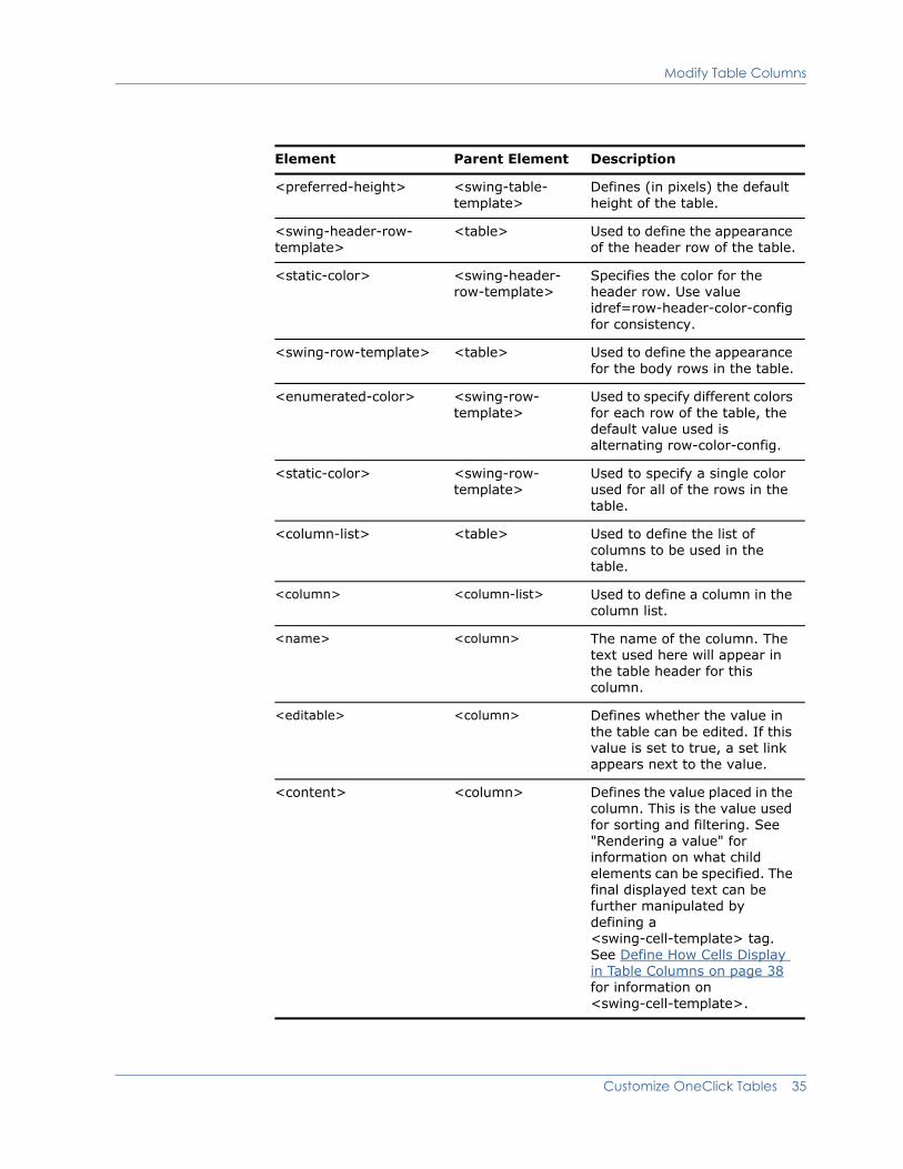
Modify Table Columns
<preferred-height> <swing-table- template>
Defines (in pixels) the default height of the table.
<swing-header-row- template>
<table> Used to define the appearance of the header row of the table.
<static-color> <swing-header- row-template>
Specifies the color for the header row. Use value idref=row-header-color-config for consistency.
<swing-row-template> <table> Used to define the appearance for the body rows in the table.
<enumerated-color> <swing-row- template>
Used to specify different colors for each row of the table, the default value used is alternating row-color-config.
<static-color> <swing-row- template>
Used to specify a single color used for all of the rows in the table.
<column-list> <table> Used to define the list of columns to be used in the table.
<column> <column-list> Used to define a column in the column list.
<name> <column> The name of the column. The text used here will appear in the table header for this column.
<editable> <column> Defines whether the value in the table can be edited. If this value is set to true, a set link appears next to the value.
<content> <column> Defines the value placed in the column. This is the value used for sorting and filtering. See "Rendering a value" for information on what child elements can be specified. The final displayed text can be further manipulated by defining a <swing-cell-template> tag. See Define How Cells Display in Table Columns on page 38 for information on <swing-cell-template>.
Element Parent Element Description
Customize OneClick Tables 35
Modify Table Columns
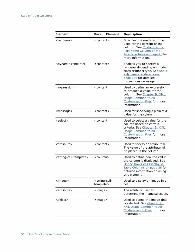
<renderer> <content> Specifies the renderer to be used for the content of the column. See Customize the Port Name Column of the Interface Table on page 48 for more information.
<dynamic-renderer> <content> Enables you to specify a renderer depending on model class or model type. See About <dynamic-renderer> on page 136 for detailed instructions on usage.
<expression> <content> Used to define an expression to produce a value for the column. See Chapter 9: XML Usage Common to All Customization Files for more information.
<message> <content> Used for specifying a plain text value for the column.
<select> <content> Used to select a value for the column based on certain criteria. See Chapter 9: XML Usage Common to All Customization Files for more information.
<attribute> <content> Used to specify an attribute ID. The value of the attribute will be placed in the column.
<swing-cell-template> <column> Used to define how the cell in the column is displayed. See Define How Cells Display in Table Columns on page 38 for detailed information on using this element.
<image> <swing-cell- template>
Used to display an image in a cell.
<attribute> <image> The attribute used to determine the image selection.
<select> <image> Used to define the image that is selected. See Chapter 9: XML Usage Common to All Customization Files for more information.
Element Parent Element Description
36 OneClick Customization Guide

Modify Table Columns
<text> <swing-cell- template>
Used to display a string of text in a cell.
<renderer> <text> The renderer used to manipulate the text. See Customize the Port Name Column of the Interface Table on page 48 for an example. See Manipulate Attribute Output Using Renderers on page 129 for detailed information on OneClick renderers.
<param> <renderer> Specifies any parameters to be used by the renderer. See About Parameters on page 127 for detailed information.
<renderer-class> <swing-cell- template>
The class to use for rendering something other than an image or text.
<editable> <column> Allows the user to edit the value in a column. See Make a Table Column Editable on page 43 for more information.
<hidden-by-default> <column> Use this element to hide the column by default. The user must add the column to the table using the preferences dialog.
<default-width> <column> The default width of the column in pixels.
<default-sort> <column-list> Used in conjunction with the <sort-column-list> element to determine how the table is sorted by default. See Set Up a Default Sort on page 46 for more information.
<sort-column-list> <default-sort> A list of columns that will be sorted on (maximum of three). See Set Up a Default Sort on page 46 for more information.
<sort-column> <sort-column-list> The column to be sorted on. Columns will be sorted in the order that they are listed. See Set Up a Default Sort on page 46 for more information.
Element Parent Element Description
Customize OneClick Tables 37
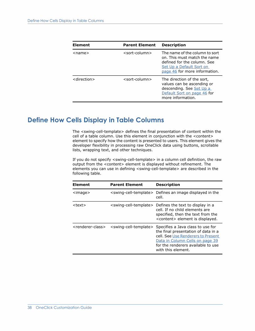
Define How Cells Display in Table Columns
Define How Cells Display in Table ColumnsThe <swing-cell-template> defines the final presentation of content within the cell of a table column. Use this element in conjunction with the <content> element to specify how the content is presented to users. This element gives the developer flexibility in processing raw OneClick data using buttons, scrollable lists, wrapping text, and other techniques.
If you do not specify <swing-cell-template> in a column cell definition, the raw output from the <content> element is displayed without refinement. The elements you can use in defining <swing-cell-template> are described in the following table.
<name> <sort-column> The name of the column to sort on. This must match the name defined for the column. See Set Up a Default Sort on page 46 for more information.
<direction> <sort-column> The direction of the sort, values can be ascending or descending. See Set Up a Default Sort on page 46 for more information.
Element Parent Element Description
Element Parent Element Description
<image> <swing-cell-template> Defines an image displayed in the cell.
<text> <swing-cell-template> Defines the text to display in a cell. If no child elements are specified, then the text from the <content> element is displayed.
<renderer-class> <swing-cell-template> Specifies a Java class to use for the final presentation of data in a cell. See Use Renderers to Present Data in Column Cells on page 39 for the renderers available to use with this element.
38 OneClick Customization Guide

Define How Cells Display in Table Columns
Use Renderers to Present Data in Column Cells
The following Java classes are available to use with <renderer-class> to render or manipulate and format raw data for display in table column cells.
TextAreaCellRenderer
Use this renderer to display text that wraps at the cell width.
Classname: com.aprisma.spectrum.app.swing.table.render.TextAreaCellRenderer
Supported Parameters: None
Example: Displaying Wrapping Text in a Cell
The following example creates a cell that displays text and allows it to wrap at a defined width, displaying in multiple lines of fixed width. This technique is used in the Notes field on the device’s Information tab. Text entered by operators in this field wraps at a predetermined column width.
<swing-cell-template>
<text/>
<renderer-class>
com.aprisma.spectrum.app.swing.table.render.TextAreaCellRenderer
</renderer-class>
</swing-cell-template>
ListAttributeRenderer
Displays the values from a list-type attribute in a scrollable list.
Classname: com.aprisma.spectrum.app.swing.table.render.ListAttributeRenderer
Supported Parameters:
<attrID> - Required parameter. ID of the SPECTRUM attribute displayed in the cell.
<maxRowsToDisplay> - Integer; specifies the maximum number of viewable list entries, scrolling is turned on after this maximum is exceeded.
<order> - True or false; if true, the users can modify the list order if the column is editable.
<add> - True or false; if true, users can add new entries to the list if the column is editable.
<remove> - True or false; if true, users can remove entries from the list if the column is editable.
<valuePrompt> - The text displayed when prompting the user to add a new value to the list. If not specified, a default prompt is used.
Customize OneClick Tables 39
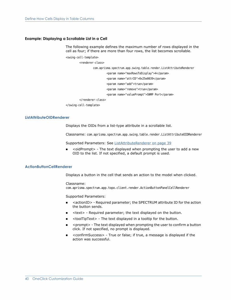
Define How Cells Display in Table Columns
Example: Displaying a Scrollable List in a Cell
The following example defines the maximum number of rows displayed in the cell as four; if there are more than four rows, the list becomes scrollable.
<swing-cell-template>
<renderer-class>
com.aprisma.spectrum.app.swing.table.render.ListAttributeRenderer
<param name="maxRowsToDisplay">4</param>
<param name="attrID">0x25e0039</param>
<param name="add">true</param>
<param name="remove">true</param>
<param name="valuePrompt">SNMP Port</param>
</renderer-class>
</swing-cell-template>
ListAttributeOIDRenderer
Displays the OIDs from a list-type attribute in a scrollable list.
Classname: com.aprisma.spectrum.app.swing.table.render.ListAttributeOIDRenderer
Supported Parameters: See ListAttributeRenderer on page 39
<oidPrompt> - The text displayed when prompting the user to add a new OID to the list. If not specified, a default prompt is used.
ActionButtonCellRenderer
Displays a button in the cell that sends an action to the model when clicked.
Classname: com.aprisma.spectrum.app.topo.client.render.ActionButtonPanelCellRenderer
Supported Parameters:
<actionID> - Required parameter; the SPECTRUM attribute ID for the action the button sends.
<text> - Required parameter; the text displayed on the button.
<toolTipText> - The text displayed in a tooltip for the button.
<prompt> - The text displayed when prompting the user to confirm a button click. If not specified, no prompt is displayed.
<confirmSuccess> - True or false; if true, a message is displayed if the action was successful.
40 OneClick Customization Guide
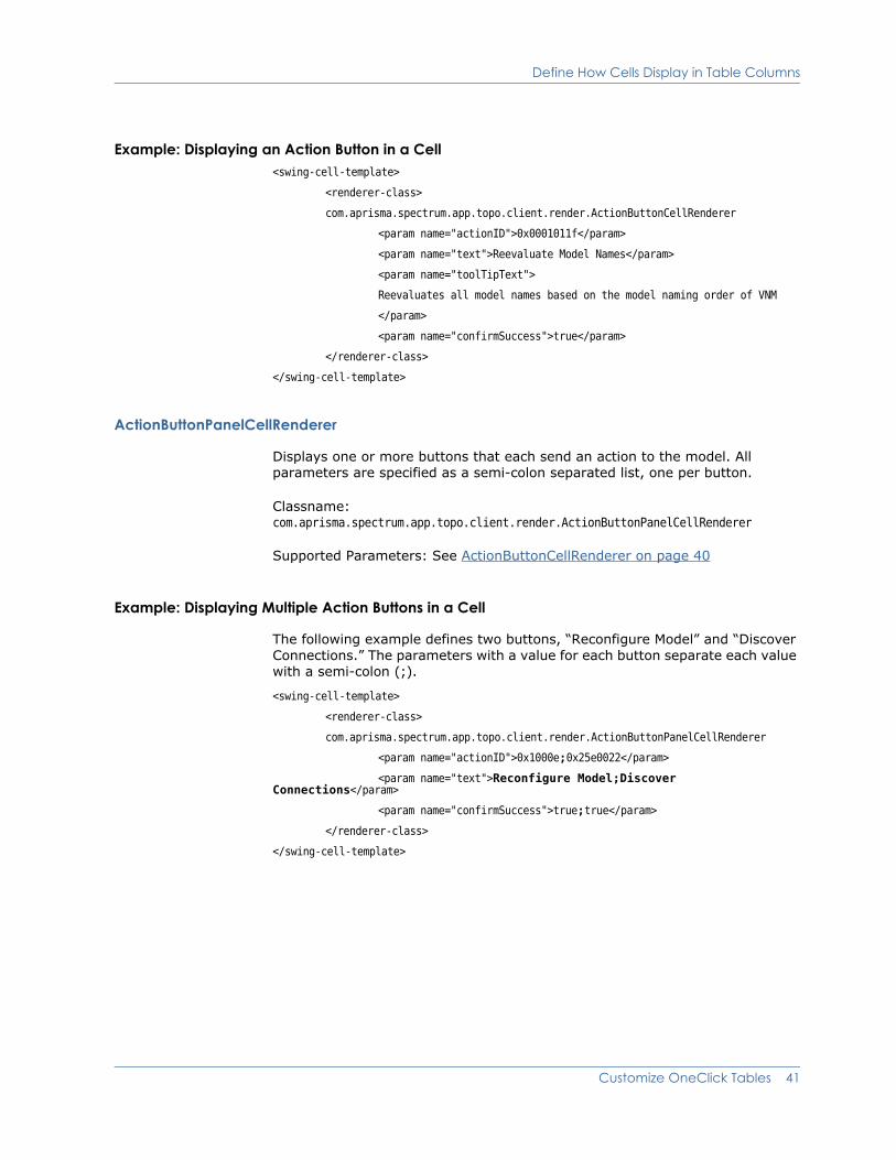
Define How Cells Display in Table Columns
Example: Displaying an Action Button in a Cell<swing-cell-template>
<renderer-class>
com.aprisma.spectrum.app.topo.client.render.ActionButtonCellRenderer
<param name="actionID">0x0001011f</param>
<param name="text">Reevaluate Model Names</param>
<param name="toolTipText">
Reevaluates all model names based on the model naming order of VNM
</param>
<param name="confirmSuccess">true</param>
</renderer-class>
</swing-cell-template>
ActionButtonPanelCellRenderer
Displays one or more buttons that each send an action to the model. All parameters are specified as a semi-colon separated list, one per button.
Classname: com.aprisma.spectrum.app.topo.client.render.ActionButtonPanelCellRenderer
Supported Parameters: See ActionButtonCellRenderer on page 40
Example: Displaying Multiple Action Buttons in a Cell
The following example defines two buttons, “Reconfigure Model” and “Discover Connections.” The parameters with a value for each button separate each value with a semi-colon (;).
<swing-cell-template>
<renderer-class>
com.aprisma.spectrum.app.topo.client.render.ActionButtonPanelCellRenderer
<param name="actionID">0x1000e;0x25e0022</param>
<param name="text">Reconfigure Model;Discover Connections</param>
<param name="confirmSuccess">true;true</param>
</renderer-class>
</swing-cell-template>
Customize OneClick Tables 41
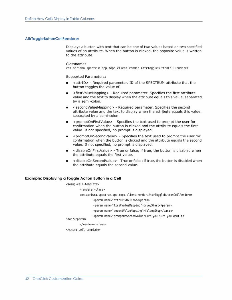
Define How Cells Display in Table Columns
AttrToggleButtonCellRenderer
Displays a button with text that can be one of two values based on two specified values of an attribute. When the button is clicked, the opposite value is written to the attribute.
Classname: com.aprisma.spectrum.app.topo.client.render.AttrToggleButtonCellRenderer
Supported Parameters:
<attrID> - Required parameter. ID of the SPECTRUM attribute that the button toggles the value of.
<firstValueMapping> - Required parameter. Specifies the first attribute value and the text to display when the attribute equals this value, separated by a semi-colon.
<secondValueMapping> - Required parameter. Specifies the second attribute value and the text to display when the attribute equals this value, separated by a semi-colon.
<promptOnFirstValue> - Specifies the text used to prompt the user for confirmation when the button is clicked and the attribute equals the first value. If not specified, no prompt is displayed.
<promptOnSecondValue> - Specifies the text used to prompt the user for confirmation when the button is clicked and the attribute equals the second value. If not specified, no prompt is displayed.
<disableOnFirstValue> - True or false; if true, the button is disabled when the attribute equals the first value.
<disableOnSecondValue> - True or false; if true, the button is disabled when the attribute equals the second value.
Example: Displaying a Toggle Action Button in a Cell<swing-cell-template>
<renderer-class>
com.aprisma.spectrum.app.topo.client.render.AttrToggleButtonCellRenderer
<param name="attrID">0x11b6e</param>
<param name="firstValueMapping">true;Start</param>
<param name="secondValueMapping">false;Stop</param>
<param name="promptOnSecondValue">Are you sure you want to stop?</param>
</renderer-class>
</swing-cell-template>
42 OneClick Customization Guide
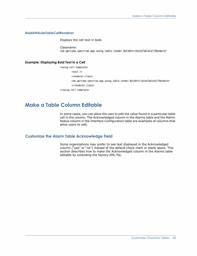
Make a Table Column Editable
BoldAttributeTableCellRenderer
Displays the cell text in bold.
Classname: com.aprisma.spectrum.app.swing.table.render.BoldAttributeTableCellRenderer
Example: Displaying Bold Text in a Cell<swing-cell-template>
<text />
<renderer-class>
com.aprisma.spectrum.app.swing.table.render.BoldAttributeTableCellRenderer
</renderer-class>
</swing-cell-template>
Make a Table Column EditableIn some cases, you can allow the user to edit the value found in a particular table cell in the column. The Acknowledged column in the Alarms table and the Admin Status column in the Interface Configuration table are examples of columns that allow users to edit.
Customize the Alarm Table Acknowledge Field
Some organizations may prefer to see text displayed in the Acknowledged column (“yes” or “no”) instead of the default check mark or blank space. This section describes how to make the Acknowledged column in the Alarms table editable by extending the factory XML file.
Customize OneClick Tables 43

Make a Table Column Editable
The following figure shows the default Acknowledged field in the Alarms table and the Acknowledged field after customizing it to make it editable.
Procedure
1. Check to see if the file <$SPECROOT>/custom/alarm/config/alarm-table-config.xml already exists. It exists in this directory if previous customizations have been made to this file. If the file does not exist, create it.
2. To create an editable Acknowledged column, open the file and add the following XML:
<table idref="alarm-table-config">
<column-list>
<column idref="column-alarmacknowledge-config">
<editable/>
<default-width>37</default-width>
</column>
</column-list>
</table>
This shows how the Acknowledged field in the Alarms table behaves by default.
User can set a Yes or No value once column is editable
44 OneClick Customization Guide
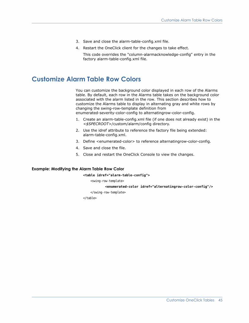
Customize Alarm Table Row Colors
3. Save and close the alarm-table-config.xml file.
4. Restart the OneClick client for the changes to take effect.
This code overrides the "column-alarmacknowledge-config" entry in the factory alarm-table-config.xml file.
Customize Alarm Table Row ColorsYou can customize the background color displayed in each row of the Alarms table. By default, each row in the Alarms table takes on the background color associated with the alarm listed in the row. This section describes how to customize the Alarms table to display in alternating gray and white rows by changing the swing-row-template definition from enumerated-severity-color-config to alternatingrow-color-config.
1. Create an alarm-table-config.xml file (if one does not already exist) in the <$SPECROOT>/custom/alarm/config directory.
2. Use the idref attribute to reference the factory file being extended: alarm-table-config.xml.
3. Define <enumerated-color> to reference alternatingrow-color-config.
4. Save and close the file.
5. Close and restart the OneClick Console to view the changes.
Example: Modifying the Alarm Table Row Color<table idref="alarm-table-config">
<swing-row-template>
<enumerated-color idref="alternatingrow-color-config"/>
</swing-row-template>
</table>
Customize OneClick Tables 45
Set Up a Default Sort
Set Up a Default SortYou can create a default sort criteria for a table using the <default-sort> element and its child elements (see the table of elements for modifying a table in Example: Defining a Table Column on page 34). You can sort on a maximum of three columns. SPECTRUM sorts the columns in the order in which they are listed in <sort-column-list>.
1. Identify the appropriate XML file that is used to build the table. All of the table files that are used to display data in the OneClick console are located in the <$SPECROOT>/tomcat/webapps/spectrum/WEB-INF/topo/config directory. All of the table files are named after the functionality that they display. For example, the table used to display interface information for each model is called table-common-ifconfig-config.xml.
2. Determine if this file exists in the <$SPECROOT>/custom/topo/config directory. It exists in this directory if previous customizations were made to this file. If it is not there, copy the factory table file into the <$SPECROOT>/custom/topo/config directory.
3. Open the file in a text editor in order to make the appropriate modifications.
4. Find the closing tag for the column-list element, </column-list>.
5. Insert the XML to create the default sort after the </column-list> using the <default-sort> element.
6. Save and close the XML file.
7. Restart the OneClick client for your changes to take effect.
46 OneClick Customization Guide

Set Up a Default Sort
Example: Using <default-sort><table>
<column-list>
.
.
.
</column-list>
<default-sort>
<sort-column-list>
<sort-column>
<name>Name_of_first_column_to_sort</name>
<direction>ascending</direction>
</sort-column>
<sort-column>
<name>Name_of_second_column_to_sort</name>
<direction>ascending</direction>
</sort-column>
<sort-column>
<name>Name_of_third_column_to_sort</name>
<direction>ascending</direction>
</sort-column>
</sort-column-list>
</default-sort>
Note: Include the specific text for the contents of each <name> element based on the column list entries.
Customize OneClick Tables 47
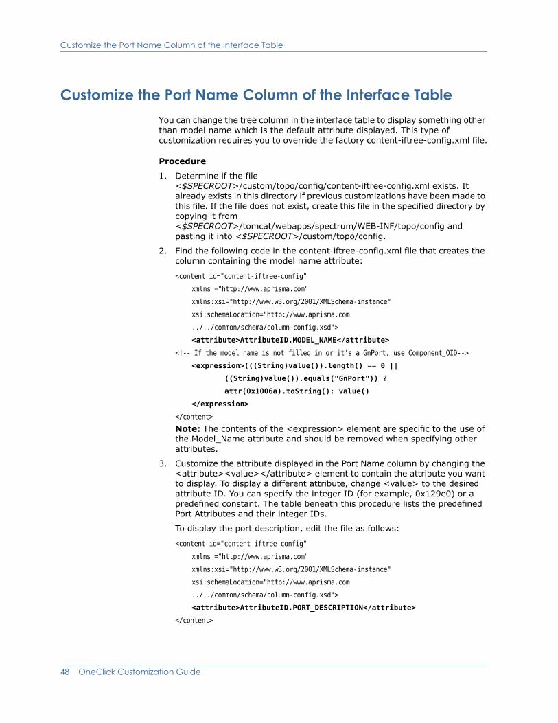
Customize the Port Name Column of the Interface Table
Customize the Port Name Column of the Interface TableYou can change the tree column in the interface table to display something other than model name which is the default attribute displayed. This type of customization requires you to override the factory content-iftree-config.xml file.
Procedure
1. Determine if the file <$SPECROOT>/custom/topo/config/content-iftree-config.xml exists. It already exists in this directory if previous customizations have been made to this file. If the file does not exist, create this file in the specified directory by copying it from <$SPECROOT>/tomcat/webapps/spectrum/WEB-INF/topo/config and pasting it into <$SPECROOT>/custom/topo/config.
2. Find the following code in the content-iftree-config.xml file that creates the column containing the model name attribute:
<content id="content-iftree-config"
xmlns ="http://www.aprisma.com"
xmlns:xsi="http://www.w3.org/2001/XMLSchema-instance"
xsi:schemaLocation="http://www.aprisma.com
../../common/schema/column-config.xsd">
<attribute>AttributeID.MODEL_NAME</attribute>
<!-- If the model name is not filled in or it's a GnPort, use Component_OID-->
<expression>(((String)value()).length() == 0 ||
((String)value()).equals("GnPort")) ?
attr(0x1006a).toString(): value()
</expression>
</content>
Note: The contents of the <expression> element are specific to the use of the Model_Name attribute and should be removed when specifying other attributes.
3. Customize the attribute displayed in the Port Name column by changing the <attribute><value></attribute> element to contain the attribute you want to display. To display a different attribute, change <value> to the desired attribute ID. You can specify the integer ID (for example, 0x129e0) or a predefined constant. The table beneath this procedure lists the predefined Port Attributes and their integer IDs.
To display the port description, edit the file as follows:
<content id="content-iftree-config"
xmlns ="http://www.aprisma.com"
xmlns:xsi="http://www.w3.org/2001/XMLSchema-instance"
xsi:schemaLocation="http://www.aprisma.com
../../common/schema/column-config.xsd">
<attribute>AttributeID.PORT_DESCRIPTION</attribute>
</content>
48 OneClick Customization Guide

Sort Interfaces Table by ifIndex
4. Save and close <$SPECROOT>/custom/topo/config/content-iftree-config.xml.
5. Close and restart the OneClick client to see the changes take effect.
Sort Interfaces Table by ifIndexSPECTRUM sorts the interfaces in the Interfaces table by the first column, which is the interface model name. SPECTRUM sorts this field alphabetically based on the textual values.
To sort the interfaces table numerically by ifIndex value
1. Edit the definition of the interfaces table content definition file acquire the ifIndex data. Check the <$SPECROOT>/custom/topo/config directory to see if the content-iftree-config.xml file exists. The file exists in this directory if previous customizations have been made to it.
If the file is not in this custom directory, create it by copying it from <$SPECROOT>/tomcat/webapps/spectrum/WEB-INF/topo/config and pasting it into the <$SPECROOT>/custom/topo/config directory.
2. Open the file and find the line that reads:<attribute>AttributeID.MODEL_NAME</attribute>
3. Change this line to read:<attribute>0x1006a</attribute>
Note: The 0x1006a attribute is Component_OID (which is rolled from ifIndex).
Note: The contents of the <expression> element are specific to the use of the Model_Name attribute and should be removed when specifying other attributes.
4. Save your changes to the content-iftree-config.xml file.
In the following steps, you edit the interface table column definition file to relabel the Model Name column to be the Index column, as it will display the interface index value instead of the model name.
5. Open the <$SPECROOT>/custom/topo/config directory and check to see if the column-iftree-config.xml file already exists there. If it does not, go to the <$SPECROOT>/tomcat/webapps/spectrum/WEB-INF/topo/config directory and find the column-iftree-config.xml file. Copy it and paste it into the <$SPECROOT>/custom/topo/config directory.
Predefined Port Attribute Value Constant Integer ID
AttributeID.PORT_DESCRIPTION 0x129e0 (ifDescr)
AttributeID.PORT_TYPE 0x129ed (ifType)
AttributeID.COMPONENT_OID 0x1006a
Customize OneClick Tables 49
Sort Interfaces Table by ifIndex
6. Find the line that reads:<name>com.aprisma.spectrum.app.util.render.ModelNameColumn</name>
7. Change this line to read:
<name>Index</name>
8. Save your changes to the column-iftree-config.xml file.
In the following steps, you edit the interface table configuration file to change the name element value from the model naming java class to the text “Index”.
9. Open the <$SPECROOT>/custom/topo/config directory and check to see if the interfaces-table-config.xml file already exists there. If it does not, go to the <$SPECROOT>/tomcat/webapps/spectrum/WEB-INF/topo/config/ directory and find the interfaces-table-config.xml file. Copy it and paste it into the <$SPECROOT>/custom/topo/config directory.
10. Find the line that reads:
<name>com.aprisma.spectrum.app.util.render.ModelNameColumn</name>
11. Change this line to read:
<name>Index</name>
12. Save your changes to the interfaces-table-config.xml file.
13. Close all of the text files and restart the OneClick console in order for the changes to take effect.
If you would like to retain the interface model name in the table, implement the following additional instructions:
1. Open the <$SPECROOT>/custom/topo/config/interfaces-table-config.xml file.
2. Find the following entry within the <column-list> element:
<column idref="column-iftree-config">
<default-width>150</default-width>
</column>
3. Add the following three lines to the end of this entry.
<column idref="column-ifmodelname-config">
<default-width>150</default-width>
</column>
4. Save your changes and close the XML file.
5. Close and restart the OneClick console in order for the changes to take effect.
50 OneClick Customization Guide

Chapter 5: Add Support for Model Types or Model Classes
This chapter describes how to add or extend OneClick support for a SPECTRUM model type or model class. For example, you may want to add specific OneClick support for a management module that you have created with SPECTRUM's Generic SNMP Toolkit.
Create a RegistrationIf you have created a new model type or model class, you can use the XML elements described in this chapter to configure the associated model appearance, available information, and views within the OneClick interface.
Register the Model Type or Model Class in custom-app-config.xml
OneClick registration for new model types and model classes is performed within the custom-app-config.xml file. Doing so enables one to configure OneClick support on a per model type and/or model class basis. There are two methods for registration:
Contents registry
Component details registry
Both of these registrations work in conjunction with each other to provide effective OneClick support for SPECTRUM models. The component details registry acts as an extension of the contents registry in order to define general and specific OneClick device support.
Because most models of a given model class will share the same OneClick device support, typically you define a contents registry for the model class to define this general support. However, for a given model class, you might want to expose different information in the Component Details panel based on model type. To accomplish this, you define a component details registry for the applicable model type. As a result, the model receives its general, shared content from the contents registry, and it receives its more specific component details content from the component details registry.
Add Support for Model Types or Model Classes 51
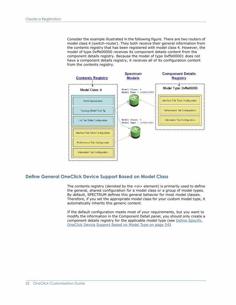
Create a Registration
Consider the example illustrated in the following figure. There are two routers of model class 4 (switch-router). They both receive their general information from the contents registry that has been registered with model class 4. However, the model of type 0xffe00000 receives its component details content from the component details registry. Because the model of type 0xffe00001 does not have a component details registry, it receives all of its configuration content from the contents registry.
Define General OneClick Device Support Based on Model Class
The contents registry (denoted by the <oi> element) is primarily used to define the general, shared configuration for a model class or a group of model types. By default, SPECTRUM defines this general behavior for most model classes. Therefore, if you set the appropriate model class for your custom model type, it automatically inherits this generic content.
If the default configuration meets most of your requirements, but you want to modify the information in the Component Detail panel, you should only create a component details registry for the applicable model type (see Define Specific OneClick Device Support Based on Model Type on page 54).
52 OneClick Customization Guide

Create a Registration
However, if you create a new model class, or you want to define a specific model appearance for a model type, you need to create a contents registry entry using the XML elements described in the following table.
Element Parent Element Description
<app-config> Not applicable The root element for the custom-app-config.xml file.
<contents-registry> <app-config> Used to associate a single or group of model classes and/or model types to configuration files that define model appearance and tooltip content.
Note: (Optional) You can use the scope attribute to specify the location of the configuration xml files you are using (when you are not using the default locations of console, topo, or common). The scope attribute has to match the directory name where the existing configuration xml files reside, as follows:
<$SPECROOT>/tomcat/webapps/spectrum/ WEB-INF/<scope>/config
For example, <contents-registry scope=“devman”> specifies the devman/config directory, which contains the configuration xml files for device management views and subviews.
<model-class> <contents-registry> Registers a model class for this contents registry.
<model-type> <contents-registry> Registers a model type for this contents registry.
Model types should only be registered for a contents registry if you need a unique topology icon or tooltip. If you only want to configure component detail content for a model type, use the <component-details- registry> instead of the <contents-registry>.
<is-derived-from> <contents-registry> Registers a parent model type and all of its derived model types for this contents registry.
Model types should only be registered for a contents registry if you need a unique topology icon or tooltip. If you want to configure only component detail content for a model type, use the <component-details- registry> instead of the <contents-registry>.
<icon-reg-id> <contents-registry> The icon registration ID that identifies the icon configuration to use. The icon configuration defines the appearance of the icon in OneClick. See Define Model Appearance on page 56 for more information.
<tooltip-config> <contents-registry> The XML that defines the tooltip content for topology icons. See Define Model Icon Tooltips on page 85 for more information.
Add Support for Model Types or Model Classes 53

Create a Registration
Define Specific OneClick Device Support Based on Model Type
As mentioned earlier in this chapter, the contents registry defines the general OneClick device support. If you want to define specific device support on a per model type basis in the OneClick client, you should define a component details registry (denoted by the <component-details-registry> element). The component details registry defines the contents for the views within the Component Detail panel.
<table-config> <contents-registry> Specifies the XML that configures the columns available on the List tab in the Contents panel.
<information-config> <contents-registry> Specifies the XML that defines the content of the model's Information tab. See Chapter 6: Customize a Model’s Information View for more information.
<performance-config> <contents-registry> Specifies the XML that defines the contents of the model's Performance tab, where one or more graphs can be defined to show the values of model attributes over time. The contents of these graphs are real time; the data is only available for the current OneClick client session. See Chapter 7: Create a Model’s Performance View for more information.
<interface-table-config> <contents-registry> Specifies the XML that configures the table on the Interfaces tab. See Chapter 4: Customize OneClick Tables for more information.
Element Parent Element Description
Element Parent Element Description
<app-config> Not applicable The root element for the custom-app-config.xml file.
<component-details- registry>
<app-config> Used to associate a single or group of model classes and/or model types to configuration files that define the content in the Component Detail panel.
Note: The same child elements of <component-details-registry> are supported within <contents-registry>. However, since <component-details-registry> is an extension of <contents-registry>, all elements that are not defined are inherited from <contents-registry>. If both are registered for the same model type or model class, <component-details-registry> takes precedence over <contents-registry>.
<model-class> <contents-registry> Registers a model class for this component details registry.
<model-type> <contents-registry> Registers a model type for this component details registry.
54 OneClick Customization Guide
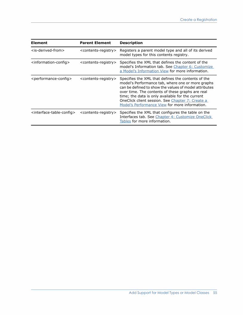
Create a Registration
<is-derived-from> <contents-registry> Registers a parent model type and all of its derived model types for this contents registry.
<information-config> <contents-registry> Specifies the XML that defines the content of the model's Information tab. See Chapter 6: Customize a Model’s Information View for more information.
<performance-config> <contents-registry> Specifies the XML that defines the contents of the model's Performance tab, where one or more graphs can be defined to show the values of model attributes over time. The contents of these graphs are real time; the data is only available for the current OneClick client session. See Chapter 7: Create a Model’s Performance View for more information.
<interface-table-config> <contents-registry> Specifies the XML that configures the table on the Interfaces tab. See Chapter 4: Customize OneClick Tables for more information.
Element Parent Element Description
Add Support for Model Types or Model Classes 55
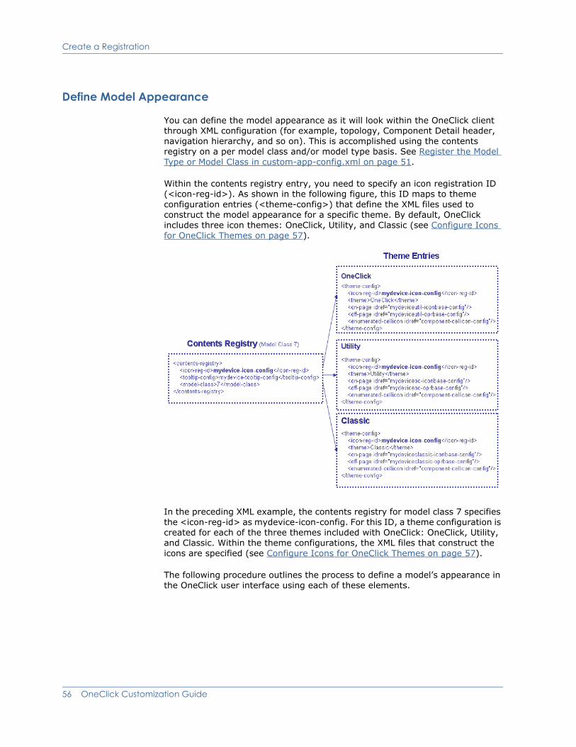
Create a Registration
Define Model Appearance
You can define the model appearance as it will look within the OneClick client through XML configuration (for example, topology, Component Detail header, navigation hierarchy, and so on). This is accomplished using the contents registry on a per model class and/or model type basis. See Register the Model Type or Model Class in custom-app-config.xml on page 51.
Within the contents registry entry, you need to specify an icon registration ID (<icon-reg-id>). As shown in the following figure, this ID maps to theme configuration entries (<theme-config>) that define the XML files used to construct the model appearance for a specific theme. By default, OneClick includes three icon themes: OneClick, Utility, and Classic (see Configure Icons for OneClick Themes on page 57).
In the preceding XML example, the contents registry for model class 7 specifies the <icon-reg-id> as mydevice-icon-config. For this ID, a theme configuration is created for each of the three themes included with OneClick: OneClick, Utility, and Classic. Within the theme configurations, the XML files that construct the icons are specified (see Configure Icons for OneClick Themes on page 57).
The following procedure outlines the process to define a model’s appearance in the OneClick user interface using each of these elements.
56 OneClick Customization Guide

Configure Icons for OneClick Themes
Procedure
1. If it does not already exist, create a file named <$SPECROOT>/custom/console/config/custom-app-config.xml by copying <$SPECROOT>/tomcat/webapps/spectrum/WEB-INF/console/config/ custom-app-config.xml.
If the file already exists, it already contains customized changes to the factory default file, and you should make your additional changes in it.
2. Open the file with a text editor.
3. Create a contents registry entry for the applicable model types and/or model classes.
<contents-registry>
...
<model-type>0xffff0000</model-type>
<model-class>2</model-class>
...
</contents-registry>
4. Within the contents registry, specify an icon registration ID. This ID will map to theme configuration entries. For more information, see Define Model Appearance on page 56.
5. For each desired theme, create a <theme-config> entry. These entries will be identified using the registration ID from the previous step. For more information, see Configure Icons for OneClick Themes on page 57.
6. Design the appearance of the icon for each theme as described in Design On-Page and Off-Page Reference Icons on page 60.
7. Define the tooltips for the icons as described in Define Model Icon Tooltips on page 85.
8. Once you have created support for a model’s appearance, you may want to customize the views and information available in the model’s Component Detail panel. For more information, see Chapter 6: Customize a Model’s Information View.
9. Save and close the <$SPECROOT>/custom/console/config/custom-app-config.xml file.
10. Restart the OneClick client for your changes to take effect.
Configure Icons for OneClick ThemesBy default, OneClick includes three icon themes:
OneClick (default theme)
Utility
Classic
The default OneClick theme is the most robust and, therefore, is the recommended theme for use.
Add Support for Model Types or Model Classes 57
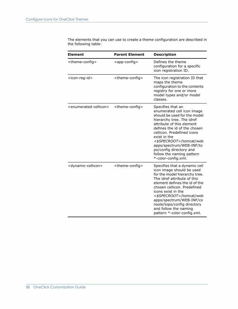
Configure Icons for OneClick Themes
The elements that you can use to create a theme configuration are described in the following table:
Element Parent Element Description
<theme-config> <app-config> Defines the theme configuration for a specific icon registration ID.
<icon-reg-id> <theme-config> The icon registration ID that maps the theme configuration to the contents registry for one or more model types and/or model classes.
<enumerated-cellicon> <theme-config> Specifies that an enumerated cell icon image should be used for the model hierarchy tree. The idref attribute of this element defines the id of the chosen cellicon. Predefined icons exist in the <$SPECROOT>/tomcat/webapps/spectrum/WEB-INF/topo/config directory and follow the naming pattern *-color-config.xml.
<dynamic-cellicon> <theme-config> Specifies that a dynamic cell icon image should be used for the model hierarchy tree. The idref attribute of this element defines the id of the chosen cellicon. Predefined icons exist in the <$SPECROOT>/tomcat/webapps/spectrum/WEB-INF/console/topo/config directory and follow the naming pattern *-color-config.xml.
58 OneClick Customization Guide
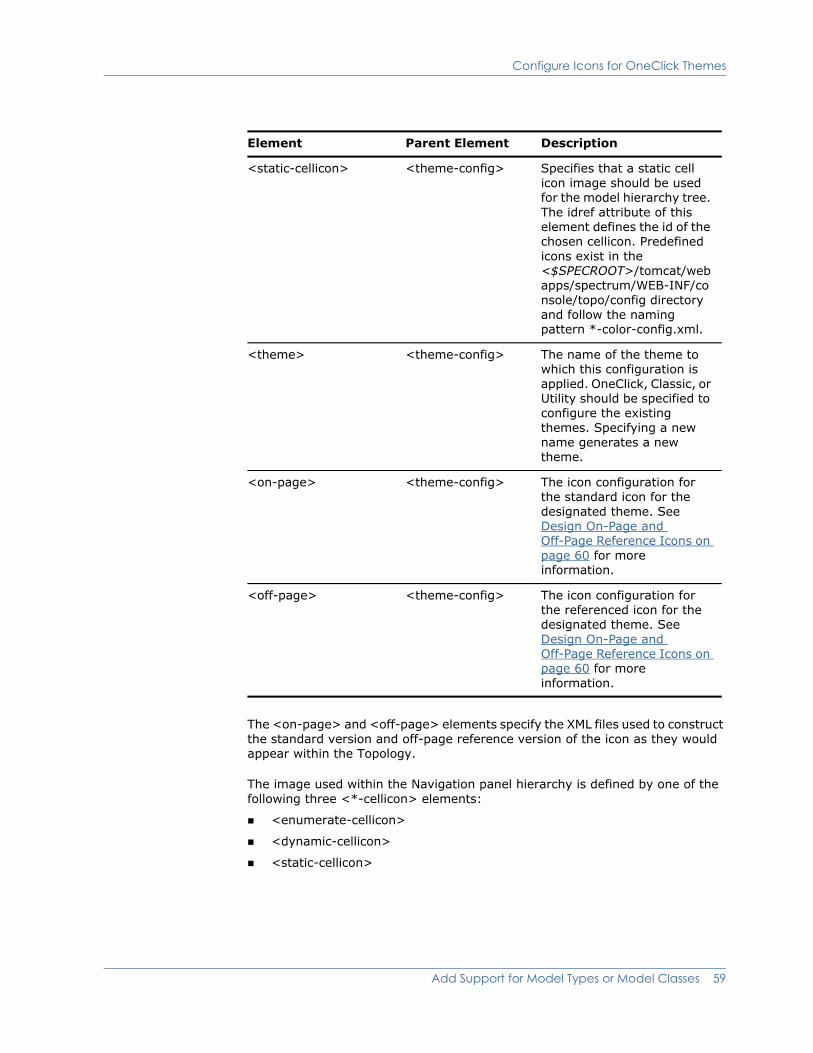
Configure Icons for OneClick Themes
The <on-page> and <off-page> elements specify the XML files used to construct the standard version and off-page reference version of the icon as they would appear within the Topology.
The image used within the Navigation panel hierarchy is defined by one of the following three <*-cellicon> elements:
<enumerate-cellicon>
<dynamic-cellicon>
<static-cellicon>
<static-cellicon> <theme-config> Specifies that a static cell icon image should be used for the model hierarchy tree. The idref attribute of this element defines the id of the chosen cellicon. Predefined icons exist in the <$SPECROOT>/tomcat/webapps/spectrum/WEB-INF/console/topo/config directory and follow the naming pattern *-color-config.xml.
<theme> <theme-config> The name of the theme to which this configuration is applied. OneClick, Classic, or Utility should be specified to configure the existing themes. Specifying a new name generates a new theme.
<on-page> <theme-config> The icon configuration for the standard icon for the designated theme. See Design On-Page and Off-Page Reference Icons on page 60 for more information.
<off-page> <theme-config> The icon configuration for the referenced icon for the designated theme. See Design On-Page and Off-Page Reference Icons on page 60 for more information.
Element Parent Element Description
Add Support for Model Types or Model Classes 59
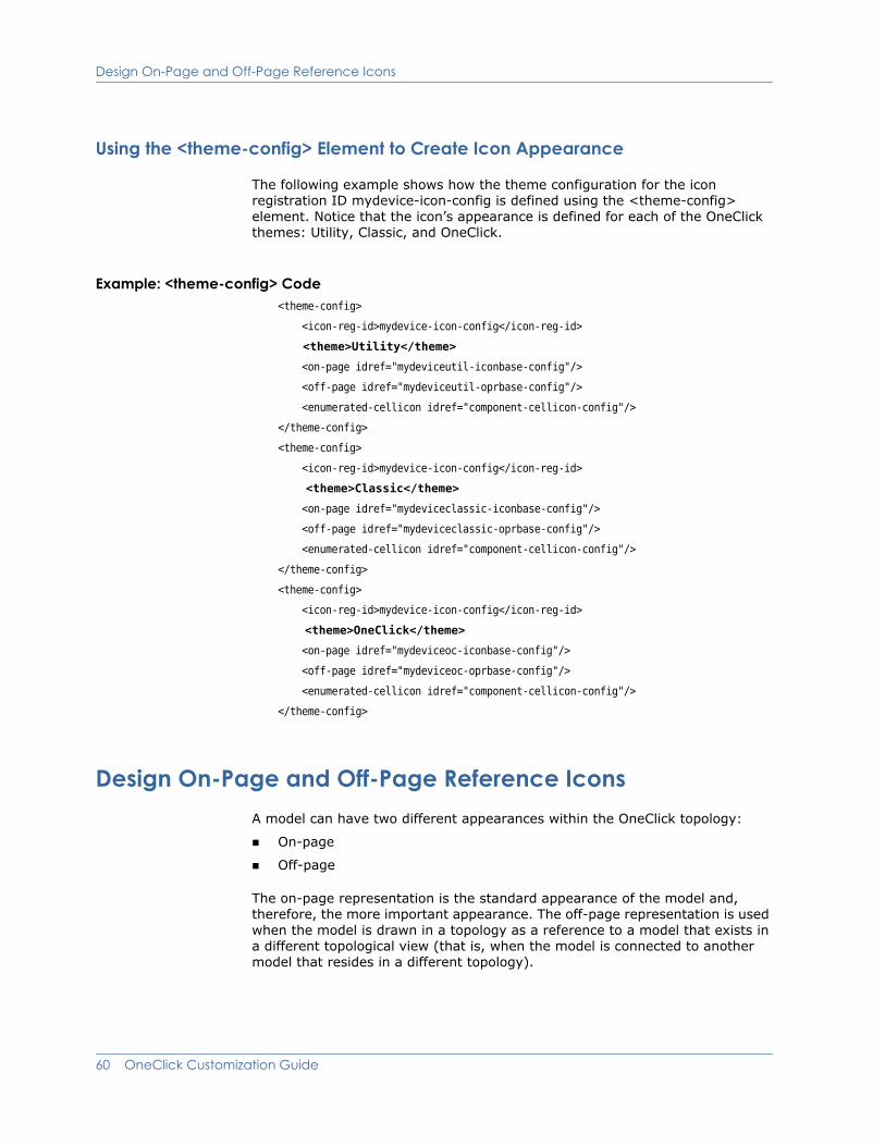
Design On-Page and Off-Page Reference Icons
Using the <theme-config> Element to Create Icon Appearance
The following example shows how the theme configuration for the icon registration ID mydevice-icon-config is defined using the <theme-config> element. Notice that the icon’s appearance is defined for each of the OneClick themes: Utility, Classic, and OneClick.
Example: <theme-config> Code<theme-config>
<icon-reg-id>mydevice-icon-config</icon-reg-id>
<theme>Utility</theme>
<on-page idref="mydeviceutil-iconbase-config"/>
<off-page idref="mydeviceutil-oprbase-config"/>
<enumerated-cellicon idref="component-cellicon-config"/>
</theme-config>
<theme-config>
<icon-reg-id>mydevice-icon-config</icon-reg-id>
<theme>Classic</theme>
<on-page idref="mydeviceclassic-iconbase-config"/>
<off-page idref="mydeviceclassic-oprbase-config"/>
<enumerated-cellicon idref="component-cellicon-config"/>
</theme-config>
<theme-config>
<icon-reg-id>mydevice-icon-config</icon-reg-id>
<theme>OneClick</theme>
<on-page idref="mydeviceoc-iconbase-config"/>
<off-page idref="mydeviceoc-oprbase-config"/>
<enumerated-cellicon idref="component-cellicon-config"/>
</theme-config>
Design On-Page and Off-Page Reference IconsA model can have two different appearances within the OneClick topology:
On-page
Off-page
The on-page representation is the standard appearance of the model and, therefore, the more important appearance. The off-page representation is used when the model is drawn in a topology as a reference to a model that exists in a different topological view (that is, when the model is connected to another model that resides in a different topology).
60 OneClick Customization Guide
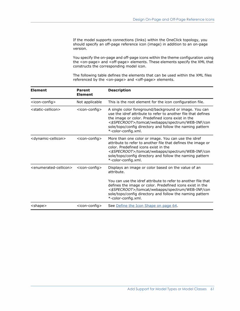
Design On-Page and Off-Page Reference Icons
If the model supports connections (links) within the OneClick topology, you should specify an off-page reference icon (image) in addition to an on-page version.
You specify the on-page and off-page icons within the theme configuration using the <on-page> and <off-page> elements. These elements specify the XML that constructs the corresponding model icon.
The following table defines the elements that can be used within the XML files referenced by the <on-page> and <off-page> elements.
Element Parent Element
Description
<icon-config> Not applicable This is the root element for the icon configuration file.
<static-cellicon> <icon-config> A single color foreground/background or image. You can use the idref attribute to refer to another file that defines the image or color. Predefined icons exist in the <$SPECROOT>/tomcat/webapps/spectrum/WEB-INF/console/topo/config directory and follow the naming pattern *-color-config.xml.
<dynamic-cellicon> <icon-config> More than one color or image. You can use the idref attribute to refer to another file that defines the image or color. Predefined icons exist in the <$SPECROOT>/tomcat/webapps/spectrum/WEB-INF/console/topo/config directory and follow the naming pattern *-color-config.xml.
<enumerated-cellicon> <icon-config> Displays an image or color based on the value of an attribute.
You can use the idref attribute to refer to another file that defines the image or color. Predefined icons exist in the <$SPECROOT>/tomcat/webapps/spectrum/WEB-INF/console/topo/config directory and follow the naming pattern *-color-config.xml.
<shape> <icon-config> See Define the Icon Shape on page 64.
Add Support for Model Types or Model Classes 61
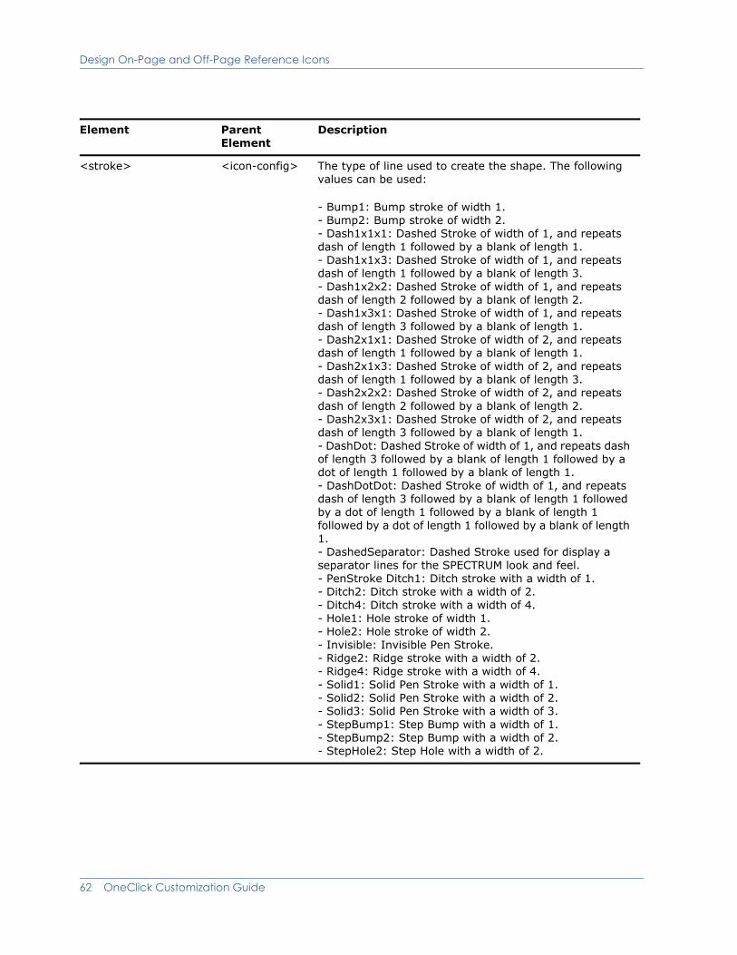
Design On-Page and Off-Page Reference Icons
<stroke> <icon-config> The type of line used to create the shape. The following values can be used:
- Bump1: Bump stroke of width 1. - Bump2: Bump stroke of width 2. - Dash1x1x1: Dashed Stroke of width of 1, and repeats dash of length 1 followed by a blank of length 1. - Dash1x1x3: Dashed Stroke of width of 1, and repeats dash of length 1 followed by a blank of length 3. - Dash1x2x2: Dashed Stroke of width of 1, and repeats dash of length 2 followed by a blank of length 2. - Dash1x3x1: Dashed Stroke of width of 1, and repeats dash of length 3 followed by a blank of length 1. - Dash2x1x1: Dashed Stroke of width of 2, and repeats dash of length 1 followed by a blank of length 1. - Dash2x1x3: Dashed Stroke of width of 2, and repeats dash of length 1 followed by a blank of length 3. - Dash2x2x2: Dashed Stroke of width of 2, and repeats dash of length 2 followed by a blank of length 2. - Dash2x3x1: Dashed Stroke of width of 2, and repeats dash of length 3 followed by a blank of length 1. - DashDot: Dashed Stroke of width of 1, and repeats dash of length 3 followed by a blank of length 1 followed by a dot of length 1 followed by a blank of length 1. - DashDotDot: Dashed Stroke of width of 1, and repeats dash of length 3 followed by a blank of length 1 followed by a dot of length 1 followed by a blank of length 1 followed by a dot of length 1 followed by a blank of length 1. - DashedSeparator: Dashed Stroke used for display a separator lines for the SPECTRUM look and feel. - PenStroke Ditch1: Ditch stroke with a width of 1. - Ditch2: Ditch stroke with a width of 2. - Ditch4: Ditch stroke with a width of 4. - Hole1: Hole stroke of width 1. - Hole2: Hole stroke of width 2. - Invisible: Invisible Pen Stroke. - Ridge2: Ridge stroke with a width of 2. - Ridge4: Ridge stroke with a width of 4. - Solid1: Solid Pen Stroke with a width of 1. - Solid2: Solid Pen Stroke with a width of 2. - Solid3: Solid Pen Stroke with a width of 3. - StepBump1: Step Bump with a width of 1. - StepBump2: Step Bump with a width of 2. - StepHole2: Step Hole with a width of 2.
Element Parent Element
Description
62 OneClick Customization Guide
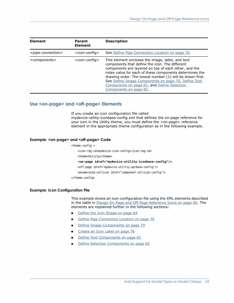
Design On-Page and Off-Page Reference Icons
Use <on-page> and <off-page> Elements
If you create an icon configuration file called mydevice-utility-iconbase-config.xml that defines the on-page reference for your icon in the Utility theme, you must define the <on-page> reference element in the appropriate theme configuration as in the following example.
Example: <on-page> and <off-page> Code <theme-config >
<icon-reg-id>mydevice-icon-config</icon-reg-id>
<theme>Utility</theme>
<on-page idref="mydevice-utility-iconbase-config"/>
<off-page idref="mydevice-utility-oprbase-config"/>
<enumerated-cellicon idref="component-cellicon-config"/>
</theme-config>
Example: Icon Configuration File
This example shows an icon configuration file using the XML elements described in the table in Design On-Page and Off-Page Reference Icons on page 60. The elements are explained further in the following sections:
Define the Icon Shape on page 64
Define Pipe Connection Location on page 70
Define Image Components on page 70
Create an Icon Label on page 76
Define Text Components on page 81
Define Selection Components on page 82
<pipe-connection> <icon-config> See Define Pipe Connection Location on page 70.
<components> <icon-config> This element encloses the image, label, and text components that define the icon. The different components are layered on top of each other, and the index value for each of these components determines the drawing order. The lowest number (1) will be drawn first. See Define Image Components on page 70, Define Text Components on page 81, and Define Selection Components on page 82.
Element Parent Element
Description
Add Support for Model Types or Model Classes 63
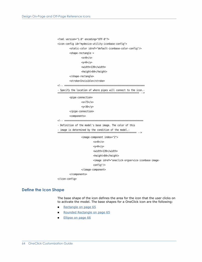
Design On-Page and Off-Page Reference Icons
<?xml version="1.0" encoding="UTF-8"?>
<icon-config id="mydevice-utility-iconbase-config">
<static-color idref="default-iconbase-color-config"/>
<shape-rectangle >
<x>0</x>
<y>0</y>
<width>139</width>
<height>84</height>
</shape-rectangle>
<stroke>Invisible</stroke>
<!-- ===========================================================
- Specify the location of where pipes will connect to the icon.- ============================================================ -->
<pipe-connection>
<x>73</x>
<y>36</y>
</pipe-connection>
<components>
<!-- ==========================================================
- Definition of the model's base image. The color of this
- image is determined by the condition of the model.- ========================================================== -->
<image-component index="2">
<x>0</x>
<y>0</y>
<width>139</width>
<height>84</height>
<image idref="oneclick-orgservice-iconbase-image-
config"/>
</image-component>
</components>
</icon-config>
Define the Icon Shape
The base shape of the icon defines the area for the icon that the user clicks on to activate the model. The base shapes for a OneClick icon are the following:
Rectangle on page 65
Rounded Rectangle on page 65
Ellipse on page 66
64 OneClick Customization Guide

Design On-Page and Off-Page Reference Icons
Polygon on page 67
Line on page 68
Define each of these shapes using the <icon-config> element.
Rectangle
Elements used to specify a rectangle in OneClick are defined in the following table.
Example: Rectangle Code<shape-rectangle>
<x>26</x>
<y>24</y>
<width>45</width>
<height>14</height>
</shape-rectangle>
Rounded Rectangle
Elements used to specify a rounded rectangle in OneClick are defined in the following table.
Element Parent Element Description
<shape-rectangle> <icon-config> Defines a rectangle.
<x> <shape-rectangle> The upper left X coordinate of the rectangle. See X and Y Coordinates on page 69.
<y> <shape-rectangle> The upper left Y coordinate of the rectangle. See X and Y Coordinates on page 69.
<width> <shape-rectangle> The width of the rectangle.
<height> <shape-rectangle> The height of the rectangle.
Element Parent Element Description
<shape-roundrectangle> <icon-config> Defines a rounded rectangle.
<x> <shape-roundrectangle> The upper left X coordinate. See X and Y Coordinates on page 69.
<y> <shape-roundrectangle> The upper left Y coordinate. See X and Y Coordinates on page 69.
Add Support for Model Types or Model Classes 65
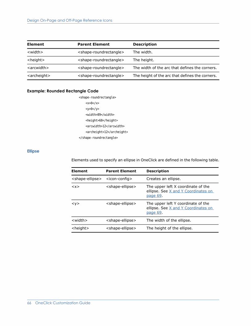
Design On-Page and Off-Page Reference Icons
Example: Rounded Rectangle Code<shape-roundrectangle>
<x>0</x>
<y>0</y>
<width>89</width>
<height>68</height>
<arcwidth>12</arcwidth>
<archeight>12</archeight>
</shape-roundrectangle>
Ellipse
Elements used to specify an ellipse in OneClick are defined in the following table.
<width> <shape-roundrectangle> The width.
<height> <shape-roundrectangle> The height.
<arcwidth> <shape-roundrectangle> The width of the arc that defines the corners.
<archeight> <shape-roundrectangle> The height of the arc that defines the corners.
Element Parent Element Description
Element Parent Element Description
<shape-ellipse> <icon-config> Creates an ellipse.
<x> <shape-ellipse> The upper left X coordinate of the ellipse. See X and Y Coordinates on page 69.
<y> <shape-ellipse> The upper left Y coordinate of the ellipse. See X and Y Coordinates on page 69.
<width> <shape-ellipse> The width of the ellipse.
<height> <shape-ellipse> The height of the ellipse.
66 OneClick Customization Guide
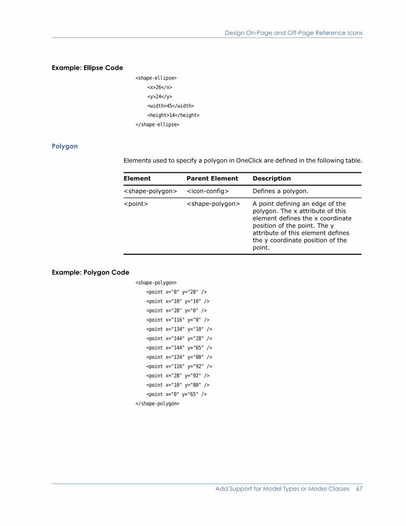
Design On-Page and Off-Page Reference Icons
Example: Ellipse Code<shape-ellipse>
<x>26</x>
<y>24</y>
<width>45</width>
<height>14</height>
</shape-ellipse>
Polygon
Elements used to specify a polygon in OneClick are defined in the following table.
Example: Polygon Code<shape-polygon>
<point x="0" y="28" />
<point x="10" y="10" />
<point x="28" y="0" />
<point x="116" y="0" />
<point x="134" y="10" />
<point x="144" y="28" />
<point x="144" y="65" />
<point x="134" y="80" />
<point x="116" y="92" />
<point x="28" y="92" />
<point x="10" y="80" />
<point x="0" y="65" />
</shape-polygon>
Element Parent Element Description
<shape-polygon> <icon-config> Defines a polygon.
<point> <shape-polygon> A point defining an edge of the polygon. The x attribute of this element defines the x coordinate position of the point. The y attribute of this element defines the y coordinate position of the point.
Add Support for Model Types or Model Classes 67

Design On-Page and Off-Page Reference Icons
Line
Elements used to specify a line in OneClick are defined in the following table.
Example: Line Code<shape-line>
<x1>5</x1>
<y1>5</y1>
<x2>40</x2>
<y2>40</y2>
</shape-line>
Element Parent Element Description
<shape-line> <icon-config> Defines a line.
<x1> <shape-line> X coordinate for the start of the line.
<y1> <shape-line> Y coordinate for the start of the line.
<x2> <shape-line> X coordinate for the end of the line.
<y2> <shape-line> Y coordinate for the end of the line.
68 OneClick Customization Guide
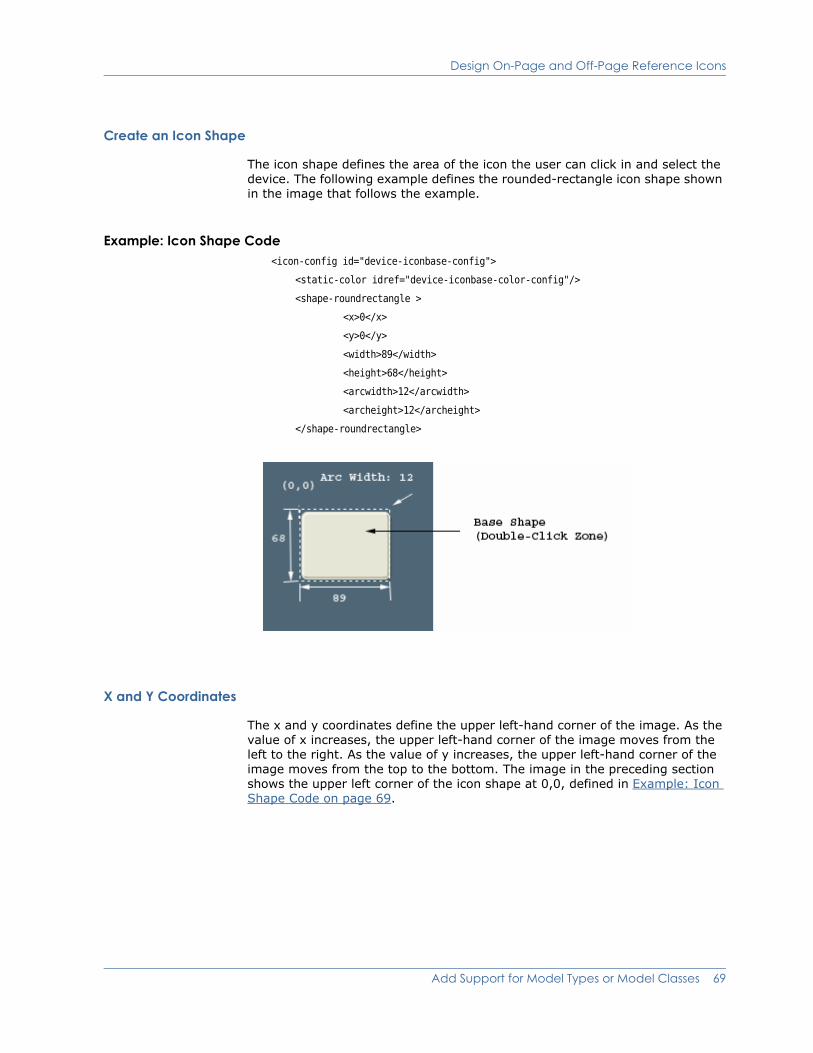
Design On-Page and Off-Page Reference Icons
Create an Icon Shape
The icon shape defines the area of the icon the user can click in and select the device. The following example defines the rounded-rectangle icon shape shown in the image that follows the example.
Example: Icon Shape Code<icon-config id="device-iconbase-config">
<static-color idref="device-iconbase-color-config"/>
<shape-roundrectangle >
<x>0</x>
<y>0</y>
<width>89</width>
<height>68</height>
<arcwidth>12</arcwidth>
<archeight>12</archeight>
</shape-roundrectangle>
X and Y Coordinates
The x and y coordinates define the upper left-hand corner of the image. As the value of x increases, the upper left-hand corner of the image moves from the left to the right. As the value of y increases, the upper left-hand corner of the image moves from the top to the bottom. The image in the preceding section shows the upper left corner of the icon shape at 0,0, defined in Example: Icon Shape Code on page 69.
Add Support for Model Types or Model Classes 69
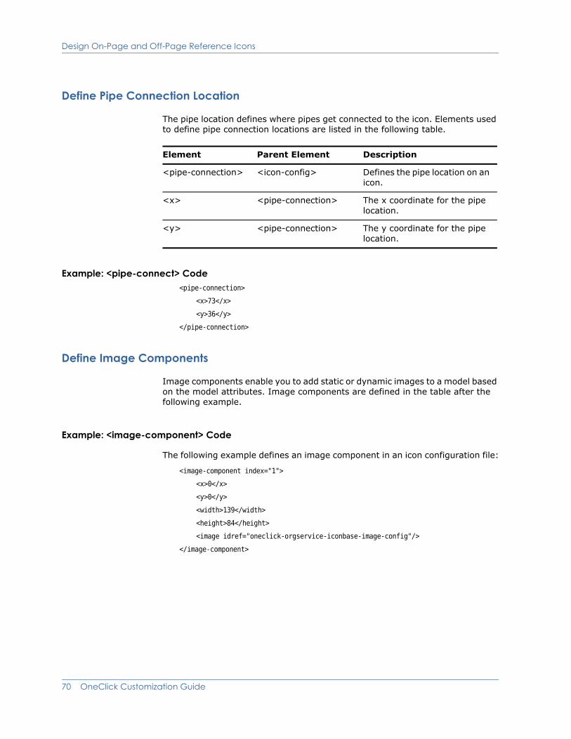
Design On-Page and Off-Page Reference Icons
Define Pipe Connection Location
The pipe location defines where pipes get connected to the icon. Elements used to define pipe connection locations are listed in the following table.
Example: <pipe-connect> Code<pipe-connection>
<x>73</x>
<y>36</y>
</pipe-connection>
Define Image Components
Image components enable you to add static or dynamic images to a model based on the model attributes. Image components are defined in the table after the following example.
Example: <image-component> Code
The following example defines an image component in an icon configuration file:
<image-component index="1">
<x>0</x>
<y>0</y>
<width>139</width>
<height>84</height>
<image idref="oneclick-orgservice-iconbase-image-config"/>
</image-component>
Element Parent Element Description
<pipe-connection> <icon-config> Defines the pipe location on an icon.
<x> <pipe-connection> The x coordinate for the pipe location.
<y> <pipe-connection> The y coordinate for the pipe location.
70 OneClick Customization Guide
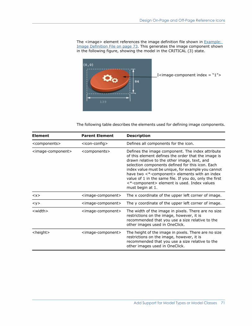
Design On-Page and Off-Page Reference Icons
The <image> element references the image definition file shown in Example: Image Definition File on page 73. This generates the image component shown in the following figure, showing the model in the CRITICAL (3) state.
The following table describes the elements used for defining image components.
I<image-component index = “1”>
Element Parent Element Description
<components> <icon-config> Defines all components for the icon.
<image-component> <components> Defines the image component. The index attribute of this element defines the order that the image is drawn relative to the other image, text, and selection components defined for this icon. Each index value must be unique, for example you cannot have two <*-component> elements with an index value of 1 in the same file. If you do, only the first <*-component> element is used. Index values must begin at 1.
<x> <image-component> The x coordinate of the upper left corner of image.
<y> <image-component> The y coordinate of the upper left corner of image.
<width> <image-component> The width of the image in pixels. There are no size restrictions on the image, however, it is recommended that you use a size relative to the other images used in OneClick.
<height> <image-component> The height of the image in pixels. There are no size restrictions on the image, however, it is recommended that you use a size relative to the other images used in OneClick.
Add Support for Model Types or Model Classes 71

Design On-Page and Off-Page Reference Icons
<image> <image-component> The image to be rendered.
The idref attribute references the XML file that builds the image. It is put in a separate file for organizational purposes only.
Images should be in png file format and should be placed in the <$SPECROOT>/tomcat/webapps/spectrum/images directory.
<shape-*> <image-component> Shape component to be drawn with image.
<enumerated-color> <image-component> Colors used for the shape.
<static-color> <image-component> Color used for the shape.
<selection-component> <image-component> Indicates whether this is to be shown only when the user selects the image component.
Element Parent Element Description
72 OneClick Customization Guide

Design On-Page and Off-Page Reference Icons
Example: Image Definition File
The following XML code defines the image used for <image-component index =“2”> in Example: Icon Configuration File on page 63. The example uses the <select>, <case>, and <expression> elements to conditionally select an image based on the value of the condition attribute. The example uses the <yield> to define which image should be used when a condition is met. Note that the image is in PNG file format. Images used for customization purposes should be stored in the <$SPECROOT>/tomcat/webapps/spectrum/images directory. Express the path to an image placed in this directory from the images directory, as images/myimage.png.
<?xml version="1.0" encoding="UTF-8"?>
<image id="oneclick-orgservice-iconbase-image-config">
<select>
<case>
<expression>
attrInt(AttributeID.CONDITION) == 0
<!-- GREEN_CONDITION -->
</expression>
<yield>
images/oneclick_org_service_green.png
</yield>
</case>
<case>
<expression>
attrInt(AttributeID.CONDITION) == 1
</expression>
<yield>
images/oneclick_org_service_yellow.png
</yield>
</case>
<case>
<expression>
attrInt(AttributeID.CONDITION) == 2
</expression>
<yield>
images/oneclick_org_service_orange.png
</yield>
</case>
<case>
<expression>
attrInt(AttributeID.CONDITION) == 3
</expression>
<yield>
Add Support for Model Types or Model Classes 73

Design On-Page and Off-Page Reference Icons
images/oneclick_org_service_red.png
</yield>
</case>
<case>
<expression>
attrInt(AttributeID.CONDITION) == 4
</expression>
<yield>
images/oneclick_org_service_brown.png
</yield>
</case>
<case>
<expression>
attrInt(AttributeID.CONDITION) == 5
</expression>
<yield>
images/oneclick_org_service_grey.png
</yield>
</case>
<case>
<expression>
attrInt(AttributeID.CONDITION) == 6
</expression>
<yield>
images/oneclick_org_service_blue.png
</yield>
</case>
<default>
images/oneclick_org_service_blue.png
</default>
</select>
</image>
74 OneClick Customization Guide

Design On-Page and Off-Page Reference Icons
Example: Icon Configuration File
This icon configuration example generates the image that follows it. The example assumes that the condition of the model is CRITICAL (3).
<?xml version="1.0" encoding="UTF-8"?>
<icon-config id="oneclick-orgservice-iconbase-config">
<static-color idref="oneclick-default-iconbase-color-config"/>
<shape-rectangle >
<x>0</x>
<y>0</y>
<width>139</width>
<height>84</height>
</shape-rectangle>
<stroke>Invisible</stroke>
<!-- ===========================================================
Specify the location of where pipes will connect to the icon.
============================================================-->
<pipe-connection>
<x>73</x>
<y>36</y>
</pipe-connection>
<components>
<!-- ===========================================================
Definition of the model label.
============================================================ -->
<label-component idref="default-iconlabel-config" index="1">
<x>0</x>
<y>77</y>
<column-list>
<field-column>
<column idref="column-modelname-config"/>
<column idref="column-devicetype-config"/>
</field-column>
</column-list>
</label-component>
<!-- ==========================================================
Definition of the model's base image. Image color is determined by model condition.
-========================================================== -->
<image-component index="2">
<x>0</x>
<y>0</y>
<width>139</width>
<height>84</height>
Add Support for Model Types or Model Classes 75
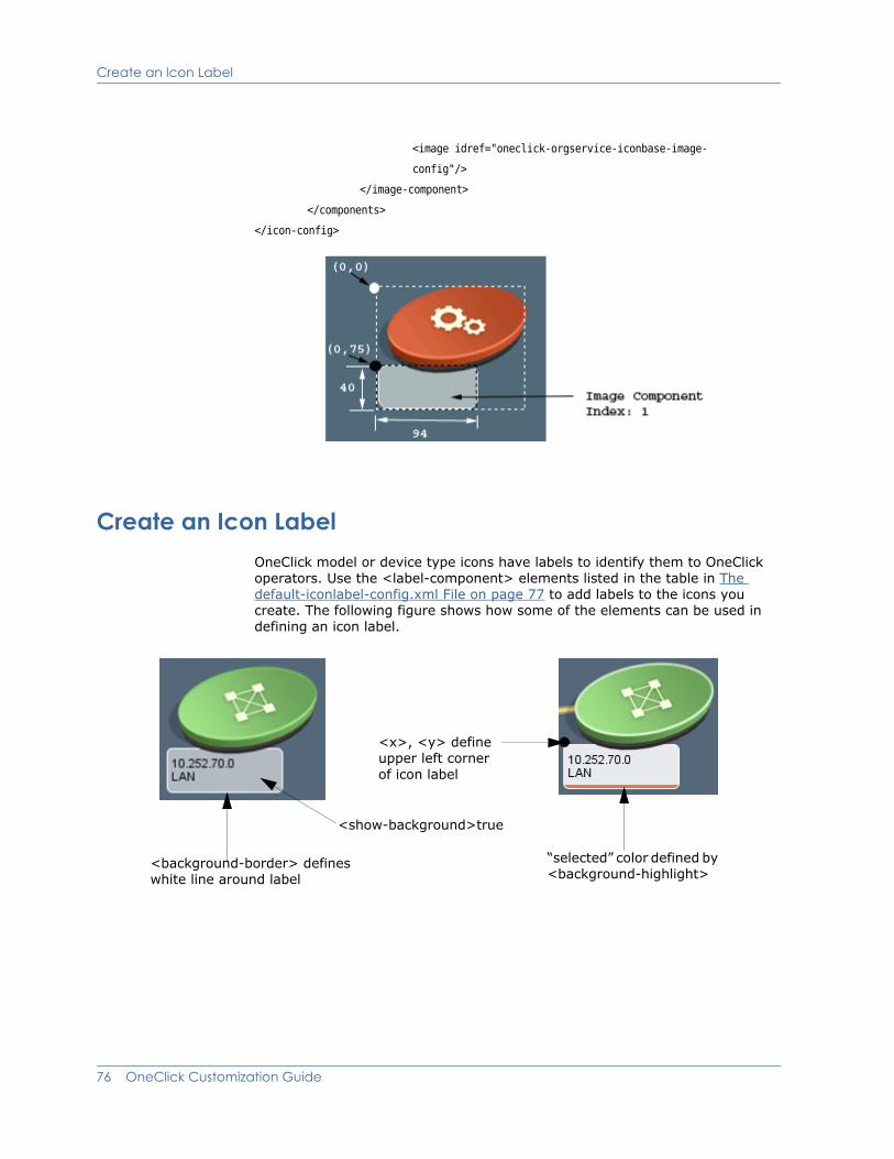
Create an Icon Label
<image idref="oneclick-orgservice-iconbase-image-
config"/>
</image-component>
</components>
</icon-config>
Create an Icon LabelOneClick model or device type icons have labels to identify them to OneClick operators. Use the <label-component> elements listed in the table in The default-iconlabel-config.xml File on page 77 to add labels to the icons you create. The following figure shows how some of the elements can be used in defining an icon label.
<x>, <y> define upper left corner of icon label
“selected” color defined by <background-highlight>
<background-border> defines white line around label
<show-background>true
76 OneClick Customization Guide
Create an Icon Label
This section describes how to create an icon label, with details in these sections:
The default-iconlabel-config.xml File on page 77
Adjust Icon Label Background Width on page 80
Default Label Width Settings on page 80
Create Fixed Width Icon Labels on page 80
The default-iconlabel-config.xml File
The file <$SPECROOT>/SPECTRUM/tomcat/webapp/spectrum/WEB-INF/topo/config/default-iconlabel-config.xml contains examples and more information on using the <label-component> element and its attributes to create icon labels.
Example: <label-component> Code<!-- =================================================================
Definition of the model label.
====================================================================-->
<label-component idref="default-iconlabel-config" index="1">
<x>0</x>
<y>67</y>
<column-list>
<field-column>
<column idref="column-modelname-config"/>
<column idref="column-devicetype-config"/>
</field-column>
</column-list>
</label-component>
Add Support for Model Types or Model Classes 77

Create an Icon Label
This example defines the model label by extending the functionality of the default-iconlabel-config.xml file. This example creates a label that displays two fields of text defined in the two column statements. The column statements create two rows in the label for the content defined by the column configuration files they reference. This label displays the model name and device type in the icon label. The code does not specify a minimum or maximum column width for the label (see the following table), so it has a fixed width of 95 pixels, the default condition.
Element Parent Element Description
<components> <icon-config> Defines all components for the icon.
<label-component> <component> Defines a label component.
The index attribute defines the order that the label is drawn in with respect to other image, text, and label components defined for the same icon. Each index value must be unique. If you have two <*-components> with the same index value - only the second one is drawn.
Index values begin at 1.
<x> <label-component> Defines the x coordinate of the upper left corner of the label relative to the icon image component.
<y> <label-component> Defines the y coordinate of the upper left corner of the label relative to the icon image component.
<column-list> <label-component> Constructs a list of columns used to create the labels. Only one column is supported.
<field-column> <column-list> Constructs a column of information
<column> <field-column> Defines the data for the <field-column>. The idref attribute allows you to associate another XML file with the <column> that defines the data for the column. The data for the <column> does not have to reside in another file.
<max-background-width> <label-component> Defines the maximum width of the label background. The label background expands and contracts in width based on the longest column value.
<min-background-width> <label-component> Defines the minimum width of the label background.
78 OneClick Customization Guide

Create an Icon Label
<default-transparency> <label-component> Defines transparency value for label background when the icon is not selected. 0 - 255; 0=completely transparent, 255=completely opaque.
<selected-transparency> <label-component> Defines transparency value for label background when the icon is selected. 0 - 255; 0=completely transparent, 255=completely opaque.
<show-background> <label-component> Indicate whether or not to show the label’s background.
<enumerated-color> <label-component> Defines the label background color.
<enumerated-color> uses expressions and enumerations to determine the color.
<static-color> <label-component> Defines the label background color.
<static-color> uses a specific color.
<vertical-spacing> <label-component> Specifies the spacing between rows of text in pixels.
<border-spacing> <label-component> Defines the border height above the first column and below the last column in pixels.
<background-border> <label-component> True or False. If true, a one-pixel wide line is used to outline the label border.
<enumerated-color> <background-border> Defines the color of <background-border>. For details, see <enumerated-color> in this table.
<static-color> <background-border> Defines the color of <background-border>.
<background-highlight> <label-component> Defines the line that displays at the bottom of the label when the icon is selected.
<enumerated-color> <background-highlight> Defines label background color when the icon is selected. For details, see <enumerated-color> in this table.
<static-color> <background-highlight> Defines the color of <background-highlight>, the label background that displays when the icon is selected.
<field-value> <label-component> Defines the values displayed in the icon label.
<enumerated-color> <field-value> Defines the color of text of the icon label.
Element Parent Element Description
Add Support for Model Types or Model Classes 79
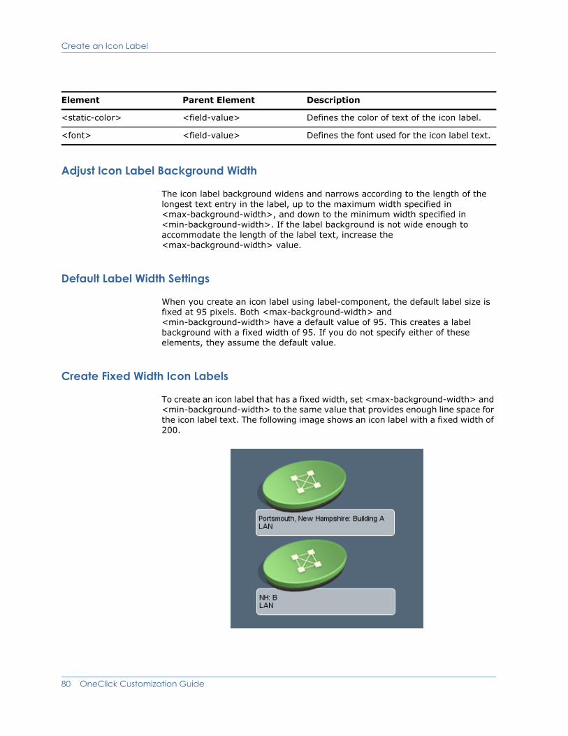
Create an Icon Label
Adjust Icon Label Background Width
The icon label background widens and narrows according to the length of the longest text entry in the label, up to the maximum width specified in <max-background-width>, and down to the minimum width specified in <min-background-width>. If the label background is not wide enough to accommodate the length of the label text, increase the <max-background-width> value.
Default Label Width Settings
When you create an icon label using label-component, the default label size is fixed at 95 pixels. Both <max-background-width> and <min-background-width> have a default value of 95. This creates a label background with a fixed width of 95. If you do not specify either of these elements, they assume the default value.
Create Fixed Width Icon Labels
To create an icon label that has a fixed width, set <max-background-width> and <min-background-width> to the same value that provides enough line space for the icon label text. The following image shows an icon label with a fixed width of 200.
<static-color> <field-value> Defines the color of text of the icon label.
<font> <field-value> Defines the font used for the icon label text.
Element Parent Element Description
80 OneClick Customization Guide
Define Text Components
Define Text ComponentsRefer to versions of this manual for release 8.0 or earlier on the SPECTRUM support and documentation web site:
http://ca.com/support
Add Support for Model Types or Model Classes 81

Define Selection Components
Define Selection ComponentsIn order to make the icon standout when selected, you may want to specify images that will appear only during selection. You do this via the <selection-component> element. In the example below there are two components added that are defined as Selection Components (image component #2 and #4). If the user selected the component, these image components would become visible. Otherwise, they remain invisible. The following figure shows the two selection components:
<?xml version="1.0" encoding="UTF-8"?>
<icon-config id="oneclick-orgservice-iconbase-config">
<static-color idref="oneclick-default-iconbase-color-config"/>
<shape-rectangle >
<x>0</x>
<y>0</y>
<width>139</width>
<height>84</height>
</shape-rectangle>
<stroke>Invisible</stroke>
<!-- =============================================================
Specify the location of where pipes will connect to the icon. - ============================================================== -->
<pipe-connection>
<x>73</x>
<y>36</y>
</pipe-connection>
<components>
<!-- =============================================================
Definition of the model text background.
============================================================== -->
<image-component index="1">
<x>0</x>
82 OneClick Customization Guide

Define Selection Components
<y>75</y>
<width>94</width>
<height>40</height>
<image>
<select>
<default>
com/aprisma/spectrum/app/topo/images/
icon_text_background.png
</default>
</select>
</image>
</image-component>
<image-component index="2">
<x>0</x>
<y>75</y>
<width>94</width>
<height>40</height>
<selection-component>true</selection-component>
<image>
<select>
<default>
com/aprisma/spectrum/app/topo/images
icon_selected_text_background.png
</default>
</select>
</image>
</image-component>
<!-- ============================================================
Definition of the model's base image. The color of this image is determined by the condition of the model.
============================================================== -->
<image-component index="3">
<x>0</x>
<y>0</y>
<width>139</width>
<height>84</height>
<image idref="oneclick-orgservice-iconbase-image-
config"/>
</image-component>
Add Support for Model Types or Model Classes 83

Define Selection Components
<!-- =============================================================
Definition of the image to show when the model is selected.
============================================================= -->
<image-component index="4">
<x>8</x>
<y>0</y>
<width>131</width>
<height>72</height>
<selection-component>true</selection-component>
<image>
<select>
<default>
com/aprisma/spectrum/app/topo/images/
oneclick_selected_container.png
</default>
</select>
</image>
</image-component>
<!--==============================================================
Definition of the model name text field.
============================================================== -->
<text-component idref="oneclick-default-textfield-config"
index="5">
<x>5</x>
<y>97</y>
<width>85</width>
<height>13</height>
<horizontal_alignment>left</horizontal_alignment>
<text>
<attribute>0x1006e</attribute>
</text>
</text-component>
<!-- =============================================================
Definition of the model type name text.
============================================================= -->
<text-component idref="oneclick-default-textfield-config"
index="6">
<x>5</x>
<width>85</width>
<height>12</height>
<horizontal_alignment>left</horizontal_alignment>
<text>
84 OneClick Customization Guide
Define Model Icon Tooltips
<attribute>AttributeID.DEVICE_TYPE</attribute>
<expression>
( value() == null || ((String)value()).length() ==
0 ) ? attr(AttributeID.MTYPE_NAME ) : value()
</expression>
</text>
</text-component>
<!-- ============================================================
Definition of the rollup condition symbol.
============================================================= -->
<image-component index="7">
<x>0</x>
<y>54</y>
<width>19</width>
<height>19</height>
<image idref="oneclick-rollup-triangle-image-config"/>
</image-component>
</components>
</icon-config>
Define Model Icon TooltipsYou can configure the content of a tooltip that displays when a OneClick user moves the cursor over the model icon. In the contents registry in the custom-app-config.xml file (see Define Model Appearance on page 56), the <tooltip-config> element specifies the file that defines the tooltip.
The following example shows that a tooltip configuration for models of model class 2, 5, 11, and 12 will be registered to use the tooltip defined within the mydevice-tooltip-config.xml file.
<contents-registry>
<reg-id>device-icon-config</reg-id>
<tooltip-config>mydevice-tooltip-config</tooltip-config>
<model-class>2</model-class>
<model-class>5</model-class>
<model-class>11</model-class>
<model-class>12</model-class>
</contents-registry>
Add Support for Model Types or Model Classes 85
Define Model Icon Tooltips
The following is an example shows the contents of a tooltip file. Each element is explained in the table that follows the example.
<?xml version="1.0" encoding="UTF-8"?>
<tooltip-config id="mydevice-tooltip-config"
xmlns ="http://www.aprisma.com"
xmlns:xsi="http://www.w3.org/2001/XMLSchema-instance"
xsi:schemaLocation="http://www.aprisma.com../../common/schema/column-config.xsd">
<format><
Define Model Icon Tooltips
<param>
<localize>
com.aprisma.spectrum.app.util.render.MACAddressColumn
</localize>
</param>
<param>
<attribute>AttributeID.MAC_ADDRESS</attribute>
<renderer>com.aprisma.spectrum.app.util.render.NullRenderer
</renderer>
</param>
</device-tooltip-config>
Element Parent Element Description
<tooltip-config> Not applicable The root element for the file that defines the tooltip. The id attribute for this element must be set equal to the value used for the <tooltip-config> element in the <content-registry> found in the custom-app-config.xml file.
<format> <tooltip-config> Use this to define how the data will be displayed in the tooltip. In the above example, an HTML table is used. The number in the curly brackets, e.g. {3}, references the corresponding parameter, for example, the third parameter defined in the file.
<param> <tooltip-config> Use this to define the value to be displayed.
<localize> <param> Converts the string specified in the parameter to a localized value. Use this if you are using a parameter value obtained from a OneClick XML file that shipped with SPECTRUM and begins with “com.aprisma.spectrum”.
<renderer> <param> See Customize the Port Name Column of the Interface Table on page 48.
<attribute> <param> Use this to identify the attribute you want to be displayed.
<message> <param> Use this for specifying a plain text value for a parameter.
Add Support for Model Types or Model Classes 87

Define Model Icon Tooltips
88 OneClick Customization Guide
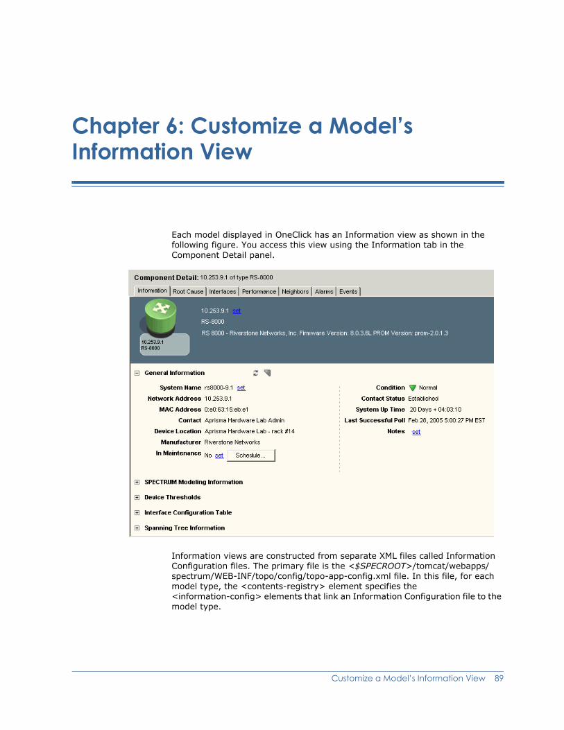
Chapter 6: Customize a Model’s Information View
Each model displayed in OneClick has an Information view as shown in the following figure. You access this view using the Information tab in the Component Detail panel.
Information views are constructed from separate XML files called Information Configuration files. The primary file is the <$SPECROOT>/tomcat/webapps/ spectrum/WEB-INF/topo/config/topo-app-config.xml file. In this file, for each model type, the <contents-registry> element specifies the <information-config> elements that link an Information Configuration file to the model type.
Customize a Model’s Information View 89

Extend or Modify an Information View
The <contents-registry> in the following example is found in topo-app-config.xml. It links the 0x2100c (Rtr_Cisco) model type with view-devicedetails-config.xml, which specifies the format for the Information view.
<contents-registry>
<reg-id>router-icon-config</reg-id>
<tooltip-config>device-tooltip-config</tooltip-config>
<information-config>view-devicedetails-config</information-config>
<performance-config>performance-data-rtrcisco-config</performance-config>
<!-- All Model Types derived from Rtr_Cisco (0x21000c) -->
<model-type>0x21000c</model-type>
<!-- Rtr_Cisco -->
</contents-registry
Note: Several model classes and model types may be specified within the contents or component details registries. Information views can be reused in one or more <contents-registry> elements.
This chapter describes how to add and edit information displayed in the Information view for a particular model type or model class.
Extend or Modify an Information ViewYou can modify or create an Information view to display information available in a device MIB that SPECTRUM and OneClick do not support by default. You can decide whether to add this parameter to one of the existing subviews in the Information view for that device type, or to create a new subview.
When you create or modify an Information view, you must create a new Information Configuration file in the <$SPECROOT>/custom/console/config/ directory. This file must have the same name as the factory default Information Configuration file that you need to modify. You then associate the Information Configuration file with the appropriate model type using the <$SPECROOT>/custom/console/config/custom-app.config.xml file.
Note: You must create the file <$SPECROOT>/custom/console/config/custom-app-config.xml and add your customization code in it. See Create Customizations on page 4 for information
90 OneClick Customization Guide
Extend or Modify an Information View
about creating and saving customization files, and relating them to their factory default counterpart files using IDREF. See Create Customizations on page 4 for information about extending, overriding, or creating new configuration files.
1. If you are modifying or extending an existing Information view for an existing model type or model class, you must identify the current Information view configuration file used to create the Information view.
a. Open the <$SPECROOT>/tomcat/webapps/spectrum/WEB-INF/topo/config/topo-app-config.xml file and find the <contents-registry> element for the appropriate model type or model class. (For an example, see the XML code example at the start of this chapter.)
Note: OneClick uses the hierarchy that model_type definitions override the same definition found in a model_class.
b. Find the <information-config> element within the <contents-registry> element, and note the name of the Information Configuration file described by this element. All of the existing Information Configuration files are located in the <$SPECROOT>/tomcat/webapps/spectrum/WEB-INF/topo/config directory.
Extend an Existing Information Configuration
2. To extend an existing information configuration:
a. Create a new file in the <$SPECROOT>/custom/topo/config directory with the same name as the Information Configuration file determined in the next step. Use idref to extend the existing factory file with the content of this new file.
b. Open the file using a text editor and use the XML syntax outlined in Create an Information Configuration File on page 92 to build the file.
c. Continue to step 4.
Override an Existing Information Configuration
3. To modify an existing information configuration:
a. Copy the Information configuration file identified in step 1 from <$SPECROOT>/tomcat/webapps/spectrum/WEB-INF/topo/config directory and paste it into <$SPECROOT>/custom/topo/config directory.
b. Open the file using a text editor and use the XML syntax outlined in Create an Information Configuration File on page 92 to modify the file.
c. Continue to step 4.
4. Save and close the file.
5. Associate the new Information Configuration file with the appropriate model types or model classes using the instructions found in Associate an Information Configuration File with a Model Class or Model Type on page 107.
Customize a Model’s Information View 91
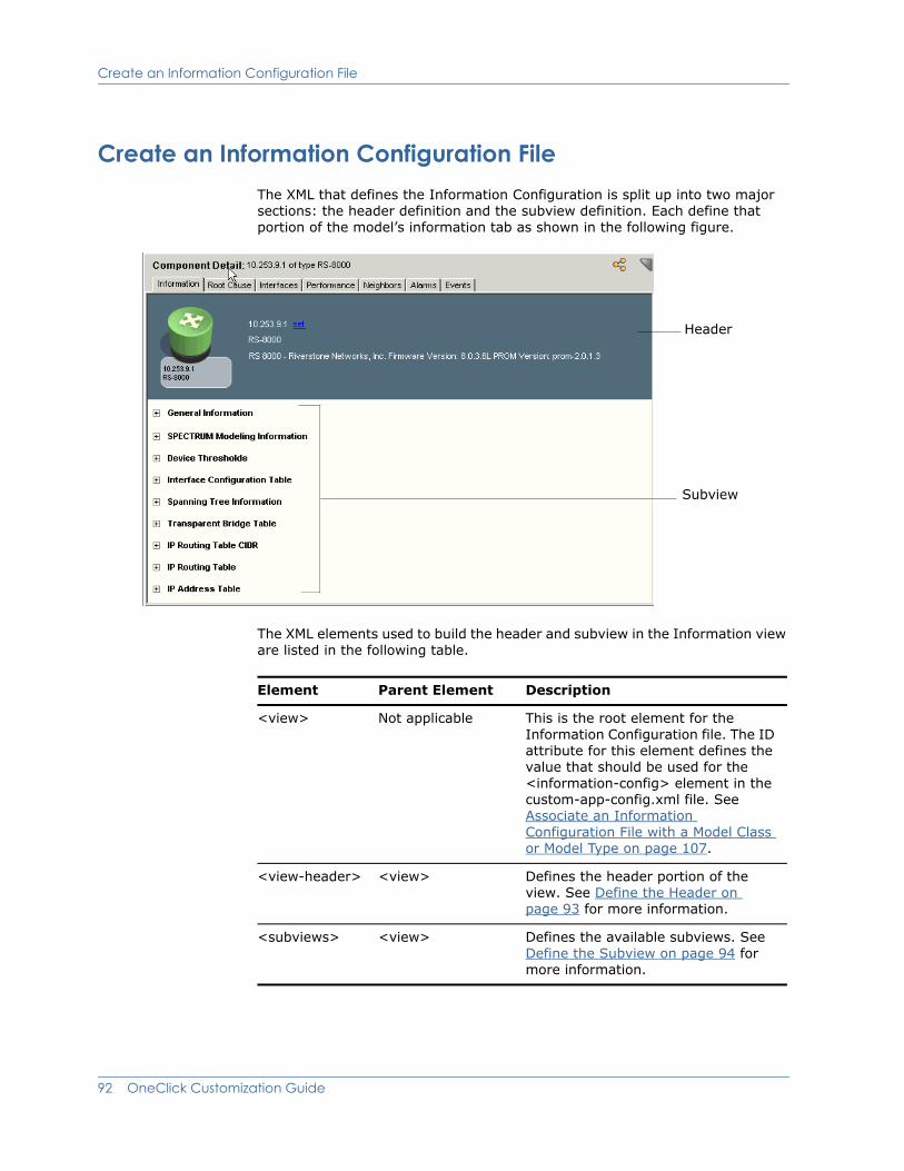
Create an Information Configuration File
Create an Information Configuration FileThe XML that defines the Information Configuration is split up into two major sections: the header definition and the subview definition. Each define that portion of the model’s information tab as shown in the following figure.
The XML elements used to build the header and subview in the Information view are listed in the following table.
Header
Subview
Element Parent Element Description
<view> Not applicable This is the root element for the Information Configuration file. The ID attribute for this element defines the value that should be used for the <information-config> element in the custom-app-config.xml file. See Associate an Information Configuration File with a Model Class or Model Type on page 107.
<view-header> <view> Defines the header portion of the view. See Define the Header on page 93 for more information.
<subviews> <view> Defines the available subviews. See Define the Subview on page 94 for more information.
92 OneClick Customization Guide
Create an Information Configuration File
Define the Header
The Information tab header is identified by the <view-header> element. The header specifies the model’s graphical depiction and textual information as shown in the image in Create an Information Configuration File on page 92.
Example: Code for Information Tab Header<view-header>
<show-icon>true</show-icon>
<show-labels>false</show-labels>
<field-column>
<column idref="column-modelname-config"/>
<column idref="column-modeltype-config"/>
</field-column>
</view-header>
Element Parent Element Description
<view-header> <view> Defines the header portion of the view.
<show-icon> <view-header> Indicates whether or not to show the icon. Values: true or false.
<show-labels> <view-header> Indicates whether or not to show field labels
Values: true or false
<field-column> <view-header> Constructs a column of information.
<column> <field-column> Defines the data for the field column. The idref attribute enables you to associate another XML file, which will define the data for the column. The data for the column does not have to be in another file, it is done for organizational purposes only.
Customize a Model’s Information View 93
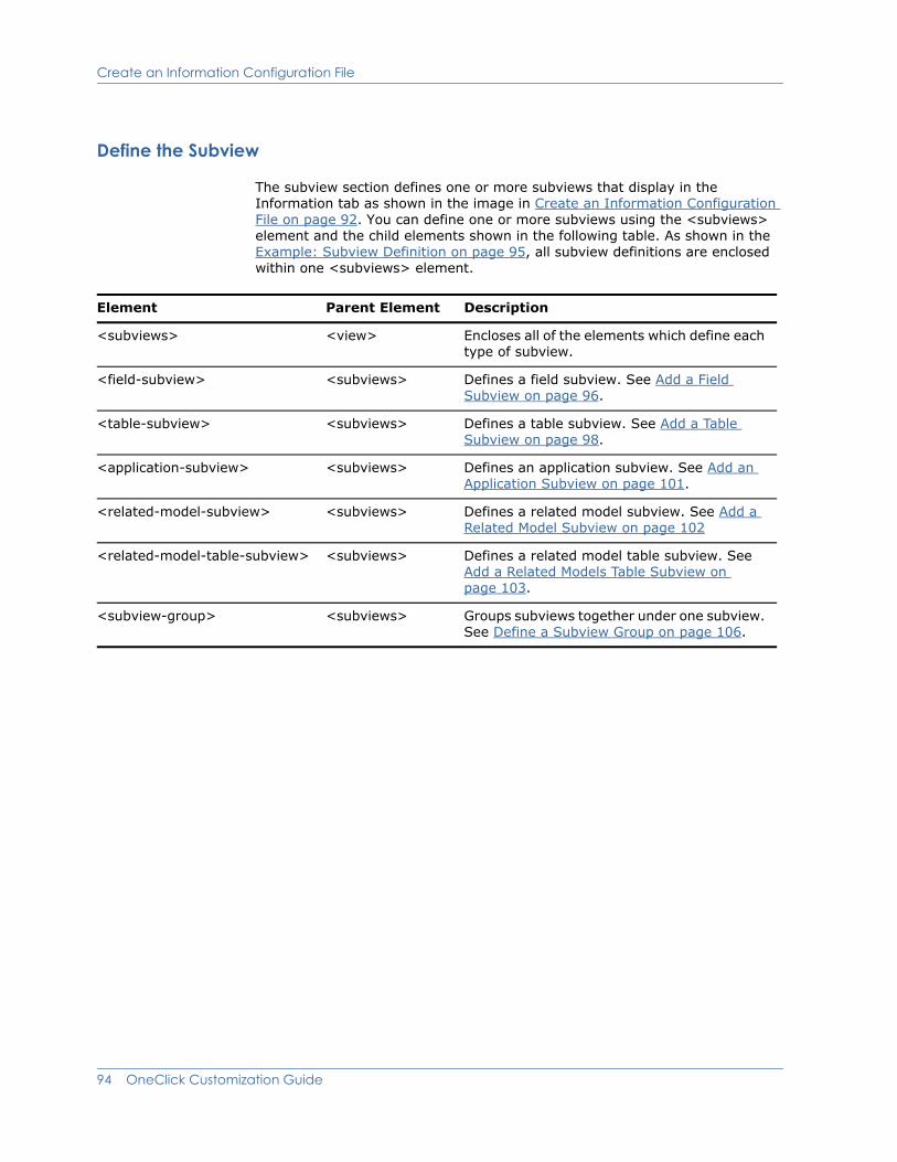
Create an Information Configuration File
Define the Subview
The subview section defines one or more subviews that display in the Information tab as shown in the image in Create an Information Configuration File on page 92. You can define one or more subviews using the <subviews> element and the child elements shown in the following table. As shown in the Example: Subview Definition on page 95, all subview definitions are enclosed within one <subviews> element.
Element Parent Element Description
<subviews> <view> Encloses all of the elements which define each type of subview.
<field-subview> <subviews> Defines a field subview. See Add a Field Subview on page 96.
<table-subview> <subviews> Defines a table subview. See Add a Table Subview on page 98.
<application-subview> <subviews> Defines an application subview. See Add an Application Subview on page 101.
<related-model-subview> <subviews> Defines a related model subview. See Add a Related Model Subview on page 102
<related-model-table-subview> <subviews> Defines a related model table subview. See Add a Related Models Table Subview on page 103.
<subview-group> <subviews> Groups subviews together under one subview. See Define a Subview Group on page 106.
94 OneClick Customization Guide

Create an Information Configuration File
Example: Subview Definition<subviews>
<field-subview>
.
.
.
</field-subview>
<application-subview>
.
.
.
</application-subview>
<table-subview>
.
.
.
</table-subview>
</subviews>
Customize a Model’s Information View 95

Create an Information Configuration File
Add a Field Subview
Field subviews are used to display a list of non-list attributes available on the selected device model. The following is an example of XML syntax used to create a field subview.
Example: Field Subview<field-subview>
<title>General Information</title>
<privilege>
<name>GeneralInfo</name>
</privilege>
<field-column>
<column idref="column-condition-config"/>
<column idref="column-contactstatus-config"/>
<column idref="column-networkaddress-config"/>
<column idref="column-ismanaged-config">
<editable/>
</column>
<column idref="column-securitystring-config">
<editable verifier=
"com.aprisma.spectrum.app.swing.widget.SecStringInputVerifier"/>
</column>
</field-column>
<field-column>
<column idref="column-modelcreationdate-config"/>
<column idref="column-modeltypename-config"/>
<column idref="column-modelclass-config"/>
<column idref="column-lastsuccessfulpoll-config"/>
<column idref="column-landscape-config"/>
<column idref="column-modelnotes-config">
<editable/>
</column>
</field-column>
</field-subview>
96 OneClick Customization Guide

Create an Information Configuration File
This code generates a subview similar to the one shown in the following figure.
You can use the elements shown in the following table to create a field subview.
Element Parent Element Description
<field-subview> <subviews> Defines a field subview.
If you set the expanded attribute of this element to true, the subview will be expanded by default.
The idref attribute enables you to associate an XML file that defines the data for this subview. The data for the subview does not have to be in another file, it is done for organizational purposes only.
<title> <field-subview> The title of the subview. In our example above, the title is “General Information”.
<display-if> <field-subview> Enables the author to specify whether the subview should be displayed via an expression.
<display-if-app-installed> <field-subview> Enables the author to specify that the defined view only be added if the specified application is installed.
<privilege> <field-subview> Associates a privilege to the subview. If the user is not given this privilege, the subview will not be displayed for that user. See Chapter 8: Create Custom Privileges for more information.
<show-labels> <field-subview> Indicates whether or not to show field labels. Values: true or false.
<field-column> <field-subview> Constructs a column of information.
Customize a Model’s Information View 97
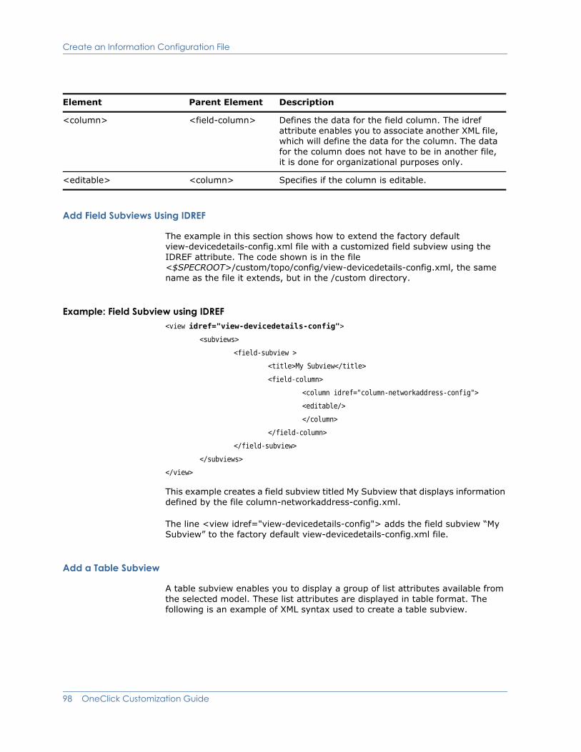
Create an Information Configuration File
Add Field Subviews Using IDREF
The example in this section shows how to extend the factory default view-devicedetails-config.xml file with a customized field subview using the IDREF attribute. The code shown is in the file <$SPECROOT>/custom/topo/config/view-devicedetails-config.xml, the same name as the file it extends, but in the /custom directory.
Example: Field Subview using IDREF<view idref="view-devicedetails-config">
<subviews>
<field-subview >
<title>My Subview</title>
<field-column>
<column idref="column-networkaddress-config">
<editable/>
</column>
</field-column>
</field-subview>
</subviews>
</view>
This example creates a field subview titled My Subview that displays information defined by the file column-networkaddress-config.xml.
The line <view idref="view-devicedetails-config"> adds the field subview “My Subview” to the factory default view-devicedetails-config.xml file.
Add a Table Subview
A table subview enables you to display a group of list attributes available from the selected model. These list attributes are displayed in table format. The following is an example of XML syntax used to create a table subview.
<column> <field-column> Defines the data for the field column. The idref attribute enables you to associate another XML file, which will define the data for the column. The data for the column does not have to be in another file, it is done for organizational purposes only.
<editable> <column> Specifies if the column is editable.
Element Parent Element Description
98 OneClick Customization Guide
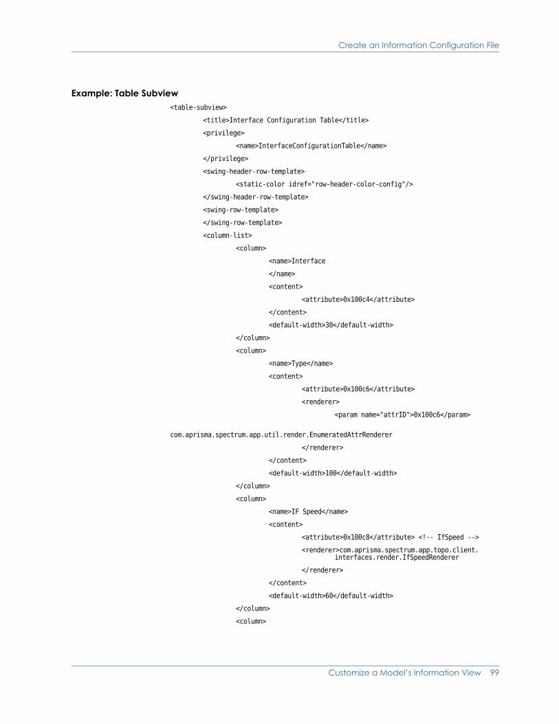
Create an Information Configuration File
Example: Table Subview<table-subview>
<title>Interface Configuration Table</title>
<privilege>
<name>InterfaceConfigurationTable</name>
</privilege>
<swing-header-row-template>
<static-color idref="row-header-color-config"/>
</swing-header-row-template>
<swing-row-template>
</swing-row-template>
<column-list>
<column>
<name>Interface
</name>
<content>
<attribute>0x100c4</attribute>
</content>
<default-width>30</default-width>
</column>
<column>
<name>Type</name>
<content>
<attribute>0x100c6</attribute>
<renderer>
<param name="attrID">0x100c6</param>
com.aprisma.spectrum.app.util.render.EnumeratedAttrRenderer
</renderer>
</content>
<default-width>100</default-width>
</column>
<column>
<name>IF Speed</name>
<content>
<attribute>0x100c8</attribute> <!-- IfSpeed -->
<renderer>com.aprisma.spectrum.app.topo.client. interfaces.render.IfSpeedRenderer
</renderer>
</content>
<default-width>60</default-width>
</column>
<column>
Customize a Model’s Information View 99

Create an Information Configuration File
<name>Physical Address</name>
<content>
<attribute>0x100c9</attribute>
</content>
<default-width>90</default-width>
</column>
</column-list>
</table-subview>
The code in this example generates a subview similar to the one shown in the following image.
You can use the elements shown in the following table to create a table subview.
Note: All of the elements that can be used to modify a table (listed in the table in Modify a Table Column on page 33) can be used to create the table for the table subview.
Element Parent Element Description
<table-subview> <subviews> Adds a table subview.
If you set the expanded attribute of this element to true, the subview will be expanded by default.
The idref attribute enables you to associate an XML file that defines the data for this subview. The data for the subview does not have to be in another file, it is done for organizational purposes only.
<title> <table-subview> The title for the table.
<privilege> <table-subview> Associates a privilege to the subview. If the user is not given this privilege, the subview will not be displayed for that user. See Chapter 8: Create Custom Privileges for more information.
100 OneClick Customization Guide

Create an Information Configuration File
Add an Application Subview
An application subview enables you to display attributes affiliated with an application model type related to the selected model type by a specified criteria. The example below uses SPECTRUM’s PossPrimApp (0x230000) relation.
Example: Application Subview<application-subview>
<title>SNMP2 IP Routing Table</title>
<model-type>0x230010</model-type>
<subviews>
<table-subview idref="table-ip2-ip-routingtable-config"/>
</subviews>
</application-subview>
The attribute used within the <model-type> element defines the model type to which the subview pertains. In the example above, the value 0x230010 is used. This attribute value corresponds to the SNMP2_Agent Application model type. This means that this particular table definition applies only to the SNMP2_Agent application. If the current device does not implement this application, this table will not be visible.
Element Parent Element Description
<application-subview> <subviews> Creates and application subview.
If you set the expanded attribute of this element to true, the subview will be expanded by default.
The idref attribute enables you to associate an XML file that defines the data for this subview. The data for the subview does not have to be in another file, it is done for organizational purposes only.
<title> <application-subview> The title of the subview.
<model-type> <application-subview> The model type to which the subviews will pertain.
<subviews> <application-subview> Enables you to add a prebuilt table-subview or field- subview to the detail components that reside within the application subview. Values: table-subview and/or field-subview.
Customize a Model’s Information View 101

Create an Information Configuration File
Add a Related Model Subview
A related model subview enables the user to display the attributes of models related to the current, selected model via a search criteria, for example, models that are related by a specific association. The user can then display attributes of the found models in field or table format. The section Add a Related Models Table Subview on page 103 shows how you can display the attributes in table format.
You can use the elements in the following table to create related model subview.
<criteria> <application-subview> The search criteria used to find the related models.
<privilege> <application-subview> Associates a privilege to the subview. If the user is not given this privilege, the subview will not be displayed for that user. See Chapter 8: Create Custom Privileges for more information.
Element Parent Element Description
Element Parent Element Description
<related-model-subview> <subviews> If you set the expanded attribute of this element to true, the subview will be expanded by default.
The idref attribute enables you to associate an XML file that defines the data for this subview. The data for the subview does not have to be in another file, it is done for organizational purposes only.
<title> <related-model-subview> The title of the subview.
<model-type> <related-model-subview> The model type to which the subviews will pertain.
<subviews> <related-model-subview> Enables you to add a prebuilt table-subview or field- subview to the detail components that reside within the subview. Values: table-subview and/or field-subview.
<criteria> <related-model-subview> The search criteria used to find the related models.
<privilege> <related-model-subview> Associates a privilege to the subview. If the user is not given this privilege, the subview will not be displayed for that user. See Chapter 8: Create Custom Privileges for more information.
102 OneClick Customization Guide
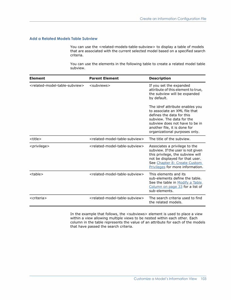
Create an Information Configuration File
Add a Related Models Table Subview
You can use the <related-models-table-subview> to display a table of models that are associated with the current selected model based on a specified search criteria.
You can use the elements in the following table to create a related model table subview.
In the example that follows, the <subviews> element is used to place a view within a view allowing multiple views to be nested within each other. Each column in the table represents the value of an attribute for each of the models that have passed the search criteria.
Element Parent Element Description
<related-model-table-subview> <subviews> If you set the expanded attribute of this element to true, the subview will be expanded by default.
The idref attribute enables you to associate an XML file that defines the data for this subview. The data for the subview does not have to be in another file, it is done for organizational purposes only.
<title> <related-model-table-subview> The title of the subview.
<privilege> <related-model-table-subview> Associates a privilege to the subview. If the user is not given this privilege, the subview will not be displayed for that user. See Chapter 8: Create Custom Privileges for more information.
<table> <related-model-table-subview> This elements and its sub-elements define the table. See the table in Modify a Table Column on page 33 for a list of sub-elements.
<criteria> <related-model-table-subview> The search criteria used to find the related models.
Customize a Model’s Information View 103

Create an Information Configuration File
Example: Related-Model-Table Subview (demo-details-config.xml)<subviews>
<related-models-table-subview>
<title>Demo Table Title</title>
<criteria>demo-search-criteria</criteria>
<table>demo-table-config</table>
</related-models-table-subview>
</subviews>
Example: Referenced Criteria XML (demo-search-criteria.xml)<search-criteria id="demo-search-criteria"
xmlns="http://www.aprisma.com"
xmlns:xsi="http://www.w3.org/2001/XMLSchema-instance"
xsi:schemaLocation="http://www.aprisma.com
../../common/schema/search-criteria-config.xsd">
<child-models>
<application-specified-models/>
<relation>Collects</relation>
</child-models>
</search-criteria>
104 OneClick Customization Guide
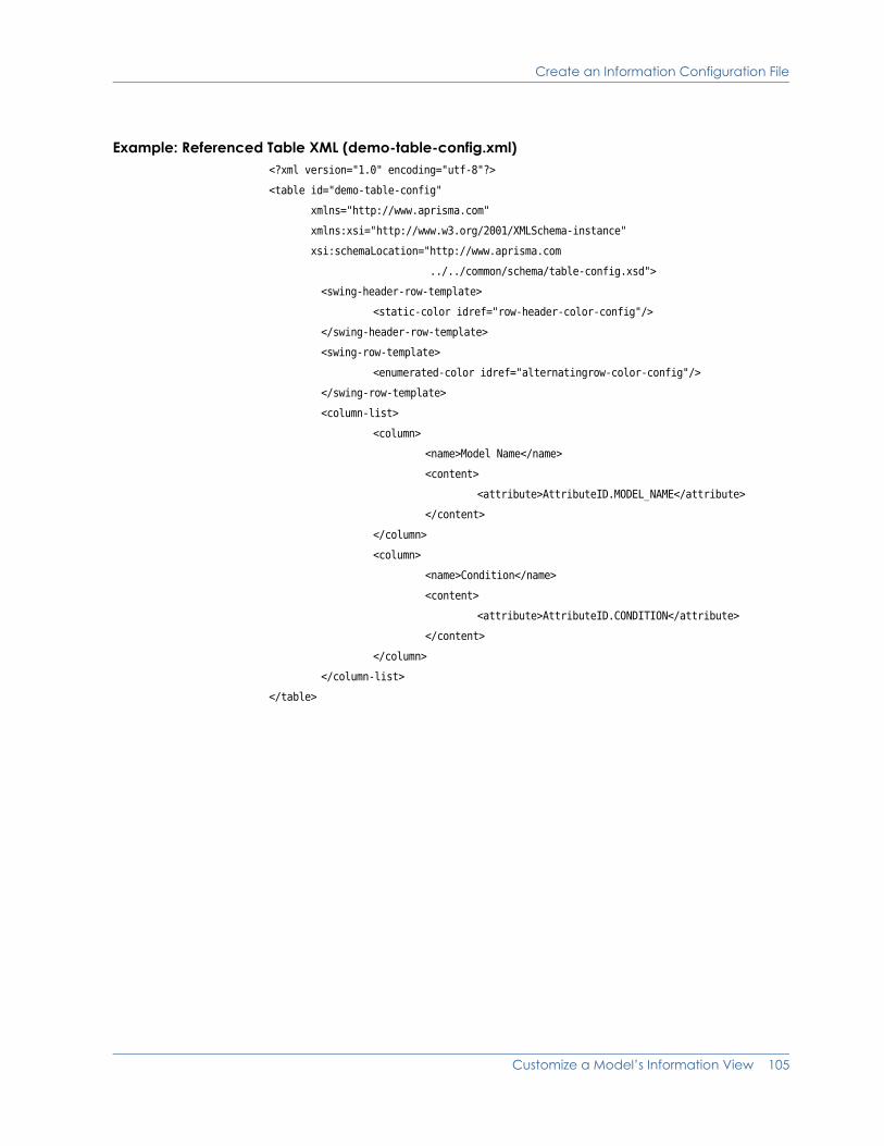
Create an Information Configuration File
Example: Referenced Table XML (demo-table-config.xml)<?xml version="1.0" encoding="utf-8"?>
<table id="demo-table-config"
xmlns="http://www.aprisma.com"
xmlns:xsi="http://www.w3.org/2001/XMLSchema-instance"
xsi:schemaLocation="http://www.aprisma.com
../../common/schema/table-config.xsd">
<swing-header-row-template>
<static-color idref="row-header-color-config"/>
</swing-header-row-template>
<swing-row-template>
<enumerated-color idref="alternatingrow-color-config"/>
</swing-row-template>
<column-list>
<column>
<name>Model Name</name>
<content>
<attribute>AttributeID.MODEL_NAME</attribute>
</content>
</column>
<column>
<name>Condition</name>
<content>
<attribute>AttributeID.CONDITION</attribute>
</content>
</column>
</column-list>
</table>
Customize a Model’s Information View 105

Create an Information Configuration File
Define a Subview Group
You can group together one or more subviews under a single collapsible group using the <subview-group> element.
<subview-group>
<title>Subview Group Title</title>
<display-if>
<expression>
attrInt(AttributeID.MTYPE_HANDLE) == 0x3cc0002
</expression>
</display-if>
<subviews>
<table-subview idref="example-table1-config">
<title>Example Sub View #1</title>
</table-subview>
<table-subview idref="example-table2-config">
<title>Example Sub View #2</title>
</table-subview>
</subviews>
</subview-group>
This example generates a subview group similar to the one shown in the following figure.
106 OneClick Customization Guide

Associate an Information Configuration File with a Model Class or Model Type
Use the elements shown in the following table to create a subview group.
Associate an Information Configuration File with a Model Class or Model Type
Once you have created the Information view with an Information Configuration file, you must follow the instructions below to associate the Information Configuration file with the model type or model class.
Procedure
1. If it does not already exist there, copy the <$SPECROOT>/tomcat/webapps/spectrum/WEB-INF/console/config/custom-app-config.xml to the <$SPECROOT>/custom/console/config directory.
2. Open this file with a text editor.
Element Parent Element Description
<subview-group> <subviews> If you set the expanded attribute of this element to true, the subview will be expanded by default.
The idref attribute enables you to associate an XML file that defines the data for this subview. The data for the subview does not have to be in another file, it is done for organizational purposes only.
<title> <subview-group> The title of the subview group. In the example above, this is Subview Group Title.
<privilege> <subview-group> Associates a privilege to the subview group. If the user is not given this privilege, the subview group will not be displayed for that user. See Chapter 8: Create Custom Privileges for more information.
<display-if> <subview-group> Adds an expression that will determine whether or not the group will be visible.
<subviews> <subview-group> Adds any type of subview (besides group) to this subview group.
Customize a Model’s Information View 107

Associate an Information Configuration File with a Model Class or Model Type
3. Add the following block of XML code to link the appropriate model type(s) or model class(es) to the Information Configuration file. Use the XML elements shown to define the information appropriate to your model type or model class. For a definition of each of these elements, see Define Model Appearance on page 56.
<contents-registry>
<icon-reg-id>your-icon-registration</icon-reg-id>
<tooltip-config>your-tooltip-config</tooltip-config>
<information-config>your-information-config-file</information-config>
<model-class>your-model-class</model-class>
</contents-registry>
4. Save and close the custom-app-config.xml file.
5. Restart the OneClick client for your changes to take effect.
108 OneClick Customization Guide
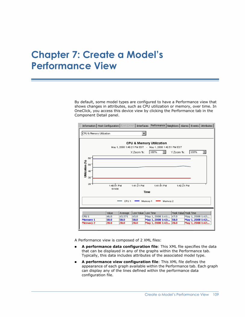
Chapter 7: Create a Model’s Performance View
By default, some model types are configured to have a Performance view that shows changes in attributes, such as CPU utilization or memory, over time. In OneClick, you access this device view by clicking the Performance tab in the Component Detail panel.
A Performance view is composed of 2 XML files:
A performance data configuration file: This XML file specifies the data that can be displayed in any of the graphs within the Performance tab. Typically, this data includes attributes of the associated model type.
A performance view configuration file: This XML file defines the appearance of each graph available within the Performance tab. Each graph can display any of the lines defined within the performance data configuration file.
Create a Model’s Performance View 109

Create a New Performance View
If the data or the format of one of the default Performance views does not meet your requirements, you can customize it for a particular model type or model class. For example, if you have added support in SPECTRUM for additional MIBs that are supported by a device, you might want to customize the view to graph some of the data that is available in the MIB. You can also create your own custom Performance views.
If a Performance view is not configured for the model currently selected in OneClick, the Performance tab is disabled.
Create a New Performance ViewWhen you create a Performance view for a model type or model class from scratch, you should place the configuration files that define the view in the <$SPECROOT>/custom/topo/config directory. This helps to ensure they are not overwritten during an upgrade of SPECTRUM.
You associate the view’s performance data configuration file with each applicable model type or model class in a file named custom-app-config.xml. While you can use either the <contents-registry> element or the <component-details-registry> element to do this, a best practice is to use the <component-details-registry> element because it configures only the Component Detail panel for the given model type or model class. For a description of the different registries available, see Chapter 5: Add Support for Model Types or Model Classes.
To create a new Performance view
1. In the <$SPECROOT>/custom/topo/config directory, create the performance data configuration file that specifies the data to be graphed in the view. For more information, see Create a Performance Data Configuration File on page 111.
2. In the <$SPECROOT>/custom/topo/config directory, create a performance view configuration file that defines the appearance of each graph in the view. For more information, see Create a Performance View Configuration File on page 114.
3. In custom-app-config.xml, associate the performance data configuration file with the appropriate model types or model classes:
a. If it does not already exist there, copy <$SPECROOT>/tomcat/webapps/spectrum/WEB-INF/console/config/ custom-app-config.xml to the <$SPECROOT>/custom/console/config directory.
Note: Make sure to copy the file to the specified location. Do not modify the default custom-app-config.xml file that is provided with SPECTRUM because it is overwritten when you upgrade to a newer version.
110 OneClick Customization Guide
Create a New Performance View
b. In custom-app-config.xml, add a block of XML code similar to the following example using a text editor. This code links the appropriate model types and model classes to the performance configuration data file.
The following XML code example associates a model type whose ID is 0x3250004 to a performance data configuration file named <$SPECROOT>/custom/topo/config/ performance-data-ciscovoiceapp-config.xml.
<component-details-registry> <performance-config>performance-data-ciscovoiceapp-config</performance-config> <model-type>0x3250004</model-type> <!-- CiscoVoiceApp --> </component-details-registry>
Note: You can specify several model classes and model types within the contents or component details registries. You can also reuse Performance views in one or more <contents-registry> elements.
c. Save and close the custom-app-config.xml file.
4. Restart the OneClick client for your changes to take effect.
Create a Performance Data Configuration File
The performance data configuration file specifies the data that can be displayed in any of the graphs within the Performance tab. A recommended naming convention for this XML file is performance-<descriptor>-data-config.xml.
Use the XML elements described in the following table to create a performance data configuration file.
Element Parent Element Description
performance-config Not applicable Represents the top-level parent element.
Note: You specify multiple graphs for a Performance view using multiple instances of the <graph> element in the performance view configuration file. For more information, see Create a Performance View Configuration File on page 114.
display performance-config Specifies the XML file that defines the view for presenting the graph data.
Note: This name must exactly match the simple file name of the actual performance view configuration file.
Create a Model’s Performance View 111
Create a New Performance View
line performance-config Defines a line in the graph.
name line Specifies the label (name) for the line defined by the <line> parent element as it will be seen in the graph. The value for name needs to match its corresponding line definition in the performance graph view configuration file.
If you are graphing a list attribute, you can also specify an attr-id attribute for the name element. This specifies an attribute ID whose value is appended to the name of each instance in the list. If not specified, the instance number is appended to the name of each list instance.
In the following example, attribute 0x12ac6 represents the list of labels for the multiple lines defined by <list-content>.
<line> <name attr-id="0x12ac6"> Memory Utilization </name> <list-content> <attribute>0x12ac6</attribute> </list-content> </line>
content line Specifies scalar data to graph as a single line defined by the <line> parent element, for example:
<content> <attribute>0x2100cc</attribute> </content>
Element Parent Element Description
112 OneClick Customization Guide
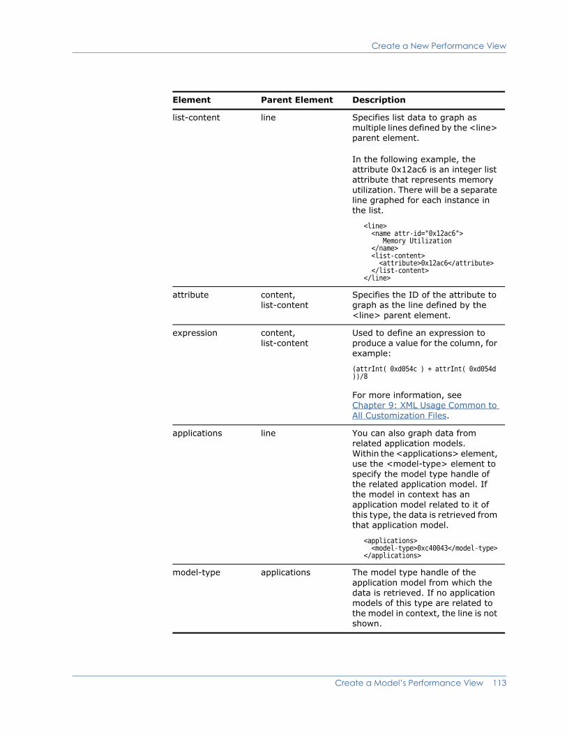
Create a New Performance View
list-content line Specifies list data to graph as multiple lines defined by the <line> parent element.
In the following example, the attribute 0x12ac6 is an integer list attribute that represents memory utilization. There will be a separate line graphed for each instance in the list.
<line> <name attr-id="0x12ac6"> Memory Utilization </name> <list-content> <attribute>0x12ac6</attribute> </list-content> </line>
attribute content, list-content
Specifies the ID of the attribute to graph as the line defined by the <line> parent element.
expression content, list-content
Used to define an expression to produce a value for the column, for example:
(attrInt( 0xd054c ) + attrInt( 0xd054d ))/8
For more information, see Chapter 9: XML Usage Common to All Customization Files.
applications line You can also graph data from related application models. Within the <applications> element, use the <model-type> element to specify the model type handle of the related application model. If the model in context has an application model related to it of this type, the data is retrieved from that application model.
<applications> <model-type>0xc40043</model-type> </applications>
model-type applications The model type handle of the application model from which the data is retrieved. If no application models of this type are related to the model in context, the line is not shown.
Element Parent Element Description
Create a Model’s Performance View 113

Create a New Performance View
The following example specifies the data to display in a 2-line performance graph that shows the change in both active and total VoIP calls over time for a Cisco device.
<performance-config id="performance-data-ciscovoiceapp-config"> <display>performance-ciscovoiceapp-config</display>
<line> <name>Active VoIP Calls</name> <content> <attribute>0x325012b</attribute><!-- VoIP_Current_Calls --> </content> </line>
<line> <name>Total VoIP Calls</name> <content> <attribute>0x3250129</attribute> <!-- VoIP_Total_Calls --> </content> </line>
</performance-config>
Tip: For additional, more complex examples of performance data configuration files, see the supporting files for the Performance views included with SPECTRUM. You can find these files by navigating to the <$SPECROOT>/tomcat/webapps/spectrum/WEB-INF directory and searching for files named perf*.
Create a Performance View Configuration File
The performance view configuration file defines the appearance of each graph available within the Performance tab. A recommended naming convention for this XML file is performance-<descriptor>-view-config.xml.
Use the XML elements described in the following table to create a performance view configuration file.
Element Parent Element Description
performance-view Not applicable Represents the top-level parent element.
graph performance-view Within the performance view configuration file, you can configure multiple graphs. Each graph is denoted by this <graph> element. The id attribute of this element is used as the graph title and displayed in the pulldown menu on the view (which is used for switching between multiple graphs for a single model).
<graph id="CPU Utilization"> <y-axis-label>Utilization</y-axis-label> <y-axis-units>%</y-axis-units> <line> <name>CPU Utilization</name> </line> </graph>
114 OneClick Customization Guide
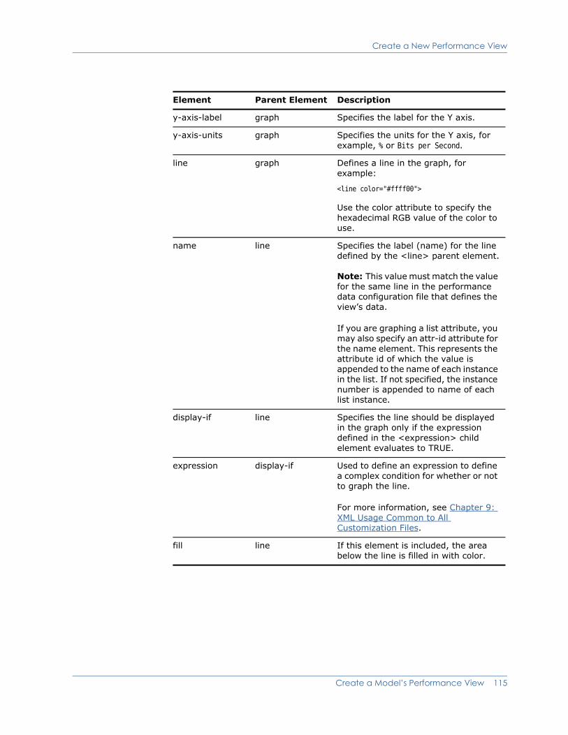
Create a New Performance View
y-axis-label graph Specifies the label for the Y axis.
y-axis-units graph Specifies the units for the Y axis, for example, % or Bits per Second.
line graph Defines a line in the graph, for example:
<line color="#ffff00">
Use the color attribute to specify the hexadecimal RGB value of the color to use.
name line Specifies the label (name) for the line defined by the <line> parent element.
Note: This value must match the value for the same line in the performance data configuration file that defines the view’s data.
If you are graphing a list attribute, you may also specify an attr-id attribute for the name element. This represents the attribute id of which the value is appended to the name of each instance in the list. If not specified, the instance number is appended to name of each list instance.
display-if line Specifies the line should be displayed in the graph only if the expression defined in the <expression> child element evaluates to TRUE.
expression display-if Used to define an expression to define a complex condition for whether or not to graph the line.
For more information, see Chapter 9: XML Usage Common to All Customization Files.
fill line If this element is included, the area below the line is filled in with color.
Element Parent Element Description
Create a Model’s Performance View 115

Customize an Existing Performance View
The following example specifies the format for a 2-line performance graph that shows the change in both active and total VoIP calls over time for a Cisco device. (Note that this is the format for the example graph whose data is defined in the previous section, Create a Performance Data Configuration File on page 111.)
<performance-view id="performance-ciscovoiceapp-config"> <graph id="VoIP Calls Title"> <y-axis-label>Calls</y-axis-label> <y-axis-units>unit</y-axis-units> <line> <name>Active VoIP Calls</name> </line> <line> <name>Total VoIP Calls</name> </line> </graph> </performance-view>
Tip: For additional, more complex examples of performance view configuration files, see the supporting files for the Performance views included with SPECTRUM. You can find these files by navigating to the <$SPECROOT>/tomcat/webapps/spectrum/WEB-INF directory and searching for files named perf*.
Customize an Existing Performance ViewIn general, you customize an existing Performance view by overriding the default configuration files for the view with versions that contain your customizations.
To customize an existing Performance view
1. Identify the default configuration files that define the Performance view you want to customize:
a. Open <$SPECROOT>/tomcat/webapps/spectrum/WEB-INF/topo/config/ topo-app-config.xml and find the <contents-registry> or <component-details-registry> element for the appropriate model type or model class.
Note: If your model qualifies for both a model type and a model class registration, the model type registration takes precedence and is applied. Also, even though you can define the Performance view configuration in both the contents registry and the component details registry, the component details registry takes precedence. The contents registry is primarily for model appearance and typically is applied to only the model class.
116 OneClick Customization Guide
Customize an Existing Performance View
b. Find the <performance-config> element within the <contents-registry> or <component-details-registry> element, and note the name of the specified performance data configuration file.
Note: All of the default performance configuration files—both the data configuration files and the view configuration files—are located in the <$SPECROOT>/tomcat/webapps/spectrum/WEB-INF/*/config directories.
c. Open the <$SPECROOT>/tomcat/webapps/spectrum/WEB-INF/topo/config directory, and then open the performance data configuration file you identified in the previous step.
d. Find the <display> element within the <performance-config> element, and note the name of the specified performance view configuration file.
2. Copy over one or both of the performance configuration files that you identified in step 1 to the <$SPECROOT>/custom/topo/config directory. You only need to copy over a file if it requires customizations.
Note: To override the factory default performance configuration files, the copied files (that will contain your customizations) must have the same names as the original, default files.
3. If necessary, modify the copied performance data configuration file per your requirements, and then save and close the file. For more information, see Create a Performance Data Configuration File on page 111.
4. If necessary, modify the copied performance view configuration file per your requirements, and then save and close the file. For more information, see Create a Performance View Configuration File on page 114.
5. If necessary, in custom-app-config.xml, change the model types or model classes that are associated with the performance data configuration file:
a. If it does not already exist there, copy <$SPECROOT>/tomcat/webapps/spectrum/WEB-INF/console/config/ custom-app-config.xml to the <$SPECROOT>/custom/console/config directory.
Note: Make sure to copy the file to the specified location. Do not modify the default custom-app-config.xml file that is provided with SPECTRUM because it is overwritten when you upgrade to a newer version.
b. In custom-app-config.xml, add a block of XML code similar to the following example using a text editor. This code links the appropriate model types and model classes to the performance configuration data file.
The following XML code example associates a model type whose ID is 0x3250004 to a performance data configuration file named <$SPECROOT>/custom/topo/config/ performance-data-ciscovoiceapp-config.xml.
<component-details-registry> <performance-config>performance-data-ciscovoiceapp-config</performance-config> <model-type>0x3250004</model-type> <!-- CiscoVoiceApp --> </component-details-registry>
Create a Model’s Performance View 117

Customize an Existing Performance View
Note: You can specify several model classes and model types within the contents or component details registries. You can also reuse Performance views in one or more <contents-registry> elements.
The <component-details-registry> element within custom-app-config.xml overrides the equivalent registration for the model type or model class within an *-app-config.xml file. These registrations are used in the factory XML files in <$SPECROOT>/tomcat/webapps/spectrum/WEB-INF/*/config/ *-app-config.xml.
c. Save and close the custom-app-config.xml file.
6. Restart the OneClick client for your changes to take effect.
118 OneClick Customization Guide
Chapter 8: Create Custom Privileges
This chapter describes how to restrict access to menu items, attributes, and subviews using privileges.
Define a Custom PrivilegeYou define each new privilege in the custom-privileges.xml file. This file registers custom privileges that can be applied to the following:
Menu items (see Chapter 2: Customize the OneClick Console Menu)
Columns (see Chapter 4: Customize OneClick Tables)
Subviews (see Chapter 6: Customize a Model’s Information View)
If an administrator has not assigned the privilege to a user, that user will not be able to access the menu item, column, or subview.
To define a custom privilege
1. If it does not already exist there, copy <$SPECROOT>/tomcat/webapps/spectrum/WEB-INF/console/config/ custom-privileges.xml to the <$SPECROOT>/custom/console/config directory.
2. Open this file with a text editor.
Note: All new privileges must be defined inside the <privileges> element. This is the root element for the file.
3. Create your new privilege using the elements shown in the table that follows this procedure.
4. Save and close the custom-privileges.xml file.
5. Restart the Tomcat web server and then restart OneClick in order for changes made to the custom-privileges.xml file to be available in OneClick.
Create Custom Privileges 119

Define a Custom Privilege
6. You can now use the privilege to do the following:
– Create a custom menu item, column, or subview that is accessible to only users who have the privilege. For instructions on linking the privilege with the menu item, column, or subview, see Reference a Privilege When Defining a Menu Item, Column, or Subview on page 125.
– Create a search that is accessible to only users who have the privilege. For information on creating searches, see the OneClick Administration Guide (5166).
You can use the elements in the following table to create a privilege.
Element Parent Element Description
<privileges> Not applicable This is the root element for the custom-privileges.xml file.
<your_privilege_name> <privileges> or <your_group_name>
This element defines the privilege. You create a new element for each privilege you define. The type attribute for this element defines the default role that you are assigning the privilege to. Possible values for the type attribute are “read” or “write”.
If you are grouping privileges together, you will place all defined privileges for that group within the element that defines your group. See Group Privileges on page 123 for instructions.
<label> <your_privilege_name> The name of the privilege, which will be shown on the privilege list.
<desc> <your_privilege_name> The description of the privilege.
<model-view-attr> <privileges> See Restrict Access to Attribute Values in Model Subviews on page 122.
120 OneClick Customization Guide
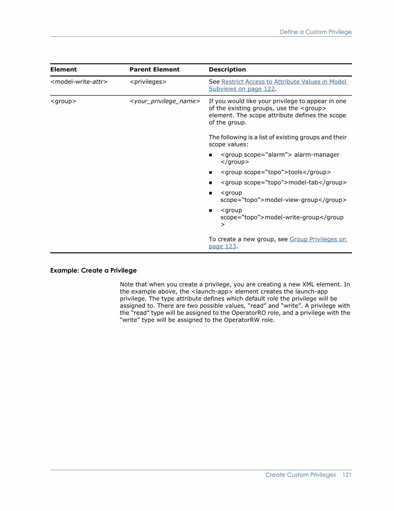
Define a Custom Privilege
Example: Create a Privilege
Note that when you create a privilege, you are creating a new XML element. In the example above, the <launch-app> element creates the launch-app privilege. The type attribute defines which default role the privilege will be assigned to. There are two possible values, “read” and “write”. A privilege with the “read” type will be assigned to the OperatorRO role, and a privilege with the “write” type will be assigned to the OperatorRW role.
<model-write-attr> <privileges> See Restrict Access to Attribute Values in Model Subviews on page 122.
<group> <your_privilege_name> If you would like your privilege to appear in one of the existing groups, use the <group> element. The scope attribute defines the scope of the group.
The following is a list of existing groups and their scope values:
<group scope=“alarm”> alarm-manager </group>
<group scope=“topo”>tools</group>
<group scope=“topo”>model-tab</group>
<group scope=“topo”>model-view-group</group>
<group scope=“topo”>model-write-group</group>
To create a new group, see Group Privileges on page 123.
Element Parent Element Description
Create Custom Privileges 121
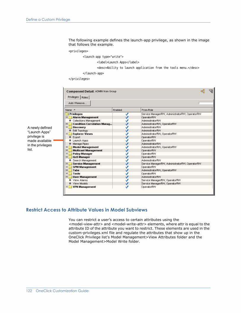
Define a Custom Privilege
The following example defines the launch-app privilege, as shown in the image that follows the example.
<privileges>
<launch-app type="write">
<label>Launch Apps</label>
<desc>Ability to launch application from the tools menu.</desc>
</launch-app>
</privileges>
Restrict Access to Attribute Values in Model Subviews
You can restrict a user’s access to certain attributes using the <model-view-attr> and <model-write-attr> elements, where attr is equal to the attribute ID of the attribute you want to restrict. These elements are used in the custom-privileges.xml file and regulate the attributes that show up in the OneClick Privilege list’s Model Management>View Attributes folder and the Model Management>Model Write folder.
A newly defined “Launch Apps” privilege is made available in the privileges list.
122 OneClick Customization Guide

Define a Custom Privilege
The <model-view-attr> element enables you to create a privilege that determines whether or not a user can see an attribute. For example, if you added the following XML to the custom-privileges.xml file, you will create a privilege called Community Name. This privilege restricts view access to attribute 10024, community name. This privilege will appear in the Model Management > View Attributes folder as specified with the <group> element. If the user does not have this privilege in any access group, they will not be able to see the community name attribute.
<model-view-10024 type=”read”>
<label>Community Name</label>
<group scope=”topo”>model-view-group</group>
</model-view-10024>
The <model-write-attr> element enables you to create a privilege that determines whether or not a user can edit an attribute. For example, if you added the following XML to the custom-privileges.xml file, you will create a privilege called Community Name. This privilege restricts write access to attribute 10024, community name. This privilege will appear in the Model Management > Model Write folder as specified with the <group> element. If the user does not have this privilege in any access group, they will not be able to edit the community name attribute.
<model-write-10024 type=”write”>
<label>Community Name</label>
<group scope=”topo”>model-write-group</group>
</model-write-10024>
Group Privileges
If you want to group privileges together, you can create groups in the custom-privileges.xml file. To specify a group, nest the element that defines the privilege (<your_privilege_name>) between the element that defines the group (<your_group_name>). The group’s <label> element defines the name that represents the group in the privileges tree (see the image later in this section).
Element Parent Element Description
<privileges> Not applicable This is the root element for the custom-privileges.xml file.
<your_group_name> <privileges> This element defines the group. You create a new element for each group you define.
<label> <your_group_name> The name of the group, which will be shown on the privilege list.
Create Custom Privileges 123
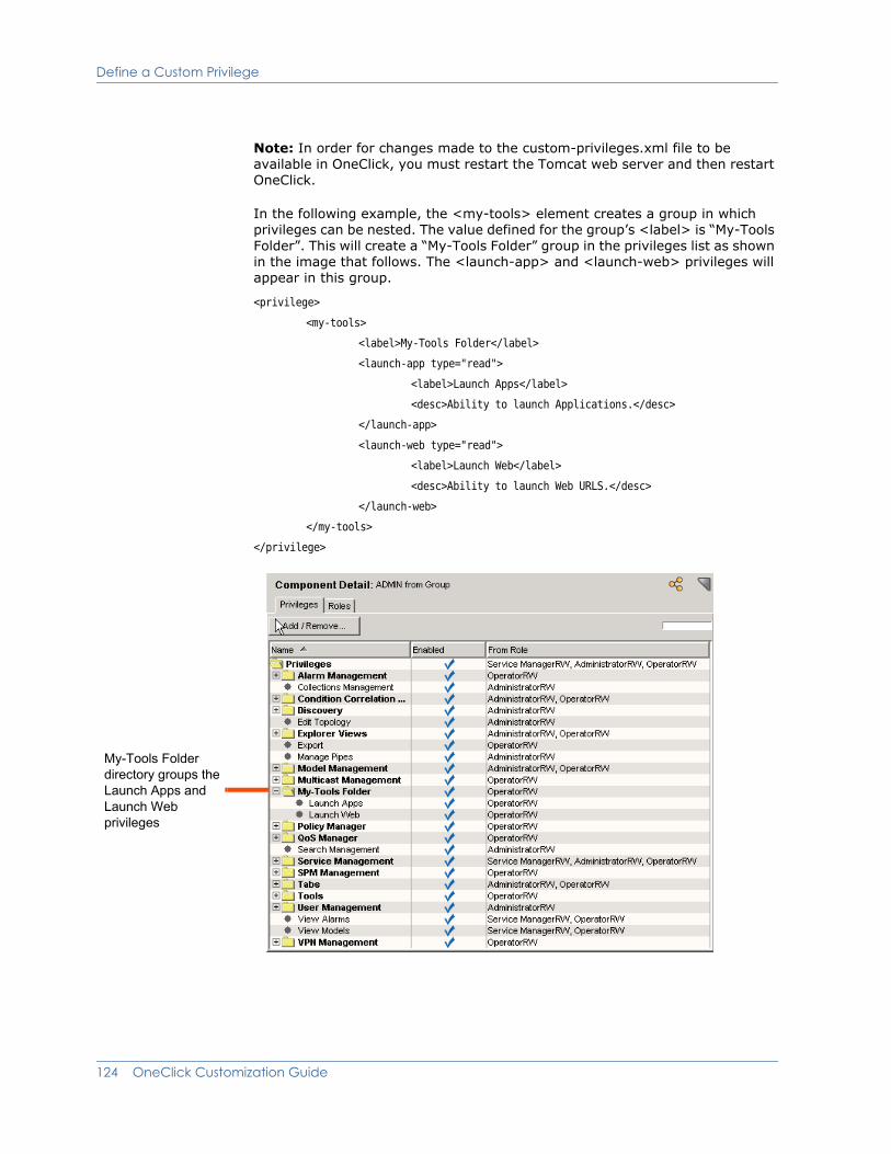
Define a Custom Privilege
Note: In order for changes made to the custom-privileges.xml file to be available in OneClick, you must restart the Tomcat web server and then restart OneClick.
In the following example, the <my-tools> element creates a group in which privileges can be nested. The value defined for the group’s <label> is “My-Tools Folder”. This will create a “My-Tools Folder” group in the privileges list as shown in the image that follows. The <launch-app> and <launch-web> privileges will appear in this group.
<privilege>
<my-tools>
<label>My-Tools Folder</label>
<launch-app type="read">
<label>Launch Apps</label>
<desc>Ability to launch Applications.</desc>
</launch-app>
<launch-web type="read">
<label>Launch Web</label>
<desc>Ability to launch Web URLS.</desc>
</launch-web>
</my-tools>
</privilege>
My-Tools Folder directory groups the Launch Apps and Launch Web privileges
124 OneClick Customization Guide

Reference a Privilege When Defining a Menu Item, Column, or Subview
Reference a Privilege When Defining a Menu Item, Column, or Subview
When you create a menu item, column, or subview, you can use the <privilege> element to reference a custom privilege you have defined in the custom-privileges.xml file. For example, if you have defined the “launch-app” privilege in the custom-privileges.xml file, you can use the following XML when defining a menu item, column, or subview:
<privilege>
<name>launch-app</name>
</privilege>
This will associate the “launch-app” privilege with the menu item, column, or subview. The user must have an associated role that grants the “launch-app” privilege in order for the menu item, column, or subview to be displayed. If granted, the menu item is always enabled. See the OneClick Administration Guide (5166) for information about privileges and roles.
Create Custom Privileges 125

Reference a Privilege When Defining a Menu Item, Column, or Subview
126 OneClick Customization Guide
Chapter 9: XML Usage Common to All Customization Files
This chapter explains common XML elements and strategies that can be used across customization files.
About ParametersYou can use the <param> element in a number of different instances to reference parameter values within a OneClick XML file. Here are several common cases where you will likely use the <param> element.
If you need to pass a parameter to a web page, use the <param> element as a child element of the <url> element. See Launch a Browser on page 22 for an example.
If you need to pass a parameter to an application, use the <param> element as a child element of the <launch-application> element. See Launch an Application From OneClick on page 25 for an example.
If you need to pass a parameter to a command, use the <param> element as a child element of the <command> element. See Launch a Browser on page 22, Launch an Application From OneClick on page 25, and Launch a Web Server Script on page 27.
If you need to format a series of values, use the <param> element in conjunction with standard HTML formatting elements. See Define Model Icon Tooltips on page 85 for an example.
If you need to manipulate the value of an attribute, you may need to use the <param> element when accessing one of the renderers. See Manipulate Attribute Output Using Renderers on page 129 for a complete explanation.
See Acquire Data—Render a Value on page 128 for information on what you can specify using the <param> tag.
XML Usage Common to All Customization Files 127

Acquire Data—Render a Value
Acquire Data—Render a ValueAcquiring data from OneClick about a model type parameter that you then act on is a fundamental process in customizing the OneClick interface. A set of elements provide the ability to acquire or render data from OneClick. These elements or tags are used in acquiring data to display in a table column, a field-subview column, a <param> element for a menu item, and the <render> element in a <dynamic-renderer>, and are shown in the following table.
You can use any number and combination of these elements chained together, with the output from one element serving as the input to the next element in the chain. The <attribute> tag must be first in a chain of elements because it yields an attribute value and does not accept input. The <message> tag must be first in a chain of elements used to render a value because it does not accept input.
Element Description
<attribute> Used to specify a SPECTRUM attribute
<select> Used to specify something based on the value of another attribute, parameter, etc.
Used to select a value based on certain criteria being met. Very generally, <select> this <if>condition1, <select> that <if> condition2.
See Use a Select Case on page 129 for more information.
<expression> Used to define an arithmetic expression. See About Expressions on page 139 for more information.
<renderer> Used to define or access any number of renderers that process raw data and refine into a specific format for presentation to the user. See Manipulate Attribute Output Using Renderers on page 129 for more information.
<dynamic-renderer> Specifies a renderer based on the value of an attribute criteria filter. See About <dynamic-renderer> on page 136 for detailed information.
<message> Used for specifying a plain text value for the column.
128 OneClick Customization Guide
Use a Select Case
Use a Select CaseIf you want to conditionally display something in the OneClick interface, you may use the <select> and the <case> elements to create a decision structure similar to those used in many programming languages. Use the <select> and <case> elements as follows:
<select>
<case>
<expression>the expression to evaluate</expression>
<yield>what to yield if the expression is true</yield>
</case>
<case>
<expression>the expression to evaluate</expression>
<yield>what to yield if the expression is true</yield>
</case>
.
.
.
<default>what to yield if no matches are found</default>
</select>
Example: Image Definition File on page 73 shows an example of the <select> and <case> elements used to select the image to be displayed on a OneClick device model icon depending on the model’s condition.
Manipulate Attribute Output Using RenderersThere are several built-in attribute renderers that you can use to manipulate how the attributes you have specified in a OneClick table are displayed. You use the <renderer> element to access one of these renderers. The text of the element must be a fully-qualified Java class name; each allowable Java class name is explained below.
Note: You will need some background in programming to fully understand the renderer concepts presented below.
You can pass parameters to a renderer using the <param> element. The text of the <param> element is the parameter value. A <param> element must have a name attribute that specifies the name of the parameter.
XML Usage Common to All Customization Files 129

Manipulate Attribute Output Using Renderers
Example
The following example specifies the BooleanRenderer with parameter trueTag set to No and parameter falseTag set to Yes. Each renderer has a set of parameters, and each renderer is defined differently.
<renderer>
<param name="trueTag">Enabled</param>
<param name="falseTag">Disabled</param>
com.aprisma.spectrum.app.util.render.BooleanRenderer
</renderer>
Boolean Renderer
The class name for the boolean renderer is com.aprisma.spectrum.app.util.render.BooleanRenderer. This renderer outputs an enumerated String for an input Boolean value. By default, "Yes" is rendered for TRUE and “No” is rendered for FALSE, but other elements or text may be specified via the following parameters:
trueTag – the tag or text to render for TRUE
falseTag - the tag or text to render for FALSE
The following example reverses the TRUE/FALSE output:
<renderer>
<param name="trueTag">No</param>
<param name="falseTag">Yes</param>
com.aprisma.spectrum.app.util.render.BooleanRenderer
</renderer>
If the input value is TRUE, “No” is rendered and if FALSE, “Yes” is rendered.
Commented Text Renderer
The class name for the commented text renderer is com.aprisma.spectrum.app.util.render.CommentedTextRenderer. This renderer strips off the HTML-commented prefix that is added by some renderers (for example, DateRenderer). It searches for the first occurrence of the ending character sequence of an HTML comment, such as <!---comment text --->, and returns the rest of the string.
130 OneClick Customization Guide
Manipulate Attribute Output Using Renderers
Date Renderer
The class name for the date renderer is com.aprisma.spectrum.app.util.render.DateRenderer. This renderer outputs a date and time using Java’s DateFormat. If the input to the renderer is a long integer (for example, of type java.lang.Long), it is assumed to represent the date and time in milliseconds. If the input is any other numeric type, it is assumed to be an integer representing the date and time in seconds. Otherwise, the only other valid input type is java.util.Date. The output string is prefixed by the numeric date and time value enclosed in HTML comments (<!---comment text --->). An example output would be:
<!--1089808869000-->Jul 14, 2004 8:41:09 AM EDT
You use the numeric value prefix in the comments tag for sorting. Without the prefix, SPECTRUM would sort on the formatted date and time string, and this would not work correctly. Therefore, you should only use the DateRenderer in the <content> element section of a column. To strip off the prefix for display, use the CommentedTextRenderer in the <swing-cell-template> section. For example:
<content>
<attribute>0x11620</attribute>
<!—an attribute that contains an integer date/time in seconds >
<renderer>
com.aprisma.spectrum.app.util.render.DateRenderer
</renderer>
</content>
<swing-cell-template>
<text>
<renderer>
com.aprisma.spectrum.app.util.render.CommentedTextRenderer
</renderer>
</text>
</swing-cell-template>
XML Usage Common to All Customization Files 131

Manipulate Attribute Output Using Renderers
Enumerated Attribute Renderer
Classname: com.aprisma.spectrum.app.util.render.EnumeratedAttrRenderer.
This renderer outputs an enumerated String for an attribute value. The renderer obtains the enumerations from the SPECTRUM database. You must specify the attribute ID via the “attrID” parameter. This renderer is most commonly preceded by an <attribute> element with the same attribute ID as the “attrID” parameter. The following sample XML renders the enumerated value for the Model_Class attribute (ID 0x11ee8):
<attribute>0x11ee8</attribute>
<renderer>
<param name="attrID">0x11ee8</param>
com.aprisma.spectrum.app.util.render.EnumeratedAttrRenderer
</renderer>
List Renderer
The classname for the list renderer is com.aprisma.spectrum.app.util.render.ListRenderer. This renderer outputs the components of a Java Collection or an array of any type as a comma-separated string.
Null Renderer
Classname: com.aprisma.spectrum.app.util.render.NullRenderer.
This renderer outputs a null input value as an empty string.
Object ID Renderer
This renderer outputs an object identifier (OID). The expected input value is type CsObjectID.
Classname: com.aprisma.spectrum.app.util.render.ObjectIDRenderer.
Supported parameters:
term—an integer value that specifies the index of a particular term of the OID to render
startTerm—an integer value that specifies the index of the first term of the OID to render
endTerm—an integer value that specifies the index of the last term of the OID to render
132 OneClick Customization Guide
Manipulate Attribute Output Using Renderers
The term indices start at 1. If you specify the startTerm without the endTerm, then the portion of the OID from the startTerm to the last term of the OID is rendered. If you specify the endTerm without the startTerm, then the portion of the OID from the first term to the endTerm is rendered.
The ObjectIDRenderer is most commonly used to render the row instance of a MIB table. You obtain the row instance via the getRowId() method in an <expression> element. You can then pass the result to the ObjectIDRenderer. For example, the following column renders the first term of the row instance:
<column>
<name>com.aprisma.spectrum.app.topo.client.ifIndex</name>
<content>
<expression>getRowId()</expression>
<renderer>
<param name="term">1</param>
com.aprisma.spectrum.app.util.render.ObjectIDRenderer
</renderer>
</content>
</column>
The following example renders terms 5 through 8:
<column>
<name>com.aprisma.spectrum.app.topo.client.NetworkAddr</name>
<content>
<expression>getRowId()</expression>
<renderer>
<param name="startTerm">5</param>
<param name="endTerm">8</param>
com.aprisma.spectrum.app.util.render.ObjectIDRenderer
</renderer>
</content>
</column>
XML Usage Common to All Customization Files 133

Manipulate Attribute Output Using Renderers
The following example combines an expression with the ObjectID renderer to enable you to display the last term of an OID value in a table:
<column>
<name>com.aprisma.spectrum.app.topo.client.ifIndex</name>
<content>
<expression>
((com.aprisma.spectrum.global.CsObjectID)value()).get_sub_oid(
((com.aprisma.spectrum.global.CsObjectID)value()).get_term_count(),
((com.aprisma.spectrum.global.CsObjectID)value()).get_term_count())
</expression>
<renderer>
<param name="term">1</param>
com.aprisma.spectrum.app.util.render.ObjectIDRenderer
</renderer>
</content>
</column>
The Round Number Renderer
The classname for this renderer is com.aprisma.spectrum.app.util.render.RoundNumberRenderer. This renderer outputs a number rounded to the nearest 100th (or 2 decimal places).
System Up Time Renderer
This renderer outputs a numeric time value represented in one hundredths of a second. The time representation is used in MIB objects such as sysUpTime. The output is expressed in days, hours, and minutes (for example, 30 days 1 hr 55 min).
Classname: com.aprisma.spectrum.app.util.render.SysUpTimeRenderer
ByteRenderer
This renderer outputs an integer value in byte units (byte, KB, MB, GB, or TB).
Classname: com.aprisma.spectrum.app.util.render.ByteRenderer
134 OneClick Customization Guide

Manipulate Attribute Output Using Renderers
InetAddressRenderer
This renders a MIB object of type InetAddress as defined in RFC-3291.
Classname: com.aprisma.spectrum.app.util.render.InetAddressRenderer
Supported parameters:
addressAttrID - the ID of the InetAddress attribute
type - the InetAddressType as defined in RFC-3291
typeAttrID - the ID of an attribute used to obtain the InetAddressType
ListInstanceRenderer
Renders the value of a specific instance of a list-type attribute.
Classname: com.aprisma.spectrum.app.util.render.ListInstanceRenderer
Supported parameters:
oid—the OID of the instance to render
index—the index of the instance to render
You must specify either the oid or index parameter.
SimpleIntegerRenderer
Renders an integer value without using comma grouping; 123456 instead of 123,456. Use this to substitute an integer value in a URL used in a menu item where commas are not acceptable input.
Classname: com.aprisma.spectrum.app.util.render.SimpleIntegerRenderer
TypePrependedInetAddressRenderer
Renders a MIB object of type InetAddress as defined in RFC-4293 with the type added to the beginning of the address.
Classname: com.aprisma.spectrum.app.util.render.TypePrependedInetAddressRenderer
Supported parameter:
addressAttrID - the ID of the InetAddress attribute
XML Usage Common to All Customization Files 135

About <dynamic-renderer>
About <dynamic-renderer>Use the <dynamic-renderer> element to specify a renderer that depends on the value of an attribute criteria such as <model_class>, <model-type>, or other attribute criteria. You select an attribute ID as the key and specify one or more <dynamic-renderer> elements in the custom-app-config.xml file. Each <dynamic-renderer> element defines a criteria and the renderer to use if the criteria is satisfied.
The structure to use with <dynamic-renderer> is as follows:
<dynamic-renderer>
<attribute><KEY_ATTRIBUTE_ID></attribute>
CRITERIA
<render>
.
.
.
</render>
<default/>
</dynamic-renderer>
The following table describes the elements you can use with <dynamic-renderer>.
Attribute Filter Criteria and <dynamic-renderer>
It is common to use <model-class> and <model-type> for attribute filter criteria. You can use any attribute and any set of complex attribute filters with any combination of nested “and” and “or” filters. The file <$SPECROOT>/tomcat/webapps/spectrum/WEB-INF/common/schema/ attributefilter.xsd contains the complete syntax for attribute filters.
Element Usage and Description
<attribute> Specifies the <KEY_ATTRIBUTE_ID> used to bind or tie together a set of dynamic-renderers.
CRITERIA Defines an attribute filter criteria used to determine which renderer is used based on the filter output. See Attribute Filter Criteria and <dynamic-renderer> on page 136.
<render> Defines what to render. See Manipulate Attribute Output Using Renderers on page 129 for more information.
<default> Specifies the dynamic-renderer to use as the default when none of the other dynamic-renderer criteria are met.
136 OneClick Customization Guide
About <dynamic-renderer>
Specify a Default <dynamic-renderer>
You define the default dynamic renderer for use when none of the conditions for using the <dynamic-renderer> specified in the CRITERIA statement are met. You can specify only one default dynamic-renderer per dynamic renderer set. Do not specify a filter criteria for the default.
Example: Using Attribute Filtering Criteria with <dynamic-renderer>
This example creates a column that displays an attribute based on the value of the model_type attribute. The attribute displayed for the model_type filter criteria conditions are shown in the following table.
Attribute to display... if model_type is...
<attribute> 0xffff0000 <model-type> 0x12
<attribute> 0xffff0001 <model-type> 0x34 and 0x56
<attribute> 0xffff0002 for all other model types (default)
XML Usage Common to All Customization Files 137

About <dynamic-renderer>
You must select one of the attributes specified in your filter criteria to be the key. This example uses 0xffff0002. Add the following <dynamic-renderer> elements to the custom-app-config.xml file:
<dynamic-renderer>
<attribute>0xffff0002</attribute>
<model-type>0x12</model-type>
<render>
<attribute>0xffff0000</attribute>
</render>
</dynamic-renderer>
<dynamic-renderer>
<attribute>0xffff0002</attribute>
<or>
<model-type>0x34</model-type>
<model-type>0x56</model-type>
</or>
<render>
<attribute>0xffff0001</attribute>
</render>
</dynamic-renderer>
<dynamic-renderer>
<attribute>0xffff0002</attribute>
<render>
<attribute>0xffff0002</attribute>
</render>
<default/>
</dynamic-renderer>
Example: Use a Key Attribute ID with <content>
This example creates a column specifying the <dynamic-renderer> element with the key attribute ID defined in the <content> element.
<column>
<name>My Column</name>
<content>
<dynamic-renderer>0xffff0002</dynamic-renderer>
</content>
</column>
138 OneClick Customization Guide

About Expressions
About ExpressionsWhen you are customizing the OneClick interface, there are several places where you may want to use an expression to display a calculated value. For example, you may want to display a calculated value in a table or subview. The section below explains how to use expressions to manipulate attribute information.
Note: Expressions are created using standard Java expressions. You must be familiar with Java code in order to implement the following instructions that create expressions in the OneClick XML files. If you are not familiar with Java code, you should refer to a Java reference before attempting to create expressions when customizing OneClick files.
Manipulate Attribute Information
The most common use of an expression is to manipulate attribute information. The attribute information available is dependent upon the OneClick context in which you are using the expression.
You can use the methods listed in the following table in the context of an expression to retrieve attribute information:
The following example shows a column configuration that displays the contact person for a device. In this example, an expression displays the attribute 0x23000c (AttributeID.CONTACT_PERSON) if the attribute 0x10b5a (AttributeID.SYS_CONTACT) is null or has no value.
java.lang.Object attr ( int attrID )
boolean attrBoolean ( int attrID )
byte attrByte (int attrID)
char attrChar ( int attrID )
double attrDouble ( int attrID )
float attrFloat ( int attrID )
int attrInt ( int attrID )
long attrLong ( int attrID )
short attrShort( int attrID )
XML Usage Common to All Customization Files 139

About Expressions
Example: Specifying a Contact for a Device Using an Expression<column id="column-contact-config"
xmlns ="http://www.aprisma.com"
xmlns:xsi="http://www.w3.org/2001/XMLSchema-instance"
xsi:schemaLocation="http://www.aprisma.com
../../common/schema/column-config.xsd">
<name>Contact Person</name>
<content>
<expression>
( attr( AttributeID.SYS_CONTACT ) == null ||
((String)attr(AttributeID.SYS_CONTACT)).length() == 0) ?
attr( AttributeID.CONTACT_PERSON ) : value()
</expression>
</content>
</column>
Another way to accomplish the same result is to use the attribute renderer to retrieve the SYS_CONTACT attribute value. You can then access the value returned using an expression that uses the value() method.
Example: Using Attribute Renderer to Retrieve Attribute Value<column id="column-contact-config"
xmlns ="http://www.aprisma.com"
xmlns:xsi="http://www.w3.org/2001/XMLSchema-instance"
xsi:schemaLocation="http://www.aprisma.com
../../common/schema/column-config.xsd">
<name>Contact Person</name>
<content>
<attribute>AttributeID.SYS_CONTACT</attribute>
<expression>
(value() == null || ((String)value()).length() == 0) ?
attr( AttributeID.CONTACT_PERSON ) : value()
</expression>
</content>
</column>
The two examples shown above produce the same value for the column.
140 OneClick Customization Guide
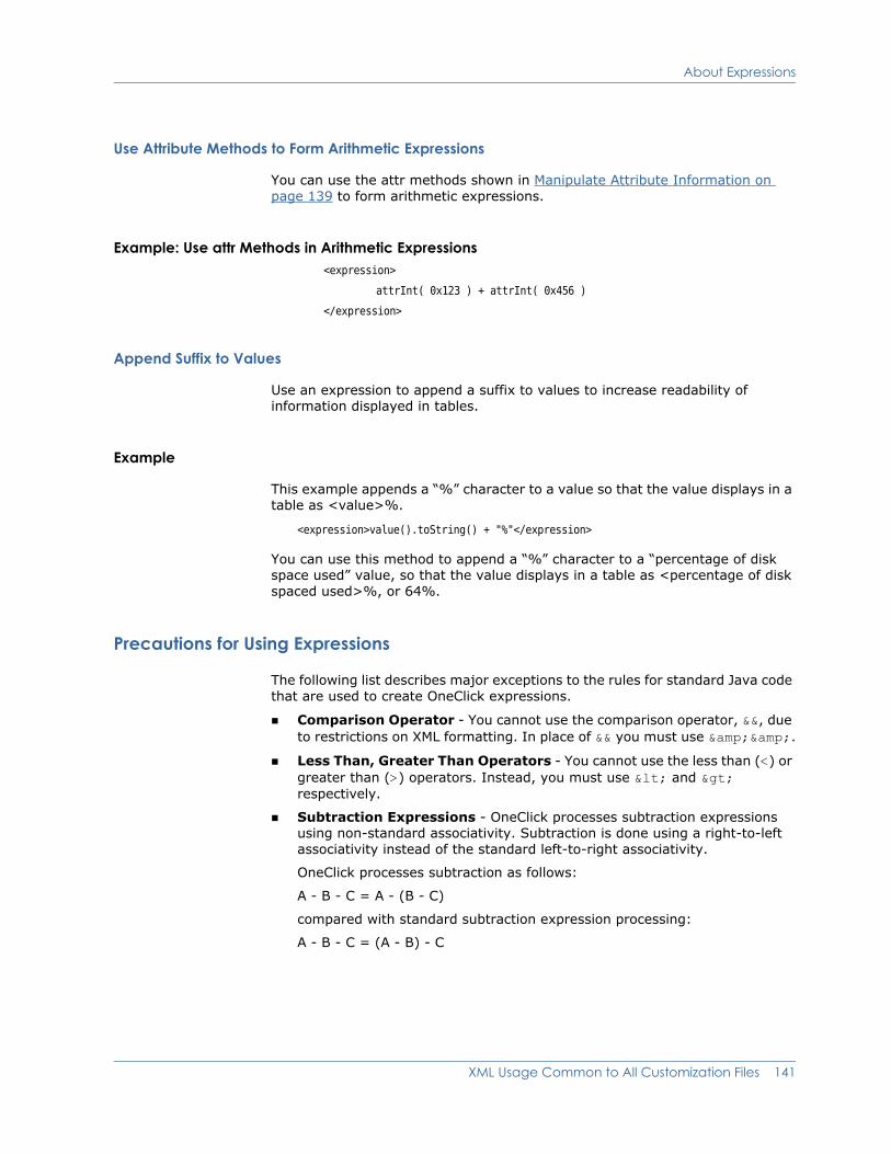
About Expressions
Use Attribute Methods to Form Arithmetic Expressions
You can use the attr methods shown in Manipulate Attribute Information on page 139 to form arithmetic expressions.
Example: Use attr Methods in Arithmetic Expressions<expression>
attrInt( 0x123 ) + attrInt( 0x456 )
</expression>
Append Suffix to Values
Use an expression to append a suffix to values to increase readability of information displayed in tables.
Example
This example appends a “%” character to a value so that the value displays in a table as <value>%.
<expression>value().toString() + "%"</expression>
You can use this method to append a “%” character to a “percentage of disk space used” value, so that the value displays in a table as <percentage of disk spaced used>%, or 64%.
Precautions for Using Expressions
The following list describes major exceptions to the rules for standard Java code that are used to create OneClick expressions.
Comparison Operator - You cannot use the comparison operator, &&, due to restrictions on XML formatting. In place of && you must use &&.
Less Than, Greater Than Operators - You cannot use the less than (<) or greater than (>) operators. Instead, you must use < and > respectively.
Subtraction Expressions - OneClick processes subtraction expressions using non-standard associativity. Subtraction is done using a right-to-left associativity instead of the standard left-to-right associativity.
OneClick processes subtraction as follows:
A - B - C = A - (B - C)
compared with standard subtraction expression processing:
A - B - C = (A - B) - C
XML Usage Common to All Customization Files 141

Reference XML Files
Reference XML FilesAs you are customizing OneClick XML files, you may find it necessary to split a single XML file into two or more XML files for the following reasons:
Some XML files are so complex that they become unreadable. In this case breaking the XML file down into two or more files assists you in keeping your code organized and making it readable and editable in the future.
You may want to reuse certain sections of XML code. Putting this XML code in a separate file allows you to reference it from multiple files instead of copying and pasting it into new files, or new sections of the same file.
Use the standard XML id and idref attributes to label and reference the split up code. (For information on XML standards, including id and idref, see www.w3.org).
Reference ImagesYou may need to reference image files from within your XML. When you reference image files in either the factory <$SPECROOT>/tomcat/webapps/spectrum/images directory or the custom <$SPECROOT>/custom/images directory, express the path starting from the images directory, for example, images/myimage.png. See Example: Icon Configuration File on page 75 for an example.
You must place all image files that you add or customize in the <$SPECROOT>/custom/images directory. Otherwise, all new or customized images you add will be deleted or overwritten during a SPECTRUM or OneClick upgrade or reinstallation.
Verify User Input Using VerifiersYou can verify user input by specifying a verifier class along with the <editable> element before committing the change. If the input is invalid, an error message is displayed. The verifiers available are described in the following section.
Specify the <verifier> element inside the <editable> element. Inside the <verifier>, you specify a verifier Java class and optional parameters to pass to the verifier class.
142 OneClick Customization Guide
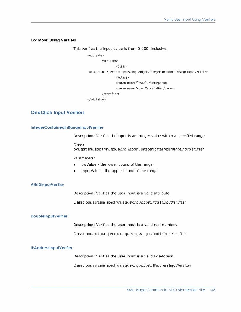
Verify User Input Using Verifiers
Example: Using Verifiers
This verifies the input value is from 0-100, inclusive.
<editable>
<verifier>
<class>
com.aprisma.spectrum.app.swing.widget.IntegerContainedInRangeInputVerifier
</class>
<param name="lowValue">0</param>
<param name="upperValue">100</param>
</verifier>
</editable>
OneClick Input Verifiers
IntegerContainedInRangeInputVerifier
Description: Verifies the input is an integer value within a specified range.
Class: com.aprisma.spectrum.app.swing.widget.IntegerContainedInRangeInputVerifier
Parameters:
lowValue - the lower bound of the range
upperValue - the upper bound of the range
AttrIDInputVerifier
Description: Verifies the user input is a valid attribute.
Class: com.aprisma.spectrum.app.swing.widget.AttrIDInputVerifier
DoubleInputVerifier
Description: Verifies the user input is a valid real number.
Class: com.aprisma.spectrum.app.swing.widget.DoubleInputVerifier
IPAddressInputVerifier
Description: Verifies the user input is a valid IP address.
Class: com.aprisma.spectrum.app.swing.widget.IPAddressInputVerifier
XML Usage Common to All Customization Files 143

Verify User Input Using Verifiers
IntegerInputVerifier
Description: Verifies the user input is a valid integer.
Class: com.aprisma.spectrum.app.swing.widget.IntegerInputVerifier
LongInputVerifier
Description: Verifies the user input is a valid long integer.
Class: com.aprisma.spectrum.app.swing.widget.LongInputVerifier
MACAddressInputVerifier
Description: Verifies the user input is a valid MAC address.
Class: com.aprisma.spectrum.app.swing.widget.MACAddressInputVerifier
NonEmptyStringInputVerifier
Description: Verifies the user input is a non-empty string.
Class: com.aprisma.spectrum.app.swing.widget.NonEmptyStringInputVerifier
UnsignedIntInputVerifier
Description: Default verifier for all integer attributes; verifies the user input is an unsigned integer.
Class: com.aprisma.spectrum.app.swing.widget.UnsignedIntInputVerifier
144 OneClick Customization Guide

Chapter 10: Customize OneClick for CA Service Desk
For a CA Service Desk SPECTRUM integration, you can modify the behavior of finding and creating Service Desk assets from OneClick. This customization is done by changing the attribute mapping between SPECTRUM models and Service Desk assets. Customizing asset reporting lets you prioritize the information used to identify a device and determine which information to record within Service Desk. How information is recorded in Service Desk can enhance the user’s efficiency and reporting capabilities to best suit your organization.
Note: For more information about customizing asset reporting for CA Service Desk, see the SPECTRUM and CA Service Desk Integration Guide (5178).
Customize OneClick for CA Service Desk 145

146 OneClick Customization Guide

Index
A
About dialog, customizing • 2
alarm attributes • 21
AlarmAttrIDACKNOWLEDGED • 21ALARM_FILTER_MH • 21ALARM_ID • 21ALARM_SOURCE • 21ALARM_STATUS • 21CAUSE_CODE • 21CAUSE_LIST • 21CAUSE_TITLE • 21CLEARED_BY_USER_NAME • 21CREATION_DATE • 21IMPACT_SEVERITY • 21INT_ALARM_ID • 21OCCURRENCES • 21ORIGINATING_EVENT • 21PERSISTENT • 21PRIMARY_ALARM • 21SEVERITY • 21TROUBLE_TICKET_ID • 21TROUBLESHOOTER • 21USER_CLEARABLE • 21
application brand name, customizing • 2
application suite name, customizing • 2
AttributeIDPort Attribute
COMPONENT_OID • 49PORT_DESCRIPTION • 49PORT_TYPE • 49
AttributeID.CONDITION • 20
AttributeID.DEVICE_TYPE • 20
AttributeID.DOMAIN_ID • 20
AttributeID.DOMAIN_NAME • 20
AttributeID.MAC_ADDRESS • 20
AttributeID.MODEL_CLASS • 20
AttributeID.MODEL_NAME • 20
AttributeID.MODEL_OBJECT • 20
AttributeID.MTYPE_ID • 20
AttributeID.MTYPE_NAME • 20
AttributeID.NETWORK_ADDRESS • 20
B
brand name, customizing • 2
branding OneClick • 2
C
CA Service Desk, customize OneClick for • 145
Classic theme • 56
command • 18
commonly used attributes • 20
component details registry • 51
console/config Directory • 2
contents registry • 51
custom-app-config.xml • 51, 56
custom-branding-config.xml • 2
custom-menu-config.xml • 9
D
Directory, alarm/config • 3
Directory, common/config • 3
Directory, topo/config • 3
E
editing table columns • 43
elementaccelerator • 11, 15action • 11, 16actionID • 40add • 39and • 16attribute • 19, 36, 87attrID • 39, 42column • 78command • 25confirmSuccess • 40
Index 147

context • 16disableOnFirstValue • 42disableOnSecondValue • 42display-exit-status • 28
example • 28display-output • 28dynamic-renderer • 136
Attribute Filter • 136specify a default • 137
enumerated-color • 79equals • 16expression • 36field-subview
display-if • 97display-if-app-installed • 97field-column • 97privilege • 97show-labels • 97title • 97
filter • 16, 19firstValueMapping • 42has-attribute • 16hot-key • 11icon
components • 63con-config • 61con-reg-id • 58dynamic-cellicon • 58enumerated-cellicon • 58off-page • 59on-page • 59static-cellicon • 59theme • 59theme-config • 58
icon-configarcheight • 66arcwidth • 66components • 71dynamic-cellicon • 61enumerated-cellicon • 61height • 71image • 72pipe-connection • 63point • 67selection-component • 72shape • 61, 72shape-ellipse • 66shape-line • 68shape-polygon • 67shape-rectangle • 65shape-roundrectangle • 65static-cellicon • 61
stroke • 62width • 71x1 • 68x2 • 68y1 • 68y2 • 68
image • 36pipe-connection • 70
image-component • 71interface
ifIndex • 49item • 10, 13label-component • 78
background-border • 79background-highlight • 79border-spacing • 79default-transparency • 79enumerated-color • 79field-value • 79font • 80max-background-width • 78min-background-width • 78selected-transparency • 79show-background • 79static-color • 79vertical-spacing • 79
launch-application • 17, 25, 28launch-browser • 16, 22launch-sso-browser • 17launch-web-server-script • 17, 27, 28maxRowsToDisplay • 39menu • 10, 12message • 36, 87oidPrompt • 40or • 16order • 39os-name • 18param • 19, 37, 87, 127privilege • 10, 100, 102privileges • 119, 120
desc • 120group • 121label • 120model-view-attr • 120, 122model-write-attr • 121, 122
prompt • 40promptOnFirstValue • 42promptOnSecondValue • 42remove • 39renderer • 37, 87renderer-class • 37
148 OneClick Customization Guide
secondValueMapping • 42select • 36separator • 10static-color • 79, 80subview-group • 107
display-if • 107privilege • 107subviews • 107
subviewsapplication-subview • 101criteria • 102
swing-cell-templateimage • 38renderer-class • 38text • 38
tablecolumn • 33, 35column-list • 33, 35, 78content • 35default-sort • 37default-width • 37direction • 38dynamic-renderer • 36editable • 35, 37field-column • 78hidden-by-default • 37line-color • 34name • 35, 38numerated-color • 35preferred-height • 35preferred-width • 34renderer • 36show-horizontal-lines • 34show-tree-lines • 34show-vertical-lines • 34sort-column • 37sort-column-list • 37static-color • 35swing-cell-template • 36swing-header-row-template • 35swing-row-template • 35swing-table-template • 34table • 34
static-color • 35table-subview • 100text • 37, 40theme-config • 60title • 100toolbar-image • 15toolbar-image-disabled • 11, 15toolbar-image-rollover • 11, 15tooltip format • 87
tooltip-config • 87localize • 87
toolTipText • 40url • 17validate • 18, 25value • 16valuePrompt • 39verifier • 142view • 92
application-subview • 94field-subview • 94, 97related-model-subview • 94related-model-table-subview • 94subview-group • 94subviews • 92, 94, 101table-subview • 94view-header • 92, 93
view-headershow-icon • 93show-labels • 93
x • 78y • 78
Ellipse • 66
examplesubview-group
title • 107
expressions • 139
I
Icon Configuration file • 63
icons, configuring • 57
Image components • 70
image types • 15
Images • 142
integrations • 145
Interfaces Table • 48, 49
K
keyboard accelerators • 15
L
launch-sso-browser • 17
launching applications • 25
launching browsers • 22
Index 149
launching scripts • 27
Line • 68
logo, customizing • 2
M
model-view-attr • 123
N
Navigation panel, customizing • 2
O
off-page reference • 61
on-page reference • 61
OneClick theme • 56
P
parameter • 86
pipe location • 70
platform • 18
platforms • 27
Polygon • 67
privilege • 100, 102
R
Rectangle • 65
registriescomponent details • 51contents • 51
RendererTable Data
ActionButtonCellRenderer • 40ActionButtonPanelCellRenderer • 41AttrToggleButtonCellRenderer • 42BoldAttributeTableCellRenderer • 43ListAttributeOIDRenderer • 40ListAttributeRenderer • 39TextAreaCellRenderer • 39
renderer • 129
Rounded Rectangle • 65
S
select case • 129
selection components • 82
Service Desk, customize OneClick for • 145
sort • 46
Specifying a Username • 24
Specifying URLs • 22
splash screen, customizing • 2
suite name, customizing • 2
T
table • 100
table columns • 31
theme configuration • 57
themesClassic • 56OneClick • 56Utility • 56
toolbarimage size • 15
toolbar-image • 10
tooltip • 85
U
USER_PARAMETER_NAME • 24
Username • 24
Utility theme • 56
V
validate • 18, 25
Y
y2 • 68
150 OneClick Customization Guide