One Degree
44
BRAND GUIDELINES
-
Upload
nicole-gorman -
Category
Documents
-
view
217 -
download
0
description
Â
Transcript of One Degree

BRAND GUIDELINES


hello & welcome to the one° brand book
This booklet contains our guidelines and explanation for the one° brand. The content in this book was created by our one degree team and should be used to answer any questions you may have. It is meant to be your go to reference for all one° stands for and how we represent ourselves.
Our branding should be treated with special care. The one° style is unique by shedding light onto a cloudy subject. Think of this book as your one° style guide.
2

contents

WELCOME
what are we about? 6 our philosophy 8our mission & vision 10where are we? 12
WHAT WE LOOK LIKE
our logo 14 logo dos & donts 16-18 color palette 20-22 typography 23-24
DESIGN ELEMENTS
illustrations 26-28iconography 29-30 photography 34-36brand assets 37-40


what is one° about?
One° is a brand and social media campaign created to educate about the causes and effects a single degree of temperature rise has on our planet. By encouraging earth healthy habits, we bring light & awareness to a cloudy & avoided subject. Through design, we have created a line of eco-friendly totes, containing educational printed materials. We are more than a brand – one° is a community, that works collectively to spread mindfulness about climate change.
Cool kids helping a warm planet.
6


our philosophy
One° promotes a cooler atmosphere, sustainable Earth, and a healthy happy future for all!
We believe that by collectively spreading awareness, a movement to stop climate change will ignite. This starts with education. Social media is an incredibly huge outlet for educating audiences and bringing attention to large-scale problems. Merchandise is another outlet we use to educate. One°’s design evokes curiousity and provides tips on how everyone can use sustainable habits to ultimately ensure a worry-free future.
We are the problem but we are also the solution.
8

mission & vision

our mission
our vision
One°’s mission is to inform people about the urgency a single degree of temperature rise has on our planet. Through our brand, word of mouth/social media, and our eco-friendly tote line, we bring attention to how essential it is that we take action.
Our desire is to improve the sustainability of all ecosystems by spreading knowledge and encouraging all to join us in sustaining a lively, fresh, future.
10


where can you find us?
One° is currently stationed in Milwaukee, Wisconsin.
Climate change and global warming affects every part of the planet, including the Midwest. Milwaukee, specifically, uses a combined sewage system which contributes to widespread pollution. By using our brand and social media as a campaign tool, we can spread mindfulness about our local influences and allow residents to draw a personal connection to a global issue.
12

what we look like

our logo
rat ionaleOur logo is reflective of Earth’s rising atmospheric temperature. Following the word “one” is a degree sign symbolizing this rise. Inside the letter “o”, a polygonal graphic Earth is present, showing that the one degree increase is directly affecting Planet Earth. The colors of this logo are found within our color palette. Shades of red and orange were strategically chosen to mirror the urgency of global warming, which is a direct result of climate change.
14
logotype Combining our logo and tagline – this variation is used mostly for published prints, professional documents and any materials that are not easily identified with the one° brand.
iconOur icon is used for promotional materials including photography, illustration, etc. This icon is the first letter “o” with the polygonal Earth inside. It is how we are most recognized.

r ight on!
01Logo colors may change to others provided in our color palette
02 Logo may be placed on a colored background found in the palette but should never vibrate with the chosen background color
03 Logotype must always use colors from our color palette
05If placed on an image, the logo used must be a transparent png and fully visible
04Never crowd the logo, leave some breathing room

01 02 03
0504
16
COOL KIDS HELPING A WA R M P L A N E T
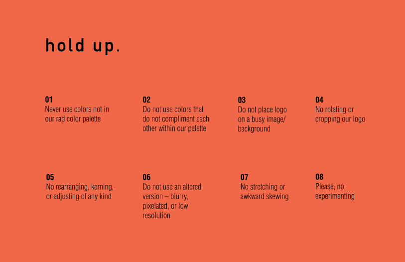
hold up.
01Never use colors not in our rad color palette
02 Do not use colors that do not compliment each other within our palette
08Please, no experimenting
07No stretching or awkward skewing
04No rotating or cropping our logo
06Do not use an altered version – blurry, pixelated, or low resolution
03Do not place logo on a busy image/background
05No rearranging, kerning, or adjusting of any kind

01 02 03 04
0805
18
06 07

color palette

The color palette for one° is bright, eye-catching and represents our colorful planet. The reds and oranges reflect heat, urgency, and attention but are not aggressive hues. Each color symbolizes the beauty of Planet Earth and the widerange of vibrancy our Earth provides. We are invoking interest about a dark subject in a colorful light.
Black & white are also used but mostly as background colors, increasing the contrast and allowing them to really pop. Black & white can also be used for body/accompaning text.
20

CMYK 8/99/99/1
RGB218/34/39
HEX#DA2227
CMYK 0/74/76/0
RGB241/104/73
HEX#F16849
CMYK 0/54/99/0
RGB246/140/33
HEX#F68C21
CMYK 0/93/98/0
RGB238/55/38
HEX#EE3726
CMYK 1/36/100/0
RGB247/173/26
HEX#F7AD1A
CMYK 2/9/76/0
RGB254/224/93
HEX#FEE05D

CMYK 0/0/0/0
RGB255/255/255
HEX#FFFFFF
CMYK 85/10/100/0
RGB0/161/75
HEX#00A14B
CMYK 38/0/100/0
RGB170/208/55
HEX#AAD037
22
CMYK 72/27/8/0
RGB61/152/199
HEX#3D98C7
CMYK 72/0/100/0
RGB71/182/73
HEX#47B649
CMYK 30/0/36/0
RGB180/220/181
HEX#B4DCB5

typography
One° uses DIN 1451 Std Mittelschrift and Engschrift. We also use Helvetica LT Std Light and Bold Condensed. Din 1451 Mittelschrift is used for titles and headers.
Use Helvetica LT Std Light Condensed or Din 1451 Engschrift for all body text. Use Helvetica LT Std Bold Condensed when information is being emphasized.
These typefaces were specifically chosen to represent one° for their clean style, which reflects our hope for a clean planet. No other typefaces should be used in relation to our brand. Since our logo is in all lowercase, we typically mimic this in headers and body text when appropriate.

DIN 1451 Std Mittelschrift abcdefghijklmnopqrstuvwxyzABCDEFGHIJKLMNOPQRSTUVWXYZ0123456789
DIN 1451 Std EngschriftabcdefghijklmnopqrstuvwxyzABCDEFGHIJKLMNOPQRSTUVWXYZ0123456789
Helvetica LT Std Light CondensedabcdefghijklmnopqrstuvwxyzABCDEFGHIJKLMNOPQRSTUVWXYZ0123456789
24
Helvetica LT Std Light CondensedabcdefghijklmnopqrstuvwxyzABCDEFGHIJKLMNOPQRSTUVWXYZ0123456789
design elements

i l lustrat ions
One°’s design elements are essential to communicating the brand as well as visually appealing to our audience. We have developed a set of branding illustrations and icons that embody the lively energy of the company as well as our eco-friendly totes and print materials. Since one° was started by local designer’s, our brand is heavy in illustration and graphic elements.
26


iconography
One° has created a collection of illustrated icons that appear on our infographic, Instagram, and other branding materials.
Icons may never be changed or altered in anyway except for the color. Any colors within the color palette may be used for the icons but they must compliment eachother and make sense with the message they are telling. These icons must be visible on the background they are placed on.
30


photography
All one° images should visually express the heart of our brand.
Photos should reflect the colorful, natural and sustainable connection between Planet Earth and the creatures living on it. The photos should reflect our social media and merchandise but more importantly the one° community.
34


brand assets
38
One° has several materials/products that our brand is applied too.
Our line of totes and T-shirts are our tangible products. They are packaged with and contain important printed materials serving as educational tools. The printed materials include a smaller foldout version of the one° infographic. There are also a series of fun promotional tools such as stickers and a small booklet.


40
@onedegreeofchange is our Instagram account, which serves as a social media campaign and is where our community really comes together.
#onedegree sparks conversation on a global level and allows a large range of people to discuss/share information about climate change in addition to potential solutions to the one degree temperature rise.
#onedegree

thank you!

That’s it. You’re now a one° expert!Thank you for helping us in our journey to a greener future.
We hope this guide has been helpful in answering any questions you may have had about our brand.
One° was founded and designed by,Nicole Gorman (upper) & Tessa Norman (lower)
Printed on May 1st, 2016 in Milwaukee, Wisconsin.All content, illustration, and photography created by our founders.