On Enhancing JMP’s Visual Analytics Using JMP · PDF fileOn Enhancing JMP’s Visual...
18
On Enhancing JMP’s anguage (JSL) Visual Analytics Using JMP ® Scripting L Theresa Utlaut, Georgia Z. Morgan, Statisticians, Intel Corporation Abstract John Tukey said, “The greatest value of a picture is when it forces us to notice what we never expected to see.” Arguably, JMP’s preeminent feature is the ease with which its users can quickly and easily create informative graphics that allow us to see what we may or may not have expected. The ability to create informative and decision‐worthy graphics is especially important currently, when data are increasing in complexity and volume at a rate that is difficult to comprehend. In an article in The Economist (February 2010), it was estimated that mankind will create 1,200 exabytes (10^18) of digital data this year. The data deluge is in full swing! The visual tools provided by JMP facilitate our effort to extract information from data, but customization is often needed when faced with complexity and volumes of data. With the additional benefit of JMP’s Scripting Language (JSL), the visual analytics can be improved for the problem at hand and our work made more effective. This paper will present examples that demonstrate the use of JSL to enhance JMP’s visual analytics and streamline the analysis process. Keywords: semiconductor industry, wafer maps, micromaps, JMP ® boundary files, multidimensional spacing, parallel coordinates graphs, interactive graphics, brushing, shading, k‐means clustering. 1. Introduction With the enormous amounts of data produced each day, effective and easily constructed data visualization tools are more important than ever. JMP’s visualization tools are a strong component of its overall capabilities and most are easily constructed with just a few clicks of the mouse. The key is for the user of JMP to know how to best display data to glean the most information from it. In the development of manufacturing technologies, the same type of data is often considered throughout the life of the technology, which provides the opportunity to develop standards and optimal visualization techniques for these data. With JSL these standards can be scripted and given to the engineers to make their task of data analysis less difficult. In this paper we will consider three kinds of visualization techniques that are useful in the semiconductor industry, as well as other industries. JMP provides the basis for each of these techniques, and JMP’s Scripting Language (JSL) allows them to be constructed easily and customized to meet the user’s needs. The three techniques are 1) customized boundary files to produce wafer maps for a given product; 2) trended micromaps that combine the structure across a wafer with a continuous variable; and 3) parallel plots with custom features that make it easier when visualizing numerous variables of different data types and scales with many observations. 2. Semiconductor Industry The semiconductor industry has a creed ‐ Smaller, Faster, and Cheaper. It is “Smaller” because finer lines can pack more transistors on a chip which in turn makes the product “Faster”, and delights customers. The array of products is volatile and competition is fierce so keeping the costs low and parts “Cheaper” increases the ability to do further development and enhance the product line. 1
Transcript of On Enhancing JMP’s Visual Analytics Using JMP · PDF fileOn Enhancing JMP’s Visual...

On Enhancing JMP’s anguage (JSL) Visual Analytics Using JMP® Scripting L
Theresa Utlaut, Georgia Z. Morgan, Statisticians, Intel Corporation
Abstract John Tukey said, “The greatest value of a picture is when it forces us to notice what we never expected to see.” Arguably, JMP’s preeminent feature is the ease with which its users can quickly and easily create informative graphics that allow us to see what we may or may not have expected. The ability to create informative and decision‐worthy graphics is especially important currently, when data are increasing in complexity and volume at a rate that is difficult to comprehend. In an article in The Economist (February 2010), it was estimated that mankind will create 1,200 exabytes (10^18) of digital data this year. The data deluge is in full swing! The visual tools provided by JMP facilitate our effort to extract information from data, but customization is often needed when faced with complexity and volumes of data. With the additional benefit of JMP’s Scripting Language (JSL), the visual analytics can be improved for the problem at hand and our work made more effective. This paper will present examples that demonstrate the use of JSL to enhance JMP’s visual analytics and streamline the analysis process.
Keywords: semiconductor industry, wafer maps, micromaps, JMP® boundary files, multidimensional spacing, parallel coordinates graphs, interactive graphics, brushing, shading, k‐means clustering.
1. Introduction With the enormous amounts of data produced each day, effective and easily constructed data visualization tools are more important than ever. JMP’s visualization tools are a strong component of its overall capabilities and most are easily constructed with just a few clicks of the mouse. The key is for the user of JMP to know how to best display data to glean the most information from it. In the development of manufacturing technologies, the same type of data is often considered throughout the life of the technology, which provides the opportunity to develop standards and optimal visualization techniques for these data. With JSL these standards can be scripted and given to the engineers to make their task of data analysis less difficult.
In this paper we will consider three kinds of visualization techniques that are useful in the semiconductor industry, as well as other industries. JMP provides the basis for each of these techniques, and JMP’s Scripting Language (JSL) allows them to be constructed easily and customized to meet the user’s needs. The three techniques are 1) customized boundary files to produce wafer maps for a given product; 2) trended micromaps that combine the structure across a wafer with a continuous variable; and 3) parallel plots with custom features that make it easier when visualizing numerous variables of different data types and scales with many observations.
2. Semiconductor Industry The semiconductor industry has a creed ‐ Smaller, Faster, and Cheaper. It is “Smaller” because finer lines can pack more transistors on a chip which in turn makes the product “Faster”, and delights customers. The array of products is volatile and competition is fierce so keeping the costs low and parts “Cheaper” increases the ability to do further development and enhance the product line.
1

Moore’s Law, a prediction published in 1965 [27], states that the number of transistors on a chip will double about every two years. Intel has kept that pace for nearly 40 years. The complexity of a process that creates a billion or more transistors in an area not much larger than a coin is enormous. The amount of data collected at the hundreds of processing steps is a statistician’s dream or worst nightmare. Regardless, the fact is that Intel creates huge amounts of data each day and to make things smaller, faster, and cheaper we need to optimize our analysis methods and visualization techniques. The primary structure of semiconductor manufacturing data is important to understand. Batches of twenty five silicon wafers, called lots, are processed through a large number of interconnected processes. Each wafer contains many chip precursors, called die, the number depending on the product. Data are gathered at hundreds of process steps at many levels.
Figure 2.1 Moore’s Law Graph, 1965 The formal statistical techniques learned in school are certainly used and cannot be ignored. However, it is a mistake to think that our data are always independent and identically distributed. We regularly violate statistical assumptions and calculate the risks of those violations. We have random and systematic variation across wafers; sampled and population data are collected at multiple levels, sometimes several points a second and sometimes a single point weekly (or less). How do we deal with all of this? We start with the basics... visual analytics, and we trust that a picture forces us to see what we never expected.
Figure 3.1 Graph Builder, “State” shape variable using SAT.jmp, colored by 2004 Verbal SAT scores.
3. Wafer Boundary Maps In JMP 9 the Graph Builder platform includes a new and exciting feature for identifying a Shape variable. A first impression of this new feature may be that its sole intention is to provide maps of various geographic regions. That opinion is warranted since the boundary files included during install are all related to drawing geographic areas such as the United States (Figure 3.1), Canada, Japan, Germany, and others. However, this new feature can be used more extensively than the default geographic regions. JMP allows users to create their own boundary files and will recognize these shapes and draw them. That allows a flexibility limited only by your imagination and the capability of your computer.
2

3.1 Creating Boundary Files
Figure 3.2 US‐State‐Name.jmp
The creation of a shape requires the formation of two JMP files. One file contains the unique names for the different regions, and the other contains the unique coordinates of the shape boundaries. The easiest way to understand the structure of these files is to review ones that are provided during the installation. As mentioned previously, on installation JMP provides boundary files of geographic regions and these files are stored in the “Maps” directory. If the shape column does not explicitly define where to find the shape file (more on that later), JMP will default to the “Maps” folder for the shape files. Consider the two files used to create the map of the United States in Figure 3.1. The file US‐State‐Name.jmp (Figure 3.2) is the file that contains the unique names for the different regions, and the file US‐State‐XY.jmp (Figure 3.3) contains the coordinates, longitude and latitude in this case. The first part of the file names can be any name that a file can ordinarily be called, and the –Name and –XY at the end of each file are keys to JMP that indicate particular functions of each file.
Figure 3.3 US‐State‐XY.jmp
The –Name file contains a Shape ID variable, which must be in the first column in ascending order, and at least one more column containing the variable name to be recognized as the Shape by Graph Builder. There can be multiple naming columns. The US‐State‐Name file contains the Shape ID column and four columns of state names that will be recognized by Graph Builder. The US‐State‐XY file contains the Shape ID, which must be in the first column in ascending order and links the –Name and –XY files. Part ID allows for a shape to have more than one part. For example, the state of Hawaii has multiple islands and Graph Builder recognizes it as a single state because of the use of the Part ID. The next two columns that must be included in the –XY file are the boundaries themselves. In the US ‐State‐XY.jmp, a special Axis display is used, Geodesic US. The X/Y columns include the boundaries of the shape of interest in units of longitude and latitude. Finally, there are column properties that need to be set so that JMP recognizes that these are special files with column names being key to Graph Builder recognizing the shape. For the name columns included in the –Name file, the column property of Map Role/Shape Definition must be set (Figure 3.4). Figure 3.4 Column Property, Map Role A useful tip when using a data file with a Shape column that creates a specified shape in Graph Builder is to set the column property Map Role to “Shape Name Use” for the shape variable column. This
3

property requires the path and file name of the –Name file to be used and also the name of the column that will be used as the key.
3.2 Wafer Maps
Due to various processing steps, equipment controls, and remnant first principle effects (heat transfer, gas flow), analysis of across‐wafer systematic effects with wafer maps is a well‐established semiconductor practice. We consider wafers our maps and have well‐defined coordinate systems and standards [7, 8]. Customized Wafer Boundary Maps allow JMP users to employ the Graph Builder platform to examine these effects Figure 3.5 – 300mm Silicon Wafer with 45nm
Integrated Circuits The ability to customize shapes leads to the creation of wafer maps for exploring data patterns across wafers. Because each product has a different die and field size, many boundary files are needed. Since the shape of the die or field is rectangular in nature, a JSL script quickly creates boundary files for
whatever size die or field the user inputs. Note that a field is a collection of die and is based on the reticle used in the lithography step. A set of die in a field is called a cluster and has a certain number of rows and columns. For more information on reticles and semiconductor processing several references are available [29, 30]. The JSL script requires that the user input the die size, center of the wafer offset, and the cluster size. A JMP table containing the wafer coordinates is also needed. When the boundary files are created, the coordinates on the x and y axes are the standard X/Y coordinates. They are not displayed in mils. The size of the die in mils is translated into the appropriate X/Y coordinate standard. The prefix of the file name can be set by the user and the –Name and –XY will be added to the file names so that JMP recognizes these as Map files. By default, it saves these two files to the JMP 9 Maps directory unless a user specifies a different directory.
Figure 3.6 Wafer Boundary Dialog
4

If the Site ID column is saved to the coordinate’s data table, the column property Map Role/Shape Name Use will be added to the column so that the location and column name are explicitly defined.
The result of the script allows the user to create wafer maps in the Graph Builder platform and use all of the features associated with it such as coloring. Figure 3.6 shows an example of a graph created using the Graph Builder platform with wafer Site ID as the Shape variable and colored by an end‐of‐line metric (coded for Intellectual Property (IP) reasons).
Figure 3.7 Wafer Map
4. Micromaps Micromaps are an extension of Edward Tufte’s idea of small multiples. He argues that a simple graphics style that is free of “chart junk” is the most effective way of communicating information, and he discusses the effectiveness of using small multiples for comparison since the reader only needs to learn the meaning of the graphical design once and then focus is on the information contained in the plots.
At the heart of quantitative reasoning is a single question: Compared to what? Small multiple designs, multivariate and data bountiful, answer directly by visually enforcing comparisons of changes, of the differences among objects, of the scope of alternatives. For a wide range of problems in data presentation, small multiples are the best design solution.
Edward Tufte, Envisioning Information
A micromap is defined as a graphic that links statistical information to an organized set of small maps. The purpose of these types of graphs is to highlight geographic or spatial patterns and associations among other variables. Micromaps are used extensively in government health agencies, such as National Center for Health Statistics and National Cancer Institute, as well as the Environmental Protection Agency. Currently, these agencies use micromaps to highlight geographic patterns across the United States or within a State by County. However, there is no reason why micromaps cannot be applied to other, non‐geographic spatial patterns, such as wafer maps. In a recently published book “Visualizing Data Patterns with Micromaps” [1] there are three types of micromaps discussed: Linked, Conditional, and Comparative. Linked Micromaps add spatial context to a row label plot by adding small maps next to a variable or variables that have perceptual grouping (e.g. 5 states for one graph with a line as a break between the groups). For example, Figure 4.1, which was produced using the software Linked Micromaps, v 1.0.2 (available for download http://gis.cancer.gov/tools/micromaps/), is an example of a linked micromap that shows the population of states and the map of the U.S. to the left so the reader can easily see the
5

region of the country with the highest population. The map and the bars are linked by color for each group of five states. The data are sorted from most populous state to least, and states that have not yet been reported are grey in color where ones that have been previously reported are tan.
Figure 4.2 Trended Micromap User Interface
Figure 4.1 Linked Micromap using the software Linked Micromaps, v.1.0.2
The second type of micromap discussed in the book is a Conditioned Micromap. The primary purpose of this type of micromap is exploratory data analysis. This type of map is based on dynamically changing two variables with sliders (or some other way of changing continuous variables) to determine the impact of those variables changing. The third type of micromap is called a Comparative Micromap and looks at sequences of maps indexed by time or some other attribute. They include “differences maps” illustrating the changes from one index to the next so that changes over time can be easily observed. Given the graphics capabilities of JMP, it is obvious that JMP has all the pieces needed to create these types of micromaps: Graph Builder with the new Shape feature, Variability Graphs for the row‐labeled plots, the Data Filter, and the ability to script sliders. To illustrate this, a script was written that generates micromaps that are a hybrid of Linked and Comparative micromaps. These are referred to as Trended Micromaps. The example shows a trended micromap linking a wafer map to an end‐of‐line metric (coded for IP reasons) with the two graphs sequenced by Lot. In reality, there are many more lots in this data set. Trended Micromaps include continuous data that are binned into a user‐defined number of bins (default = 4) and linked by color to a wafer map. Data are summarized and wafers are plotted in order, such as date processed or lot number, to visualize and compare the systematic wafer effects over time. The input (Figure 4.2) required is the response of interest, the shape (it assumes boundary files exist for this shape), summary (if needed), and order variables.
6

Figure 5.1 Parallel Plot
The four graphs in Figure 4.3 illustrate the output of the script when only two lots are compared. The lots are treated independently and sorted by the Summarize, Plot By variable (generally time and lot number). The variability graph (on the left) is an end‐of‐line metric put into four bins and colored to link the values to the wafer map. In this case each lot is summarized to a mean value for each site. The lots are plotted in sequence to illustrate the change over time.
Figure 4.3 Trended Micromaps from Script
5. Parallel Coordinates 5.1 Background
Parallel Coordinates methods have been widely used for analyzing high‐dimensional data. Figure 5.1 is created from N‐dimensional data drawn ona 2‐dimensional plot, where each dimension is represented by a parallel axis, Y1,…,Yn, and eacobservation is drawn as a polyline. The associated analysis methods identify clusters (similarities) or anomalies (dissimilarities).
h
Originally, parallel coordinates were documented by Maurice d’Ocagne in 1885 [11], and rediscovered independently in 1959 by Alfred Inselberg. Inselberg’s parallel plots and geometrical analysis gained interest after several papers and presentations in the mid‐1980’s [12]. This coincides with the availability of graphics terminals, personal computers, and many research projects on interactive graphics, such as the work by Becker and Cleveland at Bell labs [14]. Graphical tool development accelerated in the 1990’s, enabled by fast computing, interactive displays, research by both engineers (IEEE computing groups), statisticians (visual analysis), and companies supporting that research. To learn more about this “golden age” Michael Friendly’s article [22] is a good start. Parallel coordinates increasing popularity is obvious upon a quick internet search which yields multiple millions of recent results: analysis examples, new visualization techniques, training (books, tutorials, seminars) and software vendors’ advertising. Four examples to illustrate parallel coordinates expanse
7

are: tracking tropical storms [18], early detection of HIV [19], tuning AI (artificial intelligence) in video games [20], and security (intrusion detection) [21] . Paraphrasing John Tukey’s quote at the start of this paper, a good graphic opens up the way we view the data; it reveals hidden patterns and highlights connections between variables and observations. In addition, a good graphic tool creates its display with minimal effort. The popularity of JMP, web tools, and projects like IBM’s Many Eyes (Wordle is a popular example) implies that users desire the ability to easily load data and have the graphical display automatically generated. However, when the data are extensive (many observations and many variables) and the patterns are complex, the graphic display needs tools to provide users with some measure of control over how the information is presented, and in many cases, how fast. The pattern may only emerge from sequencing. JMP’s Bubble Plot with animated time sequencing is a good example. Additional motivation for interactive graphics tools include:
• The analyst has knowledge that may not be present in the current set of data. • Supervised analysis, at least 1st time analysis (learning) to reduce the risk of “wrong” paths,
dead ends and over‐fitting. • Watch and learn: the analyst’s “neural net” may be more advanced than the software. • Pattern recognition tools typically are a function of frequency and distance (similarity) metrics.
It may be important that a knowledgeable user defines the distance metrics, especially for nominal data. For example, the distance between “Always” and “Often” should be shorter than “Often” and “Never”.
Parallel coordinate plots meet the user requirement to load an entire set of data into a single graphic. Its popularity is gaining as the associated automated and interactive visualization tools improve. The graphic by itself is not enough. Most first time reactions to a parallel plot displaying an entire data set probably match those of visualization expert, Stephen Few, a parallel plot proponent who admitted his first impression of the plots was “How absurd!” [23]. However, the wealth of success stories and research support the value of parallel plots. Parallel coordinates visualization challenges include: methods to recognize a pattern; how to decluttter and create a view for these dense webs of overlapping lines; performance and user controls. Methods that attempt to ameliorate the visual challenges of parallel plots typically fall into one or more bucket:
• Scaling ‐ data transformations and missing data • Dimension – Axis orientation (low to high or reverse), order, focus, dimension reduction • Filtering – automatic and interactive • Clustering – data as a whole, hierarchical, partitioning by rules like K‐means or by designated
response variables • Animation – for time, for groups like processing tools or geographic region, for iterative cluster
identification. Ongoing work to reduce occlusion (overlap) [24], improve performance [25], and identify patterns [26] far exceeds the work presented here. Since this is the JMP Discovery Conference, the remainder of this presentation will include:
• parallel plots in JMP, and • a demonstration of a JSL enhanced application.
8

5.2 Parallel Coordinates 20012009
Bob McCafferty introduced Georgia to parallel coordinates in mid 2001, after a search for tools and methods for analyzing sensor data [15]. Bob was an early advocate for parallel plots and had documented success stories by 2001. Early examples include a wood products industry application and another for residual gas analyzer sensor data. In 2001, our version of JMP was 4.x; version 4.0 was the first JMP version with JSL, its scripting language. A very crude parallel coordinates plot was created using v4 JSL:
• stack the data, • transform it to a common [‐1,1] scale, • use the Bivariate platform to plot the transformed values versus the variable number , • then use the original observation (row number) as a grouping variable, • and fit each value.
It was fast to create and as a novice scripter easy to do. However, it lacked X‐axis naming, flexibility and produced menu pulldowns for each observation’s “fit”. Later, the script was converted to a Variability Chart and the script created and managed the polylines. A variable number, as well as the variable name was needed to control “dimension order”, that is, variable name sequencing, since this was created prior to JMP’s column property for “value order”. JMP’s built in selection tools, coloring, brushing and flyovers with this script, called PCG, provided a view that several in our statistics community use to look at multiple parameters for a given tool, FDC or SPC data, or a mix of critical dimension and electrical performance data by lot. See Figure 5.2.
Figure 5.2 PCG on $Sample_Data/Semiconductor Capability.jmp (L) All observations on 10 parameters. Note the flyover. (R) A lasso was used to select a subset of points chosen for “high” values of parameter 8, IVP4. Note how a pattern emerges with selection.
By version 5.1.1, JMP had its own Parallel Plot in its Graph menu. Later, JMP added a parallel plot view in its cluster platform. Figure 5.3 depicts JMP’s Parallel Plot from the Graph menu and Analyze, Multivariate Methods, Cluster platforms using the most popular dataset for introducing the parallel plot: the famous Iris data set, often attributed to R. A. Fisher.
9

Figure 5.3 JMP Parallel Plots on $Sample_Data/Iris.jmp (L) Plot created from the Graph, Parallel Plot, coloring by Iris Species. (R) Display created by Analyze, Multivariate Methods, Cluster, specifying k‐means cluster for the 4 continuous variables. The bold line depicts the cluster means. More recently, JMP has added options like Reverse Checkboxes, Scale Uniformly and Center at Zero to the parallel plot platform. JMP’s Data Filter with selection and animation and JMP 9’s new Marker Selection Mode, Unselected Faded extend the parallel plot capabilities. See Figure 5.4 for a JMP 9 example.
Figure 5.4 JMP 9 Parallel Plot + Data Filter on $Sample_Data/Boston Housing.jmp (1978) Color coding based on high and low values of b a metric for integration and filter for m, 38.5 < mvalue < 50. Note the shading (faded) for unselected points and multiple relationships can b seen in one display. JMP 9’s parallel plot still lack features to reduce dimensions, reorder dimensions, options for scaling or viewing missing data. The next section will define the JSL script (iPCG) “specs”, their motivation, and provide screenshots of the interfaces and output as of this writing. Since its development continues, the features change and the Discovery demonstration may vary from screenshots in this document.
10
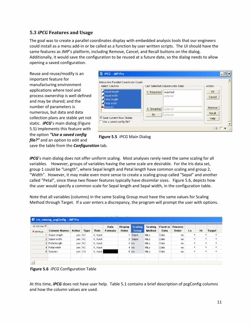
5.3 iPCG Features and Usage
The goal was to create a parallel coordinates display with embedded analysis tools that our engineers could install as a menu add‐in or be called as a function by user written scripts. The UI should have the same features as JMP’s platform, including Remove, Cancel, and Recall buttons on the dialog. Additionally, it would save the configuration to be reused at a future date, so the dialog needs to allow opening a saved configuration.
Figure 5.5 iPCG Main Dialog
Reuse and reuse/modify is an important feature for manufacturing environment applications where tool and process ownership is well defined and may be shared; and the number of parameters is numerous, but data and data collection plans are stable yet not static. iPCG’s main dialog (Figure 5.5) implements this feature with the option “Use a saved config file?” and an option to edit and save the table from the Configuration tab. iPCG’s main dialog does not offer uniform scaling. Most analyses rarely need the same scaling for all variables. However, groups of variables having the same scale are desirable. For the Iris data set, group 1 could be “Length”, where Sepal length and Petal length have common scaling and group 2, “Width”. However, it may make even more sense to create a scaling group called “Sepal” and another called “Petal”, since these two flower features typically have dissimilar sizes. Figure 5.6, depicts how the user would specify a common scale for Sepal length and Sepal width, in the configuration table. Note that all variables (columns) in the same Scaling Group must have the same values for Scaling Method through Target. If a user enters a discrepancy, the program will prompt the user with options.
Figure 5.6 iPCG Configuration Table
At this time, iPCG does not have user help. Table 5.1 contains a brief description of pcgConfig columns and how the column values are used.
11

Table 5.1 iPCG Configuration Table – tablename_pcgConfig
Columns Use Column Names Names of source data columns. If the source data does not contain a column with that
name, the column Active will be marked as “no”.Active User can reduce dimension but maintain the configuration specifications, by specifying
Active as “no”. Note, List Check is {0, 1} but Value Codes are “0=no”, “1=yes”. Type Valid Values are NC, NN, NO, CN. The 1st letter represents data type, numeric or character.
The 2nd letter represents modeling type, continuous, nominal or ordinal. Additional scaling methods nominal (NN, CN) are planned.
Role Placeholder for future work with partition.
Data Formula Abs(_x_), Log10(_x_) and Log10(Abs(_x_)) are provided using JMP’s List Check. Scaling is applied after data is transformed by the formula. JMP 9 allows cell coloring. Currently, no formulas are provided for character data, so the cell is blackened as a user reminder.
Scaling Group User creates a unique name and assigns it to each variable that should have uniform scaling.
Scaling Method Figure 5.7 displays the current options. The combination of the last 7 configuration columns (Scaling Group to Target) modifies scaling. “HiLo” is the default value.
Fixed or Data {“Fixed”, “Data”} If Scaling Method is “HiLo” and Lo & Hi are specified, “Fixed” scales and rails to Lo & Hi. “HiLo” + “Data”+ Lo&Hi, data is rails to Lo & Hi. Scaling is based upon the max and min of data within the rails. This is one version of Global vs. Local scaling, where Global=Fixed and Local=Data.
Reverse Order List Check is {0,1}, Value Labels is {“0=no”, “1=yes”}. If no, low values are at the bottom; if yes, low values are at the top.
Lo, Hi, Target User set values to be set as “rails”, source column values <Lo are scaled as to ‐0.075 and source values >Hi are scaled as 1.075
Figure 5.7 displays what the user sees after a right mouse click on a cell in the Scaling Method column. List Check is enabled for the scaling options currently implemented. “Scaling Notes” provides a few details regarding iPCG’s script characteristics. This configuration table is hidden until a user requests to edit it.
12

Scaling Notes:
• Source Data are not changed. For each active column, a new column is created using the name “~” prepended to the original column name. Scaled columns (“~”) are excluded and hidden.
• “X, Grouping” columns have no effect on scaling. “By” groups will affect scaling of columns using “Data” option or methods “Rank” or “Normalized Robust”. This is consistent with JMP’s Parallel Plot platform.
• Excluding rows, or lowering the rails (Lo, Hi) affect scaling. However, rescaling occurs after the user engages the button “Rescale”. Since anyone of 7 columns can affect scaling, it only makes sense to do this on demand. Automatic Recalc is not enabled in JMP9: more motivation for a user button option.
Figure 5.7 iPCG Configuration Table
Figures 5.8 and 5.9 depict iPCG’s tabbed display created after the initial dialog.
Figure 5.8 iPCG Analysis Tab: Features include upper and lower rails; a display for missing; outline box pulldown menu; Reverse Checkboxes embedded in a scroll box, enabling the display to stay in view; embedded Data Filter. These are toggle items. The display is embedded in a flexible scroll box, so the user has control of its size. Note: The check boxes needed to be scripted to deploy them in a scroll box. Using 25% of the vertical display for extremes and missing may seem excessive to some. However, in our environment anomaly detection is worth that much visual real estate. Highlighting is enabled by JMP 9’s Marker Selection Mode – Unselected Faded.
13

Figure 5.9 iPCG Configuration Tab View after Add/Remove Y, Responses button has been selected. The left ListBox is empty since all columns in the table are deployed in the parallel plot. The “User Action” Panel Box changes when a button is selected. Edit/Rescale makes the _pcgConfig table visible. The user must run an attached script called “Resume”, for the changes to apply. Note X, Grouping, will create a different graph for each group, and, like JMP, maintains a common scale across all groups. Separate graphs made with By variable, scales within a “By” group. Many features are planned or being developed for iPCG:
• Column Filter menu – a useful JMP 9 feature that does not have a built‐in JSL function. • Line and segment splatting [26] – methods to find clusters using a modified nearest neighbor
calculation that accommodates nominal variables and allows users to target which parameters to prioritize and does not require a pre‐set “k”.
• UI to capture and name clusters and capture “rules” (characteristics) of the cluster. • Linked Density plots.
5.4 iPCG JSL notes
New functions and display boxes in JMP 9 enabled features in this application. A short list includes: • OutlineBox<< Set MenuScript • Flexible ScrollBox • Subscribe and OnClose commands allow the script to capture user changes, heading off
unwanted window or table closings. JMP 9 has implemented User‐Defined Namespace Functions. As of this writing, iPCG has not taken advantage of this feature. However, if this application moves out of “prototype” into the general community, a code review will look for opportunities to manage globals.
14

Special recognition goes out to JMP 9 developers for improvement of its Help Indexes. The organization, expanse and sample scripts are very useful. A Wordle of the authors’ recent JMP 9 menu selections would have INDEX in big bold letters. The largest barrier to writing this script other than technical skill and time was the lack of control for JMP’s parallel plot “polyline” segment for color and transparency. Scripting time would have been saved if the useful Column Filter box would have been available through JSL. A UI improvement was suggested when a JMP table column has both List Check enabled plus Value Labels enabled, since obvious Boolean options are easier to manage as 0, 1, instead of strings.
6. Summary
Each JMP revision has new platforms, functions, and display objects that improve our ability to turn oceans of data into information. JSL enabled us to extend current JMP capabilities and tailor the tool and its usage to our organization’s needs. Micromaps and parallel plots are useful tools and our cited references support that statement. Features that are compiled in JMP will have better performance than commands from its interpreted language (JSL). The authors are looking forward to micromaps and improved parallel plot features in future versions of JMP.
15

References
1. Carr, D.B. and L. Williams Pickle. 2010. Visualizing Data Patterns with Micromaps; CRC Press; Boca Raton.
2. Carr, D. B., A. R. Olsen, J. P. Courbois, S. M. Pierson, and D. A. Carr. 1998. “Linked Micromap Plots: Named and Described,” Statistical Computing & Graphics Newsletter, Vol. 9 No. 1 pp. 24‐32.
3. Linked Micromaps, Version 1.0.2. March 2009. Statistical Research and Applications Branch, National Cancer Institute.
4. Murphrey, Wendy, and Rosemary Lucas, JMP® into JMP Scripting. Cary, NC: SAS Institute Inc.
5. SAS Institute (2009). JMP® Version 9 Basic Analysis and Graphing. Cary, NC: SAS Institute Inc.
6. SAS Institute (2009). JMP® Version 9 Scripting Guide. Cary, NC: SAS Institute Inc.
7. SEMI Standard. SEMI M21‐0304. March 2004. “Guide for Assigning Addresses to Rectangular Elements in a Cartesian Array”.
8. SEMI Standard. SEMI M20‐1104. September 2004. “Practice for Establishing a Wafer Coordinate System”.
9. Tukey, J.W. 1977. Exploratory Data Analysis. Reading, MA: Addison‐Wesley Publishing Company.
10. Data, data everywhere. (2010, February 27). The Economist, A special report on managing information. 1‐18.
11. d'Ocagne, Maurice: Coordonnées Parallèles et Axiales: Méthode de transformation géométrique et procédé nouveau de calcul graphique déduits de la considération des coordonnées parallèlles. 1885. Paris: Gauthier‐Villars.
12. Inselberg, A.: The plane with parallel coordinates. Journal The Visual Computer 1, 69–91 (1985)
13. Inselberg, A., Dimsdale, B.: Parallel coordinates: a tool for visualizing multidimensional geometry. In: VIS 1990: Proceedings of the 1st conference on Visualization 1990, pp. 361–378. IEEE Computer Society Press, Los Alamitos (1990)
14. Becker, R. A. and Cleveland, W. S.: Brushing a scatterplot matrix: high interaction graphical methods for analyzing multidimensional data . (1984) Technical Memorandum, AT&T Bell Laboratories, Murray Hill, NJ.
15. R.W. Brooks: “Viewing Process Information Multi‐dimensionally for Improved Process Understanding, Operation and Control,” Presented by invitation at the Aspenworld Conference, Boston, October 1997.
16

16. McCafferty, R. H., and Brooks, R. W.: Multivariate Fault Detection Via Geometric Process Control, Proceedings of the 2nd Advanced Equipment Control/Advanced Process Control Conference Europe, Dresden, Germany, April 2001.
17. Chung, K.L., Zhou, W.: Graph‐Based Visual Analytic Tools for Parallel Coordinates, G. Bebis et
al. (Eds.): ISVC 2008, Part II, LNCS 5359, pp. 990–999, 2008. ©Springer‐Verlag Berlin Heidelberg 2008 [The Hong Kong University of Science and Technology, [email protected], ee [email protected]]
18. Chad A. Steed, Patrick J. Fitzpatrick, J. Edward Swan II, and T.J. Jankun‐Kelly: Tropical Cyclone Trend Analysis using Enhanced Parallel Coordinates and Statistical Analytics. Cartography and Geographic Information Science, 36(3), pp. 251‐265, July 2009.
19. McCafferty, R. H.: NIH study: Parallel Coordinate Technology Foretells HIV Death, With data supplied by Dr. Stephen Bour and Dr. Bernard Lafont, NIH http://dayprofitsolutions.com/article‐NIH.htm
20. Cora, M. V., ShadyStats: Visualizing Game Statistics using Hierarchical Parallel Coordinates, Univ. Of British Columbia, CS 533C: Information Visualization, http://www.cs.ubc.ca/~tmm/courses/cpsc533c‐05‐fall/projects/mcora/report.pdf
21. Butkiewicz, M., Butkeiwicz, T., Ribarsky, W. and Change, R.: Integrating time‐series visualizations within parallel coordinates for exploratory analysis of incident databases, SPIE Proceedings Paper(2009) , http://www.viscenter.uncc.edu/~rchang/publications/2009/SPIE‐FAA.pdf
22. Friendy, M. : The Golden Age of Statistical Graphics, : Statist. Sci. Volume 23, Number 4 (2008), 502‐535
23. Few, S.: Multivariate Analysis Using Parallel Coordinates, (originally published 12‐Sep‐2006), http://www.b‐eye‐network.com/view/3355
24. Ellis, G., Dix, A.: Enabling Clutter Reduction in Parallel Coordinate Plots, IEEE Transaction on Visualization and computer Graphics, Vol. 12, No 5, Sept/Oct 2006; 717‐723
25. Kim, T‐Y, Shin, B‐S, Shin, Y. G.: Anisotropic Volume Rendering Using Intensity Interpolation, W.
Niessen and M. Viergever (Eds.): MICCAI 2001, LNCS 2208, pp1201‐1203, ©Springer‐Verlag Berlin Heidelberg 2001
26. Zhou, H, Cui, W., Qu, H., Wu Y., Yuan, X., Zhuo, W.: Splatting the Lines in Parallel Coordinates, Eurographics/IEEE‐VGTC Symposium on Visualization 2009, Volume 28(2009), Number 3.
27. G. E. Moore, “Cramming more components onto integrated circuits,” Electronics, vol. 38, no. 8, pp. 114–117, Apr. 1965.
28. Tufte, E.R. 1990. Envisioning Information. Cheshire, CT: Graphics Press.
17

18
29. From Sand to Silicon: the Making of a Chip. Web. 19 Aug. 2010. <http://www.intel.com/pressroom/kits/chipmaking/index.htm >.
30. "Stepper." Wikipedia, the Free Encyclopedia. Web. 19 Aug. 2010. <http://en.wikipedia.org/wiki/Stepper>.