
OECD Presentation Paris Dec 1, 2008 · important discoveries are captured into snapshots together...
34
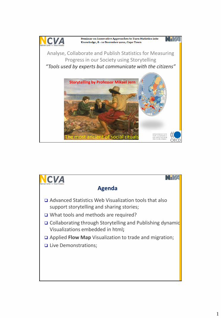
1 Analyse, Collaborate and Publish Statistics for Measuring Progress in our Society using Storytelling “Tools used by experts but communicate with the citizens” Storytelling by Professor Mikael Jern The most ancient of social rituals Agenda Advanced Statistics Web Visualization tools that also support storytelling and sharing stories; What tools and methods are required? Collaborating through Storytelling and Publishing dynamic Visualizations embedded in html; Applied Flow Map Visualization to trade and migration; Live Demonstrations;
Transcript of OECD Presentation Paris Dec 1, 2008 · important discoveries are captured into snapshots together...
1
Analyse, Collaborate and Publish Statistics for Measuring Progress in our Society using Storytelling
“Tools used by experts but communicate with the citizens”
Storytelling by Professor Mikael Jern
The most ancient of social rituals
Agenda
Advanced Statistics Web Visualization tools that also support storytelling and sharing stories;
What tools and methods are required?
Collaborating through Storytelling and Publishing dynamic Visualizations embedded in html;
Applied Flow Map Visualization to trade and migration;
Live Demonstrations;

2
http://ncva.itn.liu.se/
Applied Research based on geovisual analytics in close collaboration with governments and companies since 2000
Campus Norrköping with Science Park
May 2010Spin-off company to focus on
Advanced Statistics Web Visualization and guaranteefurther development and support to customers
http://ncomva.com/ http://ncomva.se/
Campus Norrköping with Science Park

3
NCVA started in 2008 to provide OECD with advanced interactive Web-based visualization statistical tools:
After the Stockholm meeting
OECD RegionalStatistics
Factbook eXplorer
NComVA continues in 2010 to provide OECD with advanced interactive Web-based visualization statistical tools:
PISA education data
Flow Map
Interactive documents

4
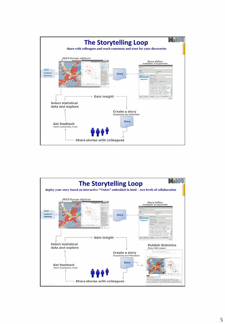
The Storytelling Loopmake discoveries through trends and patterns and derive insight
The Storytelling Loopimportant discoveries are captured into snapshots together with your descriptive metadata
5
The Storytelling Loopshare with colleagues and reach consensus and trust for your discoveries
The Storytelling Loopdeploy your story based on interactive “Vislets” embedded in html – two levels of collaboration

6
Statistics eXplorer architecture
Web compliant advanced interactive statistical visualization; Visualizations employ in-house developed GAV Flash tools
optimized for Adobe© ActionScript and Flash 10 / Flex 3 platform; Server application with anywhere accessibility; Interact with large spatio-temporal and multidimensional data;
Server application
From National to Sub-national regional developmentInteractive performance becomes an issue
Ageing population (65+) in Europe and Sweden

7
From National to Sub-national regional developmentAgeing population (65+) in Sweden (10,000 zip code regions)
8
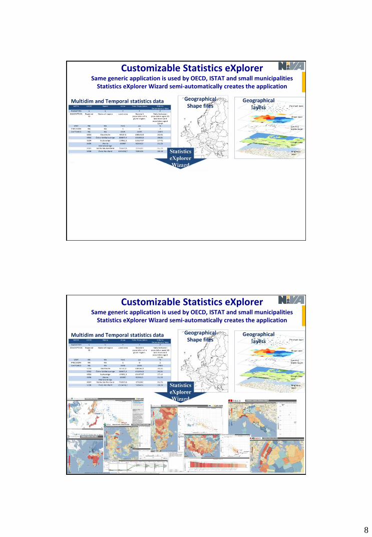
Customizable Statistics eXplorerSame generic application is used by OECD, ISTAT and small municipalities
Statistics eXplorer Wizard semi-automatically creates the application
Customizable Statistics eXplorerSame generic application is used by OECD, ISTAT and small municipalities
Statistics eXplorer Wizard semi-automatically creates the application

9
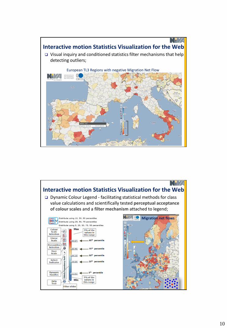
Interactive motion Statistics Visualization for the Web Applied innovative methods from Information and Geographical
Visualization e.g. table lens, profile plot, scatter matrix, dynamic histogram, glyphs etc. applied and customized for statistics data;
Statistical data is simultaneously explored through multiple-linked and coordinated views and Screen space usage is optimized for visualization no unnecessary visible GUI panels;
Interactive motion Statistics Visualization for the Web
10
Visual inquiry and conditioned statistics filter mechanisms that help detecting outliers;
European TL3 Regions with negative Migration Net Flow
Interactive motion Statistics Visualization for the Web
Dynamic Colour Legend - facilitating statistical methods for class value calculations and scientifically tested perceptual acceptance of colour scales and a filter mechanism attached to legend;
Migration net flows
Interactive motion Statistics Visualization for the Web

11
Support for Map layers with opacity control
Support for Map layers with opacity control
12
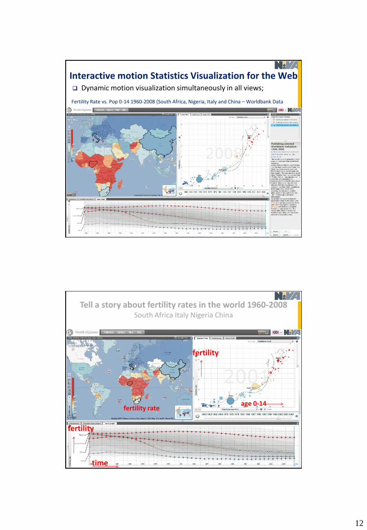
Dynamic motion visualization simultaneously in all views;
Fertility Rate vs. Pop 0-14 1960-2008 (South Africa, Nigeria, Italy and China – Worldbank Data
Interactive motion Statistics Visualization for the Web
Tell a story about fertility rates in the world 1960-2008South Africa Italy Nigeria China
fertility
age 0-14fertility rate
fertility
time

13
Interactive Histogram
Interactive Histogramdistribution Plot

14
Parallel Axes Plot or “Profile Plot”each line represents a EU TL2 region
each axis represents an indicator
compare two profiles Berlin and London against 6 indicators and mean values
age 0-14 age 65+ GDP per capita unemploym. labor prod tertiary edu.
Category Supportfilter based on categories

15
GAV Flash toolkit with layered architecture
From Static Reports to Dynamic Web Reports
http://stats.oecd.org/OECDregionalstatistics/

16
SmartDoc research development since 2004
Explore, Collaborate and Publish Official Statistics for Measuring Progress in our Society using Storytelling
17
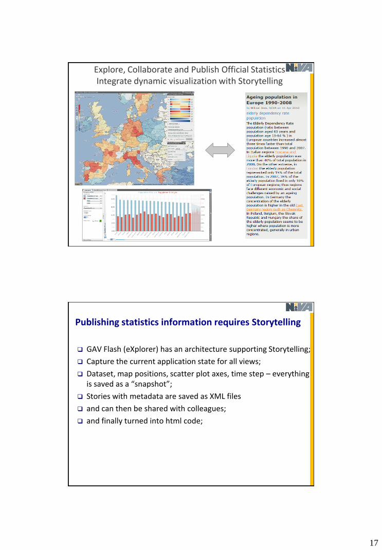
Explore, Collaborate and Publish Official StatisticsIntegrate dynamic visualization with Storytelling
Publishing statistics information requires Storytelling
GAV Flash (eXplorer) has an architecture supporting Storytelling;
Capture the current application state for all views;
Dataset, map positions, scatter plot axes, time step – everything is saved as a “snapshot”;
Stories with metadata are saved as XML files
and can then be shared with colleagues;
and finally turned into html code;

18
Storytelling requires a Snapshot Mechanism to capture important events
time, region (s), methods, indicator, colour, ..
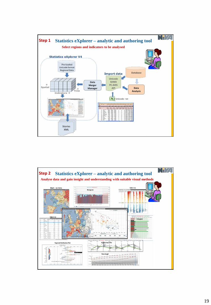
Statistics eXplorer – analytic and authoring toolStep 1
Select regions and indicators to be analysed – here OECD eXplorer
19
Statistics eXplorer – analytic and authoring toolStep 1
Select regions and indicators to be analysed
Statistics eXplorer – analytic and authoring toolAnalyse data and gain insight and understanding with suitable visual methods
Step 2

20
Statistics eXplorer – analytic and authoring tool
Story Editor
metadata
hyperlinksto snapshots
Start writing your Story - Story Editor
Step 3
Statistics eXplorer – analytic and authoring tool
Start writing your Story – use snapshots to highlight (capture)
special interesting insights, time steps and regions
Step 4

21
Statistics eXplorer – analytic and authoring toolStep 4
Reduce indicators to what your story needs Step 4a
22
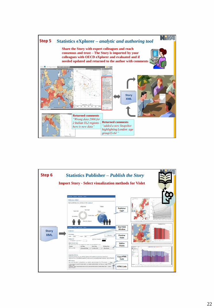
Statistics eXplorer – analytic and authoring tool
Share the Story with expert colleagues and reach
consensus and trust – The Story is imported by your
colleagues with OECD eXplorer and evaluated and if
needed updated and returned to the author with comments
Returned comments
“Wrong data 2006 for
2 Italian TL2 regions –
here is new data”
Step 5
Returned comments
“added a new Snapshot
highlighting London age
group15-64 ”
Statistics Publisher – Publish the Story
Import Story - Select visualization methods for Vislet
Step 6

23
Statistics Publisher – Publish the Story
Preview Vislet
Step 6a
Statistics Publisher – Publish the Story
Produce the HTML code
HTML code
Step 6b

24
Statistics Publisher – Publish the Story
Embed (drop) the HTML code in a Blog (or any web site)
HTML code
Step 7
Statistics Publisher – Publish the Story
A Vislet with Metadata is now Published
Step 8

25
Statistics Publisher – Publish the Story
and here with Histogram and Scatter PlotAll OECD TL2 regions
Step 8a
Statistics Publisher – Publish the Story
and here html code is inserted into a web page
Step 8b
HTML code

26
DemonstratorStep 8c
HTML code that relates to eXplorer, GIS, Data, and Vislet
27
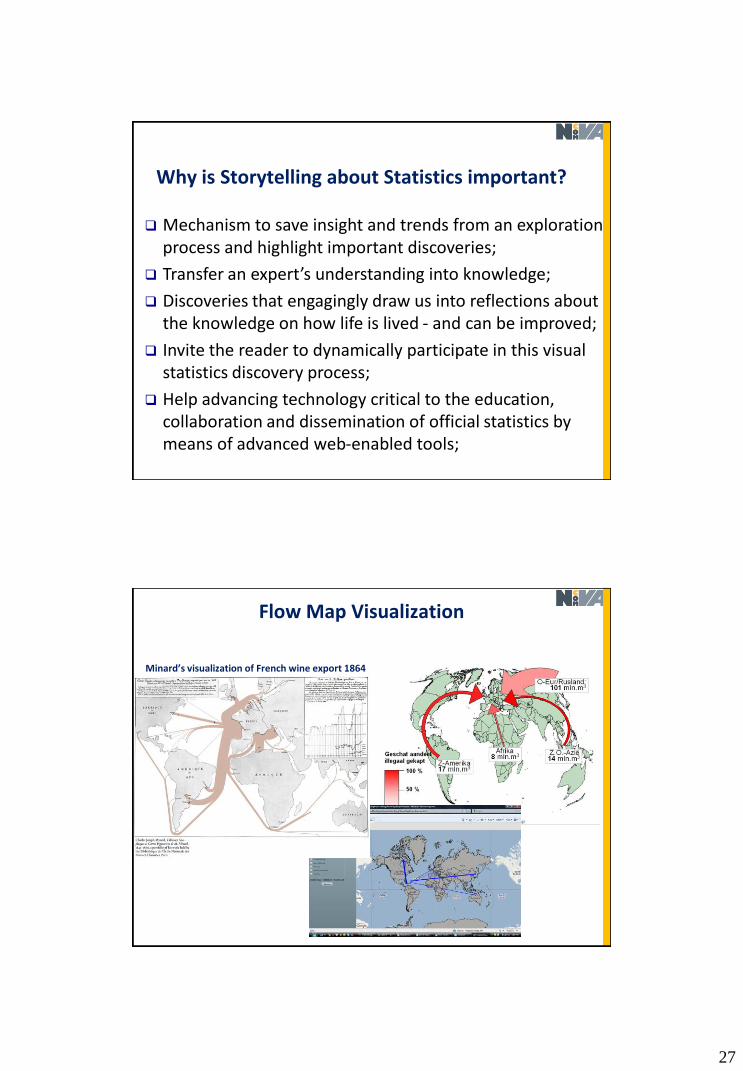
Why is Storytelling about Statistics important?
Mechanism to save insight and trends from an exploration process and highlight important discoveries;
Transfer an expert’s understanding into knowledge;
Discoveries that engagingly draw us into reflections about the knowledge on how life is lived - and can be improved;
Invite the reader to dynamically participate in this visual statistics discovery process;
Help advancing technology critical to the education, collaboration and dissemination of official statistics by means of advanced web-enabled tools;
Flow Map Visualization
Minard’s visualization of French wine export 1864

28
Migration Net Flow for Europe TL3 regions
Red means negative migration
Interaction Table
Flow Map MigrationFrom origin (focus) Oslo to Sweden
Origin“Oslo” Destination
“Stockholm”
Weighted arrows displayed as quadratic Bezier curves - can also be adjusted dynamically and edited individually to reduce clutter

29
Net Migration Swedish Counties with Stockholm as origin
Net Migration Swedish Municipalities with Norrköping as origin
30
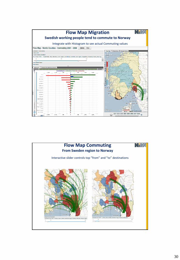
Flow Map MigrationSwedish working people tend to commute to Norway
Integrate with Histogram to see actual Commuting values
Flow Map CommutingFrom Sweden region to Norway
Interactive slider controls top ”from” and ”to” destinations

31
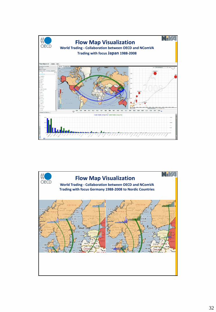
Flow Map VisualizationWorld Trading - Collaboration between OECD and NComVA
Trading with focus Germany 1988-2008
Flow Map VisualizationWorld Trading - Collaboration between OECD and NComVA
Trading with focus Japan 1988-2008
32
Flow Map VisualizationWorld Trading - Collaboration between OECD and NComVA
Trading with focus Japan 1988-2008
Flow Map VisualizationWorld Trading - Collaboration between OECD and NComVATrading with focus Germany 1988-2008 to Nordic Countries

33
Flow Map Visualization
Exploration and presentation of flow data – Web enabled through Flash;
Interaction with reasonable large volume of spatio-temporal and multivariate flow interaction table with interactive performance;
Background map layers, e.g. Google map or Bing map, for identifying the name of a geographic location;
Linked histogram to see order and magnitudes;
Animation of flow time series;
Time series glyphs to see changes over time;
Flow Map VisualizationDEMONSTRATOR
Trading with USA in focus 1988-2008
34
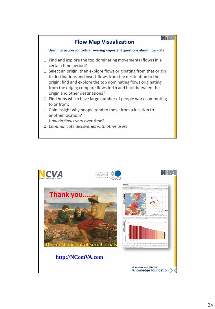
Find and explore the top dominating movements (flows) in a certain time period?
Select an origin, then explore flows originating from that origin to destinations and invert flows from the destination to the origin; find and explore the top dominating flows originating from the origin; compare flows forth and back between the origin and other destinations?
Find hubs which have large number of people work commuting to or from;
Gain insight why people tend to move from a location to another location?
How do flows vary over time? Communicate discoveries with other users
User interaction controls answering important questions about flow data
Flow Map Visualization
http://NComVA.com
Thank you......
The most ancient of social rituals