odebrecht ing
16
New brand architecture Unity in diversity
description
texto, foto
Transcript of odebrecht ing

New brand architectureUnity in diversity
Encarte ArqMarc FINAL ING.indd 1 3/22/13 10:07 PM
Encarte ArqMarc FINAL ING.indd 2 3/22/13 10:07 PM

THE USE OF A COMMON BRAND FOR ODEBRECHT BUSINESSES MEETS A NEED DICTATED BY DECENTRALIZED AND DIVERSIFIED OPERATIONS IN SEVERAL COUNTRIES WORLDWIDE.
A major change is underway in most Odebrecht
Group Businesses: they have adopted a new logo,
and some have changed their names.
This move is a result of the Group’s new brand
architecture, which has adopted the single-brand
model: the holding company, Odebrecht S.A. and all
Group Businesses will bear the name Odebrecht and
use the same logo.
The individual companies’ brands are set apart by
the wording that identifies their sector, market or
business activity. For specific reasons, Braskem and
the EEP - Estaleiro Enseada do Paraguaçu shipyard
have not adopted the new model for the time being.
The use of a common brand for Odebrecht
Businesses meets a need dictated by decentralized
and diversified operations in several countries
worldwide.
This special insert to issue #165 of Odebrecht
Informa magazine presents part of this story
and the guidelines for the creation of the Group’s
new brand architecture, recounting how it
was designed and how it is being applied.
Encarte ArqMarc FINAL ING.indd 3 3/22/13 10:07 PM
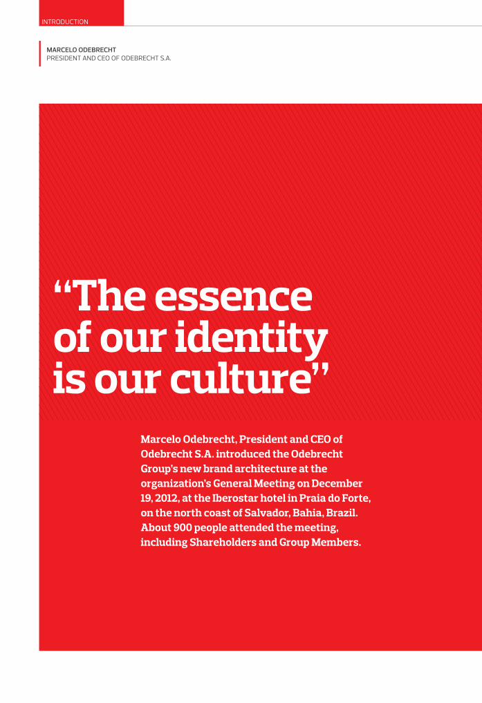
“The essence of our identity is our culture”
INTRODUCTION
Marcelo odebrechtPRESIDENT AND CEO OF ODEBRECHT S.A.
Marcelo Odebrecht, President and CEO of Odebrecht S.A. introduced the Odebrecht Group’s new brand architecture at the organization’s General Meeting on December 19, 2012, at the Iberostar hotel in Praia do Forte, on the north coast of Salvador, Bahia, Brazil. About 900 people attended the meeting, including Shareholders and Group Members.
Encarte ArqMarc FINAL ING.indd 4 3/22/13 10:07 PM

Alm
ir B
indi
latt
i
During his presentation, based on five major themes
that cut across the entire organization (People,
Productivity, Synergy, Image and Sustainable
Growth), Marcelo explained what Odebrecht’s new
Brand Strategy represents in the segment on Image:
“It is the sum of what we are, what we believe and
how we act. It is therefore our identity.” And he
warned: “We need to communicate our identity,
whose essence is our corporate culture, practiced by
knowledgeable people. We must never communicate
what we are not.”
He stressed the role of qualified communication with
the communities in the countries and regions where
Odebrecht’s companies work, and presented figures
that reveal the increasing interaction of the Group’s
people and businesses with their local environments.
These numbers included the growing number of
mentions of Odebrecht in the Brazilian media, which
rose from 3,100 in 2010 to 11,300 in 2012. “We are
increasingly in the news,” he concluded.
He also underscored the diversified and capillary
operations of the Group’s companies and the
significant growth of new types of clients, such
as users of urban transport and sanitation (water
and sewer) services and buyers of commercial
and residential real estate. As a result, he drew the
attention of the Group’s leaders to the global impacts
of local actions: “Today, international news agencies
provide immediate responses to local events.
Everything we do can represent a boost or a hit to
the international image of our brand.”
The Leaders (CEOs) of Odebrecht’s Businesses
displayed their new logos on their presentations at
the Annual Meeting. Only Braskem and EEP have
kept their original names and logos.
Marcelo Odebrecht at the Group’s Annual Meeting: highly qualified communication with the communities where Odebrecht is present
Encarte ArqMarc FINAL ING.indd 5 3/22/13 10:07 PM

6
Márcio Polidoro, the officer Responsible for Corporate Communication at Odebrecht S.A., headed the process of building the Group’s new brand architecture. In this interview, he answers five questions from Odebrecht Informa about the project he helmed.
What led Odebrecht to adopt a new brand
architecture?
Márcio Polidoro – We needed visual reinforcement
of the sense of belonging to the same organization,
for the Businesses and people. Moreover, we
also needed to demonstrate the organization’s
commitment to each of its companies. We also
needed to express alignment of beliefs, values,
vision, goals and priorities in an organization
that operates in a decentralized manner and
with broad geographic scale, but with the same
entrepreneurial culture. We believe that this new
model meets all those requirements.
What is the main change implemented through
the new brand architecture?
Márcio Polidoro – From now on, the holding
company, Odebrecht S.A., and all its businesses
will be called Odebrecht and use the same logo –
except for Braskem and EEP.
How is each business distinguished?
Márcio Polidoro – Through a unique description
associated with the Odebrecht brand. These
descriptions reflect what the brand is all about.
Their goal is not to create value, because that’s the
role of the brand. The description should be plain
and simple, so as not to distract attention from the
brand and make it easy for people to understand
the activity in question.
Why was the single-brand model adopted?
Márcio Polidoro– Because it was the most
appropriate one for an organization that is
distinguished by a unique corporate culture. The
single brand not only identifies us but sets us apart.
It spotlights the entire Group without detracting
from its parts, because they are all echoed in a logo
with the same design.
What is the main advantage of this new model?
Márcio Polidoro – It reinforces the concept of
a diversified organization, facilitates external
perceptions and brings the visual expression of
our organization closer to what we really are,
eliminating the fragmentation caused by multiple
logos without a unified design and color.
Creating more value
INTERVIEW
Márcio PolidoroRESPONSIBLE FOR CORPORATE COMMUNICATION
Encarte ArqMarc FINAL ING.indd 6 3/22/13 10:07 PM

7
The name Odebrecht appeared in red
for the first time in the signature of the
Engineering & Construction business
In the beginning, the Group’s logo was
a symbol made up of the initials of
Construtora Norberto Odebrecht (CNO).
A Changing Brand
Then, the name Odebrecht was
replaced by the acronym CNO.
At the time, multiple logos
coexisted within the Group.
Next, the names Odebrecht and
Construtora Norberto Odebrecht were
adopted and the logo was reduced.
The new logo, introduced in
2013 for all Group Businesses,
incorporates the color red and
the font of the previous two brands
The green Odebrecht logo appeared in the
1980s to represent the Group. The holding
company, Odebrecht S.A., adapted it from
Construtora Norberto Odebrecht’s logo.
Encarte ArqMarc FINAL ING.indd 7 3/22/13 10:07 PM

8
Hol
anda
Cav
alca
nti
Odebrecht hired the British firm Interbrand, which
has operated in Brazil for 10 years, to design its
new brand architecture. Rio native Laura Garcia,
the firm’s Brand Strategy Manager, was assigned
to direct the project, which took over a year to
complete. Laura and her team visited the Group’s
jobsites, industrial plants, concession companies
and offices in Brazil and other countries. “We started
out by trying to understand Odebrecht, with its
decentralized operations and unique culture, which
is rare in other companies,” she says. “Only then
could we begin to arrive at the best visual solution
for expressing the challenge we were presented
with.” In this interview, Laura Garcia discusses
the process of creating Odebrecht’s new brand
architecture, the guiding premises for that process,
and the results achieved. She believes that, due
to the changes now underway, the Group will gain
a new level of recognition. “Odebrecht is a major
company that needs a major brand.”
What was the challenge you were presented with?
laura Garcia – Odebrecht has an entrepreneurial
philosophy that embraces the decentralization of
its businesses. Therefore, each company created
and managed its own brand. But this did not lead to
an overall brand perception. The challenge we were
presented with was to help Odebrecht solve this
dilemma.
How did you conduct that process?
laura Garcia – We realized that one of the two
parts of the dilemma would have to give way. What
prevailed was the premise that Odebrecht needed
How the new brand was born
Laura Garcia: process guided by the idea that the brand is an asset that must be managed to make it understandable to stakeholders
INTERVIEW
laura GarciaBRAND STRATEGY MANAGER – INTERBRAND
Encarte ArqMarc FINAL ING.indd 8 3/22/13 10:07 PM

9
“OUR GOAL IS TO SEE THE ODEBRECHT LOGO APPLIED THE SAME WAY EVERYWHERE”
to establish its image as a group, and to do that, it
would have to adopt the same logo, what we call
a monolithic brand architecture, which required
centralized management of this issue. It wasn’t
easy, because the culture of decentralization is very
strong at Odebrecht. We discussed it extensively,
but in the end the organization’s leaders understood
the proposal and adopted the suggestions.
In the early stages of your work, what most
caught your attention about Odebrecht?
laura Garcia – What impressed us most was the
organization’s strong personality, which stems
from the Odebrecht Entrepreneurial Technology.
In all the countries we visited, we found people
whose language is consistent and on the same
page, with the same proactive stance and sense
of responsibility for their business, and a can-do
attitude. We realized that all that had to be
expressed in the new logo.
After that immersion, how did the work proceed?
laura Garcia – We put together a set of perceptions
and, working closely with the client, established the
basic premises of the project, guided by the idea
that the brand is an asset that must be managed
with a view to ensuring that its stakeholders
understand it. Another decisive vector was
the idea of building a general perception of an
entrepreneurial organization that operates in
different businesses and countries. To do so, we
needed a single logo that could withstand structural
changes. A logo that could be managed centrally in a
decentralized organization.
How did the visual expression of these concepts
develop?
laura Garcia – We had a reference, which was
the Engineering & Construction business’s logo.
Based on that, we sought to strengthen that logo’s
best features, which was the use of the color red,
an expression of strength and achievement. We
inverted the red and white and created elements
that make up and highlight the new logo. We
also brought in more elements to create a visual
system that resulted in the Brand Territory, a
website for Group members that explains the new
brand architecture and contains the manual for its
applications by all the companies [that use it].
What is the standard used for the descriptions
accompanying the logo?
laura Garcia – We needed to resolve a key issue,
since some companies’ segments are based on
expertise, and others on markets or regions. Thanks
to the client’s decision to change the names of some
companies so they start with the name Odebrecht,
we arrived at a satisfactory solution. So then we
established that the descriptions that accompany
the logo should reflect the company’s specialty
(Agroindustry, Infrastructure, Environment, Real
Estate Development, etc.).
As a result, we made significant progress toward
achieving our goal, which is to see the Odebrecht
logo applied the same way everywhere, thereby
expressing the understanding that we’re talking
about the same organization.
Encarte ArqMarc FINAL ING.indd 9 3/22/13 10:07 PM

10
Companies are already using thenew logo
FEEDBACK
Group companies are already changing their logos on the basis of the organization’s new brand architecture. Odebrecht Informa obtained feedback from three of the officers responsible for introducing the new logos. See what Odebrecht Agroindustrial Communication Manager Andressa Saurin, Odebrecht Oil & Gas Communication Manager Bárbara Nitto, and Odebrecht Realizações Imobiliárias Marketing Director Sergio Kertész have to say about the changes underway.
Encarte ArqMarc FINAL ING.indd 10 3/22/13 10:07 PM

11
Andressa SaurinOdebrecht Agroindustrial“In our case it’s a total transformation, because
we’re changing the company’s name and logo. It’s
a huge job, but I’m very happy because I always
thought that we should take the name of our parent
brand. In fact, here at ETH we have always been
Odebrecht, because we always seek to apply the
Odebrecht Entrepreneurial Technology to the
fullest extent. The only thing that’s changing now
is that our name reflects all that. To launch the new
name and logo, we created a campaign titled ‘Today
we are more.’ Precisely because we already were
Odebrecht on a daily basis. Today we are more,
Edga
r Ish
ikaw
a
“OUR MAIN FOCUS WAS ON INFORMING OUR MEMBERS ABOUT THE CHANGES FIRST. MOST OF THEM LIVE IN SMALL TOWNS IN THE MIDWEST OF BRAZIL”
Andressa Saurin (background), with Fabio Rimoli, Fernanda Kato, Karina Lara and team leader Genésio Couto (foreground)
Encarte ArqMarc FINAL ING.indd 11 3/22/13 10:07 PM

12
FEEDBACK
because we have Odebrecht in our name, on our
name tags, uniforms, and business cards. The color
red that is now on Odebrecht Agroindustrial’s logo
is the color of accomplishment. It has always been in
our blood.
“Our main focus was on informing our members
about the changes first. Most of them live in small
towns in the Midwest of Brazil, where Odebrecht
Agroindustrial is the largest employer. We had to
give them our full attention, since they mobilized
their lives to work at ETH, were groomed at ETH,
brought their families to ETH, stopped receiving
the Family Grant to work at ETH, and suddenly ETH
changes its name, colors, it becomes something
else. All this could be confusing, so we are giving
them our full attention. In addition to a series of
internal communication programs, our CEO Luiz
de Mendonça and the leaders of our agroindustrial
hubs got to work, interacting with local mayors and
communities to explain the change. We also used
radio spots and commercials on local TV channels.
“This isn’t a change that happened overnight.
We started on the February 5th, but it will go on
throughout 2013. Changes in the identity of our
units will follow a schedule that will include several
steps, from painting ethanol tanks to changing our
signs on roads in the Midwest. Everything else will
be done through a comprehensive communication
program. Our Members breathe change with pride,
pride in belonging not only to the company they
work for but to a much larger organization, which
further strengthens our journey towards our
Vision for 2020.”
Bárbara NittoOdebrecht Oil & Gas“I think that the use of a single brand is really
the best way forward for Odebrecht. It is easily
recognizable for everyone and expresses the same
stance, the same culture of a single organization
whose operations’ goals and objectives are on the
same page.
“At Odebrecht Oil & Gas, we have kept our name
but changed the logo and eliminated the initials
OOG. We won’t have any problems making this
transition. Like many other Members of the former
OOG, I always introduce myself as Odebrecht. The
brand has always come first, followed by the Oil &
Gas segment. In other words, we will keep doing
what we had been doing already.
“All of our nearly 3,000 Members were informed of
the changes on January 28th. We sent out an email
Encarte ArqMarc FINAL ING.indd 12 3/22/13 10:07 PM

13
message to all of them to explain the changes. We
put up banners on the oil rigs and in our offices. We
left a mug with the new logo and an informative
message on everybody’s desk. And we provide the
artwork (e-mail signatures, brochures, business
cards, computer screen backgrounds, a visual
identity manual, letterhead and a PowerPoint
presentation template) for the new logo so
everyone could make personal use of it.
“There will be a transition period, which is normal for
such changes. We’re going to be thrifty and use up
the materials on hand before having them replaced.
It makes no sense to throw them all away. We’ll
replace them gradually. Changing the logo on the
oil rigs may take a little longer, because it has to be
done when the platforms are anchored (’docked’ as
we say here). They can only be painted when they’re
not operating.”
Ger
aldo
Pes
talo
zzi
“WE WON’T HAVE ANY PROBLEMS MAKING THIS TRANSITION. WE’VE ALWAYS INTRODUCED OURSELVES AS ODEBRECHT”
Bárbara Nitto with the mug gifted to all Odebrecht Oil & Gas Members
Encarte ArqMarc FINAL ING.indd 13 3/22/13 10:07 PM
14
Sergio Kertész Odebrecht Realizações Imobiliárias “Making the decision to switch to using a single
brand was very important. But what will ensure
that the new brand works is its implementation, and
always taking care of it on a daily basis. This process
is just beginning. And it will only go well if we keep it
up every day.
“Odebrecht Realizações Imobiliárias [Real Estate
Development] is a company that speaks directly to
the end consumer, and has a relatively large number
of clients with different profiles. We must make
sure that these clients understand the purpose of
the change, and don’t think that the company is
any different from before, or that the people they
know will not be there anymore. This is an important
alignment between our teams and our clients, and it
will bring us even closer to our main brand.
“We will work with and change more than 90
items, from name badges, cards and stationery to
electronic environments, such as the company’s
intranet and website. We’ve changed the physical
environment of the office and the physical
environment of our construction projects. We’ve
revised our signaling and signposting manual, and will
replace fencing, uniforms, and overhead signage. We
had a unique identity that was well known in Brazil’s
main cities, and we’ve made sure that we won’t lose
that. Our challenge is to take the energy that was
channeled into consolidating and developing a brand
and translate it into this new version.
“For our clients, the impact will be relatively small,
because they believe in and trust the Odebrecht
brand. But we have to make it clear that our
personality is still the same; that the focus on
our pillars – differentiation, sustainability and
selectivity – is still there. The way we develop
products, taking care of all stages, remains exactly
the same. What we have now is complete alignment
with our parent company, Odebrecht, both in terms
of our visual identity and our name.”
Carlo
s G
uelle
r
“WHAT WILL ENSURE THAT THE NEW BRAND WORKS IS ITS IMPLEMENTATION, AND ALWAYS TAKING CARE OF IT ON A DAILY BASIS”
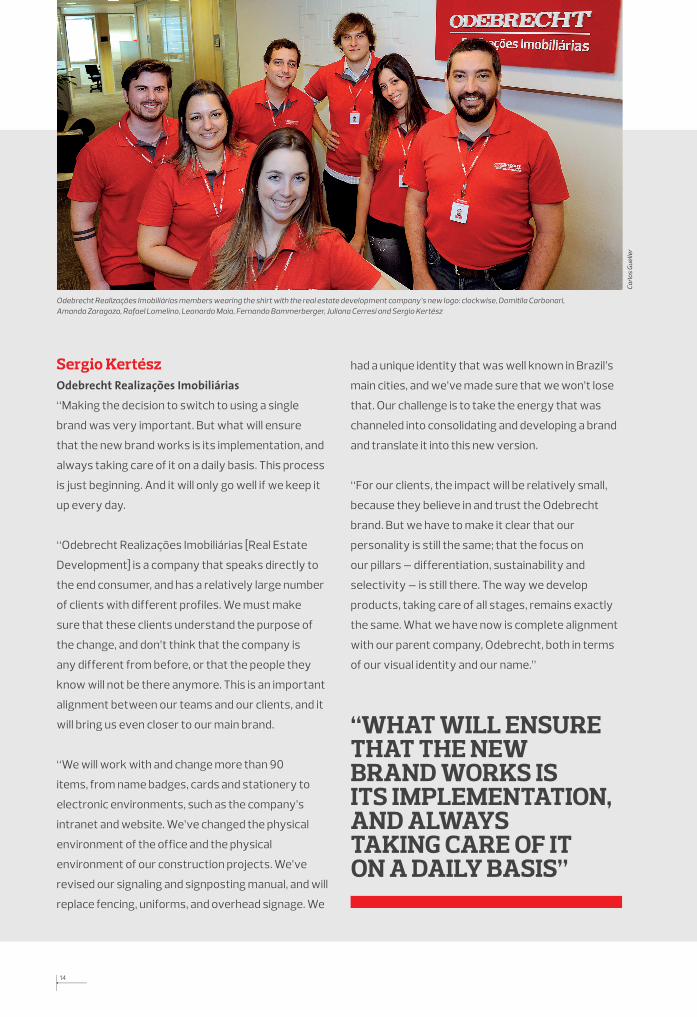
Odebrecht Realizações Imobiliárias members wearing the shirt with the real estate development company’s new logo: clockwise, Domitila Carbonari, Amanda Zaragoza, Rafael Lomelino, Leonardo Maia, Fernando Bammerberger, Juliana Cerresi and Sergio Kertész
Encarte ArqMarc FINAL ING.indd 14 3/22/13 10:07 PM

Encarte ArqMarc FINAL ING.indd 15 3/22/13 10:07 PM

Crea
ted
and
prod
uced
for O
debr
echt
S.A
. by
Ver
sal E
dito
res
Encarte ArqMarc FINAL ING.indd 16 3/22/13 10:07 PM