NATIONAL SENIOR CERTIFICATE GRADE 12 · SECTION A QUESTION 1 (20 marks in total)
72
Copyright reserved Please turn over MARKS: 150 TIME: 3 hours This question paper consists of 20 pages. This question paper must be printed in full colour. DESIGN P1 (THEORY) NOVEMBER 2011 NATIONAL SENIOR CERTIFICATE GRADE 12
Transcript of NATIONAL SENIOR CERTIFICATE GRADE 12 · SECTION A QUESTION 1 (20 marks in total)

Copyright reserved Please turn over
MARKS: 150 TIME: 3 hours
This question paper consists of 20 pages. This question paper must be printed in full colour.
DESIGN P1
(THEORY)
NOVEMBER 2011
NATIONAL SENIOR CERTIFICATE
GRADE 12

Design/P1 2 DBE/November 2011 NSC
Copyright reserved Please turn over
INSTRUCTIONS AND INFORMATION 1. 2. 3.
This question paper consists of SEVEN questions. There are choices within some questions in this question paper. Read the options carefully. This question paper consists of THREE sections:
SECTION A:
SECTION B: SECTION C:
Design literacy (80 marks) QUESTIONS 1 to 4 Design in a social/environmental context (40 marks) QUESTIONS 5 and 6 Design in a business context (30 marks) QUESTION 7
4. 5. 6. 7. 8.
Read the requirements of the questions carefully. Answer in full sentences and avoid the listing of facts. Use the mark allocation to determine the time to be spent on each question. Do NOT repeat the same facts and examples in different questions. Write neatly and legibly.

Design/P1 3 DBE/November 2011 NSC
Copyright reserved Please turn over
SECTION A: DESIGN LITERACY QUESTION 1: 'UNSEEN' EXAMPLES 1.1
FIGURE A: Jewellery design by Urbanative, South Africa, 2010. 1.1.1 South African design lacks identity. Do you agree? Discuss this
statement by referring to FIGURE A in your answer. (4)
1.1.2 Discuss the use of the following elements shown above in
FIGURE A: • Pattern • Texture
(4)
1.1.3 Explain how the principle of good continuation is applied in the
above design, for example visual flow and continuity. (2)
Design/P1 4 DBE/November 2011 NSC
Copyright reserved Please turn over
1.2
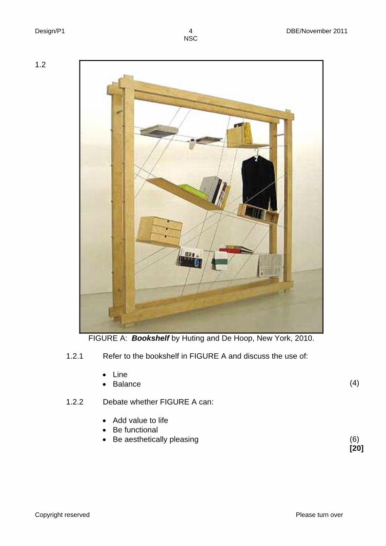
FIGURE A: Bookshelf by Huting and De Hoop, New York, 2010.
1.2.1 Refer to the bookshelf in FIGURE A and discuss the use of:
• Line • Balance
(4)
1.2.2 Debate whether FIGURE A can:
• Add value to life • Be functional • Be aesthetically pleasing
(6) [20]

Design/P1 5 DBE/November 2011 NSC
Copyright reserved Please turn over
QUESTION 2 2.1
FIGURE A: Promotional advert for ABSA, designer unknown. In this advert, ABSA celebrates the creative role of designers. The text shown
to the left of the ABSA logo (bottom right corner) reads as follows: Coming up with designs that change the world is hard. Overcoming the obstacles that threaten them can be soul destroying! At ABSA, we believe creativity takes courage … It's time to give your creativity a fighting chance …
Discuss the role of responsible design in a modern society by referring to
FIGURE A. In your discussion: • Debate the use of stereotypes, bias and prejudice in FIGURE A • Discuss the advertisement's slogan that 'Nothing should stand in the way
of great design' with reference to responsible design practice
Your discussion must be at least half a page in length.
[10]

Design/P1 6 DBE/November 2011 NSC
Copyright reserved Please turn over
QUESTION 3 3.1 Refer to FIGURE A and FIGURE B below and answer the questions that
follow.
FIGURE A: Zulu Mama chair by
Haldane Martin. Made using traditional basket weaving techniques
using recycled plastic, 2008.
FIGURE B: Lathe Chair VIII by Sebastian Brajkovic, bronze and fabric, 2008.
3.1.1 Designers often reinterpret traditional or classic designs. What is
your opinion of this practice? Give a reason for your response. (2)
3.1.2 Compare the above designs by discussing their similarities and
differences. Refer only to: • Colour • Shape • Texture • Use of materials and techniques
(8)

Design/P1 7 DBE/November 2011 NSC
Copyright reserved Please turn over
3.2
FIGURE A: Beaded coat, unknown designer, KwaZulu-Natal.
3.2.1 Craftspeople need to have a unique identity in order to sustain their
business. Discuss how the beaded coat in FIGURE A is unique in identity.
(2)
3.2.2 Write an article about a South African designer/studio/agency of
your choice. Include the following information: • The name of the designer, a product and a brief description of
its design • The characteristics of, and influences on the design • An explanation of how the designer/studio/agency created
his/her/its own unique identity
(8) [20]

Design/P1 8 DBE/November 2011 NSC
Copyright reserved Please turn over
QUESTION 4: DESIGN HISTORY 4.1 Refer to FIGURE A and answer the questions that follow.
FIGURE A: Clover chairs, Ron Arad, United Kingdom, 2010. In 1922 Antonio Gaudi said: 'Nothing beats the beauty of nature'.
The clover leaf chairs seen in FIGURE A are a good example of design that has been inspired by the shapes and forms of nature. Choose any TWO styles/movements from the list below and discuss ONE design from each style/movement: The arts and crafts movement (c.1850–1900) Art Nouveau (c.1890–1905) Modernism (c.1935–1955) Pop/New Age design (c.1955–1975) Post Modernism (c.1975 to present) Use the following guidelines in your discussion: • Name the designer(s) and design(s) of each style/movement • Discuss the main characteristics of ONE design for each style/movement
and their possible source(s) of inspiration • Discuss the general aims of each style/movement
(20)

Design/P1 9 DBE/November 2011 NSC
Copyright reserved Please turn over
4.2
FIGURE A: Bauhaus Master's House by
Walter Gropius, Germany, 1926 (Bauhaus).
FIGURE B: Surrey Mansions by Langton and Barbourne, Durban,
South Africa, 1934 (Art Deco).
Compare the buildings shown in FIGURE A and FIGURE B. In your answer
refer to the different stylistic characteristics of Bauhaus and Art Deco as shown in these buildings.
(10) [30]
TOTAL SECTION A: 80

Design/P1 10 DBE/November 2011 NSC
Copyright reserved Please turn over
SECTION B: DESIGN IN A SOCIAL/ENVIRONMENTAL CONTEXT QUESTION 5 5.1 This interactive* bus advertisement for Fitness First encourages people to join
the gym by weighing them when they sit down on the bench. * The product's effectiveness depends on the participation of the consumer.
FIGURE A: Fitness First ('Weigh in Bus Stop') by N=5 designer agency, Rotterdam, The Netherlands, 2009.

Design/P1 11 DBE/November 2011 NSC
Copyright reserved Please turn over
A critic commented on the advertisement in FIGURE A (on page 10) saying
the following: N=5 used an advertising method that is perhaps a bit too interactive in that it requires you to participate and respond to be weighed in public.
5.1.1 Do you agree or disagree with this comment? Discuss the
advantages and disadvantages in using interactive advertising methods at bus stops.
(4)
5.1.2 Discuss ONE INTERNATIONAL socially aware designer you have
studied who has through his/her designs or projects added value to life. Name the designer, discuss a design or designs and explain the way the social issue/issues has/have been dealt with. You may NOT refer to any designer(s) that you have used previously.
(6)

Design/P1 12 DBE/November 2011 NSC
Copyright reserved Please turn over
5.2
FIGURE A: A Ghost that is what I am, self portrait poster by Sindiso Nyoni for Marklives!com, South Africa, 2009.
5.2.1 The poster in FIGURE A makes us aware of certain social concerns facing South African society today. Discuss the following: • The use of contrast in conveying the message • How the imagery conveys the message of xenophobia
(4)
5.2.2 Choose ONE other local designer or design group/agency, who addresses social issue(s). Discuss the influence of social commentary on design, for example stereotyping, gender issues, values and safety. You may NOT refer to any designer(s) that you have used previously.
(6) [20]

Design/P1 13 DBE/November 2011 NSC
Copyright reserved Please turn over
QUESTION 6 Choose EITHER QUESTION 6.1 AND QUESTION 6.2 (20 marks) OR QUESTION 6.3 (20 marks).
6.1
FIGURE A: Fashion made from recycled material by Clive Rundle, South Africa, 2007.
FIGURE B: Fashion made from vegetation by Frans Gräbe, South Africa,
2008.
6.1.1 Compare FIGURE A and FIGURE B above in terms of:
• The materials used • The advantages of recycling material and disadvantages of
destroying vegetation
(4)
6.1.2 Discuss the work of ONE local designer who has focused on the
environment by using recycled materials/green methods in producing design objects. Supply the following: • Name of designer • Name of product • Describe the product and briefly explain how environmental
issues have been dealt with You may NOT refer to any designer(s) that you have used previously.
(6)
AND
Design/P1 14 DBE/November 2011 NSC
Copyright reserved Please turn over
6.2
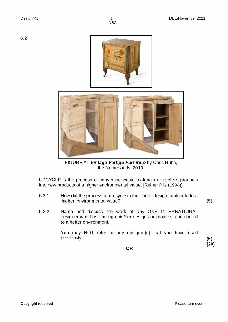
FIGURE A: Vintage Vertigo Furniture by Chris Ruhe, the Netherlands, 2010.
UPCYCLE is the process of converting waste materials or useless products
into new products of a higher environmental value. [Reiner Pilz (1994)]
6.2.1 How did the process of up-cycle in the above design contribute to a
'higher' environmental value? (5)
6.2.2 Name and discuss the work of any ONE INTERNATIONAL
designer who has, through his/her designs or projects, contributed to a better environment. You may NOT refer to any designer(s) that you have used previously.
OR
(5) [20]

Design/P1 15 DBE/November 2011 NSC
Copyright reserved Please turn over
6.3 'I am an earth warrior,' said Darryl Cherney, well known environmental
activist, singer and songwriter. Discuss the work of ONE LOCAL AND ONE INTERNATIONAL designer who, through his/her nurturing actions can be hailed as an 'earth warrior'. Use the following structure for EACH designer: • Name of the designer • Title of design/product • Description and characteristics of the design(s) • Aims of and influences on the designer • Environmental issues addressed by the designer (for example explain
why the designer is an 'earth warrior') You may NOT refer to any designer(s) that you have used previously.
[20]
TOTAL SECTION B: 40

Design/P1 16 DBE/November 2011 NSC
Copyright reserved Please turn over
SECTION C: DESIGN IN A BUSINESS CONTEXT Answer only ONE question in this section. Answer EITHER QUESTION 7.1 OR QUESTION 7.2.
7.1
FIGURE A: Re-energy, a product designed by Jin Sik Kim and Bo Sung Seo, Korea, 2010.
This ordinary bicycle (FIGURE A) is converted to generate power. The power
is then used to recharge a cellphone or connect to a computer, et cetera.

Design/P1 17 DBE/November 2011 NSC
Copyright reserved Please turn over
7.1.1
7.1.2 7.1.3
Discuss some marketing issues that the designers of Re-energy will have to address when presenting their campaign to possible clients. Use the following structure: • Target market • Aspects that would need to be considered during pricing and
costing • Initial funding and financing • Possible future marketing strategies Explain and discuss how TWO elements of design were used in FIGURE A to highlight the message of recycling. The designers of Re-energy have decided to apply for an additional bank loan. For this the bank requires a SWOT analysis. Draw up a possible SWOT analysis for Re-Energy.
(8) (4) (8)

Design/P1 18 DBE/November 2011 NSC
Copyright reserved Please turn over
7.1.4
FIGURE B: Maurizio Lamponi Leopardi lamps by Lamponi designs, Italy, 2010.
FIGURE C: Lamp designs by Weyers Marais,
South Africa, 2009.
7.1.5
Lamponi describes his lamp designs as sculptural art whereas Weyers Marais describes his lamps as product designs. Give your opinion of the above statement by comparing FIGURE B and FIGURE C. Explain what strategies you would use for marketing and displaying the products in FIGURE B.
(6) (4) [30]
OR

Design/P1 19 DBE/November 2011 NSC
Copyright reserved Please turn over
7.2 Study FIGURES A to C below and then answer the questions that follow.
FIGURE A: Men's boutique in an urban shopping mall, South Africa.
FIGURE B: Papier mâché crafter, Themba Masala, South Africa.
FIGURE C: Community trading store, South Africa.

Design/P1 20 DBE/November 2011 NSC
Copyright reserved
7.2.1
FIGURES A to C (on page 19) shows different forms of trading, ranging from formal to informal. Compare these three forms of trading according to: • Accessibility • Financial viability • Target market • Advertising • Sustainability (3 x 5)
(15)
7.2.2 Name FIVE important elements of a good display. (5) 7.2.3
In your opinion which is the most successful display shown in FIGURES A to C? Refer to the elements you have named in QUESTION 7.2.2 to justify your answer.
(3)
7.2.4
If you were the designer in FIGURES A to C respectively, briefly describe how you would package your products for the buyer after selling.
(3)
7.2.5 If you decide to pursue a career in design, name FOUR possible
opportunities that are available to you. (4) [30]
TOTAL SECTION C:
GRAND TOTAL: 30
150

Copyright reserved Please turn over
MARKS: 150
This memorandum consists of 37 pages.
DESIGN P1
(THEORY)
NOVEMBER 2011
MEMORANDUM
NATIONAL SENIOR CERTIFICATE
GRADE 12

Design/P1 2 DBE/November 2011 NSC – Memorandum
Copyright reserved Please turn over
SECTION A QUESTION 1 (20 marks in total) AS1: Make value judgments informed by a clear understanding of design. AS2: Understand design theory and use design terminology correctly.
1.1 (Allocate 10 marks in total) 1.1.1 (Allocate 4 marks):
Learners must discuss whether South African design lacks identity with a well reasoned argument by making reference to FIGURE A. POSSIBLE RESPONSES: NO, South African Design does have an identity: South Africa has a lot to offer the world. From design to architecture, this country has the potential to offer innovative solutions to many of the world's problems. South African design is difficult to define and yet you can spot it immediately, even in a world where styles are continually merging and cross-pollinating. Contemporary African symbols, colours and traditional techniques (for example Haldane Martin's Zulu Mama Chair) are slowly emerging after years of European and American design style derivatives. We can't undo the traditional Western influences but, at the same time, it's important to build a design style that is uniquely South African. It's important because the development of South African style has helped to forge a unique and unified South African identity. Giving birth to a culture that encourages people to celebrate their own diverse and common heritage rather than always looking to Europe or America, will also positively impact social, cultural and economic growth (Proudly South African campaign). And that's starting to happen. South African design is no longer always cheesy, touristy zebra skin motifs, masks and Zulu huts. There is so much more, from Bitter Komix and I-Juicy to SABC 1's new South African campaign. More and more television adverts are looking increasingly unequivocally South African. Figure A has utilised shapes that are more 'African' in appeal. These shapes could suggest shields that have been arranged in an informal manner. The design's repetitive spiral surface pattern is engraved /incised which could be influenced by traditional African craft practices. The natural colour palette also adds to the African appeal of the design.
Design/P1 3 DBE/November 2011 NSC – Memorandum
Copyright reserved Please turn over
YES, South African Design does not have an identity:
South African design is difficult to define as styles are continually merging and cross-pollinating. South African cultures and lifestyle are so diverse and multi-faceted that it is difficult to identify a singular, distinct South African style. Figure A seems to be a marriage of different styles (eclectic ) that appears to mix traditional African faceted shapes with spiral Eastern patterns. FIGURE A does not have a distinct South African style as the colour, shapes and lines do not suggest a uniquely South African design. The extended, elongated forms of the piece create an exotic (Mexican) appeal. Credit must be given to any valid and reasonable answer.
1.1.2 (Allocate 4 marks):
The following may be included in the analysis:
• Pattern (element) – repetition of shapes, colours and lines creates a typical African pattern. Negative spaces within the design reinforce the overall effect of the pattern. The repetition and placing of the red stones. Repetition of the shield motif, etc
• Texture (element) – the engraved spiral pattern and the raised
red stones on some of the metal pieces (visual texture) can be seen in FIGURE A. This can be felt on the original design (tactile texture). The interplay of light between solids and voids creates a dynamic visual texture. Contrast between smooth and rough surfaces: glass and metal.
1.1.3 (Allocate 2 marks)
• Good continuation – elements arranged in a straight line (like the almond, eye or shield shaped metal pieces) are perceived as a group and are seen as more related than elements not on the same line. Additionally the engraved spiral patterns on each piece are repeated in a way that the eye completes the spiral shape. It creates unity between the separate shapes.
Credit must be given to any valid and reasonable answer.

Design/P1 4 DBE/November 2011 NSC – Memorandum
Copyright reserved Please turn over
1.2 (Allocate 10 marks in total) 1.2.1 (Allocate 4 marks): illustrations to supplement answer
acceptable • Line – basic geometric shapes are created by the use of
straight lines only. There are no curvy lines in the bookshelf, only angular/diagonal. The many negative spaces/shapes created by the lines provide a feeling of openness and spaciousness. The use of lines also create functionality. The use of diagonal lines creates movement and leads the eye to observe the whole bookshelf.
• Balance – the outside frame of the bookshelf is symmetrically
square but the inside of the frame is filled with diagonal wires that create an asymmetrical design solution. Balance/solidity (weight) is created by the bold outer frame. Literal physical balance also created.
1.2.2 (Allocate 6 marks):
• Add value to life: Some candidates may argue that the bookshelf can add value to life as it provides storage for multiple items, e.g. books, clothing, documents, magazines, etc. It can also organise a variety of items that would otherwise lie around in different places. This way these items can easily be found as they will all be in one place and highly visible. Other candidates may argue that the bookshelf will not add value to life as it is not stable and could easily collapse and create chaos. The wires would also only be able to carry a certain amount of weight. Books look as though they could fall off the wire shelves (unstable). The design is not child-friendly as items may fall off due to the unstable weight distribution.
• Be functional: Some candidates may argue that the bookshelf is functional as it serves as a central place for the storage of various items. It takes up little floor space as it can stand against a wall. Otherwise it can also serve as a room divider, in other words be multi-functional. Other candidates may argue that it is not very functional as the wires cannot hold much weight. The wires are also at an angle which could make it difficult to balance certain items. The shelf may also give an untidy impression. Not protected from dust.
Q1.1 LEVEL
COGNITIVE SKILLS
WEIGHTING
QUESTION MARKS 10
Lower order
Recall of elements and principles
20%
1.1.1
2
Middle order Application of elements & principles
60%
1.1.2 + 1.1.3
6
Higher order
Analysis Synthesis Evaluation
20%
1.1.1
2

Design/P1 5 DBE/November 2011 NSC – Memorandum
Copyright reserved Please turn over
• Be aesthetically pleasing: Some candidates may argue that
the bookshelf is aesthetically pleasing as it is an unusual, interesting and a unique design. A variety of items can be stored, making for an interesting display. The lines are very clean-cut to create a neat and tidy impression. Other candidates may say that the shelf looks like a piece of junk or DIY construction. It might create an untidy/chaotic impression because of the contents hanging at different angles and protruding out. Furthermore the shelf might not contribute to the already established aesthetics within an interior. Some candidates may discuss both positive and negative comments concerning the above aspects.
Credit must be given to any valid and reasonable answer.
QUESTION 2 [10 marks] AS3: Discuss, explain and demonstrate the context and purpose of the products, images, signs and symbols used in design to convey overt and hidden messages that reinforce or challenge stereotypes, biases and prejudices, past and present. AS2: Understand design theory and use design terminology correctly.
2.1 2.1.1 (Allocate 10 marks in total)
Responsible designers demonstrate an understanding of the ways in which design can be used to reinforce or challenge social, cultural, environmental and ethical issues. They demonstrate an understanding of the designer's responsibilities in relation to the society in which they live. Responsible designers are able to make informed decisions that are able to build a society that we are all proud of. These designers are culturally tolerant, politically sensitive to diversity and are able to encourage responsible citizenship.
1.2 LEVEL
COGNITIVE SKILLS
WEIGHTING %
QUESTION MARKS 10
Lower order Visual comprehension 20% 1.2.1 2 Middle order Application 30% 1.2.1 + 1.2.2 3 Higher order Evaluation 50% 1.2.2 5

Design/P1 6 DBE/November 2011 NSC – Memorandum
Copyright reserved Please turn over
• The use of stereotypes, bias and prejudice in FIGURE A.
There are many biases and prejudices that are seen in the advert. The characters are stereotypical. The 'fat' client, e.g. the 'fat' cat and the evil expression of Danny ''Deadline'' are typical stereotypes and prejudices (corporate business men) that are often associated with a creative design working environments. These characters are portrayed as negative, unpopular while the designers are 'slim', hip and young. Everybody has been represented and is invited by the bank. The female designer called Stacy is typecast as a typical stereotypical 'sexy' woman in the work place.
• ''Nothing should stand in the way of great design''
Learners may argue that good design require no boundaries. Boundaries stifle creativity and originality. Great
designers often push limits which results in good design solutions that are celebrated and remembered. Good design should always be the prerogative of all designers in the face of mediocrity. Alternatively, learners may also argue that good design is made through responsible design practice. Even in the creation of good design, there remains the need to be sensitive to the society we live in. Contemporary design practice require designers to be more aware of not offending a diverse target market. Good design requires inclusivity on many levels.
Credit must also be awarded to any other reasonable observations.
Q2 LEVEL
COGNITIVE SKILLS
WEIGHTING
QUESTION MARKS 10
Lower order
Observation; Recall Comprehension
40%
2.1.1
4
Middle order Application 40% 2.1.1 4 Higher order
Analysis; Synthesis Evaluation Deduction
20%
2.1.1
2

Design/P1 7 DBE/November 2011 NSC – Memorandum
Copyright reserved Please turn over
QUESTION 3 [20 marks] AS4: Investigate, reflect on and interpret information from a variety of sources that show global influences shaping the development of design.
3.1 (Allocate 10 marks in total)
See relevant recommended LTSM in the LPG for these examples, or refer to Gr.12 Design Handbook. A learner may also use any example from the prescribed LTSM in the LPG or any other documented source.
3.1.1 (Allocate 2 marks):
Learners will offer different viewpoints in response to the statement. Learners will base their opinions on the success or failure of the design. Some learners may point out that by reinterpreting traditional designs, they are made to look cheap. These designs mix and match already established styles and often don't work and are visually unappealing. Copying stifles creativity. Alternatively, learners may argue that these 'new' designs breathe new life into traditional designs. By reinterpreting designs, the target market is kept interested and does not become bored by stale ideas. Creative and original designs have been developed by reinterpretation. Credit must also be awarded to any other reasonable observations.
3.1.2 (Allocate 8 marks):
• Colour: The colour used for FIGURE A is simple/modern (black and silver/chrome) that has created a sleek appearance. FIGURES A and B use dark colours that create a 'heavy' appearance in FIGURE B but not in FIGURE A as a result of the weaving technique employed. FIGURE B has colour shown in the backrest whereas FIGURE A has no colour.
• Shape: The seat of FIGURE A has an oval shape/form that has been combined with the simple geometric shape of the legs in comparison to FIGURE B that has a 'bulky' shape/form.
FIGURE B has an unusual/unique shape/form as seen in this post-modern design.
• Texture: The texture of FIGURE A is much more tactile due to the traditional basket weaving technique. FIGURE B utilises traditional soft padded fabric which suggest a woven texture.

Design/P1 8 DBE/November 2011 NSC – Memorandum
Copyright reserved Please turn over
• Use of materials and techniques: The style of FIGURE A is
contemporary as it has reinterpreted a classic design (19th century) by using new materials in a unique way (marriage of tradition and Modernity). FIGURE B's is anti-traditional as it takes a traditional /classic design and completely transforms (using fusion) it into a new, eclectic design (by merging/adapting two chairs into one resulting in a parody of previous design styles). The material used in FIGURE A is recycled plastic and chrome while FIGURE B has combined bronze and fabric.
In terms of similarities, FIGURE A has reinterpreted a classic modern design
by using traditional basket weaving techniques. FIGURE B has reinterpreted a traditional classic design by transforming it into a contemporary creation. Both chairs have been machine manufactured. Credit must also be awarded to any other reasonable observations.
3.2 (Allocate 10 marks in total)
NOTE: A learner may choose to use any example as provided in the LPG, PAT or any other documented source.
3.2.1 (Allocate 2 marks)
The design makes use of traditional craftwork practices to transform a contemporary piece of clothing into a unique wearable item. The design is also unique as it incorporates traditional geometric patterns that are local to KwaZulu-Natal. It is unusual for a formal western jacket to be surface-decorated with beads.
3.2.2 (Allocate 8 marks)
Allocate marks as follow: • Name of the designer / studio / agency (allocate 1 mark)
and the design / product (allocate 1 mark) and a brief description (Allocate 2 marks) of the design.
• The characteristics and influences of the design. (Allocate
2 marks) • Their own unique identity created. (Allocate 2 marks)
Q3.1 LEVEL
COGNITIVE SKILLS
WEIGHTING QUESTION MARKS 10
Lower order Observation 40% 3.1.2 4 Middle order Application 40% 3.1.2 4 Higher order Evaluation 20% 3.1.1 2

Design/P1 9 DBE/November 2011 NSC – Memorandum
Copyright reserved Please turn over
EXAMPLE 1:
Supply a name, a product and a brief description of the design: Moonbasket Studio designers Dani le Roy and Laura Summs. They have a variety of products including lampshades, cuff bracelets and stools. The products are made out of strings and jute twine done in bright expressive threads of cloth. The products are a result of natural jute strings, cotton and braids crocheted with a variety of stitches.
The products are simplified and modern and they show a coloured outline thread. These products are used for living spaces or interiors. What are the characteristics of and influences on the design? A major influence was designer Laura Summs' love of crocheting, a typical traditional craft that is now transformed into new and exciting 'African' products. Crocheting is one of the few crafts that cannot be replicated by a machine. The unique quality of each handmade item produced becomes the most important part of its luxury. Moonbasket combines the passion for crochet work with the desire to help impoverished communities in surrounding townships. The group is an economic empowerment project. How has the designer/studio/agency created his/her/its own unique identity? By the use of cotton string and jute twine, the products enhance the sculptural quality of the stitch work. The use of different stitching / crocheting allows the product to emphasise the patterns when it reflects light. The style of the products is very simple and unique because it takes a Victorian traditional craft and reinterprets this technique in a bold new Afrocentric direction. N.B. The application of critical thinking skills and how the learner is able to answer appropriately is to be considered in the overall assessment of this question. Credit must also be awarded to any other reasonable observations.
Q3.2 LEVEL
COGNITIVE SKILLS
WEIGHTING QUESTION MARKS 10
Lower order Recall Name
30% 3.2.2 3
Middle order Application 40% 3.2.2 4 Higher order
Analysis Synthesis Evaluation / Deduction
30%
3.2.1 + 3.2.2
2 + 1

Design/P1 10 DBE/November 2011 NSC – Memorandum
Copyright reserved Please turn over
QUESTION 4 [30 marks] AS4: AS5:
Investigate, reflect on and interpret information from a variety of sources that show global influences shaping the development of design. Analyse, interpret and critically reflect on examples and relate them to their cultural, historical and contemporary contexts.
See relevant/ recommended LTSMs in the LPG for a list of 20th Century styles to be covered or refer to Gr. 12 Design Handbook or any other documented sources.
4.1 (Allocate 20 marks in total):
STRUCTURE: • Name TWO styles/movements • Name the designer and design per style / movement and reflect their
possible sources of inspiration. (Allocate 2 marks per movement) • Discuss the main characteristics of ONE design for each style /
movement. (Allocate 4 marks per movement) • Discuss the general aims of each style / movement. (Allocate 4 marks
per movement) (Allocate 10 marks per style / movement in total)
OPTION: ART NOUVEAU
Name the designer and design: (allocate 2 marks) EXAMPLE 1: Antonio Gaudi e.g. Casa Mila or 'La Pedrera,' or 'The Quarry'. Discuss the main characteristics of the design and Gaudí's possible source of inspiration: (Allocate 4 marks). The structure of Casa Mila has horizontals and cantilevered verticals, an assembly of folds of stone, sea-caves that evoke the primitive image of the ''roca'', a word conveying the senses of both 'fortress' and 'cliff'. The shape and structure of the facade has been likened to beehives, sand dunes
and African desert houses built into cliff faces. Other inspirations range from ocean waves to a variety of generalised references to ''holy mountains'' e.g. Catalunya - Montserrat, Montseny, Montsalvat, even a mountain crest with clouds. Casa Mila is sculptural, with contrasts between curves, concavities, and voids, with pale stone contrasting with dark iron. Forged-iron balconies derived their forms from kelp, sea-snails and coral incrustation. The roof scape of Casa Mila is an amazing integration of sculptural form with architectural inspiration - the roof swelling up, swirling around and turning into chimneys and ventilators that resemble fire breathing 'humanoid' totems, helmeted heads (heads that reminds one today of Darth Vader and his storm troopers in Star Wars).

Design/P1 11 DBE/November 2011 NSC – Memorandum
Copyright reserved Please turn over
OR
EXAMPLE 2:
(Allocate 2 marks) Louis Tiffany e.g. The Dragonfly Tiffany Lamp range - available in e.g. Green; Ocean Blue and Yellow Dragonfly lamp.
Green Dragonfly Ocean Blue Dragonfly Yellow Dragonfly
Red Maple Leaf Lamp Willow tree Lamp Sunflower Floral Lamp

Design/P1 12 DBE/November 2011 NSC – Memorandum
Copyright reserved Please turn over
(Allocate 4 marks):
Discuss the main characteristics of the design range and Louis Tiffany's possible source of inspiration: Tiffany was tired of the scientific nature of the mass produced world. He wanted to create homes as a retreat from the sterile world. Inspired by bugs and a lifelong fascination with horticulture, Tiffany turned to nature. Tiffany lamps are high quality, handmade and created from stained glass with a bronze base. Six main types of lamps: floor, desk, hanging shade, wall sconce, table and chandelier. Tiffany's lamps can be grouped in 7 categories: Irregular Upper, Lower Border, Favrile, Geometric, Transitions to Flowers, Flowered Cone and Flowered Globe. The titles are inspired by nature; Red Maple Leaf, Willow tree & Sunflower Floral Lamp, etc. The Irregular Upper and Lower Border lamps carry an openwork crown edge that helps to stimulate a branch, tree, or shrubbery. The Favrile category, which means handcrafted, identifies the first lamps Tiffany made with this label. His initials LCT, later replaced the Favrile stamp. The Geometric category, done primarily by the male craftsman, speaks for itself. The Tiffany craftsman used geometric shapes such as triangles, squares, rectangles, and ovals to form these patterns for these lamps. Next is the Transition to Flowers group, which is subdivided into the Flowered Cone and Globe lamps. All of these lamps follow a nature, or botanical, design using flowers, dragonflies,
spiders with webs, butterflies and peacock feathers. The difference within these two smaller categories is the difference in the lamp shapes, basically a cone and a globe. The use of organic motifs of hearts, buds and egg shaped forms are all influences from the Art Nouveau style which uses these objects as symbols of growth and life. Strong use of wavy, sinuous curvilinear and whiplash lines inspired by organic shapes and forms from nature, e.g. branches, stems and flowers. The female form inspired slim, graceful and elegant-sophisticated designs as seen in some of the stems of Tiffany Lamps.
The aims of Art Nouveau – (Allocate 4 marks):
• The main aim was to find a suitable style for the industrial age. In 1861
the English designer William Morris, hoped to overcome the banality of industrially produced decorative arts by fostering a return to medieval craftsmanship.
• The visual standards of the Art Nouveau style is built on the use of flat, decorative patterns intertwined with organic forms, stems and flowers.
• Art Nouveau promoted handcrafting as opposed to machine manufacturing and the use of new materials e.g. wrought iron and pewter.
• Principal subjects are lavish birds and flowers, insects and femme fatale or the sensual female form. Abstract lines and shapes are used widely within recognisable subject matter.
• One of the major influences of Art Nouveau was the Symbolist Movement, which began in the 1880s. Imagery adopted by this group combined religious mysticism with eroticism. Art Nouveau combined inspiration from this source with some of the elements of Arts and Crafts philosophy; it was also highly varied and asymmetrical.

Design/P1 13 DBE/November 2011 NSC – Memorandum
Copyright reserved Please turn over
• Art Nouveau, traces of which are discernible in the art of the Pre-
Raphaelites and even in that of the 18th-century visionary poet William Blake, concentrated on the treatment of surface decoration.
• It was primarily a decorative style and as such was used particularly effectively in metalwork, jewellery, and glassware, and in book illustration, where the influence of Japanese prints is often evident.
• Japanese wood-block prints with their curved lines, patterns, contrasting voids, and flatness of their picture-plane, also influenced Art Nouveau.
• The style's patterns and motifs are clearly inspired by nature and therefore biomorphic. The characteristic line, a flowing curvilinear, was to give Art Nouveau the descriptive nicknames 'noodle,' 'whiplash,' 'tapeworm,' and 'cigarette-smoke style.'
• A favourite Art Nouveau theme was a nymph with flowers in her abundant streaming hair. She appeared on the posters of Alfonso Mucha and among the opals and moonstones of René Lalique's jewellery. Other favourites were peacocks, dragonflies, and moths – all reflect a natural influence with a touch of fantasy.
• Strong use of brilliant enamels and gold filigree is used in combs, brooches, and other adornments. Morning glory flowers glimmer through the stained glass of Louis Comfort Tiffany.
AND
OPTION: POSTMODERNIST MOVEMENT
(Allocate 10 marks per style/movement) EXAMPLE: Name the designer and design: (Allocate 2 marks) Alessandro Loschiavo e.g. Marabou stork or Ornitho-Morphic tables. Discuss the main characteristics of the design and Alessandro Loschiavo's possible source of inspiration: (Allocate 4 marks)

Design/P1 14 DBE/November 2011 NSC – Memorandum
Copyright reserved Please turn over
The main stimulus came from the observation of certain wading birds (e.g. the
stork) that habitually live along the shores of the great lakes in equatorial Africa and the African savannah. The Marabou Stork inspired these unconventional surreal side tables as they imitate storks walking across a pond. Their tall, slender legs and cautious, measured movement as they advance in shallow waters were the influences for the shaping of the MARABU. The MARABU is a side table made entirely in mahogany or rose hard woods. It is composed of a flat teardrop-shaped top, two obtuse-angled legs and a circular base. It is also homage / tribute to Surrealist artist Meret Oppenheim's 1939 work 'Table with Bird's Legs'. Both designs are characterised by humour or wit.
Discuss main aims of Postmodernism: (Allocate 4 marks)
• Postmodernism is a reaction to Modernism and its limitations. • The architect Robert Venturi believed in ''Less is a Bore'' – aimed at
including a variety of visual imagery and symbolism of popular culture, e.g. brightly-coloured, neon-lit facades of hotels, casinos, etc. - protesting against the Modernist focus of Mies van der Rohe's famous ''Less is more''.
• Humorous or witty ornamentation and reference is part of Postmodernism. In Postmodern structures these were often achieved by placing contradictory building styles alongside each other.
• The Italian Anti-design movement (e.g. studio group Memphis Studio) becomes a strong influence, with prominent designers, e.g. Ettore Sottass, aiming at promoting freedom of expression in the use of bold form and color.

Design/P1 15 DBE/November 2011 NSC – Memorandum
Copyright reserved Please turn over
Ettore Sottass e.g. Charlton Bookcase • A 'Neo-Eclectic Style' emerged. Quoted / borrowed styles and references
can be seen in many ornamented architectural facades. This eclecticism is often combined with the use of non-orthogonal angles and unusual surfaces, e.g. Etorre Sottass borrowed from Kitsch, Art Deco and Futurism and included cheap materials from popular and high culture in his designs.
• A ''Classical Eclectic Style'' developed and borrowed from Classic modernism - from the ancient Greeks e.g. Charles Moore and his ''Piazza d' Italia'' - quoting past aspects of various buildings and combining them (sometimes even in an inharmonious manner). A vivid example of this new approach was the comeback of columns and pediments (but not simply recreating them, as was done in neoclassical architecture). In Modernism, the traditional column (as a design feature) was treated as a cylindrical pipe form, replaced by other technological means such as cantilevers, or masked completely by curtain wall façades. The revival of the column was an aesthetic, rather than a technological, necessity e.g. ''Piazza d'Italia'' by Charles Moore.
• Charles Moore's ''Piazza d'Italia'' (1978) is also an excellent example of irony, quoting (architecturally) elements of Italian Renaissance and Roman Antiquity. However, he does so with a twist. The irony comes when it is noted that the pillars are covered with steel.
Charles Moore and his 'Piazza d' Italia'' • Design agencies know that the consumers are more design-conscious
and that they buy affordable but status symbol designs. Alessi and Swatch employed designers such as Phillipe Starck and Frank Gehry.

Design/P1 16 DBE/November 2011 NSC – Memorandum
Copyright reserved Please turn over
Phillipe Starck e.g. ''Ghost Chairs'' • Phillip Starck created a contradiction with the ''Ghost Chairs'' – its see-
through plastic looks fragile, yet is strong.
• Deconstruction – places emphasis on designs that don't adhere to normal
structural rules e.g. Frank Gehry's unique, whimsical ''Strata Building''. Structures are fragmented like a Cubist painting/sculpture. Deconstruction also loves to expose the hidden structure of forms.
• Feminism – aimed at including the female point of view when designing
cars, buildings and public spaces. • Contextualisation is rooted in the belief that all knowledge is ''context-
sensitive''. To be able to interpret a design, the cultural context of the materials, forms and details need to be taken into account.
''The City Hall in Mississauga'', (Canada) The vast rural farm context influenced the structure of this 'futuristic farm hall'
• Pluralism (two or more meanings) calls for diverse use of styles and this
leads to a multi-layered interpretation of designs. • Strong return to biomorphic and organic and sustainable or green
designs. Other relevant examples may be discussed.
Design/P1 17 DBE/November 2011 NSC – Memorandum
Copyright reserved Please turn over
4.2 (Allocate 10 marks) The two images (FIGURE A and FIGURE B) are chosen from two different
movements in the design history.
In respect of the similarities, learners may argue that both FIGURE A and FIGURE B are buildings and are functional. Both buildings have windows.
In reference to the differences, FIGURE A (Bauhaus) uses philosophies from De Stijl as its influence unlike Figure B (Art Deco) that gets its influences from Constructivism, Cubism, Fauvism and the art of Egypt. Figure A's (Bauhaus) structure is rigid and this is achieved through the use of geometric lines. The structure of Figure B (Art Deco) uses strong linear motifs and the lines are intense and flowing with gentle edges as opposed to FIGURE A that employs the philosophy of 'economy of detail'. Additionally, FIGURE B is heavy in appearance compared to the 'lightness' of FIGURE A. The decorative surface detail of FIGURE B is in direct contrast to the 'clean' simplistic detail of FIGURE A. FIGURE A has simple industrial style rectangular windows whereas FIGURE B has rounded windows on the corners. FIGURE A has large areas of uninterrupted and undecorated wall space whereas FIGURE B is predominantly occupied by windows and surface decorations.
TOTAL SECTION A: 80
Q4.1 LEVEL
COGNITIVE SKILLS
WEIGHTING QUESTION MARKS 20
Lower order Recall of facts 30% 4.1 6 Middle order Application 40% 4.1 8 Higher order Critique
Analysis 30% 4.1 6
Q4.2 LEVEL
COGNITIVE SKILLS
WEIGHTING QUESTION MARKS 10
Lower order Recall of facts 20% 4.2 2 Middle order Application 40% 4.2 4 Higher order Analysis
Synthesis Evaluation/ Deduction
40% 4.2 4

Design/P1 18 DBE/November 2011 NSC – Memorandum
Copyright reserved Please turn over
SECTION B QUESTION 5: SOCIAL EMPHASIS [20 marks]
AS7: Demonstrate an understanding of the ways in which design can be used
to reinforce or challenge social, cultural, environmental and ethical issues.
5.1 SOCIAL ISSUES (INTERNATIONAL) (Allocate 10 marks in total) 5.1.1 Some may agree with the statement: (Allocate 4 marks)
Weight issues are very complex, emotional and personal problems. For most people this type of advertising might just be too
invasive. Imagine the surprise, or indeed horror, of the unsuspecting commuters relaxing after a hard day's work, only to look up and be confronted with their weight being measured and made public. For many people this might be an invasion of privacy. Others may disagree: The guerrilla tactics used here are aimed at hard hitting facts / realities. All over the world we are dealing with populations that are unfit, and overweight. Obesity and health related issues have become a common sight. More and more people are diagnosed with diabetes and hypertension because of a poor lifestyle, e.g. overeating and ''junk'' foods. Part of Dutch culture is to cycle. The bus, as in most Western countries, is being used more and more as public transport – and so gaining weight can start here. The guerrilla campaign by N=5 hopes to achieve a profound and lasting change. The aim is awareness and perhaps shock and embarrassment, hopefully to nurture people back to the Fitness First Gym, (a very popular gym chain in the Netherlands - similar to Virgin Active in South Africa). To all intents and purposes, it is a clever idea and it will more than likely shock people into joining a gym. They might not even want to use a bus again.

Design/P1 19 DBE/November 2011 NSC – Memorandum
Copyright reserved Please turn over
Advantage(s) in using interactive advertising at bus stops to brand
your product: It allows marketers to establish a two-way interaction with the target audience. It enhances brand awareness and the visual image generates awareness about the brand, product or need or problem. Bus stop or shelter advertising gets a quick message across to a travelling audience. Designers and advertisers have seen the creative side of this format. The problem, and the solution, can be narrowed down significantly. Interactive design can seem at times so simple that the discipline is often collapsed to a request-response interface - e.g. the design of a web form; the layout of an ATM machine; or a ticketing booth for a public bicycle share scheme. Disadvantage(s) in using interactive advertising at bus stops to brand your product: Designers have to use the correct media when they want to convey a message. Some felt that the use of the LSD technology could have been used more creatively. Knowledge of your clients is important as people do not want or need confrontation. Designers and advertisers need to understand that people and their problems/needs are complex and not necessarily suitable for interactive advertising. As this is quite an expensive way of advertising budget constraints might be a problem with this design.
Credit must be given to any valid and reasonable answer.
5.1.2 ONE INTERNATIONAL SOCIALLY AWARE DESIGNER ADDING
VALUE TO LIFE: (Allocate 6 marks) ONE POSSIBLE EXAMPLE:

Design/P1 20 DBE/November 2011 NSC – Memorandum
Copyright reserved Please turn over
Name of the designer: Jonathan Barnbrook – British graphic
designer and typographer who uses his graphic design, fonts / typeface to respond to social, cultural and political events. He said in his 'First Things First 2000' manifesto that designers should be conscious of the power that their crafted message can have in the mass-media. Discussion of design or designs: The Barnbrook studio is notable for its belief in the ability of graphic design to facilitate social change. Barnbrooke's output is deeply thought-provoking, from his corporate identity to his magazine work, his typeface, his industrial designs and CD covers. In one of his latest projects ''Friendly Fire'' he confirmed that graphic design is a social and political tool or weapon. On a billboard in Las Vegas, Barnbrook said: ''Stay away from corporations that want you to lie for them''. (1991) He regularly responds to all the unfairness in this world. Some of his well known fonts include Bastard, Exocet, False Idol, Infidel, Moron, Sarcastic, Shock & Awe and Tourett – many reflecting Barnbrook's emotive and controversial style and themes.
Most of his ideas, compositions and his typeface designed to
agitate the reader are captured in his first monograph, ''Barnbrook Bible''. Designed to challenge, if not agitate the reader, the book is so deliberately kinetic (movement in the lay-out and use of elements/principles) and chaotic that it requires time and effort to decipher. Once the reader has deciphered or decoded his layouts and style, the design can be appreciated as a personal expression in the service of mass communication, usually containing a social or political agenda. Although the ''Barnbrook Bible'' is typography in anarchy, it serves as a valuable historical overview of his work and contributes to the graphic style of the computer age. This brings us to Barnbrook's political commentary in the ''Barnbrook Bible''. American foreign policy and global corporatism are his main targets. Most of this work is self-initiated and self-funded. Combining Ronald MacDonald and Osama Bin Laden into one single iconic character is witty but also has a higher purpose which is to infuriate corporate America and Al Qaeda supporters. It's easy to dismiss Barnbrook's political work as typographic cartooning. Credit must be given to any valid and reasonable answer
Design/P1 21 DBE/November 2011 NSC – Memorandum
Copyright reserved Please turn over
5.2 (Allocate 10 marks in total) 5.2.1 (Allocate 4 marks)
• The contrast in the poster is dramatic as seen by the youth in the harsh use of tonal gradation. This harsh depiction of tone captures the social concern of Xenophobia being addressed. It also latches onto the harshness of contemporary disadvantaged environments (graffiti-style used) where Xenophobia is more prevalent.
• The fact that the designer decided to use himself as the focal point (a self-portrait) makes the message more personal. It evokes sympathy, understanding and hopefully acceptance for his intended message. The ‘X’ on his forehead says that he is marked.
Credit must be given to any valid and reasonable answer.
5.2.2 (Allocate 6 marks)
ONE POSSIBLE EXAMPLE: Wola Nani Wola Nani is committed to providing a caring and developmental service that enables people living with HIV to respond positively to their status. Through counselling, care, training, increased awareness and community support, people with HIV are empowered to take control of their lives with confidence, dignity and hope. Wola Nani, isiXhosa for 'we embrace and develop one another', was established in 1994 as a non-profit organisation to help bring relief to the communities hardest hit by the HIV crisis. Formed against a background of economic curtailment on welfare spending and a huge increase in the number of HIV and AIDS cases, Wola Nani initiated programmes to help HIV+ people in the local community cope with the emotional and financial strains brought about by HIV and AIDS.
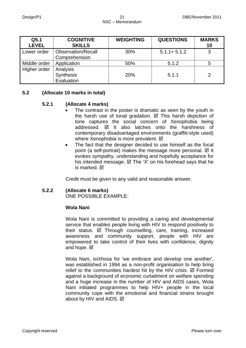
Q5.1 LEVEL
COGNITIVE SKILLS
WEIGHTING QUESTIONS MARKS 10
Lower order Observation/Recall Comprehension
30% 5.1.1+ 5.1.2 3
Middle order Application 50% 5.1.2 5 Higher order Analysis
Synthesis Evaluation
20%
5.1.1
2

Design/P1 22 DBE/November 2011 NSC – Memorandum
Copyright reserved Please turn over
Focusing on the needs of HIV+ women and their children, Wola
Nani's services aim to ease the burden of HIV by enabling people living with the virus to respond positively and attain the skills to develop their own coping strategies. Historically disenfranchised, disempowered and marginalised, women bear the brunt of the national pandemic. They have little voice to articulate their needs or to claim the services on which their survival depends. Wola Nani Crafts emerged in response to the need for unemployed, HIV-positive women to generate an income. Through a developmental, self help approach the project's members have been enabled to take greater control of their lives and achieve a better quality of life. Crafts include beaded ribbons, bracelets and napkin rings, paper mache bowls and picture frames, light bulbs, tea lights and cards.
They are distributed extensively throughout South Africa and overseas. Their colourful, cheerful designs are widely recognised and they enjoy the Proudly South African endorsement. The beaded square, worn as a brooch or necklace, is a traditional Zulu love letter. The beaded AIDS ribbon draws both on this ethnic tradition and on the international recognition of the red ribbon as a symbol of solidarity and compassion for all those affected by HIV/AIDS. By wearing this symbol, you reflect your support of global AIDS awareness, and your contribution directly benefits Wola Nani clients. Wola Nani also produce custom-made designs in response to specific requests e.g. items for dinners, Christmas cards, conference items (such as nametags, place settings, etc) and book marks.
Credit must be given to any valid and reasonable answer

Design/P1 23 DBE/November 2011 NSC – Memorandum
Copyright reserved Please turn over
QUESTION 6 Candidates should choose question 6.1 AND 6.2 OR Question 6.3
6.1 (Allocate 10 marks in total) 6.1.1 (Allocate 4 marks):
Materials used: FIGURE A utilises used/old fabrics that are recycled in a new way
and is soft on the skin. FIGURE B uses naturally found materials, plant, leaves which could irritate the skin. Advantages of using recycled material:
Recycled materials eliminate the costs of buying raw material and machinery, thus limiting the use of raw material for all related industries which make it cheaper to manufacture in South Africa. A related industry will be created which in turn means that more people will be selling uniquely South African products that will grow our economy. This will impact positively on our economy as they (designs) provide new opportunities for creating economic value, growth, revenues, profits and jobs. The unused and old material is not thrown away as waste to pollute the eco-system.
Disadvantages of using vegetation:
The clothing may be worn only once. You may need new clothes everyday which may become costly for you. Depletion of source of clothing if it should cater for everybody on daily basis opposing the ideas of going ''Green''. There will be a negative impact on the environment. Credit must be given to any valid and reasonable answer.
Q 5.2 LEVEL
COGNITIVE SKILLS
WEIGHTING QUESTION MARKS 10
Lower order Observation/Recall Comprehension
40% 5.2.2 4
Middle order Application 20% 5.2.2 2 Higher order Analysis
Synthesis
40%
5.2.1 4

Design/P1 24 DBE/November 2011 NSC – Memorandum
Copyright reserved Please turn over
6.1.2 (Allocate 6 marks):
• Name of the designer: (Allocate 1 mark) Township Patterns • Title of the design (s): (Allocate 1 mark) A range of fabrics • Describe the design (s) and briefly explain how
environmental issues have been addressed: (Allocate 4 marks)
They produce a range of products which include sarongs, tunics,
shirts, bags, scarves, and homeware on printed fabrics that are100% African cotton and come in a variety of styles. The products come in different shapes and appearances that have customised features such as knitted or beaded accessories, adjustable straps and fastenings. They use different motifs for the bags to keep up to date with international fashion and colour trends. The bags have a unique ethnic look and feel. The embroidery and beads add a special touch and are meant to personalise the custom-made products. The products are inspired by fascinating patterns and colours emerge from township urban spaces. All the products are biodegradable. Credit must be given to any valid and reasonable answer
AND
Q6.1 LEVEL
COGNITIVE SKILLS
WEIGHTING
QUESTION
MARKS 10
Lower order
Recall/Knowledge Comprehension 40% 6.1.2 4
Middle order Application 40% 6.1.1 +6.1.2 4 Higher order
Analysis Synthesis Evaluation
20% 6.1.1 2

Design/P1 25 DBE/November 2011 NSC – Memorandum
Copyright reserved Please turn over
6.2 Local and International Designers
(Allocate 10 marks in total)
6.2.1 (Allocate 5 marks):
The contribution of UPCYCLE and creating a ''higher'' environmental value refers to the re-use of found / junk / scrap materials, sourced from shipping yards (the recycled use of crates and old ''classical'' and vintage building materials from renovated houses, e.g. wooden doors, windows and frames) as well as cabriole legs sourced from the framework of an old chair or table.
UPCYCLE also refers to re-contextualising original pieces in a completely new direction. Here the new furniture design becomes an artwork, a statement and a conversation piece. It can also be seen as well-crafted furniture with a strong deconstructed or fragmented structure. It becomes a truly Postmodernist design with a complex discourse and plural meaning. UPCYCLE also refers to the true sense of sustainable designs; it re-educates people to co-exist effortlessly with nature. Instead of throwing away durable and sometimes even irreplaceable materials, UPCYCLE asks of you to think creatively about materials. By re-using and recycling materials we can create contemporary designs that reflect sensitivity towards the past that still retain their social, cultural and historical value. UPCYCLE is now trendy due to its current marketability and the lowered cost of re-used materials. Credit must be given to any valid and reasonable answer. Do NOT disadvantage candidates for repetition.
6.2.2 (Allocate 5 marks)
The application of critical thinking skills and how the learner is able to answer appropriately is to be considered in the overall assessment of this question. Credit must also be awarded to any other reasonable observations. Example of One International Environmental designer contributing to a better environment: Designer: Peter Latz, German urban planner and landscape-architect working together with his wife Anneliese Latz. Examples of their work: Public Park (558 acres) in the ruined industrial port at Saarbrücken (1979 – 1989) Or Public park: Landscaftspark Duitsburg-Nord

Design/P1 26 DBE/November 2011 NSC – Memorandum
Copyright reserved Please turn over
The aim for Landscaftspark Duitsburg-Nord is to turn German
industrial sites into twenty-first-century parks and to turn once regarded eyesores into spectacular monumental architecture. The aim was to turn something that was useless into a magnificent tourist attraction. The Ruhr Valley needed to be transformed into an innovative architectural and cultural area with a sustained ecological system.
The park was created out of several miles of blast furnaces, railroad tracks, and slag (muddy) heaps along the canalised remains of the Emscher River. The Latze's did not tear down the existing buildings; instead they re-used blast furnaces and built walkways through them. They did not worry about the slag heaps but let them grow wild with acacia and ailanthus trees. The formal gardens were created in ore pits and lily ponds in cooling tanks, the railway dykes are covered in wild rose and sambuca, a lovely rose garden with a small maze. These blur and twist concepts like ''natural'', ''artificial'', ''open space'', and ''conservation'' – everything linked to traditional understanding of what a park is. The 100 foot high multicoloured windmill is the most obvious clue to the park's ecological aspects. It is used for lifting water out of a well and is the canal's oxygenation system. The windmill is also symbolic: nature depends on technology; technology depends on nature. The entire water system is planned ecology: All of the water in the canal comes from rainwater collectors and aqueducts that snake through the park and buildings. The important idea is the identity of nature and culture. At Duitsburg-Nord you had ecological and natural systems like the canal – but it became stagnant and polluted by sewage. It was rehabilitated into a reed-lined, ecologically self-sustaining canal. The park works on a number of levels. The central area contains the blast furnace, gas tank or ''gasometer'', and other infrastructures – now to be enjoyed as a giant jungle gym. Walkways bring you to the summit of the blast furnace and train tracks are now bicycle paths. Credit must be given to any valid and reasonable answer.

Design/P1 27 DBE/November 2011 NSC – Memorandum
Copyright reserved Please turn over
Q6.2 LEVEL
COGNITIVE SKILLS
WEIGHTING QUESTION MARKS 10
Lower order Observation/Recall Comprehension
20% 6.2.2 2
Middle order Application 40% 6.2.1 + 6.2.2 4 Higher order
Analysis Synthesis Evaluation
40%
6.2.1
4
OR
QUESTION 6.3: (Allocate 20 marks in total) ONE LOCAL and ONE INTERNATIONAL environmentally aware designer EXAMPLE: INTERNATIONAL (Allocate 10 marks) Name: Stuart Haygarth
Title: ''Twenty Twenty'' light design Description or characteristics of the design: For ''Twenty Twenty'', Haygarth has collated and arranged hundreds of pairs of glasses found through Vision Aid Overseas. This is a charitable organisation for the collection and redistribution of discarded prescription spectacles. By salvaging the glasses for this chandelier Haygarth has drawn an elegant and an analogous line between their old and new purposes – from prescriptive items for improving sight to an imposing and dramatic light installation enabling visitors to see up through the Design Museum atrium. This narrative and the idea of making a light from an object that helps people to see (in the same way a light does) is interesting. The concept and the story behind the work are important and give it more depth. All recycled objects have a past life and a story to tell which hopefully comes across in the work. He has specifically chosen spectacles with transparent plastic frames so that the frame becomes illuminated. He wanted here to create a chandelier which resembles a showcase – almost like a museum of spectacles.
''Twenty Twenty'' '' Millennium Chandelier'' ''Disposable Chandelier'' ''Tide Chandelier''
Design/P1 28 DBE/November 2011 NSC – Memorandum
Copyright reserved Please turn over
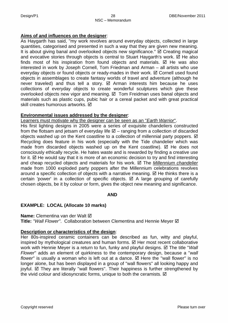
Aims of and influences on the designer: As Haygarth has said, ''my work revolves around everyday objects, collected in large quantities, categorised and presented in such a way that they are given new meaning. It is about giving banal and overlooked objects new significance.'' Creating magical and evocative stories through objects is central to Stuart Haygarth's work. He also finds most of his inspiration from found objects and materials. He was also interested in work by Joseph Cornell, Tom Friedman and Arman – all artists who use everyday objects or found objects or ready-mades in their work. Cornell used found objects in assemblages to create fantasy worlds of travel and adventure (although he never traveled) and thus tell a story. Arman interests him because he uses collections of everyday objects to create wonderful sculptures which give these overlooked objects new vigor and meaning. Tom Freidman uses banal objects and materials such as plastic cups, pubic hair or a cereal packet and with great practical skill creates humorous artworks.
Environmental issues addressed by the designer: Learners must motivate why the designer can be seen as an ''Earth Warrior''. His first lighting designs in 2005 were a series of exquisite chandeliers constructed from the flotsam and jetsam of everyday life – ranging from a collection of discarded objects washed up on the Kent coastline to a collection of millennial party poppers. Recycling does feature in his work (especially with the Tide chandelier which was made from discarded objects washed up on the Kent coastline). He does not consciously ethically recycle. He hates waste and is rewarded by finding a creative use for it. He would say that it is more of an economic decision to try and find interesting and cheap recycled objects and materials for his work. The Millennium chandelier made from 1000 exploded party poppers after the Millennium celebrations revolves around a specific collection of objects with a narrative meaning. He thinks there is a certain 'power' in a collection of specific objects. A large grouping of carefully chosen objects, be it by colour or form, gives the object new meaning and significance.
AND
EXAMPLE: LOCAL (Allocate 10 marks) Name: Clementina van der Walt Title: ''Wall Flower''. Collaboration between Clementina and Hennie Meyer Description or characteristics of the design: Her 80s-inspired ceramic containers can be described as fun, witty and playful, inspired by mythological creatures and human forms. Her most recent collaborative work with Hennie Meyer is a return to fun, funky and playful designs. The title ''Wall Flower'' adds an element of quirkiness to the contemporary design, because a ''wall flower'' is usually a woman who is left out at a dance. Here the ''wall flower'' is no longer alone, but has been displayed in a group of ''wall flowers'' all looking happy and joyful. They are literally ''wall flowers''. Their happiness is further strengthened by the vivid colour and idiosyncratic forms, unique to both the ceramists.

Design/P1 29 DBE/November 2011 NSC – Memorandum
Copyright reserved Please turn over
Hylton Nel's influence and emphasis on the handmade and associative irregularity in shape, thickness and texture, all come together in this piece. In deliberate contrast to the flat brightness of over-glazed enamel paintwork, she introduces qualities of subtlety, depth and variation in her use of glazes. This piece also affirms her role as 'woman'' and 'home decorator'' within society, family and home.
AND
''Wall flower'' at The Indaba by Clementina van der Walt and Hennie Meyer (2010)
Other examples of Clementina van der Walt's works clearly influenced by Africa.

Design/P1 30 DBE/November 2011 NSC – Memorandum
Copyright reserved Please turn over
Aims of and influences on the designer: Her early ceramics were informed by zoomorphic forms of African mythology, geometric forms used in Zulu and Ndebele beadwork, African textiles, pottery and basketry, This became her signature style of the 80s that seemed to celebrate the cultural achievements of Southern Africa and anticipate the political liberation of the end of the decade. She is inspired by William Morris's words:''Have nothing in your homes that you do not know to be useful or believe to be beautiful''. His rigour and economy profoundly affected her work. In 1993 Clementina van der Walt visited Hylton Nel in Bethulie and worked with him in his studio for two weeks. Following this stay in Bethulie she turned to handmade, individual pieces that contrasted with her factory-produced work in every aspect. Although not obvious in the style of her recent ceramic work these connect with many African traditions of domestic utensils. They also express the dimension of domestic rituals affirming one's place in one's community and family, both living and dead. In recent years the influence of oriental models is visible. This range of ceramic ware was made specifically to suit the requirements of macrobiotic cooking that she practices. Environmental issues addressed by the designer: Learners must motivate why the designer can be seen as an ''Earth Warrior''. Clementina van der Walt's use of sustainable material, namely clay, confirms her as an ''Earth Warrior''. ''Mother Earth'' supplies her with pigments and inspiration for her use of forms/shapes and textures. Microbiotic cooking deals with a healthy cooking style. So she designs utensils to support a macrobiotic way of life, using organic foods related to the season and the climate, to balance the human system. These utensils celebrate a much needed return to natural foods and to the earth. Credit must be given to any valid and reasonable answer.
TOTAL SECTION B: 40
Q6.3 LEVEL
COGNITIVE SKILLS
WEIGHTING
QUESTION
MARKS 20
Lower order Recall/knowledge Comprehension
30% 6.3 6
Middle order Application 40% 6.3 8 Higher order
Analysis Synthesis Evaluation
30%
6.3
6

Design/P1 31 DBE/November 2011 NSC – Memorandum
Copyright reserved Please turn over
SECTION C QUESTION 7: (Allocate 30 marks in total)
AS9: AS10:
Demonstrate a basic understanding of marketing design products in terms of target market, packaging and advertising. Demonstrate an understanding of responsible design by taking into consideration human rights and environmental issues throughout the process.
Answer either 7.1 OR 7.2 The application of critical thinking skills and how the learner is able to answer appropriately is to be considered in the overall assessment of this question. Credit must also be awarded to any other reasonable observations.
7.1 DESIGN IN A BUSINESS CONTEXT 7.1.1 (Allocate 8 marks)
''Re-energy's'' target market: Environmentally conscious and/or health conscious people that enjoy outdoor activity will be targeted. Teenagers in general will be targeted, as well as corporate people who are on the run and don't have time to charge their phones, ipods, etc. Aspects that would need to be considered during pricing and costing: The cost of the materials used will be a factor. The expensive equipment needed for production should also be considered. The use of trained and skilled workers in the manufacturing process will influence the pricing and costing. The rental of workspace, transport costs and insurance for the workspace and products will affect the pricing. Provision of amenities for workers. It will be expensive to market. Initial funding and financing options: Bank loan, corporate sponsorship or private and personal financing. Possible future marketing strategies: Looking at the feasibility of applying the concept to wheelchairs and / or other mobile devices, e.g. laptops, radio's and gym bikes, or other gym equipment.

Design/P1 32 DBE/November 2011 NSC – Memorandum
Copyright reserved Please turn over
7.1.2 (Allocate 4 marks):
Colour: The colour green was predominantly used to symbolise a green, environmental and sustained living philosophy. The colour green also fused the idea of recycling or the re-use symbol with that of the energy or power generated from the peddling of the bicycle. Background grass is also green, referring to the concept. Shape: Circular shapes are repeatedly re-used in the bicycle wheel and the movement inside the wheel is imitated by the re-cycled symbol. The universal principle of continuation was also applied to suggest the continued turning of a wheel. Triangular shapes contrast with the continuous use of rounded shapes.

Design/P1 33 DBE/November 2011 NSC – Memorandum
Copyright reserved Please turn over
Line: Lines are curved or rounded to further strengthen the idea of movement and continuous recycling. No hard-edged lines are used. Texture: Very smooth texture to enhance the ergonomical feel of streamlining and continuity.
7.1.3 (Allocate 8 marks)
SWOT ANALYSIS: Strengths: Promotes a green energy saving life style, together with a healthy and fit way of living. It is light weight and easy to store inside a small apartment. Saving on electricity is a huge benefit for most countries. Excess energy can be used within your home or apartment. Weaknesses: Differently abled people or people who do not like to ride a bicycle would not invest or buy into this concept. Weather conditions can influence the functionality of this product.
Safety considerations. Opportunities: Gyms or fitness centres that are environmentally conscious, corporate people that are constantly on the move, teenagers leading an active lifestyle and the medical sector might be interested in investing because of the growing numbers of obese people and associated health problems. Threats: Companies or designers with the same ideas or concepts.
Bank loans might be subject to approval. It might be too expensive to produce and technology needs to be continuously upgraded which might make this even more expensive. Look at the mark allocation to guide the length of your paragraphs. The headings (for SWOT) may also be credited.
7.1.4 Comparison between FIGURES B and C: (Allocate 6 marks)
FIGURE C: These designs have a specific purpose and target. They work according to a brief, a specific budget and a deadline.
The designer is focussed on ensuring that the design solution looks good or aesthetically pleasing and could add value to life or alternatively change the way we live. The products are also informed by the latest trends. This is more functional. FIGURE B: Here the designs are concerned with self-expression. They deal with the surrounding world and issues from everyday life. This allows for more freedom to explore ideas and mediums that emphasises the message rather than functionality. In FIGURE B the designer may not work with a client or their specifications, unless they have to create a commissioned work for someone. This work is more decorative.

Design/P1 34 DBE/November 2011 NSC – Memorandum
Copyright reserved Please turn over
7.1.5 (Allocate 4 marks)
Marketing strategies: A glossy lifestyle and art magazines can be targeted. Advertisements can be placed in specialised magazines and books dealing with the latest design and art issues e.g. Design Indaba Magazines, Visi, etc. Media exposure can be viewed at recognised cultural centres and gatherings. Accredited gallery websites are required. Marketing and branding (national and international) will be beneficial. Display opportunities: Accredited galleries, museums or private institutions, which are open to the public, could be used for displaying these designs.
These designs also require an exhibition at international galleries and museums, not just locally. OR any other reasonable answers.
Q7.1
LEVEL COGNITIVE
SKILLS WEIGHTING
QUESTION
MARKS
30 Lower order Recall/knowledge 30% 7.1.5 + 7.1.3 9 Middle order Application 40% 7.1.1 + 7.1.2 + 7.1.4 12 Higher order Analysis
Synthesis Evaluation
30% 7.1.1 + 7.1.4 9
OR
7.2 (Allocate 30 marks in total) 7.2.1 (Allocate 15 marks):
Comparison between FIGURES A to C according to: • Accessibility: FIGURE A would only be accessible to mostly
affluent urban people whereas FIGURE B would be to tourists and travellers in rural areas. FIGURE C would be accessible to mostly urban communities.
• Financial viability: In FIGURE A the shop's monthly rental will be very high as it is situated in an up-market mall, reducing profits but in FIGURE B there will be no rent to pay, increased profits and keeping selling price down. In FIGURE C the rental will probably be average and far more affordable than the mall, making profit margins and asking prices fair with regard to cost.

Design/P1 35 DBE/November 2011 NSC – Memorandum
Copyright reserved Please turn over
• Target market: FIGURE A's target market will be the affluent
visitor to the up-market shopping mall, wanting to buy exclusive designs in clothing, mainly for the corporate world. The target market for FIGURE B would be the incidental passer-by, the tourists or maybe the informed craft collector. In FIGURE C the target market would be mainly people from the community, regular customers, living within walking distance from the shop.
• Advertising: Marketing in FIGURE A will mainly take place within the mall or through glossy fashion and/or corporate magazines or lifestyle programmes/ advertisements on television. FIGURE B's advertising will probably happen through word-by-mouth, articles in design magazines, tourist leaflets or flyers. Marketing for FIGURE C might also take place through word-by-mouth (in the local community) or posters put up locally.
• Sustainability: FIGURE A will be dependant on fashion trends, economic trends and the success of the shopping mall as an attraction. FIGURE B will be dependant on the popularity of the route as a tourist attraction, as well as the weather and environmental circumstances. FIGURE C could most likely be the most sustainable of all three as it would become a communal institution as long as the owner wanted to continue and the building was available.
Give credit for any other information that concentrates on the above aspects. The discussion should be clear and focused on the requirements.
7.2.2 (Allocate 5 marks):
The important elements of a successful display could be: • The display should be eye-catching through the use of colour
or emphasis – some element that will make the passer-by look more than once.
• The display should present the merchandise in a way that evokes interest.
• The display should be clear and not cluttered unless the style of the merchandise or context calls for it.
• The display should attract attention and be innovative. • The display should be unified, neat and in an orderly fashion.

Design/P1 36 DBE/November 2011 NSC – Memorandum
Copyright reserved Please turn over
7.2.3 (Allocate 3 marks):
The candidate can choose any one of the three visual examples FIGURES A to C, provided that the choice is motivated by the elements of a good display. EXAMPLE: FIGURE A because the display is clear, uncluttered and appears unified and neat, arranged in an orderly fashion. As the display window covers a large area it will offer multiple opportunities to attract the attention of the passer-by.
Credit must be given to any valid and reasonable answer or relevant points.
7.2.4 (Allocate 3 marks):
In Figure A products could be packaged in branded or labelled designer carrier bags. In Figure B the packaging could be cheap, easily obtainable wrapping to protect the product when being transported, e.g. newspaper. Packaging in Figure C could be ordinary plastic or brown paper bags. Credit must be given to any valid and reasonable answer or relevant points.
7.2.5 (Allocate 4 marks):
Possible careers (these are only examples): Visual Communication Design: Graphic Designer; Photographer; Animator; Web Designer; Journalist; Communications manager Surface Design: Fashion Designer; Interior Designer; Textile Designer; Wallpaper Designer Product Design: Fashion Designer; Jewellery Designer; Interior Designer; Industrial Designer; Product Manager; Environmental Design: Architect; Landscape Designer; Set Designer for theatre or television; Town and Regional Planner; Event Marketer; Event Publicist General: Brand consultant; Brand manager; Marketing manager; Brand architect, Strategic planner; Media planner Credit must be given to any valid and reasonable answer.

Design/P1 37 DBE/November 2011 NSC – Memorandum
Copyright reserved
TOTAL SECTION C:
GRAND TOTAL: 30
150
Q7.2 LEVEL
COGNITIVE SKILLS
WEIGHTING QUESTION MARKS 30
Lower order
Observation/ Comprehension/
Recall
30%
7.2.2 + 7.2.5
9
Middle order Application 40% 7.2.1 + 7.2.3 + 7.2.4 12 Higher order
Analysis Synthesis Evaluation
30%
7.2.1 + 7.2.4
9
Copyright reserved Please turn over
MARKS: 100 TIME: LO1: Practical process/preparation at school and/or home [50] LO2: Practical product done under controlled conditions ONLY at school, 18 hours [50]
LO1 to be done during the third term. LO2 must be done during the fourth term.
This question paper consists of 14 pages and 1 addendum. This question paper must be printed in full colour.
DESIGN P2
PRACTICAL PAPER
18 JULY–28 OCTOBER 2011
NATIONAL SENIOR CERTIFICATE
GRADE 12

Design/P2 DBE/November 2011 NSC
Copyright reserved Please turn over
2
INSTRUCTIONS AND INFORMATION 1. This practical examination consists of ONE question paper. 2. This question paper comprises TWO parts:
The examination workbook/sourcebook (LO1) (A3 size) [50 marks] The final practical examination product (LO2) [50 marks] TOTAL: 100 MARKS
INSTRUCTIONS TO CANDIDATES The question paper has two topics. Choose only ONE of the two. 1. BRIEF/TOPIC: South Africa Celebrates! South African festivals offer you a mind-boggling diversity of celebrations
that include wildlife, diving, whale-watching, vineyard-visiting, lounging on the beach and many more. Throughout the country colourful and vibrant festivals range from music and religion to culture. Festivals and events are a part of this spectacular Rainbow Nation and they cater for all tastes, from music to a variety of traditional food. Some of the popular festivals and events in South Africa include the following: • Western Cape: The Prince Albert Town and Olive Festival, held in the
Swartberg every April – the region's famous olive and wine festival with an arts exhibition, beer tents, live music, witblits tasting, crafts for kids, historic tours, a cycle race, an olive-pip spitting competition, culinary
demonstrations, a midnight ghost walk, stalls, cabaret, a dance and more.
• Gauteng: Arts Alive, every September – a heady mix of dance, visual arts, poetry and music at venues in the Johannesburg inner city with the main concert at the Johannesburg Stadium and other shows at various venues in Newtown, including the ever-popular Jazz on the Lake on the final day.
• Free State: Macufe Cultural Festival, late September every year – featuring jazz, gospel, kwaito, hip hop, R&B, rock and classical music, as well as dance, drama, cabaret, musical theatre, poetry, fine arts and traditional arts and crafts.
• Eastern Cape: The Grahamstown National Arts Festival, held in late June or early July every year – South Africa's oldest, biggest and best-known arts festival, offering every indulgence of theatre, music, song, dance, film and a whole lot more.
• KwaZulu-Natal: The Umdwebo Lifestyle Festival, held in November every year – celebrating the better things in life (Umdwebo is isiZulu for 'to create art' or 'to underline something beautiful') and features fine dining, elegant black-tie affairs, art and photographic exhibitions, opera, classical music and more.

Design/P2 DBE/November 2011 NSC
Copyright reserved Please turn over
3
• North West: Oppikoppi, held in August – showcasing the country's
original musical talent and comedy to help establish many South Africans' careers, but it's not for the faint-hearted.
• Northern Cape: The Gariep Kunstefees (arts festival), held in September every year – an impressive line-up of local musicians, a film festival showcasing South Africa's new film-makers, as well as art exhibitions and children's theatre.
• Mpumalanga: The Tonteldoos Peach Festival, held late March or early April every year – offering peaches and pretty much everything that can be made from the fruit, including peach mampoer.
• Limpopo: The Ellisras Bushveld Festival, held early July every year – including cattle shows, a game auction, show jumping, dog shows, agricultural activities, a three-day battle for the best 4x4, a game farm expo, hunting opportunities, bird- and tree-identification competitions, boerewors and other traditional foods, a beer tent and huge camp fires.
People in South Africa eagerly await these festivals every year as they offer
an escape from the demands of a contemporary lifestyle. These festivals provide a diverse selection of entertainment appealing to all members of the community. The festivals enable the performers to inspire children to participate and excel in many artistic pursuits.

Design/P2 DBE/November 2011 NSC
Copyright reserved Please turn over
4
Create an original design for any aspect of a festival of your choice. You could
even create an imaginary festival for your area or region. You are NOT restricted to the list of festivals mentioned. Choose ONE of the following design categories: • Communication/Information Design • Craft/Design (basically two-dimensional design) • Craft/Design (basically three-dimensional design) • Environmental Design and Digital Design
OR
2. BRIEF/TOPIC: Nature Inspires
Chelsea Flower Show, award-winning displays in 2010.

Design/P2 DBE/November 2011 NSC
Copyright reserved Please turn over
5
ENVIRONMENTAL DESIGNS
Cacoon by Jack Menlo at the Chelsea Garden Show 2010.
Simbiotic, a vertical green-garden design by Kooho Jung and Kelly Choi.

Design/P2 DBE/November 2011 NSC
Copyright reserved Please turn over
6
PRODUCT DESIGN
Design in Bloom, shoes Flower, bag by Sasannah Hunter. by Manolo Blahnik.
Laser-cut Dress by Chelsea Fashion Show, Alexander McQueen. inspired by flowers and foliage.

Design/P2 DBE/November 2011 NSC
Copyright reserved Please turn over
7
Gymea Lily mug, by Maxwell & Williams.
Splash dipping bowls by Akimasa Yamada.
Leaf Swings by Studio Enea. Clover chairs or tables by Widrig.
Tree Table by Sebastian Errazuriz.

Design/P2 DBE/November 2011 NSC
Copyright reserved Please turn over
8
SURFACE DESIGNS
Peacock, mosaic design. Bamboo, self-adhesive wallpaper.
Nature Inspired wallpaper designs by Trove.

Design/P2 DBE/November 2011 NSC
Copyright reserved Please turn over
9
The first Chelsea Flower Show was held in 1862 in London and since then it
has become the most famous gardening event in the world. It is attended by more than 157 000 visitors each year. This highly acclaimed flower show is synonymous with displaying award-winning designs and futuristic 'trendy' landscaping design. For many years it has given internationally acclaimed florists, horticulturists, landscapers and landscape architects a competitive platform to showcase their most creative award-winning floral displays. Through the years, it has become obvious to the organisers that more and more visitors come to the show, not to see the landscaping as such, but more to see the next trendy designs for outside patio furniture, dividers, mirrors, tiling, mosaics, wall cladding, wallpaper, pots, vases, fashion garments, accessories, et cetera. It was for this very reason that the organisers listed graphic designers, surface designers, product designers and environmental designers to be invited and to create designs, inspired by nature, with landscapers and florists. Designers from all over the world have been invited to participate in the upcoming flower show, entitled Nature Inspires. South Africa has been part of this show for many years. As a representative of South Africa, you have been invited by the organisers to participate. Their brief to South African designers is to be creative, to think 'outside of the box', as long as their final product is inspired by the typical fauna and flora of South Africa. An environmental approach to their final products has been recommended.
Create an original design in ONE of the following design categories:
• Communication/Information Design • Craft/Design (basically two-dimensional design) • Craft/Design (basically three-dimensional design) • Environmental Design and Digital Design
Design/P2 DBE/November 2011 NSC
Copyright reserved Please turn over
10
REQUIREMENTS PART 1 PROCESS 1. All processIpreparatory work for your design must be shown in a
sourcebookIworkbook (A3 size).
2. This will involve the processes from conceptualisation to realisation. 3. Thorough investigation of problems posed by the design brief should be
shown.
4. The design process must be captured in an A3 format. 5. The workbook/sourcebook is to be presented in the form of an album (that is
in book form).
6. It must open easily and have pages that turn easily. 7. The workbook/sourcebook must be made of light material, to facilitate
transport.
8. Ensure that the workbook is presented professionally. NOTE: • As LO1 (preparation) has the same mark allocation as LO2 (the final product),
it should be given enough time to acknowledge its importance. • Your teacher can be involved in this preliminary preparatory session. • You may work at home.
REQUIREMENTS OF THE DESIGN PROCESS You should present the following (refer to the NSC Design Examination Guidelines 2011): • Expression of intention and rationale • Evidence of research, experimentation and reflection • Evidence of detailed planning and presentation related to the final concept
(10) (10) (30) [50]

Design/P2 DBE/November 2011 NSC
Copyright reserved Please turn over
11
PART 2 PRODUCT A two-dimensional design should not be larger than A2 in size. The size of a three-dimensional design will depend on the function of the object being made. Bear in mind that the final product will need to be transported to a central marking venue.
NOTE: • Your teacher may NOT assist you in any way during the final production of the
design. • ALL work must be done under the teacher's supervision at your school. • Any form of direct copying/plagiarism or work that is not the candidate's original
work will be strictly penalised. • A declaration of authenticity (ADDENDUM A) must be completed by each
candidate and the chief invigilator/teacher. • Work must be done on a continuous basis during contact time, for example during
three consecutive days with sessions of 6 hours each. This can be negotiated with your school.
CRITERIA FOR THE DESIGN PRODUCT You should use the following criteria: • Creativity/Originality/Interpretation in terms of the concept and solutions that are
relevant to the brief • Evidence of design involvement: The appropriate use of design elements and
principles • Technique/Craftsmanship/Method • The design solution should show evidence of at least 18 hours' work under
controlled circumstances • Professional presentation and functionality of the design solution
(10) (10) (10) (10) (10)
TOTAL (LO1 AND LO2):
[50] 100

Design/P2 DBE/November 2011 NSC
Copyright reserved Please turn over
12
INSTRUCTIONS TO THE TEACHER PRACTICAL EXAMINATION LO1 (50 MARKS) AND LO2 (50 MARKS) 1. This practical examination consists of ONE paper. This question paper
comprises TWO parts, LO1 (the examination workbook/sourcebook, A3 size) and LO2 (the final practical examination product).
2. This practical question paper should not be given to the learners before
Monday 18 July 2011. The final hand-in date will be Friday 28 October 2011.
3. As LO1 (preparation) has the same weighting as LO2 (the final product), it
should be given enough time to acknowledge its importance.
4. Consequently learners should have enough time to do their LO1
(preparation). The teacher can be involved in this preliminary preparatory session. Due to the preparatory nature of LO1, learners are allowed to complete work at home.
5. Learners must use the LO1 workbook/sourcebook as a point of reference
during their LO2 examinations. Both LO1 and LO2 examination work must be submitted to the chief invigilator immediately after the LO2 examinations are completed.
6. The teacher may NOT assist the candidate in any way during the final
production of the design product (LO2).
7. Any form of direct copying/plagiarism or work that is not the candidate's
original work will be strictly penalised (ZERO marks).
8. LO2 must be done on a continuous basis during contact time, for example
during three consecutive days in sessions of 6 hours each. Your choice of examination time options must be negotiated with your school.
9. LO2 must be done at the learner's examination centre, under the supervision
of the invigilator. LO2 work must NOT be done at home. LO2 work must NOT be removed from the examination centre.
10. Each province will determine the process involved in the marking of LO1
(workbook/sourcebook A3) and LO2 (final product). Schools will be notified by the provinces concerning the date, time and venue for the submission of work to the examination centres.
11. The examination LO1 should be professionally presented in an A3
workbook/sourcebook in an album format.
12. LO1 and LO2 must be neatly and clearly labelled. Writing must be legible.

Design/P2 13 DBE/November 2011 NSC
Copyright reserved Please turn over
13. Attach ADDENDUM A to LO1 and LO2 work securely.
14. Do not confuse or mix up LO1 and LO2 (examination work) with PATs 1, 3 and 5 (year work).
PATs 1, 3 AND 5
1. Each province will determine the process involved in the moderation of the
examination LO1 (process/preparation in the sourcebook/workbook), examination LO2 (final product) and PATs 1, 3 and 5. Schools will be notified by the provinces concerning the date, time and venue for the moderation of PATs 1, 3 and 5 (year work) and marking/assessment of the final examination work.
2. LO1 is to be professionally presented in an A3 workbook/sourcebook in an
album format.
3. Candidates who do not submit PATs 1, 3 and 5 will receive NO marks for this
portion of the examination.
4. The following procedure may be adjusted by each province to suit their own
process of moderation/assessment of work at the end of the year: An example of the compilation of a workbook/sourcebook (A3): • Index with legible page references • All the LO1s (process/preparation) must be in the workbook/sourcebook
(A3) in chronological order, accompanied by respective assessment sheets, for example completed assessment sheet followed by LO1 (process/preparation) of PAT 1; completed assessment sheet followed by LO1 (process/preparation) of PAT 3; completed assessment sheet followed by LO1 (process/preparation) of PAT 5.
5. Each province will stipulate their own process of handing in and moderation/
assessment of LO2. A possible example: The LO2 (final product) of PATs 1, 3 and 5 should be presented as part of an exhibition accompanied by the respective assessment sheets underneath or next to each one for moderation.

Design/P2 DBE/November 2011 NSC
Copyright reserved
14
ASSESSMENT GUIDELINES
OUTCOMES
REQUIREMENTS WEIGHTING
% MARKS
Expression of intention and
rationale
10
Evidence of research,
experimentation and reflection
10
THE
WO
RK
BO
OK
LO1
The Design Process
The learner is able to understand the design process from
conceptualisation to realisation.
Evidence of detailed planning and
presentation related to the final concept
30
50
Creativity/Originality/Interpretation
in terms of the concept and solutions that are relevant to the
brief
10
Evidence of design involvement:
the appropriate use of design elements and principles
10
Technique/Craftsmanship/Method
10
The design solution should show
evidence of at least 18 hours' work under controlled
circumstances
10
THE
FIN
AL
PRO
DU
CT
LO2
Design Production
The learner is able to produce and present a body of work in the chosen discipline(s) which shows an understanding of design skills
and production processes.
Professional presentation and
functionality of the design solution
10
50
TOTAL 100 NOTE: Teachers and markers must refer to the NSC Design Examination Guidelines 2011. These guidelines supersede all previous documents.

Design/P2 DBE/November 2011 NSC
Copyright reserved
ADDENDUM A This addendum must be detached, copied, completed, signed and pasted on the front cover of the A3 year workbook/sourcebook (which contains the preparation/process as part of the PATs). Do the same with the final examination workbook/sourcebook (which contains the preparation process of the final examination). NOTE: Provinces may require this work to be submitted in ONE workbook/sourcebook. Indicate with a cross (X) whether this is the year workbook/sourcebook (PATs) and/or the examination workbook/sourcebook.
NOVEMBER 2011 PRACTICAL EXAMINATION 1. Name of subject
2. Code of subject
DECLARATION This work was done under the supervision of the Design teacher and without the help of anybody else. This is to certify that all work submitted is the original and own work of the candidate. Centre number
Examination number
District
Region
Signature Date Candidate
Principal
Chief Invigilator/Teacher
YEAR WORKBOOK/SOURCEBOOK (preparation/process as part of the PATs) AND design products as part of PATs
EXAMINATION WORKBOOK/SOURCEBOOK (preparation/process for final examination) AND final examination design product(s)


![SENIOR CERTIFICATE GRADE 12Memo… · SENIOR CERTIFICATE GRADE 12 ... nsc ]](https://static.fdocuments.in/doc/165x107/5f94dbeb11fa4f04db455741/senior-certificate-grade-12-ampmemo-senior-certificate-grade-12-nsc-.jpg)