Naked Soap Process Book
21
soap · savon Process Book Tiffany Chin Cornelia Baptista
description
The process behind this collaborative packaging project is outlined in the following document.
Transcript of Naked Soap Process Book

soap · savon
Process BookTiffany ChinCornelia Baptista

Project Brief

DESIGN BRIEFI would like you to consider various product categories across a broad spectrum;foods & beverages (including pet foods), electronics, computers, toys, cosmetics,fashion, etc; whatever product category you would like to work with.
Within your chosen product category, please select a product; for example, if you select cosmetics, you could choose a line of facial creams. The same analogy could be applied to new software for the computer product sector.
Once you have selected your product category/specific product within the category, please create a new brand name, brand identity and packaging graphics for a new hypothetical line of the product you have selected. Please note, for this project, I do not expect you to create a new product, just select an existing product and create anew brand name, brand identity and packaging graphics for it across a minimum of three SKUs (varieties).
Project Brief

Table of Contents
BrandNameDevelopment1 Brain Storming2 Brand Name Finalization
BrandIdentityDevelopment3 Type Exploration4 Final Type Selection
PackagingGraphicsDevelopment5 Inspiration7 Visual Brainstorming11 Concept Development12 Concept Finalization13 Colour Refinements
DesignRationale14 Rationale + Final Packaging

Table of Contents

Project 2 Process Book
Brand Name DevelopmentBrain Storming

Project 2 Process Book
Brand Name Development
2
'ne-kednot wearing any clothes : not covered by clothing: stripped
Brand Name Finalization
*1. Naked
2. Blanche
3. Wonderland
4. Champagne
5. Porcelain
Naked was selected as our final brand name because we felt it best represented our brand qualities and product. Naked is simple and honest, true to the nature of our product which takes pride in being stripped of harmful chemicals; using simple ingredients, natural scents and plant based dyes. It also speaks to the actual use of the product, plain and simple you must be naked to use it.
Blanche is similar to the name naked in its conveyance of a stripped down and minimal name however it did refer to the process of bleaching which is why it was not selected as our final name.
This brand name option emphasizes the luxurious and refined nature of our product.
This brand name option emphasizes the whimsy behind our product. Speaking more to the fragrance and luxury of the product leaving you feeling as if you have escaped to a different world.
We felt this name reflected the pure and feminine nature of our product.

Project 2 Process Book
Brand Identity DevelopmentType Exploration
3
nakednakednaked
naked
naked
nakednaked
naked
Naked
Naked
naked
naked
Type Refinements
nakednakednakednaked
WALBAUM REGULAR
Unkerned
Kerned
WALBAUM ITALIC
WALBAUM MEDIUM
WALBAUM MEDIUM ITALIC
nakednaked

Project 2 Process Book
Brand Identity DevelopmentFinal Brand Identity
4
WALBAUMMEDIUMITALICwas chosen to be the primary typeface making up the naked brand identity because of its flowy, feminine and strong nature.
GOTHAMBOOKacts as the secondary typeface to the main brand identity. It compliments the feminine nature of Walbaum while grounding it with a bit more clarity with its simple, rounded, sans-serif forms.
PRIMARYTYPEFACEWALBAUM MED ITALIC
To be used only in lowercase
SECONDARYTYPEFACEGOTHAM BOOK
To be used only in lowercase

Project 2 Process Book
Packaging Graphics Development
5
Inspiration
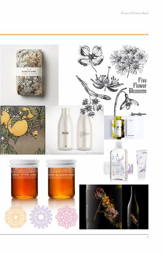
Project 2 Process Book
Packaging Graphics Development
6

Project 2 Process Book
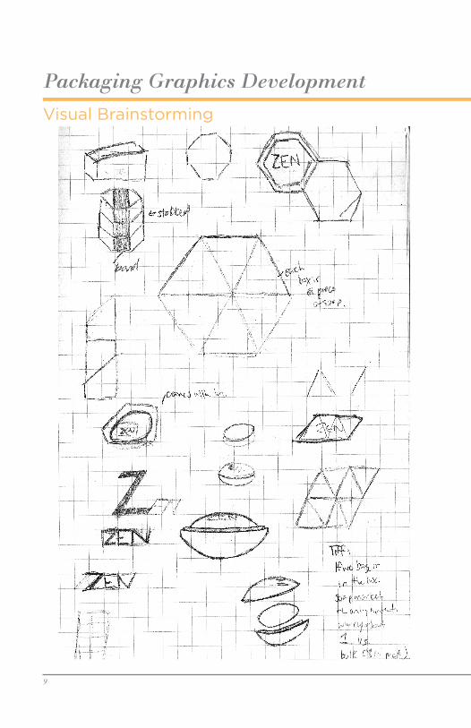
Packaging Graphics DevelopmentVisual Brainstorming
7

Project 2 Process Book
Packaging Graphics Development
8
Project 2 Process Book
Packaging Graphics DevelopmentVisual Brainstorming
9

Project 2 Process Book
Packaging Graphics Development
10

Project 2 Process Book
Packaging Graphics Development
11
nakednaked
lavender
Net Wt 250g 8.8oz
orange blossomhypoalergenic soap
Net Wt 250g 8.8oz
naked
orange blossom
naked
lavender
nakedhypoalergenic soap
Net Wt 250g 8.8oz
nakedlavender
naked
naked
hypoalergenic soap
Net Wt 250g 8.8oz
lavender
lavender
hypoalergenic soap
Net Wt 250g 8.8oz
orange blossom
orange blossom
hypoalergenic soap
Net Wt 250g 8.8oz
naked
nakedorange blossom
hypoalergenic soap
Net Wt 250g 8.8oz
naked
naked
naked lavender
hypoalergenic soap
Net Wt 250g 8.8oz
orange blossom
hypoalergenic soap
Net Wt 250g 8.8oz
nakedrose
hypoalergenic soapNet Wt 250g 8.8oz
nakednaked
Concept Development
Project 2 Process Book
Packaging Graphics Development
12
nakednaked
lavender
Net Wt 250g 8.8oz
orange blossomhypoalergenic soap
Net Wt 250g 8.8oz
naked
orange blossom
naked
lavender
nakedhypoalergenic soap
Net Wt 250g 8.8oz
nakedlavender
naked
naked
hypoalergenic soap
Net Wt 250g 8.8oz
lavender
lavender
hypoalergenic soap
Net Wt 250g 8.8oz
orange blossom
orange blossom
hypoalergenic soap
Net Wt 250g 8.8oz
naked
nakedorange blossom
hypoalergenic soap
Net Wt 250g 8.8oz
naked
naked
naked lavender
hypoalergenic soap
Net Wt 250g 8.8oz
orange blossom
hypoalergenic soap
Net Wt 250g 8.8oz
nakedrose
hypoalergenic soapNet Wt 250g 8.8oz
nakednaked
nakednaked
lavender
Net Wt 250g 8.8oz
orange blossomhypoalergenic soap
Net Wt 250g 8.8oz
naked
orange blossom
naked
lavender
nakedhypoalergenic soap
Net Wt 250g 8.8oz
nakedlavender
naked
naked
hypoalergenic soap
Net Wt 250g 8.8oz
lavender
lavender
hypoalergenic soap
Net Wt 250g 8.8oz
orange blossom
orange blossom
hypoalergenic soap
Net Wt 250g 8.8oz
naked
nakedorange blossom
hypoalergenic soap
Net Wt 250g 8.8oz
naked
naked
naked lavender
hypoalergenic soap
Net Wt 250g 8.8oz
orange blossom
hypoalergenic soap
Net Wt 250g 8.8oz
nakedrose
hypoalergenic soapNet Wt 250g 8.8oz
nakednaked
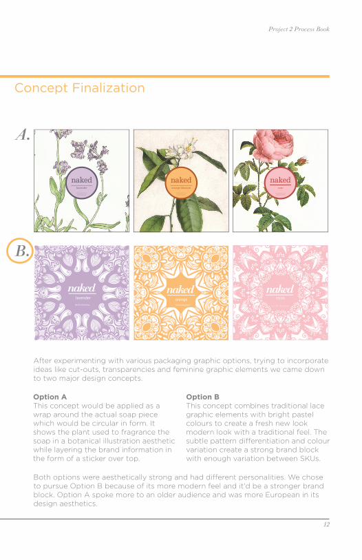
Concept Finalization
A.
B.
Option A This concept would be applied as a wrap around the actual soap piece which would be circular in form. It shows the plant used to fragrance the soap in a botanical illustration aesthetic while layering the brand information in the form of a sticker over top.
Option BThis concept combines traditional lace graphic elements with bright pastel colours to create a fresh new look modern look with a traditional feel. The subtle pattern differentiation and colour variation create a strong brand block with enough variation between SKUs.
After experimenting with various packaging graphic options, trying to incorporate ideas like cut-outs, transparencies and feminine graphic elements we came down to two major design concepts.
Both options were aesthetically strong and had different personalities. We chose to pursue Option B because of its more modern feel and it'd be a stronger brand block. Option A spoke more to an older audience and was more European in its design aesthetics.
Project 2 Process Book
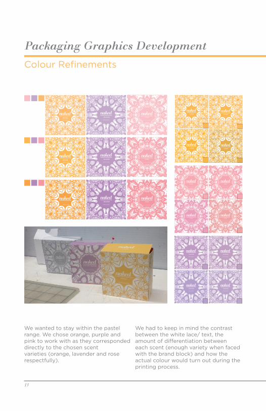
Packaging Graphics DevelopmentColour Refinements
nakedlavender
Net Wt 250g 8.8oz
nakedlavender
Net Wt 250g 8.8oz
nakedlavender
Net Wt 250g 8.8oz
nakedlavender
Net Wt 250g 8.8oz
nakedorange
nakedorange
nakedorange
nakedorange
nakedrose
Net Wt 250g 8.8oz
nakedrose
Net Wt 250g 8.8oz
nakedrose
Net Wt 250g 8.8oz
nakedrose
Net Wt 250g 8.8oz
13
We wanted to stay within the pastel range. We chose orange, purple and pink to work with as they corresponded directly to the chosen scent varieties (orange, lavender and rose respectfully).
We had to keep in mind the contrast between the white lace/ text, the amount of differentiation between each scent (enough variety when faced with the brand block) and how the actual colour would turn out during the printing process.

Project 2 Process Book
Packaging Graphics Development
14
Colour Finalization
Corresponding Graphics
The final colours are soft and pastel enough to carry out our vision while being bold enough to contrast the white elements of the design.
In order to create subtle differentiation between the varying scents of soap we chose similar lace graphics that had slightly different details.
A secondary graphic was created to represent the individual scent minimally.
orange
PANTONE P 17-6 U
lavender
PANTONE P 93-3 U
rose
PANTONE P 73-11 U
Primary Graphics
Secondary Graphics
Project 2 Process Book
Rationale
13
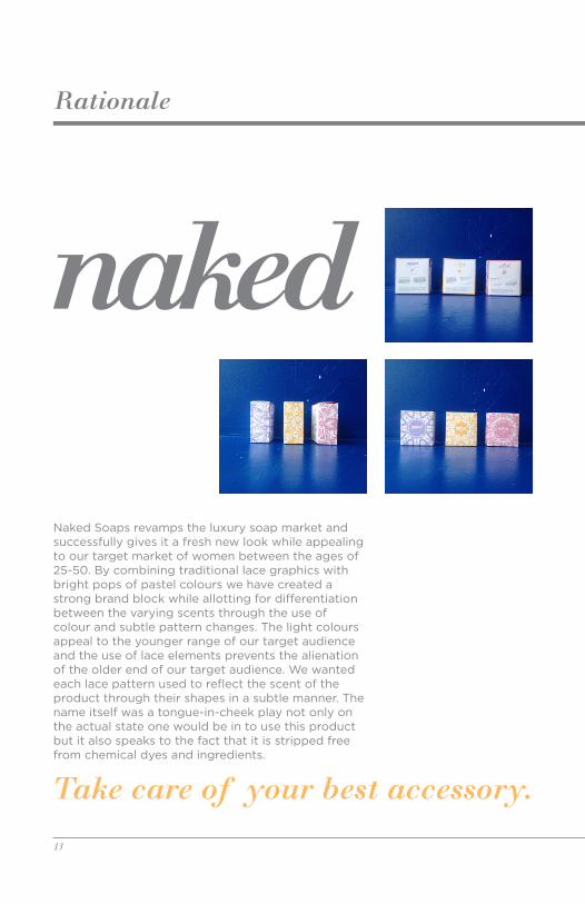
Naked Soaps revamps the luxury soap market and successfully gives it a fresh new look while appealing to our target market of women between the ages of 25-50. By combining traditional lace graphics with bright pops of pastel colours we have created a strong brand block while allotting for differentiation between the varying scents through the use of colour and subtle pattern changes. The light colours appeal to the younger range of our target audience and the use of lace elements prevents the alienation of the older end of our target audience. We wanted each lace pattern used to reflect the scent of the product through their shapes in a subtle manner. The name itself was a tongue-in-cheek play not only on the actual state one would be in to use this product but it also speaks to the fact that it is stripped free from chemical dyes and ingredients.
Take care of your best accessory.

Project 2 Process Book
Rationale
14
Take care of your best accessory.