My Evaluation
28
MY EVALUATION Rian Doherty
-
Upload
rian-doherty -
Category
Documents
-
view
57 -
download
2
Transcript of My Evaluation

MY EVALUATION
Rian Doherty
QUESTION 1
In what ways does your media product use, develop or challenge forms and conventions of real media
products?

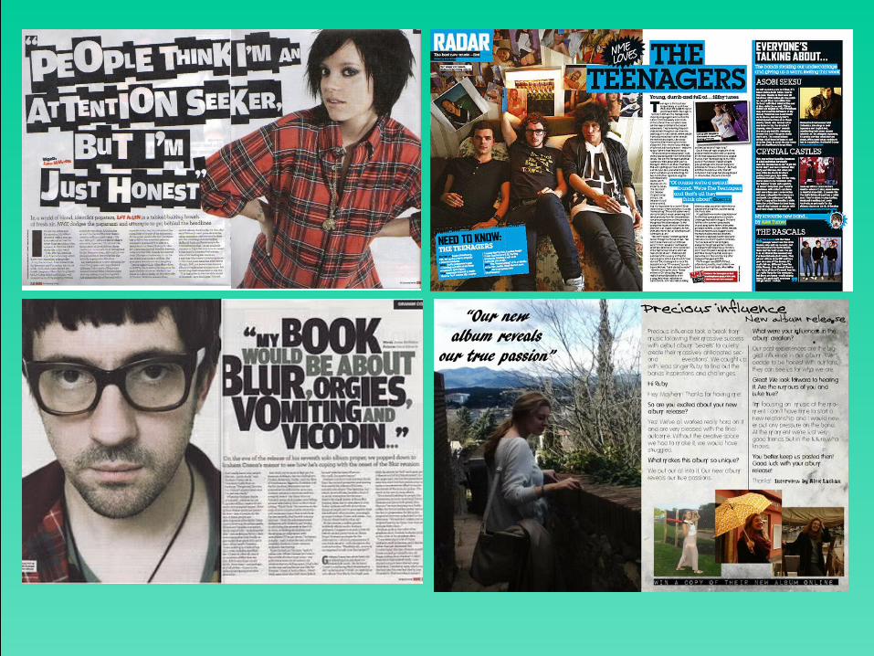
On my front cover, many of the conventions I used were influenced by other magazines with a similar genre.
I researched in to some of these on my blog:
http://riandohertymedia.blogspot.co.uk/2013/10/spin-magazine-music-analysis.html
http://riandohertymedia.blogspot.co.uk/2013/10/billboard-music-magazine.html
Main cover star isn’t giving direct address but is appearing strong as present so draws the attention of the audience this way.
Cover lines, on the left side so are able to be read easily
Image of the band precious influence to see the main star in her band.
I think my masthead is fitting with the convention of an indie rock magazine

My contents page for the magazine was influenced by the idea of collage as well as the visual layouts of some of the other contents pages I researched here:
http://riandohertymedia.blogspot.co.uk/2013/11/contents-page-analysis.html The contents headline
matches my masthead to show a style throughout my magazine
My contents page is a collage of images that relate to the articles inside, so the readers can see visually what is inside of the magazine.
The main features are also written down to help readers locate where they most want to read.


QUESTION 2
How does your social media product represent particular social groups?

• The lead singer in the band featured in my magazine is a woman, which challenges the gender representation in some ways. As women are usually represented as being more passive. Her dominance within her group, as she is the one who is marketed most, is another challenge of the stereotype as it’s stereotypically males who assert the power and dominance over females.
Other magazines showed a similar representation of women here:http://riandohertymedia.blogspot.co.uk/2013/10/the-second-artist-i-chose-to-do.html
• However, stereotypically, women are also often represented as more motivated so her ability to manage more work, such as the media coverage of her band, follows this stereotype. The double page spread interview, looking deeper into her life, includes her emotions and past experience, the allowed vulnerability is commonly associated with women, as often males attempt to present a strong ‘macho’ exterior.

• My inspiration to create a lead singer like this, came from bands such as Florence and the machine, where Florence Welch is the main face of her band.
• I did some research into her and her previous magazine covers on my blog to find out her style and see how she presents her femininity along side her power and assertiveness.
• Her careful balance between vulnerability and femininity compared with her dominance and motivation, create a perfect example of a lead female singer as she retains the ability to relate to others.
http://riandohertymedia.blogspot.co.uk/2013/10/florence-welch-from-florence-and.html
QUESTION 3
What kind of media institution might distribute your media product and why?

• Due to the niche market of the band, it is likely they would be featured on a magazine that isn’t distributed by a major distribution company, as the likelihood they’ll be unknown to the majority of the mass audience for the magazines they distribute, they are likely to loose money, sales and credibility.
• Therefore, my magazine also has a niche audience, one that will appreciate the features and style of the magazine as well as being likely to recognise the band due to them being in the niche market of the magazine being purchased.
• An example would be SPIN magazine, who have an individual company called Spin Media LLC due to the selling of the magazine to McEvory group LLC. Their audience is aimed towards those who like indie rock and alternative music largely. A company like this to distribute my magazine would be ideal.
• I looked into spin magazine more on my blog here: http://riandohertymedia.blogspot.co.uk/2013/10/spin-magazine-music-analysis.html

Distribution company
• The distribution company I have chosen to distribute my magazine is IPC media, as they distribute many magazines of a similar genre.
• One of the magazines they distribute is NME magazine, a magazine that has been a big inspiration behind my own.
QUESTION 4
Who would be the audience for your media product?

• The target audience for my media product would be those interested in indie rock/alternative music. Although directed towards and age range of 18-26 often older people may still read for the featured artist or a particular feature.
• On my blog I’ve made a post for my target audience and have also compared to a magazine with a similar audience already in circulation: http://riandohertymedia.blogspot.co.uk/2014/02/blog-post_2550.html
• Although the genre is found to be more widely listened to by males, with the increased number of popular niche female singers a new female audience has begun to be created. This magazine is possibly more geared towards a female audience due to finding insight into particular artists life which is usually appreciated by female readers. However, the band technical information and upcoming tour dates, along with many more of the features in the magazine, are likely to be enjoyed by males as well.

QUESTION 6
What have you learnt about the technologies from the process of
constructing the product?

• I’ve found that some of the programmes I’ve used during the creation of my magazine have limitations. For example, paint.net, although allowing brilliant photo manipulation and layering, was difficult to navigate often. Also, if the image was flattened, there is no way to change the positioning of the parts of it as they have become one, so if flattened before finished could result in having to start over. When doing my preliminary task, I flatten by accident when saving and had to restart due to not being happy with the work. I thought paint.net was a good programme but very time consuming and technically difficult to use.
• For my final magazine, I used page plus to create it. This programme I found easier to use and learn. Despite only beginning to use it a few weeks before, I knew more about how to make the most out of it than I did paint.net.

Strengths
Publisher/Word Paint.net Page Plus
Ease of use Image manipulation Flexible layers to allow change at any time
Range of fonts and sizes with ease of editing them
Wide range of tools to use image and text
Quicker to use in comparison to paint.net
Spell check More options for photo manipulation
Accurate print previews

Weaknesses
Publisher/Word Paint.net Page plus
Can’t save as a jpeg Most time consuming software of the three
Background removal can be tricky sometimes
The movement of text and images can be difficult
Unable to edit layer after deselecting so can be frustrating
Temptation to overuse effects
Can’t edit photographs Less high quality with the effects

http://riandohertymedia.blogspot.co.uk/2013/10/blog-post.html
https://www.blogger.com/blogger.g?blogID=4252790567850580552#editor/target=post;postID=3084900905742564436
This is the magazine I created when practicing my use of page plus features. Although creating an issue of a magazine that already exists, It gave me new ideas due to discovering the new things I was able to do. For example, The contents page collage is an idea I carried forward into my final magazine as I thought it was quirky and effective.
My use of paint.net in the preliminary task was more limited.

Photographic choicesI used Kellie Evans as my model for the female artist in the band precious influence.
I took a range of photographs to maximise my contentment with the ones I chose.
I chose the photographs I did based on their conforming with the style of the magazine, for example the black and white photo on the front cover matches the image I wished to portray of the artist best.

Blogger• I think using blogger was an effective tool for storing and displaying all of our
work. The blog posts meant that we would be able to access our work from anywhere with an internet connection rather than a folder on a specific computer.
• Although you were unable to add posts in at the times you wanted to after the day, posts could be doubled on another post to add it in.
• Also the ability to add html as well as text and image is useful when displaying slide share presentations.
• Posts are easy to edit and remove if necessary
• In my opinion blogger is a useful and efficient method of storing our work
http://riandohertymedia.blogspot.co.uk/

QUESTION 7
Looking back at your preliminary task, what do you think you have learnt in the
progression from it to your final product?

I feel my work has progressed a lot since the preliminary task. The use of fonts for the cover lines is poorly chosen and the placement on the page doesn’t fit. The magazine does look disjointed but it solidified my knowledge of the conventions of a magazine as I was conscious to include as many as I could. Therefore I was able to use it as a reference tool throughout the creation of my final product to ensure I included all of the necessary conventions.
Another thing I do like about my magazine is the font used on the headline – it looks drawn and was the inspiration behind my final choice of font for my music magazine title.
http://riandohertymedia.blogspot.co.uk/2014/01/masthead_31.html
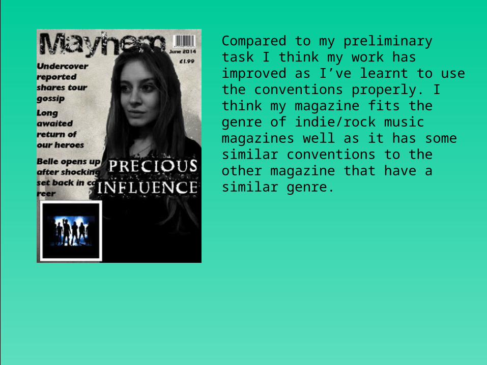
Compared to my preliminary task I think my work has improved as I’ve learnt to use the conventions properly. I think my magazine fits the genre of indie/rock music magazines well as it has some similar conventions to the other magazine that have a similar genre.

When comparing the two magazines you can see where I’ve improved as well as where I have gained inspiration from first creating a magazine cover.
QUESTION 8
How successful do you think the end product is in fulfilling the task? How
well does it fit the brief?

OVERALL• Overall I am pleased with how my magazine creation went.
Although I found it difficult to maintain the time management of the blog, I thought that the final product turned out well. I am most pleased with my cover page as I like the photography that has been used, as I think it is fitting with the genre.
• If I was to change anything I would have ensured my blog posts were made more regularily.