> movie poster - · PDF file• review movie poster typography includes tagline or...
14
> movie poster > objective(s): Students will create a professional quality movie poster that effectively markets an existing or fictitious film using integrated multiple images and typography > curricular focus: This lesson focuses on the effective and seamless integration of multiple images into a unified composition, the use of typography to deliver a message, font selection to match mood and advanced typesetting of information. > specifications: save as: Movie Poster_Lastname.psd dimensions: 7"x10.5" resolution: 200 dpi mode: RGB contents: Transparent > instruction: • introduction to fundamentals of movie poster design slideshow of professional movie posters, highlighting positive and negative aspects (Movie Poster Examples folder) discuss elements of a movie poster (see Movie Poster Anatomy on page 5) discuss using a dominant image to anchor the composition (see Creating Dominance on page 6) • review techniques to transition from one image to another (see Transition Techniques on page 7) • review pull color versus emotive quality of color pull color- using color present in the main image throughout the rest of the design emotive quality- refer to Color Guide at MHSCG website http://www.mhscomputergraphics.com/uploads/1/5/1/3/1513764/_mhscg_color_guide.pdf • review unifying a design through a limited color palette common approaches include monochromatic, analogous, warm versus cool (see Limited Color Palette on page 8 and Blue and Orange Color Scheme on page 9) • review how to do a cut-out background using a Layer Mask • review adjusting contrast using Levels you must get all foreground images match in brightness and contrast go to Image: Adjustments: Levels move pyramids for darks, midtones and highlights until desired look is achieved (see Contrast Correction on page 10 for details) • review adjusting color cast using Color Balance and/or Layer Style Color Overlay remove the color from an image partially desaturate- go to Image: Adjustments: Hue/Saturation and adjust the Saturation slider fully desaturate- go to Image: Adjustments: Desaturate adjust color by using Color Balance or Color Overlay Layer Style go to Color Balance (Image: Adjustments: Color Balance) and adjust sliders to create desired color go to Layer Style: Color Overlay and select desired color and Blending Mode (see Color Correction on page 11 for details) • introduction to movie poster typography title usually a wordmark logo (which you may download and use) or text you create you may also create your own text font selection must reflect mood of film must utilize creative use of text (bevel and emboss, drop shadow, out glow, texture, etc.) see procedures on page 2
-
Upload
hoangkhanh -
Category
Documents
-
view
215 -
download
0
Transcript of > movie poster - · PDF file• review movie poster typography includes tagline or...
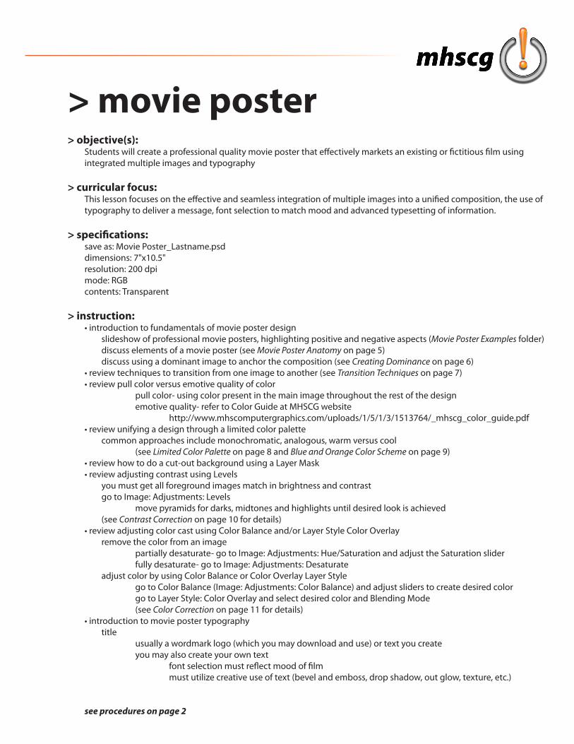
> movie poster> objective(s):
Students will create a professional quality movie poster that effectively markets an existing or fictitious film using integrated multiple images and typography
> curricular focus:This lesson focuses on the effective and seamless integration of multiple images into a unified composition, the use of typography to deliver a message, font selection to match mood and advanced typesetting of information.
> specifications:save as: Movie Poster_Lastname.psddimensions: 7"x10.5"resolution: 200 dpimode: RGBcontents: Transparent
> instruction:• introduction to fundamentals of movie poster design slideshow of professional movie posters, highlighting positive and negative aspects (Movie Poster Examples folder) discuss elements of a movie poster (see Movie Poster Anatomy on page 5) discuss using a dominant image to anchor the composition (see Creating Dominance on page 6)• review techniques to transition from one image to another (see Transition Techniques on page 7)• review pull color versus emotive quality of color pull color- using color present in the main image throughout the rest of the design emotive quality- refer to Color Guide at MHSCG website http://www.mhscomputergraphics.com/uploads/1/5/1/3/1513764/_mhscg_color_guide.pdf• review unifying a design through a limited color palette common approaches include monochromatic, analogous, warm versus cool (see Limited Color Palette on page 8 and Blue and Orange Color Scheme on page 9)• review how to do a cut-out background using a Layer Mask• review adjusting contrast using Levels you must get all foreground images match in brightness and contrast go to Image: Adjustments: Levels move pyramids for darks, midtones and highlights until desired look is achieved (see Contrast Correction on page 10 for details)• review adjusting color cast using Color Balance and/or Layer Style Color Overlay remove the color from an image partially desaturate- go to Image: Adjustments: Hue/Saturation and adjust the Saturation slider fully desaturate- go to Image: Adjustments: Desaturate adjust color by using Color Balance or Color Overlay Layer Style go to Color Balance (Image: Adjustments: Color Balance) and adjust sliders to create desired color go to Layer Style: Color Overlay and select desired color and Blending Mode (see Color Correction on page 11 for details)• introduction to movie poster typography title usually a wordmark logo (which you may download and use) or text you create you may also create your own text font selection must reflect mood of film must utilize creative use of text (bevel and emboss, drop shadow, out glow, texture, etc.)
see procedures on page 2
> movie poster tagline this is the movie slogan (you will find this information at imdb.com) appears at the very top of the poster or at the bottom (above production info) almost always presented in all caps billing this is the cast (you will find this information at imdb.com) always appears at the top of the poster always presented in all caps in a tall, slender font production credits credits include cast, director, producer, music, screenplay, etc. (you will find this information at imdb.com) always presented in all caps in a tall, slender font see Production Credits on page 13 and Production Credits Fonts on page 14 for details • review altering type settings in the Character palette adjusting Leading (distance between lines of text) adjusting Character Width and Height adjusting Tracking (distance between letters)
> procedure:• select movie title and approve with instructor• research potential images online and select (remember to select large format in search tools) characters find images of main characters that best reflect their mood or role in the plot example: Star Wars- Han Solo is a brash gunslinger so maybe an image where he is shooting settings/scenes find images that are important to the story example: Star Wars- Death Star, X-Wings, Millennium Falcon, starfield, planet movie title wordmark logo (if it exists) remember, this is not required; you may create your own using text with creative usage trying finding it as a PNG file where it is already cut out for you (example: search "Star Wars logo png") production logos production company, distribution company, sound effects company, visual effects company, etc. this information can be found by looking at existing movie posters of your selection on imdb.com note: download more than you think you need so you have a lot of good options• create thumbnail sketches important notes: - open and print Movie Poster Thumbnails.pdf - minimum two different compositional sketches can be same or different images but must be different on arrangement approach - draw characters as external contours (silhouettes) only do not draw internal details like clothes, faces, etc. - review professional movie poster design for examples of foreground montage arrangements step 1: create production information text, logos, and release date see list of required elements to include on Production Info on page 13 names you use do not have to be accurate (e.g. you can make yourself the director) step 2: place movie title wordmark logo or text can be at the top (under tagline/billing) or at the bottom (above production info) step 3: place dominant this is the character who is most important to the story must be 2-3 times larger than any other foreground image usually in the center but may also be offsetcontinued on page 3
> movie poster step 4: place supporting foreground images minimum two additional images (but can be more) most commonly foreground characters are protagonists (good guys) must overlap (or be overlapped by) dominant so the montage functions as a single visual unit step 5: place background images minimum two (but can be more) can be additional characters, environments, objects (for example vehicles) background must be full bleed imagery cannot interfere with text at top or bottom step 6: decide on (and label) color casting foreground montage can either be full color or fully color with subtle color cast background montage can be partially or fully destaurated but must have strong color casting step 7: label transitions and colors focus on unity in your design images must blend and work together as one unit in both foreground and background compositions must include each of the following: overlapping, feathered edge, color casting (and color and type), transparency limit your color palette (2-3 colors is most common) remember to reinforce mood consider schemes like: analogous, monochromatic, warm vs. cool (blue/orange) step 8: discuss and approve with instructor• begin work on the computer set up file (see specifications above) review movie poster text requirements carefully review Production Credits on page 13 and Production Credits Fonts on page 14 remember all text is all caps with fonts that are tall and slender create all typesetting elements first tagline or billing (top) cast usually done as two decks (first name above last name) names should be evenly spaced and centered on the document movie title (top or bottom) can be logo or created type (font must match mood) production information (bottom) obtain info from an actual professional poster for your movie, or at imdb.com see Production Credits on page 13 for required items to include (names may be ficticious) release date appears in larger font and centered underneath production info production credits logos appear on same "line" as release date visually balanced on each side include: production house and/or distribution house, movie rating (required) sound house and effects house (if available) logos should be one color only (and usually match the color you use for production info text) these logos do not have to be accurate if you cannot find actual information create foreground montage place and scale images create transitions match all images for brightness, contrast, color and color cast (if using) create background montage place and scale images create transitions desaturate (partially or fully as previously planned) and add color/gradient overlaysee requirements on page 4
> movie poster> requirements:
• file - document specifications are adhered to (see page 1) - all layers are named and ordered appropriately - no hidden layers are present• composition - must show at least one example of each: COB (cut-out background); overlapping; feathered edge; color casting COB(s) must be clean and accurate with the Layer Mask applied - design must incorporate effective use of filters, effects and/or styles - utilizes full bleed photography/graphic elements - images/graphic elements do not interfere readability of tagline/actors, title, production info• foreground montage - minimum three images - images overlap to create unity - montage has a dominant dominant is 2-3 times larger than other supporting foreground images, giving the viewer a place to start - images have the same brightness, contrast and color cast people must appear as if they gathered together for a single image • background montage - minimum two images that reinforce plot, mood or location can be environment, characters, objects, etc. - background images have the same color cast (may be more than one color), contrast and intensity - background images do not compete with foreground montage• color - composition utilizes a limited color scheme (monochromatic, analogous, warm vs. cool) - colors selected must support overall message and mood• self-created artwork - supports the overall composition (not a requirement; extra grade consideration if included) - tutorials may be incorporated if only a minor part of the design (at instructor's discretion and approval) any tutorial used in any way must be sited in the metafile description copy and paste tutorial URL into Description field of metadata (go to File: File Info)• typography - all text anti-alias is set to Smooth for all text - movie title may be COB of actual logo or self-created text (font selection must reflect mood of movie) - production credits (at bottom) must include: distribution/production house (for example Paramount, Universal, Lucasfilm); producer; director; main actors; casting; costume design; music composer; film editor; production designer; director of photography; screenplay (written by); release date names of people in credits may be fictional font selection must reflect traditional movie poster trend of tall, skinny, all caps typeface imagery behind text must be subtle to allow easy readability text on top of a busy, chaotic background makes text difficult to read - tagline or cast billing font selection must reflect mood/genre of movie or match the production credits font utilizes all caps typeface imagery behind text must be subtle to allow easy readability
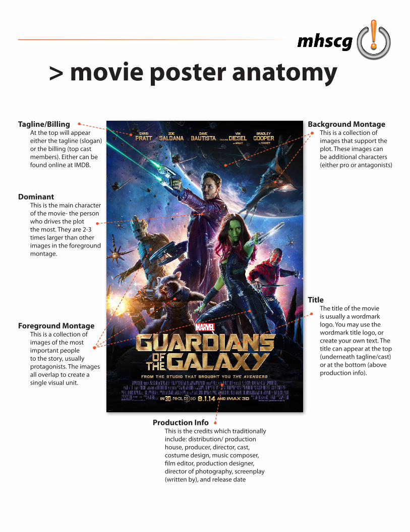
> movie poster anatomy
DominantThis is the main character of the movie- the person who drives the plot the most. They are 2-3 times larger than other images in the foreground montage.
Foreground MontageThis is a collection of images of the most important people to the story, usually protagonists. The images all overlap to create a single visual unit.
Production InfoThis is the credits which traditionally include: distribution/ production house, producer, director, cast, costume design, music composer, film editor, production designer, director of photography, screenplay (written by), and release date
Tagline/BillingAt the top will appear either the tagline (slogan) or the billing (top cast members). Either can be found online at IMDB.
TitleThe title of the movie is usually a wordmark logo. You may use the wordmark title logo, or create your own text. The title can appear at the top (underneath tagline/cast) or at the bottom (above production info).
Background MontageThis is a collection of images that support the plot. These images can be additional characters (either pro or antagonists)
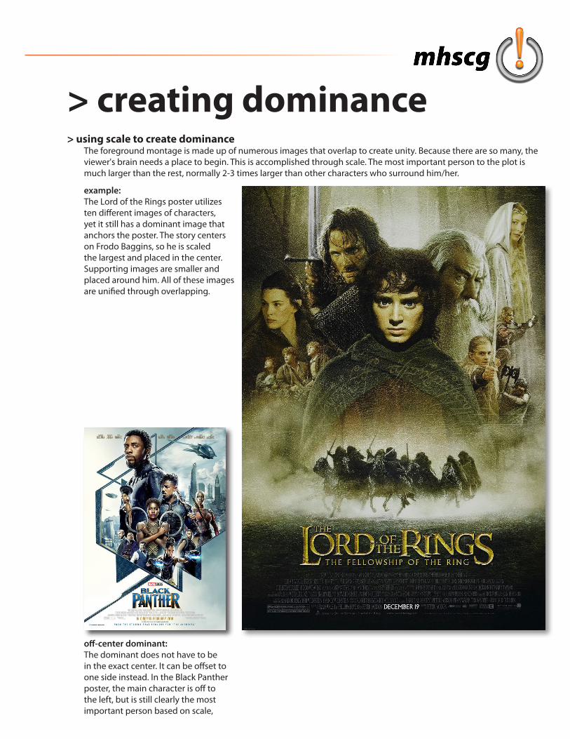
> creating dominance> using scale to create dominance
The foreground montage is made up of numerous images that overlap to create unity. Because there are so many, the viewer's brain needs a place to begin. This is accomplished through scale. The most important person to the plot is much larger than the rest, normally 2-3 times larger than other characters who surround him/her.
example:The Lord of the Rings poster utilizes ten different images of characters, yet it still has a dominant image that anchors the poster. The story centers on Frodo Baggins, so he is scaled the largest and placed in the center. Supporting images are smaller and placed around him. All of these images are unified through overlapping.
off-center dominant:The dominant does not have to be in the exact center. It can be offset to one side instead. In the Black Panther poster, the main character is off to the left, but is still clearly the most important person based on scale,
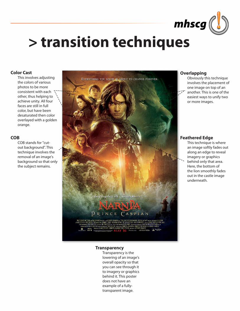
> transition techniques
COBCOB stands for "cut-out background". This technique involves the removal of an image's background so that only the subject remains.
OverlappingObviously this technique involves the placement of one image on top of an another. This is one of the easiest ways to unify two or more images.
TransparencyTransparency is the lowering of an image's overall opacity so that you can see through it to imagery or graphics behind it. This poster does not have an example of a fully-transparent image.
Feathered EdgeThis technique is where an image softly fades out along an edge to reveal imagery or graphics behind only that area. Here, the bottom of the lion smoothly fades out in the castle image underneath.
Color CastThis involves adjusting the colors of various photos to be more consistent with each other, thus helping to achieve unity. All four faces are still in full color, but have been desaturated then color overlayed with a golden orange.
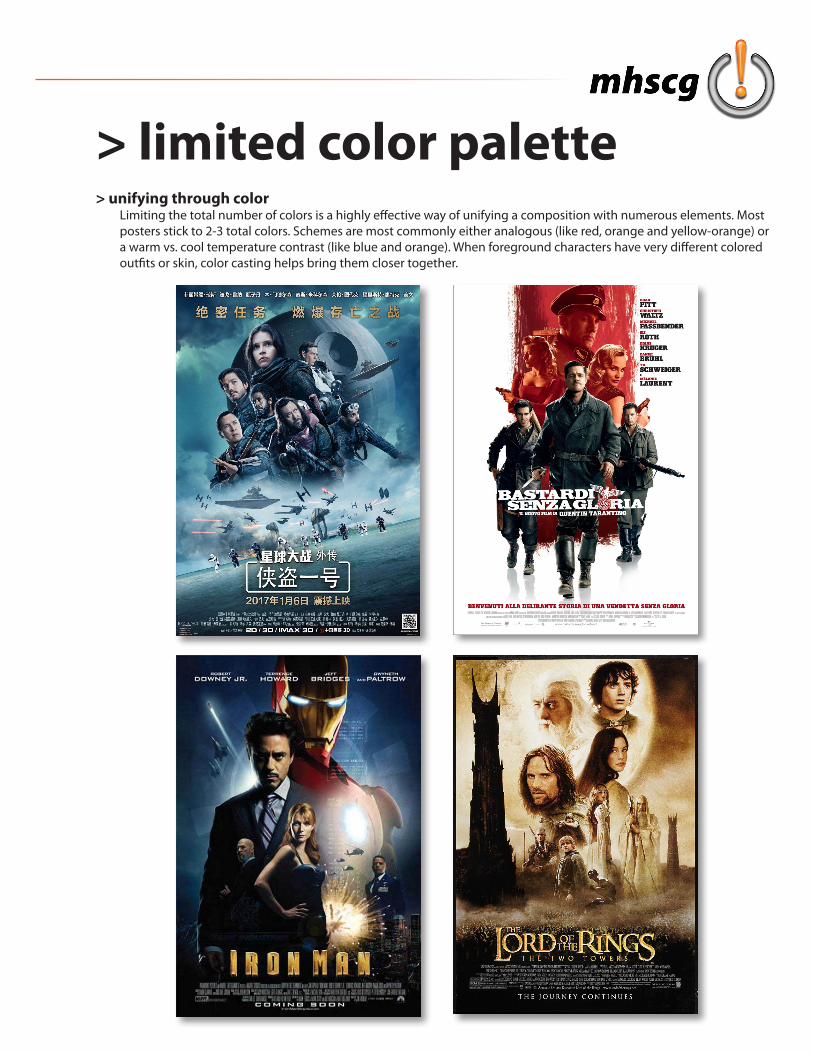
> limited color palette> unifying through color
Limiting the total number of colors is a highly effective way of unifying a composition with numerous elements. Most posters stick to 2-3 total colors. Schemes are most commonly either analogous (like red, orange and yellow-orange) or a warm vs. cool temperature contrast (like blue and orange). When foreground characters have very different colored outfits or skin, color casting helps bring them closer together.
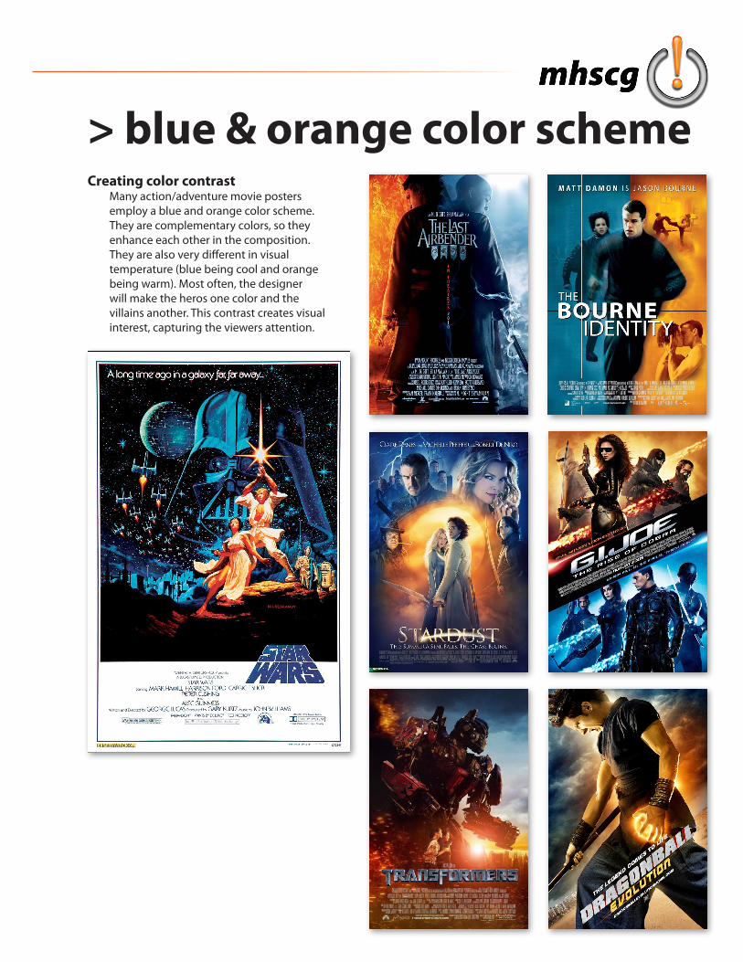
> blue & orange color schemeCreating color contrast
Many action/adventure movie posters employ a blue and orange color scheme. They are complementary colors, so they enhance each other in the composition. They are also very different in visual temperature (blue being cool and orange being warm). Most often, the designer will make the heros one color and the villains another. This contrast creates visual interest, capturing the viewers attention.
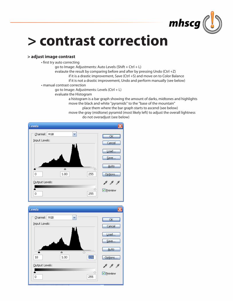
> adjust image contrast • first try auto correcting go to Image: Adjustments: Auto Levels (Shift + Ctrl + L) evalaute the result by comparing before and after by pressing Undo (Ctrl +Z) if it is a drastic improvement, Save (Ctrl +S) and move on to Color Balance if it is not a drastic improvement, Undo and perform manually (see below) • manual contrast correction go to Image: Adjustments: Levels (Ctrl + L) evaluate the Histogram a histogram is a bar graph showing the amount of darks, midtones and highlights move the black and white "pyramids" to the "base of the mountain" place them where the bar graph starts to ascend (see below) move the gray (midtone) pyramid (most likely left) to adjust the overall lightness do not overadjust (see below)
> contrast correction
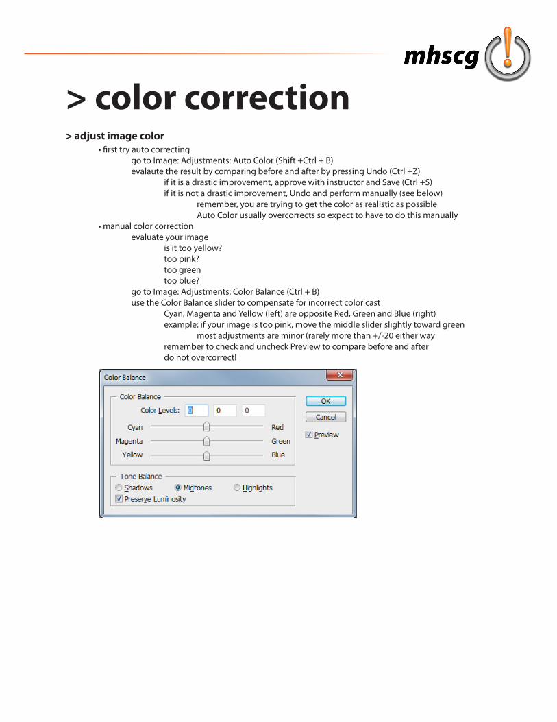
> color correction> adjust image color • first try auto correcting go to Image: Adjustments: Auto Color (Shift +Ctrl + B) evalaute the result by comparing before and after by pressing Undo (Ctrl +Z) if it is a drastic improvement, approve with instructor and Save (Ctrl +S) if it is not a drastic improvement, Undo and perform manually (see below) remember, you are trying to get the color as realistic as possible Auto Color usually overcorrects so expect to have to do this manually • manual color correction evaluate your image is it too yellow? too pink? too green too blue? go to Image: Adjustments: Color Balance (Ctrl + B) use the Color Balance slider to compensate for incorrect color cast Cyan, Magenta and Yellow (left) are opposite Red, Green and Blue (right) example: if your image is too pink, move the middle slider slightly toward green most adjustments are minor (rarely more than +/-20 either way remember to check and uncheck Preview to compare before and after do not overcorrect!
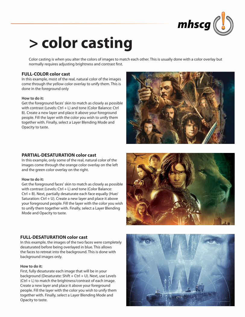
> color castingColor casting is when you alter the colors of images to match each other. This is usually done with a color overlay but normally requires adjusting brightness and contrast first.
FULL-COLOR color castIn this example, most of the real, natural color of the images come through the yellow color overlay to unify them. This is done in the foreground only
How to do it:Get the foreground faces' skin to match as closely as possible with contrast (Levels: Ctrl + L) and tone (Color Balance: Ctrl B). Create a new layer and place it above your foreground people. Fill the layer with the color you wish to unify them together with. Finally, select a Layer Blending Mode and Opacity to taste.
FULL-DESATURATION color castIn this example, the images of the two faces were completely desaturated before being overlayed in blue. This allows the faces to retreat into the background. This is done with background images only.
How to do it:First, fully desaturate each image that will be in your background (Desaturate: Shift + Ctrl + U). Next, use Levels (Ctrl + L) to match the brightness/contrast of each image. Create a new layer and place it above your foreground people. Fill the layer with the color you wish to unify them together with. Finally, select a Layer Blending Mode and Opacity to taste.
PARTIAL-DESATURATION color castIn this example, only some of the real, natural color of the images come through the orange color overlay on the left and the green color overlay on the right.
How to do it:Get the foreground faces' skin to match as closely as possible with contrast (Levels: Ctrl + L) and tone (Color Balance: Ctrl + B). Next, partially desaturate each face equally (Hue/Saturation: Ctrl + U). Create a new layer and place it above your foreground people. Fill the layer with the color you wish to unify them together with. Finally, select a Layer Blending Mode and Opacity to taste.
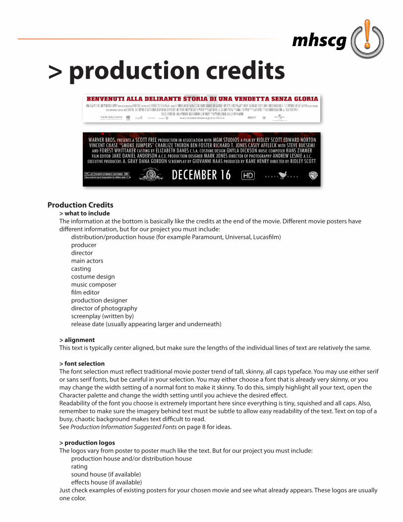
> production credits
Production Credits> what to includeThe information at the bottom is basically like the credits at the end of the movie. Different movie posters have different information, but for our project you must include: distribution/production house (for example Paramount, Universal, Lucasfilm) producer director main actors casting costume design music composer film editor production designer director of photography screenplay (written by) release date (usually appearing larger and underneath)
> alignmentThis text is typically center aligned, but make sure the lengths of the individual lines of text are relatively the same.
> font selectionThe font selection must reflect traditional movie poster trend of tall, skinny, all caps typeface. You may use either serif or sans serif fonts, but be careful in your selection. You may either choose a font that is already very skinny, or you may change the width setting of a normal font to make it skinny. To do this, simply highlight all your text, open the Character palette and change the width setting until you achieve the desired effect.Readability of the font you choose is extremely important here since everything is tiny, squished and all caps. Also, remember to make sure the imagery behind text must be subtle to allow easy readability of the text. Text on top of a busy, chaotic background makes text difficult to read.See Production Information Suggested Fonts on page 8 for ideas.
> production logosThe logos vary from poster to poster much like the text. But for our project you must include: production house and/or distribution house rating sound house (if available) effects house (if available)Just check examples of existing posters for your chosen movie and see what already appears. These logos are usually one color.
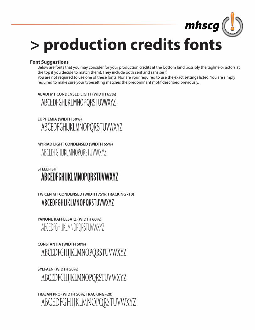
> production credits fontsFont Suggestions
Below are fonts that you may consider for your production credits at the bottom (and possibly the tagline or actors at the top if you decide to match them). They include both serif and sans serif. You are not required to use one of these fonts. Nor are your required to use the exact settings listed. You are simply required to make sure your typesetting matches the predominant motif described previously.
ABADI MT CONDENSED LIGHT (WIDTH 65%)
ABCEDFGHIJKLMNOPQRSTUVWXYZ
EUPHEMIA (WIDTH 50%)
ABCEDFGHIJKLMNOPQRSTUVWXYZMYRIAD LIGHT CONDENSED (WIDTH 65%)
ABCEDFGHIJKLMNOPQRSTUVWXYZ
STEELFISH
ABCEDFGHIJKLMNOPQRSTUVWXYZ
TW CEN MT CONDENSED (WIDTH 75%; TRACKING -10)
ABCEDFGHIJKLMNOPQRSTUVWXYZ
YANONE KAFFEESATZ (WIDTH 60%)
ABCEDFGHIJKLMNOPQRSTUVWXYZ
CONSTANTIA (WIDTH 50%)
ABCEDFGHIJKLMNOPQRSTUVWXYZSYLFAEN (WIDTH 50%)
ABCEDFGHIJKLMNOPQRSTUVWXYZTRAJAN PRO (WIDTH 50%; TRACKING -20)
ABCEDFGHIJKLMNOPQRSTUVWXYZ