Movie Poster Analysis
6
Film Poster Analysis 1
-
Upload
grace-westlake -
Category
Education
-
view
159 -
download
0
Transcript of Movie Poster Analysis
1
Film Poster Analysis
2
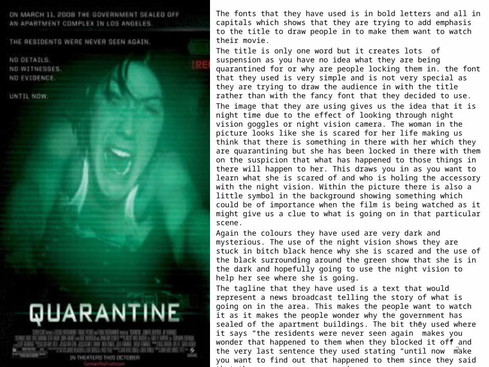
The fonts that they have used is in bold letters and all in capitals which shows that they are trying to add emphasis to the title to draw people in to make them want to watch their movie. The title is only one word but it creates lots of suspension as you have no idea what they are being quarantined for or why are people locking them in. the font that they used is very simple and is not very special as they are trying to draw the audience in with the title rather than with the fancy font that they decided to use. The image that they are using gives us the idea that it is night time due to the effect of looking through night vision goggles or night vision camera. The woman in the picture looks like she is scared for her life making us think that there is something in there with her which they are quarantining but she has been locked in there with them on the suspicion that what has happened to those things in there will happen to her. This draws you in as you want to learn what she is scared of and who is holing the accessory with the night vision. Within the picture there is also a little symbol in the background showing something which could be of importance when the film is being watched as it might give us a clue to what is going on in that particular scene. Again the colours they have used are very dark and mysterious. The use of the night vision shows they are stuck in bitch black hence why she is scared and the use of the black surrounding around the green show that she is in the dark and hopefully going to use the night vision to help her see where she is going.The tagline that they have used is a text that would represent a news broadcast telling the story of what is going on in the area. This makes the people want to watch it as it makes the people wonder why the government has sealed of the apartment buildings. The bit they used where it says “the residents were never seen again” makes you wonder that happened to them when they blocked it off and the very last sentence they used stating “until now” make you want to find out that happened to them since they said that they were never seen again. It doesn’t tell you what starts are featured in the movie but the lady on the front must be important because she has been used to represent the movie. Overall the poster is well set out as it draws people in and tells them a little about what is going on without giving away too much but also making it hard it understand and making you want to watch it to find out what happens. The posters overall effectiveness is very good as it is scary when you first look at it but then as you read the pester it makes you want to watch it to get the whole story. I do believe there could have given you the names of the people starring in it because if your favourite start is in the movie then you are more likely going to want to watch it rather than having to wait to find out who the main characters are.
3
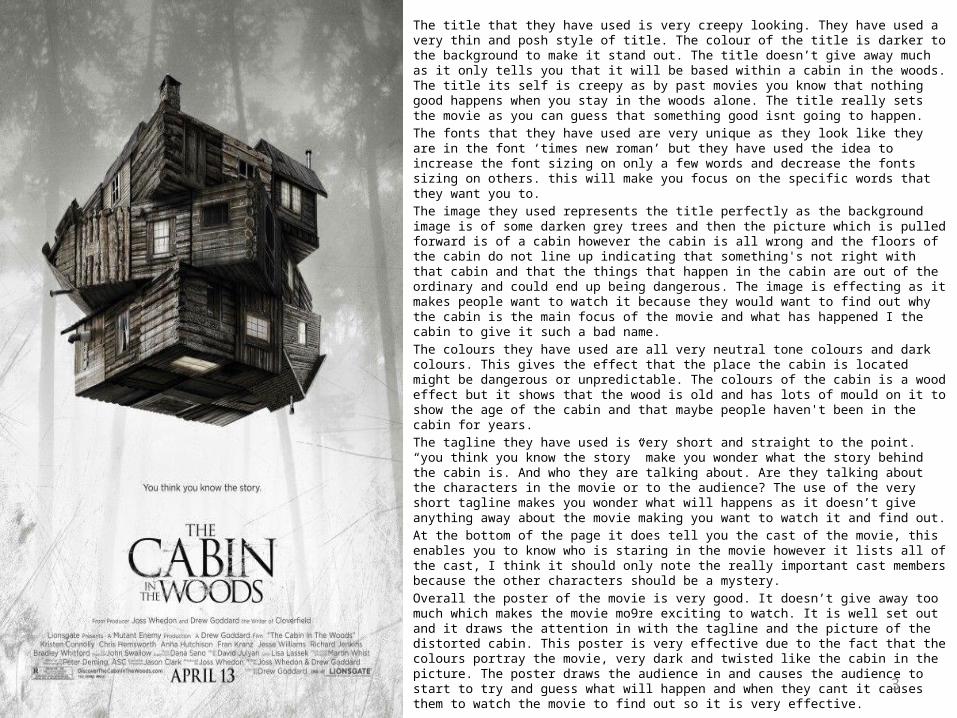
The title that they have used is very creepy looking. They have used a very thin and posh style of title. The colour of the title is darker to the background to make it stand out. The title doesn’t give away much as it only tells you that it will be based within a cabin in the woods. The title its self is creepy as by past movies you know that nothing good happens when you stay in the woods alone. The title really sets the movie as you can guess that something good isnt going to happen. The fonts that they have used are very unique as they look like they are in the font ‘times new roman’ but they have used the idea to increase the font sizing on only a few words and decrease the fonts sizing on others. this will make you focus on the specific words that they want you to. The image they used represents the title perfectly as the background image is of some darken grey trees and then the picture which is pulled forward is of a cabin however the cabin is all wrong and the floors of the cabin do not line up indicating that something's not right with that cabin and that the things that happen in the cabin are out of the ordinary and could end up being dangerous. The image is effecting as it makes people want to watch it because they would want to find out why the cabin is the main focus of the movie and what has happened I the cabin to give it such a bad name. The colours they have used are all very neutral tone colours and dark colours. This gives the effect that the place the cabin is located might be dangerous or unpredictable. The colours of the cabin is a wood effect but it shows that the wood is old and has lots of mould on it to show the age of the cabin and that maybe people haven't been in the cabin for years. The tagline they have used is very short and straight to the point. “you think you know the story” make you wonder what the story behind the cabin is. And who they are talking about. Are they talking about the characters in the movie or to the audience? The use of the very short tagline makes you wonder what will happens as it doesn’t give anything away about the movie making you want to watch it and find out. At the bottom of the page it does tell you the cast of the movie, this enables you to know who is staring in the movie however it lists all of the cast, I think it should only note the really important cast members because the other characters should be a mystery. Overall the poster of the movie is very good. It doesn’t give away too much which makes the movie mo9re exciting to watch. It is well set out and it draws the attention in with the tagline and the picture of the distorted cabin. This poster is very effective due to the fact that the colours portray the movie, very dark and twisted like the cabin in the picture. The poster draws the audience in and causes the audience to start to try and guess what will happen and when they cant it causes them to watch the movie to find out so it is very effective.
4
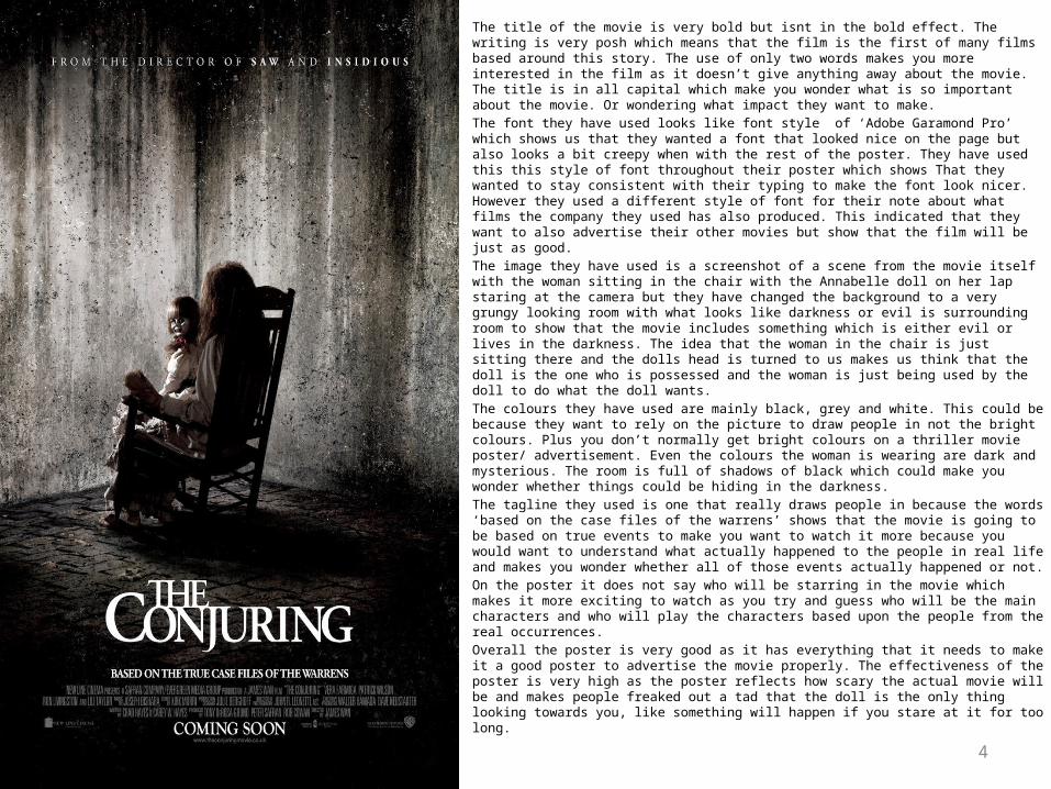
The title of the movie is very bold but isnt in the bold effect. The writing is very posh which means that the film is the first of many films based around this story. The use of only two words makes you more interested in the film as it doesn’t give anything away about the movie. The title is in all capital which make you wonder what is so important about the movie. Or wondering what impact they want to make.The font they have used looks like font style of ‘Adobe Garamond Pro’ which shows us that they wanted a font that looked nice on the page but also looks a bit creepy when with the rest of the poster. They have used this this style of font throughout their poster which shows That they wanted to stay consistent with their typing to make the font look nicer. However they used a different style of font for their note about what films the company they used has also produced. This indicated that they want to also advertise their other movies but show that the film will be just as good. The image they have used is a screenshot of a scene from the movie itself with the woman sitting in the chair with the Annabelle doll on her lap staring at the camera but they have changed the background to a very grungy looking room with what looks like darkness or evil is surrounding room to show that the movie includes something which is either evil or lives in the darkness. The idea that the woman in the chair is just sitting there and the dolls head is turned to us makes us think that the doll is the one who is possessed and the woman is just being used by the doll to do what the doll wants. The colours they have used are mainly black, grey and white. This could be because they want to rely on the picture to draw people in not the bright colours. Plus you don’t normally get bright colours on a thriller movie poster/ advertisement. Even the colours the woman is wearing are dark and mysterious. The room is full of shadows of black which could make you wonder whether things could be hiding in the darkness. The tagline they used is one that really draws people in because the words ‘based on the case files of the warrens’ shows that the movie is going to be based on true events to make you want to watch it more because you would want to understand what actually happened to the people in real life and makes you wonder whether all of those events actually happened or not. On the poster it does not say who will be starring in the movie which makes it more exciting to watch as you try and guess who will be the main characters and who will play the characters based upon the people from the real occurrences. Overall the poster is very good as it has everything that it needs to make it a good poster to advertise the movie properly. The effectiveness of the poster is very high as the poster reflects how scary the actual movie will be and makes people freaked out a tad that the doll is the only thing looking towards you, like something will happen if you stare at it for too long.
5
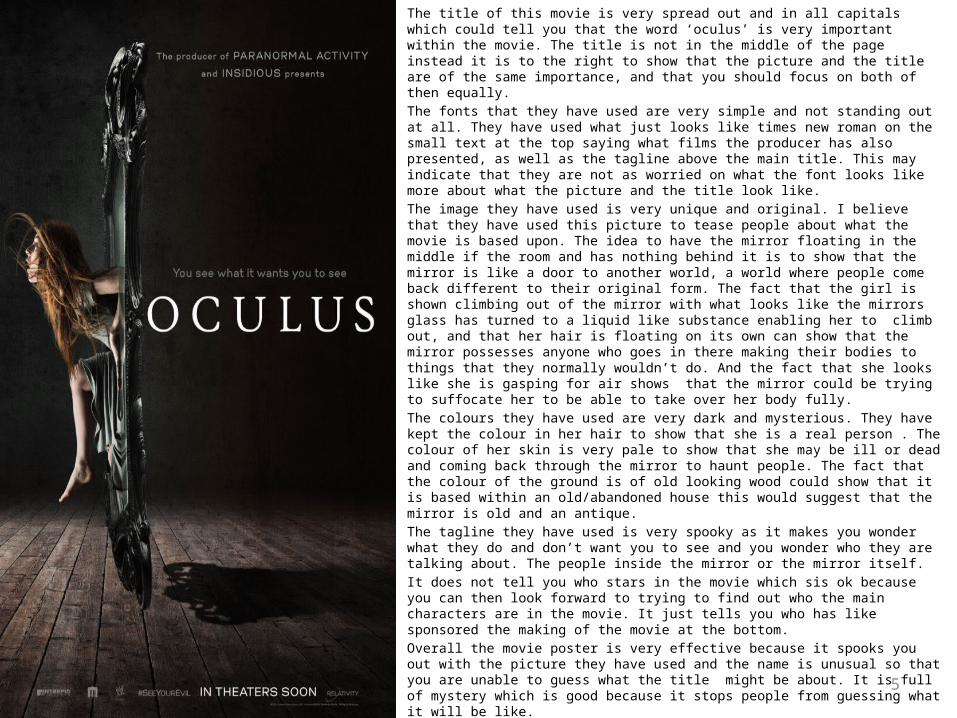
The title of this movie is very spread out and in all capitals which could tell you that the word ‘oculus’ is very important within the movie. The title is not in the middle of the page instead it is to the right to show that the picture and the title are of the same importance, and that you should focus on both of then equally. The fonts that they have used are very simple and not standing out at all. They have used what just looks like times new roman on the small text at the top saying what films the producer has also presented, as well as the tagline above the main title. This may indicate that they are not as worried on what the font looks like more about what the picture and the title look like. The image they have used is very unique and original. I believe that they have used this picture to tease people about what the movie is based upon. The idea to have the mirror floating in the middle if the room and has nothing behind it is to show that the mirror is like a door to another world, a world where people come back different to their original form. The fact that the girl is shown climbing out of the mirror with what looks like the mirrors glass has turned to a liquid like substance enabling her to climb out, and that her hair is floating on its own can show that the mirror possesses anyone who goes in there making their bodies to things that they normally wouldn’t do. And the fact that she looks like she is gasping for air shows that the mirror could be trying to suffocate her to be able to take over her body fully. The colours they have used are very dark and mysterious. They have kept the colour in her hair to show that she is a real person . The colour of her skin is very pale to show that she may be ill or dead and coming back through the mirror to haunt people. The fact that the colour of the ground is of old looking wood could show that it is based within an old/abandoned house this would suggest that the mirror is old and an antique. The tagline they have used is very spooky as it makes you wonder what they do and don’t want you to see and you wonder who they are talking about. The people inside the mirror or the mirror itself. It does not tell you who stars in the movie which sis ok because you can then look forward to trying to find out who the main characters are in the movie. It just tells you who has like sponsored the making of the movie at the bottom. Overall the movie poster is very effective because it spooks you out with the picture they have used and the name is unusual so that you are unable to guess what the title might be about. It is full of mystery which is good because it stops people from guessing what it will be like.
6
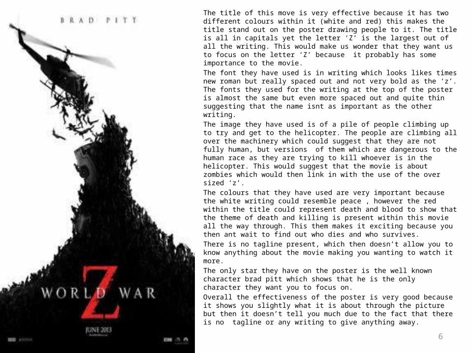
The title of this move is very effective because it has two different colours within it (white and red) this makes the title stand out on the poster drawing people to it. The title is all in capitals yet the letter ‘Z’ is the largest out of all the writing. This would make us wonder that they want us to focus on the letter ‘Z’ because it probably has some importance to the movie. The font they have used is in writing which looks likes times new roman but really spaced out and not very bold as the ‘z’. The fonts they used for the writing at the top of the poster is almost the same but even more spaced out and quite thin suggesting that the name isnt as important as the other writing. The image they have used is of a pile of people climbing up to try and get to the helicopter. The people are climbing all over the machinery which could suggest that they are not fully human, but versions of them which are dangerous to the human race as they are trying to kill whoever is in the helicopter. This would suggest that the movie is about zombies which would then link in with the use of the over sized ‘z’. The colours that they have used are very important because the white writing could resemble peace , however the red within the title could represent death and blood to show that the theme of death and killing is present within this movie all the way through. This them makes it exciting because you then ant wait to find out who dies and who survives. There is no tagline present, which then doesn’t allow you to know anything about the movie making you wanting to watch it more. The only star they have on the poster is the well known character brad pitt which shows that he is the only character they want you to focus on. Overall the effectiveness of the poster is very good because it shows you slightly what it is about through the picture but then it doesn’t tell you much due to the fact that there is no tagline or any writing to give anything away.