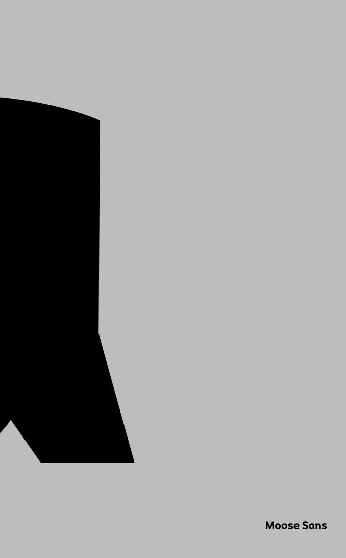
Moose Sans
26
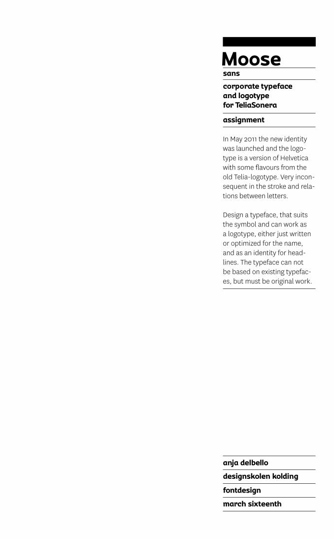
Moose Sans
-
Upload
anja-delbello -
Category
Documents
-
view
248 -
download
2
description
Moose Sans type specimen; description, presentation and usage.
Transcript of Moose Sans
Moose Sans

Moosesans
assignment
anja delbello
designskolen kolding
fontdesign
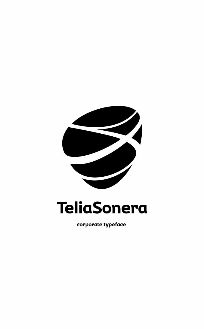
march sixteenth
corporate typeface
and logotype
for TeliaSonera
In May 2011 the new identity was launched and the logo-type is a version of Helvetica with some flavours from the old Telia-logotype. Very incon-sequent in the stroke and rela-tions between letters.
Design a typeface, that suits the symbol and can work as a logotype, either just written or optimized for the name, and as an identity for head-lines. The typeface can not be based on existing typefac-es, but must be original work.
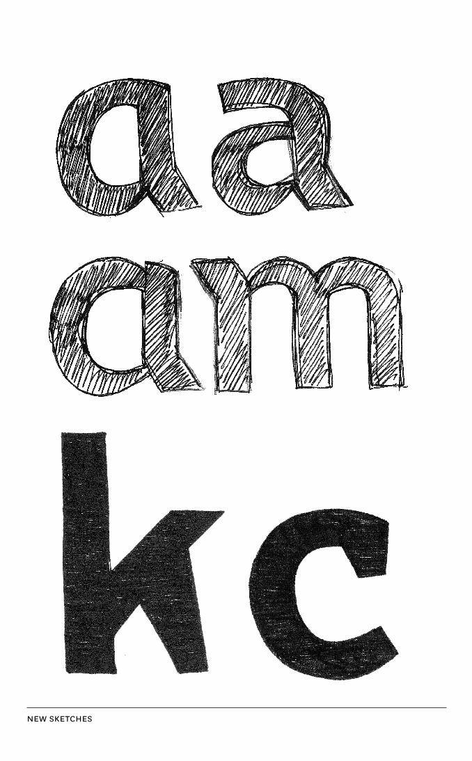
NEW SKETCHES
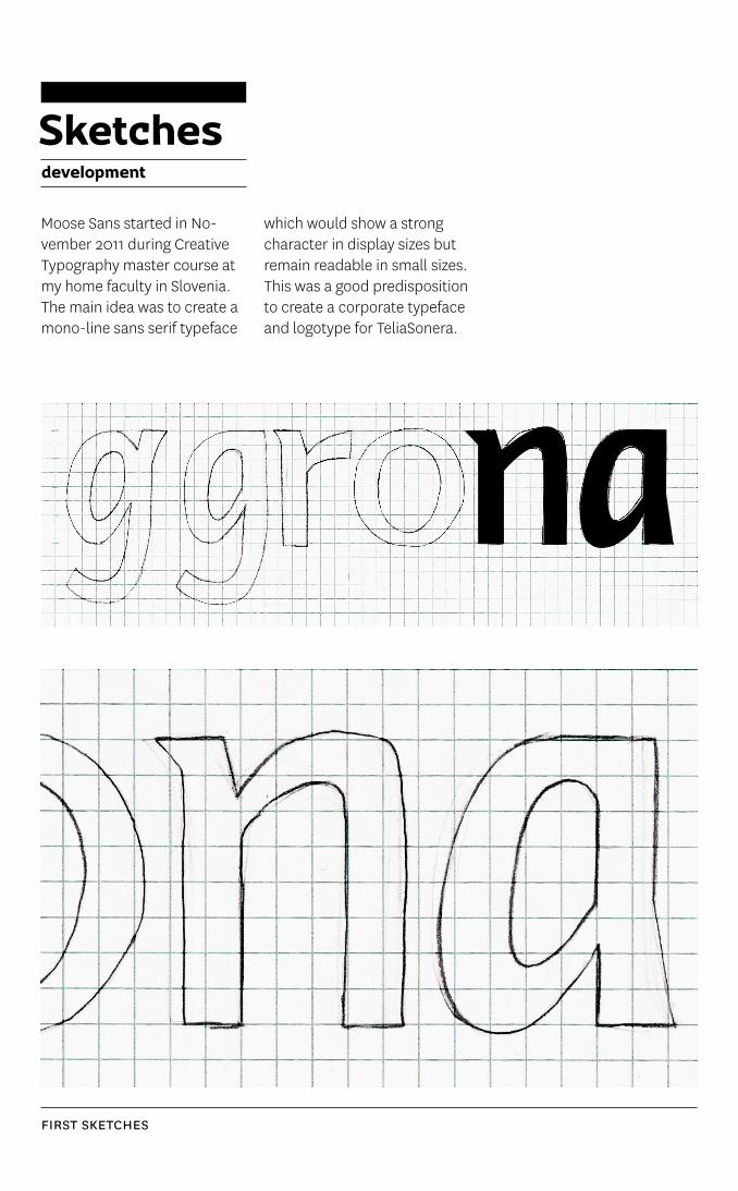
FIRST SKETCHES
Sketchesdevelopment
Moose Sans started in No-vember 2011 during Creative Typography master course at my home faculty in Slovenia. The main idea was to create a mono-line sans serif typeface
which would show a strong character in display sizes but remain readable in small sizes. This was a good predisposition to create a corporate typeface and logotype for TeliaSonera.
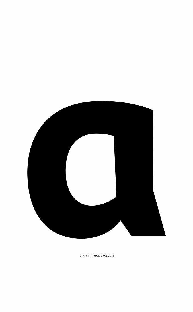
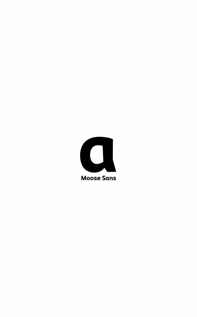
FINal loWERCaSE a
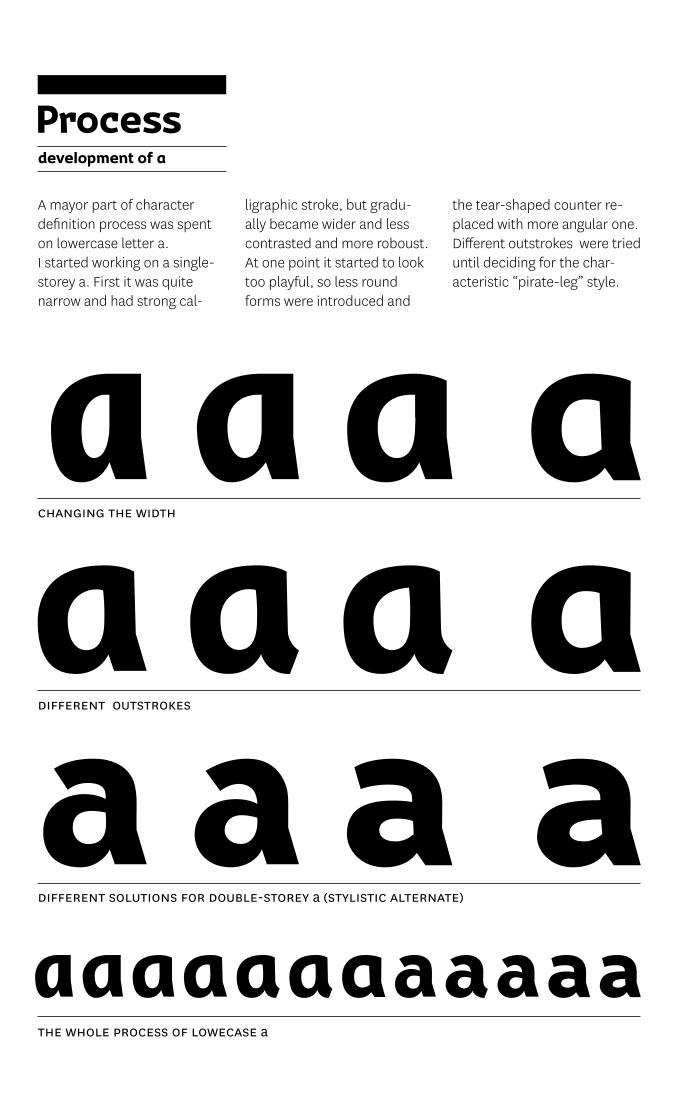
dIFFERENT ouTSTRoKES
CHaNgINg THE WIdTH
dIFFERENT SoluTIoNS FoR doublE-SToREy a (STylISTIC alTERNaTE)
THE WHolE pRoCESS oF loWECaSE a
Processdevelopment of a
A mayor part of character definition process was spent on lowercase letter a. I started working on a single-storey a. First it was quite narrow and had strong cal-
ligraphic stroke, but gradu-ally became wider and less contrasted and more roboust. At one point it started to look too playful, so less round forms were introduced and
the tear-shaped counter re-placed with more angular one. Different outstrokes were tried until deciding for the char-acteristic “pirate-leg” style.
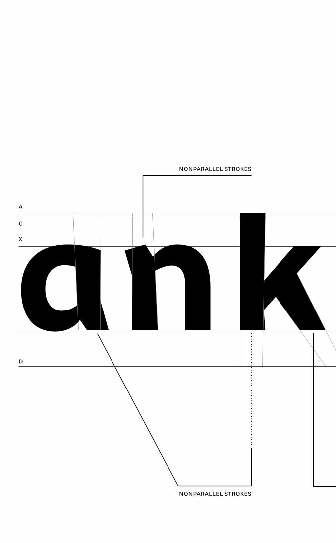
ank g šcX
a
C
d
NoNpaRallEl STRoKES
NoNpaRallEl STRoKES
ank g šc
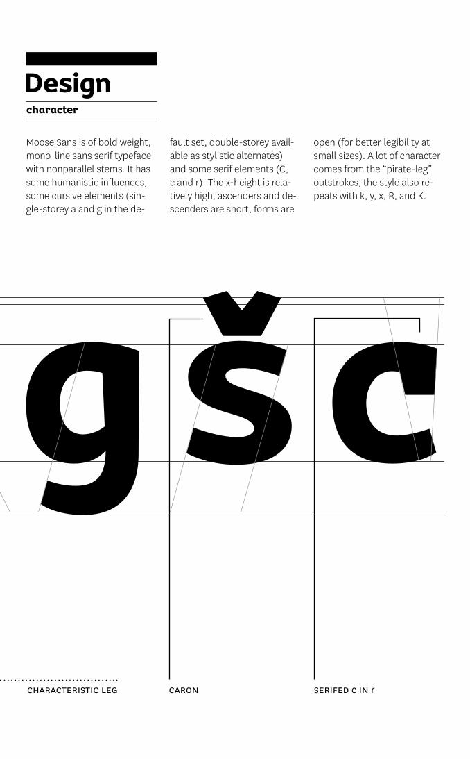
Designcharacter
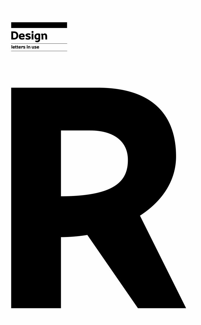
Moose Sans is of bold weight, mono-line sans serif typeface with nonparallel stems. It has some humanistic influences, some cursive elements (sin-gle-storey a and g in the de-
fault set, double-storey avail-able as stylistic alternates) and some serif elements (C, c and r). The x-height is rela-tively high, ascenders and de-scenders are short, forms are
open (for better legibility at small sizes). A lot of character comes from the “pirate-leg” outstrokes, the style also re-peats with k, y, x, R, and K.
CaRoN SERIFEd c IN rCHaRaCTERISTIC lEg
a g y wa g y w
X
X
d
d
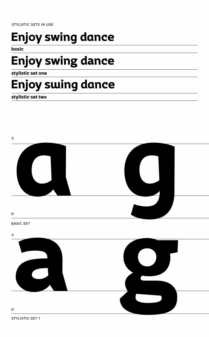
Enjoy swing dance
Enjoy swing dance
Enjoy swing dance
basic
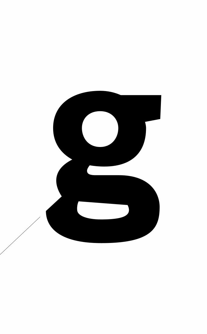
stylistic set one
stylistic set two
STylISTIC SETS IN uSE
baSIC SET
STylISTIC SET 1
a g y wa g y w
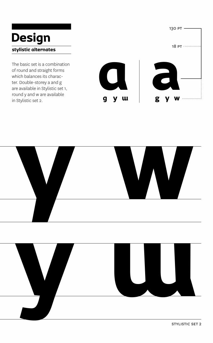
Designstylistic alternates
The basic set is a combination of round and straight forms which balances its charac-ter. Double-storey a and g are available in Stylistic set 1, round y and w are available in Stylistic set 2.
18 pT
130 pT
STylISTIC SET 2
aag y w g y w
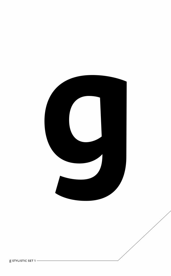
g STylISTIC SET 1
Designletters in use
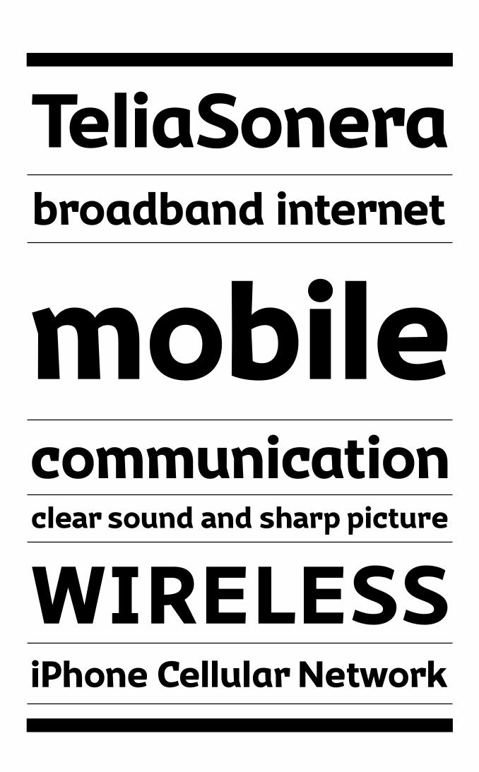
corporate typeface
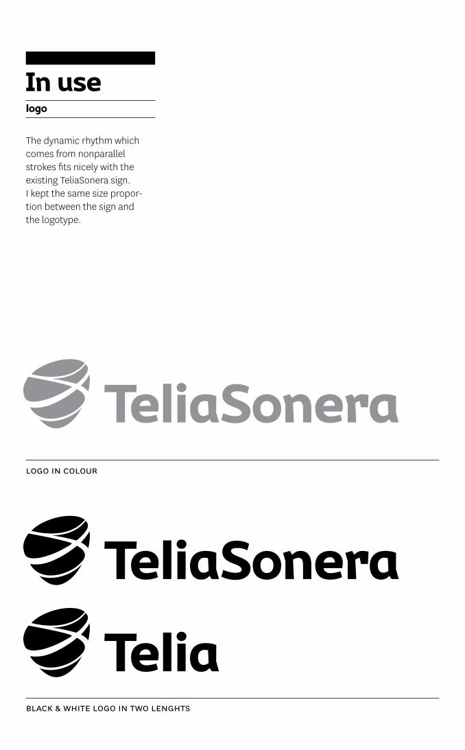
UIn usUUUelogo
The dynamic rhythm which comes from nonparallel strokes fits nicely with the existing TeliaSonera sign. I kept the same size propor-tion between the sign and the logotype.
logo IN ColouR
blaCK & WHITE logo IN TWo lENgHTS

UIn usUUUeads
I applied Moose Sans to exist-ing style of TeliaSonera ads to show how the typeface works in the branding applications.
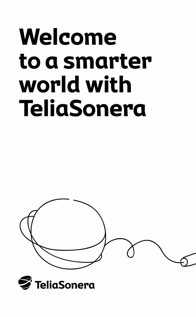
Welcome to a smarter world withTeliaSonera
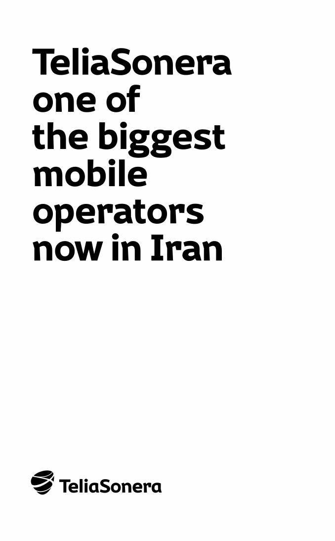
TeliaSoneraone of the biggest mobile operatorsnow in Iran
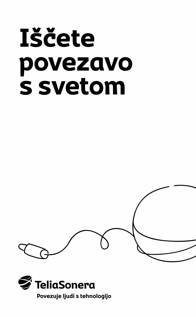
Iščete povezavo s svetom
Povezuje ljudi s tehnologijo
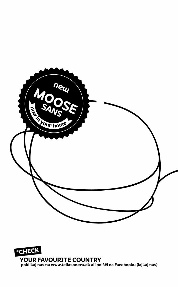
poklikaj nas na www.teliasonera.dk ali poišči na Facebooku (lajkaj nas)YOUR FAVOURITE COUNTRY
*CHECK
now
in your home
MOOSESANS
new
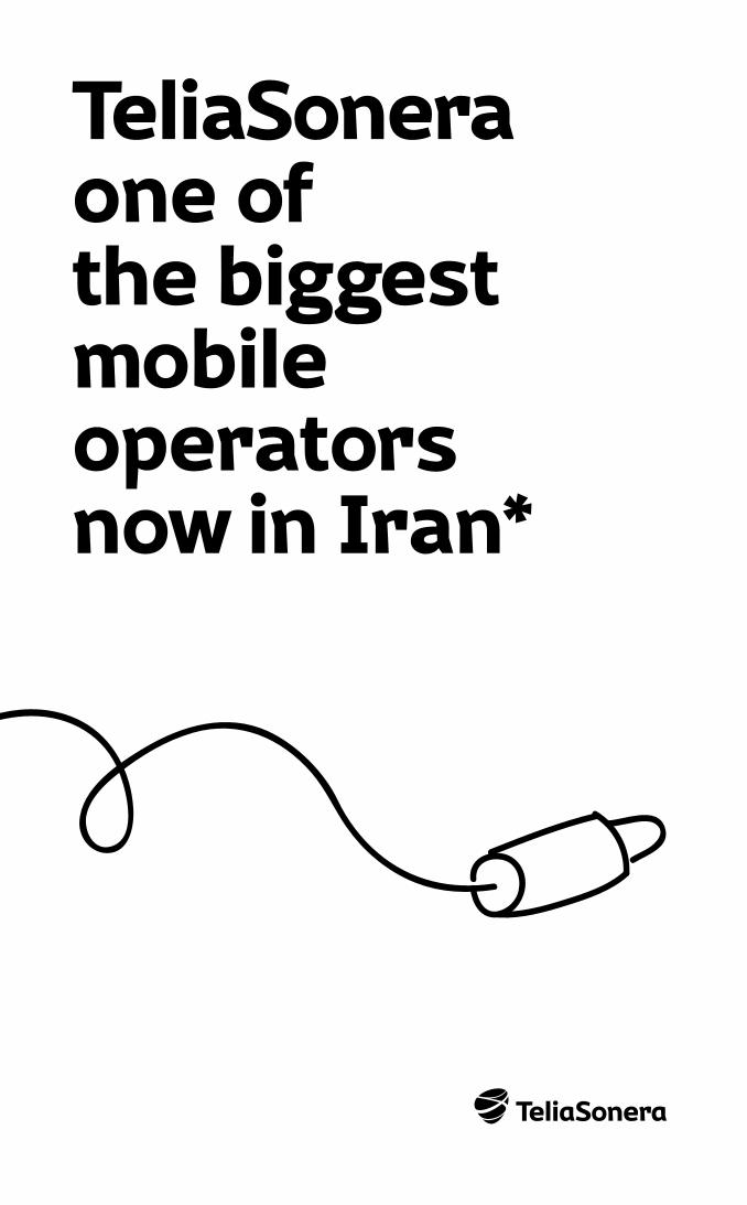
TeliaSoneraone of the biggest mobile operatorsnow in Iran*
poklikaj nas na www.teliasonera.dk ali poišči na Facebooku (lajkaj nas)YOUR FAVOURITE COUNTRY
Moose Sans