Mood Boards, Colours and Fonts
7
Transcript of Mood Boards, Colours and Fonts


FontsMagazine- Arial
Magazine- Adobe Gothic Std B
Magazine- Algerian
Magazine- Aharoni
Magazine- Forte
Magazine- Rockwell
Magazine- Script MT Bold
Magazine- Tekton Pro Ext
Magazine- Trajan Pro
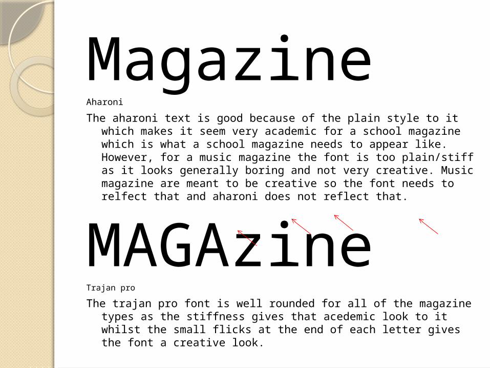
MagazineAharoni
The aharoni text is good because of the plain style to it which makes it seem very academic for a school magazine which is what a school magazine needs to appear like. However, for a music magazine the font is too plain/stiff as it looks generally boring and not very creative. Music magazine are meant to be creative so the font needs to relfect that and aharoni does not reflect that.
MAGAzineTrajan pro
The trajan pro font is well rounded for all of the magazine types as the stiffness gives that acedemic look to it whilst the small flicks at the end of each letter gives the font a creative look.

MagazineScript MT Bold
The text is too fluent for my eyes as the letters connect which gives the font a fluency that most fonts don’t have which is usually a good thing but give a quick look at the font then it will be hard to read. A font must easy to read at a first glance if it is to be on any magazine. The quality of the font that gives the font it’s fluency is the letters connect to one another.
MagazineTekton Pro Ext
The Tekton font is eye catching and easy to read which is an excellent quality for font if it is to be used on a magazine frot covnrt5e r but for a school or music magazine it does not have the right qualities. For a school magazine the font seems to comical so it would project the wrong look for the school. For a music magazine, the font is too much like an ink pen as the end of the letters seem like an ink spot spreading which I believe to be a negative thing because the font will dominate the page and not have that creative flare needed for a music magazine.