Mieg data vis 19 11 14
13
-
Upload
peter-clements -
Category
Data & Analytics
-
view
252 -
download
1
Transcript of Mieg data vis 19 11 14


What is data visualisation for?
• The aim of data visualisation is to present data in a format that minimises the time we need to understand information and reduces the risk of error and misinterpretation.
• Bringing out salient features (including errors) that cannot be seen by examining raw data: in short to enable insight.
2

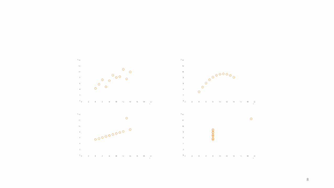
Anscombe’s quartet
Four data sets that have near identical statistical properties
I
x y
10 8.04
8 6.95
13 7.58
9 8.81
11 8.33
14 9.96
6 7.24
4 4.26
12 10.84
7 4.82
5 5.68
II
x y
10 9.14
8 8.14
13 8.74
9 8.77
11 9.26
14 8.1
6 6.13
4 3.1
12 9.13
7 7.26
5 4.74
III
x y
10 7.46
8 6.77
13 12.74
9 7.11
11 7.81
14 8.84
6 6.08
4 5.39
12 8.15
7 6.42
5 5.73
IV
x y
8 6.58
8 5.76
8 7.71
8 8.84
8 8.47
8 7.04
8 5.25
19 12.5
8 5.56
8 7.91
8 6.8
3

I
4

II
5

III
6

IV
7
8

What is data visualisation for?
Source: http://www.microsiervos.com/archivo/azar/loto-estrella.html
Not just eye-candy…
9


HEFCE maps
Participation map
• http://www.hefce.ac.uk/whatwedo/wp/ourresearch/polar/mapofyoungparticipationareas/
Data maps of HE provision
• http://www.hefce.ac.uk/whatwedo/crosscutting/coldspots/
• Where’s UBH?

HESA mobile application
• M.hesa.ac.uk/uk-he-statistics

Data Visualisation – a master
• Hans Rosling• http://www.youtube.com/watch?v=jbkSRLYSojo
Note sound and movement are integral to this example ….
Is this just data visualisation or do you need a Hans Rosling to take this approach?