MicroStrategy Academic Program
128
DASHBOARDS AND DATA DISCOVERY APPROXIMATE TIME NEEDED: 6 HOURS MicroStrategy Academic Program Creating a center of excellence for enterprise analytics and mobility.
Transcript of MicroStrategy Academic Program

DASHBOARDS AND DATA DISCOVERYAPPROXIMATE TIME NEEDED: 6 HOURS
MicroStrategy Academic Program
Creating a center of excellence for enterprise analytics and mobility.

© 2017 MicroStrategy, Inc. 2
CONTENTS
1. Import DataDesktop foundations ................................................................................................ 7
Exercise 1.1: Download MicroStrategy Desktop ..................................... 7
Import data.................................................................................................................11Prepare data.......................................................................................................12Reports .................................................................................................................14Exercise 1.2: Import data................................................................................14Exercise 1.3: Make a grid report ..................................................................18Business concepts: attributes ......................................................................20Business measures and KPIs: metrics ........................................................21Refine data..........................................................................................................22Refresh data........................................................................................................23Exercise 1.4: Import another dataset.........................................................24Workshop 1: Edit and refresh your data...................................................29
2. Create a Dashboardwith DataVisualizations
Desktop interface .....................................................................................................34Format dashboards .........................................................................................36
Types of visualizations............................................................................................39Grid ........................................................................................................................39Heat Map .............................................................................................................40Bar Graph.............................................................................................................40Line Graph...........................................................................................................41Area Graph..........................................................................................................41Bubble Graph.....................................................................................................42Pie chart ...............................................................................................................42

Contents Dashboards and Data Discovery
3 © 2017 MicroStrategy, Inc.
Combo Graph ....................................................................................................43ESRI Map ..............................................................................................................44Network Visualization.....................................................................................46Exercise 2.1: Add visualizations to the dashboard ...............................47Workshop 2: Practicing data import and choosing the right visualization........................................................................................................55
3. Analyze Visualizations
Group related data objects: layer data .............................................................65
Limit data to a specific value: filters ..................................................................65Filter a sheet .......................................................................................................66Filter a visualization.........................................................................................68Use visualizations as filters............................................................................69Activity: Filter the dashboard.......................................................................69
Easily identify trends ...............................................................................................71Sort data ..............................................................................................................71Forecast data: trend lines ..............................................................................72Reference lines ..................................................................................................72
Dig deeper into your data: Drill data.................................................................73Activity: Sort data .............................................................................................74
Highlight important changes in data: thresholds ........................................75Workshop 3: Visualization analysis ............................................................77
Create a metric based on existing metrics: Derived metrics ....................86Calculate values in an existing metric: Aggregate By .........................87Combine values of metrics: Calculations.................................................87Create custom metrics using the Metric Editor.....................................89Workshop 3: Visualization analysis ............................................................89
Enhance your dashboard: insert text or images ...........................................92Add text ...............................................................................................................92Add an image.....................................................................................................93Exercise 3.1: Insert text and complete the dashboard........................93Workshop 4: Analyze data to determine areas of opportunity .......98
4. Publish DashboardsAnnotate a dashboard..........................................................................................110
Save a dashboard...................................................................................................111
Export a dashboard ...............................................................................................111
Export a visualization............................................................................................112

Dashboards and Data Discovery Contents
© 2017 MicroStrategy, Inc. 4
Exercise 4.1: Export the dashboard..................................................................113
Further analyze your data ...................................................................................114
5. Workshop: Dashboard Analysis
Create and analyze the Worldwide Emissions Analysis dashboard.....116Copyright Information..................................................................................126

Contents Dashboards and Data Discovery
5 © 2017 MicroStrategy, Inc.

© 2017 MicroStrategy, Inc. 6
1IMPORT DATA
MicroStrategy Desktop is a client application which provides instant access to data. Desktop lets users create interactive dashboards to display and explore their business data. Using simple, interactive visualizations and pre-defined, presentation-quality formatting, you can quickly display the data in a visually-striking, interactive dashboard. This data discovery tool empowers you to analyze and understand your data, and easily share those insights with others.
In Desktop, datasets provide the data displayed in a dashboard. You can import data directly into Desktop from many different sources, including local files, databases, a Google drive, Facebook, and more. A dataset can be imported from a single source, or different types of data can be combined into a single dataset.
After data is imported, add visual representations of the data with a single click to make the data easier to interpret. Examples of these visualizations include grids, line charts, and heat maps. Visualizations provide a variety of ways for you to display and interact with the data in a dashboard. For example, you can explore the relationships between data elements by creating a network visualization, or create visually striking graphs that summarize key business indicators in a clear, easy-to-understand format. Each visualization can include data from multiple datasets at once.

Import Data Dashboards and Data Discovery1
7 Desktop foundations © 2017 MicroStrategy, Inc.
In this course we will focus on:
• Understanding the components of a dataset.
• Importing data into Desktop.
• Using the dataset to create interactive visualizations on a dashboard.
• Analyze visualizations through the use of filters, thresholds, and drilling.
• Exporting and sharing dashboards.
Desktop foundations
You will use MicroStrategy Desktop to create visually appealing dashboards to display a variety of data. The basic steps involved in creating a dashboard are to:
• Import and configure your dataset.
• Use the dataset to create visualizations.
• Enhance particular data trends, or focus on specific data point by applying options to the visualization.
• Customize the look and feel of the dashboard.
• Send the dashboard to relevant users.
In Desktop, you have many options for how to import your data. The data can be imported from a file (such as an Excel spreadsheet), a database, a web page (Facebook, Twitter, Google, etc.), or by using the results of a custom database query.
Attributes and metrics are the foundation of a MicroStrategy report, and are what ultimately comprise the datasets used in dashboards and MicroStrategy documents.
Desktop functions as a standalone product, meaning you do not need to own the MicroStrategy Enterprise Platform.
Exercise 1.1: Download MicroStrategy Desktop
In this exercise you will download MicroStrategy Desktop for free from the MicroStrategy website. All of the exercises in this course will use this program. These steps provide instruction for downloading Desktop to a Windows machine. If you are using a Mac and have difficulty, please consult the Instructor.

Dashboards and Data Discovery Import Data 1
© 2017 MicroStrategy, Inc. Desktop foundations 8
Navigate to the MicroStrategy Website
1 In your Internet browser type: www.microstrategy.com.
2 On the main page, click Download Desktop Today. In the image below, you will see 3 circles at the bottom of the window. Make sure you click the far left circle to access the Desktop page if needed.

Import Data Dashboards and Data Discovery1
9 Desktop foundations © 2017 MicroStrategy, Inc.
3 Fill in your information and click Download.
4 Click Windows 64-bit to begin the download.
5 Open the downloaded zip file and double-click MicroStrategyDesktop-64bit.exe.

Dashboards and Data Discovery Import Data 1
© 2017 MicroStrategy, Inc. Desktop foundations 10
6 On the welcome screen, click Next to begin installation.
7 Select I accept the terms of this license agreement and click Start.
8 When the install is complete, select Launch MicroStrategy Desktop and click Finish.
9 On the Welcome to MicroStrategy 10 screen, click Create Dashboard.
10 Notice the Quick Tips placed around the Desktop window. Click the gray area of the screen to dismiss the tips.

Import Data Dashboards and Data Discovery1
11 Import data © 2017 MicroStrategy, Inc.
11 On the Getting Started and Quick Tips bar click OK.
You have now successfully downloaded and launched MicroStrategy Desktop. Leave Desktop open, as we will continue to use it throughout this course.
Import dataThere are a variety of ways to import data into Desktop and build a grid report. These will serve as the datasets for the visualizations placed on the dashboard.
Data can be imported from many different data sources such as:
• File sources
• Database sources
• Hadoop
• Salesforce report
• Google Analytics
• Google BigQuery
• Google drive
• Dropbox
• Reports and queries in BI tools
• MicroStrategy server
In order to import data from a MicroStrategy report, as you can with a Visual Insight dashboard created in MicroStrategy Web, you must be connected to the Intelligence Server.

Dashboards and Data Discovery Import Data 1
© 2017 MicroStrategy, Inc. Import data 12
Once you locate your data source, you can import the data into the dashboard by adding a new dataset. Then you select the type of data source from the following menu:
Prepare data
Once you select a data source you have the opportunity to prepare the data before it is imported. Sometimes when you import data you may have to manually adjust which objects are indicated as attributes and metrics so that you can properly analyze the grid report. In the example below, you will notice that Column 4 is empty and has no data and the LONGITUD is listed as a metric. Before

Import Data Dashboards and Data Discovery1
13 Import data © 2017 MicroStrategy, Inc.
the data is imported into the dashboard we want to make sure that we remove Column 4 and that LONGITUD is actually an attribute.
By selecting Do Not Import for Column 4 and moving LONGITUD from a metric to an attribute we can ensure that the data is ready to be used in the dashboard.

Dashboards and Data Discovery Import Data 1
© 2017 MicroStrategy, Inc. Import data 14
Reports
Reports display your business data, and are the focus of business intelligence. You can gather business insight by analyzing data in your report. Reports are made up of attributes and metrics. The rows of a report typically represent a business concept, or attribute. The columns of a report generally represent important business calculations, or metrics.
Reports can be viewed as grids or graphs, and are typically used as datasets in MicroStrategy dashboards and documents. The visualizations used in a dashboard are created from the grid report.
Below is an example of a simple report shown as a grid on a dashboard:
Exercise 1.2: Import data
For this exercise the Instructor will send you multiple data files that will be used throughout this course. You will first save all of the files to your computer, and then begin importing them into Desktop.

Import Data Dashboards and Data Discovery1
15 Import data © 2017 MicroStrategy, Inc.
Download and save external data
1 The Instructor will send you the following files:
• Airline Data.xslx
• Article Database.xlsx
• Facebook data.csv
• NewCompanyData.xlsx
• NewCompanyDataII.xlsx
• Supplier Report by Region.xlsx
• Worldwide Emissions 1990-2010.xlsx
2 Create a folder on your computer titled: Desktop Exercise Files.
3 Download and save all of the exercise files to this folder. Make sure to store the folder in a convenient location as we will be accessing it regularly.
Add new data
1 In the Dataset (also known as All Objects) panel, click Add New Data.
2 In the Connect to Your Data window, click File From Disk.
3 Click Choose files.
4 Select the Supplier Report by Region.xlsx file, and click Open. This should be saved in your Desktop Exercise Files folder.

Dashboards and Data Discovery Import Data 1
© 2017 MicroStrategy, Inc. Import data 16
5 To make sure the data imports properly, click Prepare Data in the Upload your files window.
6 In the new window, select the Supplier Overview worksheet and click Select.
Whenever there are multiple worksheets in an imported file, you will be prompted to select which worksheet you would like to add.

Import Data Dashboards and Data Discovery1
17 Import data © 2017 MicroStrategy, Inc.
7 Verify that Region, Category, and Supplier are listed as attributes, and that Cost, Profit, and Profit Margin are listed as metrics.
Attributes provide context to the business concepts and the metrics represent the business measures.
8 Click Finish.
You have now successfully added a dataset to the dashboard.
9 Save the dashboard as Supplier Dashboard in the default folder location: My Documents\MicroStrategy\My Dashboards.

Dashboards and Data Discovery Import Data 1
© 2017 MicroStrategy, Inc. Import data 18
Exercise 1.3: Make a grid report
In this exercise, we will turn the dataset into a grid report in the dashboard. We will quickly go over how to add a Grid to the dashboard, while in the next chapter we will explore the components of the Desktop interface in more detail.
1 By default the Grid option is the default for the Visualization 1 window. To be sure you are using the correct visualization, click the Grid icon in the top of the visualizations gallery column on the far right of the screen.

Import Data Dashboards and Data Discovery1
19 Import data © 2017 MicroStrategy, Inc.
2 There are many ways to add data to the grid, which will be discussed in the next chapter. For this exercise, simply double-click each attribute and each metric (in order) to populate a grid report.
3 Save the dashboard.

Dashboards and Data Discovery Import Data 1
© 2017 MicroStrategy, Inc. Import data 20
Business concepts: attributes
Attributes are the business concepts that are reflected in your data source. Attributes provide a context in which to report on and analyze business facts or calculations. An attribute on a dashboard serves as a label for a group of metrics. Examples of attributes may be Month, Year, Department, or Region. In the following example, Region and Distribution Center are the attributes:

Import Data Dashboards and Data Discovery1
21 Import data © 2017 MicroStrategy, Inc.
Attributes are comprised of attribute elements. An attribute element is the value of the attribute. In the example above, Central, Mid-Atlantic, Northeast, etc. are the attribute elements of the Region attribute. Attributes are automatically created when you import your data into Desktop. Attributes are displayed with the following icon on the Dataset panel:
Business measures and KPIs: metrics
Metrics represent the business measures and key performance indicators. Metrics are calculations that are performed on the data in the data source. Metrics are similar to formulas in a spreadsheet. A metric is made up of data source facts and the mathematical operations to be performed on those facts. These operations allow for meaningful business analysis to be performed on the results.
A metric on a dashboard shows a list of values that are used for analytical calculations. Metrics can be used to show sales trends, profit analysis, growth patterns, and more. In the following example, the metrics in the grid are Revenue and Cost.

Dashboards and Data Discovery Import Data 1
© 2017 MicroStrategy, Inc. Import data 22
Similar to attributes, metrics are automatically created when you import your data into Desktop. Metrics are displayed with the following icon in the Dataset panel:
Refine data
An advanced feature of data preparation is the data wrangle feature. This allows users to modify data as it is presented in the rows of the data source.
You can explore your imported data to evaluate its quality and usability. You can then prepare your data to improve its quality before you import it into MicroStrategy Desktop. For example, you can remove white space, filter your data, delete duplicate rows or cells, find and replace data, concatenate columns, and so on.
You can refine the data from different sources to standardize the format for all the data. You can also use data wrangling as a data discovery tool and to bypass some traditional extraction, transformation, and loading (ETL) methods.

Import Data Dashboards and Data Discovery1
23 Import data © 2017 MicroStrategy, Inc.
For example, in this case you want to separate the Camis and Location ID column.
In the Wrangle Your Data window you can choose to split the data, and indicate the separator. The data is now split into two columns as seen in the image below:
Refresh data
Republish or refresh your datasets to make sure that the data in your dashboard is up to date. You can indicate if new data replaces or adds to your existing data.
When you republish imported data MicroStrategy Desktop attempts to automatically update the dataset. If MicroStrategy cannot find the data, or is unable to update it, you must re-specify the data source. To do this, you would follow the same steps when you initially imported the data. Keep in mind that any data preparation or wrangling would have to be manually reapplied.
You also have the option to automatically refresh your data and to set the refresh frequency.

Dashboards and Data Discovery Import Data 1
© 2017 MicroStrategy, Inc. Import data 24
Exercise 1.4: Import another dataset
In this exercise we will insert another dataset into the Supplier Dashboard, using the Supplier Details worksheet of the Supplier Report by Region file. We will prepare and wrangle the data before adding it to the dashboard to verify that it is accurate.
1 On the toolbar, click Add Data and select New Data.
2 Click File From Disk.
3 Click Choose files and select the Supplier Report by Region.xlsx file, and click Open.
4 In the Upload your files window, click Prepare Data.
5 Deselect the Supplier Overview check box and only select the Supplier Report check box.
6 Click Select.
Notice two issues on this screen:
• Order Count and Units Sold should be metrics, not attributes

Import Data Dashboards and Data Discovery1
25 Import data © 2017 MicroStrategy, Inc.
• Some of the Subcategory fields are missing
7 To move the Order Count and Units Sold objects to metrics, click and drag the objects in to the metrics section of the table. The table should now resemble the following:

Dashboards and Data Discovery Import Data 1
© 2017 MicroStrategy, Inc. Import data 26
8 To fix the missing Subcategory data, click Wrangle. Notice the empty spaces, these should all be filled with the Art & Architecture subcategory.
9 In the Wrangle Your Data window, select the Subcategory column and from the Function Selector drop-down list, choose Text Selector.

Import Data Dashboards and Data Discovery1
27 Import data © 2017 MicroStrategy, Inc.
10 In the bottom pane, scroll to the end of the Subcategory menu, hover your cursor over the (blank)(4) option and click Edit.
11 From the menu, click Art & Architecture.
12 You will see Art & Architecture replace the blank field. Click the double check-marks button for Apply to All (Enter).

Dashboards and Data Discovery Import Data 1
© 2017 MicroStrategy, Inc. Import data 28
13 Notice that now the first 5 rows all have Art & Architecture listed as the subcategory. The data is now ready to be imported. Click OK.
14 In the Preview window, click Finish.
15 Click Save.

Import Data Dashboards and Data Discovery1
29 Import data © 2017 MicroStrategy, Inc.
The Dataset panel should match the image below:
Workshop 1: Edit and refresh your data
In this workshop, you will import a dataset into Desktop and create a new dashboard based on that dataset. This workshop builds on the lessons you learned in the previous exercises and in addition to creating a dashboard from imported data, you will also edit information in the dataset and republish the dataset.
1 On the File menu, click New to create a new dashboard.

Dashboards and Data Discovery Import Data 1
© 2017 MicroStrategy, Inc. Import data 30
2 Click the Add Data icon at the top of the dashboard and select New Data.
3 On the Connect to Your Data page, click File From Disk.
4 Select Choose files and then select NewCompanyData.xlsx.
5 Click Prepare Data. The Select Worksheets window opens.

Import Data Dashboards and Data Discovery1
31 Import data © 2017 MicroStrategy, Inc.
6 Click Select. The Preview page opens.
Notice that the two metrics are Cost and Revenue, and the other columns are designated as attributes.
7 Click Finish. This will return you to the dashboard.
8 In the Visualization Gallery located on the right-hand side of the screen, click the Grid icon.
9 Drag the Distribution Center attribute from the Dataset panel to the Rows box in the Editor panel.

Dashboards and Data Discovery Import Data 1
© 2017 MicroStrategy, Inc. Import data 32
10 Drag the Cost and Revenue metrics to the Metrics box. The dashboard should now look like this:
11 Make sure that the results match the following:
• Boston’s cost and revenue are $286,479 and $335, 446.
• Milwaukee’s cost and revenue are $816,576 and $955, 795.
• Seattle’s cost and revenue are $133,763 and $158,216.
12 Save the dashboard as New Company Dashboard.
Refresh the data
You can refresh your data without having to re-import and wrangle it. In these steps we will mimic updating the original data file and then refreshing the data.
1 If you have Excel available on your computer, open the NewCompanyData.xlsx file. Make the following changes to Boston, Milwaukee, and Seattle listed below:
• Row 18: Cost = $9,526, Revenue= $11,992
• Row 74: Cost = $45,409, Revenue= $59,635
• Row 158: Cost = $30,366, Revenue= $32,427

Import Data Dashboards and Data Discovery1
33 Import data © 2017 MicroStrategy, Inc.
a Save the file as: NewCompanyDataII.xlsx (replacing the file of the same name provided by the Instructor).
b If you do not have Excel, the data has already been updated and is saved in the revised file named NewCompanyDataII.xlsx provided to you by the Instructor.
2 On the dashboard, in the Dataset panel, right-click the NewCompanyData dataset and select Republish Cube. The Republish window opens.
3 Click the down arrow next to Replace existing data to see the available refresh options.
4 Accept the Replace existing data default option and click Upload.
5 Select NewCompanyDataII.xlsx and click Finish.
6 When the dataset has been republished, click Done. Notice that the dashboard now displays updated cost and revenue data for Boston, Milwaukee, and Seattle.
7 Click Save and close the dashboard.

© 2017 MicroStrategy, Inc. Desktop interface 34
2CREATE A DASHBOARD WITH DATA VISUALIZATIONS
Once you have imported a dataset into the dashboard, you can showcase and explore the data through visualizations. Visualizations are grids, graphs, and other displays placed on the dashboard that make your data interactive and easy to interpret. You can customize the look and feel of the visualizations as well the data that is displayed. Add multiple visualizations to create an interactive display of key data.
In this chapter we will explore the parts of the Desktop interface and some of the available visualizations.
Desktop interfaceBefore we can add visualizations to the dashboard, we first need to understand the components of the Desktop window. The image below shows the different

Create a Dashboard with Data Visualizations Dashboards and Data Discovery2
35 Desktop interface © 2017 MicroStrategy, Inc.
panels that make up the Desktop interface. Before we start adding visualizations, it is helpful to know what is contained in each panel.
1 Dataset panel
The datasets, which contain the attributes and metrics, are contained here. Build the visualizations using these datasets.
2 Editor panel
Drag and drop attributes and metrics into the Rows, Columns, and Metrics boxes to see them appear in the visualization. Options in this panel depend on the selected visualization. Click through the tabs in this panel to access the Filter and Format panels which will be discussed later.
3 Visualization Area
This area contains the visualizations, and is the only portion of the interface visible when you view complete the dashboard and display it in

Dashboards and Data Discovery Create a Dashboard with Data Visualizations 2
© 2017 MicroStrategy, Inc. Desktop interface 36
Presentation Mode. Multiple visualizations can be added and organized in a way to best represent your data, as seen in the example below:
4 Visualization Gallery
Available visualizations are listed here. Hover over an icon to see the visualization name and data requirements (minimum number of attributes or metrics). More details on the visualizations can be found later in this chapter.
Format dashboards
From the Format menu on the toolbar, there are a variety of themes and color palettes to choose from when designing your dashboard.
Desktop dashboards provide you with more flexibility and ease when creating visualizations. For each visualization there are a variety of formatting options that directly impact analysis. Options such as Color By, Break By, and Size By help you fine tune your data. You can also quickly drag and drop data objects into the different Editor panel fields to watch your data visualization transform.
Customize the look and feel of your visualizations by using the Preferences panel, and selecting custom color and label options. Of course, the available options are dependent on the visualization type. These options make for quick and easy dashboard design. Below you will find a brief explanation of the available visualizations.

Create a Dashboard with Data Visualizations Dashboards and Data Discovery2
37 Desktop interface © 2017 MicroStrategy, Inc.
Pre-created formats: themes
A themes is a set of formatting you can apply with a single click. Applying a theme to the dashboard saves you the time of setting formatting options for individual visualizations and objects. Desktop defaults to the Light Theme. If you prefer a sleeker look, you can switch to the dark theme that will switch all the backgrounds to black instead of white. Below is an example of a dashboard with a Dark Theme. Notice how the background and text colors have changed:
Custom color palettes
Desktop comes with a two built-in color palettes, to be used when formatting a variety of aspects of a visualization. Define your own color palette(s) to reflect

Dashboards and Data Discovery Create a Dashboard with Data Visualizations 2
© 2017 MicroStrategy, Inc. Desktop interface 38
your company aesthetic or business needs. From the color palette menu chose an existing palette or create your own as seen in the image below:
Dashboard formatting options
You can set the font, size, and color of text, as well as the fill colors for the different visualizations. Options selected in this menu will be applied to all objects and visualizations in the dashboard. These settings are accessed from the Dashboard Formatting Properties window.

Create a Dashboard with Data Visualizations Dashboards and Data Discovery2
39 Types of visualizations © 2017 MicroStrategy, Inc.
Types of visualizationsVisualizations are used to form a picture of business trends at a glance, explore relationships between data, and quickly identify areas of improvement. Desktop provides you with a variety of pre-designed visualizations that you can add to your dashboard. These can be found in the Visualization Gallery located on the right-side of the screen. Hover over the icon to see the data requirements for each visualization.
Your goal is to design a dashboard with clear and intuitive visualizations that make data analysis easy for business users. Ensure that the chosen visualizations provide the type of analysis needed. Sometimes you may not be sure what visualization will work best. Desktop makes choosing visualizations easy, by allowing you to quickly switch between visualizations, without having to add or remove dataset objects. Click the drop-down menu on the visualization pane to switch the visualization.
When adding dataset objects to the Editor panel your visualization will begin to take shape. See the immediate impact and relationships of various objects as soon as you place them on the visualization. Easily move objects on the Editor panel to see their affect. Below, you will find more information on the available visualizations in Desktop.
Grid
A Grid is the most basic visualization used. It is a tabular layout, and enables you to quickly and easily manipulate the visualization directly within the visualization area. By default, when you open a new visualization, it displays as a Grid visualization. To use a grid visualization, you need at least one dataset object in the rows or columns and you have the option to add more. Grids provide you with features such as drilling, adding or removing attribute elements, sorting, adding thresholds, showing totals and subtotals, etc.

Dashboards and Data Discovery Create a Dashboard with Data Visualizations 2
© 2017 MicroStrategy, Inc. Types of visualizations 40
Heat Map
A Heat Map displays a combination of colored rectangles, each representing an attribute element. This visualization is best used when you want to do quick analysis of a large number of attribute elements at a glance. To create a Heat Map, you need at least one attribute and two metrics. Choose which metric adjusts the size of the boxes (Size By) and which controls the color (Color By). In this example the color display of the Heat Map was customized using the Preferences panel.
Bar Graph
A Bar Graph is the most commonly used graphical visualization. It makes the data easy to analyze and presentable. With the use of a Bar Graph we can compare multiple elements or series. You need at least one attribute and one metric to create a Bar Graph. Placing the attributes and metrics in the Horizontal or Vertical area on the Editor panel can alter the orientation of the Bar Graph.

Create a Dashboard with Data Visualizations Dashboards and Data Discovery2
41 Types of visualizations © 2017 MicroStrategy, Inc.
Line Graph
Use a Line Graph to compare multiple series over time. The minimum requirements of a Line Graph are one attribute and one metric. You can add extra attributes to the Color By and Break By areas to break the visualization into different series, and create a more detailed analysis. The Line Graph can be changed to vertical or horizontal by placing the objects in the Vertical or Horizontal area.
Area Graph
The Area Graph is another way to compare objects. This visualization requires at least one metric and one attribute. The Area Graph fills in the area beneath the data points to create a clearly visible set of data points for quick visual analysis. In

Dashboards and Data Discovery Create a Dashboard with Data Visualizations 2
© 2017 MicroStrategy, Inc. Types of visualizations 42
this chart the area represents metric values for each element of the attribute. By selecting more than one metric you will see multiple areas on one chart.
Bubble Graph
Bubble graphs are used for analyzing the relationship between two variables and detecting patterns in the data. You can customize the bubble chart by adding objects to the color and Size By areas. You can also chose which axis your attributes and metrics are added to.
Pie chart
Pie charts are used when you want to analyze percentage of a total. When using pie charts, be sure to keep the number of components to six or fewer, or label components so that users can easily tell them apart. To use a pie chart, you must

Create a Dashboard with Data Visualizations Dashboards and Data Discovery2
43 Types of visualizations © 2017 MicroStrategy, Inc.
have at least one attribute and one metric. You should place the attribute in the Slice area and metric in the Angle area. You can add additional attributes to the Slice area. This will create additional slices for each combination of attribute elements. You can also add additional metrics to the Angle area.
Combo Graph
The Combo Graph allows you to view multiple metrics on one graph, with each metric displayed using a different graph type (graph types are customizable). The minimum requirements for this graph are two metrics and one attribute. In this example the first metric is displayed as a bar, and the second metric is displayed as a line.

Dashboards and Data Discovery Create a Dashboard with Data Visualizations 2
© 2017 MicroStrategy, Inc. Types of visualizations 44
ESRI Map
The Map requires at least one attribute, but that attribute must contain geolocation data. You can also use Latitude and Longitude attributes. Each Map can be customized to show indicated metrics. The example below is a map showing Supplier locations using bubble markers. The bubbles are sized by Revenue and colored by Unit Profit.
Maps can be created in three different styles: markers, density maps, and map areas. Within each style you also have the option to select the type of map such as topographical, satellite, light gray (above), etc.
Map markers
Map markers are ideal when you want to display an individual marker for each geographic location, such as a store or supplier location. You can display the markers as images or more commonly as markers.
The benefit of a bubble marker is that you can apply metrics to be displayed by the bubbles, as we did in the example above. These bubbles can quickly provide you with a variety of data just by looking at the map.
Density Map
A density map is used to analyze patterns and trends for many geographic locations. The trends are displayed by color gradients based on the concentration of geographic data. In th example below, the density map indicates the volume of

Create a Dashboard with Data Visualizations Dashboards and Data Discovery2
45 Types of visualizations © 2017 MicroStrategy, Inc.
stores in a given area. Red indicates the highest volume and blue the lowest, the color range can be customized.
Map areas
Geographic data, such as countries, states, and counties, are indicated by colored regions on a map. You can include metrics on the map to differentiate the colors. There are a few base maps built into Desktop, your attribute must include data that matches the available base maps.
Some examples of base maps include:
• Countries of the world
• United States state names
• United States counties
As an example, if your attribute contains US state name data you can select the United States state names base map to display the data. As you see below, the

Dashboards and Data Discovery Create a Dashboard with Data Visualizations 2
© 2017 MicroStrategy, Inc. Types of visualizations 46
base map combined with the attribute show data on a state level. The metric, if added, changes the color of the map areas.
Network Visualization
A Network Visualization allows you to easily identify relationships between related items. The data is displayed by clusters. This visualization requires one attribute, but can be enhanced by the addition of more attributes and metrics. Attribute elements are displayed as nodes, and the lines between them represent the relationship between the elements. Node size, edge thickness, line thickness, and colors are indicative of relationship characteristics.

Create a Dashboard with Data Visualizations Dashboards and Data Discovery2
47 Types of visualizations © 2017 MicroStrategy, Inc.
Exercise 2.1: Add visualizations to the dashboard
In this exercise, we will open the Supplier Dashboard and use the Supplier Report by Region datasets to build visualizations and create the dashboard. We will add Map, Network, and Bar chart visualizations. Once the visualizations have been added to the dashboard, we will view it in Presentation Mode.
Add a Map with markers
1 Navigate to, or open, the Supplier Dashboard.
2 To remove the grid currently on the dashboard, hover your cursor in the top right corner of the Visualization Area, click the down arrow and select Delete.
3 Click the Map icon in the Visualization Gallery.
4 In the Dataset panel, click and drag the Supplier Latitude attribute to the Latitude area on the Editor panel, and add the Supplier Longitude attribute to the Longitude area.

Dashboards and Data Discovery Create a Dashboard with Data Visualizations 2
© 2017 MicroStrategy, Inc. Types of visualizations 48
5 Click and drag the Revenue metric to the Color By area. The Editor panel should now match the image below:
6 In the Editor panel, click the Format tab (with a gear icon).
7 In the Map style drop-down list, accept the default Light gray style.
8 In the Graphic type drop-down list, select Bubbles.
9 Select Show Legend.
10 Switch back to the Editor tab, and add the Unit Profit metric to the Size By box.
11 Click Save.

Create a Dashboard with Data Visualizations Dashboards and Data Discovery2
49 Types of visualizations © 2017 MicroStrategy, Inc.
Notice that the bubbles changed in size. If you view the legend on the map you will see that the bubbles are colored by their percentage of the Revenue and sized by the Unit Profit.
The map now shows us the location of our suppliers, what they contribute to the overall revenue, and who are the most profitable.
Add a Network Visualization
1 On the toolbar, click Insert Visualization.
2 A new visualization pane will appear. Select Visualization 2. You will see a blue box appear around the Visualization 2 area.
3 In the Visualization Gallery select Network.
4 Click and drag the Category attribute to the From Item box.
5 Add the Region attribute to the To Item box.

Dashboards and Data Discovery Create a Dashboard with Data Visualizations 2
© 2017 MicroStrategy, Inc. Types of visualizations 50
6 To color the relationship lines, add the Profit metric to the Edge Color box. Now you can see that the more profitable relationships are in green, and less profitable are in red.
7 To see these relationships more clearly, add the Profit metric to the Edge Size box. The Edge Size feature works the same as Size By, in that the more profitable relationships have thicker lines.
8 To analyze a metric for all the attribute nodes (on the outside) add the Profit Margin metric to the Item size box.
Your dashboard should now match the following image:
You may need to zoom and pan within the map visualization to match the image above. To zoom click + on the map. To pan, click and drag the map.

Create a Dashboard with Data Visualizations Dashboards and Data Discovery2
51 Types of visualizations © 2017 MicroStrategy, Inc.
9 Hover your cursor over the node labeled Central in the Network visualization to see what other nodes it connects to. The relationship lines appear in black.
10 Change the look of the Network visualization by clicking in the Network visualization pane, then selecting the highlighted option, seen below:

Dashboards and Data Discovery Create a Dashboard with Data Visualizations 2
© 2017 MicroStrategy, Inc. Types of visualizations 52
11 Save the dashboard.
Add a Bar Graph
1 Click Insert Visualization to add a third visualization to the dashboard.
2 To move the visualization pane to another area of the dashboard, click the titled Visualization 3.
3 When the move arrow appears, click and drag the pane below the other visualizations. When you see a blue line appear under both visualizations release your mouse.
4 Select the Visualization 3 pane (you should see a blue line around it).
5 In the Visualization Gallery click Bar Chart.
6 Add the Supplier attribute from the second dataset (Supplier Report by Region) to the Horizontal box.

Create a Dashboard with Data Visualizations Dashboards and Data Discovery2
53 Types of visualizations © 2017 MicroStrategy, Inc.
7 Add the Revenue metric to the Vertical box.
Format the chart
8 To hide the grid lines in the graph, right-click a grid line and select Hide.
9 To change the color of the bars, in the Editor panel, click the Format tab.
10 In the first drop-down list, select Shapes and Data Labels.
11 In the Shape Formatting section, change the fill color to Sea Green.
12 Click Save.

Dashboards and Data Discovery Create a Dashboard with Data Visualizations 2
© 2017 MicroStrategy, Inc. Types of visualizations 54
View the dashboard in Presentation Mode
1 To view the current dashboard, click the Presentation Mode icon on the toolbar.
2 Compare your dashboard to the one below:
3 To return to design mode, click the Edit icon on the toolbar.

Create a Dashboard with Data Visualizations Dashboards and Data Discovery2
55 Types of visualizations © 2017 MicroStrategy, Inc.
Workshop 2: Practicing data import and choosing the right visualization
In this workshop, you will access MicroStrategy Desktop and create a dashboard based on imported data. When importing data, you need to map the columns in the data source to attributes and metrics to create the dashboard. You will also learn how to manipulate the organization of the data in the visualization as well as how to chose the best type of visualization for your data.
Import data
1 From the File menu, select New. A new, blank dashboard is displayed.
If you are prompted to save changes to the previous dashboard, select Don’t Save.
2 Click the Add Data icon on the toolbar, and select New Data.
The Connect to Your Data window opens.

Dashboards and Data Discovery Create a Dashboard with Data Visualizations 2
© 2017 MicroStrategy, Inc. Types of visualizations 56
3 Click File From Disk. The Upload your files window opens.
4 Click Choose files and select Facebook data.csv.
5 Click Open. The file is listed on the Upload your files window.
6 Click Prepare Data at the bottom of the Upload your files window.
7 The Preview window opens. Click the arrow at the bottom left to expand the full preview of your data in a grid.
8 Click Wrangle.
Create a Dashboard with Data Visualizations Dashboards and Data Discovery2
57 Types of visualizations © 2017 MicroStrategy, Inc.
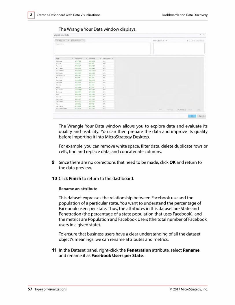
The Wrangle Your Data window displays.
The Wrangle Your Data window allows you to explore data and evaluate its quality and usability. You can then prepare the data and improve its quality before importing it into MicroStrategy Desktop.
For example, you can remove white space, filter data, delete duplicate rows or cells, find and replace data, and concatenate columns.
9 Since there are no corrections that need to be made, click OK and return to the data preview.
10 Click Finish to return to the dashboard.
Rename an attribute
This dataset expresses the relationship between Facebook use and the population of a particular state. You want to understand the percentage of Facebook users per state. Thus, the attributes in this dataset are State and Penetration (the percentage of a state population that uses Facebook), and the metrics are Population and Facebook Users (the total number of Facebook users in a given state).
To ensure that business users have a clear understanding of all the dataset object’s meanings, we can rename attributes and metrics.
11 In the Dataset panel, right-click the Penetration attribute, select Rename, and rename it as Facebook Users per State.

Dashboards and Data Discovery Create a Dashboard with Data Visualizations 2
© 2017 MicroStrategy, Inc. Types of visualizations 58
Add a visualization
The visualization needs to reveal how far Facebook has penetrated the market in individual states. You want to create a high-contrast visualization that allows viewers to quickly understand the connection between the population of a state and the number of Facebook users in a state. There are many possible approaches; a good place to start is with a simple and familiar visualization. To start, create a bar graph that presents the state population and the rate of Facebook use side by side as bars.
1 Click the Bar Chart icon in the Visualization Gallery.
2 Drag the Population and FB Users metrics from the Dataset panel to the Horizontal area in the Editor pane. Drag the State attribute to the Vertical box in the Editor panel.
3 To merge the graphs, drag Metric Names to the Vertical box on the Editor panel.

Create a Dashboard with Data Visualizations Dashboards and Data Discovery2
59 Types of visualizations © 2017 MicroStrategy, Inc.
Use Color-by to distinguish data
4 Drag Metric Names into the Color By area. This will create a visualization that displays a strong color contrast between the two metrics. You will now see a legend appear on the graph that indicates Population and FB Users
In addition to using Color by, we can also add the metric names to the left axis.
5 Right-click the State attribute in the Vertical area and select Left Row. The result should look like this:

Dashboards and Data Discovery Create a Dashboard with Data Visualizations 2
© 2017 MicroStrategy, Inc. Types of visualizations 60
Q. What other visualization types might work for this particular dashboard?
Rename the visualization
6 At the top of the Editor panel, click the drop-down arrow for Visualization 1 and select Rename.
7 Type the new name: Facebook Users per State.
Explore the data using other visualizations
Again, the point of the visualization is to clearly express the relationship between the number of Facebook users per state and the overall state population. Which of these visualizations is most useful?

Create a Dashboard with Data Visualizations Dashboards and Data Discovery2
61 Types of visualizations © 2017 MicroStrategy, Inc.
8 Hover the cursor over the visualization, then click the arrow icon on the top right corner. On the drop-down menu, point to Change Visualization and select Heat Map.
A grid is a good way of displaying textual and numerical items, but it lacks the ability to show trends and summaries the way a graph can. Network visualizations illustrate the relationships between items. A Heat Map displays a combination of colored rectangles, each representing an attribute element. Heat maps are the best option when you need to understand the impact of a large number of attribute elements at once.
The resulting visualization shows the percentage of a state’s population using Facebook. This visualization would be ideal except for the fact that some of the attribute headers cannot be displayed. The heat map boxes are too small for the text.

Dashboards and Data Discovery Create a Dashboard with Data Visualizations 2
© 2017 MicroStrategy, Inc. Types of visualizations 62
This is a vital element of visualization best practices. The display should always be easy to read, and all text should be clearly displayed so viewers can quickly grasp the information displayed in the visualization. Note the use of color here, as well. The contrast of red and green makes the visualization easy to analyze for someone who needs to quickly understand the information being conveyed.
9 To create an area graph, click the Area Graph icon in the Visualization Gallery.
10 On the Editor panel click Swap to switch the Vertical and Horizontal axes.
11 Drag Population from the Color by box to the Horizontal box.
12 Drag Metric Names to the Vertical box, to put both metrics on the same graph.

Create a Dashboard with Data Visualizations Dashboards and Data Discovery2
63 Types of visualizations © 2017 MicroStrategy, Inc.
13 Drag Metric Names to the Color by box so the metrics have different colors. Your visualization should now match the image below:
Ensure that you have State and Metric Names in the Vertical box; Population and FB Users in the Horizontal box; and Metric Names in the Color By box.
Whereas the bar graph used horizontal bars to display comparative rankings of individual items, the area graph uses shaded areas to create a visual comparison of the two items. In this case, the area graph compares the number of Facebook users per state and the overall state population. The area graph is therefore another good visualization format for users who need to ascertain the market penetration of Facebook in a particular state.
Additionally, all of the pertinent data is visible in the area graph, which makes it a better visualization choice for this example than the heat map. You can experiment with other visualization types to determine whether they are suitable for this particular dataset.
14 Save the dashboard as Facebook Use per State Dashboard. Close the dashboard.

© 2017 MicroStrategy, Inc. 64
3ANALYZE VISUALIZATIONS
Easily interact with your data visualizations to identify trends, patterns, and details at a glance. In this chapter we will focus on the following features that allow you to emphasize and examine your data in a more effective way:
• Layer data
• Filter data
• Sort data
• Drill into details of data
• Apply thresholds to highlight important changes in data
• Calculate data in new ways by combining metrics, creating derived metrics
• Insert text

Analyze Visualizations Dashboards and Data Discovery3
65 Group related data objects: layer data © 2017 MicroStrategy, Inc.
Group related data objects: layer dataBy default a dashboard contains one sheet, or page, of data. You can add sheets to a dashboard to create multiple layers of data. Sheets allow you to group and organize related data and objects. Layering your data onto sheets also makes for more effective data filtering which is discussed in the next section.
To add a new sheet click the tab with a + next to Sheet 1 at the bottom of the dashboard.
To access options for the selected sheet, including renaming or deleting, click the down-arrow on the tab.
Navigate between the different sheets by clicking on the desired tab.
Limit data to a specific value: filtersA filter is used to limit the amount of data visible on the dashboard. They can be used for an entire sheet of a dashboard, meaning they target multiple visualizations, or on a specific visualization. When datasets contain a large amount of data, a filter can help you to narrow down the focus of the visualization. For example, rather than viewing detailed information for every retail store, you can filter by a particular region, or by highest or lowest percentage of sales.

Dashboards and Data Discovery Analyze Visualizations 3
© 2017 MicroStrategy, Inc. Limit data to a specific value: filters 66
Filter a sheet
A sheet is a layer of data in a dashboard, it functions similarly to a worksheet in an Excel spreadsheet. You can add multiple sheets to each dashboard thus creating multiple pages. If filtering by sheet, the selected filter will be applied to all objects on that sheet. Place objects on different sheets to filter in different ways if needed.
To add a filter to a sheet, click and drag an attribute or metric from the dataset to the Filter tab on the Editor Panel. Attribute and metric filters will appear differently. In the following example, the Subcategory attribute and Revenue metric have been added to the Filter panel.
Notice that Sheet 1 is indicated at the top of the panel. The attribute filter provides a check box next to each element. Click all, or click only to only filter by a specific attribute element. The metric filter is displayed as a slider.

Analyze Visualizations Dashboards and Data Discovery3
67 Limit data to a specific value: filters © 2017 MicroStrategy, Inc.
In the example below, the Action subcategory was selected on the Filter panel. See how the dashboard changes? The Map and Bar Graph visualizations both change to only reflect data associated with the Action subcategory.
Right-click the attribute or metric in the Filter Panel to access additional filtering options:
Attribute Filter Options
Metric Filter Options

Dashboards and Data Discovery Analyze Visualizations 3
© 2017 MicroStrategy, Inc. Limit data to a specific value: filters 68
Filter a visualization
In addition to filtering all the objects on a sheet, you can also filter data within a specific visualization. Filtering a visualization works the same as filtering data on a sheet, except the filter only targets the selected visualization.
The following are high-level steps to create a filter for a visualization, find detailed steps on filtering a dashboard in the next exercise:
1 To insert a filter, click Insert on the toolbar. The filter pane will appear on the dashboard.
2 Drag your attribute or metric into the filter.
3 Once the object is placed in the filter, click Select Target.
4 Click the visualization you want to target with the filter and click Apply.
In the example below, the Profit metric has been added to the Filter pane and the Network visualization is the targeted visualization. Use the Profit slider to indicated a range of Profits on the filter, the data in the Network Visualization will be filtered to only show data that falls within that range.
Be sure that the filter contains objects that used in the data of the targeted visualization.

Analyze Visualizations Dashboards and Data Discovery3
69 Limit data to a specific value: filters © 2017 MicroStrategy, Inc.
In this example the Profit metric filter is displayed as a slider. The image below shows how the targeted visualization changes when the filter is applied:
Use visualizations as filters
If your dashboard contains multiple visualizations, you can use an object in one visualization to filter the other selected visualizations on the dashboard. For example, in the image above, you could designate the network visualization (Visualization 2) as a filter. If you were to click Electronics in the visualization, the data in the other visualizations would be filtered to only display data for electronics. Practice using visualizations as filters in Workshop 4 at the end of this chapter.
Activity: Filter the dashboard
In this activity we will apply a filter to the dashboard by dragging an object into the filter. This will filter all the visualizations that contain that object.
1 Locate the Supplier Dashboard.
2 On the Editor panel of the Supplier Dashboard, click the Filter tab.
3 Click and drag the Subcategory attribute onto the Filter panel.

Dashboards and Data Discovery Analyze Visualizations 3
© 2017 MicroStrategy, Inc. Limit data to a specific value: filters 70
4 On the Filter panel, click the down arrow to the right of Subcategory to view filter options.
5 In the drop-down menu, point to Display Style and select Drop-down.
6 From the Subcategory drop-down box, click Action.
Notice how the dashboard has changed.
Why is the Network visualization not affected by the filter?
7 Clear the filter by clicking the Subcategory down arrow and selecting Delete.

Analyze Visualizations Dashboards and Data Discovery3
71 Easily identify trends © 2017 MicroStrategy, Inc.
Easily identify trends
Sort data
Sort data to organize how the data is displayed on a visualization. You can sort data in ascending or descending order. To sort, right-click the object label on a grid or graph and select the sort order. The object label is the data label found on the graph axis. In the image below, Revenue and Supplier are the object labels.
To remove the sort once is has been applied, select Clear Sort. The example below shows a bar chart that has been sorted in ascending order. Sorting the data in this way helps users to better visualize trends and identify key information.
Keep in mind that sorting may not be available for every visualization.

Dashboards and Data Discovery Analyze Visualizations 3
© 2017 MicroStrategy, Inc. Easily identify trends 72
Forecast data: trend lines
You can display a trend line for each metric or for a specific metric. You can use a trend line to not only analyze your current data, but to also forecast or predict future values. Right-click the visualization to add a trend line.
Reference lines
Reference lines can be displayed in a graph. A reference line is a user-defined vertical or horizontal line on the graph. You can use these lines to compare, reference, and measure against your data. In the example below, a reference line

Analyze Visualizations Dashboards and Data Discovery3
73 Dig deeper into your data: Drill data © 2017 MicroStrategy, Inc.
was added near the top of the graph to show the maximum revenue value for the suppliers:
Similar to the trend line, a reference line can also be added by right-clicking on the graph. The available types of reference lines include:
• Minimum
• Maximum
• Average
• Median
• First
• Last
• Constant
Dig deeper into your data: Drill dataDrilling allows you to explore data at additional levels of detail beyond what is immediately visible. Drilling is available for Grid, Graph, Network, and Heat Map visualizations. Drilling within in specific visualization will not affect other dashboard visualizations. Available drilling options are dependent upon the dataset and the visualization.

Dashboards and Data Discovery Analyze Visualizations 3
© 2017 MicroStrategy, Inc. Dig deeper into your data: Drill data 74
For example, if your dataset contains geographical regions, states, and cities, you might be interested in drilling from regional data, to state, or down to city. This allows you to see how the data changes at different levels of the business. Below you will find high-level steps for drilling on a visualization.
To enable drilling, right-click an attribute element and select drill. Choose from a list of the available drill options to manipulate the data. In the example below the Network visualization was drilled down to Supplier:
To undo the drill and return to the original data display, select Clear All in the filter drop-down of the visualization, as seen below:
Activity: Sort data
1 In the Supplier Dashboard, in Visualization 3, right-click the Revenue metric name on the Y-axis of the bar graph.
2 Click Sort Ascending.
What information can you now quickly determine by glancing at the graph?

Analyze Visualizations Dashboards and Data Discovery3
75 Highlight important changes in data: thresholds © 2017 MicroStrategy, Inc.
Highlight important changes in data: thresholds
Apply thresholds to highlight metric data in a visualization when that data fulfills a specified condition. A color based threshold will apply a selected color to data that meets the threshold conditions. This can make analyzing large amounts of data easier because different colors are quickly identified.
A threshold is made up of two parts: the condition the data must meet to have the threshold formatting automatically applied, and the formatting that is applied when the value meets that condition. When you add a metric to the Color By area of a visualization, a default threshold is applied to the data.
When you create a threshold on a metric, you can apply the threshold formatting to:
• Metric values
• Metric subtotals
• Metric values and subtotals
You can also apply attribute element thresholds when you use Grid visualizations.
You can also create multiple thresholds on the same visualization, including thresholds with multiple conditions. Below you will find high-level steps for adding a threshold to a metric.
1 Select the visualization to apply the threshold.
2 In the Editor panel, right-click the metric to apply the threshold.

Dashboards and Data Discovery Analyze Visualizations 3
© 2017 MicroStrategy, Inc. Highlight important changes in data: thresholds 76
3 Select Thresholds from the menu.
4 In the Thresholds window make selections for the following:
Color: Select the color, or color range, that you want to apply to the metric when it meets the threshold’s conditions.
Based on: Determine whether you want the threshold color to be applied to the metric's rank or its value, when the metric meets the threshold's condition
Break by: Select the attribute level to restart counting rank or percentage values. Select None to continue without restarting. This option is only available for rank or percentage values.

Analyze Visualizations Dashboards and Data Discovery3
77 Highlight important changes in data: thresholds © 2017 MicroStrategy, Inc.
Color band: Click and drag the spacers to increase or decrease range values.
5 Click OK to apply the threshold.
6 To remove the threshold, return to the Editor Panel for the visualization, right-click the metric, and select Clear Thresholds.
Workshop 3: Visualization analysis
In this workshop, a company has delegated two employees to travel and speak at multiple conferences throughout the year. To help these employees reach their destination in a timely manner, their highly talented travel coordinator, Joe, will create a dashboard to examine airport data, including the number of flights and percent of delayed or canceled flights for each airport.
Part I
Joe needs to find out which airports the speakers should fly out of and which airlines have the lowest percentage of delayed or canceled flights. Joe begins by finding a dataset and importing it into Desktop. Given the particulars of this scenario, that dataset must contain the following information.
• Total number of flights for major U.S. airports
• Total number of cancellations for major U.S. airports
• Total number of delays for major U.S. airports

Dashboards and Data Discovery Analyze Visualizations 3
© 2017 MicroStrategy, Inc. Highlight important changes in data: thresholds 78
For the purpose of this exercise, we will assume that Joe has located or created a dataset that meets all of these criteria. We will import a preformatted spreadsheet that conveniently includes all the necessary data.
Joe is creating a bubble graph for the initial visualization.
Create the initial visualization
1 Open a new dashboard in Desktop. In the toolbar, click the Add Data icon and select New Data.
2 Click File From Disk.
3 In the Upload your files window, click Choose files and select the file Airline Data.xlsx click OK.
4 Click Prepare Data. You will notice that all the objects are listed as attributes. We need to revise the data to include metrics before we can successfully generate our visualizations.
5 Convert the following columns to metrics:
• Number of Flights
• Flights Canceled
• Flights Delayed

Analyze Visualizations Dashboards and Data Discovery3
79 Highlight important changes in data: thresholds © 2017 MicroStrategy, Inc.
To convert these columns to metrics, click the drop-down menu on the column title and select Convert to Metric.
If the preview is not expanded, click the arrow to expand and display all the data.
The data preview page should now look like this:
6 Click Finish.
Add a visualization
7 Click the Bubble Chart icon in the Visualization Gallery.
8 In the dashboard, place the following dataset objects in the indicated areas:

Dashboards and Data Discovery Analyze Visualizations 3
© 2017 MicroStrategy, Inc. Highlight important changes in data: thresholds 80
• Add the Origin Airport attribute to the Vertical box.
• Make the Flights Canceled metric the Horizontal box.
• Drag the Flights Delayed metric into the Color By box.
• Drag the Number of Flights metric into the Size By box.
The resulting dashboard should look like this:
The relatively small sizes of the bubbles make them difficult to see. We can further work with the dataset objects to make the visualization more effective.
9 To improve the readability of this chart, right-click the Flights Delayed metric in the Color By box and select Thresholds.

Analyze Visualizations Dashboards and Data Discovery3
81 Highlight important changes in data: thresholds © 2017 MicroStrategy, Inc.
10 Select Red-Orange-Green as the color and click Reversed. Click OK.
11 Save the dashboard as Airline Data Dashboard.
The dashboard should look like this:.
The location of each bubble in the graph shows the number of flights that were canceled for each airport. The size of each bubble represents how many flights each airport handled, and the color of the bubbles represents the percent of flights delayed.
Joe creates a filter for the Origin Airport attribute that displays only the airports in those two metropolitan areas the employees are traveling from.

Dashboards and Data Discovery Analyze Visualizations 3
© 2017 MicroStrategy, Inc. Highlight important changes in data: thresholds 82
Filter the data
1 Click the Filter tab in the Editor panel to apply a filter to the dashboard.
2 In the drop-down arrow for Sheet 1, point to Add Filters, and under Attributes, select Origin Airport. Click OK.
Begin typing the airport you want to add to the filter, and select it from the list that appears. In addition to adding the filter, you also want to indicate the actions the filter should take, in this case we want to include the airports in the filter.
3 In the Origin Airport box, type the airports in the Los Angeles and Washington, DC areas. These include:
• Baltimore/Washington International Thurgood Marshall
• Dulles International
• Ronald Reagan Washington National
• La/Ontario International
• Los Angeles International
• Long Beach Daugherty Field

Analyze Visualizations Dashboards and Data Discovery3
83 Highlight important changes in data: thresholds © 2017 MicroStrategy, Inc.
4 Set the filter to Include.
Once the filter has been completed, the dashboard should look like this:
5 Click Save.
This filter makes the visualization much easier to read. A quick glance at the graph shows Joe should book a flight from Los Angeles airport, because even though the cancellation rate is higher than the rate at other airports, more flight options are available.
While Baltimore has a higher percentage of delayed flights, it has a low cancellation rate and more flights. On the other hand, Dulles has a lower percentage of delays, but a higher percentage of cancellation and fewer flights. The employees would rather have their flight delayed than canceled, so Joe chooses Baltimore.

Dashboards and Data Discovery Analyze Visualizations 3
© 2017 MicroStrategy, Inc. Highlight important changes in data: thresholds 84
Part II
In this scenario, Joe is making travel plans for Sam and Alice’s annual joint Spring Convention presentation, which occurs in April. Alice and Sam have decided that Los Angeles (LAX) and Baltimore/Washington (BWI) are their preferred airports for commuting purposes, so Joe can only make travel plans using those two airports.
Additionally, because their schedules are so tight, Joe needs to know which day of the week is best for travel in terms of the percentage of delays from the respective airports. Joe is going to determine which day of the week in April is most convenient for Sam and Alice by creating a heat map.
Create a heat map
1 Add a new sheet for the second visualization by clicking the + icon at the bottom of the dashboard.
2 On Sheet 2, click the Heat Map icon in the Visualization Gallery.
3 Create a filter that ensures the visualization will only include results from the specific month and origin airport. Make sure both Month and Origin Airport are selected, then click OK.
4 Select April for the Month attribute filter. Hover over April and click Only to just apply that filter.

Analyze Visualizations Dashboards and Data Discovery3
85 Highlight important changes in data: thresholds © 2017 MicroStrategy, Inc.
5 To filter by airport, select Baltimore/Washington International Thurgood Marshall and Los Angeles International for the Origin Airport filter.
Your display may differ and may show Month filter on the top and Origin Airport filter on the bottom.
6 After the filters are applied, create a heat map that visualizes the number of flights delayed per airline, per day, in the month of April, at the selected airports:
• In the Editor panel, drag the Origin Airport and Day of Week attributes into the Grouping box.
• Add the Number of Flights metric into the Size by box.
• Remove Number of Flights from the Color by box.
• Add the Flights Delayed metric into the Color By box.
7 Right-click the Flights Delayed metric in the Color By box and select Thresholds.
8 On the Thresholds - Flights Delayed window, select Red Orange Green for the Color, and Lowest % for the Based on option. Click Reversed to have green

Dashboards and Data Discovery Analyze Visualizations 3
© 2017 MicroStrategy, Inc. Create a metric based on existing metrics: Derived metrics 86
represent the lowest end of the spectrum, with red indicating the high end of the spectrum. Next, click OK.
Based on this information, and bearing in mind their travel requirements, which day of the week is the best day for travel for both Sam and Alice? According to this heat map, the best travel day for both Sam and Alice is Saturday.
9 Save the dashboard and keep it open. We will continue this workshop after we learn about derived metrics.
Create a metric based on existing metrics: Derived metrics
Derived metrics are metrics that are created based on existing dataset objects. Derived metrics perform calculations on the fly with available data, without having to re-execute the dashboard against the data source. They are an easy way to present already available data in different ways, providing further analysis of the data.
You can use derived metrics to quickly perform analyses such as margins, contributions, and differences between metrics on the report.
Examples of way to include derived metrics are:
• Subtracting one metric value from another.
• Ranking a metric’s value from least to greatest.

Analyze Visualizations Dashboards and Data Discovery3
87 Create a metric based on existing metrics: Derived metrics © 2017 MicroStrategy, Inc.
• Displaying metric values as a percentage of the total.
Calculate values in an existing metric: Aggregate By
Aggregation functions are used to calculate subtotals for the metric. Examples of aggregate functions include: Sum, Average, Standard Deviation, and Median. You can create a derived metric using the aggregate function.
To create a derived metric using an aggregate function, right-click the metric in the Dataset panel. Select Aggregate By and choose a function. The function and metric name will appear as a new dataset object. In the example below, the Average function is selected for the Revenue metric:
Once the function is selected, the new metric appears in the dataset as Avg(Revenue).
Combine values of metrics: Calculations
You can create a new metric by combining existing metrics with an arithmetic operator. These operators allow you add, subtract, multiply, divide, or find the percentage of the selected metrics.

Dashboards and Data Discovery Analyze Visualizations 3
© 2017 MicroStrategy, Inc. Create a metric based on existing metrics: Derived metrics 88
To create a derived metric by combining two metrics with mathematical operators, right-click a metric in the dataset and select Calculation. The metric you initially selected will appear in the first drop-down box (you can change this). Next, select your mathematical operator. In the example below, the minus sign (-) was selected:
Use the drop-down menu in the next text field to select the second metric. In this example, Cost was selected:
When the new metric is created it will appear as (Revenue-Cost) in the dataset. To give more meaning to the derived metric, you can right-click and select rename. In this case, the new metric could be renamed Profit.

Analyze Visualizations Dashboards and Data Discovery3
89 Create a metric based on existing metrics: Derived metrics © 2017 MicroStrategy, Inc.
Create custom metrics using the Metric Editor
The Create Metric option is the most robust method to create metrics. Whereas the Aggregate by and Calculation derived metrics allow you to quickly create new metrics based on the objects in the Dataset Objects panel, the Create Metric option provides access to a number of advanced formula, function, and object options.
These derived metrics are created using the Metric Editor. To access the Metric Editor, right-click a metric in the dataset and select Create Metric. The Metric Editor window will appear:
In addition to using the listed functions and objects to build a new metric, click the Switch to Function Editor to customize the functions.
Workshop 3: Visualization analysis
This is a continuation of the previous workshop. In Part III, we will add derived metrics to the Airline Data Dashboard to find the best airline and day to fly. If you remember, Joe is booking flights for Sam and Alice. Sam is flying out of the DC area and Alice is flying out of California.
Part III

Dashboards and Data Discovery Analyze Visualizations 3
© 2017 MicroStrategy, Inc. Create a metric based on existing metrics: Derived metrics 90
Create derived metrics to analyze airport delays
1 Navigate to the open Airline Data Dashboard heat map.
2 On the Datasets panel, right-click Flights Delayed.
3 Select Calculation.
4 Choose the division symbol and add Number of Flights in the bottom drop-down. The new metric should be Flights Delayed/Number of Flights.
5 Right-click the new metric and select Rename. Type: Percentage Delayed
6 Right-click Percentage Delayed and select Number Format.
7 Ensure Percent is selected. Remove the decimal points.
8 Click OK.
9 Add Percentage Delayed to the Tooltip box on the Editor panel.
10 Hover over the days for each airport to see which days have the lowest percentage of delayed flights. You will see that Saturday is the best for both airports, which helps Joe to reaffirm his earlier decision to try and book flights on Saturday.
Now that Joe has confirmed the airport and the day of the week, he should determine which airline is most likely to get Sam and Alice to their convention on time.
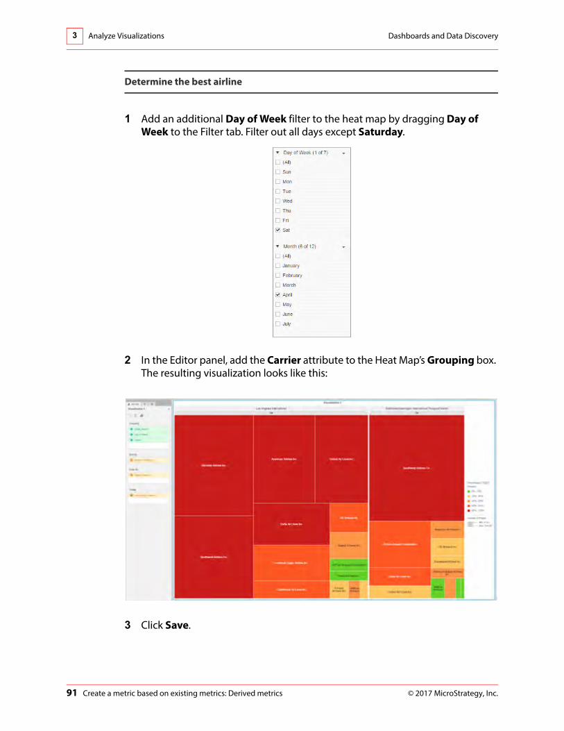
Analyze Visualizations Dashboards and Data Discovery3
91 Create a metric based on existing metrics: Derived metrics © 2017 MicroStrategy, Inc.
Determine the best airline
1 Add an additional Day of Week filter to the heat map by dragging Day of Week to the Filter tab. Filter out all days except Saturday.
2 In the Editor panel, add the Carrier attribute to the Heat Map’s Grouping box. The resulting visualization looks like this:
3 Click Save.

Dashboards and Data Discovery Analyze Visualizations 3
© 2017 MicroStrategy, Inc. Enhance your dashboard: insert text or images 92
We want to know which airline is most likely to get Sam and Alice to their convention on time.
At approximately 8%, Air Tran clearly has the best delay rate of any available airline at Los Angeles. Assuming Joe can find an appropriate booking, he should book Alice on Air Tran. In Sam’s case, the airline with the lowest delay rate is JetBlue, with a very low, 0%, cancellation rate.
In this workshop, Joe was able to build clear visualizations and come to his conclusions in a matter of minutes. In addition to planning flights for Sam and Alice, Joe can use Desktop to plan a variety of other travel obligations throughout the year.
Enhance your dashboard: insert text or images
While the main focus of dashboards are the visual representations of the data, these can be enhanced by adding text or images. Text can serve as a data label or provide descriptive information to users. Images, such as a corporate logo, can give the dashboard a polished look.
Add text
Adding text is an easy way to provide more information to users. Text can provide labels for visualizations, explain the data that is contained in the visualization, or provide additional information to users. Text can be formatted, resized, and repositioned on the dashboard.
To add text to the dashboard:
1 Click Insert on the toolbar and select Text.
2 The text box by default will appear at the top of the dashboard. Click and drag to move it to your desired location.

Analyze Visualizations Dashboards and Data Discovery3
93 Enhance your dashboard: insert text or images © 2017 MicroStrategy, Inc.
Dynamic text
In addition to typing static text into a text box, you also have the option of using the dataset objects to create dynamic text. For example, if you click and drag the Revenue metric into the text box you will see {Revenue} appear in text box. Press enter, and a revenue value will appear. This is the total Revenue for that dataset.
Using a dynamic variable in a text box means that the value that appears each time you look at this dashboard, will be automatically updated based on the latest data that is available for that Revenue metric in your data source. Dynamic text is created when dataset objects are dragged into the text box. Combine static text with dynamic text to give the value meaning. For example, to combine the text enter “Total Supplier Revenue:” before the metric value. The text field should read: Total Supplier Revenue: {Revenue}.
Add an image
You can add your corporate logo or a relevant image to enhance the overall look of your dashboard. Once you have inserted the image, you can even specify that it opens your company homepage by inserting a URL.
Exercise 3.1: Insert text and complete the dashboard
In this exercise we will insert a text box with a title for the dashboard, insert a text box with dynamic text showing total supplier revenue, and then insert a company

Dashboards and Data Discovery Analyze Visualizations 3
© 2017 MicroStrategy, Inc. Enhance your dashboard: insert text or images 94
logo that will link to the company website. Lastly, we will rename the visualizations with relevant titles.
Insert the title text
1 Open the Supplier Dashboard.
2 On the Supplier Dashboard toolbar, click Insert and select Text.
3 Click inside the text box and type: Supplier Report Dashboard.
4 With the text box selected, click the Format tab.
5 Change the Font size to 20.
6 In the drop-down list next to the font size, set the text color to White.
7 Set the Fill color to Black.
8 Type: Supplier Report Dashboard in the text box.
9 Click Save.
Add a text box with dynamic text
1 Click Insert on the toolbar and select Text.

Analyze Visualizations Dashboards and Data Discovery3
95 Enhance your dashboard: insert text or images © 2017 MicroStrategy, Inc.
2 Click and drag the new text box to the right of the title.
3 Place your cursor in the text field and type: Total Supplier Revenue
4 Click and drag the Revenue metric from the dataset and place it to the right of the entered text.
5 With the text box selected, click the Format tab on the Editor panel.
6 Change the Font size to 14.
7 Change the text color to White.
8 Change the background fill color to Black.
Resize the text box
9 Click and drag the left side of the Total Supplier Revenue text box, to the right of the screen so that the dashboard title takes up the majority of the space at the top of the dashboard, as seen in the image below:
Add an image
1 Click Insert, then select Image.
2 Click and drag the image container to the left of the text box as seen below.
3 Copy and paste the following URL into the Enter an image field: https://www.microstrategy.com/Strategy/media/images/homepage/mini-banners/mini-banner_mstr-10.png
4 Click OK. You will see the image appear.

Dashboards and Data Discovery Analyze Visualizations 3
© 2017 MicroStrategy, Inc. Enhance your dashboard: insert text or images 96
Resize the image container
5 To resize the image container, click the right side of the container and drag it until it reaches the desired size.
Edit the image
6 Select the image container and click the Format tab on the Editor Panel.
7 Change the Fill color to Black.
8 In the Link section, in the drop-down list, select Navigate to URL.
9 Enter the following URL: www.microstrategy.com
10 Click and drag the image to the left of the Supplier Report Dashboard text box as seen in the image above.
11 Click Save.

Analyze Visualizations Dashboards and Data Discovery3
97 Enhance your dashboard: insert text or images © 2017 MicroStrategy, Inc.
The next phase of creating the dashboard we will create labels for the visualizations so that the purpose of the data is clear to users. There are a variety of ways to create these labels, including adding text boxes. For the last step of this exercise, however, we will change the name of the visualization title.
Rename the visualizations
1 To rename the Map visualization, double-click the title Visualization 1.
2 When the text is highlighted, click Delete.
3 Type the new title: Profit and Revenue per Supplier Location.
4 Repeat these steps and rename the Network Visualization: Profit Analysis for Region and Category.
5 Rename Visualization 3 as: Revenue per Supplier.
6 Click Save.
Analyze the dashboard
1 View the dashboard in Presentation Mode.

Dashboards and Data Discovery Analyze Visualizations 3
© 2017 MicroStrategy, Inc. Enhance your dashboard: insert text or images 98
2 Click the company logo to launch the homepage.
3 Explore the visualizations by doing the following:
c Hover over a data point to view more details.
d Sort a visualization.
e View drill options for the Bar Graph.
f Change the view of the Network Visualization.
g Change the style of the map.
4 Return to Edit Mode and add a Revenue filter to the dashboard. See how the visualizations and Revenue text box change.
Workshop 4: Analyze data to determine areas of opportunity
Sydney Electronics is a growing online store selling electronics products. The company recently created a blog to engage with customers and increase its online presence. The executives of Sydney Electronics want to obtain an overall view of the successes and failures of each blog article author. They are looking for growth in the number of views and the number of different interactions for each author. Specifically, they are looking for any areas that need to be improved or adjusted. In this exercise, you will create a dashboard that enables the executives to explore the overall and detailed information about each author.
In this workshop, we will create derived metrics and apply them to visualizations to determine the success and failures of the blog articles.
Add a dataset
1 Open a new dashboard in Desktop. Click Add Data and select New Data.
2 Click File From Disk.
3 Click Choose files and upload the Article Database.xlsx file.
4 Click Prepare Data. Be sure to select both the Blog Stats and Followers worksheets when prompted, and click Select.

Analyze Visualizations Dashboards and Data Discovery3
99 Enhance your dashboard: insert text or images © 2017 MicroStrategy, Inc.
5 In the Preview window, note that there are several columns marked as attributes that need to be converted into metrics. Convert the following columns into metrics by right-clicking next to the specific attribute and selecting Convert to Metric.
• Number of View
• Number of Comments
• Number of Favorites
• Number of Shares
• Shares
• Favorites
• Comments
The revised data should look like this in the Preview window:
6 Click Finish to update the dataset.
Create derived metrics to add to the visualizations
7 In the Dataset panel, right-click the Reader attribute and select Duplicate as Metric; the new Count (Reader) metric is created and displayed.

Dashboards and Data Discovery Analyze Visualizations 3
© 2017 MicroStrategy, Inc. Enhance your dashboard: insert text or images 100
8 In the Dataset panel, right-click the Count (Reader) metric and select Edit. In the Display Name box, type Number of Views II.
9 Click Switch to Formula Editor.
10 In the formula box, change Distinct=True to Distinct=False.
11 Click Save.
12 In the Visualization Gallery, click Line Chart.
13 In the Dataset panel, drag the View Month attribute to the Horizontal box.
14 Drag the Number of Views II metric to the Vertical area.

Analyze Visualizations Dashboards and Data Discovery3
101 Enhance your dashboard: insert text or images © 2017 MicroStrategy, Inc.
15 Drag the Author attribute to the Color By box. The visualization will display as shown below.
The visualization now shows the number of views per month, with each line representing a different author.
16 Add a second visualization using the Insert Visualization icon on the toolbar.
Make sure that the new visualization is displayed as a grid. If it is not, click the Grid icon in the Visualization Gallery.

Dashboards and Data Discovery Analyze Visualizations 3
© 2017 MicroStrategy, Inc. Enhance your dashboard: insert text or images 102
17 In the new visualization, drag the Author attribute to the Rows box. Drag the View Month attribute to the Columns box.
18 Add the Shares, Favorites, and Comments metrics to the Metrics box.
19 Click the grid visualization’s (Visualization 2) title bar and drag it below the first. The result should match the image below:
Add a filter
20 In the first visualization, on the top right corner, click the down arrow, and select Use as Filter.

Analyze Visualizations Dashboards and Data Discovery3
103 Enhance your dashboard: insert text or images © 2017 MicroStrategy, Inc.
21 In the Filter options window, select Visualization 2. Click OK.
You can now control the grid data in Visualization 2 by selecting a month or months from Visualization 1.
22 Save the dashboard as Article Database Dashboard in the My Dashboards folder.
Notice how the filter allows users to obtain detailed information much more quickly.
Analyze the visualization
• Which author had the most views in July?
• In June, which author had the highest number of favorites, shares, and comments?
• In April, which authors show a decrease in the number of views?

Dashboards and Data Discovery Analyze Visualizations 3
© 2017 MicroStrategy, Inc. Enhance your dashboard: insert text or images 104
Add a new sheet and create derived metrics
1 At the bottom of the dashboard window, click the + icon to add a new sheet.
2 In the Dataset panel, right-click Comments, point to Calculation and click ÷.
3 In the top drop-down list, leave Comments selected and in the bottom drop-down list, select Number of Views II. Click OK.
4 A derived metric displays in the Dataset panel. This derived metric is named (Comments/Number of Views II). Right-click it and select Rename to rename it as Comment Rate.
5 Repeat the appropriate steps above, with Favorites and Shares. Create derived metrics by dividing Favorites and Shares by Number of Views II. Name the new derived metrics Favorite Rate and Share Rate.
Add a bubble chart
1 Click the Bubble Chart icon in the Visualization Gallery.
2 In the Dataset panel, drag the Author attribute to the Vertical box. Drag the Comment Rate metric to the Horizontal box. Drag the Share Rate metric to the Color By box.
3 The current color scheme does not allow for a quick analysis. To make the color scheme more visually representative of the data, right-click the Share Rate metric in the Color By box, and select Thresholds.
4 Select Red-Orange-Green for a color scheme that offers a higher degree of contrast. In the Based on drop-down list, select Value and click OK.

Analyze Visualizations Dashboards and Data Discovery3
105 Enhance your dashboard: insert text or images © 2017 MicroStrategy, Inc.
5 Drag the Favorite Rate metric to the Size By box.
6 In the Editor panel, click the Format tab.
7 In the top drop-down box, select Data Exploration.
8 In the Max size drop-down list, select Manual.
• In the box, type 1.
9 From the Min size drop-down list, select Adjusted Range.
• Type .5 in the box.
The Format tab in the Editor panel should look like this:

Dashboards and Data Discovery Analyze Visualizations 3
© 2017 MicroStrategy, Inc. Enhance your dashboard: insert text or images 106
The dashboard should now look like this:
Analyze the visualization
Based on this dashboard, answer the following questions.
• Which author has the lowest comment rate?
• Which authors have the best share rate?
• Which author has the highest favorite rate?

Analyze Visualizations Dashboards and Data Discovery3
107 Enhance your dashboard: insert text or images © 2017 MicroStrategy, Inc.
Drill down from author
1 Right-click the circle for Filaro, point to Drill and select Article Topic.
The resulting bubble visualization displays Filaro’s article topics.

Dashboards and Data Discovery Analyze Visualizations 3
© 2017 MicroStrategy, Inc. Enhance your dashboard: insert text or images 108
Analyze the visualization
Answer the following questions based on this visualization:
• Which topic had the highest comment rate?
• Which topic had the highest share rate?
• Which topic had the lowest share rate?
• Which topic was the least favorite?

Analyze Visualizations Dashboards and Data Discovery3
109 Enhance your dashboard: insert text or images © 2017 MicroStrategy, Inc.

© 2017 MicroStrategy, Inc. Annotate a dashboard 110
4PUBLISH DASHBOARDS
Once you have created your dashboard you can:
• Annotate the dashboard: Add comments and shapes to save and share thoughts and observations on the data.
• Save the dashboard as an MSTR file that can be sent to other users.
• View the dashboard as an image or PDF when you export the dashboard.
• Export data for an individual visualization to analyze a specific set of data.
• Further analyze your data using other programs in the MicroStrategy Enterprise.
Annotate a dashboardUse the Annotation Mode feature to create a temporary snapshot of your dashboard and add comments and shapes to highlight specific areas of the dashboard. You can use annotations to highlight key data points and then save and share the image file.

Publish Dashboards Dashboards and Data Discovery4
111 Save a dashboard © 2017 MicroStrategy, Inc.
Click Annotate Mode on the toolbar to access the annotation tools. Once you have completed annotating the dashboard click Export to save and send the image file.
Save a dashboardWhen you save a dashboard all of the objects, visualizations, filters, etc. are saved as a.mstr file. You can then share this file with other MicroStrategy Desktop users. If you are connected to the MicroStrategy Enterprise Platform, users can open this file in other MicroStrategy programs such as Web.
Export a dashboardExporting a dashboard allows you to view the dashboard results outside of MicroStrategy. You can download, view, print, and share the files with other users and on other devices. The PDF will display some visualizations in grid format. If you want to view the visualizations as you see them on the screen, save the dashboard as an image.

Dashboards and Data Discovery Publish Dashboards 4
© 2017 MicroStrategy, Inc. Export a visualization 112
You can export a dashboard in the following formats:
• Image: Save the dashboard as a PNG file.
• PDF: View the PDF on any device with a PDF reader such as your mobile device while you’re on the go.
• MSTR file: As mentioned above, you can transfer the dashboard data to other MicroStratgey users
Export a visualizationYou can export the data for a visualization to the following formats:
• Data
• Excel
To export data for a specific visualization, right-click the visualization and select Show Data. In the Show Data window, from the Export Data drop-down list, select the format you want to export the dashboard to. Below is an image of the high-level steps mentioned above.

Publish Dashboards Dashboards and Data Discovery4
113 Exercise 4.1: Export the dashboard © 2017 MicroStrategy, Inc.
Exercise 4.1: Export the dashboardIn this exercise, we will compare the differences in exporting to PDF vs. exporting as an image file.
Export to PDF
1 Open the Supplier Dashboard file.
2 From the File menu, point to Export, and select PDF.
3 Save the Supplier Dashboard file in the default location (C:\Users\mstr\Documents\MicroStrategy\My Dashboards).
4 Navigate to the folder listed above and view the PDF.

Dashboards and Data Discovery Publish Dashboards 4
© 2017 MicroStrategy, Inc. Further analyze your data 114
Export to PNG
When you export the dashboard as an image any open panels (dataset objects, visualization gallery, etc.) will be included. To just export an image of the dashboard we have to hide the Desktop panels.
1 Click the View menu and clear all the panels.
2 From the File menu, click Export, then Image.
3 Save the image in the default location.
4 Open and view the image.
Further analyze your dataIn this course, we started by importing our data to create a dataset that would serve as the foundation for our dashboard. From this dataset we added visualizations that served as interactive representations of key data, allowing us to identify trends and opportunities at a glance. Once the dashboard was created we learned how to share and analyze our findings.
In addition to Desktop, the MicroStrategy Enterprise has many tools that can help you take your data analysis to new levels. Use MicroStrategy Report Services to create detailed analysis of data objects, such as creating filters, prompts, and custom metrics. Use tools such as MicroStrategy Web to create boardroom quality documents that can be deployed throughout the company via the Intelligence

Publish Dashboards Dashboards and Data Discovery4
115 Further analyze your data © 2017 MicroStrategy, Inc.
Server. Create and subscribe to the delivery of visual documents to receive the latest data. These documents build on the capabilities discussed in Desktop. Access your data even easier by deploying these reports and documents to your mobile device so that you can access your data any time, any where.

© 2017 MicroStrategy, Inc. Create and analyze the Worldwide Emissions Analysis dashboard 116
5WORKSHOP: DASHBOARD ANALYSIS
Create and analyze the Worldwide Emissions Analysis dashboard
For this workshop, you will design a dashboard to analyze worldwide, energy-related carbon dioxide emissions data for the past twenty years. The data used in the exercise comes from the US Energy Information Administration office (http.//www.eia.gov). You will apply the concepts you have used throughout this course to analyze the data.
Add data
1 Open a new dashboard.
2 Click the Add Data icon at the top of the dashboard and select New Data.
3 Click File From Disk.
4 Click Choose files.

Workshop: Dashboard Analysis Dashboards and Data Discovery5
117 Create and analyze the Worldwide Emissions Analysis dashboard © 2017 MicroStrategy, Inc.
5 Select Worldwide Emissions 1990-2010 II.xlsx, and click Open. Click Prepare Data.
Wrangle data
We need to make sure that USA is listed as United States so that the map can locate the country properly. We can do this by using the Wrangle data feature.
6 Click Wrangle.
7 In order to see all of the data, click Sample Size in the right corner of the data window and enter 5000. You are indicating that you would like to see the first 5000 rows of data. A message will appear that all data is visible, click OK.
8 Select the Country column and select Text Selector from the function drop-down.
9 Locate USA in the list and click Edit.
10 Change USA to United States and click Apply to All.
11 Click OK, then click Finish.

Dashboards and Data Discovery Workshop: Dashboard Analysis 5
© 2017 MicroStrategy, Inc. Create and analyze the Worldwide Emissions Analysis dashboard 118
Create visualizations
1 Using the Grid visualization, place the Country attribute in the Rows area.
Since this dataset does not contain a metric for Total Emissions, create this metric by adding together the emissions generated by all of the energy sources available. You will also create a derived metric for Emissions per Capita, defined as Total Emissions divided by Population (m).
2 In the Dataset panel, right-click the From Coal metric and select Create Metric.
3 From the Available Objects list in the middle, double-click From Coal to add it to the Formula pane.
4 In the Formula pane, click + after the metric. Repeat the above step with the From Natural Gas and From Petroleum metrics, until the following formula

Workshop: Dashboard Analysis Dashboards and Data Discovery5
119 Create and analyze the Worldwide Emissions Analysis dashboard © 2017 MicroStrategy, Inc.
is complete: [From Coal] + [From Natural Gas] + [From Petroleum]. In the Metric Name box, type Total Emissions as the metric name.
5 Click Save.
6 In the Dataset panel, right-click Total Emissions, point to Calculation and click ÷.
7 In the top drop-down list, leave Total Emissions selected and in the bottom drop-down list, select Population (m).
8 Click OK. Rename the derived metric as Emissions per Capita.

Dashboards and Data Discovery Workshop: Dashboard Analysis 5
© 2017 MicroStrategy, Inc. Create and analyze the Worldwide Emissions Analysis dashboard 120
9 Save the dashboard as Worldwide Emissions Analysis I.
Now you are ready to create a new visualization.
10 Hover the cursor over the visualization and on the top right corner, click the arrow icon, point to Change Visualization, and click Map.
11 Drag the Country attribute to the Geo Attribute box.
12 Drag the Total Emissions metric to the Color By box.
13 Drag the Emissions per Capita metric to the Tooltip box,
14 Set the following threshold conditions for the Total Emissions metric:
• For Color, select Red-Orange-Green and click Reversed.
• For Based on, select Highest%.
Use the available options to make sure that green represents the lowest end of the spectrum, while red represents the highest.
The selection of color in a visualization is an important element of visualization best practices. In this case, you are creating a visualization to represent different levels of carbon emissions in various locations. Viewers will commonly identify the color green as the most favorable emissions rating, because the color green is readily identifiable with environmentalism and

Workshop: Dashboard Analysis Dashboards and Data Discovery5
121 Create and analyze the Worldwide Emissions Analysis dashboard © 2017 MicroStrategy, Inc.
ecologically sound practices. Likewise, the color red generally signifies the higher end of the spectrum in comparative analyses. Red is also associated with environmental hazards. When creating visualizations, consider how the viewer will relate to the color scheme and the overall appearance of the visualization. Are there ideas tied to the use of colors and imagery in specific situations?
15 Click OK.
16 On the Format tab, in the Graphic type drop-down list, select Area.
The dashboard should now look like this:
You may need to zoom and center the map.
Create a second visualization that will indicate yearly emissions data. To maximize the contrast of items defined in visualization best practices, make the second visualization a bar chart.
Add a second visualization to the dashboard
1 Insert a Combo Chart from Visualization Gallery.
2 Drag the Year attribute to the Horizontal area.
3 Drag the Emissions per Capita, Population (m), and Total Emissions metrics to the Vertical area.
4 Drag Metric Names from the Vertical area to the Color By area.

Dashboards and Data Discovery Workshop: Dashboard Analysis 5
© 2017 MicroStrategy, Inc. Create and analyze the Worldwide Emissions Analysis dashboard 122
5 Right-click Emissions per Capita in the Vertical area, point to Number Format, and in the drop-down list, select Fixed.
6 Click OK. Maximize the visualization to see it more clearly.
7 Use the drop-down menu to Restore the original dashboard.
8 Click Save.
Now you will add a third visualization. To maximize the contrast with the first two visualizations, make the third visualization a Line Chart.
9 For Visualization 3, drag the Year attribute to the Horizontal area.
10 Next, drag the From Coal, From Natural Gas, and From Petroleum metrics to the Vertical area.
11 Drag Metric Names to the Color By area.

Workshop: Dashboard Analysis Dashboards and Data Discovery5
123 Create and analyze the Worldwide Emissions Analysis dashboard © 2017 MicroStrategy, Inc.
12 Maximize the third visualization. It should look like this:
13 Return to the main view of the dashboard.
You have now created a dashboard with three visualizations.
Rename the visualizations
1 Rename the visualizations by clicking the down arrow at the top of each visualization:
• Visualization 1 should be renamed Worldwide Emissions Map.
• Visualization 2 should be renamed Yearly Emissions Data.
• Visualization 3 should be renamed Detailed Emissions Data.

Dashboards and Data Discovery Workshop: Dashboard Analysis 5
© 2017 MicroStrategy, Inc. Create and analyze the Worldwide Emissions Analysis dashboard 124
2 Save the dashboard. When complete, the dashboard should look like the image below:
Put the dashboard to the test by answering the following questions using the visualizations.
1 What is the emissions per capita of Canada?
Since you need a specific emissions statistic, simply click o Canada in the Worldwide Emissions map for the answer.
Use the other two visualizations to acquire insight relating to long-term changes and overall trends.
2 What is the overall trend in worldwide emissions?
3 Notice that overall emissions declined in 2009, the only year in the total number of years surveyed that indicates emissions decreases in all three

Workshop: Dashboard Analysis Dashboards and Data Discovery5
125 Create and analyze the Worldwide Emissions Analysis dashboard © 2017 MicroStrategy, Inc.
emissions sources. Why is that? What broader socio-political context might explain this single yearly decrease?

Copyright Information
All Contents Copyright © 2016 MicroStrategy Incorporated. All Rights Reserved.
Trademark Information
MicroStrategy, MicroStrategy 10, MicroStrategy 10 Secure Enterprise, MicroStrategy 9, MicroStrategy 9s, MicroStrategy Analytics, MicroStrategy Analytics Platform, MicroStrategy Desktop, MicroStrategy Operations Manager, MicroStrategy Analytics Enterprise, MicroStrategy Evaluation Edition, MicroStrategy Secure Enterprise, MicroStrategy Web, MicroStrategy Mobile, MicroStrategy Server, MicroStrategy Parallel Relational In-Memory Engine (MicroStrategy PRIME), MicroStrategy MultiSource, MicroStrategy OLAP Services, MicroStrategy Intelligence Server, MicroStrategy Intelligence Server Universal, MicroStrategy Distribution Services, MicroStrategy Report Services, MicroStrategy Transaction Services, MicroStrategy Visual Insight, MicroStrategy Web Reporter, MicroStrategy Web Analyst, MicroStrategy Office, MicroStrategy Data Mining Services, MicroStrategy Narrowcast Server, MicroStrategy Health Center, MicroStrategy Analyst, MicroStrategy Developer, MicroStrategy Web Professional, MicroStrategy Architect, MicroStrategy SDK, MicroStrategy Command Manager, MicroStrategy Enterprise Manager, MicroStrategy Object Manager, MicroStrategy Integrity Manager, MicroStrategy System Manager, MicroStrategy Analytics App, MicroStrategy Mobile App, MicroStrategy Tech Support App, MicroStrategy Mobile App Platform, MicroStrategy Cloud, MicroStrategy R Integration, Dossier, Usher, MicroStrategy Usher, Usher Badge, Usher Security, Usher Security Server, Usher Mobile, Usher Analytics, Usher Network Manager, Usher Professional, MicroStrategy Services, MicroStrategy Professional Services, MicroStrategy Consulting, MicroStrategy Customer Services, MicroStrategy Education, MicroStrategy University, MicroStrategy Managed Services, BI QuickStrike, Mobile QuickStrike, Transaction Services QuickStrike Perennial Education Pass, MicroStrategy Web Based Training (WBT), MicroStrategy World, Best in Business Intelligence, Pixel Perfect, Global Delivery Center, Direct Connect, Enterprise Grade Security For Every Business, Build Your Own Business Apps, Code-Free, Welcome to Ideal, The World’s Most Comprehensive Analytics Platform, The World’s Most Comprehensive Analytics Platform. Period.
All other company and product names may be trademarks of the respective companies with which they are associated. Specifications are subject to change without notice. MicroStrategy is not responsible for errors or omissions. MicroStrategy makes no warranties or commitments concerning the availability of future products or versions that may be planned or under development.
Patent Information
This product is patented. One or more of the following patents may apply to the product sold herein: U.S. Patent Nos. 6,154,766, 6,173,310, 6,260,050, 6,263,051, 6,269,393, 6,279,033, 6,567,796, 6,587,547, 6,606,596, 6,658,093, 6,658,432, 6,662,195, 6,671,715, 6,691,100, 6,694,316, 6,697,808, 6,704,723, 6,741,980, 6,765,997, 6,768,788, 6,772,137, 6,788,768, 6,798,867, 6,801,910, 6,820,073, 6,829,334, 6,836,537, 6,850,603, 6,859,798, 6,873,693, 6,885,734, 6,940,953, 6,964,012, 6,977,992, 6,996,568, 6,996,569, 7,003,512, 7,010,518,

Dashboards and Data Discovery
© 2017 MicroStrategy, Inc. 127
7,016,480, 7,020,251, 7,039,165, 7,082,422, 7,113,474, 7,113,993, 7,127,403, 7,174,349, 7,181,417, 7,194,457, 7,197,461, 7,228,303, 7,260,577, 7,266,181, 7,272,212, 7,302,639, 7,324,942, 7,330,847, 7,340,040, 7,356,758, 7,356,840, 7,415,438, 7,428,302, 7,430,562, 7,440,898, 7,486,780, 7,509,671, 7,516,181, 7,559,048, 7,574,376, 7,617,201, 7,725,811, 7,801,967, 7,836,178, 7,861,161, 7,861,253, 7,881,443, 7,925,616, 7,945,584, 7,970,782, 8,005,870, 8,035,382, 8,051,168, 8,051,369, 8,094,788, 8,130,918, 8,296,287, 8,321,411, 8,452,755, 8,521,733, 8,522,192, 8,577,902, 8,606,813, 8,607,138, 8,645,313, 8,761,659, 8,775,807, 8,782,083, 8,812,490, 8,832,588, 8,943,044, 8,943,187. 8,958,537, 8,966,597, 8,983,440, 8,984,274, 8,984,288, 8,995,628, 9,027,099, 9,027,105, 9,037, 577, 9,038,152, 9,076,006, 9,086,837, 9,116,954, 9,124,630, 9,154,303, 9,154,486, 9,160,727, 9,166,986, 9,171,073, 9,172,699, 9,173,101, 9,183, 317, 9,195,814, 9,208,213, 9,208,444, 9,262,481, 9,264,415, 9,264,480, 9,269,358, 9,275,127, 9,292,571, 9,300,646, 9,311,683 9,313,206, 9,330,174, 9,338,157, 9,361,392, 9,378,386, 9,386,416, 9,391,782, 9,397,838, 9,397,980, 9,405,804, 9,413,710, 9,413,794, 9,430,629, 9,432,808, 9,438,597, 9,444,805, 9,450,942, 9,450,958, and 9,454,594. Other patent applications are pending.
This Course (course and course materials) and any Software are provided “as is” and without express or limited warranty of any kind by either MicroStrategy Incorporated (“MicroStrategy”) or anyone who has been involved in the creation, production, or distribution of the Course or Software, including, but not limited to, the implied warranties of merchantability and fitness for a particular purpose. The entire risk as to the quality and performance of the Course and Software is with you. Should the Course or Software prove defective, you (and not MicroStrategy or anyone else who has been involved with the creation, production, or distribution of the Course or Software) assume the entire cost of all necessary servicing, repair, or correction.
In no event will MicroStrategy or any other person involved with the creation, production, or distribution of the Course or Software be liable to you on account of any claim for damage, including any lost profits, lost savings, or other special, incidental, consequential, or exemplary damages, including but not limited to any damages assessed against or paid by you to any third party, arising from the use, inability to use, quality, or performance of such Course and Software, even if MicroStrategy or any such other person or entity has been advised of the possibility of such damages, or for the claim by any other party. In addition, MicroStrategy or any other person involved in the creation, production, or distribution of the Course and Software shall not be liable for any claim by you or any other party for damages arising from the use, inability to use, quality, or performance of such Course and Software, based upon principles of contract warranty, negligence, strict liability for the negligence of indemnity or contribution, the failure of any remedy to achieve its essential purpose, or otherwise.The Course and the Software are copyrighted and all rights are reserved by MicroStrategy.
MicroStrategy reserves the right to make periodic modifications to the Course or the Software without obligation to notify any person or entity of such revision. Copying, duplicating, selling, or otherwise distributing any part of the Course or Software without prior written consent of an authorized representative of MicroStrategy are prohibited.

1850 Towers Crescent Plaza | Tysons Corner, VA 22182 | Copyright ©2017. All Rights Reserved. microstrategy.comCOLL-1664 Dashboards and Data Discovery