MGA Brand Guidelines
7
BRAND GUIDELINES SEPTEMBER 2016
-
Upload
alexandra-diamond-tumbush -
Category
Documents
-
view
18 -
download
0
Transcript of MGA Brand Guidelines

BRAND GUIDELINES
SEPTEMBER 2016

1
The MGA BrandAccurate. Accepted. Trusted.
MGA Research Corporation is a trusted third-party provider of product testing and advanced testing equipment.
The MGA brand can best be summarized in three “We” statements:
» We are competent.» We are efficient.» We will not sacrifice accuracy for speed.
Technical competency is at the core of the MGA brand, which has come to represent accuracy and objectivity in our procedures and reports. Our processes and expertise also allow us to deliver results that can be repeated.
Three visionary Cornell Aeronautical Laboratory engineers – Patrick Miller, Jim Greene, and Rudy Arendt – pooled resources and talents in 1977 to launch an innovative product-testing company in Buffalo, NY, which they named MGA Research Corporation. From the start, MGA leadership was focused on growth and reinvestment in the company, which has resulted in several expansions and acquisitions. By the close of the 1980s, MGA had developed a strong reputation in transportation safety and today is recognized as a world-leading, independent organization specializing in crash testing.
Our History
32
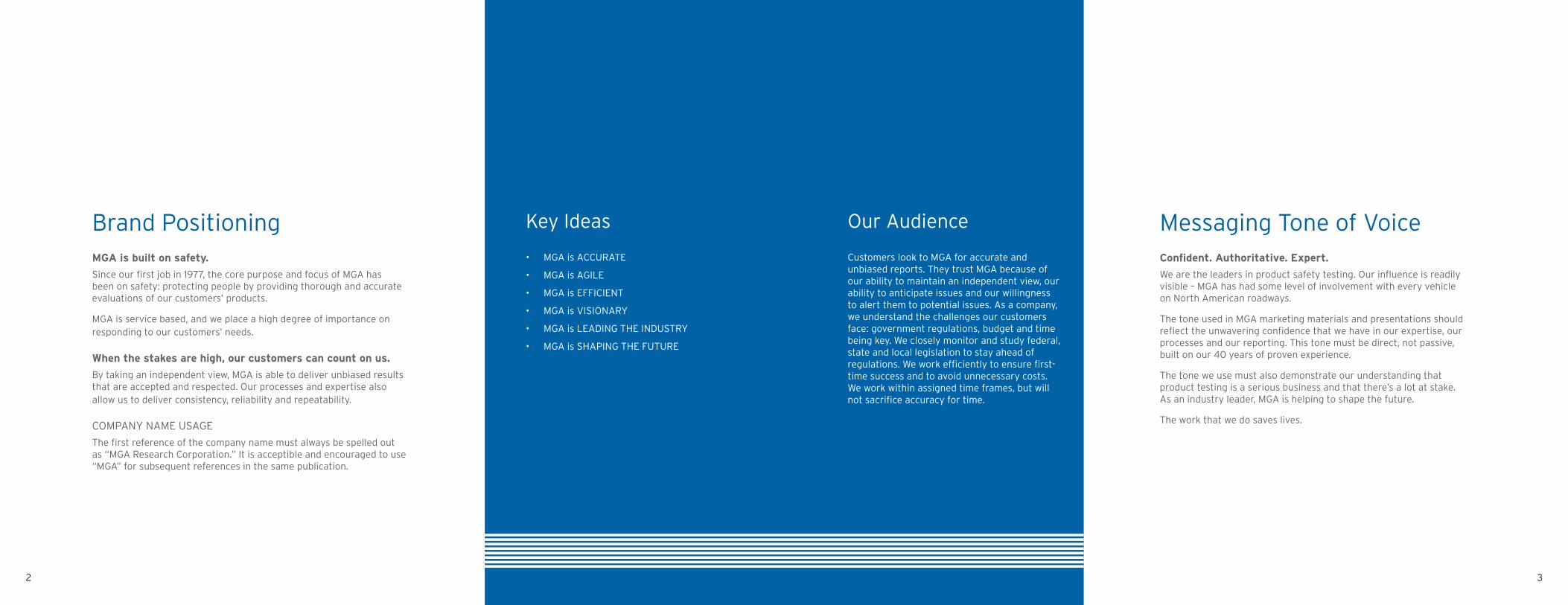
Brand PositioningMGA is built on safety.
Since our first job in 1977, the core purpose and focus of MGA has been on safety: protecting people by providing thorough and accurate evaluations of our customers’ products.
MGA is service based, and we place a high degree of importance on responding to our customers’ needs.
When the stakes are high, our customers can count on us.
By taking an independent view, MGA is able to deliver unbiased results that are accepted and respected. Our processes and expertise also allow us to deliver consistency, reliability and repeatability.
COMPANY NAME USAGE
The first reference of the company name must always be spelled out as “MGA Research Corporation.” It is acceptible and encouraged to use “MGA” for subsequent references in the same publication.
Messaging Tone of VoiceConfident. Authoritative. Expert.
We are the leaders in product safety testing. Our influence is readily visible – MGA has had some level of involvement with every vehicle on North American roadways.
The tone used in MGA marketing materials and presentations should reflect the unwavering confidence that we have in our expertise, our processes and our reporting. This tone must be direct, not passive, built on our 40 years of proven experience.
The tone we use must also demonstrate our understanding that product testing is a serious business and that there’s a lot at stake. As an industry leader, MGA is helping to shape the future.
The work that we do saves lives.
• MGA is ACCURATE
• MGA is AGILE
• MGA is EFFICIENT
• MGA is VISIONARY
• MGA is LEADING THE INDUSTRY
• MGA is SHAPING THE FUTURE
Key Ideas
Customers look to MGA for accurate and unbiased reports. They trust MGA because of our ability to maintain an independent view, our ability to anticipate issues and our willingness to alert them to potential issues. As a company, we understand the challenges our customers face: government regulations, budget and time being key. We closely monitor and study federal, state and local legislation to stay ahead of regulations. We work efficiently to ensure first-time success and to avoid unnecessary costs. We work within assigned time frames, but will not sacrifice accuracy for time.
Our Audience

54
MGA Logo CompositionThe MGA logo – always appears as a single color in PMS 300 or Black in either positive or reverse applications. The logo consists of the stylized letter forms “m g a”, the subline “mga research corporation” and supporting “motion marks,” which are the horizontal lines leading the letter forms at left. Those lines symbolize the forward focus of the company.
The MGA logo should be placed so that it stands apart from any other words and/or graphics. As demonstrated at right, the “safe zone” should be no less than the first two lines of the ‘m’ in the MGA Logo (“X”) on all four sides of the mark.
The “motion marks” can be lengthened or truncated to fit the space, extending not less than the length of the “m g a” letter forms. An alternate version uses a gradient treatment of the “motion marks”. The letter forms “m g a” may be used as a background and/or supporting element.
SIZING
For the sake of legibility and brand protection, the logo should never appear in print smaller than .25” high. When using the mark at smaller sizes for things like promotional items, common sense should be used to ensure legibility of the logo.
MGA TypefaceThe primary MGA corporate typeface is Interstate, which is a sans-serif font based on the font chosen by the U.S. Federal Highway Administration for use on highway signage.
This font is clean, dignified and unpretentious, representing the efficiency and accuracy of MGA and the authority of our reports.
Interstate Light is to be used for body copy and subhead material.
Interstate Bold is reserved for use in headlines and in areas of emphasis, such as bolded words/phrases or lead-in statements.
ALTERNATE FONT
Arial is to be used for MGA communication (i.e., memos, customer letters, etc.) when the primary font Interstate is unavailable.
Interstate - Light
Interstate - Bold
ABCDEFGHIJKLM NOPQRSTUVWXYZ
abcdefghijklm nopqrstuvwxyz
ABCDEFGHIJKLM NOPQRSTUVWXYZ
abcdefghijklm nopqrstuvwxyz
DEFINED SAFE AREA
POSITIVE APPLICATIONS
REVERSE APPLICATIONS
76
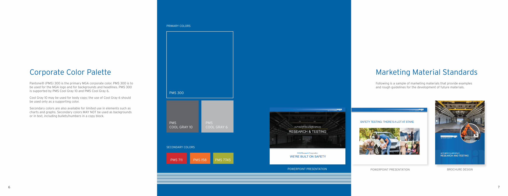
Corporate Color Palette Pantone® (PMS) 300 is the primary MGA corporate color. PMS 300 is to be used for the MGA logo and for backgrounds and headlines. PMS 300 is supported by PMS Cool Gray 10 and PMS Cool Gray 6.
Cool Gray 10 may be used for body copy; the use of Cool Gray 6 should be used only as a supporting color.
Secondary colors are also available for limited use in elements such as charts and graphs. Secondary colors MAY NOT be used as backgrounds or in text, including bullets/numbers in a copy block.
Marketing Material StandardsFollowing is a sample of marketing materials that provide examples and rough guidelines for the development of future materials.
PMS COOL GRAY 10
PMS 300
SECONDARY COLORS
PMS 711 PMS 158 PMS 7745
PMS COOL GRAY 6
PRIMARY COLORS
POWERPOINT PRESENTATION MARKETING MATERIALS EXAMPLEPOWERPOINT PRESENTATION BROCHURE DESIGN

98
Business Cards & StationaryStationery standards are designed to communicate a consistent brand to all customers. The business card, envelope and letterhead are just a few of the communications that make up stationery.
Be sure to read the standards to understand how to use the logos, typefaces and color palettes properly. For specifics on these elements, see pages 4-6.
Order stationery items from approved vendors. If needed, artwork files are located or can be requested from XXX.
LETTERHEAD
BUSINESS CARDS
ENVELOPS
• Printing: 2-colors (PMS 300, PMS Cool Gray 10)
• Trim: 3.5” x 2” (Business Cards), 8.5" x 11" (letterhead), #10 Envelope
• Paper: 100# cover (Business Cards) 80# text (letterhead)
Do not alter the design. Do not alter the font, font size or font color.
Production Specifications

1110
Branded ApparelApparel generally worn by staff, during trade show events and other corporate outings create a distinct and lasting impression of a company. Visual consistency and quality across all apparel applications is an important opportunity for brand expression.
When designing apparel, keep it simple. Follow the logo use rules for all apparel designs and wear the brand proudly.
• Use the approved logo colors. PMS color and color match thread numbers are to the right.
• Adhere to logo clear space requirements and size logo appropriately.
Apparel Color Options
When selecting apparel fabrics and colors, choose black, white or closest match to approved mga brand blue or gray.
Blue PMS 300 Isacord 3900
Gray PMS Cool Gray 10 Isacord 2564
Gray PMS Cool Gray 6 Isacord 1972
Color Match Thread