Metro Book
32
-
Upload
james-olsen -
Category
Documents
-
view
221 -
download
1
description
This is a guidline for Metro styles and usage
Transcript of Metro Book


METRO
METRO metro
STYLE GUIDE V1.0 03 . 29. 10

METRO GUIDELINES | ABOUT METRO4 ABOUT METRO | METRO GUIDELINES 5
METRO IS OUR DESIGN LANGUAGE. IT’S MODERN AND CLEAN, SIMPLE AND DIRECT. IT ELEVATES CONTENT. IT LOVES TYPOGRAPHY. AND, WHILE IT’S UNDENIABLY, AUTHENTICALLY MICROSOFT, METRO IS ALSO A FRESH PERSPECTIVE.
WELCOME.
metro

METRO GUIDELINES | ABOUT METRO6 ABOUT METRO | METRO GUIDELINES 7
metro brings us together. WHAT WE SHARE WHEN WE SHARE DESIGN LANGUAGE.
For our consumers, Metro creates confidence and comfort. It’s how we communicate.
For Microsoft, Metro becomes the language for our consumer experiences. It aligns us, literally and philosophically.
Metro brings everything together. Everyone benefits.

METRO GUIDELINES | ABOUT METRO8 ABOUT METRO | METRO GUIDELINES 9
ourinspiration WHERE METRO COMES FROM.
When you think Metro, think visual communication that takes people from one place to another. From transportation graphics to subways to airports. From editorial design to print design to pictograms.
It’s a complicated world. We want to make it simpler.

METRO GUIDELINES | ABOUT METRO10 ABOUT METRO | METRO GUIDELINES 11
TRANSPORTATION GRAPHICS& PICTOGRAMS

METRO GUIDELINES | ABOUT METRO12 ABOUT METRO | METRO GUIDELINES 13
TYPOGRAPHY

METRO GUIDELINES | ABOUT METRO14 ABOUT METRO | METRO GUIDELINES 15
EDITORIAL& PRINTDESIGN

METRO GUIDELINES | ABOUT METRO16 ABOUT METRO | METRO GUIDELINES 17
the basics SIMPLE THINGS THAT MAKE METRO WORK.
We want consumers to become familiar with our products and experiences in different contexts across three screens. To do that, we share certain basic assets – then apply them correctly and consistently. It’s that simple.
These are the assets Metro shares:
Design principlesSegoe typographyIconography

METRO GUIDELINES | OUR PRINCIPLES18 OUR PRINCIPLES | METRO GUIDELINES 19
ourprinciplesTHE FOUNDATION OF METRO
CLEAN, LIGHT AND OPEN.CONTENT NOT CHROME.
IT IS WHAT IT IS. TYPOGRAPHY IS BEAUTIFUL.
EVERYTHING MATTERS.COUNT ON STRUCTURE.
MOTION BRINGS DESIGN TO LIFE.

METRO GUIDELINES | OUR PRINCIPLES20 OUR PRINCIPLES | METRO GUIDELINES 21
We like modern. It’s contemporary and progressive. It looks forward. Metro is simple and minimal – does a lot with a little – and it’s light and responsive.
cleanlightand
open.
THINK MODERN

METRO GUIDELINES | OUR PRINCIPLES22 OUR PRINCIPLES | METRO GUIDELINES 23
ELEVATE CONSUMER CONTENT.
We believe consumer content should be elevated, and everything else minimized. Make content the hero. Let users interact directly. Content is what makes the experience profoundly personal.
content notchrome.
METRO GUIDELINES | OUR PRINCIPLES24 OUR PRINCIPLES | METRO GUIDELINES 25
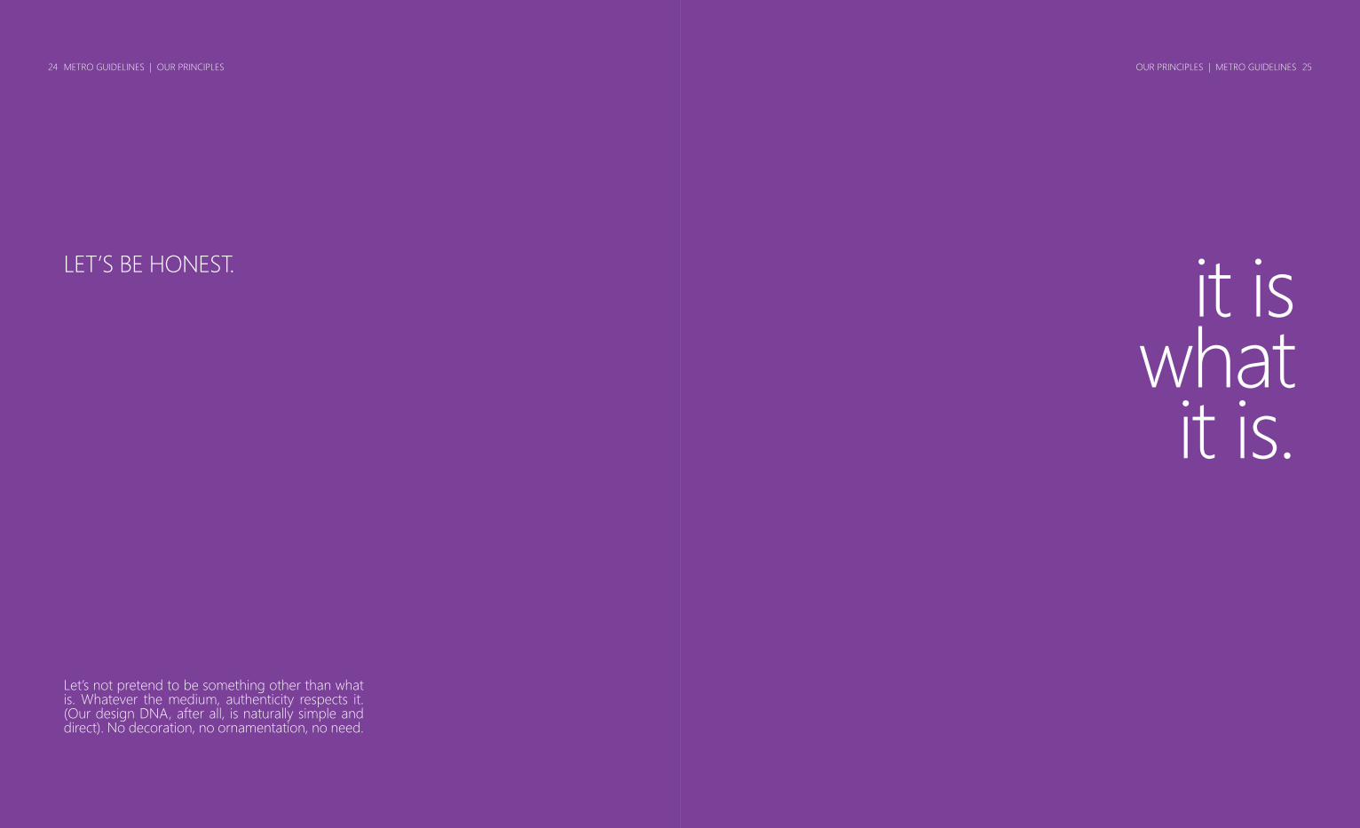
it iswhat it is.
LET’S BE HONEST.
Let’s not pretend to be something other than what is. Whatever the medium, authenticity respects it. (Our design DNA, after all, is naturally simple and direct). No decoration, no ornamentation, no need.

METRO GUIDELINES | OUR PRINCIPLES26 OUR PRINCIPLES | METRO GUIDELINES 27
type isbeautiful.
WORDS ARE IDEAS.
Let’s make words feel welcome. Let’s make typography beautiful. Let’s think about weight, balance, and scale. Let’s make words readable and ideas clear. One of our primary shared assets is typography. We use Segoe.

METRO GUIDELINES | OUR PRINCIPLES28 OUR PRINCIPLES | METRO GUIDELINES 29
everythingmatters.
We pay attention - sometimes, obsessive attention - to the details. Everything matters to us. Quality. Fit. Finish. We know this takes time and effort. And, we believe our customers benefit from our approach to craftsmanship in design.
IT’S IN THE DETAILS.

METRO GUIDELINES | OUR PRINCIPLES30 OUR PRINCIPLES | METRO GUIDELINES 31
count onstructure.
SEE BEAUTY IN ORDER.
With structure and organization, comes visual calm. The breathe-easy of a well-defined grid gives us something to count on. We believe beauty lies in simple elements such as space, scale and contrast - everything in its place and a place for everything.

METRO GUIDELINES | OUR PRINCIPLES32 METRO GUIDELINES | OUR PRINCIPLES32 OUR PRINCIPLES | METRO GUIDELINES 33OUR PRINCIPLES | METRO GUIDELINES 33
motion brings design to life.
IT’S DELIGHT.
Life is in motion. So are we. Motion brings Metro to life, moving swiftly, responding to input, tying everything together. Motion creates delight. You know how good that feels?.

METRO GUIDELINES | CASE STUDIES34 CASE STUDIES | METRO GUIDELINES 35
casestudiesMETRO TODAY.
With proper usage of principles, typography, space, color and motion, here are some examples of Metro already in practice today.

METRO GUIDELINES | CASE STUDIES36 CASE STUDIES | METRO GUIDELINES 37

METRO GUIDELINES | CASE STUDIES38 CASE STUDIES | METRO GUIDELINES 39

METRO GUIDELINES | CASE STUDIES40 CASE STUDIES | METRO GUIDELINES 41

METRO GUIDELINES | CASE STUDIES42 CASE STUDIES | METRO GUIDELINES 43

44
CASE STUDIES | METRO GUIDELINES 45

METRO GUIDELINES | CASE STUDIES46 CASE STUDIES | METRO GUIDELINES 47

METRO GUIDELINES | TYPOGRAPHY48 TYPOGRAPHY | METRO GUIDELINES 49
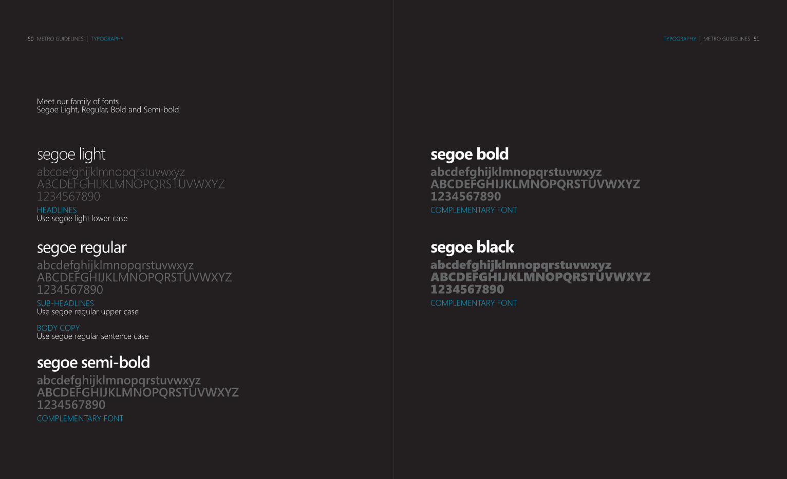
We use segoeourtypefaceMETRO’S MOST INSTINCTIVE DESIGN ASSET.
Segoe offers versatility as our core type, with bold, regular, and light fonts. This modern, simple font instinctively characterizes our headlines and body copy, without competing against overall design. When appropriately applied, Segoe accompanies any layout beautifully.
METRO GUIDELINES | TYPOGRAPHY50 TYPOGRAPHY | METRO GUIDELINES 51
segoe lightabcdefghijklmnopqrstuvwxyzABCDEFGHIJKLMNOPQRSTUVWXYZ1234567890HEADLINESUse segoe light lower case
segoe semi-boldabcdefghijklmnopqrstuvwxyzABCDEFGHIJKLMNOPQRSTUVWXYZ1234567890COMPLEMENTARY FONT
segoe regularabcdefghijklmnopqrstuvwxyzABCDEFGHIJKLMNOPQRSTUVWXYZ1234567890SUB-HEADLINESUse segoe regular upper case
BODY COPYUse segoe regular sentence case
segoe boldabcdefghijklmnopqrstuvwxyzABCDEFGHIJKLMNOPQRSTUVWXYZ1234567890COMPLEMENTARY FONT
segoe blackabcdefghijklmnopqrstuvwxyzABCDEFGHIJKLMNOPQRSTUVWXYZ1234567890COMPLEMENTARY FONT
Meet our family of fonts. Segoe Light, Regular, Bold and Semi-bold.

METRO GUIDELINES | TYPOGRAPHY52 TYPOGRAPHY | METRO GUIDELINES 53
Body CopySegoe Regular sentence case
headlinesSegoe Light lower case
SUBHEADLINESSegoe Regular upper case
COMPLEMENTARYSegoe Semi-Bold
COMPLEMENTARYSegoe Bold
COMPLEMENTARYSegoe Black
Capitalization

METRO GUIDELINES | TYPOGRAPHY54 TYPOGRAPHY | METRO GUIDELINES 55
Segoe in color to emphasize hierarchy.
hello, welcome to metrohello, welcome to metrohello, welcome to metro
Mike GoldbergUPDATED HIS STATUSTaking off to Capitol Hill
Mike GoldbergUPDATED HIS STATUS
Mike GoldbergUPDATED HIS STATUSTaking off to Capitol Hill
METRO GUIDELINES | ICONS56 ICONS | METRO GUIDELINES 57
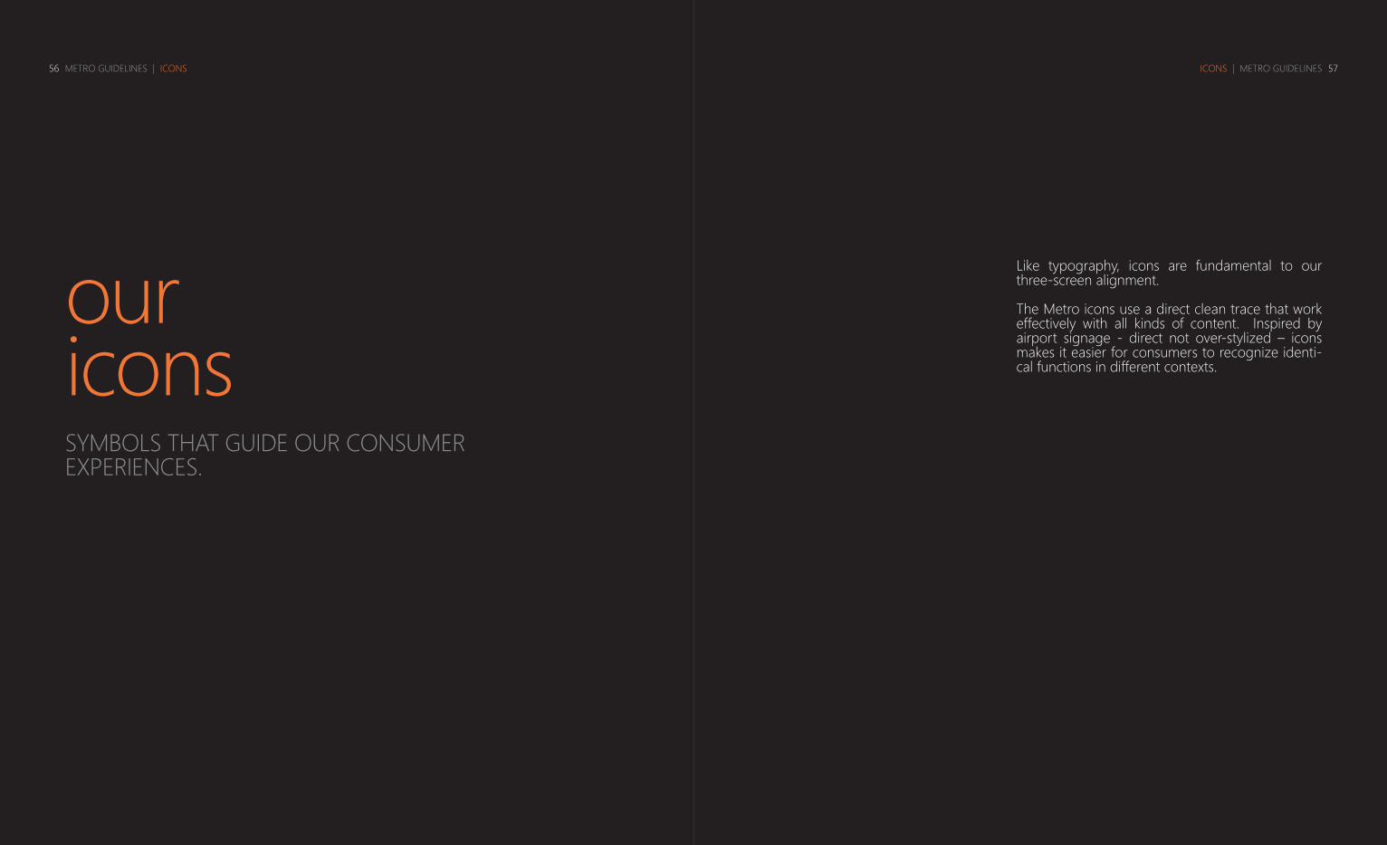
ouriconsSYMBOLS THAT GUIDE OUR CONSUMER EXPERIENCES.
Like typography, icons are fundamental to our three-screen alignment.
The Metro icons use a direct clean trace that work effectively with all kinds of content. Inspired by airport signage - direct not over-stylized – icons makes it easier for consumers to recognize identi-cal functions in different contexts.

METRO GUIDELINES | ICONS58 ICONS | METRO GUIDELINES 59

METRO GUIDELINES | ICONS60 ICONS | METRO GUIDELINES 61

METRO GUIDELINES | CASE STUDIES62 CASE STUDIES | METRO GUIDELINES 63
what’snextTHE INTEGRATED VISION OF METRO
We are already working towards aligning experiences – creating an easy flow from one screen to another.
And we want to keep on refining, so that the experi-ence is always seamless, and includes industrial design and hardware.
You could say we’re aiming for intuitive alignment.