META 2020 - Gallery Central
12
META 2020 3 - 22 August Mon - Fri 10am - 4.30pm; Sat 12 - 2.30pm Gallery Central 12 Aberdeen Street, Perth, www.gallerycentral.com.au Showcasing innovave and excing creave works completed by year 11 and 12 students enrolled in Visual Art and Design courses, META complements North Metro TAFE’s presgious art and design programs and acknowledges the excellence and originality of budding arst/designers in senior secondary schools across WA. Jessica Abreu Applecross Senior High School Year 11 More Than Comfort Digital Animaon with elements of charcoal, photography, and watercolour This animaon that was largely made through Adobe Pho- toshop. The animaon shows a character walking through rooms, all drawn with different mediums while she’s strictly drawn digitally. I used digital art, charcoal, photography, and watercolours to create each unique seng and combine them. The main idea I wanted to convey was stepping out of com- fort. I aimed to take the audience on a journey with a char - acter who starts in a place of comfort, catches a glimpse of something more and pushes through uncertainty to get there. Krisan Almario Thornlie Senior High School Year 12 Behind Schedule Acrylic on paper I live in an extremely stressful me as a year 12 student who aims to go to university, with unstable circumstances for the 2020 Aus- tralian Terary Admission Rank (ATAR) because of COVID-19. I need to manage my schedule of work and adjust the me accord- ing to this fluctuang situaon. I feel we have lived in a war situ- aon. I depict myself in this painng as one who is trying hard to manage this harsh and difficult mes. I use monotones in black and white to depict my feelings. The artwork has been inspired by arst Salvador Dali. Willow Armitstaed John Curn College of the Arts Year 12 Florid Becoming wire, texles, beads, string, ink, This work represents an acceptance of the earth and natural cycles. Fungi exists almost outside of life, and serves to decompose. The work presents a need for humanity or the self to let go and start anew. Florid: having a red or flushed complexion, excessively intricate or elaborate.
Transcript of META 2020 - Gallery Central

META 2020 3 - 22 August Mon - Fri 10am - 4.30pm; Sat 12 - 2.30pm
Gallery Central 12 Aberdeen Street, Perth, www.gallerycentral.com.au
Showcasing innovative and exciting creative works completed by year 11 and 12 students enrolled in Visual Art and Design courses, META complements North Metro TAFE’s prestigious art and design programs and acknowledges the
excellence and originality of budding artist/designers in senior secondary schools across WA.
Jessica AbreuApplecross Senior High School Year 11More Than ComfortDigital Animation with elements of charcoal, photography, and watercolourThis animation that was largely made through Adobe Pho-toshop. The animation shows a character walking through rooms, all drawn with different mediums while she’s strictly drawn digitally. I used digital art, charcoal, photography, and watercolours to create each unique setting and combine them. The main idea I wanted to convey was stepping out of com-fort. I aimed to take the audience on a journey with a char-acter who starts in a place of comfort, catches a glimpse of something more and pushes through uncertainty to get there.
Kristian AlmarioThornlie Senior High School Year 12Behind ScheduleAcrylic on paperI live in an extremely stressful time as a year 12 student who aims to go to university, with unstable circumstances for the 2020 Aus-tralian Tertiary Admission Rank (ATAR) because of COVID-19.I need to manage my schedule of work and adjust the time accord-ing to this fluctuating situation. I feel we have lived in a war situ-ation. I depict myself in this painting as one who is trying hard to manage this harsh and difficult times. I use monotones in black and white to depict my feelings. The artwork has been inspired by artist Salvador Dali.
Willow ArmitstaedJohn Curtin College of the Arts Year 12Florid Becomingwire, textiles, beads, string, ink,This work represents an acceptance of the earth and natural cycles. Fungi exists almost outside of life, and serves to decompose. The work presents a need for humanity or the self to let go and start anew. Florid: having a red or flushed complexion, excessively intricate or elaborate.

Caitlin BaileySt Stephen’s School, Duncraig Year 11 Menace Company Promotional PosterDigital Print My poster promotes Menace Company and their campaign “Menace to Normality”. I used the approach of shock by disjointing the main image and filling the space with other, unrelated images to give it a collage feel. The collaged photos include my own lifestyle photography as well as aspects of nature (a tiger’s eye, the ocean, leaves, etc.). The collage elements are coming out of the model’s head and the model herself is disjointed to further ‘shock’ audiences.
Ashton BainSt Marks Anglican Community School Year 11Slip Sliding AwayClay sculptureMy work focuses on Identity. We often feel defined by everyone else’s expectations of us. Do we ever really get to decide how we want to be perceived? The star sign Pisces was a starting point for my work, defined as the most misunderstood sign of the zodiac and often seen as sensitive and obsessive, yet caring and loving. The splitting of the Piscean fish in my work reflects the emotional slipping of one’s resolve in having to meet the expectations of others.
Jonathon BallHelena College Senior School Year 12Powerful but GentleBleach on cardI visited a nature reserve in the south of Sri Lanka. I was lucky enough to witness these magnificent animals in the wild. I was able to see the gentle baby elephants and wonder how those small creatures could grow to become such beautiful and powerful animals. In this work I used different strengths of bleach to change the pigment of black card. This allowed me to reverse shade the painting.
Clare BowenPinjarra Senior High School Year 12Vertebrae 1, 2 & 3PhotographyMy series had to be associated with the theme ‘The Body”. I got the inspiration from Miguel Ribeiro’s medical photographs. I liked how his images made me cringe and feel uncomfortable, which is the response I wanted to create, but at the same time, make them look beautiful. My model was quite lean making it easier to define his skeletal structures. In post-production, I removed certain fea-tures of his body to create an abstract shape, converted the images to black and white to emphasize and exaggerate the bones in each image.
Kohl BranchLake Joondalup Baptist College Year 12Geometric Teaporcelain clayMy work is inspired and based on the ancient Japanese art of Neri-komi; hand building clay forms from layers of coloured clay. I’ve used this technique with geometric shapes, to help convey the sense of ritual, which is methodical and timed, involved in the ancient tra-dition of tea drinking in Japanese culture. The abstract geometric shapes add a more masculine and robust feeling to the gentle art of tea drinking, showing how traditions can evolve and develop greater inclusivity.
Lexi BranchSt Mark’s Anglican Community School Year 12Rotpaper clay, papier mache, acrylic paintMy artwork portrays the relationship between humans and nature, and how all living things live and die. The figure has long, scruffy hair and untidy stubble, suggesting nature is wild and untameable. His eyes are shadowed, making him less individual and more representative of many human beings. The brown, earthy tones represent the earth and the dirt, and the animal skull on the subject’s head is a symbol for the inevitability
of death and decay. The twisted, rough, branch-like horns represent plants and the ecosystem. The sculp-ture is made from the clay medium, which is made from the earth.
Jessica BryanGovernor Stirling Senior High School Year 12A Teenage FacadePhotographThis portrait communicates the whirlwind of emotions that are attached to being a teenager, and the need we often feel to hide them. The red shadow represents frustration and anger, slowly creeping within the model, despite her best attempts to shut these emotions off with her blank, expressionless face.
Sean CameronApplecross Senior High School Year 12Oh To Be OpenedGraphite on paperThrough my piece, I wished to discuss my experience of being gay and the fears of coming out. The term ‘oh to be opened’ largely representing the idea of releasing all my pent up fears and emotions and showing myself for who I really am. I constructed myself to appear somewhat ‘mutated’ through the
placement of eyes on my face to discuss how unnatural and ‘out of the ordinary’ I used to feel due to my sexuality. I used graphite pencils to reference my past work as a lot of my fears of coming out surrounded been seen different by my peers or my family; thus, I wished to demonstrate how I am the same person as before. Through biblical references such as the halo, as well as my hand placement, I am able to discuss the period of my life in which I first saw a difference between myself and the other people around me and my somewhat religious background. Although my religious peers have never openly criticised me, the harmful ideologies particular religions can promote surrounding the LGBT+ community had left a stain on myself and my identity. However, I’ve become proud of who I am - an idea I aimed to promote through this piece.

Blair CargillPrendiville Catholic College Year 12Do You See Me?fused glass disc on timber/metal standThe ocelli on peacock’s feathers (colourful eye spots) have disappeared and reappeared several times over the course of history. It is suspected that the changes were a response to interest from the ladies (peahens). I sympathise with the poor peacock who has to constantly put on a show.
Alyssa CarrelloCorpus Christi College Year 12IsolationSilkscreen‘Isolation’ was influenced by my connection with a skate park in Fremantle. I would often go there to escape the pressure of being a teenager. Initially I wanted my artwork to communicate the reflective nature of isolation, but over the last few months the message has taken on a different meaning of the word ‘Isolation’. During COVID 19 I was isolated from a place and space that offered my escape. The somber mood is further amplified with the use of blues contributing to this dislocation and loneliness.
Sophie CatchpoleKalamunda Senior High School Year 11Apple Daydreamswatercolour on paperThe intention of this piece was to represent a short story I wrote that en-compassed the themes of youth and childishness. The story follows the imaginary journey of a boy through a harsh landscape, and his struggle to reach his destination. The apple is a key element, symbolising wisdom. Watercolour’s delicate and vibrant effects help to convey the innocent nature of the child’s mind. The composition of the boy lying in the grass is to show an element of ‘carefreeness’ and almost wondrous naivety.
Brooke Connolly-RogersCecil Andrews College Year 11BeegAcrylic paint on Wooden PanelMy painting is simply a big frog. I created my work to be observed by the viewer and have them make up their own mind and representa-tion. Some say that frogs represent alertness and readiness but Beeg appears relaxed and calm. Beeg is expressive. He is unique. He rep-resents what you want him to represent.
Abbey CookeSt Hilda’s Anglican School For Girls Year 11Is this what I’ve become; a piece of meat?oil pastels on acrylic paperMy composition communicates the concept of ‘opposites’ represent-ed by the juxtaposition of two contrasting objects to convey a point of view. The somewhat repulsive sheep carcass was placed on an antique lounge that symbolises beauty, creating two opposing visual images. I placed the carcass in the traditional pose of the ‘reclining nude’ to interrogate the objectifying of women. Audiences today mostly see the traditional western art historical convention of the re-clining nude presenting women as vulnerable and the object of men’s desires. My work suggests that women continue to be treated ‘like
pieces of meat’ and appreciated simply for their bodies.
Brielle CounselSt Mary’s Anglican Girls School Year 11Deus Ex MachinaMDF, recycled materials, metal, wire, drink cans & old mapsMy title is a Latin phrase that translates to ‘a God from the machine’. My artwork is a commentary on our relationship between what is manmade (machines) and what is natural, with particular focus on the clearing of our natural bushland to make way for houses and industry. I have made a bird from recycled drink cans that sits atop a nest made of discarded objects and wire. Holding up the nest are three blades from an old com-bine harvester, the base is made up of an old discarded map of Perth; both are symbolic of how we have literally torn up the earth.
Cameron CrainPrendiville Catholic College Year 12Circular PoolRed Tingle, Jarrah, reactive fused glass with silver dust inclusions The endangered Giant Red Tingle grows in a small pocket in the South-West of Western Australia, through which flows the Frankland River. In the midst of this forest you will find Circular Pool. This work, made from Red Tingle and fused glass, represents a pause or tranquil moment in time where the river waters slow and swirl in the midst of the long pas-sage from tiny tributaries to the vast ocean, emulating life’s journey.
Georgia CutlerPrendiville Catholic College Year 12Read Between the Linesfused and slumped glass bowl/plateThe process of glassworking puts me into a meditative state where I can relax and let go of everyday concerns.

Max De-VriesCorpus Christi College Year 12The Golden DaysMixed MediaMy artwork is a commentary on the lack of refurbishment and infrastruc-ture since the glory days of the 1980’s America’s Cup in parts of the port city of Fremantle. I’m interested in the distribution of the balance of wealth and the lingering nostalgic elements of a seaside boom town. Using icons of Australiana, pop elements of repetition, print techniques and collage, I hope my work translates the forgotten spaces and deterioration of a once thriving golden era of Fremantle history.
Zohra DostComo Secondary College Year 12Eyes are the window of the soulDigital Photography For this design brief we were asked to photograph compositions that expressed our culture. This photo is of my friend, veiled with Afghan shawls, which are part of my culture. Her eyes are made up in colours that complement the fabrics. This unifies the image and helps make her eyes the focal point.
Cait DowleyPerth Modern School Year 12Djinanginy Kaartdijin (Seeing and Understanding) (1 )Bulgalla (2) Biyoo (3 )Wongup (4) Moodjar (5) WilyawaWatercolour, Paper Clay, Ceramic Decal TransfersPlants are often viewed in a purely aesthetic way; they look pret-ty, they have beautiful colouring, the leaves are delicate. They are considered a simple luxury, there to admire. Rarely do people consider flowers beyond their face value and beauty, but plants and flowers can often hold such greater value and power beyond their aesthetic. My artwork aims to explore both the diverse, unique beauty of Western Australian plants, and the multiple
traditional uses of these plants. I aim to advocate for these stunning plants by exploring their value and beauty for others to see and appreciate.
Mia Dunne St Marks Anglican Community School Year 12Design/Photography PortfolioBook - print gloss on paper, book bindingPhotography came to me at a time I needed it the most - it was an outlet for me to calm down and express my creativity. It fits me, my personality, my strengths and my hobbies. It had me thinking, chang-ing, developing. Thinking that tomorrow will never be the same as today. I believe that each person was created to share and use their abilities and passions to express themselves. I am certain this is mine.
Emma-Lee EganSouthern River College Year 12The Green FrogAcrylic on canvasI painted the Green Frog as a representation of the noongar family, which is my family Bennell, as our totem is a green/brown frog. The frog is also a spiritual animal in our family. The painting is done in an Aboriginal style.
Essi ElliotSt Hilda’s Anglican School For Girls Year 11Bloody Freshwatercolour, ink, charcoal, pastels on watercolour paperMy two paneled drawing aims to visually represent the idea of ‘opposites’. The fleshy cut of raw meat served up on a silver platter is a juxtaposition in itself. The meat, placed alongside the flowers, representing beauty and pleasure, creates a contrast that is designed to evoke a visceral response in the viewer. I painted the flower arrangement with watercolours and used pastels to en-hance the vibrant hues and create depth. I used charcoal, pastels and inks for the meat and blood. I was influenced by the style and grotesque subject matter used by Belgian artist Cindy Wright.
Greta FondaShenton College Year 12State of MindScratchboardThis is about the emotions we keep to ourselves and hide away from people around us. We let these emotions surround us and swallow us up into a certain state of mind, where all we know is anger, hate and sadness. Our mind tricks us into thinking that no one cares and that we’ll never be happy, letting this sadness and hate slowly take over us on the inside, while on the outside we pretend that everything is fine.
Katie ForwardSt Mark’s Anglican Community School Year 11KingfisherphotographI took this photo on a trip of a lifetime conservation expedition in Madagascar. I’m very interested in wildlife and love animals. I carried my camera with me for most of the trip, and it was just by chance that I saw this tiny, beautiful little kingfisher sitting about 100 meters away in the middle of the lake we were hiking past. The brightly coloured little bird was perfectly posed on the stem, and framed by the surrounding lake and lilies. I felt very lucky to get to see one of these amazing birds in the wild and be able to capture it on camera.
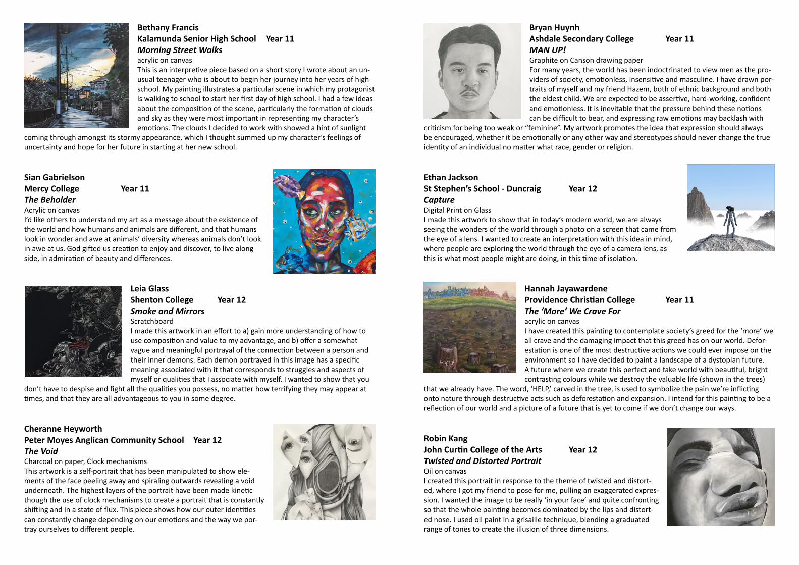
Bethany FrancisKalamunda Senior High School Year 11Morning Street Walksacrylic on canvasThis is an interpretive piece based on a short story I wrote about an un-usual teenager who is about to begin her journey into her years of high school. My painting illustrates a particular scene in which my protagonist is walking to school to start her first day of high school. I had a few ideas about the composition of the scene, particularly the formation of clouds and sky as they were most important in representing my character’s emotions. The clouds I decided to work with showed a hint of sunlight
coming through amongst its stormy appearance, which I thought summed up my character’s feelings of uncertainty and hope for her future in starting at her new school.
Sian GabrielsonMercy College Year 11The BeholderAcrylic on canvasI’d like others to understand my art as a message about the existence of the world and how humans and animals are different, and that humans look in wonder and awe at animals’ diversity whereas animals don’t look in awe at us. God gifted us creation to enjoy and discover, to live along-side, in admiration of beauty and differences.
Leia GlassShenton College Year 12Smoke and MirrorsScratchboardI made this artwork in an effort to a) gain more understanding of how to use composition and value to my advantage, and b) offer a somewhat vague and meaningful portrayal of the connection between a person and their inner demons. Each demon portrayed in this image has a specific meaning associated with it that corresponds to struggles and aspects of myself or qualities that I associate with myself. I wanted to show that you
don’t have to despise and fight all the qualities you possess, no matter how terrifying they may appear at times, and that they are all advantageous to you in some degree.
Cheranne HeyworthPeter Moyes Anglican Community School Year 12The VoidCharcoal on paper, Clock mechanismsThis artwork is a self-portrait that has been manipulated to show ele-ments of the face peeling away and spiraling outwards revealing a void underneath. The highest layers of the portrait have been made kinetic though the use of clock mechanisms to create a portrait that is constantly shifting and in a state of flux. This piece shows how our outer identities can constantly change depending on our emotions and the way we por-tray ourselves to different people.
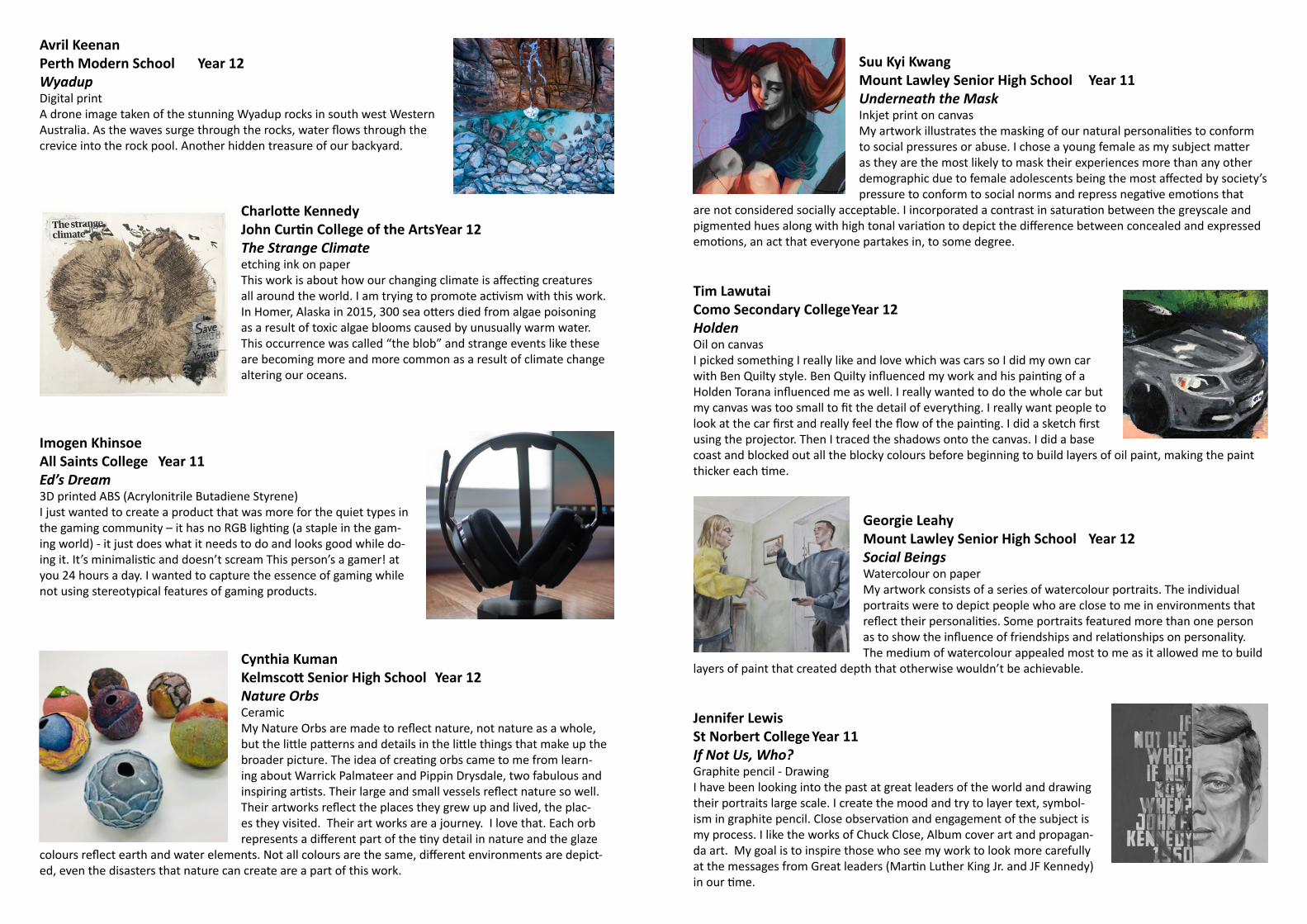
Bryan HuynhAshdale Secondary College Year 11MAN UP!Graphite on Canson drawing paperFor many years, the world has been indoctrinated to view men as the pro-viders of society, emotionless, insensitive and masculine. I have drawn por-traits of myself and my friend Hazem, both of ethnic background and both the eldest child. We are expected to be assertive, hard-working, confident and emotionless. It is inevitable that the pressure behind these notions can be difficult to bear, and expressing raw emotions may backlash with
criticism for being too weak or “feminine”. My artwork promotes the idea that expression should always be encouraged, whether it be emotionally or any other way and stereotypes should never change the true identity of an individual no matter what race, gender or religion.
Ethan JacksonSt Stephen’s School - Duncraig Year 12CaptureDigital Print on GlassI made this artwork to show that in today’s modern world, we are always seeing the wonders of the world through a photo on a screen that came from the eye of a lens. I wanted to create an interpretation with this idea in mind, where people are exploring the world through the eye of a camera lens, as this is what most people might are doing, in this time of isolation.
Hannah JayawardeneProvidence Christian College Year 11The ‘More’ We Crave Foracrylic on canvasI have created this painting to contemplate society’s greed for the ‘more’ we all crave and the damaging impact that this greed has on our world. Defor-estation is one of the most destructive actions we could ever impose on the environment so I have decided to paint a landscape of a dystopian future. A future where we create this perfect and fake world with beautiful, bright contrasting colours while we destroy the valuable life (shown in the trees)
that we already have. The word, ‘HELP,’ carved in the tree, is used to symbolize the pain we’re inflicting onto nature through destructive acts such as deforestation and expansion. I intend for this painting to be a reflection of our world and a picture of a future that is yet to come if we don’t change our ways.
Robin KangJohn Curtin College of the Arts Year 12Twisted and Distorted PortraitOil on canvasI created this portrait in response to the theme of twisted and distort-ed, where I got my friend to pose for me, pulling an exaggerated expres-sion. I wanted the image to be really ‘in your face’ and quite confronting so that the whole painting becomes dominated by the lips and distort-ed nose. I used oil paint in a grisaille technique, blending a graduated range of tones to create the illusion of three dimensions.
Avril KeenanPerth Modern School Year 12WyadupDigital printA drone image taken of the stunning Wyadup rocks in south west Western Australia. As the waves surge through the rocks, water flows through the crevice into the rock pool. Another hidden treasure of our backyard.
Charlotte KennedyJohn Curtin College of the Arts Year 12The Strange Climateetching ink on paperThis work is about how our changing climate is affecting creatures all around the world. I am trying to promote activism with this work. In Homer, Alaska in 2015, 300 sea otters died from algae poisoning as a result of toxic algae blooms caused by unusually warm water. This occurrence was called “the blob” and strange events like these are becoming more and more common as a result of climate change altering our oceans.
Imogen KhinsoeAll Saints College Year 11Ed’s Dream3D printed ABS (Acrylonitrile Butadiene Styrene)I just wanted to create a product that was more for the quiet types in the gaming community – it has no RGB lighting (a staple in the gam-ing world) - it just does what it needs to do and looks good while do-ing it. It’s minimalistic and doesn’t scream This person’s a gamer! at you 24 hours a day. I wanted to capture the essence of gaming while not using stereotypical features of gaming products.
Cynthia KumanKelmscott Senior High School Year 12Nature OrbsCeramicMy Nature Orbs are made to reflect nature, not nature as a whole, but the little patterns and details in the little things that make up the broader picture. The idea of creating orbs came to me from learn-ing about Warrick Palmateer and Pippin Drysdale, two fabulous and inspiring artists. Their large and small vessels reflect nature so well. Their artworks reflect the places they grew up and lived, the plac-es they visited. Their art works are a journey. I love that. Each orb represents a different part of the tiny detail in nature and the glaze
colours reflect earth and water elements. Not all colours are the same, different environments are depict-ed, even the disasters that nature can create are a part of this work.
Suu Kyi KwangMount Lawley Senior High School Year 11Underneath the MaskInkjet print on canvasMy artwork illustrates the masking of our natural personalities to conform to social pressures or abuse. I chose a young female as my subject matter as they are the most likely to mask their experiences more than any other demographic due to female adolescents being the most affected by society’s pressure to conform to social norms and repress negative emotions that
are not considered socially acceptable. I incorporated a contrast in saturation between the greyscale and pigmented hues along with high tonal variation to depict the difference between concealed and expressed emotions, an act that everyone partakes in, to some degree.
Tim LawutaiComo Secondary College Year 12HoldenOil on canvasI picked something I really like and love which was cars so I did my own car with Ben Quilty style. Ben Quilty influenced my work and his painting of a Holden Torana influenced me as well. I really wanted to do the whole car but my canvas was too small to fit the detail of everything. I really want people to look at the car first and really feel the flow of the painting. I did a sketch first using the projector. Then I traced the shadows onto the canvas. I did a base coast and blocked out all the blocky colours before beginning to build layers of oil paint, making the paint thicker each time.
Georgie LeahyMount Lawley Senior High School Year 12Social BeingsWatercolour on paperMy artwork consists of a series of watercolour portraits. The individual portraits were to depict people who are close to me in environments that reflect their personalities. Some portraits featured more than one person as to show the influence of friendships and relationships on personality. The medium of watercolour appealed most to me as it allowed me to build
layers of paint that created depth that otherwise wouldn’t be achievable.
Jennifer LewisSt Norbert College Year 11 If Not Us, Who?Graphite pencil - DrawingI have been looking into the past at great leaders of the world and drawing their portraits large scale. I create the mood and try to layer text, symbol-ism in graphite pencil. Close observation and engagement of the subject is my process. I like the works of Chuck Close, Album cover art and propagan-da art. My goal is to inspire those who see my work to look more carefully at the messages from Great leaders (Martin Luther King Jr. and JF Kennedy) in our time.

Qingying LiBalcatta Senior High School Year 11Self-portraitoil on canvasMy self-portrait was inspired by Kathryn Haug, a Western Australian art-ist, who I had the privilege of meeting and learning from this year. In my painting, I tried to use my palette knife to create layers and textures that I watched Haug paint herself. Later, I used my brush to tame my palette knife strokes and refine my blending. I chose to work within a soft and gentle colour palette as I wanted this to reflect my persona and capture a pensive expression.
Louise LimApplecross Senior High School Year 11Where Do I Belong?photography and digital illustrationMy work is a series of portraits intend to show the inner-conflict be-tween the two ‘personalities’ of young Asian-Australian’s heritage and western culture. Influenced by prints of emperors and empresses from different Chinese dynasties and eras, the history and aesthetic of these prints merges with modern portraits through photography representing the conflict between two alter egos. Japonisme inspired the vivid colour and flat imagery. I incorporated symbolic objects from Chinese emper-ors and empresses such as ornate robes and detailed head-dresses to
establish Asian-Australian connections and the traditional ‘Asian’ customs and standards Asian-Australians face in westernised society as they try to stay connected with their roots, but also explore themselves.
Alan MaRockingham Senior High School Year 12Blue AuroraDigital PhotographThis photograph is the result of experimentation with a blue light stick at 2am in the morning at Lake Richmond, near my home. The slow shutter speed captures the movement of the light stick to resemble the Aurora Bo-realis. I am getting more interested and involved in astrophotography, and take every opportunity to go out with my Canon 200D, tripod and my wide angle 10-22mm lens to capture the night sky.
Antonia MacriChisholm Catholic College Year 11The Sum Total of ClaudioOil on boardThis is my attempt at challenging socially accepted stereotypes found within the power-driven profession of the finance industry. I have used my father, Claudio, as the focus of my piece, as he contradicts entirely these stereotyp-ical personality traits. The exploration of textural brushstrokes and an ener-getic colour palette, tries to capture his jovial, spirited but grounded nature.
This grounded-ness is further re-enforced with the inclusion of the land, an ode to my Father’s humble upbringing. The square composition is a simple allusion to the metaphor of being ‘boxed in’.
Chloe MannersSt Mark’s Anglican Community School Year 12Black Comedy; Non FictionAcrylic on canvas with diamontes; forged plastic mask, thread, metal eyeletsA satirical expose on wealth inequality and the gap between the quality of life for the upper and lower class and their access to the modern means of sur-vival. The artwork contrasts the absurd standard of luxury demanded by the wealthy & the reality of low quality for lower class. Inspired by the represen-
tations of this wealth inequality from Bong Joon Ho’s film ‘Parasite’ (2019), the message of class inequality was only fuelled from the COVID19 pandemic that saw this humourous exaggeration become a stark reality.
Lali MardonGeraldton Senior High School Year 1218.6 Million HectaresAcrylic paint on driftwoodThis piece symbolizes the traumatic Australian bush fires that started burning the spring of 2019 to the end of summer in 2020. It was called the ‘Black Summer’. 18.6million hectares of land were destroyed, along with 1 million different Australian species being killed. I decided to recycle driftwood, that I had found south of Greenough beach. I chose it because it’s environmentally friendly and it is the key represen-tation of the traumatic fires. Even though I’m from WA, seeing the images really ‘hit home’.
Irene Masque SalgadoDuncraig Senior High School Year 11Deceptionoil paint on canvasThe theme that I chose is fear and deception. I wanted to the viewer to see two different aspects of a regular scene to present the message that things have more than one side and to show deception in ordinary parts of life. I wanted to create a piece that combined realism and surrealism and to give it a slightly sinister feel. The idea behind it is that nothing is what it seems at a first glance. I was inspired by Salvador Dalí and how he creates inter-esting and bizarre works. I was very interested in his love of the subcon-scious and how many aspects are left to the imagination. I tried to incorpo-
rate some of his techniques such as the melting feeling of objects to make my piece more captivating. I began by drawing a realistic still life and proceeded to experiment with it using distortion software. Then I used SketchBook to digitally paint; to try out a variety of different colours. The process of mixing colours was definitely the hardest part. I also found that reference pictures are very important as they helped me see how light behaves.
Bronte McCarthyPerth College Year 12Panic State of MindPlaster, acrylic paint, polymer clay, aerosol and epoxy glueMy artwork represents my experience with panic disorder. My panic attacks are sudden and reoccurring. Among the strands of polymer clay hair, words spill down my neck, depicting the eruption of inter-nalized thoughts and fears. Nature grows over each sense to depict my depersonalisation and derealisation. While the nature distorts each of my senses, heightening my terror, it establishes an absurd di-chotomy because it creates growth. Beautiful fungi grows from death & decay, coral grows toward the sun in the ocean’s dark depths. In this symbolism, I too grow from each attack.
Jay McCowanSchool of Isolated and Distance Education Year 12Grey Scale PerspectivePencil on PaperThis work reflects on the relationship between a loving parent and their child. In the parent’s mind their children will always be their children, leading them to be loving and protective. This is reflected through the black and white figures, with the father spoon-feeding their child. The love one feels from a parent is often unconditional, which can lead to anxious questioning of whether that love is de-serving or not. Am I receiving that love because I am a good person and have earned it or simply because I am my parent’s child. The veil of anxiety and worry is represented through the overwhelming scene
and unfinished areas of canvas, showing the incomplete and immersive state of anxiety felt by the child.
Eve MiragliottaMercedes College Year 12 NeostalgiaPaper prints of manual and digital graphics, leather and acrylic prototypesThe brief was to design and prototype a handbag and bag charm that identifies with a niche fashion subculture, in this case retro wave. The design process began with re-search that would inspire the ideation stage of my process. Ideas were then developed and refined, continuously eval-uated against user feedback and the brief. Moving to the commercial design process production values were created for prototyping. The final design uses semiotics to identify the retro wave style, specifically, a palm tree, alluding to the Miami Vice TV show and dream wave, Space Invaders figures and retro car relay themes of outrun culture and darker motifs to express the aesthetic of dark wave design.
Lisa NguyenWilletton Senior High School Year 12Be a ManOil paint on canvasMy artwork is a close-up portrait of a close male friend with heavy makeup, flowers and butterflies. It was an adventur-ous experience for both me and my friend, especially during preparation process, with the makeup application exposing him to a typically female routine. I was greatly mesmerised by the hyper realistic works of Robin Eley who had models wrapped in plastic, and took inspiration from his artwork by adding an element of plastic into my own. I chose to chal-lenge the social attitudes towards effeminacy and gender expectations. Identity is a social construct, it is what skin you feel most comfortable wearing, and I believe that men should not be shamed for subverting stereotypically ‘male’ identities.
Hannah NicholsonGreenwood College Year 12Cobra Snake PoseMixed Media sculpture - wire, paper, snake leather, paintMy intention was to create a sculpture exhibiting a smooth transforma-tion or morphing between a human and a snake. The idea came to me during a yoga class I attended. Energy or Kundalini awakens from the lower back and slithers up the spine to the crown of the head! It is in full fruition that the Serpent is ready to dance into attack. After personally experiencing the Cobra Pose, research and drawings, I used a strong wire structure overlaid with paper-mache. The final painting, visual morphing and decorative embellishments consumed many hours and became a meditative experience in itself.
Madison OesterheldLake Joondalup Baptist College Year 12Paper Thinoil on boardMy work is a self-portrait exploring the relationship between the mind and anxiety. I wanted the work to encompass my experiences struggling with anxiety and the detrimental effect it had on my self-image, struc-tural integrity of my mind and emotional state. I would go through days where waking up was an anxiety ridden task in itself, coming out of a peaceful slumber and waking up to immediate panic as the realization I had to endure another day of torture riddled with anxiety. It become an energy devouring and emotionally draining moment that left me lifeless
for the rest of the day. I wanted to channel this intense emotion of destruction that anxiety causes by creat-ing a work that imitates a scrunched piece of paper in both composition and form.
Hannah PembertonPerth Modern School Year 11The EndDigital printThe conceptualising and planning stages of this piece coincided with the beginning of the COVID-19 pandemic, but it was a while before the more significant and long-lasting impacts of the situation would become clear. The panic was only just beginning, and as someone who struggles with anxiety and finds difficulty in uncertainty, it was a highly distressing time for me. I likened the panic to a ‘culture of fear’ perpetuated by the media stirring up a frenzy about the virus even before it spread across the world, which made me contemplate the nature of fear we feel as a collective.
Erin PooleSt Clare’s School Year 12Erin and SamAcrylic on canvasI gaze into the distance of a nameless future. The unexpected element is startling and a sense of surrealism is projected by the presence of Sam. He stands stoic and strong and has direction and purpose.
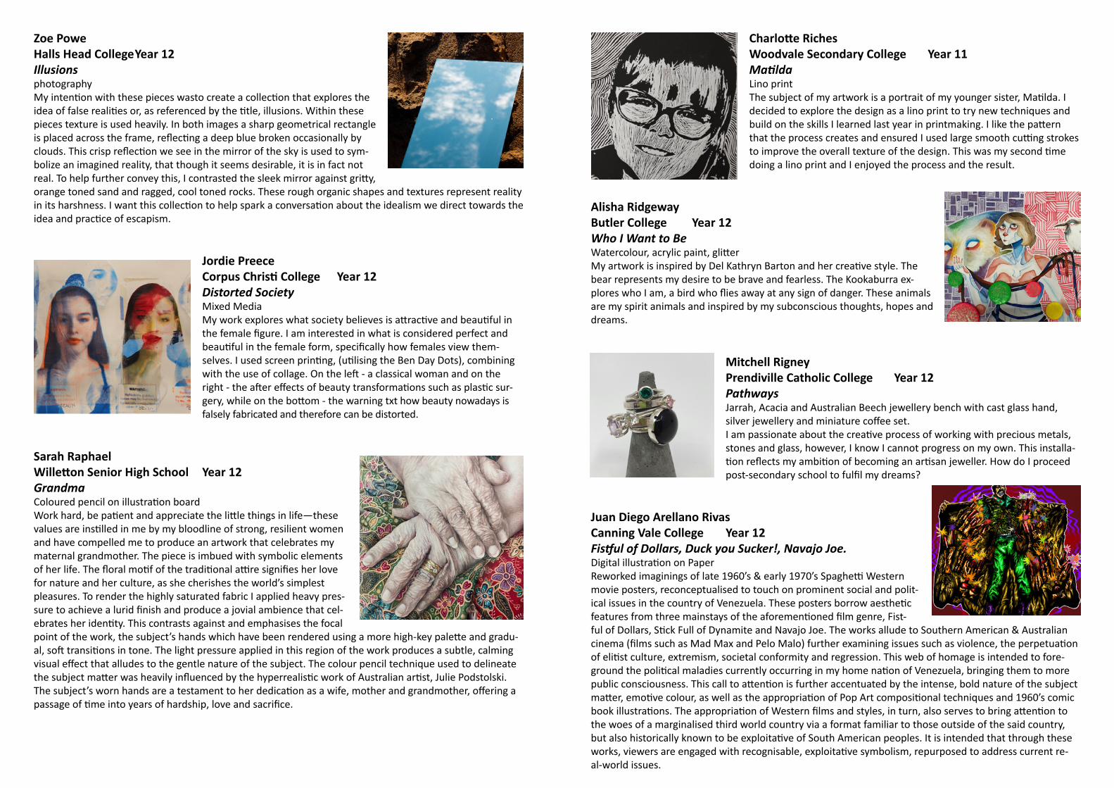
Zoe PoweHalls Head College Year 12IllusionsphotographyMy intention with these pieces wasto create a collection that explores the idea of false realities or, as referenced by the title, illusions. Within these pieces texture is used heavily. In both images a sharp geometrical rectangle is placed across the frame, reflecting a deep blue broken occasionally by clouds. This crisp reflection we see in the mirror of the sky is used to sym-bolize an imagined reality, that though it seems desirable, it is in fact not real. To help further convey this, I contrasted the sleek mirror against gritty, orange toned sand and ragged, cool toned rocks. These rough organic shapes and textures represent reality in its harshness. I want this collection to help spark a conversation about the idealism we direct towards the idea and practice of escapism.
Jordie PreeceCorpus Christi College Year 12Distorted SocietyMixed MediaMy work explores what society believes is attractive and beautiful in the female figure. I am interested in what is considered perfect and beautiful in the female form, specifically how females view them-selves. I used screen printing, (utilising the Ben Day Dots), combining with the use of collage. On the left - a classical woman and on the right - the after effects of beauty transformations such as plastic sur-gery, while on the bottom - the warning txt how beauty nowadays is falsely fabricated and therefore can be distorted.
Sarah RaphaelWilletton Senior High School Year 12GrandmaColoured pencil on illustration boardWork hard, be patient and appreciate the little things in life—these values are instilled in me by my bloodline of strong, resilient women and have compelled me to produce an artwork that celebrates my maternal grandmother. The piece is imbued with symbolic elements of her life. The floral motif of the traditional attire signifies her love for nature and her culture, as she cherishes the world’s simplest pleasures. To render the highly saturated fabric I applied heavy pres-sure to achieve a lurid finish and produce a jovial ambience that cel-ebrates her identity. This contrasts against and emphasises the focal point of the work, the subject’s hands which have been rendered using a more high-key palette and gradu-al, soft transitions in tone. The light pressure applied in this region of the work produces a subtle, calming visual effect that alludes to the gentle nature of the subject. The colour pencil technique used to delineate the subject matter was heavily influenced by the hyperrealistic work of Australian artist, Julie Podstolski. The subject’s worn hands are a testament to her dedication as a wife, mother and grandmother, offering a passage of time into years of hardship, love and sacrifice.
Charlotte RichesWoodvale Secondary College Year 11MatildaLino printThe subject of my artwork is a portrait of my younger sister, Matilda. I decided to explore the design as a lino print to try new techniques and build on the skills I learned last year in printmaking. I like the pattern that the process creates and ensured I used large smooth cutting strokes to improve the overall texture of the design. This was my second time doing a lino print and I enjoyed the process and the result.
Alisha RidgewayButler College Year 12Who I Want to BeWatercolour, acrylic paint, glitterMy artwork is inspired by Del Kathryn Barton and her creative style. The bear represents my desire to be brave and fearless. The Kookaburra ex-plores who I am, a bird who flies away at any sign of danger. These animals are my spirit animals and inspired by my subconscious thoughts, hopes and dreams.
Mitchell RigneyPrendiville Catholic College Year 12PathwaysJarrah, Acacia and Australian Beech jewellery bench with cast glass hand, silver jewellery and miniature coffee set. I am passionate about the creative process of working with precious metals, stones and glass, however, I know I cannot progress on my own. This installa-tion reflects my ambition of becoming an artisan jeweller. How do I proceed post-secondary school to fulfil my dreams?
Juan Diego Arellano RivasCanning Vale College Year 12Fistful of Dollars, Duck you Sucker!, Navajo Joe.Digital illustration on PaperReworked imaginings of late 1960’s & early 1970’s Spaghetti Western movie posters, reconceptualised to touch on prominent social and polit-ical issues in the country of Venezuela. These posters borrow aesthetic features from three mainstays of the aforementioned film genre, Fist-ful of Dollars, Stick Full of Dynamite and Navajo Joe. The works allude to Southern American & Australian cinema (films such as Mad Max and Pelo Malo) further examining issues such as violence, the perpetuation of elitist culture, extremism, societal conformity and regression. This web of homage is intended to fore-ground the political maladies currently occurring in my home nation of Venezuela, bringing them to more public consciousness. This call to attention is further accentuated by the intense, bold nature of the subject matter, emotive colour, as well as the appropriation of Pop Art compositional techniques and 1960’s comic book illustrations. The appropriation of Western films and styles, in turn, also serves to bring attention to the woes of a marginalised third world country via a format familiar to those outside of the said country, but also historically known to be exploitative of South American peoples. It is intended that through these works, viewers are engaged with recognisable, exploitative symbolism, repurposed to address current re-al-world issues.

Jasmine RobertsonSt Mary’s Anglican Girls School Year 12Arabian NightsRecycled book, foam core and paperMy model/sculpture is an interpretation of the book “Arabian Nights”, which is a collection of ancient Middle Eastern folk tales. Islamic architecture is the common thread throughout the tales, so I have used the pages of the book (with words written in Arabic) to create an Islamic Mosque. I believe that architecture is the best way to represent an ancient civiliza-tion. One of the most famous stories from Arabian Nights is Aladdin, and I have acknowledged this through the incorpora-tion of the flying carpet, above the dome.
Matilda ShandIona Presentation College Year 12What do you want to do when you finish high school?Ballpoint Pen on PaperMy artwork aims to address the way in which our identity is manipulated and handled by those closest to us. This personal point of view has been developed in response to the behaviours and opinions of others who believe that they ‘know best’ when it comes to my future choices. The repeated self-portraits express a sense of compliancy as I am being physically and emotionally pulled in different directions by a number of dif-ferent people. My appearance reflects a certain willingness to participate despite the seemingly uncomfortable and conflicting transformation being forced upon me.
Estelle ShulmanPerth College Year 11ReflectionLead pencil on watercolour paperThis artwork is a representation of childhood and freedom, the subject matter has been chosen to create a sense of nostalgia. The minimalistic background reflects the simplicity of childhood, where uncluttered thoughts and free spirit reigns. Through the artwork I am reflecting on my personal experiences at Rottnest and other coastal settings throughout summer. The bathers, interaction with fresh air, natural breezes and sunlight symbolise this carefree time. My art aims to convey a sense of longing for these childhood expe-riences to be relived, even if through imagination, and to remind people of what youth offers.
Samarah SilveraIona Presentation College Year 12The Hilton HoneyAdobe Photoshop and Illustrator and 3D Mock upIn Design Graphics, we were given the brief to create a branding and packaging concept for an imaginary Australian product. The Hilton Honey product is all about sustainability. They believe in creating products that stem from natural resources, something that can be used in everyday life. The vector honey bear and the bees illustrations are to reinforce the idea of nature in which the product comes from. A minimalistic yet eye-catch-ing design was created with the help of hand written typography to cre-ate a sense of playfulness. The elements and principles of design have been used to create a minimalistic, unique and individual visual branding.
Amara Sinclair-HillSchool of Isolated and Distance Education Year 11TendrilsWatercolour on paperThis self-portrait was created to reflect the way pressure and expectations affect my mental and emotional states. Braiding has connotations of love as an act of service, this painting aims to subvert this, the hair pulled tightly causes tension and pain. I wanted to explore the way benevolent intentions can still have damaging consequences. The different directions the hair is
being pulled reflect uncertainty and confusion, due to contrasting expectations, choices and pressures. The tightly knitted sweater has started unravelling, mirroring the mental deterioration.
Drew SmithKelmscott Senior High School Year 12Kalbarri CoastCeramicMy clay work is a “piece taken straight out of the land.” I was aiming to rec-reate the land formations as accurately as possible. To achieve this I used a gloss glaze to represent the sheen of the water and matte underglaze to contrast and show the dry, harsh land. My inspiration behind this piece comes from a family holiday to Kalbarri years ago. This area is very significant to me and holds valuable memories. To achieve the feel and atmosphere of the real life place, I used natural and organic forms, co-lours and textures bring life and mood to the piece.
Fiona SomervilleSt Hilda’s Anglican School For Girls Year 11Sick at HeartAcrylic paint and coloured pencils on acrylic paperMy work is about how greed and the pursuit of material things can ob-sess a person, causing them to become rotten to the core. This is repre-sented metaphorically by the unhealthy looking heart which is removed from its context and surrounded by infusion tubes. The lavish jewels cling to the heart, engulfing it and infecting it like a virus. I used a realist style for maximum impact and used a dark background to contrast with the visceral qualities of the heart and the dazzling light on the jewels.

Yasmine SotoCorpus Christi College Year 11Differencespencil, charcoal on paperThis artwork attempts to explore the relationship between the agony of internalised division and nature. The macabre nature of the piece creates a mood of unease and pain while attempts to connect the figure to the landscape continue to draw parallels to broken environ-ments. The tearing of the figure is juxtaposed with the dove of peace to indicate that there is still hope to stop current and future actions.
Amy StanleyWarnbro Community High School Year 12AcceptancePhotographWords and a tidal wave of hatred can beat you down. Stereotypes are safe havens and they are alos prisons; society expects you to fit into the role they give you and it’s unacceptable to unpick the seams and share what’s truly inside. I want the viewer to see that if you choose to embrace and accept yourself, others’ acceptance isn’t needed.My image is a contrast of vibrant colour and darkness, invoking the pride of acceptance, and the restricted, silent burden of a person concealing who they truly are. The rainbow reaches out to hold hands as a universal symbol of acceptance and solidarity. The mouth is stitched to physically manifest the many ways in which people who are ‘other’ are held silent; expectations, fear, misogyny, hatred, disappointment, isolation. As a message of hope, the subject has taken the stitches out on the right side and embraced the colours that speak to her, as a way of demonstrating her true ‘self’ and her courage to love who she wants. Acceptance means holding my hand, even when it is different. Together, I am stronger.
Calum StirlingPerth Modern School Year 12Self IdentityDigital PrintIn settings such as school and work, it can be difficult to show who we really are, especially when we are expected to act and behave in a particular way, such as in the classroom. Teachers, other students and co-workers almost never see the real side of you, and we’re often only labelled by our names, grades and other personal infor-mation. As we grow older and more comfortable with who we are, we slowly develop our own image of self-identity and convey that to the people around us. These images show three subjects with their faces sub-divided and rearranged. This self-development we experi-ence can be seen as the pieces move and organise themselves in the
correct manner, eventually making our whole self-representation.
Fuka TakadaSt Mark’s Anglican Community School Year 11LostPhotographLost - but now I am found
Megan ThanooWoodvale Secondary College Year 12la cinaAcrylic on canvas boardLa cina means town in Italian. I chose the streetscape of Leederville to represent contemporary society and Australian identity. I was inspired by the modernist artist Grace Cossington Smith and contem-porary landscape artist, Michael White. I began my painting by faith-fully following the photograph in a more moderist style but as I built up the layers I desaturated the colours and blended the brushstokes to make the buildings look less structured.
Tarvorreak TuonComo Secondary College Year 12AngelPaper Clay with underglaze stainsI based my sculpture off a female angel. I wanted to make an angel that had a sad and neutral look on her face. The first thing I had to do for my design was draw it out. I then began clay work. The first thing I had to do was work on the body. The next thing I started on was the head. I then got up to putting in the details on my sculp-ture which was putting on the hair, ears, mouth, nose and eyes. For the finishing touch I put a little Togo across her body. I really enjoyed working on paper clay. Making and designing a sculpture that is based on a something that is human like was challenging.
Via Clarisse VillarojoHampton Senior High School Year 12Handpaper clay, black glaze‘Hand’ explores the different styles, cultures and history of tattoo art. I was inspired by the sculptural pieces of Evenlyn Tannus who juxtaposed ceramics with tattoo design. Through this investigation, I created my own tattoo style and built my own hand out of clay. I like how my artwork creates contrasting connotations between ce-ramics and tattoo design. Tattoo design is not always seen as ‘real’ art but by using a common art medium helps elevate the design into artwork status.
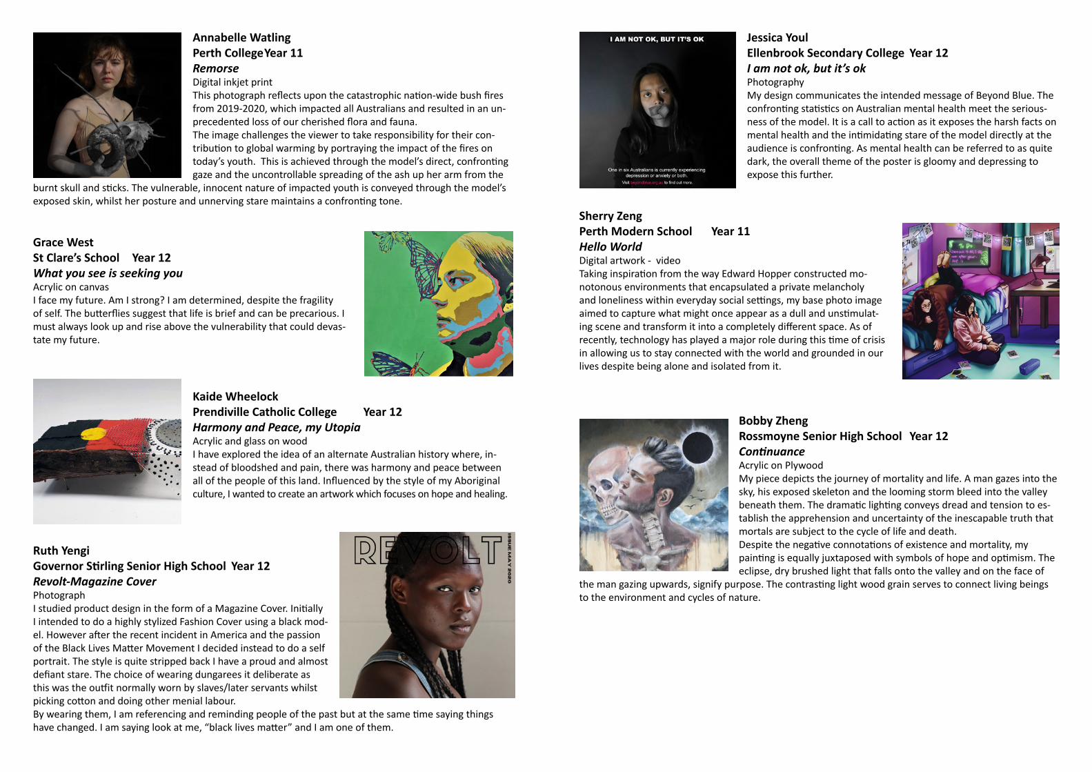
Annabelle WatlingPerth College Year 11RemorseDigital inkjet printThis photograph reflects upon the catastrophic nation-wide bush fires from 2019-2020, which impacted all Australians and resulted in an un-precedented loss of our cherished flora and fauna.The image challenges the viewer to take responsibility for their con-tribution to global warming by portraying the impact of the fires on today’s youth. This is achieved through the model’s direct, confronting gaze and the uncontrollable spreading of the ash up her arm from the
burnt skull and sticks. The vulnerable, innocent nature of impacted youth is conveyed through the model’s exposed skin, whilst her posture and unnerving stare maintains a confronting tone.
Grace WestSt Clare’s School Year 12What you see is seeking youAcrylic on canvasI face my future. Am I strong? I am determined, despite the fragility of self. The butterflies suggest that life is brief and can be precarious. I must always look up and rise above the vulnerability that could devas-tate my future.
Kaide WheelockPrendiville Catholic College Year 12Harmony and Peace, my UtopiaAcrylic and glass on woodI have explored the idea of an alternate Australian history where, in-stead of bloodshed and pain, there was harmony and peace between all of the people of this land. Influenced by the style of my Aboriginal culture, I wanted to create an artwork which focuses on hope and healing.
Ruth YengiGovernor Stirling Senior High School Year 12Revolt-Magazine CoverPhotographI studied product design in the form of a Magazine Cover. Initially I intended to do a highly stylized Fashion Cover using a black mod-el. However after the recent incident in America and the passion of the Black Lives Matter Movement I decided instead to do a self portrait. The style is quite stripped back I have a proud and almost defiant stare. The choice of wearing dungarees it deliberate as this was the outfit normally worn by slaves/later servants whilst picking cotton and doing other menial labour.By wearing them, I am referencing and reminding people of the past but at the same time saying things have changed. I am saying look at me, “black lives matter” and I am one of them.
Jessica YoulEllenbrook Secondary College Year 12I am not ok, but it’s okPhotographyMy design communicates the intended message of Beyond Blue. The confronting statistics on Australian mental health meet the serious-ness of the model. It is a call to action as it exposes the harsh facts on mental health and the intimidating stare of the model directly at the audience is confronting. As mental health can be referred to as quite dark, the overall theme of the poster is gloomy and depressing to expose this further.
Sherry ZengPerth Modern School Year 11Hello WorldDigital artwork - videoTaking inspiration from the way Edward Hopper constructed mo-notonous environments that encapsulated a private melancholy and loneliness within everyday social settings, my base photo image aimed to capture what might once appear as a dull and unstimulat-ing scene and transform it into a completely different space. As of recently, technology has played a major role during this time of crisis in allowing us to stay connected with the world and grounded in our lives despite being alone and isolated from it.
Bobby ZhengRossmoyne Senior High School Year 12ContinuanceAcrylic on PlywoodMy piece depicts the journey of mortality and life. A man gazes into the sky, his exposed skeleton and the looming storm bleed into the valley beneath them. The dramatic lighting conveys dread and tension to es-tablish the apprehension and uncertainty of the inescapable truth that mortals are subject to the cycle of life and death.Despite the negative connotations of existence and mortality, my painting is equally juxtaposed with symbols of hope and optimism. The eclipse, dry brushed light that falls onto the valley and on the face of
the man gazing upwards, signify purpose. The contrasting light wood grain serves to connect living beings to the environment and cycles of nature.


![BMC Genetics BioMed Central...The genome-scan meta-analysis (GSMA) method proposed by Wise et al. [1] accommodates differ-ing marker maps in a meta-analysis, but this test is based](https://static.fdocuments.in/doc/165x107/60ee43ee13e7da6c30516d11/bmc-genetics-biomed-central-the-genome-scan-meta-analysis-gsma-method-proposed.jpg)


