MEPHISTOPOLIS NOIRdocs.daz3d.com/.../index/17246/17246-mephistopolis-noir-manual.pdf · project...
14
MEPHISTOPOLIS NOIR 20 TH CENTURY & NEWS-HERALD DAZ|S TUDIO SHADERS BY EUSTACE S CRUBB
-
Upload
nguyentuong -
Category
Documents
-
view
215 -
download
2
Transcript of MEPHISTOPOLIS NOIRdocs.daz3d.com/.../index/17246/17246-mephistopolis-noir-manual.pdf · project...
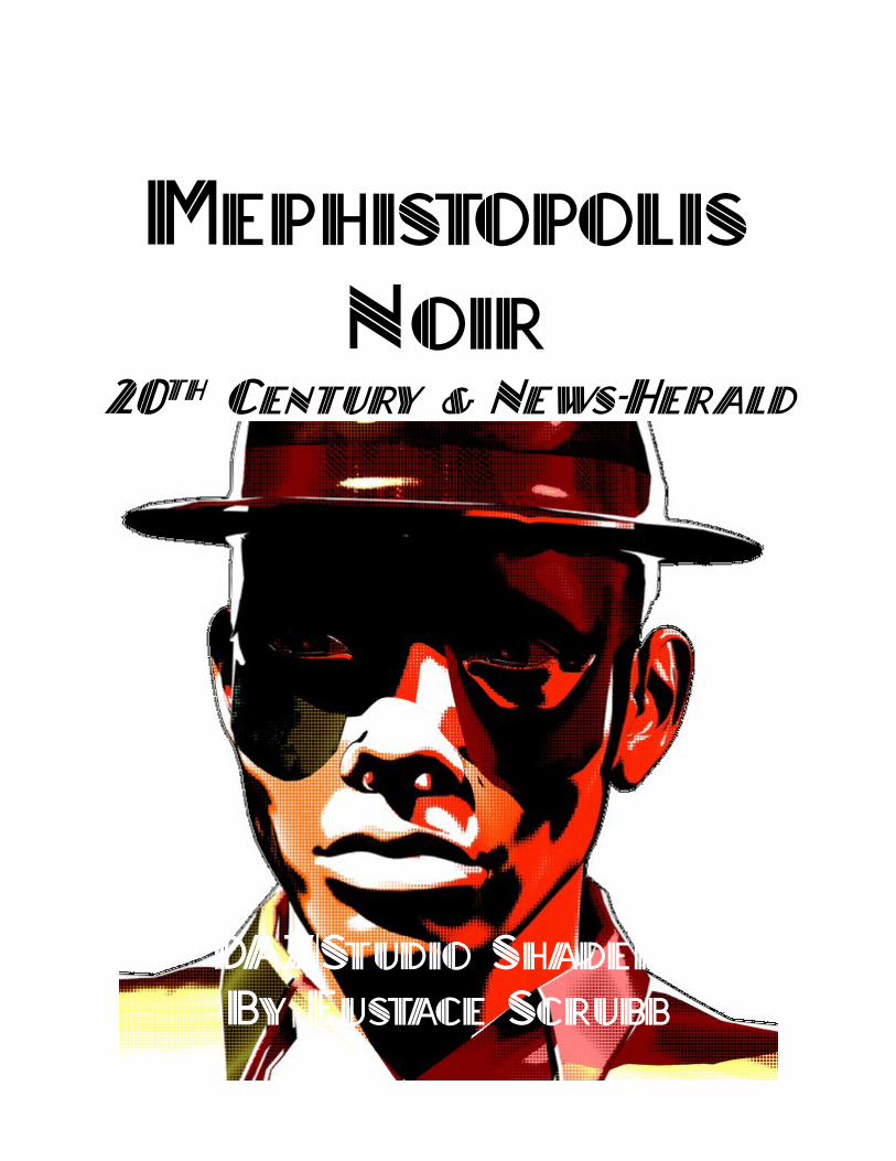
MEPHISTOPOLIS
NOIR 20TH CENTURY & NEWS-HERALD
DAZ|STUDIO SHADERS BY EUSTACE SCRUBB
Credits I'd like to credit many friends, both online
and off, artists and otherwise, without whom this
project would have been impossible:
My good Creator and Redeemer, Jesus
Christ, whose art I am and without whose imprint
I cannot create a thing. My dear, and very long-
suffering, wife who keeps at me to get my projects
done (so as to spend time on her, of course).
My development and consulting team,
known only by their anonymous handles on the 3D
fora, some of whom beta-tested and some who just
gave advice, encouragement, or code snippets (the
latter are credited appropriately within), or
inspiration:
• Agent_Unawares
• AgeOfArmour
• BagginsBill
• BelovedAlia
• BishounenTaurus
• DollyGirl
• JakiBlue
• JesterVII
• JustTheBast
• LuxCompagno
• Pendraia
• Richard Hazeltine
• RKane_1
• SassyWench
• Zigraphix
Thanks also go to the rest of my friends
and correspondents on the DAZ-3D fora, and to
the artists living, dead, and obscure, whose work
inspired this project: Stan Lee, Rachel Stahl, Roy
Lichtenstein, J. R. R. Tolkien, El Greco, N. C.
Wyeth, Howard Pyle, and many more, like the
anonymous painters of pulp magazine covers.
Stuart Immonen is also worth mentioning.
Plaid textures used in the Tartan presets
included in this package are taken from swatches
found at http://resources.scottishtartans.org/ as a
Fair Use and/or Public Domain resource and out
of copyright.
Contents
• Why Mephistopolis?
• Rules for Use
• Setting Up The Shaders
• Surface Properties
◦ Diffuse
◦ Ambient
◦ Specular
◦ Bump
◦ Displacement
◦ Tiling
• Raytracing
◦ Reflection
◦ Refraction
• Comic Effects
◦ Outlines
◦ Depth Cue
◦ Clamps
◦ Dots Off
◦ Dot Density
◦ Color Modes
• Geometry Shells
• Metals and Gems
• Using the Depth Cue
• Line-Art Illustration
• Plaid and Tartan
• Roy and other Questions
• User Gallery
Why Mephistopolis? Mephistopolis is a bold new shader set for
DAZ 3D's flagship software, DAZ|Studio. While
other shaders compete to give you the most pristine,
the most subtle, the most photo-real version of your
subject available, Mephistopolis does little of that.
While other toon shaders exude sweetness and
light, evoking childhood joys, the tones of
Mephistopolis are stark, bright like naked bulbs,
and hard. These may be the colors of the pulp
magazines behind the counter, or your uncle's box
of Thrilling Tales in the back of Gramps' garage.
This is Noir like you remember but like you've
never seen it before. The name “Mephistopolis” is from
“mephitus”, or malodorous, and “-polis” for “city”.
It alludes to Faust's devil Mephistopheles, named
“lover of foulness” as well as Mephitus Mephitus,
the Striped Skunk. It translates to “Skunkville”,
and it might be any city, anywhere. From Red
Harvest's Poisonville to the City of Angels in The
Big Sleep, and from Mickey Spillane's New York
to The Untouchables' Chicago and Walker Percy's
Feliciana Parish, or Clark Kent's Metropolis and
the Lantern's Coastal City. It is a symbol and
symptom of the modern world. And in this case, it
is a versatile, all-procedural† shader package to
replicate dot-printed comics and newspaper images.
(I have discovered that it's also the name of a horror
book trilogy by one Edward Lee, and another book
by Mr. Keith Planit: their work has no bearing on
or direct connection to mine.) This is not the only
comic-book shader or pop-art shader on the market,
but it is the first comprehensive toon shader
package built on actual color models and true
materials raytracing, with map tiling, crisp outlines
and integrated opacity. And it is the only one built
from the beginning with backwards compatibility
to DS3 in mind.
The Mephistopolis shaders are versatile,
easy to use, and render quickly. The properties
follow those of the DAZ|Studio Default Shader,
and are set to allow you to copy and paste material
settings from any standard shader into it. In DS3
and 4.0 you will need to copy each material's
†Tiled plaid materials use images in the Eustace/Tartans
directory of your textures folder. No other image files
settings before applying the shader base: this is
a drawback of Shader Mixer materials in older
versions. I endeavor to make these shaders, and this
documentation, as user-friendly as practical, so if
I seem to be telling you what you knew already, or
preaching to the choir, just say “Amen!” and we'll
move on.
are required or called.
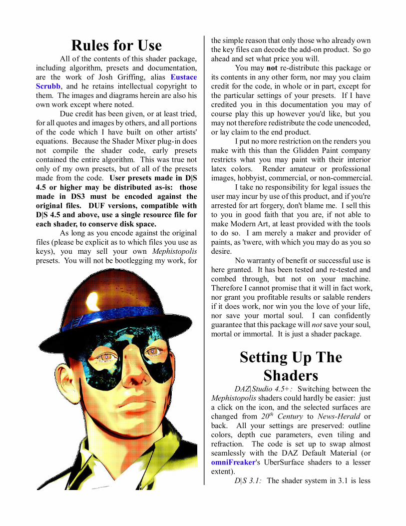
Rules for Use All of the contents of this shader package,
including algorithm, presets and documentation,
are the work of Josh Griffing, alias Eustace
Scrubb, and he retains intellectual copyright to
them. The images and diagrams herein are also his
own work except where noted. Due credit has been given, or at least tried,
for all quotes and images by others, and all portions
of the code which I have built on other artists'
equations. Because the Shader Mixer plug-in does
not compile the shader code, early presets
contained the entire algorithm. This was true not
only of my own presets, but of all of the presets
made from the code. User presets made in D|S
4.5 or higher may be distributed as-is: those
made in DS3 must be encoded against the
original files. DUF versions, compatible with
D|S 4.5 and above, use a single resource file for
each shader, to conserve disk space. As long as you encode against the original
files (please be explicit as to which files you use as
keys), you may sell your own Mephistopolis
presets. You will not be bootlegging my work, for
the simple reason that only those who already own
the key files can decode the add-on product. So go
ahead and set what price you will. You may not re-distribute this package or
its contents in any other form, nor may you claim
credit for the code, in whole or in part, except for
the particular settings of your presets. If I have
credited you in this documentation you may of
course play this up however you'd like, but you
may not therefore redistribute the code unencoded,
or lay claim to the end product. I put no more restriction on the renders you
make with this than the Glidden Paint company
restricts what you may paint with their interior
latex colors. Render amateur or professional
images, hobbyist, commercial, or non-commercial.
I take no responsibility for legal issues the
user may incur by use of this product, and if you're
arrested for art forgery, don't blame me. I sell this
to you in good faith that you are, if not able to
make Modern Art, at least provided with the tools
to do so. I am merely a maker and provider of
paints, as 'twere, with which you may do as you so
desire.
No warranty of benefit or successful use is
here granted. It has been tested and re-tested and
combed through, but not on your machine.
Therefore I cannot promise that it will in fact work,
nor grant you profitable results or salable renders
if it does work, nor win you the love of your life,
nor save your mortal soul. I can confidently
guarantee that this package will not save your soul,
mortal or immortal. It is just a shader package.
Setting Up The
Shaders DAZ|Studio 4.5+: Switching between the
Mephistopolis shaders could hardly be easier: just
a click on the icon, and the selected surfaces are
changed from 20th Century to News-Herald or
back. All your settings are preserved: outline
colors, depth cue parameters, even tiling and
refraction. The code is set up to swap almost
seamlessly with the DAZ Default Material (or
omniFreaker's UberSurface shaders to a lesser
extent). D|S 3.1: The shader system in 3.1 is less
accommodating than in 4.x, but the shaders still
work as ordered. It just takes a little longer to
switch them over. Apply them one material at a
time, as follows: 1. Save your existing scene first. Always save
your scenes and projects regularly.
2. Select the material to switch shaders on in
the Surfaces tab. At the bottom of the tab,
click [Copy] to retain the current values. 3. Under Scene, or in the workspace, select
the figure or node whose surface you are re-
shading. (D|S 4.x does this when the
surface is selected.) 4. In Surfaces again, select all surfaces you
wish to apply the copied settings to. 5. From the Content menu, select Shaders » !
Mephistopolis Liquor and Lead » 20th
Century.dsb or Shaders » ! Mephistopolis
Liquor and Lead » News-Herald.dsb as you
prefer. Wait for it: if you have more
surfaces to change than you have RAM to
change them with, it may take a minute or
so. 6. When the change is complete, the color of
the surfaces will be pale and nondescript,
but all affected surfaces will still be
selected. Click [Paste] under Surfaces.
Based on the number of maps, et cetera,
this may take even longer than the last step. a) If all else fails and you are forced to
restart the program, just re-open the
scene and conduct the above steps one
material at a time. This is not always
necessary, and is a pain in the keister for
complex figures, but sometimes that's
what it takes.
7. Adjust settings. Save your work again.
8. Repeat as necessary.
Note also that the effects you see in DS3
may not be quite the same in DS4, because they use
different versions of 3Delight. In DS3 the Ambient
channel is strong enough at 100% to actually color
the shadowed side of the mesh, despite Diffuse or
Specular input. The DS4 renderer already pushes
hues toward saturation, as much as doubling the
saturation of certain tones, and darkening the
overall effect.
If the basic shaders are applied (in DS4)
over any shader using standardized values, the
basic settings should not be affected. On the other
hand, if you need to switch from one to the other,
it's almost a direct conversion: even the
ColorMode value will be transferred (RGB
becomes B&W, and HSI becomes Sepia. If you
apply a 20th C. preset onto a News-Herald surface,
it will not retain the News-Herald shader under the
new values, or vise versa.
If the HSI in 20th C. does not seem to be
working—if all of your textures are black and
heavy, look at the Diffuse color. You may have
attempted too dark a color altogether. If your
baseline material value is too dark for your light
setup, you will render flat black in pure HSI mode.
In the handling of darker colors, News-Herald is
unequivocally worse: both color modes render
too-dark objects in solid blackness. It is a Noir
shader, after all.
If your color is too pale, too washed out, it
will render in Back and White in 20th C.'s HSI
mode: it will look exactly like the Sepia mode in
News-Herald when the Sepia value is white. Here
intensity (rather, the lack of it) is greater than
saturation, and the paint points of
the hue are lost in shadow.
Try something less
grey.
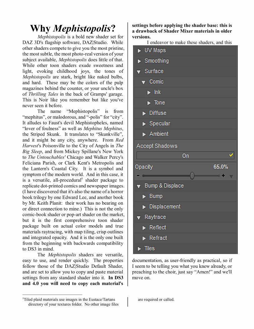
Surface Properties In the Mephistopolis shader interface, I
have sought as nearly as possible to keep things
simple and familiar. Most of the color values are
mappable, and both Bump and Displacement are
accounted for.
The following properties will be familiar to
anyone who uses the DAZ|Studio Surfaces tab to
any extent. They are wired to do exactly the same
things and relate to one another in exactly the same
ways.
• Diffuse is mappable: it is still the base color
for your mesh's surface. This will show up, as
always, on the OpenGL preview in the program.
◦ Diffuse Strength is also mappable:
it calculates a float percentage and multiplies
the value of the Diffuse channel thereby. I
left this mappable specifically for localized
Diffuse effects like tattoos, but unlike the
DAZ Default Material, tattoos will present in
gray-scale only. For color tattoos use the
Image Editor or Layered Image Editor on the
Diffuse texture itself, or use an outside
program (DS3 users).
• Ambient is mappable: as usual this is the
“base” material color where the light does not
reach.
◦ Ambient Strength is not mappable.
The DS3 version of 3Delight handles the
channel blending differently than does that in
DS4.x, so users in DS3 may find a lower AS
value necessary to achieve the desired effect
(the default value is 100%).
• Specular is mappable: this is the default
highlight color of your object, when it is seen in
white light.
◦ Roughness: Essentially the surface
grain and coarseness of the surface, as it
affects light scattering. A higher value (1 is
default) results in a smaller highlight. Lower
values spread the highlight. Enough like
Glossiness that many shaders leave it out,
but what's Noir without a little unnecessary
Roughness? Not mappable.
◦ Glossiness: Not mappable. The
sharpness of the highlight on your object.
Not quite the same as Roughness, as it deals
more with the sharpness and intensity of the
highlight, but again, a high number yields a
small highlight.
◦ Specular Strength is not mappable.
◦ Multiply Specular through
Opacity: This button comes standard. Turn
it off to allow highlights on transparent
objects.
• Opacity: Exactly what it says. A mappable
percentage of a material's opacity at any given
point. In contrast to other toon shaders, partial
opacity does not ghost backfacing polygons in the
outline color. Because the opacity is generally
mapped from the whole mesh, this is the only
mapped value that does not tile.
• Accept Shadows: Because every once in a
while, looming figures leave you in the dark.
These are the basic surface settings in the
user interface. They are fairly straightforward
3Delight material properties and work the same
way, basically, in any correctly-configured
Renderman shader. The next parameters are also
basic to the complete D|S shader, but affect the
shape of the surface, rather than its color.
• Bump: This mappable parameter provides
surface irregularities without deforming the mesh
itself.
◦ Negative: The depth of bump-
mapped irregularities below the surface.
◦ Positive: The height of bump-
mapping above the surface.
• Displacement: Functions rather like Bump,
but distends the mesh surface at render time
according to its map.
◦ Minimum: The lowest distortion
into the surface of the mesh by
Displacement at 100%.
◦ Maximum: The highest extension
of the mesh surface by Displacement at
100%.
The Tiling functions are not grouped
among the surface functions because they affect all
maps equally, except Opacity as noted above. My
thanks go to Zigraphix for working out the tile
rotation sequence in the Shader Mixer tutorial.
• Horizontal Tiles: Texture map iterations
across the mesh's UV map from left to right.
• Vertical Tiles: Texture map iterations across
the mesh's UV map from left to right.
• Horizontal Offset: Portion of whole tile
width to shift texture left or right of UV center.
• Vertical Offset: Portion of whole tile height
to shift texture up or down from UV center.
• Pattern Angle: Texture rotation angle in
degrees: -180º to 180º.
Raytracing The casual user will find many more
properties listed for Reflection and Refraction in
the Mephistopolis shader interface than in most
other general-purpose shaders. This is by design,
because I wanted to make the most of the ray-trace
capabilities of the 3Delight renderer. You will also
see that the Reflection and Refraction channels
are not mappable, constraining them to true
raytracing.
• Reflection Color: The color by which the
reflected scene image is multiplied. Reflected rays
bounce off surfaces and do not penetrate to the
interior of the mesh. Not mappable, because I
dislike mapped reflection.
◦ Reflection Strength: As it says—the
reflective strength of the material.
◦ Reflect Distance: The length of the
reflective ray, from bounce point to furthest
reflected object. So it's just an incredibly long
vector....
◦ Reflection Cone: This is the angle of
spread for the raytrace: from a single ray (0º
cone) all the way out: the end result gives an
average reflected value of everything within
the cone. Cones overlap each other and the
resulting reflection will be blurred accordingly.
◦ Sample Reflection: Number of mesh
collisions to calculate reflection from. The
reflection of a reflection requires at least one
sample per mirrored surface. Mutually
mirroring surfaces will need a high SR1 value.
◦ Reflection Bias: Offset of the reflection
from the reflecting mesh. The default is -1 to
simulate the depth of a mirror's glass, but bare
polished metals should be biased at zero.
• Refraction Color: Color multiplied into
refracted scene. Refracted rays are those passing
through an object's interior: thus it is rarely used
with 100% Opacity. Not mappable.
◦ Index of Refraction: As advertised.
Default is 1.0 (no refraction /air).
◦ Refraction Strength: The strength of the
material's refraction.
◦ Refract Distance: Distance to the furthest
refracted point in the scene.
◦ Refraction Cone: The same concept as
the Reflection Cone, now applied to
Refraction.
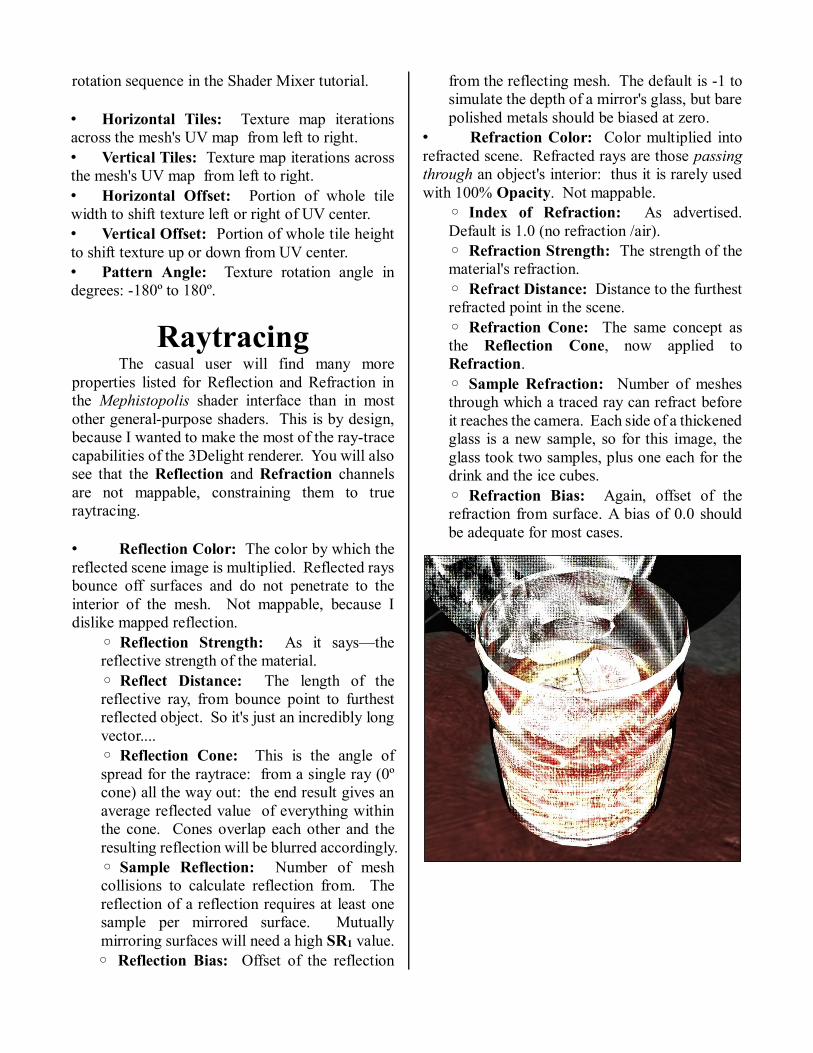
◦ Sample Refraction: Number of meshes
through which a traced ray can refract before
it reaches the camera. Each side of a thickened
glass is a new sample, so for this image, the
glass took two samples, plus one each for the
drink and the ice cubes.
◦ Refraction Bias: Again, offset of the
refraction from surface. A bias of 0.0 should
be adequate for most cases.
Comic Effects At the heart of the Mephistopolis shaders
are the comic effects that change the ordinary
surface's appearance into a vivid comic-book or
newsprint panel, or eye-popping pop art. The dot-
print filter, first published by JustTheBast on the
DAZ3D forum, screens each of the component
layers of the surface material color so that each
layer is presented in pure dots on white. The color
mode filters set the dot sizes by the value of each
layer at the given point, and the layers are overlaid
in a representation of the original value, like the
layers of colored ink applied to a page. All of the
regular surface settings pass through the dot filter,
including Opacity.
The outline of the object is at first glance an
ordinary 3Delight toon outline, based on the mesh's
normal angles. But the Mephistopolis outline is
sharper and crisper than others, without Opacity
interference. I've also applied a depth-from-
camera modifier (based on a code snippet uploaded
by Agent_Unawares) to enhance nearer objects'
lines and thin those in the distance.
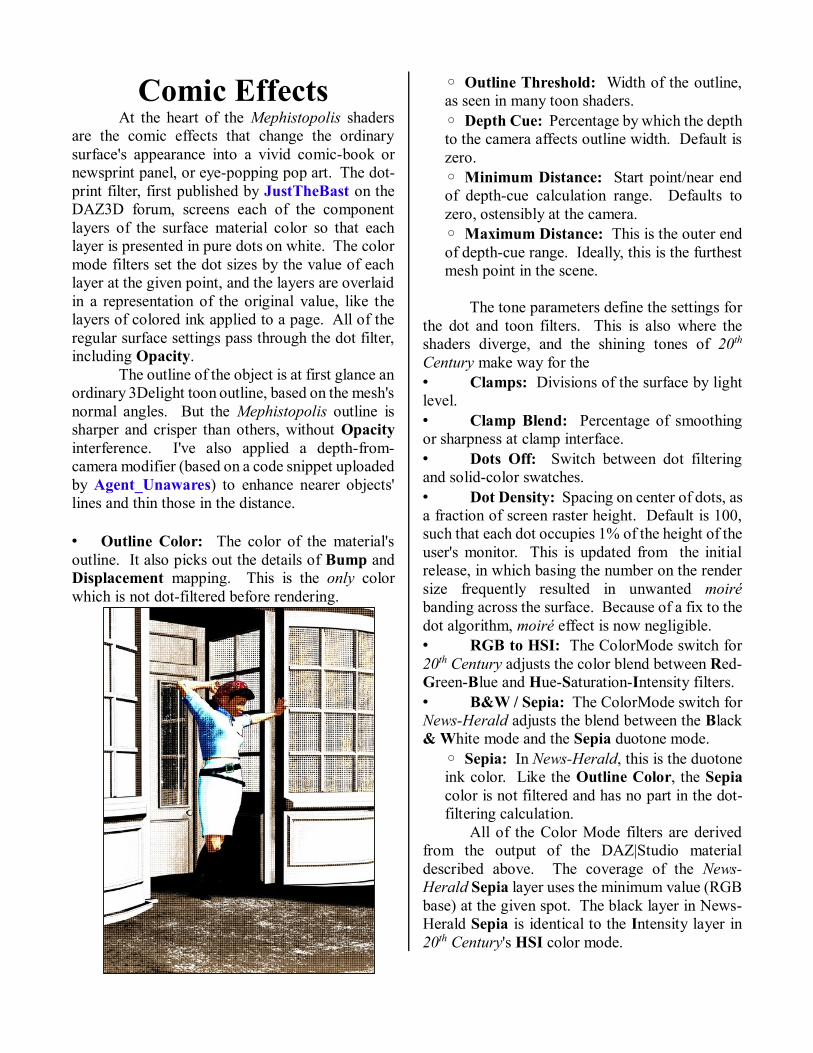
• Outline Color: The color of the material's
outline. It also picks out the details of Bump and
Displacement mapping. This is the only color
which is not dot-filtered before rendering.
◦ Outline Threshold: Width of the outline,
as seen in many toon shaders.
◦ Depth Cue: Percentage by which the depth
to the camera affects outline width. Default is
zero.
◦ Minimum Distance: Start point/near end
of depth-cue calculation range. Defaults to
zero, ostensibly at the camera.
◦ Maximum Distance: This is the outer end
of depth-cue range. Ideally, this is the furthest
mesh point in the scene.
The tone parameters define the settings for
the dot and toon filters. This is also where the
shaders diverge, and the shining tones of 20th
Century make way for the
• Clamps: Divisions of the surface by light
level.
• Clamp Blend: Percentage of smoothing
or sharpness at clamp interface.
• Dots Off: Switch between dot filtering
and solid-color swatches.
• Dot Density: Spacing on center of dots, as
a fraction of screen raster height. Default is 100,
such that each dot occupies 1% of the height of the
user's monitor. This is updated from the initial
release, in which basing the number on the render
size frequently resulted in unwanted moiré
banding across the surface. Because of a fix to the
dot algorithm, moiré effect is now negligible.
• RGB to HSI: The ColorMode switch for
20th Century adjusts the color blend between Red-
Green-Blue and Hue-Saturation-Intensity filters.
• B&W / Sepia: The ColorMode switch for
News-Herald adjusts the blend between the Black
& White mode and the Sepia duotone mode.
◦ Sepia: In News-Herald, this is the duotone
ink color. Like the Outline Color, the Sepia
color is not filtered and has no part in the dot-
filtering calculation.
All of the Color Mode filters are derived
from the output of the DAZ|Studio material
described above. The coverage of the News-
Herald Sepia layer uses the minimum value (RGB
base) at the given spot. The black layer in News-
Herald Sepia is identical to the Intensity layer in
20th Century's HSI color mode.
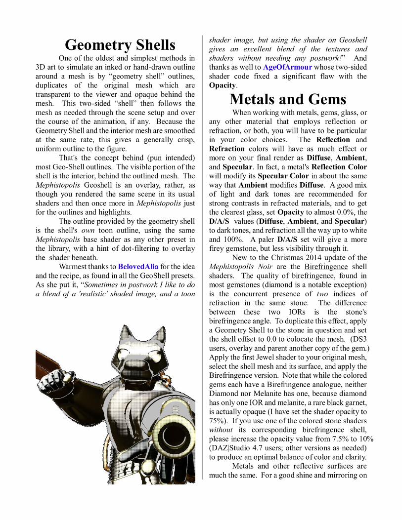
Geometry Shells
One of the oldest and simplest methods in
3D art to simulate an inked or hand-drawn outline
around a mesh is by “geometry shell” outlines,
duplicates of the original mesh which are
transparent to the viewer and opaque behind the
mesh. This two-sided “shell” then follows the
mesh as needed through the scene setup and over
the course of the animation, if any. Because the
Geometry Shell and the interior mesh are smoothed
at the same rate, this gives a generally crisp,
uniform outline to the figure.
That's the concept behind (pun intended)
most Geo-Shell outlines. The visible portion of the
shell is the interior, behind the outlined mesh. The
Mephistopolis Geoshell is an overlay, rather, as
though you rendered the same scene in its usual
shaders and then once more in Mephistopolis just
for the outlines and highlights. The outline provided by the geometry shell
is the shell's own toon outline, using the same
Mephistopolis base shader as any other preset in
the library, with a hint of dot-filtering to overlay
the shader beneath. Warmest thanks to BelovedAlia for the idea
and the recipe, as found in all the GeoShell presets.
As she put it, “Sometimes in postwork I like to do
a blend of a 'realistic' shaded image, and a toon
shader image, but using the shader on Geoshell
gives an excellent blend of the textures and
shaders without needing any postwork!” And
thanks as well to AgeOfArmour whose two-sided
shader code fixed a significant flaw with the
Opacity.
Metals and Gems When working with metals, gems, glass, or
any other material that employs reflection or
refraction, or both, you will have to be particular
in your color choices. The Reflection and
Refraction colors will have as much effect or
more on your final render as Diffuse, Ambient,
and Specular. In fact, a metal's Reflection Color
will modify its Specular Color in about the same
way that Ambient modifies Diffuse. A good mix
of light and dark tones are recommended for
strong contrasts in refracted materials, and to get
the clearest glass, set Opacity to almost 0.0%, the
D/A/S values (Diffuse, Ambient, and Specular)
to dark tones, and refraction all the way up to white
and 100%. A paler D/A/S set will give a more
firey gemstone, but less visibility through it. New to the Christmas 2014 update of the
Mephistopolis Noir are the Birefringence shell
shaders. The quality of birefringence, found in
most gemstones (diamond is a notable exception)
is the concurrent presence of two indices of
refraction in the same stone. The difference
between these two IORs is the stone's
birefringence angle. To duplicate this effect, apply
a Geometry Shell to the stone in question and set
the shell offset to 0.0 to colocate the mesh. (DS3
users, overlay and parent another copy of the gem.)
Apply the first Jewel shader to your original mesh,
select the shell mesh and its surface, and apply the
Birefringence version. Note that while the colored
gems each have a Birefringence analogue, neither
Diamond nor Melanite has one, because diamond
has only one IOR and melanite, a rare black garnet,
is actually opaque (I have set the shader opacity to
75%). If you use one of the colored stone shaders
without its corresponding birefringence shell,
please increase the opacity value from 7.5% to 10%
(DAZ|Studio 4.7 users; other versions as needed)
to produce an optimal balance of color and clarity. Metals and other reflective surfaces are
much the same. For a good shine and mirroring on
your metallic surfaces, use a bright Reflection
color and high Reflection Strength, but a darker
Diffuse color. Specular may still be pale, but too
much shine may disrupt the reflections. Metals
need a very low refraction value, if any at all: in
3Delight (and real life) the refraction addresses
light as it passes through an interior. Too high and
bright a refraction will show you the interior shape
of an otherwise opaque mesh: I know, because I've
tried it. I'm sure it would be very useful somehow,
but I don't have any use for it.
Using the Depth Cue The Depth Cue feature modifies the width
of the outline according to the object's distance
from the camera. Using Agent_Unawares' tidy
depth shader snippet (available on line), one may
enhance the foreground outlines and diminish
those in the background. Its best use is for large
props, sets, vehicles, and figures that extend
significant distances into the background, so that
the diminishment of the line may be seen. When
the viewer's line of sight is roughly parallel to the
surface of a mesh, the Edge-Blend-based outline
seeks to incorporate it into the outline. This is
often undesirable, when we wish to see, for
instance, the colors of the bricks or the lettering of
the posters on a wall, or the goods behind shop-
windows. The concept is based on the Inking Rule,
as expressed by comic artist RKane_1 on the DAZ
3D boards: “General rules of inking include
objects closer to the viewer should be more heavily
outlined with greater line variance. Objects in the
background should have a thin line around them
and little line variance.
“Line weight (i. e. Thickness) should be
greater on the side of the object with the greatest
amount of shade.”
It may take a couple of minutes to find just
how deep the geometry of your scene is, in
meters—the radius of your skydome is a good
place to start but only if you are using one. Set the
Maximum Distance just a little inside of the
skydome, or a little beyond if you need outlines to
cross it. The Minimum Distance is assumed to
be at the camera, defaulting to 0.0 meters from the
viewpoint of the render, but may be adjusted as
necessary. When the render is completed, the
objects at Maximum Distance or beyond will
have no outline left at all (at 100% Depth Cue),
and the foreground will be inked in bold relief.
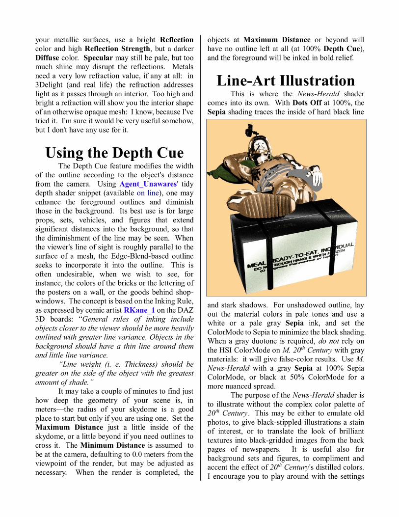
Line-Art Illustration This is where the News-Herald shader
comes into its own. With Dots Off at 100%, the
Sepia shading traces the inside of hard black line
and stark shadows. For unshadowed outline, lay
out the material colors in pale tones and use a
white or a pale gray Sepia ink, and set the
ColorMode to Sepia to minimize the black shading.
When a gray duotone is required, do not rely on
the HSI ColorMode on M. 20th Century with gray
materials: it will give false-color results. Use M.
News-Herald with a gray Sepia at 100% Sepia
ColorMode, or black at 50% ColorMode for a
more nuanced spread.
The purpose of the News-Herald shader is
to illustrate without the complex color palette of
20th Century. This may be either to emulate old
photos, to give black-stippled illustrations a stain
of interest, or to translate the look of brilliant
textures into black-gridded images from the back
pages of newspapers. It is useful also for
background sets and figures, to compliment and
accent the effect of 20th Century's distilled colors.
I encourage you to play around with the settings
and develop your own shader presets for whatever
style you prefer.
The News-Herald presets in this package
do not affect the D/A/S settings, but portray the
selected materials according to the News-Herald
parameters described.
Plaid and Tartan A brief word must be said about plaids,
tartans, and other tiled textures. I have included a
sampling of Scots clan tartans among the presets in
order to demonstrate the tiling options. They may
render too large a check for your purposes, or more
likely, too small: most well-mapped garments
should need very little adjustment in scale. But if
you find it necessary, adjust both Horizontal and
Vertical tiles proportionately. Some of the tiles do
not tile as well as they ought, because they were
cropped from photos of actual tartan weave, not
some ready-made texturing resource. This is also
why the Buchannan pattern is twice as long as it is
high: it was the best way to crop it to tile
effectively.
All of the plaids were cropped from
swatches at http://resources.scottishtartans.org/ as
an explicitly Public Domain resource and free of
copyright.
Roy & Other Questions I am not going to call this “Frequently
Asked Questions,” because nobody's asked most of
them, and most everyone's got a “Frequently
Asked” list. Maybe with Walker Percy, I could call
it Questions They Never Asked Me, but that's been
taken by my betters. So these are the questions that
I might ask, buying a set like this, as well as what
others occur to me: 1. Can I recreate a Roy Lichtenstein print with
these shaders?
a) No, you cannot. Not one you could pass as
the Real Thing anywhere. For one thing,
Lichtenstein's art had no ambient or specular
effect in non-reflective surfaces, and no issue
with moiré banding. For another, most of his
dots were laid out in a honeycomb grid, with
intersecting lines meeting at sixty degrees of
offset, while Mephistopolis uses a grid of rows
and columns at right angles to one another.
That being said, the presets included for the
News-Herald shader are based explicitly on
the palettes of Lichtenstein's comic panels. 2. Who is Rachel Stahl?
a) She was an art student a year ahead of me in
high school who did three or four large pieces
approximating Lichtenstein's style.
3. Who is John Galt?
a) Who cares?
4. What is the air-speed velocity of an unladen
swallow?
a) What do you mean, an African or a
European Swallow?
5. How can I make my render look like a
photograph?
a) Use somebody else's shaders. These are
made to look like a comic book.
6. Did you get the idea from the Manga Style
shaders by BishounenTaurus in the DAZ3D
store? a) He beat me to the market, for various
reasons, but this project was underway before
BT ever released his early Visual Style set.
And no, I did not borrow any of his code,
either. 7. If I make a bestselling comic-book with this,
are you going to sue me?
a) No, but I just might buy a copy. I'm fairly
choosy about what I read, both comics and
books, so make it good, and tell a good story
well.
8. Why do you make Noir shaders?
a) I admire the art style of the pulp
magazine covers from the 1940s and '50s, and
enjoy good comic books and detective stories
like the Continental Op of Hammett's Red
Harvest or Philip Marlowe from The Big
Sleep. These stories and images are what I
seek to evoke with the shaders. I made my
first Noir shaders—presets for D|S 1.5's toon
plastic shader back in 2005 when it first came
out—and continued with Poser 5 and 6
procedurals after I got a deal on P6. All of my
early shaders are available on my ShareCG
gallery. 9. But why noir at all? It's so dark!
a) In two words, Original Sin. The Noir or
“hardboiled fiction” genre is about the only
modern genre that acknowledges the
universality of the human capacity for evil
and looks it in its eyes. Then, sometimes of
course, it doesn't know what to do with the
beast once it's seen it. Read Chesterton and
O'Connor.
10. Sinead O'Connor?
a) No, Flannery O'Connor. Start among her
short stories, like “A Good Man is Hard to
Find,” or “Everything That Rises Must
Converge,” or maybe “Parker's Back.” Then
read her novel The Violent Bear it Away. 11. Wasn't she, like, a female Erskine
Caldwell?
a) Don't talk to me about that old carpet-
bagger.
12. Why don't the colors show up in my
News-Herald renders? a) Because that is not its purpose. In case
you skipped that page, the News-Herald
shader is a monochrome and duotone shader,
solely and exclusively. 13. Is there a way to change the color of the
black dots to match the outline color?
a) Yes, but unfortunately, it's called
postwork, because the Mephistopolis shaders
themselves are not set up to do that. Black is
black is black. 14. Isn't what you call “RGB” ColorMode in
20th Century actually a CMY mode? a) Yes, but CMY = -1 x (RGB). There's
really no difference at the computer-artist's
user level. CMY (and CMYK) are actually
based on printing ink on white paper, and
that's the effect I was aiming at. 15. Why isn't there a CMYK mode in the
Mephistopolis? a) Maybe next time. It's not a very difficult
algorithm.
16. My reflections take hours and hours to
render. What can I do now?
a) Go get some lunch, and maybe catch a
movie. Spend some time with your family
and kids. They'll thank you immensely for it.
And by the time you get back, your render
will be at least a little further along. Essential
to any raytrace is the ray's endpoint: it's the
color that 3Delight bases the final color of the
pixel on. So never, never attempt a refraction
in front of—or reflection that faces out
into—empty 3D world-space. Skydomes or
worldballs are cheap enough, in dollars and
RAM load, that you're just wasting render
power not to use them in need. Sample
size—the number of mesh interactions the
ray is permitted before its final collision—is
critical, because with each mesh interaction,
the renderer calculates a new value for the ray,
and each equation takes time. The
milliseconds add up. 17. Why does DAZ|Studio lock down when I
use reflections and refractions together in
glass?
a) It's probably not locked down, just
bogged down something fierce. It has too
many ray samples to whip out a quick little
pocket render. See the answer above: you
didn't set both ray functions at 100%, with
traced shadows, did you? 18. Sometimes, merely trying to render my
scene makes DAZ|Studio crash entirely.
Why does it do that?
a) I assure you that you're not alone, but it's
not my shaders doing it. I'm not DAZ or
Windows tech support, so all I can advise is
to save your work frequently. Sometimes it's
caused by glitches in the program code, and
sometimes Windows just likes to “free up
memory” for the applications you aren't
using at the moment by shutting down the
ones you are. Or are you using fiber-hair
presets on an off-the-shelf laptop like mine?
Tell me, how did you get all the way to
Ctrl+R before it finally collapsed?
19. Why don't my textures tile in D|S3?
a) The tiling effect is not visible in the
OpenGL preview for DAZ|Studio 3, but the
texture will be tiled in the render. Do not
worry about that. Likewise, the rotation of
the tiles does not show up in the preview on
either version, but will render correctly in
either program. 20. Where has this been all my rendering life?
a) I don't know about the whole of your
rendering life, but the germ of this has been
banging around between my ears for most of
mine, and that's been a few years now. I had
the idea: until I saw the first dot prototype
JustTheBast published on the old boards I
just didn't have the key piece to make it a
reality. Now that reality is in the palm of
your—well, it's here on your hard drive,
anyway.

All artwork is and remains the intellectual property of its respective
creators. Artwork in this manual not otherwise credited was created by the
author, J. Griffing (a. k. a. Eustace Scrubb) and is his own. The
Mephistopolis Noir shaders are designed and marketed by Eustace Scrubb
(J.G.) in the DAZ3D.com marketplace. ~ J. Griffing, 5/9/2013