
Monumental Inscription Index - Memento Mori · Monumental Inscription Index - Memento Mori
Upload
georgiadesouzaCategory
view
3download
0description

Opening Title Sequence Analysis
Georgia De Souza

Editing• At the beginning of the clip we see the title fade in from a black screen to the first
shot which is the protagonist holding the picture. • This is achieved through editing and it conveys to the audience that the picture is the main
object to focus on as this is where the title of the movie is introduced.
• We realise that the whole sequence is a reverse.
• This shows us the events that have happened right after the murder and it allows the audience to look closely at what the assassinator is doing and why he is doing so.
• This reverse might also be significant in the way that the protagonist is feeling some sort of regret or is looking back at it for unknown reasons.
• This makes the audience ask questions such as what is he doing and why.
• Slow paced editing highlights how calm and controlled the protagonist is, allowing the audience also to follow his slow and precise moments to help them understand what is going on

CameraThe POV shot of the victim hides his identity, as the only thing we know is that he is a man that
wears glasses.The extreme close up of the blood dripping
highlights how fresh the murder is and connotes the violence and dramatic consequences of the
victim.
Throughout the opening title, a lot of close-ups and extreme close ups are used to show the specific details about each object which
are significant to what happens in ‘Memento’.
The close-up of the glasses suggest that an innocent person has been killed. Glasses
stereotypically suggest intelligence therefore the idea that the
person killed was vulnerable
and weak.
The close-up of a bullet conveys the fact that the murderer perhaps only
uses a gun as his weapon. It creates irony as
the close-up suggests the bullet is small
however the mess of blood suggests that the result was big.

Misé-en-scene• The key prop used is the polaroid picture as well as the polaroid camera.
• The picture relates to the title ‘memento’ as pictures usually seem to capture certain moments in life.
• This makes the audience feel quite uncomfortable and makes them ask questions such as –
• ‘why is he taking a picture’ what is he taking the picture of?’
• The protagonist is wearing a suit which contrasts with the murder that he has committed.
• The audience wonder if this is his job and if he is a professional at what he does.
• The protagonist has scratches on his face suggesting he is a victim trying to protect himself.
• These scratches make him seem vulnerable.
• Blue and grey tones have been used creating a cold atmosphere following the typical thriller colour scheme.
• The dominating bright red colour of the blood contrasts to this blue lighting which helps the murder look even more dramatic as the red is the first thing the audience notice.
• This conveys the idea of violence throughout the movie

Sound• The non-diegetic soundtrack that is being played in the background
during the opening title sequence builds up throughout the sequence.
• It is quiet and slow, that varies from a high pitch to a low pitch.
• Legato violin chords are played building up tension from the audience
• This ultimately allows the audience to feel sorrow and grief as they are unaware of the storyline so far.
• Violin is usually associated with peaceful moments, however this is strongly contrasts with the gun shot at the end of the sequence.
• The soundtrack becomes a higher pitch close to the end to show that the sequence has reached a climax and something will happen.
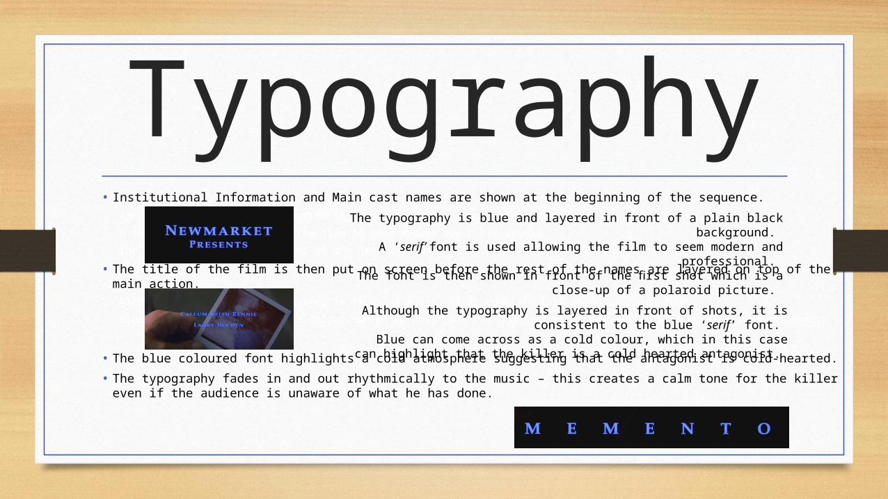
Typography• Institutional Information and Main cast names are shown at the beginning of the sequence.
The typography is blue and layered in front of a plain black background.
A ‘serif’ font is used allowing the film to seem modern and professional.
The font is then shown in front of the first shot which is a close-up of a polaroid picture.
• The title of the film is then put on screen before the rest of the names are layered on top of the main action.
Although the typography is layered in front of shots, it is consistent to the blue ‘serif’ font.
Blue can come across as a cold colour, which in this case can highlight that the killer is a cold hearted antagonist.
• The blue coloured font highlights a cold atmosphere suggesting that the antagonist is cold-hearted.
• The typography fades in and out rhythmically to the music – this creates a calm tone for the killer even if the audience is unaware of what he has done.
Although the typography is layered in front of shots, it is consistent to the blue ‘serif’ font.
Blue can come across as a cold colour, which in this case can highlight that the killer is a cold hearted antagonist.
The typography is blue and layered in front of a plain black background. A ‘serif’ font is used allowing the film to seem modern and professional.
The font is then shown in front of the first shot which is a close-up of a polaroid picture.


![Memento Fiscal2007[1]](https://static.fdocuments.in/doc/165x107/577d219b1a28ab4e1e959830/memento-fiscal20071.jpg)