Media pro magazine contents pages
14
There page numbers in bold next to each article, they are bold and a different colour. This contents page doesn't have ‘contents’ as the title, instead it has ‘NME this week’ – this fits in with the original and individual theme they have going on with them magazine, as it makes it different to any other magazine. The layout is columned, in a clear and is aesthetically pleasing. Subscription advertisement for their magazine at the bottom of the page.
-
Upload
et04936523 -
Category
News & Politics
-
view
15 -
download
1
Transcript of Media pro magazine contents pages
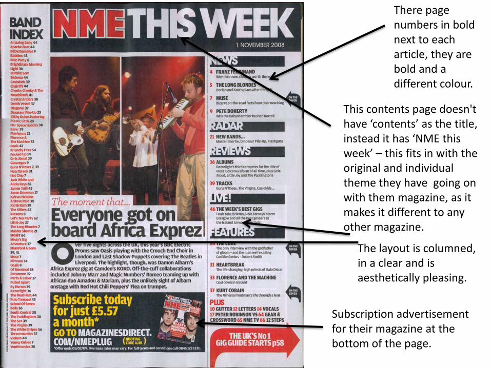
There page numbers in bold next to each article, they are bold and a different colour.
This contents page doesn't have ‘contents’ as the title, instead it has ‘NME this week’ – this fits in with the original and individual theme they have going on with them magazine, as it makes it different to any other magazine.
The layout is columned, in a clear and is aesthetically pleasing.
Subscription advertisement for their magazine at the bottom of the page.
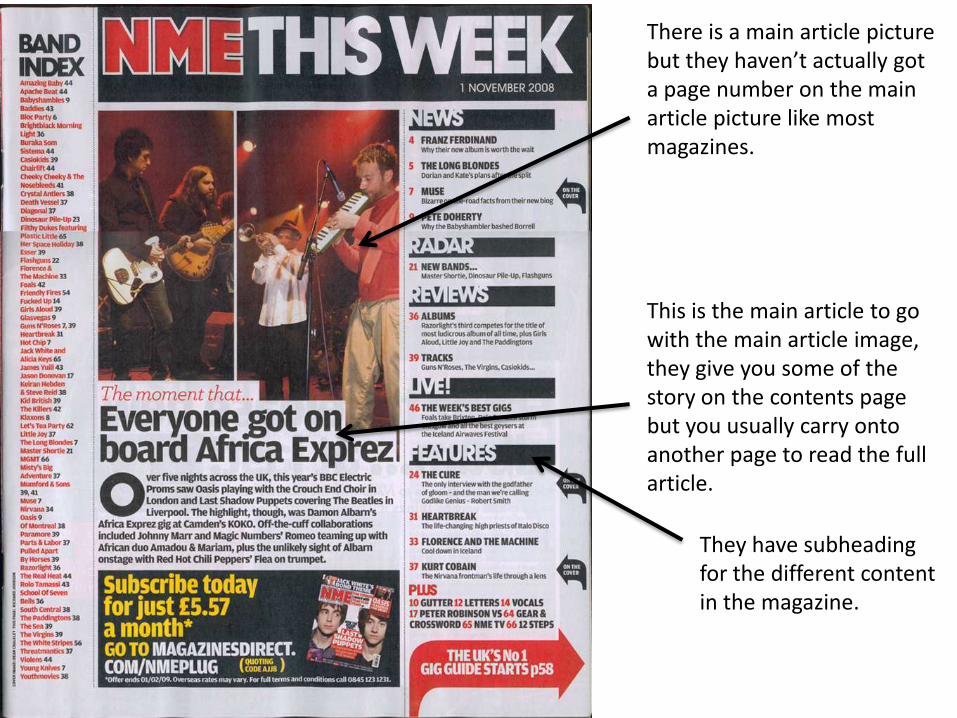
There is a main article picture but they haven’t actually got a page number on the main article picture like most magazines.
This is the main article to go with the main article image, they give you some of the story on the contents page but you usually carry onto another page to read the full article.
They have subheading for the different content in the magazine.
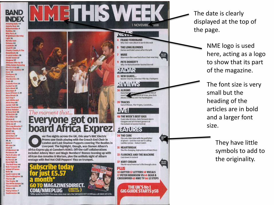
The date is clearly displayed at the top of the page.
NME logo is used here, acting as a logo to show that its part of the magazine.
The font size is very small but the heading of the articles are in bold and a larger font size.
They have little symbols to add to the originality.
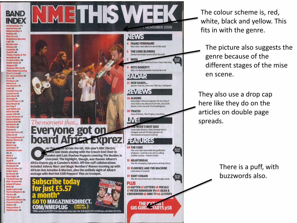
The colour scheme is, red, white, black and yellow. This fits in with the genre.
The picture also suggests the genre because of the different stages of the mise en scene.
They also use a drop cap here like they do on the articles on double page spreads.
There is a puff, with buzzwords also.
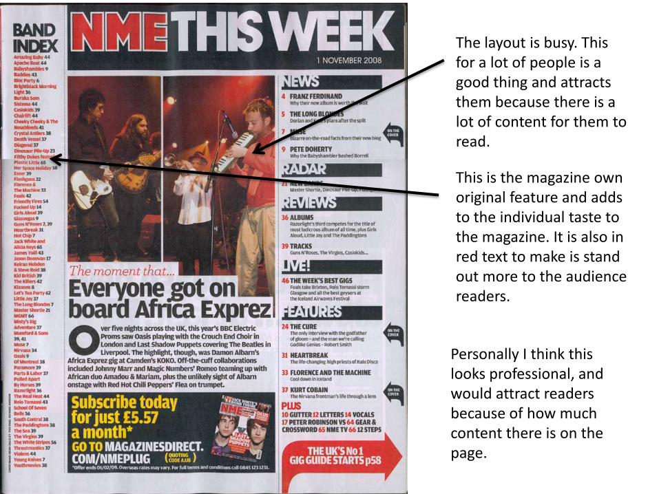
The layout is busy. This for a lot of people is a good thing and attracts them because there is a lot of content for them to read.
This is the magazine own original feature and adds to the individual taste to the magazine. It is also in red text to make is stand out more to the audience readers.
Personally I think this looks professional, and would attract readers because of how much content there is on the page.
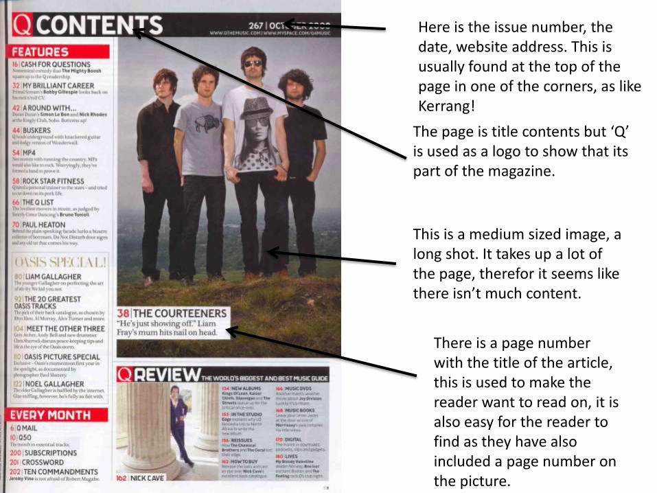
Here is the issue number, the date, website address. This is usually found at the top of the page in one of the corners, as like Kerrang!
The page is title contents but ‘Q’ is used as a logo to show that its part of the magazine.
This is a medium sized image, a long shot. It takes up a lot of the page, therefor it seems like there isn’t much content.
There is a page number with the title of the article, this is used to make the reader want to read on, it is also easy for the reader to find as they have also included a page number on the picture.
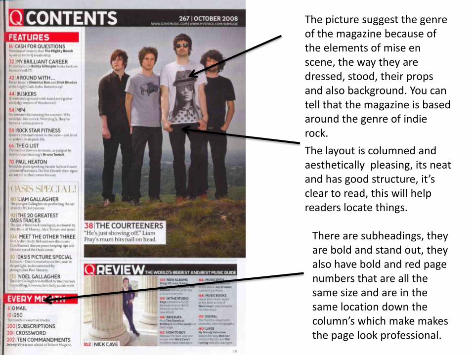
The picture suggest the genre of the magazine because of the elements of mise en scene, the way they are dressed, stood, their props and also background. You can tell that the magazine is based around the genre of indie rock.
The layout is columned and aesthetically pleasing, its neat and has good structure, it’s clear to read, this will help readers locate things.
There are subheadings, they are bold and stand out, they also have bold and red page numbers that are all the same size and are in the same location down the column’s which make makes the page look professional.
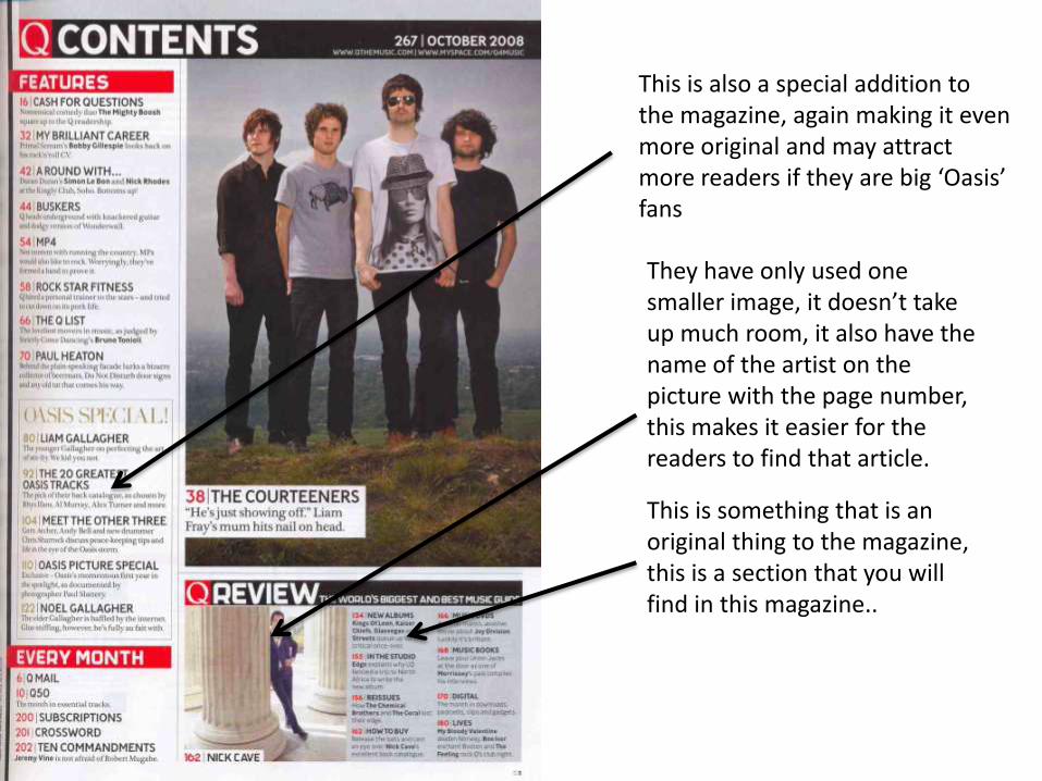
This is something that is an original thing to the magazine, this is a section that you will find in this magazine..
They have only used one smaller image, it doesn’t take up much room, it also have the name of the artist on the picture with the page number, this makes it easier for the readers to find that article.
This is also a special addition to the magazine, again making it even more original and may attract more readers if they are big ‘Oasis’ fans
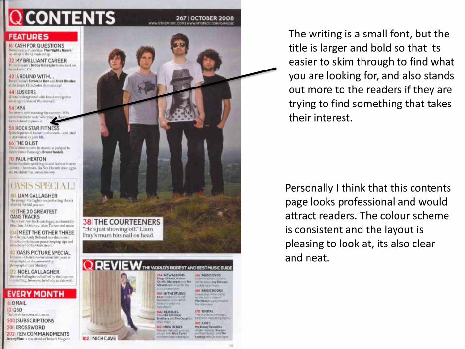
The writing is a small font, but the title is larger and bold so that its easier to skim through to find what you are looking for, and also stands out more to the readers if they are trying to find something that takes their interest.
Personally I think that this contents page looks professional and would attract readers. The colour scheme is consistent and the layout is pleasing to look at, its also clear and neat.
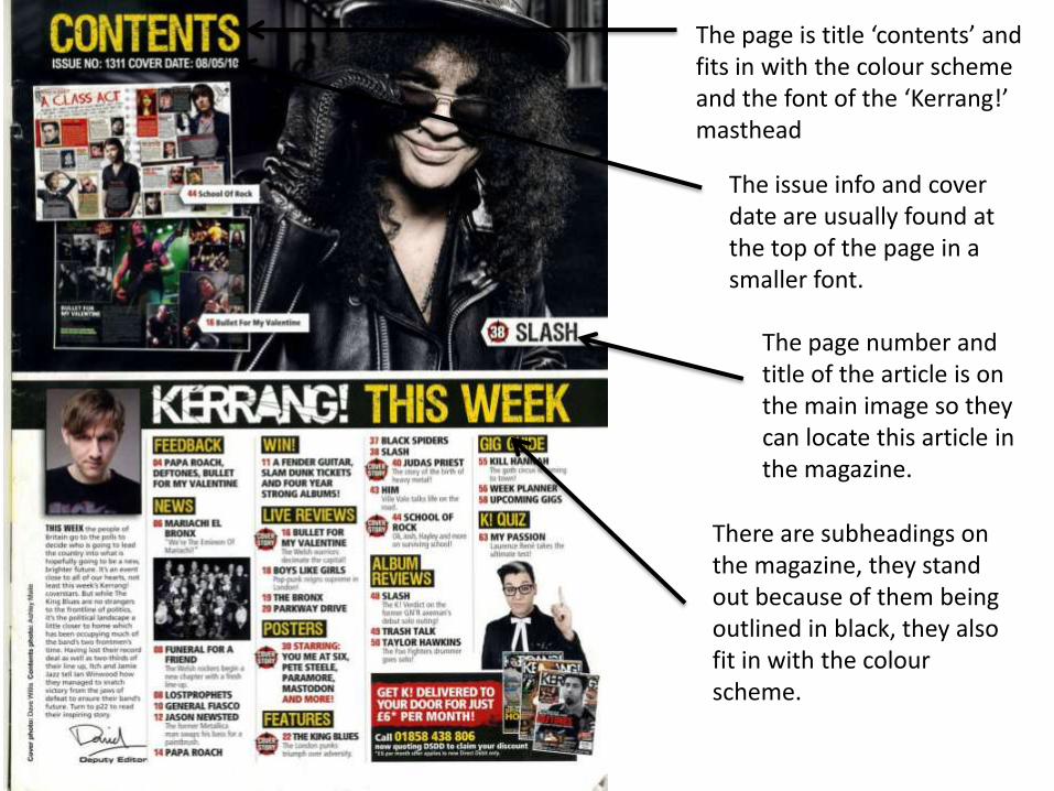
The page is title ‘contents’ and fits in with the colour scheme and the font of the ‘Kerrang!’ masthead
The issue info and cover date are usually found at the top of the page in a smaller font.
The page number and title of the article is on the main image so they can locate this article in the magazine.
There are subheadings on the magazine, they stand out because of them being outlined in black, they also fit in with the colour scheme.
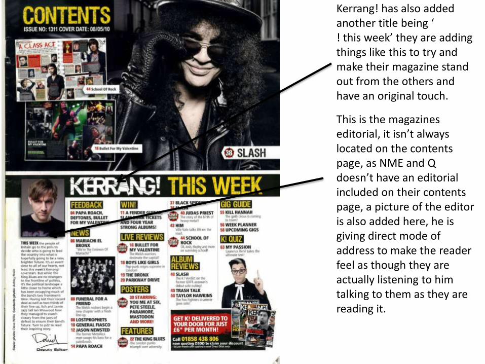
Kerrang! has also added another title being ‘! this week’ they are adding things like this to try and make their magazine stand out from the others and have an original touch.
This is the magazines editorial, it isn’t always located on the contents page, as NME and Q doesn’t have an editorial included on their contents page, a picture of the editor is also added here, he is giving direct mode of address to make the reader feel as though they are actually listening to him talking to them as they are reading it.
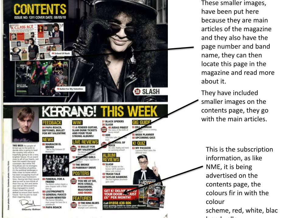
They have included smaller images on the contents page, they go with the main articles.
These smaller images, have been put here because they are main articles of the magazine and they also have the page number and band name, they can then locate this page in the magazine and read more about it.
This is the subscription information, as like NME, it is being advertised on the contents page, the colours fir in with the colour scheme, red, white, black and yellow.
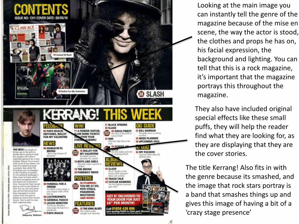
Looking at the main image you can instantly tell the genre of the magazine because of the mise en scene, the way the actor is stood, the clothes and props he has on, his facial expression, the background and lighting. You can tell that this is a rock magazine, it’s important that the magazine portrays this throughout the magazine.
They also have included original special effects like these small puffs, they will help the reader find what they are looking for, as they are displaying that they are the cover stories.
The title Kerrang! Also fits in with the genre because its smashed, and the image that rock stars portray is a band that smashes things up and gives this image of having a bit of a ‘crazy stage presence’
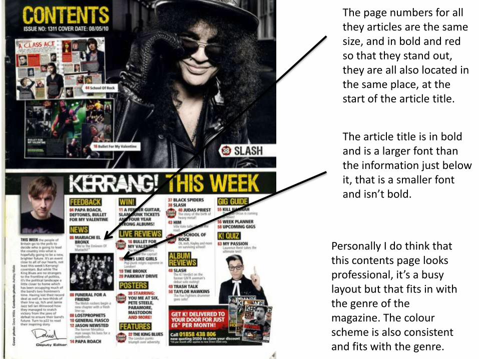
The page numbers for all they articles are the same size, and in bold and red so that they stand out, they are all also located in the same place, at the start of the article title.
The article title is in bold and is a larger font than the information just below it, that is a smaller font and isn’t bold.
Personally I do think that this contents page looks professional, it’s a busy layout but that fits in with the genre of the magazine. The colour scheme is also consistent and fits with the genre.