Media Evaluation - 1.
14
E valuati o n.
-
Upload
smullett3 -
Category
News & Politics
-
view
439 -
download
3
Transcript of Media Evaluation - 1.

Evaluatio
n.
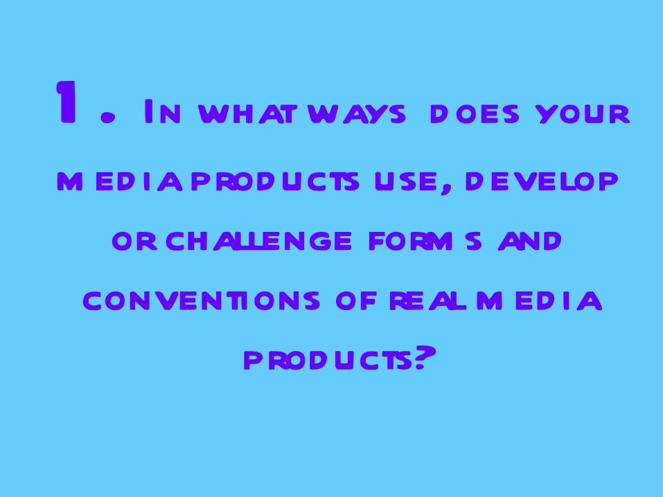
1 . In what ways does your
m ed ia products use, develop
or challenge form s and
conventions of real m ed ia
products?

Initial IdeasDeciding my genre was important because it would indicate what conventions of a music magazine I should follow, or even go against. After much consideration, I decided to choose the indie genre because firstly, it’s the genre I have the most knowledge on so I had an overall better understanding. Although, it was also one I was interested in it was one I was looking forward to finding out about different aspects of.
Although there are currently indie magazines in circulation, I still decided to go with the idea as I felt if I could execute my magazine well enough, it would have a place in the market as people are always challenging current ideas to enable magazines continue to improve their standards.
To follow on from this, among my research, I decided to produce a broadcast magazine rather than a niche magazine. However, from my point of view, my magazine does incorporate aspects of niche magazines.
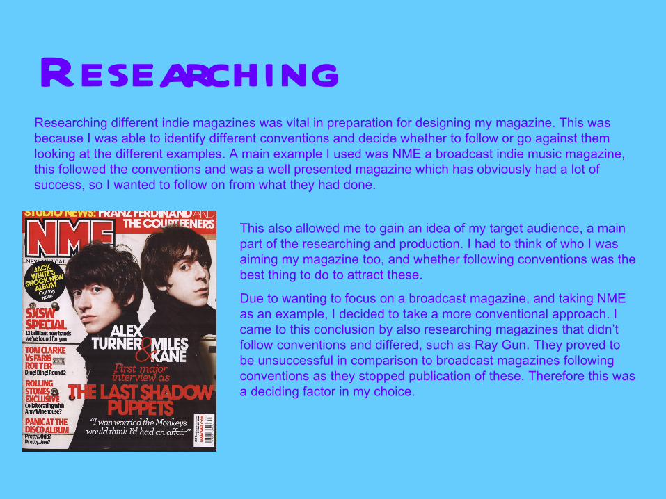
ResearchingResearching different indie magazines was vital in preparation for designing my magazine. This was because I was able to identify different conventions and decide whether to follow or go against them looking at the different examples. A main example I used was NME a broadcast indie music magazine, this followed the conventions and was a well presented magazine which has obviously had a lot of success, so I wanted to follow on from what they had done.
This also allowed me to gain an idea of my target audience, a main part of the researching and production. I had to think of who I was aiming my magazine too, and whether following conventions was the best thing to do to attract these.
Due to wanting to focus on a broadcast magazine, and taking NME as an example, I decided to take a more conventional approach. I came to this conclusion by also researching magazines that didn’t follow conventions and differed, such as Ray Gun. They proved to be unsuccessful in comparison to broadcast magazines following conventions as they stopped publication of these. Therefore this was a deciding factor in my choice.
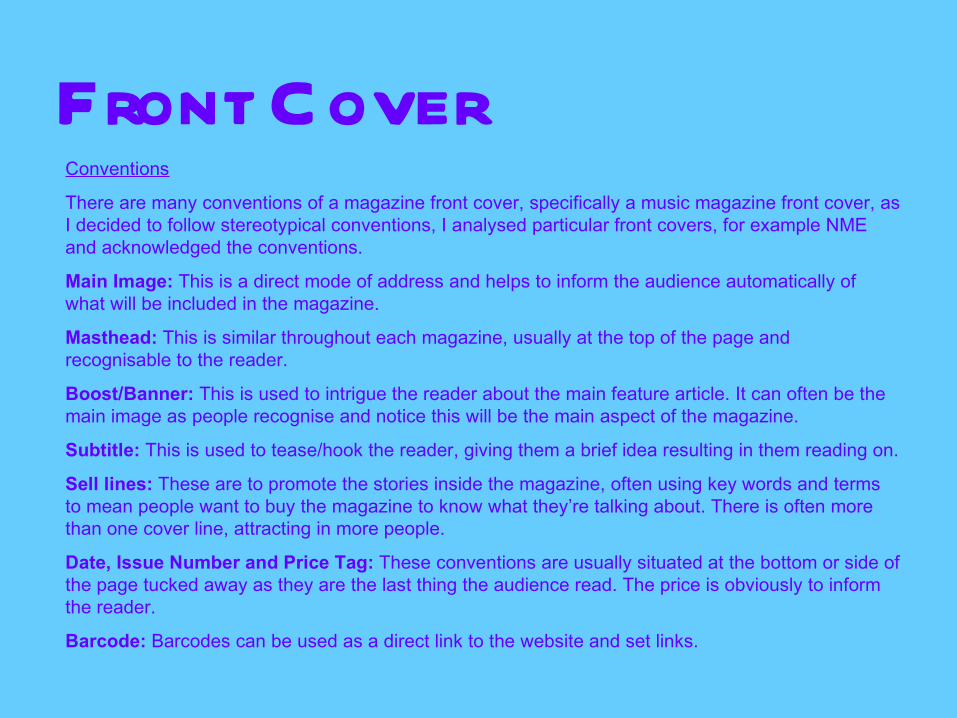
Front CoverConventions
There are many conventions of a magazine front cover, specifically a music magazine front cover, as I decided to follow stereotypical conventions, I analysed particular front covers, for example NME and acknowledged the conventions.
Main Image: This is a direct mode of address and helps to inform the audience automatically of what will be included in the magazine.
Masthead: This is similar throughout each magazine, usually at the top of the page and recognisable to the reader.
Boost/Banner: This is used to intrigue the reader about the main feature article. It can often be the main image as people recognise and notice this will be the main aspect of the magazine.
Subtitle: This is used to tease/hook the reader, giving them a brief idea resulting in them reading on.
Sell lines: These are to promote the stories inside the magazine, often using key words and terms to mean people want to buy the magazine to know what they’re talking about. There is often more than one cover line, attracting in more people.
Date, Issue Number and Price Tag: These conventions are usually situated at the bottom or side of the page tucked away as they are the last thing the audience read. The price is obviously to inform the reader.
Barcode: Barcodes can be used as a direct link to the website and set links.

M y Front CoverMain Image: My main image is big and fills the whole height of the page and is the focal point. As the person in the photo is my main aspect of my magazine, the photo is big. With the image being an attractive girl, it draws the male demographic in, but also the women because they aspire to be like her.
Masthead: My masthead is the title of my magazine, ‘indicle’. This would be similar throughout many articles and is easily recognisable, just like NME. People know what they’re looking for.
Boost/Banner: The boost I have used is definitely the picture because people will see the picture of the artist and want to find more out about her.
Subtitle: Underneath my sell lines I have added a little text to briefly describe to the readers what they can expect, without giving too much away. Resulting in them reading further.
Sell lines: I have included three sell lines to attract the audience, including aspects that I feel hit stereotypical aspects of the genre and what my target audience want.
Date, Issue Number and Price Tag: I decided to put these at the left hand side of my page, going against conventions slightly but this was due to my design of my front cover. I had empty space on the left rather than the bottom so it worked better to do it that way.
Barcode: I decided to put a barcode in to enable people to scan it from their phone and automatically go to the website. This means that its connected with the internet showing intertextuality.
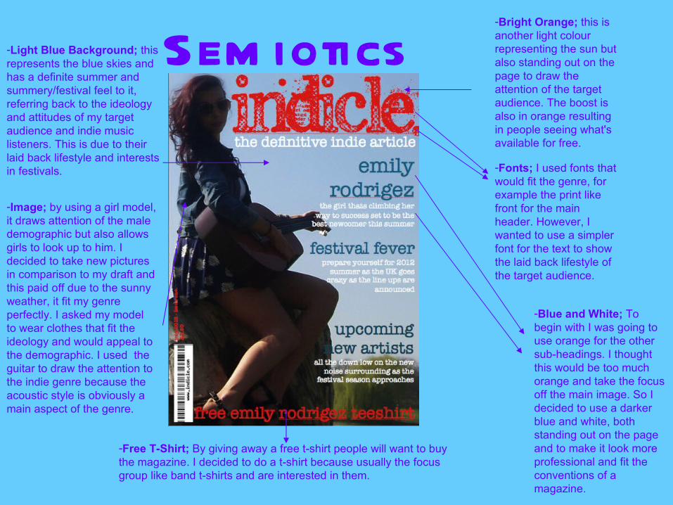
-Free T-Shirt; By giving away a free t-shirt people will want to buy the magazine. I decided to do a t-shirt because usually the focus group like band t-shirts and are interested in them.
-Light Blue Background; this represents the blue skies and has a definite summer and summery/festival feel to it, referring back to the ideology and attitudes of my target audience and indie music listeners. This is due to their laid back lifestyle and interests in festivals.
-Bright Orange; this is another light colour representing the sun but also standing out on the page to draw the attention of the target audience. The boost is also in orange resulting in people seeing what's available for free.
-Blue and White; To begin with I was going to use orange for the other sub-headings. I thought this would be too much orange and take the focus off the main image. So I decided to use a darker blue and white, both standing out on the page and to make it look more professional and fit the conventions of a magazine.
-Image; by using a girl model, it draws attention of the male demographic but also allows girls to look up to him. I decided to take new pictures in comparison to my draft and this paid off due to the sunny weather, it fit my genre perfectly. I asked my model to wear clothes that fit the ideology and would appeal to the demographic. I used the guitar to draw the attention to the indie genre because the acoustic style is obviously a main aspect of the genre.
-Fonts; I used fonts that would fit the genre, for example the print like front for the main header. However, I wanted to use a simpler font for the text to show the laid back lifestyle of the target audience.
Sem iotics

ContentsConventions
Although the contents is important, its not as important as a front cover, indicating that there’s less conventions to follow, so if you’re following conventions, you have a big more freedom. After drafting two completely different contents pages it allowed me to create the best one I could.
Contents: This tells the reader what to expect from the magazine and tells them what they can read about and the different stories. As I said, there is more freedom in this aspect, so they can change to suit the audience.
Page Numbers: They navigate the reader throughout the issue. In the contents they have a brief description to them so have a brief idea of what to expect.
Smaller Image: These smaller images advertise sell lines so people can visually see what to expect and look for the image if they’re looking for a certain point.
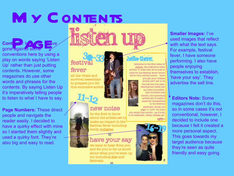
M y Contents
PageContents: In a way, I have gone against some conventions here by using a play on words saying ‘Listen Up’ rather than just putting contents. However, some magazines do use other words and phrases for the contents. By saying Listen Up it’s imperatively telling people to listen to what I have to say.
Page Numbers: These direct people and navigate the reader easily. I decided to have a quirky effect with mine so I slanted them slightly and used a quirky font. They’re also big and easy to read.
Smaller Images: I’ve used images that reflect with what the text says. For example, festival fever, I have someone performing. I also have people enjoying themselves to establish, ‘have your say’. They advertise the sell line.
Editors Note: Some magazines don’t do this, so in some cases it’s not conventional, however, I decided to include one because I felt it created a more personal aspect. This goes towards my target audience because they’re seen as quite friendly and easy going.
Sem iotics
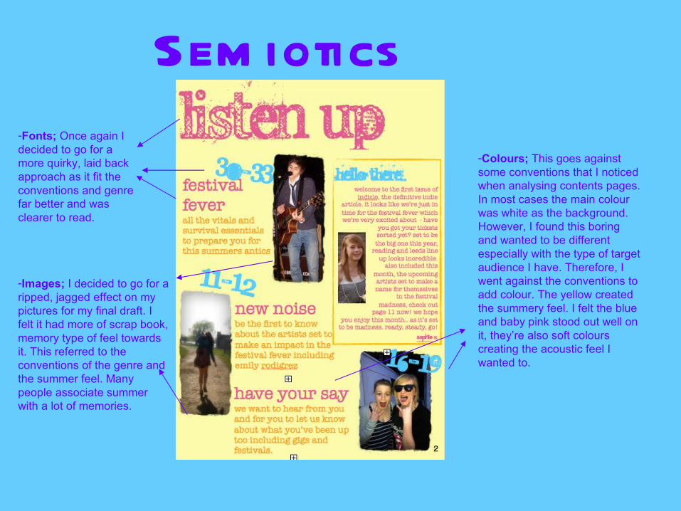
-Fonts; Once again I decided to go for a more quirky, laid back approach as it fit the conventions and genre far better and was clearer to read.
-Images; I decided to go for a ripped, jagged effect on my pictures for my final draft. I felt it had more of scrap book, memory type of feel towards it. This referred to the conventions of the genre and the summer feel. Many people associate summer with a lot of memories.
-Colours; This goes against some conventions that I noticed when analysing contents pages. In most cases the main colour was white as the background. However, I found this boring and wanted to be different especially with the type of target audience I have. Therefore, I went against the conventions to add colour. The yellow created the summery feel. I felt the blue and baby pink stood out well on it, they’re also soft colours creating the acoustic feel I wanted to.
D ouble Page
SpreadConventions
Double page spreads are important in magazines because it’s conventionally a main article and often those that draw the attention of the target audience and of people to reading the magazine. Often the main image on the front cover links to the double page spread – this is the case for me.
Main Image: The main image dominates the page and is often based on the subject of the article, EG. A music artist who’s being interviewed.
Banner Headline: It’s often a wide headline to inform the reader easily and clearly of what the articles about.
Stand First: This introduces the audience, but doesn’t reveal too much so they have to continue reading the article.
Main Article: This is the topic of the storyline and draws the audience to the magazine. Conventionally there is one main article in magazines each issue, if people are interested in the article they will be more inclined to by the magazine. Some people buy magazines purely for the main article in some cases.
Quote: Quotes are often used to gain information from the person the articles about, they’re eye catching and draw attention.
Page Numbers: These are used to inform and navigate the reader to enable they can find the main article and story.
Drop Capitals: These stand out from the rest of the text meaning its evident where the text starts.
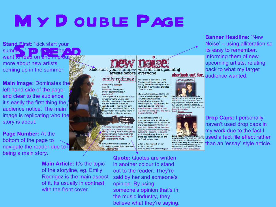
M y D ouble Page
Spread
Main Image: Dominates the left hand side of the page and clear to the audience, it’s easily the first thing the audience notice. The main image is replicating who the story is about.
Banner Headline: ‘New Noise’ – using alliteration so its easy to remember. Informing them of new upcoming artists, relating back to what my target audience wanted.
Stand First: ‘kick start your summer..’ This makes them want to read on and find out more about new artists coming up in the summer.
Main Article: It’s the topic of the storyline, eg. Emily Rodrigez is the main aspect of it. Its usually in contrast with the front cover.
Quote: Quotes are written in another colour to stand out to the reader. They’re said by her and someone’s opinion. By using someone’s opinion that’s in the music industry, they believe what they’re saying.
Page Number: At the bottom of the page to navigate the reader due to it being a main story.
Drop Caps: I personally haven’t used drop caps in my work due to the fact I used a fact file effect rather than an ‘essay’ style article.

Sem iotics
-Image; Once again, a girl model has been used for the main article. The guitar is evident along with the clothes she’s wearing fitting with conventions.
-Images; I included two other images so there’s not just one main image, there’s smaller images as well. This fits conventions as there are images to fit the other stories I’m showing.
-Colours: I’ve used light blue again to imply the summer feel again. The purple and black both stand out on the page well and go with the blue as the quotes are easy to establish.
-Fonts; Once again I have used the same main font, this shows continuity throughout, although it could be seen as a bad thing. However, the other fonts are once again, simple and easy to read, following conventions.
Overall..I believe I’ve followed the conventions of real media products when referring to an indie music magazine. I decided to follow them and create a broadcast magazine because I believed I’d get the most success. I have followed the conventions of the images and colours, keeping the acoustic feel. The colours and images are well associated with the context and stories in the magazine that refer to the festival season and upcoming artists, always referring back to my target audience and what my focus group wanted. These are main elements of the genre and the type of people that would be interested in the music.
However, in some cases I went against conventions, very rarely due to the fact I think it worked better for my magazine personally, but overall, the majority of the time I followed them and think it was the right decision to make.
![Media evaluation presentation[1][1]](https://static.fdocuments.in/doc/165x107/5560db5dd8b42a0d088b5b4f/media-evaluation-presentation11-55849bace6761.jpg)


![Evaluation media xx[1]](https://static.fdocuments.in/doc/165x107/549f477fac7959554c8b4805/evaluation-media-xx1.jpg)


![Media evaluation[1]](https://static.fdocuments.in/doc/165x107/55922d771a28abd54a8b470d/media-evaluation1-5593d5f310683.jpg)