Media codes and conventions music mag
6
Codes and conventions of a music magazine Flo Mayo
-
Upload
flomayo -
Category
Art & Photos
-
view
524 -
download
0
Transcript of Media codes and conventions music mag
Codes and conventions of a music magazine
Flo Mayo
What is a convention?
• Conventions are the ‘rules’ that are generally understood and accepted when producing a media text in particular genre.

What are codes?
• Codes are a system of symbols, letters, or words given certain meanings, used for delivering messages requiring secrecy. So a media text like a magazine has a message that it wants to communicate with us (mainly, this is “but this magazine”!) and there are certain methods (or codes) by which it does this.
• We might say that codes give a messag or meaning to particular conventions.
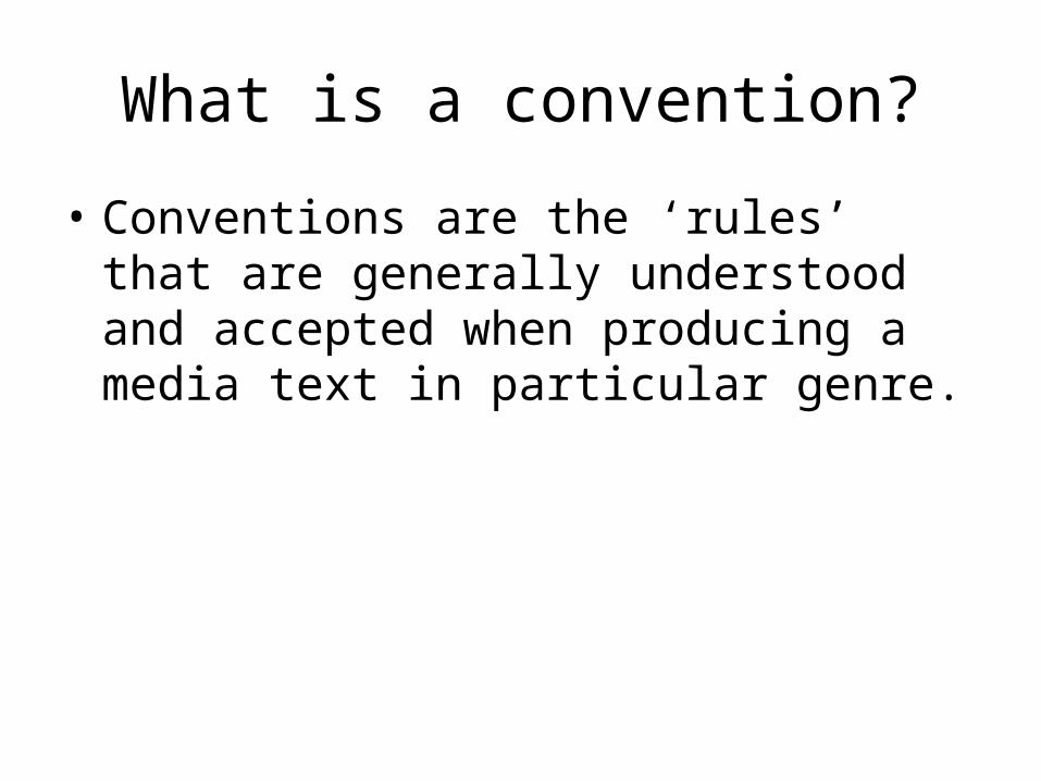
Colour scheme • White• Black • Red• YellowWhite and black show formal, old age.The red is powerful and bright.The yellow shows happiness and lures you in. It is also modern and new.
Issue number
BarcodeURL
Price
MastheadBlack and white (MOJO)-Iconic3D effect-stands out, cannotes importanceRecognisable ‘MOJO’.
Puff (lure) Strip Varied audience
Main image-looking at usCannotes he is talking to usMakes us feel involved.Dylan stands in front of the MOJO sign showing he is more important than the actual name of the magazine or this could show that ‘MOJO’ is so well known it doesn’t need to be completely shown as people will know what is says anyway!
Coverlines
Buzz wordsThe bright colours (yellow, red, blue) on the black and white background cannotes ‘new and modern;’
Sublines

Colour scheme• Red• Yellow• Black• White• Blue
Uniform layout but chaotic mise-en scene
Anchorage
The house style suggests the target audience are older
Same text as front coverFollowing the house style
Subheadings
Bright blue stands out and draws your attention
Smaller font for description

Colour scheme• White• Red• BlackThe colours match the front cover and first contents page which makes it look neat and matching rather than messy.
Black writing, headings in the contents box are bigger than the text which makes them stand out so the reader can find what their looking for easily.
Page numbers in a bold red allows readers to find what they want quickly and easily.
The Photograph is mainly blue which is a different colour from the colour scheme making it more eye catching and interesting. The bright blue also matches with the small amount of blue on the front cover and on the first contents page.
In contrast to the other pages (house style suggests an older audience) this house style suggests a younger audience as the man in photograph looks young, he’s in dungarees an is holding two dogs.