Media beth
7
-
Upload
bethparrish -
Category
Education
-
view
129 -
download
2
Transcript of Media beth

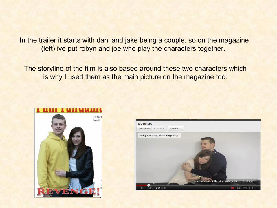
In the trailer it starts with dani and jake being a couple, so on the magazine (left) ive put robyn and joe who play the characters together.
The storyline of the film is also based around these two characters which is why I used them as the main picture on the magazine too.
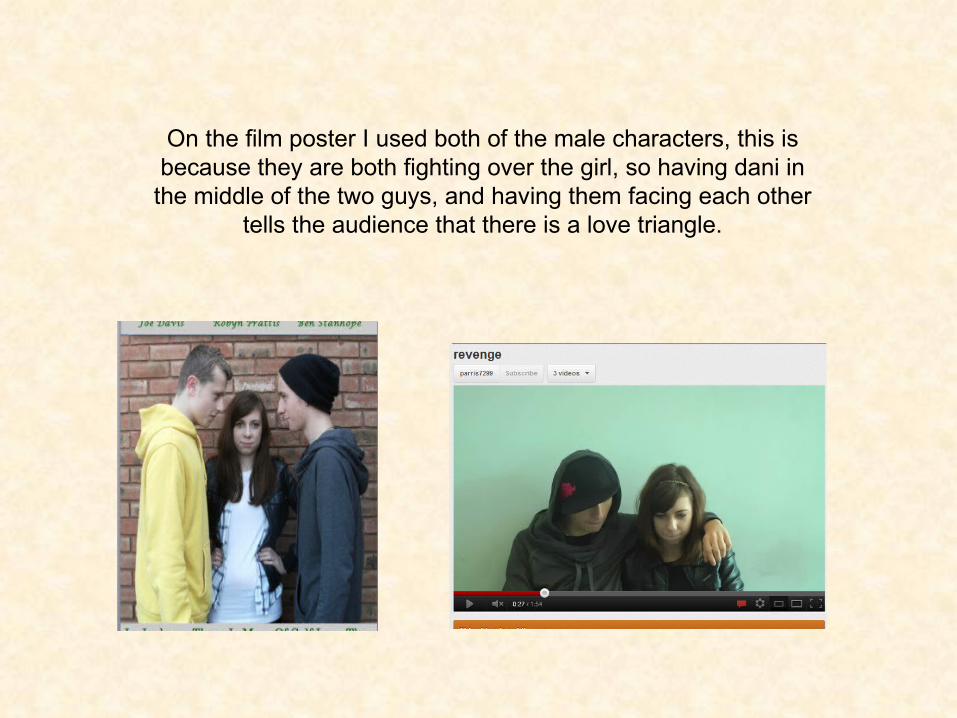
On the film poster I used both of the male characters, this is because they are both fighting over the girl, so having dani in
the middle of the two guys, and having them facing each other tells the audience that there is a love triangle.

On my magazine cover ive got all 3 of the characters from the film, this tells
the audience that the magazine is going to be focused on the new film!
I have a big bold cover line which is the film title. Its in a bright
colour and interesting font, this will catch the audiences attention.
Hopefully making them read the snippet
underneath.
I also have the snippet which is
linked to the cover line, this bit gives a little info about what the main article will be about. This will make the audience want to read on and hopefully get them
to go watch the film.

Big bold title at the top to catch the audience’s
attention
3 main characters in the centre of the page,
audience can see whether they know the
actors.
Film slogan at the bottom, says a little but not a lot about
the film
Actors names
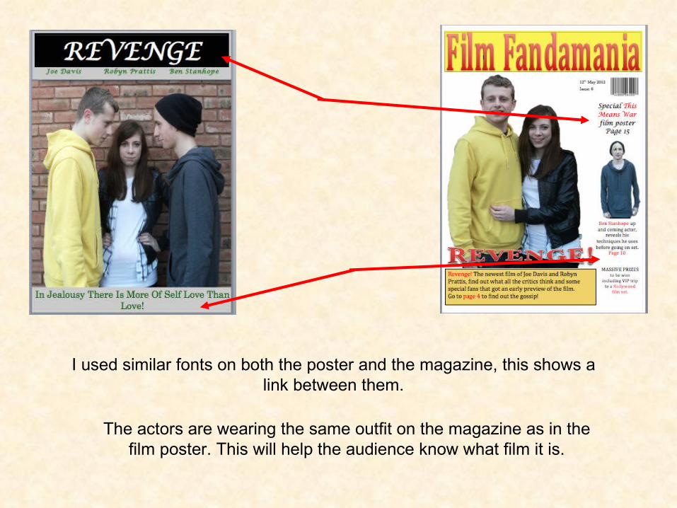
I used similar fonts on both the poster and the magazine, this shows a link between them.
The actors are wearing the same outfit on the magazine as in the film poster. This will help the audience know what film it is.

In the trailer there is a rivalry between the 2 guys, this is shown in the trailer numerous times, but the main one was with the car scene. On the film poster the rivalry is shown by the 2 of them looking angry at each other. Also the girl is standing between them, which tells the
audience that the rivalry is over her.