
Measuring Public Preferences for Policy: On the … · Measuring Public Preferences for Policy: ......
42
Measuring Public Preferences for Policy: On the Limits of ‘Most Important Problem’ *Will Jennings, Politics and International Relations, School of Social Sciences, University of Southampton, Southampton SO17 1BJ, United Kingdom. E-mail: [email protected] *Christopher Wlezien, Department of Political Science, Temple University, Philadelphia PA 19122-6089. E-mail: [email protected]. *Corresponding authors Running header: Measuring Public Preferences for Policy Word count (text excluding figures, tables, references and appendices): 6,531
-
Upload
nguyenhanh -
Category
Documents
-
view
226 -
download
0
Transcript of Measuring Public Preferences for Policy: On the … · Measuring Public Preferences for Policy: ......
Measuring Public Preferences for Policy:
On the Limits of ‘Most Important Problem’
*Will Jennings, Politics and International Relations, School of Social Sciences, University of
Southampton, Southampton SO17 1BJ, United Kingdom. E-mail: [email protected]
*Christopher Wlezien, Department of Political Science, Temple University, Philadelphia PA
19122-6089. E-mail: [email protected].
*Corresponding authors
Running header: Measuring Public Preferences for Policy
Word count (text excluding figures, tables, references and appendices): 6,531
Author Note
1. Author affiliation information
WILL JENNINGS is Senior Lecturer in Politics, University of Southampton, UK.
CHRISTOPHER WLEZIEN is Professor of Political Science at Temple University.
2. Acknowledgements
Prepared for presentation at the Annual Meeting of the Elections, Public Opinion and Parties
group of the Political Studies Association, Oxford, September, 2012. We are grateful to
Shaun Bevan for his constructive comments.
3. Corresponding author contact information
*Address correspondence to Will Jennings, Politics and International Relations, School of
Social Sciences, University of Southampton, Southampton, SO17 1BJ, United Kingdom. E-
mail: [email protected] or to Christopher Wlezien, Department of Political Science,
Temple University, Philadelphia PA 19122-6089; E-mail: [email protected].
Abstract
To measure public preferences for policy scholars often rely on a survey
question that asks about the “most important problem” (MIP) facing the nation. It is
not clear that MIP responses actually tap the public’s policy preferences, however.
This paper directly addresses the issue. First, it conceptualizes policy preferences and
MIP responses. Second, using data from the United Kingdom and the United States,
it examines the relationship between the public’s spending preferences and MIP
responses over time. Third, it consider how using MIP responses in place of actual
measures of spending preferences impacts analysis, focusing specifically on opinion
representation. The results indicate that MIP responses and spending preferences tap
very different things and are modestly related only in selected policy domains.
Perhaps most importantly, we learn that using MIP responses substantially
misrepresents the representational relationship between public preferences and policy.
Measurement matters for the inferences we make about how democracy works.
The public’s policy preferences are important to political science research.
Scholars want to know what the public wants. Do they want more or less policy? A
lot more or just a little? These preferences are consequential independent variables in
analyses of voting behavior, elections and policy (see Erikson and Tedin, 2010, for a
summary of the vast literature). Partly because of their impact on politics, they also
are important dependent variables (see, e.g., Durr 1993; Wlezien 1995; Erikson, et al.
2002; Soroka and Wlezien 2010).
Public preferences for policy are difficult to measure. The behavior of survey
organizations is telling. They frequently ask about support for specific bills or
policies. They also ask about support for policy under different circumstances, as for
abortion or gun control. Survey organisations very rarely ask about respondents’
preferred levels of policy. How much health care should the government provide?
How much defense spending? What level of environmental regulation?
Presumably people do not have specific preferred levels of policy in these areas or
survey organizations do not suppose they can easily measure them. This does not
mean that people’s preferences do not differ, and that some want more than others.
Rather, it apparently is the case that people do not commonly have specific absolute
preferences.
Respondents typically are asked about their relative preferences instead. Do
you think the government should do more (less) on health care? Spend more (less) on
defense? Increase (decrease) the amount of environmental regulation? It may be that
people think about policies in relative terms. It also may be that relative questions
better elicit their preferences. (As such, the responses may better reveal the
differences among individuals.) We are agnostic on all of these possibilities. We
simply want to make clear what survey organizations provide in the way of questions
about policy preferences, and what they mostly measure are relative preferences (also
see Soroka and Wlezien, 2010).
Although relative measures are more readily available, they are not widely
available across countries and over time.1 Because of this, early studies of policy
responsiveness to public preferences tended to rely upon measures of support for
specific bills or policies (Monroe 1979; Page and Shapiro 1983; also see Petry 1999).
Indeed, Stimson’s (1991) development of the measure of “public policy mood” was in
part inspired by this problem of missing and irregular data on preferences over time.
Recently, in response to this lacuna, the Comparative Study of Electoral Systems
(CSES) project has introduced a survey module that measures relative preferences for
government spending, which offers the prospect in future of comparable data on
relative preferences across a broad range of countries. Even here, availability of the
data on relative preferences will be infrequent, dictated by the electoral cycle in each
country, i.e., they will not be measured outside election years.
To measure public preferences for policy in comparative research, scholars
increasingly have relied on a well-known survey question that asks about the “most
important problem” (MIP) facing the nation (e.g. Hobolt and Klemmensen 2005;
2008; Hobolt et al. 2008; John 2006; Jennings 2009; Valenzuela 2011; also see
McDonald et al. 2005 for work that uses MIP responses in the context of analysis of
1 Some relative measures of preferences for spending are available from Gallup surveys in the US, UK
and Canada (for details see Soroka and Wlezien 2010), as well as in the International Social Survey
Program (ISSP) which has included questions on preferences for government policies as part of its
1985, 1990, 1996 and 2006 waves, with data available for 17 countries at up to four points in time. As
such, relative measures are available for just a handful of years, often spaced at irregular time intervals,
and tend to focus on spending in particular domains.
democratic responsiveness).2 This has been asked in many countries for many years.
Gallup first asked the question in the US in 1935 and in the UK in 1947. It has since
been asked, and continues to be asked, by polling organisations in a large number of
countries, e.g. Australia, Canada, France, Spain, Denmark, Ireland, the Netherlands,
and Germany. The availability of MIP responses in different countries makes
scholars’ use of those data more understandable. We do not know with what
consequences, however. That is, we do not know whether and to what extent MIP
responses tap the public’s policy preferences.
In theory, MIP responses and policy preferences are different things. Policy
preferences register support for government action. MIP responses tap assessments of
problems. They may be related but are not the same thing. They can differ in
numerous ways. It may be that the problems people identify may have more to do
with conditions than government policy. It also may be that people do not want the
government to do anything about the problems they identify. Even if MIP responses
do reflect a connection to policy, they are informative only about preferences in
domains that are problems. Finally, MIP responses presumably only tell us something
about whether people want more policy, not whether they want less. Although
preferences and MIP responses differ in theory, how much do they differ in practice?
How much does the difference matter for research? These are empirical questions.
This paper directly addresses these issues. First, it conceptualizes policy
preferences and MIP responses. Second, using data from the US and UK, it examines
2 In practice, some scholars treat MIP as directly measuring public preferences for policy while others
are more circumspect about their equivalence, using MIP as a substitute for preferences, and others use
MIP for tests of policy-opinion responsiveness that do not explicitly equate MIP with preferences, but
imply as much through their theoretical approach.
the relationship between the public’s spending preferences and MIP responses over
time. Third, it considers how using MIP responses in place of actual measures of
spending preferences impacts analysis of opinion representation. The results indicate
that MIP responses and spending preferences tap very different things and are only
modestly related and only in selected policy domains. Perhaps most importantly,
using MIP responses substantially distorts the representational relationship between
public preferences and policy.
Conceptualizing Public Preferences for Policy and Most Important Problems
Let us consider the characteristics of the public’s policy preferences and MIP
responses and the possible relationships between them. We begin with public
preferences.
Public Preferences for Policy
Public preferences are collective preferences. They summarize the
preferences of some group of people. Typically, we are interested in capturing the
central tendency or average preference. Public preferences can come in different
forms.
Ideally, we would be able to measure people’s preferred levels of policy (P*).
These are notoriously difficult to measure. Consider budgetary policy. How much
spending do we want on defense? Welfare? Health? How about specific programs
within these general areas? How about areas that are less well-known? What about
policies that are more complex? Consider regulation. What should be the emission
standards set for automobiles? Or the tolerated level of pesticide residues on food?
These are technical issues on which the public often have a low level of interest and
knowledge (Hood et al., 2001).
It is possible to assess absolute preferences for certain policies. For instance,
we can measure support for abortion under different circumstances. Survey
organizations routinely ask about abortion preferences and the responses people give
are highly stable. Much the same is true about support for other social policies, e.g.,
gun control. Although such questions tap absolute preferences, they do not indicate
the preferred levels of policy. Of course, one may be able to derive these from
responses to different items, as in the case of abortion or gun control. Otherwise, we
cannot tell what policy respondents want.
It commonly is necessary to measure people’s preferences for policy change,
their relative preferences. Survey organizations commonly ask about whether the
government is spending or doing “too much” or “too little” or whether it should “do
more.” These items ask respondents to compare their absolute preferences and the
policy status quo. That is, do you want more than what the government currently is
spending or doing? Or do you want less? Relative preferences (R) can therefore be
theorised as equal to the difference between the public’s ideal preference for policy
(P*) and actual policy (P), such that
R = P* – P. (1)
In theory, then, responses differ (and change) when the preferred level of policy
differs (changes). They also differ (change) when policy differs (changes). That is,
following Wlezien (1995), the responses would be “thermostatic.” Much research
demonstrates that this is true, at least for certain types of issues and under certain
institutional contexts (Soroka and Wlezien, 2010).
Most Important Problems

Survey organizations routinely ask people about the most important problem
(MIP) facing the nation. In theory, an important problem captures the importance of
an issue and the degree to which it is a problem. An issue can be a problem but of
little importance. Likewise, an issue can be important but not a problem. Both are
necessary for something to be an important problem. The most important problem is
the single leading important problem. It need not be a really important issue. It need
not be a really big problem. It simply is the one at the top of the list. See Wlezien
(2005) for more on the conceptual difference between important issues and problems.
Not surprisingly, research shows that MIP responses tap variation in problem
status in particular domains (e.g. Hibbs 1979; Hudson 1994; Wlezien 2005). For
example, when the economy worsens, “economic” mentions increase. MIP responses
also tap variation in the problem status of other domains matters. When the economy
worsens and economic mentions increase, responses in other, non-economic
categories drop.3
Most Important Problems and Public Preferences
In theory public preferences for policy and MIP responses are different things.
But how different are they in practice? It may be, after all, that the differences are
slight and MIP responses are reasonable substitutes. For our examination, we focus
only on relative public preferences, R. This is for two reasons: (1) relative
preferences commonly are all that we measure and (2) the relationship between
3 Survey organizations increasingly have been asking about the “most important issue,” or MII.
Although there is reason to think that MIP and MII responses differ, recent scholarship reveals little
difference between the two (Jennings and Wlezien, 2011). Specifically, it appears that, when asked
about issues, people think about problems.
absolute preferences and MIP responses is much less interesting.4 In theory, the
relationship between MIP and relative preferences depends on what people reflect
when identifying their most important problem. We consider two alternative
possibilities: that MIP responses are explicitly about policy or otherwise just about
conditions.
We first consider the case where MIP responses strictly reflect policy
concerns. Here, an individual compares the policy she wants and policy outputs
themselves. If there is no difference, the individual is perfectly happy with the status
quo. As the difference increases, however, the issue becomes a problem. The
government is doing either “too little” or “too much.” And the greater the difference
between what the individual wants and gets, the greater the problem. This implies a
close correspondence between relative preferences and problem assessments. It only
takes us part of the way toward an understanding of MIP responses, however. Most
importantly, we have not yet taken importance into account. There can be many
issues on which the public thinks the government is doing too little or too much, only
some of which may be very important. Perhaps most crucially, only one problem is
most important for each individual. For aggregations of individuals, some problems
may be more important than others. Typically, the economy and foreign policy tend
to dominate public concerns (Page and Shapiro 1983; Jones 1994; see Burstein 2003
for a review).
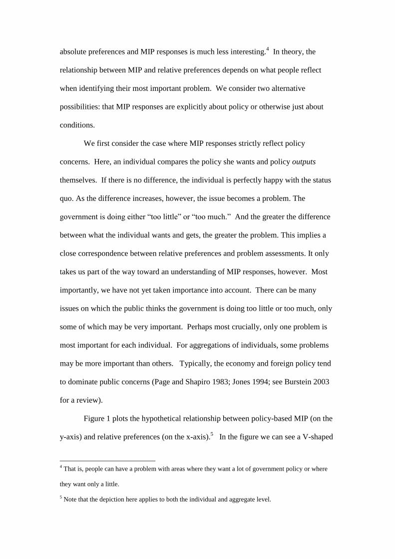
Figure 1 plots the hypothetical relationship between policy-based MIP (on the
y-axis) and relative preferences (on the x-axis).5 In the figure we can see a V-shaped
4 That is, people can have a problem with areas where they want a lot of government policy or where
they want only a little.
5 Note that the depiction here applies to both the individual and aggregate level.
pattern owing to the fact that policy concerns undergird MIP responses. (Technically,
we might expect a parabolic pattern and not a V-shaped one.) People do not have
problems in domains where they are happy with the policy status quo—when they do
not want more or less policy than is currently in place. They do have problems where
they think the government should do more or less, that is, moving to the right or left
of center along the x-axis. There is a lot of variation in the pattern, however. This
reflects the fact that not all of the domains to the left and right are the most important
to many people. Indeed, it may be that certain areas where there are modest problems
are more important to people than those where problems are more severe.6 What is
important in Figure 1 is that where MIP responses strictly reflect policy concerns,
they are not good substitutes for relative preferences. Consider that the Pearson’s
correlation for the hypothetical data points in Figure 1 is a trivial -0.16 (p=.45). This
implies potentially no relationship whatsoever between measured MIP and R in
practice.
-- Figure 1 about here –
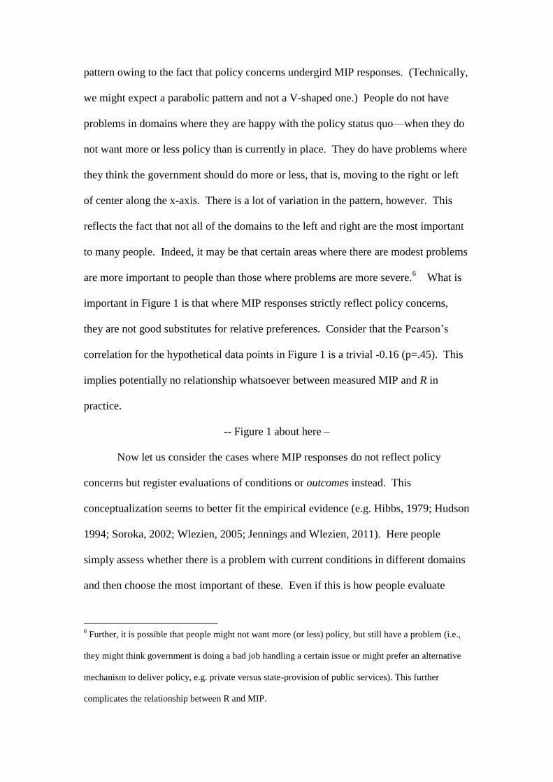
Now let us consider the cases where MIP responses do not reflect policy
concerns but register evaluations of conditions or outcomes instead. This
conceptualization seems to better fit the empirical evidence (e.g. Hibbs, 1979; Hudson
1994; Soroka, 2002; Wlezien, 2005; Jennings and Wlezien, 2011). Here people
simply assess whether there is a problem with current conditions in different domains
and then choose the most important of these. Even if this is how people evaluate
6 Further, it is possible that people might not want more (or less) policy, but still have a problem (i.e.,
they might think government is doing a bad job handling a certain issue or might prefer an alternative
mechanism to deliver policy, e.g. private versus state-provision of public services). This further
complicates the relationship between R and MIP.
problems, MIP responses still may relate to policy preferences if people want
government to do something about problems. Specifically, we expect a positive
relationship between relative preferences and MIP responses. This is because, when
focusing only conditions, problems are defined asymmetrically, where conditions are
worse than people would like. It is hard to imagine that people would have a problem
if things are better than they want, after all, i.e., that people would conclude that
national security is too strong, there is too little crime, the environment is too clean, or
education is too good.7 To the extent people want the government to do something
about problems, we would expect a positive relationship between relative preferences
and assessments of problems based on conditions. Of course, there will be a good
amount of variation because importance varies across issues and, for each individual,
there is only one most important problem.
Figure 2 depicts the hypothetical relationship between outcome-based MIP
and relative preferences. As discussed, the figure shows a positive relationship
between the two. It also reveals growing dispersion as R increases, owing to the
variation in importance and also the constraint owing to the selection of only the
“most” important problem. The point is that people will want more policy in some
domains that are most important problems and others that are not. (In domains where
R is low, and people want less government, outcomes presumably are not
problems.) Although it is not perfect, there still is a relationship between measured R
and MIP. In the figure, the Pearson’s correlation between the hypothetical data points
is 0.69 (p<0.01). Recall that this relationship is based on imaginary numbers. It may
be stronger than Figure 2 suggests. It also may be weaker. One possibility is that
7 In effect, focusing on conditions tends to increase the “valence” status of issues where voters are in
broad agreement about the desirability of outcomes (Stokes, 1963).
people do not want the government to do anything (or much) about the problems they
identify. If this is so, we might expect very little connection between MIP and R. The
problem is that we do not know how respondents formulate their MIP responses. We
also do not know how much correspondence there is between those responses and
relative preferences. That needs to be settled empirically.
-- Figure 2 about here –
The Correspondence between Public Preferences and Most Important Problems
Survey organizations have been asking about the most important problem
facing the nation for many years. Gallup first asked the question in the US in 1935
and in the UK in 1947, specifically, “What is the most important problem facing the
country today?” In the UK the wording was later changed to “Which would you say is
the most urgent problem facing the country at the present time?”8 Our analysis
compares aggregate responses to these questions to relative preferences for spending
over time in the two countries. We examine preferences for spending because these
are the only subject that survey organizations have asked the public about on a regular
basis, as noted above. Specifically, survey organizations have asked: Do you think
the government is spending too much, too little or the right amount on [health]? The
question has been asked for only a limited period of time: in the US, annually since
1972 and then in every other year since 2004; in the UK, first in 1961, and in most
years between 1975 and 1995 (in 16 out of 21 years, with occasional gaps).
8 Note that the wording changed in two ways: (1) the use of urgent instead of important and (2) the use
of at the present time instead of today. King and Wybrow (2001, p. 261) report that “[t]he reasons for
substituting the word ‘urgent’ for the word ‘important’ are unclear; but, as usual, it is doubtful whether
the change made much practical difference.” Because of a lack of data, we cannot directly compare
responses.
Respondents have consistently been asked about spending preferences in a
limited set of categories, which differs across countries: in the US, cities, crime,
defense, education, the environment, foreign aid, health, space, parks, roads, and
welfare; in the UK, defense, education, health, pensions and roads. To characterize
aggregate public preferences in each domain in each year (and country), we rely on
“percentage difference” measures. There are calculated by taking the percentage
saying the government is spending “too little” and subtracting the percentage saying
“too much.” The measure is virtually indistinguishable over time from the mean
preference but it provides a much more intuitive empirical referent. In the analysis
that follows, we refer to the measure as “net support” for spending.
In order to compare spending preferences and MIP responses, it is necessary
to aggregate the latter into common categories. We were able to do this using MIP
data from the Policy Agendas Project (www.policyagendas.org), and the UK Policy
Agendas Project (www.policyagendas.org.uk), matching the preference data with the
corresponding policy topics – this includes categories for defense, education, health,
the environment, foreign aid, transport, crime, and social welfare.9 (The numerical
topic code for the Policy Agendas Project is reported in the left-hand column of Table
1.) The MIP data is simply the percentage of MIP mentions referring to a given topic
(taking a value between 0% and 100%).
9 In a few cases, the issue category for MIP responses is broader in scope than that for preferences (e.g.
preferences refer to ‘foreign aid’ whereas MIP responses refer to ‘international affairs and foreign aid’,
our italics). This may reduce the degree of correspondence between the measures, though it does not
affect the majority of the main categories (i.e., health, education, the environment, crime, welfare, and
defense) with the exception of the example given, and the level of salience of most other categories is
extremely low (i.e., the mean of MIP responses is close to zero for transport, community development
and housing, public lands and water management, space, science, technology and communications).
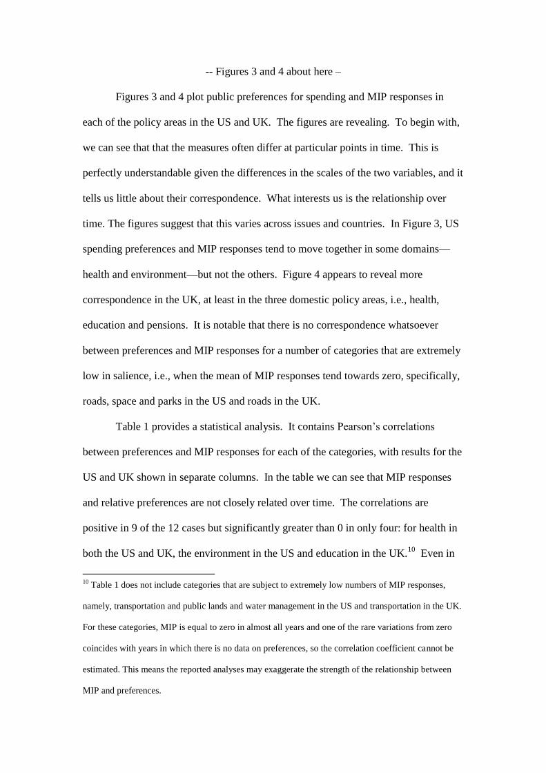
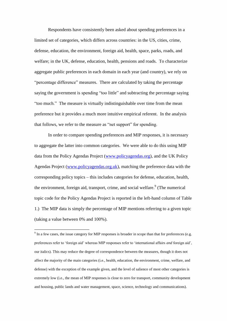
-- Figures 3 and 4 about here –
Figures 3 and 4 plot public preferences for spending and MIP responses in
each of the policy areas in the US and UK. The figures are revealing. To begin with,
we can see that that the measures often differ at particular points in time. This is
perfectly understandable given the differences in the scales of the two variables, and it
tells us little about their correspondence. What interests us is the relationship over
time. The figures suggest that this varies across issues and countries. In Figure 3, US
spending preferences and MIP responses tend to move together in some domains—
health and environment—but not the others. Figure 4 appears to reveal more
correspondence in the UK, at least in the three domestic policy areas, i.e., health,
education and pensions. It is notable that there is no correspondence whatsoever
between preferences and MIP responses for a number of categories that are extremely
low in salience, i.e., when the mean of MIP responses tend towards zero, specifically,
roads, space and parks in the US and roads in the UK.
Table 1 provides a statistical analysis. It contains Pearson’s correlations
between preferences and MIP responses for each of the categories, with results for the
US and UK shown in separate columns. In the table we can see that MIP responses
and relative preferences are not closely related over time. The correlations are
positive in 9 of the 12 cases but significantly greater than 0 in only four: for health in
both the US and UK, the environment in the US and education in the UK.10
Even in
10
Table 1 does not include categories that are subject to extremely low numbers of MIP responses,
namely, transportation and public lands and water management in the US and transportation in the UK.
For these categories, MIP is equal to zero in almost all years and one of the rare variations from zero
coincides with years in which there is no data on preferences, so the correlation coefficient cannot be
estimated. This means the reported analyses may exaggerate the strength of the relationship between
MIP and preferences.
these four cases, the correlations average below 0.60. In one case, defense in the UK,
the correlation actually is negative and statistically significant. That is, when defence
is considered to be a problem, there is less of a preference for spending on it. For the
full set of 12 cases, the mean correlation is a meager 0.21. The relationship is slightly
stronger in the UK, as we see positive, significant correlations in two of the four cases
there and a larger mean correlation—0.29 by comparison with 0.18 in the US. Before
drawing any definitive conclusions, do recall that one of the four UK cases is negative
and significant and also note that the difference in mean correlations is not
statistically significant. Even to the extent there are differences between the US and
UK, these may reflect differences in the number and types of policy domains for
which data on relative preferences is available—in the UK, we have data for a handful
of comparatively salient domains.
-- Table 1 about here –
The results in Table 1 thus indicate that MIP responses are not a good
substitute for relative preferences in most spending domains. Although they may
indicate preferences in some areas, this is the exception, not the rule. Even here, they
are partial indicators. This is precisely as we hypothesized above where MIP
responses reflect public assessments of conditions, not policy per se. (Of course, it
may be that they assess both policy and conditions, which would produce a similar
pattern to the one we posited above.)
Although MIP responses may not work well in specific spending domains,
they may function better for related policy domains taken together. For instance, it
may be that MIP responses for the aggregate of “social” policy areas may serve to
indicate relative preferences for government policy. We can test this proposition in
two ways. Firstly, it is possible to assess the degree of correspondence between MIP
responses on social issues (the sum of MIP responses for the civil rights, health,
education, environment and housing categories) and aggregated spending preferences
in the same domains (the average of net support for spending for health, environment
and cities in the US and for health and education in the UK). Secondly, it is also
possible to substitute Stimson’s public policy mood, that is, the relative preference of
citizens for either more liberal or more conservative government policy (Stimson
1991; Erikson et al. 2002; Bartle et al. 2011). We know that these alternative
measures of relative preferences are closely correlated (Wlezien 1995). The two
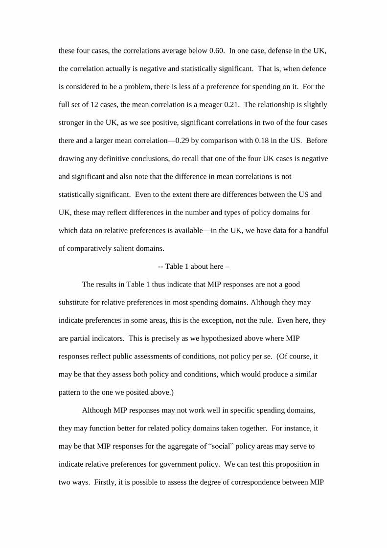
series are plotted against MIP responses on social issues in Figures 5 and 6. These
exhibit a degree of common movement over time.
-- Figures 5 and 6 about here –
Table 2 presents an analysis between the two measures of aggregate
preferences and MIP totals for social policy domains. Understandably, the results
largely summarize what we saw in Table 1—modest relationships between the
variables that are slightly stronger in the UK and much stronger for spending
preferences than for public policy mood. Indeed, the correlations with social
spending preferences reported in Table 2 are about twice as large as the average
correlations across spending domains from Table 1. This partly reflects the fact that
the analysis in Table 2 combines policy areas that showed the closest correspondence.
Consider that the average correlations for the “social” domains in Table 1—0.42 in
the US and 0.64 in the UK—are not that much lower than what we find in Table 2
when they are combined. MIP for related (social) domains seemingly do not work
much better when preferences for spending are taken together or when public
preferences for government policy are measured on a general left-right dimension.11
-- Table 2 about here –
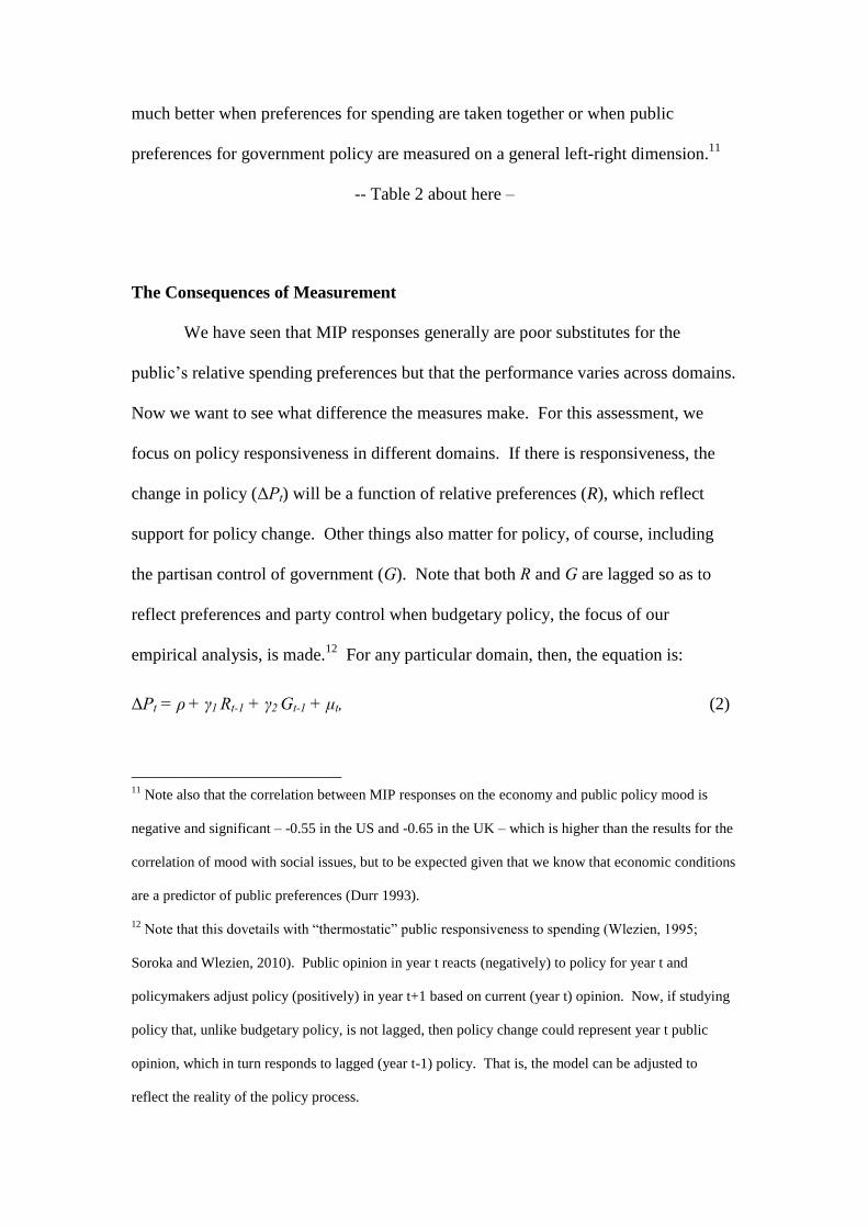
The Consequences of Measurement
We have seen that MIP responses generally are poor substitutes for the
public’s relative spending preferences but that the performance varies across domains.
Now we want to see what difference the measures make. For this assessment, we
focus on policy responsiveness in different domains. If there is responsiveness, the
change in policy (ΔPt) will be a function of relative preferences (R), which reflect
support for policy change. Other things also matter for policy, of course, including
the partisan control of government (G). Note that both R and G are lagged so as to
reflect preferences and party control when budgetary policy, the focus of our
empirical analysis, is made.12
For any particular domain, then, the equation is:
ΔPt = ρ + γ1 Rt-1 + γ2 Gt-1 + μt, (2)
11
Note also that the correlation between MIP responses on the economy and public policy mood is
negative and significant – -0.55 in the US and -0.65 in the UK – which is higher than the results for the
correlation of mood with social issues, but to be expected given that we know that economic conditions
are a predictor of public preferences (Durr 1993).
12 Note that this dovetails with “thermostatic” public responsiveness to spending (Wlezien, 1995;
Soroka and Wlezien, 2010). Public opinion in year t reacts (negatively) to policy for year t and
policymakers adjust policy (positively) in year t+1 based on current (year t) opinion. Now, if studying
policy that, unlike budgetary policy, is not lagged, then policy change could represent year t public
opinion, which in turn responds to lagged (year t-1) policy. That is, the model can be adjusted to
reflect the reality of the policy process.
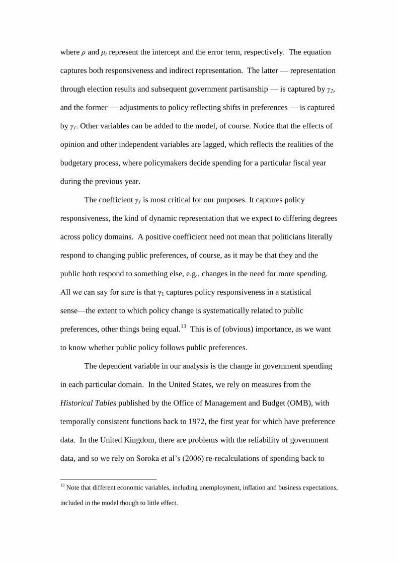
where ρ and μt represent the intercept and the error term, respectively. The equation
captures both responsiveness and indirect representation. The latter — representation
through election results and subsequent government partisanship — is captured by γ2,
and the former — adjustments to policy reflecting shifts in preferences — is captured
by γ1. Other variables can be added to the model, of course. Notice that the effects of
opinion and other independent variables are lagged, which reflects the realities of the
budgetary process, where policymakers decide spending for a particular fiscal year
during the previous year.
The coefficient γ1 is most critical for our purposes. It captures policy
responsiveness, the kind of dynamic representation that we expect to differing degrees
across policy domains. A positive coefficient need not mean that politicians literally
respond to changing public preferences, of course, as it may be that they and the
public both respond to something else, e.g., changes in the need for more spending.
All we can say for sure is that γ1 captures policy responsiveness in a statistical
sense—the extent to which policy change is systematically related to public
preferences, other things being equal.13
This is of (obvious) importance, as we want
to know whether public policy follows public preferences.
The dependent variable in our analysis is the change in government spending
in each particular domain. In the United States, we rely on measures from the
Historical Tables published by the Office of Management and Budget (OMB), with
temporally consistent functions back to 1972, the first year for which have preference
data. In the United Kingdom, there are problems with the reliability of government
data, and so we rely on Soroka et al’s (2006) re-recalculations of spending back to
13
Note that different economic variables, including unemployment, inflation and business expectations,
included in the model though to little effect.

1980. When combined with two years of earlier data recalculated by HM Treasury
for Public Expenditure Statistical Analysis (PESA), we have functionally-consistent
data from 1978 to 1995, the last year for which preference data are available. We
adjust all of the measures for inflation.14
As noted above, the models include measures of the party composition of
government. In the US, there are measures for the president and the Congress. The
former variable takes the value “1” under Democratic presidents and “0” under
Republican presidents, and the latter variable represents the average percentage of
Democrats in the House and Senate. In the UK, party control of government is coded
“1” under Conservative governments and “0” under Labour governments. As for net
support, these political variables are measured during year t − 1. Models in selected
UK domains (education and health) also include the unemployment rate. Following
Wlezien (2004) and Soroka and Wlezien (2010), dummy variables are included in the
US models for fiscal years 1977 and 1978 for cities and the environment.
Now, we are interested in seeing what difference it makes to use MIP
responses in place of relative preferences. To make this assessment, we first estimate
the equation 1 for each spending domain using our measures of net support and then
estimate the same equation using MIP responses in place of net support. To begin
with, we present these two estimated equations for the US welfare spending domain.
The results are shown in Table 3.
-- Table 3 about here –
14
The US data is adjusted with the GDP chained price index (Table 10.1 of the OMB's historical
tables) and the UK data is adjusted with the GDP deflator (series YBGB from the Office for National
Statistics).
In the first column of Table 3 we see that changes in welfare spending do
closely follow public preferences for spending in that domain over time. As indicated
by the positive, significant coefficient (0.33) for net support, when the public
preference for more spending is high politicians tend to provide more spending A
one-point increase in support for more spending in year t-1 leads to a $0.33 billion
increase in year t. This is evidence of actual policy responsiveness; that is, spending
changes in response to preferences independently of party control of government,
which itself may reflect preferences. (Though do note that neither party control of the
presidency nor Congress impact welfare spending.)
Using MIP in place of preferences produces very different results. The
coefficient for MIP (-.08) on spending actually is negative, though not statistically
significant. Model performance also is much lower, with the R-squared equal to just
0.03 compared to 0.17 using the measure of spending preferences. The evidence thus
is clear: the measures matter and in fundamental ways. Welfare MIP is not at all a
good substitute for actual spending preferences. Of course, this is just one domain in
one country.
Let us turn, next, to compare the pattern of dynamic representation across all
domains, in both the US and the UK. Firstly, in Table 4 we present the results from
estimating the equation in each US spending domain using measures of public
preferences. Here there is unmistakable evidence of representation of preferences,
with positive and significant coefficients in seven out of the nine domains. An
increase in support for spending in year t-1 tends to lead to an increase in year t, the
same as for welfare spending. The size of effect varies across domains. For
example, a one-point increase in net support for defense spending leads to a $0.74
billion increase, whereas a one-point increase in net support for the environment leads
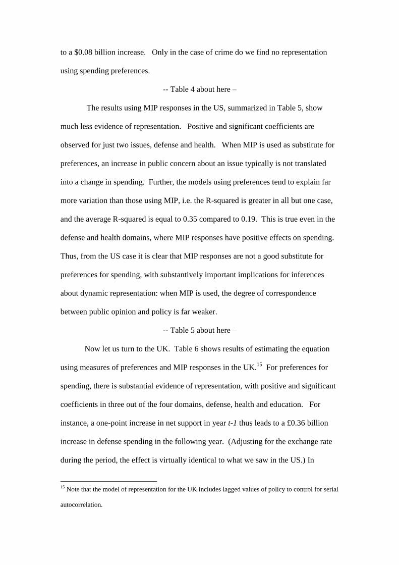
to a $0.08 billion increase. Only in the case of crime do we find no representation
using spending preferences.
-- Table 4 about here –
The results using MIP responses in the US, summarized in Table 5, show
much less evidence of representation. Positive and significant coefficients are
observed for just two issues, defense and health. When MIP is used as substitute for
preferences, an increase in public concern about an issue typically is not translated
into a change in spending. Further, the models using preferences tend to explain far
more variation than those using MIP, i.e. the R-squared is greater in all but one case,
and the average R-squared is equal to 0.35 compared to 0.19. This is true even in the
defense and health domains, where MIP responses have positive effects on spending.
Thus, from the US case it is clear that MIP responses are not a good substitute for
preferences for spending, with substantively important implications for inferences
about dynamic representation: when MIP is used, the degree of correspondence
between public opinion and policy is far weaker.
-- Table 5 about here –
Now let us turn to the UK. Table 6 shows results of estimating the equation
using measures of preferences and MIP responses in the UK.15
For preferences for
spending, there is substantial evidence of representation, with positive and significant
coefficients in three out of the four domains, defense, health and education. For
instance, a one-point increase in net support in year t-1 thus leads to a £0.36 billion
increase in defense spending in the following year. (Adjusting for the exchange rate
during the period, the effect is virtually identical to what we saw in the US.) In
15
Note that the model of representation for the UK includes lagged values of policy to control for serial
autocorrelation.
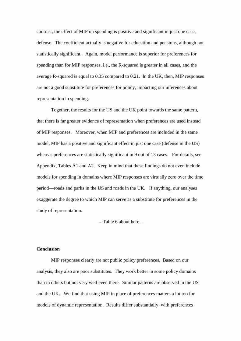
contrast, the effect of MIP on spending is positive and significant in just one case,
defense. The coefficient actually is negative for education and pensions, although not
statistically significant. Again, model performance is superior for preferences for
spending than for MIP responses, i.e., the R-squared is greater in all cases, and the
average R-squared is equal to 0.35 compared to 0.21. In the UK, then, MIP responses
are not a good substitute for preferences for policy, impacting our inferences about
representation in spending.
Together, the results for the US and the UK point towards the same pattern,
that there is far greater evidence of representation when preferences are used instead
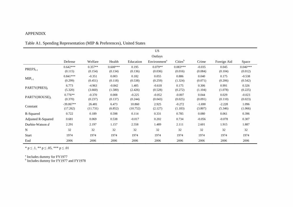
of MIP responses. Moreover, when MIP and preferences are included in the same
model, MIP has a positive and significant effect in just one case (defense in the US)
whereas preferences are statistically significant in 9 out of 13 cases. For details, see
Appendix, Tables A1 and A2. Keep in mind that these findings do not even include
models for spending in domains where MIP responses are virtually zero over the time
period—roads and parks in the US and roads in the UK. If anything, our analyses
exaggerate the degree to which MIP can serve as a substitute for preferences in the
study of representation.
-- Table 6 about here –
Conclusion
MIP responses clearly are not public policy preferences. Based on our
analysis, they also are poor substitutes. They work better in some policy domains
than in others but not very well even there. Similar patterns are observed in the US
and the UK. We find that using MIP in place of preferences matters a lot too for
models of dynamic representation. Results differ substantially, with preferences
having a positive and statistically significant effect on government spending in 10 out
of 13 domains, whereas MIP responses have an effect in just 3 out of 13. This leads
to quite different conclusions. Simply, inferences drawn about the nature of dynamic
representation vary substantially depending on the measure used. Furthermore, the
model performance is much greater if preferences are used instead of MIP, indicating
that it is better able to account for changes in government spending. While MIP
responses might be very good as measures of the evolving public agenda and a
mediocre measure of the salience of political issues, they bear little resemblance to
actual policy preferences in most domains.
It remains possible, however, that MIP responses might sometimes be usable
as a substitute for preferences in certain domains, but this is the exception rather than
the rule. The relationship between MIP and relative preferences depends on what
people reflect when identifying their most important problem. When focusing only
on conditions, problems are defined asymmetrically, where conditions are worse than
people would like, i.e. people rarely desire “more crime,” “more unemployment,” or
so on). As discussed above, there may be a degree of correspondence between MIP
and preferences in such cases, as MIP mentions will tend to increase as conditions
worsen and people want government to do something about it, i.e., more policy.
Recall that, even in these cases, we do not expect the relationship to be perfect, for at
least two reasons: (1) people may not want more policy in response to bad conditions
and (2) people may want more policy even where conditions are good.
Any decision to use MIP as a substitute for preferences for policy thus should
not be taken lightly and should, further, be subjected to validity checks for that
particular domain for that period of time (e.g. Jennings 2009). Indeed, the empirical
implications here almost certainly apply for assessments of the ‘most important issue’

(MII) as well, as there is little difference between these and MIP responses (Jennings
and Wlezien, 2011).16
While it is theoretically possible for there to be a relationship between MIP
and relative preferences, the results here indicate they tend to tap very different things
and are related only in selected policy domains. Perhaps most critically, our findings
show that using MIP responses substantially misrepresents the representational
relationship between public preferences and policy. This is not a minor technical
issue of measurement; it has substantive consequences for inferences about how
democracy works.
16
That research implies that when the public is asked about “issues,” they tend to think about
“problems.”

References
Bartle, John, Sebastian Dellepiane-Avellaneda, and James A. Stimson. 2011. ‘The
Moving Centre: Preferences for Government Activity in Britain, 1950-2005.’ British
Journal of Political Science 41(2): 259-285.
Burstein, Paul. 2003. ‘The Impact of Public Opinion on Public Policy: A Review and
an Agenda.’ Political Research Quarterly 56(1): 29-40.
Durr, Robert H. 1993. ‘What Moves Policy Sentiment?’ American Political Science
Review 87: 158–170.
Erikson, Robert S., Michael B. MacKuen and James A. Stimson. 2002. The Macro
Polity. Cambridge: Cambridge University Press.
Erikson, Robert S. and Kent L. Tedin. 2004. American Public Opinion. New York:
Longman.
Hibbs, Douglas A. 1979. ‘The Mass Public and Macro-Economic Policy: The
Dynamics of Public Opinion towards Unemployment and Inflation.’ American
Journal of Political Science 2(3): 705-31.
Hobolt, Sara B., and Robert Klemmensen. 2005. ‘Responsive Government? Public
Opinion and Government Policy Preferences in Britain and Denmark.’ Political
Studies 53(2): 379-402.
Hobolt, Sara B., and Robert Klemmensen. 2008. ‘Government Responsiveness and
Political Competition in Comparative Perspective.’ Comparative Political Studies
41(3): 309-337.
Hobolt, Sara B., Robert Klemmensen and Mark Pickup. 2008. ‘'The Dynamics of
Issue Diversity in Party Rhetoric.’ Oxford Centre for the Study of Inequality and
Democracy, Working Paper 03. December 2008.
Hood, Christopher, Henry Rothstein and Robert Baldwin. 2001. The Government of
Risk. Oxford: Oxford University Press.
Hudson, John. 1994. ‘Granger Causality, Rational Expectations and Aversion to
Unemployment and Inflation.’ Public Choice 80(1/2): 9-21.
Jennings, Will. 2009. ‘The Public Thermostat, Political Responsiveness and Error-
Correction: Border Control and Asylum in Britain, 1994-2007.’ British Journal of
Political Science 39(4): 847-870.
Jennings, Will, and Peter John. 2009. ‘The Dynamics of Political Attention: Public
Opinion and the Queen’s Speech in the United Kingdom.’ American Journal of
Political Science 53(4): 838-854.
Jennings, Will, and Christopher Wlezien. 2011. ‘Distinguishing between Most
Important Problems and Issues.’ Public Opinion Quarterly 75: 545-555.
John, Peter. 2006. ‘Explaining policy change: the impact of the media, public opinion
and political violence on urban budgets in England.’ Journal of European Public
Policy 13(7): 1053-1068.
Jones, Bryan. 1994. Reconceiving Decision-making in Democratic Politics: Attention,
Choice, and Public Policy. Chicago: University of Chicago Press.
King, Anthony, and Robert Wybrow. 2001. British Political Opinion 1937-2000.
London: Politicos.
McDonald, Michael D, Ian Budge and Paul Pennings. 2005. ‘Choice Versus
Sensitivity: Party reactions to Public Concerns.’ European Journal of Political
Research 43(6): 845-868.
Page, Benjamin I. and Robert Y. Shapiro. 1983. ‘Effects of public opinion on policy.’
American Political Science Review 77: 175-190.

Petry, François. 1999. ‘The Opinion-Policy Relationship in Canada.’ Journal of
Politics 61(2): 541-551.
Soroka, Stuart N. 2002. Agenda-Setting Dynamics in Canada. Vancouver: University
of British Columbia Press.
Soroka, Stuart N., and Christopher Wlezien. 2005. ‘Opinion-Policy Dynamics: public
preferences and public expenditure in the United Kingdom.’ British Journal of
Political Science 35: 665-689.
Soroka, Stuart N., and Christopher Wlezien. 2010. Degrees of Democracy: The
Public, Politics and Policy. Cambridge: Cambridge University Press.
Soroka, Stuart, Christopher Wlezien and Iain McLean. 2006. ‘Public Expenditure in
the U.K.: How Measures Matter.’ Journal of the Royal Statistical Society, Series A
169: 255-71.
Stimson, James A. 1991. Public Opinion in America: Moods, Cycles, and Swings.
Boulder, Col.: Westview.
Stokes, Donald. 1963. ‘Spatial Models and Party Competition.’ American Political
Science Review 57(2): 368–377.
Valenzuela, Sebastián. 2011. ‘Politics without Citizens? Public Opinion, Television
News, the President, and Real-World Factors in Chile, 2000-2005.’ The
International Journal of Press/Politics 16(3): 357-381.
Wlezien, Christopher. 1995. ‘The Public as Thermostat: dynamics of preferences for
spending.’ American Journal of Political Science 39: 981–1000.
Wlezien, Christopher. 2004. ‘Patterns of Representation: Dynamics of Public
Preferences and Policy.’ The Journal of Politics 66(1): 1-24.
Wlezien, Christopher. 2005. ‘On the salience of political issues: The problem with
‘most important problem’.’ Electoral Studies 24(4): 555-79.
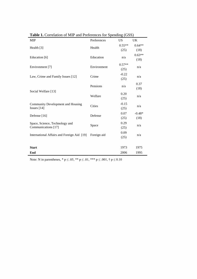
Table 1. Correlation of MIP and Preferences for Spending (GSS)
MIP Preferences US UK
Health [3] Health 0.55**
(25)
0.64**
(18)
Education [6] Education n/a 0.63**
(18)
Environment [7] Environment 0.57**
(25) n/a
Law, Crime and Family Issues [12] Crime -0.22
(25) n/a
Social Welfare [13]
Pensions n/a 0.37
(18)
Welfare 0.20
(25) n/a
Community Development and Housing
Issues [14] Cities
-0.15
(25) n/a
Defense [16] Defense 0.07
(25)
-0.48*
(18)
Space, Science, Technology and
Communications [17] Space
0.29
(25) n/a
International Affairs and Foreign Aid [19] Foreign aid 0.09
(25) n/a
Start 1973 1975
End 2006 1995
Note: N in parentheses, * p ≤ .05, ** p ≤ .01, *** p ≤ .001, † p ≤ 0.10

Table 2. Correlation between Aggregations of MIP (Social Topics)
and Preferences
MIP Preferences US UK
Social categories (civil rights,
health, education, environment,
community development and
housing issues)
Public Policy Mood 0.38*
(34)
0.49***
(19)
Aggregate Spending
Preferences
0.62*
(25)
0.66**
(16)
Start 1973 1975
End 2006 1995
Note N in parentheses, * p ≤ .05, ** p ≤ .01, *** p ≤ .001, with gaps for preference series
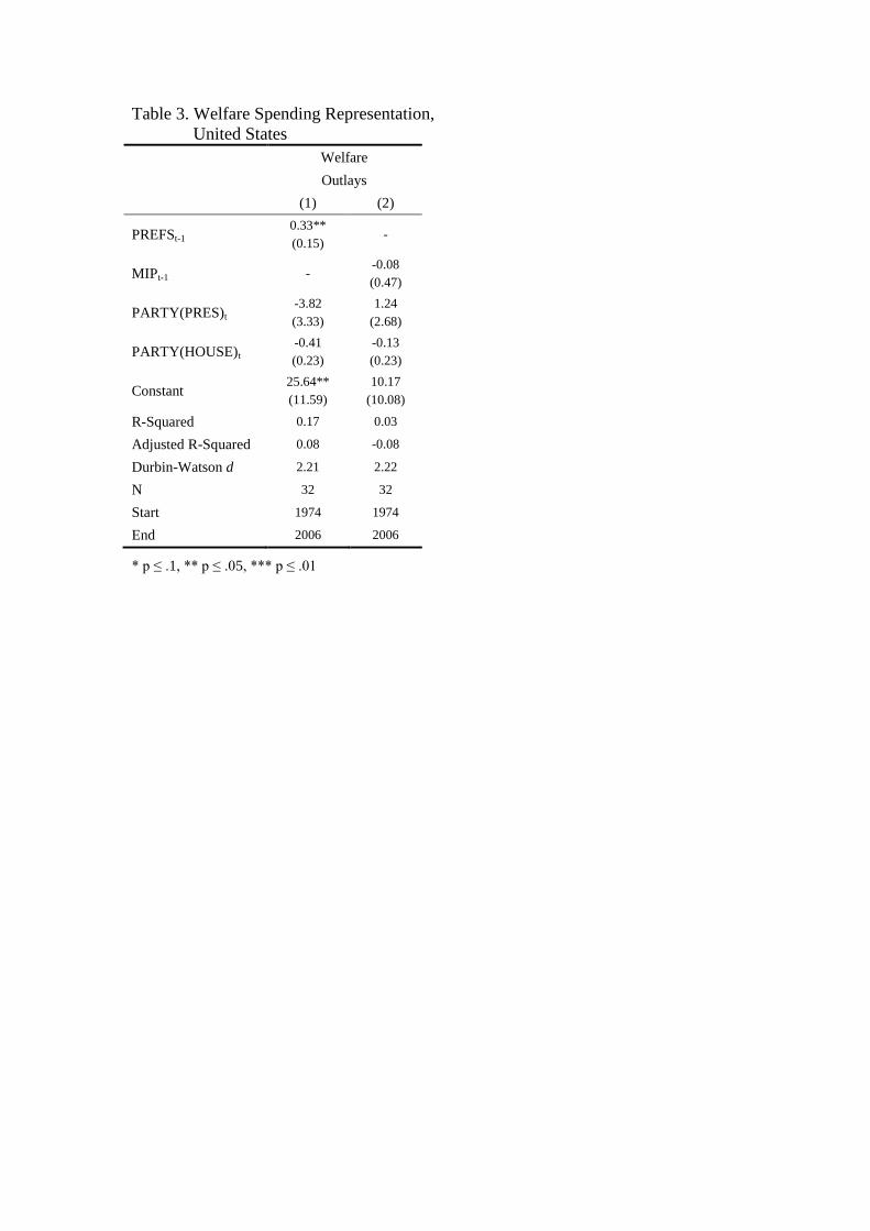
Table 3. Welfare Spending Representation,
United States
Welfare
Outlays
(1) (2)
PREFSt-1 0.33**
(0.15) -
MIPt-1 - -0.08
(0.47)
PARTY(PRES)t -3.82
(3.33)
1.24
(2.68)
PARTY(HOUSE)t -0.41
(0.23)
-0.13
(0.23)
Constant 25.64**
(11.59)
10.17
(10.08)
R-Squared 0.17 0.03
Adjusted R-Squared 0.08 -0.08
Durbin-Watson d 2.21 2.22
N 32 32
Start 1974 1974
End 2006 2006
* p ≤ .1, ** p ≤ .05, *** p ≤ .01
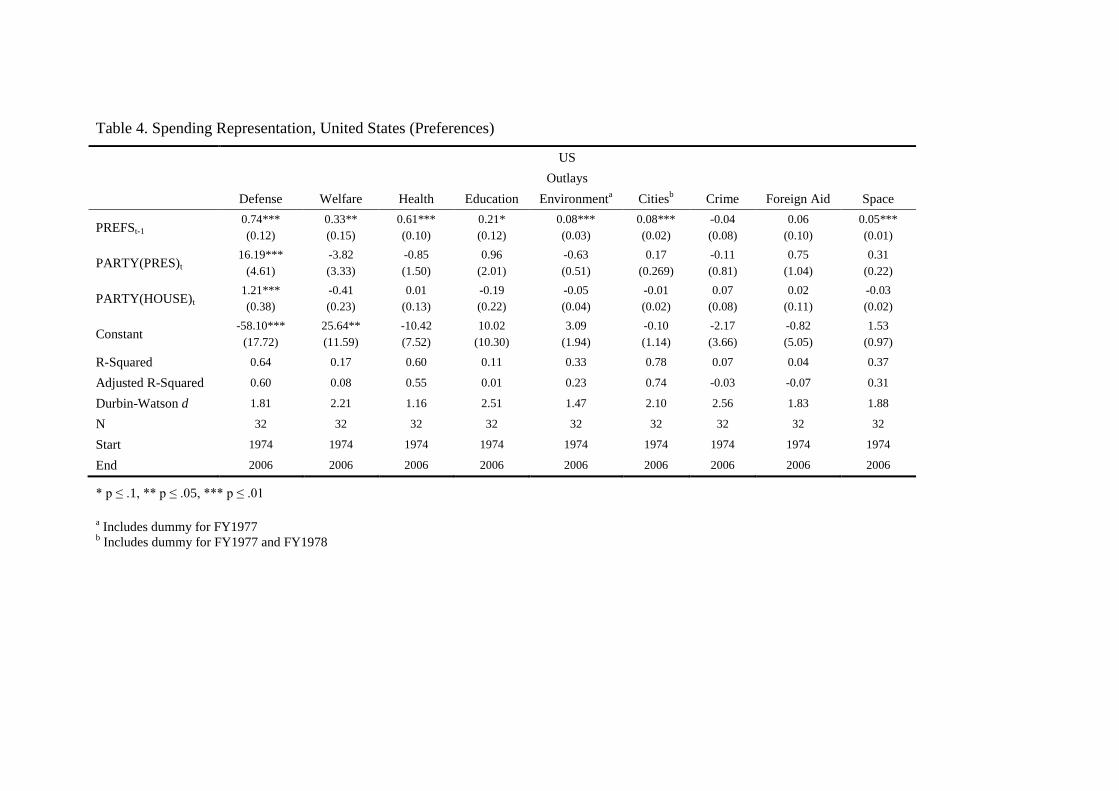
Table 4. Spending Representation, United States (Preferences)
US
Outlays
Defense Welfare Health Education Environmenta Cities
b Crime Foreign Aid Space
PREFSt-1 0.74***
(0.12)
0.33**
(0.15)
0.61***
(0.10)
0.21*
(0.12)
0.08***
(0.03)
0.08***
(0.02)
-0.04
(0.08)
0.06
(0.10)
0.05***
(0.01)
PARTY(PRES)t 16.19***
(4.61)
-3.82
(3.33)
-0.85
(1.50)
0.96
(2.01)
-0.63
(0.51)
0.17
(0.269)
-0.11
(0.81)
0.75
(1.04)
0.31
(0.22)
PARTY(HOUSE)t 1.21***
(0.38)
-0.41
(0.23)
0.01
(0.13)
-0.19
(0.22)
-0.05
(0.04)
-0.01
(0.02)
0.07
(0.08)
0.02
(0.11)
-0.03
(0.02)
Constant -58.10***
(17.72)
25.64**
(11.59)
-10.42
(7.52)
10.02
(10.30)
3.09
(1.94)
-0.10
(1.14)
-2.17
(3.66)
-0.82
(5.05)
1.53
(0.97)
R-Squared 0.64 0.17 0.60 0.11 0.33 0.78 0.07 0.04 0.37
Adjusted R-Squared 0.60 0.08 0.55 0.01 0.23 0.74 -0.03 -0.07 0.31
Durbin-Watson d 1.81 2.21 1.16 2.51 1.47 2.10 2.56 1.83 1.88
N 32 32 32 32 32 32 32 32 32
Start 1974 1974 1974 1974 1974 1974 1974 1974 1974
End 2006 2006 2006 2006 2006 2006 2006 2006 2006
* p ≤ .1, ** p ≤ .05, *** p ≤ .01
a Includes dummy for FY1977
b Includes dummy for FY1977 and FY1978

Table 5. Spending Representation, United States (MIP)
US
Outlays
Defense Welfare Health Education Environmenta Cities
b Crime Foreign Aid Space
MIPt-1 1.37***
(0.41)
-0.08
(0.47)
0.33**
(0.123)
0.50
(0.50)
0.37
(0.23)
0.17
(1.86)
0.04
(0.07)
0.18
(0.20)
-0.42
(0.65)
PARTY(PRES)t -4.32
(7.12)
1.24
(2.68)
1.94
(1.90)
2.35
(2.38)
-0.14
(0.51)
0.03
(0.38)
0.37
(1.08)
0.93
(1.05)
0.42
(0.27)
PARTY(HOUSE)t 0.46
(0.53)
-0.13
(0.23)
0.29*
(0.16)
-0.10
(0.23)
-0.03
(0.04)
0.00
(0.03)
0.06
(0.09)
0.06
(0.09)
0.00
(0.03)
Constant -22.27
(24.51)
10.17
(10.08)
-10.42
(7.52)
3.60
(9.65)
1.18
(2.09)
-0.22
(1.67)
-2.37
(3.39)
-3.63
(4.20)
-0.32
(1.20)
R-Squared 0.40 0.03 0.29 0.05 0.21 0.56 0.07 0.05 0.09
Adjusted R-Squared 0.34 -0.08 0.21 -0.06 0.10 0.47 -0.03 -0.05 -0.01
Durbin-Watson d 1.48 2.22 0.85 2.63 1.43 1.09 2.60 1.89 1.28
N 32 32 32 32 32 32 32 32 32
Start 1974 1974 1974 1974 1974 1974 1974 1974 1974
End 2006 2006 2006 2006 2006 2006 2006 2006 2006
* p ≤ .1, ** p ≤ .05, *** p ≤ .01
a Includes dummy for FY1977
b Includes dummy for FY1977 and FY1978
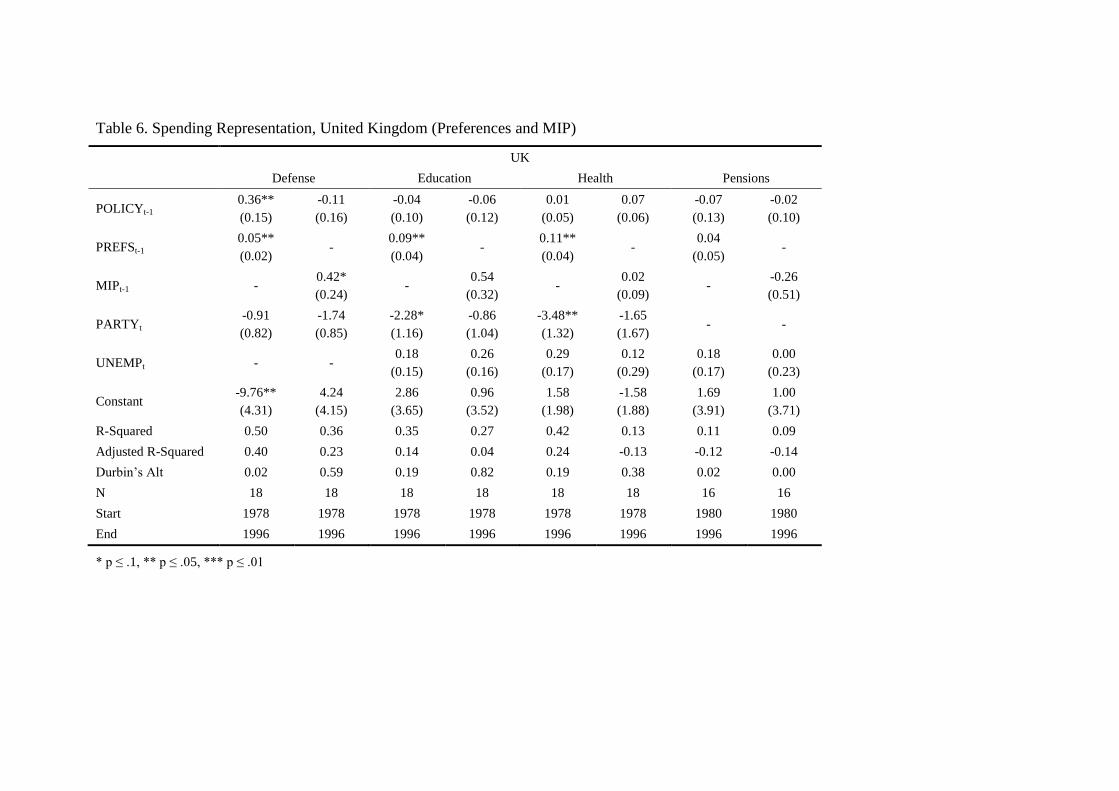
Table 6. Spending Representation, United Kingdom (Preferences and MIP)
UK
Defense Education Health Pensions
POLICYt-1 0.36**
(0.15)
-0.11
(0.16)
-0.04
(0.10)
-0.06
(0.12)
0.01
(0.05)
0.07
(0.06)
-0.07
(0.13)
-0.02
(0.10)
PREFSt-1 0.05**
(0.02) -
0.09**
(0.04) -
0.11**
(0.04) -
0.04
(0.05) -
MIPt-1 - 0.42*
(0.24) -
0.54
(0.32) -
0.02
(0.09) -
-0.26
(0.51)
PARTYt -0.91
(0.82)
-1.74
(0.85)
-2.28*
(1.16)
-0.86
(1.04)
-3.48**
(1.32)
-1.65
(1.67) - -
UNEMPt - - 0.18
(0.15)
0.26
(0.16)
0.29
(0.17)
0.12
(0.29)
0.18
(0.17)
0.00
(0.23)
Constant -9.76**
(4.31)
4.24
(4.15)
2.86
(3.65)
0.96
(3.52)
1.58
(1.98)
-1.58
(1.88)
1.69
(3.91)
1.00
(3.71)
R-Squared 0.50 0.36 0.35 0.27 0.42 0.13 0.11 0.09
Adjusted R-Squared 0.40 0.23 0.14 0.04 0.24 -0.13 -0.12 -0.14
Durbin’s Alt 0.02 0.59 0.19 0.82 0.19 0.38 0.02 0.00
N 18 18 18 18 18 18 16 16
Start 1978 1978 1978 1978 1978 1978 1980 1980
End 1996 1996 1996 1996 1996 1996 1996 1996
* p ≤ .1, ** p ≤ .05, *** p ≤ .01
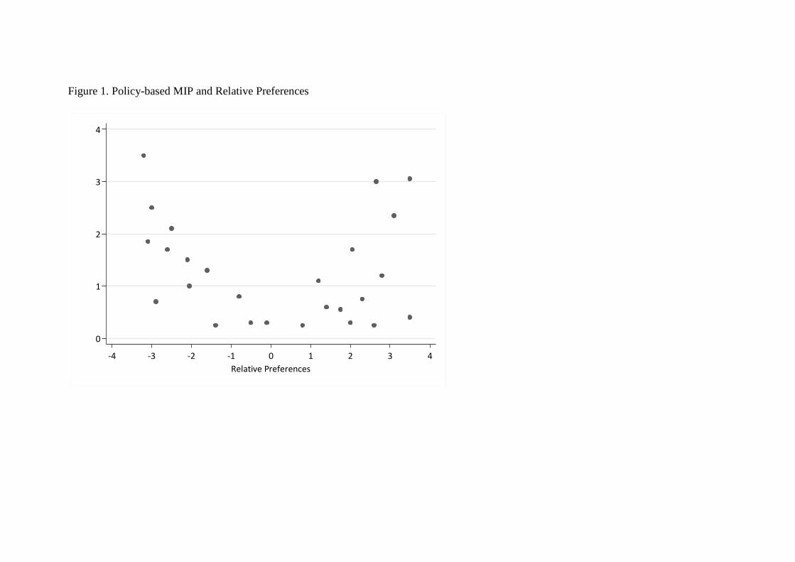
Figure 1. Policy-based MIP and Relative Preferences
0
1
2
3
4
MIP
Men
tio
ns
-4 -3 -2 -1 0 1 2 3 4
Relative Preferences
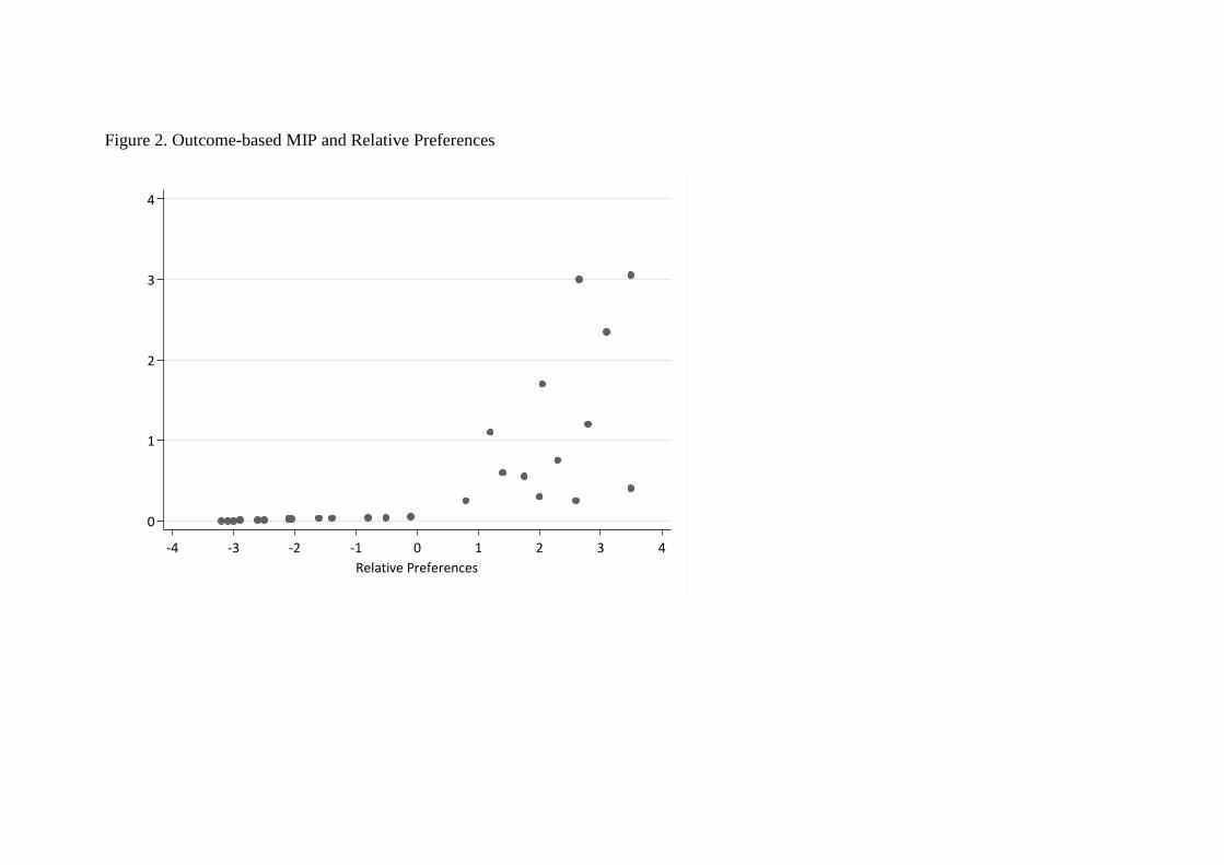
Figure 2. Outcome-based MIP and Relative Preferences
0
1
2
3
4
MIP
Men
tio
ns
-4 -3 -2 -1 0 1 2 3 4
Relative Preferences
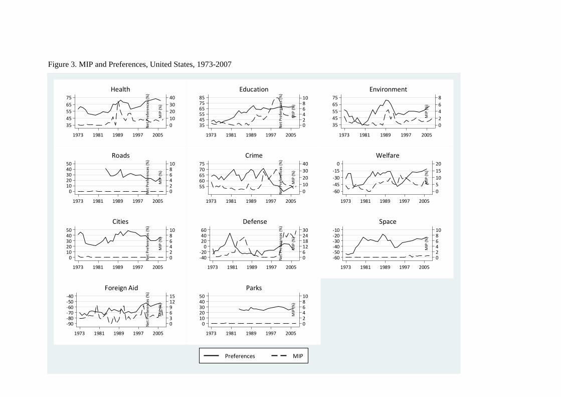
Figure 3. MIP and Preferences, United States, 1973-2007
0
10
20
30
40
MIP
(%
)
35
45
55
65
75
Ne
t P
refe
ren
ces
(%)
1973 1981 1989 1997 2005
Health
0246810
MIP
(%
)
354555657585
Ne
t P
refe
ren
ces
(%)
1973 1981 1989 1997 2005
Education
0
2
4
6
8
MIP
(%
)
35
45
55
65
75
Ne
t P
refe
ren
ces
(%)
1973 1981 1989 1997 2005
Environment
0246810
MIP
(%
)
01020304050
Ne
t P
refe
ren
ces
(%)
1973 1981 1989 1997 2005
Roads
0
10
20
30
40
MIP
(%
)
5560657075
Ne
t P
refe
ren
ces
(%)
1973 1981 1989 1997 2005
Crime
0
5
10
15
20
MIP
(%
)
-60
-45
-30
-15
0
Ne
t P
refe
ren
ces
(%)
1973 1981 1989 1997 2005
Welfare
0246810
MIP
(%
)
01020304050
Ne
t P
refe
ren
ces
(%)
1973 1981 1989 1997 2005
Cities
0612182430
MIP
(%
)
-40-20
0204060
Ne
t P
refe
ren
ces
(%)
1973 1981 1989 1997 2005
Defense
0246810
MIP
(%
)
-60-50-40-30-20-10
Ne
t P
refe
ren
ces
(%)
1973 1981 1989 1997 2005
Space
03691215
MIP
(%
)
-90-80-70-60-50-40
Ne
t P
refe
ren
ces
(%)
1973 1981 1989 1997 2005
Foreign Aid
0246810
MIP
(%
)
01020304050
Ne
t P
refe
ren
ces
(%)
1973 1981 1989 1997 2005
Parks
Preferences MIP

Figure 4. MIP and Preferences, United Kingdom, 1975-1995
0
5
10
15
20
25
30
MIP
(%
)
30
40
50
60
70
80
90
Ne
t P
refe
ren
ces
(%)
1975 1980 1985 1990 1995
Health
0
1
2
3
4
5
6
MIP
(%
)
25
35
45
55
65
75
85
Ne
t P
refe
ren
ces
(%)
1975 1980 1985 1990 1995
Education
0
1
2
3
4
5
6
MIP
(%
)
0
10
20
30
40
50
60
Ne
t P
refe
ren
ces
(%)
1975 1980 1985 1990 1995
Roads
0
1
2
3
4
5
MIP
(%
)
40
50
60
70
80
90
Ne
t P
refe
ren
ces
(%)
1975 1980 1985 1990 1995
Pensions
0
1
2
3
4
5
6
MIP
(%
)
-60
-45
-30
-15
0
15
30
Ne
t P
refe
ren
ces
(%)
1975 1980 1985 1990 1995
Defense
Preferences MIP
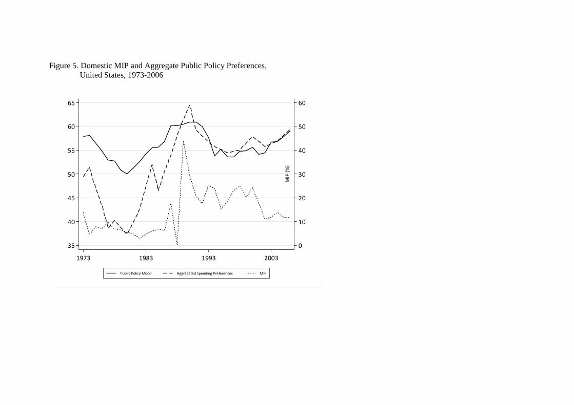
Figure 5. Domestic MIP and Aggregate Public Policy Preferences,
United States, 1973-2006
0
10
20
30
40
50
60
MIP
(%
)
35
40
45
50
55
60
65
Pu
blic
Po
licy
Mo
od
1973 1983 1993 2003
Public Policy Mood Aggregated Spending Preferences MIP

Figure 6. Domestic MIP and Aggregate Public Policy Preferences,
United Kingdom, 1975-1995
0
5
10
15
20
25
30
MIP
(%
)
30
40
50
60
70
80
90
Pu
blic
Po
licy
Mo
od
1975 1980 1985 1990 1995
Public Policy Mood Aggregated Spending Preferences MIP
APPENDIX
Table A1. Spending Representation (MIP & Preferences), United States
US
Outlays
Defense Welfare Health Education Environmenta Cities
b Crime Foreign Aid Space
PREFSt-1 0.642***
(0.115)
0.357**
(0.154)
0.608***
(0.134)
0.195
(0.136)
0.079**
(0.036)
0.083***
(0.016)
-0.035
(0.084)
0.045
(0.104)
0.046***
(0.012)
MIPt-1 0.841***
(0.299)
-0.351
(0.451)
0.003
(0.118)
0.182
(0.538)
0.055
(0.259)
0.886
(1.324)
0.040
(0.071)
0.175
(0.206)
-0.538
(0.542)
PARTY(PRES)t 6.773
(5.320)
-4.963
(3.660)
-0.842
(1.580)
1.405
(2.426)
-0.618
(0.528)
0.175
(0.272)
0.306
(1.104)
0.991
(1.078)
0.326
(0.225)
PARTY(HOUSE)t 0.776**
(0.370)
-0.370
(0.237)
0.008
(0.137)
-0.225
(0.244)
-0.052
(0.043)
-0.007
(0.025)
0.044
(0.091)
0.029
(0.110)
-0.023
(0.023)
Constant -39.067**
(17.262)
26.481
(11.731)
6.473
(6.852)
10.860
(10.752)
2.925
(2.127)
-0.272
(1.183)
-1.690
(3.807)
-2.228
(5.346)
1.096
(1.066)
R-Squared 0.722 0.189 0.598 0.114 0.331 0.785 0.080 0.061 0.396
Adjusted R-Squared 0.681 0.069 0.538 -0.017 0.202 0.734 -0.056 -0.078 0.307
Durbin-Watson d 2.291 2.197 1.157 2.558 1.489 2.111 2.601 1.915 1.887
N 32 32 32 32 32 32 32 32 32
Start 1974 1974 1974 1974 1974 1974 1974 1974 1974
End 2006 2006 2006 2006 2006 2006 2006 2006 2006
* p ≤ .1, ** p ≤ .05, *** p ≤ .01
a Includes dummy for FY1977
b Includes dummy for FY1977 and FY1978
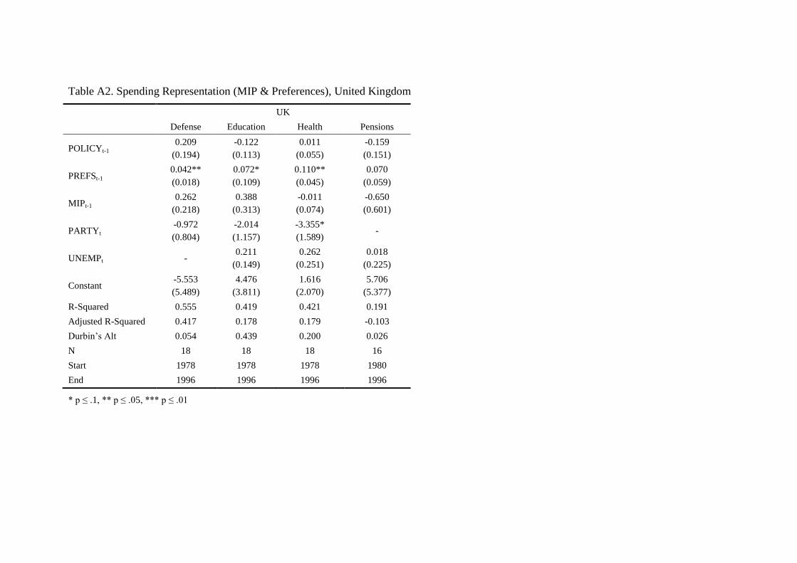
Table A2. Spending Representation (MIP & Preferences), United Kingdom
UK
Defense Education Health Pensions
POLICYt-1 0.209
(0.194)
-0.122
(0.113)
0.011
(0.055)
-0.159
(0.151)
PREFSt-1 0.042**
(0.018)
0.072*
(0.109)
0.110**
(0.045)
0.070
(0.059)
MIPt-1 0.262
(0.218)
0.388
(0.313)
-0.011
(0.074)
-0.650
(0.601)
PARTYt -0.972
(0.804)
-2.014
(1.157)
-3.355*
(1.589) -
UNEMPt - 0.211
(0.149)
0.262
(0.251)
0.018
(0.225)
Constant -5.553
(5.489)
4.476
(3.811)
1.616
(2.070)
5.706
(5.377)
R-Squared 0.555 0.419 0.421 0.191
Adjusted R-Squared 0.417 0.178 0.179 -0.103
Durbin’s Alt 0.054 0.439 0.200 0.026
N 18 18 18 16
Start 1978 1978 1978 1980
End 1996 1996 1996 1996
* p ≤ .1, ** p ≤ .05, *** p ≤ .01


![Measuring Social Norms and Preferences using Experimental ...1].pdf · for measuring aspects of social norms and social preferences. Economists use the term “preferences” to refer](https://static.fdocuments.in/doc/165x107/5ecf5121872eca1ce71ed850/measuring-social-norms-and-preferences-using-experimental-1pdf-for-measuring.jpg)