May 2009 Newsletter
28
-
Upload
barbara-qualley -
Category
Documents
-
view
215 -
download
2
description
May 2009 Newsletter
Transcript of May 2009 Newsletter

2
Executive Meetings are held on the first Tuesday of each month
at Eleanor Harris’ home from 9am to noon
All members are welcome!
Regular monthly meetings are held on the
second Tuesday of each month
(EXCEPT JULY and AUGUST) from 9am to noon
Island Savings Centre
2687 James Street Duncan, BC
Warmland Calligraphers of the Cowichan Valley (the Guild) is a non-profit group formed to facilitate the exchange of information between calligraphers, and to promote interest in and appreciation of calligraphy as an art form within the community. Its membership is open to calligraphers at all levels of expertise as well as those with a love of beautiful writing. Contents of this newsletter are copyrighted by the authors/artists. Requests for permission to reprint any part must be made through the Editor. The views of contributors are not necessarily those of the Editor or of the Guild. Members are invited to submit concise pieces for publi-cation as well as to alert the Editors to conferences, papers, speeches and other matters of interest to our readers. The Editors reserve the right to make editorial changes in material accepted for publication. These include such revisions or additions as are necessary to ensure correctness of grammar and spelling, clarification of obscurities, brevity and conformity to the newsletter style.
Membership in the Warmland Calligraphers guild includes three newsletters published in February, May and October. Annual membership dues are
C$20 for Canadian residents and US$20 for US/International
COPY DEADLINE FOR NEXT ISSUE 8 September 2009
P.O. Box 2, Duncan, B C, V9L 3X1 Canada http://members.shaw.ca/warmlandcalligraphers
Logo
des
igne
d by
Judi
th L
ovell
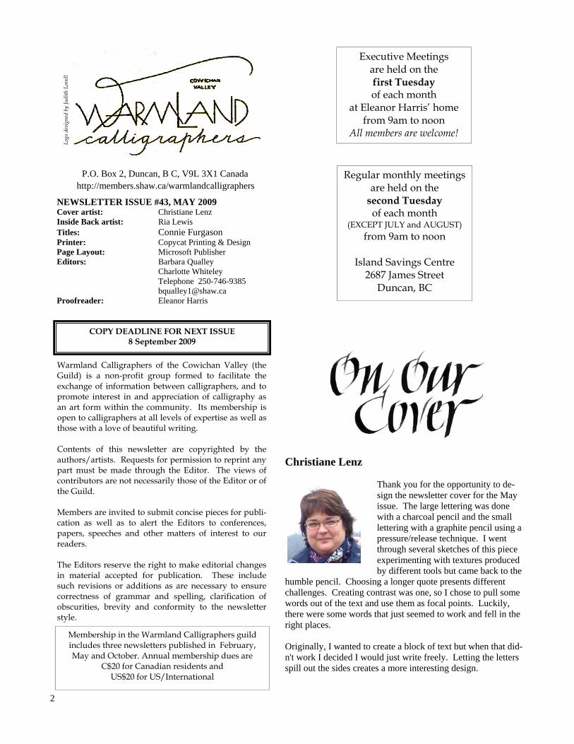
NEWSLETTER ISSUE #43, MAY 2009 Cover artist: Christiane Lenz Inside Back artist: Ria Lewis Titles: Connie Furgason Printer: Copycat Printing & Design Page Layout: Microsoft Publisher Editors: Barbara Qualley Charlotte Whiteley Telephone 250-746-9385 [email protected] Proofreader: Eleanor Harris
Christiane Lenz Thank you for the opportunity to de-sign the newsletter cover for the May issue. The large lettering was done with a charcoal pencil and the small lettering with a graphite pencil using a pressure/release technique. I went through several sketches of this piece experimenting with textures produced by different tools but came back to the
humble pencil. Choosing a longer quote presents different challenges. Creating contrast was one, so I chose to pull some words out of the text and use them as focal points. Luckily, there were some words that just seemed to work and fell in the right places. Originally, I wanted to create a block of text but when that did-n't work I decided I would just write freely. Letting the letters spill out the sides creates a more interesting design.

3
I am pleased to welcome Charlotte Whiteley to the newsletter team. This issue she has done the ‘full deal’ on Letters, Lines and Watercolours. She attended the class, wrote the article, took photographs and finally created
the pages that you see here. Thank you! What a great contribution. Brigitte French continues to be our distribution lady. She sees that all members receive their copies in a
timely manner. Thank you Brigitte! Janice Graham-Andrews continues to ensure that all events are reported and assigns members to write the words and take photos. Thank you Janice!
April 1st marked the beginning of our business year. Membership fees were collected and open executive positions were filled. We would like to wel-come new executive members Gwyneth Evans and Trish Peebles who are sharing the Secretarial posi-tion and Charlotte Whiteley who is assisting with the newsletter. Executive positions are for a two year term. This means that many positions will be open and need filling next March. As you attend meetings, workshops and activities during the coming year please think about how you could best contribute to the guild. Sharing the workload makes for a strong guild. We have had excellent attendance at our meetings this year; over 40 members have been present at some meetings. We are excited about what we can accomplish as we con-tinue to work together. It has been a busy few months and you will be reading about the many classes, shows and happenings in this
issue. I would like to say a special thank you to our vice presi-dent Marilyn Lun-strom who filled in for me when I was away on my travels to Mexico and Egypt in February and March. As well as
taking meetings, Marilyn and her committee were busy organizing the Loft Show and Sale. The show was well presented and all in all was a great success. Nine pieces were sold. Shirley Johnson has been coordinating a showing of our work at Sunridge Place. The pieces hang in one hall-way of the care home and brighten the area for residents and visitors. Shirley and her committee have changed the artwork three times so there has been an excellent variety of work shown. Thank you to Shirley and her commit-tee and to all of our members who have contributed work. The public library in the Island Sav-ings Centre will be showing our work again this summer. Last year Judy Dearman worked with the library to mount a Warmland exhibit and it was so successful that they have asked us to display more work this summer. Thank you for organizing this exhibit Judy.
This year Warmland assisted with the CVAC spring art show and sale by acting as hosts on the Friday of the show. Thank you to Pat Wheatley for organizing the day and to Betty Locke for giving calligraphy demonstrations in the morning. Stay tuned to hear more about this show during the year. It is a quality event that showcases a variety of visual arts by local artists. Betty was the only calligrapher who contributed to the show and we would like to encourage more Warmland members to consider participating next year. Several members offered workshops in February and March. Trish Peebles and I joined together to give our first ever class in card making. We had a lot of fun and it was well received so we are hoping we can organize some-thing again for next year. Marilyn Lundstrom offered some sessions in Bookhand and Betty Locke presented a series of Beginner’s Italic classes through Elder College. Connie Fur-gason from Victoria presented a de-lightful two day workshop called Let-ters, Lines and Watercolours – it was informative and inspiring. After this busy late winter and spring I think we are all ready for a bit of a break. I hope to see many of you at the Pot Luck in June and wish you all a happy and relaxing summer.
- Marilyn Silver
After much discussion a few months ago about using unauthorized soft-ware, I am pleased to report that Warmland Calligraphers is now the owner of registered Microsoft Office Professional 2003 software. Thanks to all contributors this is an-other edition jam packed with your artwork. Enjoy!
- Barbara Qualley

4
It was because of Betty Locke's sensitivity to the needs of the calligraphers who attended the original Uncial Workshop (see January Newsletter) that 'Uncials and Beyond' was possible. Much was covered in the initial course, but the calligraphers wanted an opportunity to extend these learnings. The four week workshop addressed the wishes of the eleven participants, and what better way than by a questionnaire follow-up to the original Uncial workshop. As much as we wanted more gilding and banding practice, we also wanted practice/feedback with our formation of the uncial hand. We found that after Betty's guidance in slanting the uncial, lengthening it, and shortening it, the traditional alphabet was much less a challenge. Betty had us molding the alpha-bet in a way that expressed the word's meaning. We had time to see all participants' versions of this. The goal was to loosen up and loosen we did! Bouncing letters was made easier by drawing a line above and below the body of the letter, approximately 1/8 inch, using that to give the word movement. We were reminded that once we showed we knew the rules, we were allowed to break them!
To grasp the shaping of the uncial alphabet thoroughly, time was spent with pigma pen, drawing the thick lines with a C-2 nib would have left such a thick line. This put us in touch with the pen angle and resultant shape. After such an intimate understanding of the uncial hand it was much easier to create the letter forms with a pen nib. Oversized uncial letters were drawn with the pigma pen and banding was taken to a new level with pigma pen creative designs in place of water colour. Time was spent sharing our gilding techniques, successes and failures. Two layers of sizing were often needed, with an approximate 10 minute drying time between coats. The most challenging area of the gilded letter was the outer por-tion as it tended to dry quickly and not adhere to the gold/metal. Classmates shared that they sometimes had to touch up the edges in gilded pieces by reapplying sizing and metal after the letter was dried and brushed. (see Feb 2009 Newsletter article re Uncial Workshop for gilding method).
Perhaps the most fun in the four weeks was in seeing the resultant negative-spaced writing with colour banding. This was an extension of an example given us by instructors Georgia Angelopoulos and Lorraine Douglas in the original workshop. It was a new technique for most of us and one that we all enjoyed thoroughly. The words are first pencil drawn, attempting to have no two letters the same. Water colour is painted around these letter forms allowing us to further practise our banding skills, thus making the piece legible. Thanks to the support of all classmates and Betty's guid-ance, we managed to not only take ourselves beyond un-cials, but to do so confidently and with great joy.
- Janice Graham-Andrews
Marilyn Boechler
Betty Locke

5
Dinah Cyr
Joyce Gammie
Ria Lewis
Joyce Gammie

6
Marilyn Boechler and Shirley Johnson led us through the following tech-niques at our February meeting.
Three Dot Flowers Mix a little bit of water-colour in the palette (purple/pink etc). Using smallest brush, place 3 small dots of paint about
1/8 inch apart. Leave them to dry. Switch colours and repeat the above method two additional times, having each set of 3 dots about an inch apart. Rinse brush with clean water and holding the brush in an overhand posi-tion, pull the paint approx 1/2 inch away from each dot, thus forming the pet-als. Try to make one flower bigger than the other two. Add a leaf or two, perhaps some stems to connect into a bouquet if desired. Salt Technique Using a sponge brush that is moderately wet with water, form a circular shape about 3 sq. in. in diameter Load up with paint a bigger brush than in the technique
above. Form a starburst shape on the dampened paper by making criss-crossed strokes. Drop a pinch of course salt into the centre of the circle. Let dry a few hours. Brush salt away. A fine dry brush can be used to define the flower further if needed. Flower Shapes Use a flower/seed cata-logue to see that the three basic flower shapes are circular (rose, peony, daisy), cupped (tulip, fritil-laria) and trumpet-shaped (lily).
These shapes can be pen-ciled lightly on watercolour paper. Vary the angle of the flower shape, make half circles too (for daisies). Using dry paper, with paint on brush, start with the richest paint application in
the flower's middle....pull paint to the edge of the petal so that it's lighter at petal's end. Remember to leave a space between petals wherever possible. Paint and water touch-ups can be added.
Wet on Wet Use a moderately wet sponge to dampen the paper in a flower shape (circle for example). Drop a little of the flower colour where the petal would be and watch the mix of paint and water. To achieve the look of the peony, place paint here and there, allowing the paint to blend with the water into petal shapes. Petals can be more clearly defined after paper is dry. - Janice Graham-Andrews
Miriam Beechey
2009 - 2010 Executive
PRESIDENT Marilyn Silver
PAST PRESIDENT
Shirley Johnson
FIRST VICE PRESIDENT Marilyn Lundstrom
SECOND VICE PRESIDENT
Denise Rothney
SECRETARY
Gwyneth Evans Trish Peebles
TREASURER Eleanor Harris
NEWSLETTER Barbara Qualley
Charlotte Whiteley
LIBRARIAN Judy Dearman
WORKSHOPS
Marilyn Boechler Betty Locke
MEMBERSHIP
Judy Lowood
NEW MEMBER LIAISON Leslie Healy
HISTORIAN Pat Wheatley

7
Connie graciously allows us to quote her website “I love watching what paint and other mediums “Do” to white space….whether it be paper canvas or a wall! Then adding the “voice” or “message” to that newly created place...it’s a wonderful backdrop for your own words to find meaning. It’s an opportunity to draw further from that well of expres-sion, that’s in all of us”. Connie was introduced to the class of 17 students by Betty Locke. A nice surprise for local calligraphers is Connie is practically in our back yard with a recent move to North Saanich with her new husband.
Connie related a really cute story told to her by Godfrey Pack about how when you arrive to take a course you arrive with a full backpack full of burdens such as “I’m not good enough”, “I won’t be able to do this” and other self talk like that. The idea is to empty the backpack outside the door and come in with an empty pack that you will take away with you filled with the new good stuff that you learn and grow with over the course of the workshop. And when you get home take a couple of things out the backpack and give them a try. GETTING STARTED The day started with some very easy exercises to get the creative juices flowing. We were told to make some very basic shapes on our practice pads in pencil. That idea was not to be artistic but just to draw a circle, square, rectangle
or any simple shape on the paper. From there you created items out of this simple shape. For example a triangle could be an evergreen tree or tent and a circle an apple. A quick trip outside followed to look at shapes in nature. We looked at a scene and broke it down into shapes. The waterfront scene on the mural in the foyer was easily triangles, rectan-gles and squares. Back inside to get back to work.
The workshop incorporated demonstrations and then we could go play. We watched how Connie put just bits of col-our and blotches to start the process. She never has only one project on the go as she is always waiting for paint to dry. She used a circle and triangle to demonstrate the apple and a leaf. Only bits of colour are added at a time.
Then she went on to grapes and played with bits of colour there. The idea was not to colour in the shape but to use fairly wet techniques to create what she called the essence of an apple or grapes or whatever the shape was intended to be. Connie likes to use the soft round brushes and the edge brush. She prefers the shorter haired versions and likes to use 1/2 and 1 inch brushes. Connie uses paper towel to blot and create interesting water colours and stressed that you needed to come back and revisit the piece from time to time as it was drying to add definition and interest.
Connie talks about shapes on mural at Island Savings Centre.
Connie guides Lorraine Hoy’s hand
Robbin Olive

8
The idea is to layer the colours. Connie suggested that you play with the colours and practice in sketch pads or scraps of paper that you can paste into workbooks. She uses sketchbooks to record all sorts of things that she does so that they can be reference for later. She will try different pig-ments and different papers and sees what effect or results she gets. Connie never throws out her experiments or her mistakes but merely turns them into note paper or back-ground. The results can be stunning when you thought ini-tially they were mistakes! Her process is to store them in envelopes so they are readily available for the many projects at hand. Throughout the workshop Connie was a wealth of informa-tion on products and references to some of her inspirational artists. Sara Midda was one whose illustrations are simple and beautiful in her books like “South Of France” and “In and Out of the Garden”. We took a break and returned to review our composition and add more details. We were to experiment with the paint-ing techniques she showed us before the break.. Her mantra was don’t overwork, don’t rush, there are no rules and by using subtle hints of colour you are creating the “essence” of the object. By letting something dry you are building layers. She also will do wet-on-wet and gets different result. These are all good. Before lunch we did an exercise playing with the brushes to see how they respond. We made wallpaper in a sense with squiggles and swoosh's….. To take the edge brush and cre-ate thick and thin lines...Experiment and see what you get when you use the edge, tip, side, flat wide edge, and flat-tening the bristles.... Add lots of water and colour…. Intro-duce other colours to wet work and blot out for different results. After lunch we made a simple fold and cut booklet. The ends were cut off to be utilized on some other project. The demo after lunch was using the edge brush to create flower petals or similar shaped objects.
FLOWER PETALS AND OTHER BLOBS OF COLOUR Next demo was to press and roll the dry brush. Using your 1/2” edge brush we pressed the corner tip of the brush on the paper watching how the hairs spread and moved. Next
we added colour and practiced. It was difficult not to get points as you lifted the brush but with practice we could see that we needed to be very brush aware. The paint is pressed out and the brush is moved to the left and lifted. This tech-nique was referred to as ‘flipping off’. There is a tendency to twist but it creates a pointed end. Connie’s suggestion here is to practise and experiment as there are probably some techniques that will give you results that you want. Three hundred press and roll dots later we were ready to try a tree. To change stroke directions, change direction in the wrist not the arm.
UP AGAINST A BRICK WALL Next demo was painting bricks using the edge brush. The paint is pretty wet and you use a double loaded brush to get interesting results. This means colour is picked up by one side of the brush turned over and another colour is picked up. The brush is placed on the paper and paint is pressed out and brush is moved along. It is important to observe what is happening to the brush and the paint. Is the brush spreading wide. Is the paint too dry and the results will look more like textiles. (These are for future references). The position of the brush can be changed to be flat on the edge with the handle pointing to you. When you pull across the brick shape will be irregular and interesting. The class spent time practising before heading home and calling it a day. The homework was to bring a scene to work on the next day in class. Something that you could add pots, rocks, vines, and anything to add interest.
Judy Miller
Pat Wheatley’s work
Connie demonstrates colour blending and outlining

9
DRAWING THE LINE SOMEWHERE Lines are added to dry work. These lines en-hance but do not out-line your work or ob-ject. Using smaller strokes with the pigma pens. Connie men-tioned that her prefer-
ence was using older pigma pens as they create less solid lines and therefore more inter-esting pieces. Her analogy was to think of a little bug that is exploring your work going in and out and around. Avoid squiggly and solid lines. After lunch we started work on the ideas we brought from home incorporating the shapes and techniques learned. DOING POTS Technique #3 garden pots Think a soup spoon that you fill with paint and then spill (this is the position of the brush). The brush is placed on its side and colour is pulled. When you are learning a new technique, it’s like the box step, boxy and clunky. What she wants you to think in terms of is grace and flow. The paint is fairly wet and the brush is double loaded. The first step is to create the pot rim going from left to right. Then the colour from the rim is pulled down on the left side to create the sides. The right side is done using just water to outline the edge. The rest of the colour is added in two or three strokes right to left leaving white paces and varying the angles of the lines to create interesting shapes. The idea was to create three pots and then move onto one of your other projects and come back to the pots later. The theory behind this is you can overwork it and get frustrated. Pots can be done using the brick painting method as well. Connie uses some unique painting terminologies such as “flipping off” to describe the action after putting paint to paper and lifting the brush.. “A bee sting of colour” to de-scribe adding the slightest bit of contrast colour to wet paint to get it to move and spread in the work. In Connie’s words “it’s not against the law”. Connie likes to refer to creating the “essence” of an object. She demonstrated the simple ways to create a couch, book-shelves, lamps and little people. She always says you can go back and add more paint even after adding pigma pen.
When Connie paints flowers, she usually doesn’t wait for each colour to dry and tends to paint wet-on-wet. She dem-onstrated the iris and double loading the brush for a stun-ning effect. She suggests leaving the white spaces as they create visual interest and effects.
Connie had us draw lines in a rectangle in very random style making sure we went from edge to edge. When we had this done we filleted or added curves where all the lines inter-sected. The result was rocks. The white space were painted in grey tones to look like soil or mosses. The class concluded with a quick lesson in versals and how to create interesting shapes, add colours and outline with pigma ink. Handouts were given and as all good things must come to an end class was dismissed and students reluctantly left. This workshop was chock-a-block full of information and fun exercises. It was the recommendation of a number of the classmates that a level 2 Connie Furgason class be held in the near future so we can expand on the concepts and tech-niques we learned.
- Charlotte Whiteley
Victoria Bellefeuille’s pots before and after pigma pen added
Charlotte Whiteley’s rocks
Backpack Ideas
An old sock with a hole for the thumb to protect your work and prevent smudges. Booklets: Connie draws her paint palettes in and lists the paint and the brand, colour and other details she wants to keep for future refer-ence. She will paste in the different paper she uses and the way the pigments from the different watercolours performed and behaved with the papers that she has listed and pasted into this booklet. This creates a handy reference for later. Stuff and where to get it: Painting books for fun James Christianson—Dover colouring books Metallic watercolours—Quietfire Design Paper for booklets: Strathmore 400 series sketch, 600# premium recy-cled paper 5.5 x 8.5 “ also comes in other sizes. Paper Arches text wove—good for books Arches 140# hot press—smooth surface –think ironed. Arches cold pressed 140# cold pressed—think cold goose bumps. The higher the number –the thicker the paper. If you have paper that is buckled and bumpy, turn over and spritz with water and lie flat to dry. It should flatten out.

10
Okay. The Truth: just about every surface around you can be written upon. With experimentation and imagination, exciting possibilities emerge as displayed in our February Galleria. As a bonus we learnt about Nepalese Mani Stones and that the Welsh Lion was adopted from Late Roman cavalry whistling Draco banners (www.fectio.org.uk). If you'd like to use fabric as your 'paper', scribe with acrylic paint mixed in equal parts with acrylic medium, allow to dry and then heat set by ironing for 1-2 minutes, by blowing with a hairdryer for 4-7 minutes or by curing in a 250°F oven for 4 minutes. However you choose to set the paint, do it in a well venti-lated area. It's fun to look at the world around you from a whole new perspective.
- Laura Griffin
Joyce Gammie reproduced the Cowichan Lawn Bowling Club logo (created by Betty Locke) on her white jacket.
Anne Berens painted on fabric.
Ida Marie Threadkell painted on ceramic.
Judy Lowood prepared a stencil for glass etching but when she found that the cream had hardened, she used the stencil with acrylic paint.
Laura Griffin painted a tin can.

11
Pat Wheatley contributed a painted pie place and a Styro-foam banner.
Marilyn Boechler painted her reusable grocery bag.
Muriel Heggie shared a painted coconut.
Marion Craig contributed an ancestral dragon banner.
Pauline Thompson painted her message on a corn husk.

12
The theme for the 2010 Cowichan Fall Fair is “Hats Off to the New Fall Fair”. Susan Smith created this hat and advises that it is incomplete, so watch for the finished product at the Fair! Barbara Qualley cut a stencil from MacTac and used glass
etching cream to produce the message.
Trudy Kungold Ammann shared painted Mani stones. Dinah Cyr painted a reusable shopping bag.
Borders were used in the art of many ancient cultures - Greek to enclose a story, Celtic knots and Roman designs: 'bead and reel, egg and dart, acanthus leaf. Borders were/are used in publications to separate one piece of data from another and to enclose a certificate. A border can mirror the content of the page or contrast it....if busy inside, the border can be plain. We saw that a border can show more character when it isn't made with a ruler. The disparate arrangement of designs can effectively suggest a border. A rosette is often placed in the corners to keep a border pattern symmetrical. A border acts to focus our eye on something.
- Janice Graham-Andrews

13

14
We held our 12th annual Show and sale at the Loft Art Gallery above Vines to Wines in Mill Bay from February 6th to March 6th.We had 81 pieces by 19 members on display. Laura Griffin designed this year’s dramatic black and white poster used for ad-vertisement throughout the Cowichan Valley. Betty and Duncan Locke pro-duced the cards for each exhibit and Eleanor Harris collected and coordinated the pieces and cards at her home. Leslie Healey, Anne McDonald, Judy Dear-man, Jim Wisnia, Shirley Johnson and Marilyn Lundstrom hung the display.
Thank you to everyone for their help. The decorated envelopes were sent to Alana Lalonde on Saltspring Island and were on display along with a lovely note from her postmistress who just had to let her know how much she has enjoy having them pass through her office. The local Daily Show at Shaw always goes out to see the show and sale. This year Rick Denis decided that he would like to know exactly what Calligraphy was. He had noticed that it was more than just words beautifully printed on paper. Is it Art? Betty had the cable crew come to her home to discuss this question. While they talked, she did some demonstrat-ing showing examples of calligraphy's usefulness in the decorating of letters and envelopes. She then showed the piece she did when the New York skyscrapers were destroyed on 9/11. These pieces showed the dramatic use of lettering and lines to show the horror of this day. Clearly, Calligraphy is an Art form. We sold nine pieces. Congratulations to Pat Wheatley, Judy Dearman, Barb Qualley (2), Betty Locke (2), Georgia Angelopoulos, Ida Marie Threadkell, and Joyce Gammie.
- Marilyn Lundstrom

15 Barbara Qualley
Ria Lewis
Georgia Angelopoulos
Marilyn Lundstrom
Marilyn Boechler

16
Pat Wheatley and her two dogs
Shirley Johnson and Anne Berens
Trudy Kungold Amman and Pauline Thompson
Gwyneth Evans and her cat

17
Leslie Healy and Warmland Study Group
Anne McDonald
Brigitte French inspired by her birdfeeder
Marilyn Lundstrom and June Maffin
Marilyn Boechler and Warmland Study Group
Ria Lewis and her sister

18
Mar
ion
Cra
ig /d
raw
ing
clas
s
Pauline Thompson and grandson
Betty Locke and Marilyn Silver
Ida Marie Threadkell and claymaker
Anne
Atk
inso
n

19
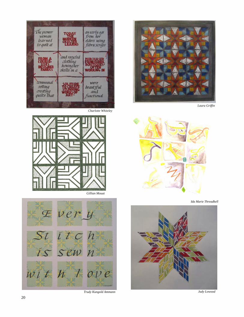
As in all galleria efforts, there was a wide interpretation of the topic. The enjoyment of this galleria piece was seen in the potential quilt pattern that would result from a repetition of the original design.
When the letter was repeated, both closed and open squares re-sulted. In some pieces, not only the letter was repeated, but the design between the letters was repeated as well. Former calligra-phy work was used in one piece, similar to the quilting practice of using pieces from former clothes. The pieces contained marvelous applications of muted shades and complimentary colours. The direc-tion of our eyes was manipulated by the letter placement. We saw mosaic patterns, crayon resist, airy background with
letters made from hand made rub-ber stamps, zentangles , counter spaces and one 3D surprise in which the ‘letter’ was interpreted as a letter of correspondence com-pleted in a nine patch quilt design. It was noted that a repetition of the piece creates a very different feel than the original.
- critiqued by Judith Lovell - Janice Graham-Andrews
Anne McDonald
Anne Atkinson
Betty
Loc
ke
Judith Lovell
Judy Dearman
20
Charlotte Whiteley
Gillian Mouat
Trudy Kungold Ammann
Laura Griffin
Ida Marie Threadkell
Judy Lowood

21 Shirley Johnson
Marilyn Lundstrom
Brigitte French
June Maffin
Marion Craig
Pat Wheatley

22
This workshop allowed us to experiment with giving the Neuland alphabet some added character. Lines and dots were added, letters were tipped and curved, edges were softened and crossbars were moved. -Janice Graham-Andrews Member Judy Matheson presented this programme several years ago. Her exemplar and instructions are posted on our web site under Techniques. I have also taken the liberty of including her piece below. Enjoy! - Editor
Judy Matheson
Judy Matheson

23
I had never made a card like the ones we produced at this amazing workshop. My previous idea of making a card was doing some calligraphy, photocopying it and sending it out. Now, there’s nothing wrong with that, but that concept did not fit this workshop. I needed a concept enhancement and I had come to the right place to get it. The cards we made with Marilyn Silver and Trish Peebles were little gems, small works of art: charming, elegant and whimsical, in turn. Likely the other 16 participants can think of more delicious adjectives to add. The two days went by quickly. Trish and Marilyn had gone to an enormous amount of time and work before they presented us with their ideas. Before we started each card, we were shown exam-ples, and then either chose an envelope or were given one that contained our materials, all precut. (After a day of mak-ing cards with my granddaughter, I came to appreciate all the time this must have taken.) We were free to alter the papers we received, add accents in a different way, emboss smooth or bumpy style, and pop or not pop! Each card had its own individual interpretation of the original. We were introduced to heat guns, cutting boards, metal em-bossing, the use of pigma pens to enhance stamps (both postage and rubber) for metal stamping, and making lady-bug trails. We used punches in circle and star shapes and different sizes, and made flat cards and circular ones tied flat with ribbon. We visited Asian motifs, and wee cards hung on a wire ‘clothes-line’ to use with four-letter words. Only the polite ones were encouraged. We were given web sites, and places to shop. Beware, those of you who are gadget-happy, or really like ‘stuff’. Card making can be expensive and addictive! But it does produce beautiful end results. Many thanks to Trish and Marilyn for a fun-filled two days, and for the hemisphere-crossing exercises to get both sides of the brain active! Trish and Marilyn tracked down suppliers. Here’s the list. In Victoria: Island Blueprint - good source of decorative papers www.islandblue.com Stampers - stamping supplies and paper. Offers classes. www.stamprs.com
Opus - mostly art supplies, but worth a look - nice paint selection and interesting decorative papers. www.opusframing.com Scrapbook Parade - great paper selection www.scrapbookparade.com Lasting Impressions - at Mattick's Farm www.lastingstamps.com Lantzville: Crafty Capers - stamping supplies and papers. Offers classes. www.craftycapers.com On-line: Quietfire Design in Courtenay. Great supplies and great on line service. www.quietfiredesign.com The Old Island Stamp Company in Lion's Bay on the Mainland. Great selection on-line stamps. www.saltspring.com/oldisland Dyan's Designs - www.dyan.topcities.com Hero Arts - www.heroarts.com Learn2Stamp - www.learn2stamp.com Iris Folding - www.irisfolding.CircleofCrafters.com
- Mary Nelson

24
Ginny Porter'’s story is one of good penmanship and karma. She is one of the Fairbank Guild members who is also one of our guild members, a kind of dual citizen. Ginny is an Island girl, born and raised in Oak Bay, she now lives on
an old apple farm in Saanich with Joan Byers, another one of our "dual citizens". She has only recently retired and is not yet noticing that she is any less busy (This seems to be a common discovery among our retirees). Before I go into any more detail on Ginny's recent interests I want to backtrack to her penmanship stories and careers. Her beautiful writing has played a part in at least three success-ful job interviews during a interesting, and varied, work history. She has been a short order cook, a university
student (for a short time), a mining claims draftsman, a UI claims ad-juster, a display artist and designer for Provincial campgrounds and public areas, and also one of the display team for the BC Royal Museum in Victoria. In the last few years you would have found Ginny managing Beacon Books in Sidney. At one point she and Joan also ran Apple Press Farm – 1,200 apple trees, mostly heritage varieties, figs, pears, grapes and flowers.
One of Ginny's first 'real' jobs was doing mining claims with the BC gov-ernment. Computers were not com-monplace yet so her job seems to have involved huge sheets of Mylar and small squares. I can see why she aban-doned this job when the opportunity to travel across Canada, camping with friends, came along. This came about because one of her teacher friends had got a job in Winnipeg and they de-cided to go the long way around. (Is it just me, or is there, like, one degree of separation between calligraphers and
teachers?). So at the end of summer Ginny found herself job hunting in Winnipeg. This is one of the penman-ship stories, (actually so was the min-ing claims job). Young and, presuma-bly, poor (having spent the Summer gallivanting across Canada), she found herself running 4 blocks to her interview (wrong bus stop), in August (on the Prairies), in a woolen dress seaside upbringing). The interviewer/manager did not notice her disheveled state, but did notice her "lovely writ-ing, much like his son's", and hired
her that day. Her new career as a UI claims adjuster started that next week. Eventually Ginny ended up back on the Island (can anyone ever really leave?) and the inevitable "job inter-view/penmanship connection" reoc-curred. Ginny was fairly convinced that she was not going to get this job in the display department of the BC government. In fact, when she saw the job requirements she decided that even her magical penmanship (my words, not Ginny's) could not help

25
her. She was unaware that karma would also come into play, and that the cross country camping spree would eventually end up being a good career move. So, dressed in sweat-pants, and feeling very relaxed, she did the interview and got the tradi-tional comments on her fine handwrit-ing. Much to her surprise she got called in for a follow up interview. It turns out that her ideas for mapping out campground facilities was exactly what they were looking for. So, a summer spent looking at campground maps ends up getting you a very good government job! By this time in our conversation I am beyond curious about this amazing script. Ginny explained that in her earlier experiences with handwriting it was not nearly so well received. In fact, her Elementary School teachers invested an extraordinary amount of time and energy, theirs and Ginny's, to try and force her writing to fit into school requirements. It seems that Ginny's writing reverted back as soon as the pressure was off, and has stood her in good stead. I think my fascina-tion had a bit to do with the kind of "Fairy Tale" aspect of this magic pen-manship. I don't think that Ginny is going to buy into my romanticized version though. So, back to the good government job, and then to the cutbacks of the 80's, and the 90's, which eventually led to the BC Royal Museum Display De-partment. From there Ginny decided to get a job on purpose (as opposed to using her magic handwriting) in a field for which she had a true passion. She has a love for books and was spending enough time, and money, at Beacon Books that it was a logical next step to work there. The next logi-cal step was to manage it. And the next logical step was to retire and have Joan manage it. (Honestly, there is a bit of a Fairy Tale to this story.) Ginny talks about the connection peo-ple can have with books, and with the people who sell them. She told more stories about her time at Beacon Books than any of her other jobs.
Talking to Ginny about her interest in calligraphy I quickly realize, that for her, calligraphy is part of the larger passion that encompasses both art and bookmaking. The same variety that you see in her job history is also re-flected in the variety of ways that cal-ligraphy is incorporated into her life. Ginny has never had any formal art training but has an innate ability that is most noticeable in the books she has been a part of creating and her calligraphy. One of the books she and Joan did together for a "cabbage" exhibition was a Perriot Doll whose body hid an intricately folded (3-D) book. (FYI "cabbage" refers to the Canadian Bookbinding and Book Artists Guild
(www.cbbag.ca)). The website is defi-nitely worth a look, and you can fol-low the links to "exhibits" and actu-ally see this doll/book. Another book Ginny mentioned was a folding fish that ends up being 8 feet long when stretched out. Then there are the canvas books, the medieval
bestiary , the book of faces, the book of crows.... there are BIG books and small ones. Between "Cabbage" and the Fairbank Calligraphy Society there is a wealth of experience and enthusi-asm, and Ginny (and Joan) seem to be in the middle of it all. The Fairbank Calligraphy Society also has a "Bookcell" group that makes books in a collaborative way that allows mem-bers to learn from each other. Hopefully you are still reading this article because I have one more, su-per-interesting, thing that I have to mention. It turns out that Ginny and Joan are the proud owners of an an-tique Chandler and Price 10X15 Platen Press. This is a huge, heavy, letter press that was delivered to their barn on a hydraulic lift, complete with about 4 different coats of paint. To get it from the barn and into the house involved taking it apart, cleaning each piece, and then moving the individual pieces into the house and putting eve-rything back together, in the correct order. Ginny was quite sure that this was a hobby and not another career move. We shall see. I am sure that there are many other, super-interesting (my words, not Ginny's), things about Ginny but I am out of time and space. She and Lorraine Douglas are thinking that they may be able to attend one of our meetings. I am definitely hoping she can come and that I shall get a chance to see her "magic" handwriting.
- Lucy Hylkema
Judy Dearman, our Librarian, and her assistants are working on creating a categorical listing of our inventory. You will be
able to access a listing on our web site soon http://members.shaw.ca/warmlandcalligraphers/library.htm

26
Ria Lewis I was born and raised in the south of The Netherlands in a town called Kerkrade. My family still lives near there. I met my husband, Bob, during Carnival. He was a
transplant from Saskatche-wan and teaching on a multi-national NATO base near my hometown. After a very brief courtship and to the shock of my parents, we were wed and off to "married bliss" in Saska-toon and later Swift Cur-rent, Sask. Needless to say it was a bit of cultural shock to me as a young newly-wed and immi-grant. After five years in Saskatchewan, we moved to Lethbridge, AB with two young children, a son and daughter. My husband en-couraged me to enter the University of Lethbridge where I graduated with a B.Ed with a major in Social Studies in 1980. I soon found myself teaching in
Lethbridge at the elemen-tary schools and later in Junior High. We moved to Vancouver in 1988 so that Bob could pursue a Ph.D. in educa-tion. I spent the first year in Vancouver as an education research assistant at Simon Fraser University and when we decided to stay for an-other year, I found a teaching position in the Surrey middle schools. Circumstances kept us in Vancouver for another three years and when an opportunity arose to teach in Brunei, S. E. Asia, we grabbed it. The following five years were spent teaching Eng-lish to Bruneian students and travelling extensively in S.E. Asia. Both our kids stayed in Vancouver to pursue post-secondary edu-cation but were able to visit us each year. The time
spent in the rich sultanate of Brunei allowed us to save some money and to build a home on Vancouver Island which I had coveted for many years. We moved to the Cowichan Valley 10 years ago and I continued to teach for seven more years, part-time. We are both semi-retired now and are happily pursuing our hob-bies of which calligraphy presently has most of my attention. To stay fit, I teach a few Aquafit classes at the new Aquatic Center each week. We also enjoy travelling which often involves visit-ing our son, daughter-in-law and two grandsons in Albuquerque, New Mexico and my family in The Netherlands. Our daughter is only a ferry ride away in Vancouver.
27

28
2 On our Cover — Christiane Lenz 3 President’s Message Editor’s Message 4 Uncials and Beyond 6 2009 — 2010 Executive Watercolour Flowers 7 Letters, Lines and Watercolours — Connie Furgason 10 February Galleria — No Paper Please 12 Borders with Betty 13 Bulletin Board 14 The Loft Show 16 March Galleria — A collaborative piece 19 April Galleria — A quilted look 22 Funky Lettering 23 Card Making workshop 24 Exposé — Ginny Porter 25 Library News 26 Back Cover Artist — Ria Lewis
ISSUE NUMBER 44 — MAY 2009